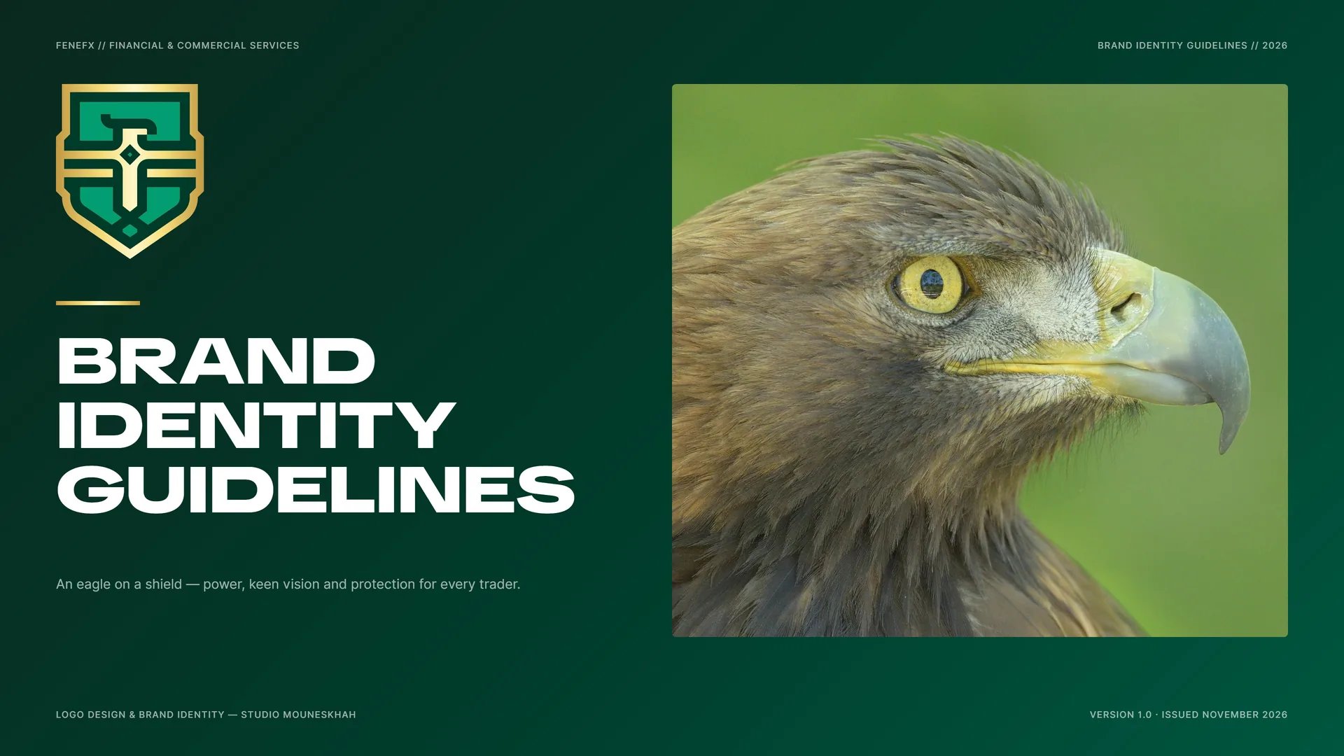
FENEFX Brand Identity Guidelines
FENEFX is a proprietary trading firm. Its identity stands for skill, discipline and a professional standard in the financial markets.
An eagle on a shield: the power and keen vision to read the market from above, and the protection that lets a trader act with confidence.
- Ano
- 2023
- Cliente
- FENEFX
- Setor
- Proprietary trading firm · financial & commercial services
- Serviços
- Identidade visual, Design de logotipo
- Projeto
- Brand Identity Guidelines · v1.0 · 2026
00
Introduction
00.1
Brand Concept
FENEFX is a proprietary trading firm. Its identity stands for skill, discipline and a professional standard in the financial markets.
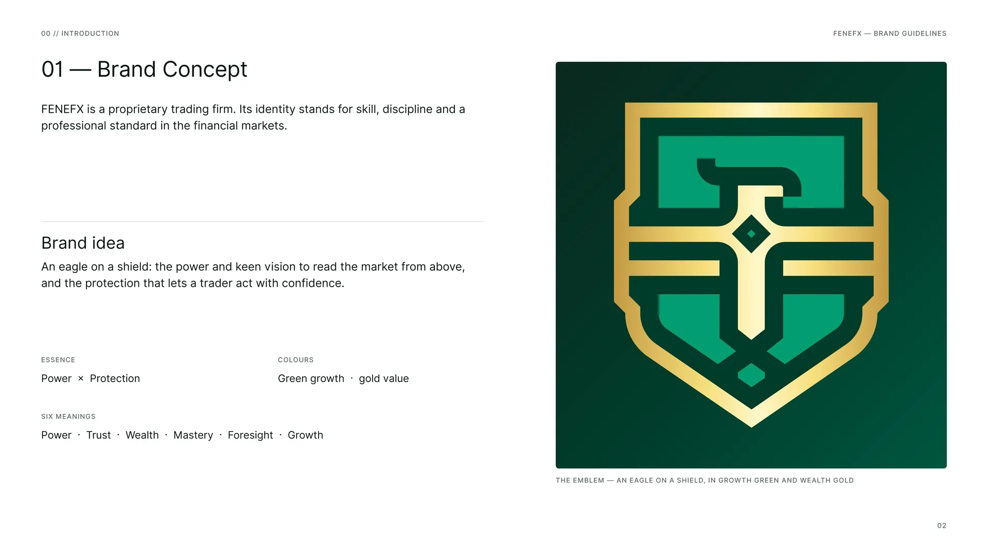
Brand idea: An eagle on a shield: the power and keen vision to read the market from above, and the protection that lets a trader act with confidence.
Essence: Power × Protection.
Colours: Green growth · gold value.
Six meanings: Power · Trust · Wealth · Mastery · Foresight · Growth.
The emblem — an eagle on a shield, in growth green and wealth gold.
00.2
The Brand Problem
Proprietary trading is a crowded field of look-alike firms and loud promises. FENEFX needed an identity that earns trust through calm and precision rather than claims: strength, security and a professional standard traders can recognise.
The challenge: A crowded field of look-alike firms · Trust must be earned, not claimed · Careful language in a regulated field · From an app icon to a building fascia.
The approach: Draw one strong emblem — an eagle on a shield — in a single line weight on a strict grid, and set it in growth green and wealth gold.
The opportunity: A sign as calm and exact as the discipline it stands for.
The shift: From a crowd of look-alikes → one sign, drawn with care.
00.3
Primary logo
01
Brand
- 01.1Skill first
- 01.2Mission & Vision
- 01.3Brand Values
- 01.4Tone of Voice
- 01.5Taglines
- 01.6Service Names (client wording)
01.1
Skill first
FENEFX was founded with a clear vision: a professional environment in which traders develop their skill and work to a high standard — with technology, evaluation and education in one place.
Its aim is a community of ambitious traders who learn, practise and grow with discipline and integrity.
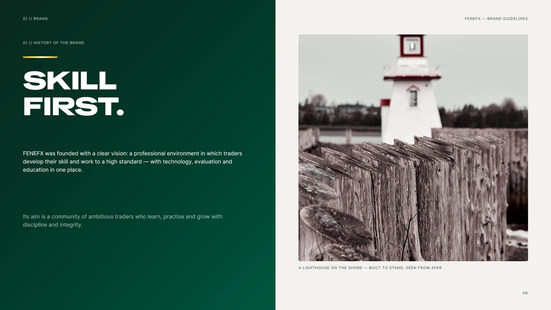
A lighthouse on the shore — built to stand, seen from afar.
01.2
Mission & Vision
Mission: To give ambitious traders the tools, education and support to work to a professional standard in the financial markets.
Talent deserves a professional home. FENEFX offers a supportive, well-run environment in which traders can hone their skills and practise their strategies with discipline.
Vision: To become a leading proprietary trading firm — a hub for trader development, innovation and financial mastery.
A future where financial talent is recognised and nurtured regardless of background: traders who are mentored, supported and empowered to lead, with the highest standards of integrity and trust.
01.3
Brand Values
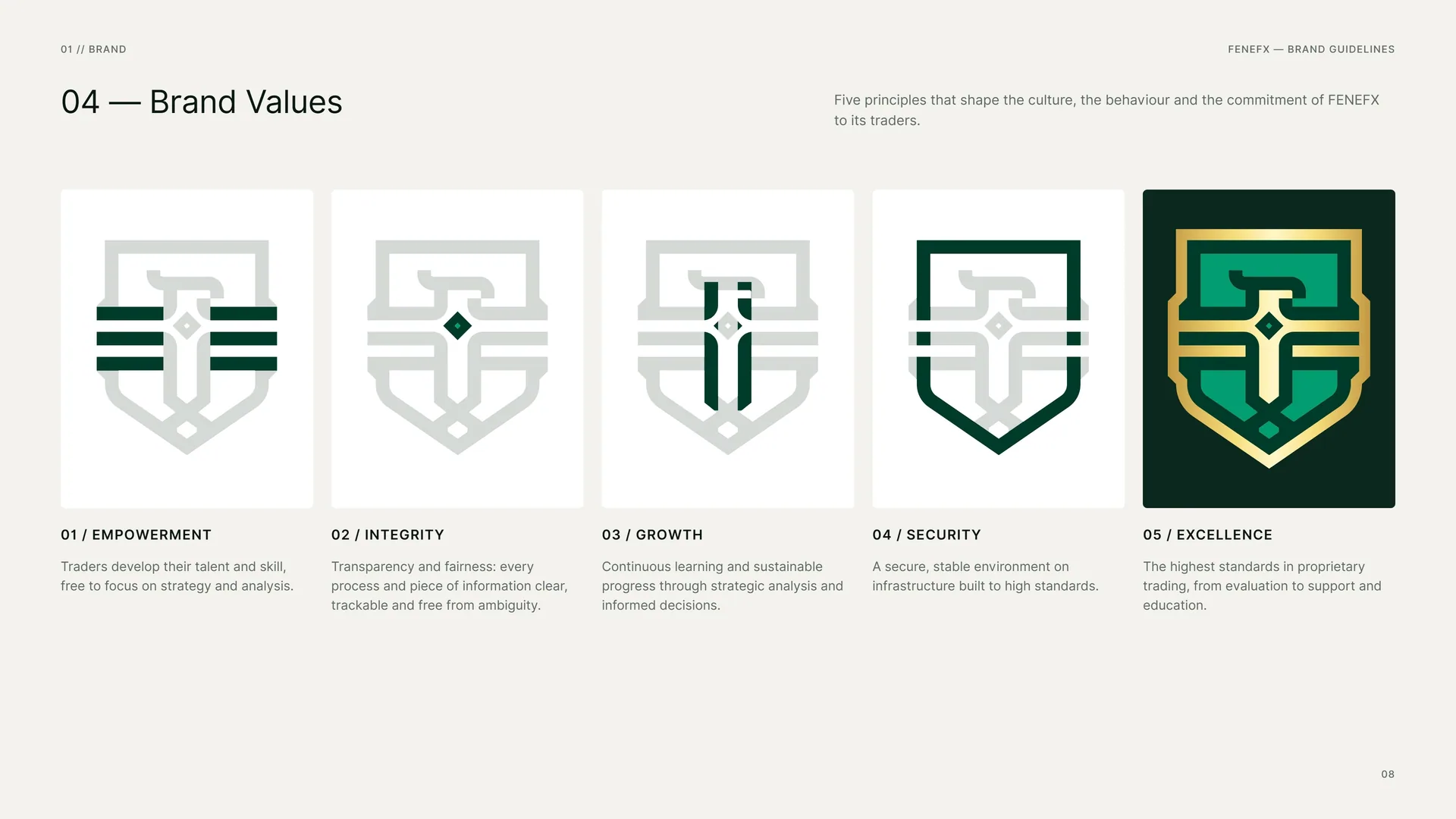
Five principles that shape the culture, the behaviour and the commitment of FENEFX to its traders.
Empowerment: Traders develop their talent and skill, free to focus on strategy and analysis.
Integrity: Transparency and fairness: every process and piece of information clear, trackable and free from ambiguity.
Growth: Continuous learning and sustainable progress through strategic analysis and informed decisions.
Security: A secure, stable environment on infrastructure built to high standards.
Excellence: The highest standards in proprietary trading, from evaluation to support and education.
01.4
Tone of Voice
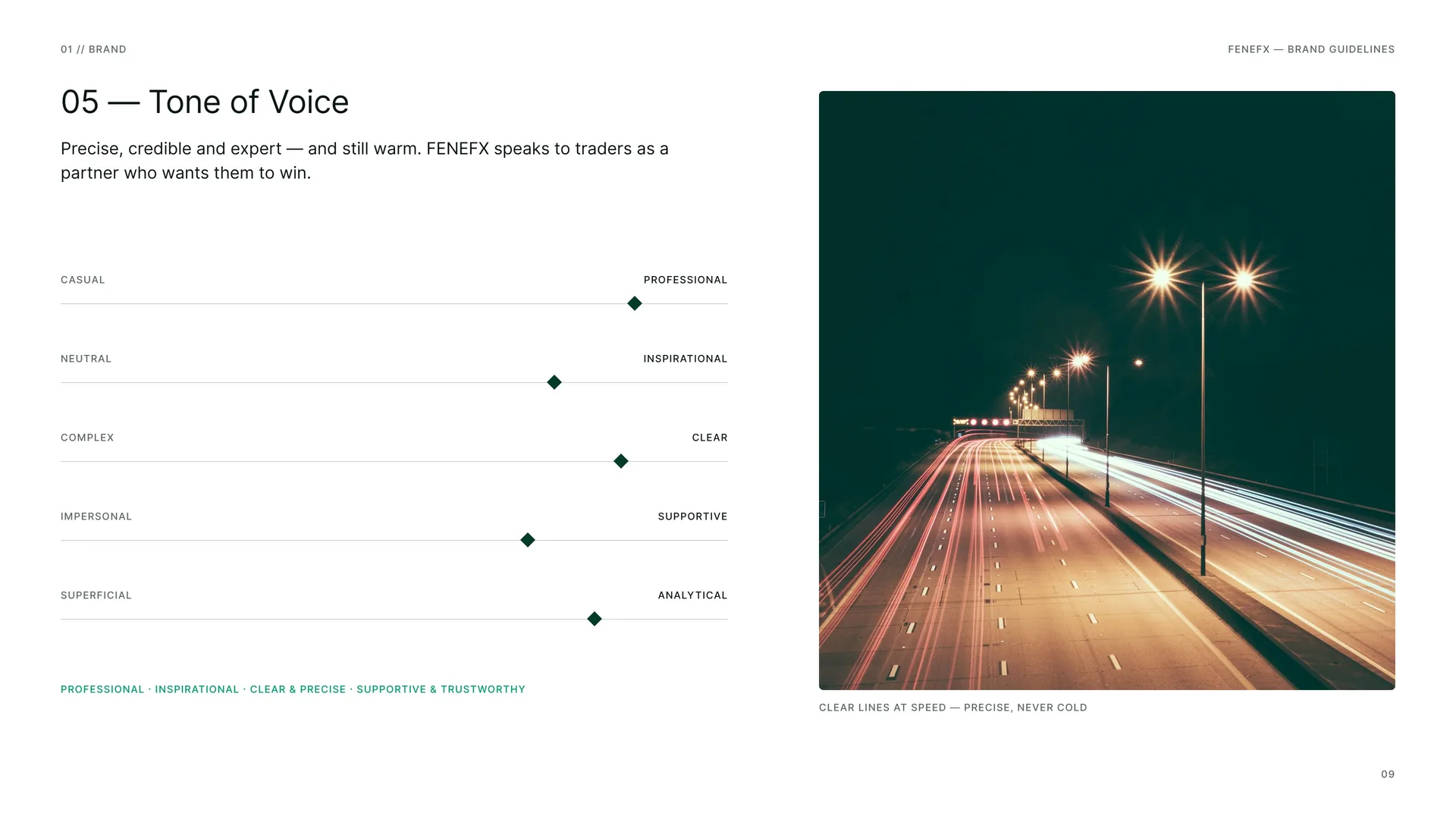
Precise, credible and expert — and still warm. FENEFX speaks to traders as a partner who wants them to win.
Casual / Professional · Neutral / Inspirational · Complex / Clear · Impersonal / Supportive · Superficial / Analytical.
Professional · Inspirational · Clear & precise · Supportive & trustworthy.
Clear lines at speed — precise, never cold.
01.5
Taglines
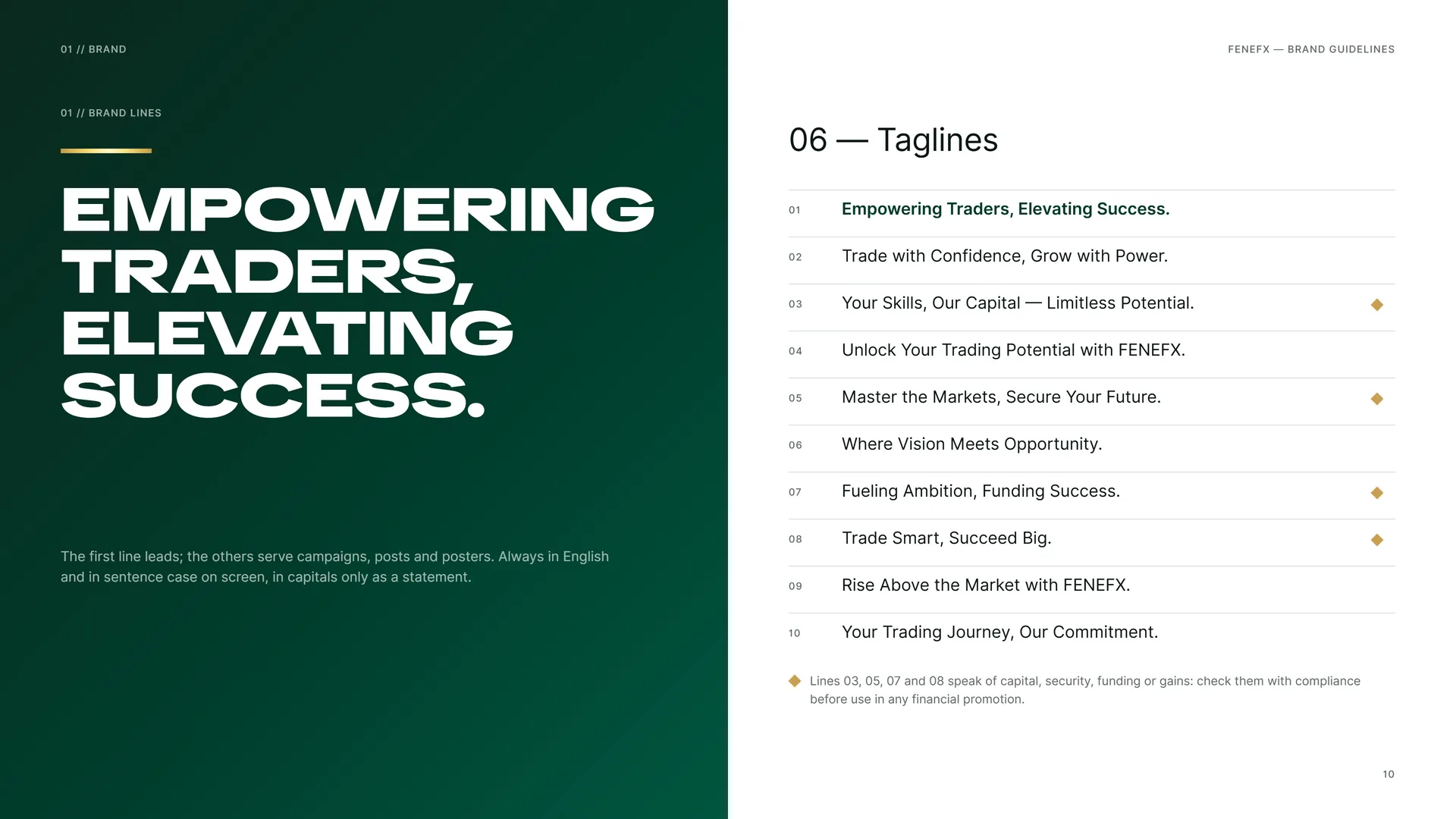
Empowering traders, elevating success.
The first line leads; the others serve campaigns, posts and posters. Always in English and in sentence case on screen, in capitals only as a statement.
01 · Empowering Traders, Elevating Success.
02 · Trade with Confidence, Grow with Power.
03 · Your Skills, Our Capital — Limitless Potential.
04 · Unlock Your Trading Potential with FENEFX.
05 · Master the Markets, Secure Your Future.
06 · Where Vision Meets Opportunity.
07 · Fueling Ambition, Funding Success.
08 · Trade Smart, Succeed Big.
09 · Rise Above the Market with FENEFX.
10 · Your Trading Journey, Our Commitment.
Lines 03, 05, 07 and 08 speak of capital, security, funding or gains: check them with compliance before use in any financial promotion.
01.6
Service Names (client wording)
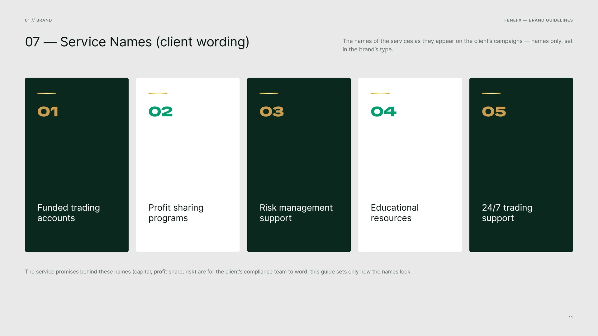
The names of the services as they appear on the client’s campaigns — names only, set in the brand’s type.
Funded trading accounts · Profit sharing programs · Risk management support · Educational resources · 24/7 trading support.
The service promises behind these names (capital, profit share, risk) are for the client’s compliance team to word; this guide sets only how the names look.
02
Concept
- 02.1F + X + Eagle + Shield
- 02.2Logo Meaning
- 02.3Wings spread
- 02.4The Shield
- 02.5One line. One weight.
- 02.6Macro
- 02.7The Mark in Motion
02.1
F + X + Eagle + Shield
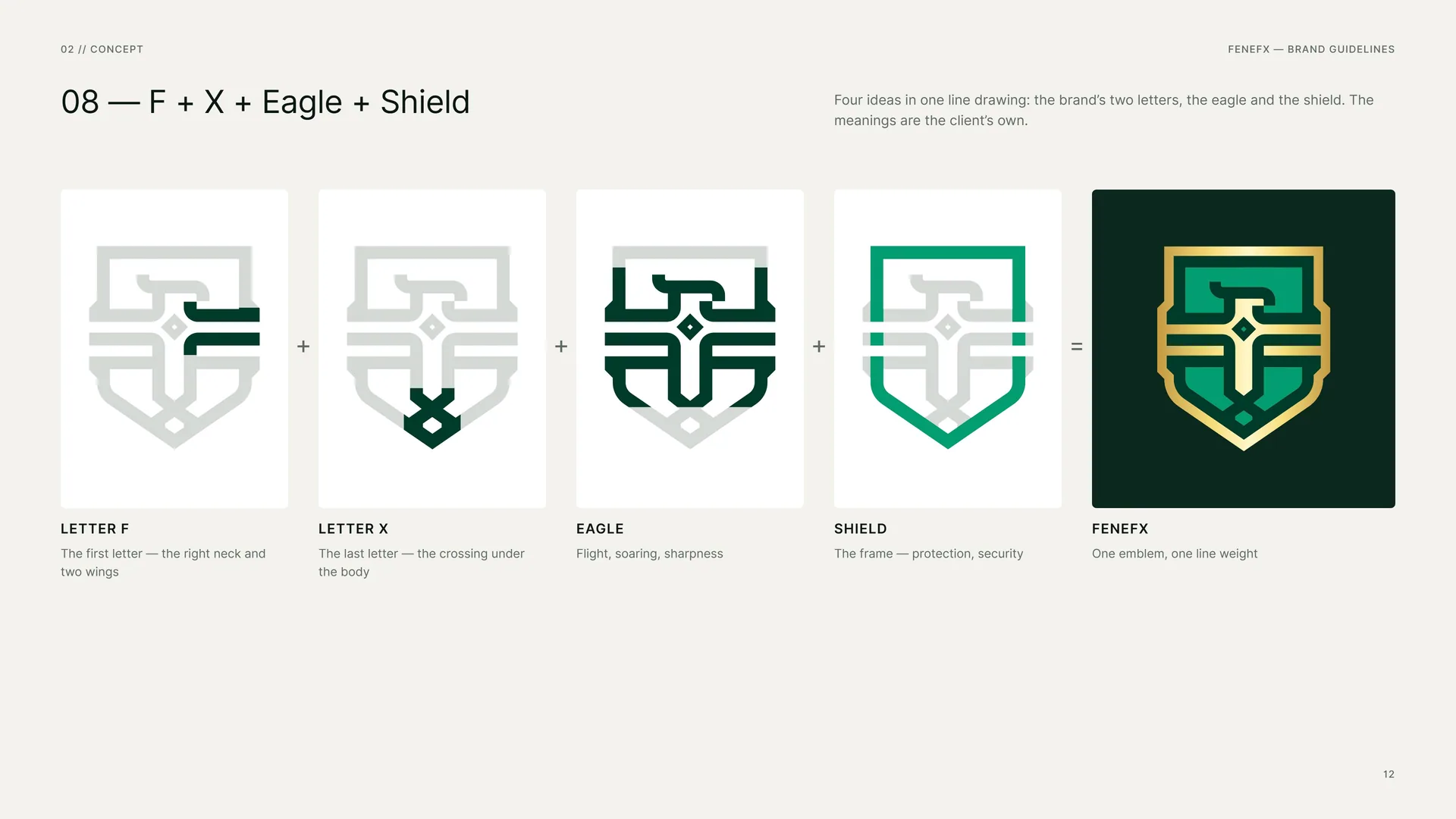
Four ideas in one line drawing: the brand’s two letters, the eagle and the shield. The meanings are the client’s own.
Letter F: The first letter — the right neck and two wings.
Letter X: The last letter — the crossing under the body.
Eagle: Flight, soaring, sharpness.
Shield: The frame — protection, security.
FENEFX: One emblem, one line weight.
02.2
Logo Meaning
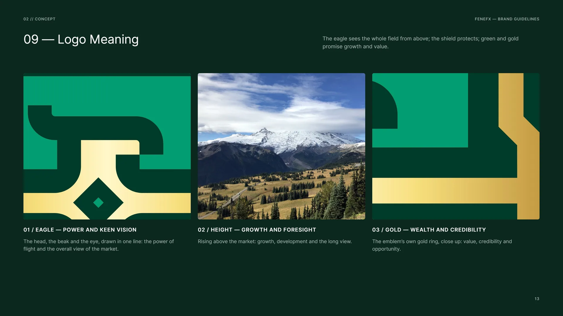
The eagle sees the whole field from above; the shield protects; green and gold promise growth and value.
Eagle — power and keen vision: The head, the beak and the eye, drawn in one line: the power of flight and the overall view of the market.
Height — growth and foresight: Rising above the market: growth, development and the long view.
Gold — wealth and credibility: The emblem’s own gold ring, close up: value, credibility and opportunity.
02.3
Wings spread
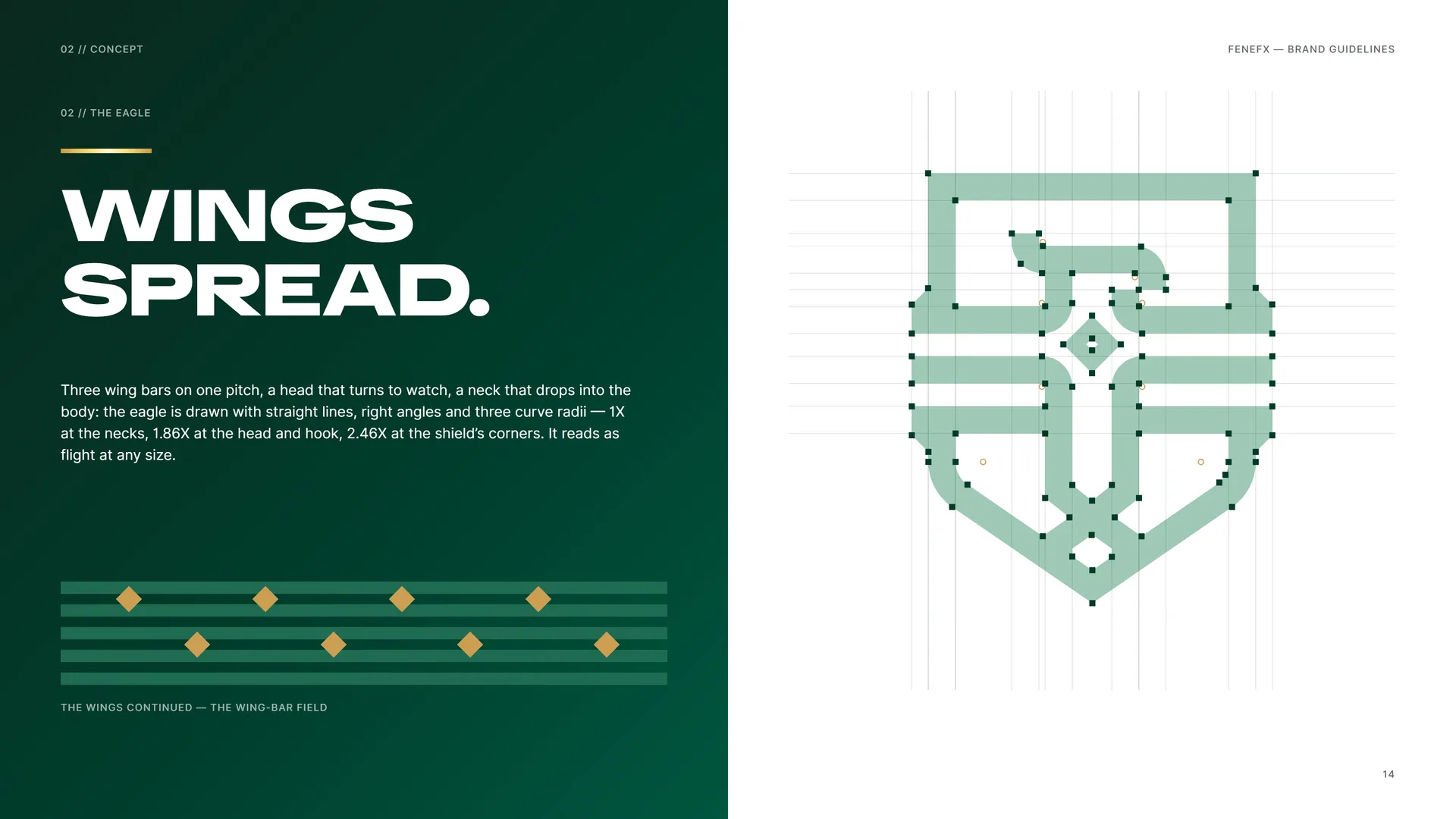
Three wing bars on one pitch, a head that turns to watch, a neck that drops into the body: the eagle is drawn with straight lines, right angles and three curve radii — 1X at the necks, 1.86X at the head and hook, 2.46X at the shield’s corners. It reads as flight at any size.
The wings continued — the wing-bar field.
02.4
The Shield
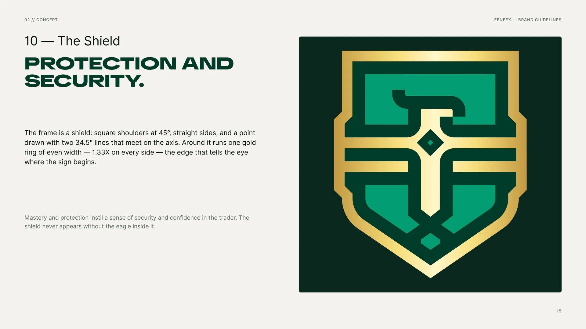
Protection and security.
The frame is a shield: square shoulders at 45°, straight sides, and a point drawn with two 34.5° lines that meet on the axis. Around it runs one gold ring of even width — 1.33X on every side — the edge that tells the eye where the sign begins.
Mastery and protection instil a sense of security and confidence in the trader. The shield never appears without the eagle inside it.
02.5
One line. One weight.
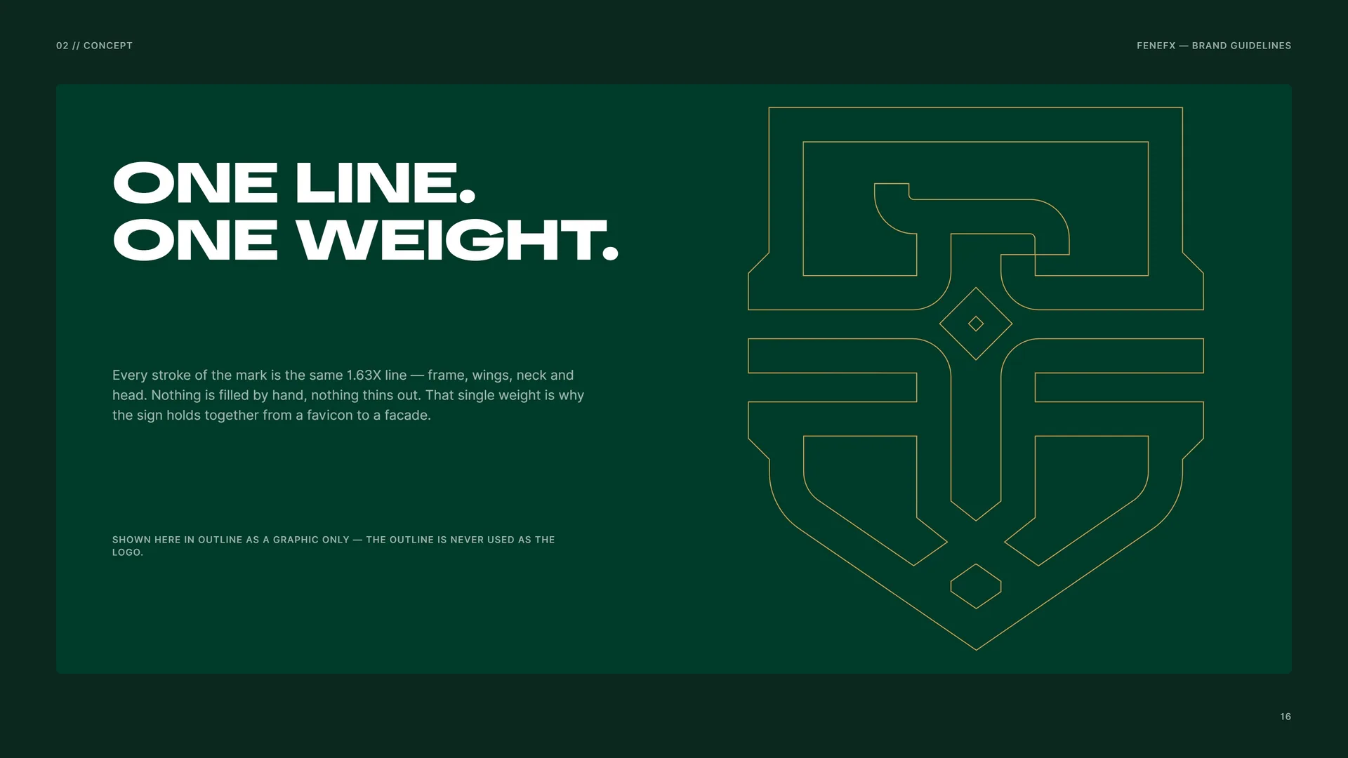
Every stroke of the mark is the same 1.63X line — frame, wings, neck and head. Nothing is filled by hand, nothing thins out. That single weight is why the sign holds together from a favicon to a facade.
Shown here in outline as a graphic only — the outline is never used as the logo.
02.6
Macro
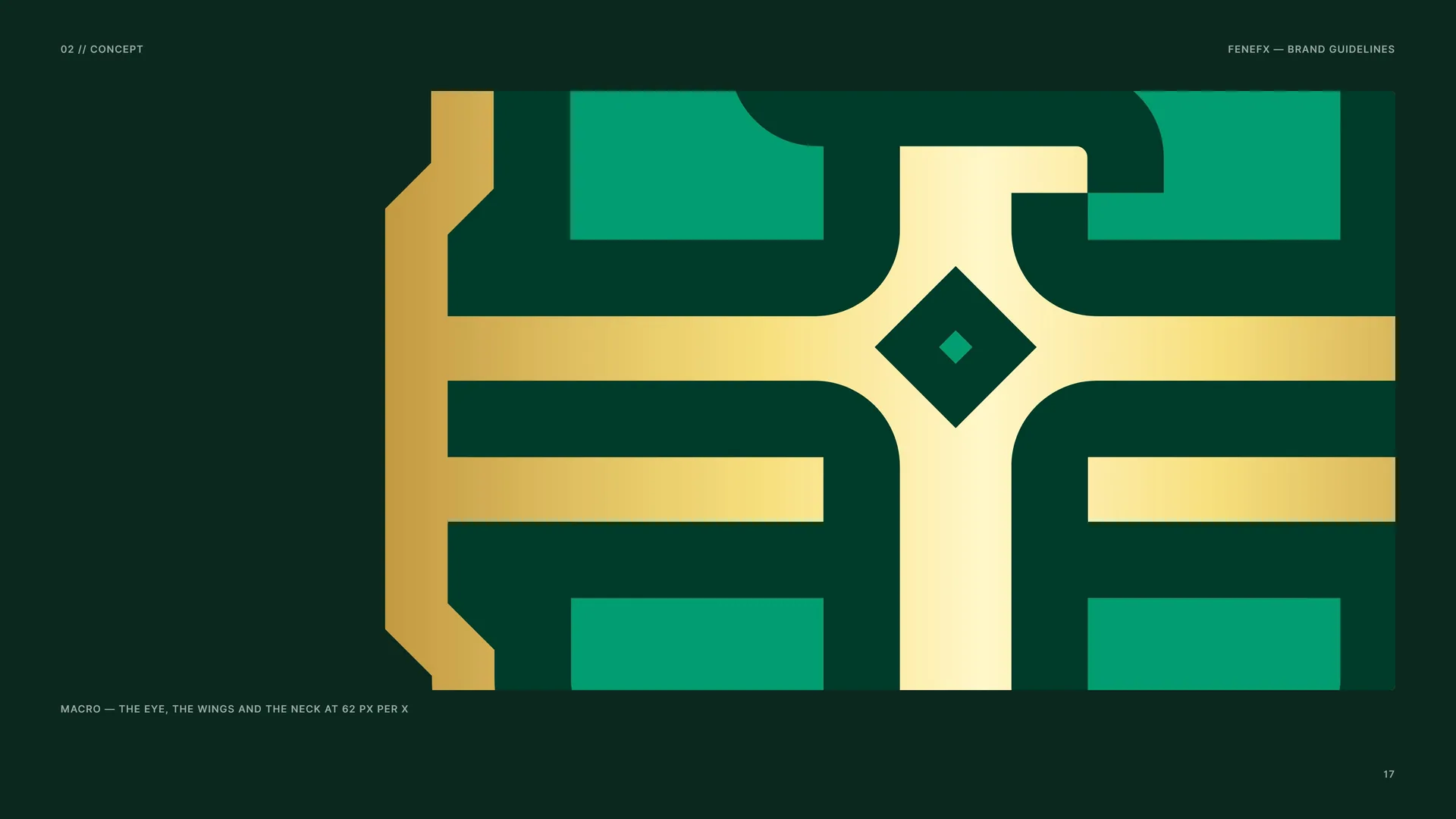
Macro — the eye, the wings and the neck at 62 px per X.
02.7
The Mark in Motion
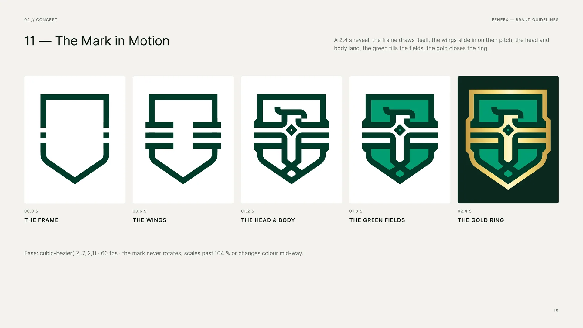
A 2.4 s reveal: the frame draws itself, the wings slide in on their pitch, the head and body land, the green fills the fields, the gold closes the ring.
00.0 s — The frame · 00.6 s — The wings · 01.2 s — The head & body · 01.8 s — The green fields · 02.4 s — The gold ring.
Ease: cubic-bezier(.2,.7,.2,1) · 60 fps · the mark never rotates, scales past 104 % or changes colour mid-way.
03
Logo & grid
- 03.1The Primary Logo
- 03.2The Logo Family
- 03.3Anatomy
- 03.4The Grid
- 03.5Proportions in X
- 03.6Line Weight & Rhythm
- 03.7Curves & Angles
- 03.8The Wordmark
- 03.9Stacked Proportions
- 03.10Horizontal Proportions
- 03.11Clear Space
- 03.12Colour Versions
- 03.13App Icon & Favicon
- 03.14Minimum Size
- 03.15Misuse
- 03.16Logo on Grounds & Photos
03.1
The Primary Logo
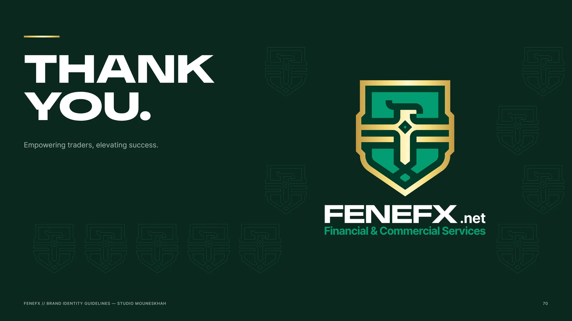
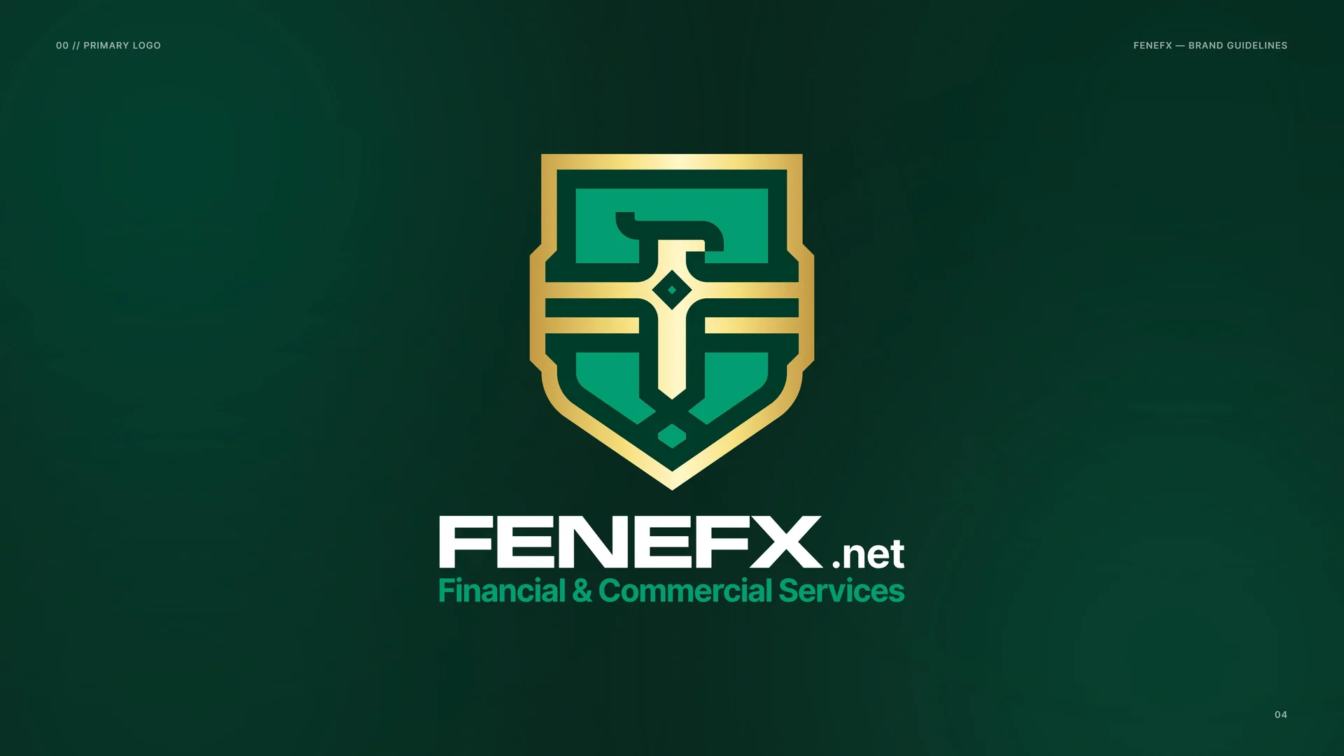
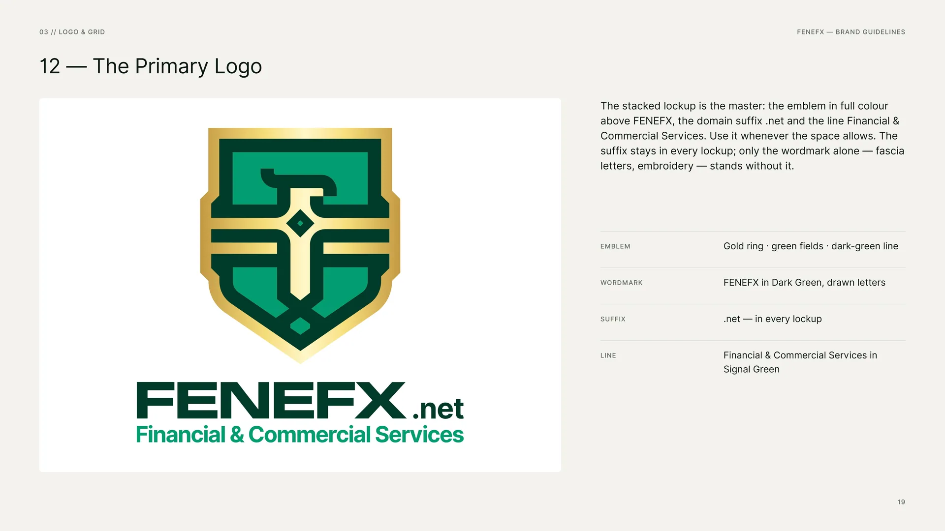
The stacked lockup is the master: the emblem in full colour above FENEFX, the domain suffix .net and the line Financial & Commercial Services. Use it whenever the space allows. The suffix stays in every lockup; only the wordmark alone — fascia letters, embroidery — stands without it.
Emblem: Gold ring · green fields · dark-green line.
Wordmark: FENEFX in Dark Green, drawn letters.
Suffix: .net — in every lockup.
Line: Financial & Commercial Services in Signal Green.
03.2
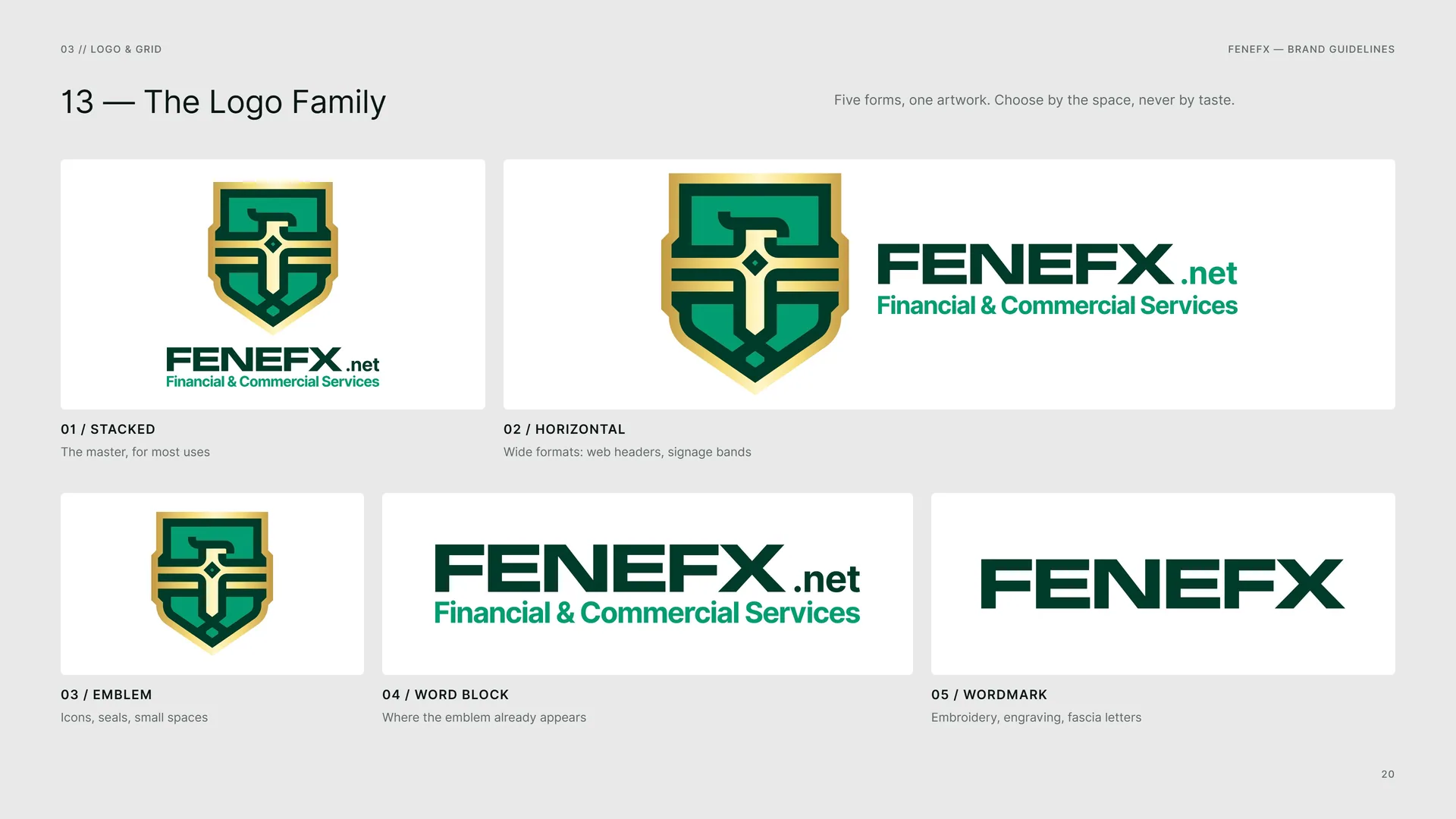
The Logo Family
Five forms, one artwork. Choose by the space, never by taste.
Stacked: The master, for most uses.
Horizontal: Wide formats: web headers, signage bands.
Emblem: Icons, seals, small spaces.
Word block: Where the emblem already appears.
Wordmark: Embroidery, engraving, fascia letters.
03.3
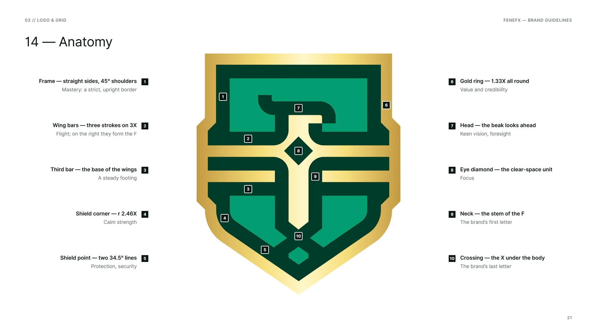
Anatomy
1 · Frame — straight sides, 45° shoulders. Mastery: a strict, upright border.
2 · Wing bars — three strokes on 3X. Flight; on the right they form the F.
3 · Third bar — the base of the wings. A steady footing.
4 · Shield corner — r 2.46X. Calm strength.
5 · Shield point — two 34.5° lines. Protection, security.
6 · Gold ring — 1.33X all round. Value and credibility.
7 · Head — the beak looks ahead. Keen vision, foresight.
8 · Eye diamond — the clear-space unit. Focus.
9 · Neck — the stem of the F. The brand’s first letter.
10 · Crossing — the X under the body. The brand’s last letter.
03.4
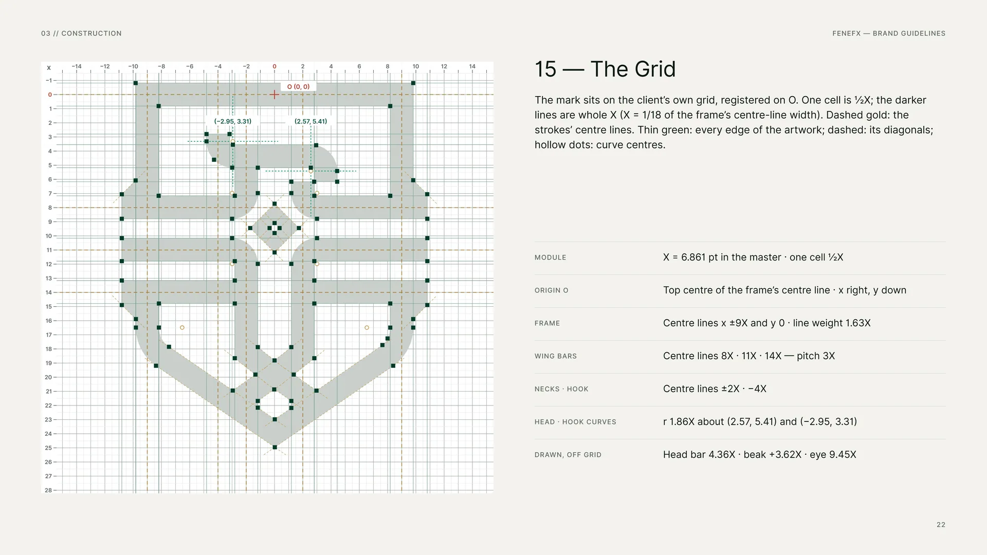
The Grid
The mark sits on the client’s own grid, registered on O. One cell is ½X; the darker lines are whole X (X = 1/18 of the frame’s centre-line width). Dashed gold: the strokes’ centre lines. Thin green: every edge of the artwork; dashed: its diagonals; hollow dots: curve centres.
Module: X = 6.861 pt in the master · one cell ½X.
Origin O: Top centre of the frame’s centre line · x right, y down.
Frame: Centre lines x ±9X and y 0 · line weight 1.63X.
Wing bars: Centre lines 8X · 11X · 14X — pitch 3X.
Necks · hook: Centre lines ±2X · −4X.
Head · hook curves: r 1.86X about (2.57, 5.41) and (−2.95, 3.31).
Drawn, off grid: Head bar 4.36X · beak +3.62X · eye 9.45X.
03.5
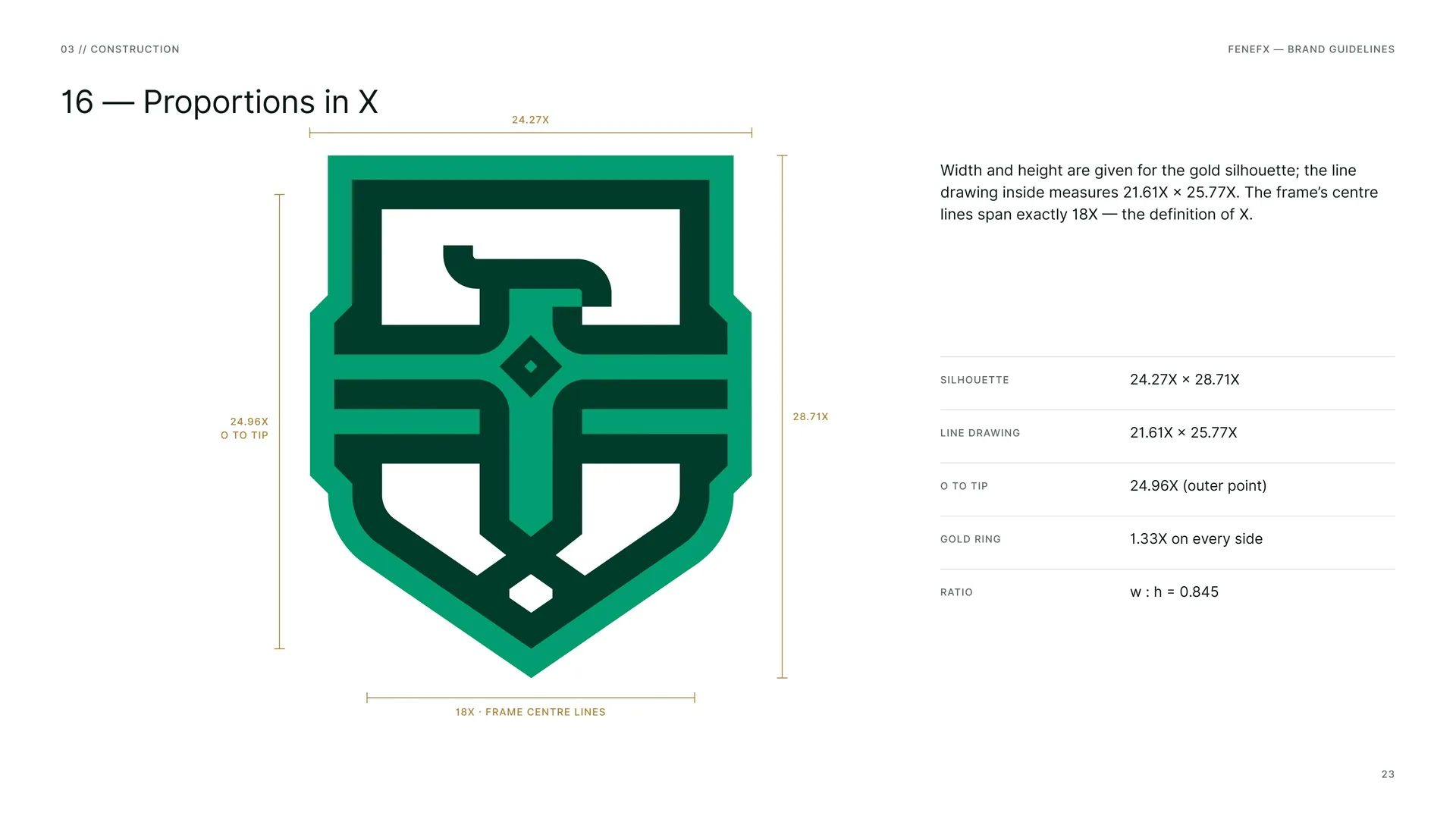
Proportions in X
Width and height are given for the gold silhouette; the line drawing inside measures 21.61X × 25.77X. The frame’s centre lines span exactly 18X — the definition of X.
Silhouette: 24.27X × 28.71X.
Line drawing: 21.61X × 25.77X.
O to tip: 24.96X (outer point).
Gold ring: 1.33X on every side.
Ratio: w : h = 0.845.
03.6
Line Weight & Rhythm
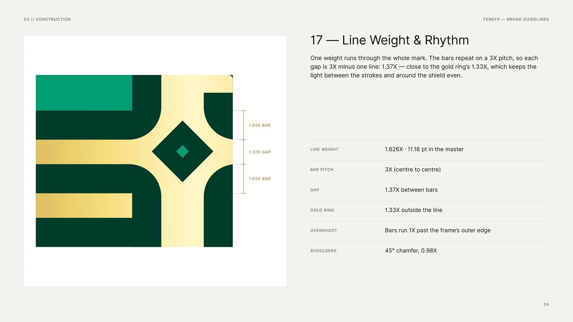
One weight runs through the whole mark. The bars repeat on a 3X pitch, so each gap is 3X minus one line: 1.37X — close to the gold ring’s 1.33X, which keeps the light between the strokes and around the shield even.
Line weight: 1.626X · 11.16 pt in the master.
Bar pitch: 3X (centre to centre).
Gap: 1.37X between bars.
Gold ring: 1.33X outside the line.
Overshoot: Bars run 1X past the frame’s outer edge.
Shoulders: 45° chamfer, 0.98X.
03.7
Curves & Angles
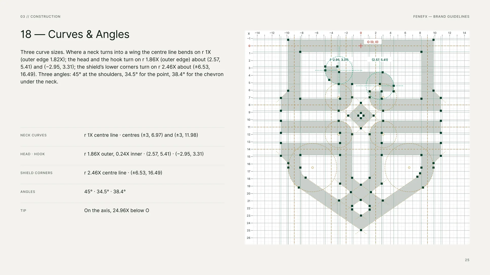
Three curve sizes. Where a neck turns into a wing the centre line bends on r 1X (outer edge 1.82X); the head and the hook turn on r 1.86X (outer edge) about (2.57, 5.41) and (−2.95, 3.31); the shield’s lower corners turn on r 2.46X about (±6.53, 16.49). Three angles: 45° at the shoulders, 34.5° for the point, 38.4° for the chevron under the neck.
Neck curves: r 1X centre line · centres (±3, 6.97) and (±3, 11.98).
Head · hook: r 1.86X outer, 0.24X inner · (2.57, 5.41) · (−2.95, 3.31).
Shield corners: r 2.46X centre line · (±6.53, 16.49).
Angles: 45° · 34.5° · 38.4°.
Tip: On the axis, 24.96X below O.
03.8
The Wordmark
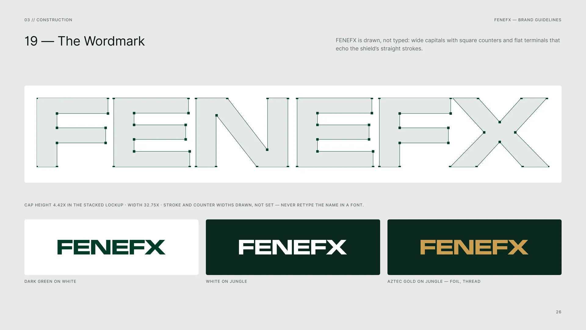
FENEFX is drawn, not typed: wide capitals with square counters and flat terminals that echo the shield’s straight strokes.
Cap height 4.42X in the stacked lockup · width 32.75X · stroke and counter widths drawn, not set — never retype the name in a font.
Dark Green on white · White on Jungle · Aztec Gold on Jungle — foil, thread.
03.9
Stacked Proportions
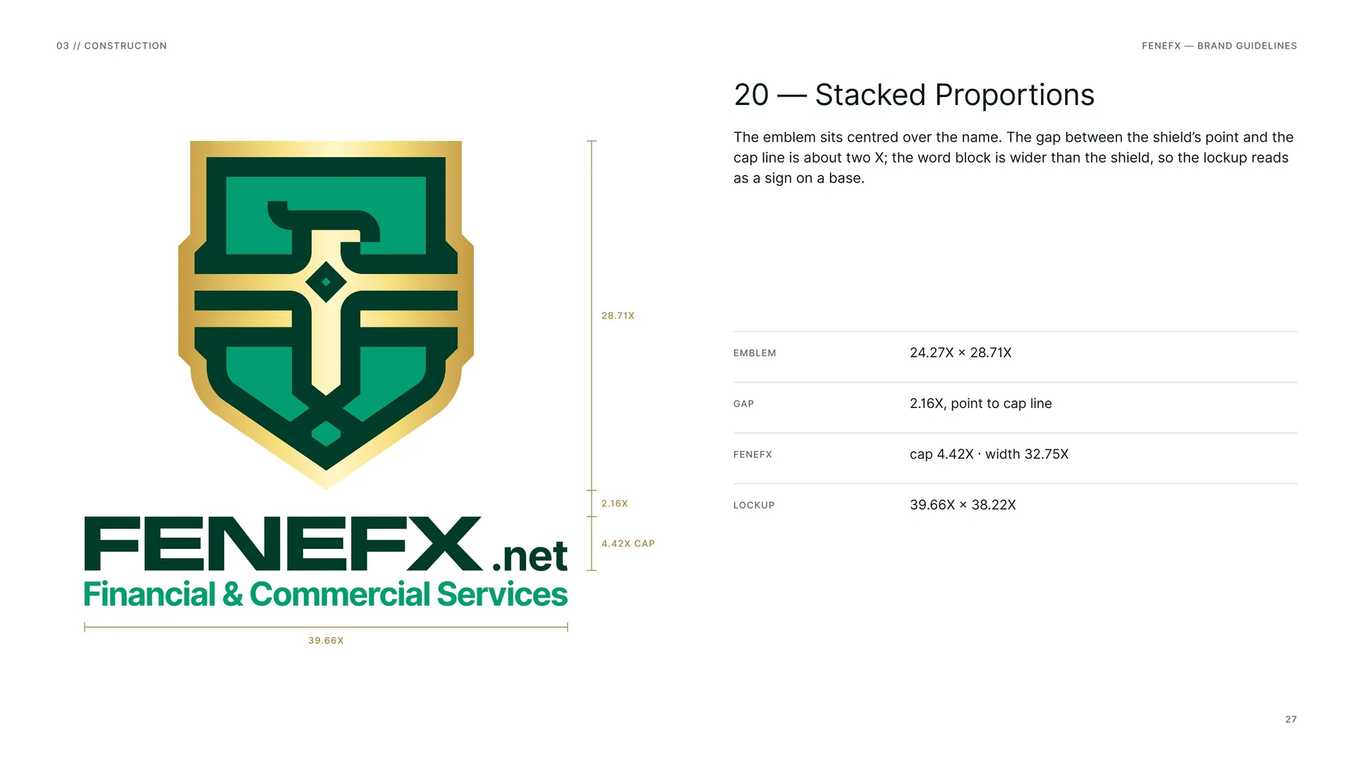
The emblem sits centred over the name. The gap between the shield’s point and the cap line is about two X; the word block is wider than the shield, so the lockup reads as a sign on a base.
Emblem: 24.27X × 28.71X.
Gap: 2.16X, point to cap line.
FENEFX: cap 4.42X · width 32.75X.
Lockup: 39.66X × 38.22X.
03.10
Horizontal Proportions
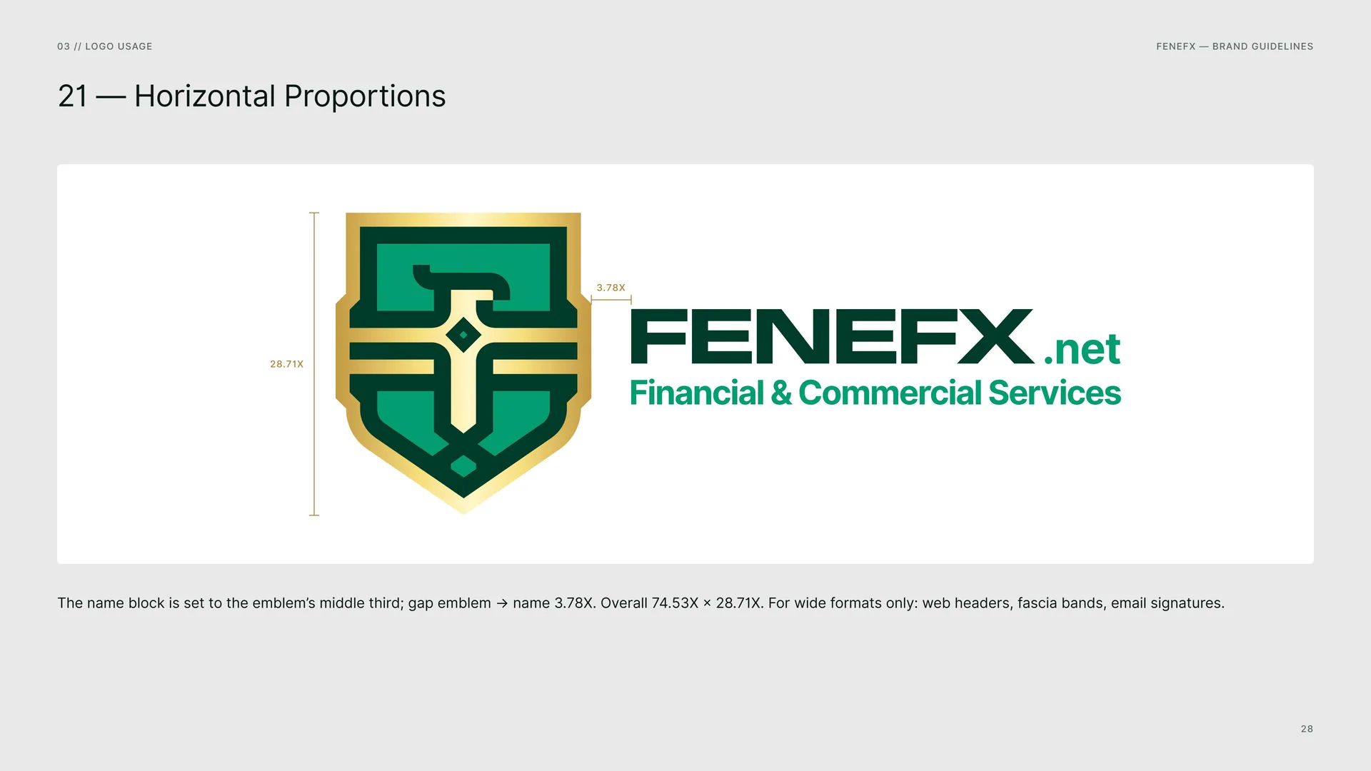
The name block is set to the emblem’s middle third; gap emblem → name 3.78X. Overall 74.53X × 28.71X. For wide formats only: web headers, fascia bands, email signatures.
03.11
Clear Space
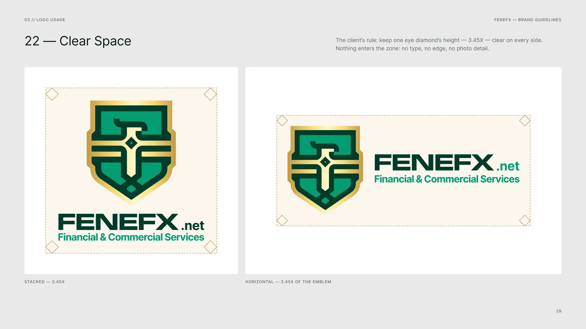
The client’s rule: keep one eye diamond’s height — 3.45X — clear on every side. Nothing enters the zone: no type, no edge, no photo detail.
Stacked — 3.45X.
Horizontal — 3.45X of the emblem.
03.12
Colour Versions
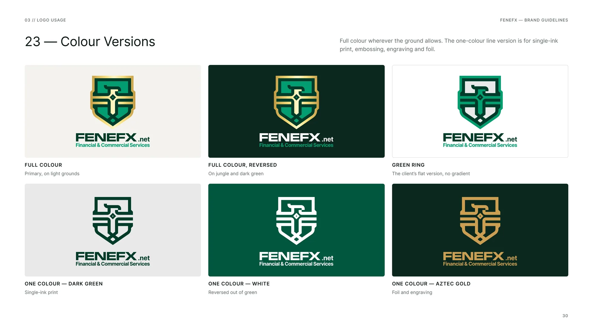
Full colour wherever the ground allows. The one-colour line version is for single-ink print, embossing, engraving and foil.
Full colour: Primary, on light grounds.
Full colour, reversed: On jungle and dark green.
Green ring: The client’s flat version, no gradient.
One colour — Dark Green: Single-ink print.
One colour — White: Reversed out of green.
One colour — Aztec Gold: Foil and engraving.
03.13
App Icon & Favicon
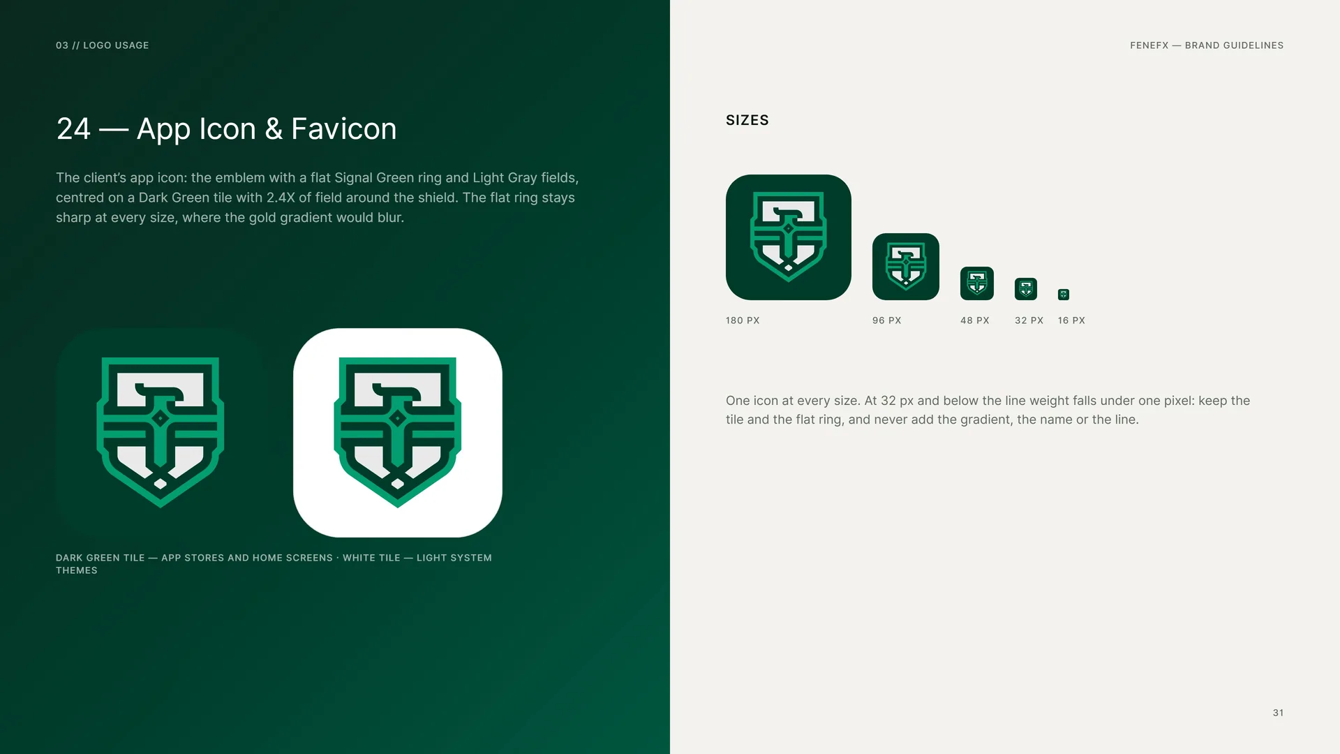
The client’s app icon: the emblem with a flat Signal Green ring and Light Gray fields, centred on a Dark Green tile with 2.4X of field around the shield. The flat ring stays sharp at every size, where the gold gradient would blur.
Dark green tile — app stores and home screens · white tile — light system themes.
Sizes: 180 px · 96 px · 48 px · 32 px · 16 px.
One icon at every size. At 32 px and below the line weight falls under one pixel: keep the tile and the flat ring, and never add the gradient, the name or the line.
03.14
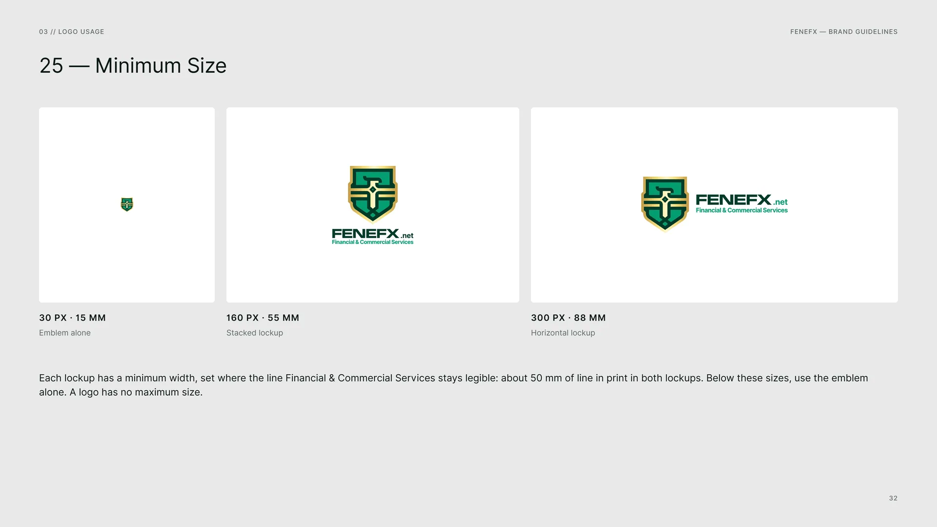
Minimum Size
Emblem alone: 30 px · 15 mm.
Stacked lockup: 160 px · 55 mm.
Horizontal lockup: 300 px · 88 mm.
Each lockup has a minimum width, set where the line Financial & Commercial Services stays legible: about 50 mm of line in print in both lockups. Below these sizes, use the emblem alone. A logo has no maximum size.
03.15
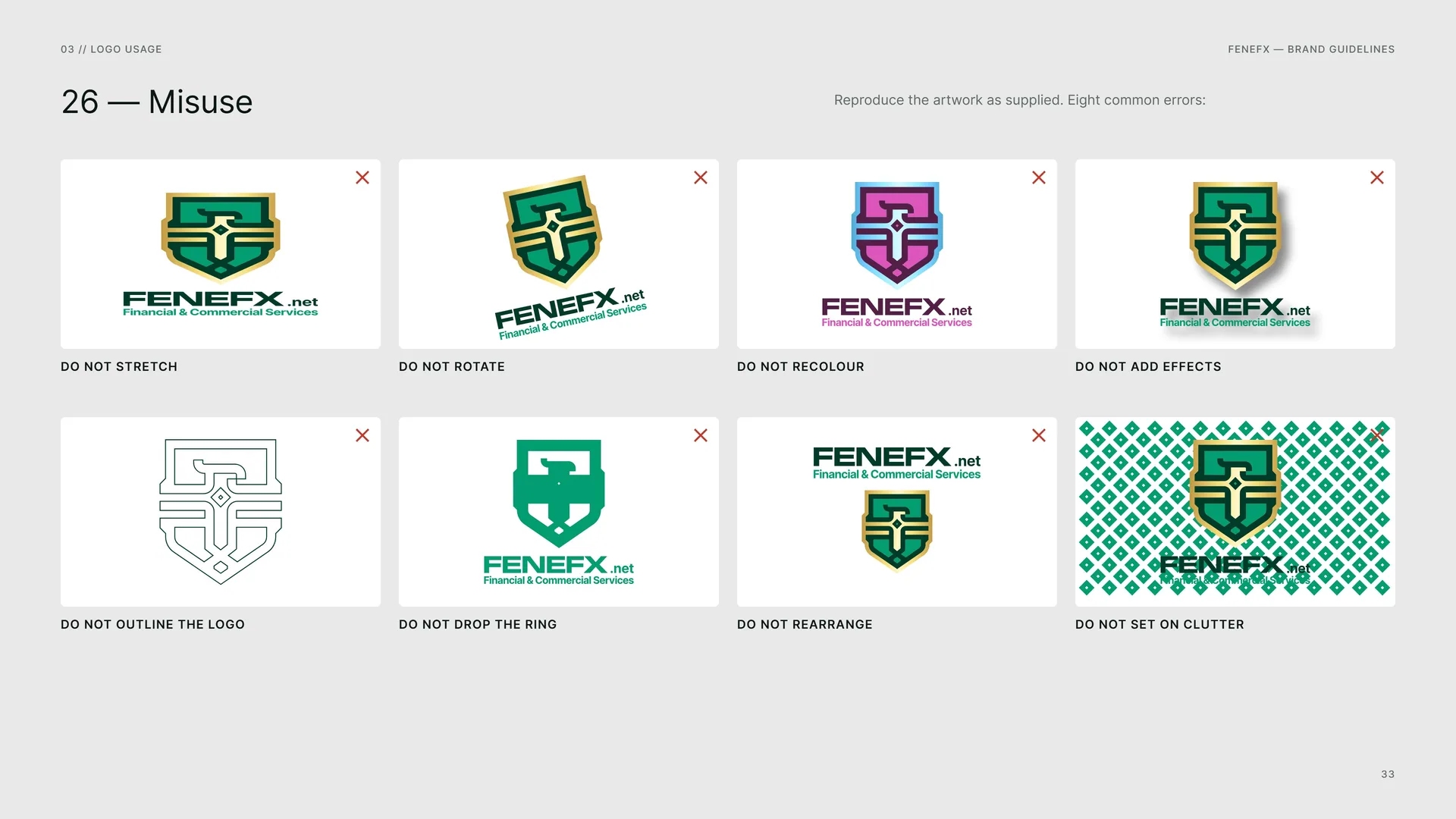
Misuse
Reproduce the artwork as supplied. Eight common errors:
Do not stretch · Do not rotate · Do not recolour · Do not add effects · Do not outline the logo · Do not drop the ring · Do not rearrange · Do not set on clutter.
03.16
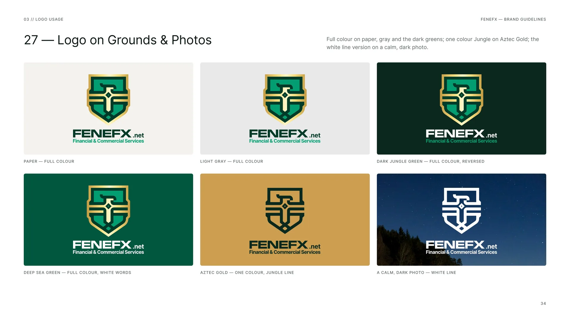
Logo on Grounds & Photos
Full colour on paper, gray and the dark greens; one colour Jungle on Aztec Gold; the white line version on a calm, dark photo.
Paper — full colour.
Light Gray — full colour.
Dark Jungle Green — full colour, reversed.
Deep Sea Green — full colour, white words.
Aztec Gold — one colour, Jungle line.
A calm, dark photo — white line.
04
Colour
04.1
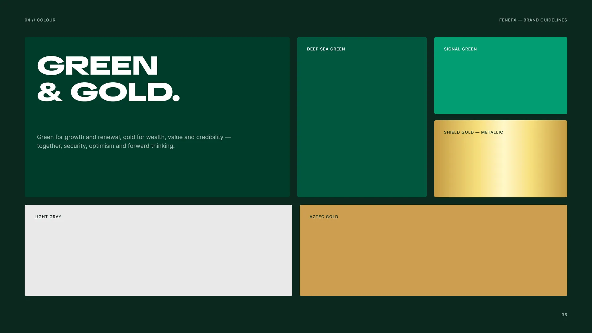
Green & Gold
Green for growth and renewal, gold for wealth, value and credibility — together, security, optimism and forward thinking.
Deep Sea Green · Signal Green · Shield Gold — metallic · Light Gray · Aztec Gold.
04.2
Colour Values
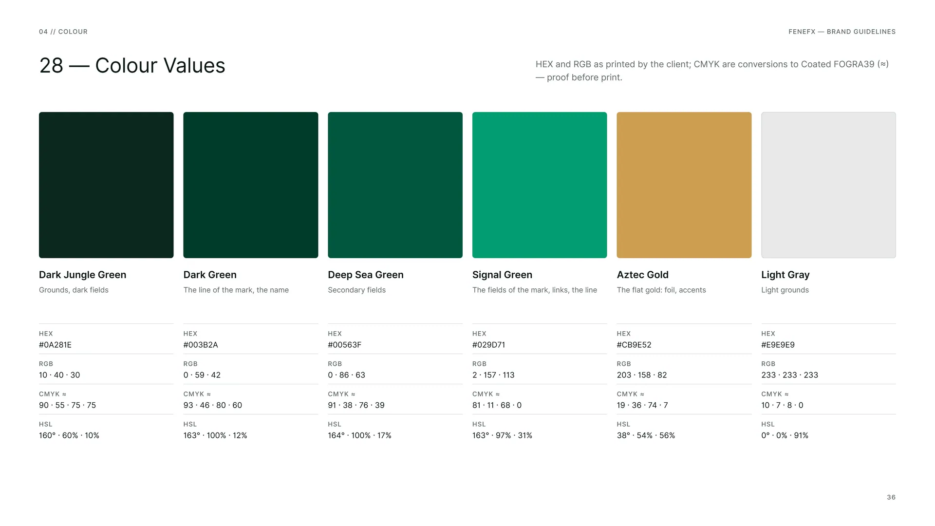
HEX and RGB as printed by the client; CMYK are conversions to Coated FOGRA39 (≈) — proof before print.
Dark Jungle Green — Grounds, dark fields. HEX #0A281E · RGB 10 · 40 · 30 · CMYK ≈ 90 · 55 · 75 · 75 · HSL 160° · 60% · 10%.
Dark Green — The line of the mark, the name. HEX #003B2A · RGB 0 · 59 · 42 · CMYK ≈ 93 · 46 · 80 · 60 · HSL 163° · 100% · 12%.
Deep Sea Green — Secondary fields. HEX #00563F · RGB 0 · 86 · 63 · CMYK ≈ 91 · 38 · 76 · 39 · HSL 164° · 100% · 17%.
Signal Green — The fields of the mark, links, the line. HEX #029D71 · RGB 2 · 157 · 113 · CMYK ≈ 81 · 11 · 68 · 0 · HSL 163° · 97% · 31%.
Aztec Gold — The flat gold: foil, accents. HEX #CB9E52 · RGB 203 · 158 · 82 · CMYK ≈ 19 · 36 · 74 · 7 · HSL 38° · 54% · 56%.
Light Gray — Light grounds. HEX #E9E9E9 · RGB 233 · 233 · 233 · CMYK ≈ 10 · 7 · 8 · 0 · HSL 0° · 0% · 91%.
04.3
Shield Gold
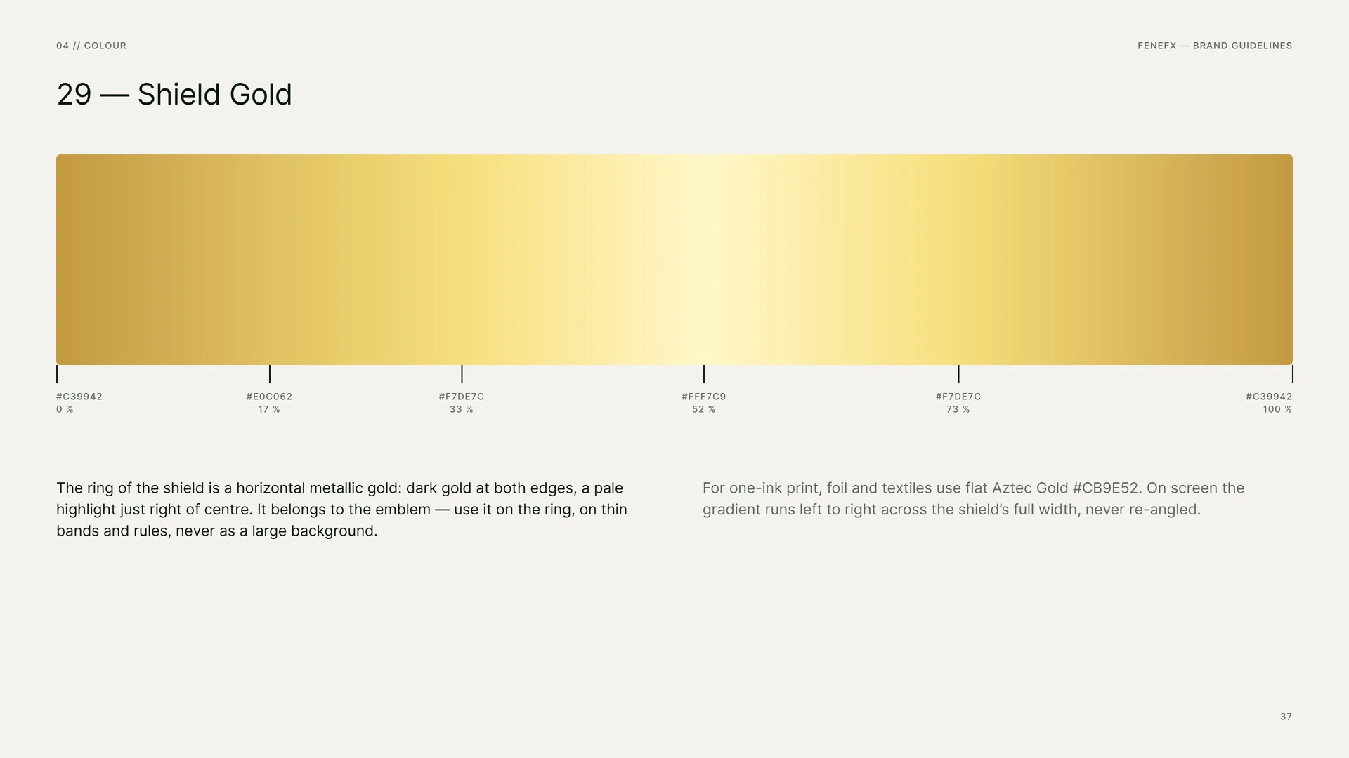
#C39942 0 % · #E0C062 17 % · #F7DE7C 33 % · #FFF7C9 52 % · #F7DE7C 73 % · #C39942 100 %.
The ring of the shield is a horizontal metallic gold: dark gold at both edges, a pale highlight just right of centre. It belongs to the emblem — use it on the ring, on thin bands and rules, never as a large background.
For one-ink print, foil and textiles use flat Aztec Gold #CB9E52. On screen the gradient runs left to right across the shield’s full width, never re-angled.
04.4
Contrast & Accessibility
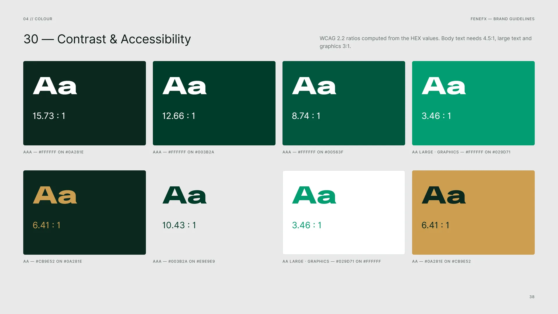
WCAG 2.2 ratios computed from the HEX values. Body text needs 4.5:1, large text and graphics 3:1.
AAA — #FFFFFF on #0A281E · 15.73 : 1.
AAA — #FFFFFF on #003B2A · 12.66 : 1.
AAA — #FFFFFF on #00563F · 8.74 : 1.
AA large · graphics — #FFFFFF on #029D71 · 3.46 : 1.
AA — #CB9E52 on #0A281E · 6.41 : 1.
AAA — #003B2A on #E9E9E9 · 10.43 : 1.
AA large · graphics — #029D71 on #FFFFFF · 3.46 : 1.
AA — #0A281E on #CB9E52 · 6.41 : 1.
04.5
Tints
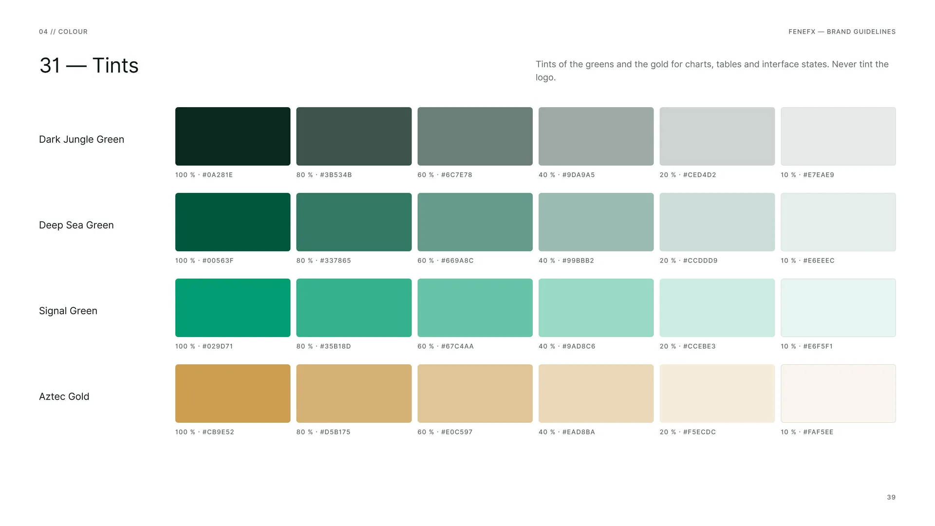
Tints of the greens and the gold for charts, tables and interface states. Never tint the logo.
Dark Jungle Green: 100 % #0A281E · 80 % #3B534B · 60 % #6C7E78 · 40 % #9DA9A5 · 20 % #CED4D2 · 10 % #E7EAE9.
Deep Sea Green: 100 % #00563F · 80 % #337865 · 60 % #669A8C · 40 % #99BBB2 · 20 % #CCDDD9 · 10 % #E6EEEC.
Signal Green: 100 % #029D71 · 80 % #35B18D · 60 % #67C4AA · 40 % #9AD8C6 · 20 % #CCEBE3 · 10 % #E6F5F1.
Aztec Gold: 100 % #CB9E52 · 80 % #D5B175 · 60 % #E0C597 · 40 % #EAD8BA · 20 % #F5ECDC · 10 % #FAF5EE.
05
Typography
05.1
Typefaces
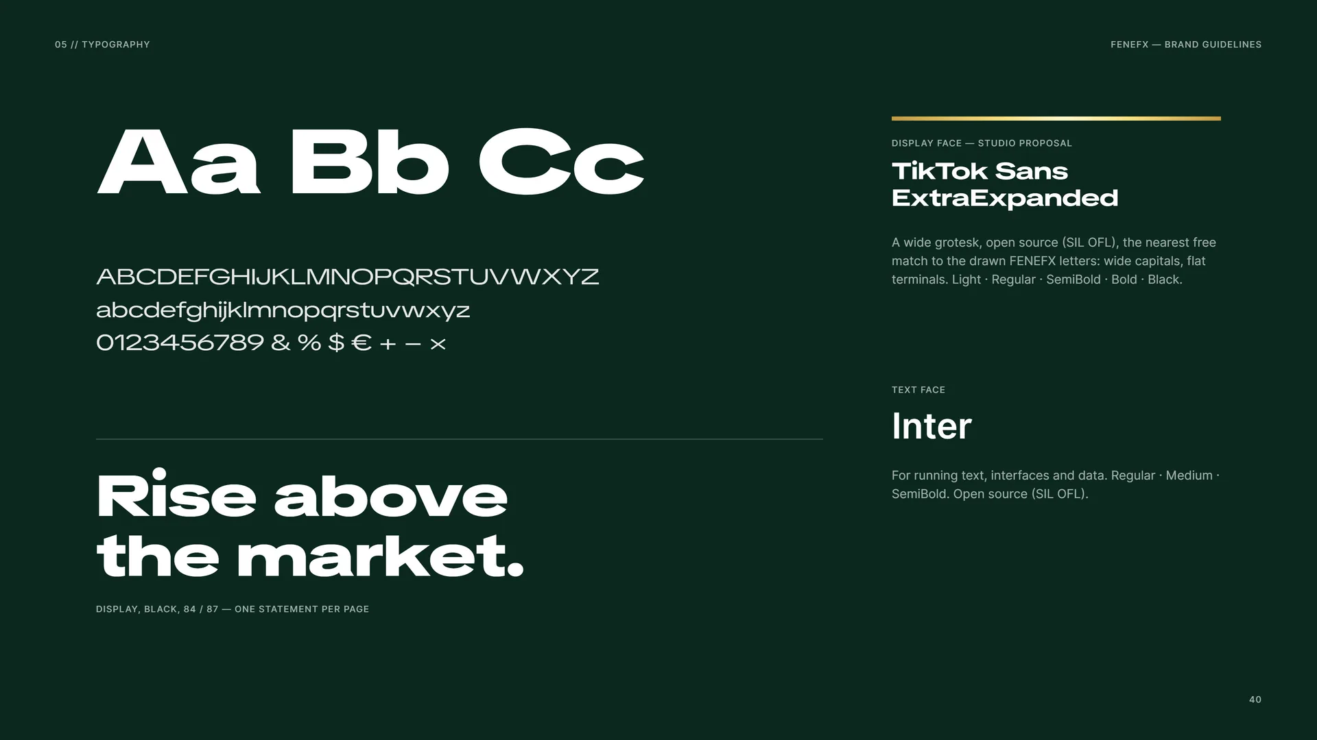
Rise above the market.
Display, Black, 84 / 87 — one statement per page.
Display face — studio proposal: TikTok Sans ExtraExpanded. A wide grotesk, open source (SIL OFL), the nearest free match to the drawn FENEFX letters: wide capitals, flat terminals. Light · Regular · SemiBold · Bold · Black.
Text face: Inter. For running text, interfaces and data. Regular · Medium · SemiBold. Open source (SIL OFL).
05.2
Display Face
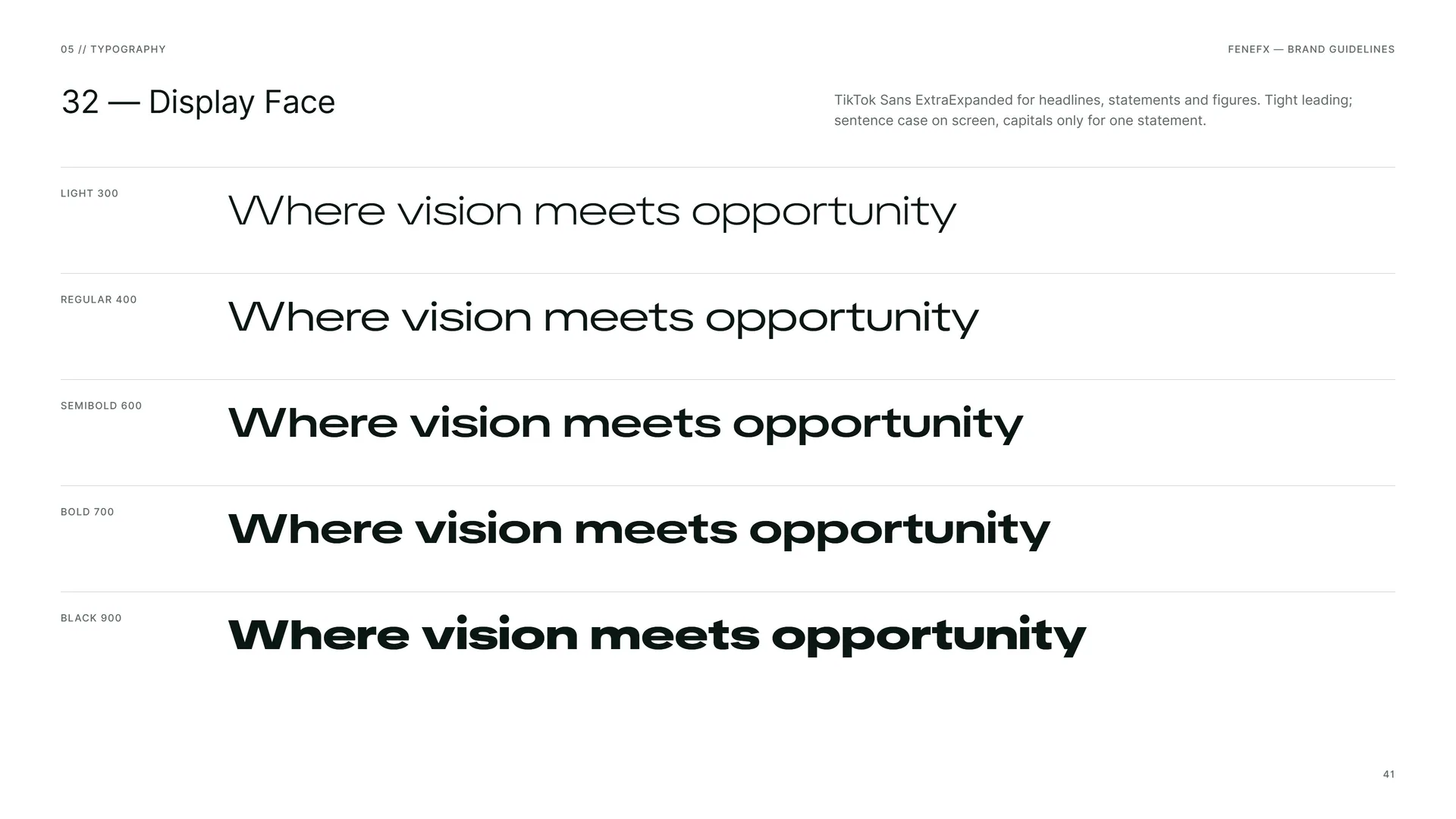
TikTok Sans ExtraExpanded for headlines, statements and figures. Tight leading; sentence case on screen, capitals only for one statement.
Light 300 · Regular 400 · Semibold 600 · Bold 700 · Black 900.
Where vision meets opportunity.
05.3
Inter — Text
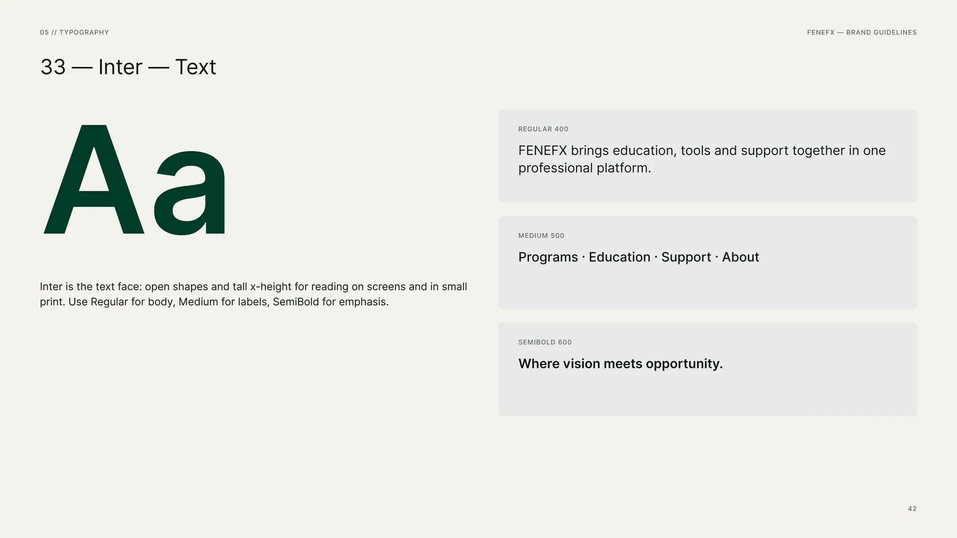
Inter is the text face: open shapes and tall x-height for reading on screens and in small print. Use Regular for body, Medium for labels, SemiBold for emphasis.
Regular 400: FENEFX brings education, tools and support together in one professional platform.
Medium 500: Programs · Education · Support · About.
Semibold 600: Where vision meets opportunity.
05.4
Type System
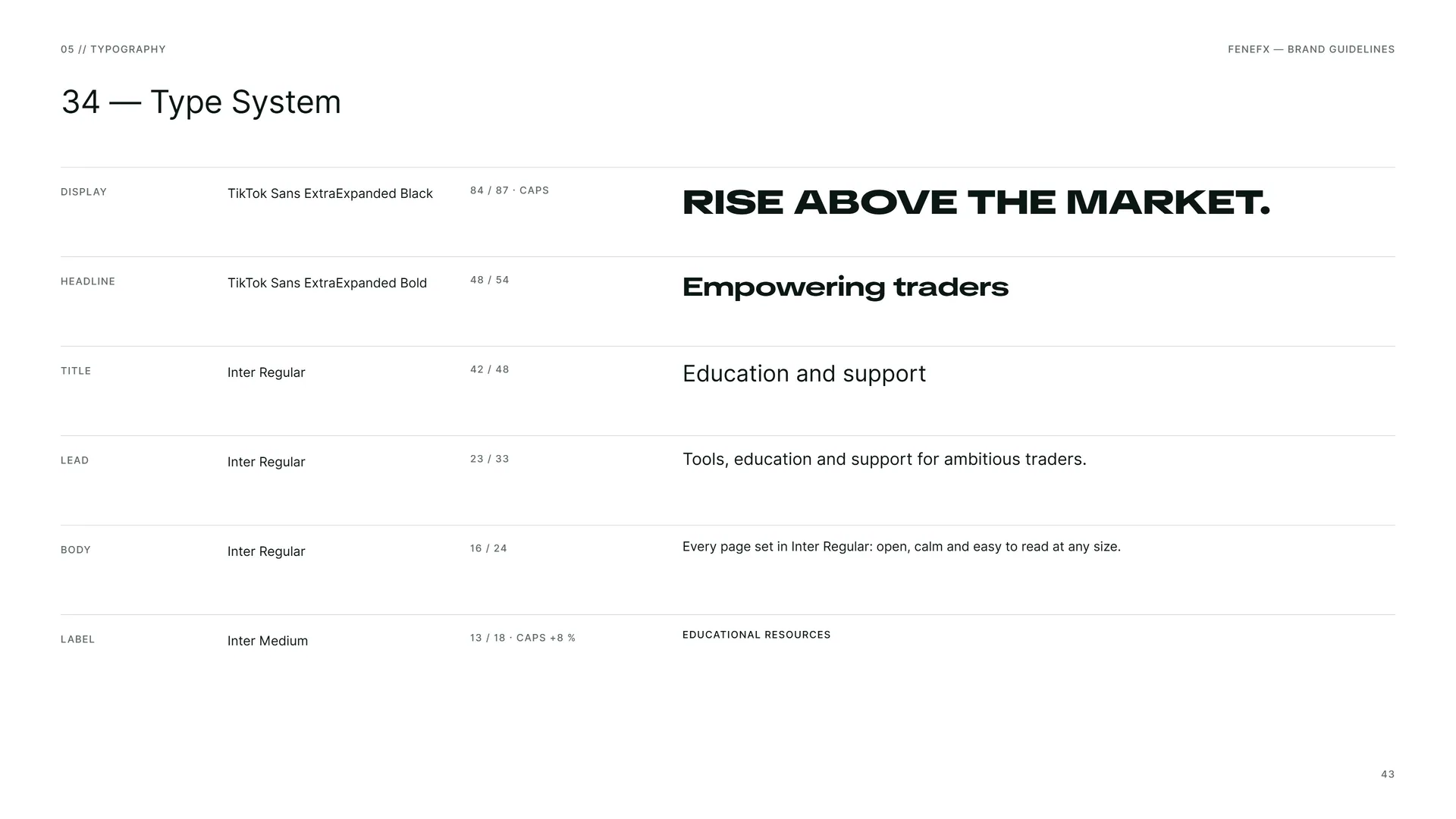
Display: TikTok Sans ExtraExpanded Black · 84 / 87 · caps — Rise above the market.
Headline: TikTok Sans ExtraExpanded Bold · 48 / 54 — Empowering traders.
Title: Inter Regular · 42 / 48 — Education and support.
Lead: Inter Regular · 23 / 33 — Tools, education and support for ambitious traders.
Body: Inter Regular · 16 / 24 — Every page set in Inter Regular: open, calm and easy to read at any size.
Label: Inter Medium · 13 / 18 · caps +8 % — Educational resources.
06
Pattern
- 06.1The shield field
- 06.2How the Pattern Is Built
- 06.3The Pattern Family
- 06.4The Wing-Bar Field
- 06.5Pattern Rules
- 06.6Pattern in Use
06.1
The shield field
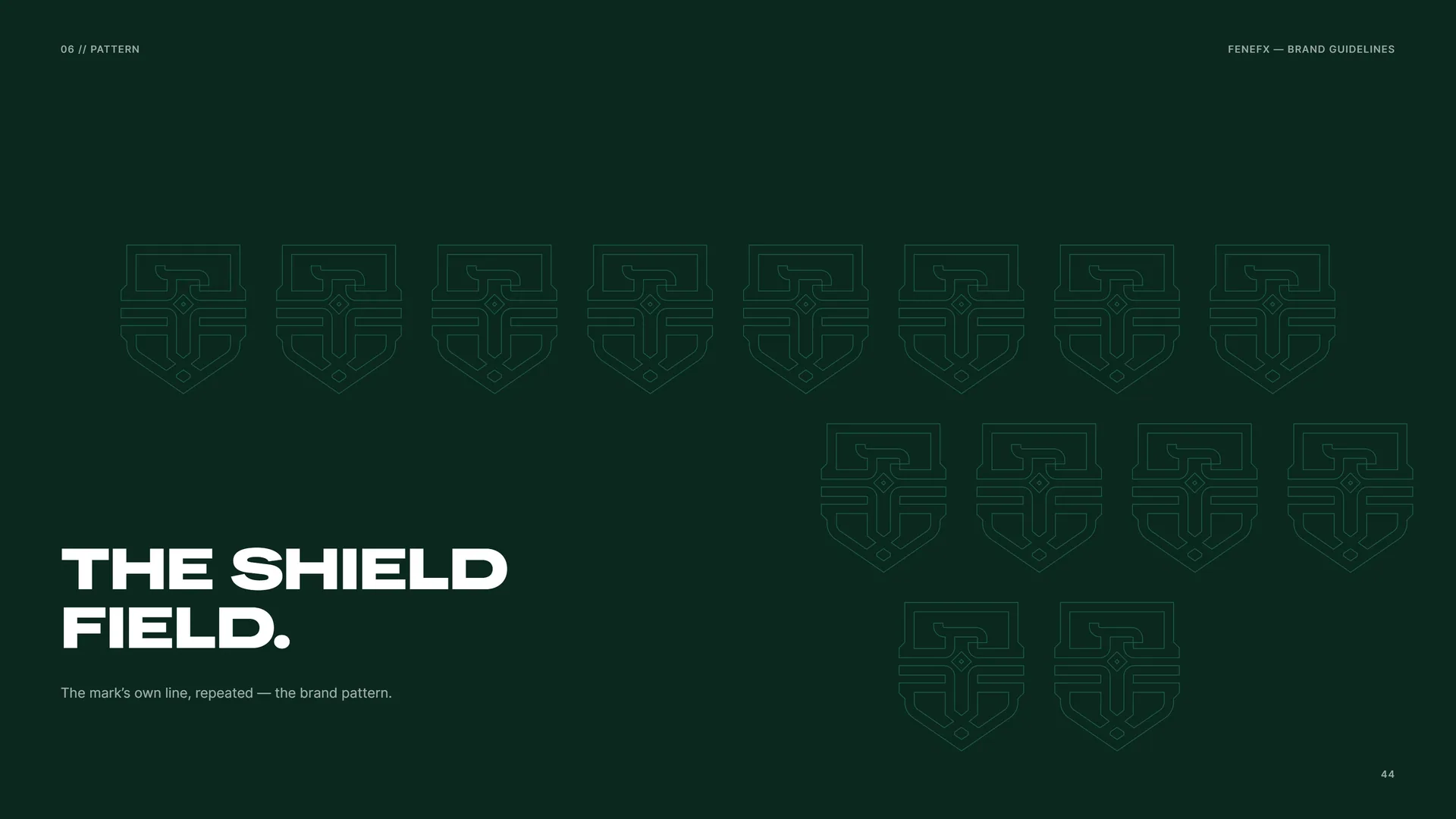
The mark’s own line, repeated — the brand pattern.
06.2
How the Pattern Is Built
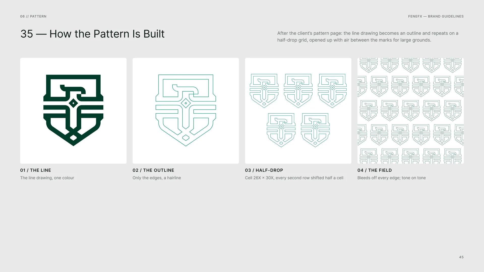
After the client’s pattern page: the line drawing becomes an outline and repeats on a half-drop grid, opened up with air between the marks for large grounds.
The line: The line drawing, one colour.
The outline: Only the edges, a hairline.
Half-drop: Cell 26X × 30X, every second row shifted half a cell.
The field: Bleeds off every edge; tone on tone.
06.3
The Pattern Family
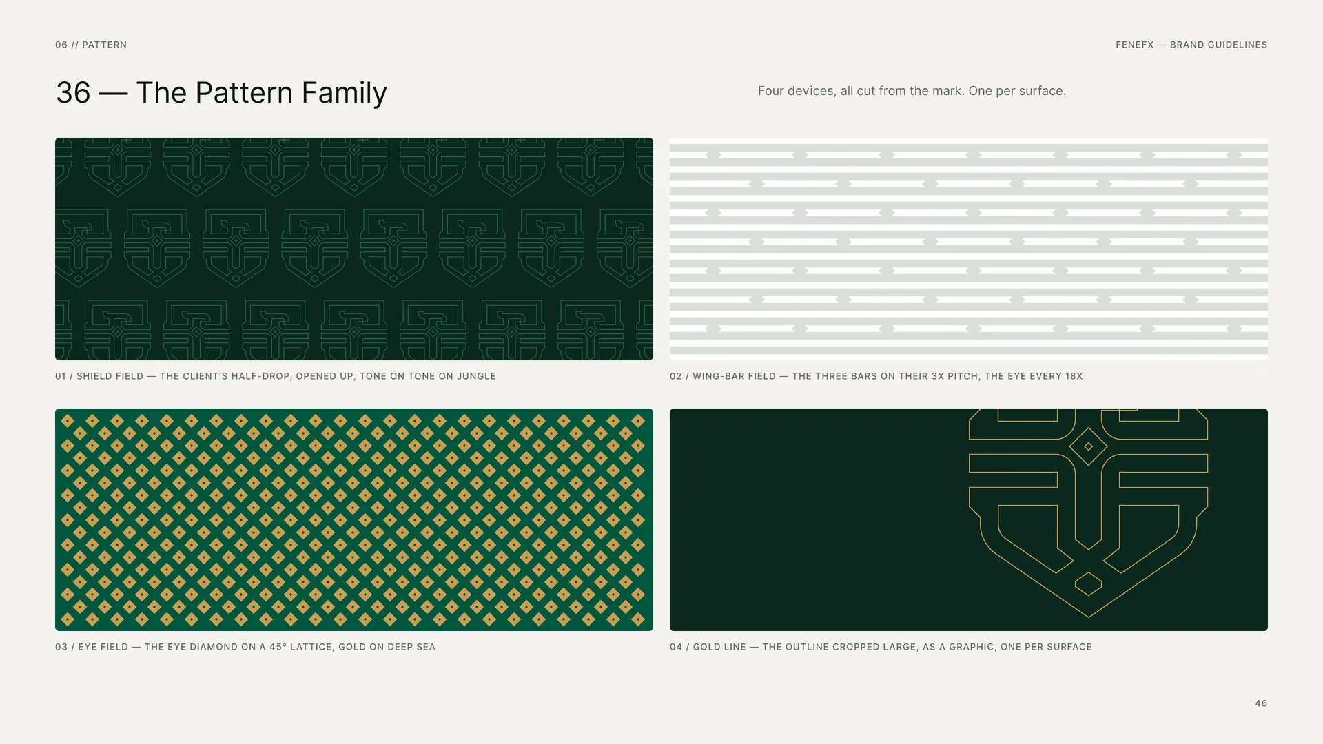
Four devices, all cut from the mark. One per surface.
Shield field — the client’s half-drop, opened up, tone on tone on Jungle.
Wing-bar field — the three bars on their 3X pitch, the eye every 18X.
Eye field — the eye diamond on a 45° lattice, gold on Deep Sea.
Gold line — the outline cropped large, as a graphic, one per surface.
06.4
The Wing-Bar Field
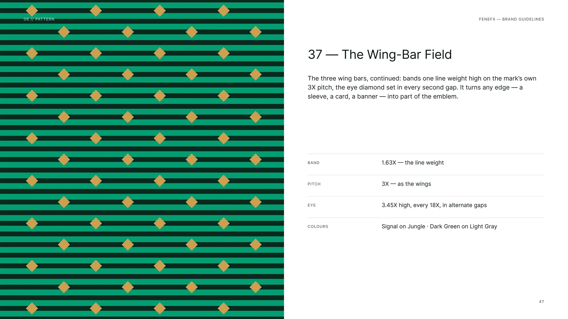
The three wing bars, continued: bands one line weight high on the mark’s own 3X pitch, the eye diamond set in every second gap. It turns any edge — a sleeve, a card, a banner — into part of the emblem.
Band: 1.63X — the line weight.
Pitch: 3X — as the wings.
Eye: 3.45X high, every 18X, in alternate gaps.
Colours: Signal on Jungle · Dark Green on Light Gray.
06.5
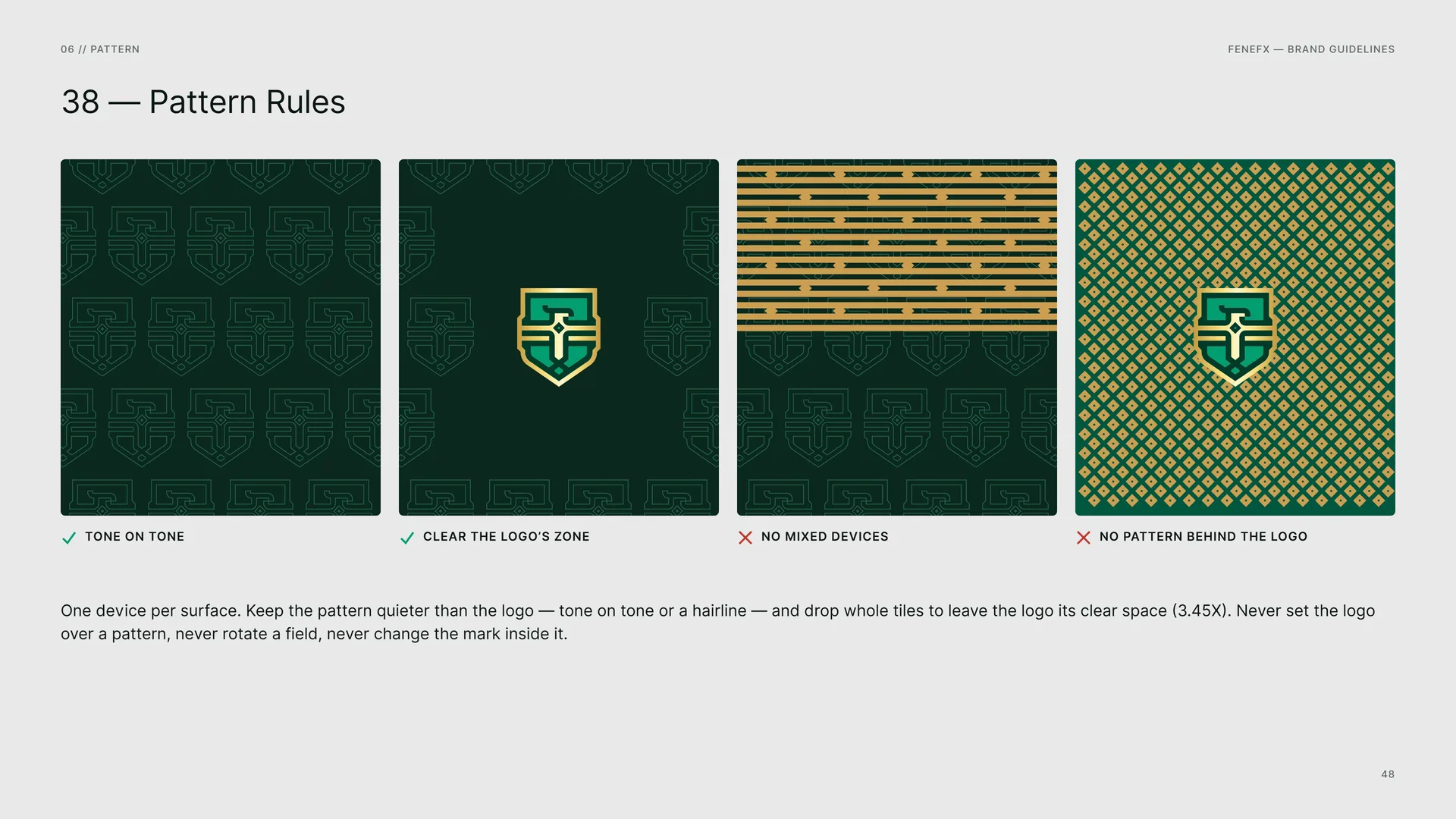
Pattern Rules
Tone on tone · Clear the logo’s zone.
No mixed devices · No pattern behind the logo.
One device per surface. Keep the pattern quieter than the logo — tone on tone or a hairline — and drop whole tiles to leave the logo its clear space (3.45X). Never set the logo over a pattern, never rotate a field, never change the mark inside it.
06.6
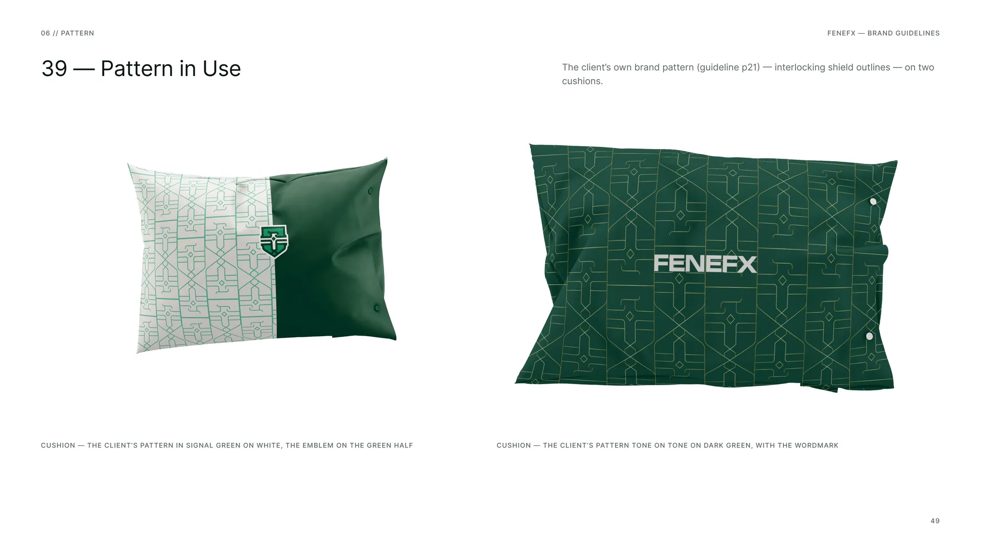
Pattern in Use
The client’s own brand pattern (guideline p21) — interlocking shield outlines — on two cushions.
Cushion — the client’s pattern in Signal Green on white, the emblem on the green half.
Cushion — the client’s pattern tone on tone on Dark Green, with the wordmark.
07
Imagery
07.1
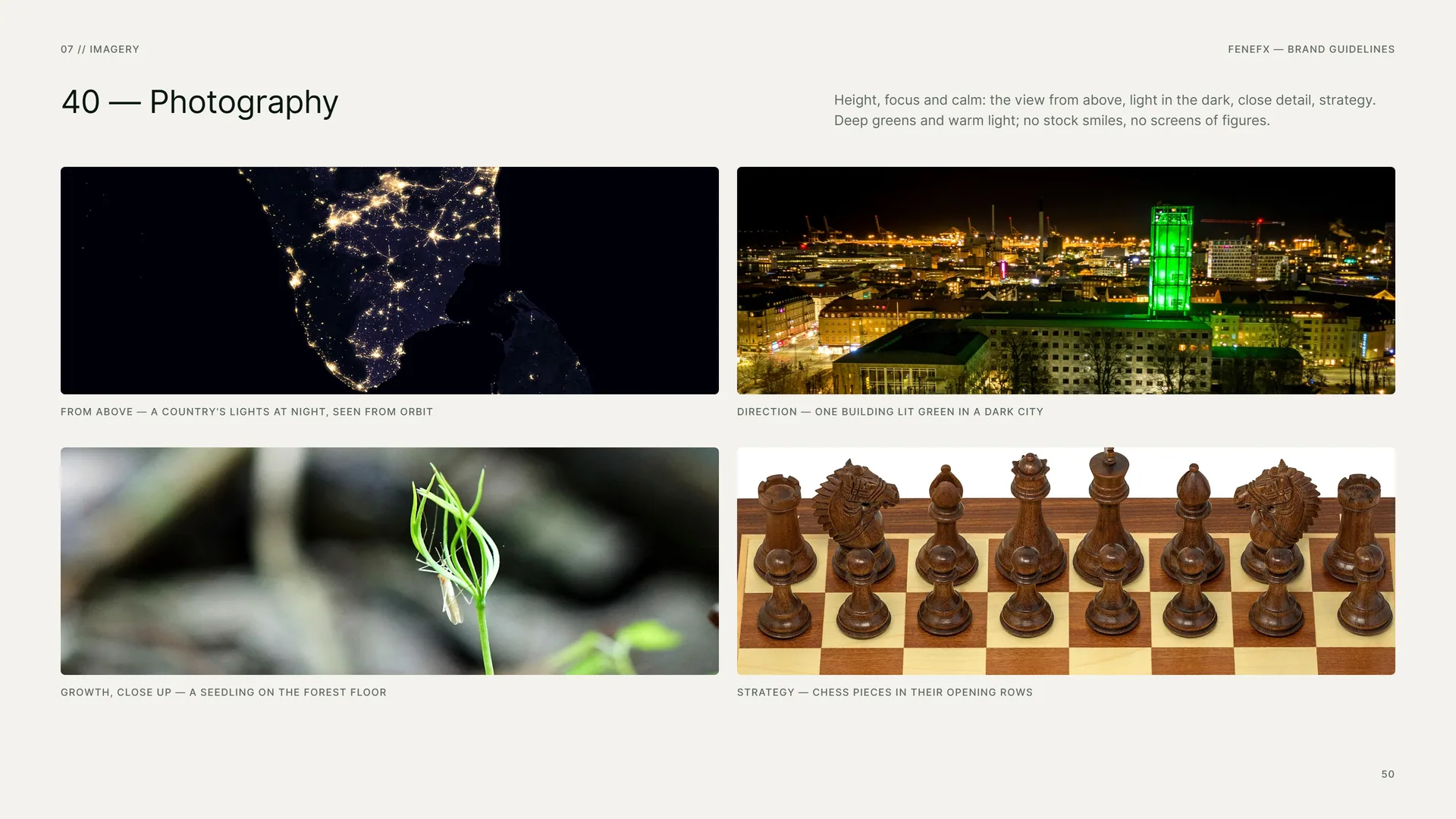
Photography
Height, focus and calm: the view from above, light in the dark, close detail, strategy. Deep greens and warm light; no stock smiles, no screens of figures.
From above — a country’s lights at night, seen from orbit.
Direction — one building lit green in a dark city.
Growth, close up — a seedling on the forest floor.
Strategy — chess pieces in their opening rows.
08
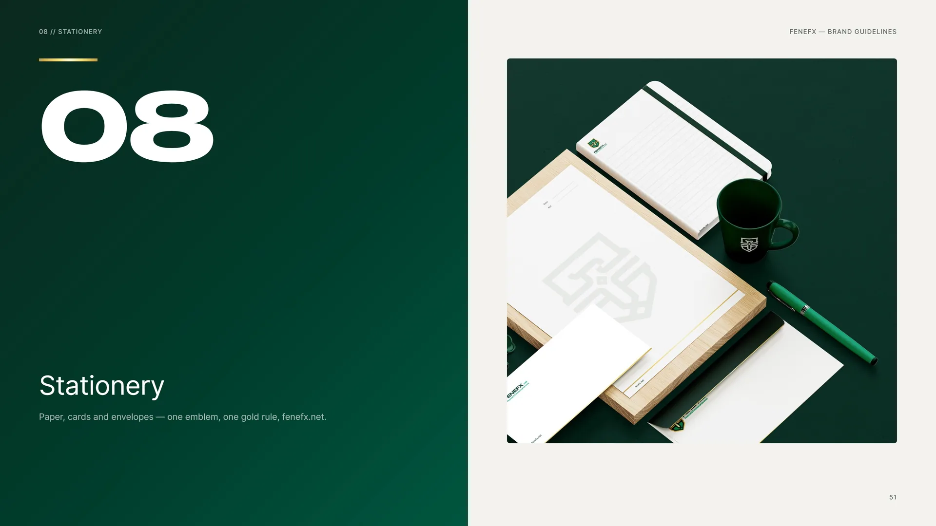
Stationery
Paper, cards and envelopes — one emblem, one gold rule, fenefx.net.
08.1
Letterhead & Business Card
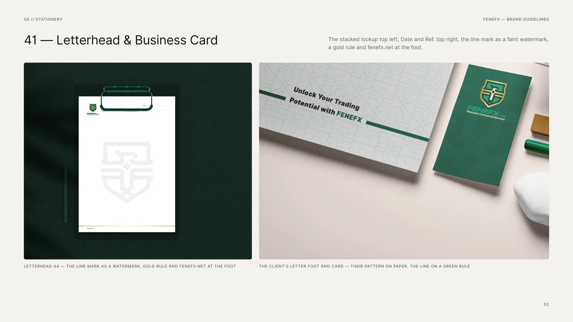
The stacked lockup top left, Date and Ref. top right, the line mark as a faint watermark, a gold rule and fenefx.net at the foot.
Letterhead A4 — the line mark as a watermark, gold rule and fenefx.net at the foot.
The client’s letter foot and card — their pattern on paper, the line on a green rule.
08.2
Stationery Layout
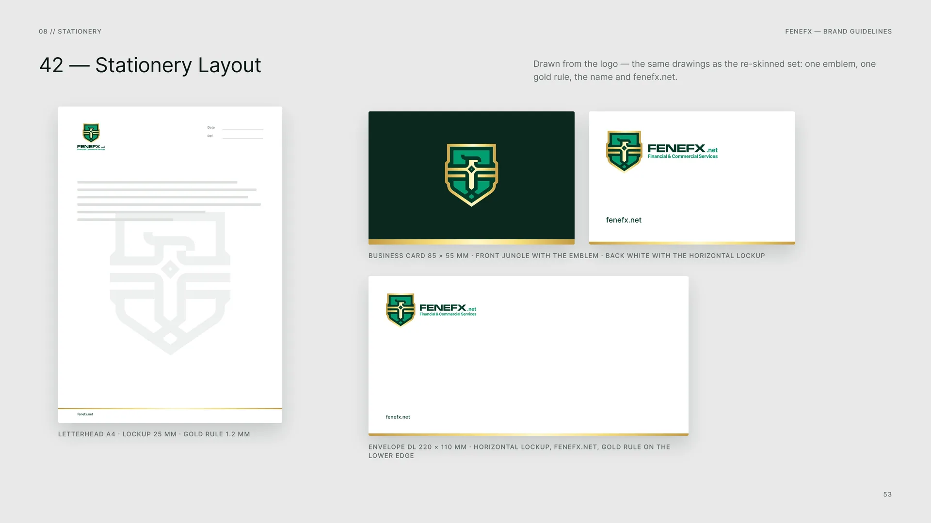
Drawn from the logo — the same drawings as the re-skinned set: one emblem, one gold rule, the name and fenefx.net.
Letterhead A4 · lockup 25 mm · gold rule 1.2 mm.
Business card 85 × 55 mm · front Jungle with the emblem · back white with the horizontal lockup.
Envelope DL 220 × 110 mm · horizontal lockup, fenefx.net, gold rule on the lower edge.
08.3
Badge & Key Ring
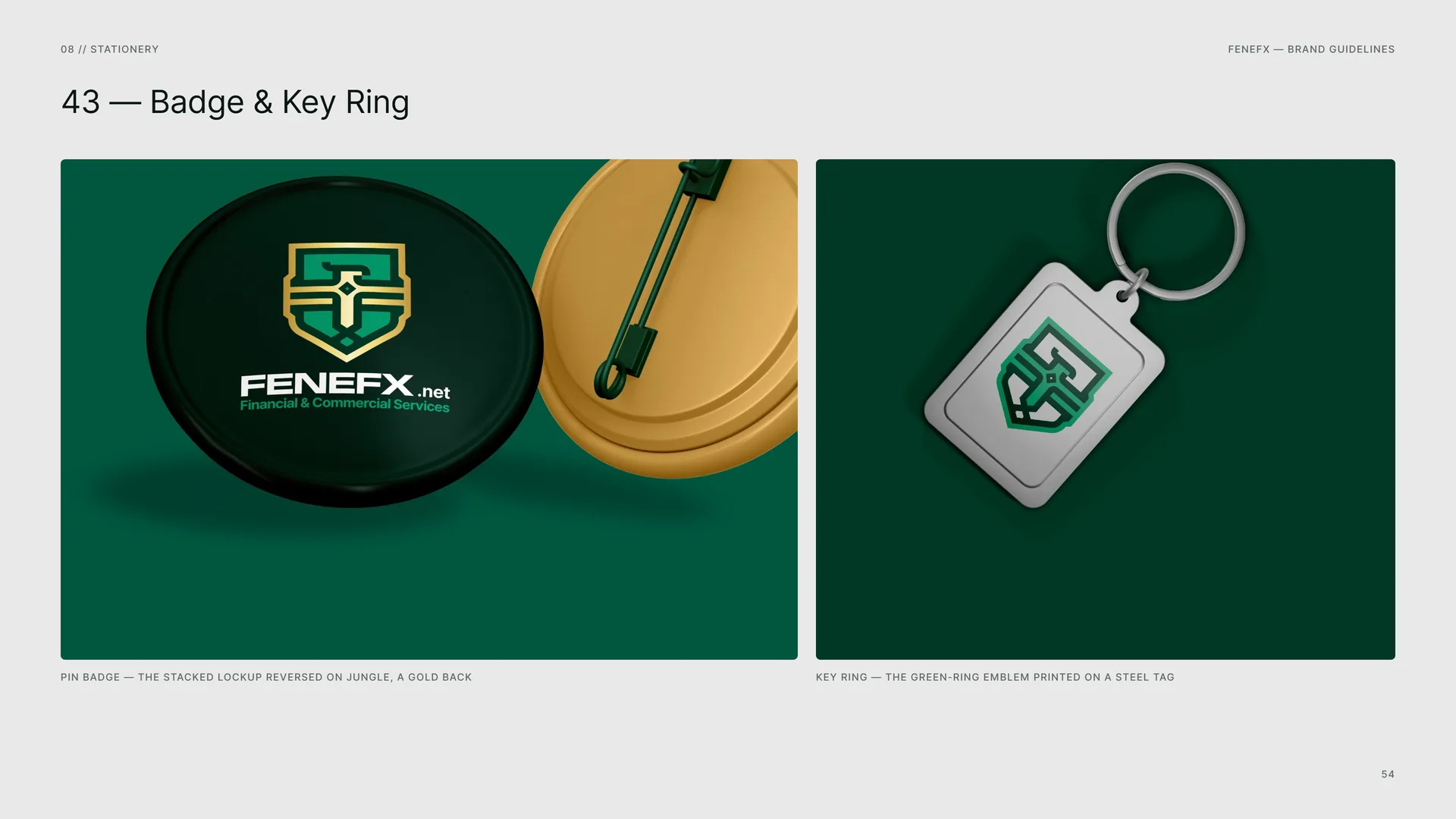
Pin badge — the stacked lockup reversed on Jungle, a gold back.
Key ring — the green-ring emblem printed on a steel tag.
09
Digital media
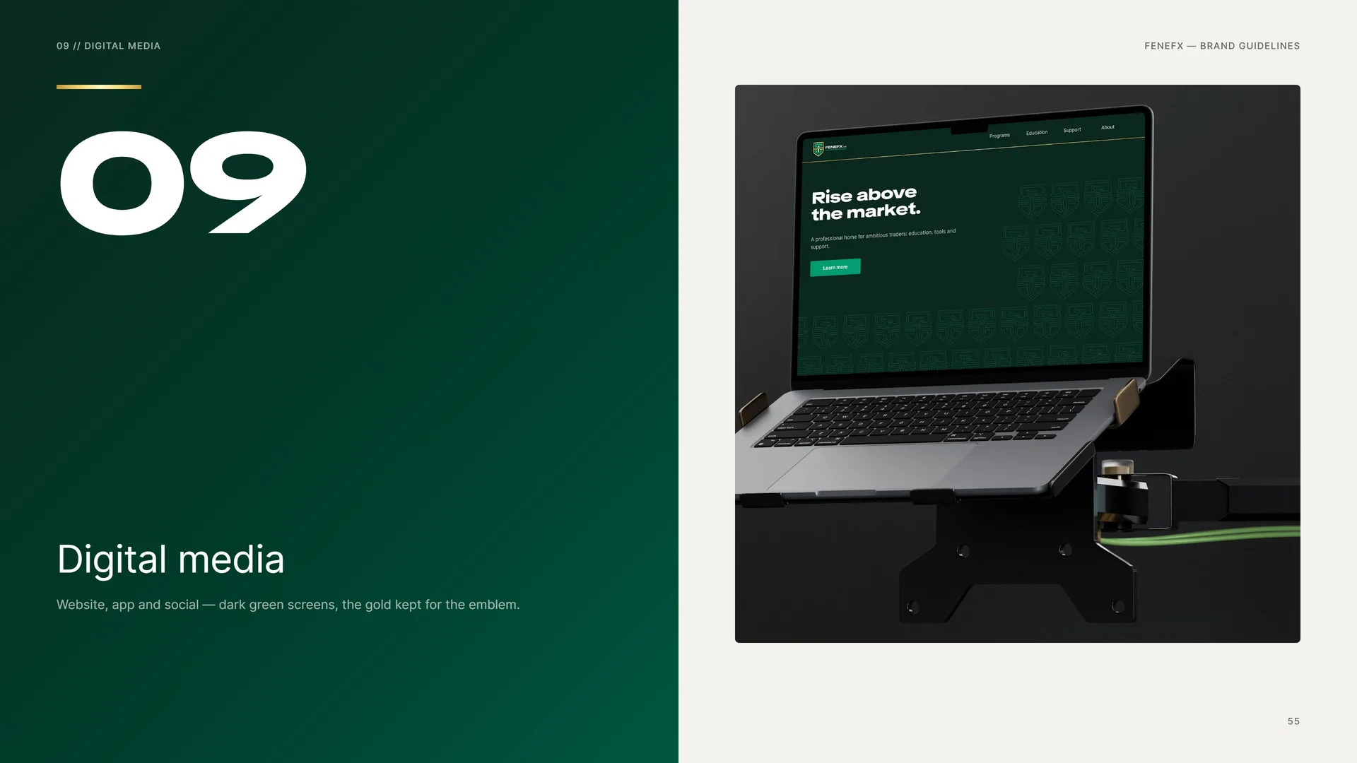
Website, app and social — dark green screens, the gold kept for the emblem.
09.1
App & App Icon
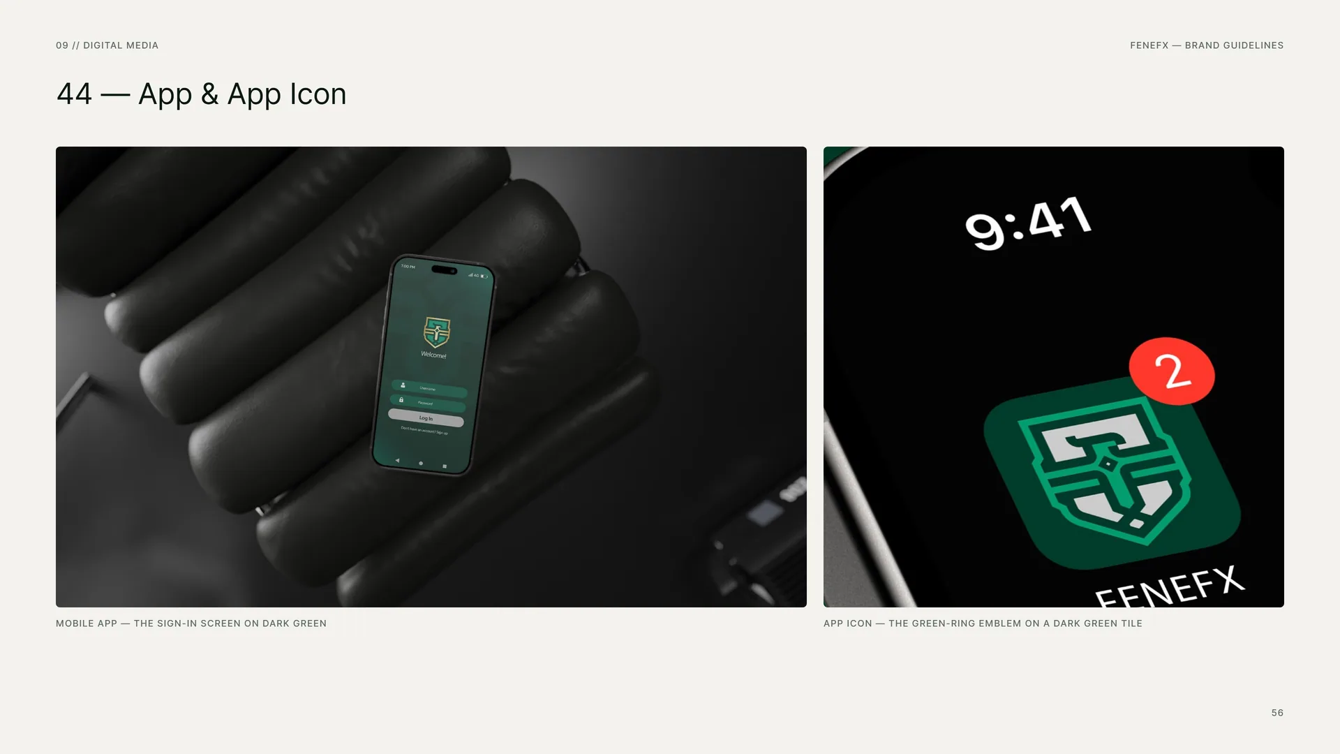
Mobile app — the sign-in screen on dark green.
App icon — the green-ring emblem on a dark green tile.
09.2
Social Media
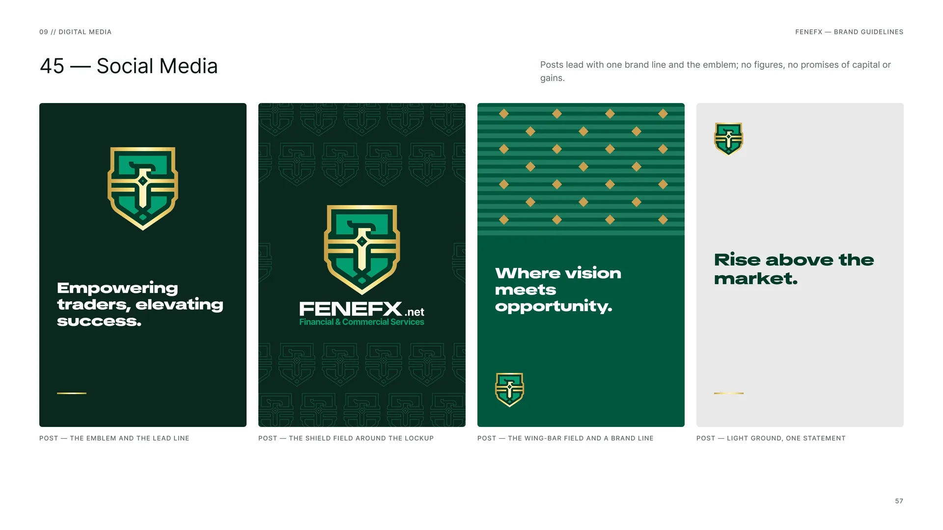
Posts lead with one brand line and the emblem; no figures, no promises of capital or gains.
Post — the emblem and the lead line.
Post — the shield field around the lockup.
Post — the wing-bar field and a brand line.
Post — light ground, one statement.
09.3
Website & E-mail
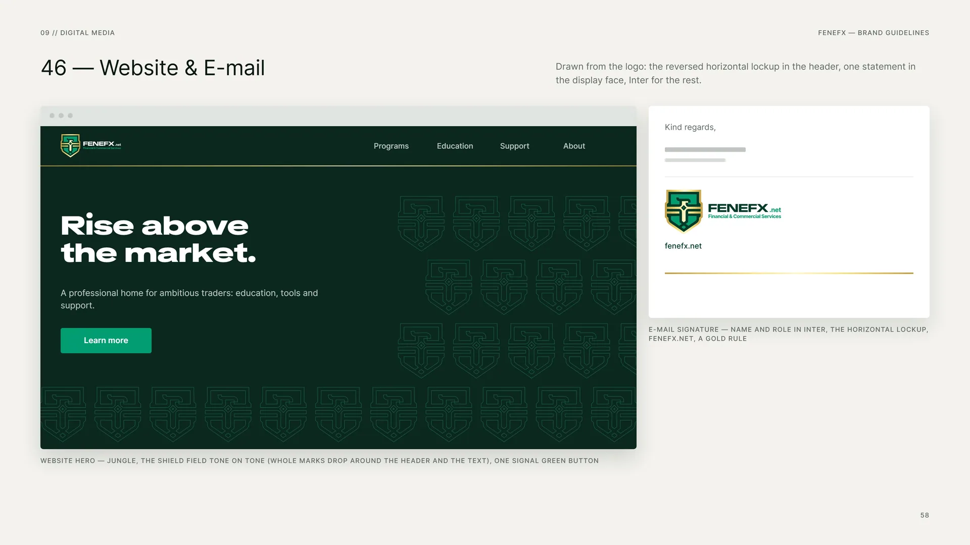
Drawn from the logo: the reversed horizontal lockup in the header, one statement in the display face, Inter for the rest.
Website hero — Jungle, the shield field tone on tone (whole marks drop around the header and the text), one Signal Green button.
E-mail signature — name and role in Inter, the horizontal lockup, fenefx.net, a gold rule.
10
Merchandise
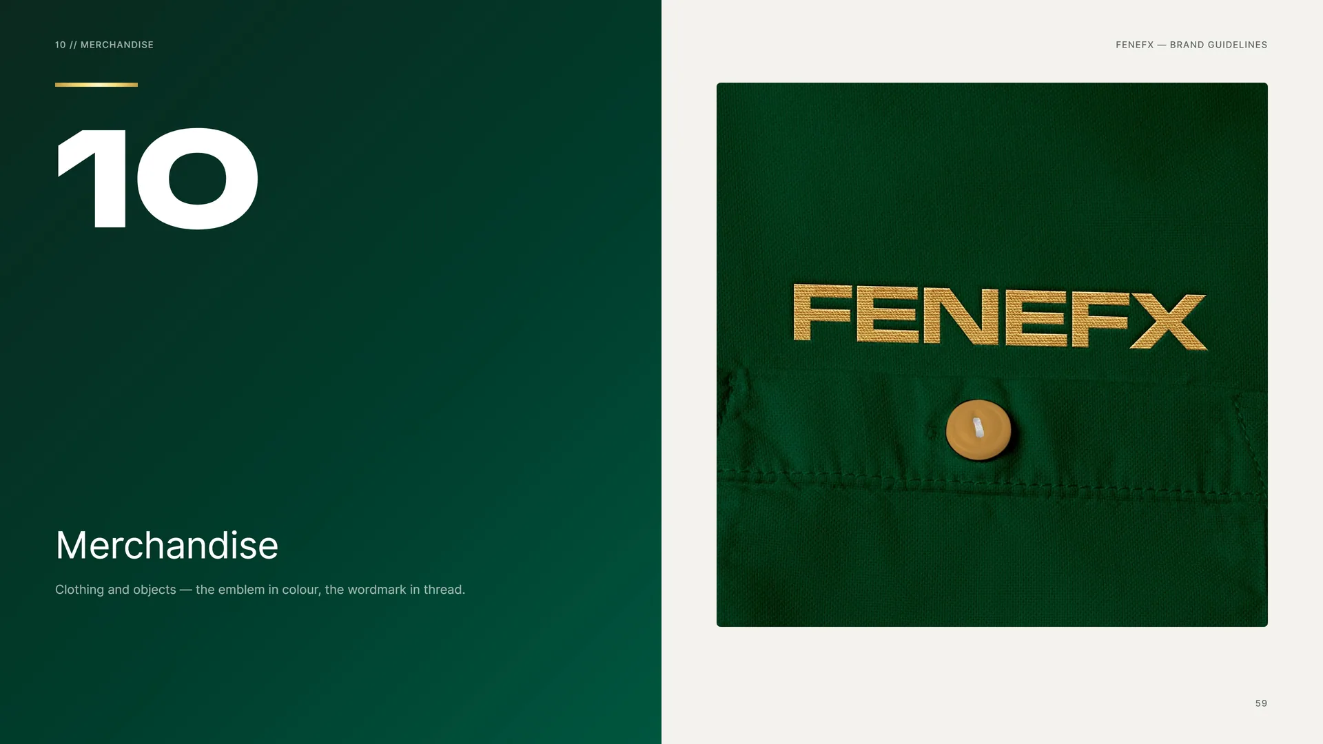
Clothing and objects — the emblem in colour, the wordmark in thread.
10.1
Tote
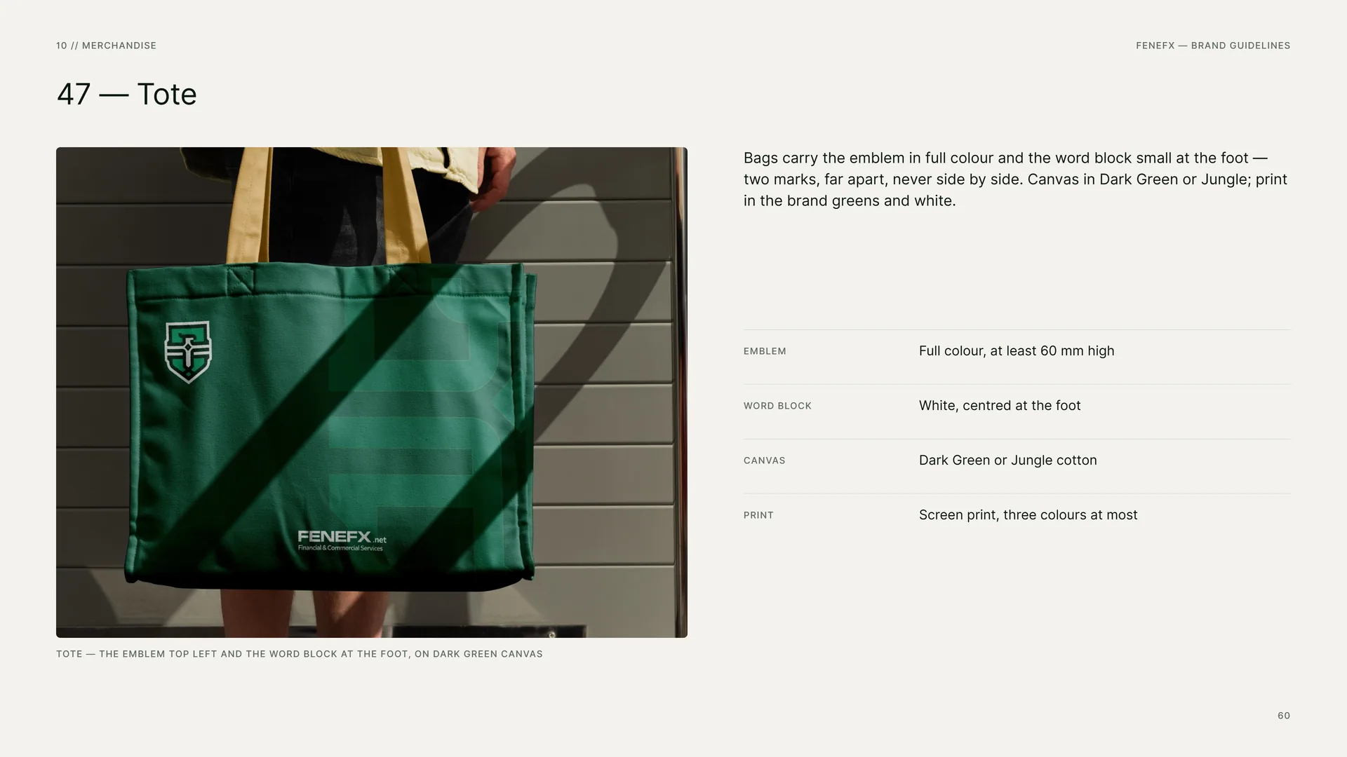
Tote — the emblem top left and the word block at the foot, on dark green canvas.
Bags carry the emblem in full colour and the word block small at the foot — two marks, far apart, never side by side. Canvas in Dark Green or Jungle; print in the brand greens and white.
Emblem: Full colour, at least 60 mm high.
Word block: White, centred at the foot.
Canvas: Dark Green or Jungle cotton.
Print: Screen print, three colours at most.
10.2
Sticker & Silver
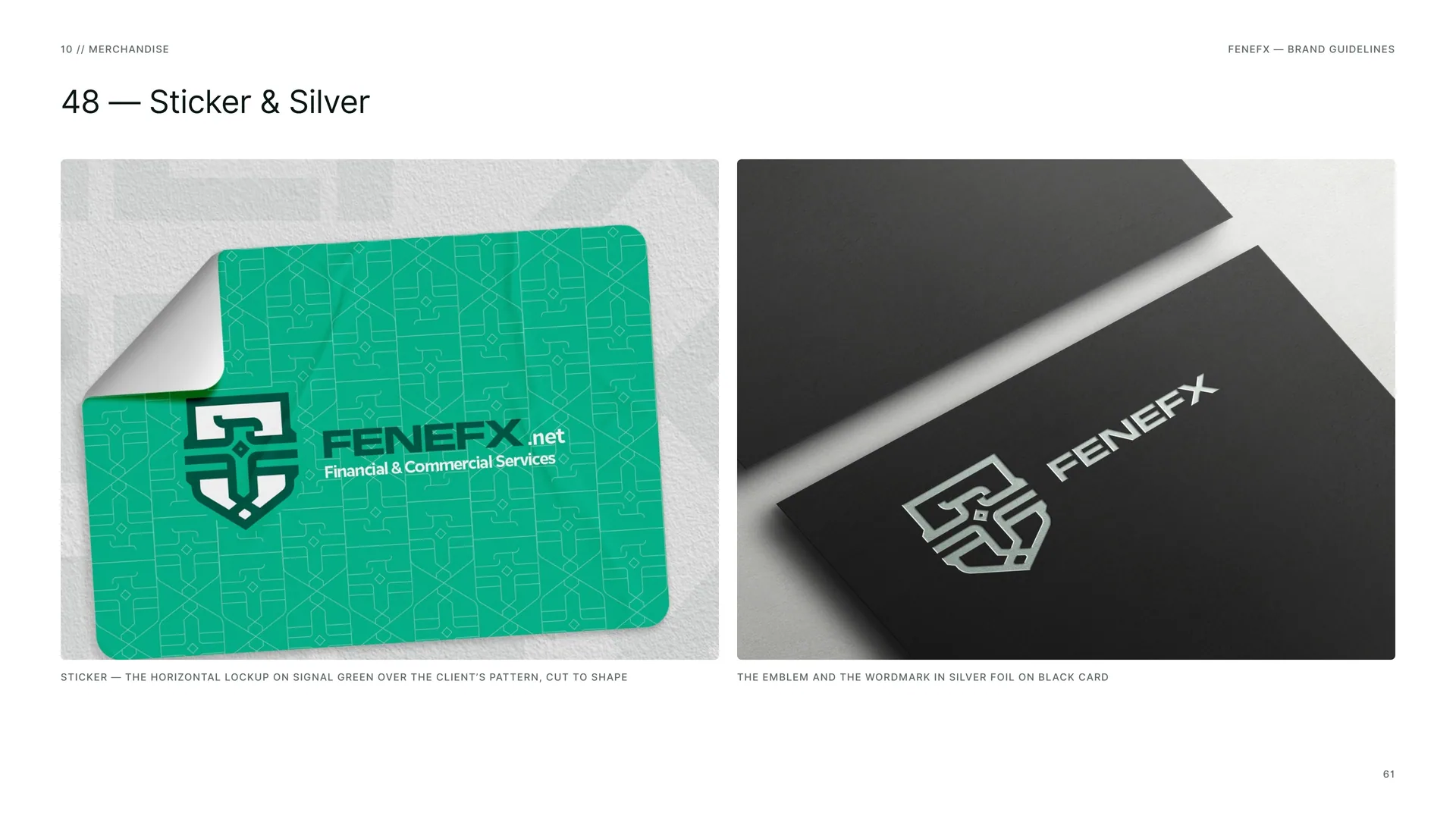
Sticker — the horizontal lockup on Signal Green over the client’s pattern, cut to shape.
The emblem and the wordmark in silver foil on black card.
10.3
Merchandise Rules
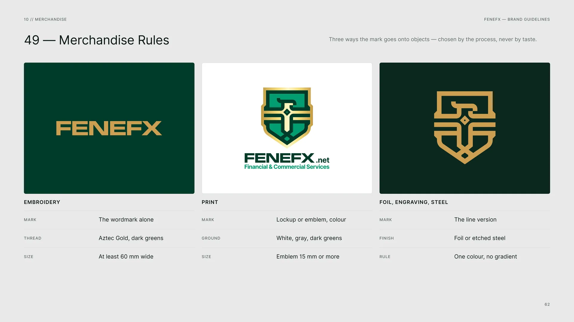
Three ways the mark goes onto objects — chosen by the process, never by taste.
Embroidery — Mark: The wordmark alone · Thread: Aztec Gold, dark greens · Size: At least 60 mm wide.
Print — Mark: Lockup or emblem, colour · Ground: White, gray, dark greens · Size: Emblem 15 mm or more.
Foil, engraving, steel — Mark: The line version · Finish: Foil or etched steel · Rule: One colour, no gradient.
11
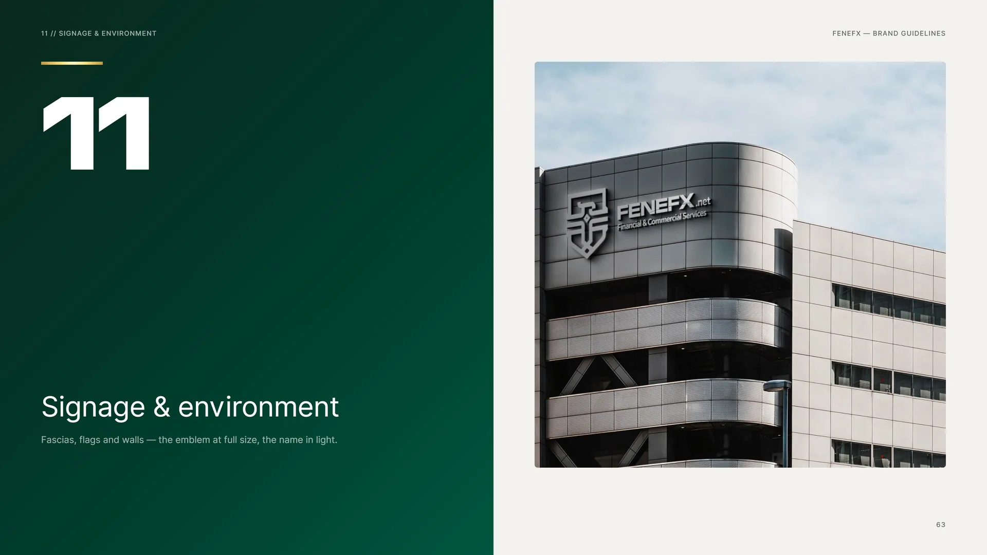
Signage & environment
Fascias, flags and walls — the emblem at full size, the name in light.
11.1
Building & Reception
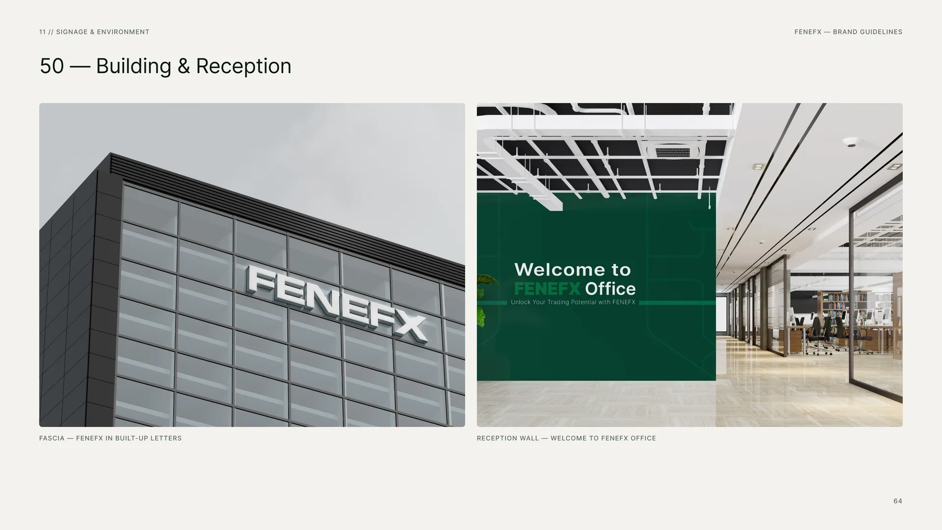
Fascia — FENEFX in built-up letters.
Reception wall — Welcome to FENEFX Office.
11.2
Wall Banner
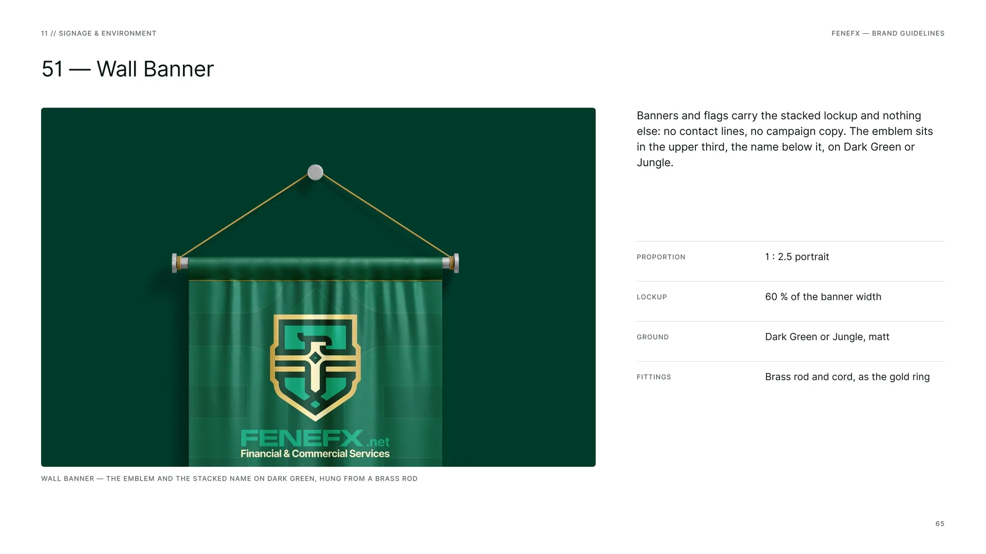
Wall banner — the emblem and the stacked name on dark green, hung from a brass rod.
Banners and flags carry the stacked lockup and nothing else: no contact lines, no campaign copy. The emblem sits in the upper third, the name below it, on Dark Green or Jungle.
Proportion: 1 : 2.5 portrait.
Lockup: 60 % of the banner width.
Ground: Dark Green or Jungle, matt.
Fittings: Brass rod and cord, as the gold ring.
11.3
Billboards
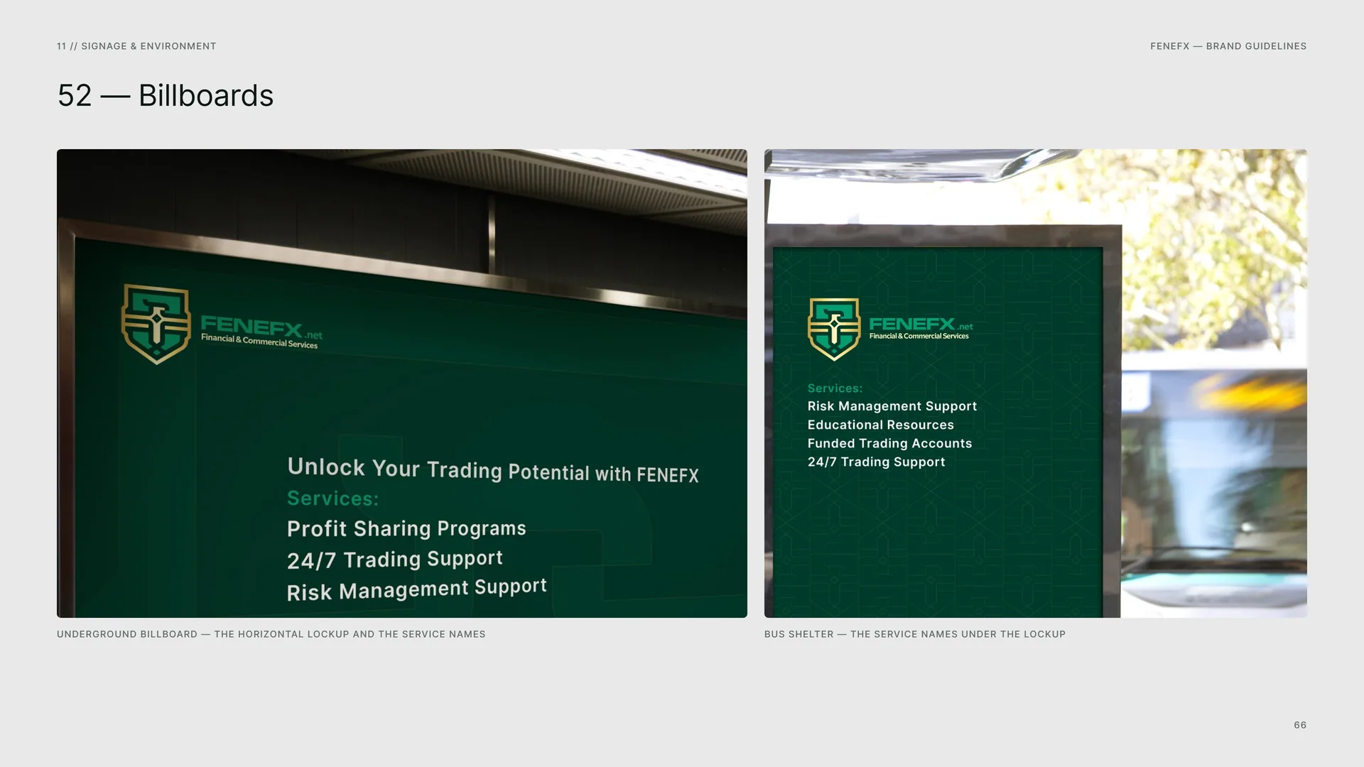
Underground billboard — the horizontal lockup and the service names.
Bus shelter — the service names under the lockup.
11.4
Posters
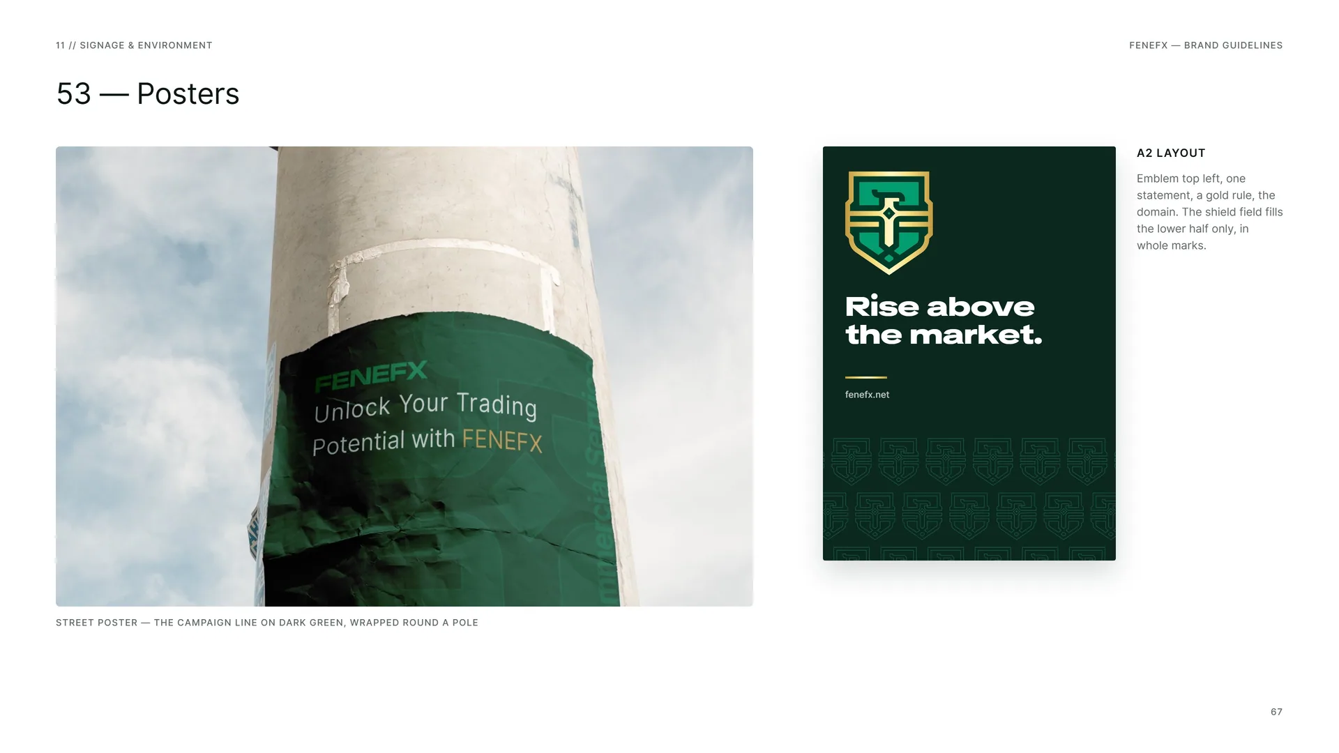
Street poster — the campaign line on dark green, wrapped round a pole.
A2 layout: Emblem top left, one statement, a gold rule, the domain. The shield field fills the lower half only, in whole marks.
11.5
Signage System
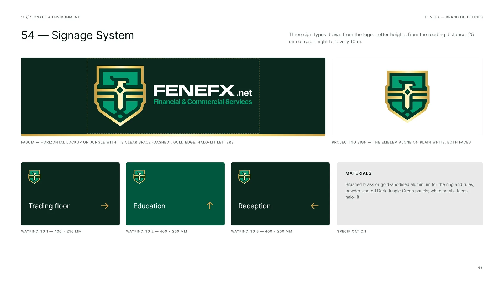
Three sign types drawn from the logo. Letter heights from the reading distance: 25 mm of cap height for every 10 m.
Fascia — horizontal lockup on Jungle with its clear space (dashed), gold edge, halo-lit letters.
Projecting sign — the emblem alone on plain white, both faces.
Wayfinding 1 — 400 × 250 mm.
Wayfinding 2 — 400 × 250 mm.
Wayfinding 3 — 400 × 250 mm.
Materials: Brushed brass or gold-anodised aluminium for the ring and rules; powder-coated Dark Jungle Green panels; white acrylic faces, halo-lit.
Specification.
12
Files
12.1
Files & Contact
Logo files: Stacked, horizontal, emblem, word block, wordmark — full colour, green ring, one colour (Dark Green, White, Aztec Gold) — SVG, PDF, PNG.
Colour: Dark Jungle Green, Dark Green, Deep Sea Green, Signal Green, Aztec Gold, Light Gray, Shield Gold gradient.
Typefaces: TikTok Sans ExtraExpanded (display) · Inter (text) — both SIL Open Font License.
Pattern: Shield field, wing-bar field, eye field, gold line — SVG.
Web: fenefx.net.
Photography: Wikimedia Commons, CC0 / public domain — see the photo credits file.
12.2
Thank you
Empowering traders, elevating success.