TIVAN Brand Identity Guidelines
TIVAN buys, sells and exports goods. Its sign joins the company’s initial, T, with the number 1 — one monogram for the founding moment and for the single path the company moves on.
The mark moves forward: its verticals stand upright while every horizontal rises 17.5° — the dynamism of trade in motion. Blue for security and trust, red for energy and power.
- Ano
- 2021
- Cliente
- TIVAN
- Setor
- Buying · selling · export
- Serviços
- Identidade visual
- Projeto
- Brand Identity Guidelines · v1.0 · 2026
00
Introduction
00.1
Brand Concept
TIVAN buys, sells and exports goods. Its sign joins the company’s initial, T, with the number 1 — one monogram for the founding moment and for the single path the company moves on.
The mark moves forward: its verticals stand upright while every horizontal rises 17.5° — the dynamism of trade in motion. Blue for security and trust, red for energy and power.
Brand idea: Have it your business way — a trading partner that moves goods across borders on the client’s terms, one dependable step at a time.
Brand essence: T + 1.
Brand promise: Trust beyond borders.
Core values: Excellence · Trust · Innovation · Energy · Security.
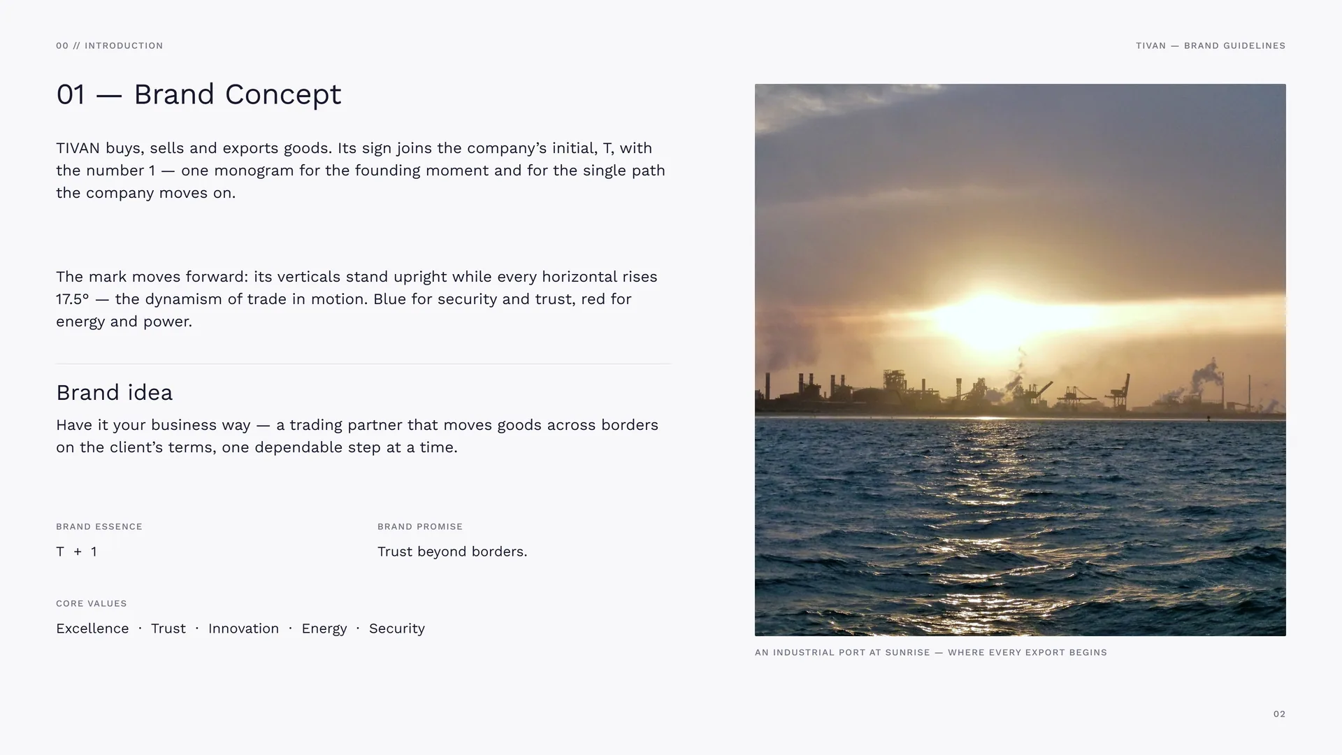
An industrial port at sunrise — where every export begins.
00.2
The Brand Problem
Trade runs on trust. A buyer abroad has to rely on a partner they may never meet: on the quality of the goods, on the paperwork, on the date the container arrives. Many trading houses look and sound alike — and say little about why they can be trusted.
The challenge: Trading companies that look interchangeable · Partners who meet only on paper · Quality that is promised, not shown · Markets that change faster than brands.
Brand positioning: A buying, selling and export company that leads by being dependable: one clear sign, one consistent voice, one standard of quality.
The opportunity: To be the first name a partner thinks of — number one in the field, as the mark says.
The shift: From a trader among many → the partner that leads the way.
00.3
Primary logo
01
Brand
- 01.1History of the Brand
- 01.2Mission & Vision
- 01.3Brand Values
- 01.4Tone of Voice
- 01.5Taglines
- 01.6What TIVAN Does
01.1
History of the Brand
Leading the way, one step at a time.
TIVAN was founded to become a leading company in buying, selling and exporting goods. The journey began with a commitment to quality, reliability and innovation — and with trust and security as the foundation of every deal. The red in the logo stands for the energy that has driven its growth.
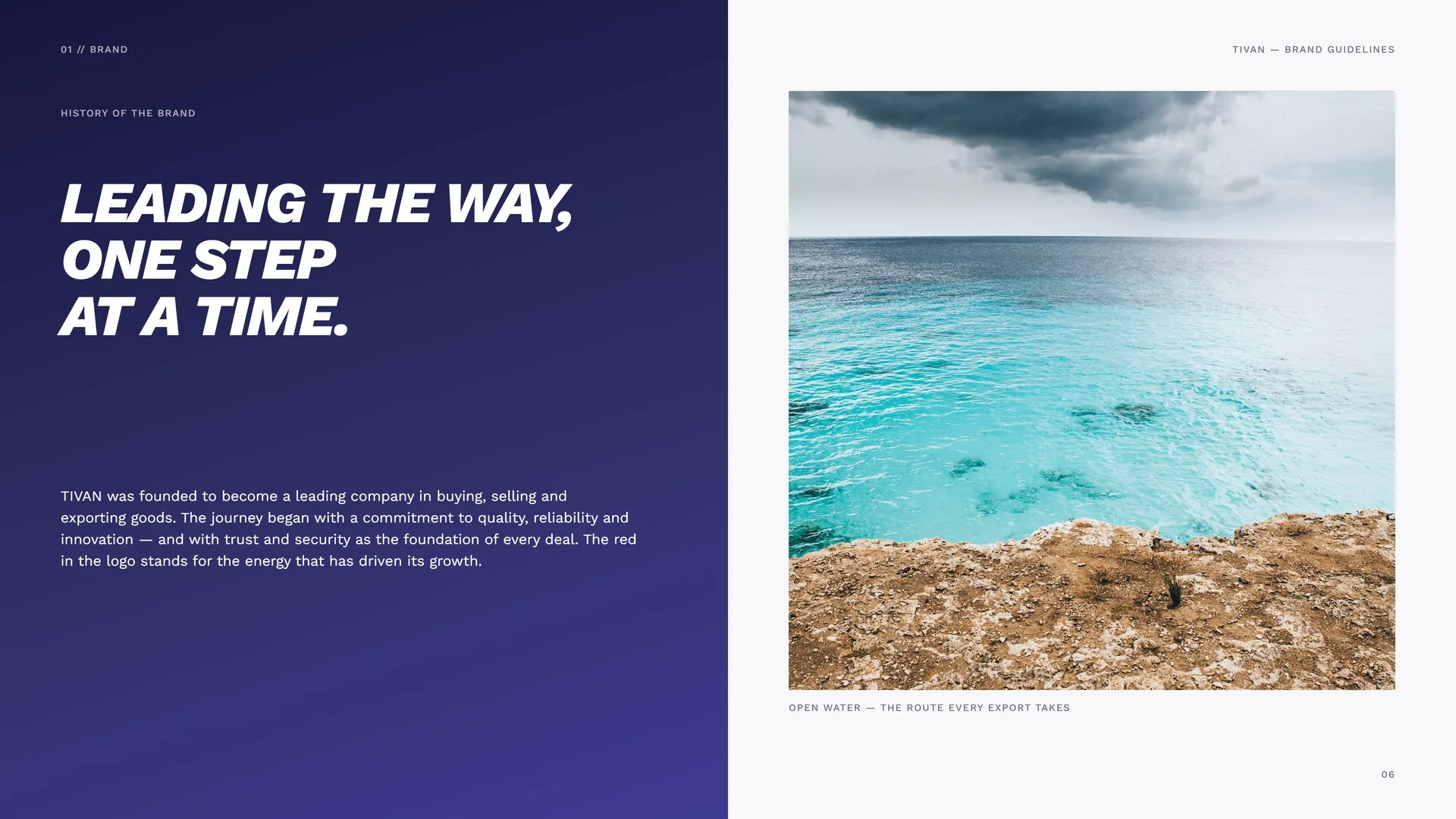
Open water — the route every export takes.
01.2
Mission & Vision
Mission: To provide high-quality products and services that meet the diverse needs of clients, and to be a reliable partner in the buying, selling and export of goods across the globe.
TIVAN builds meaningful relationships with its customers and helps businesses grow through trusted, secure and efficient trade — and keeps improving its processes to stay ahead of a fast-changing market.
Vision: To be a global leader in trade and export, recognised for excellence, trust and innovation — setting new standards while its reach keeps growing.
A culture of progress and empowerment, where every decision follows integrity, reliability and sustainability, and every product sold proves the company’s care for quality and service.
01.3
Brand Values
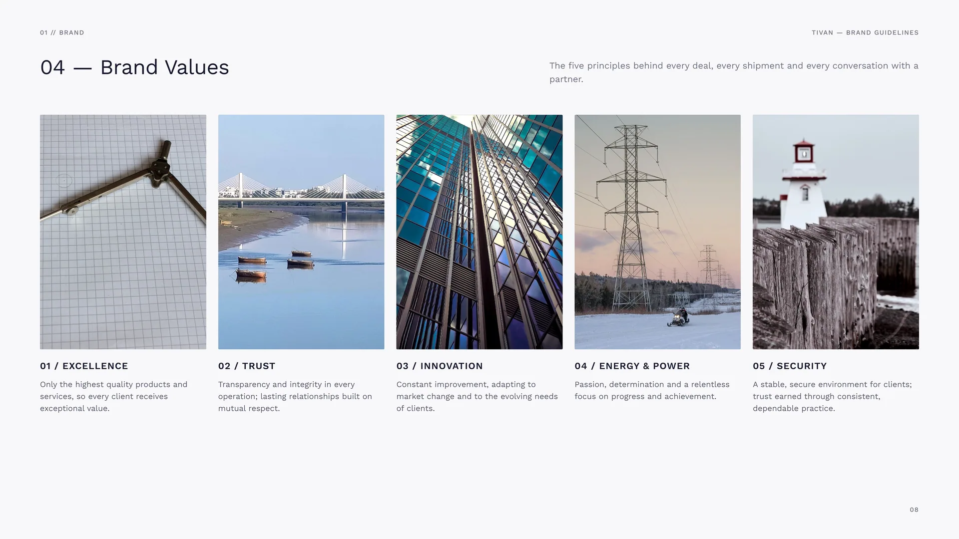
The five principles behind every deal, every shipment and every conversation with a partner.
Excellence: Only the highest quality products and services, so every client receives exceptional value.
Trust: Transparency and integrity in every operation; lasting relationships built on mutual respect.
Innovation: Constant improvement, adapting to market change and to the evolving needs of clients.
Energy & power: Passion, determination and a relentless focus on progress and achievement.
Security: A stable, secure environment for clients; trust earned through consistent, dependable practice.
01.4
Tone of Voice
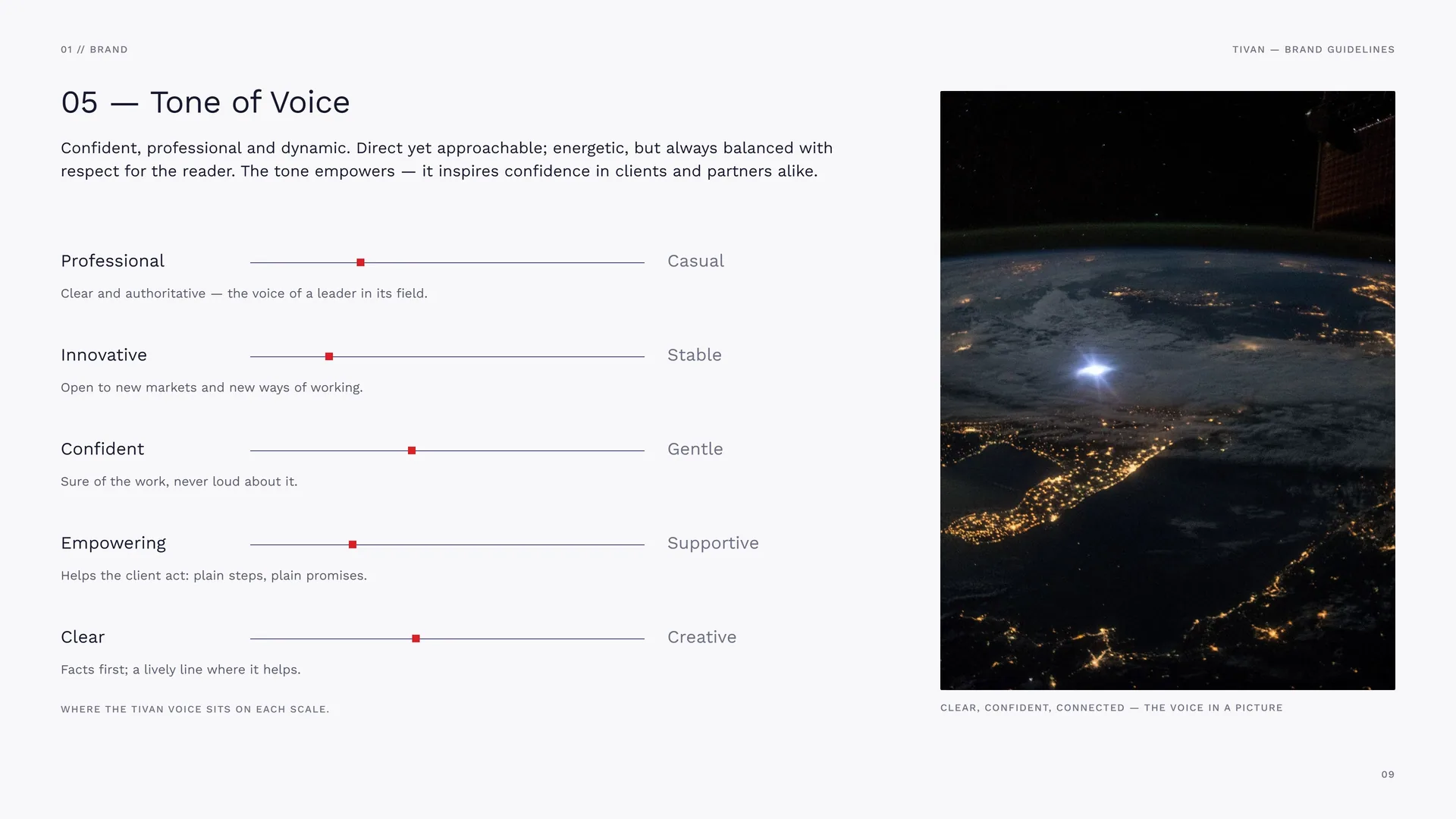
Confident, professional and dynamic. Direct yet approachable; energetic, but always balanced with respect for the reader. The tone empowers — it inspires confidence in clients and partners alike.
Professional: Clear and authoritative — the voice of a leader in its field.
Innovative: Open to new markets and new ways of working.
Confident: Sure of the work, never loud about it.
Empowering: Helps the client act: plain steps, plain promises.
Clear: Facts first; a lively line where it helps.
Casual · Stable · Gentle · Supportive · Creative.
Where the TIVAN voice sits on each scale.
Clear, confident, connected — the voice in a picture.
01.5
Taglines
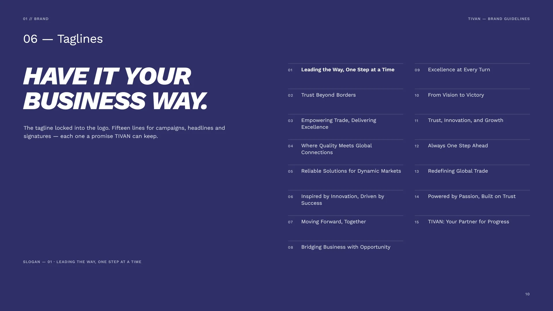
Have it your business way.
The tagline locked into the logo. Fifteen lines for campaigns, headlines and signatures — each one a promise TIVAN can keep.
Leading the Way, One Step at a Time · Trust Beyond Borders · Empowering Trade, Delivering Excellence · Where Quality Meets Global Connections · Reliable Solutions for Dynamic Markets · Inspired by Innovation, Driven by Success · Moving Forward, Together · Bridging Business with Opportunity · Excellence at Every Turn · From Vision to Victory · Trust, Innovation, and Growth · Always One Step Ahead · Redefining Global Trade · Powered by Passion, Built on Trust · TIVAN: Your Partner for Progress.
Slogan — 01 · Leading the way, one step at a time.
01.6
What TIVAN Does
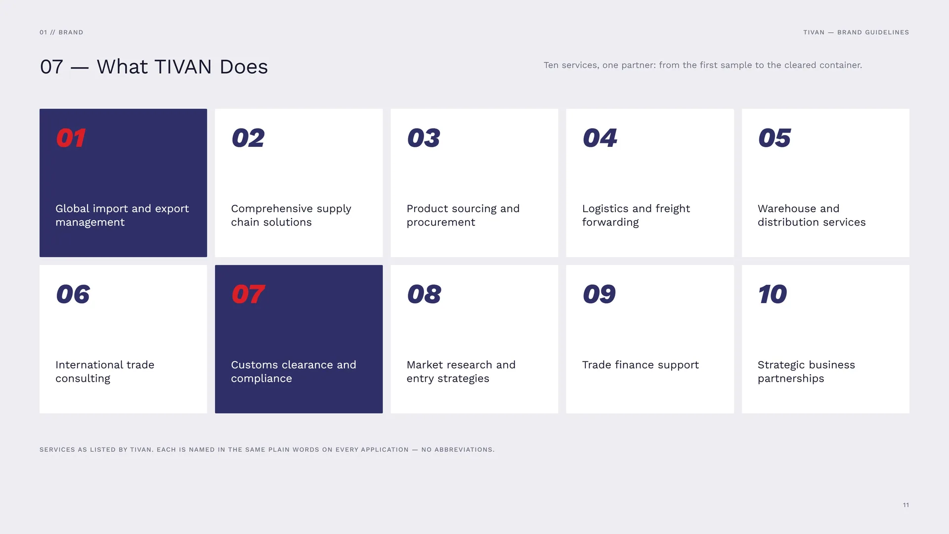
Ten services, one partner: from the first sample to the cleared container.
Global import and export management · Comprehensive supply chain solutions · Product sourcing and procurement · Logistics and freight forwarding · Warehouse and distribution services · International trade consulting · Customs clearance and compliance · Market research and entry strategies · Trade finance support · Strategic business partnerships.
Services as listed by TIVAN. Each is named in the same plain words on every application — no abbreviations.
02
Concept
- 02.1T + 1 = One Mark
- 02.2Logo Meaning
- 02.3One angle. 17.5°
- 02.4One step at a time
- 02.5Two forms, one sign
- 02.6Have it your business way
- 02.7The Mark in Motion
02.1
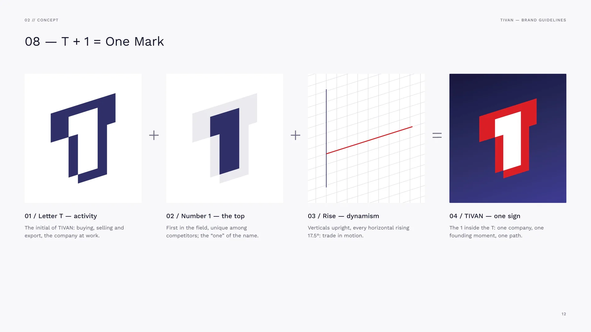
T + 1 = One Mark
Letter T — activity: The initial of TIVAN: buying, selling and export, the company at work.
Number 1 — the top: First in the field, unique among competitors; the “one” of the name.
Rise — dynamism: Verticals upright, every horizontal rising 17.5°: trade in motion.
TIVAN — one sign: The 1 inside the T: one company, one founding moment, one path.
02.2
Logo Meaning
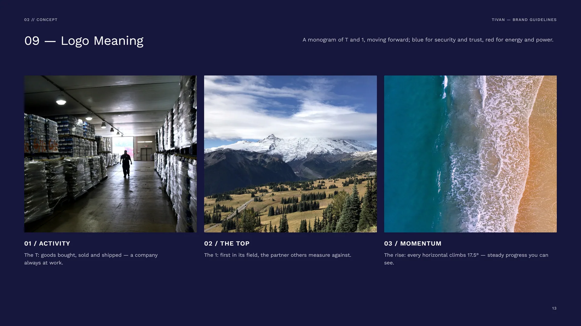
A monogram of T and 1, moving forward; blue for security and trust, red for energy and power.
Activity: The T: goods bought, sold and shipped — a company always at work.
The top: The 1: first in its field, the partner others measure against.
Momentum: The rise: every horizontal climbs 17.5° — steady progress you can see.
02.3
One angle. 17.5°
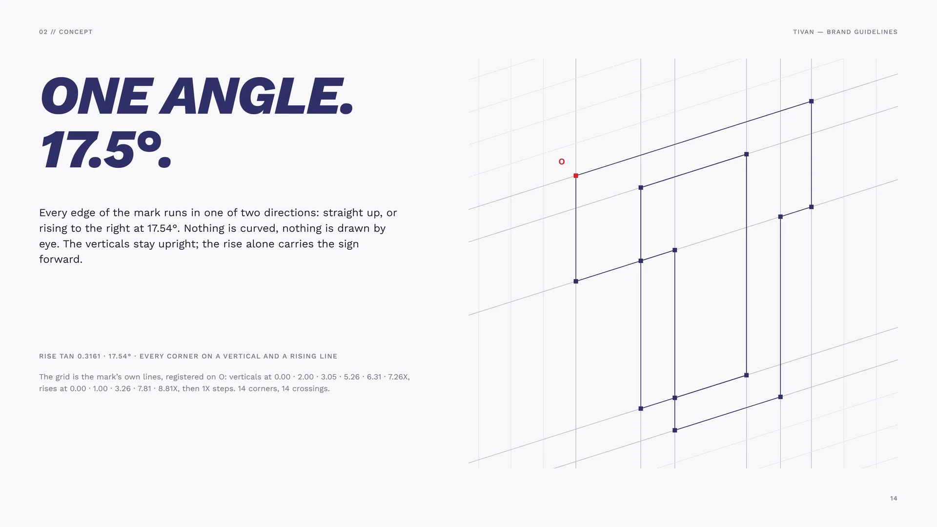
Every edge of the mark runs in one of two directions: straight up, or rising to the right at 17.54°. Nothing is curved, nothing is drawn by eye. The verticals stay upright; the rise alone carries the sign forward.
Rise tan 0.3161 · 17.54° · every corner on a vertical and a rising line.
The grid is the mark’s own lines, registered on O: verticals at 0.00 · 2.00 · 3.05 · 5.26 · 6.31 · 7.26X, rises at 0.00 · 1.00 · 3.26 · 7.81 · 8.81X, then 1X steps. 14 corners, 14 crossings.
02.4
One step at a time
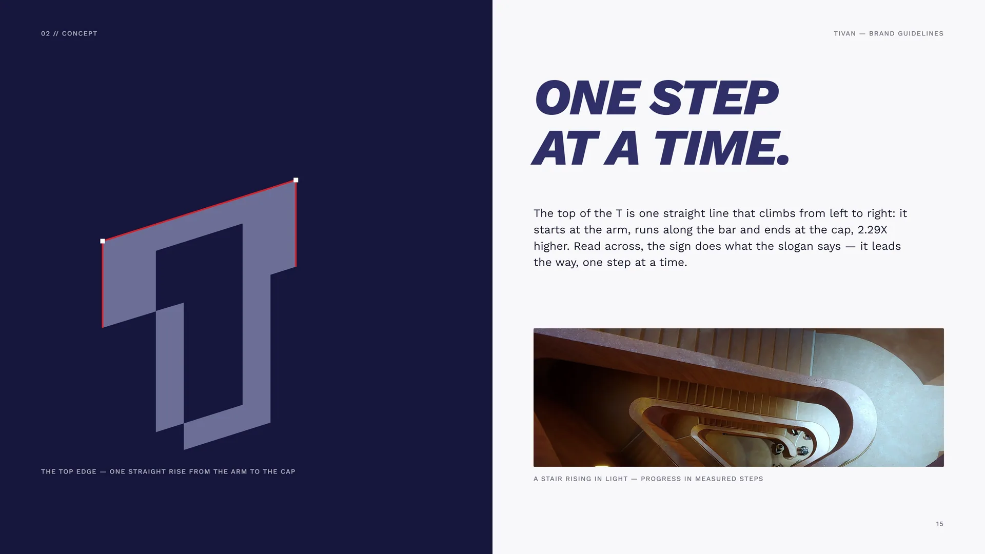
The top edge — one straight rise from the arm to the cap.
The top of the T is one straight line that climbs from left to right: it starts at the arm, runs along the bar and ends at the cap, 2.29X higher. Read across, the sign does what the slogan says — it leads the way, one step at a time.
A stair rising in light — progress in measured steps.
02.5
Two forms, one sign
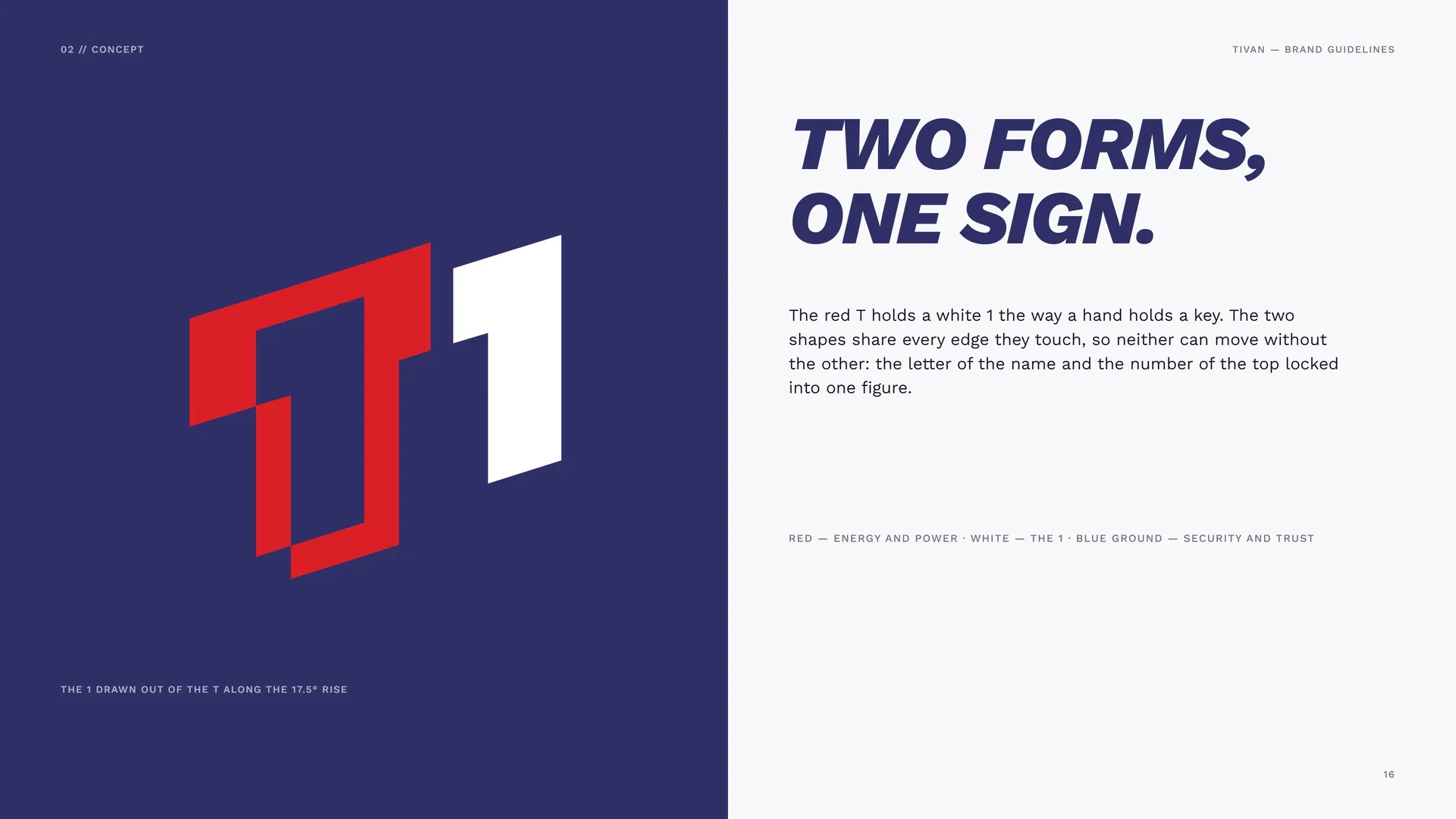
The 1 drawn out of the T along the 17.5° rise.
The red T holds a white 1 the way a hand holds a key. The two shapes share every edge they touch, so neither can move without the other: the letter of the name and the number of the top locked into one figure.
Red — energy and power · White — the 1 · Blue ground — security and trust.
02.6
Have it your business way
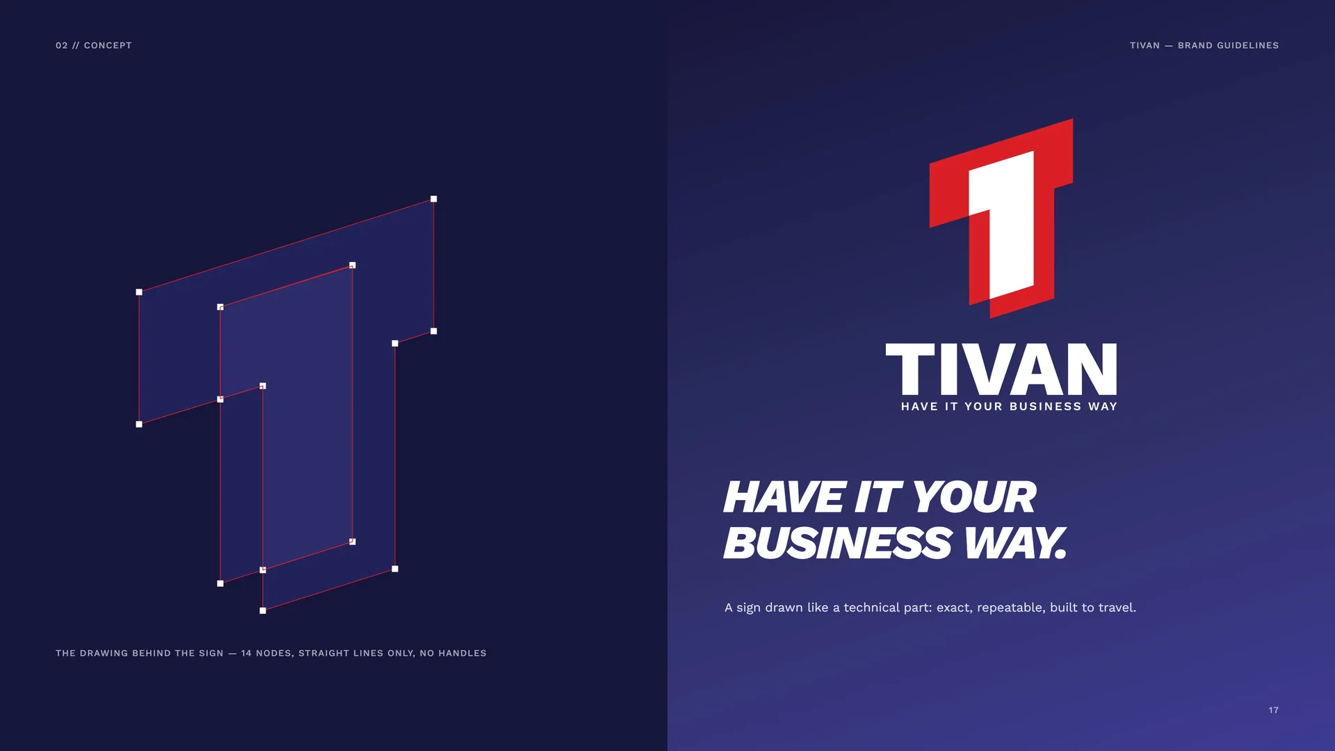
The drawing behind the sign — 14 nodes, straight lines only, no handles.
A sign drawn like a technical part: exact, repeatable, built to travel.
02.7
The Mark in Motion
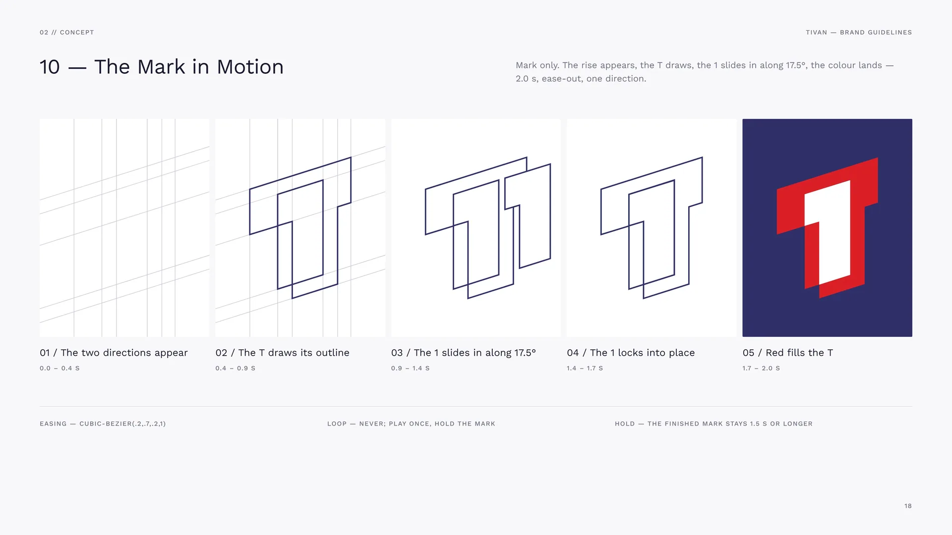
Mark only. The rise appears, the T draws, the 1 slides in along 17.5°, the colour lands — 2.0 s, ease-out, one direction.
The two directions appear: 0.0 – 0.4 s.
The T draws its outline: 0.4 – 0.9 s.
The 1 slides in along 17.5°: 0.9 – 1.4 s.
The 1 locks into place: 1.4 – 1.7 s.
Red fills the T: 1.7 – 2.0 s.
Easing — cubic-bezier(.2,.7,.2,1).
Loop — never; play once, hold the mark.
Hold — the finished mark stays 1.5 s or longer.
03
Logo & grid
- 03.1The Primary Logo
- 03.2Logo Family
- 03.3Anatomy
- 03.4Construction Grid
- 03.5Proportions in X
- 03.6Wordmark
- 03.7Horizontal Proportions
- 03.8Stacked Proportions
- 03.9Clear Space
03.1
The Primary Logo
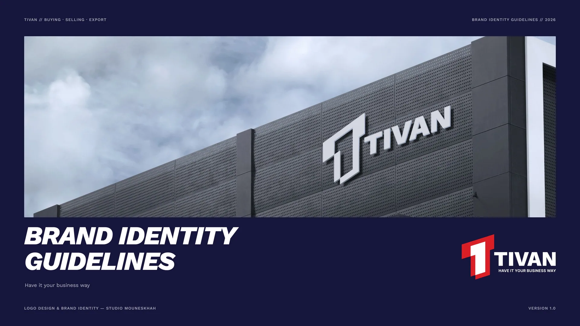
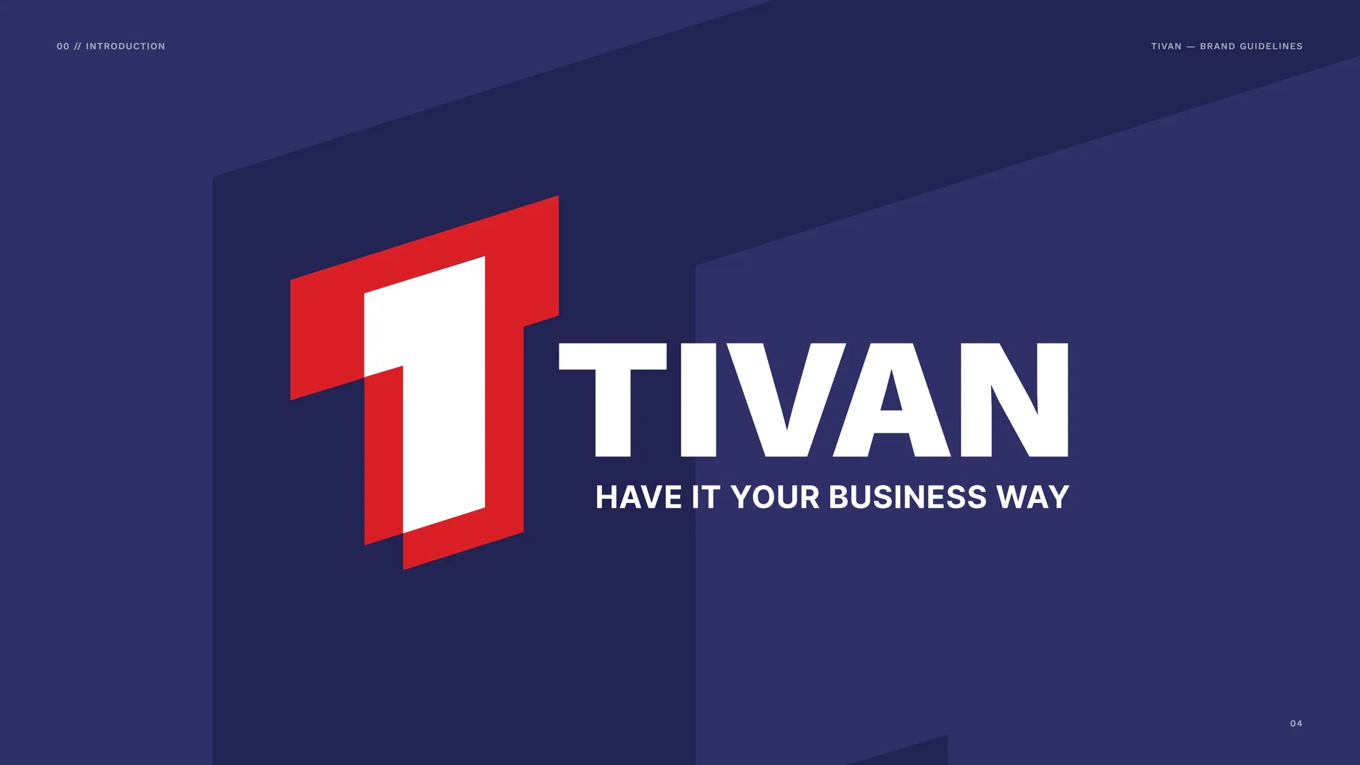
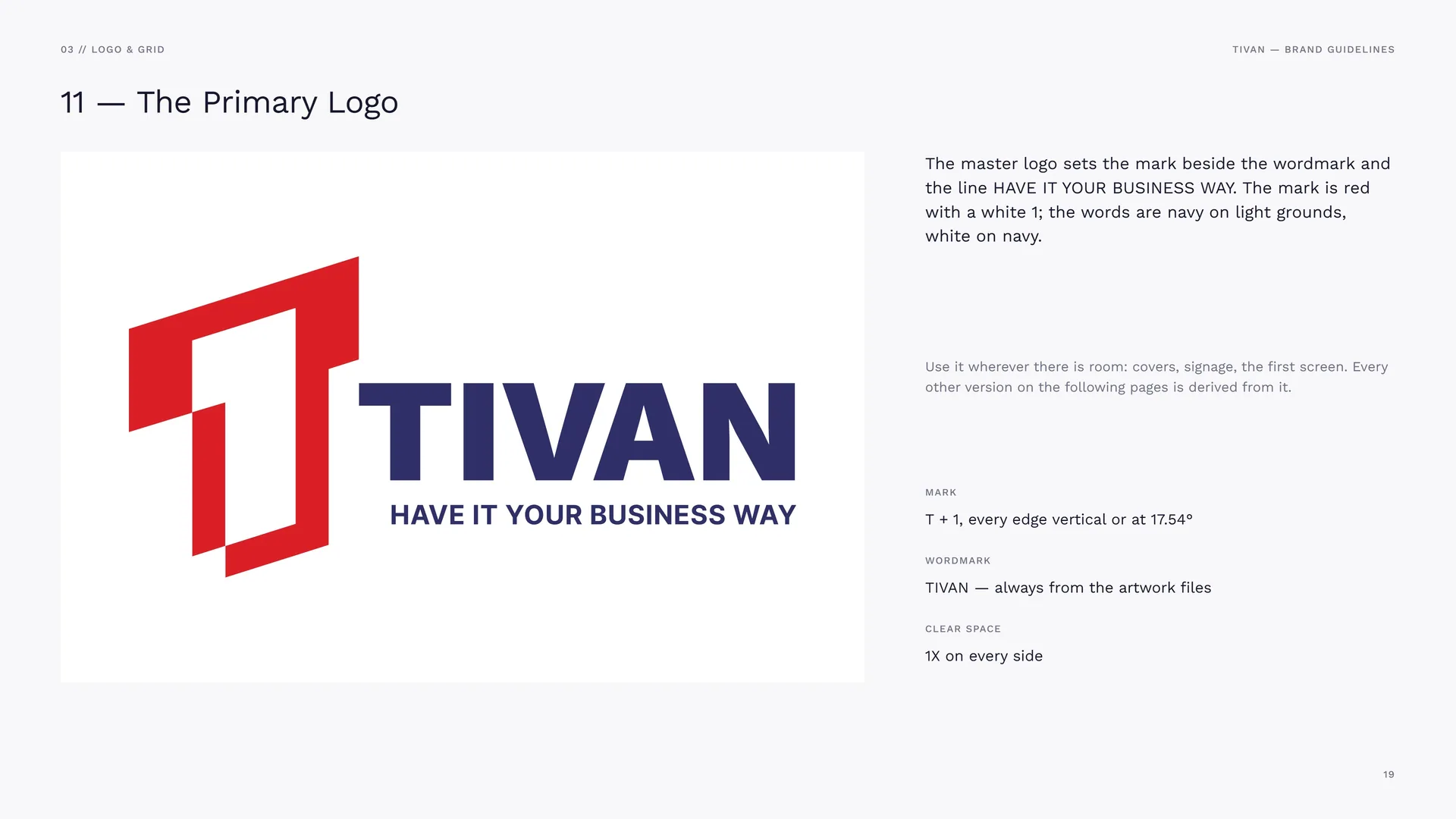
The master logo sets the mark beside the wordmark and the line HAVE IT YOUR BUSINESS WAY. The mark is red with a white 1; the words are navy on light grounds, white on navy.
Use it wherever there is room: covers, signage, the first screen. Every other version on the following pages is derived from it.
Mark: T + 1, every edge vertical or at 17.54°.
Wordmark: TIVAN — always from the artwork files.
Clear space: 1X on every side.
03.2
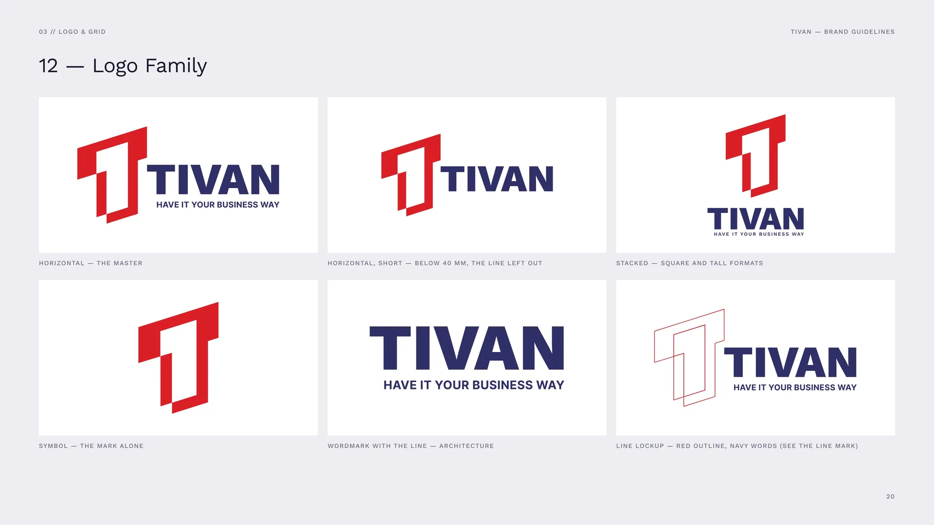
Logo Family
Horizontal — the master.
Horizontal, short — below 40 mm, the line left out.
Stacked — square and tall formats.
Symbol — the mark alone.
Wordmark with the line — architecture.
Line lockup — red outline, navy words (see the line mark).
03.3
Anatomy
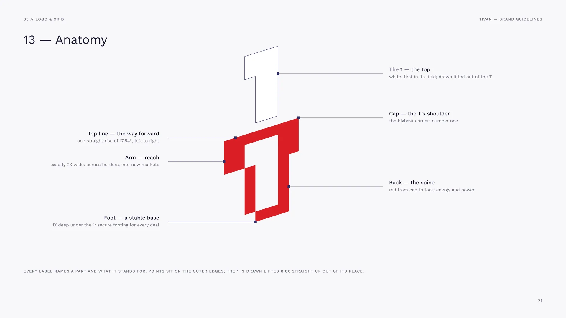
Top line — the way forward: one straight rise of 17.54°, left to right.
Arm — reach: exactly 2X wide: across borders, into new markets.
Foot — a stable base: 1X deep under the 1: secure footing for every deal.
The 1 — the top: white, first in its field; drawn lifted out of the T.
Cap — the T’s shoulder: the highest corner: number one.
Back — the spine: red from cap to foot: energy and power.
Every label names a part and what it stands for. Points sit on the outer edges; the 1 is drawn lifted 8.6X straight up out of its place.
03.4
Construction Grid
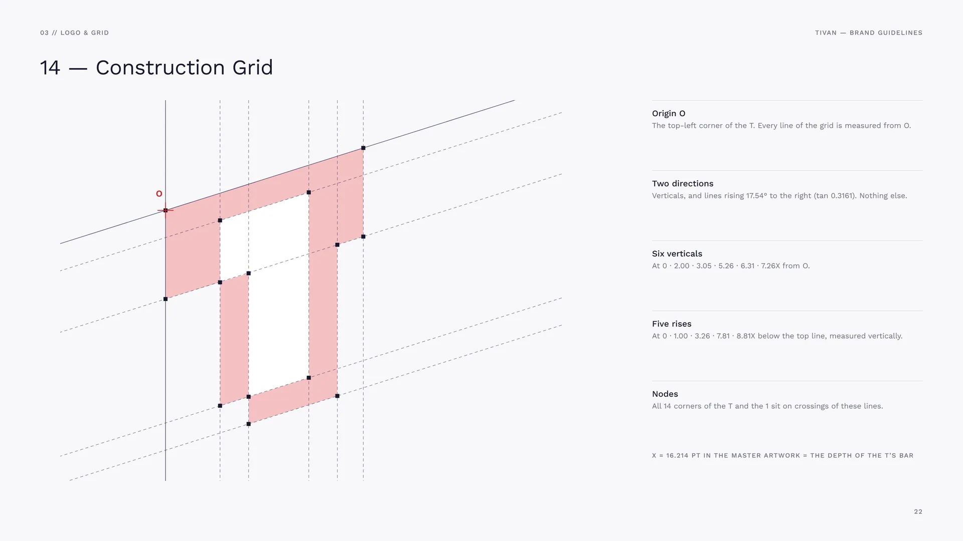
Origin O: The top-left corner of the T. Every line of the grid is measured from O.
Two directions: Verticals, and lines rising 17.54° to the right (tan 0.3161). Nothing else.
Six verticals: At 0 · 2.00 · 3.05 · 5.26 · 6.31 · 7.26X from O.
Five rises: At 0 · 1.00 · 3.26 · 7.81 · 8.81X below the top line, measured vertically.
Nodes: All 14 corners of the T and the 1 sit on crossings of these lines.
X = 16.214 pt in the master artwork = the depth of the T’s bar.
03.5
Proportions in X
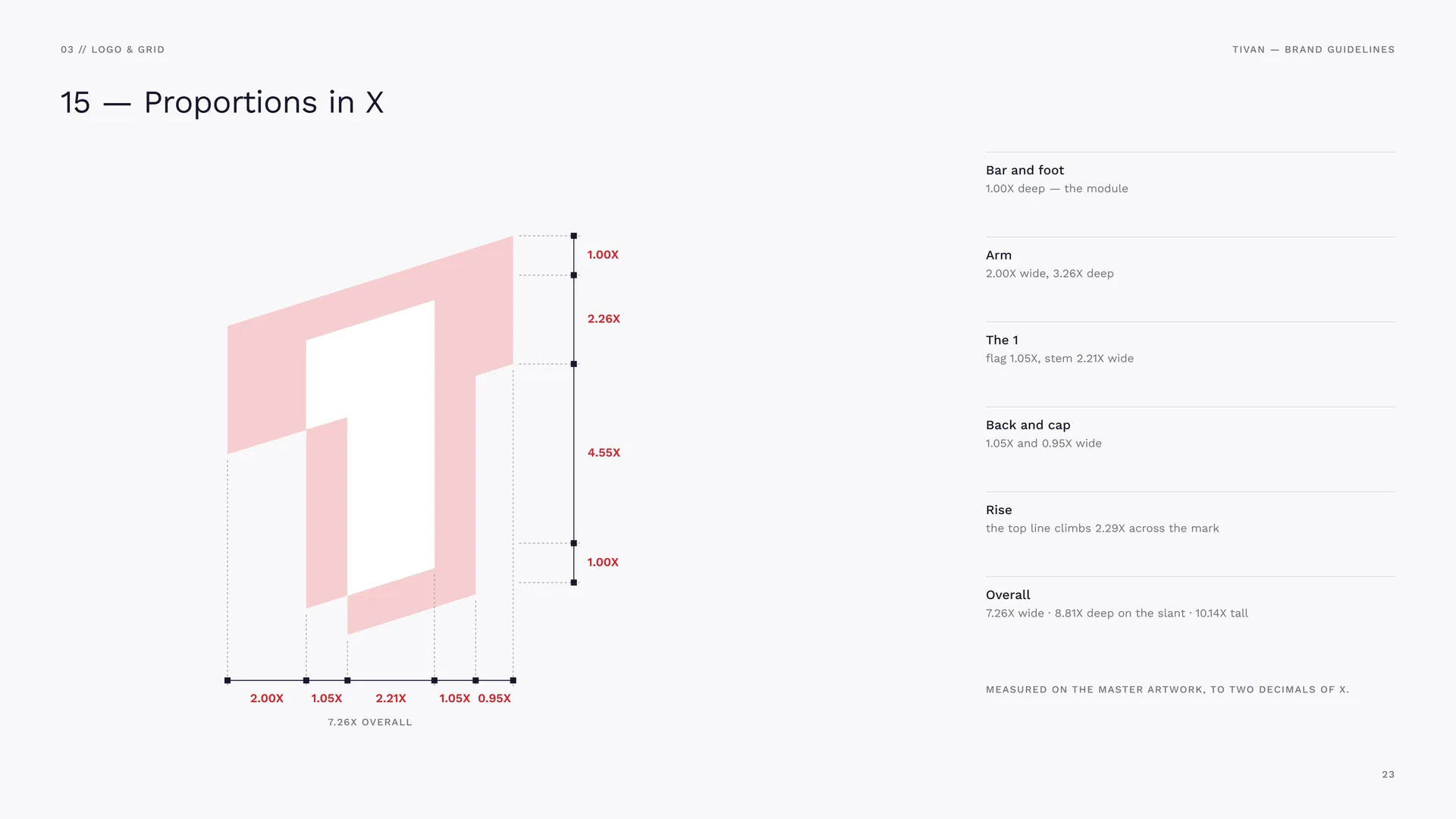
Bar and foot: 1.00X deep — the module.
Arm: 2.00X wide, 3.26X deep.
The 1: flag 1.05X, stem 2.21X wide.
Back and cap: 1.05X and 0.95X wide.
Rise: the top line climbs 2.29X across the mark.
Overall: 7.26X wide · 8.81X deep on the slant · 10.14X tall.
Measured on the master artwork, to two decimals of X.
03.6
Wordmark
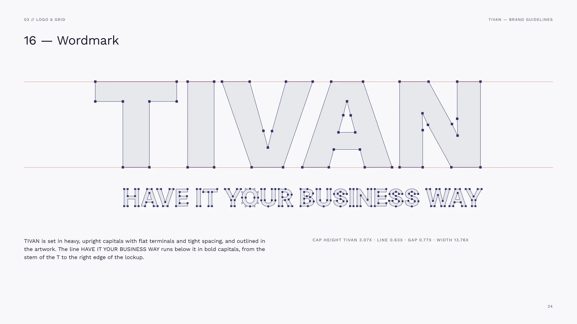
TIVAN is set in heavy, upright capitals with flat terminals and tight spacing, and outlined in the artwork. The line HAVE IT YOUR BUSINESS WAY runs below it in bold capitals, from the stem of the T to the right edge of the lockup.
Cap height TIVAN 3.07X · line 0.63X · gap 0.77X · width 13.76X.
03.7
Horizontal Proportions
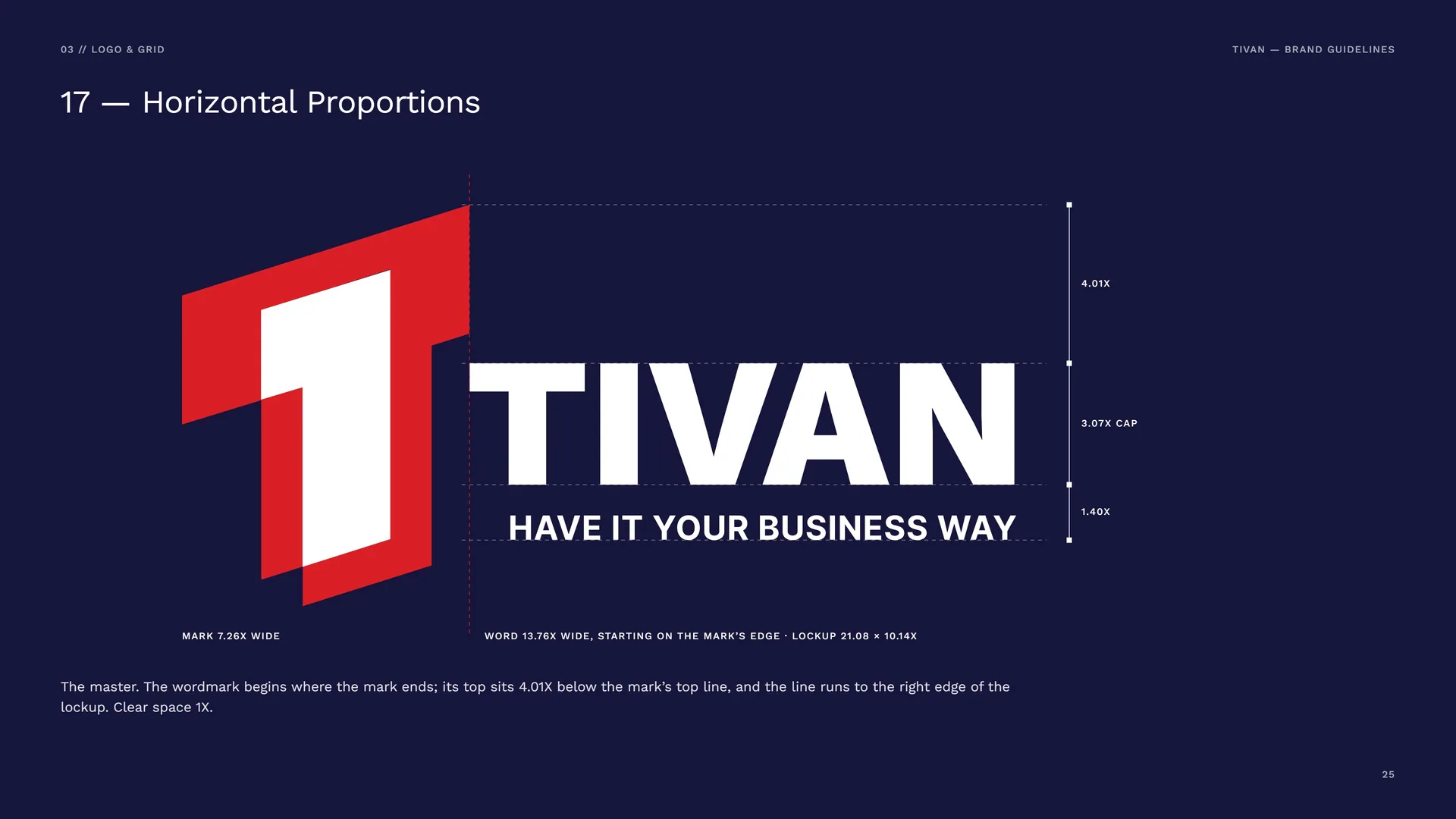
Mark 7.26X wide · word 13.76X wide, starting on the mark’s edge · lockup 21.08 × 10.14X.
The master. The wordmark begins where the mark ends; its top sits 4.01X below the mark’s top line, and the line runs to the right edge of the lockup. Clear space 1X.
03.8
Stacked Proportions
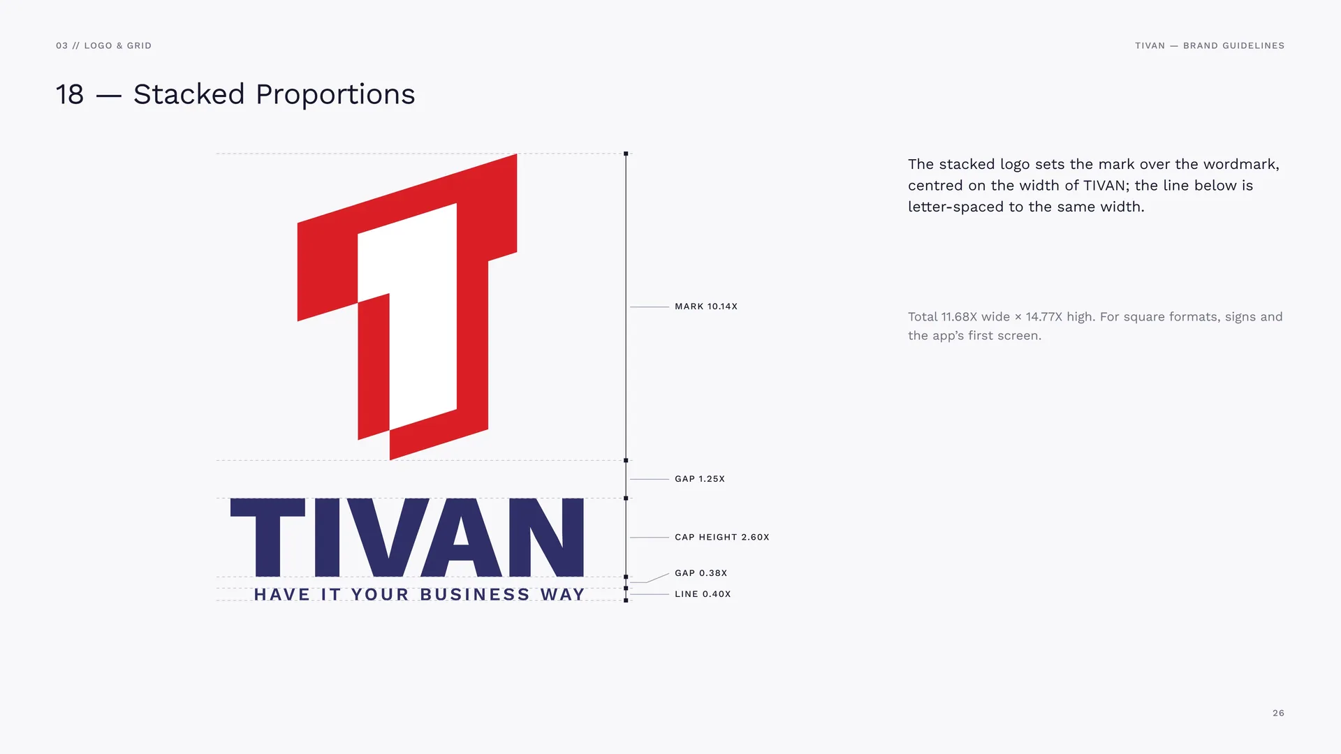
Mark 10.14X · gap 1.25X · cap height 2.60X · gap 0.38X · line 0.40X.
The stacked logo sets the mark over the wordmark, centred on the width of TIVAN; the line below is letter-spaced to the same width.
Total 11.68X wide × 14.77X high. For square formats, signs and the app’s first screen.
03.9
Clear Space
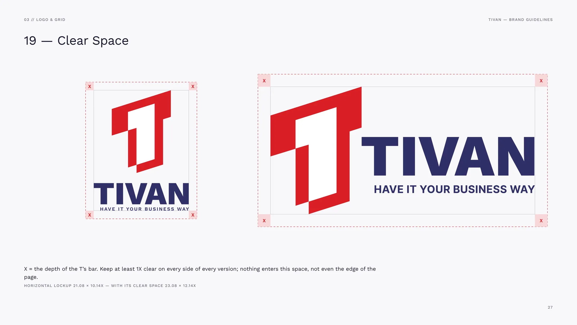
X = the depth of the T’s bar. Keep at least 1X clear on every side of every version; nothing enters this space, not even the edge of the page.
Horizontal lockup 21.08 × 10.14X — with its clear space 23.08 × 12.14X.
04
Logo in use
- 04.1Colour Versions
- 04.2App Icon & Favicon
- 04.3Minimum Size
- 04.4Placement
- 04.5Misuse
- 04.6Logo in use
- 04.7The Mark as Material
04.1
Colour Versions
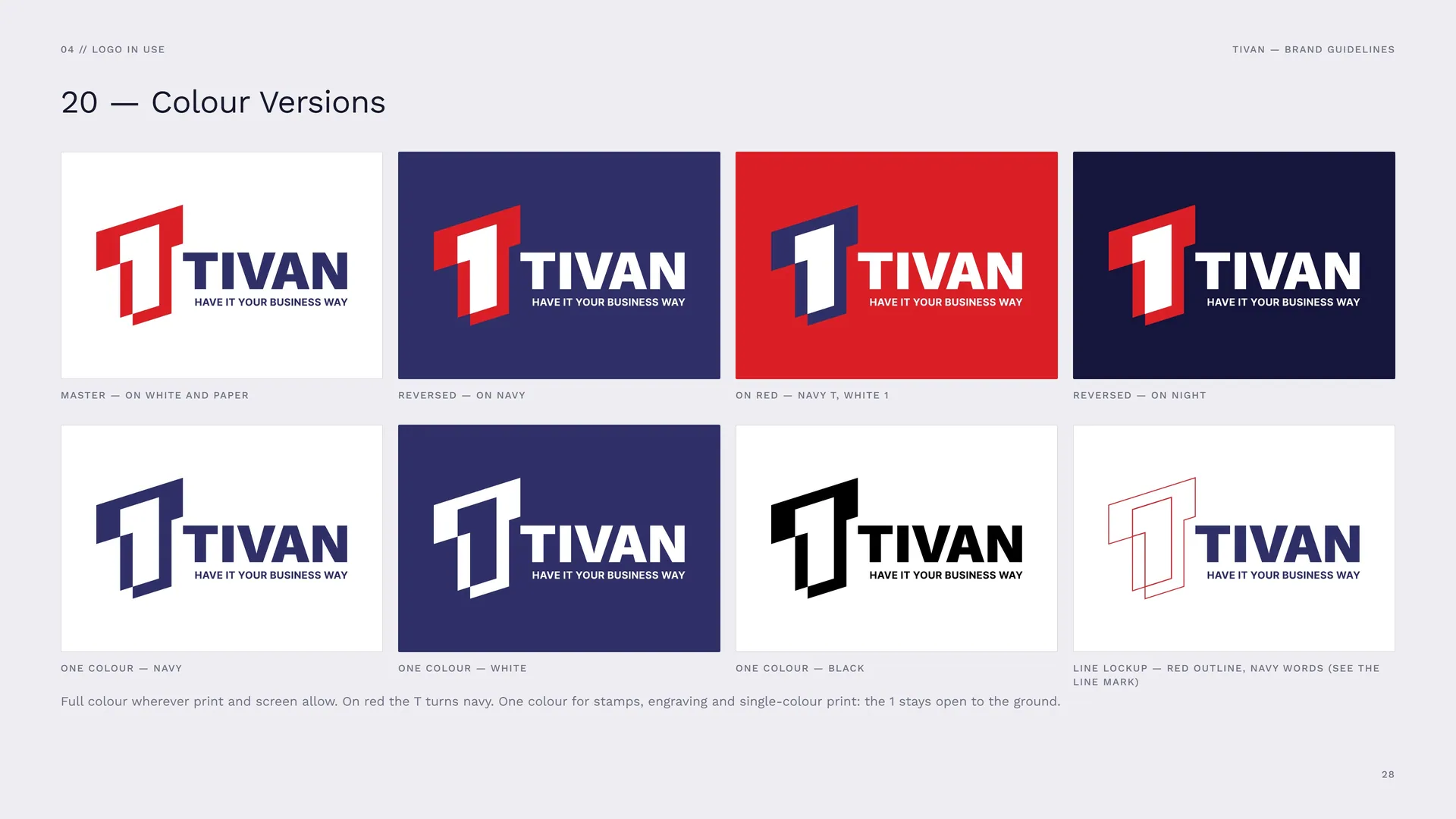
Master — on white and paper.
Reversed — on navy.
On red — navy T, white 1.
Reversed — on night.
One colour — navy.
One colour — white.
One colour — black.
Line lockup — red outline, navy words (see the line mark).
Full colour wherever print and screen allow. On red the T turns navy. One colour for stamps, engraving and single-colour print: the 1 stays open to the ground.
04.2
App Icon & Favicon
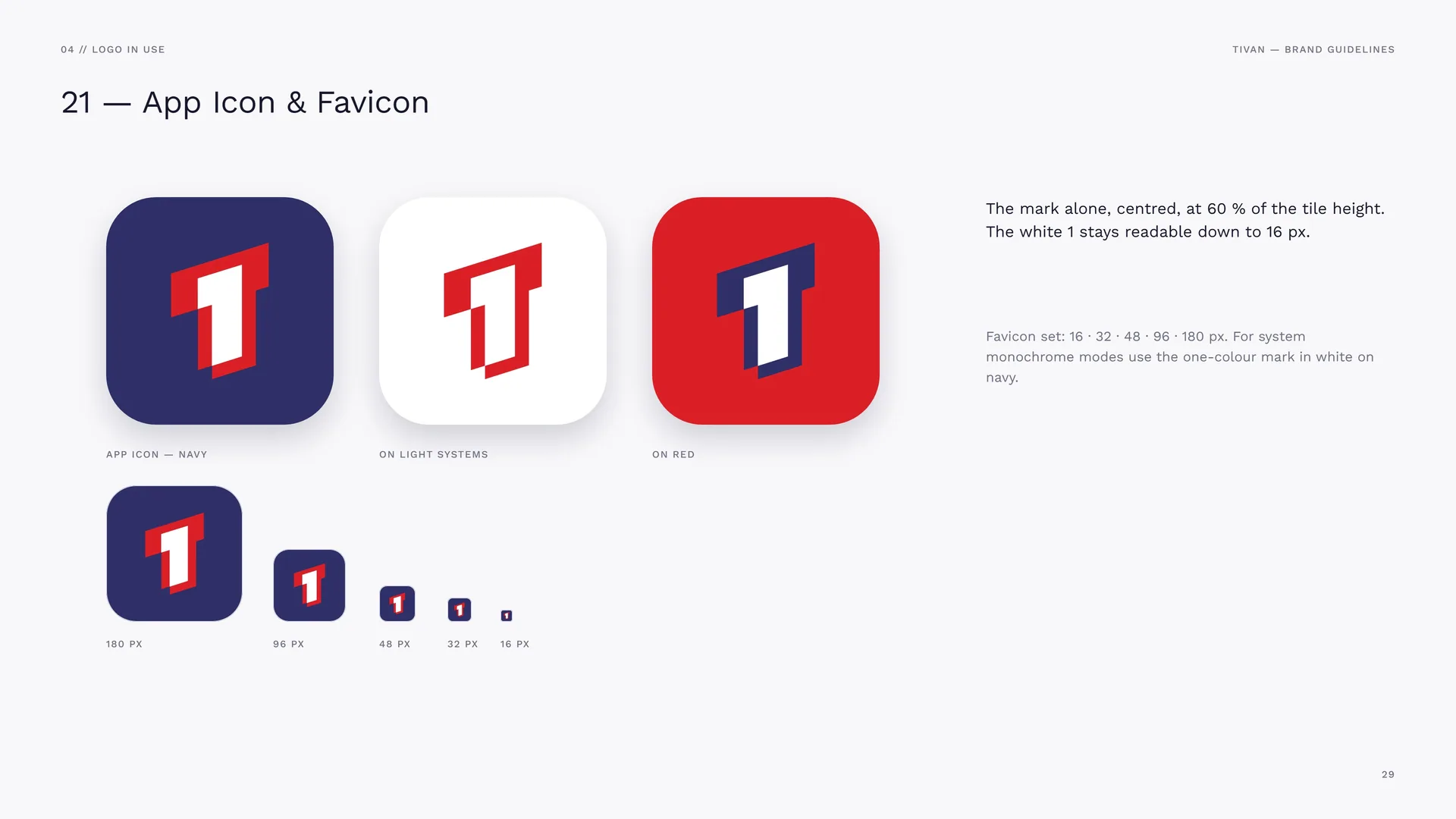
App icon — navy · On light systems · On red.
The mark alone, centred, at 60 % of the tile height. The white 1 stays readable down to 16 px.
Favicon set: 16 · 32 · 48 · 96 · 180 px. For system monochrome modes use the one-colour mark in white on navy.
04.3
Minimum Size
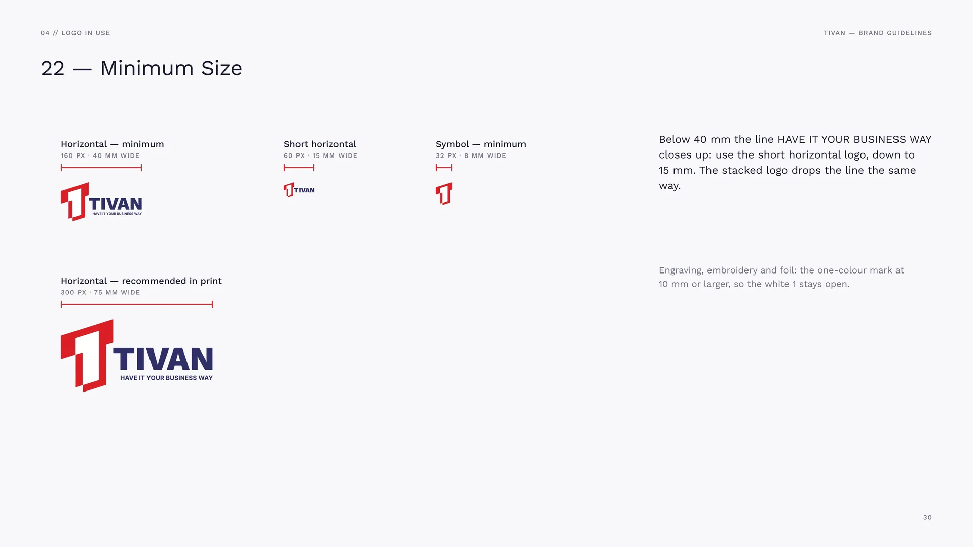
Horizontal — minimum: 160 px · 40 mm wide.
Short horizontal: 60 px · 15 mm wide.
Symbol — minimum: 32 px · 8 mm wide.
Horizontal — recommended in print: 300 px · 75 mm wide.
Below 40 mm the line HAVE IT YOUR BUSINESS WAY closes up: use the short horizontal logo, down to 15 mm. The stacked logo drops the line the same way.
Engraving, embroidery and foil: the one-colour mark at 10 mm or larger, so the white 1 stays open.
04.4
Placement
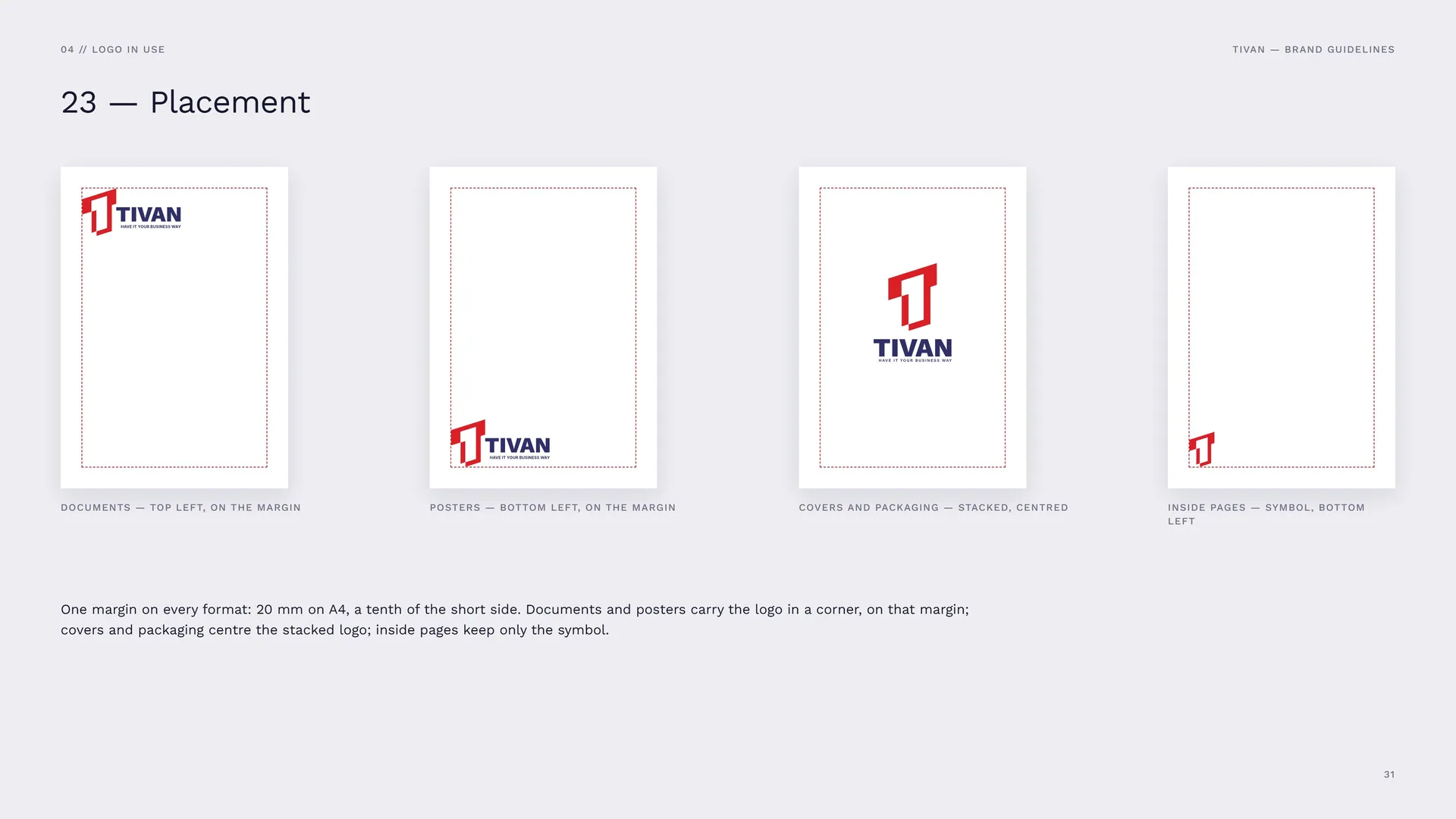
Documents — top left, on the margin.
Posters — bottom left, on the margin.
Covers and packaging — stacked, centred.
Inside pages — symbol, bottom left.
One margin on every format: 20 mm on A4, a tenth of the short side. Documents and posters carry the logo in a corner, on that margin; covers and packaging centre the stacked logo; inside pages keep only the symbol.
04.5
Misuse
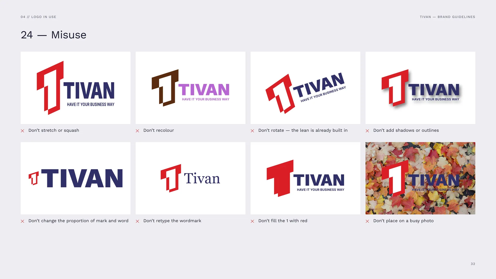
Don’t stretch or squash · Don’t recolour · Don’t rotate — the lean is already built in · Don’t add shadows or outlines · Don’t change the proportion of mark and word · Don’t retype the wordmark · Don’t fill the 1 with red · Don’t place on a busy photo.
04.6
Logo in use
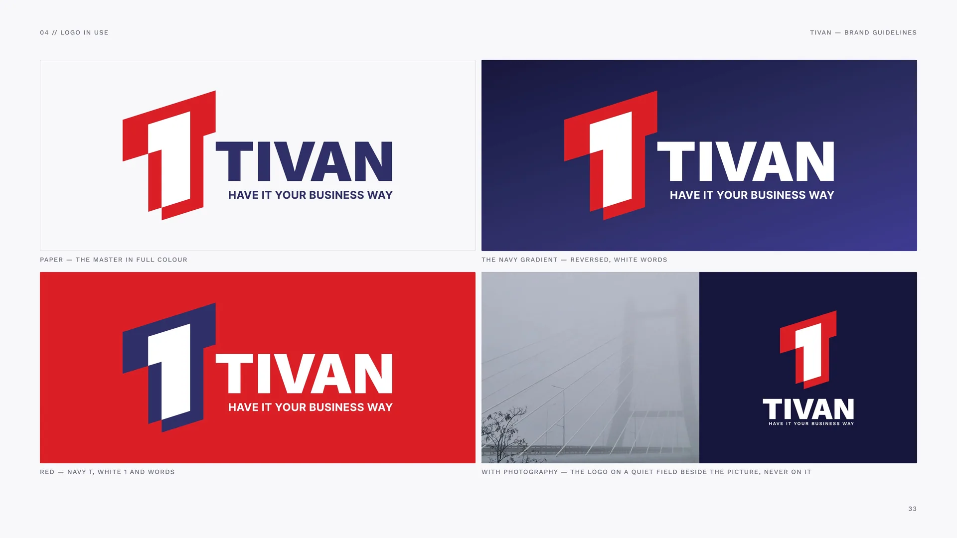
Paper — the master in full colour.
The navy gradient — reversed, white words.
Red — navy T, white 1 and words.
With photography — the logo on a quiet field beside the picture, never on it.
04.7
The Mark as Material
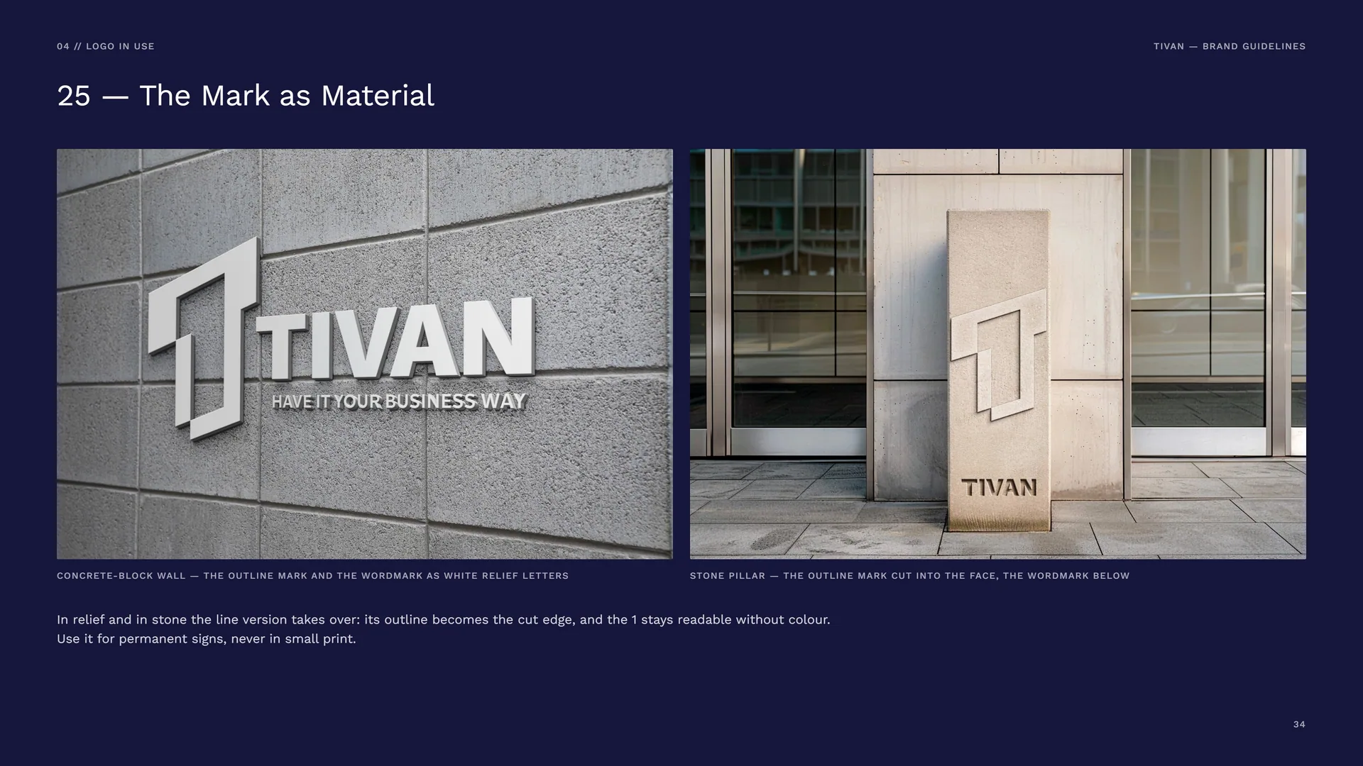
Concrete-block wall — the outline mark and the wordmark as white relief letters.
Stone pillar — the outline mark cut into the face, the wordmark below.
In relief and in stone the line version takes over: its outline becomes the cut edge, and the 1 stays readable without colour. Use it for permanent signs, never in small print.
05
Colour
05.1
Navy & red
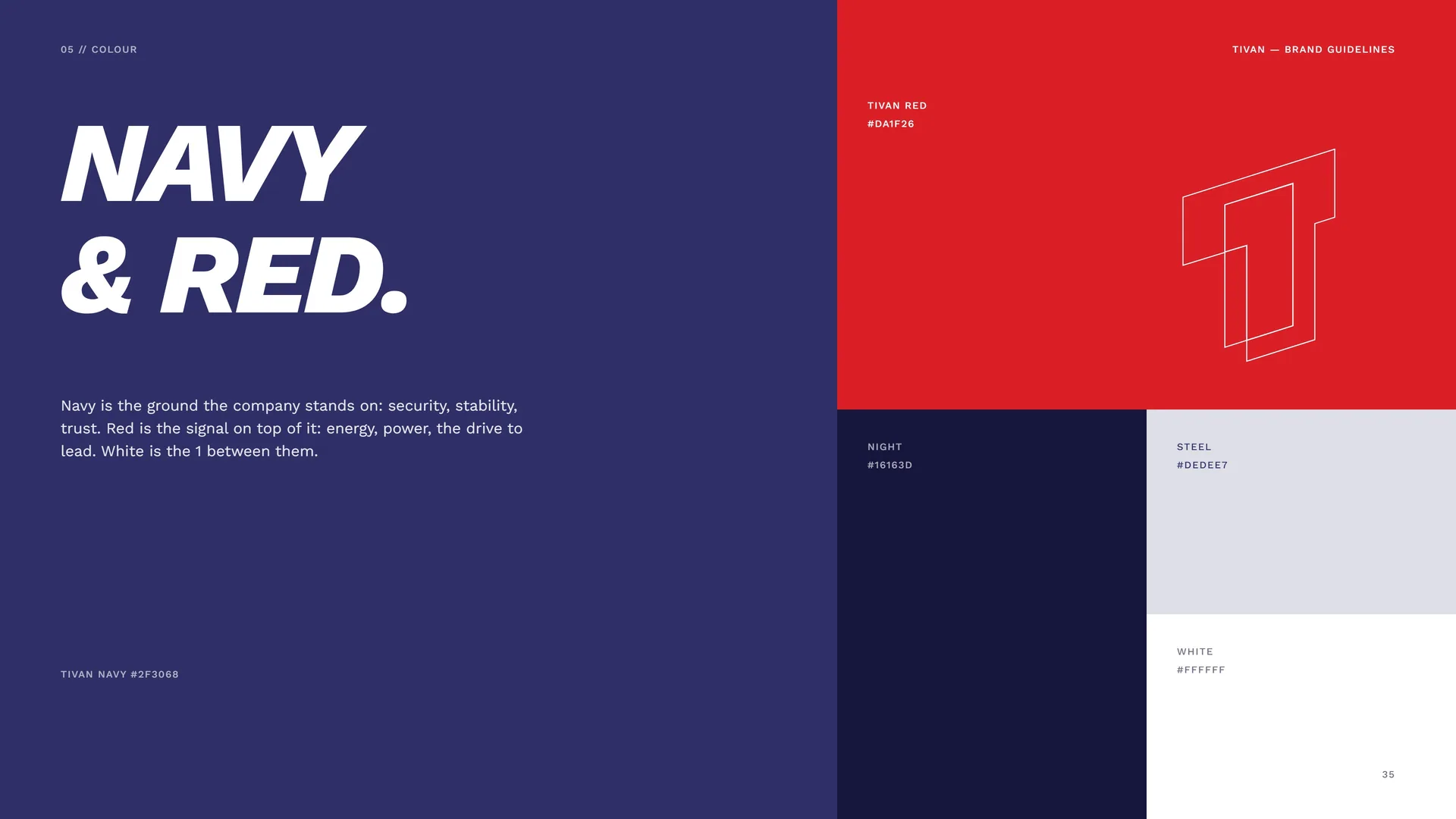
Navy is the ground the company stands on: security, stability, trust. Red is the signal on top of it: energy, power, the drive to lead. White is the 1 between them.
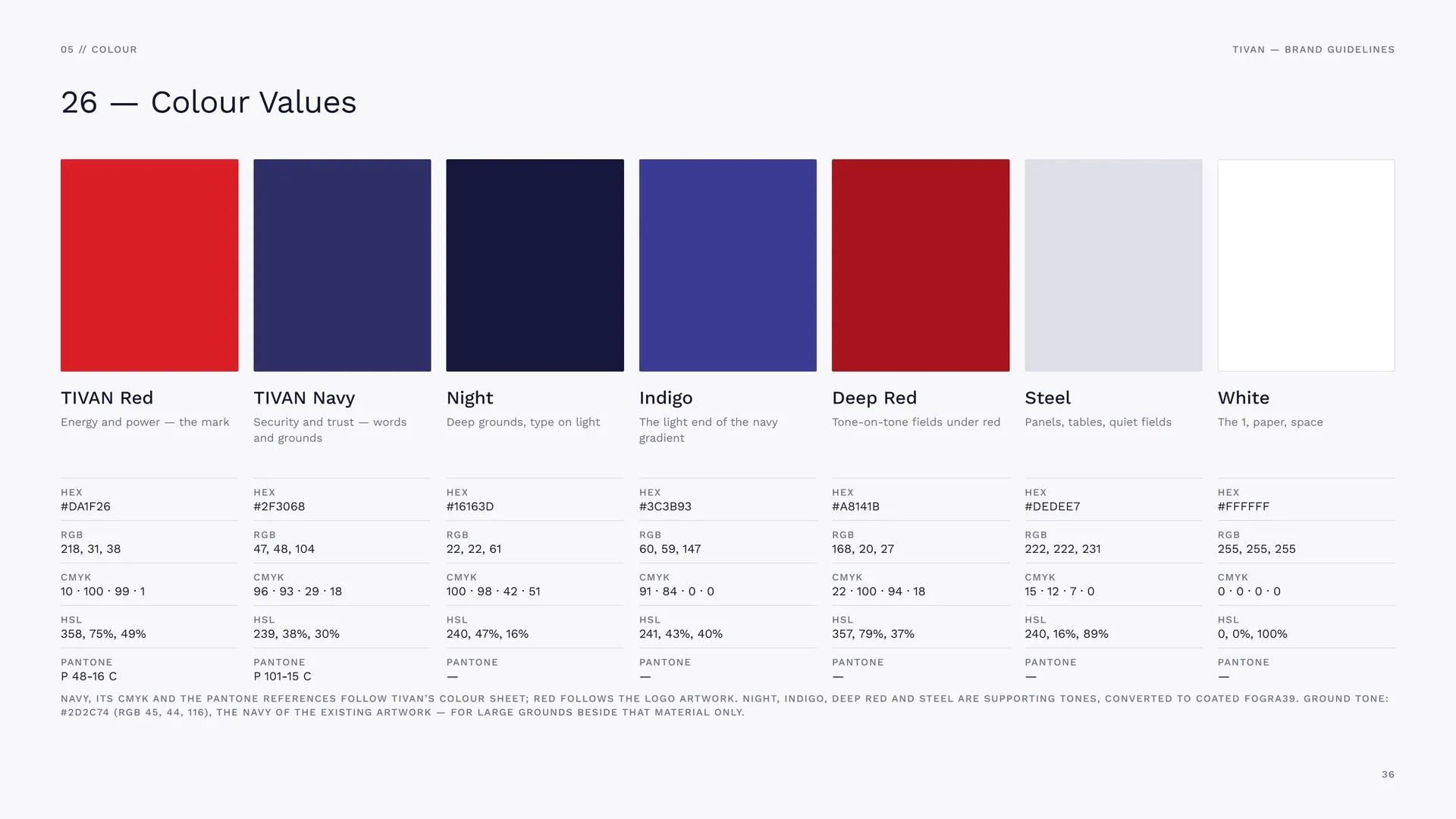
TIVAN Navy #2F3068 · TIVAN Red #DA1F26 · Night #16163D · Steel #DEDEE7 · White #FFFFFF.
05.2
Colour Values
TIVAN Red: Energy and power — the mark. HEX #DA1F26 · RGB 218, 31, 38 · CMYK 10 · 100 · 99 · 1 · HSL 358, 75%, 49% · PANTONE P 48-16 C.
TIVAN Navy: Security and trust — words and grounds. HEX #2F3068 · RGB 47, 48, 104 · CMYK 96 · 93 · 29 · 18 · HSL 239, 38%, 30% · PANTONE P 101-15 C.
Night: Deep grounds, type on light. HEX #16163D · RGB 22, 22, 61 · CMYK 100 · 98 · 42 · 51 · HSL 240, 47%, 16%.
Indigo: The light end of the navy gradient. HEX #3C3B93 · RGB 60, 59, 147 · CMYK 91 · 84 · 0 · 0 · HSL 241, 43%, 40%.
Deep Red: Tone-on-tone fields under red. HEX #A8141B · RGB 168, 20, 27 · CMYK 22 · 100 · 94 · 18 · HSL 357, 79%, 37%.
Steel: Panels, tables, quiet fields. HEX #DEDEE7 · RGB 222, 222, 231 · CMYK 15 · 12 · 7 · 0 · HSL 240, 16%, 89%.
White: The 1, paper, space. HEX #FFFFFF · RGB 255, 255, 255 · CMYK 0 · 0 · 0 · 0 · HSL 0, 0%, 100%.
Navy, its CMYK and the Pantone references follow TIVAN’s colour sheet; red follows the logo artwork. Night, Indigo, Deep Red and Steel are supporting tones, converted to coated FOGRA39. Ground tone: #2D2C74 (RGB 45, 44, 116), the navy of the existing artwork — for large grounds beside that material only.
05.3
Colour Story
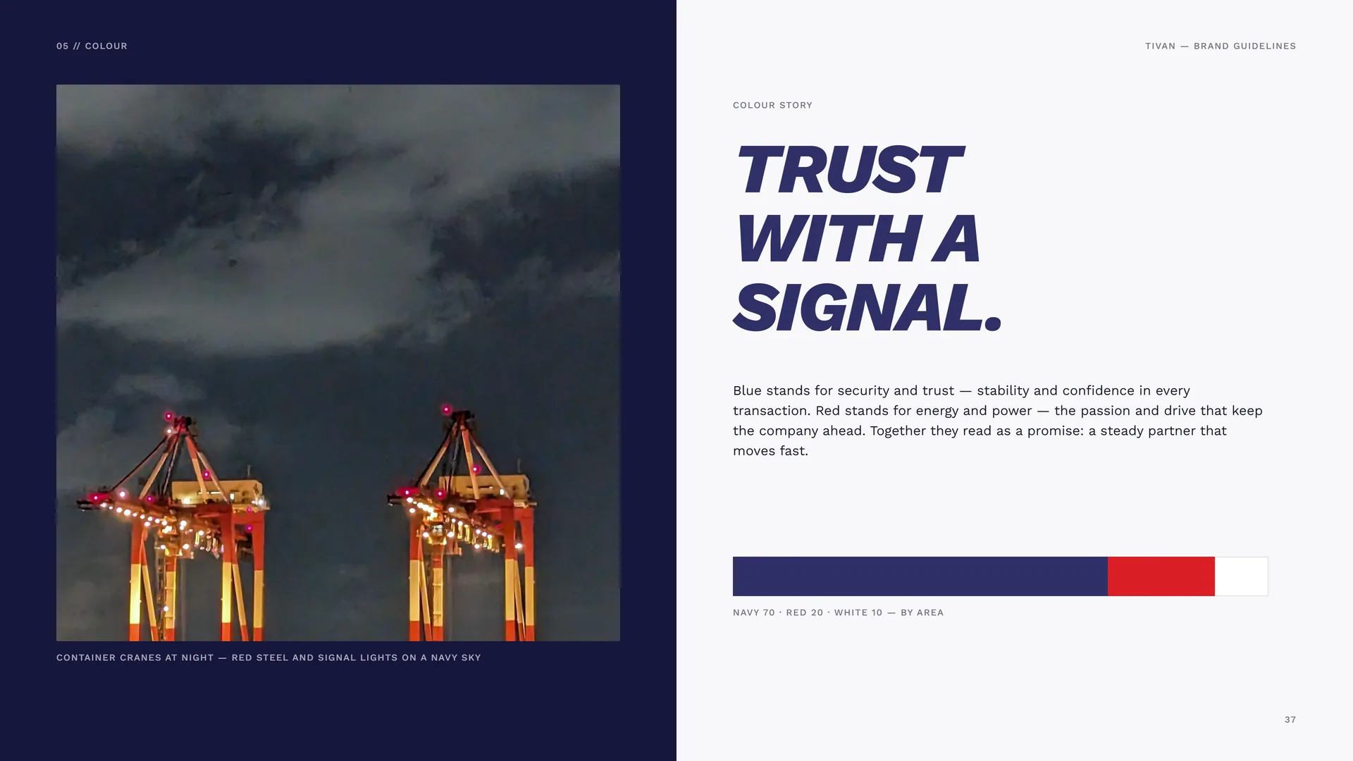
Container cranes at night — red steel and signal lights on a navy sky.
Trust with a signal.
Blue stands for security and trust — stability and confidence in every transaction. Red stands for energy and power — the passion and drive that keep the company ahead. Together they read as a promise: a steady partner that moves fast.
Navy 70 · Red 20 · White 10 — by area.
05.4
Contrast & Accessibility
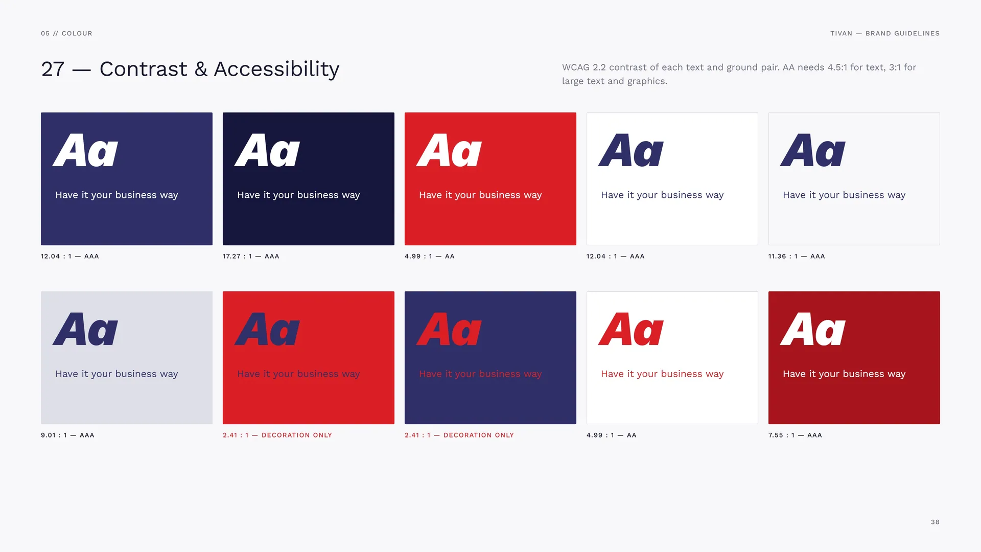
WCAG 2.2 contrast of each text and ground pair. AA needs 4.5:1 for text, 3:1 for large text and graphics.
12.04 : 1 — AAA · 17.27 : 1 — AAA · 4.99 : 1 — AA · 12.04 : 1 — AAA · 11.36 : 1 — AAA.
9.01 : 1 — AAA · 2.41 : 1 — decoration only · 2.41 : 1 — decoration only · 4.99 : 1 — AA · 7.55 : 1 — AAA.
05.5
Tints & Gradient
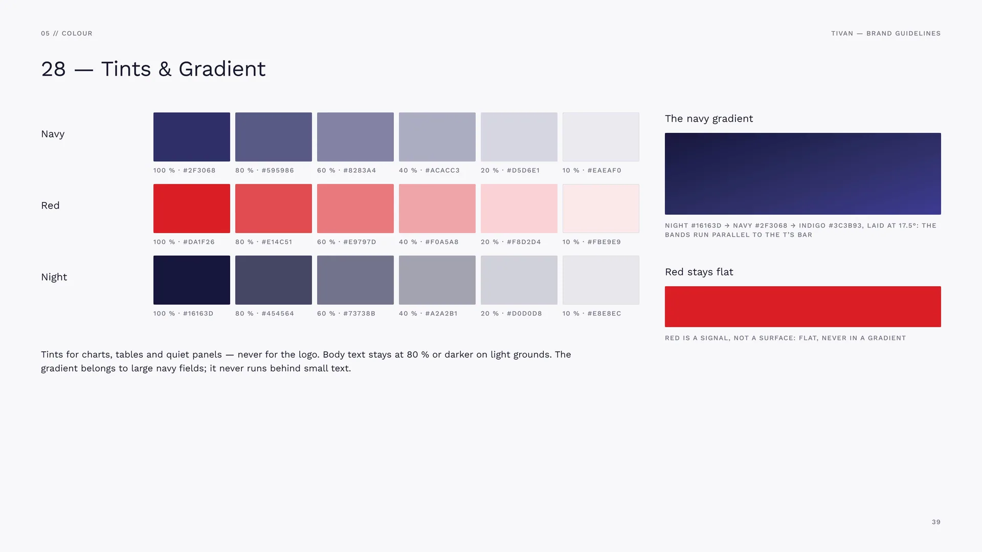
Navy: 100 % #2F3068 · 80 % #595986 · 60 % #8283A4 · 40 % #ACACC3 · 20 % #D5D6E1 · 10 % #EAEAF0.
Red: 100 % #DA1F26 · 80 % #E14C51 · 60 % #E9797D · 40 % #F0A5A8 · 20 % #F8D2D4 · 10 % #FBE9E9.
Night: 100 % #16163D · 80 % #454564 · 60 % #73738B · 40 % #A2A2B1 · 20 % #D0D0D8 · 10 % #E8E8EC.
Tints for charts, tables and quiet panels — never for the logo. Body text stays at 80 % or darker on light grounds. The gradient belongs to large navy fields; it never runs behind small text.
The navy gradient: Night #16163D → Navy #2F3068 → Indigo #3C3B93, laid at 17.5°: the bands run parallel to the T’s bar.
Red stays flat: Red is a signal, not a surface: flat, never in a gradient.
06
Typography
06.1
Typography
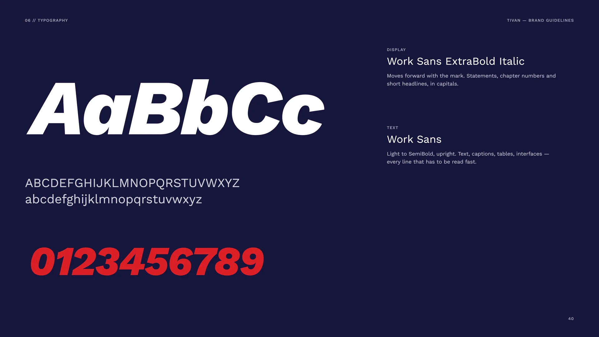
Display: Work Sans ExtraBold Italic. Moves forward with the mark. Statements, chapter numbers and short headlines, in capitals.
Text: Work Sans. Light to SemiBold, upright. Text, captions, tables, interfaces — every line that has to be read fast.
06.2
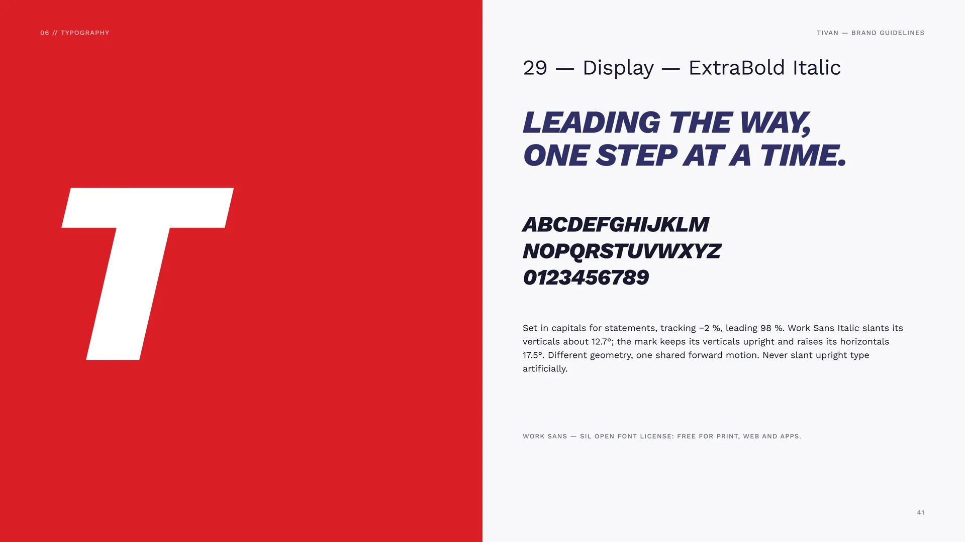
Display — ExtraBold Italic
Set in capitals for statements, tracking −2 %, leading 98 %. Work Sans Italic slants its verticals about 12.7°; the mark keeps its verticals upright and raises its horizontals 17.5°. Different geometry, one shared forward motion. Never slant upright type artificially.
Work Sans — SIL Open Font License: free for print, web and apps.
06.3
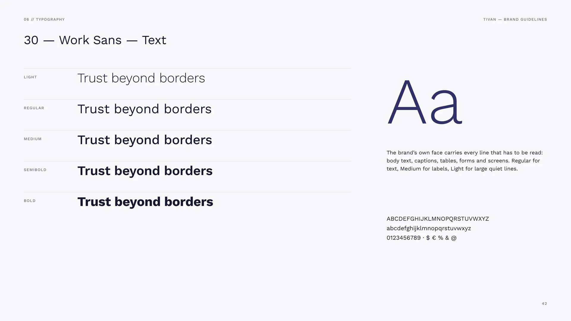
Work Sans — Text
Light · Regular · Medium · SemiBold · Bold.
The brand’s own face carries every line that has to be read: body text, captions, tables, forms and screens. Regular for text, Medium for labels, Light for large quiet lines.
06.4
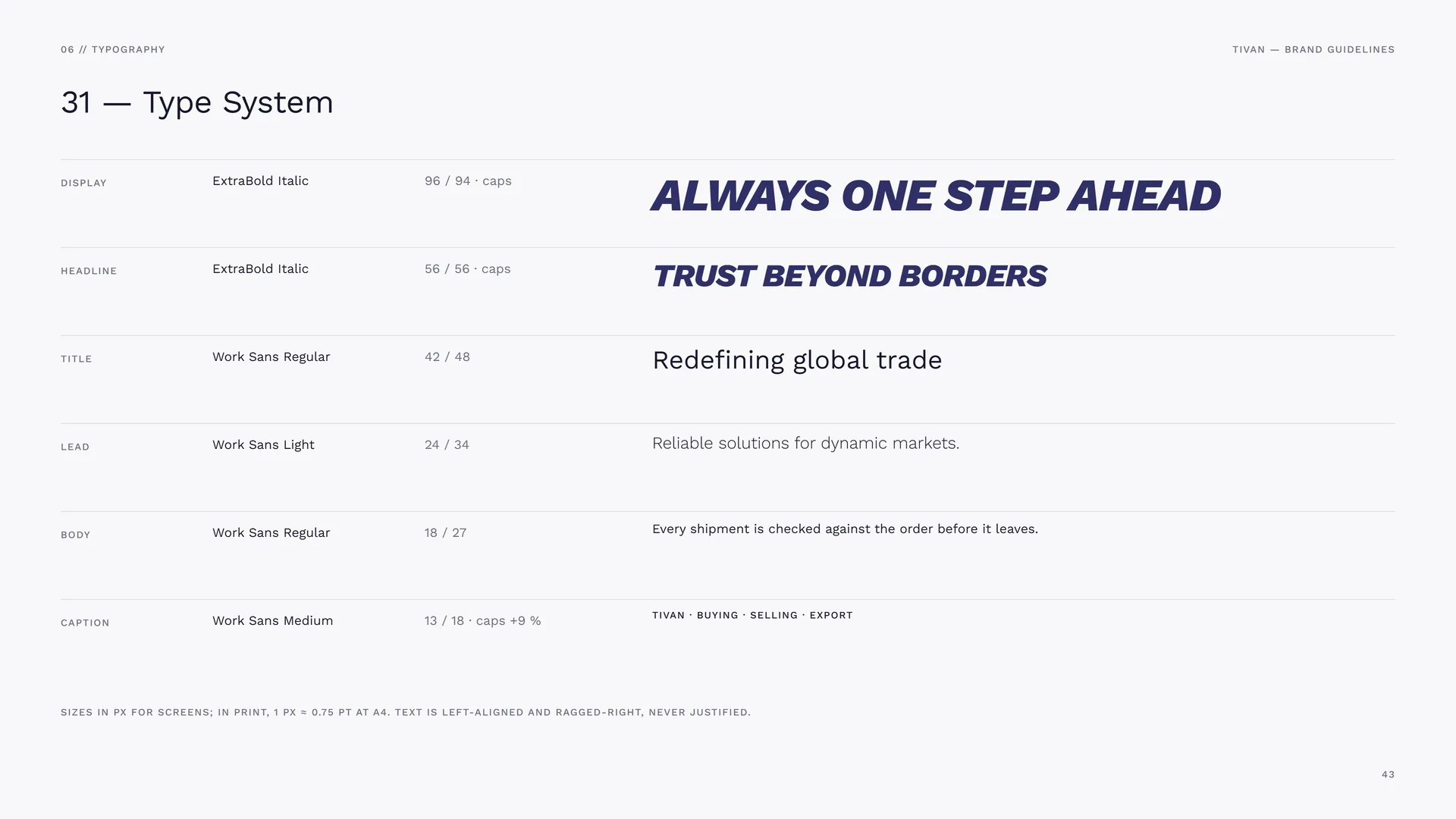
Type System
Display: ExtraBold Italic · 96 / 94 · caps.
Headline: ExtraBold Italic · 56 / 56 · caps.
Title: Work Sans Regular · 42 / 48.
Lead: Work Sans Light · 24 / 34.
Body: Work Sans Regular · 18 / 27.
Caption: Work Sans Medium · 13 / 18 · caps +9 %.
Sizes in px for screens; in print, 1 px ≈ 0.75 pt at A4. Text is left-aligned and ragged-right, never justified.
07
Graphic elements
- 07.1Line & plane
- 07.2The Line Mark
- 07.3The Tonal Planes
- 07.4How the Pattern Is Built
- 07.5The Master Pattern
- 07.6Pattern Rules
- 07.7Office wall, gift box and shopping bag
07.1
Line & plane
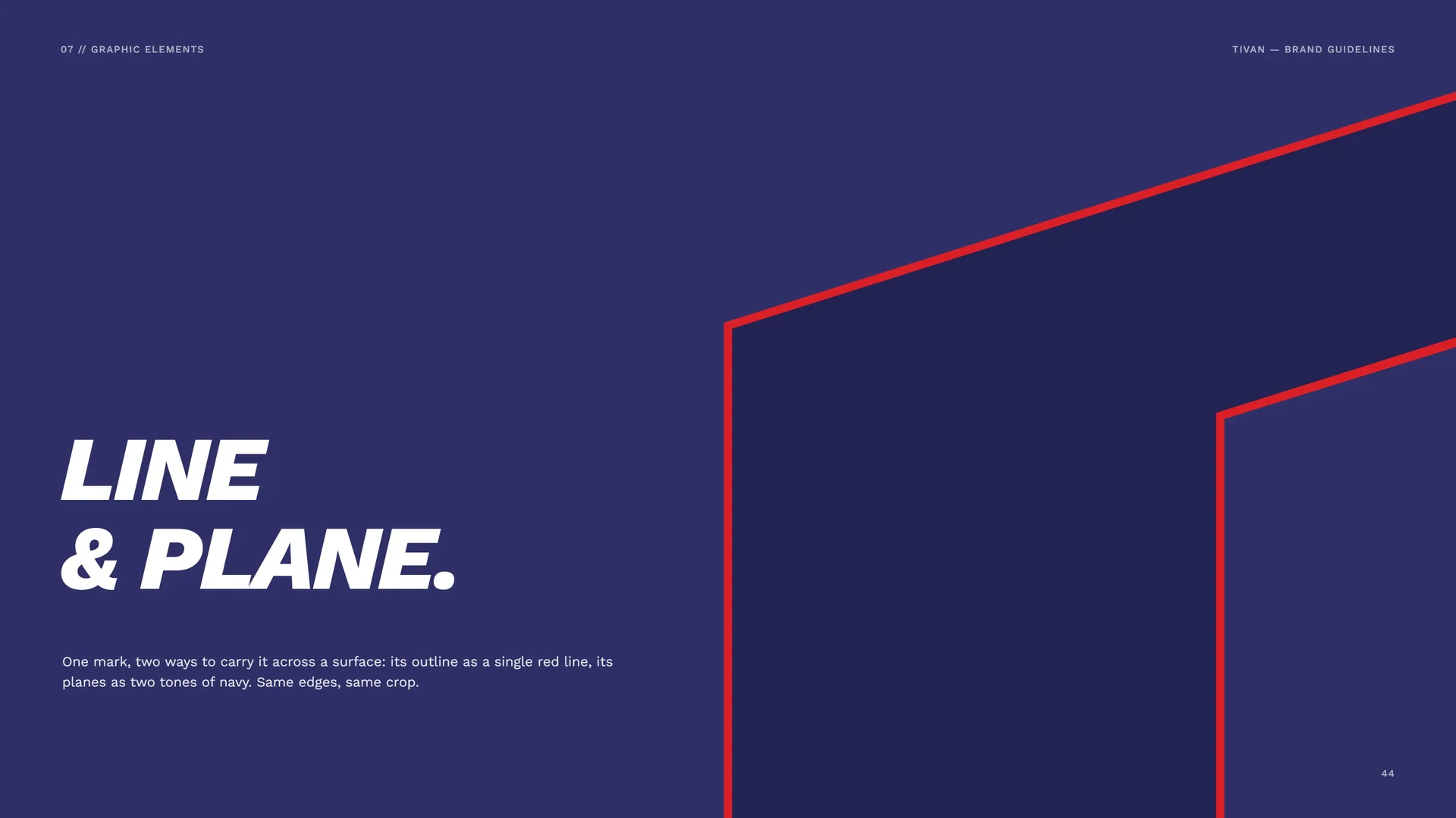
One mark, two ways to carry it across a surface: its outline as a single red line, its planes as two tones of navy. Same edges, same crop.
07.2
The Line Mark
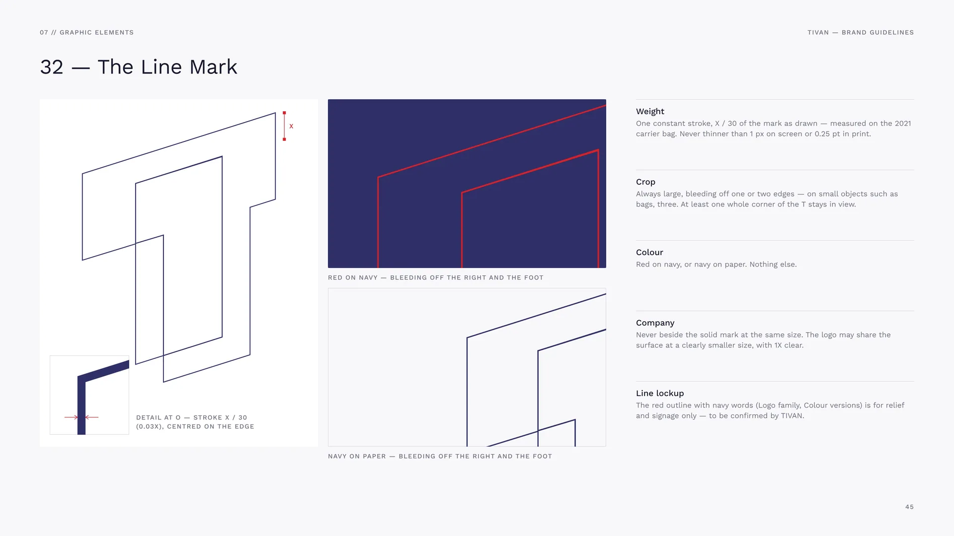
Red on navy — bleeding off the right and the foot.
Detail at O — stroke X / 30 (0.03X), centred on the edge.
Navy on paper — bleeding off the right and the foot.
Weight: One constant stroke, X / 30 of the mark as drawn — measured on the 2021 carrier bag. Never thinner than 1 px on screen or 0.25 pt in print.
Crop: Always large, bleeding off one or two edges — on small objects such as bags, three. At least one whole corner of the T stays in view.
Colour: Red on navy, or navy on paper. Nothing else.
Company: Never beside the solid mark at the same size. The logo may share the surface at a clearly smaller size, with 1X clear.
Line lockup: The red outline with navy words (Logo family, Colour versions) is for relief and signage only — to be confirmed by TIVAN.
07.3
The Tonal Planes
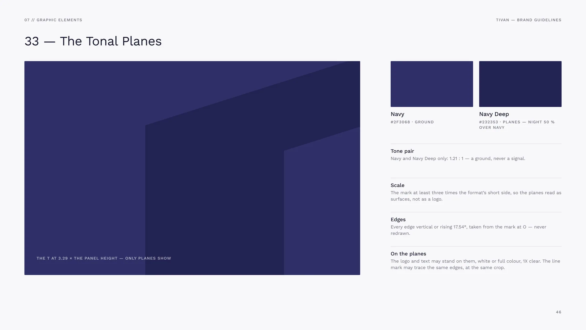
The T at 3.29 × the panel height — only planes show.
Navy: #2F3068 · ground.
Navy Deep: #232353 · planes — Night 50 % over Navy.
Tone pair: Navy and Navy Deep only: 1.21 : 1 — a ground, never a signal.
Scale: The mark at least three times the format’s short side, so the planes read as surfaces, not as a logo.
Edges: Every edge vertical or rising 17.54°, taken from the mark at O — never redrawn.
On the planes: The logo and text may stand on them, white or full colour, 1X clear. The line mark may trace the same edges, at the same crop.
07.4
How the Pattern Is Built
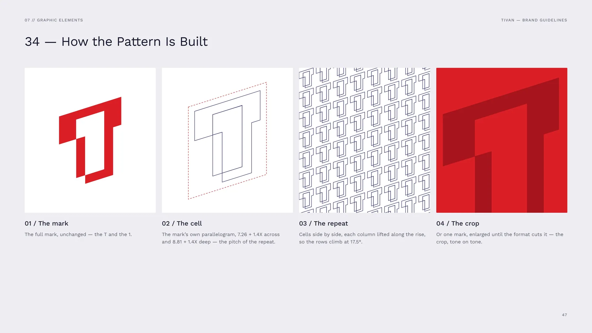
The mark: The full mark, unchanged — the T and the 1.
The cell: The mark’s own parallelogram, 7.26 + 1.4X across and 8.81 + 1.4X deep — the pitch of the repeat.
The repeat: Cells side by side, each column lifted along the rise, so the rows climb at 17.5°.
The crop: Or one mark, enlarged until the format cuts it — the crop, tone on tone.
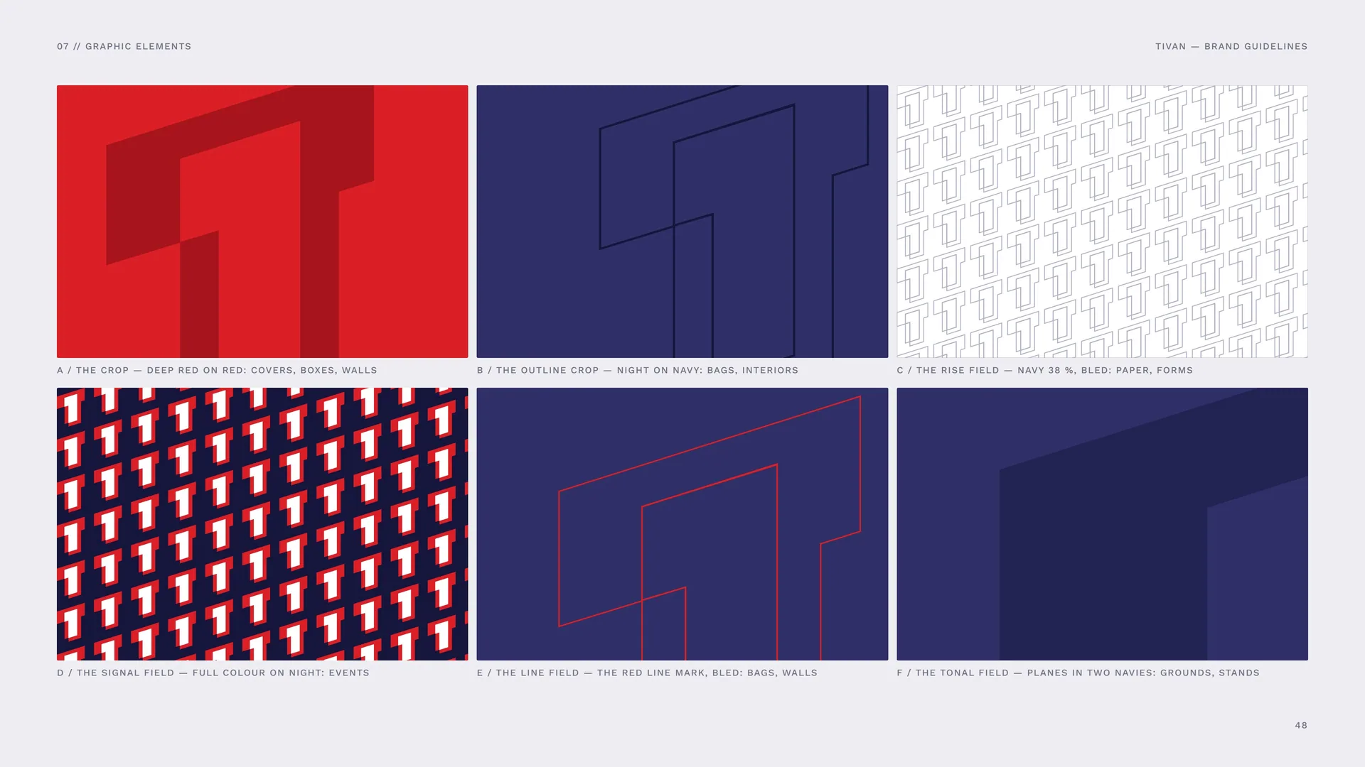
A / The crop — Deep Red on red: covers, boxes, walls.
B / The outline crop — Night on navy: bags, interiors.
C / The rise field — navy 38 %, bled: paper, forms.
D / The signal field — full colour on Night: events.
E / The line field — the red line mark, bled: bags, walls.
F / The tonal field — planes in two navies: grounds, stands.
07.5
The Master Pattern
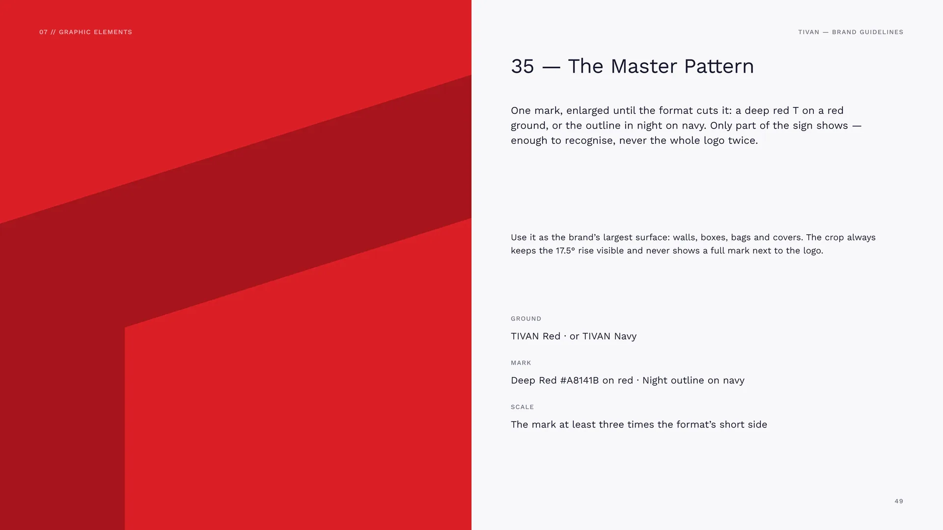
One mark, enlarged until the format cuts it: a deep red T on a red ground, or the outline in night on navy. Only part of the sign shows — enough to recognise, never the whole logo twice.
Use it as the brand’s largest surface: walls, boxes, bags and covers. The crop always keeps the 17.5° rise visible and never shows a full mark next to the logo.
Ground: TIVAN Red · or TIVAN Navy.
Mark: Deep Red #A8141B on red · Night outline on navy.
Scale: The mark at least three times the format’s short side.
07.6
Pattern Rules
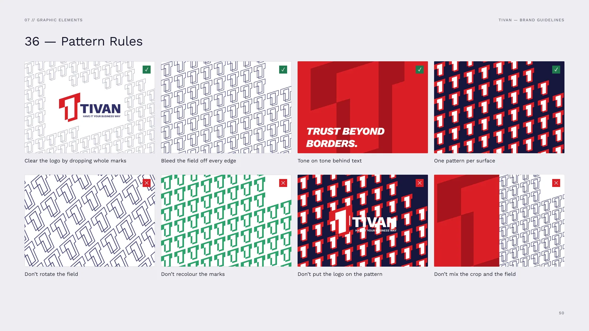
Clear the logo by dropping whole marks · Bleed the field off every edge · Tone on tone behind text · One pattern per surface.
Don’t rotate the field · Don’t recolour the marks · Don’t put the logo on the pattern · Don’t mix the crop and the field.
07.7
Office wall, gift box and shopping bag
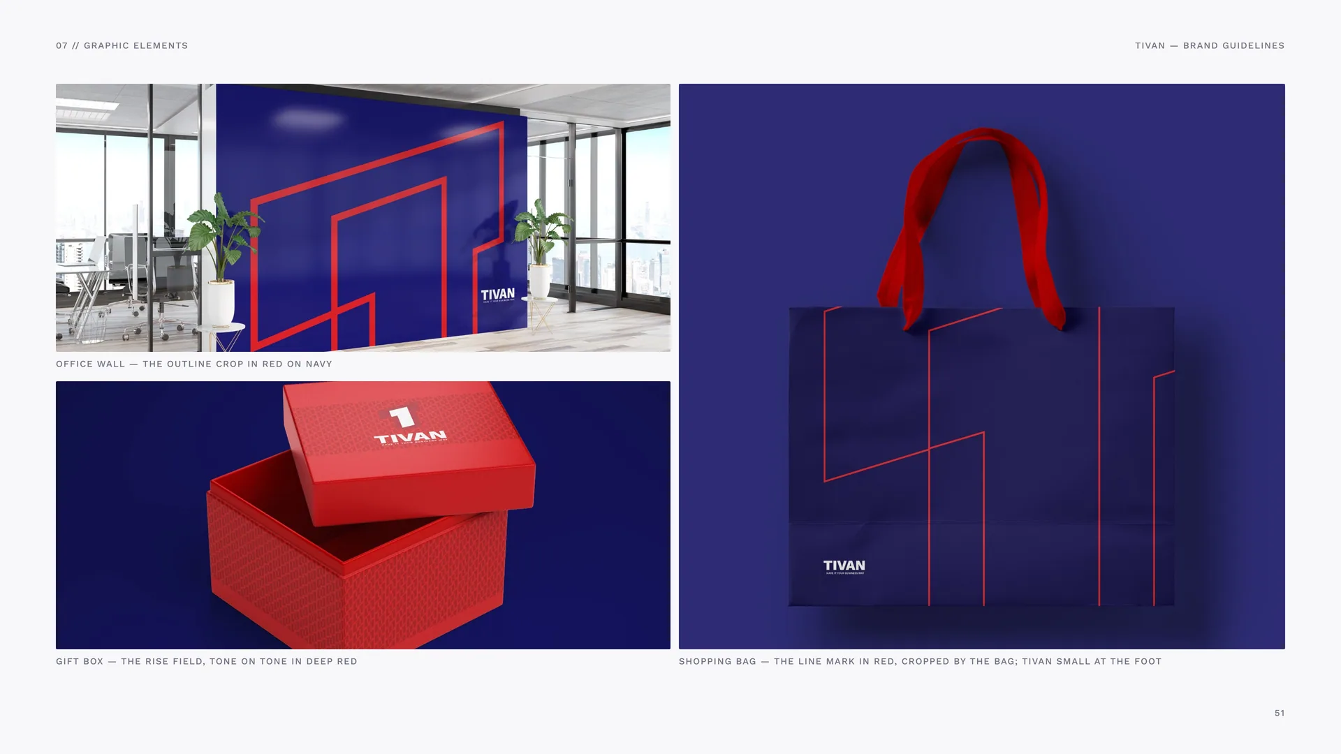
Office wall — the outline crop in red on navy.
Gift box — the rise field, tone on tone in Deep Red.
Shopping bag — the line mark in red, cropped by the bag; TIVAN small at the foot.
08
Imagery
08.1
Photography
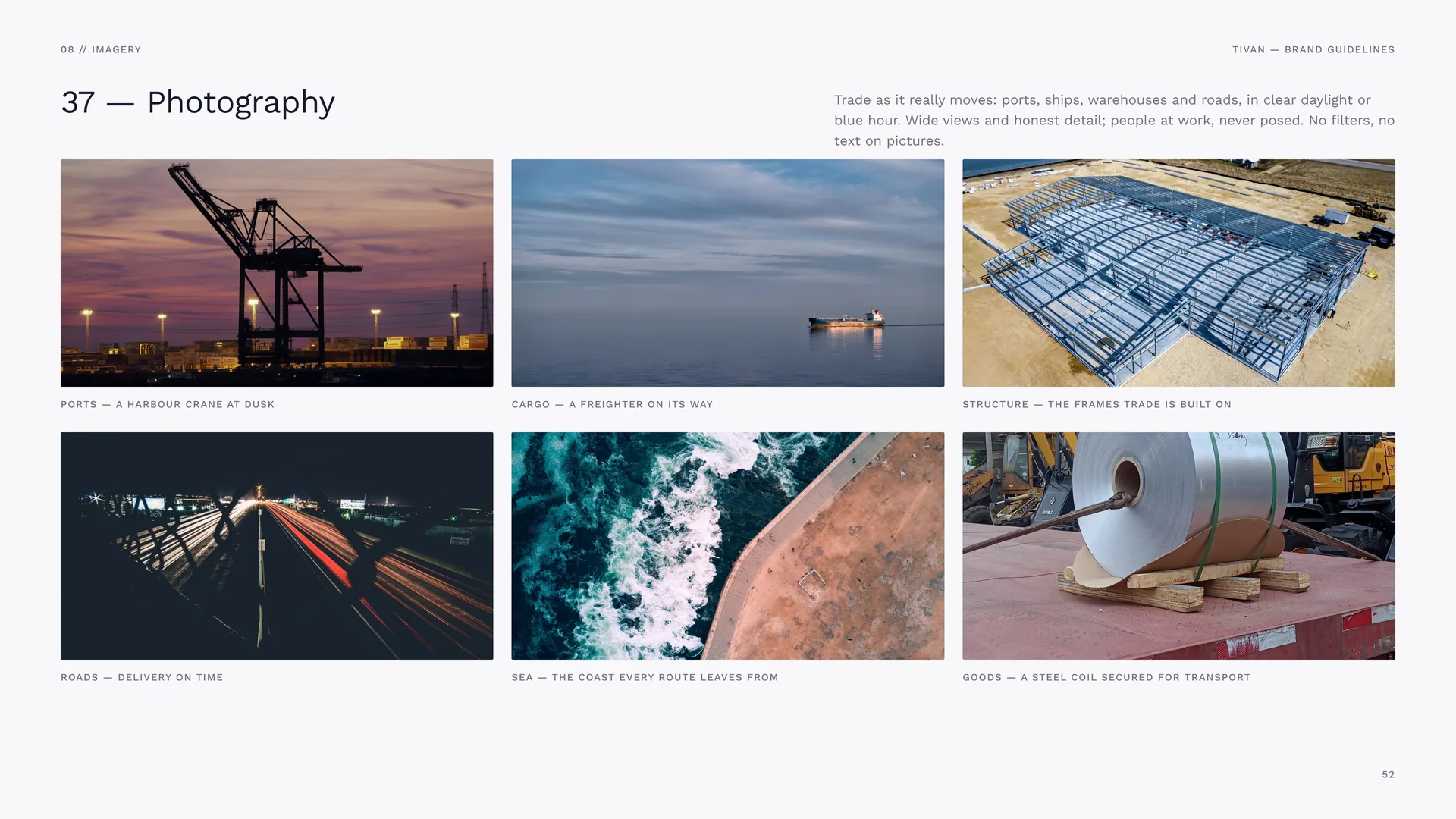
Trade as it really moves: ports, ships, warehouses and roads, in clear daylight or blue hour. Wide views and honest detail; people at work, never posed. No filters, no text on pictures.
Ports — a harbour crane at dusk.
Cargo — a freighter on its way.
Structure — the frames trade is built on.
Roads — delivery on time.
Sea — the coast every route leaves from.
Goods — a steel coil secured for transport.
09
Stationery
Cards, letterheads, envelopes and folders — navy, red and white paper.
09.1
Business Cards
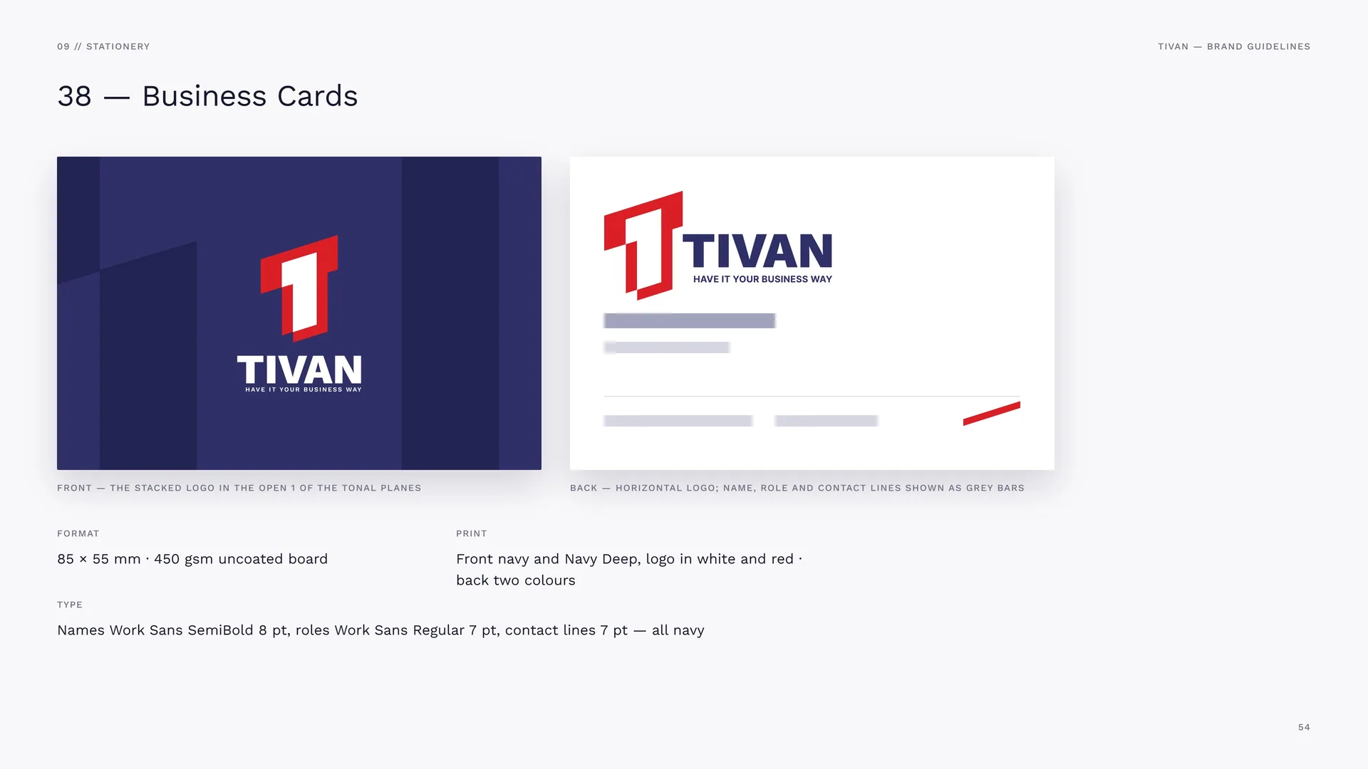
Front — the stacked logo in the open 1 of the tonal planes.
Back — horizontal logo; name, role and contact lines shown as grey bars.
Format: 85 × 55 mm · 450 gsm uncoated board.
Print: Front navy and Navy Deep, logo in white and red · back two colours.
Type: Names Work Sans SemiBold 8 pt, roles Work Sans Regular 7 pt, contact lines 7 pt — all navy.
09.2
Letterhead & Envelope
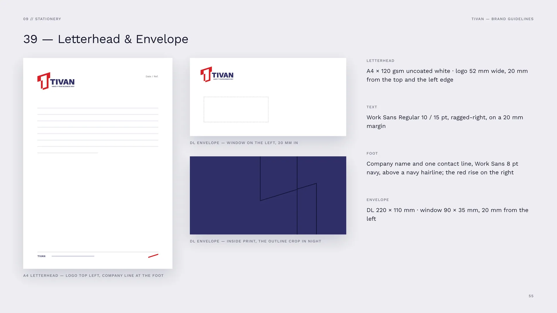
A4 letterhead — logo top left, company line at the foot.
DL envelope — window on the left, 20 mm in.
DL envelope — inside print, the outline crop in Night.
Letterhead: A4 × 120 gsm uncoated white · logo 52 mm wide, 20 mm from the top and the left edge.
Text: Work Sans Regular 10 / 15 pt, ragged-right, on a 20 mm margin.
Foot: Company name and one contact line, Work Sans 8 pt navy, above a navy hairline; the red rise on the right.
Envelope: DL 220 × 110 mm · window 90 × 35 mm, 20 mm from the left.
10
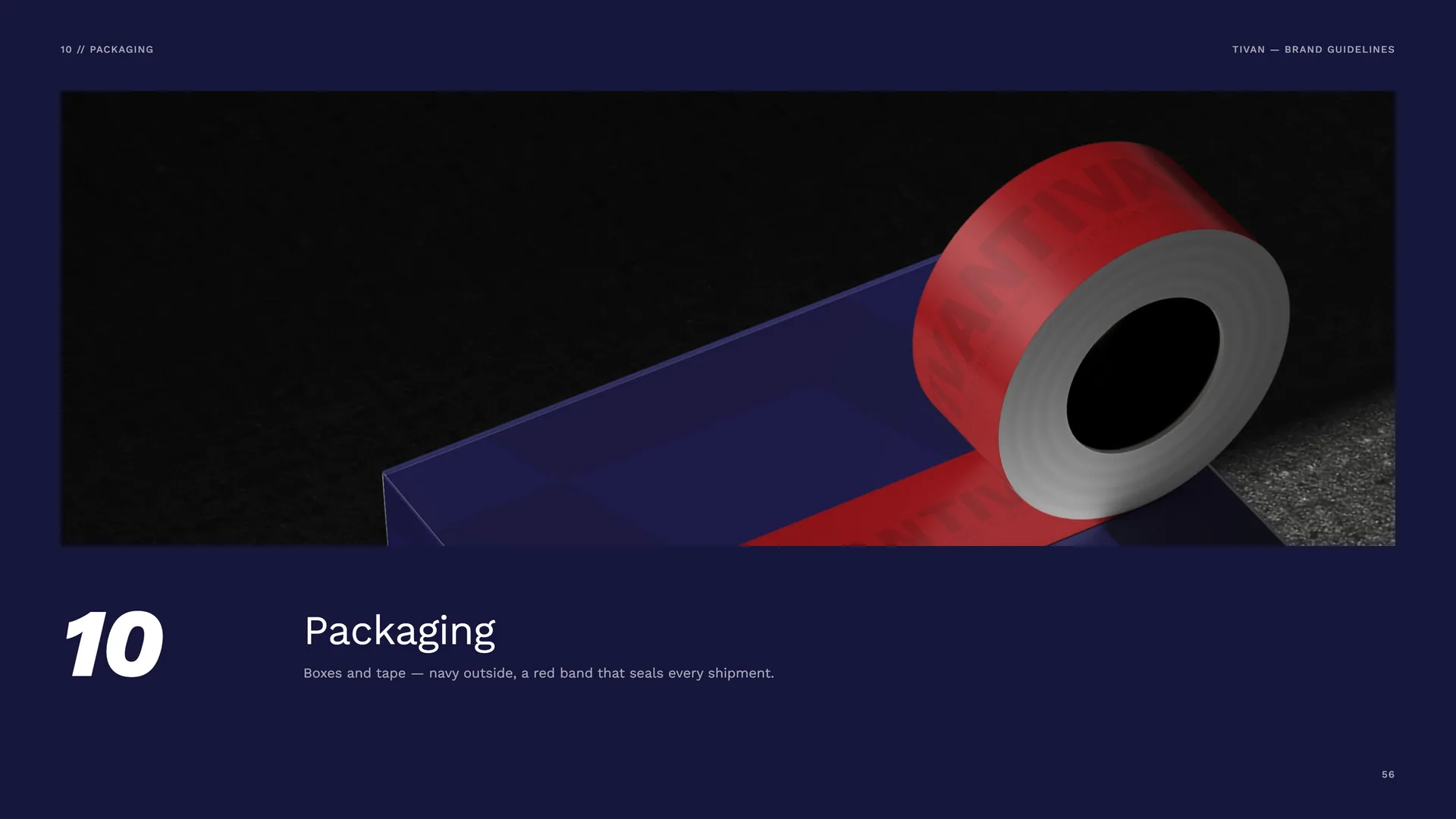
Packaging
Boxes and tape — navy outside, a red band that seals every shipment.
10.1
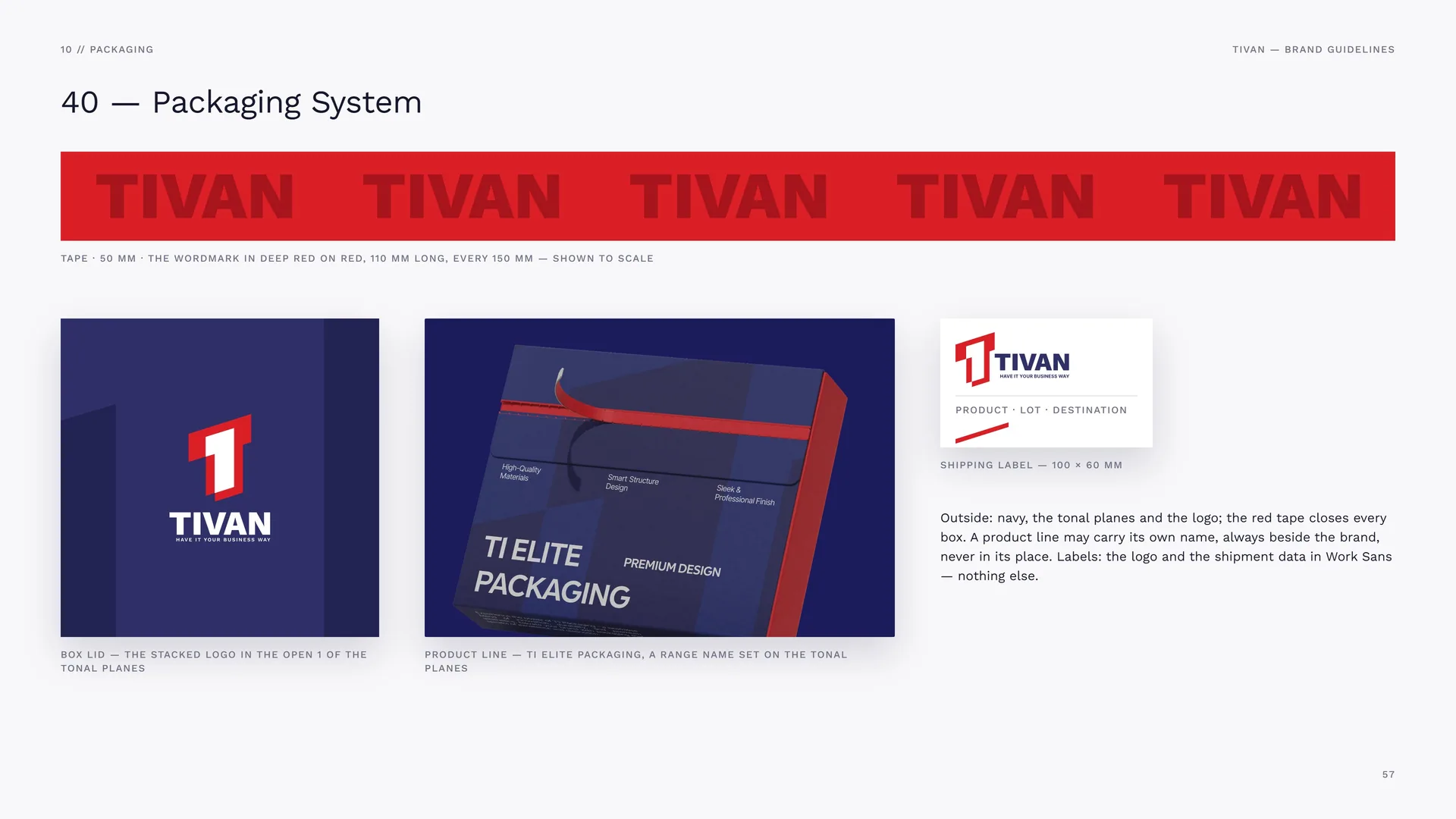
Packaging System
Tape · 50 mm · the wordmark in Deep Red on red, 110 mm long, every 150 mm — shown to scale.
Box lid — the stacked logo in the open 1 of the tonal planes.
Product line — TI ELITE packaging, a range name set on the tonal planes.
Shipping label — 100 × 60 mm.
Outside: navy, the tonal planes and the logo; the red tape closes every box. A product line may carry its own name, always beside the brand, never in its place. Labels: the logo and the shipment data in Work Sans — nothing else.
11
Digital media
Website, app and social — navy screens, red actions, real photography.
11.1
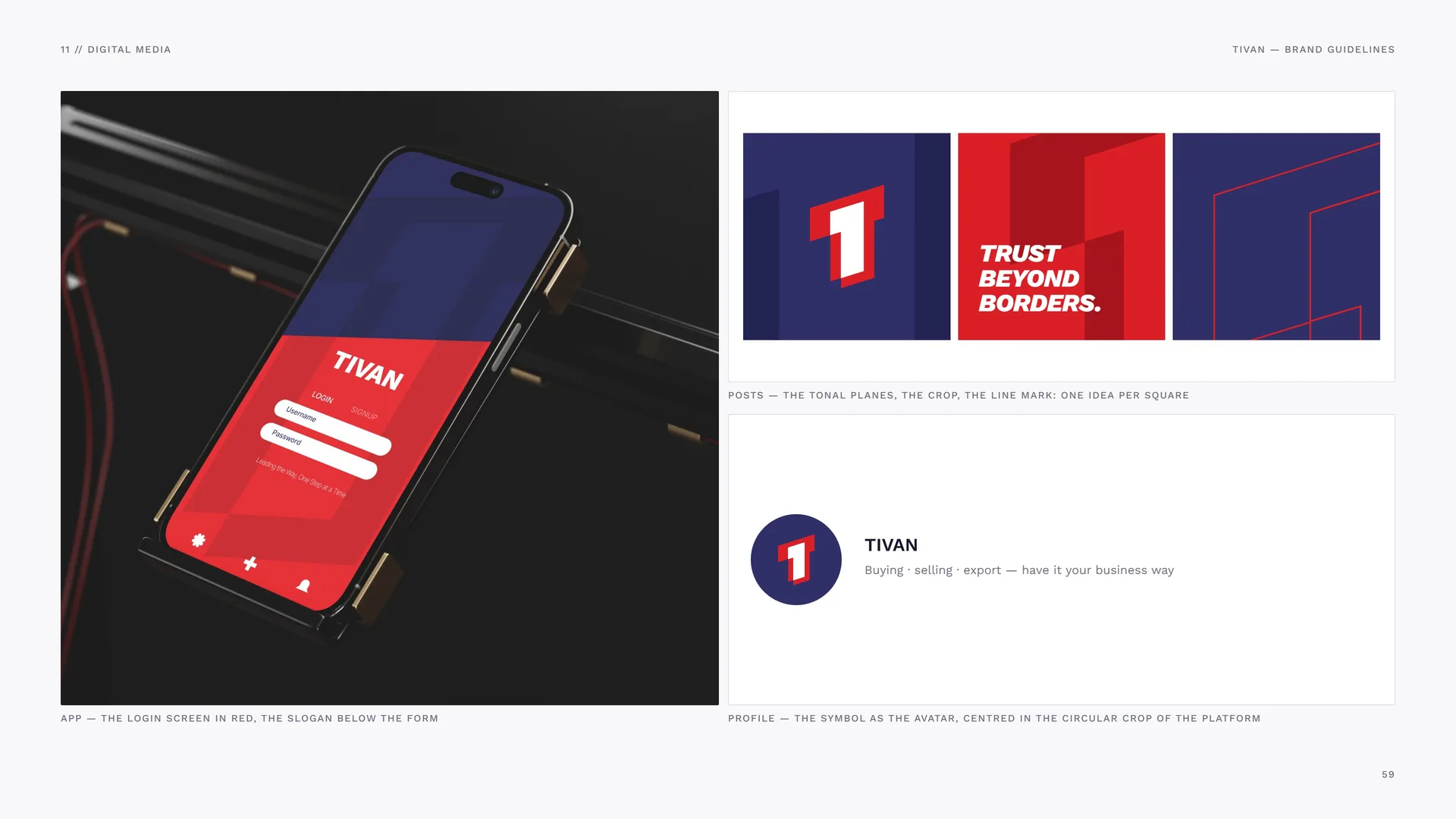
App, posts and profile
App — the login screen in red, the slogan below the form.
Posts — the tonal planes, the crop, the line mark: one idea per square.
Profile — the symbol as the avatar, centred in the circular crop of the platform.
11.2
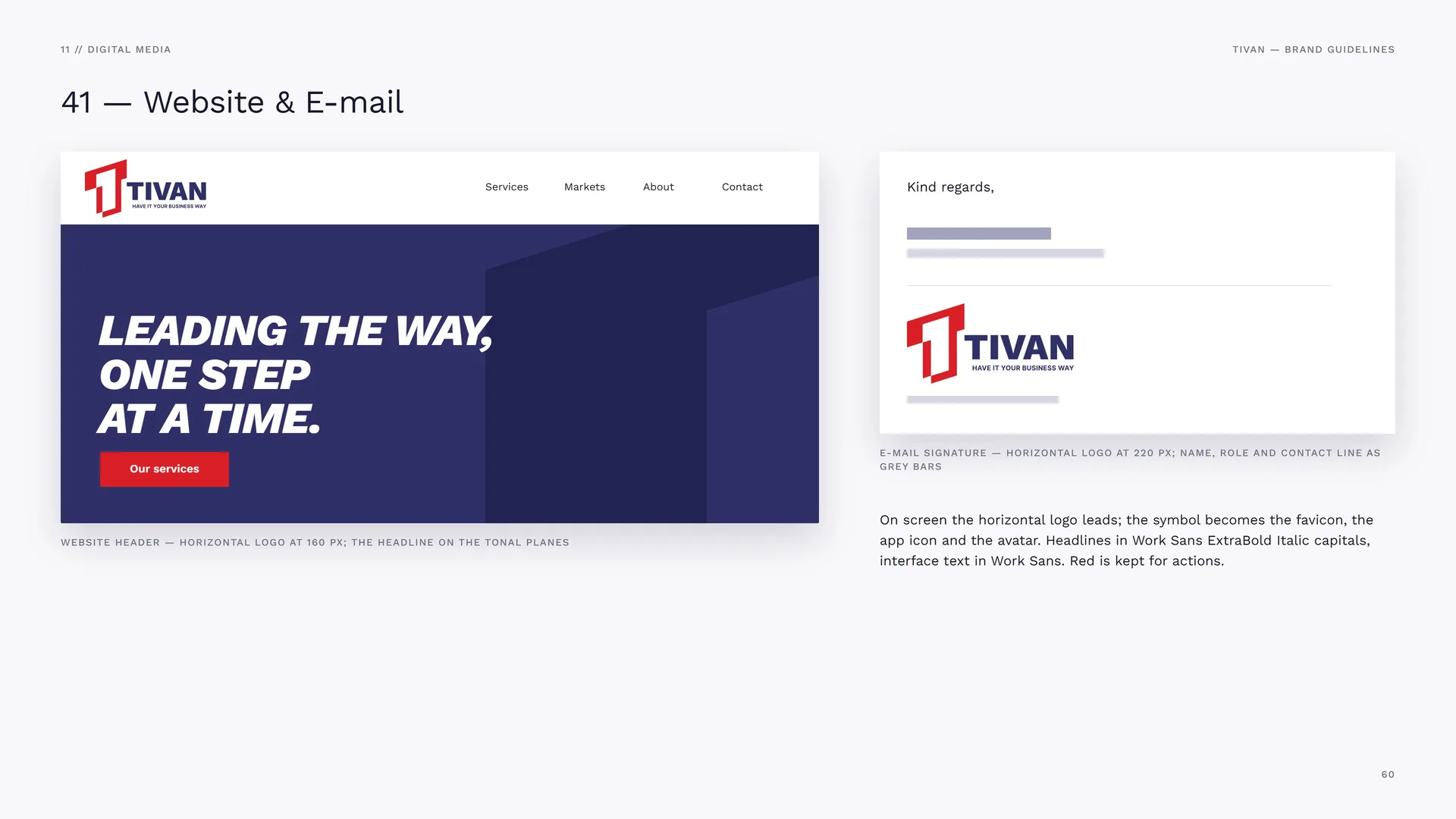
Website & E-mail
Website header — horizontal logo at 160 px; the headline on the tonal planes.
E-mail signature — horizontal logo at 220 px; name, role and contact line as grey bars.
On screen the horizontal logo leads; the symbol becomes the favicon, the app icon and the avatar. Headlines in Work Sans ExtraBold Italic capitals, interface text in Work Sans. Red is kept for actions.
12
Merchandise
Workwear and bags — the mark first, the wordmark small.
12.1
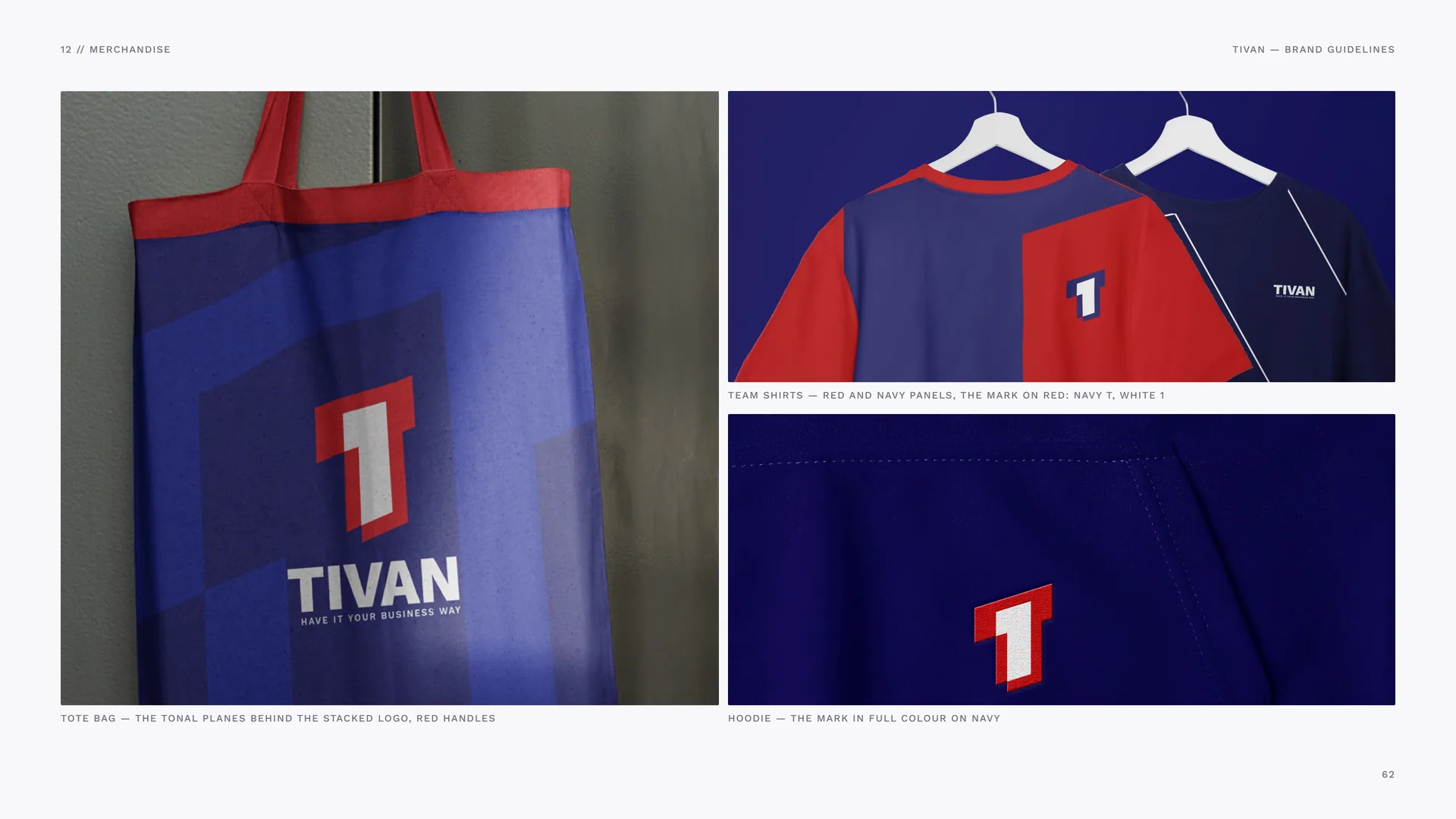
Merchandise
Tote bag — the tonal planes behind the stacked logo, red handles.
Team shirts — red and navy panels, the mark on red: navy T, white 1.
Hoodie — the mark in full colour on navy.
13
Signage & environment
Buildings, signs, containers and stands — the brand at the scale of trade.
- 13.1Head office, projecting sign and station poster
- 13.2Signage System
- 13.3Container Livery
- 13.4Exhibition Stand
- 13.5Campaign Posters
13.1
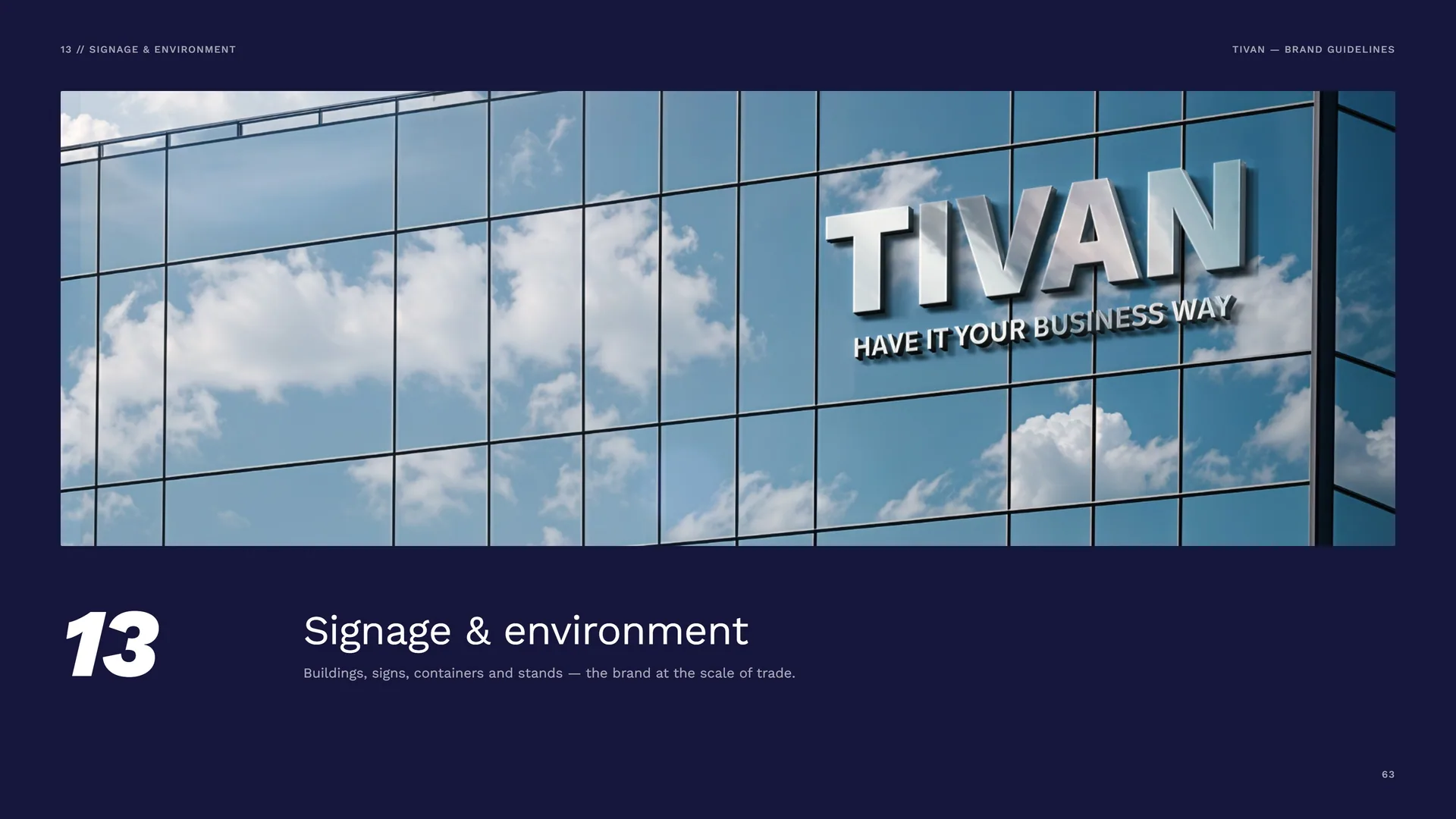
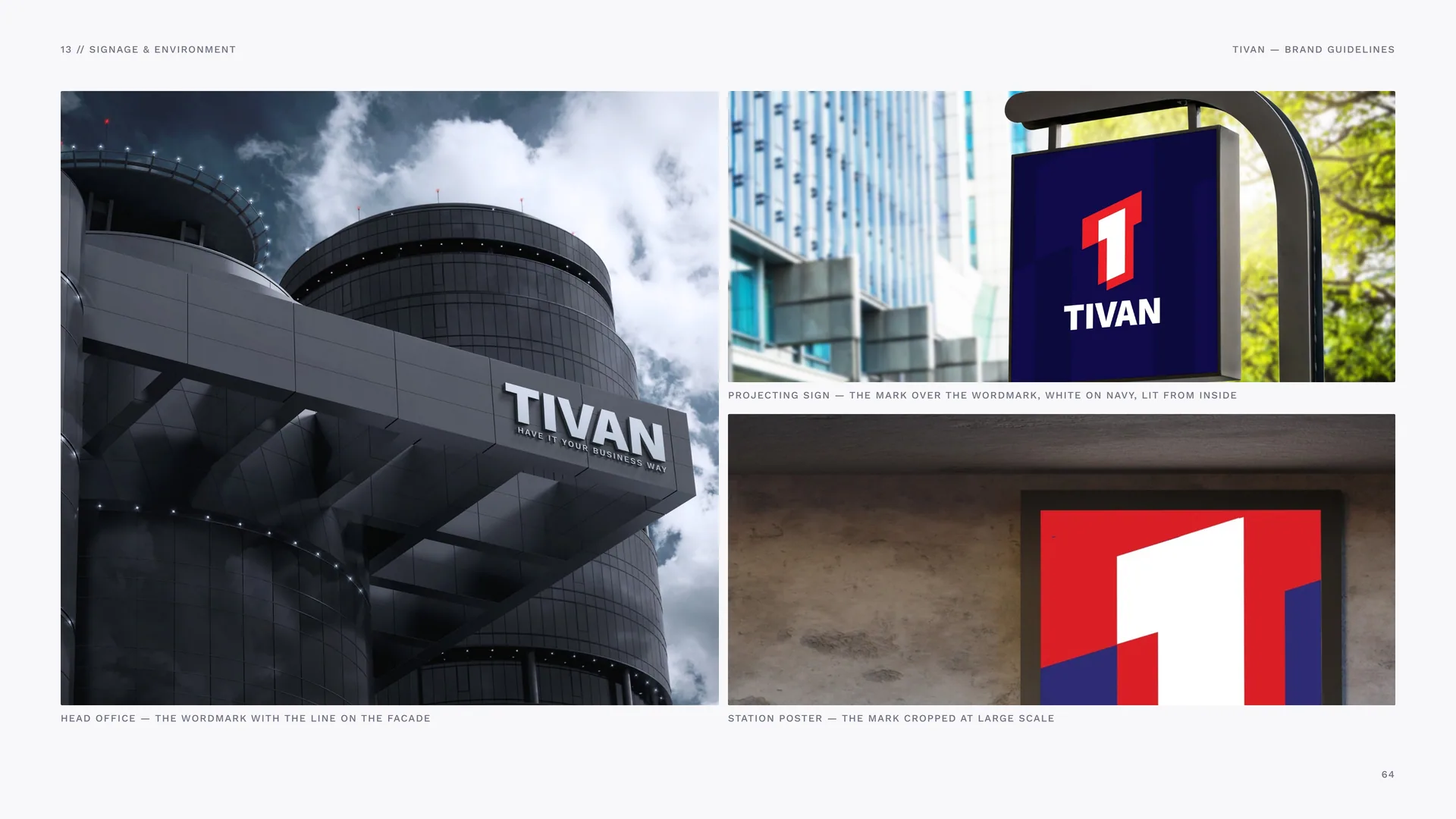
Head office, projecting sign and station poster
Head office — the wordmark with the line on the facade.
Projecting sign — the mark over the wordmark, white on navy, lit from inside.
Station poster — the mark cropped at large scale.
13.2
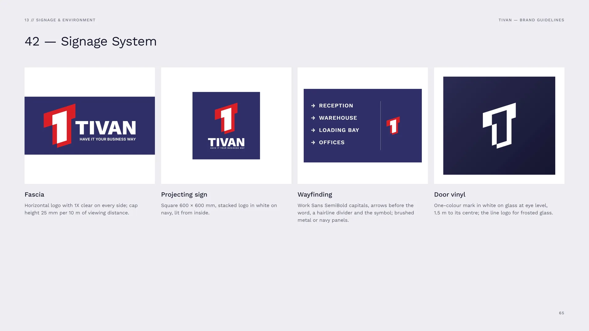
Signage System
Fascia: Horizontal logo with 1X clear on every side; cap height 25 mm per 10 m of viewing distance.
Projecting sign: Square 600 × 600 mm, stacked logo in white on navy, lit from inside.
Wayfinding: Work Sans SemiBold capitals, arrows before the word, a hairline divider and the symbol; brushed metal or navy panels.
Door vinyl: One-colour mark in white on glass at eye level, 1.5 m to its centre; the line logo for frosted glass.
13.3
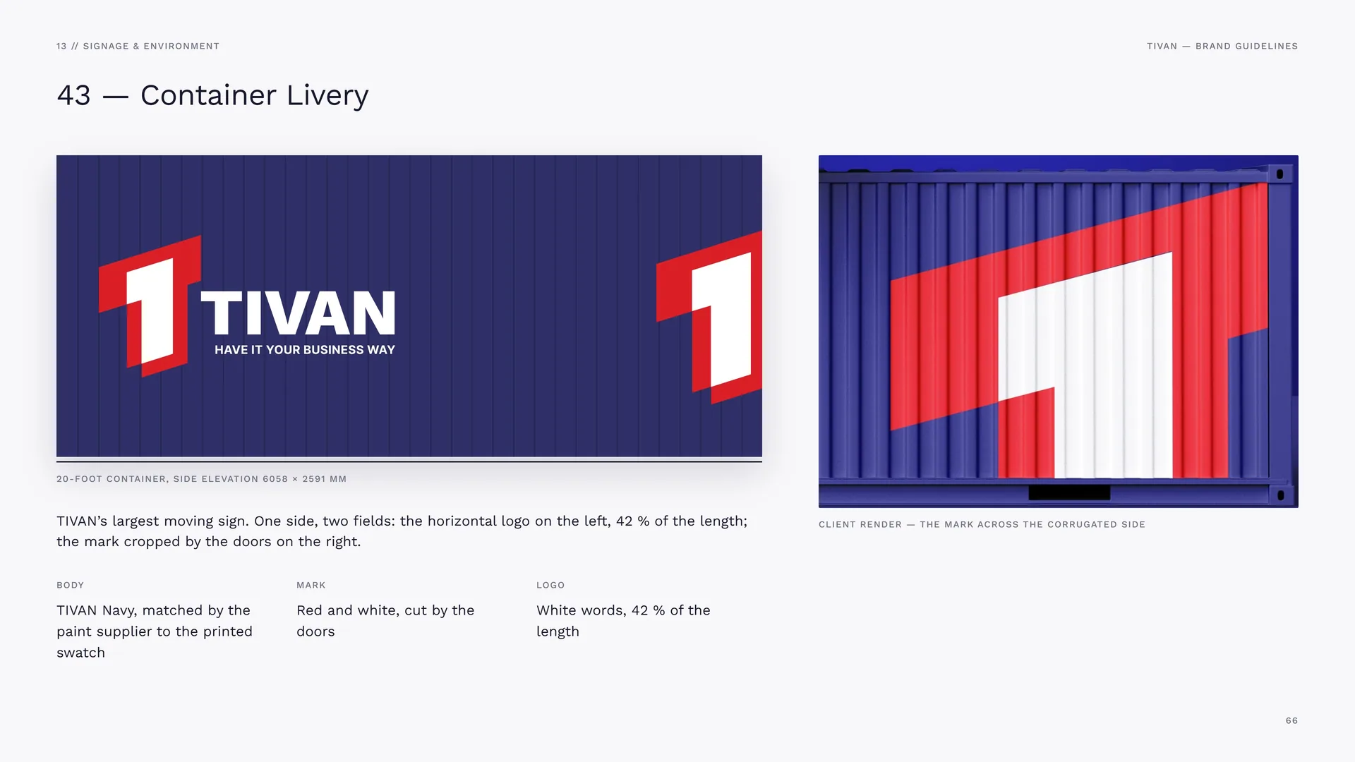
Container Livery
20-foot container, side elevation 6058 × 2591 mm.
TIVAN’s largest moving sign. One side, two fields: the horizontal logo on the left, 42 % of the length; the mark cropped by the doors on the right.
Body: TIVAN Navy, matched by the paint supplier to the printed swatch.
Mark: Red and white, cut by the doors.
Logo: White words, 42 % of the length.
Client render — the mark across the corrugated side.
13.4
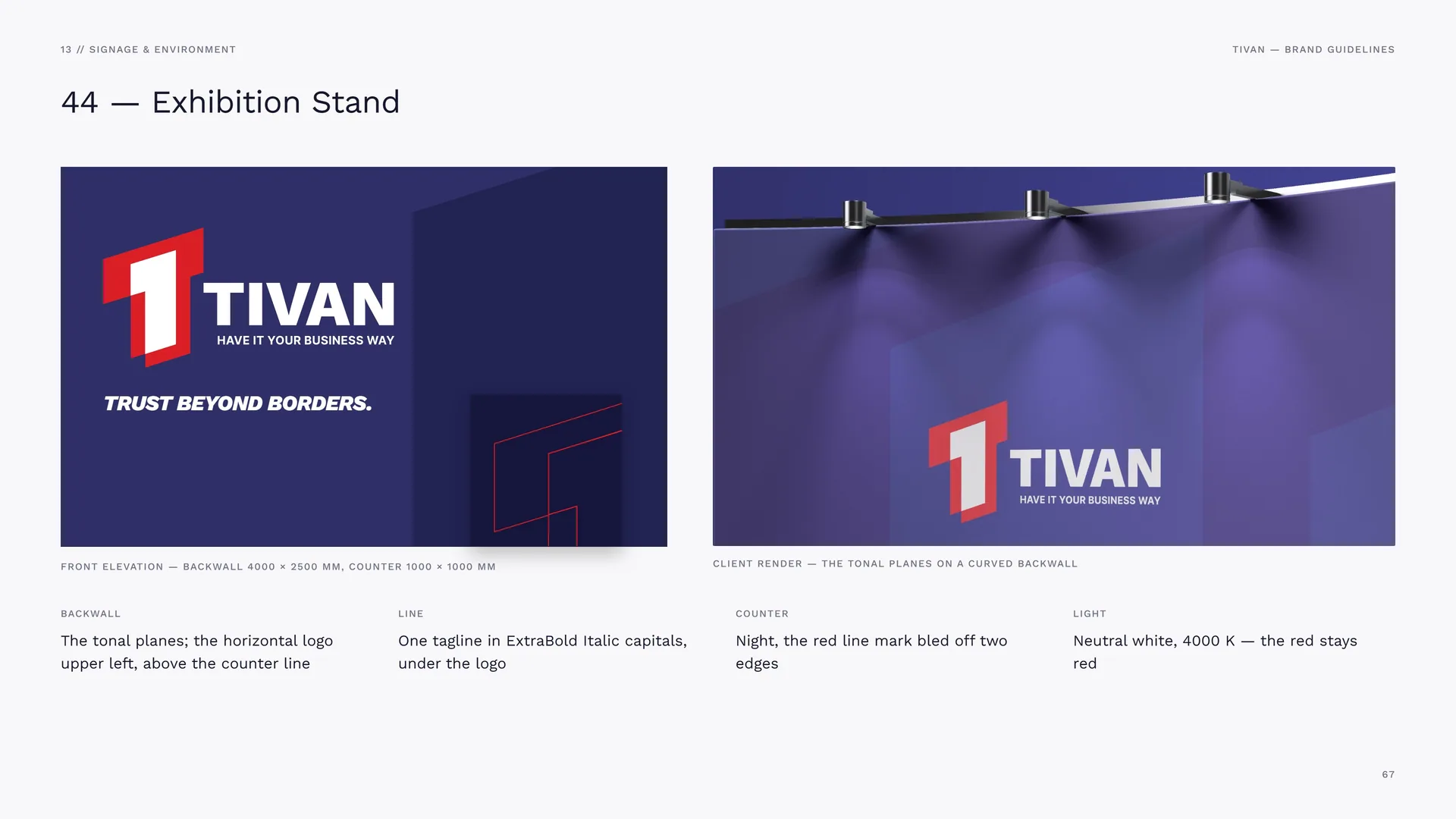
Exhibition Stand
Front elevation — backwall 4000 × 2500 mm, counter 1000 × 1000 mm.
Client render — the tonal planes on a curved backwall.
Backwall: The tonal planes; the horizontal logo upper left, above the counter line.
Line: One tagline in ExtraBold Italic capitals, under the logo.
Counter: Night, the red line mark bled off two edges.
Light: Neutral white, 4000 K — the red stays red.
13.5
Campaign Posters
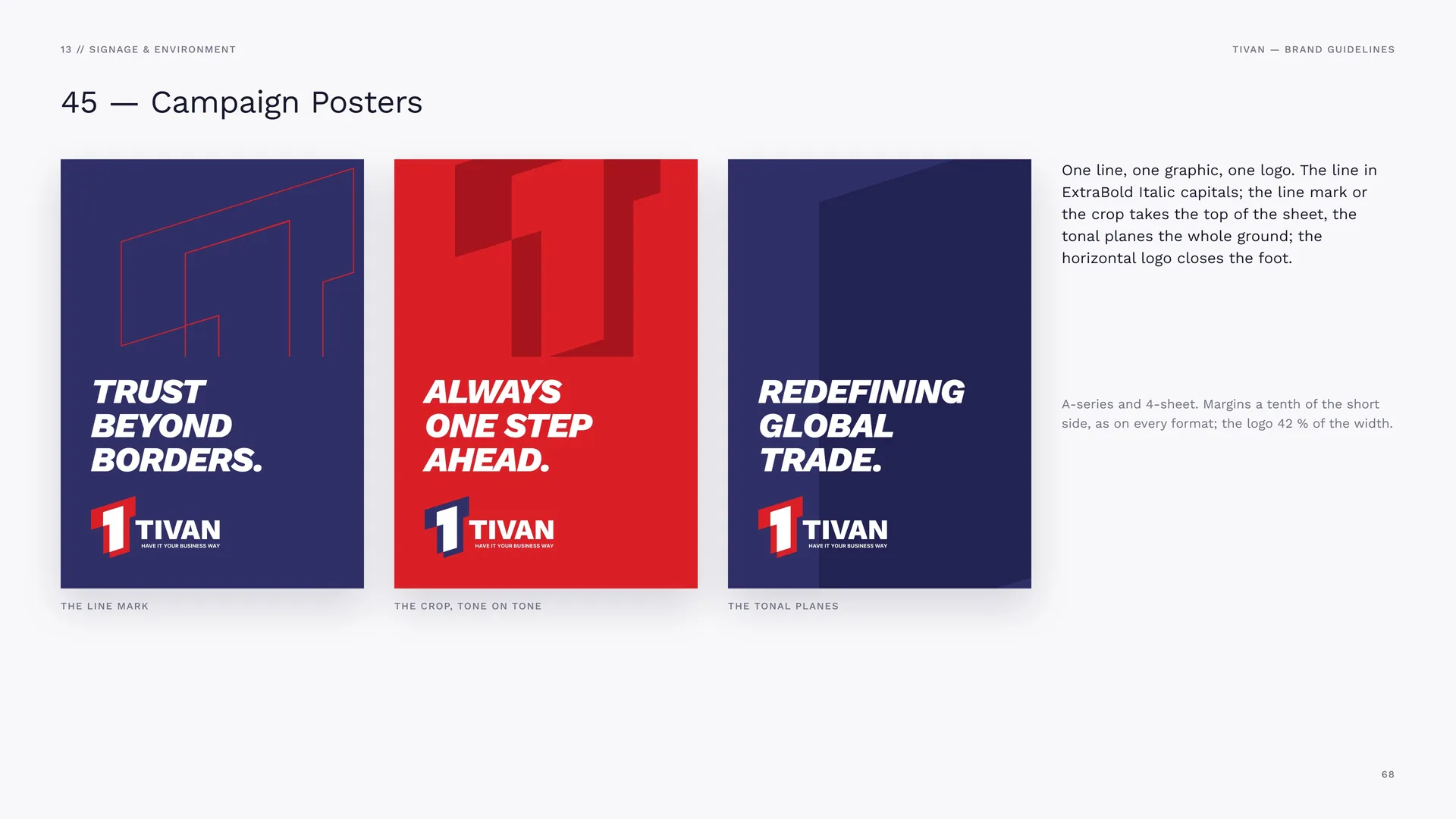
The line mark · The crop, tone on tone · The tonal planes.
One line, one graphic, one logo. The line in ExtraBold Italic capitals; the line mark or the crop takes the top of the sheet, the tonal planes the whole ground; the horizontal logo closes the foot.
A-series and 4-sheet. Margins a tenth of the short side, as on every format; the logo 42 % of the width.
14
Files & contact
14.1
Files & Contact
Logo files: Horizontal, short horizontal, stacked, symbol, wordmark — full colour, on red, one colour (navy, white, black), line.
Formats: AI and EPS for print · SVG and PNG for screens · PDF for office use.
Colour: CMYK coated for print · RGB / HEX for screens.
Font: Work Sans (SIL Open Font License).
Graphics: The line mark, the tonal planes, the crop, the outline crop and the fields as vector files and seamless PNG tiles.
Photography: Brand images and mockups; stock pictures in this guide: Wikimedia Commons, CC0 / public domain.
Identity by Studio Mouneskhah, 2021 · this guide, version 1.0, November 2026.
14.2
Thank you
Have it your business way.