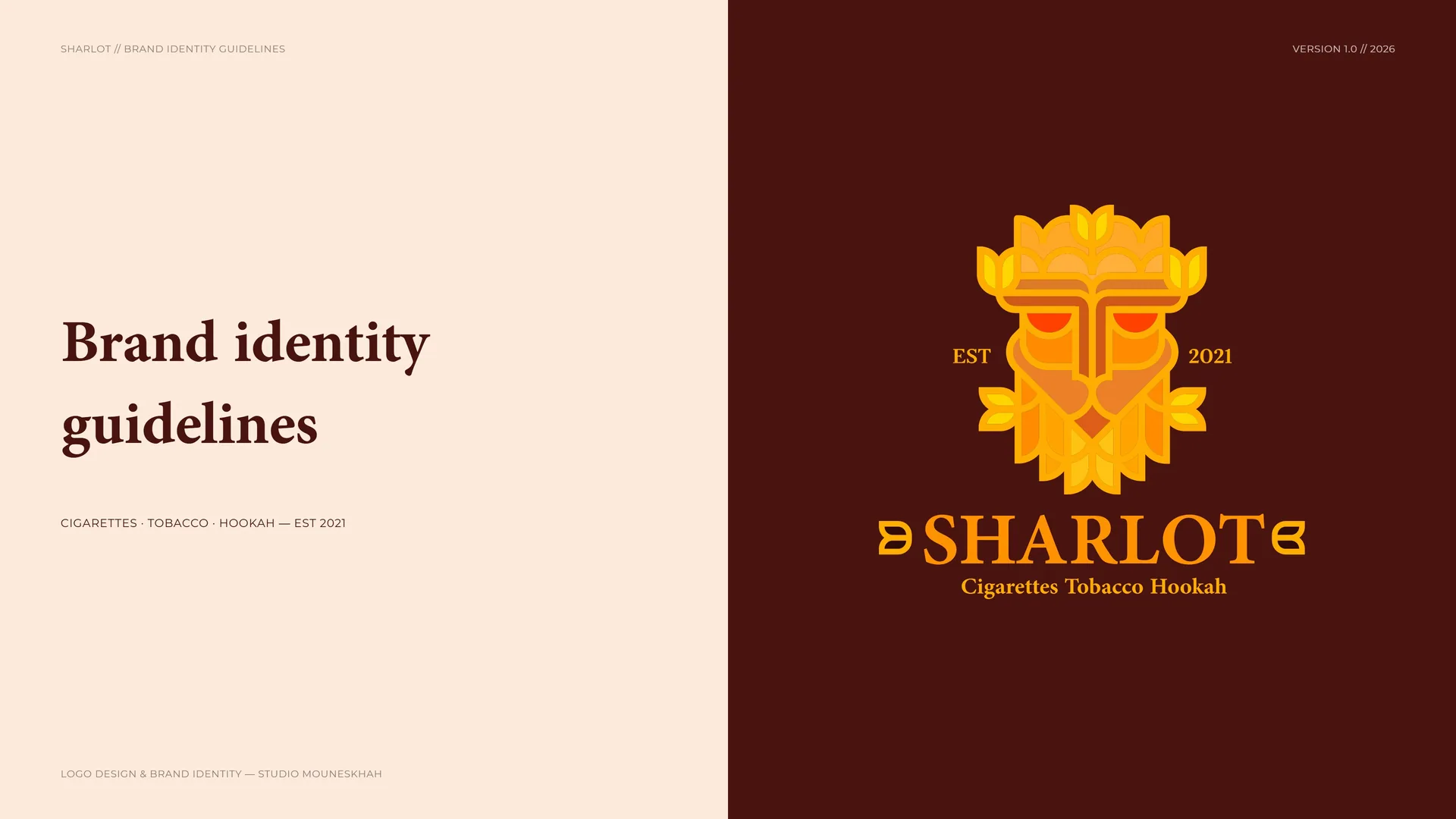
SHARLOT Brand Identity Guidelines
Sharlot is a distinguished international brand for the sale and export of premium tobacco and hookah products — positioned not merely as a commodity, but as a global symbol of luxury, structural integrity and unwavering quality.
Its foundation is the synthesis of nature and authority: the organic essence of the tobacco leaf merged with the commanding presence of a lion.
- Ano
- 2021
- Cliente
- SHARLOT
- Setor
- Premium tobacco and hookah products, international sale and export
- Serviços
- Identidade visual
- Projeto
- Brand Identity Guidelines · v1.0 · 2026
00
Introduction
00.1
Brand Concept
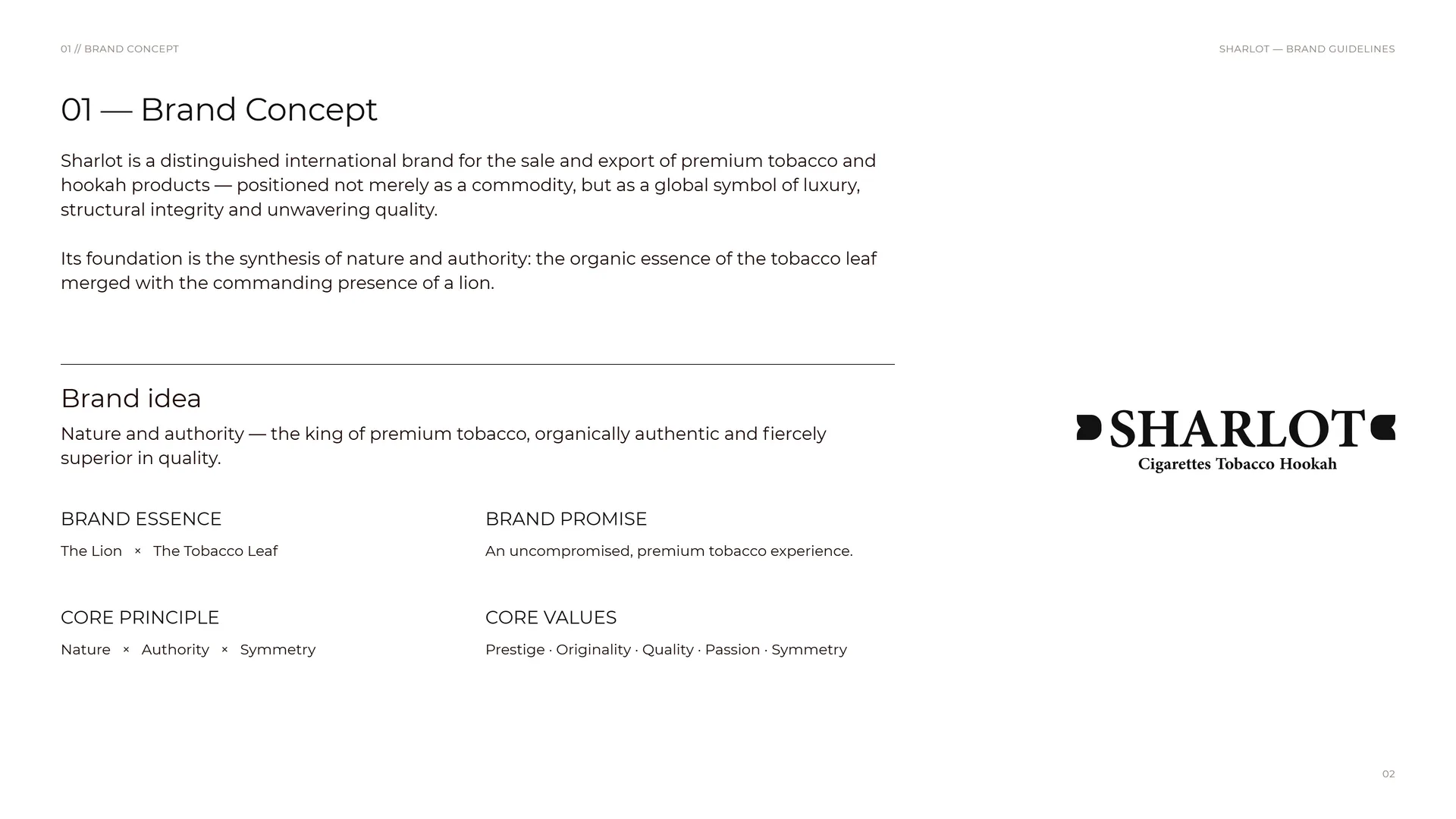
Sharlot is a distinguished international brand for the sale and export of premium tobacco and hookah products — positioned not merely as a commodity, but as a global symbol of luxury, structural integrity and unwavering quality.
Its foundation is the synthesis of nature and authority: the organic essence of the tobacco leaf merged with the commanding presence of a lion.
Brand idea: Nature and authority — the king of premium tobacco, organically authentic and fiercely superior in quality.
Brand essence: The Lion × The Tobacco Leaf.
Brand promise: An uncompromised, premium tobacco experience.
Core principle: Nature × Authority × Symmetry.
Core values: Prestige · Originality · Quality · Passion · Symmetry.
00.2
The Brand Problem
Positioned not merely as a commodity, Sharlot needed a visual presence that matches the uncompromised calibre of its products — so it partnered with Studio Mouneskhah to engineer a complete identity system.
The challenge: A visual presence that matches the uncompromised calibre of premium tobacco and hookah products.
Brand positioning: An international brand for the sale and export of premium tobacco and hookah products.
The opportunity: Step beyond the commodity: a global symbol of luxury, structural integrity and unwavering quality.
The shift: From product on a shelf → to the king of premium tobacco.
00.3
Primary logo
01
Brand
- 01.1History of the brand
- 01.2Mission & vision
- 01.3Brand values
- 01.4Tone of Voice
- 01.5Logo in motion
- 01.6What Sharlot offers
01.1
History of the brand
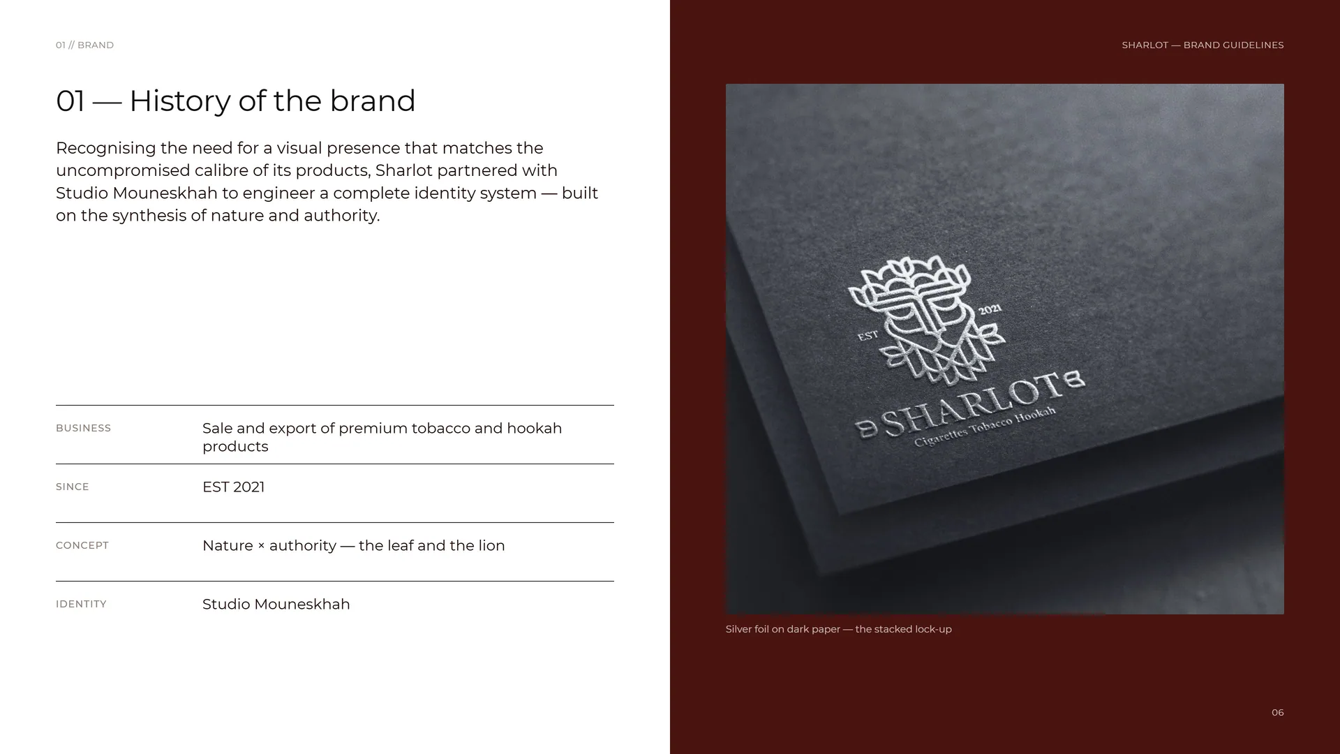
Recognising the need for a visual presence that matches the uncompromised calibre of its products, Sharlot partnered with Studio Mouneskhah to engineer a complete identity system — built on the synthesis of nature and authority.
Business: Sale and export of premium tobacco and hookah products.
Since: EST 2021.
Concept: Nature × authority — the leaf and the lion.
Identity: Studio Mouneskhah.
Silver foil on dark paper — the stacked lock-up.
01.2
Mission & vision
Mission: To deliver an uncompromised, premium tobacco experience to the international market — rooted in absolute reliability, security and honesty, while fostering a passionate and inviting connection with our consumers.
Vision: To stand globally as the paramount symbol of luxury, power and prestige in the premium tobacco industry — recognised for unyielding originality and decisive market authority.
01.3
Brand values
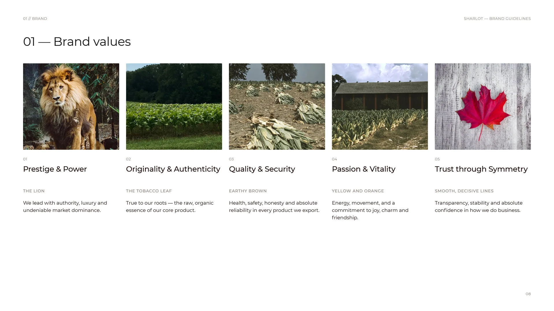
Prestige & Power — The lion: We lead with authority, luxury and undeniable market dominance.
Originality & Authenticity — The tobacco leaf: True to our roots — the raw, organic essence of our core product.
Quality & Security — Earthy brown: Health, safety, honesty and absolute reliability in every product we export.
Passion & Vitality — Yellow and orange: Energy, movement, and a commitment to joy, charm and friendship.
Trust through Symmetry — Smooth, decisive lines: Transparency, stability and absolute confidence in how we do business.
01.4
Tone of Voice
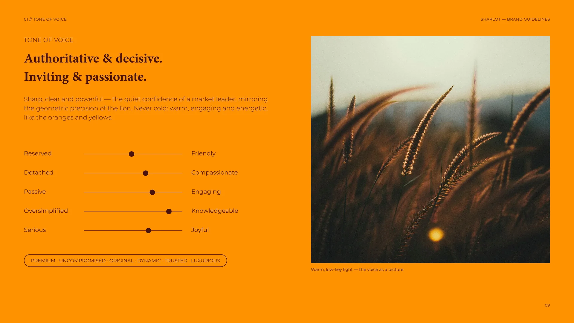
Authoritative & decisive. Inviting & passionate.
Sharp, clear and powerful — the quiet confidence of a market leader, mirroring the geometric precision of the lion. Never cold: warm, engaging and energetic, like the oranges and yellows.
Reserved · Detached · Passive · Oversimplified · Serious.
Friendly · Compassionate · Engaging · Knowledgeable · Joyful.
Premium · Uncompromised · Original · Dynamic · Trusted · Luxurious.
Warm, low-key light — the voice as a picture.
01.5
Logo in motion
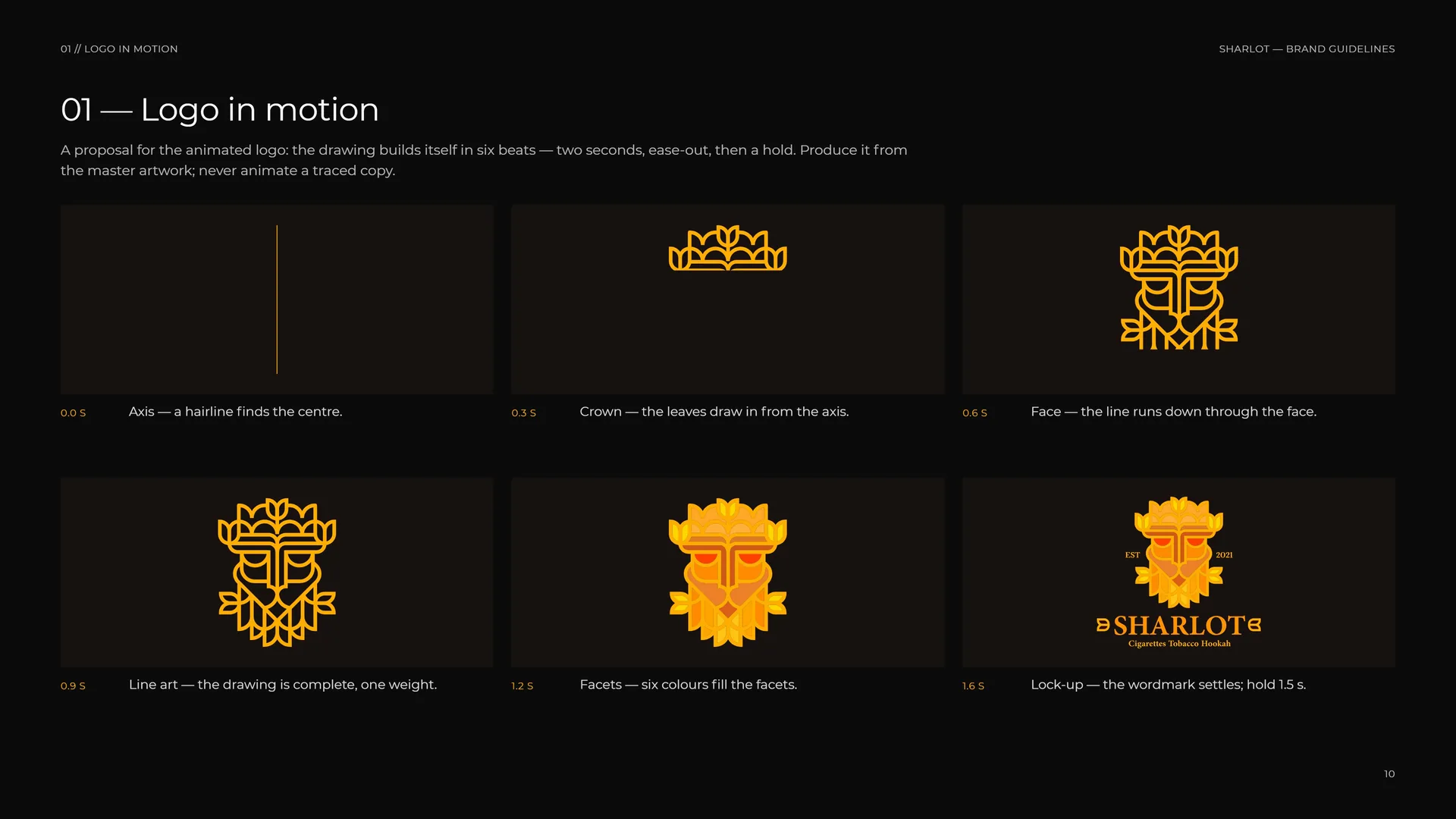
A proposal for the animated logo: the drawing builds itself in six beats — two seconds, ease-out, then a hold. Produce it from the master artwork; never animate a traced copy.
0.0 s: Axis — a hairline finds the centre.
0.3 s: Crown — the leaves draw in from the axis.
0.6 s: Face — the line runs down through the face.
0.9 s: Line art — the drawing is complete, one weight.
1.2 s: Facets — six colours fill the facets.
1.6 s: Lock-up — the wordmark settles; hold 1.5 s.
01.6
What Sharlot offers
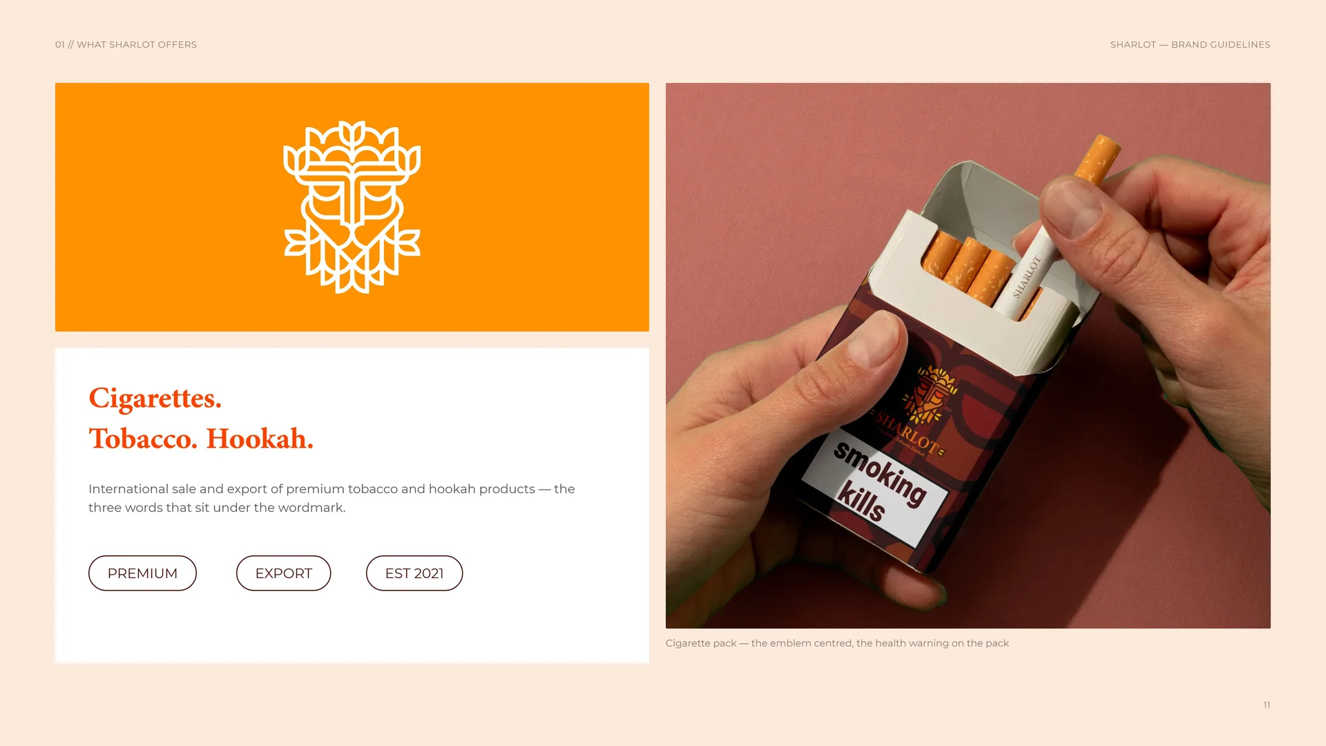
Cigarettes. Tobacco. Hookah.
International sale and export of premium tobacco and hookah products — the three words that sit under the wordmark.
Premium · Export · EST 2021.
Cigarette pack — the emblem centred, the health warning on the pack.
02
Concept
- 02.1Leaf + lion = one emblem
- 02.2The Lion and the Tobacco Leaf
- 02.3Smooth, decisive lines
- 02.4From leaf to lion
- 02.5Trust through symmetry
- 02.6The king of premium tobacco
- 02.7Nature and authority
02.1
Leaf + lion = one emblem
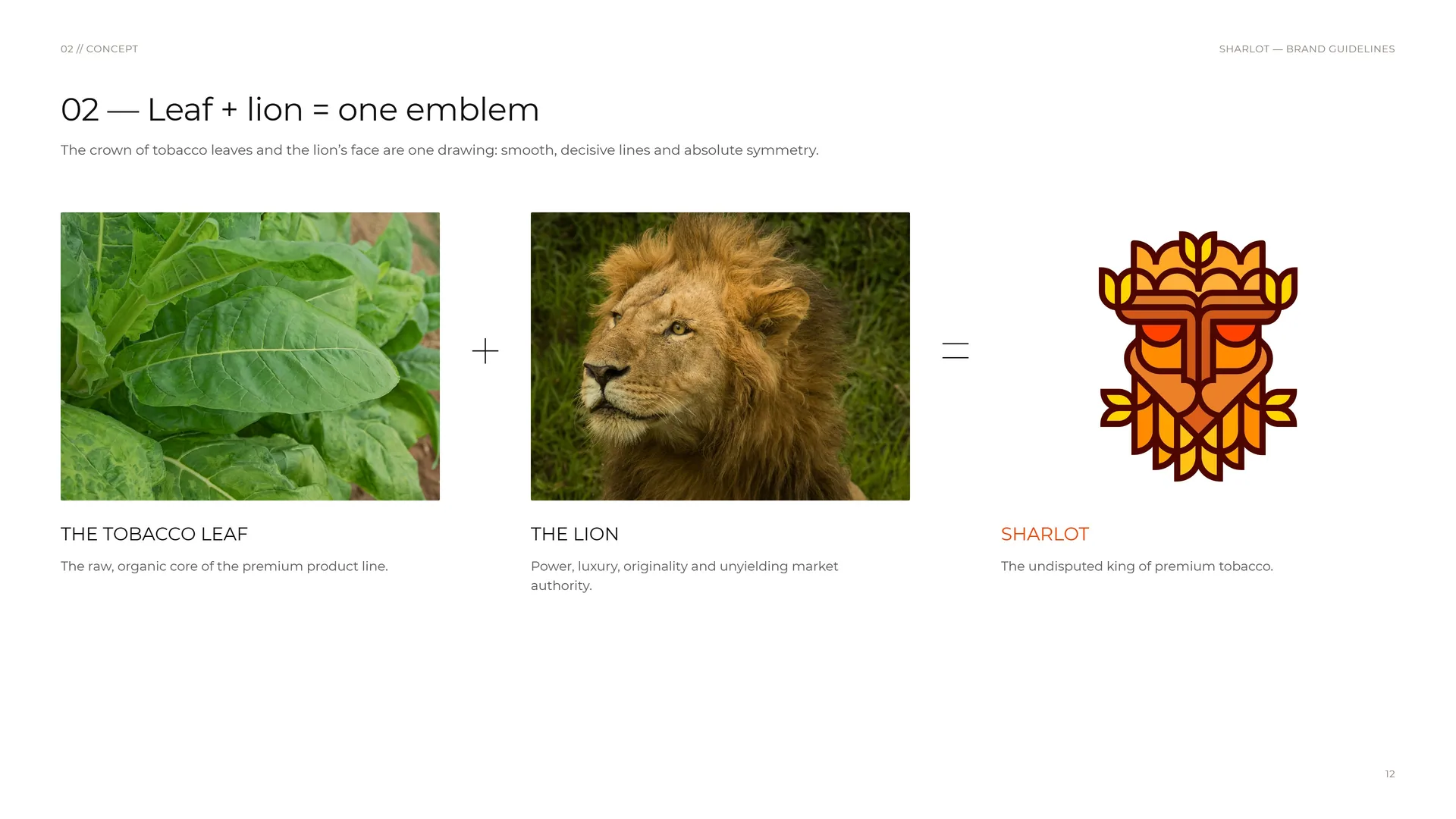
The crown of tobacco leaves and the lion’s face are one drawing: smooth, decisive lines and absolute symmetry.
The tobacco leaf: The raw, organic core of the premium product line.
The lion: Power, luxury, originality and unyielding market authority.
Sharlot: The undisputed king of premium tobacco.
02.2
The Lion and the Tobacco Leaf
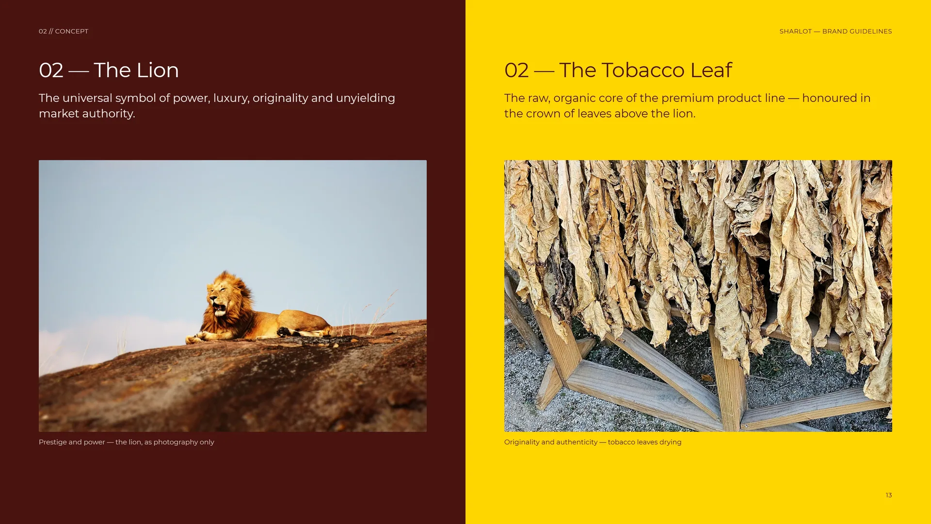
The Lion: The universal symbol of power, luxury, originality and unyielding market authority.
The Tobacco Leaf: The raw, organic core of the premium product line — honoured in the crown of leaves above the lion.
Prestige and power — the lion, as photography only.
Originality and authenticity — tobacco leaves drying.
02.3
Smooth, decisive lines
Smooth, decisive lines.
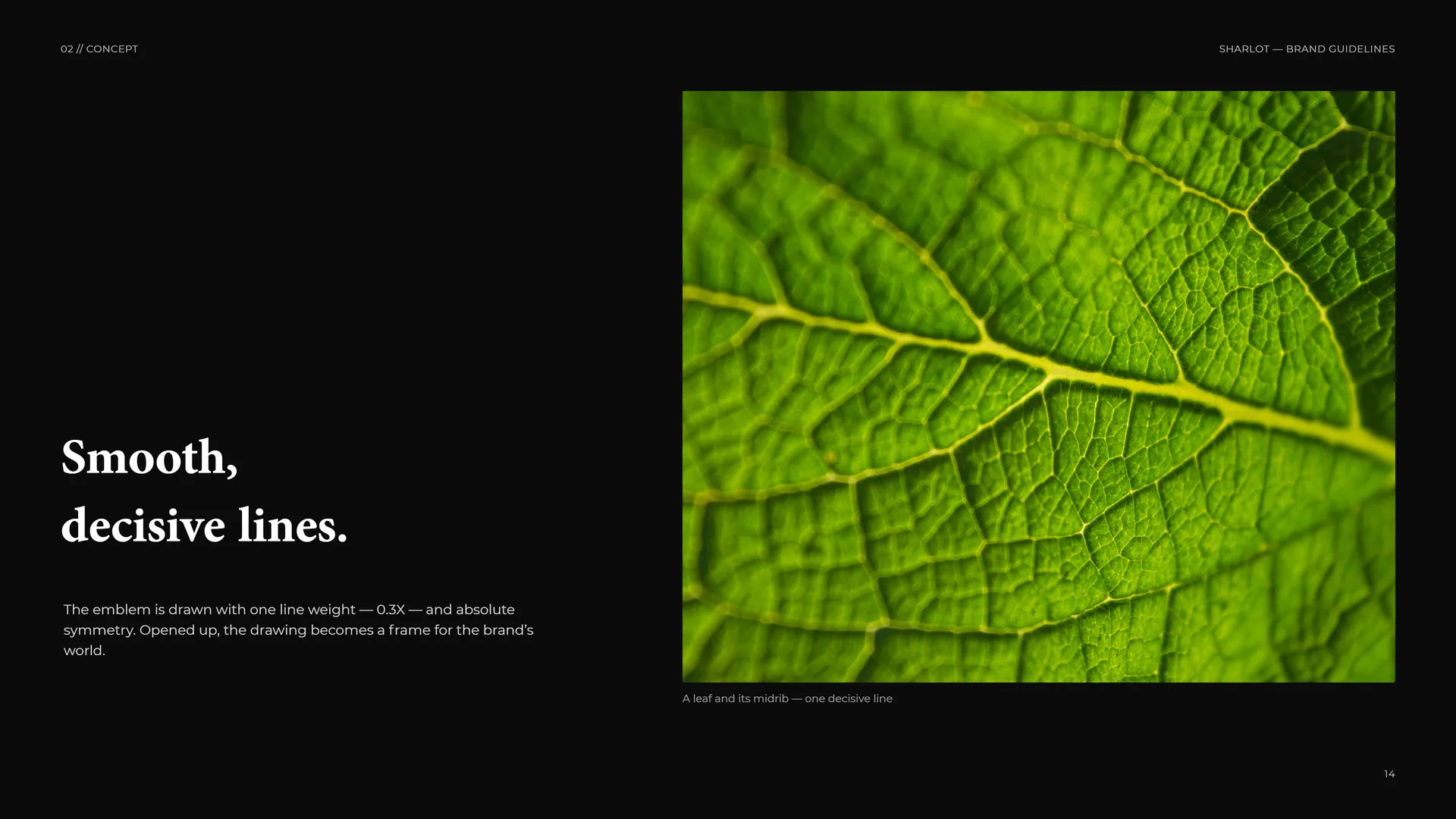
The emblem is drawn with one line weight — 0.3X — and absolute symmetry. Opened up, the drawing becomes a frame for the brand’s world.
A leaf and its midrib — one decisive line.
02.4
From leaf to lion
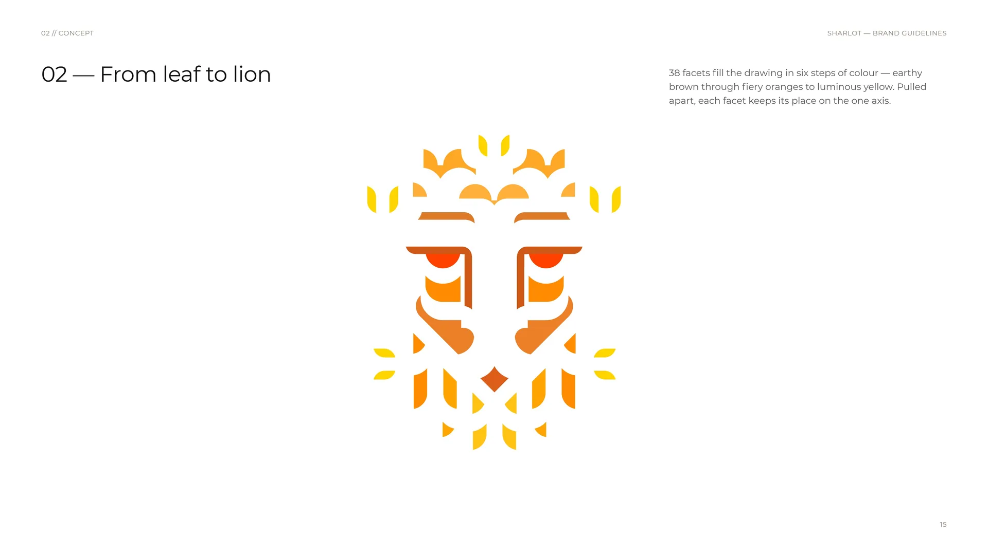
38 facets fill the drawing in six steps of colour — earthy brown through fiery oranges to luminous yellow. Pulled apart, each facet keeps its place on the one axis.
02.5
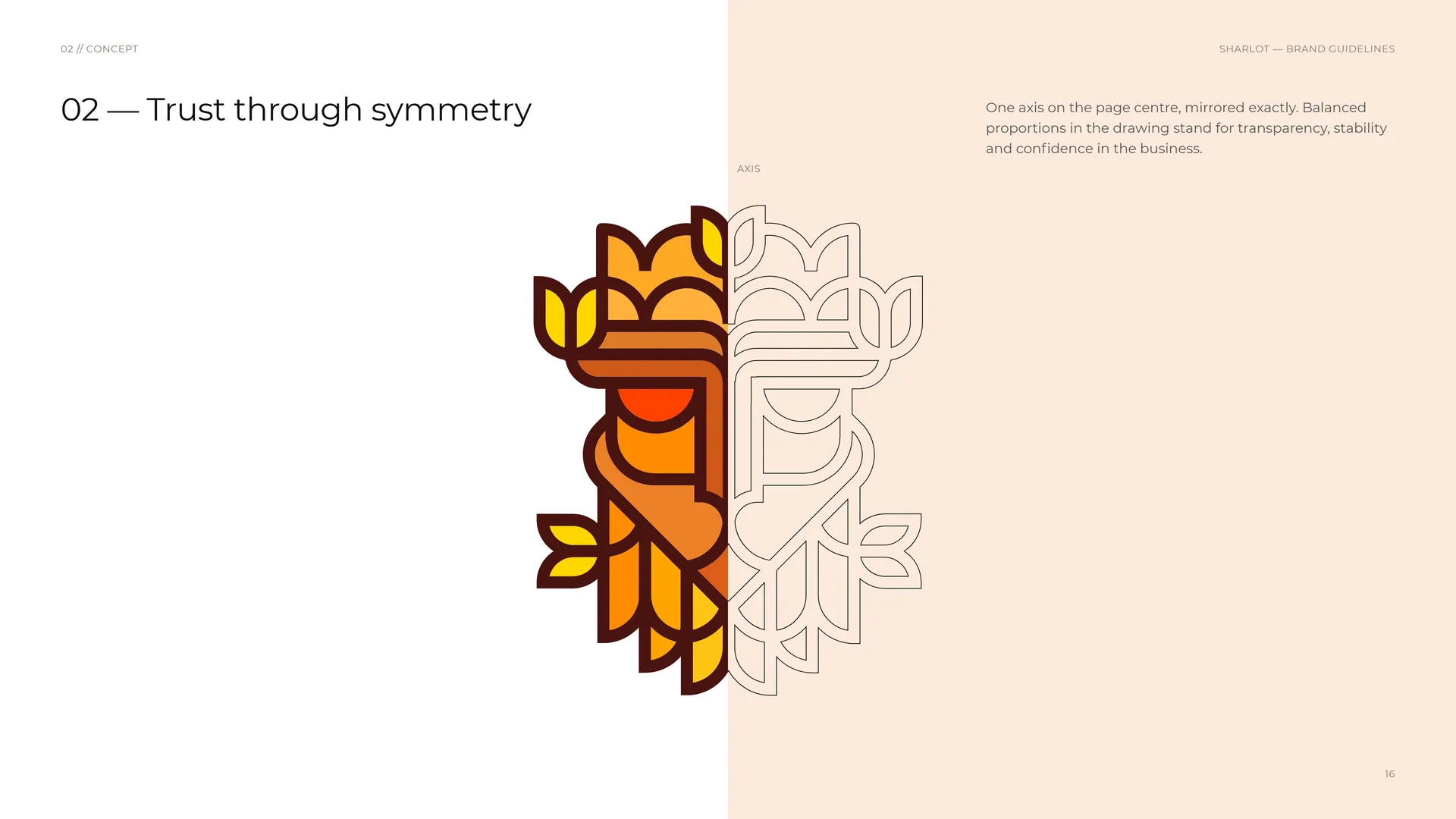
Trust through symmetry
Axis.
One axis on the page centre, mirrored exactly. Balanced proportions in the drawing stand for transparency, stability and confidence in the business.
02.6
The king of premium tobacco
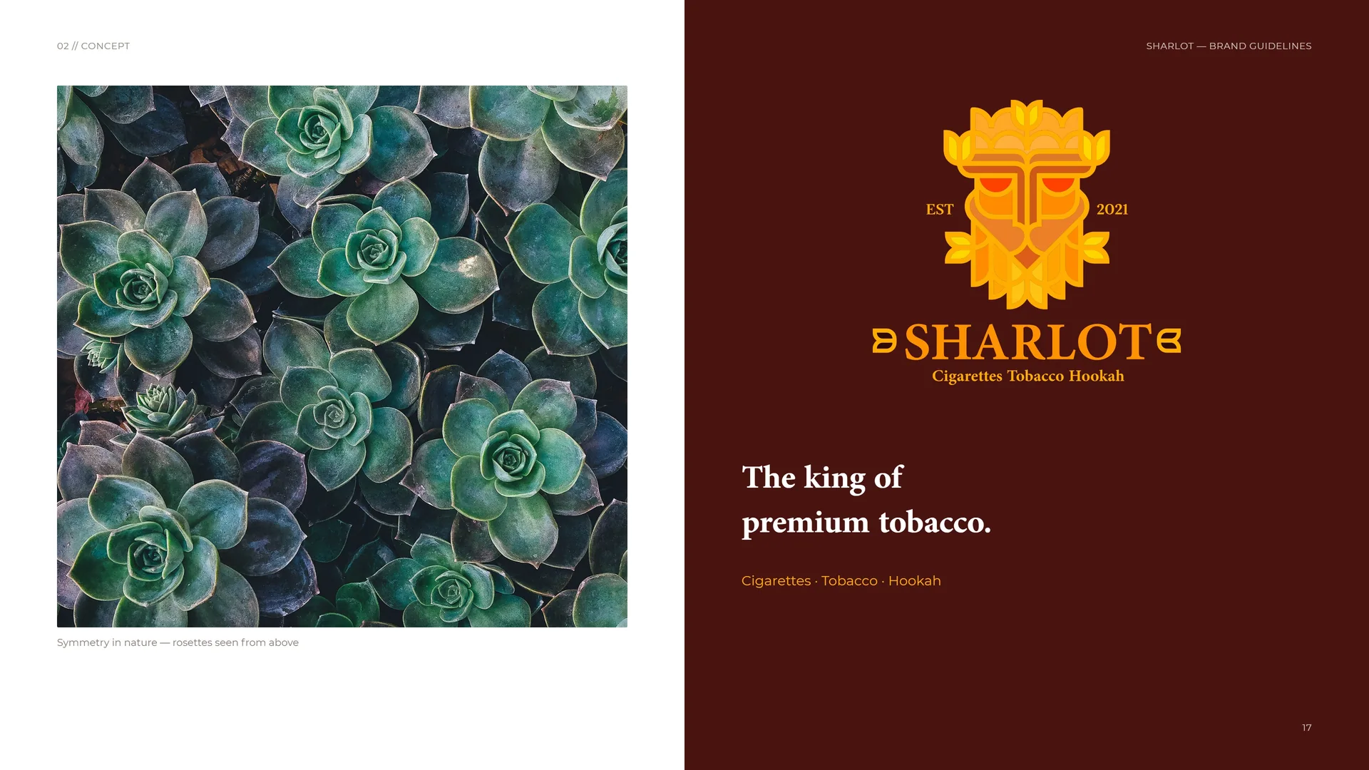
Symmetry in nature — rosettes seen from above.
The king of premium tobacco.
Cigarettes · Tobacco · Hookah.
02.7
Nature and authority
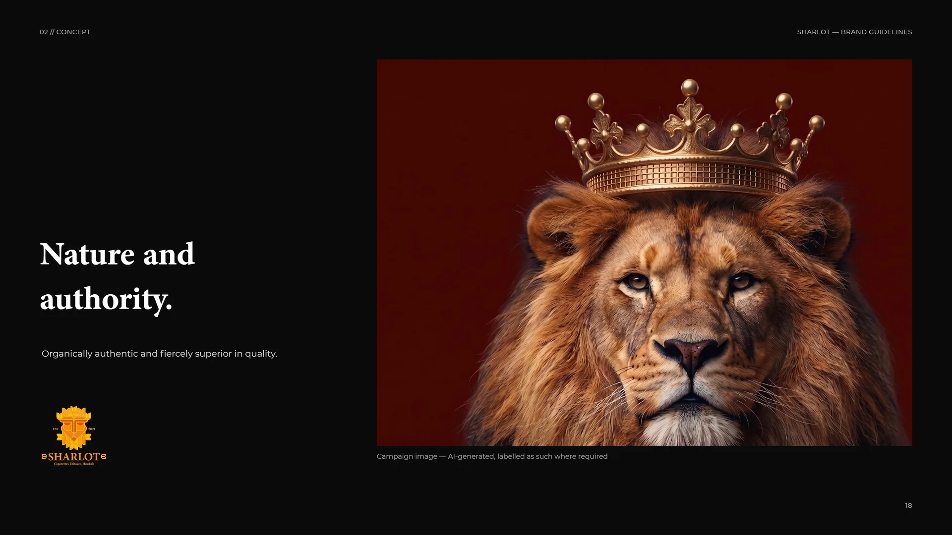
Nature and authority.
Organically authentic and fiercely superior in quality.
Campaign image — AI-generated, labelled as such where required.
03
Logo & grid
- 03.1Primary logo
- 03.2Anatomy
- 03.3Emblem construction
- 03.4Guide lines
- 03.5Wordmark
- 03.6Stacked proportions
- 03.7Horizontal lock-up
- 03.8Clear space
- 03.9Letter macro
- 03.10Versions
- 03.11The logo family
- 03.12App icon
- 03.13Minimum size
- 03.14Placement
- 03.15Misuse
- 03.16Backgrounds
03.1
Primary logo
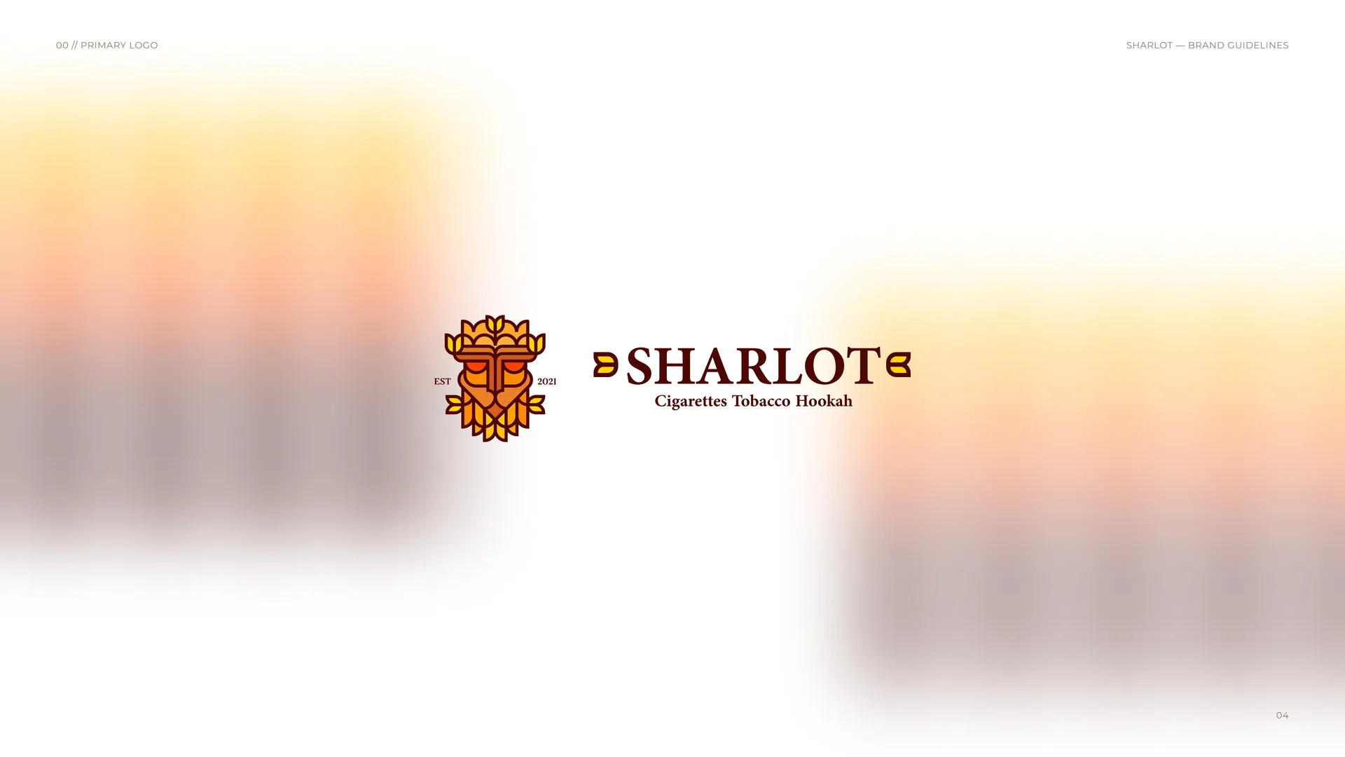
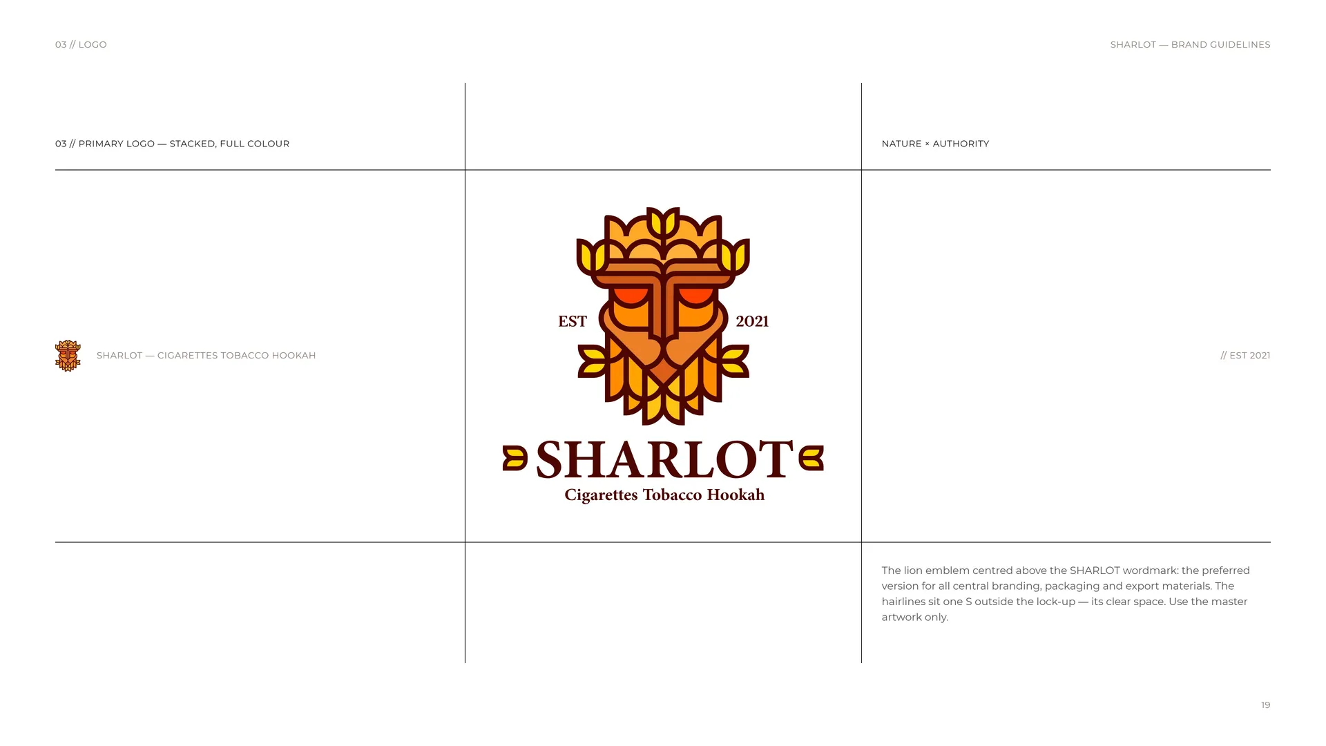
Primary logo — stacked, full colour.
The lion emblem centred above the SHARLOT wordmark: the preferred version for all central branding, packaging and export materials. The hairlines sit one S outside the lock-up — its clear space. Use the master artwork only.
SHARLOT — Cigarettes Tobacco Hookah.
Nature × Authority.
// EST 2021.
03.2
Anatomy
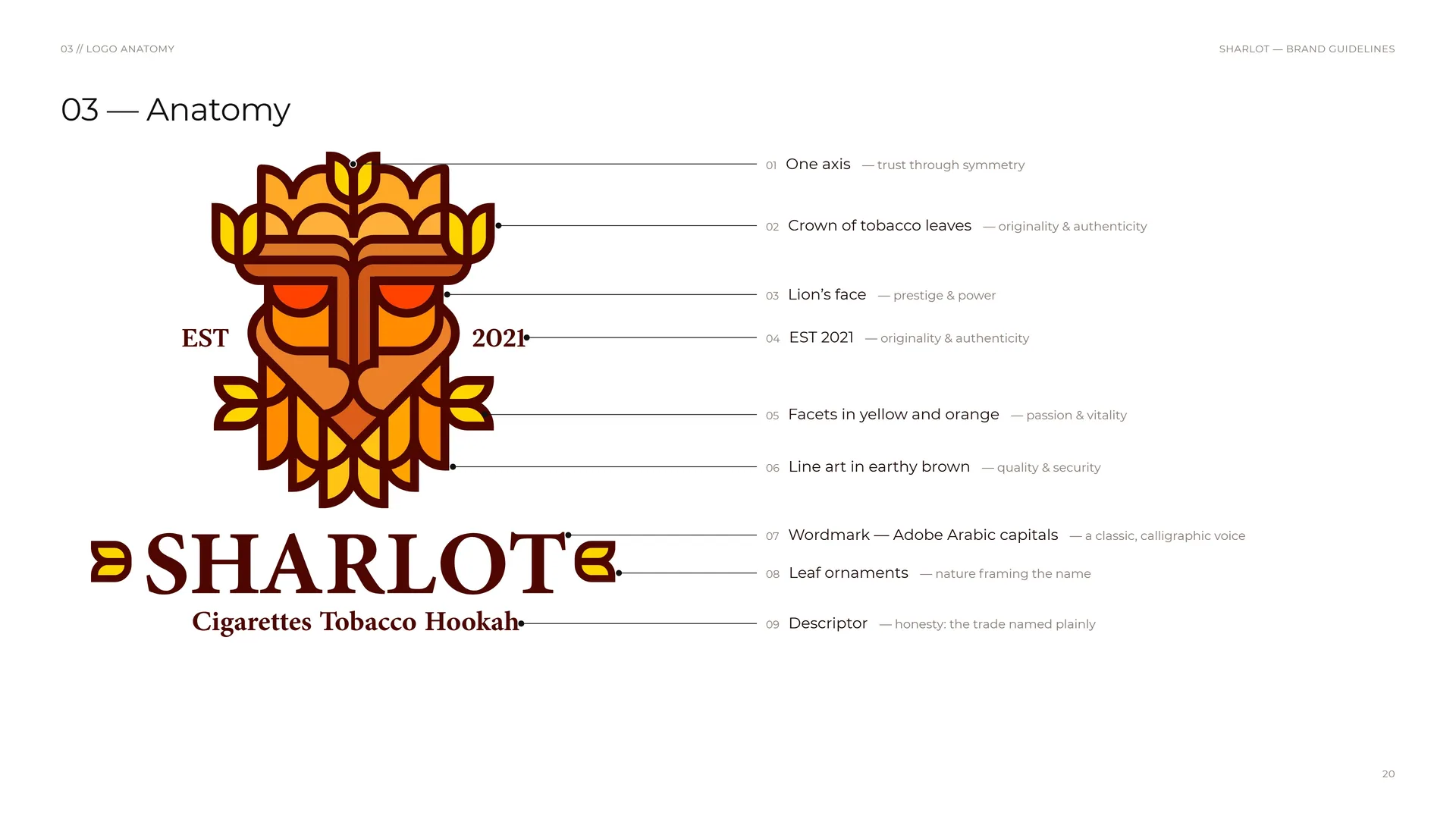
01 One axis — trust through symmetry.
02 Crown of tobacco leaves — originality & authenticity.
03 Lion’s face — prestige & power.
04 EST 2021 — originality & authenticity.
05 Facets in yellow and orange — passion & vitality.
06 Line art in earthy brown — quality & security.
07 Wordmark — Adobe Arabic capitals — a classic, calligraphic voice.
08 Leaf ornaments — nature framing the name.
09 Descriptor — honesty: the trade named plainly.
03.3
Emblem construction
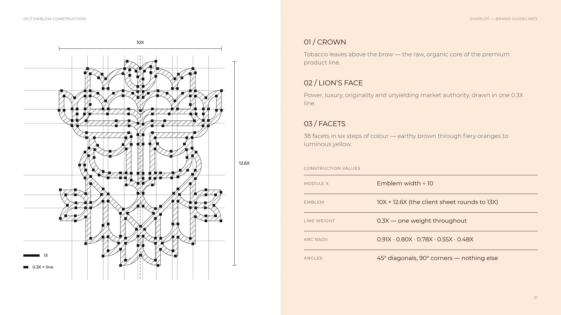
Crown: Tobacco leaves above the brow — the raw, organic core of the premium product line.
Lion’s face: Power, luxury, originality and unyielding market authority, drawn in one 0.3X line.
Facets: 38 facets in six steps of colour — earthy brown through fiery oranges to luminous yellow.
Module X: Emblem width ÷ 10.
Emblem: 10X × 12.6X (the client sheet rounds to 13X).
Line weight: 0.3X — one weight throughout.
Arc radii: 0.91X · 0.80X · 0.78X · 0.55X · 0.48X.
Angles: 45° diagonals, 90° corners — nothing else.
10X · 12.6X · 1X · 0.3X = line.
03.4
Guide lines
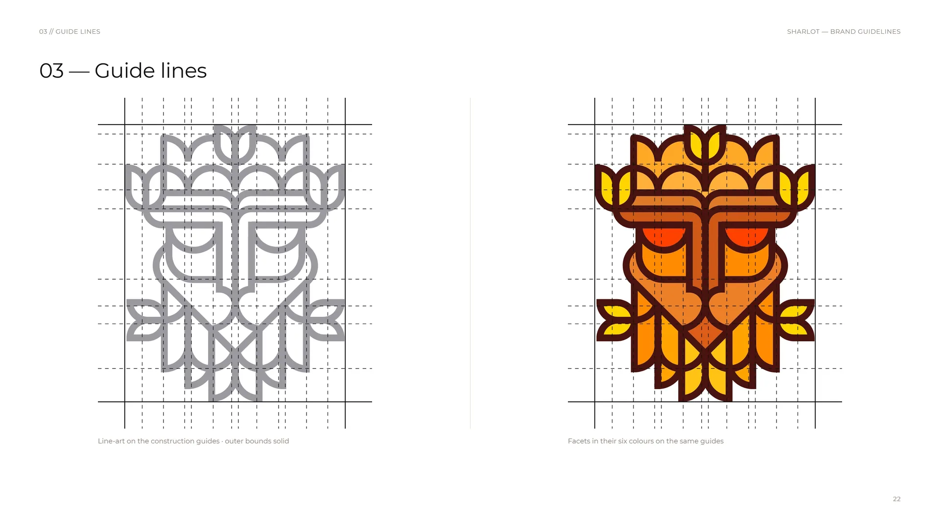
Line-art on the construction guides · outer bounds solid.
Facets in their six colours on the same guides.
03.5
Wordmark
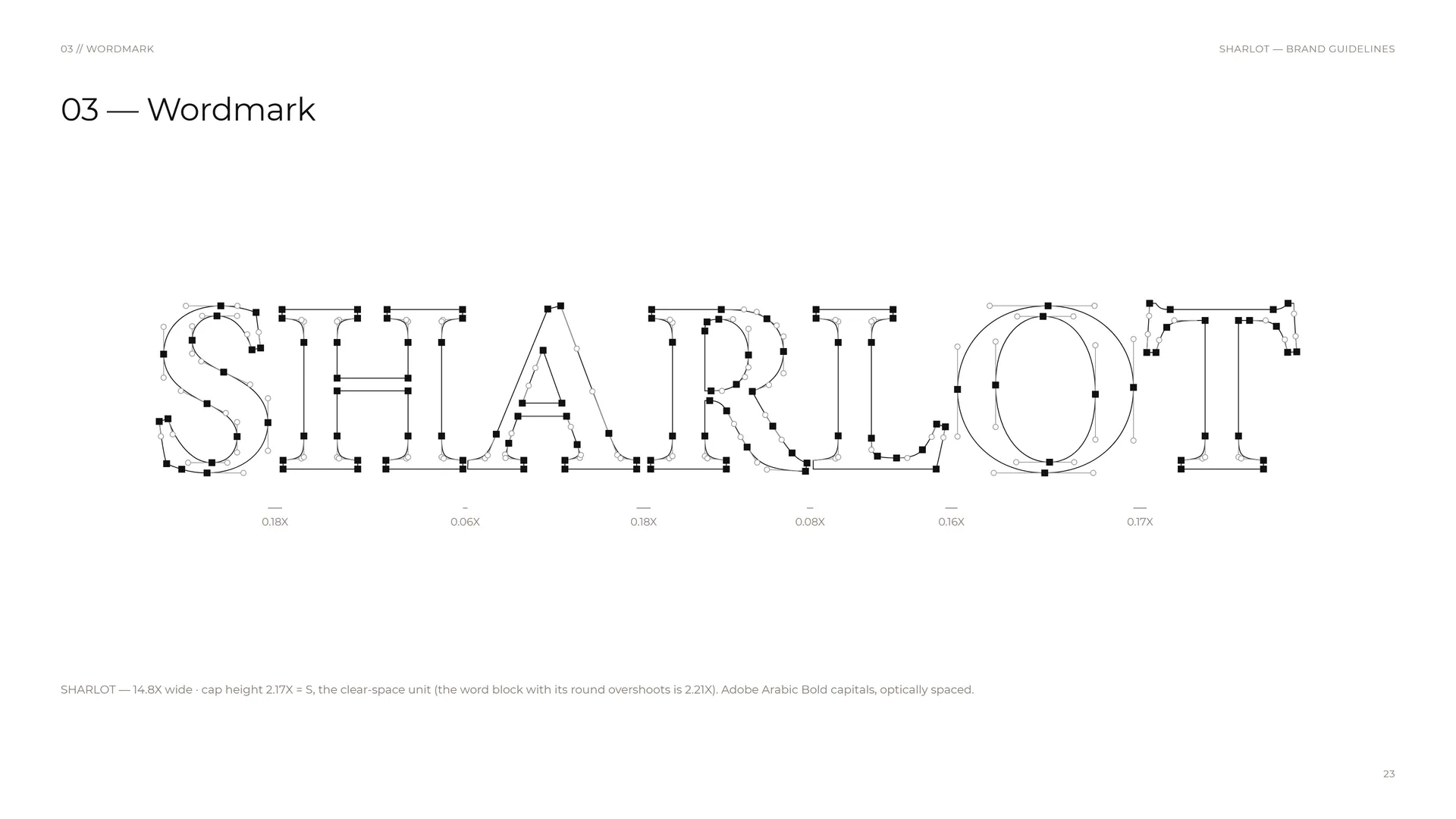
SHARLOT — 14.8X wide · cap height 2.17X = S, the clear-space unit (the word block with its round overshoots is 2.21X). Adobe Arabic Bold capitals, optically spaced.
0.18X · 0.06X · 0.18X · 0.08X · 0.16X · 0.17X.
03.6
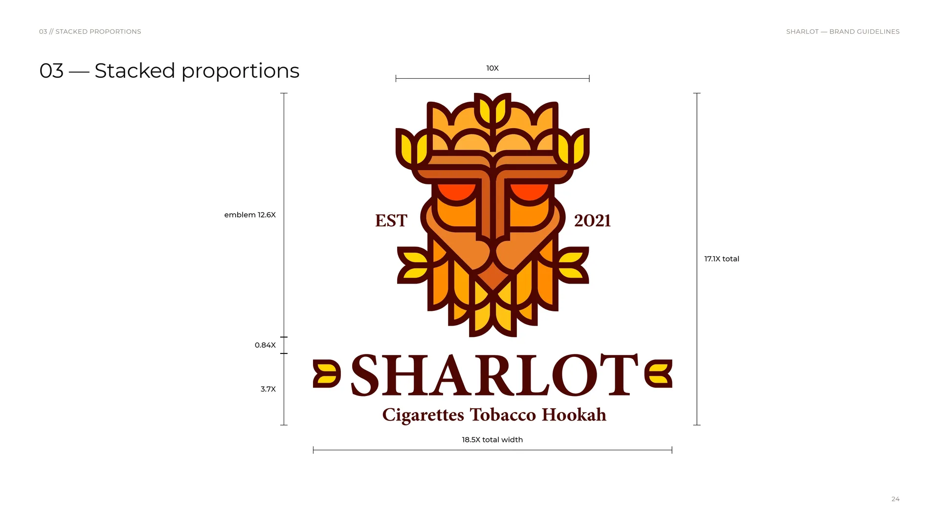
Stacked proportions
Emblem 12.6X · 10X wide.
0.84X between emblem and wordmark · wordmark block 3.7X.
18.5X total width · 17.1X total.
03.7
Horizontal lock-up
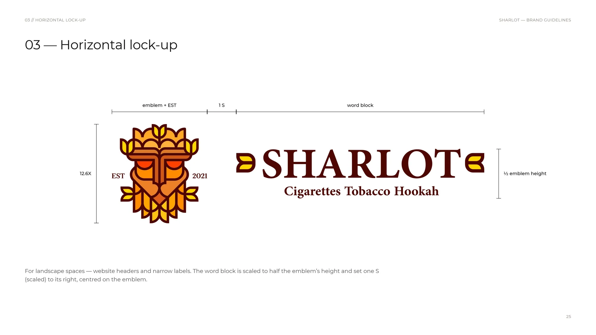
For landscape spaces — website headers and narrow labels. The word block is scaled to half the emblem’s height and set one S (scaled) to its right, centred on the emblem.
Emblem + EST · 1 S · word block · 12.6X · ½ emblem height.
03.8
Clear space
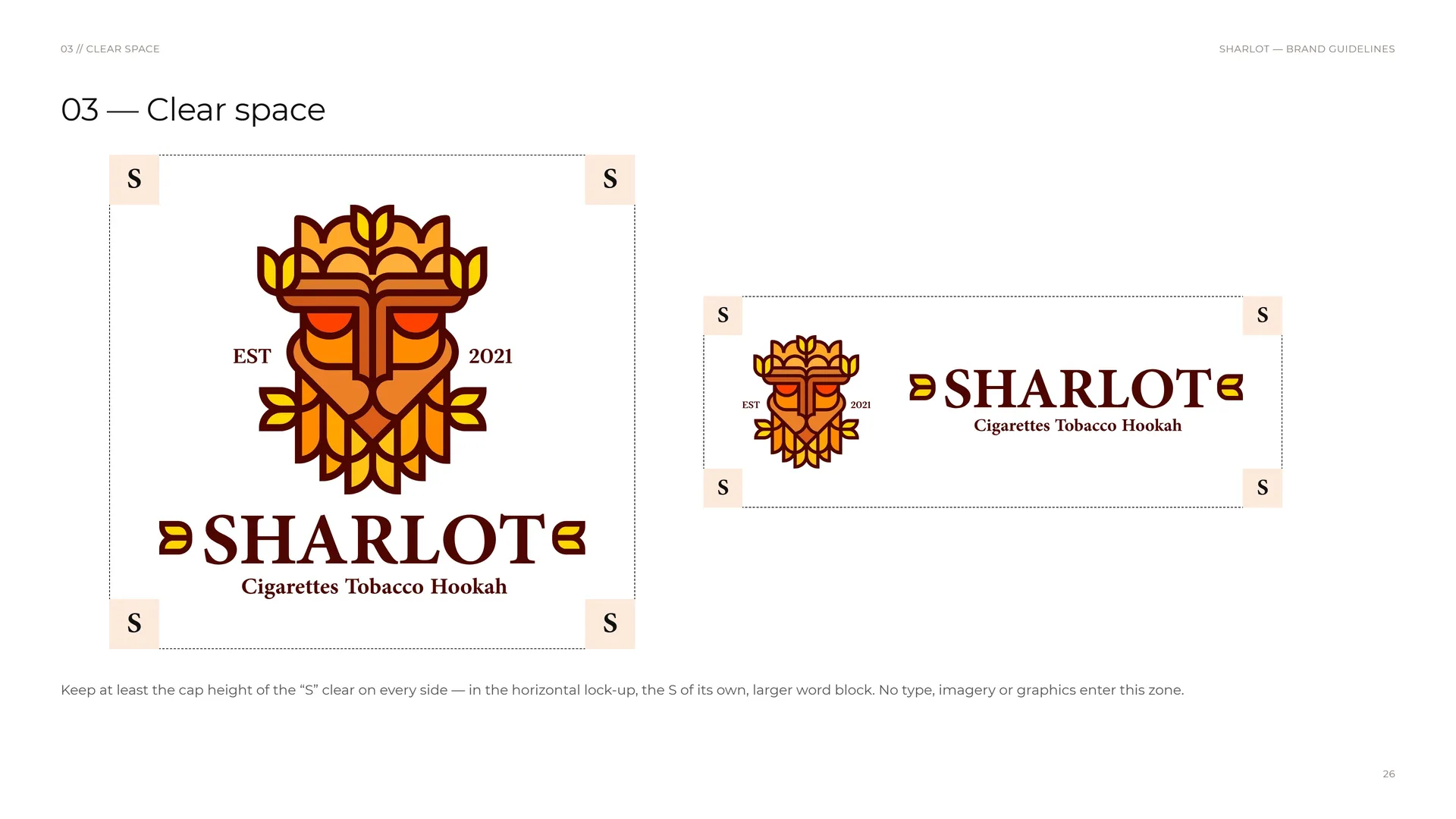
Keep at least the cap height of the “S” clear on every side — in the horizontal lock-up, the S of its own, larger word block. No type, imagery or graphics enter this zone.
03.9
Letter macro
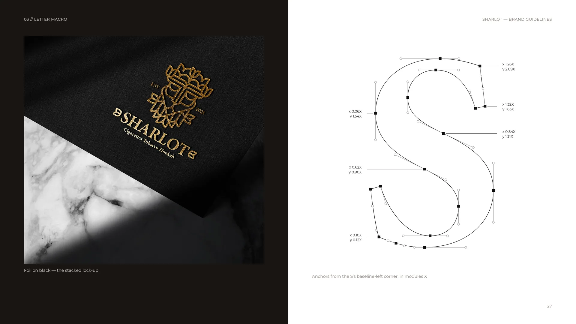
Foil on black — the stacked lock-up.
Anchors from the S’s baseline-left corner, in modules X.
03.10
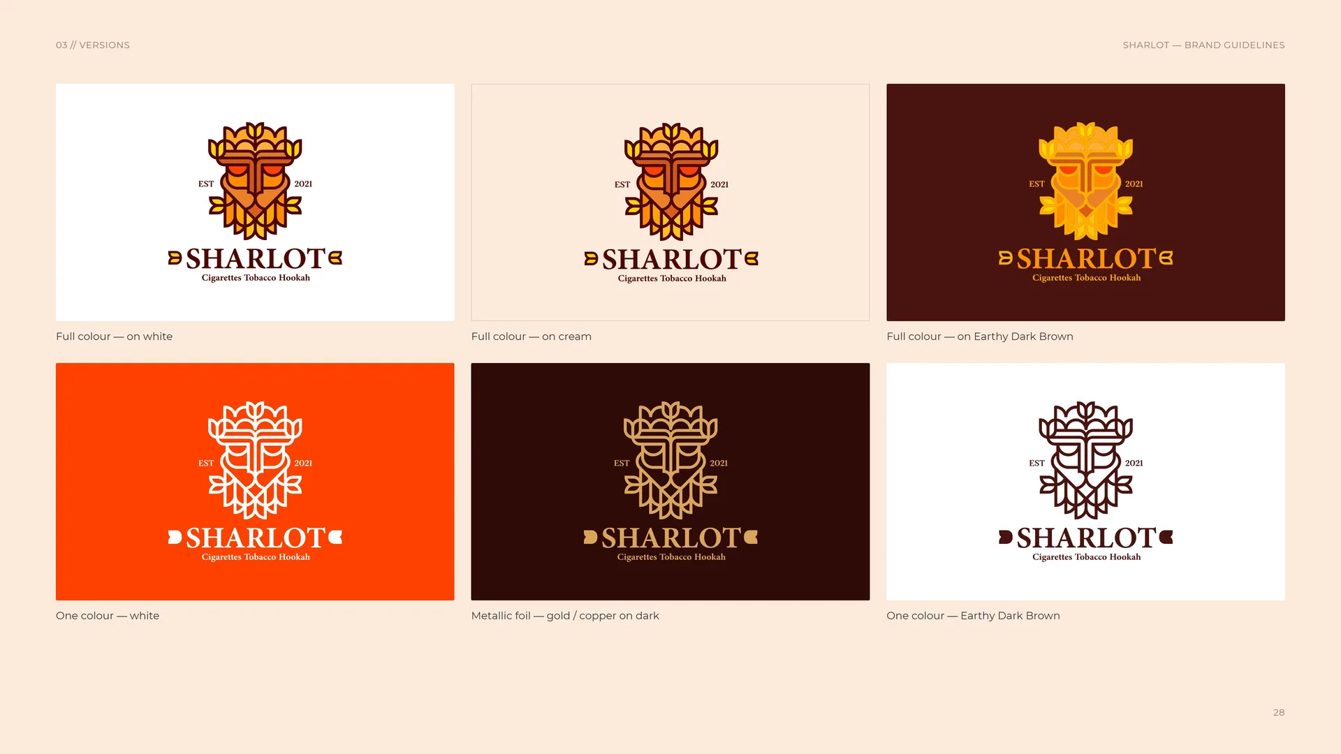
Versions
Full colour — on white.
One colour — white.
Full colour — on cream.
Full colour — on Earthy Dark Brown.
Metallic foil — gold / copper on dark.
One colour — Earthy Dark Brown.
03.11
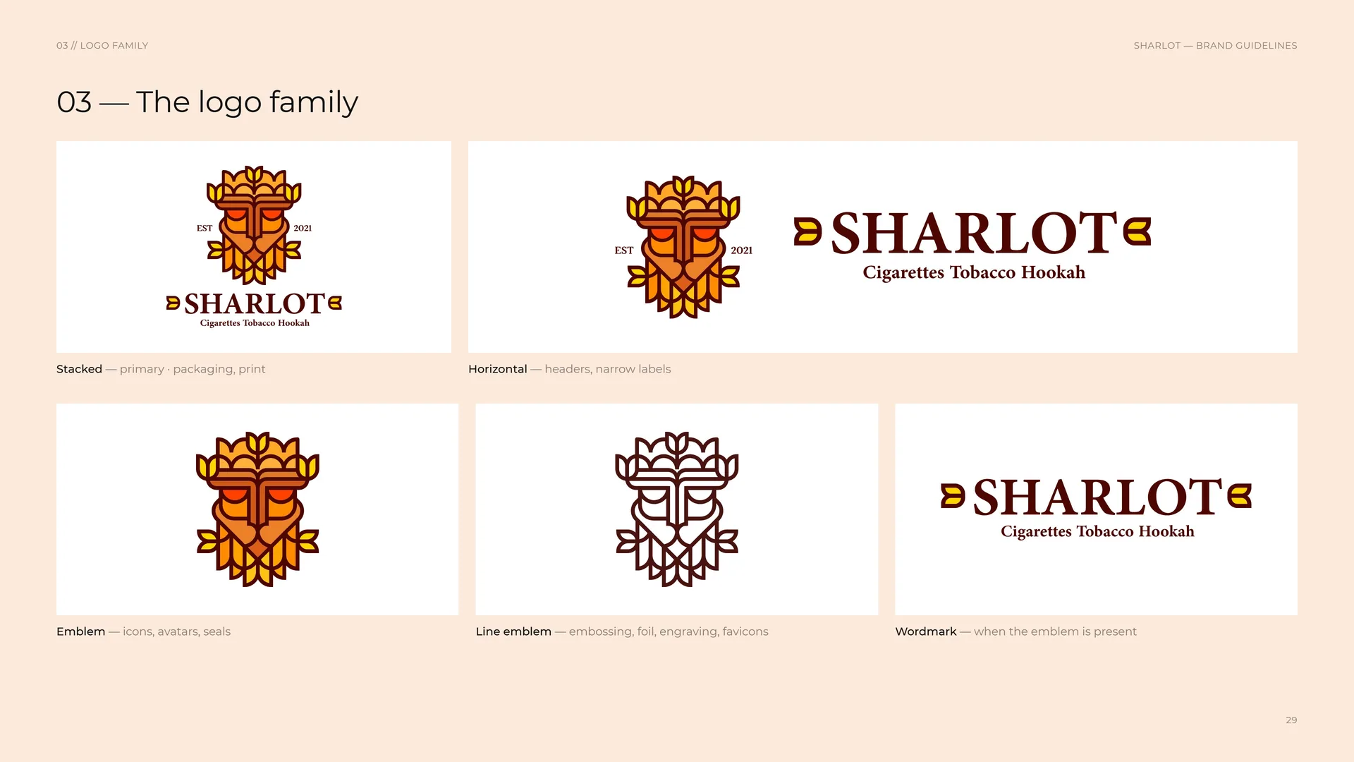
The logo family
Stacked — primary · packaging, print.
Horizontal — headers, narrow labels.
Emblem — icons, avatars, seals.
Line emblem — embossing, foil, engraving, favicons.
Wordmark — when the emblem is present.
03.12
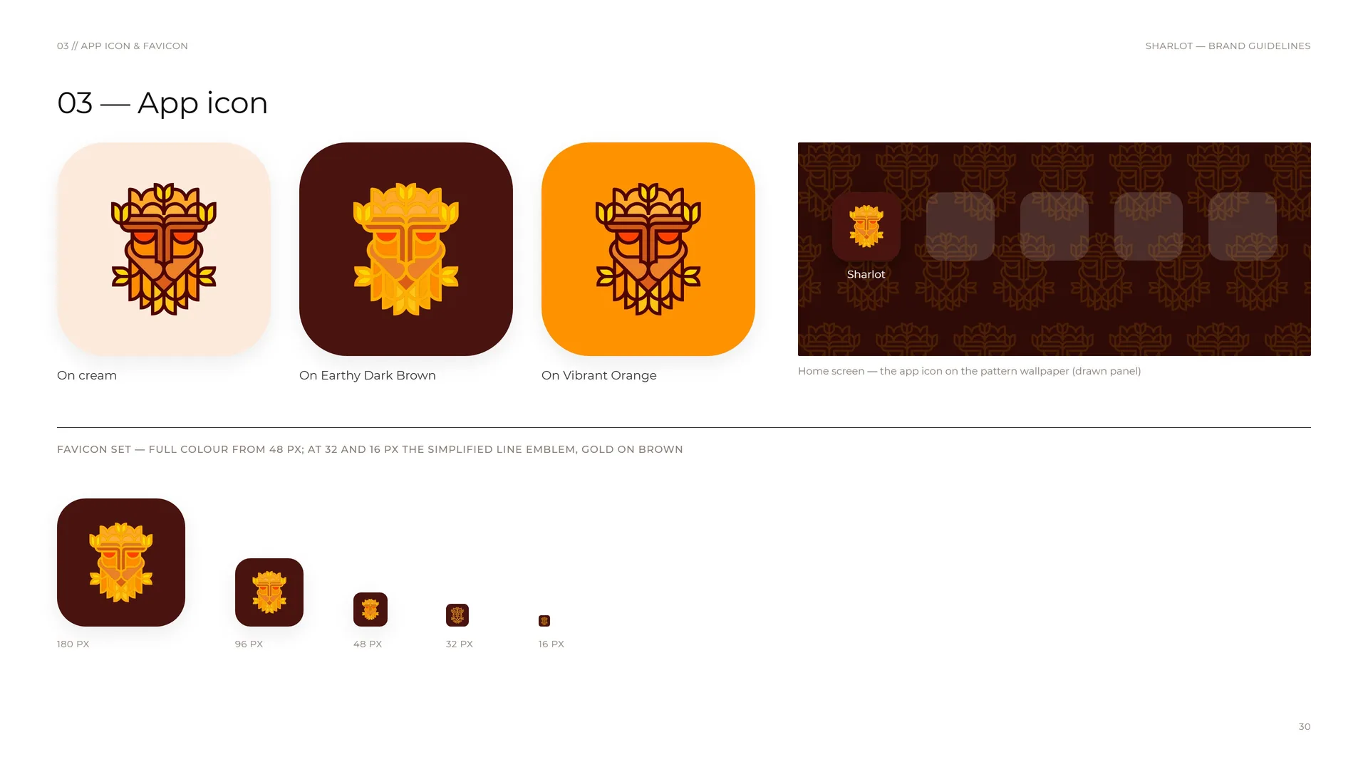
App icon
On cream.
On Earthy Dark Brown.
On Vibrant Orange.
Favicon set — full colour from 48 px; at 32 and 16 px the simplified line emblem, gold on brown.
180 px · 96 px · 48 px · 32 px · 16 px.
Sharlot Home screen — the app icon on the pattern wallpaper (drawn panel).
03.13
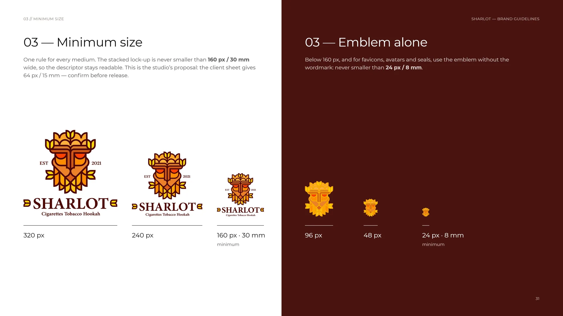
Minimum size
One rule for every medium. The stacked lock-up is never smaller than 160 px / 30 mm wide, so the descriptor stays readable. This is the studio’s proposal: the client sheet gives 64 px / 15 mm — confirm before release.
Emblem alone: Below 160 px, and for favicons, avatars and seals, use the emblem without the wordmark: never smaller than 24 px / 8 mm.
320 px · 240 px · 160 px · 30 mm minimum.
96 px · 48 px · 24 px · 8 mm minimum.
03.14
Placement
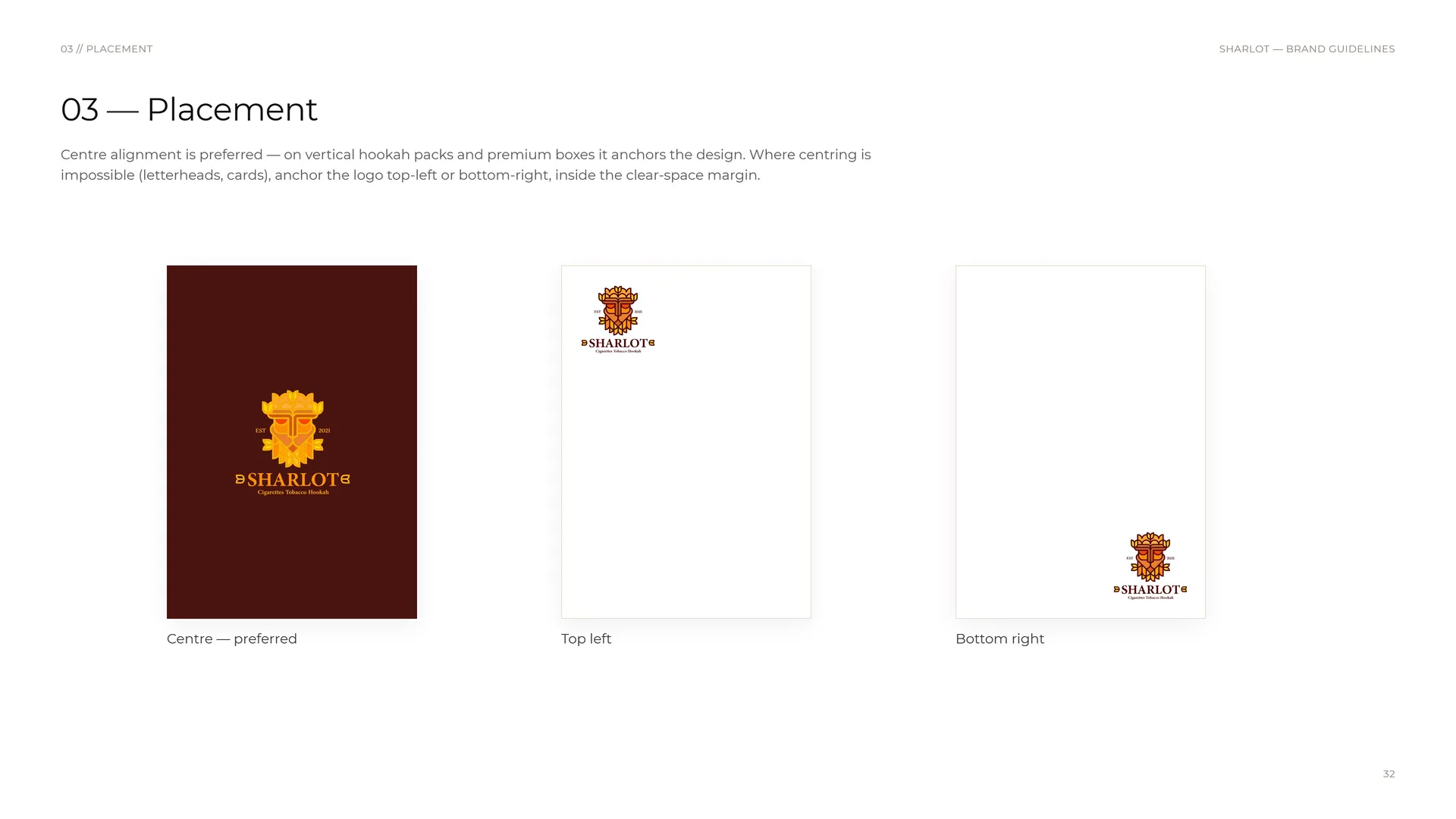
Centre alignment is preferred — on vertical hookah packs and premium boxes it anchors the design. Where centring is impossible (letterheads, cards), anchor the logo top-left or bottom-right, inside the clear-space margin.
Centre — preferred.
Top left.
Bottom right.
03.15
Misuse
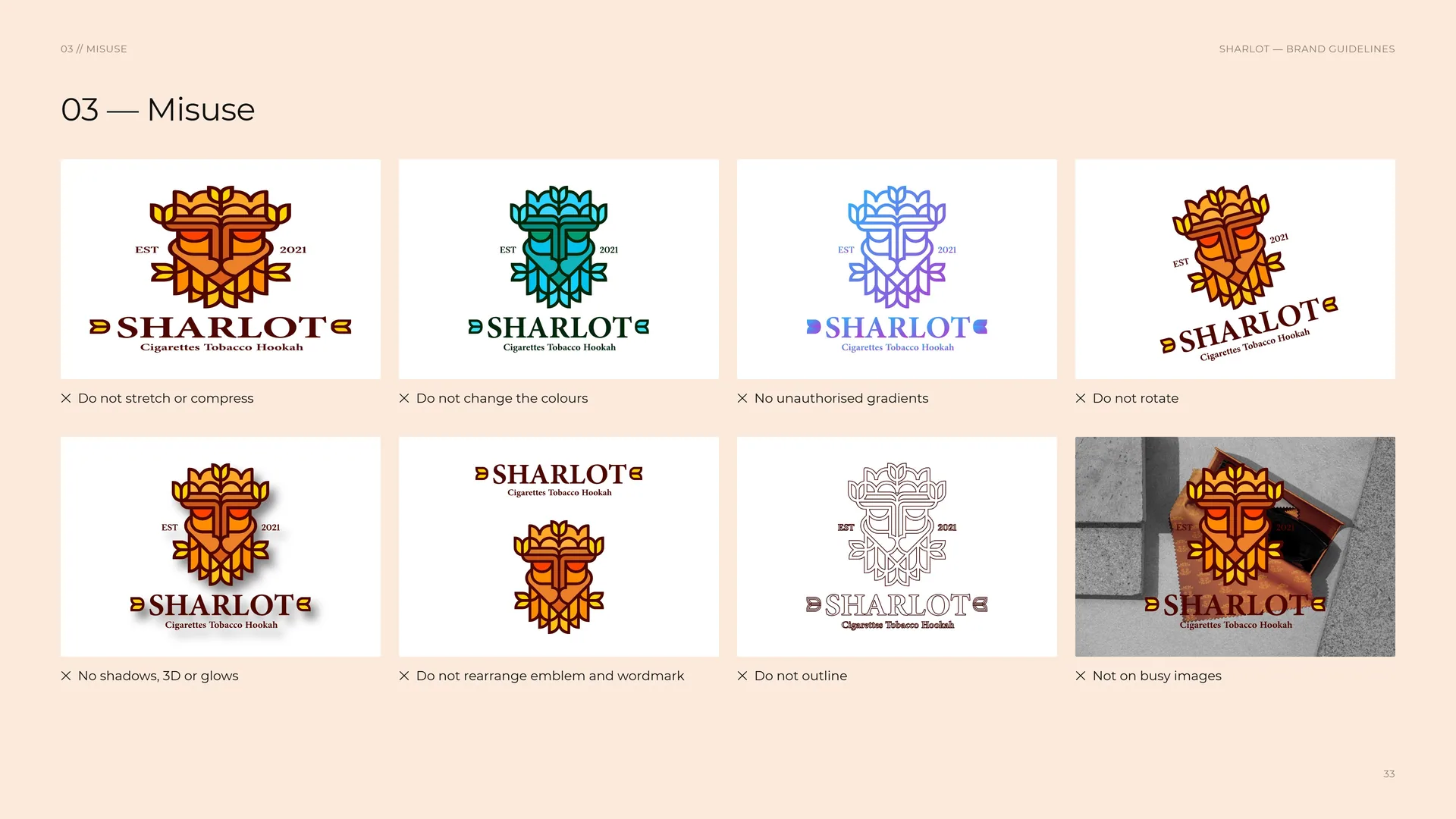
✕ Do not stretch or compress.
✕ Do not change the colours.
✕ No unauthorised gradients.
✕ Do not rotate.
✕ No shadows, 3D or glows.
✕ Do not rearrange emblem and wordmark.
✕ Do not outline.
✕ Not on busy images.
03.16
Backgrounds
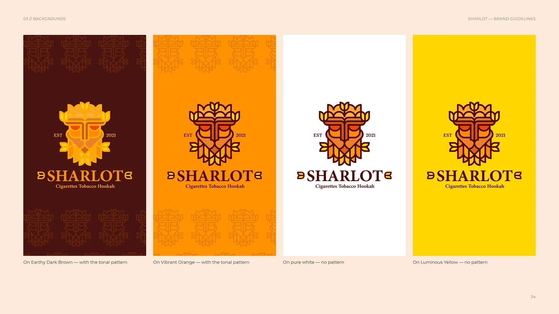
On Earthy Dark Brown — with the tonal pattern.
On Vibrant Orange — with the tonal pattern.
On pure white — no pattern.
On Luminous Yellow — no pattern.
04
Colour
- 04.1Colour palette
- 04.2Colour values
- 04.3Gradient & tints
- 04.4Contrast & accessibility
- 04.5Colour from the source
04.1
Colour palette
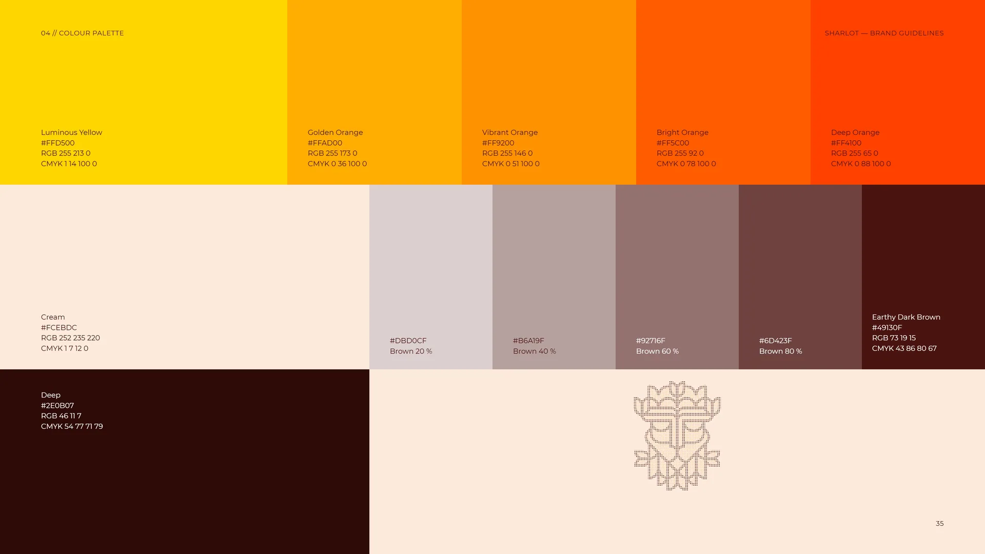
Luminous Yellow: #FFD500 · RGB 255 213 0 · CMYK 1 14 100 0.
Golden Orange: #FFAD00 · RGB 255 173 0 · CMYK 0 36 100 0.
Vibrant Orange: #FF9200 · RGB 255 146 0 · CMYK 0 51 100 0.
Bright Orange: #FF5C00 · RGB 255 92 0 · CMYK 0 78 100 0.
Deep Orange: #FF4100 · RGB 255 65 0 · CMYK 0 88 100 0.
Earthy Dark Brown: #49130F · RGB 73 19 15 · CMYK 43 86 80 67.
Deep: #2E0B07 · RGB 46 11 7 · CMYK 54 77 71 79.
Cream: #FCEBDC · RGB 252 235 220 · CMYK 1 7 12 0.
Brown tints: #DBD0CF Brown 20 % · #B6A19F Brown 40 % · #92716F Brown 60 % · #6D423F Brown 80 %.
04.2
Colour values
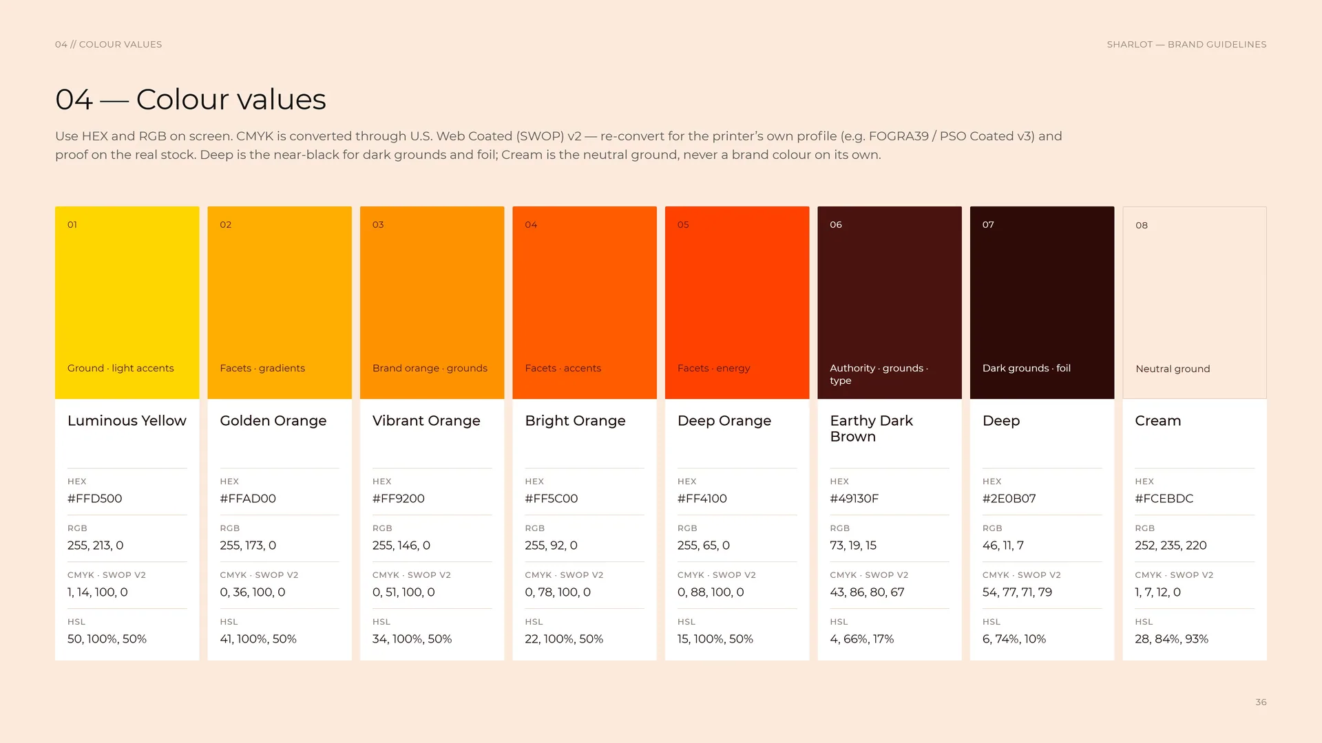
Use HEX and RGB on screen. CMYK is converted through U.S. Web Coated (SWOP) v2 — re-convert for the printer’s own profile (e.g. FOGRA39 / PSO Coated v3) and proof on the real stock. Deep is the near-black for dark grounds and foil; Cream is the neutral ground, never a brand colour on its own.
01 Luminous Yellow — ground · light accents: HEX #FFD500 · RGB 255, 213, 0 · CMYK (SWOP v2) 1, 14, 100, 0 · HSL 50, 100%, 50%.
02 Golden Orange — facets · gradients: HEX #FFAD00 · RGB 255, 173, 0 · CMYK (SWOP v2) 0, 36, 100, 0 · HSL 41, 100%, 50%.
03 Vibrant Orange — brand orange · grounds: HEX #FF9200 · RGB 255, 146, 0 · CMYK (SWOP v2) 0, 51, 100, 0 · HSL 34, 100%, 50%.
04 Bright Orange — facets · accents: HEX #FF5C00 · RGB 255, 92, 0 · CMYK (SWOP v2) 0, 78, 100, 0 · HSL 22, 100%, 50%.
05 Deep Orange — facets · energy: HEX #FF4100 · RGB 255, 65, 0 · CMYK (SWOP v2) 0, 88, 100, 0 · HSL 15, 100%, 50%.
06 Earthy Dark Brown — authority · grounds · type: HEX #49130F · RGB 73, 19, 15 · CMYK (SWOP v2) 43, 86, 80, 67 · HSL 4, 66%, 17%.
07 Deep — dark grounds · foil: HEX #2E0B07 · RGB 46, 11, 7 · CMYK (SWOP v2) 54, 77, 71, 79 · HSL 6, 74%, 10%.
08 Cream — neutral ground: HEX #FCEBDC · RGB 252, 235, 220 · CMYK (SWOP v2) 1, 7, 12, 0 · HSL 28, 84%, 93%.
04.3
Gradient & tints
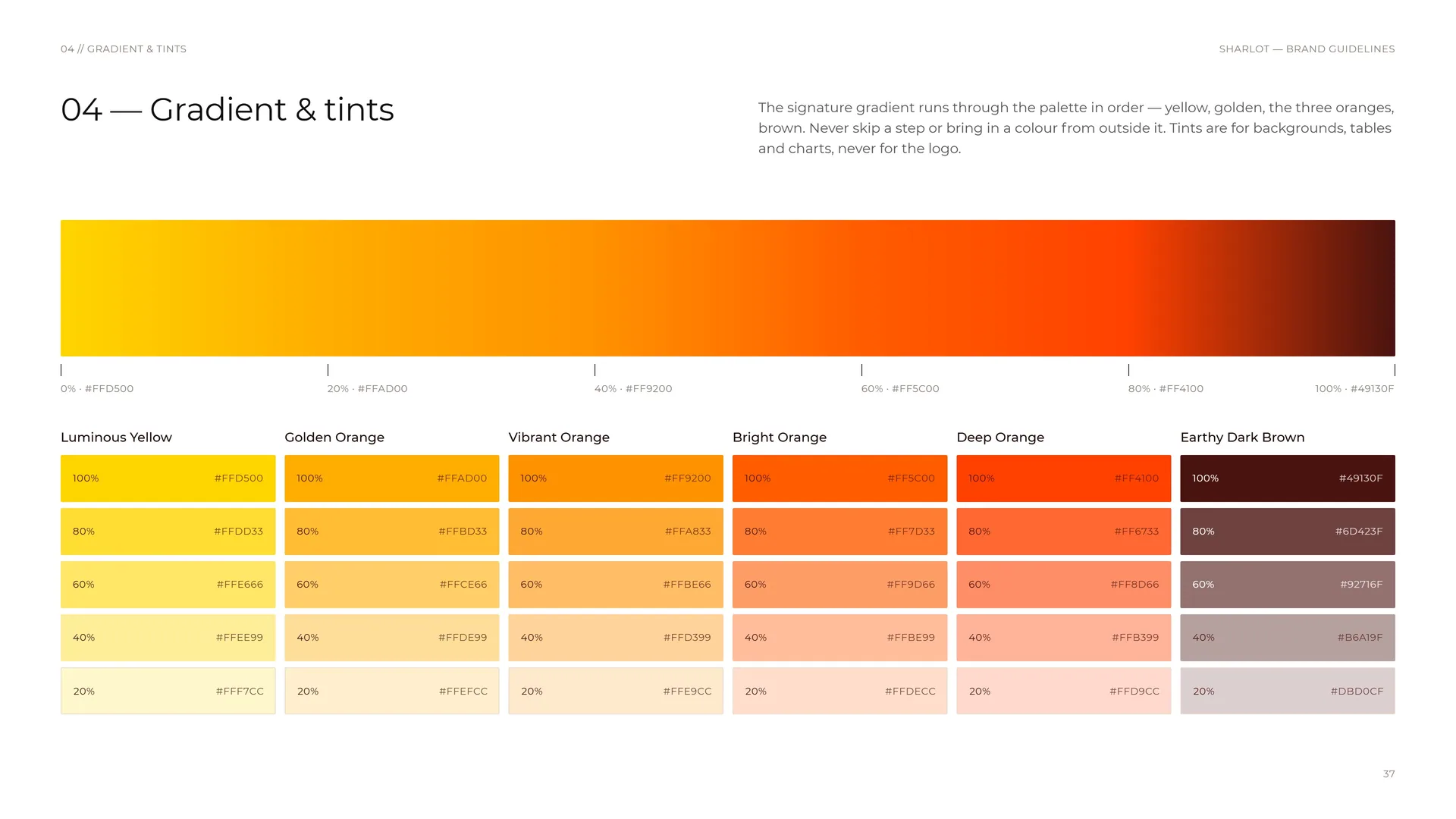
The signature gradient runs through the palette in order — yellow, golden, the three oranges, brown. Never skip a step or bring in a colour from outside it. Tints are for backgrounds, tables and charts, never for the logo.
Signature gradient: 0% · #FFD500 Luminous Yellow → 20% · #FFAD00 → 40% · #FF9200 → 60% · #FF5C00 → 80% · #FF4100 → 100% · #49130F.
Luminous Yellow: 100% #FFD500 · 80% #FFDD33 · 60% #FFE666 · 40% #FFEE99 · 20% #FFF7CC.
Golden Orange: 100% #FFAD00 · 80% #FFBD33 · 60% #FFCE66 · 40% #FFDE99 · 20% #FFEFCC.
Vibrant Orange: 100% #FF9200 · 80% #FFA833 · 60% #FFBE66 · 40% #FFD399 · 20% #FFE9CC.
Bright Orange: 100% #FF5C00 · 80% #FF7D33 · 60% #FF9D66 · 40% #FFBE99 · 20% #FFDECC.
Deep Orange: 100% #FF4100 · 80% #FF6733 · 60% #FF8D66 · 40% #FFB399 · 20% #FFD9CC.
Earthy Dark Brown: 100% #49130F · 80% #6D423F · 60% #92716F · 40% #B6A19F · 20% #DBD0CF.
04.4
Contrast & accessibility
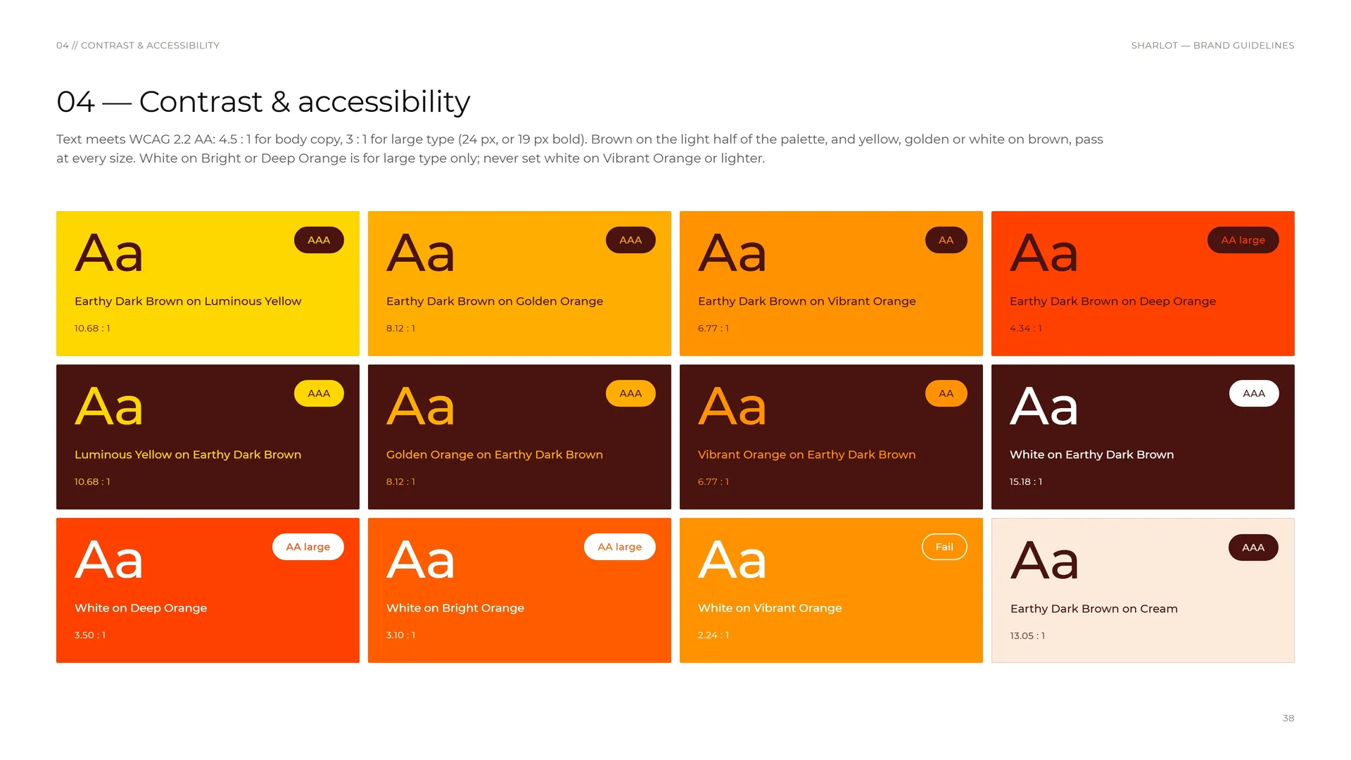
Text meets WCAG 2.2 AA: 4.5 : 1 for body copy, 3 : 1 for large type (24 px, or 19 px bold). Brown on the light half of the palette, and yellow, golden or white on brown, pass at every size. White on Bright or Deep Orange is for large type only; never set white on Vibrant Orange or lighter.
Earthy Dark Brown on Luminous Yellow: 10.68 : 1 — AAA.
Luminous Yellow on Earthy Dark Brown: 10.68 : 1 — AAA.
White on Deep Orange: 3.50 : 1 — AA large.
Earthy Dark Brown on Golden Orange: 8.12 : 1 — AAA.
Golden Orange on Earthy Dark Brown: 8.12 : 1 — AAA.
White on Bright Orange: 3.10 : 1 — AA large.
Earthy Dark Brown on Vibrant Orange: 6.77 : 1 — AA.
Vibrant Orange on Earthy Dark Brown: 6.77 : 1 — AA.
White on Vibrant Orange: 2.24 : 1 — Fail.
Earthy Dark Brown on Deep Orange: 4.34 : 1 — AA large.
White on Earthy Dark Brown: 15.18 : 1 — AAA.
Earthy Dark Brown on Cream: 13.05 : 1 — AAA.
04.5
Colour from the source
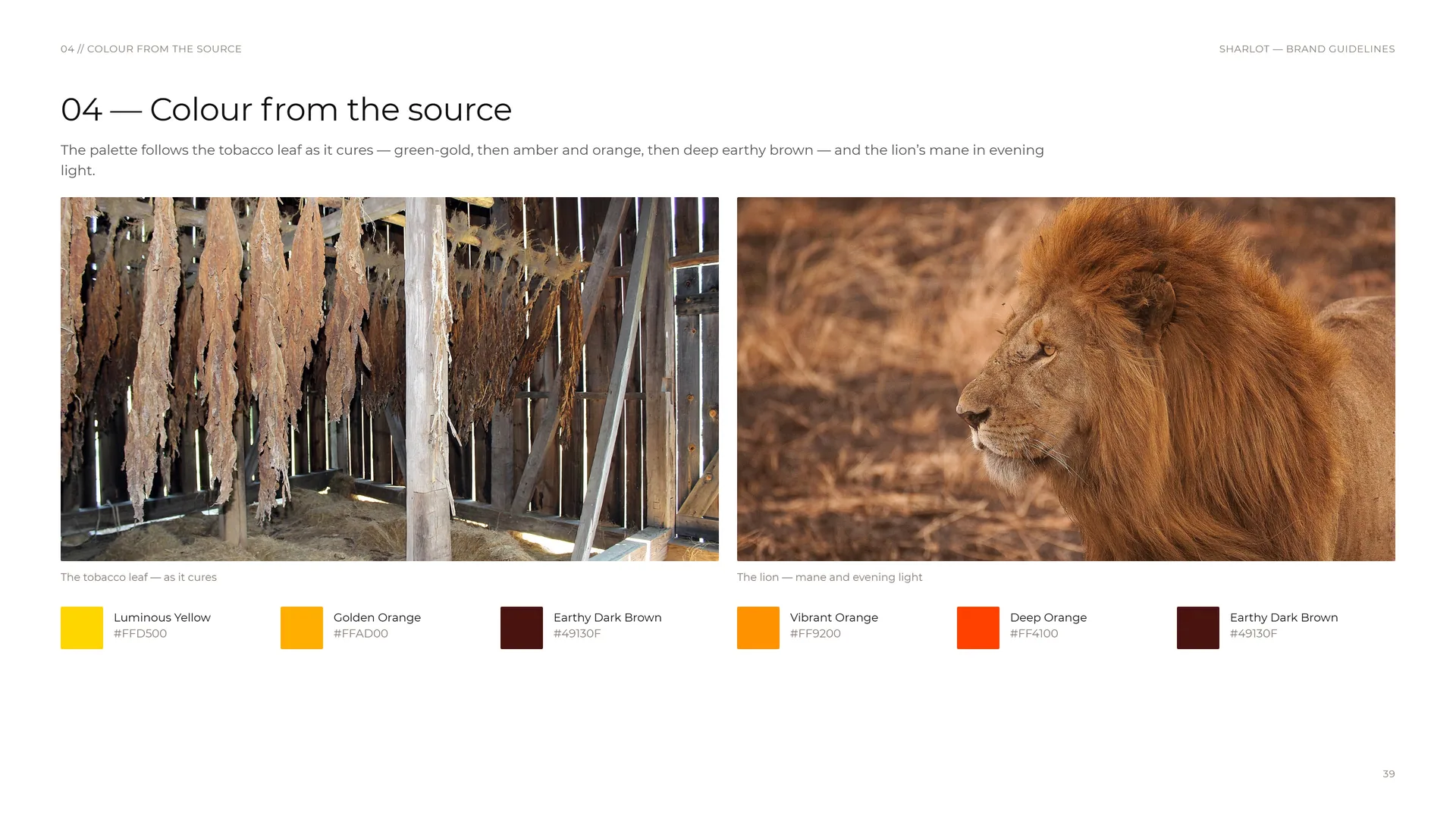
The palette follows the tobacco leaf as it cures — green-gold, then amber and orange, then deep earthy brown — and the lion’s mane in evening light.
The tobacco leaf — as it cures: Luminous Yellow #FFD500 · Golden Orange #FFAD00 · Earthy Dark Brown #49130F.
The lion — mane and evening light: Vibrant Orange #FF9200 · Deep Orange #FF4100 · Earthy Dark Brown #49130F.
05
Typography
05.1
Typography
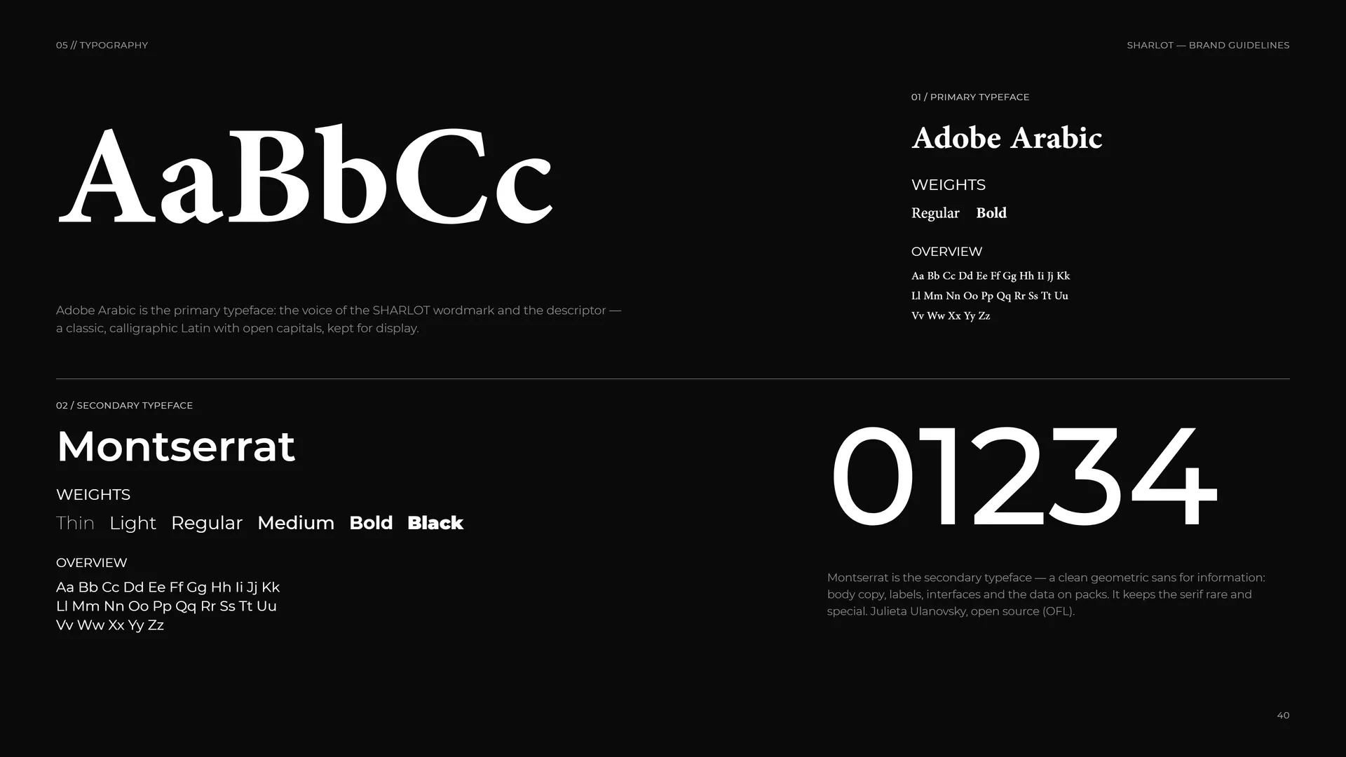
01 / Primary typeface: Adobe Arabic. Weights: Regular · Bold.
Adobe Arabic is the primary typeface: the voice of the SHARLOT wordmark and the descriptor — a classic, calligraphic Latin with open capitals, kept for display.
02 / Secondary typeface: Montserrat. Weights: Thin · Light · Regular · Medium · Bold · Black.
Montserrat is the secondary typeface — a clean geometric sans for information: body copy, labels, interfaces and the data on packs. It keeps the serif rare and special. Julieta Ulanovsky, open source (OFL).
05.2
Montserrat
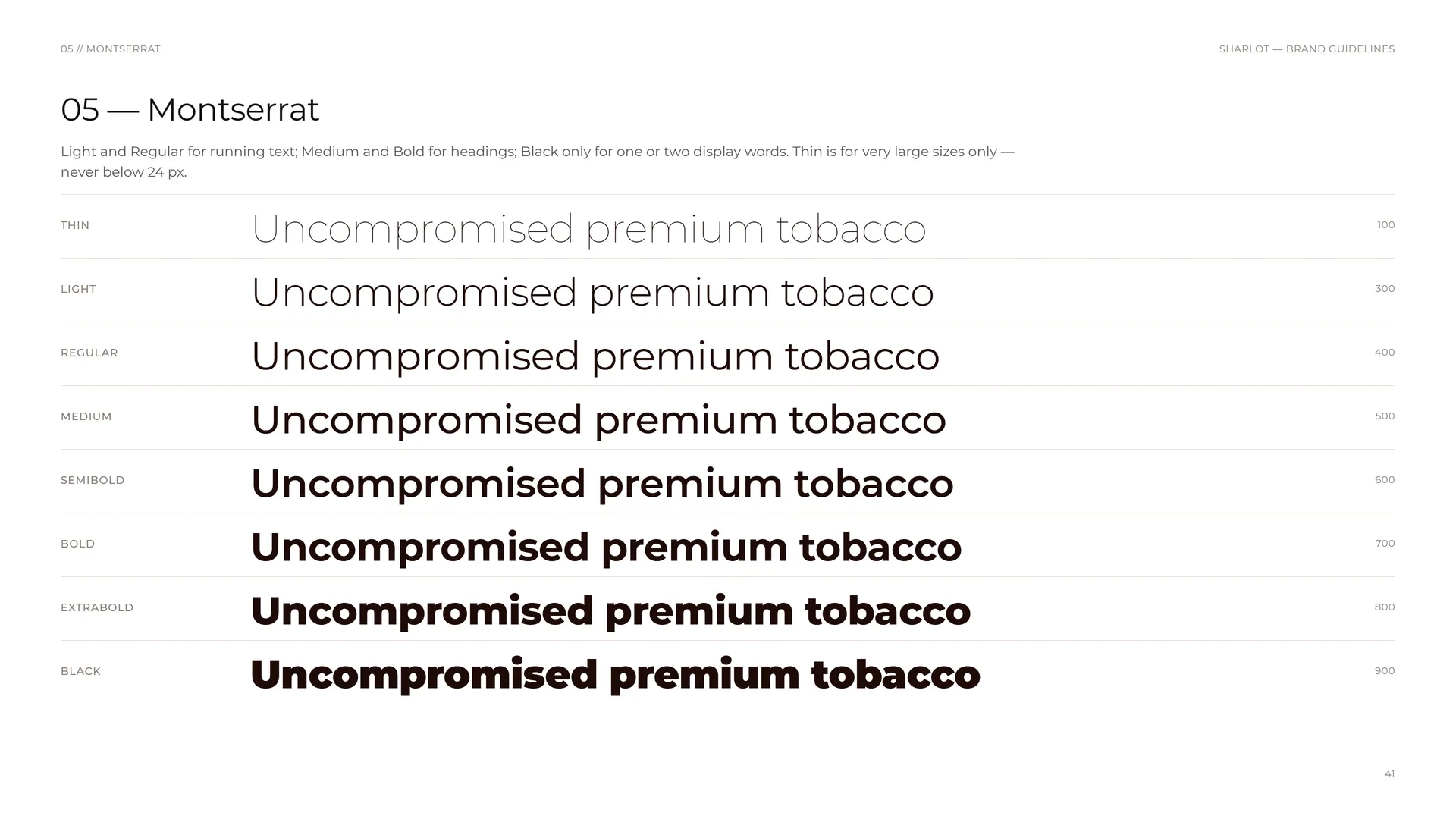
Light and Regular for running text; Medium and Bold for headings; Black only for one or two display words. Thin is for very large sizes only — never below 24 px.
Thin 100 · Light 300 · Regular 400 · Medium 500 · SemiBold 600 · Bold 700 · ExtraBold 800 · Black 900: Uncompromised premium tobacco.
05.3
Adobe Arabic
01 / Primary typeface: Adobe Arabic.
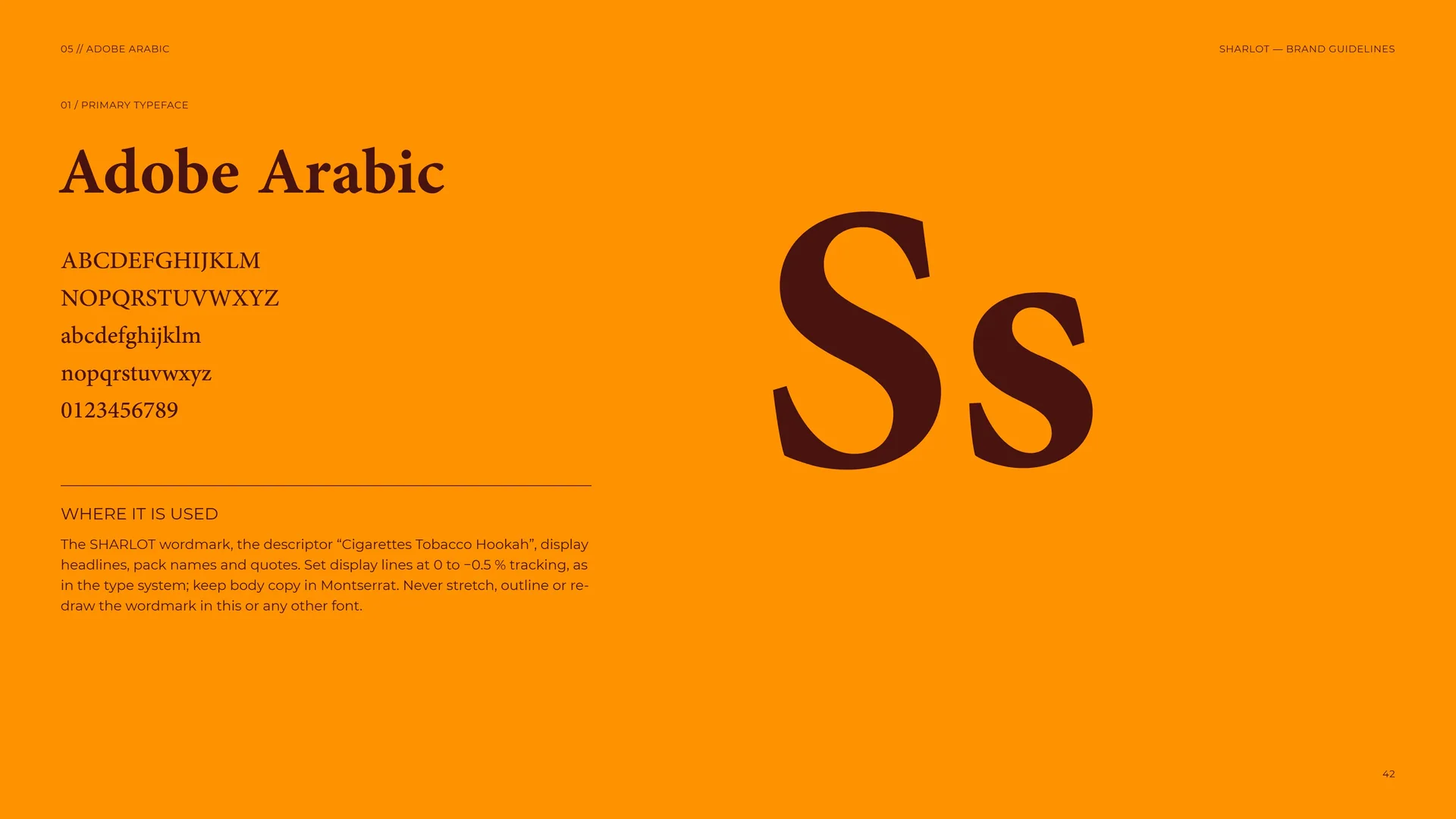
Where it is used: The SHARLOT wordmark, the descriptor “Cigarettes Tobacco Hookah”, display headlines, pack names and quotes. Set display lines at 0 to −0.5 % tracking, as in the type system; keep body copy in Montserrat. Never stretch, outline or redraw the wordmark in this or any other font.
05.4
Type system
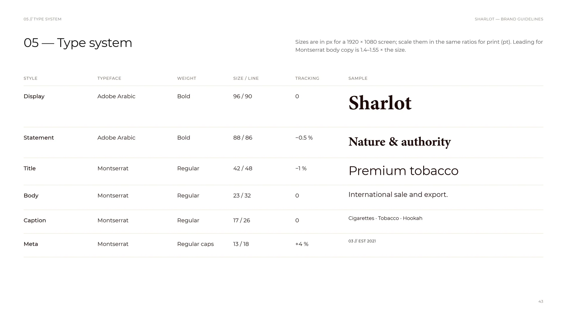
Sizes are in px for a 1920 × 1080 screen; scale them in the same ratios for print (pt). Leading for Montserrat body copy is 1.4–1.55 × the size.
Display: Adobe Arabic Bold · 96 / 90 · tracking 0 — Sharlot.
Statement: Adobe Arabic Bold · 88 / 86 · tracking −0.5 % — Nature & authority.
Title: Montserrat Regular · 42 / 48 · tracking −1 % — Premium tobacco.
Body: Montserrat Regular · 23 / 32 · tracking 0 — International sale and export.
Caption: Montserrat Regular · 17 / 26 · tracking 0 — Cigarettes · Tobacco · Hookah.
Meta: Montserrat Regular caps · 13 / 18 · tracking +4 % — 03 // EST 2021.
06
Pattern
- 06.1The pattern
- 06.2How the pattern is built
- 06.3Pattern family
- 06.4Pattern rhythm
- 06.5Pattern rules
- 06.6Pattern in use
06.1
The pattern
The pattern.
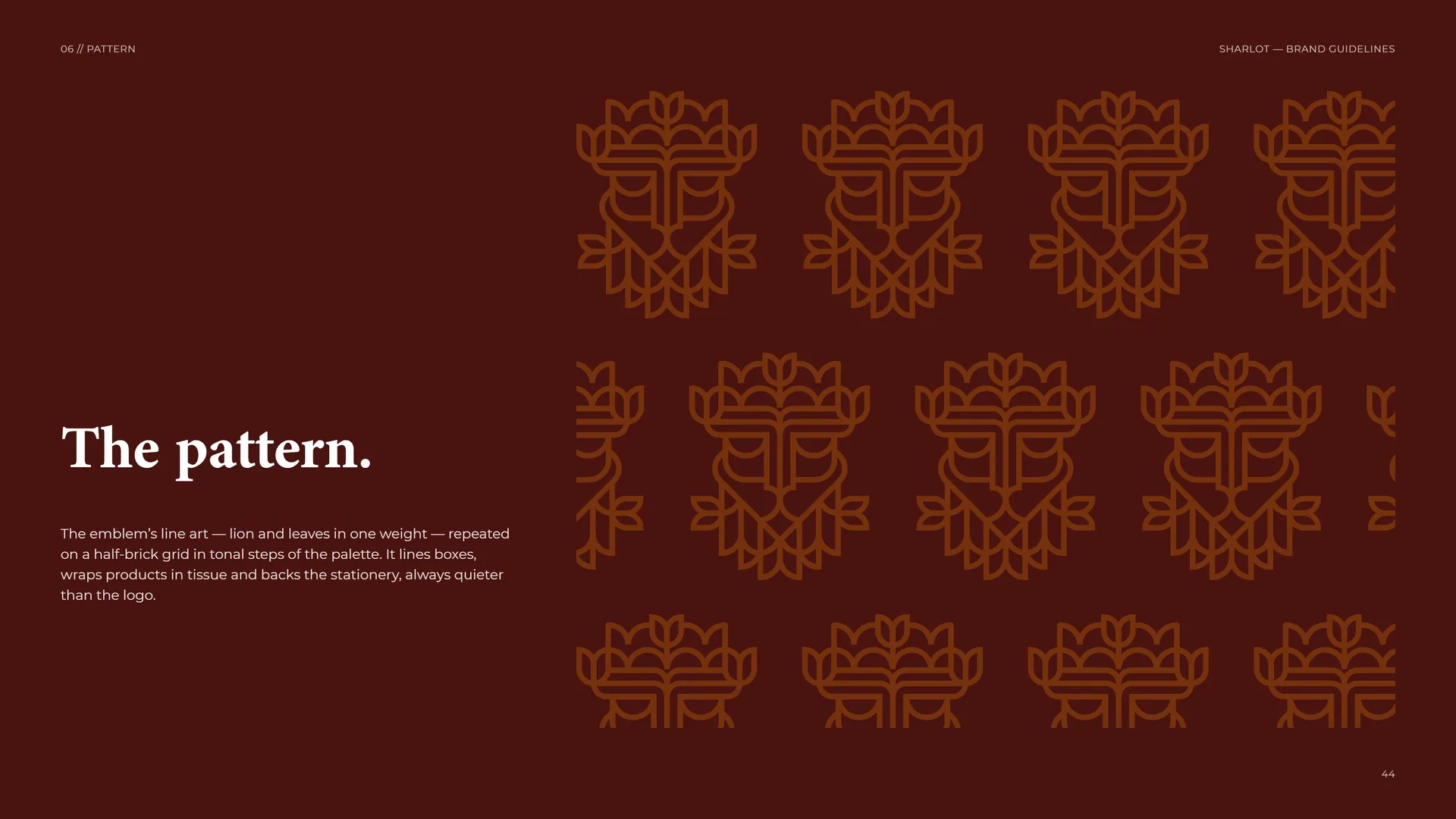
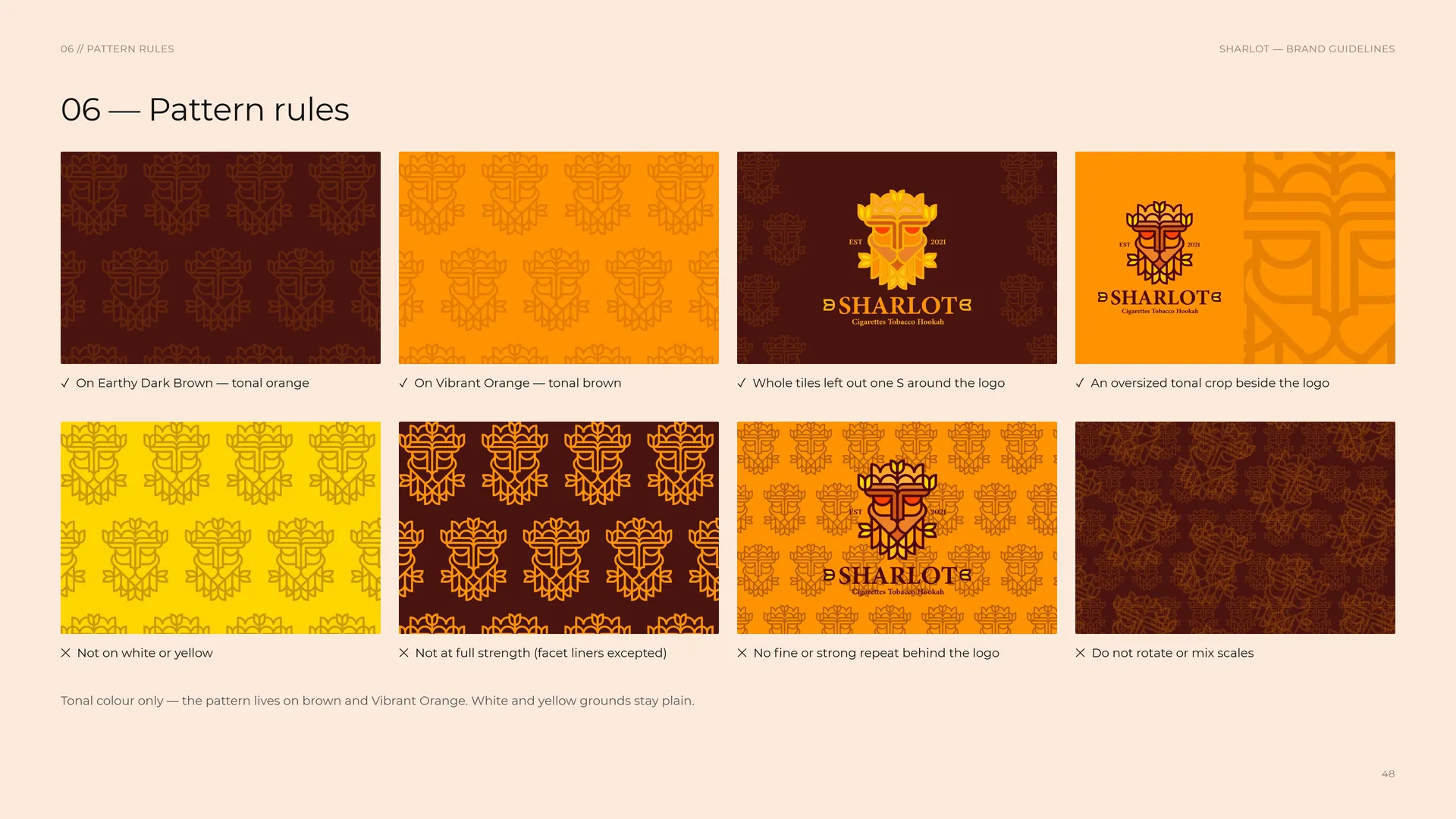
The emblem’s line art — lion and leaves in one weight — repeated on a half-brick grid in tonal steps of the palette. It lines boxes, wraps products in tissue and backs the stationery, always quieter than the logo.
06.2
How the pattern is built
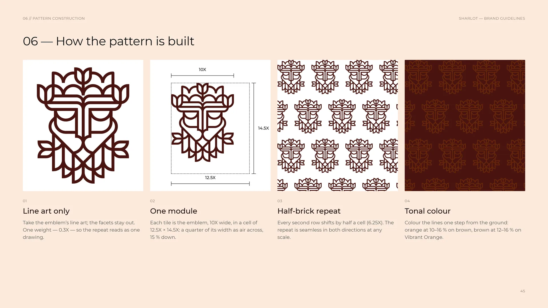
Line art only: Take the emblem’s line art; the facets stay out. One weight — 0.3X — so the repeat reads as one drawing.
One module: Each tile is the emblem, 10X wide, in a cell of 12.5X × 14.5X: a quarter of its width as air across, 15 % down.
Half-brick repeat: Every second row shifts by half a cell (6.25X). The repeat is seamless in both directions at any scale.
Tonal colour: Colour the lines one step from the ground: orange at 10–16 % on brown, brown at 12–16 % on Vibrant Orange.
06.3
Pattern family
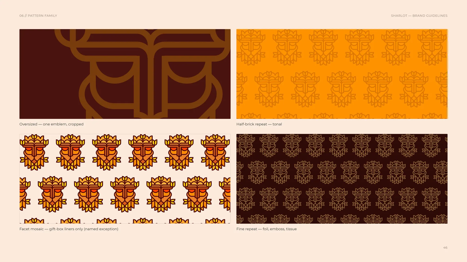
Oversized — one emblem, cropped.
Half-brick repeat — tonal.
Facet mosaic — gift-box liners only (named exception).
Fine repeat — foil, emboss, tissue.
06.4
Pattern rhythm
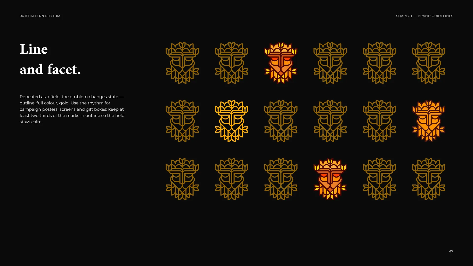
Line and facet.
Repeated as a field, the emblem changes state — outline, full colour, gold. Use the rhythm for campaign posters, screens and gift boxes; keep at least two thirds of the marks in outline so the field stays calm.
06.5
Pattern rules
✓ On Earthy Dark Brown — tonal orange.
✓ On Vibrant Orange — tonal brown.
✓ Whole tiles left out one S around the logo.
✓ An oversized tonal crop beside the logo.
✕ Not on white or yellow.
✕ Not at full strength (facet liners excepted).
✕ No fine or strong repeat behind the logo.
✕ Do not rotate or mix scales.
Tonal colour only — the pattern lives on brown and Vibrant Orange. White and yellow grounds stay plain.
06.6
Pattern in use
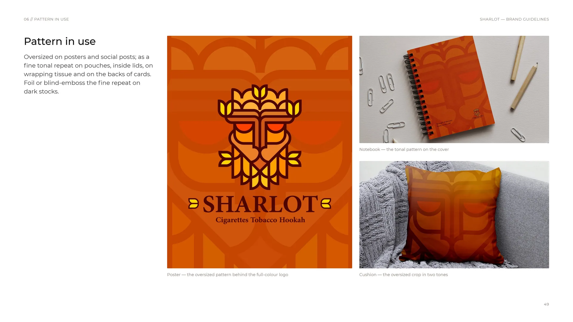
Oversized on posters and social posts; as a fine tonal repeat on pouches, inside lids, on wrapping tissue and on the backs of cards. Foil or blind-emboss the fine repeat on dark stocks.
Notebook — the tonal pattern on the cover.
Poster — the oversized pattern behind the full-colour logo.
Cushion — the oversized crop in two tones.
07
Imagery
07.1
Imagery
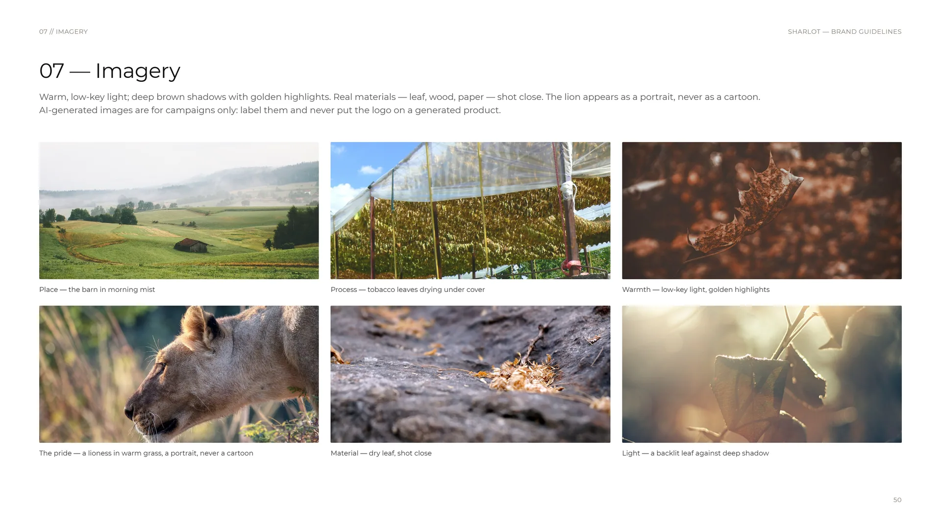
Warm, low-key light; deep brown shadows with golden highlights. Real materials — leaf, wood, paper — shot close. The lion appears as a portrait, never as a cartoon. AI-generated images are for campaigns only: label them and never put the logo on a generated product.
Place — the barn in morning mist.
Process — tobacco leaves drying under cover.
Warmth — low-key light, golden highlights.
The pride — a lioness in warm grass, a portrait, never a cartoon.
Material — dry leaf, shot close.
Light — a backlit leaf against deep shadow.
08
Stationery
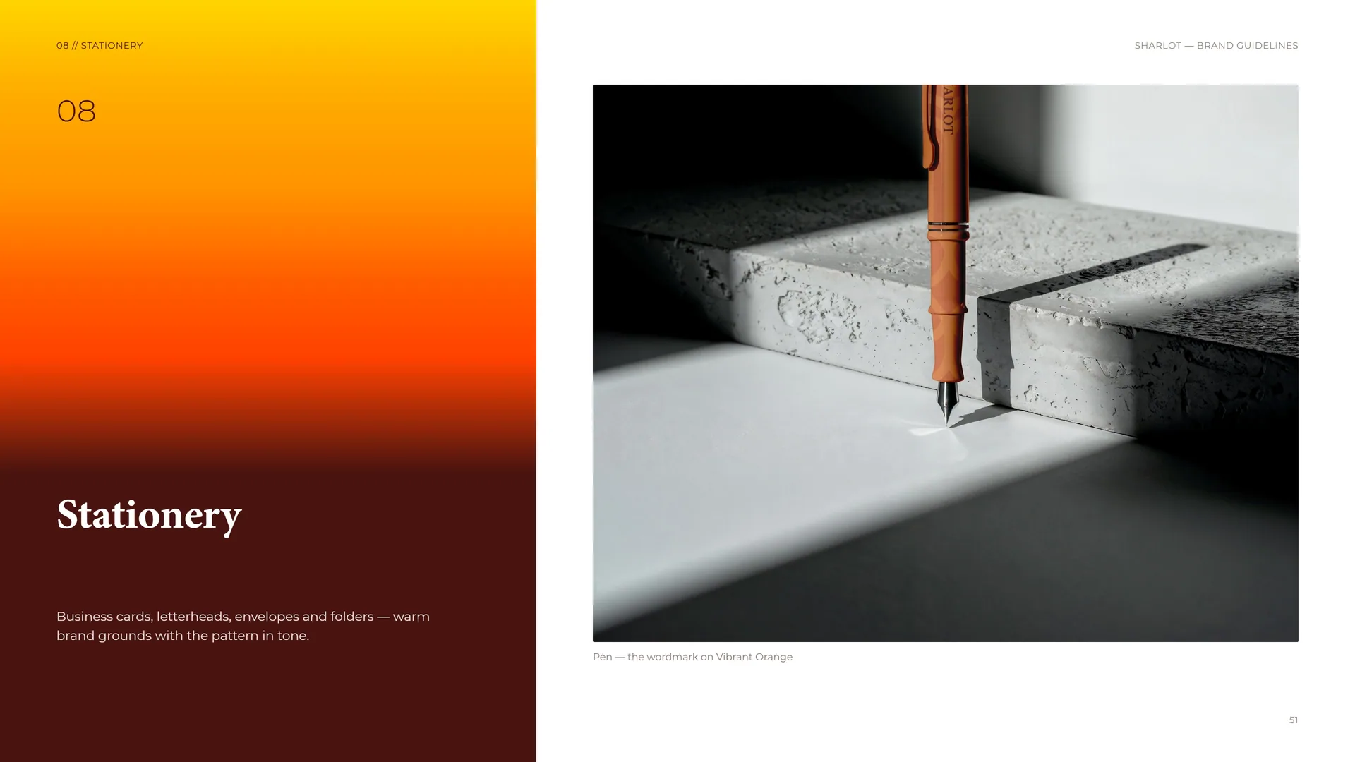
Business cards, letterheads, envelopes and folders — warm brand grounds with the pattern in tone.
Pen — the wordmark on Vibrant Orange.
08.1
Warm grounds, clear data
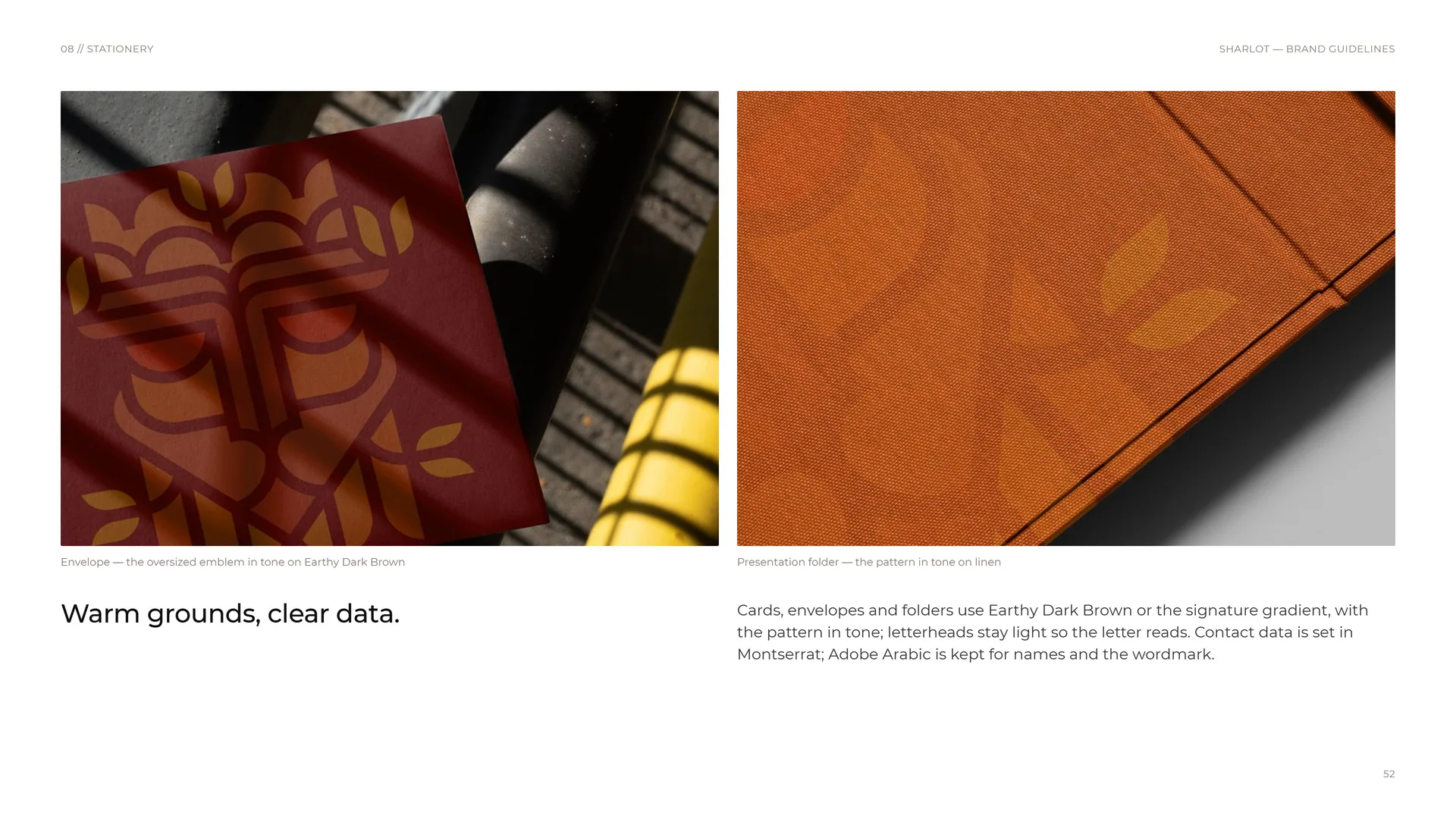
Envelope — the oversized emblem in tone on Earthy Dark Brown.
Warm grounds, clear data.
Presentation folder — the pattern in tone on linen.
Cards, envelopes and folders use Earthy Dark Brown or the signature gradient, with the pattern in tone; letterheads stay light so the letter reads. Contact data is set in Montserrat; Adobe Arabic is kept for names and the wordmark.
08.2
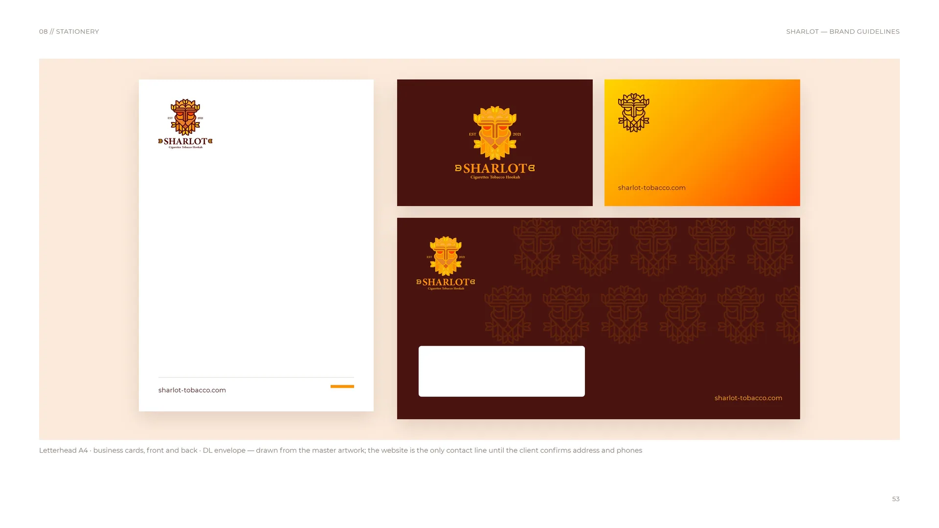
Letterhead, business cards and envelope
Letterhead A4 · business cards, front and back · DL envelope — drawn from the master artwork; the website is the only contact line until the client confirms address and phones.
09
Packaging
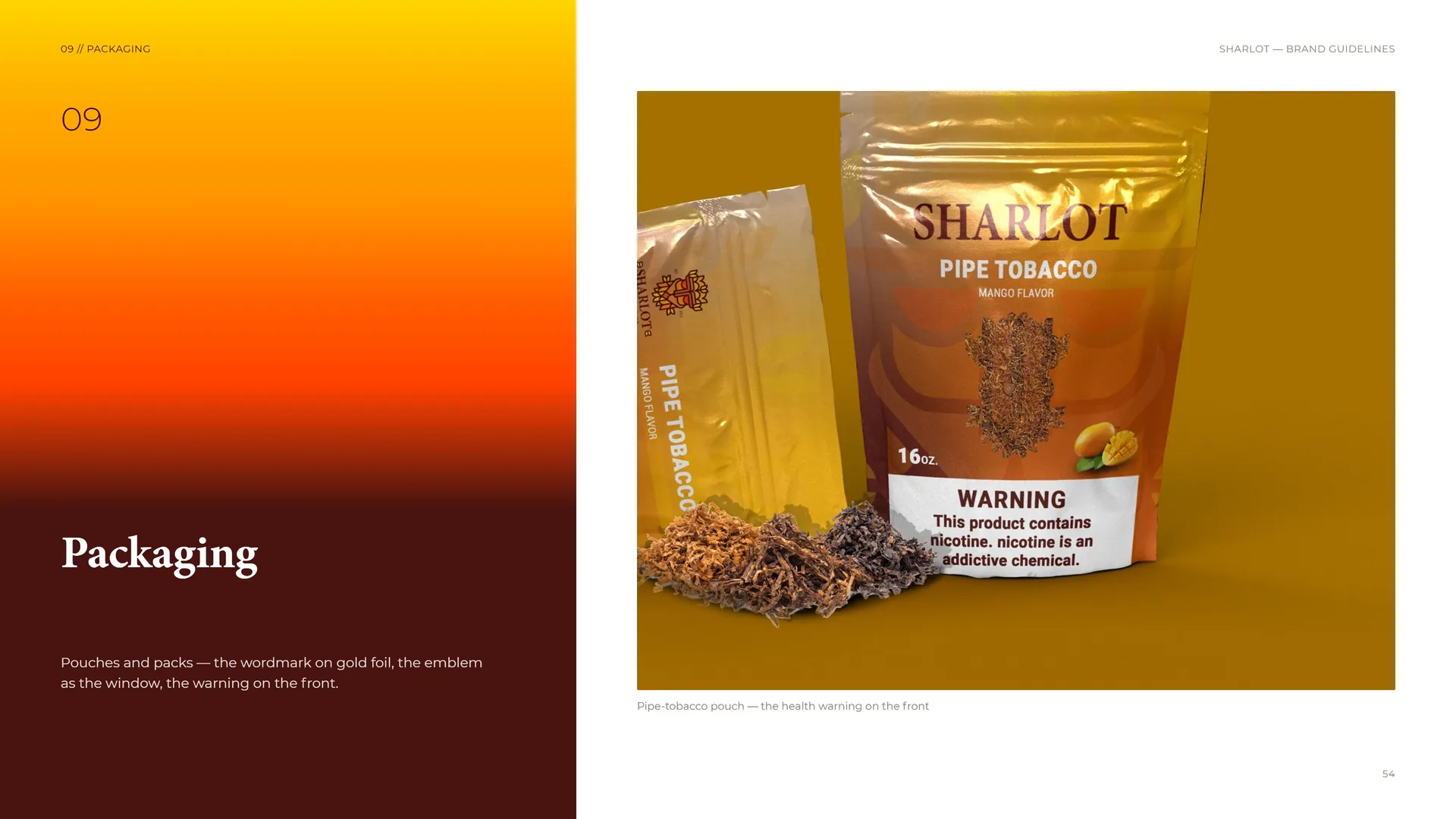
Pouches and packs — the wordmark on gold foil, the emblem as the window, the warning on the front.
Pipe-tobacco pouch — the health warning on the front.
09.1
Room for the warning
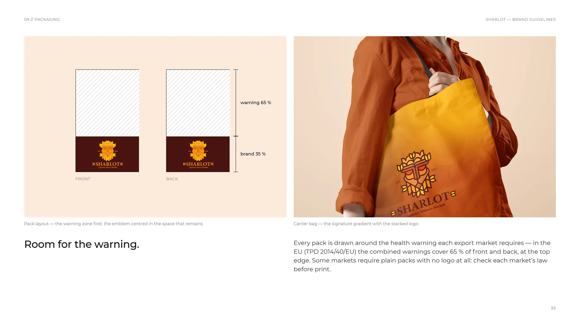
Pack layout — the warning zone first; the emblem centred in the space that remains.
Warning 65 % · brand 35 % · front · back.
Room for the warning.
Carrier bag — the signature gradient with the stacked logo.
Every pack is drawn around the health warning each export market requires — in the EU (TPD 2014/40/EU) the combined warnings cover 65 % of front and back, at the top edge. Some markets require plain packs with no logo at all: check each market’s law before print.
10
Digital media
10.1
Design tokens
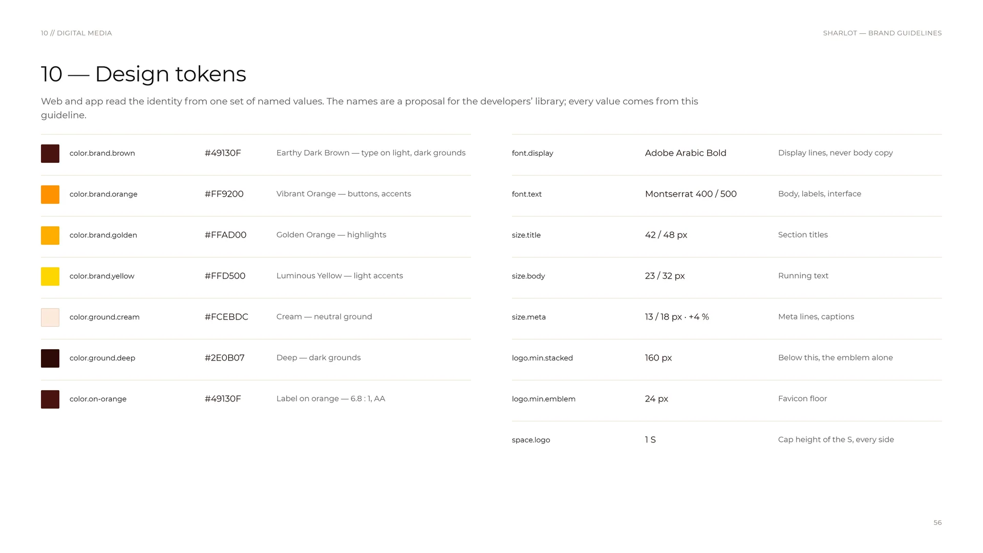
Web and app read the identity from one set of named values. The names are a proposal for the developers’ library; every value comes from this guideline.
color.brand.brown: #49130F — Earthy Dark Brown — type on light, dark grounds.
color.brand.orange: #FF9200 — Vibrant Orange — buttons, accents.
color.brand.golden: #FFAD00 — Golden Orange — highlights.
color.brand.yellow: #FFD500 — Luminous Yellow — light accents.
color.ground.cream: #FCEBDC — Cream — neutral ground.
color.ground.deep: #2E0B07 — Deep — dark grounds.
color.on-orange: #49130F — Label on orange — 6.8 : 1, AA.
font.display: Adobe Arabic Bold — Display lines, never body copy.
font.text: Montserrat 400 / 500 — Body, labels, interface.
size.title: 42 / 48 px — Section titles.
size.body: 23 / 32 px — Running text.
size.meta: 13 / 18 px · +4 % — Meta lines, captions.
logo.min.stacked: 160 px — Below this, the emblem alone.
logo.min.emblem: 24 px — Favicon floor.
space.logo: 1 S — Cap height of the S, every side.
10.2
App-store header and lock screen
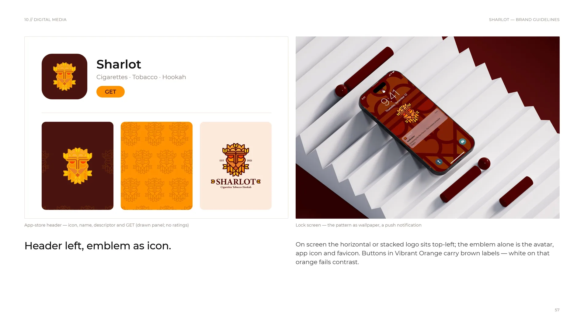
App-store header — icon, name, descriptor and GET (drawn panel; no ratings).
Header left, emblem as icon.
Lock screen — the pattern as wallpaper, a push notification.
On screen the horizontal or stacked logo sits top-left; the emblem alone is the avatar, app icon and favicon. Buttons in Vibrant Orange carry brown labels — white on that orange fails contrast.
10.3
One voice on every screen
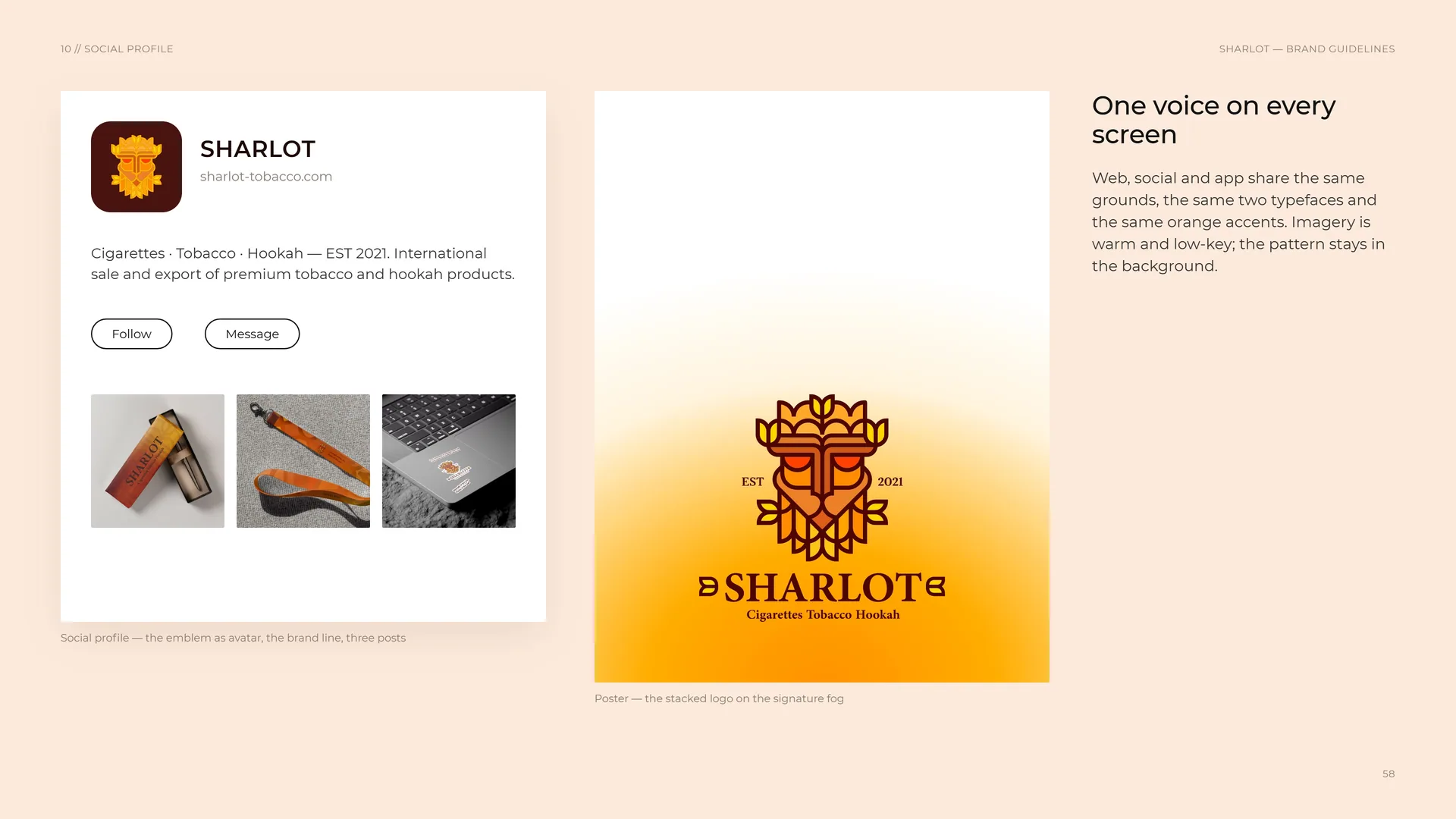
One voice on every screen.
Web, social and app share the same grounds, the same two typefaces and the same orange accents. Imagery is warm and low-key; the pattern stays in the background.
Social profile — the emblem as avatar, the brand line, three posts.
Poster — the stacked logo on the signature fog.
10.4
Browser tab
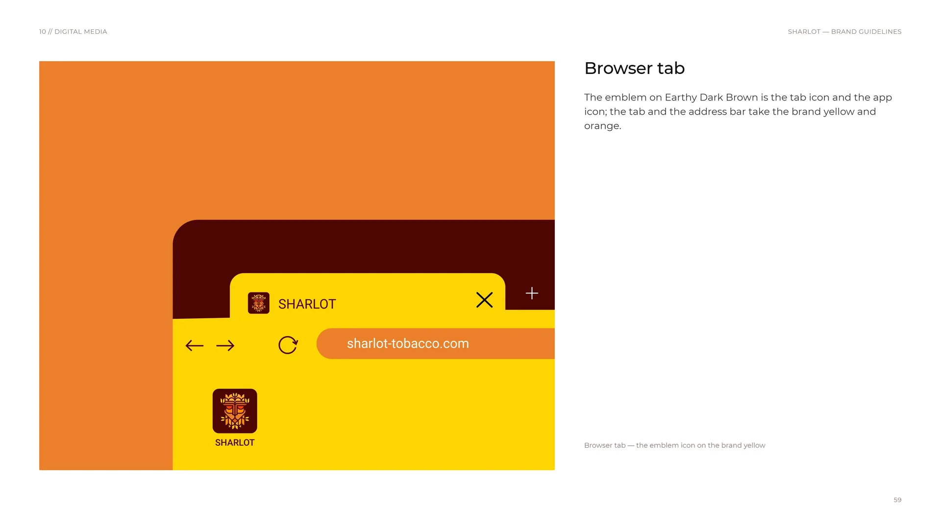
The emblem on Earthy Dark Brown is the tab icon and the app icon; the tab and the address bar take the brand yellow and orange.
Browser tab — the emblem icon on the brand yellow.
11
Merchandise
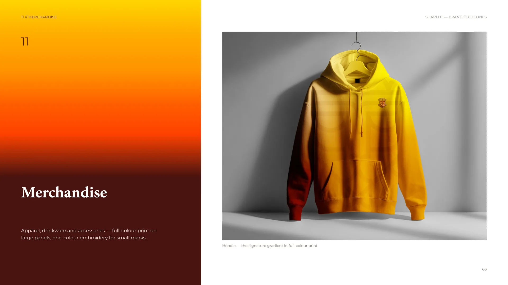
Apparel, drinkware and accessories — full-colour print on large panels, one-colour embroidery for small marks.
Hoodie — the signature gradient in full-colour print.
11.1
Print in full colour
Print in full colour.
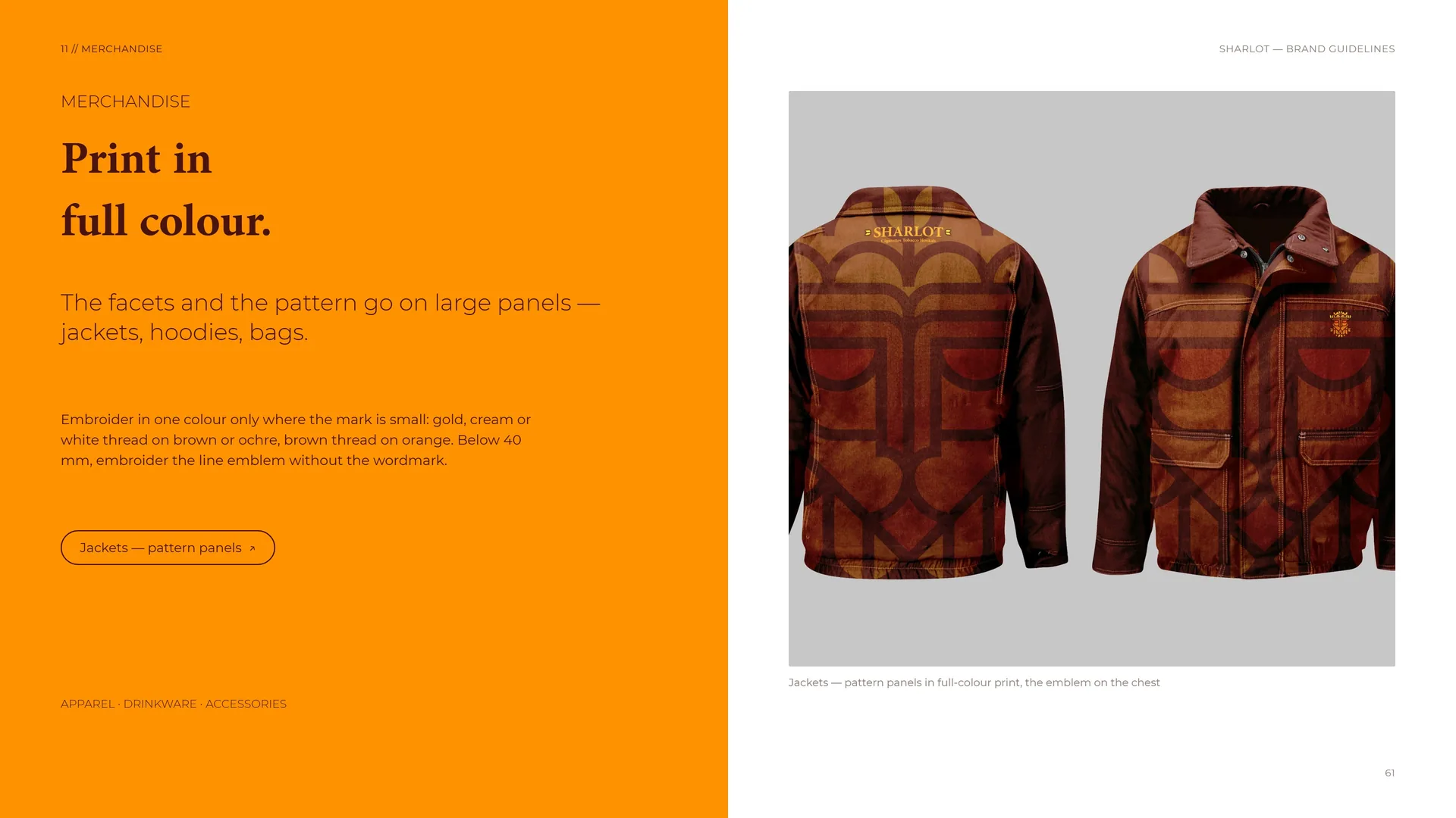
The facets and the pattern go on large panels — jackets, hoodies, bags.
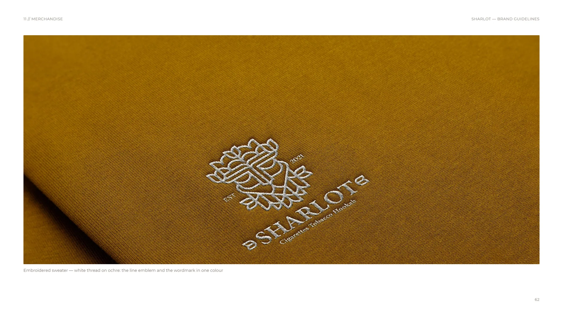
Embroider in one colour only where the mark is small: gold, cream or white thread on brown or ochre, brown thread on orange. Below 40 mm, embroider the line emblem without the wordmark.
Apparel · Drinkware · Accessories.
Jackets — pattern panels in full-colour print, the emblem on the chest.
11.2
Embroidered sweater
Embroidered sweater — white thread on ochre: the line emblem and the wordmark in one colour.
11.3
Small objects, one mark
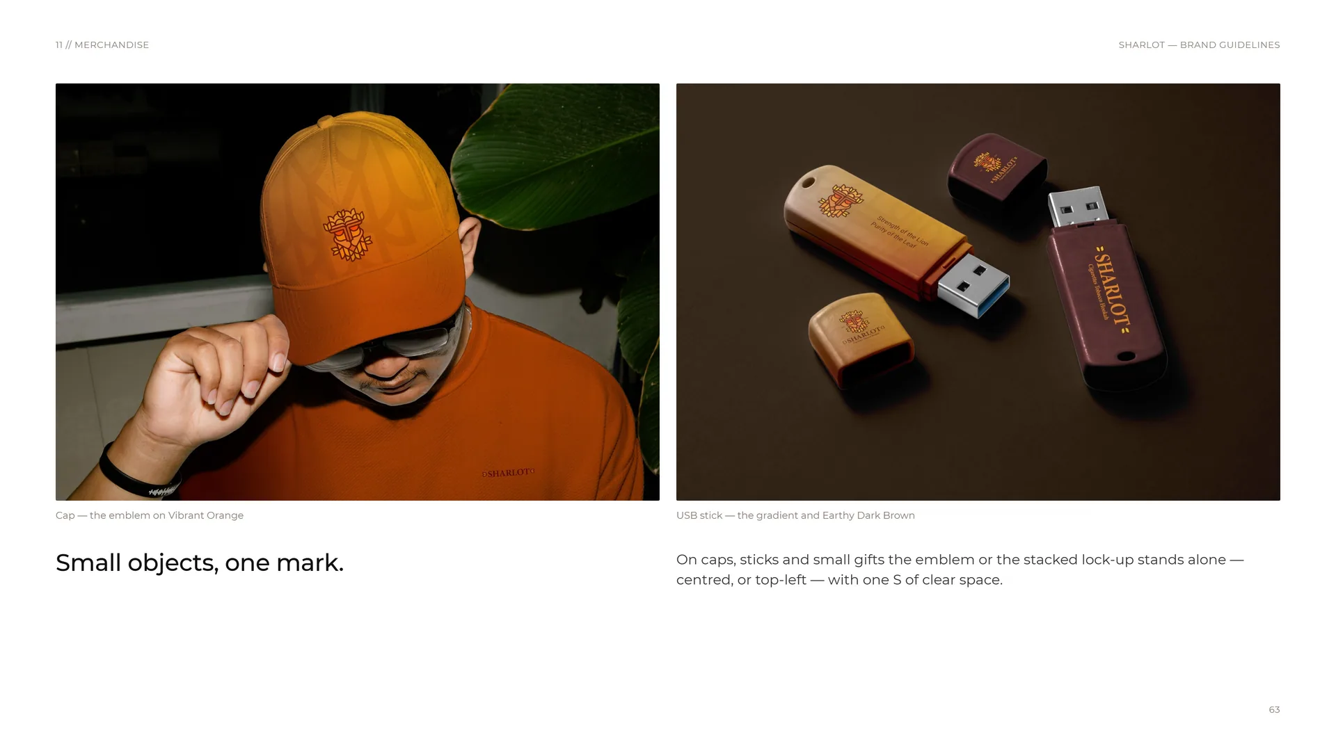
Cap — the emblem on Vibrant Orange.
Small objects, one mark.
USB stick — the gradient and Earthy Dark Brown.
On caps, sticks and small gifts the emblem or the stacked lock-up stands alone — centred, or top-left — with one S of clear space.
12
Signage & environment
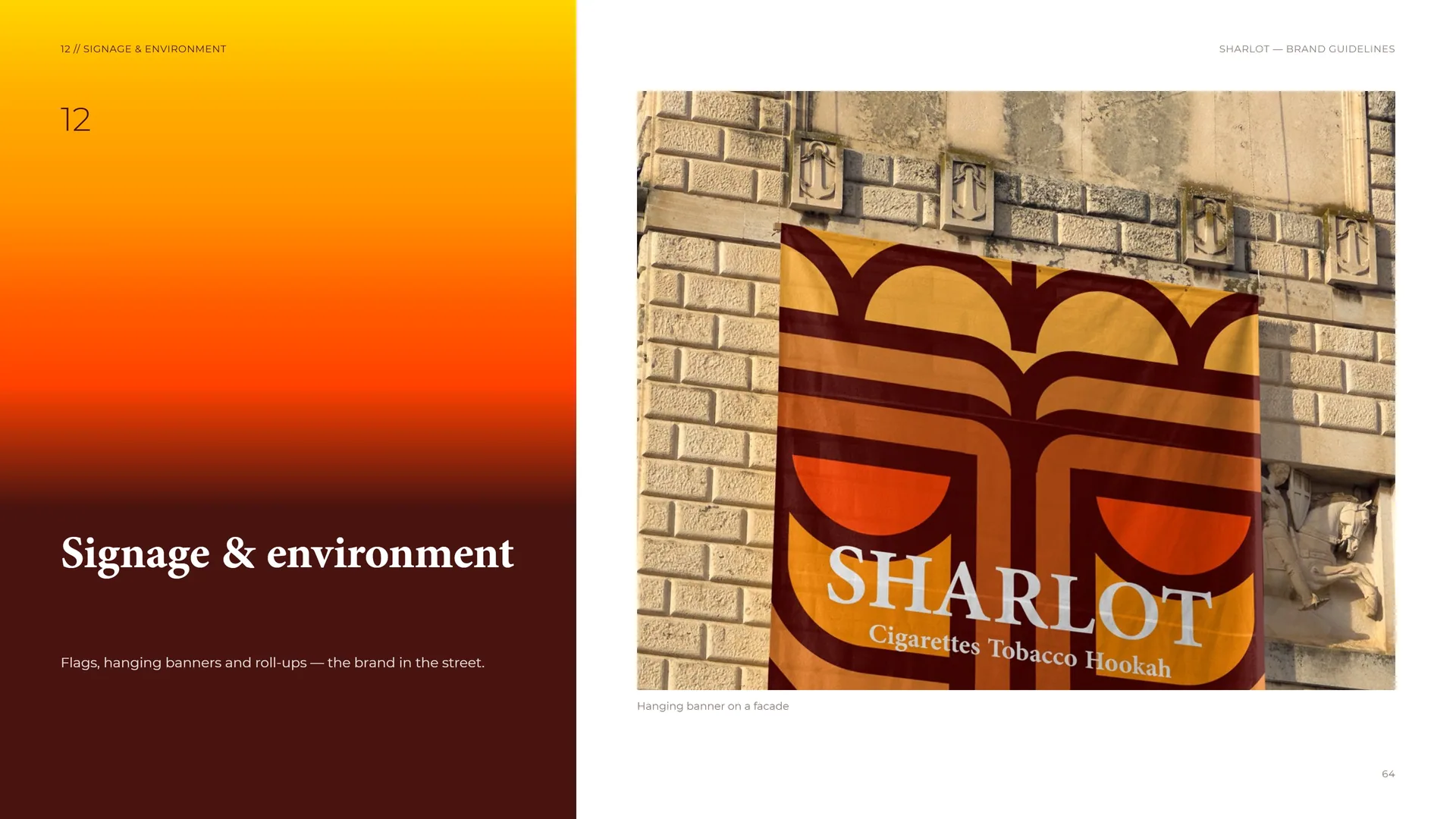
Flags, hanging banners and roll-ups — the brand in the street.
Hanging banner on a facade.
12.1
Blade flag
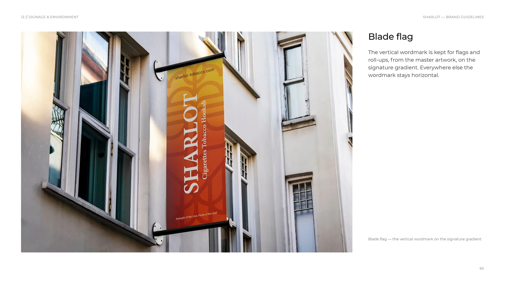
The vertical wordmark is kept for flags and roll-ups, from the master artwork, on the signature gradient. Everywhere else the wordmark stays horizontal.
Blade flag — the vertical wordmark on the signature gradient.
12.2
One image, one logo
One image, one logo.
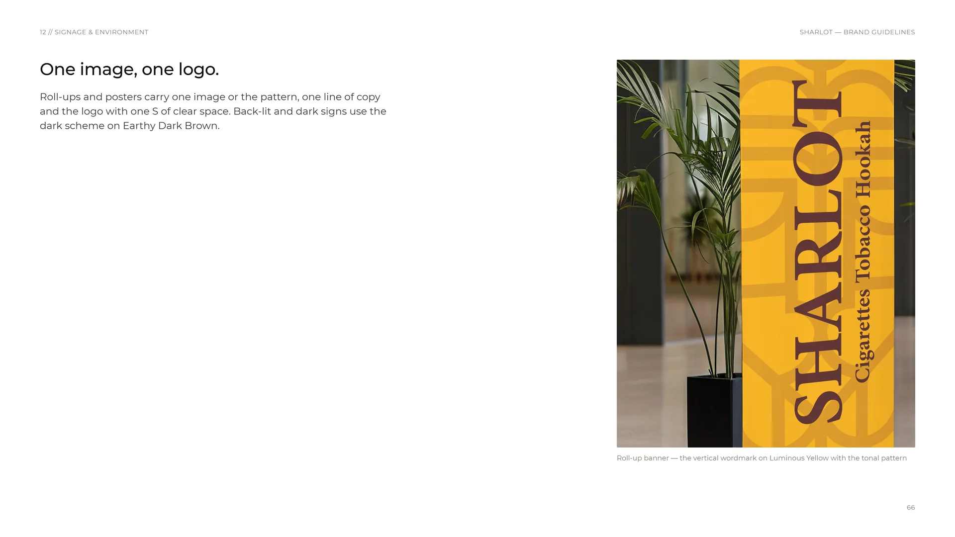
Roll-ups and posters carry one image or the pattern, one line of copy and the logo with one S of clear space. Back-lit and dark signs use the dark scheme on Earthy Dark Brown.
Roll-up banner — the vertical wordmark on Luminous Yellow with the tonal pattern.
12.3
Signage system
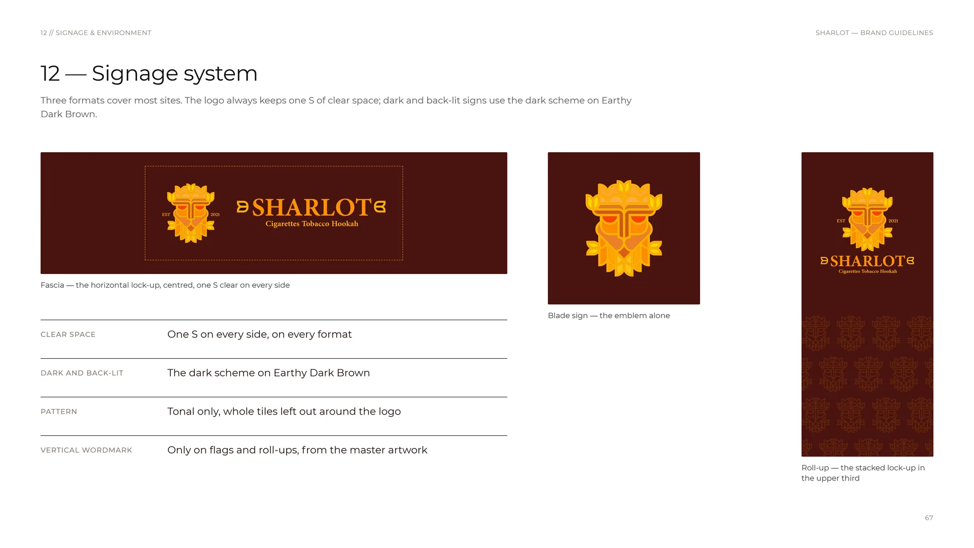
Three formats cover most sites. The logo always keeps one S of clear space; dark and back-lit signs use the dark scheme on Earthy Dark Brown.
Fascia — the horizontal lock-up, centred, one S clear on every side.
Blade sign — the emblem alone.
Roll-up — the stacked lock-up in the upper third.
Clear space: One S on every side, on every format.
Dark and back-lit: The dark scheme on Earthy Dark Brown.
Pattern: Tonal only, whole tiles left out around the logo.
Vertical wordmark: Only on flags and roll-ups, from the master artwork.
13
The system
13.1
The system at a glance
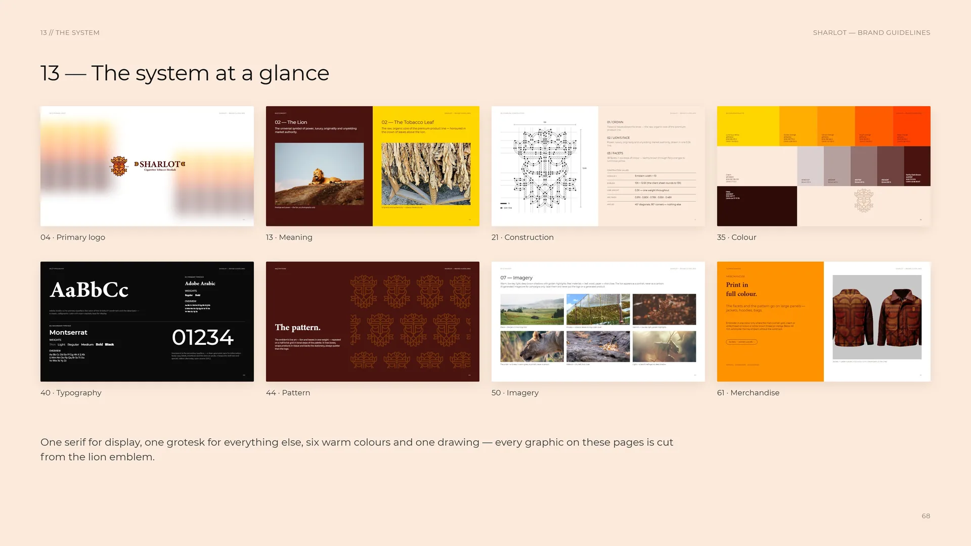
One serif for display, one grotesk for everything else, six warm colours and one drawing — every graphic on these pages is cut from the lion emblem.
04 · Primary logo · 13 · Meaning · 21 · Construction · 35 · Colour · 40 · Typography · 44 · Pattern · 50 · Imagery · 61 · Merchandise.
14
Files & contact
14.1
Files & contact
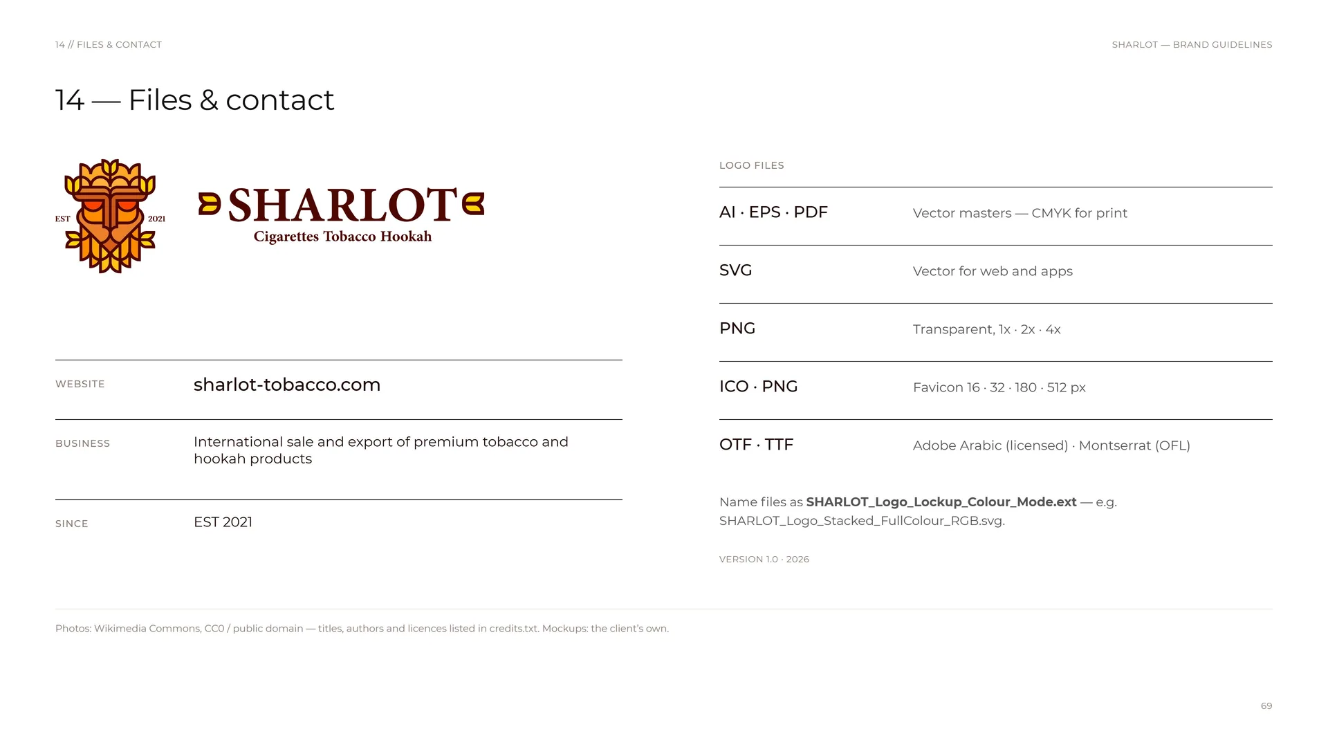
Website: sharlot-tobacco.com.
Business: International sale and export of premium tobacco and hookah products.
Since: EST 2021.
Logo files: AI · EPS · PDF — Vector masters — CMYK for print.
SVG: Vector for web and apps.
PNG: Transparent, 1x · 2x · 4x.
ICO · PNG: Favicon 16 · 32 · 180 · 512 px.
OTF · TTF: Adobe Arabic (licensed) · Montserrat (OFL).
Name files as SHARLOT_Logo_Lockup_Colour_Mode.ext — e.g. SHARLOT_Logo_Stacked_FullColour_RGB.svg.
Version 1.0 · 2026.
Photos: Wikimedia Commons, CC0 / public domain — titles, authors and licences listed in credits.txt. Mockups: the client’s own.
14.2
Thank you
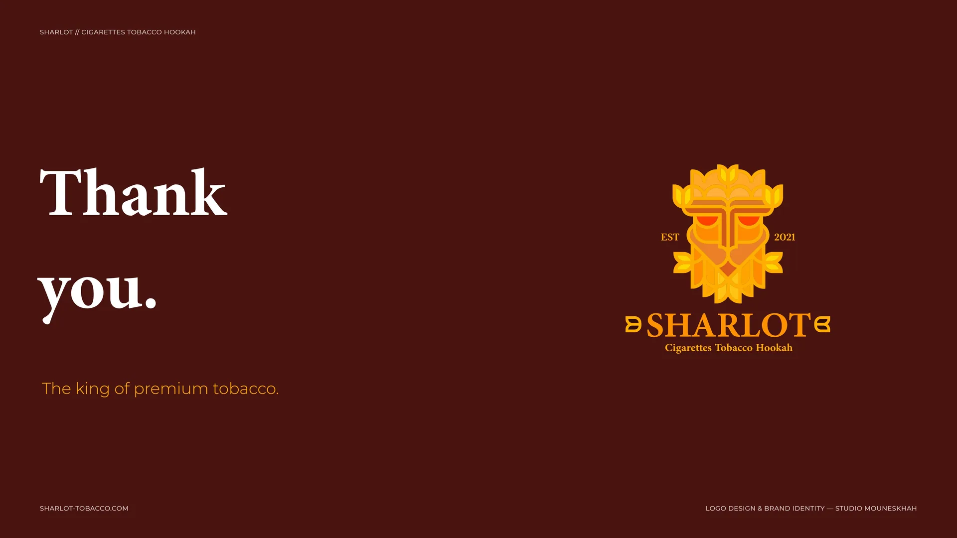
Thank you.
The king of premium tobacco.
SHARLOT-TOBACCO.COM.
Logo design & brand identity — Studio Mouneskhah.