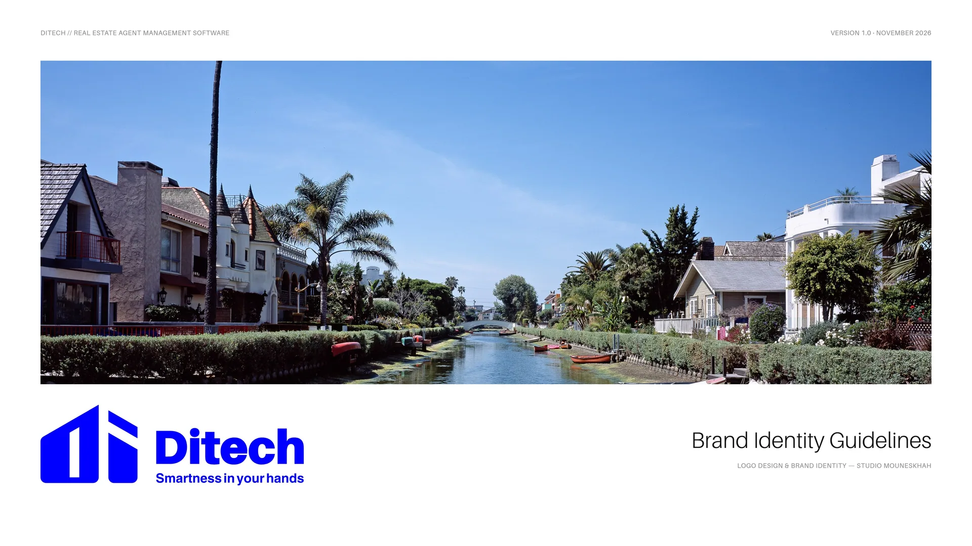
DITECH Brand Identity Guidelines
DITECH redefines how real estate agents manage their operations in one of the world’s most dynamic property markets — Los Angeles. The brand emerged from the intersection of technology, architecture and human-centered design.
Traditional management systems were fragmented, inefficient and unable to keep up with modern real estate. DITECH answers with one software platform that joins precision-driven tools with intuitive usability.
- Année
- 2024
- Client
- DITECH
- Secteur
- Real estate agent management software · Los Angeles
- Services
- Identité visuelle
- Projet
- Brand Identity Guidelines · v1.0 · 2026
00
Introduction
00.1
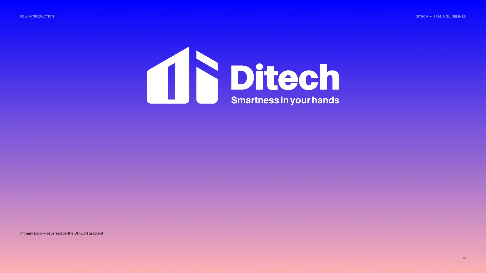
Primary logo
Primary logo — reversed on the DITECH gradient.
01
Brand
- 01.1Brand Concept
- 01.2The Brand Problem
- 01.3History of the Brand
- 01.4Mission & Vision
- 01.5Brand Values
- 01.6Tone of Voice
- 01.7Smartness in your hands
- 01.8Every transaction, efficient and meaningful
01.1
Brand Concept
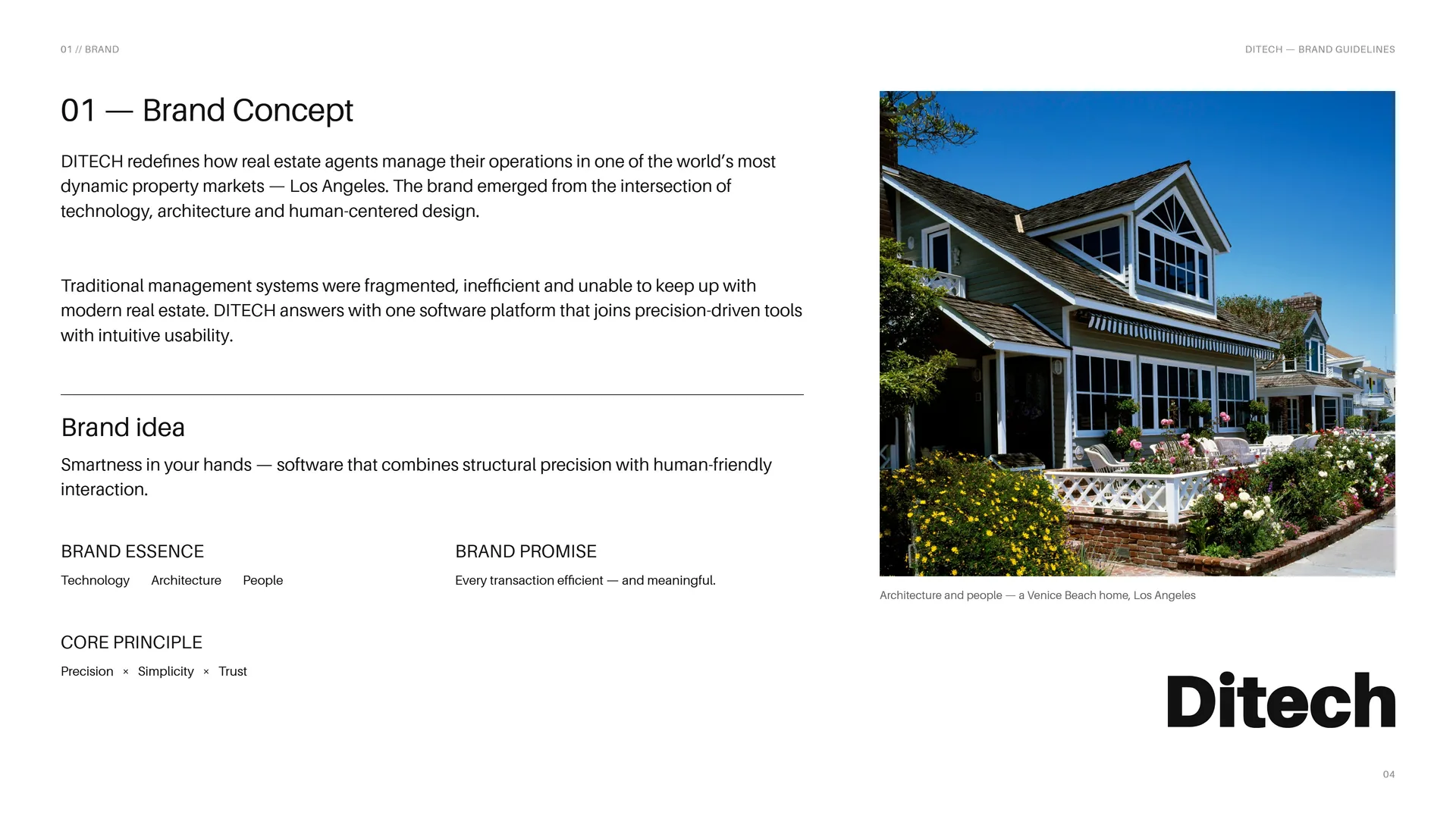
DITECH redefines how real estate agents manage their operations in one of the world’s most dynamic property markets — Los Angeles. The brand emerged from the intersection of technology, architecture and human-centered design.
Traditional management systems were fragmented, inefficient and unable to keep up with modern real estate. DITECH answers with one software platform that joins precision-driven tools with intuitive usability.
Brand idea: Smartness in your hands — software that combines structural precision with human-friendly interaction.
Brand essence: Technology · Architecture · People.
Brand promise: Every transaction efficient — and meaningful.
Core principle: Precision × Simplicity × Trust.
Architecture and people — a Venice Beach home, Los Angeles.
01.2
The Brand Problem
Real estate agents in Los Angeles work across fragmented tools that were never designed to work together. Traditional management systems are inefficient and unable to keep up with the complexity of modern real estate demands.
The challenge: Fragmented management tools · Inefficient, manual processes · Complexity that outgrows old systems · Client relationships lost between apps.
Brand positioning: A software platform for real estate professionals that integrates precision-driven tools with intuitive usability — a symbol of progress, reliability and innovation.
The opportunity: To simplify complex processes, enhance productivity and improve client relationships — first in Los Angeles, then across global markets.
The shift: From fragmented tools → One unified platform.
01.3
History of the Brand
DITECH was founded with a clear purpose: to redefine how real estate agents manage their operations in Los Angeles. Its journey began by closing the gaps of fragmented, inefficient systems with a platform that integrates precision-driven tools with intuitive usability.
Today the brand stands for progress, reliability and innovation in the real estate industry.
Business: Real estate agent management software.
Market: Los Angeles, then global markets.
Tagline: Smartness in your hands.
Identity: Studio Mouneskhah, 2024.
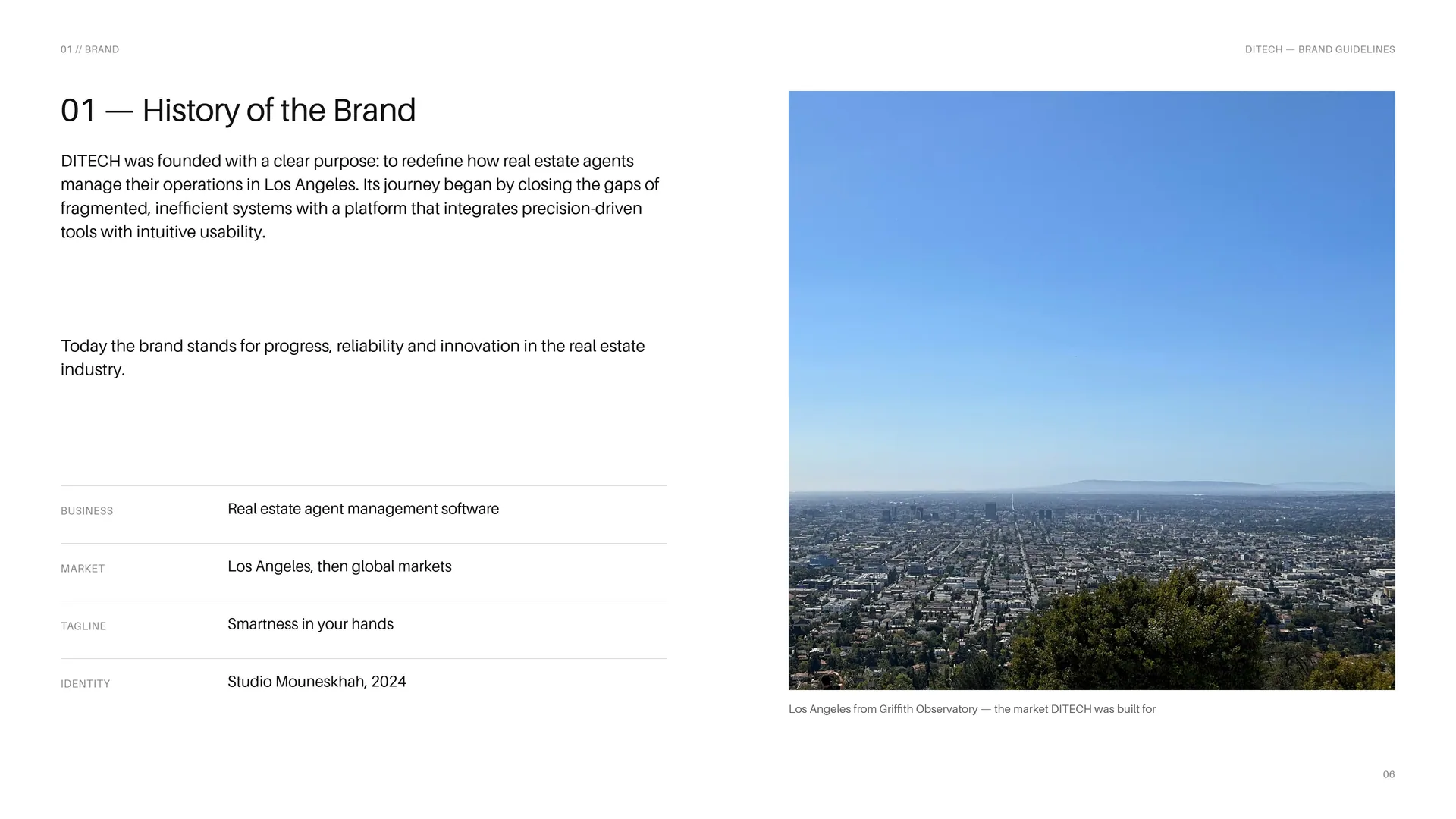
Los Angeles from Griffith Observatory — the market DITECH was built for.
01.4
Mission & Vision
Mission: To empower real estate professionals with seamless, efficient and intelligent management software tailored to the needs of Los Angeles — simplifying complex processes, enhancing productivity and improving client relationships by merging advanced technology with human-centered design.
Vision: To become the leading real estate management software in Los Angeles, and eventually across global markets — setting a new standard of excellence in efficiency, design and adaptability, so that agents no longer struggle with fragmented tools.
Through innovation, accuracy and continuous improvement, every transaction should be not only efficient but also meaningful.
01.5
Brand Values
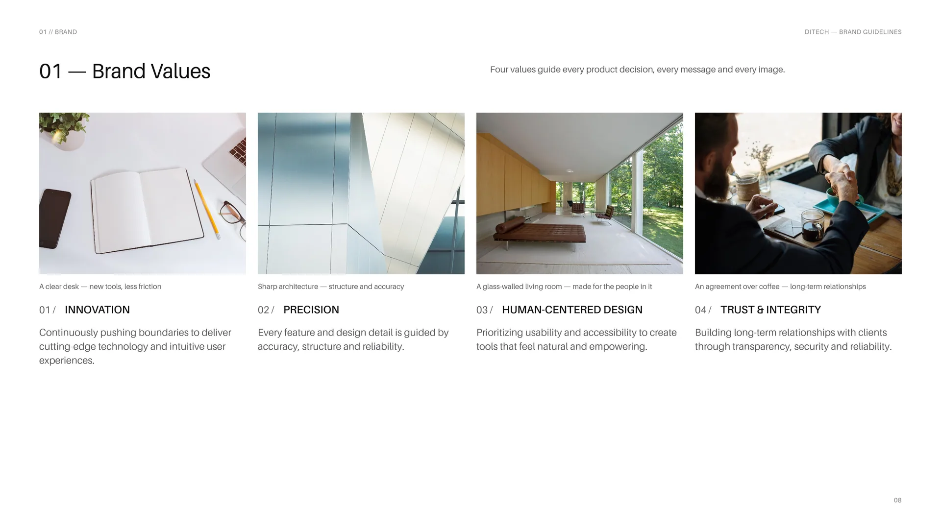
Four values guide every product decision, every message and every image.
A clear desk — new tools, less friction.
Innovation: Continuously pushing boundaries to deliver cutting-edge technology and intuitive user experiences.
Sharp architecture — structure and accuracy.
Precision: Every feature and design detail is guided by accuracy, structure and reliability.
A glass-walled living room — made for the people in it.
Human-centered design: Prioritizing usability and accessibility to create tools that feel natural and empowering.
An agreement over coffee — long-term relationships.
Trust & integrity: Building long-term relationships with clients through transparency, security and reliability.
01.6
Tone of Voice
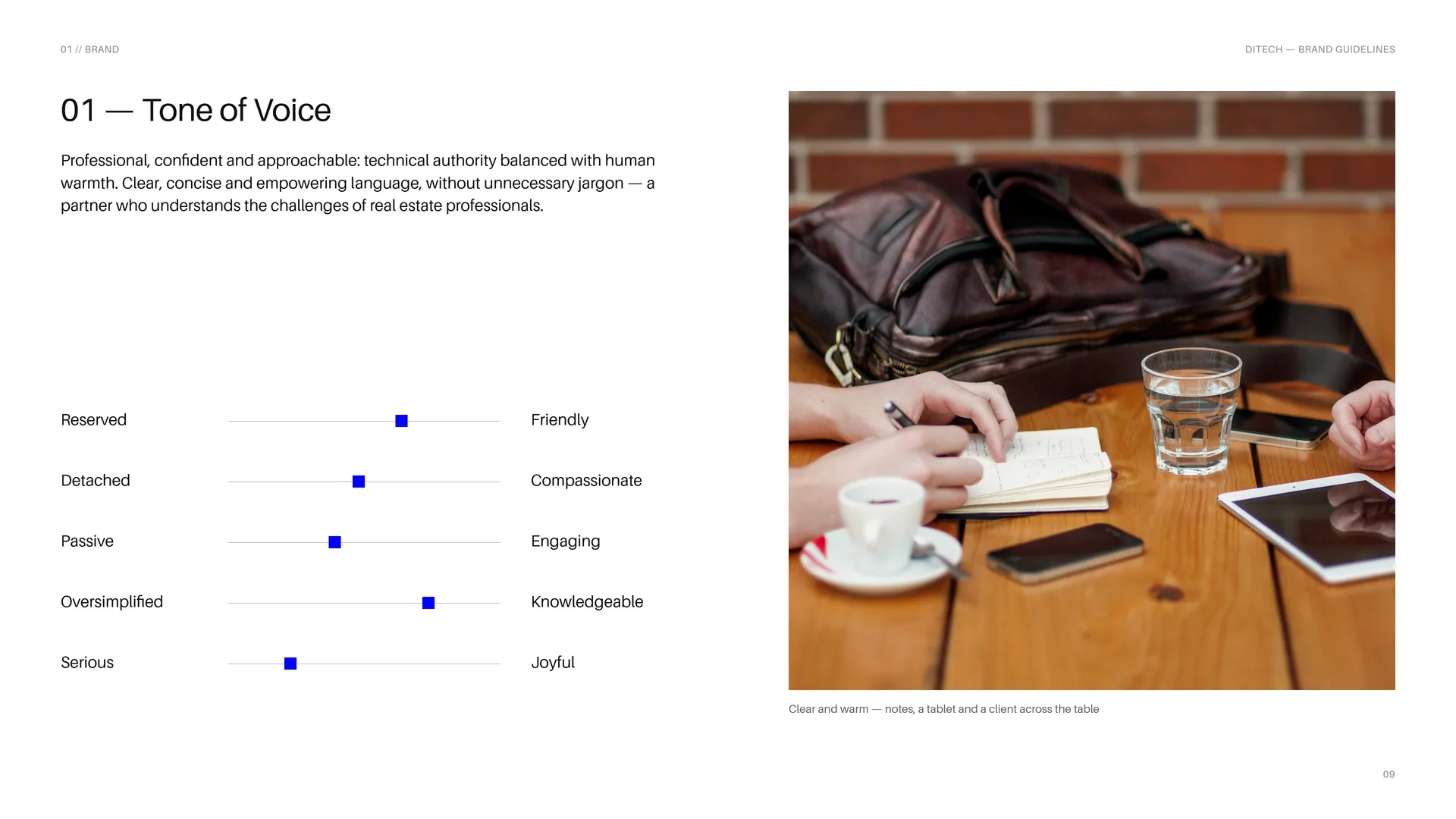
Professional, confident and approachable: technical authority balanced with human warmth. Clear, concise and empowering language, without unnecessary jargon — a partner who understands the challenges of real estate professionals.
Reserved — Friendly.
Detached — Compassionate.
Passive — Engaging.
Oversimplified — Knowledgeable.
Serious — Joyful.
Clear and warm — notes, a tablet and a client across the table.
01.7
Smartness in your hands
The tagline — said once, at the end of a message, or set under the logo.
Innovation · Precision · Trust & integrity.
In your hands — a tablet, the day’s listings at a glance.
01.8
Every transaction, efficient and meaningful
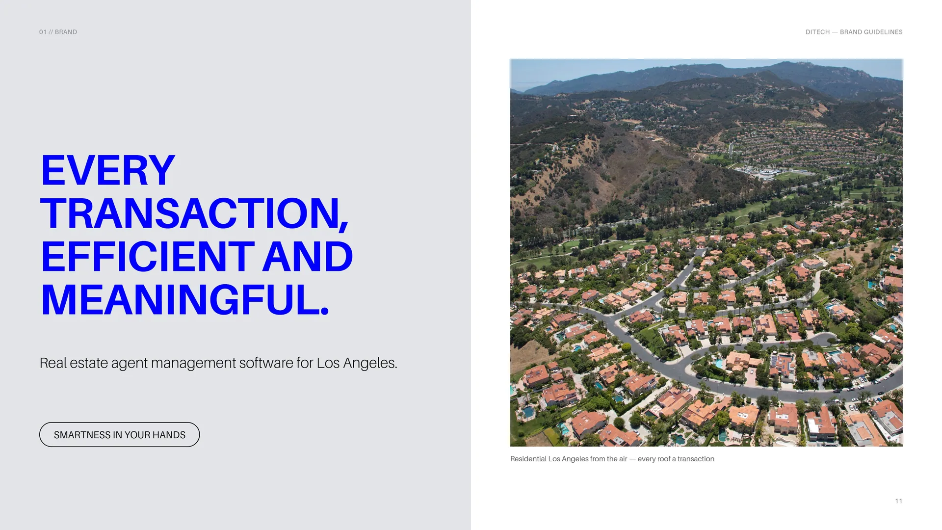
Real estate agent management software for Los Angeles.
Smartness in your hands.
Residential Los Angeles from the air — every roof a transaction.
02
Concept
- 02.1D + I = One Monogram
- 02.2The Outline of a House
- 02.3Linear Geometry
- 02.4Sharp and Soft
- 02.5Built on a Hexagon
- 02.6The D
- 02.7Architecture, Line by Line
02.1
D + I = One Monogram
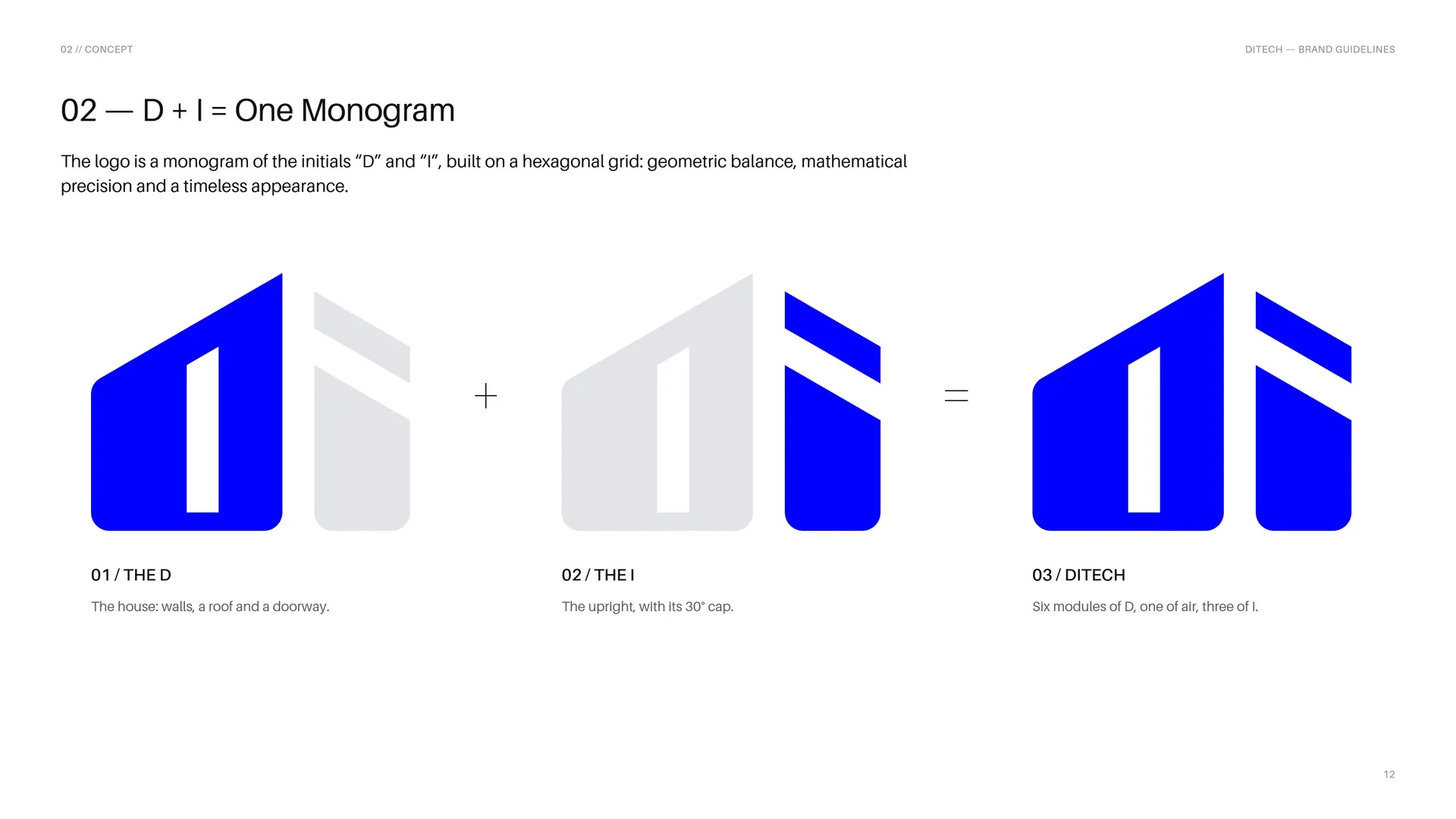
The logo is a monogram of the initials “D” and “I”, built on a hexagonal grid: geometric balance, mathematical precision and a timeless appearance.
The D: The house: walls, a roof and a doorway.
The I: The upright, with its 30° cap.
DITECH: Six modules of D, one of air, three of I.
02.2
The Outline of a House
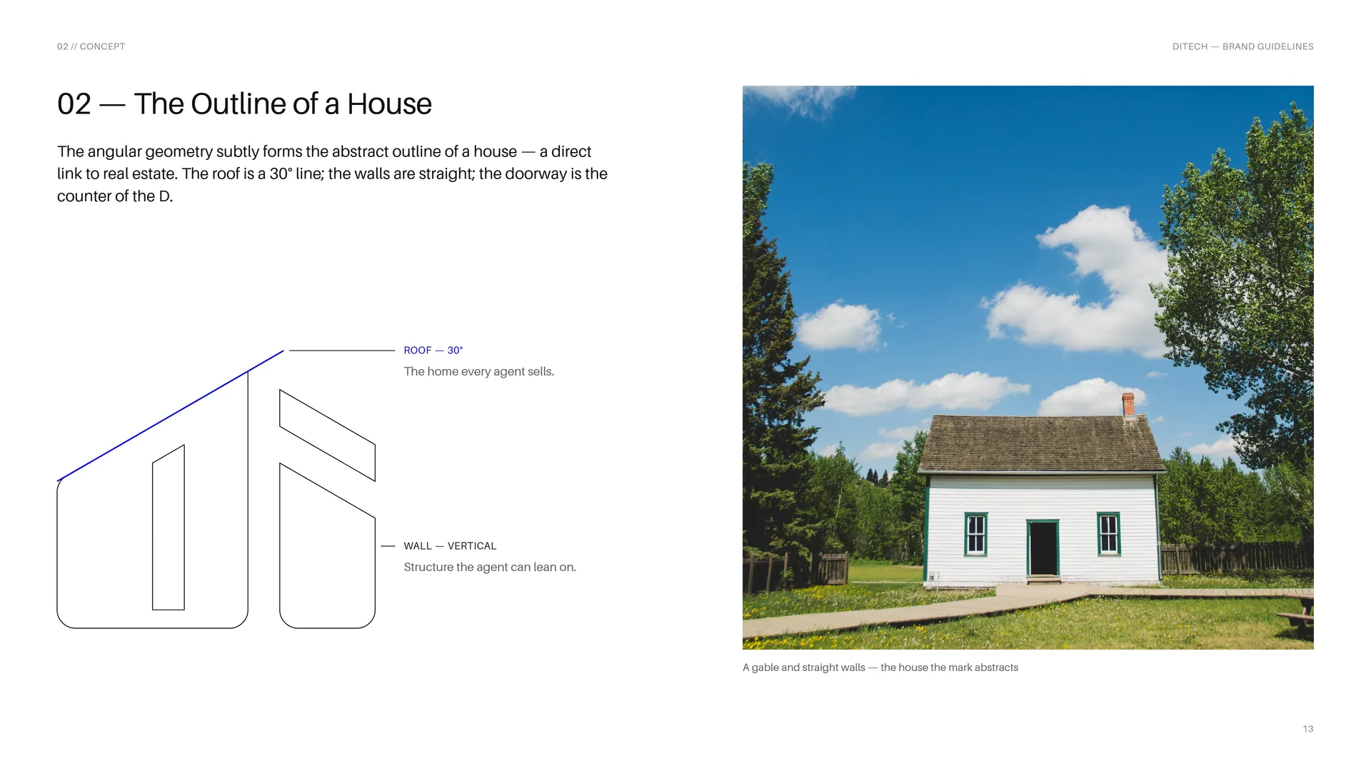
The angular geometry subtly forms the abstract outline of a house — a direct link to real estate. The roof is a 30° line; the walls are straight; the doorway is the counter of the D.
Roof — 30°: The home every agent sells.
Wall — vertical: Structure the agent can lean on.
A gable and straight walls — the house the mark abstracts.
02.3
Linear Geometry
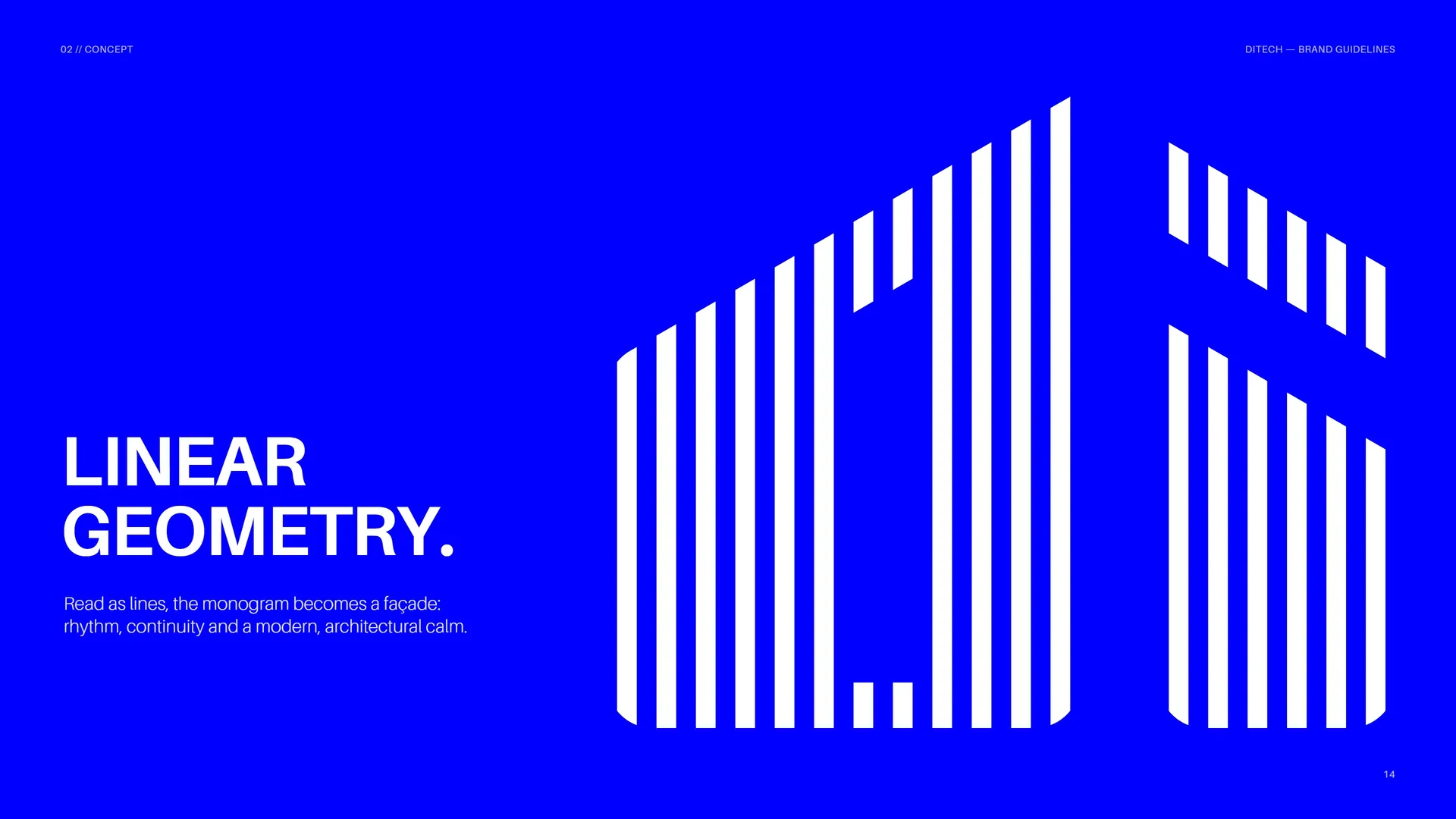
Read as lines, the monogram becomes a façade: rhythm, continuity and a modern, architectural calm.
02.4
Sharp and Soft
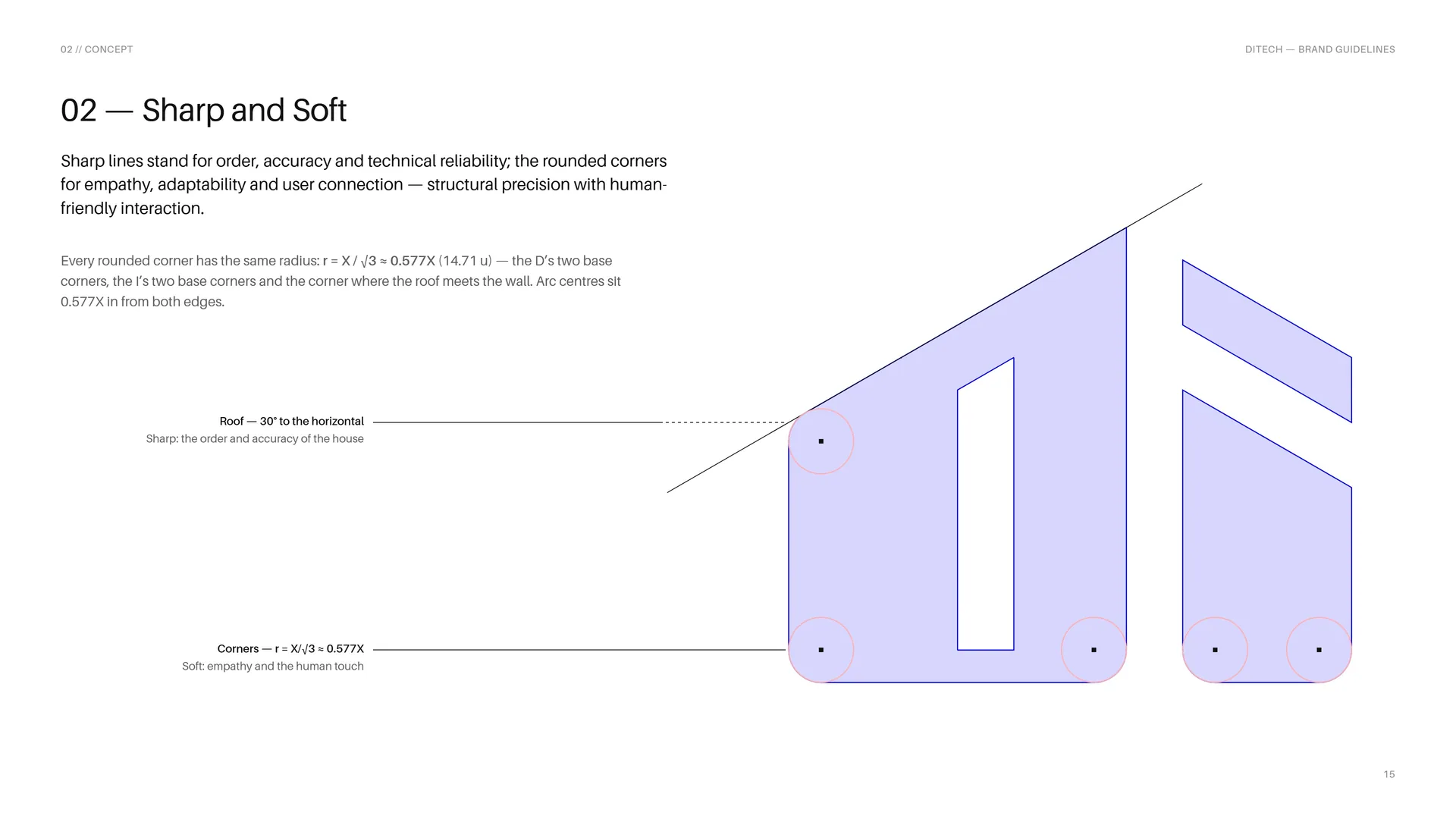
Sharp lines stand for order, accuracy and technical reliability; the rounded corners for empathy, adaptability and user connection — structural precision with human-friendly interaction.
Every rounded corner has the same radius: r = X / √3 ≈ 0.577X (14.71 u) — the D’s two base corners, the I’s two base corners and the corner where the roof meets the wall. Arc centres sit 0.577X in from both edges.
Roof — 30° to the horizontal. Sharp: the order and accuracy of the house.
Corners — r = X/√3 ≈ 0.577X. Soft: empathy and the human touch.
02.5
Built on a Hexagon
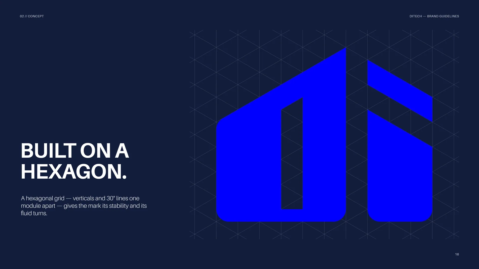
A hexagonal grid — verticals and 30° lines one module apart — gives the mark its stability and its fluid turns.
02.6
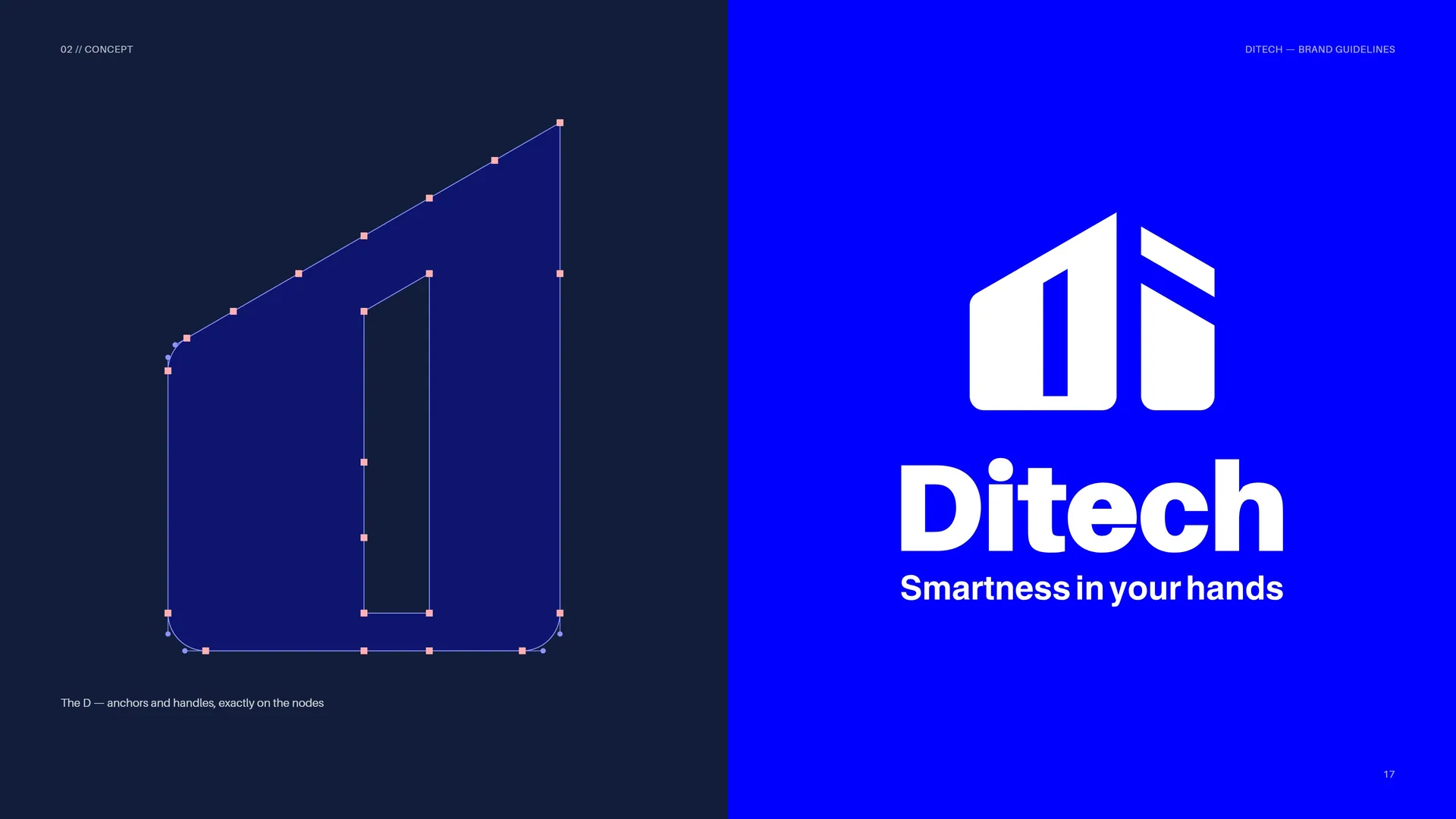
The D
The D — anchors and handles, exactly on the nodes.
02.7
Architecture, Line by Line
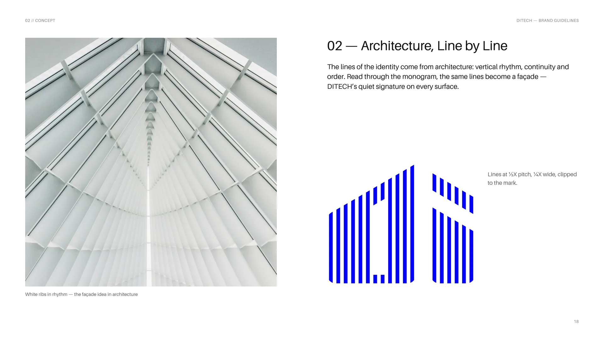
The lines of the identity come from architecture: vertical rhythm, continuity and order. Read through the monogram, the same lines become a façade — DITECH’s quiet signature on every surface.
Lines at ½X pitch, ¼X wide, clipped to the mark.
White ribs in rhythm — the façade idea in architecture.
03
Logo & grid
- 03.1The DITECH Logo
- 03.2The Hexagonal Grid
- 03.3Proportions
- 03.4The wordmark
- 03.5Stacked Proportions
- 03.6Horizontal Proportions
- 03.7Clear Space
- 03.8The D of Ditech
- 03.9Full color, reversed and one color
- 03.10The Logo Family
- 03.11App Icon
- 03.12Size
- 03.13Placement
- 03.14Misuse
- 03.15Logo on Backgrounds
03.1
The DITECH Logo
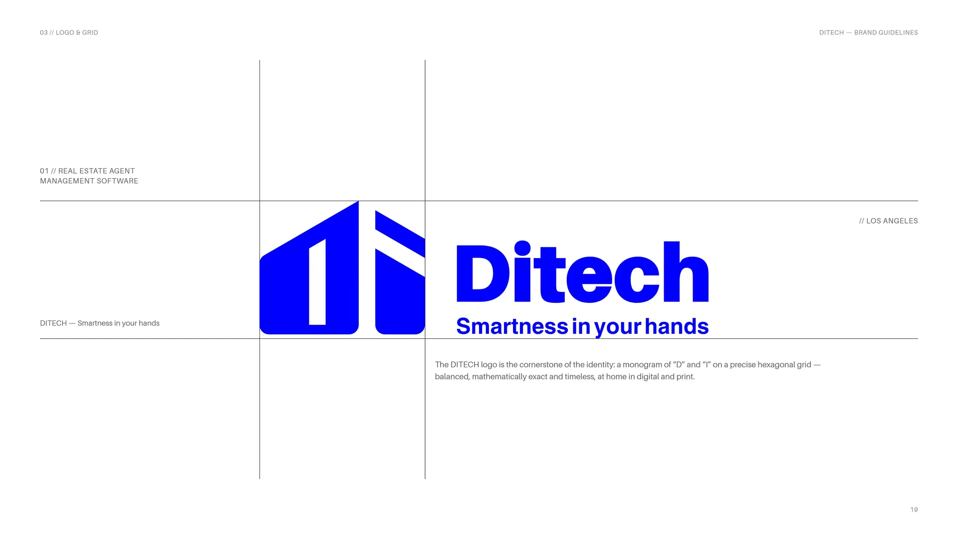
The DITECH logo is the cornerstone of the identity: a monogram of “D” and “I” on a precise hexagonal grid — balanced, mathematically exact and timeless, at home in digital and print.
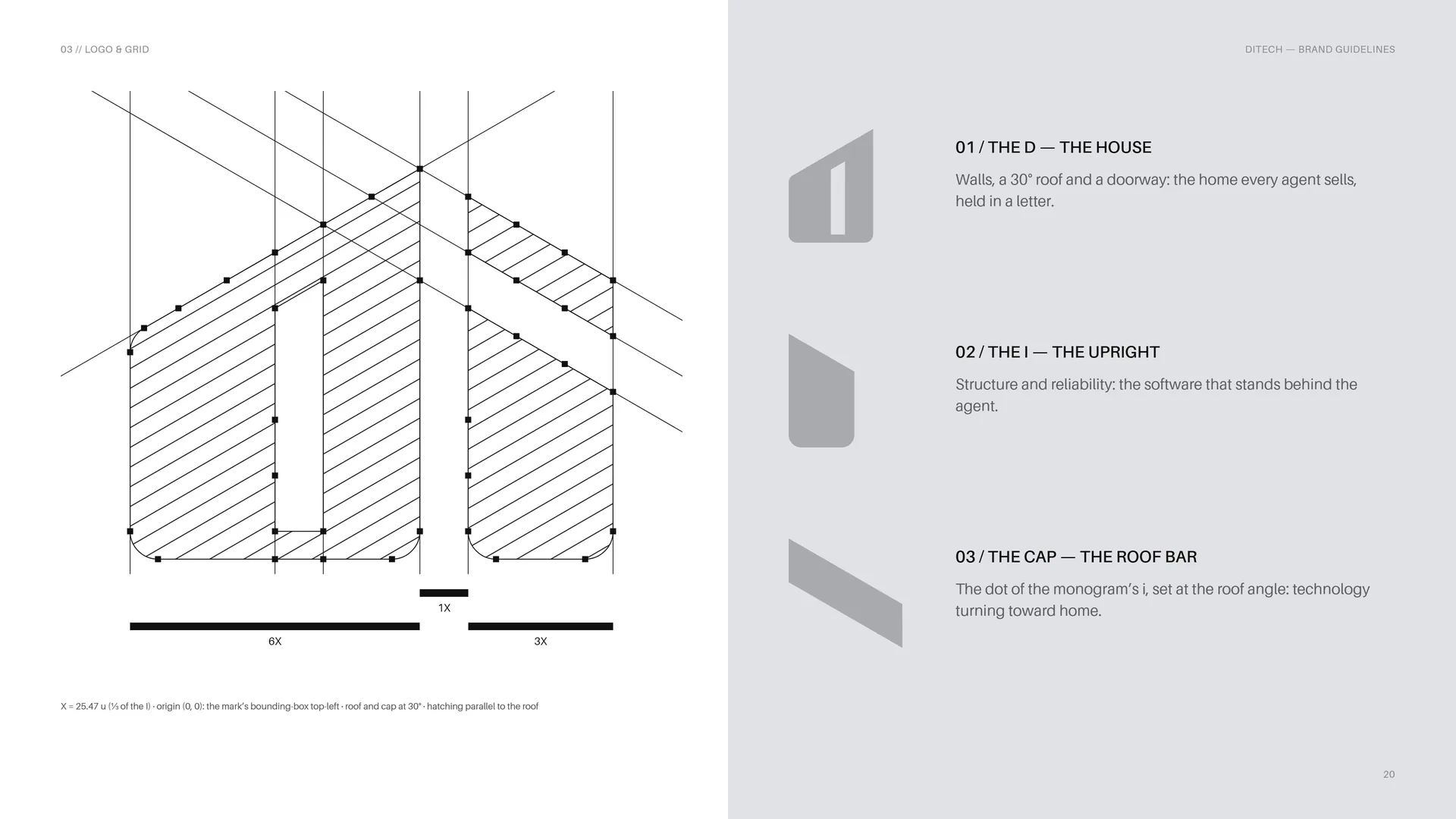
The D — the house: Walls, a 30° roof and a doorway: the home every agent sells, held in a letter.
The I — the upright: Structure and reliability: the software that stands behind the agent.
The cap — the roof bar: The dot of the monogram’s i, set at the roof angle: technology turning toward home.
X = 25.47 u (⅓ of the I) · origin (0, 0): the mark’s bounding-box top-left · roof and cap at 30° · hatching parallel to the roof.
03.2
The Hexagonal Grid
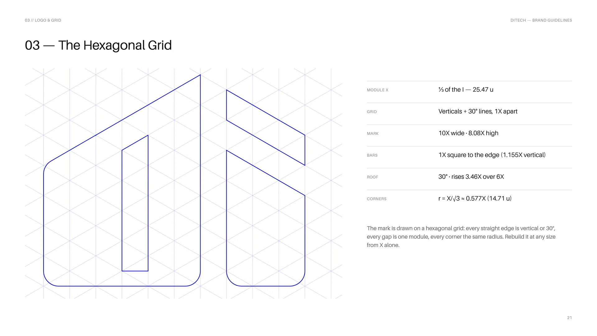
The mark is drawn on a hexagonal grid: every straight edge is vertical or 30°, every gap is one module, every corner the same radius. Rebuild it at any size from X alone.
Module X: ⅓ of the I — 25.47 u.
Grid: Verticals + 30° lines, 1X apart.
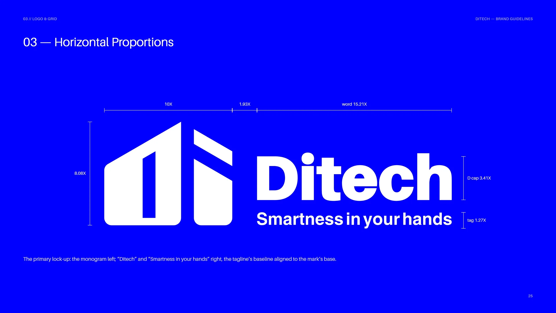
Mark: 10X wide · 8.08X high.
Bars: 1X square to the edge (1.155X vertical).
Roof: 30° · rises 3.46X over 6X.
Corners: r = X/√3 ≈ 0.577X (14.71 u).
03.3
Proportions
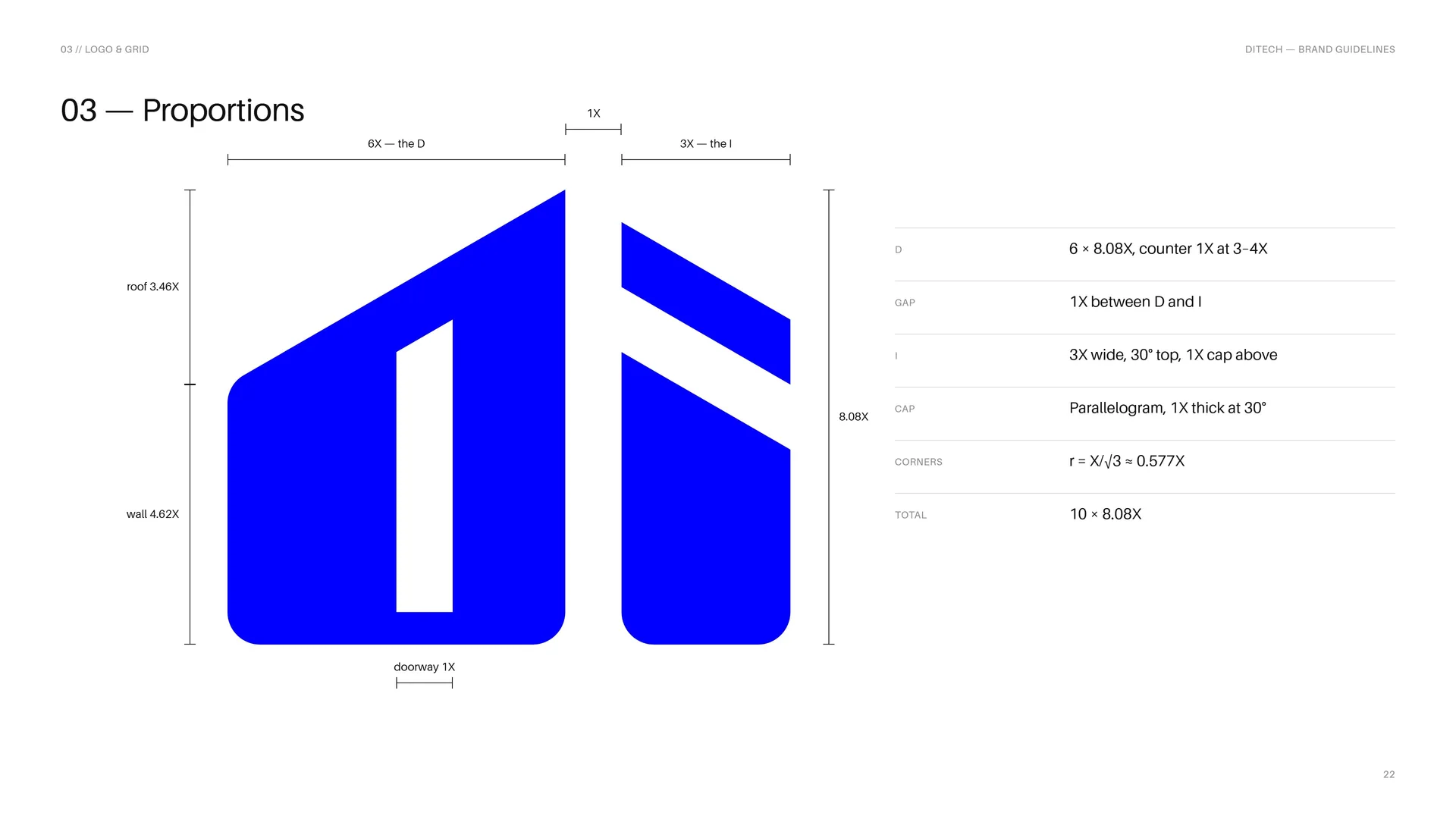
D: 6 × 8.08X, counter 1X at 3–4X.
Gap: 1X between D and I.
I: 3X wide, 30° top, 1X cap above.
Cap: Parallelogram, 1X thick at 30°.
Corners: r = X/√3 ≈ 0.577X.
Total: 10 × 8.08X.
03.4
The wordmark
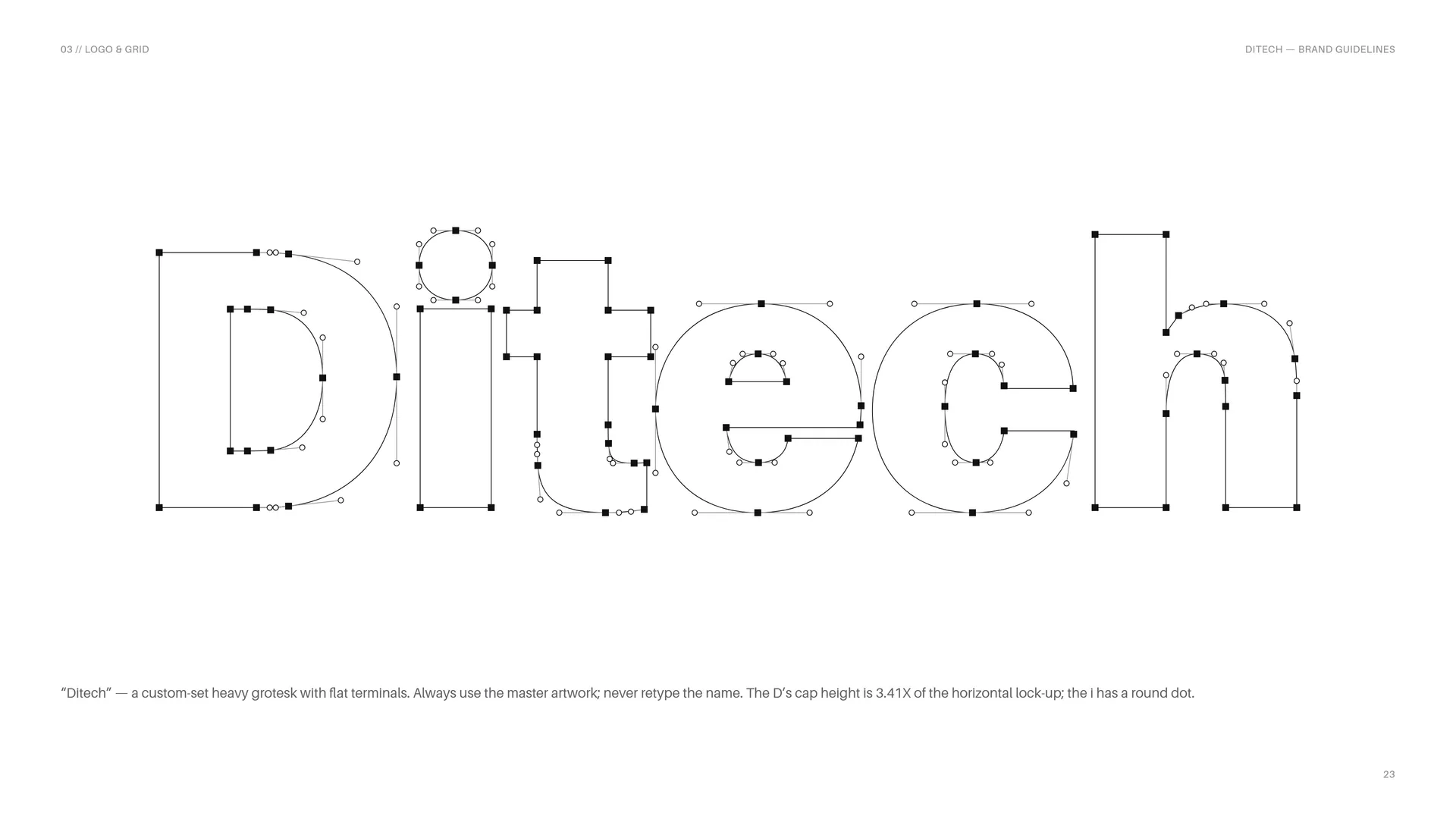
“Ditech” — a custom-set heavy grotesk with flat terminals. Always use the master artwork; never retype the name. The D’s cap height is 3.41X of the horizontal lock-up; the i has a round dot.
03.5
Stacked Proportions
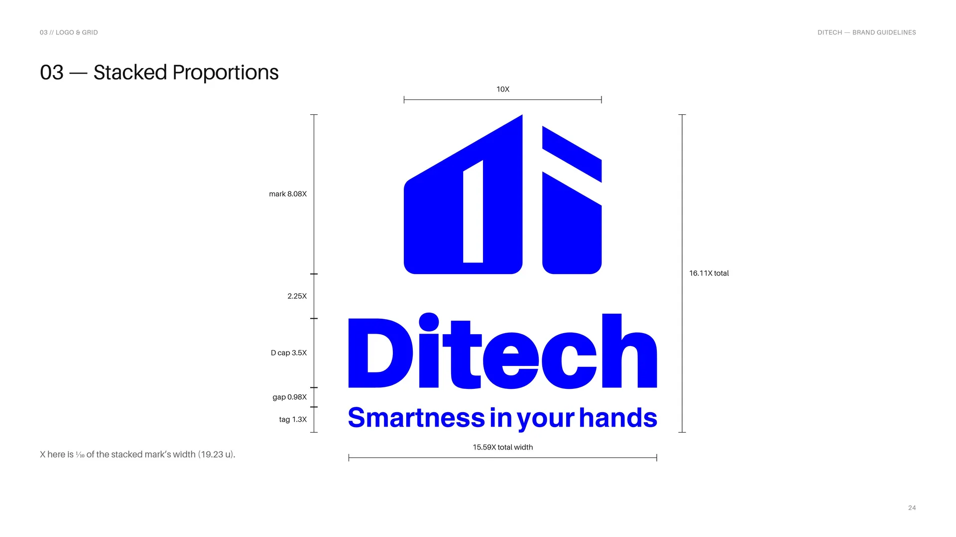
X here is ⅒ of the stacked mark’s width (19.23 u).
03.6
Horizontal Proportions
The primary lock-up: the monogram left; “Ditech” and “Smartness in your hands” right, the tagline’s baseline aligned to the mark’s base.
03.7
Clear Space
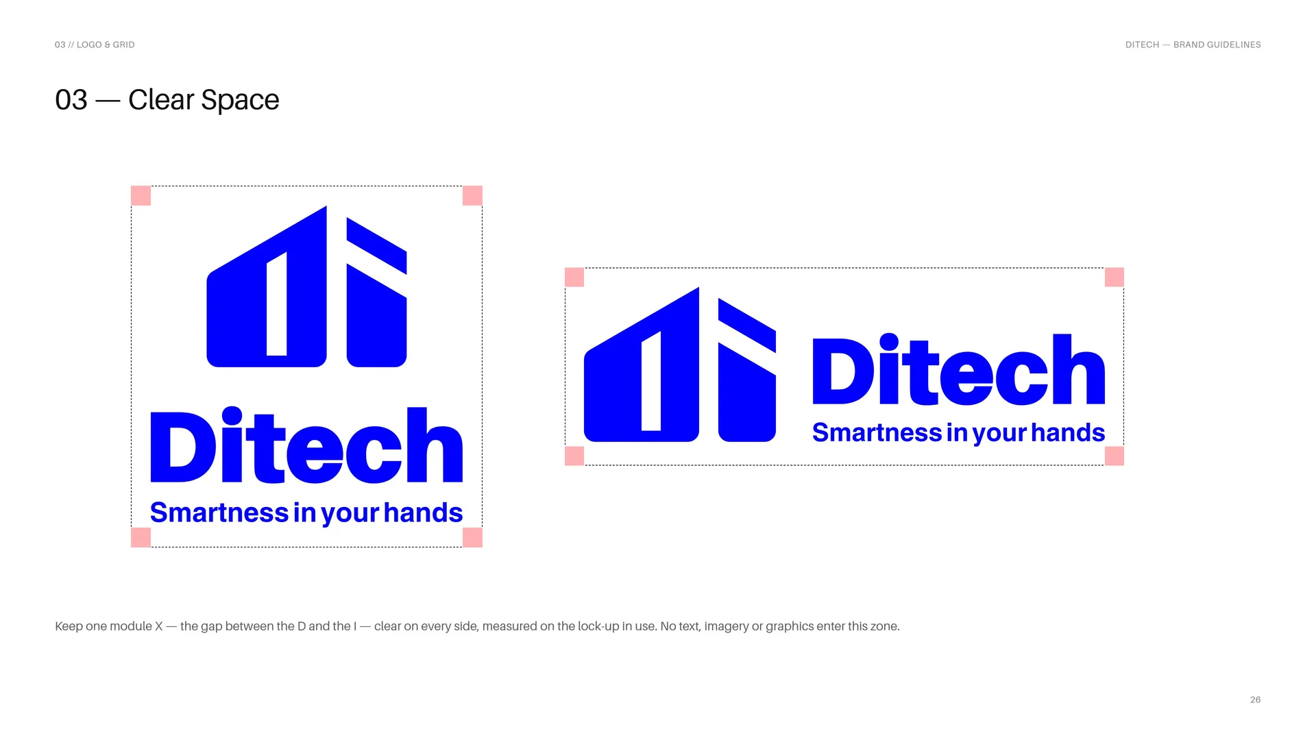
Keep one module X — the gap between the D and the I — clear on every side, measured on the lock-up in use. No text, imagery or graphics enter this zone.
03.8
The D of Ditech
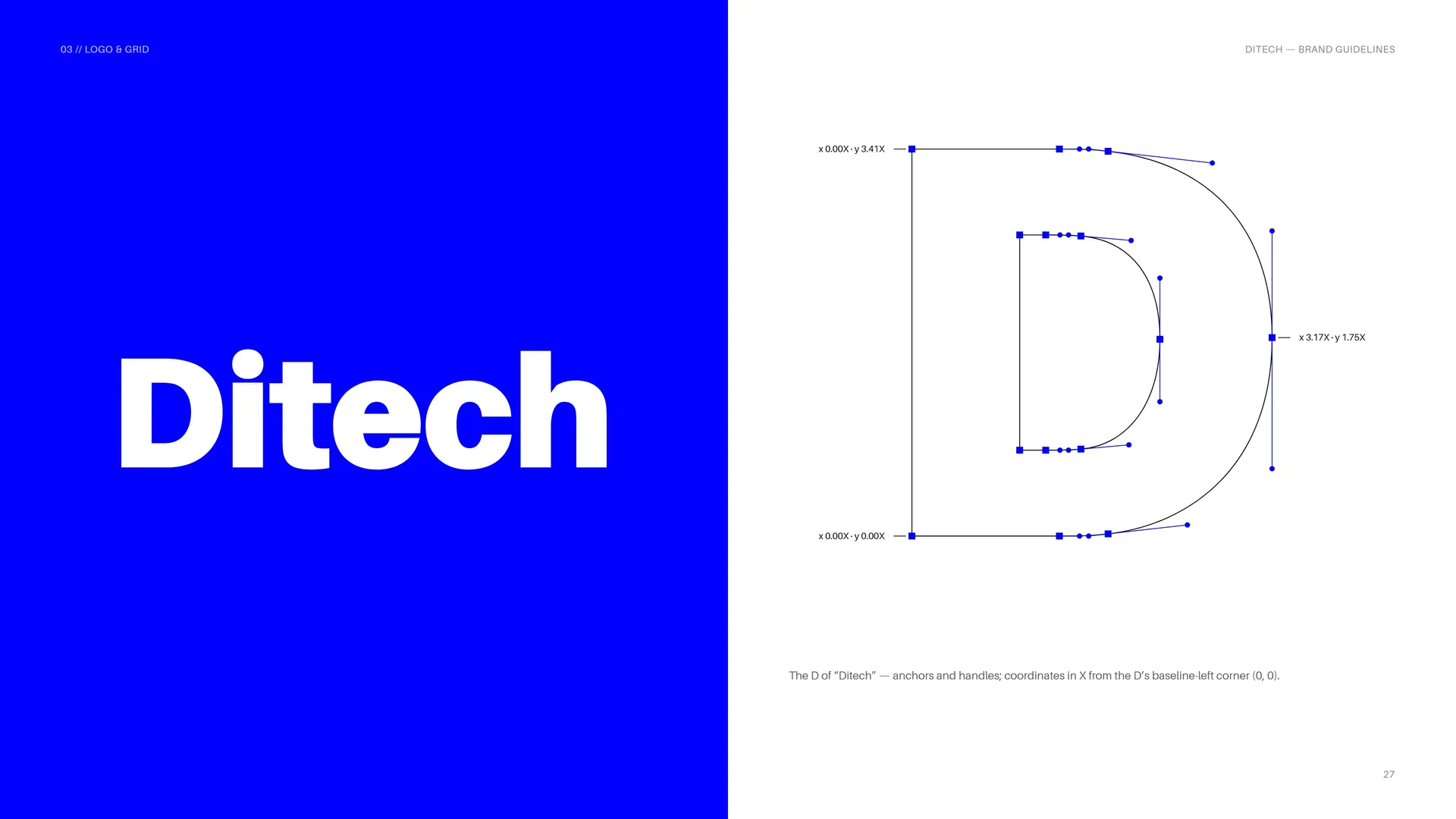
The D of “Ditech” — anchors and handles; coordinates in X from the D’s baseline-left corner (0, 0).
03.9
Full color, reversed and one color
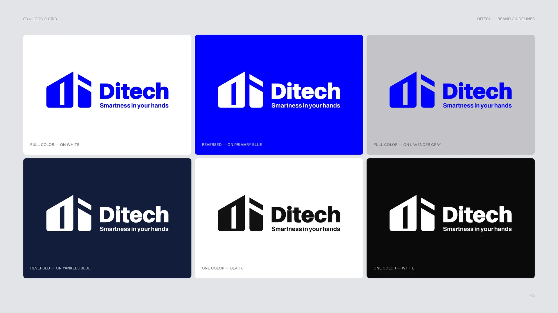
Full color — on white.
Reversed — on Primary Blue.
Full color — on Lavender Gray.
Reversed — on Yankees Blue.
One color — black.
One color — white.
03.10
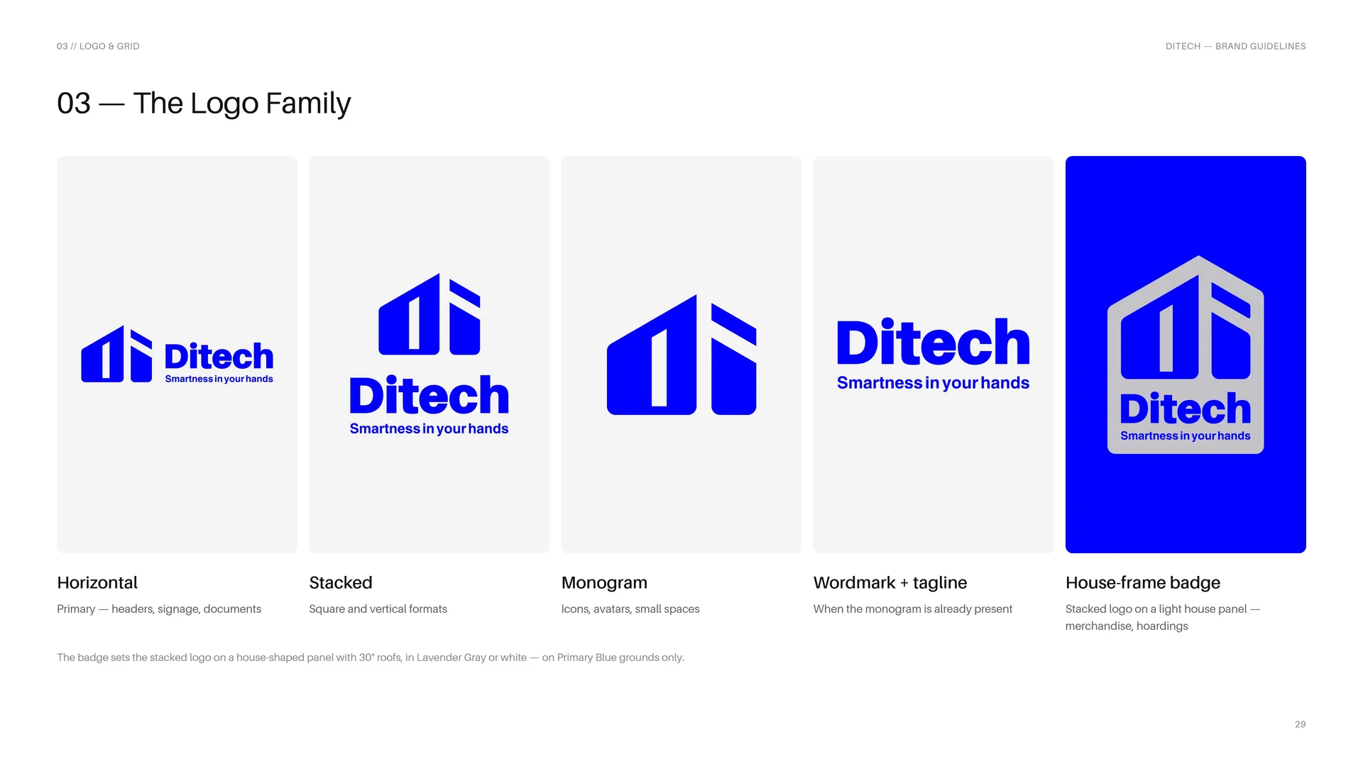
The Logo Family
Horizontal: Primary — headers, signage, documents.
Stacked: Square and vertical formats.
Monogram: Icons, avatars, small spaces.
The badge sets the stacked logo on a house-shaped panel with 30° roofs, in Lavender Gray or white — on Primary Blue grounds only.
Wordmark + tagline: When the monogram is already present.
House-frame badge: Stacked logo on a light house panel — merchandise, hoardings.
03.11
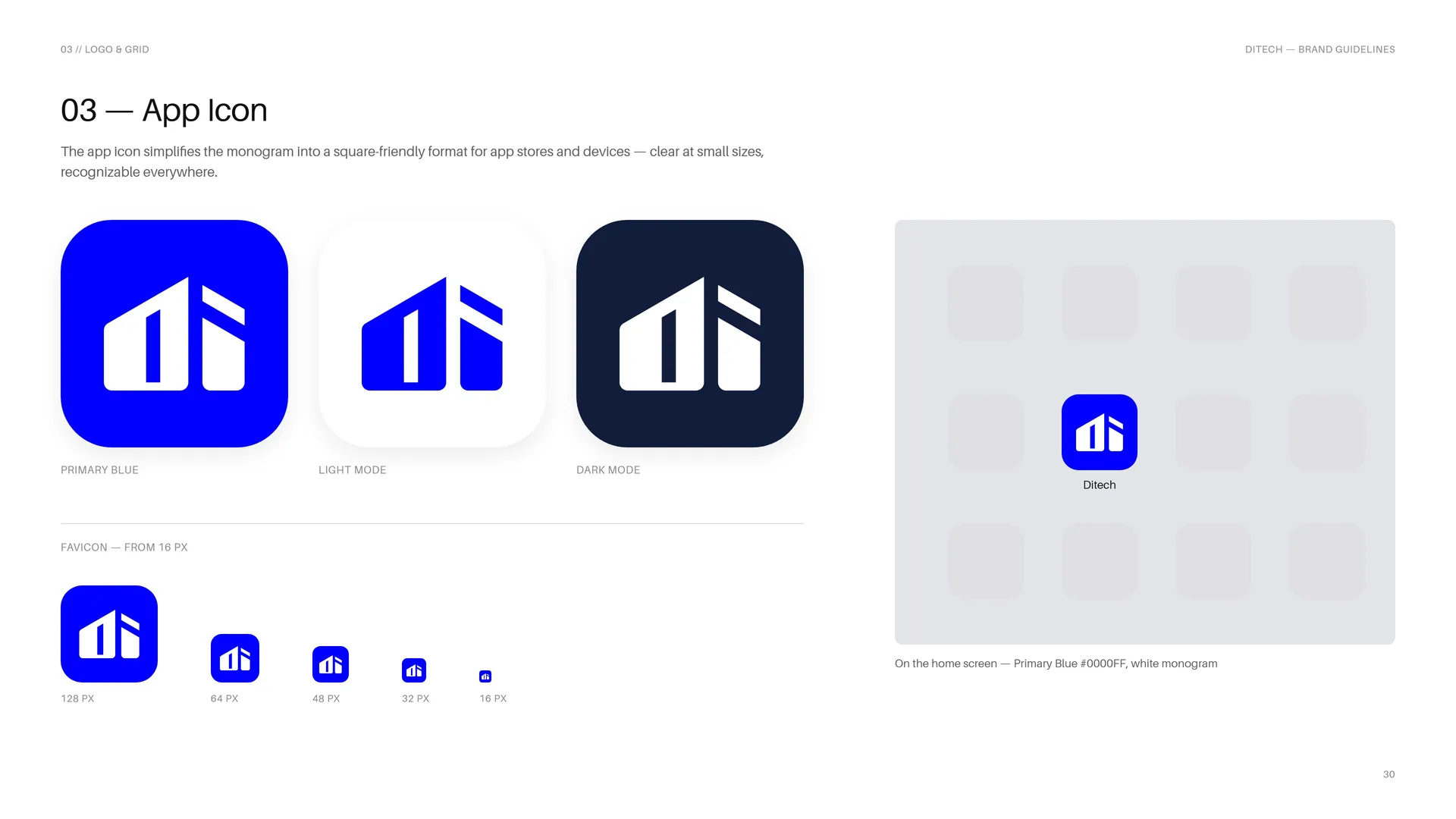
App Icon
The app icon simplifies the monogram into a square-friendly format for app stores and devices — clear at small sizes, recognizable everywhere.
Primary Blue favicon — from 16 px.
Light mode · Dark mode.
128 px · 64 px · 48 px · 32 px · 16 px.
On the home screen — Primary Blue #0000FF, white monogram.
03.12
Size
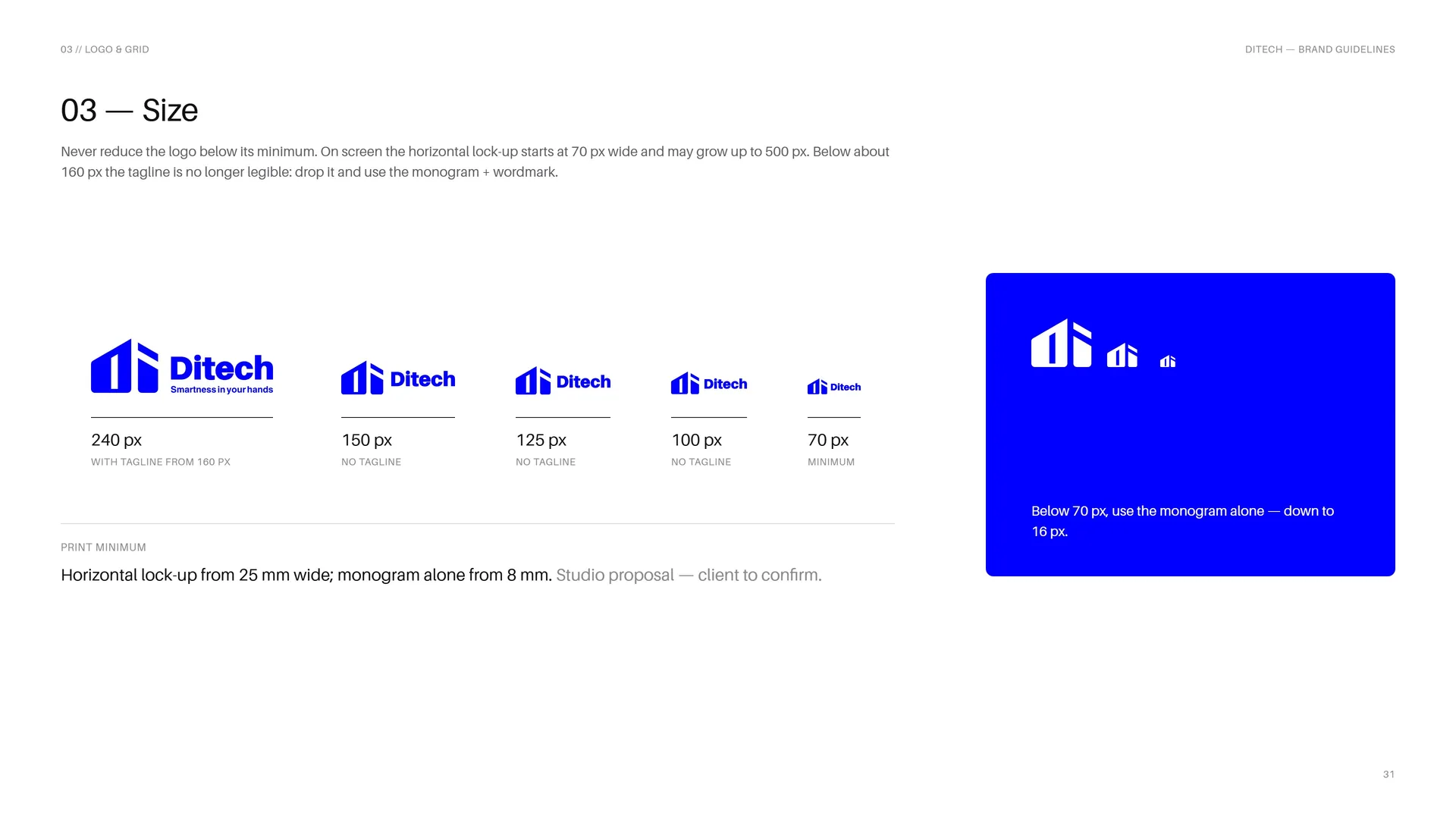
Never reduce the logo below its minimum. On screen the horizontal lock-up starts at 70 px wide and may grow up to 500 px. Below about 160 px the tagline is no longer legible: drop it and use the monogram + wordmark.
240 px — with tagline from 160 px.
150 px — no tagline.
125 px — no tagline.
100 px — no tagline.
70 px — minimum.
Print minimum: Horizontal lock-up from 25 mm wide; monogram alone from 8 mm. Studio proposal — client to confirm.
Below 70 px, use the monogram alone — down to 16 px.
03.13
Placement
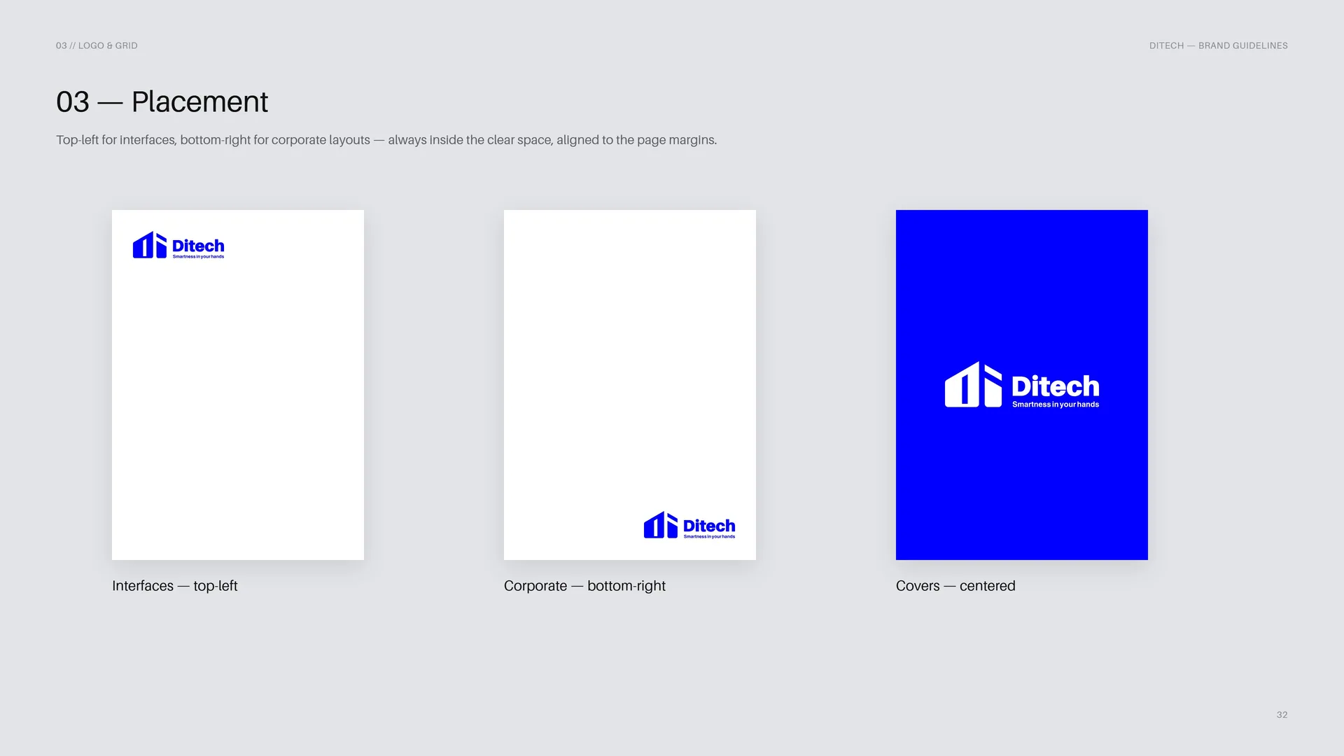
Top-left for interfaces, bottom-right for corporate layouts — always inside the clear space, aligned to the page margins.
Interfaces — top-left.
Corporate — bottom-right.
Covers — centered.
03.14
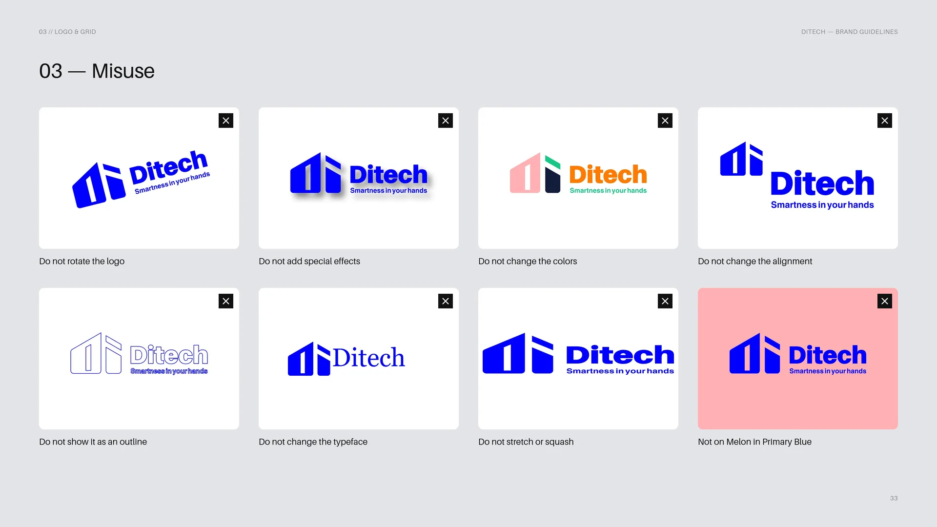
Misuse
Do not rotate the logo.
Do not add special effects.
Do not change the colors.
Do not change the alignment.
Do not show it as an outline.
Do not change the typeface.
Do not stretch or squash.
Not on Melon in Primary Blue.
03.15
Logo on Backgrounds
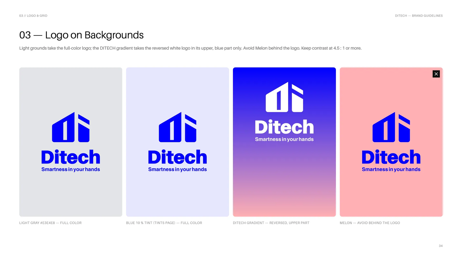
Light grounds take the full-color logo; the DITECH gradient takes the reversed white logo in its upper, blue part only. Avoid Melon behind the logo. Keep contrast at 4.5 : 1 or more.
Light Gray #E3E4E8 — full color.
Blue 10 % tint (Tints page) — full color.
DITECH gradient — reversed, upper part.
Melon — avoid behind the logo.
04
Color
04.1
Color
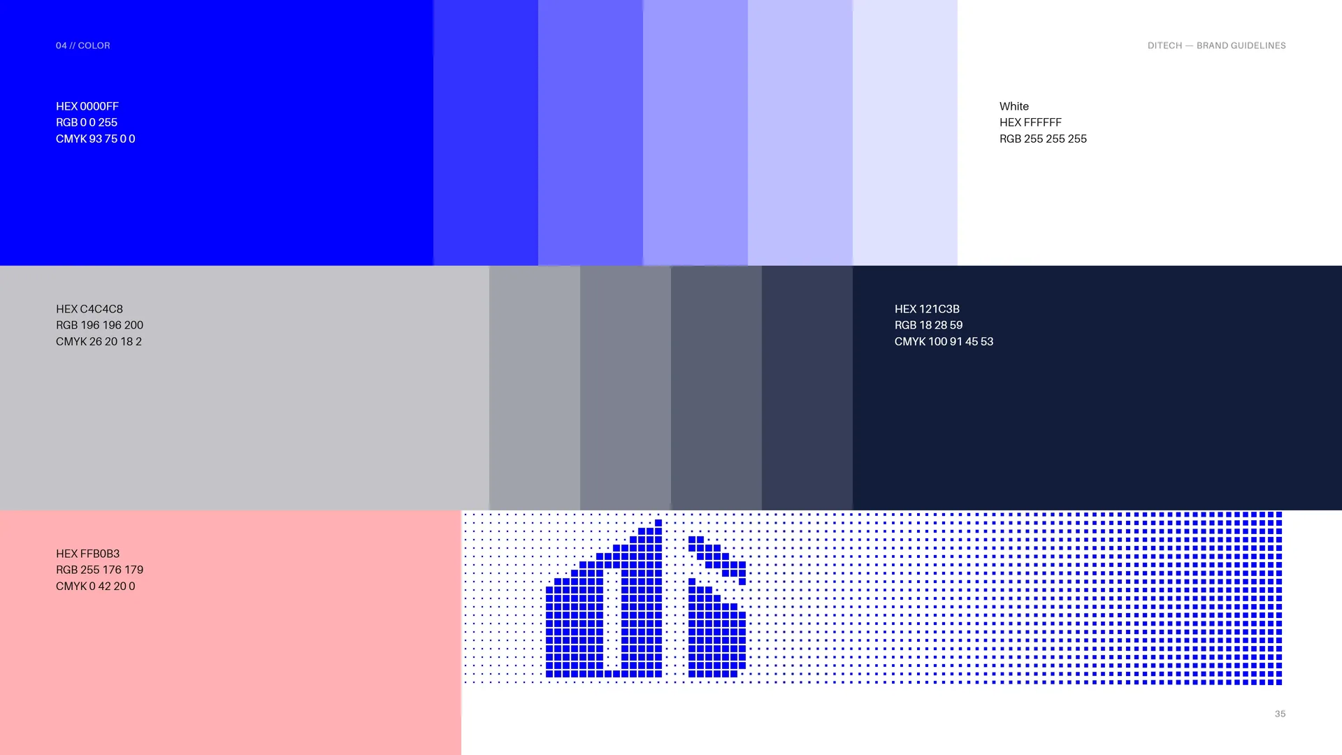
HEX 0000FF · RGB 0 0 255 · CMYK 93 75 0 0.
White: HEX FFFFFF · RGB 255 255 255.
HEX C4C4C8 · RGB 196 196 200 · CMYK 26 20 18 2.
HEX 121C3B · RGB 18 28 59 · CMYK 100 91 45 53.
HEX FFB0B3 · RGB 255 176 179 · CMYK 0 42 20 0.
04.2
Color Values
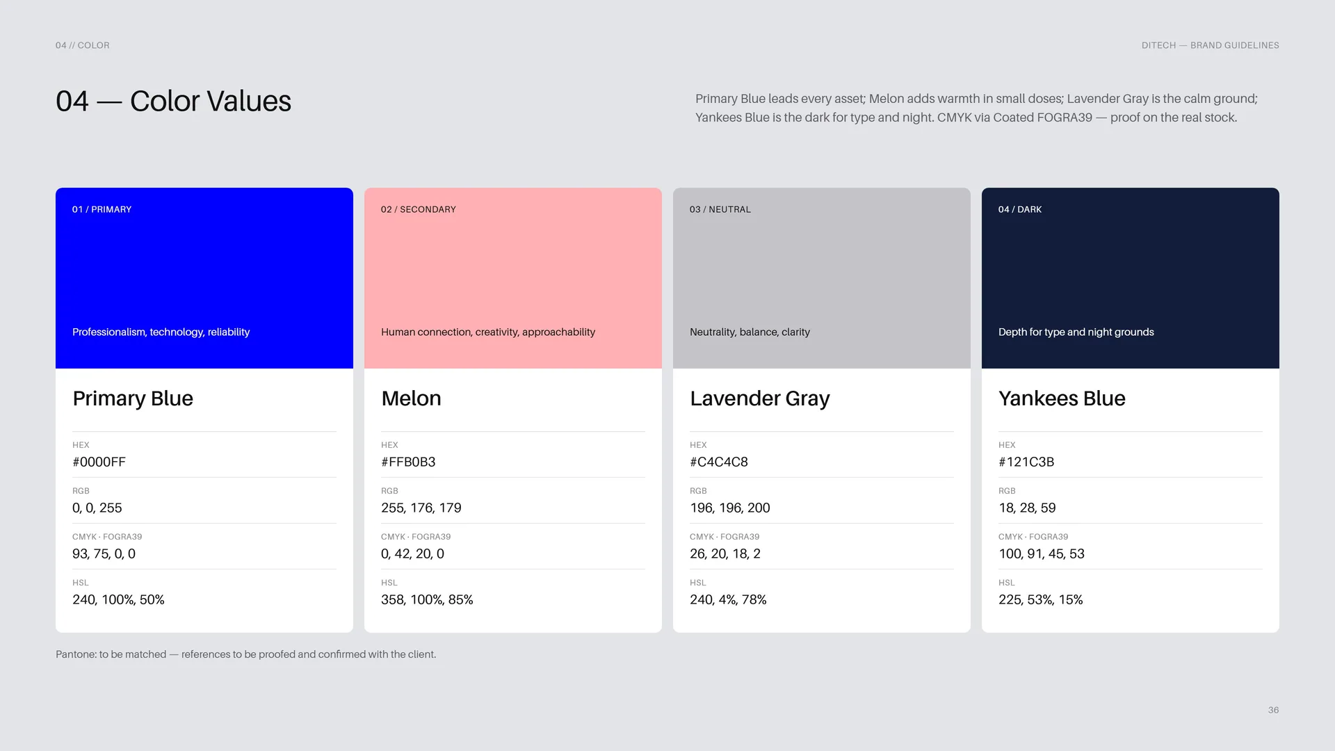
Primary Blue leads every asset; Melon adds warmth in small doses; Lavender Gray is the calm ground; Yankees Blue is the dark for type and night. CMYK via Coated FOGRA39 — proof on the real stock.
Primary — Professionalism, technology, reliability. Primary Blue: HEX #0000FF · RGB 0, 0, 255 · CMYK (FOGRA39) 93, 75, 0, 0 · HSL 240, 100%, 50%.
Secondary — Human connection, creativity, approachability. Melon: HEX #FFB0B3 · RGB 255, 176, 179 · CMYK (FOGRA39) 0, 42, 20, 0 · HSL 358, 100%, 85%.
Neutral — Neutrality, balance, clarity. Lavender Gray: HEX #C4C4C8 · RGB 196, 196, 200 · CMYK (FOGRA39) 26, 20, 18, 2 · HSL 240, 4%, 78%.
Dark — Depth for type and night grounds. Yankees Blue: HEX #121C3B · RGB 18, 28, 59 · CMYK (FOGRA39) 100, 91, 45, 53 · HSL 225, 53%, 15%.
Pantone: to be matched — references to be proofed and confirmed with the client.
04.3
Tints
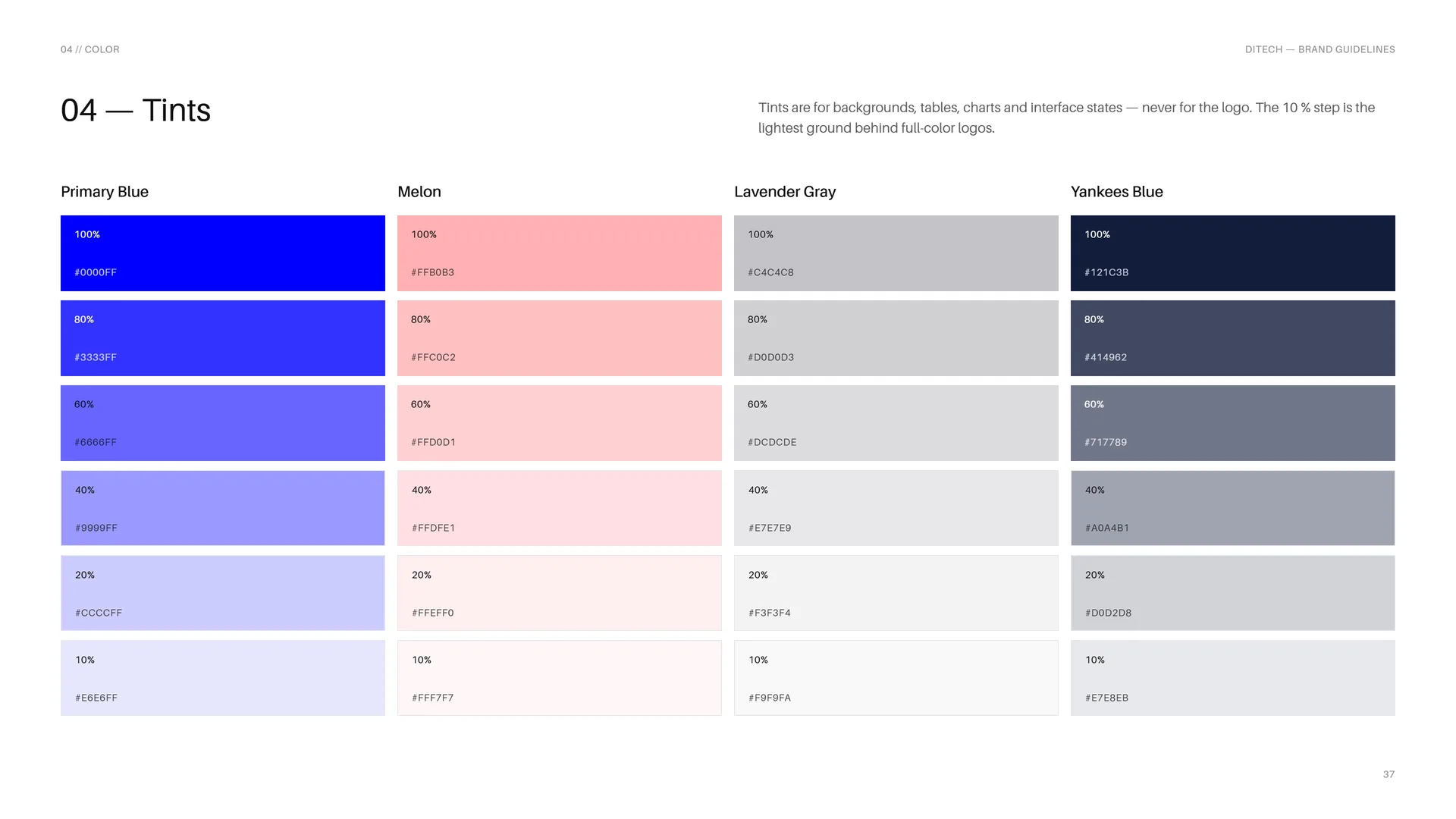
Tints are for backgrounds, tables, charts and interface states — never for the logo. The 10 % step is the lightest ground behind full-color logos.
Primary Blue: 100% #0000FF · 80% #3333FF · 60% #6666FF · 40% #9999FF · 20% #CCCCFF · 10% #E6E6FF.
Melon: 100% #FFB0B3 · 80% #FFC0C2 · 60% #FFD0D1 · 40% #FFDFE1 · 20% #FFEFF0 · 10% #FFF7F7.
Lavender Gray: 100% #C4C4C8 · 80% #D0D0D3 · 60% #DCDCDE · 40% #E7E7E9 · 20% #F3F3F4 · 10% #F9F9FA.
Yankees Blue: 100% #121C3B · 80% #414962 · 60% #717789 · 40% #A0A4B1 · 20% #D0D2D8 · 10% #E7E8EB.
04.4
Contrast & Accessibility
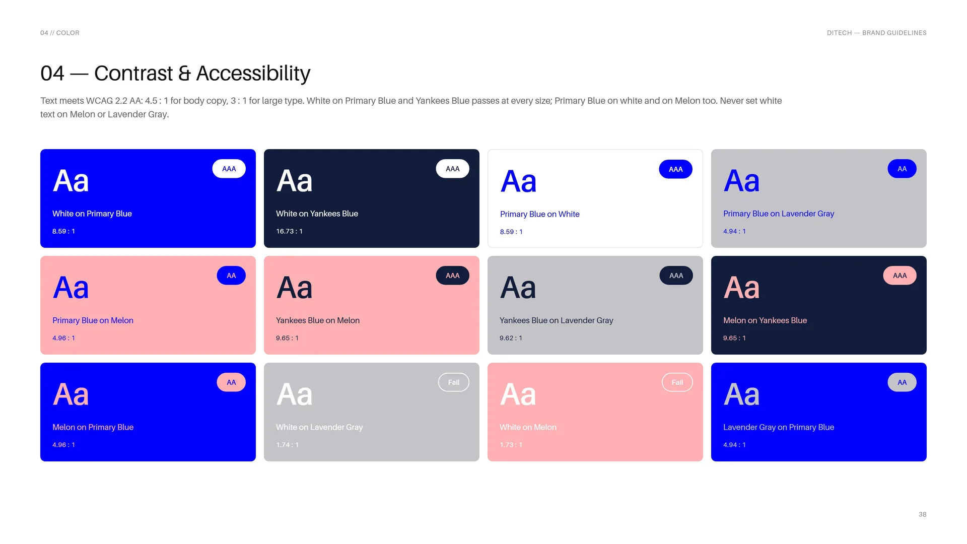
Text meets WCAG 2.2 AA: 4.5 : 1 for body copy, 3 : 1 for large type. White on Primary Blue and Yankees Blue passes at every size; Primary Blue on white and on Melon too. Never set white text on Melon or Lavender Gray.
White on Primary Blue — 8.59 : 1 · AAA.
White on Yankees Blue — 16.73 : 1 · AAA.
Primary Blue on White — 8.59 : 1 · AAA.
Primary Blue on Lavender Gray — 4.94 : 1 · AA.
Primary Blue on Melon — 4.96 : 1 · AA.
Yankees Blue on Melon — 9.65 : 1 · AAA.
Yankees Blue on Lavender Gray — 9.62 : 1 · AAA.
Melon on Yankees Blue — 9.65 : 1 · AAA.
Melon on Primary Blue — 4.96 : 1 · AA.
White on Lavender Gray — 1.74 : 1 · Fail.
White on Melon — 1.73 : 1 · Fail.
Lavender Gray on Primary Blue — 4.94 : 1 · AA.
04.5
Color Story
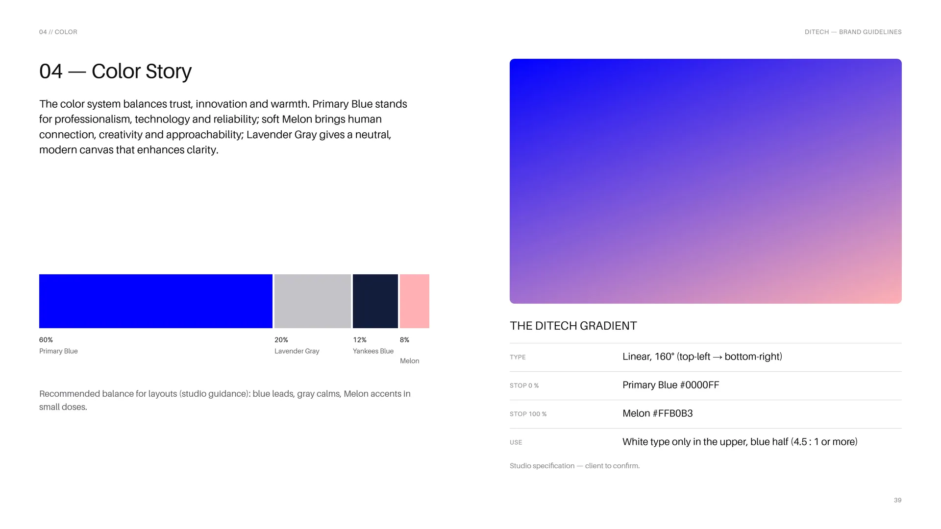
The color system balances trust, innovation and warmth. Primary Blue stands for professionalism, technology and reliability; soft Melon brings human connection, creativity and approachability; Lavender Gray gives a neutral, modern canvas that enhances clarity.
60% Primary Blue · 20% Lavender Gray · 12% Yankees Blue · 8% Melon.
Recommended balance for layouts (studio guidance): blue leads, gray calms, Melon accents in small doses.
The DITECH gradient — Type: Linear, 160° (top-left → bottom-right) · Stop 0 %: Primary Blue #0000FF · Stop 100 %: Melon #FFB0B3.
Use: White type only in the upper, blue half (4.5 : 1 or more).
Studio specification — client to confirm.
05
Typography
05.1
Typography
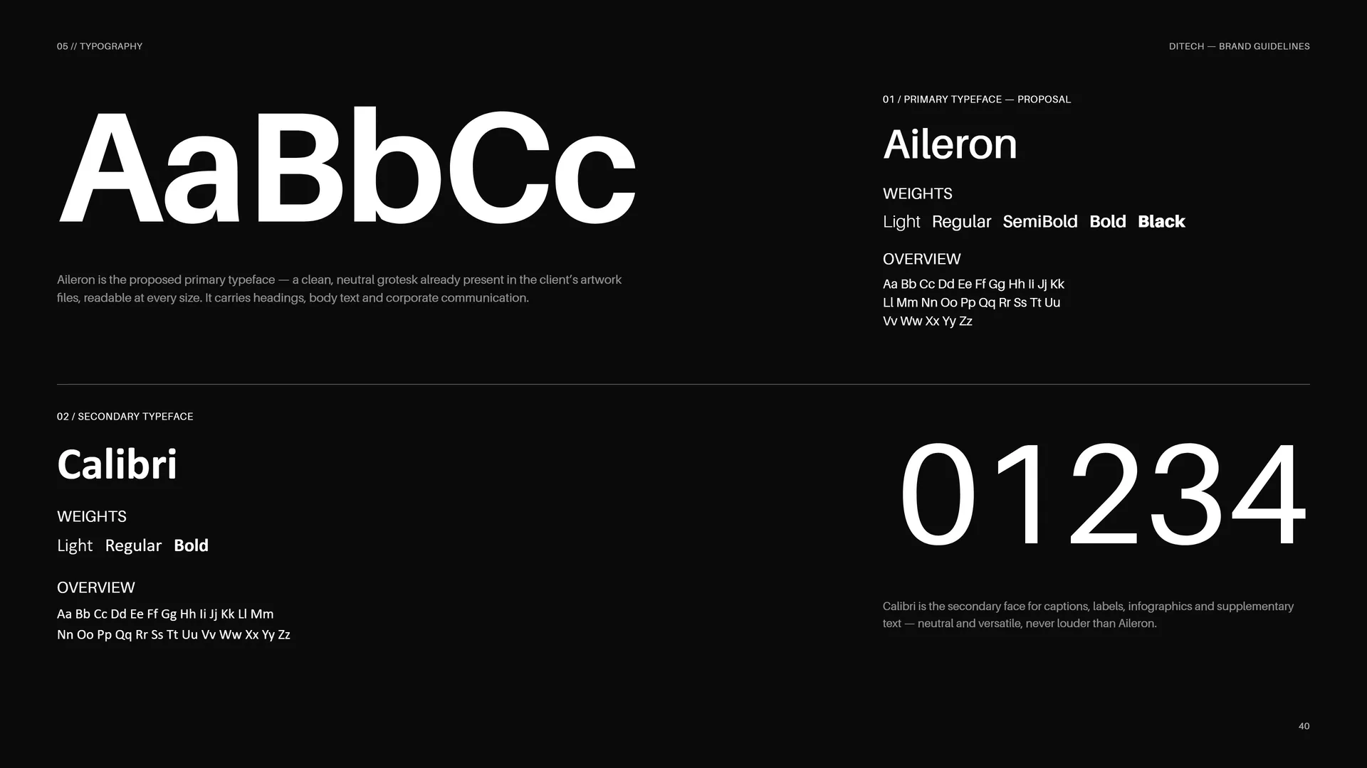
Aileron is the proposed primary typeface — a clean, neutral grotesk already present in the client’s artwork files, readable at every size. It carries headings, body text and corporate communication.
Primary typeface — proposal: Aileron. Weights: Light · Regular · SemiBold · Bold · Black.
Overview: Aa Bb Cc Dd Ee Ff Gg Hh Ii Jj Kk Ll Mm Nn Oo Pp Qq Rr Ss Tt Uu Vv Ww Xx Yy Zz.
Secondary typeface: Calibri. Weights: Light · Regular · Bold.
Overview: Aa Bb Cc Dd Ee Ff Gg Hh Ii Jj Kk Ll Mm Nn Oo Pp Qq Rr Ss Tt Uu Vv Ww Xx Yy Zz.
Calibri is the secondary face for captions, labels, infographics and supplementary text — neutral and versatile, never louder than Aileron.
05.2
Aileron
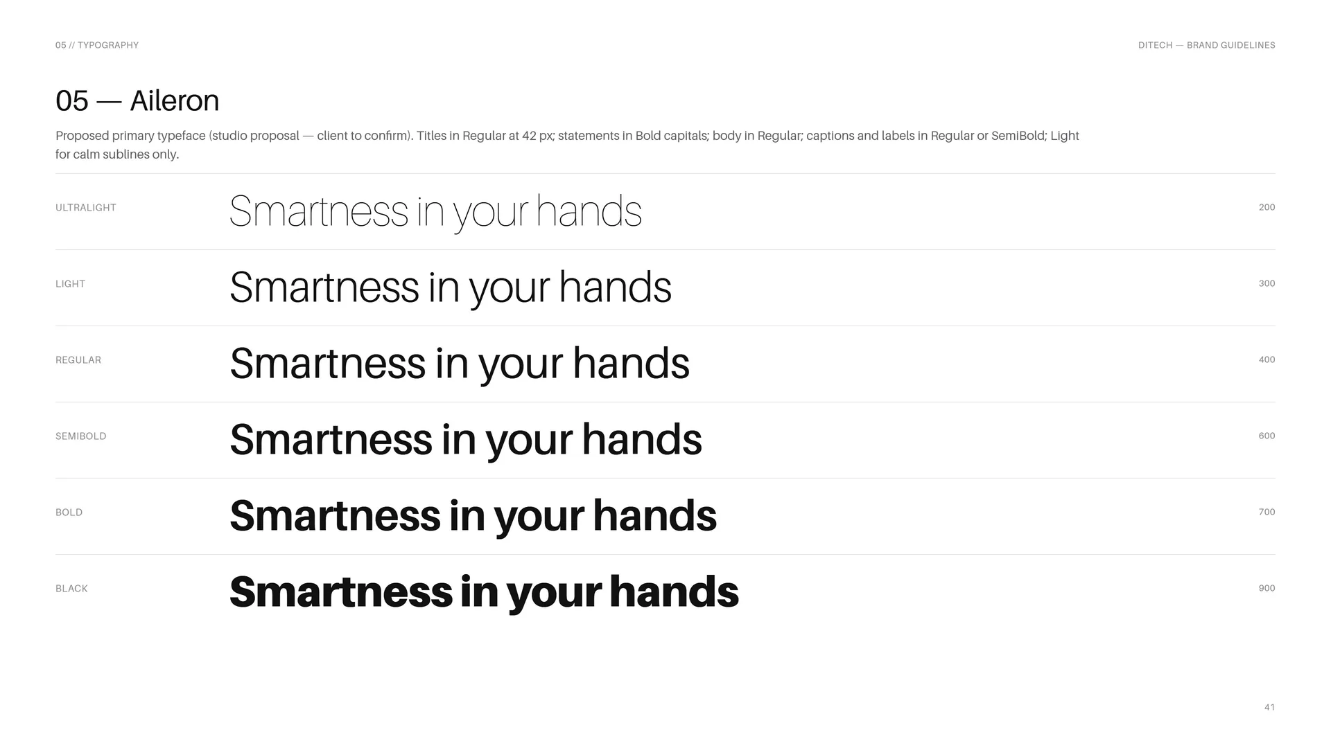
Proposed primary typeface (studio proposal — client to confirm). Titles in Regular at 42 px; statements in Bold capitals; body in Regular; captions and labels in Regular or SemiBold; Light for calm sublines only.
Ultralight 200 · Light 300 · Regular 400 · SemiBold 600 · Bold 700 · Black 900: Smartness in your hands.
05.3
Calibri
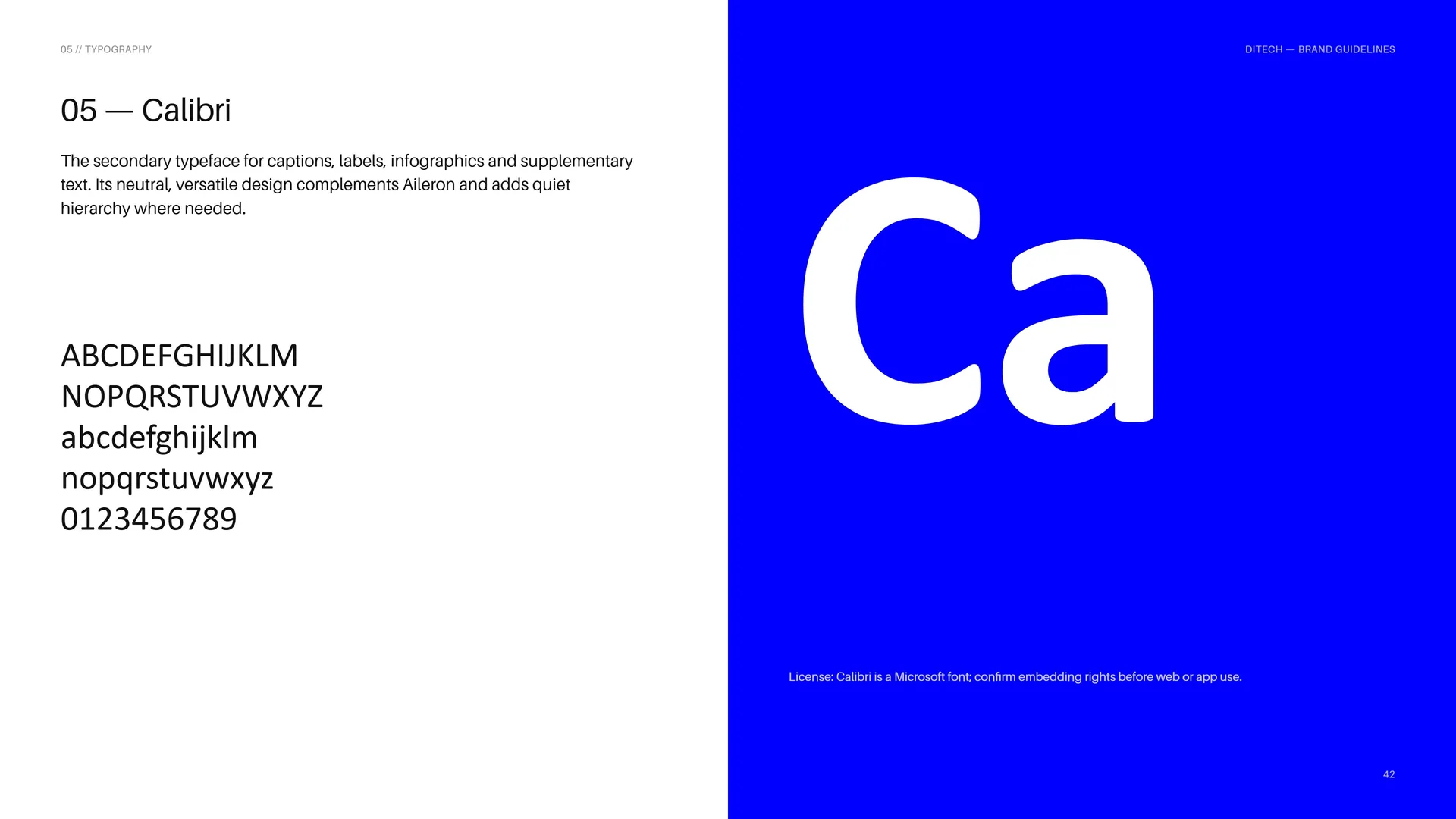
The secondary typeface for captions, labels, infographics and supplementary text. Its neutral, versatile design complements Aileron and adds quiet hierarchy where needed.
ABCDEFGHIJKLM NOPQRSTUVWXYZ abcdefghijklm nopqrstuvwxyz 0123456789.
License: Calibri is a Microsoft font; confirm embedding rights before web or app use.
05.4
Type System
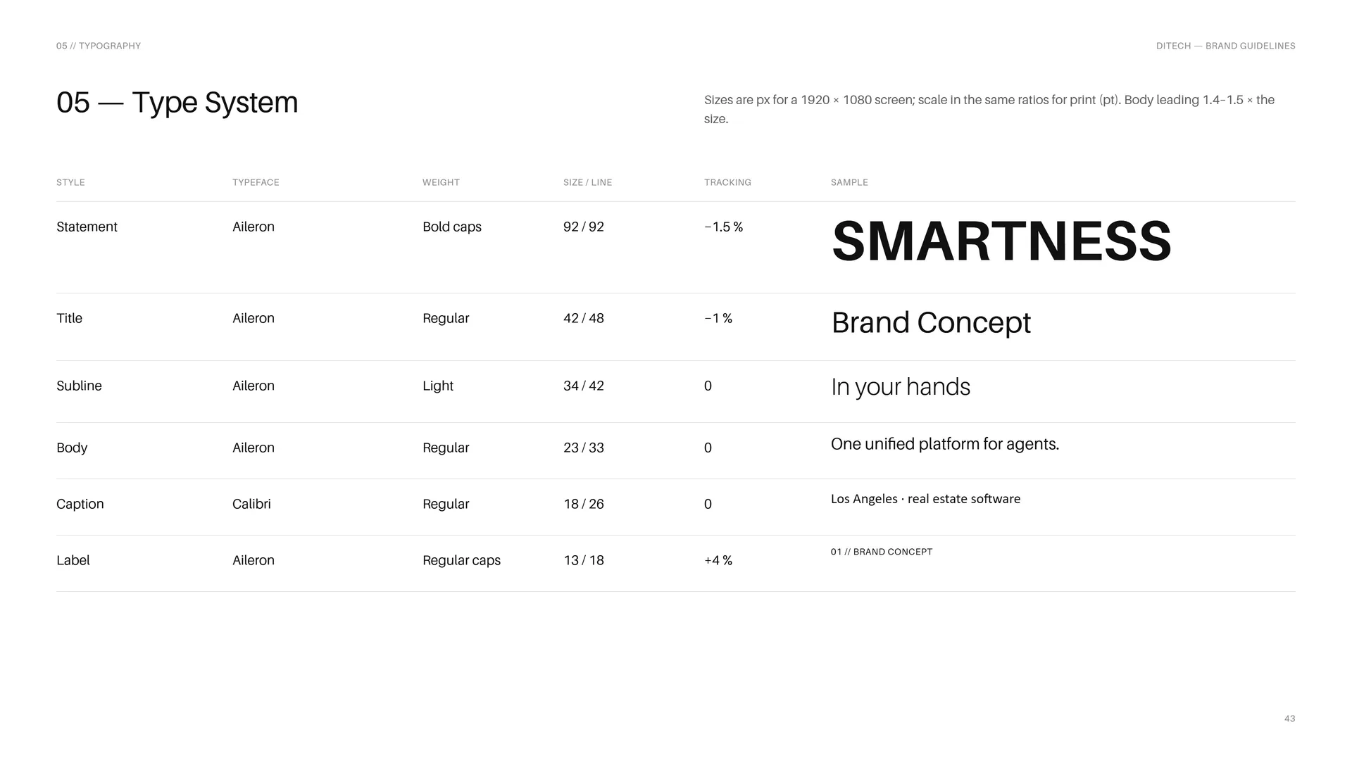
Sizes are px for a 1920 × 1080 screen; scale in the same ratios for print (pt). Body leading 1.4–1.5 × the size.
Statement: Aileron · Bold caps · 92 / 92 · tracking −1.5 %.
Title: Aileron · Regular · 42 / 48 · tracking −1 %.
Subline: Aileron · Light · 34 / 42 · tracking 0.
Body: Aileron · Regular · 23 / 33 · tracking 0.
Caption: Calibri · Regular · 18 / 26 · tracking 0.
Label: Aileron · Regular caps · 13 / 18 · tracking +4 %.
06
Pattern
- 06.1Repeat the Monogram
- 06.2How the Pattern is Built
- 06.3The Pattern Family
- 06.4Line, Solid, Façade
- 06.5Pattern Rules
- 06.6Pattern in Use
06.1
Repeat the Monogram
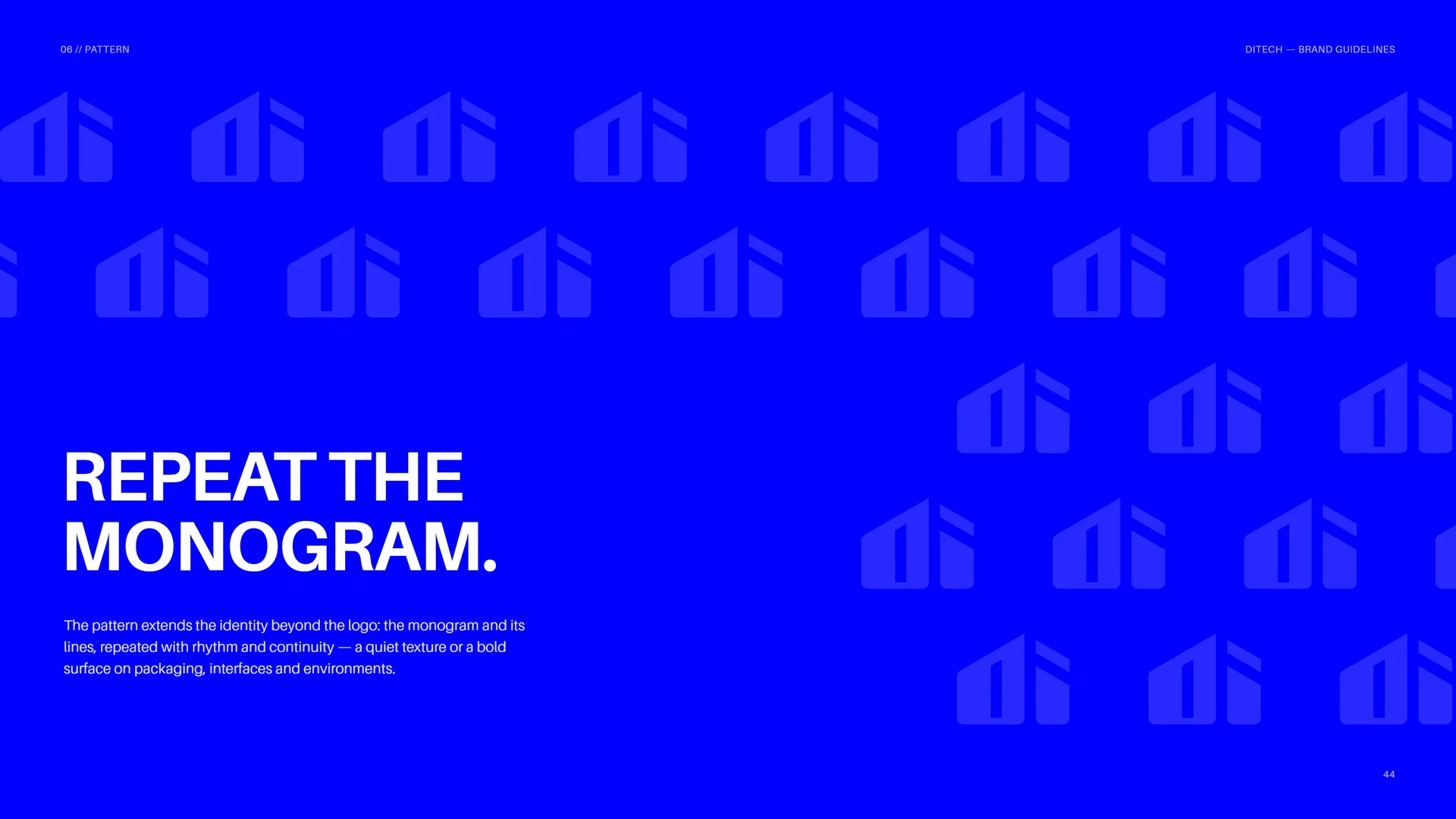
The pattern extends the identity beyond the logo: the monogram and its lines, repeated with rhythm and continuity — a quiet texture or a bold surface on packaging, interfaces and environments.
06.2
How the Pattern is Built
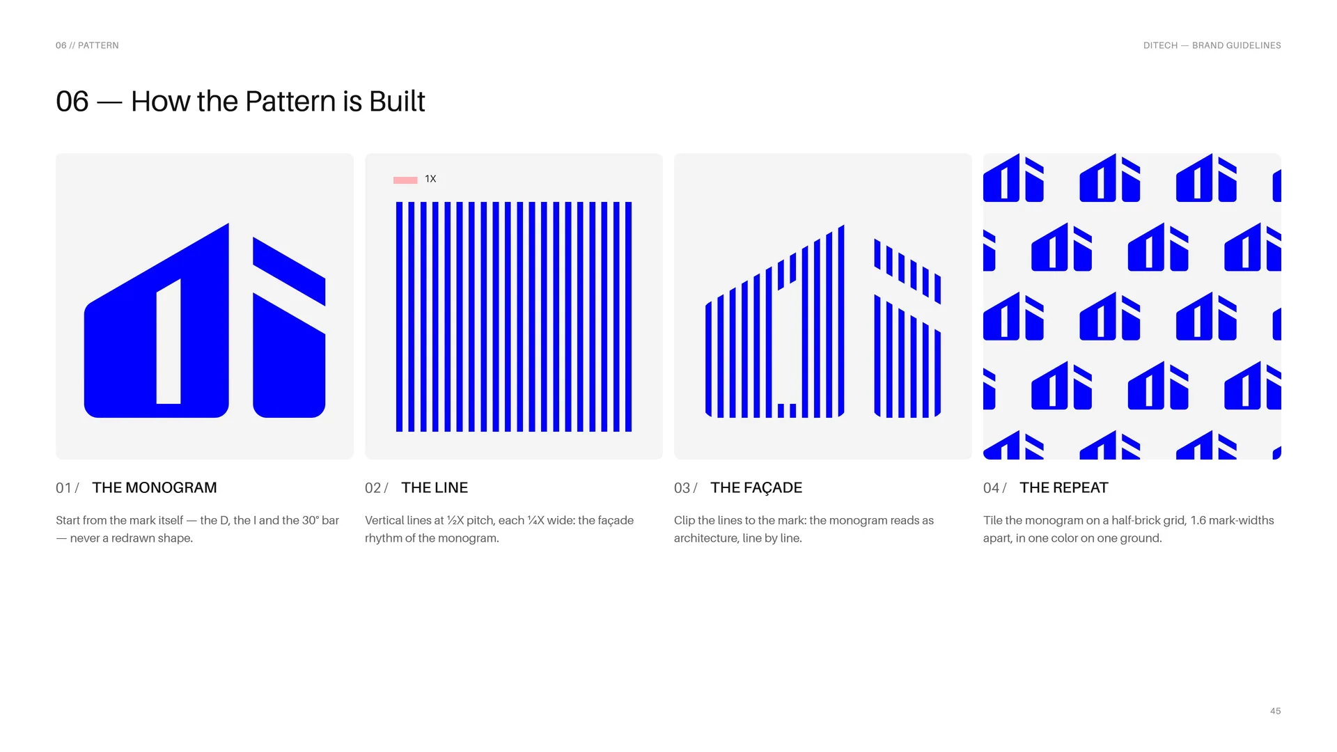
The monogram: Start from the mark itself — the D, the I and the 30° bar — never a redrawn shape.
The line: Vertical lines at ½X pitch, each ¼X wide: the façade rhythm of the monogram.
The façade: Clip the lines to the mark: the monogram reads as architecture, line by line.
The repeat: Tile the monogram on a half-brick grid, 1.6 mark-widths apart, in one color on one ground.
06.3
The Pattern Family
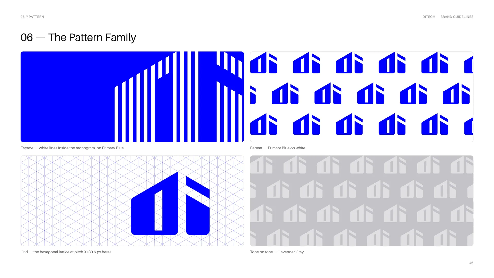
Façade — white lines inside the monogram, on Primary Blue.
Grid — the hexagonal lattice at pitch X (30.6 px here).
Repeat — Primary Blue on white.
Tone on tone — Lavender Gray.
06.4
Line, Solid, Façade
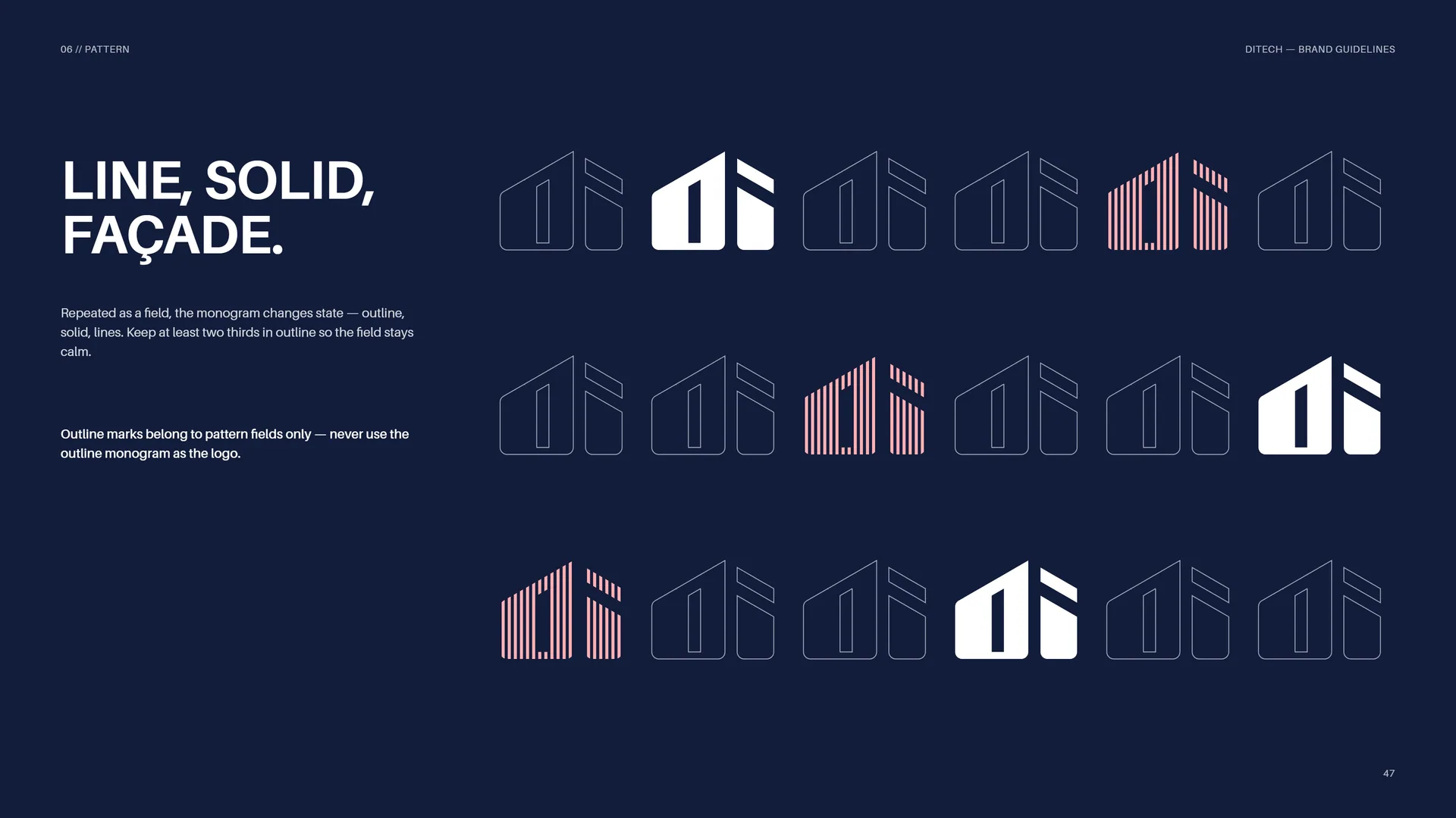
Repeated as a field, the monogram changes state — outline, solid, lines. Keep at least two thirds in outline so the field stays calm.
Outline marks belong to pattern fields only — never use the outline monogram as the logo.
06.5
Pattern Rules
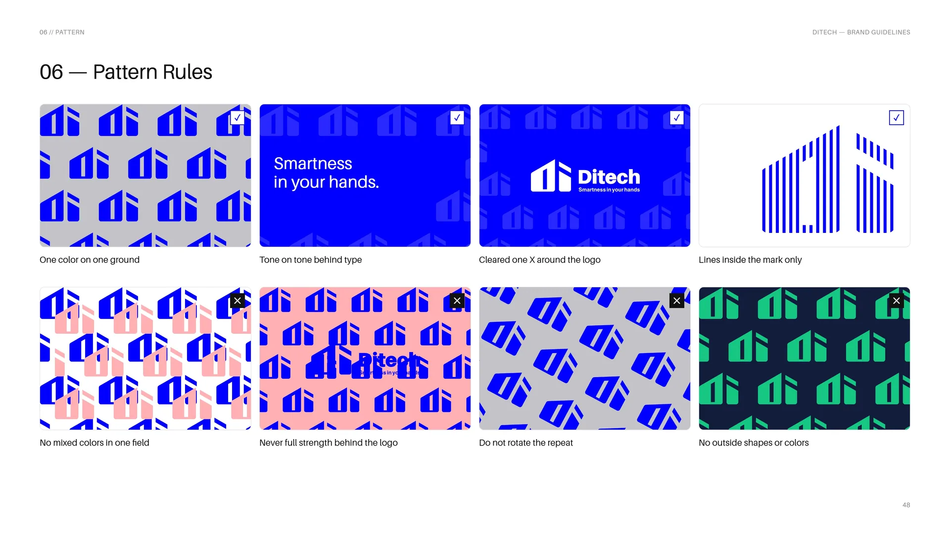
✓ One color on one ground.
✓ Tone on tone behind type.
✓ Cleared one X around the logo.
✓ Lines inside the mark only.
✕ No mixed colors in one field.
✕ Never full strength behind the logo.
✕ Do not rotate the repeat.
✕ No outside shapes or colors.
06.6
Pattern in Use
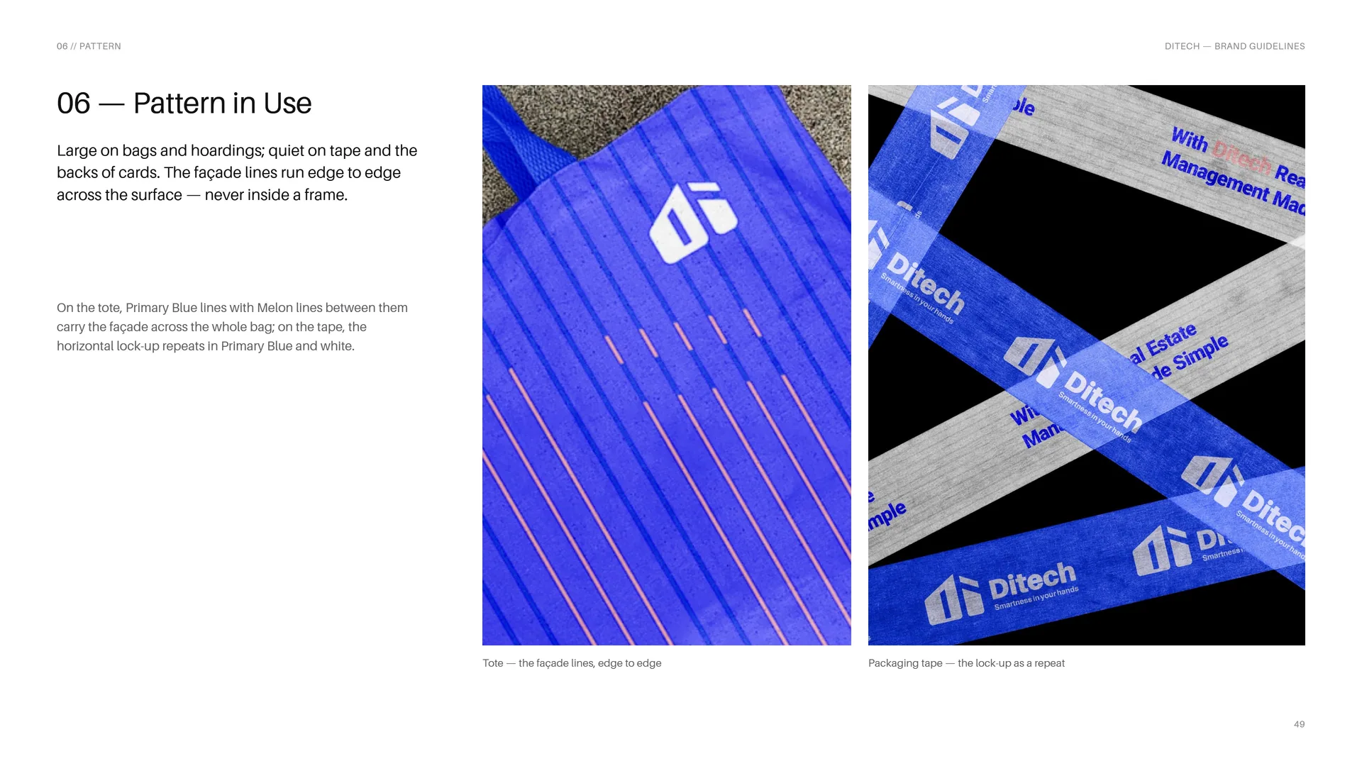
Large on bags and hoardings; quiet on tape and the backs of cards. The façade lines run edge to edge across the surface — never inside a frame.
On the tote, Primary Blue lines with Melon lines between them carry the façade across the whole bag; on the tape, the horizontal lock-up repeats in Primary Blue and white.
Tote — the façade lines, edge to edge.
Packaging tape — the lock-up as a repeat.
07
Imagery & motion
07.1
Imagery
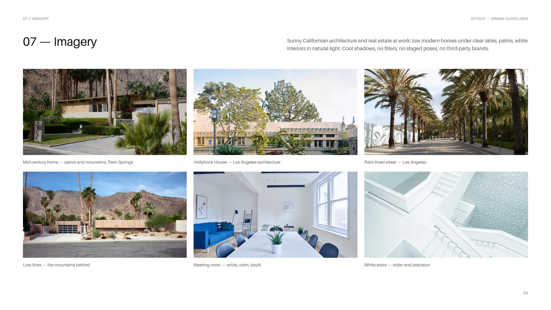
Sunny Californian architecture and real estate at work: low modern homes under clear skies, palms, white interiors in natural light. Cool shadows, no filters, no staged poses, no third-party brands.
Mid-century home — palms and mountains, Palm Springs.
Hollyhock House — Los Angeles architecture.
Palm-lined street — Los Angeles.
Low lines — the mountains behind.
Meeting room — white, calm, daylit.
White stairs — order and precision.
07.2
Logo Motion
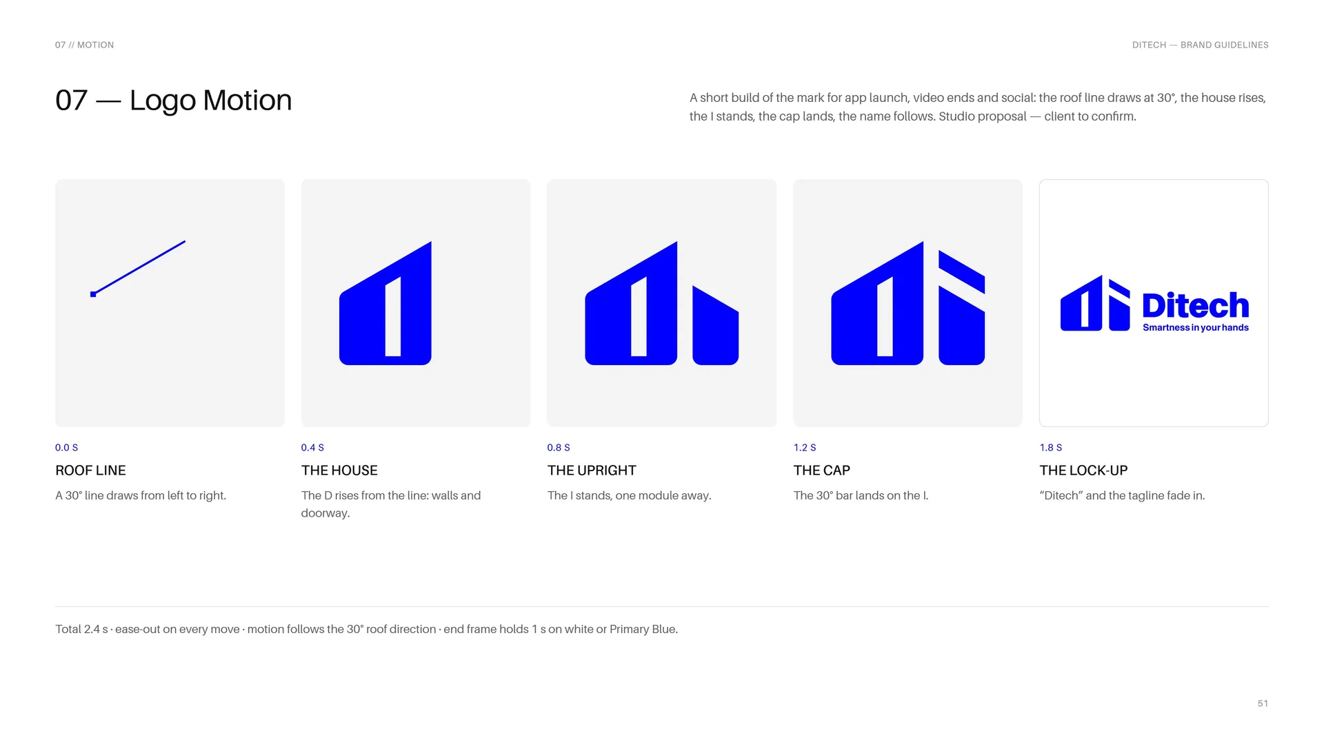
A short build of the mark for app launch, video ends and social: the roof line draws at 30°, the house rises, the I stands, the cap lands, the name follows. Studio proposal — client to confirm.
0.0 s — Roof line: A 30° line draws from left to right.
0.4 s — The house: The D rises from the line: walls and doorway.
0.8 s — The upright: The I stands, one module away.
1.2 s — The cap: The 30° bar lands on the I.
1.8 s — The lock-up: “Ditech” and the tagline fade in.
Total 2.4 s · ease-out on every move · motion follows the 30° roof direction · end frame holds 1 s on white or Primary Blue.
08
Stationery
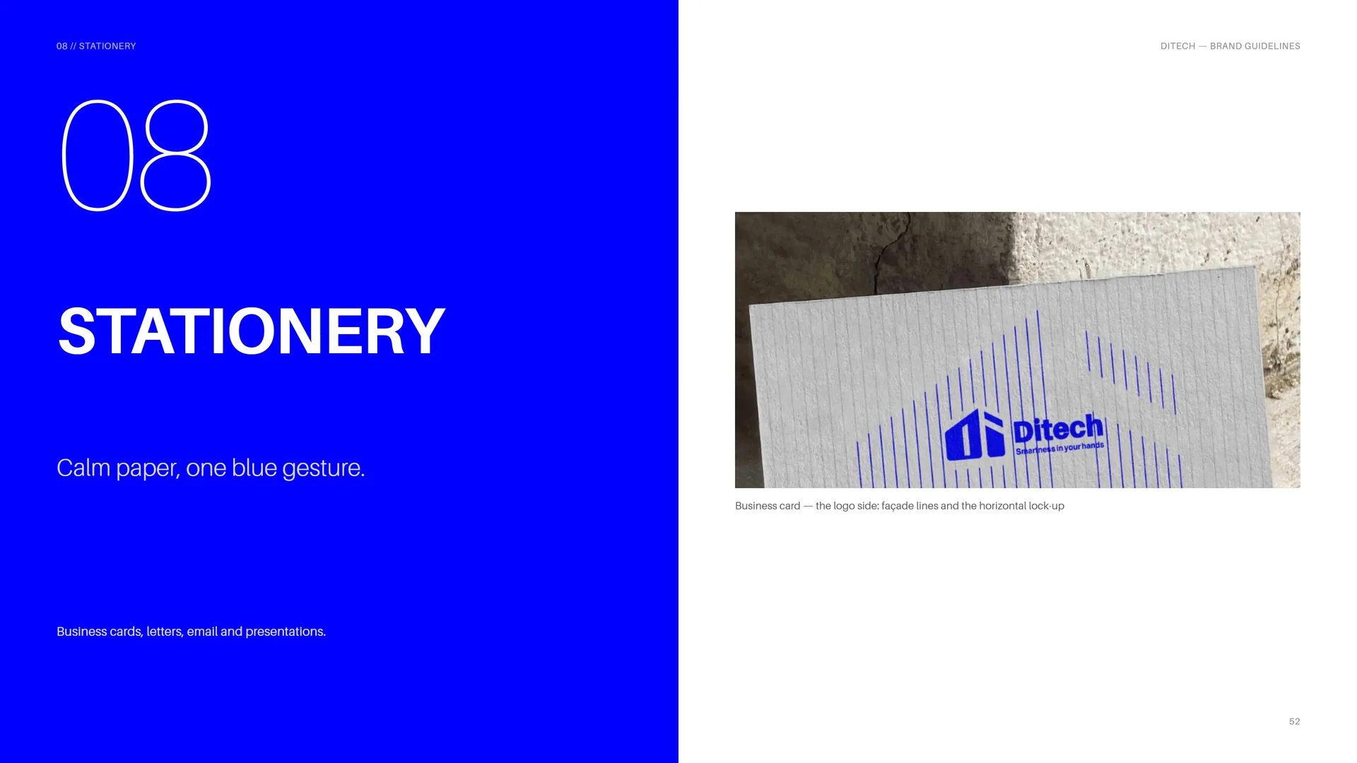
Calm paper, one blue gesture.
Business cards, letters, email and presentations.
Business card — the logo side: façade lines and the horizontal lock-up.
08.1
Clear data, precise layout
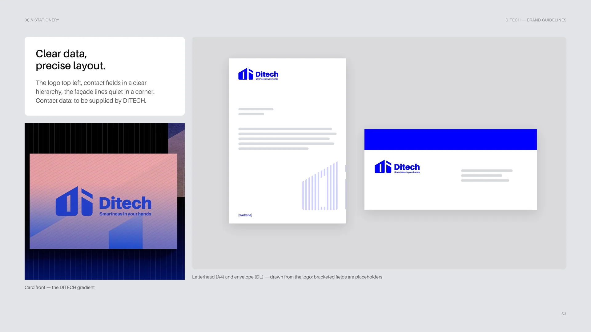
The logo top-left, contact fields in a clear hierarchy, the façade lines quiet in a corner. Contact data: to be supplied by DITECH.
Card front — the DITECH gradient.
Letterhead (A4) and envelope (DL) — drawn from the logo; bracketed fields are placeholders.
08.2
Email Signature
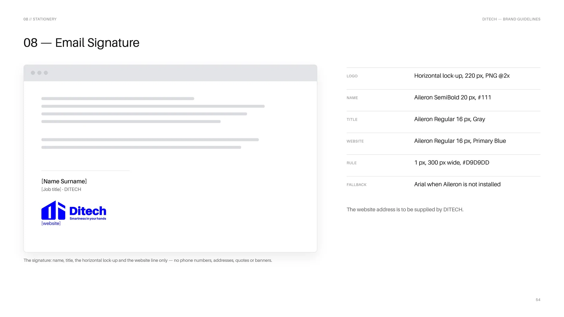
The signature: name, title, the horizontal lock-up and the website line only — no phone numbers, addresses, quotes or banners.
Logo: Horizontal lock-up, 220 px, PNG @2x.
Name: Aileron SemiBold 20 px, #111.
Title: Aileron Regular 16 px, Gray.
Website: Aileron Regular 16 px, Primary Blue.
Rule: 1 px, 300 px wide, #D9D9DD.
Fallback: Arial when Aileron is not installed.
The website address is to be supplied by DITECH.
08.3
Presentation Template
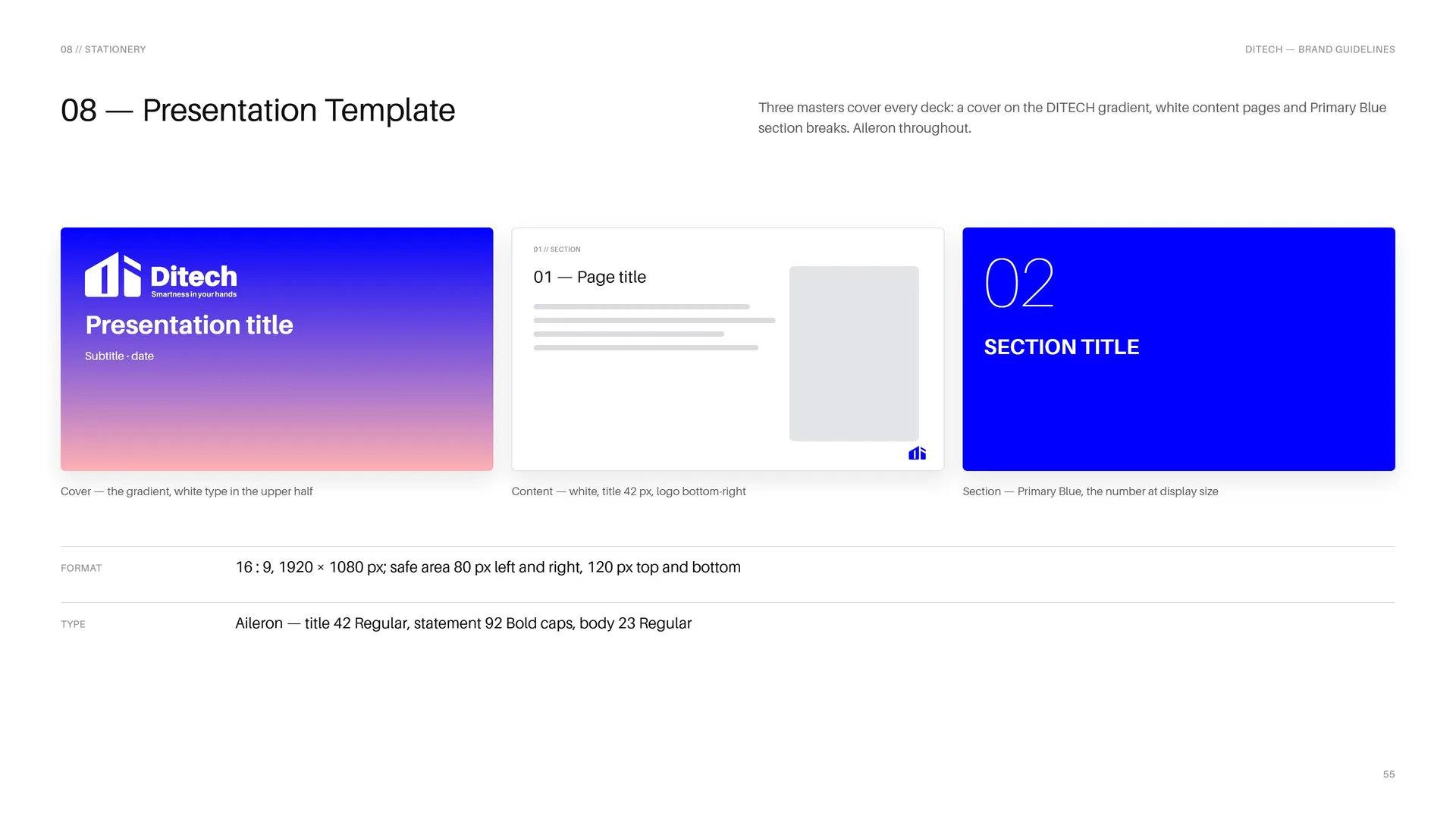
Three masters cover every deck: a cover on the DITECH gradient, white content pages and Primary Blue section breaks. Aileron throughout.
Cover — the gradient, white type in the upper half.
Content — white, title 42 px, logo bottom-right.
Section — Primary Blue, the number at display size.
Format: 16 : 9, 1920 × 1080 px; safe area 80 px left and right, 120 px top and bottom.
Type: Aileron — title 42 Regular, statement 92 Bold caps, body 23 Regular.
09
Packaging
Delivered with care.
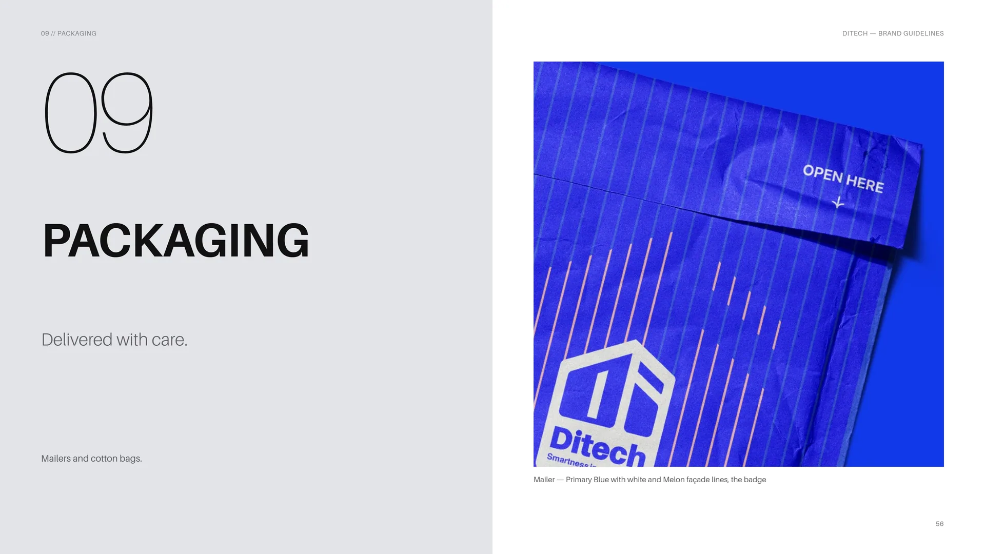
Mailers and cotton bags.
Mailer — Primary Blue with white and Melon façade lines, the badge.
09.1
Cotton Bag
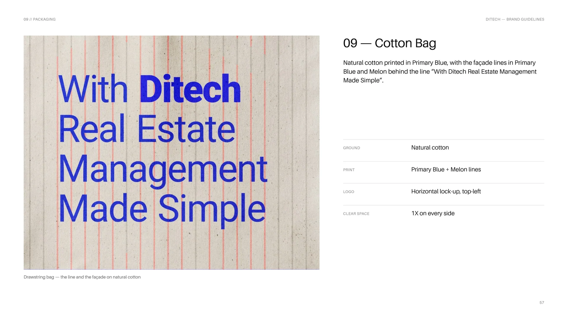
Natural cotton printed in Primary Blue, with the façade lines in Primary Blue and Melon behind the line “With Ditech Real Estate Management Made Simple”.
Ground: Natural cotton.
Print: Primary Blue + Melon lines.
Logo: Horizontal lock-up, top-left.
Clear space: 1X on every side.
Drawstring bag — the line and the façade on natural cotton.
10
Digital media
Smartness in your hands.
App, dashboard, website, tokens and social.
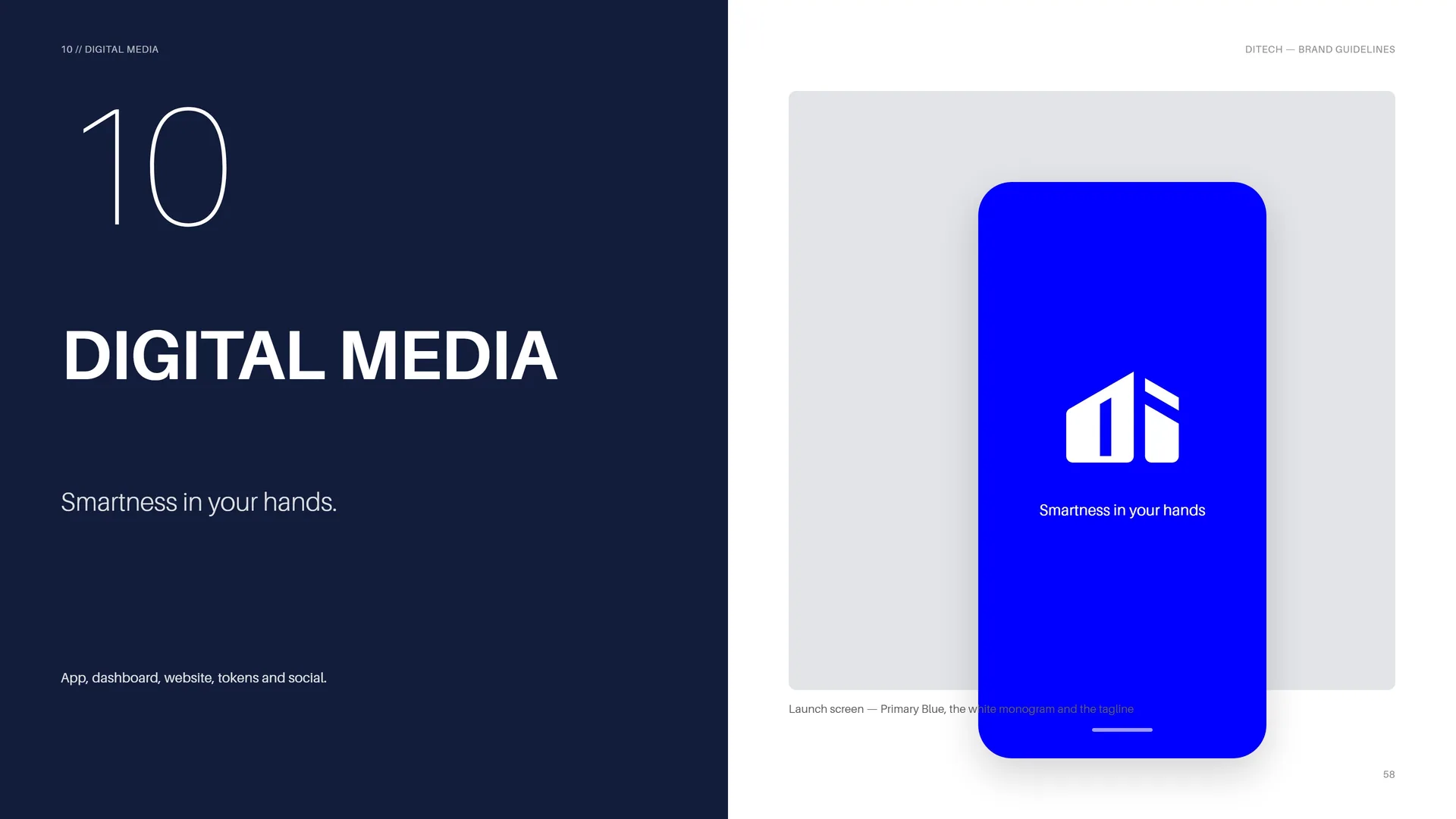
Launch screen — Primary Blue, the white monogram and the tagline.
10.1
Product Dashboard
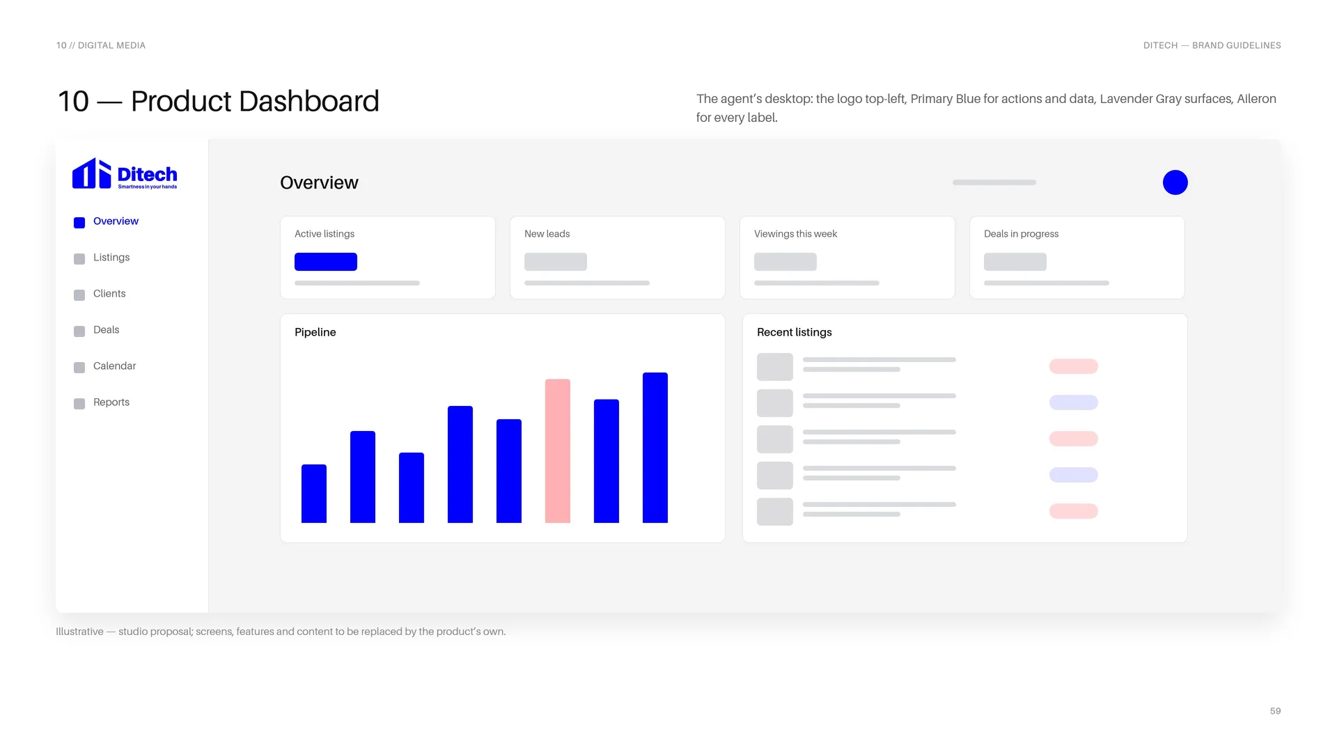
The agent’s desktop: the logo top-left, Primary Blue for actions and data, Lavender Gray surfaces, Aileron for every label.
Illustrative — studio proposal; screens, features and content to be replaced by the product’s own.
10.2
Mobile App
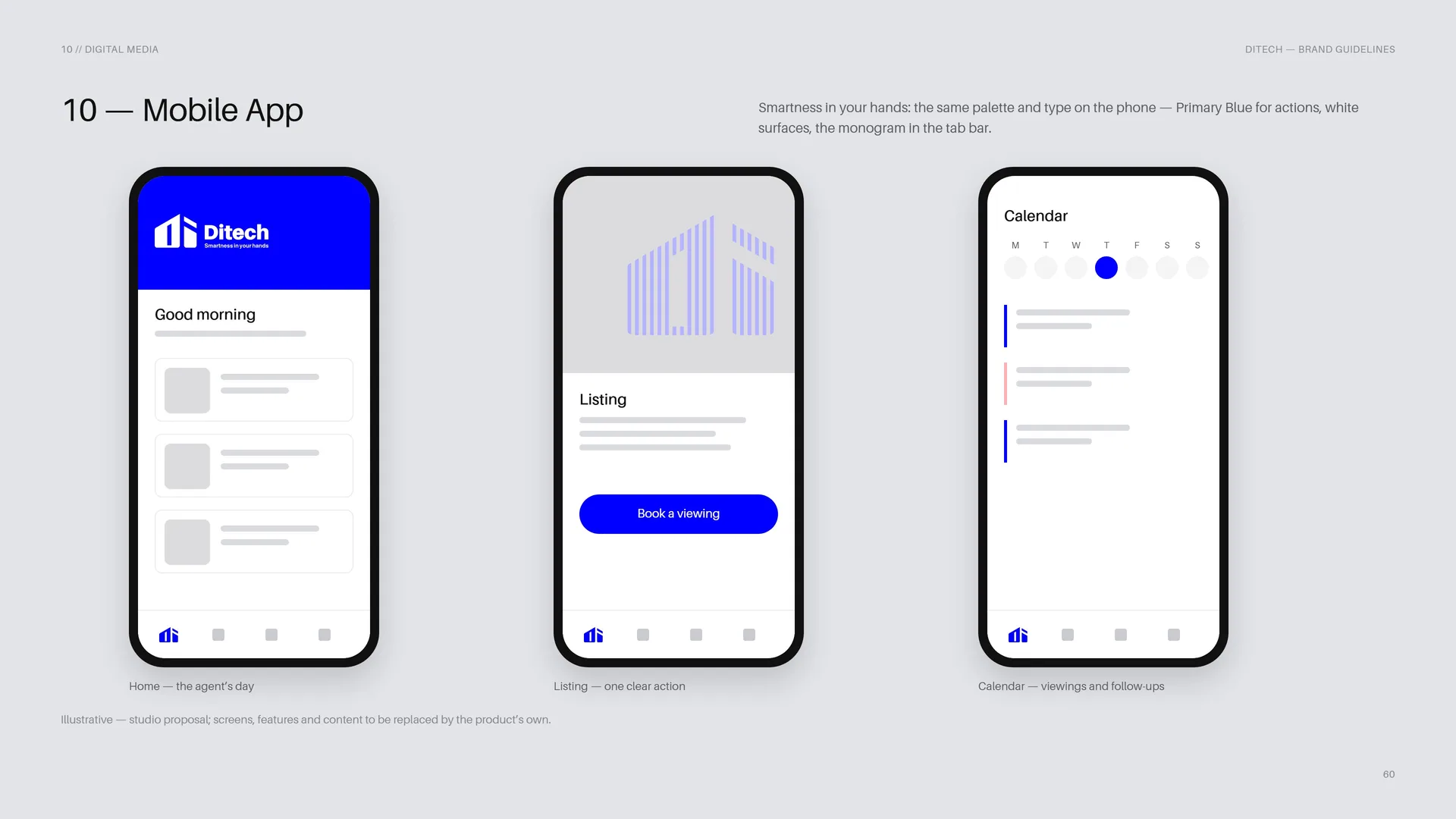
Smartness in your hands: the same palette and type on the phone — Primary Blue for actions, white surfaces, the monogram in the tab bar.
Home — the agent’s day.
Listing — one clear action.
Calendar — viewings and follow-ups.
Illustrative — studio proposal; screens, features and content to be replaced by the product’s own.
10.3
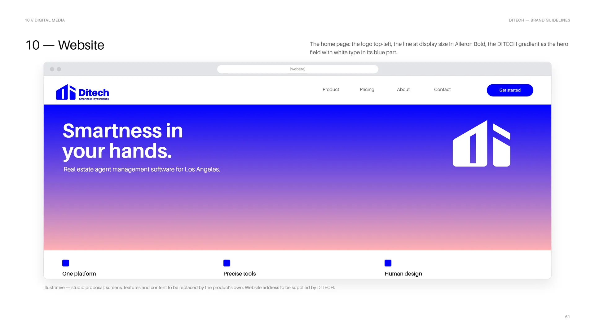
Website
The home page: the logo top-left, the line at display size in Aileron Bold, the DITECH gradient as the hero field with white type in its blue part.
Illustrative — studio proposal; screens, features and content to be replaced by the product’s own. Website address to be supplied by DITECH.
10.4
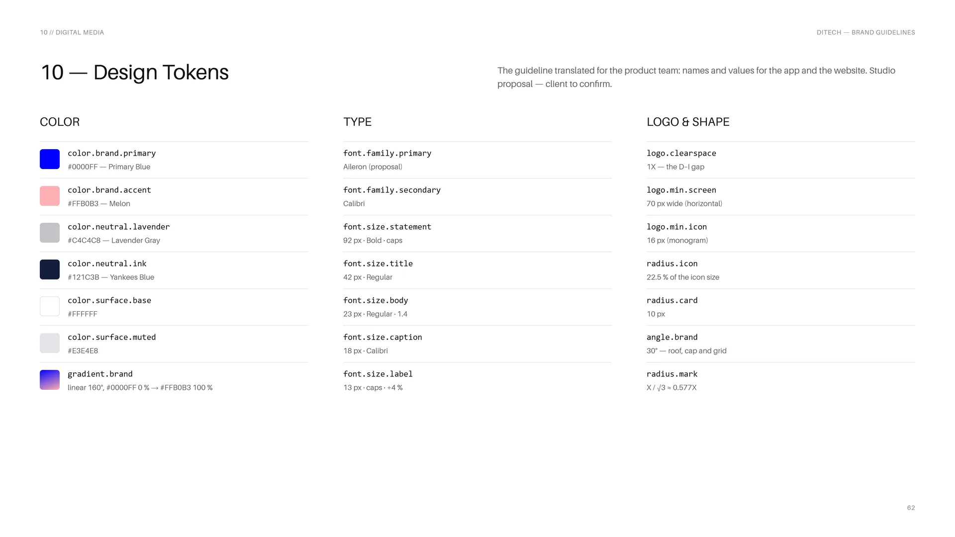
Design Tokens
The guideline translated for the product team: names and values for the app and the website. Studio proposal — client to confirm.
Color: color.brand.primary #0000FF — Primary Blue · color.brand.accent #FFB0B3 — Melon · color.neutral.lavender #C4C4C8 — Lavender Gray · color.neutral.ink #121C3B — Yankees Blue · color.surface.base #FFFFFF · color.surface.muted #E3E4E8 · gradient.brand linear 160°, #0000FF 0 % → #FFB0B3 100 %.
Type: font.family.primary Aileron (proposal) · font.family.secondary Calibri · font.size.statement 92 px · Bold · caps · font.size.title 42 px · Regular · font.size.body 23 px · Regular · 1.4 · font.size.caption 18 px · Calibri · font.size.label 13 px · caps · +4 %.
Logo & shape: logo.clearspace 1X — the D–I gap · logo.min.screen 70 px wide (horizontal) · logo.min.icon 16 px (monogram) · radius.icon 22.5 % of the icon size · radius.card 10 px · angle.brand 30° — roof, cap and grid · radius.mark X / √3 ≈ 0.577X.
10.5
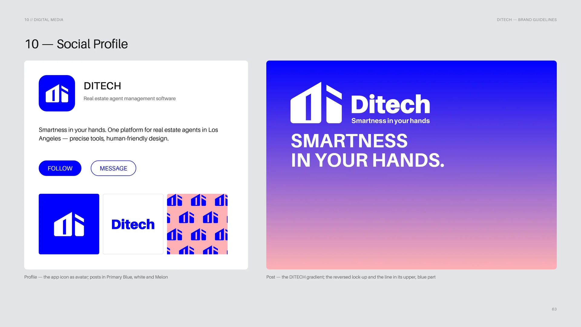
Social Profile
Profile — the app icon as avatar; posts in Primary Blue, white and Melon.
Post — the DITECH gradient; the reversed lock-up and the line in its upper, blue part.
11
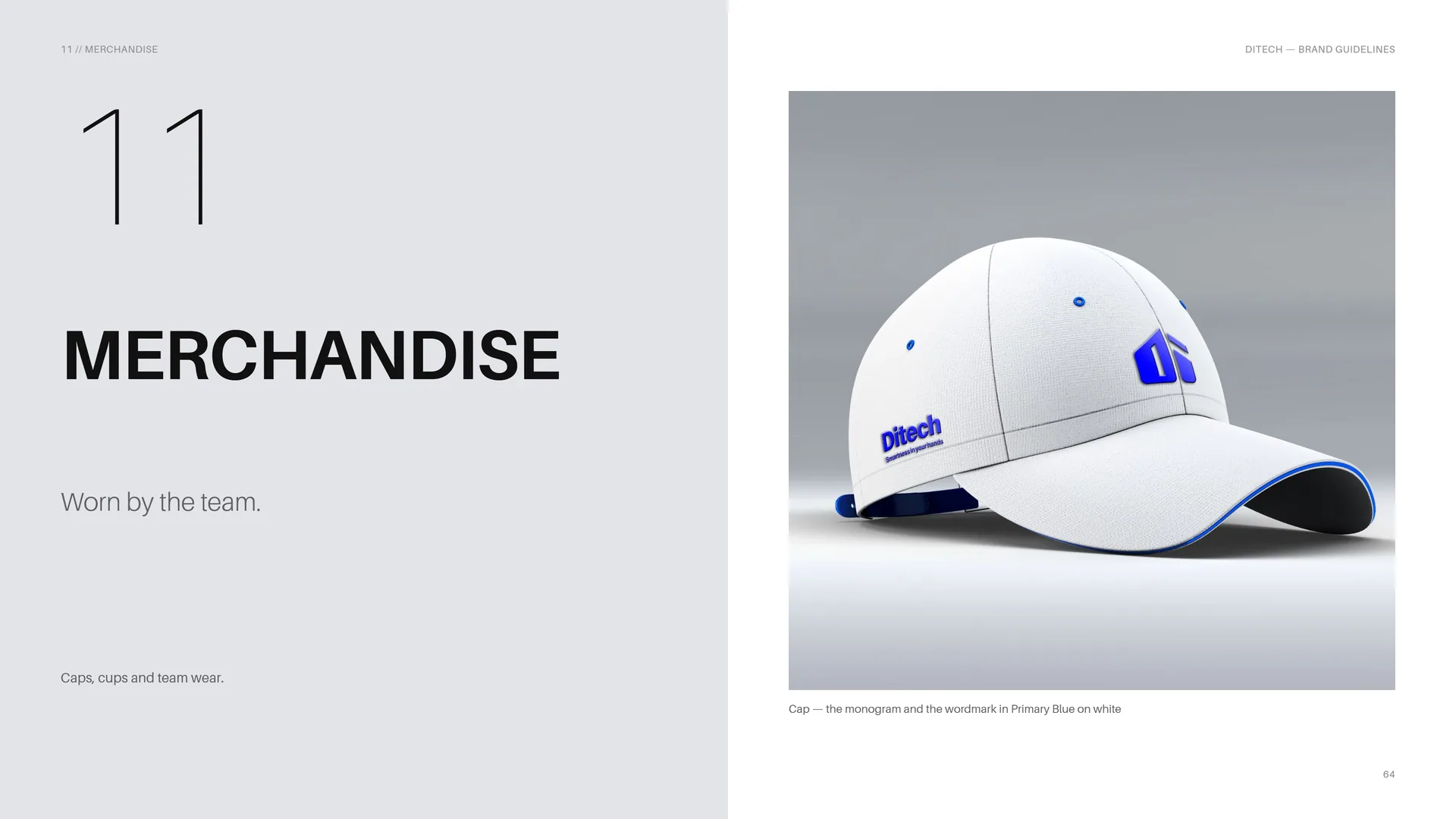
Merchandise
Worn by the team.
Caps, cups and team wear.
Cap — the monogram and the wordmark in Primary Blue on white.
11.1
Blue, white and Melon lines
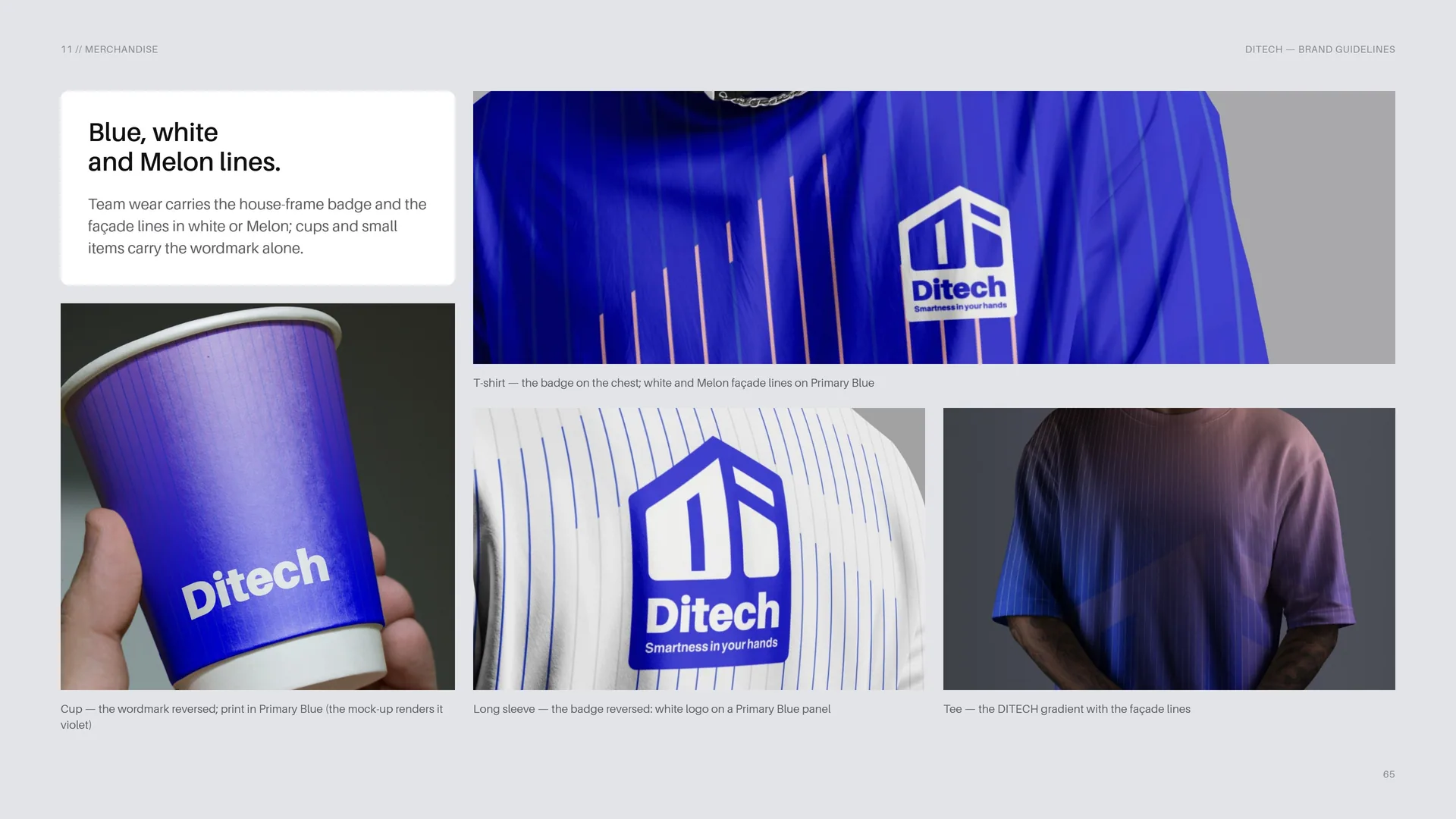
Team wear carries the house-frame badge and the façade lines in white or Melon; cups and small items carry the wordmark alone.
T-shirt — the badge on the chest; white and Melon façade lines on Primary Blue.
Cup — the wordmark reversed; print in Primary Blue (the mock-up renders it violet).
Long sleeve — the badge reversed: white logo on a Primary Blue panel.
Tee — the DITECH gradient with the façade lines.
12
Signage & environment
At street scale.
Reception walls, stands and wayfinding.
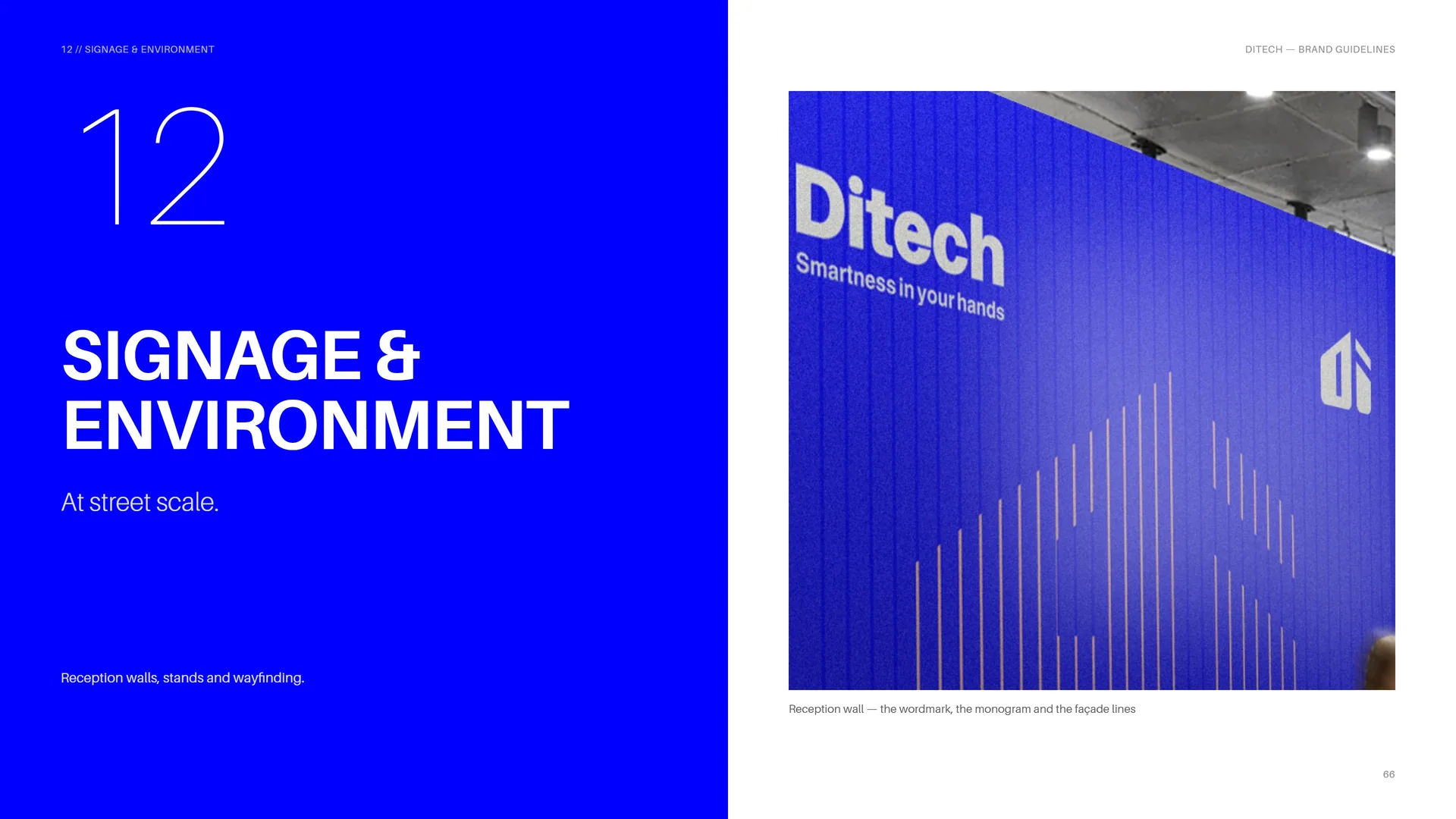
Reception wall — the wordmark, the monogram and the façade lines.
12.1
Glass Street Stand
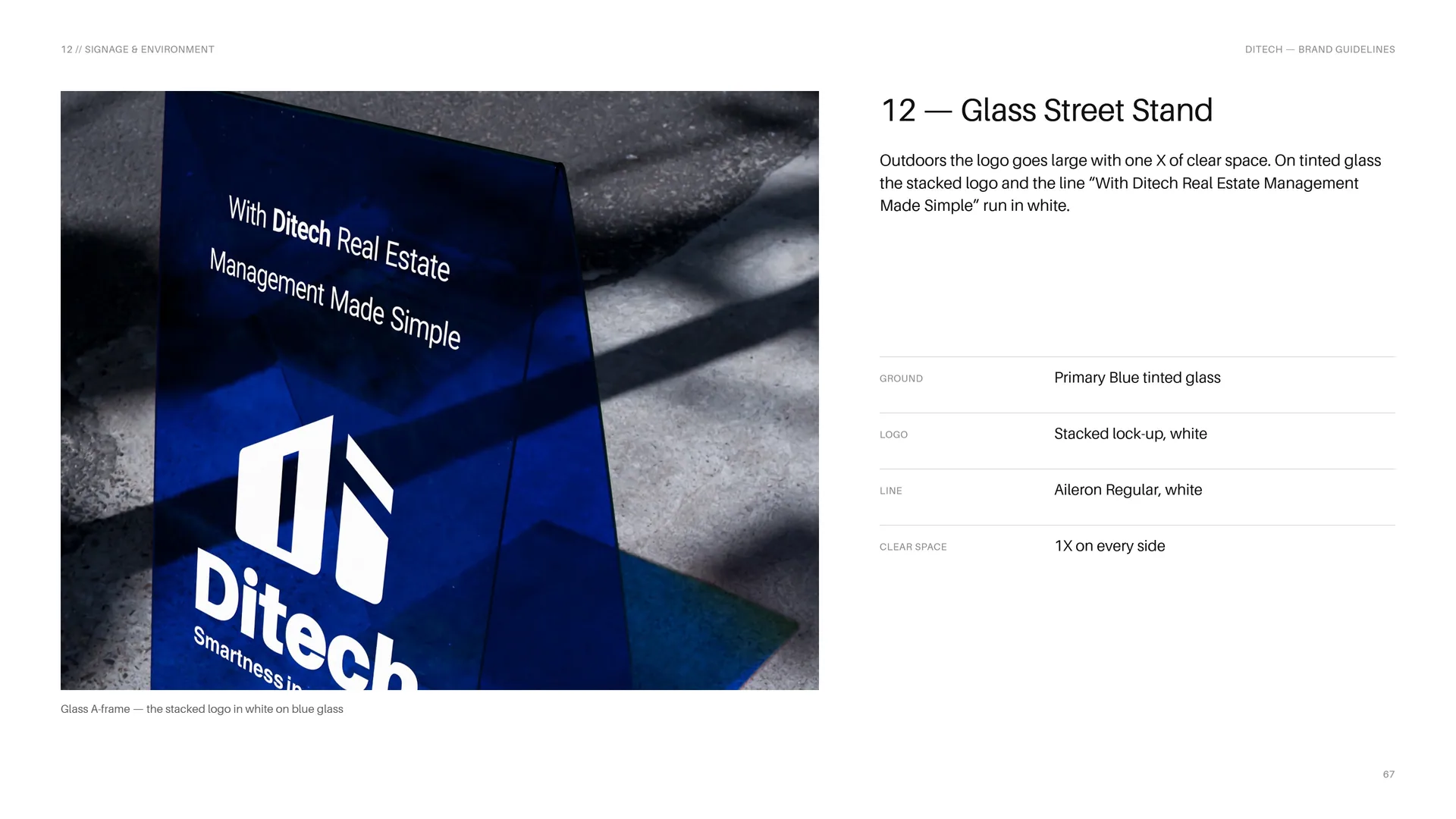
Outdoors the logo goes large with one X of clear space. On tinted glass the stacked logo and the line “With Ditech Real Estate Management Made Simple” run in white.
Ground: Primary Blue tinted glass.
Logo: Stacked lock-up, white.
Line: Aileron Regular, white.
Clear space: 1X on every side.
Glass A-frame — the stacked logo in white on blue glass.
12.2
Signage System
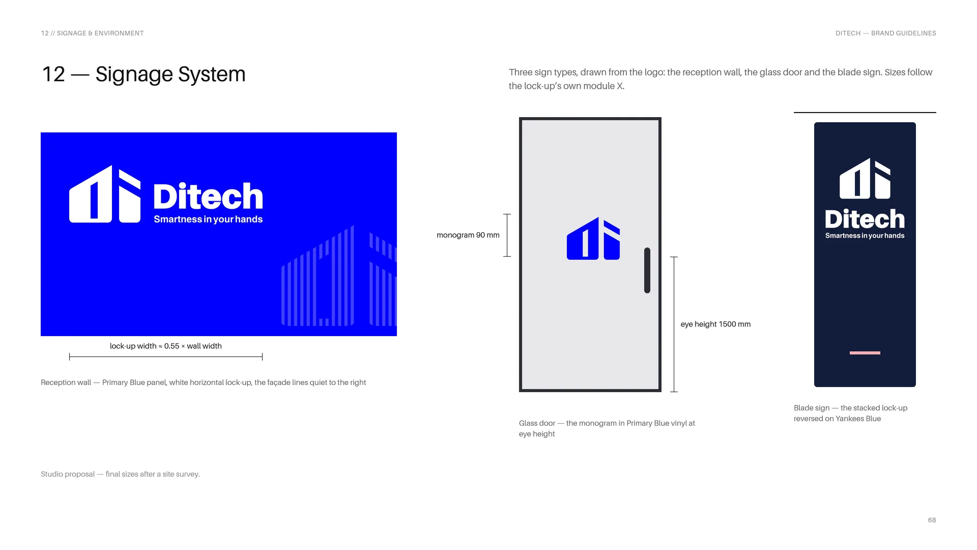
Three sign types, drawn from the logo: the reception wall, the glass door and the blade sign. Sizes follow the lock-up’s own module X.
Reception wall — Primary Blue panel, white horizontal lock-up, the façade lines quiet to the right.
Lock-up width ≈ 0.55 × wall width.
Glass door — the monogram in Primary Blue vinyl at eye height.
Monogram 90 mm · eye height 1500 mm.
Blade sign — the stacked lock-up reversed on Yankees Blue.
Studio proposal — final sizes after a site survey.
13
Files & contact
13.1
Files & Contact
Business: Real estate agent management software.
Market: Los Angeles.
Brand contact: To be supplied by DITECH.
Logo files — AI · EPS · PDF: Vector masters — CMYK.
SVG: Vector for web and apps.
PNG: Transparent, 1x · 2x · 4x.
ICO · PNG: Monogram favicon 16 · 32 · 48 · 64 · 128 px.
Fonts: Aileron (proposed) · Calibri ships with Microsoft Office — not included.
Name files as DITECH_Logo_Lockup_Color_Mode.ext — e.g. DITECH_Logo_Horizontal_Blue_RGB.svg.
Version 1.0 · November 2026.
Photos: Wikimedia Commons, CC0 / public domain.
13.2
Thank you
Smartness in your hands.