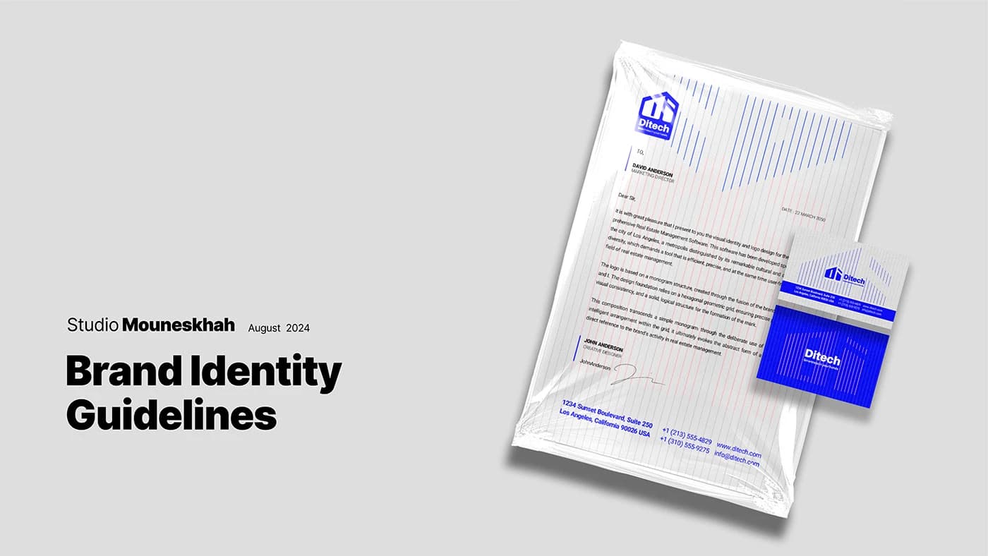
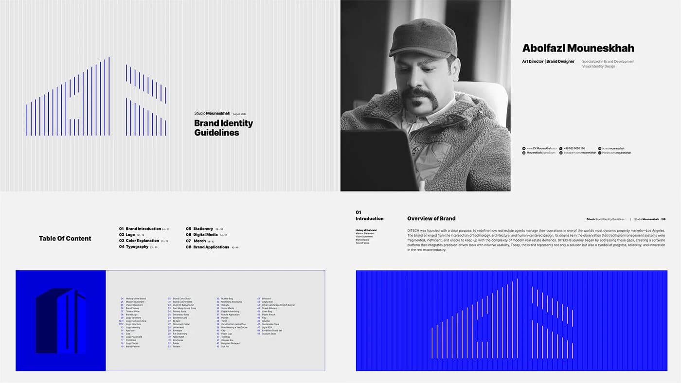
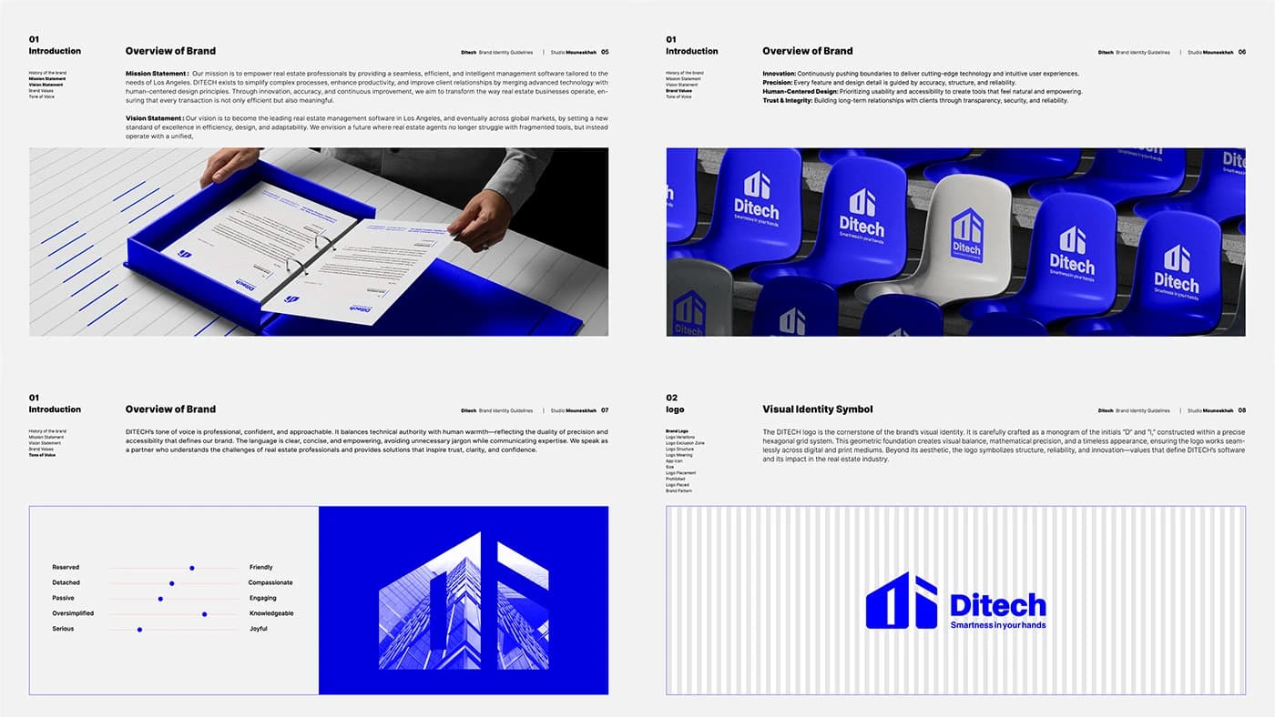
DITECH Brand Identity
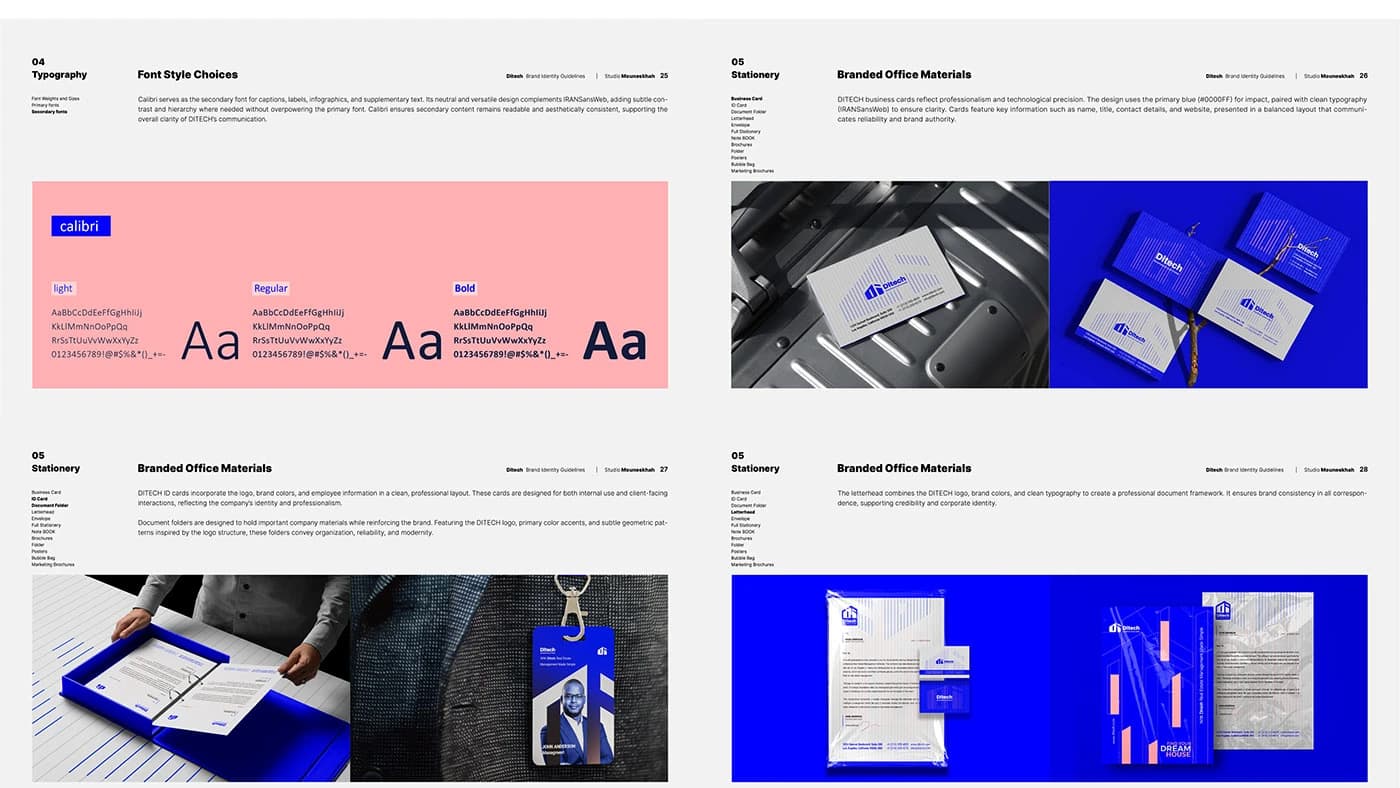
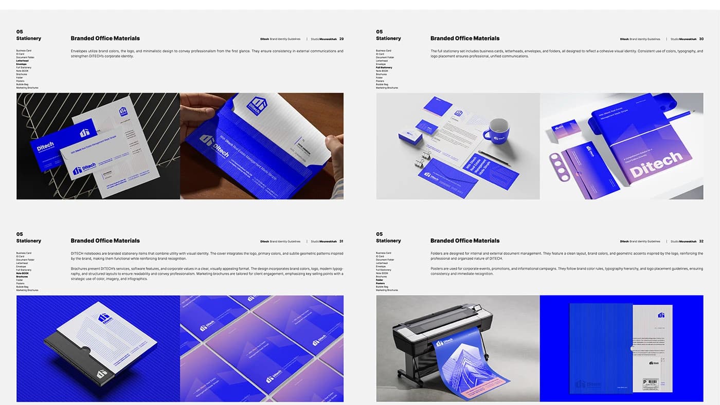
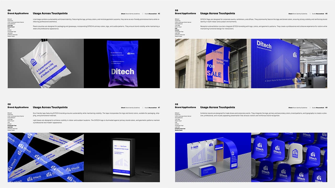
DITECH | PropTech Identity System The Brief Building a brand for a tech-driven real estate platform in Los Angeles. The goal was to move away from generic "house" icons and create a visual language that feels as precise as an architectural blueprint but as fluid as a modern app.
- Year
- 2024
- Client
- DITECH
- Field
- Real-estate software · Los Angeles
- Services
- Visual identity
- Project
- DITECH Brand Identity
About
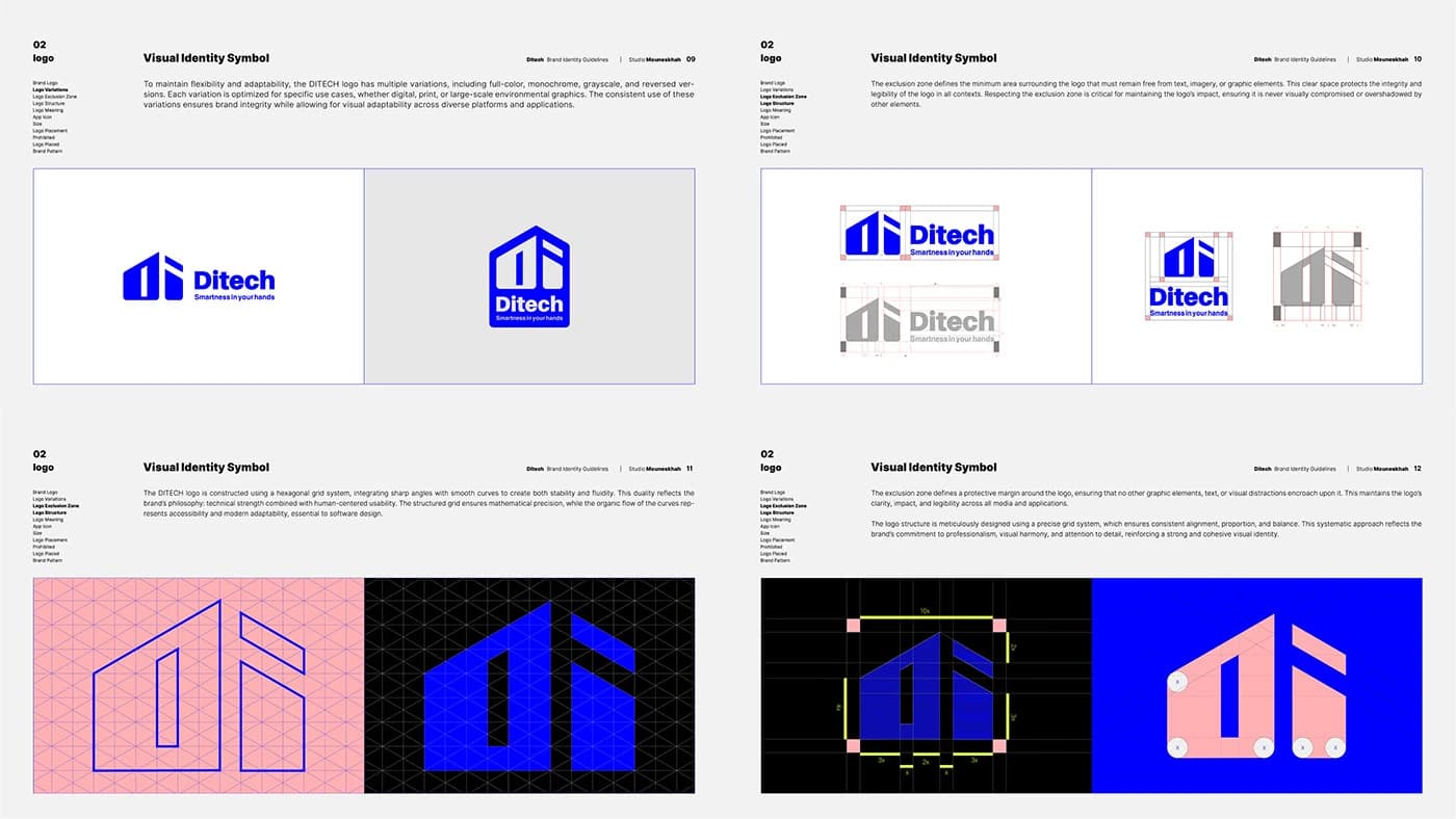
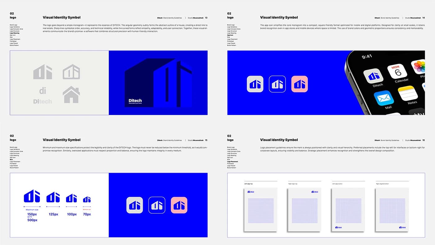
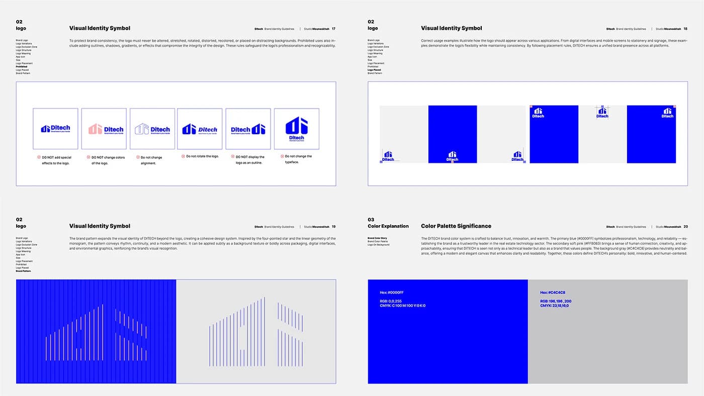
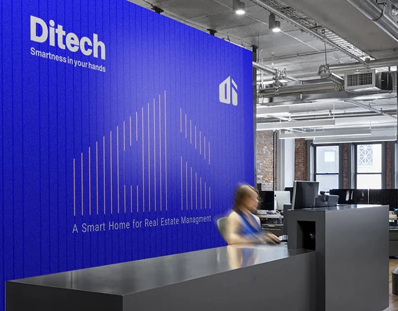
The Solution The identity is built on a strict hexagonal grid. I constructed a geometric monogram of the 'D' and 'I' that functions as a structural unit. By balancing sharp technical angles with calculated curves, the mark feels stable yet approachable.
The design
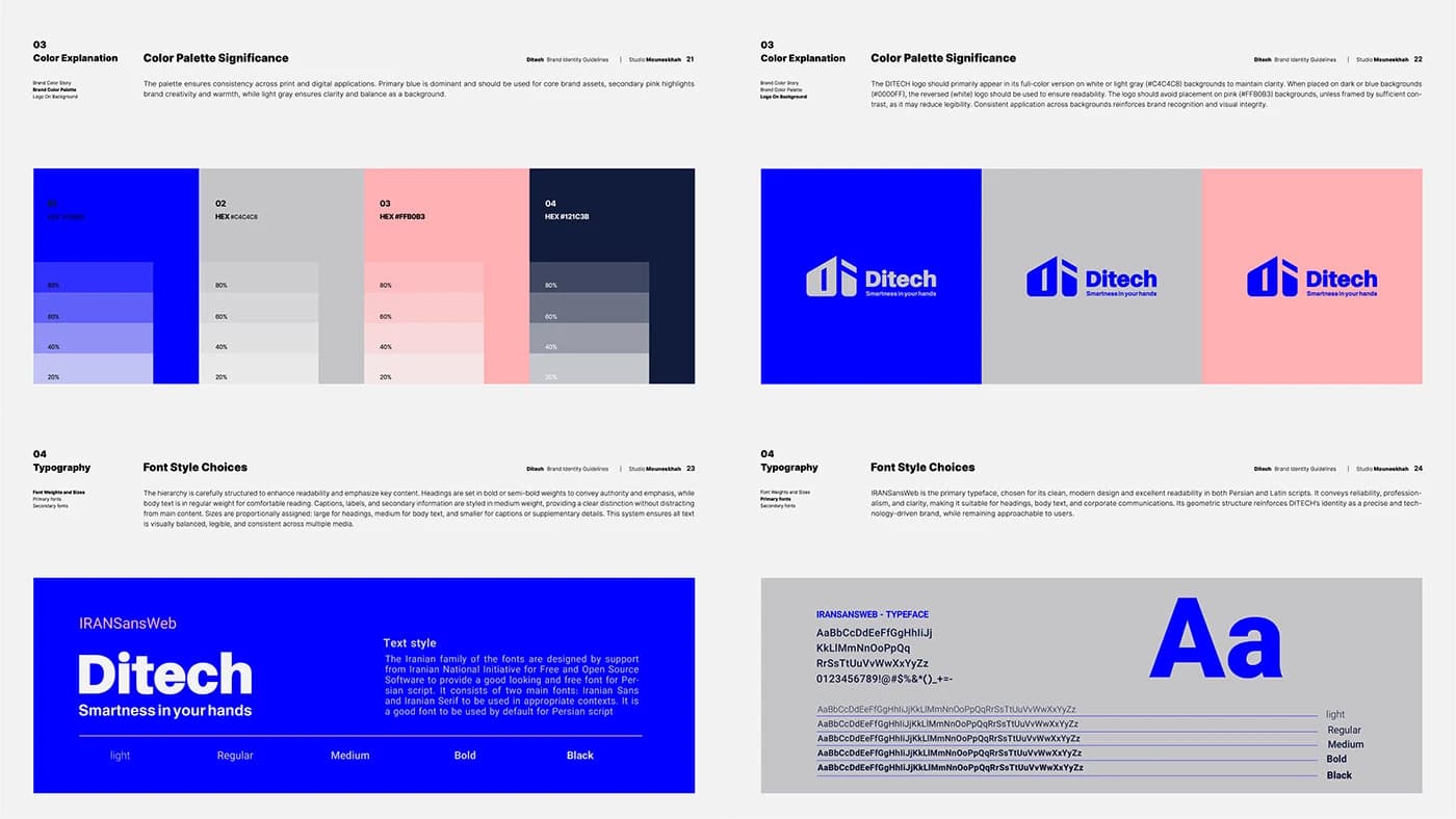
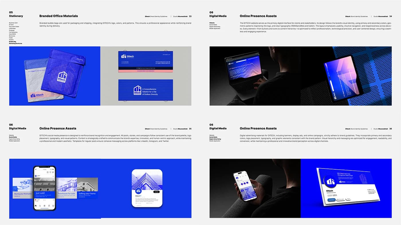
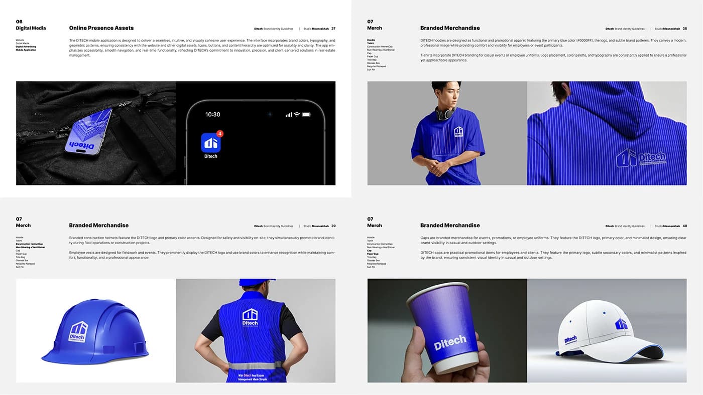
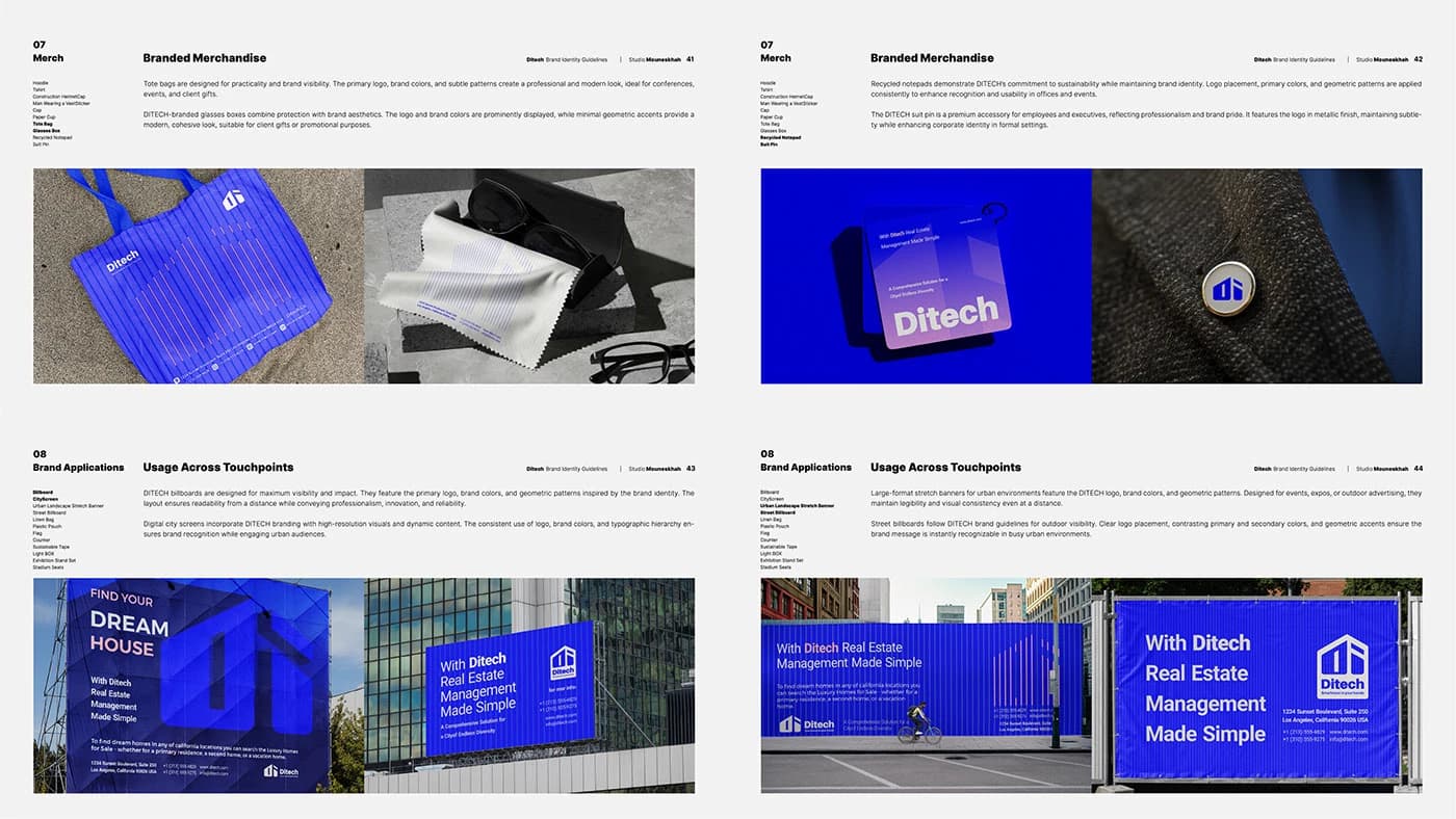
Scalable Geometry: The monogram is designed to hold its integrity from a favicon to 3D physical signage. Systematic Growth: Using a hexagonal framework allowed us to develop a cohesive brand pattern and UI language that scales across the entire DITECH ecosystem. Market Alignment: A clean, "Warm Minimalist" aesthetic tailored specifically for the LA real estate and tech sectors.