MONDFX Brand Identity Guidelines
MONDFX operates in the financial markets, giving traders access to the vast Forex market through the MONDFX brokerage. It was founded on transparency, innovation and efficiency — to bridge the gap between individual traders and the opportunities of the financial world.
Its identity draws on the most iconic traders: resilience, adaptability and strategic thinking. The mark joins a wolf’s face and a diamond — power and agility, value and wealth.
- Jahr
- 2024
- Kunde
- MONDFX
- Branche
- Forex brokerage
- Leistungen
- Visuelle Identität
- Projekt
- Brand Identity Guidelines · v1.0 · 2026
00
Introduction
00.1
Brand Concept
MONDFX operates in the financial markets, giving traders access to the vast Forex market through the MONDFX brokerage. It was founded on transparency, innovation and efficiency — to bridge the gap between individual traders and the opportunities of the financial world.
Its identity draws on the most iconic traders: resilience, adaptability and strategic thinking. The mark joins a wolf’s face and a diamond — power and agility, value and wealth.
Brand idea: Trade smart, trade with MONDFX. Straight lines, grid systems and calculated angles — a sign of trust and power for every trader.
Brand essence: Wolf × Diamond.
Brand promise: Empowering traders, elevating profits.
Core principle: Transparency × Innovation × Efficiency.
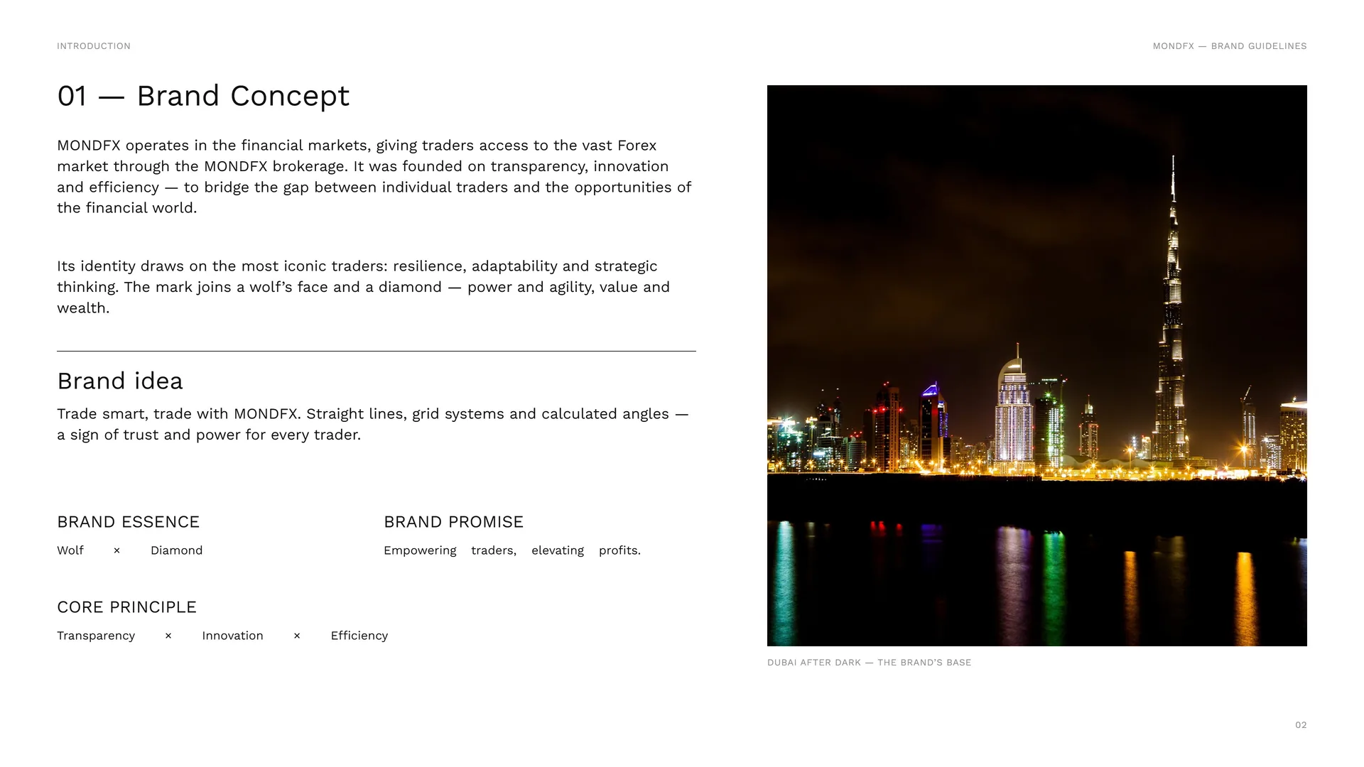
Dubai after dark — the brand’s base.
00.2
The Brand Problem
Individual traders have long stood apart from the opportunities of the financial world. Institutional-level tools, deep market insight and fast execution belonged to the few — and trust in a broker had to be earned, not assumed.
The challenge: A gap between retail traders and institutional-level opportunity · Trading tools and market insight out of reach · Concerns over the security of funds and data · Execution speed that decides every result.
Brand positioning: A brokerage that values both security and growth: the tools, insights and market access traders need, on one trusted platform.
The opportunity: To democratize access to the global Forex market — secure, transparent and technologically advanced.
The shift: From retail access → institutional-level opportunity.
00.3
Primary logo
01
Brand
- 01.1History of the brand
- 01.2Mission & Vision
- 01.3Brand Values
- 01.4Tone of Voice
- 01.5Brand lines
- 01.6Services & Brand Lines
01.1
History of the brand
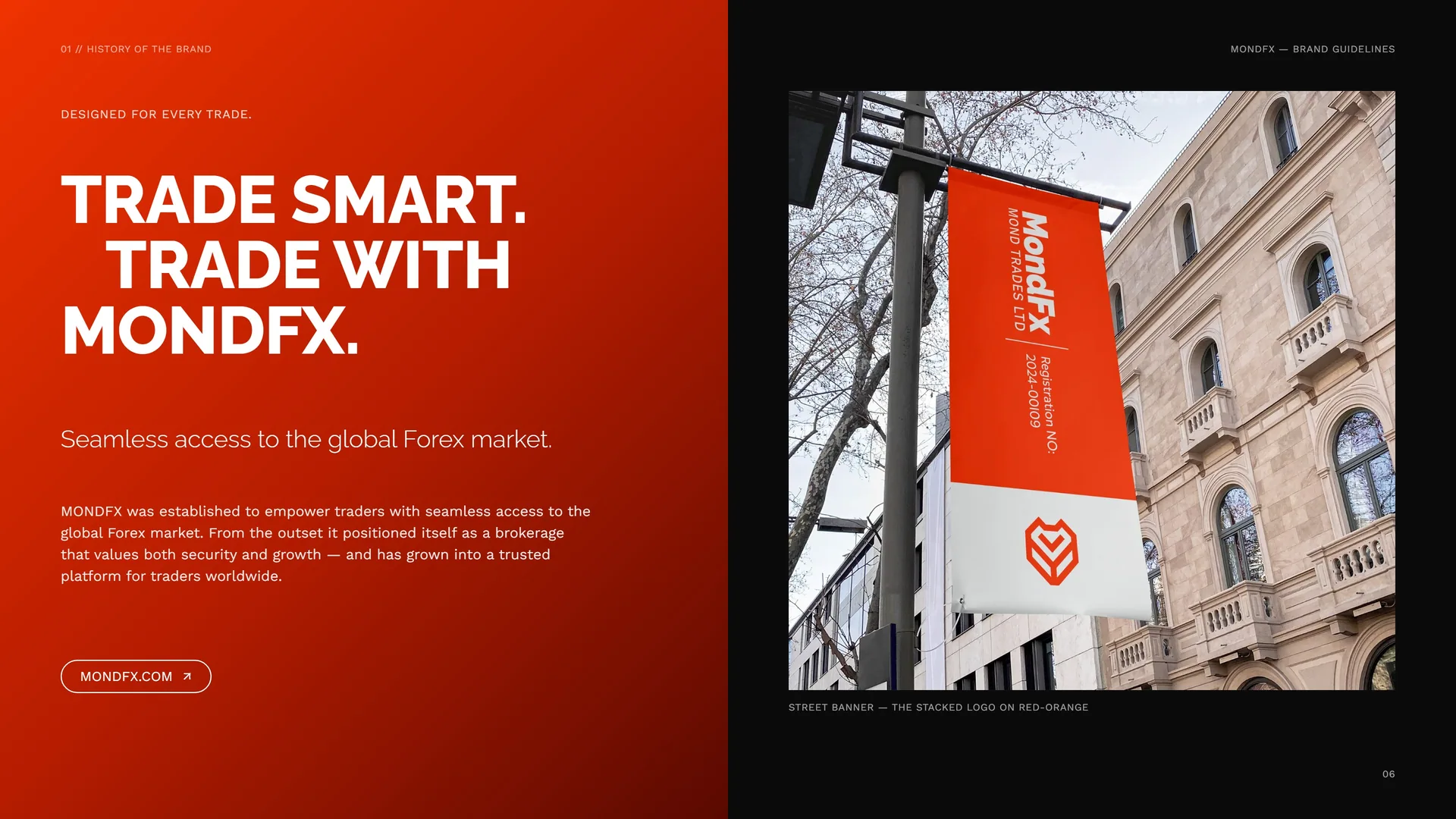
Designed for every trade.
Trade smart. Trade with MONDFX.
Seamless access to the global Forex market.
MONDFX was established to empower traders with seamless access to the global Forex market. From the outset it positioned itself as a brokerage that values both security and growth — and has grown into a trusted platform for traders worldwide.
mondfx.com
Street banner — the stacked logo on red-orange.
01.2
Mission & Vision
Mission: To democratize access to the global Forex market with a secure, transparent and technologically advanced trading environment — bridging the gap between retail traders and institutional-level opportunities with top-tier tools, deep market insight and unparalleled execution speed.
We foster financial growth and independence with education, expert support and the resources traders need to succeed.
Vision: To be the most trusted, innovative and trader-centric Forex brokerage, setting new standards in transparency, technology and financial empowerment.
A dynamic, accessible trading ecosystem where individuals thrive — cutting-edge tools, educational resources and a community-driven approach. MONDFX aims to become the preferred choice for traders worldwide.
01.3
Brand Values
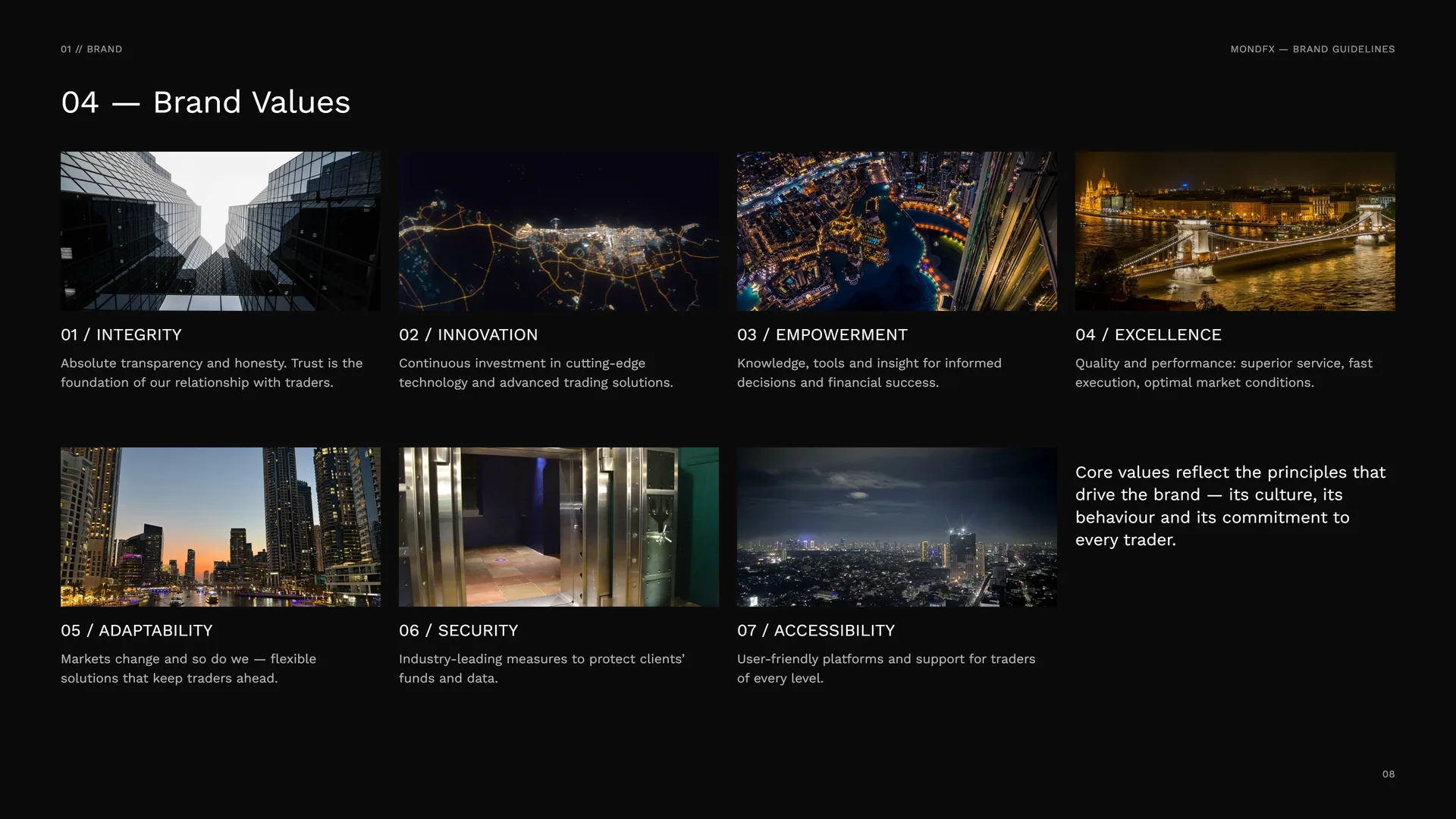
Integrity: Absolute transparency and honesty. Trust is the foundation of our relationship with traders.
Innovation: Continuous investment in cutting-edge technology and advanced trading solutions.
Empowerment: Knowledge, tools and insight for informed decisions and financial success.
Excellence: Quality and performance: superior service, fast execution, optimal market conditions.
Adaptability: Markets change and so do we — flexible solutions that keep traders ahead.
Security: Industry-leading measures to protect clients’ funds and data.
Accessibility: User-friendly platforms and support for traders of every level.
Core values reflect the principles that drive the brand — its culture, its behaviour and its commitment to every trader.
01.4
Tone of Voice
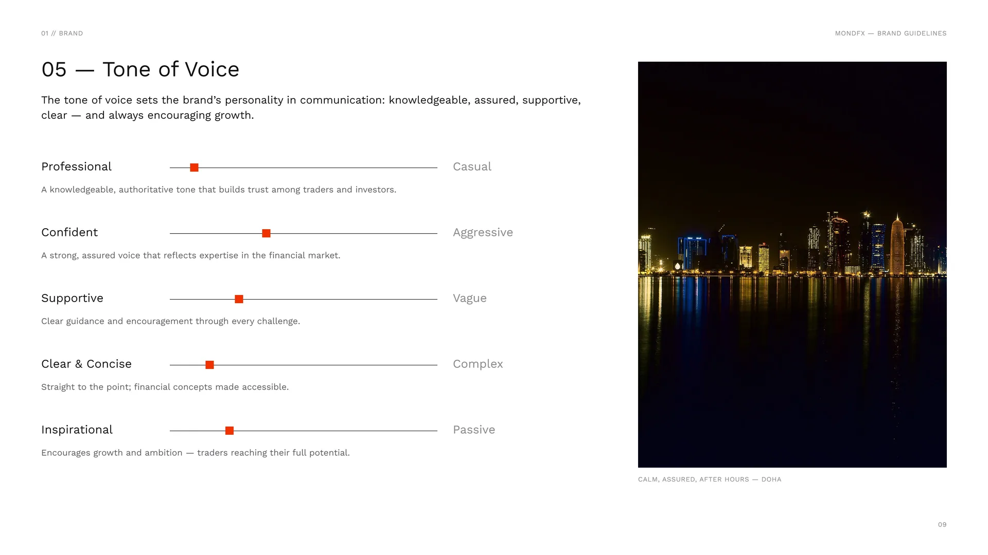
The tone of voice sets the brand’s personality in communication: knowledgeable, assured, supportive, clear — and always encouraging growth.
Professional: A knowledgeable, authoritative tone that builds trust among traders and investors.
Confident: A strong, assured voice that reflects expertise in the financial market.
Supportive: Clear guidance and encouragement through every challenge.
Clear & Concise: Straight to the point; financial concepts made accessible.
Inspirational: Encourages growth and ambition — traders reaching their full potential.
Casual · Aggressive · Vague · Complex · Passive.
Calm, assured, after hours — Doha.
01.5
Brand lines
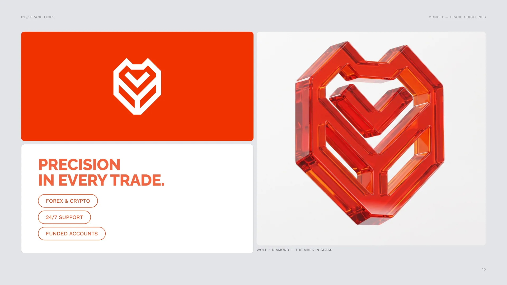
Precision in every trade.
Forex & crypto · 24/7 support · Funded accounts.
Wolf × Diamond — the mark in glass.
01.6
Services & Brand Lines
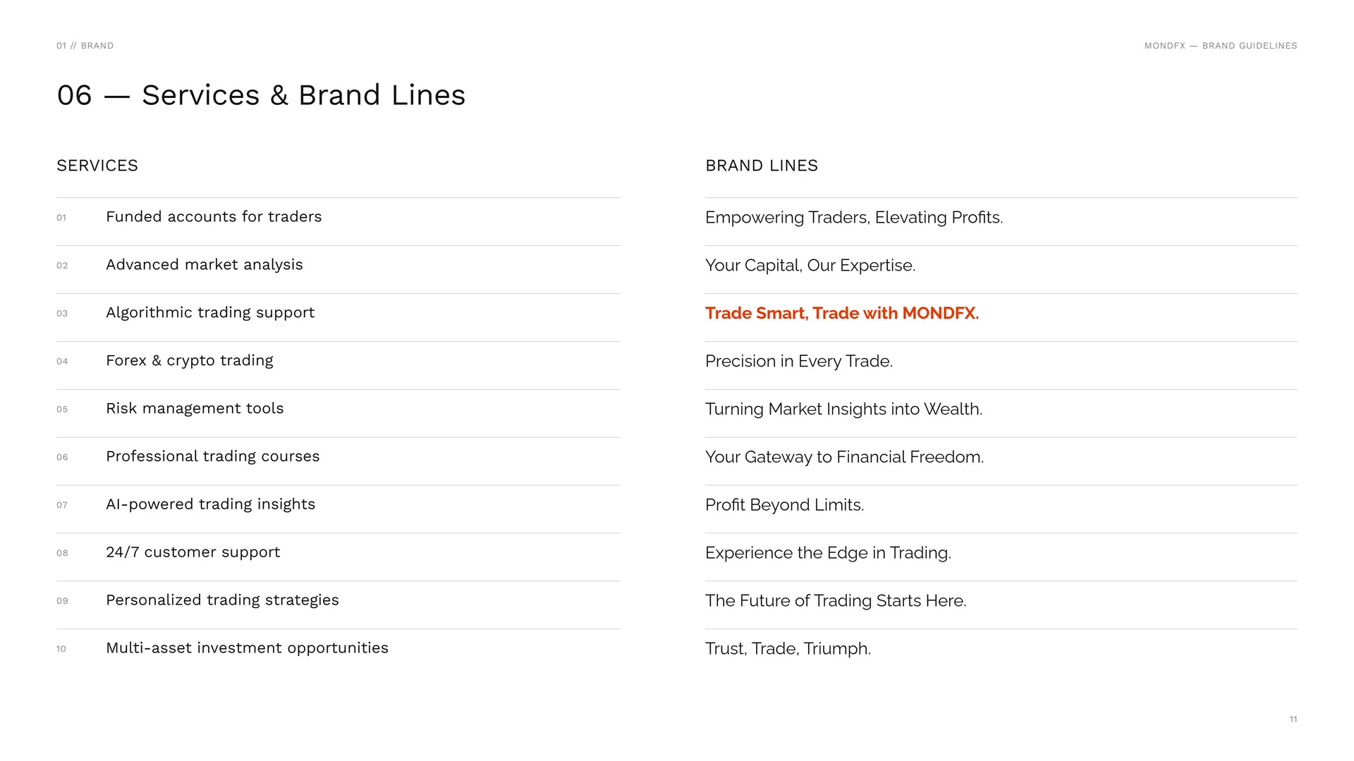
Services: Funded accounts for traders · Advanced market analysis · Algorithmic trading support · Forex & crypto trading · Risk management tools · Professional trading courses · AI-powered trading insights · 24/7 customer support · Personalized trading strategies · Multi-asset investment opportunities.
Brand lines: Empowering Traders, Elevating Profits. · Your Capital, Our Expertise. · Trade Smart, Trade with MONDFX. · Precision in Every Trade. · Turning Market Insights into Wealth. · Your Gateway to Financial Freedom. · Profit Beyond Limits. · Experience the Edge in Trading. · The Future of Trading Starts Here. · Trust, Trade, Triumph.
02
Concept
- 02.1Wolf + Diamond = One Mark
- 02.2Logo Meaning
- 02.3Straight lines, calculated angles
- 02.445° Throughout
- 02.5Value at the Centre
- 02.6Precision in every trade
- 02.7The Mark in Motion
02.1
Wolf + Diamond = One Mark
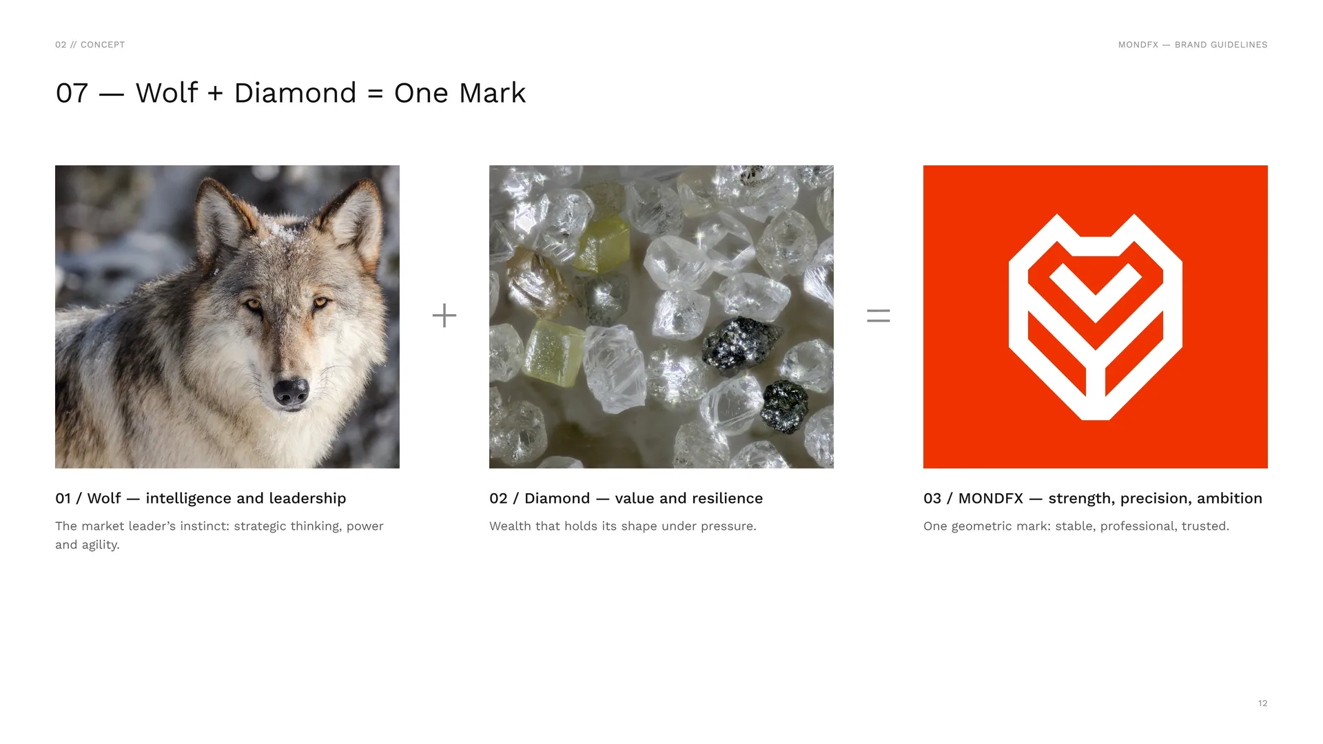
Wolf — intelligence and leadership: The market leader’s instinct: strategic thinking, power and agility.
Diamond — value and resilience: Wealth that holds its shape under pressure.
MONDFX — strength, precision, ambition: One geometric mark: stable, professional, trusted.
02.2
Logo Meaning
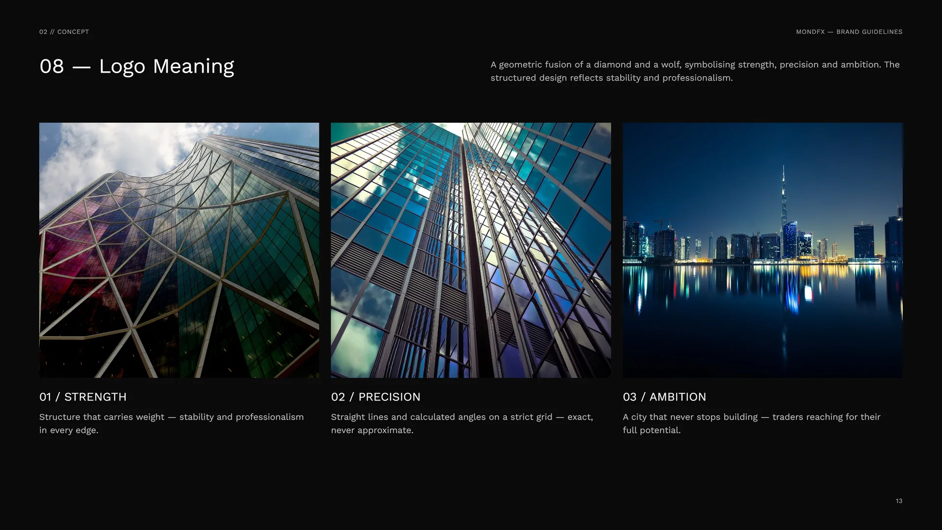
A geometric fusion of a diamond and a wolf, symbolising strength, precision and ambition. The structured design reflects stability and professionalism.
Strength: Structure that carries weight — stability and professionalism in every edge.
Precision: Straight lines and calculated angles on a strict grid — exact, never approximate.
Ambition: A city that never stops building — traders reaching for their full potential.
02.3
Straight lines, calculated angles
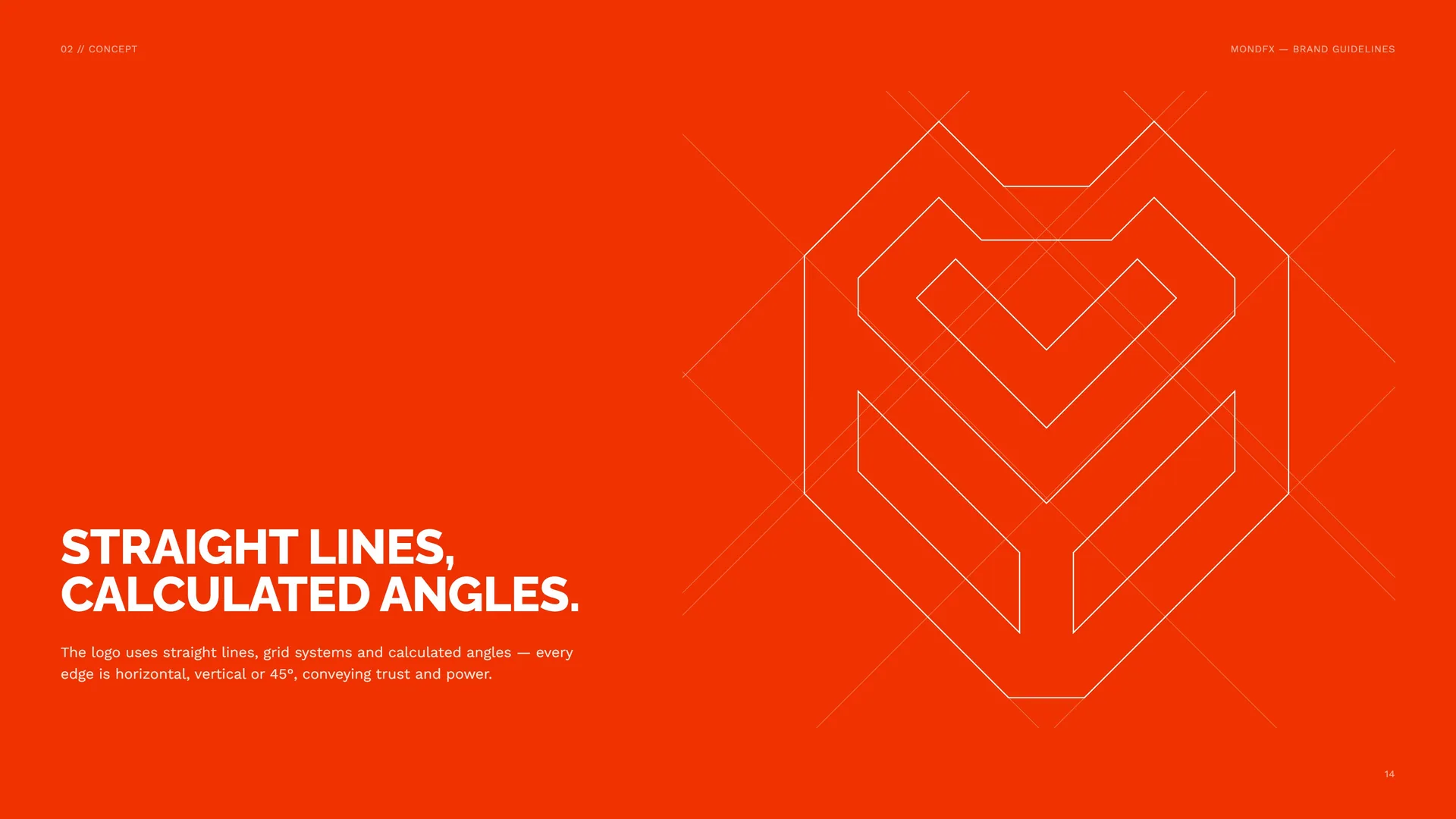
The logo uses straight lines, grid systems and calculated angles — every edge is horizontal, vertical or 45°, conveying trust and power.
02.4
45° Throughout
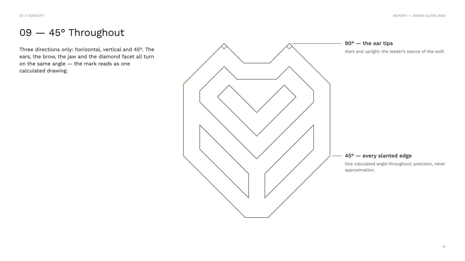
Three directions only: horizontal, vertical and 45°. The ears, the brow, the jaw and the diamond facet all turn on the same angle — the mark reads as one calculated drawing.
90° — the ear tips: Alert and upright: the leader’s stance of the wolf.
45° — every slanted edge: One calculated angle throughout: precision, never approximation.
02.5
Value at the Centre
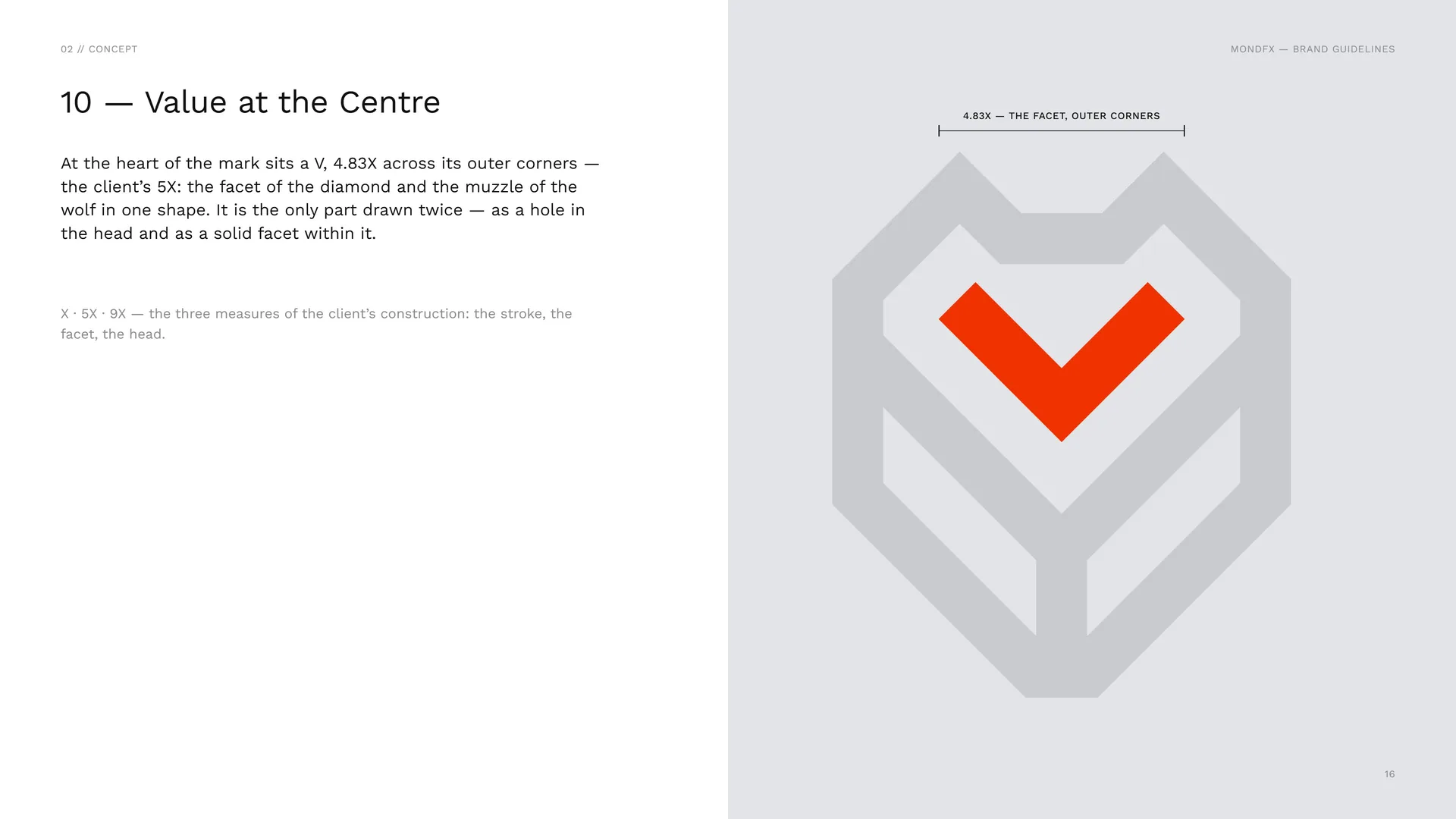
At the heart of the mark sits a V, 4.83X across its outer corners — the client’s 5X: the facet of the diamond and the muzzle of the wolf in one shape. It is the only part drawn twice — as a hole in the head and as a solid facet within it.
X · 5X · 9X — the three measures of the client’s construction: the stroke, the facet, the head.
02.6
Precision in every trade
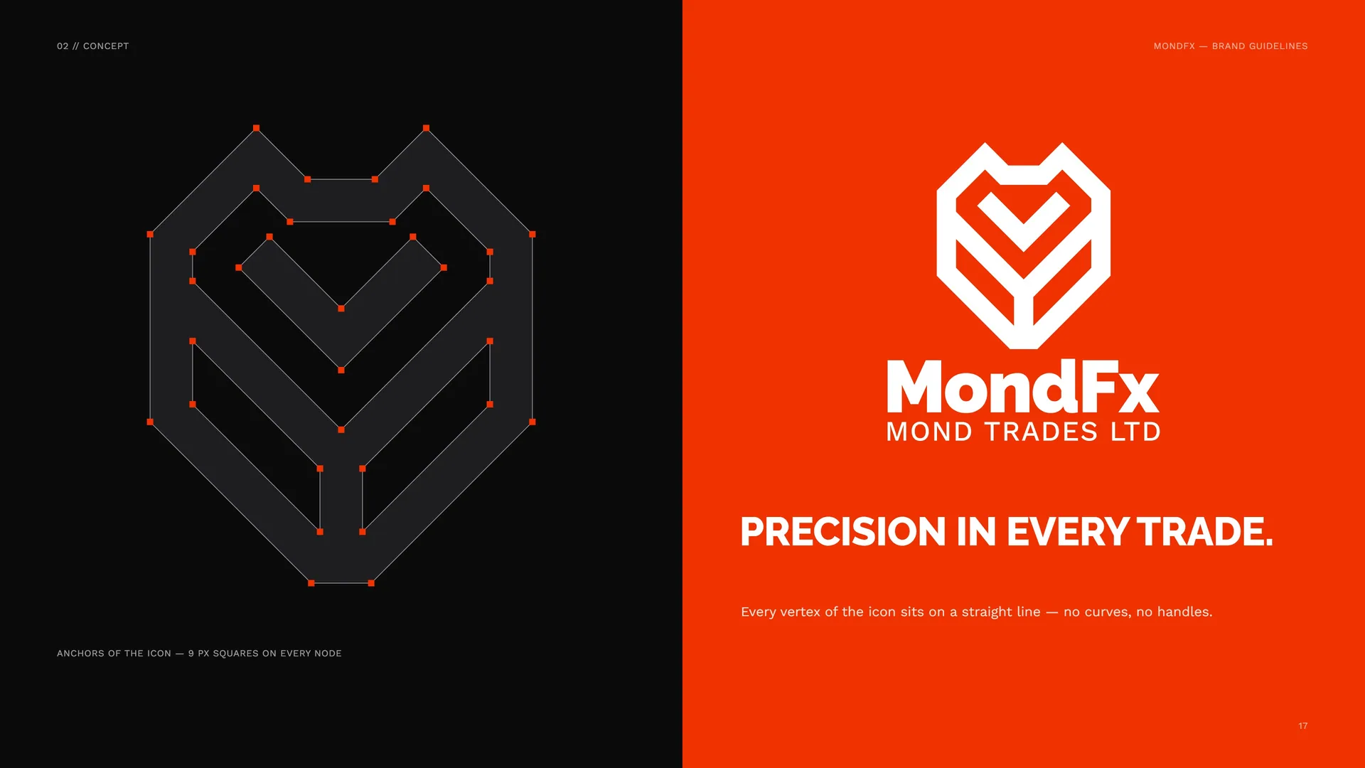
Anchors of the icon — 9 px squares on every node.
Every vertex of the icon sits on a straight line — no curves, no handles.
02.7
The Mark in Motion
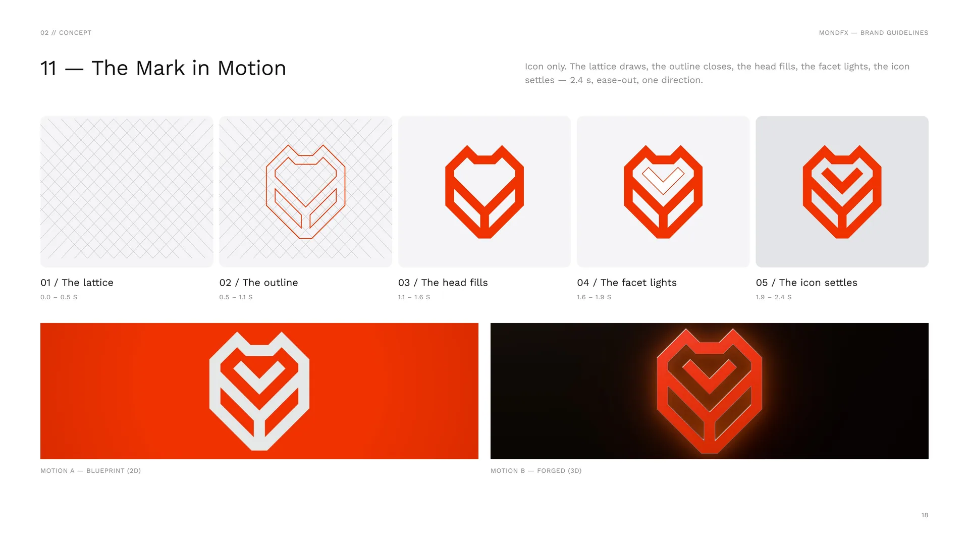
Icon only. The lattice draws, the outline closes, the head fills, the facet lights, the icon settles — 2.4 s, ease-out, one direction.
The lattice: 0.0 – 0.5 s.
The outline: 0.5 – 1.1 s.
The head fills: 1.1 – 1.6 s.
The facet lights: 1.6 – 1.9 s.
The icon settles: 1.9 – 2.4 s.
Motion A — blueprint (2D) · Motion B — forged (3D).
03
Logo & grid
- 03.1Primary logo — the full logo, stacked
- 03.2Logo variations
- 03.3Logo construction
- 03.4The 1X Grid
- 03.5Wordmark
- 03.6Trade Smart, Trade with MONDFX
- 03.7Stacked Proportions
- 03.8Horizontal Proportions
- 03.9Clear Space
03.1
Primary logo — the full logo, stacked
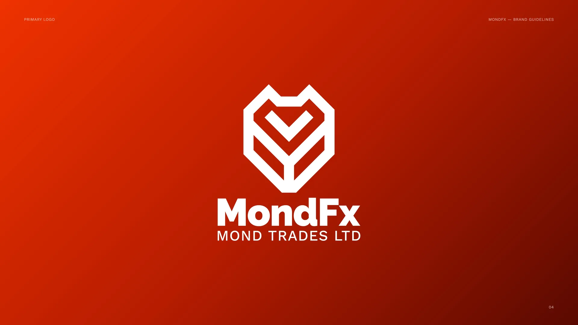
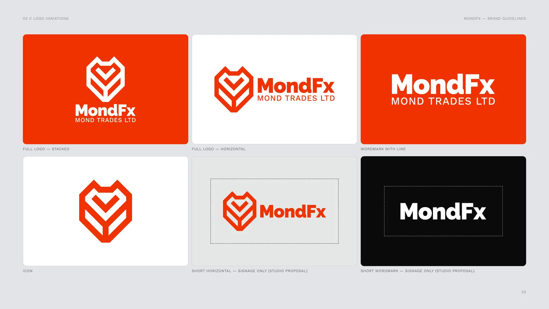
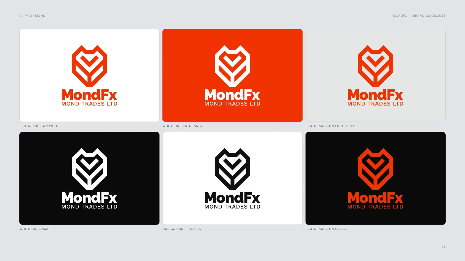
The icon above the MondFx wordmark and the line MOND TRADES LTD. Red-orange on white or light grey; white on red-orange.
03.2
Logo variations
Full logo — stacked.
Full logo — horizontal.
Wordmark with line.
Icon.
Short horizontal — signage only (studio proposal).
Short wordmark — signage only (studio proposal).
03.3
Logo construction
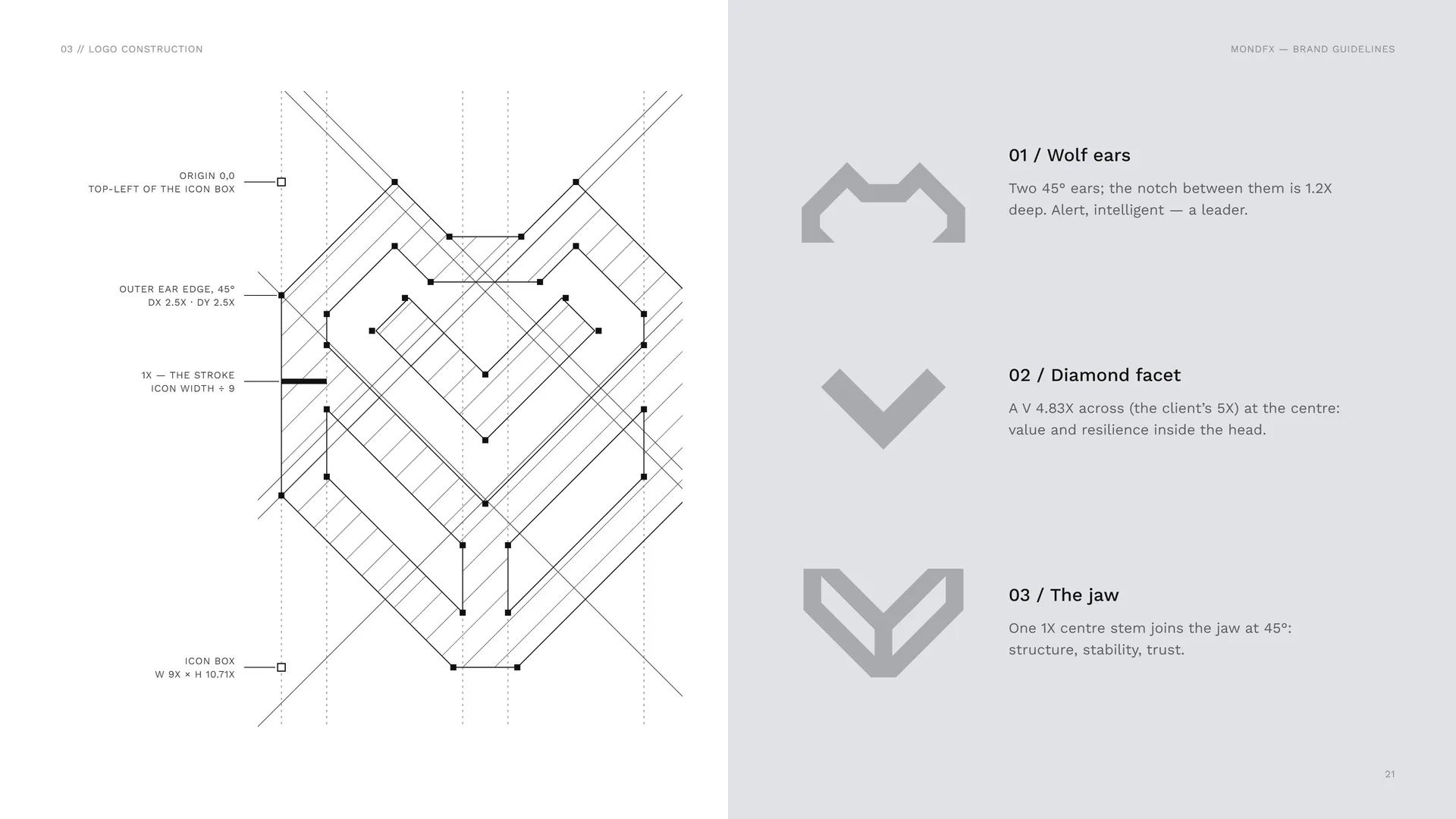
Wolf ears: Two 45° ears; the notch between them is 1.2X deep. Alert, intelligent — a leader.
Diamond facet: A V 4.83X across (the client’s 5X) at the centre: value and resilience inside the head.
The jaw: One 1X centre stem joins the jaw at 45°: structure, stability, trust.
03.4
The 1X Grid
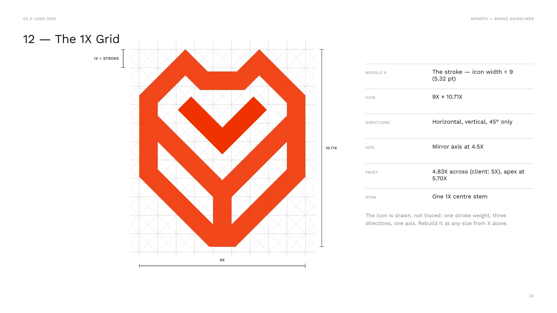
Module X: The stroke — icon width ÷ 9 (5.32 pt).
Icon: 9X × 10.71X.
Directions: Horizontal, vertical, 45° only.
Axis: Mirror axis at 4.5X.
Facet: 4.83X across (client: 5X), apex at 5.70X.
Stem: One 1X centre stem.
The icon is drawn, not traced: one stroke weight, three directions, one axis. Rebuild it at any size from X alone.
03.5
Wordmark
03.6
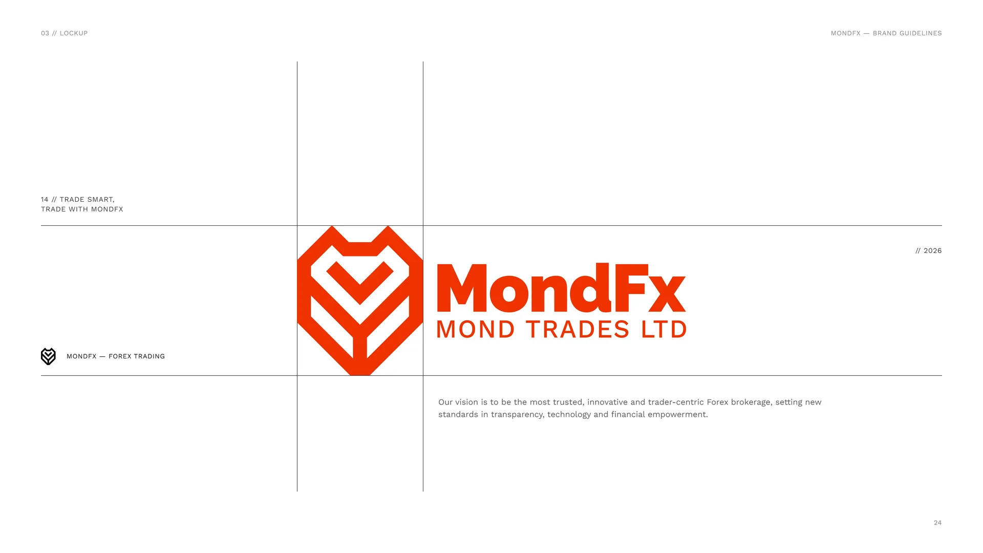
Trade Smart, Trade with MONDFX
Our vision is to be the most trusted, innovative and trader-centric Forex brokerage, setting new standards in transparency, technology and financial empowerment.
03.7
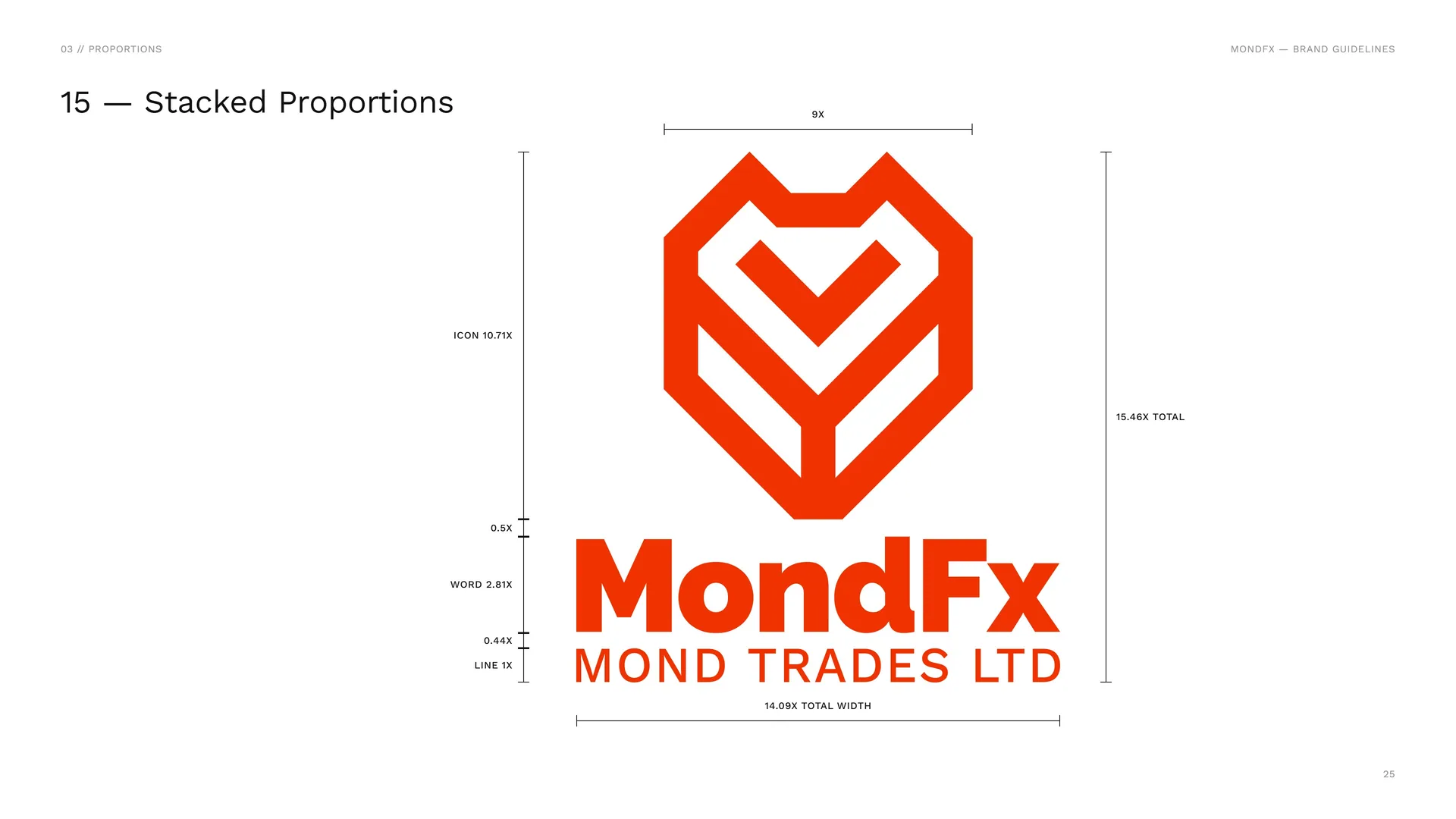
Stacked Proportions
9X · Icon 10.71X · 15.46X total · 0.5X · Word 2.81X · 0.44X · Line 1X · 14.09X total width.
03.8
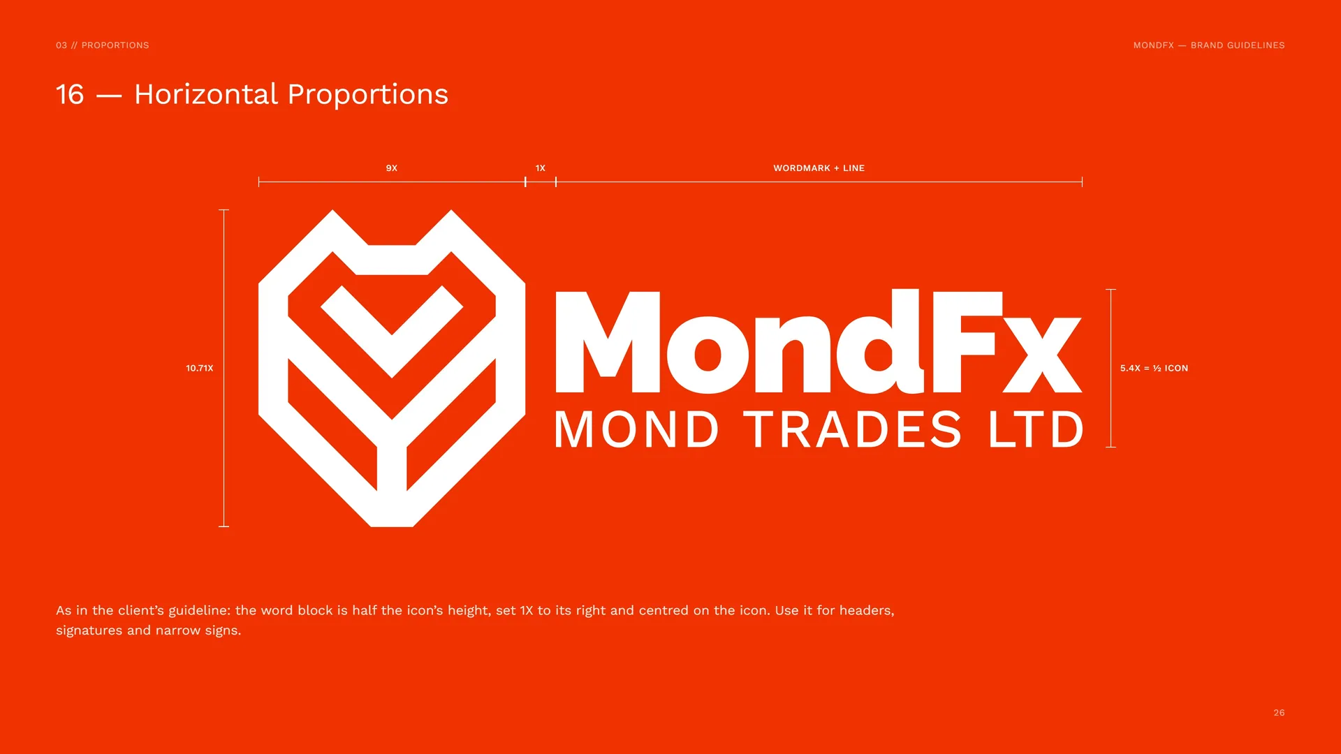
Horizontal Proportions
9X · 1X · Wordmark + line · 10.71X · 5.4X = ½ icon.
As in the client’s guideline: the word block is half the icon’s height, set 1X to its right and centred on the icon. Use it for headers, signatures and narrow signs.
03.9
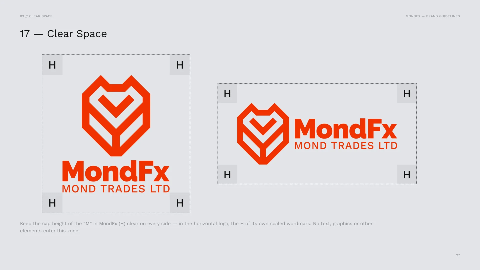
Clear Space
Keep the cap height of the “M” in MondFx (H) clear on every side — in the horizontal logo, the H of its own scaled wordmark. No text, graphics or other elements enter this zone.
04
Logo in use
- 04.1Versions
- 04.2App Icon & Favicon
- 04.3Size
- 04.4Placement
- 04.5Misuse
- 04.6Logo on backgrounds
- 04.7Logo in material
04.1
Versions
Red-orange on white.
White on red-orange.
Red-orange on light grey.
White on black.
One colour — black.
Red-orange on black.
04.2
App Icon & Favicon
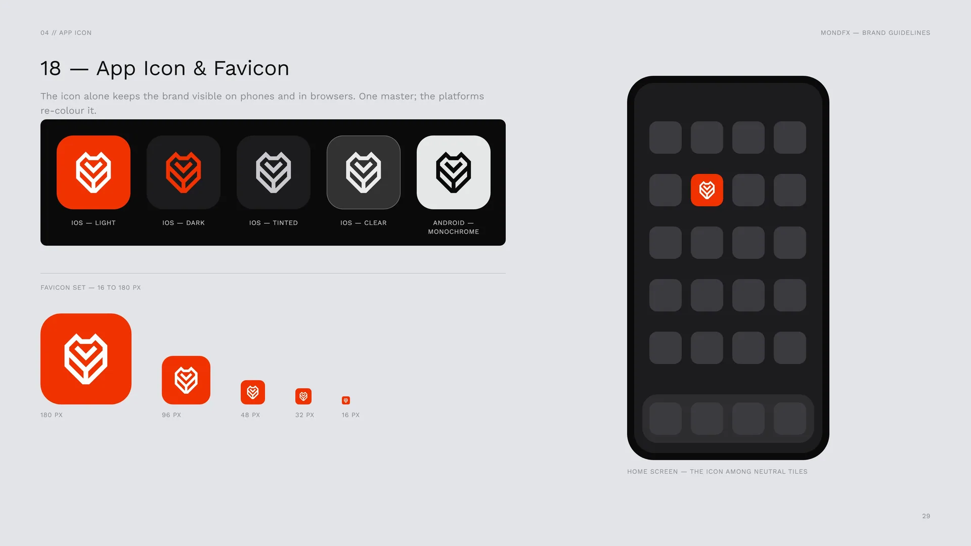
The icon alone keeps the brand visible on phones and in browsers. One master; the platforms re-colour it.
iOS — light · iOS — dark · iOS — tinted · iOS — clear · Android — monochrome.
Favicon set — 16 to 180 px: 180 px · 96 px · 48 px · 32 px · 16 px.
Home screen — the icon among neutral tiles.
04.3
Size
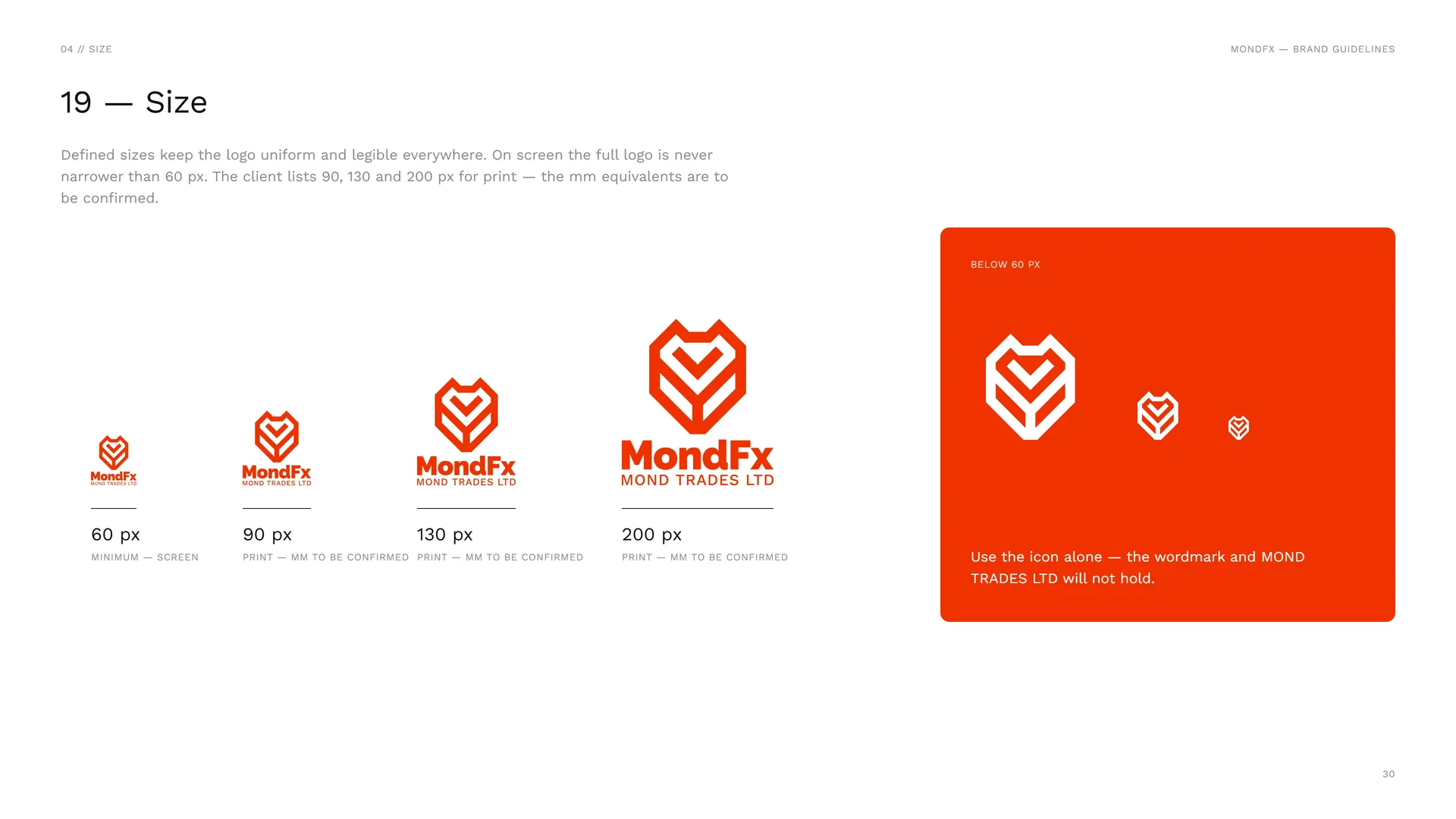
Defined sizes keep the logo uniform and legible everywhere. On screen the full logo is never narrower than 60 px. The client lists 90, 130 and 200 px for print — the mm equivalents are to be confirmed.
60 px: Minimum — screen.
90 px: Print — mm to be confirmed.
130 px: Print — mm to be confirmed.
200 px: Print — mm to be confirmed.
Below 60 px: Use the icon alone — the wordmark and MOND TRADES LTD will not hold.
04.4
Placement
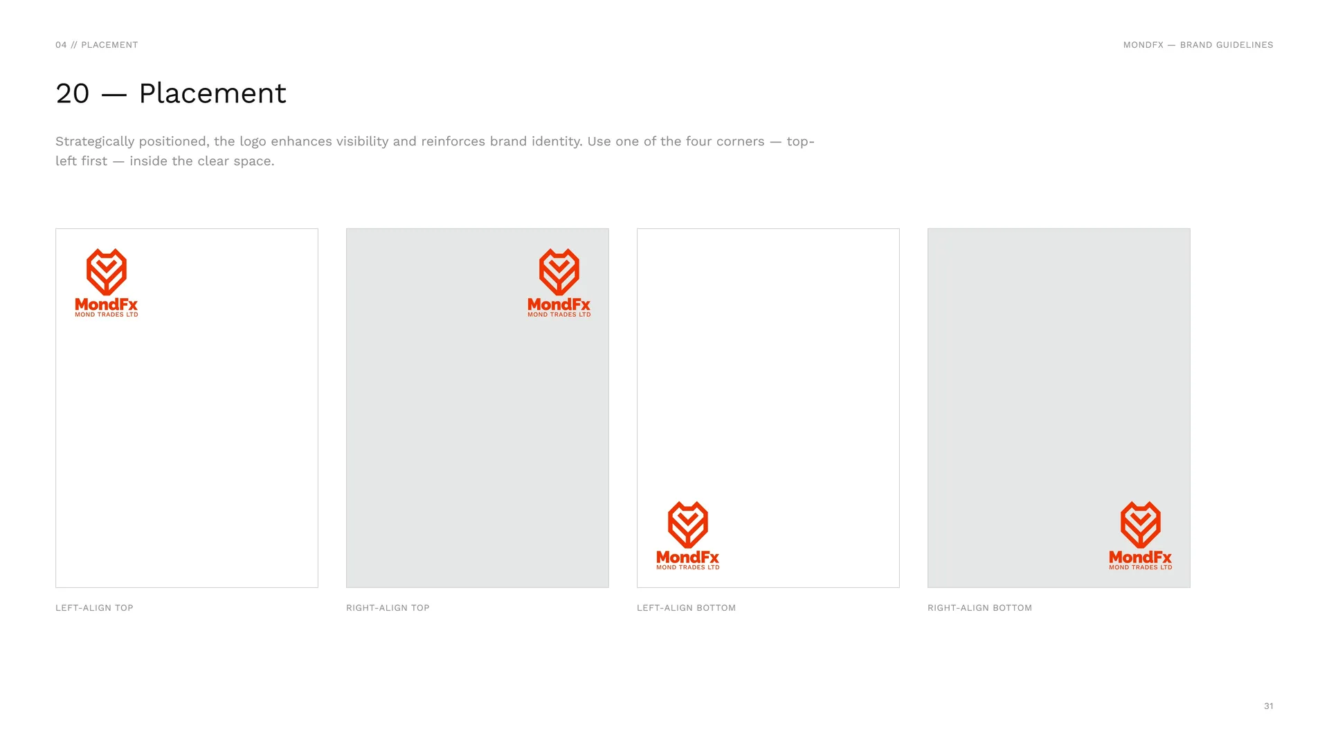
Strategically positioned, the logo enhances visibility and reinforces brand identity. Use one of the four corners — top-left first — inside the clear space.
Left-align top · Right-align top · Left-align bottom · Right-align bottom.
04.5
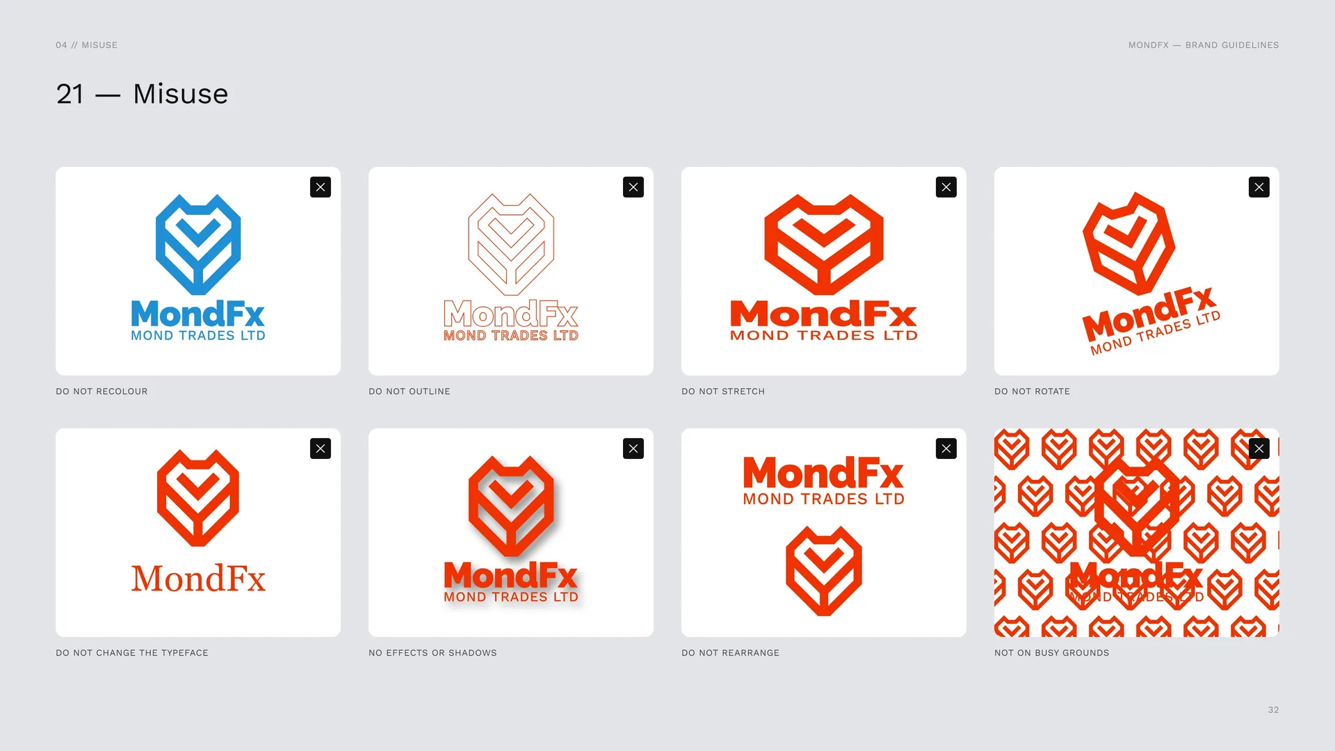
Misuse
Do not recolour · Do not outline · Do not stretch · Do not rotate · Do not change the typeface · No effects or shadows · Do not rearrange · Not on busy grounds.
04.6
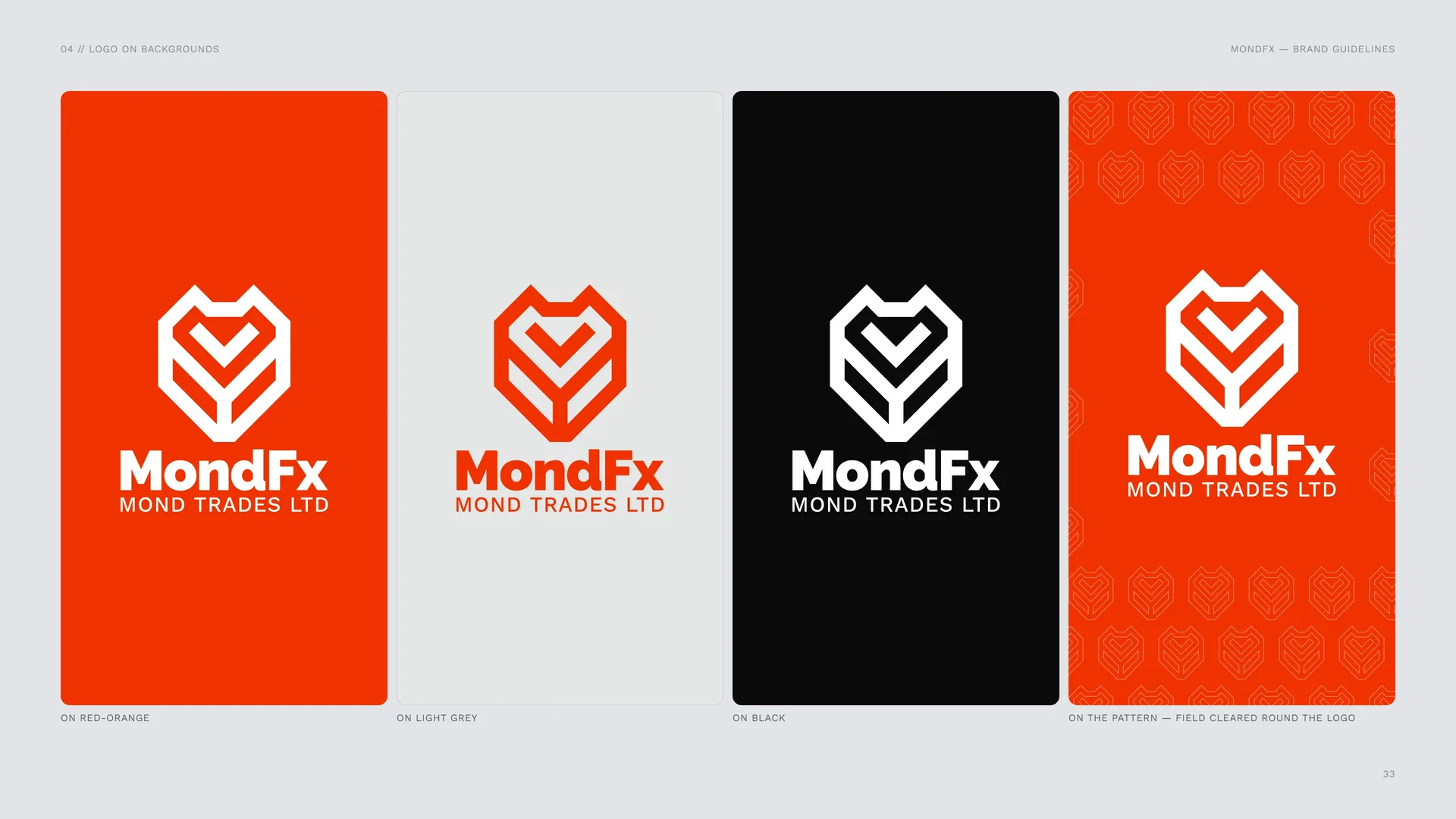
Logo on backgrounds
On red-orange · On light grey · On black.
On the pattern — field cleared round the logo.
04.7
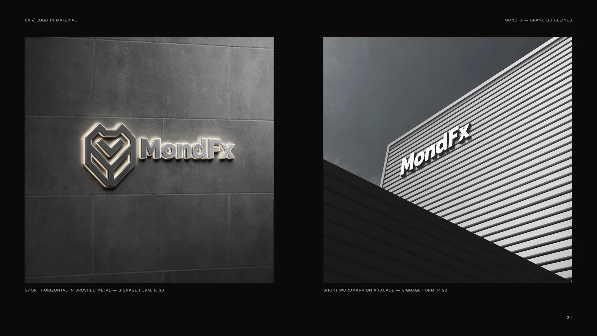
Logo in material
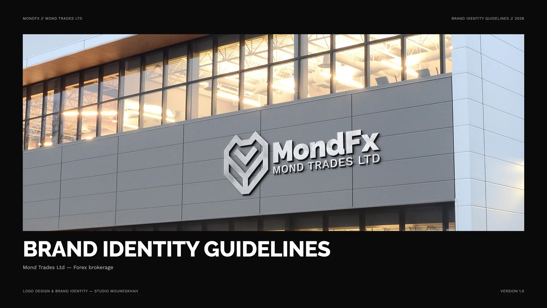
Short horizontal in brushed metal — signage form, p. 20.
Short wordmark on a facade — signage form, p. 20.
05
Colour
05.1
Colour
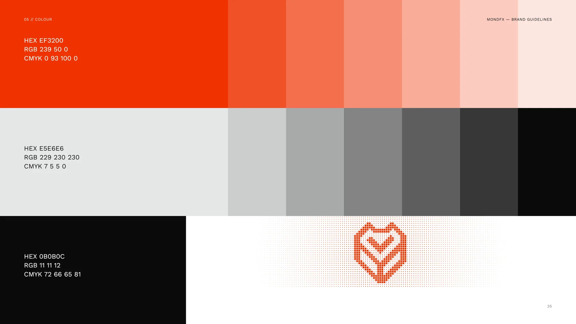
HEX EF3200 · RGB 239 50 0 · CMYK 0 93 100 0.
HEX E5E6E6 · RGB 229 230 230 · CMYK 7 5 5 0.
HEX 0B0B0C · RGB 11 11 12 · CMYK 72 66 65 81.
05.2
Colour Values
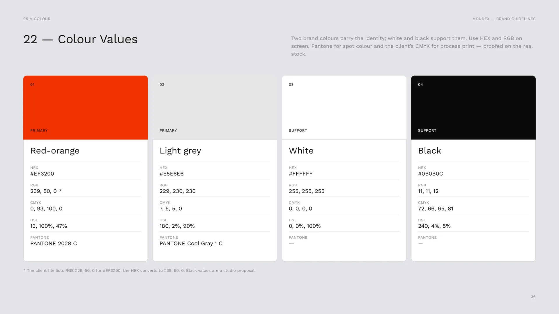
Two brand colours carry the identity; white and black support them. Use HEX and RGB on screen, Pantone for spot colour and the client’s CMYK for process print — proofed on the real stock.
Primary — Red-orange: HEX #EF3200 · RGB 239, 50, 0 * · CMYK 0, 93, 100, 0 · HSL 13, 100%, 47% · PANTONE 2028 C.
Primary — Light grey: HEX #E5E6E6 · RGB 229, 230, 230 · CMYK 7, 5, 5, 0 · HSL 180, 2%, 90% · PANTONE Cool Gray 1 C.
Support — White: HEX #FFFFFF · RGB 255, 255, 255 · CMYK 0, 0, 0, 0 · HSL 0, 0%, 100%.
Support — Black: HEX #0B0B0C · RGB 11, 11, 12 · CMYK 72, 66, 65, 81 · HSL 240, 4%, 5%.
* The client file lists RGB 229, 50, 0 for #EF3200; the HEX converts to 239, 50, 0. Black values are a studio proposal.
05.3
Colour story
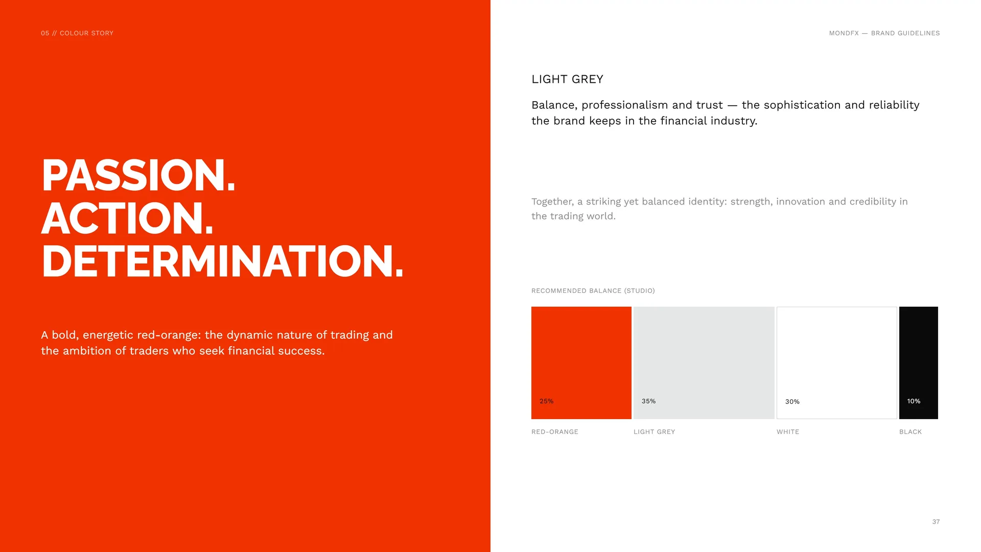
Passion. Action. Determination.
A bold, energetic red-orange: the dynamic nature of trading and the ambition of traders who seek financial success.
Light grey: Balance, professionalism and trust — the sophistication and reliability the brand keeps in the financial industry.
Together, a striking yet balanced identity: strength, innovation and credibility in the trading world.
Recommended balance (studio): 25% Red-orange · 35% Light grey · 30% White · 10% Black.
05.4
Contrast & Accessibility
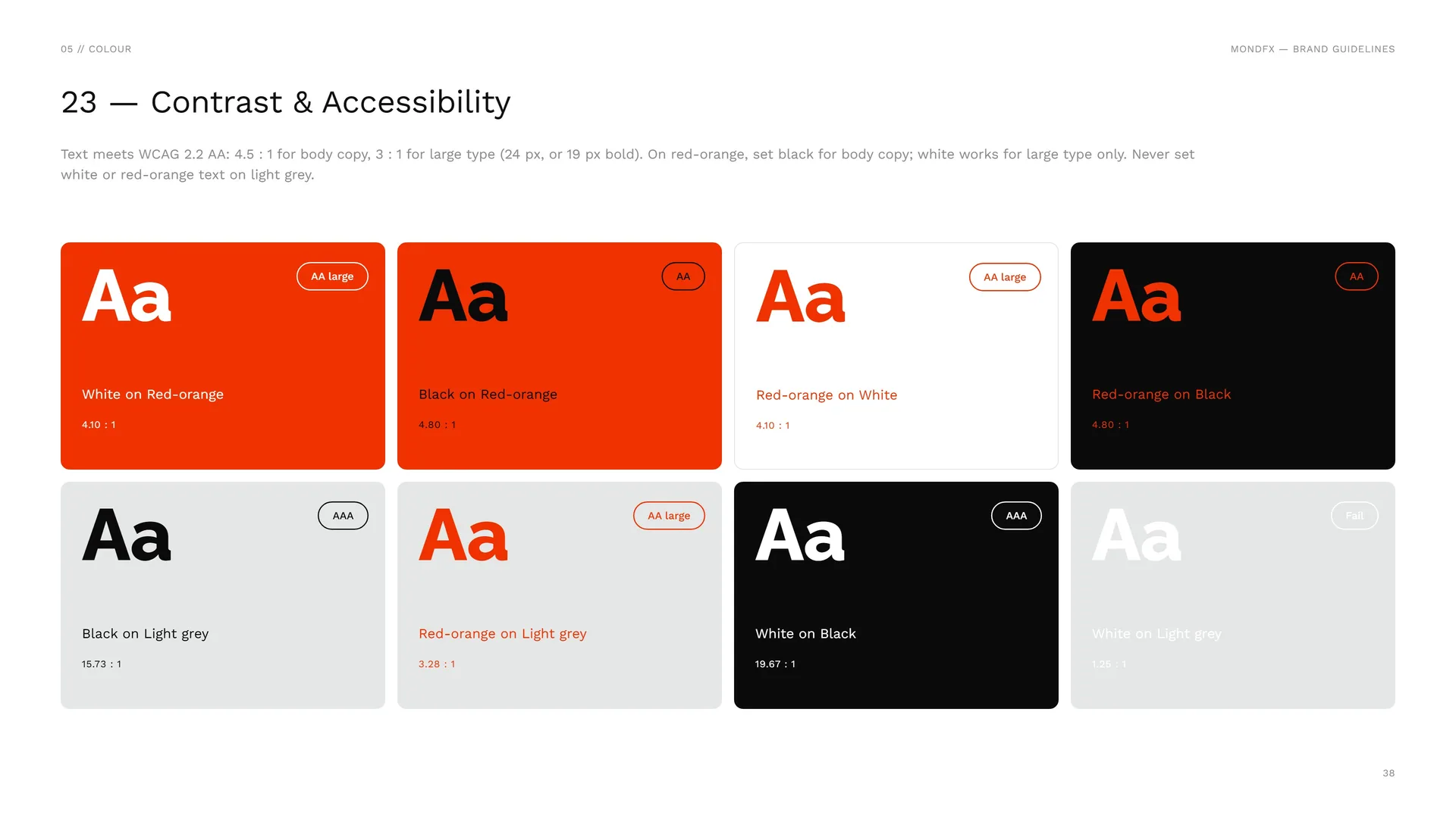
Text meets WCAG 2.2 AA: 4.5 : 1 for body copy, 3 : 1 for large type (24 px, or 19 px bold). On red-orange, set black for body copy; white works for large type only. Never set white or red-orange text on light grey.
White on Red-orange: 4.10 : 1 · AA large.
Black on Red-orange: 4.80 : 1 · AA.
Red-orange on White: 4.10 : 1 · AA large.
Red-orange on Black: 4.80 : 1 · AA.
Black on Light grey: 15.73 : 1 · AAA.
Red-orange on Light grey: 3.28 : 1 · AA large.
White on Black: 19.67 : 1 · AAA.
White on Light grey: 1.25 : 1 · Fail.
05.5
Tints
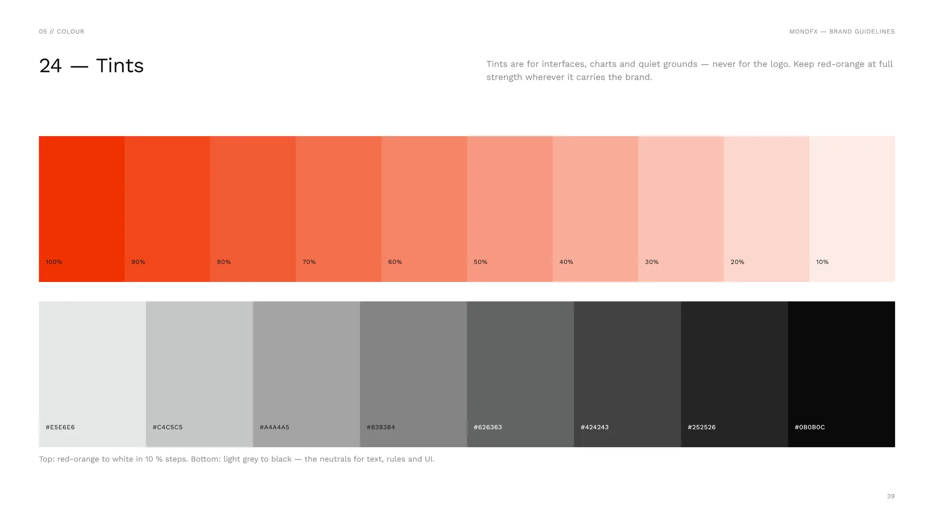
Tints are for interfaces, charts and quiet grounds — never for the logo. Keep red-orange at full strength wherever it carries the brand.
100% · 90% · 80% · 70% · 60% · 50% · 40% · 30% · 20% · 10%.
#E5E6E6 · #C4C5C5 · #A4A4A5 · #838384 · #626363 · #424243 · #252526 · #0B0B0C.
Top: red-orange to white in 10 % steps. Bottom: light grey to black — the neutrals for text, rules and UI.
06
Typography
06.1
Typography
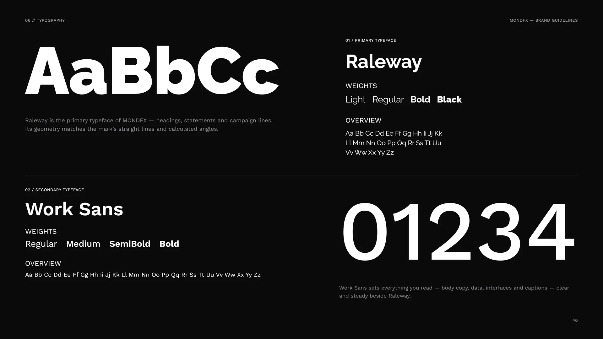
Raleway is the primary typeface of MONDFX — headings, statements and campaign lines. Its geometry matches the mark’s straight lines and calculated angles.
Primary typeface: Raleway. Weights: Light · Regular · Bold · Black.
Secondary typeface: Work Sans. Weights: Regular · Medium · SemiBold · Bold.
Work Sans sets everything you read — body copy, data, interfaces and captions — clear and steady beside Raleway.
06.2
Raleway
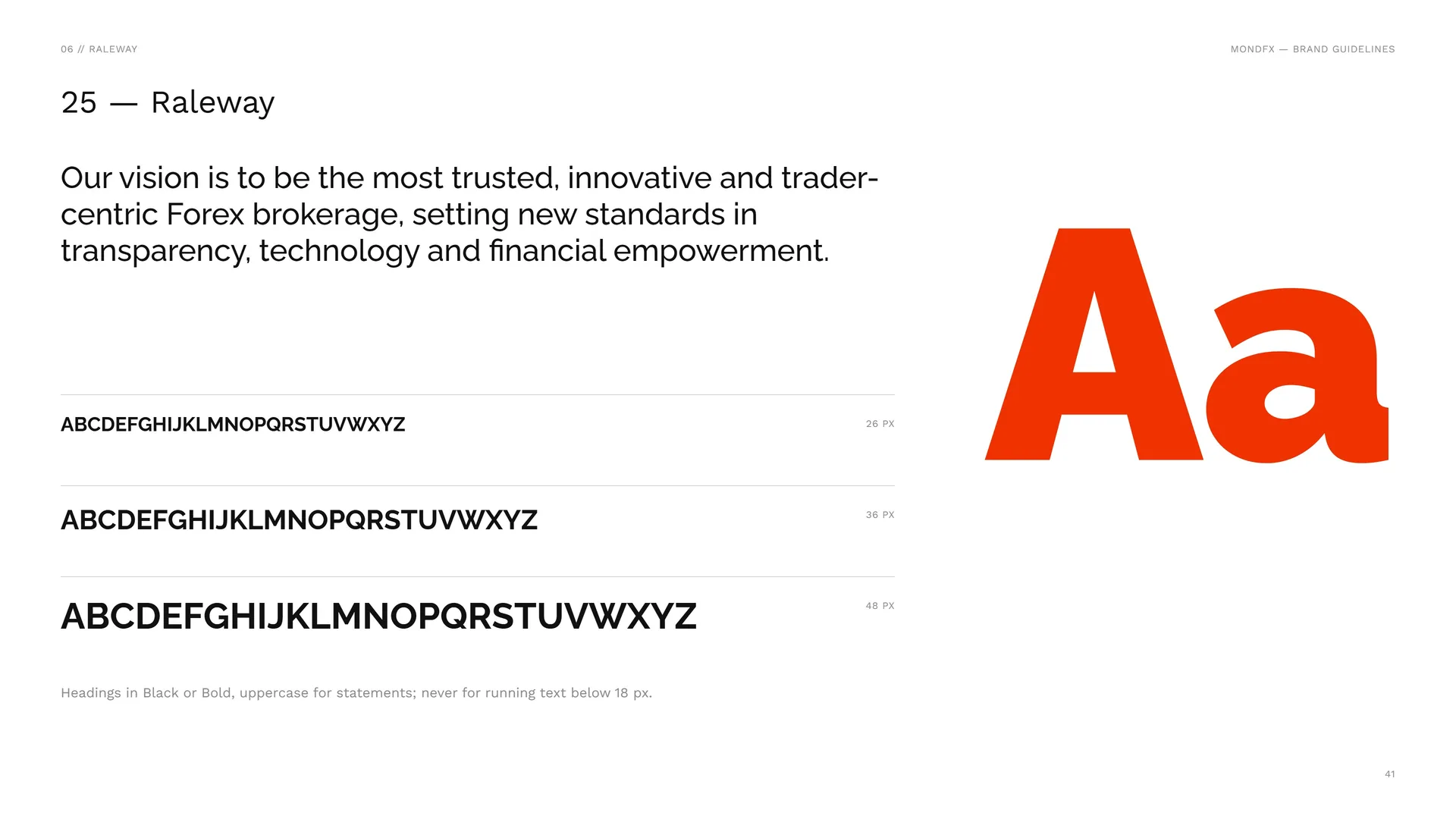
Our vision is to be the most trusted, innovative and trader-centric Forex brokerage, setting new standards in transparency, technology and financial empowerment.
26 px · 36 px · 48 px.
Headings in Black or Bold, uppercase for statements; never for running text below 18 px.
06.3
Work Sans
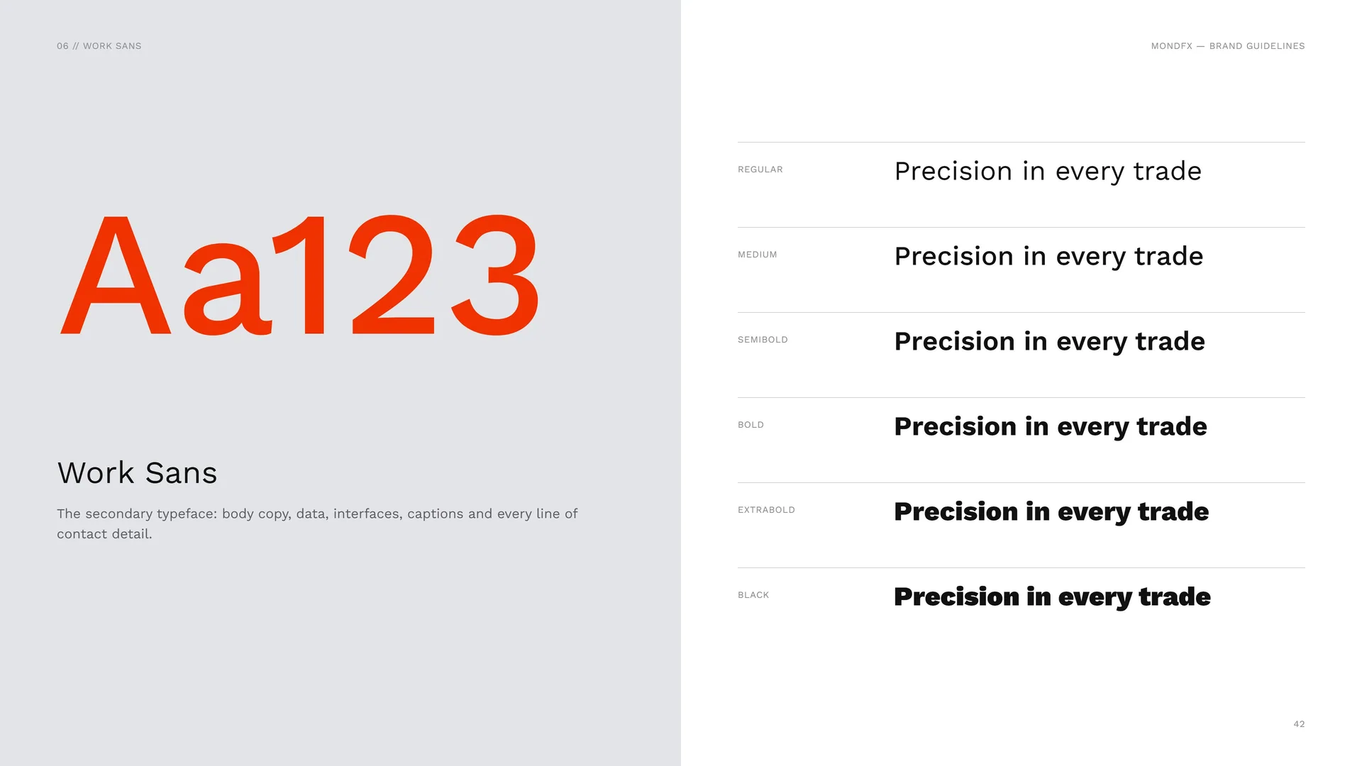
The secondary typeface: body copy, data, interfaces, captions and every line of contact detail.
Regular · Medium · SemiBold · Bold · ExtraBold · Black.
06.4
Type System
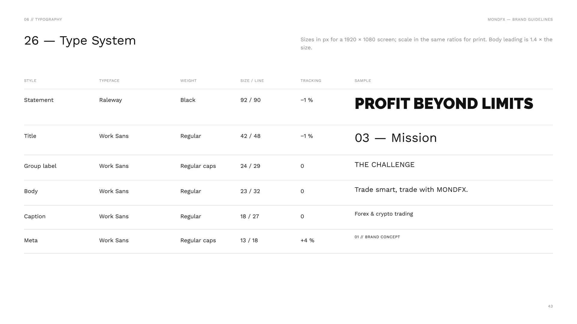
Sizes in px for a 1920 × 1080 screen; scale in the same ratios for print. Body leading is 1.4 × the size.
Statement: Raleway Black · 92 / 90 · −1 %.
Title: Work Sans Regular · 42 / 48 · −1 %.
Group label: Work Sans Regular caps · 24 / 29 · 0.
Body: Work Sans Regular · 23 / 32 · 0.
Caption: Work Sans Regular · 18 / 27 · 0.
Meta: Work Sans Regular caps · 13 / 18 · +4 %.
07
Pattern
- 07.1The Pattern
- 07.2How the Pattern Is Built
- 07.3Pattern family
- 07.4Dot texture
- 07.5Pattern Rules
- 07.6Pattern in use
07.1
The Pattern
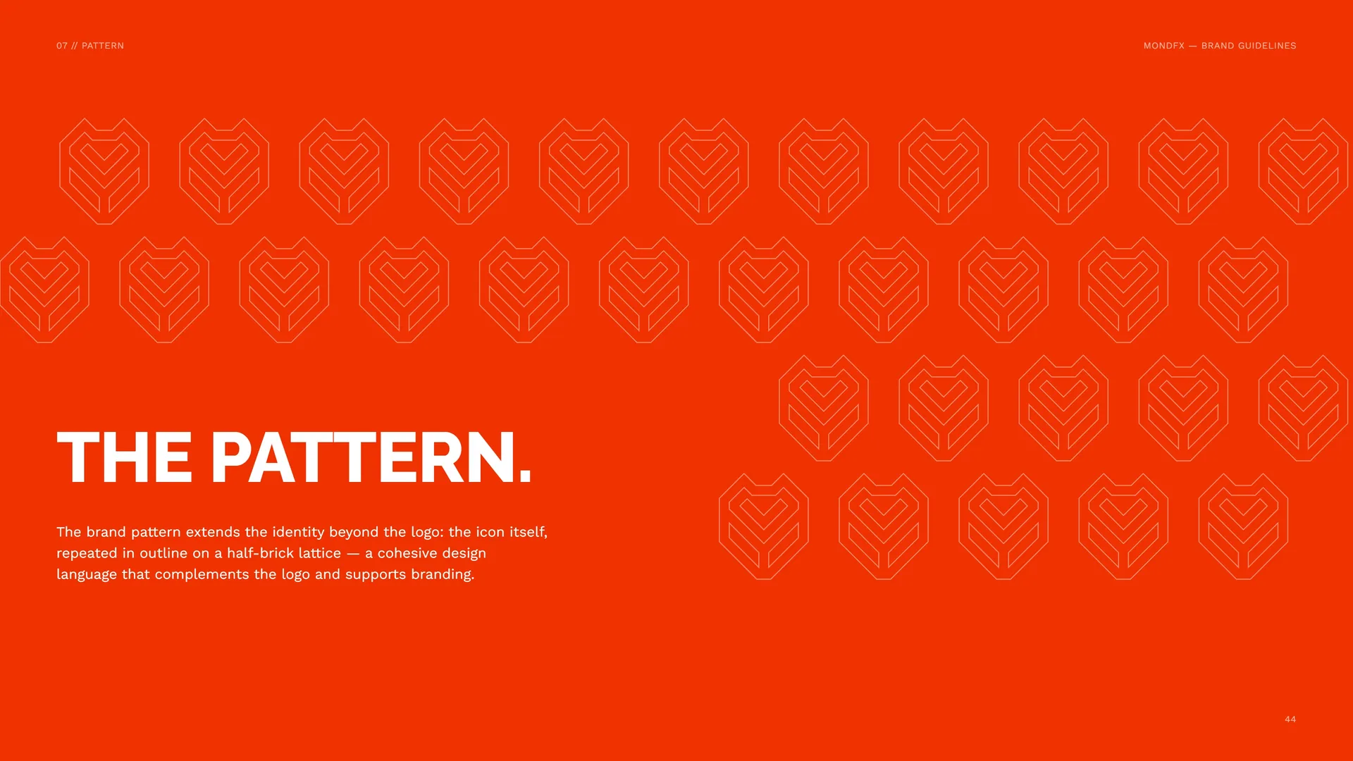
The brand pattern extends the identity beyond the logo: the icon itself, repeated in outline on a half-brick lattice — a cohesive design language that complements the logo and supports branding.
07.2
How the Pattern Is Built
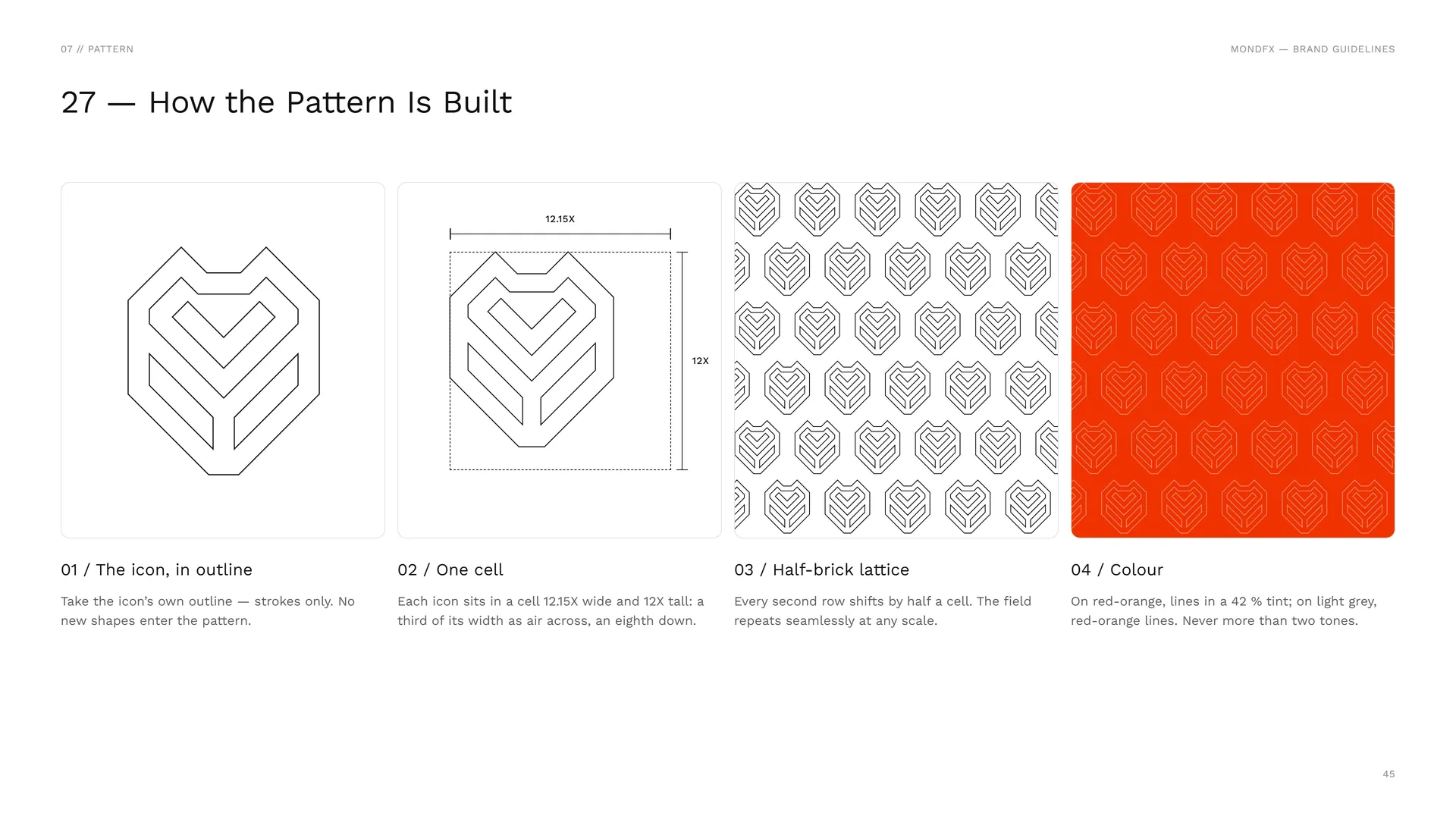
The icon, in outline: Take the icon’s own outline — strokes only. No new shapes enter the pattern.
One cell: Each icon sits in a cell 12.15X wide and 12X tall: a third of its width as air across, an eighth down.
Half-brick lattice: Every second row shifts by half a cell. The field repeats seamlessly at any scale.
Colour: On red-orange, lines in a 42 % tint; on light grey, red-orange lines. Never more than two tones.
07.3
Pattern family
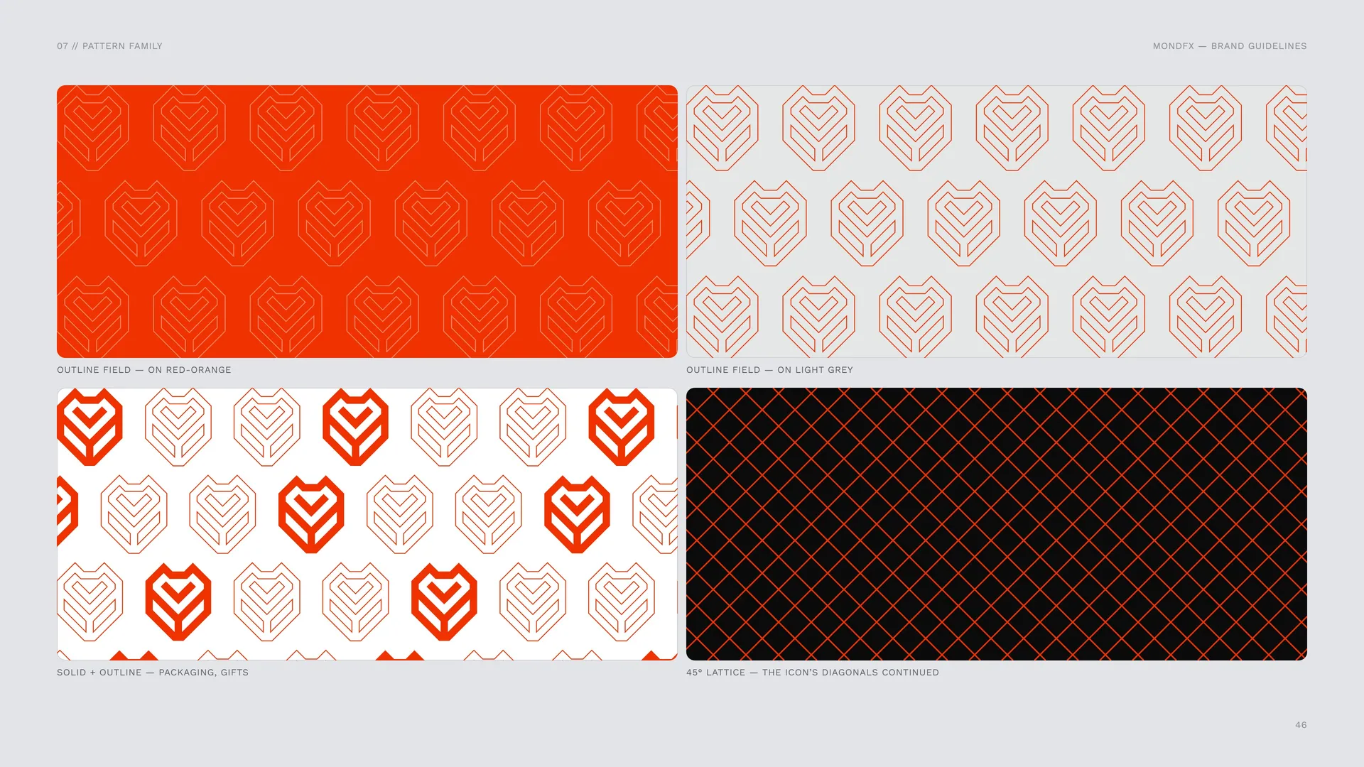
Outline field — on red-orange.
Outline field — on light grey.
Solid + outline — packaging, gifts.
45° lattice — the icon’s diagonals continued.
07.4
Dot texture
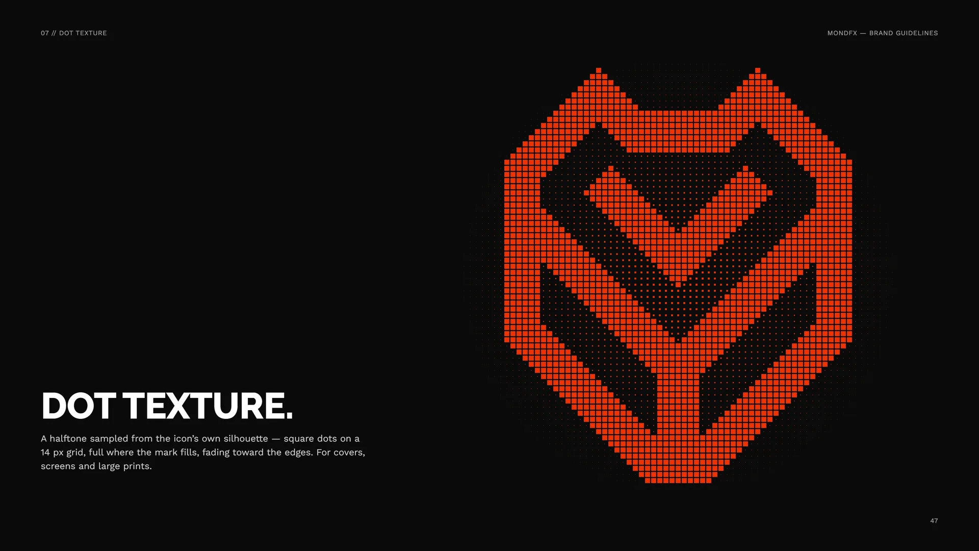
A halftone sampled from the icon’s own silhouette — square dots on a 14 px grid, full where the mark fills, fading toward the edges. For covers, screens and large prints.
07.5
Pattern Rules
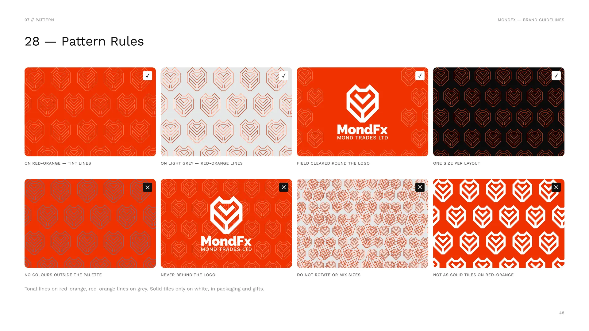
On red-orange — tint lines.
On light grey — red-orange lines.
Field cleared round the logo.
One size per layout.
No colours outside the palette.
Never behind the logo.
Do not rotate or mix sizes.
Not as solid tiles on red-orange.
Tonal lines on red-orange, red-orange lines on grey. Solid tiles only on white, in packaging and gifts.
07.6
Pattern in use
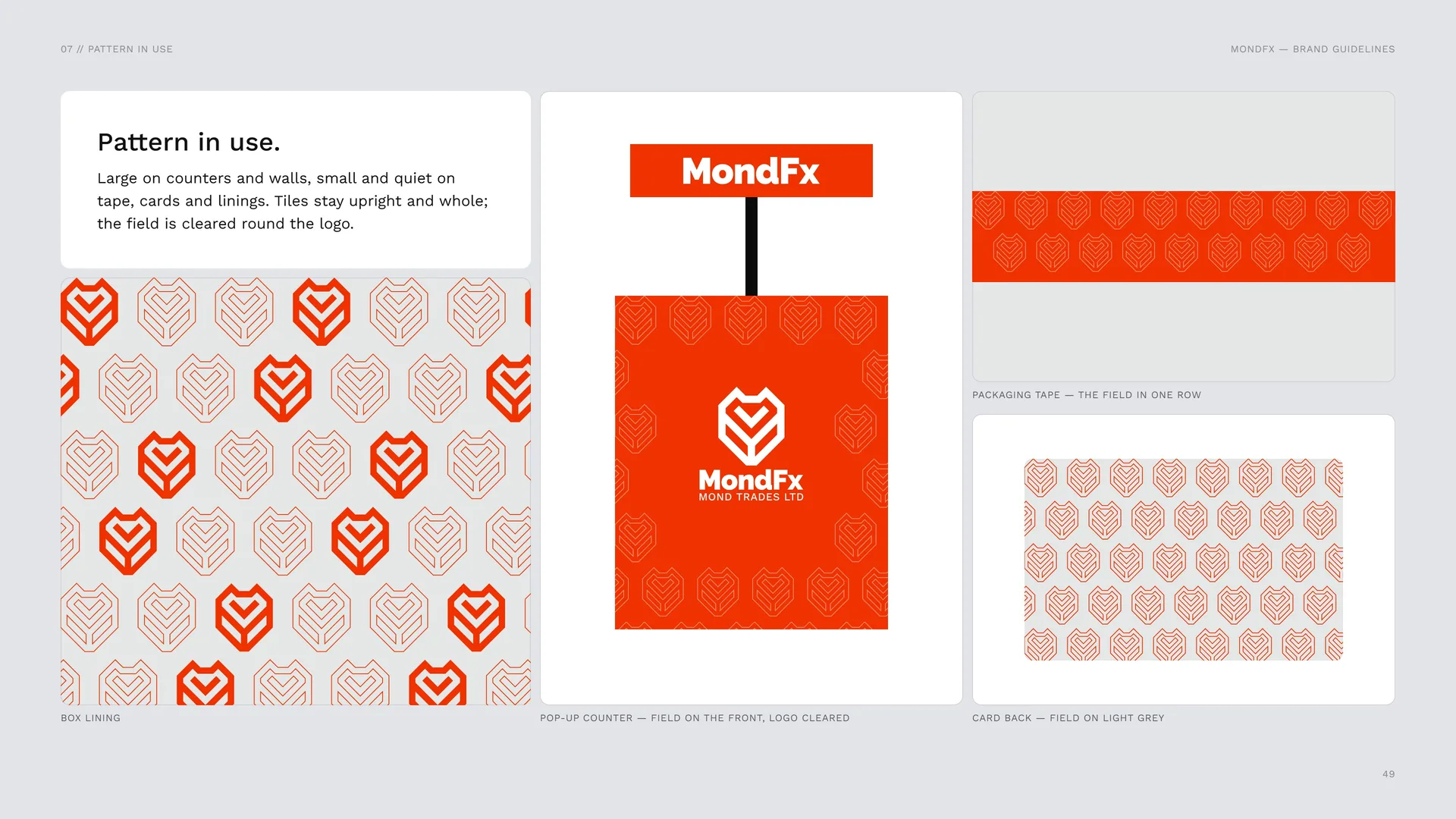
Large on counters and walls, small and quiet on tape, cards and linings. Tiles stay upright and whole; the field is cleared round the logo.
Packaging tape — the field in one row.
Box lining.
Pop-up counter — field on the front, logo cleared.
Card back — field on light grey.
08
Imagery
08.1
Imagery
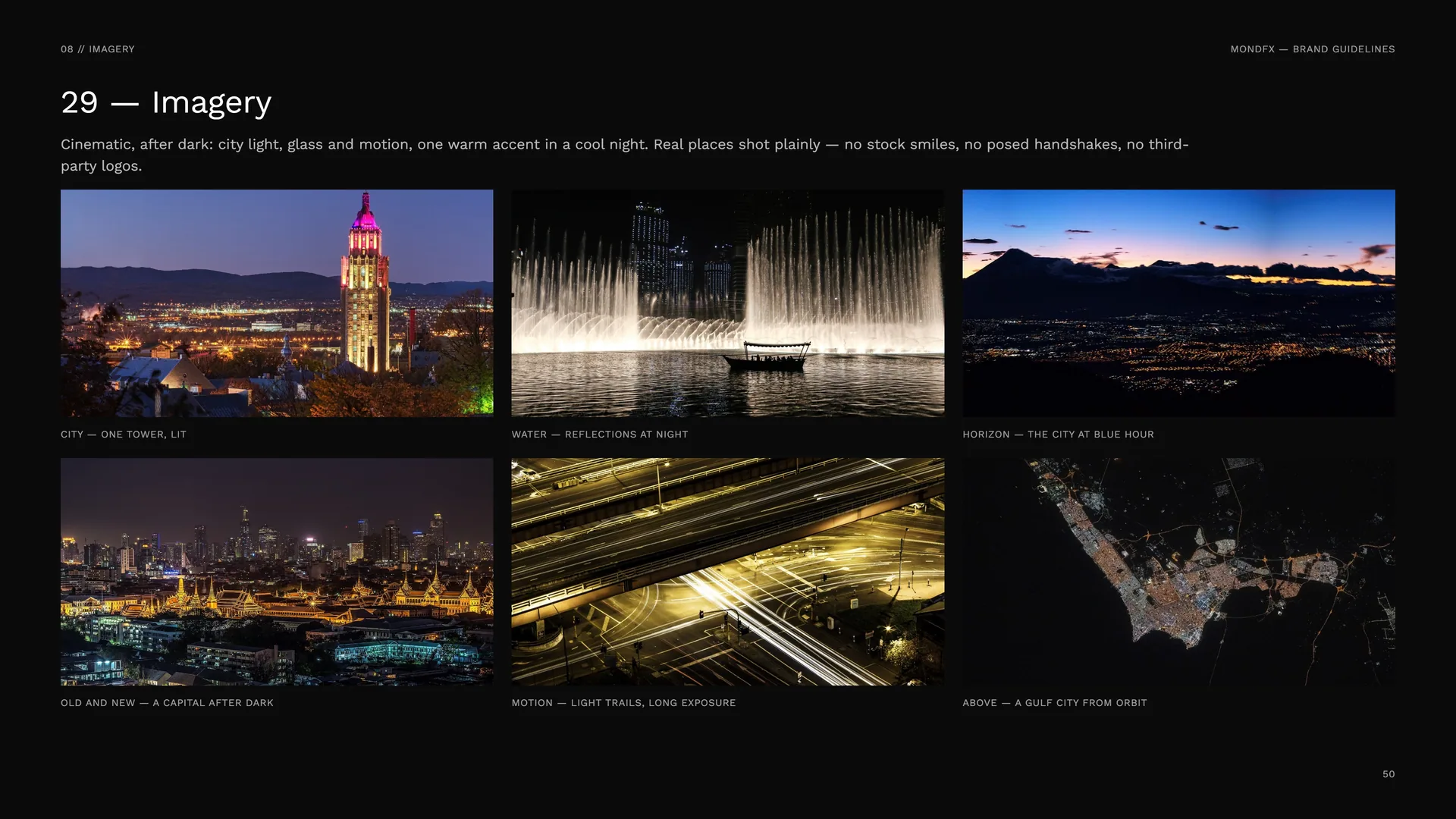
Cinematic, after dark: city light, glass and motion, one warm accent in a cool night. Real places shot plainly — no stock smiles, no posed handshakes, no third-party logos.
City — one tower, lit.
Water — reflections at night.
Horizon — the city at blue hour.
Old and new — a capital after dark.
Motion — light trails, long exposure.
Above — a Gulf city from orbit.
09
Stationery
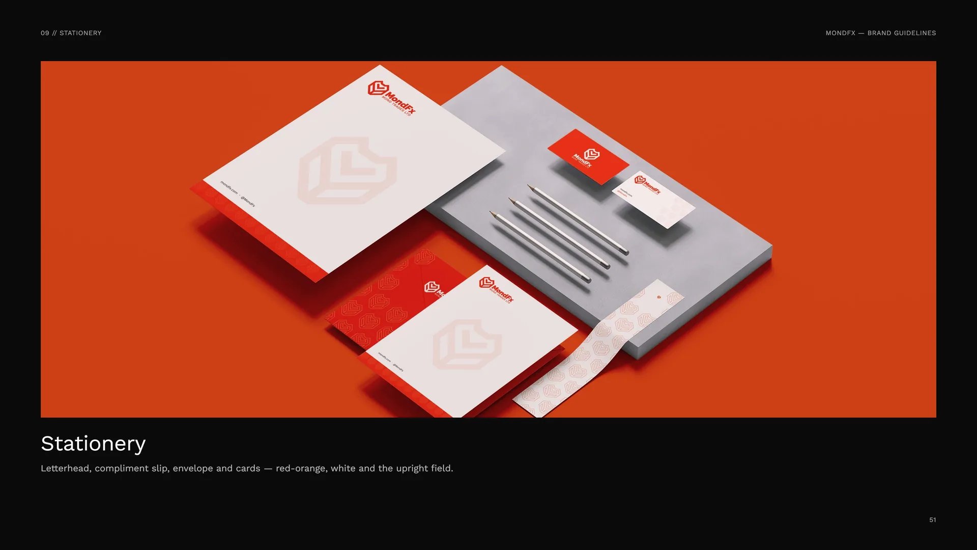
Letterhead, compliment slip, envelope and cards — red-orange, white and the upright field.
09.1
Business Cards
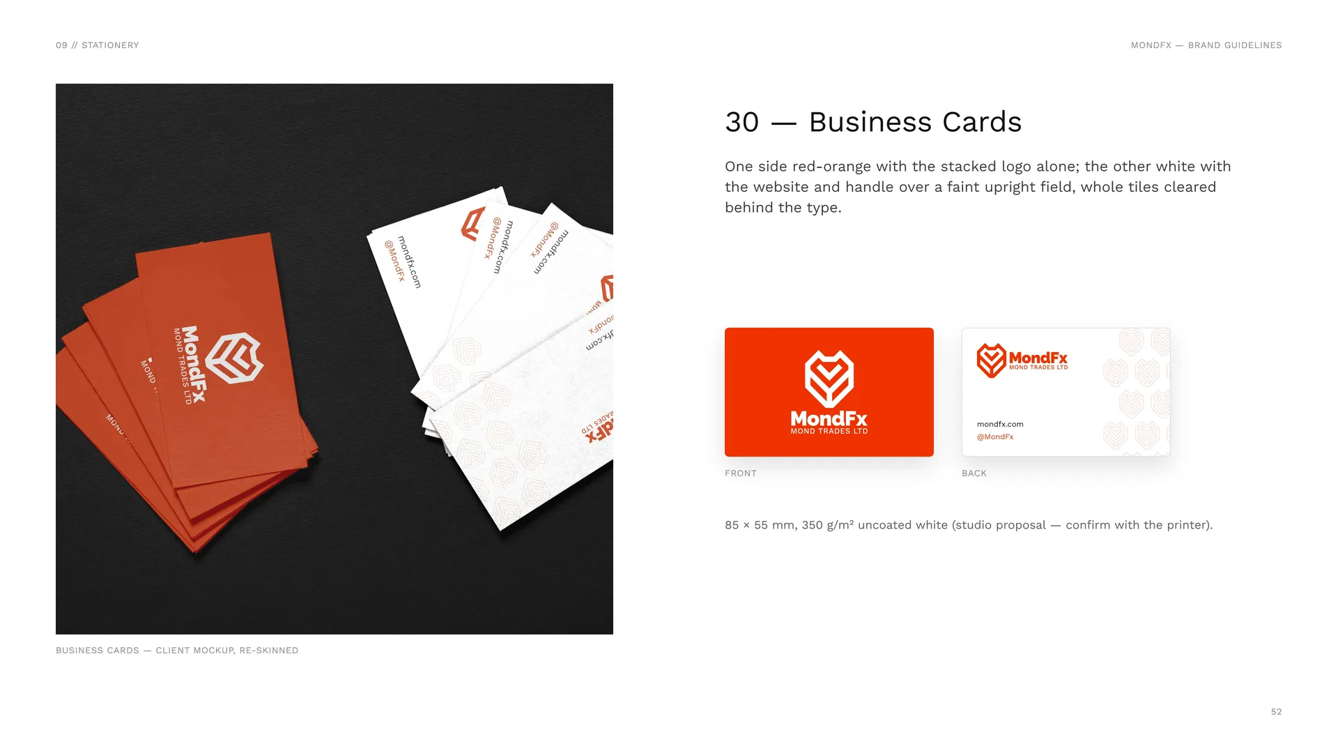
Business cards — client mockup, re-skinned.
One side red-orange with the stacked logo alone; the other white with the website and handle over a faint upright field, whole tiles cleared behind the type.
Front · Back.
85 × 55 mm, 350 g/m² uncoated white (studio proposal — confirm with the printer).
09.2
Letterhead
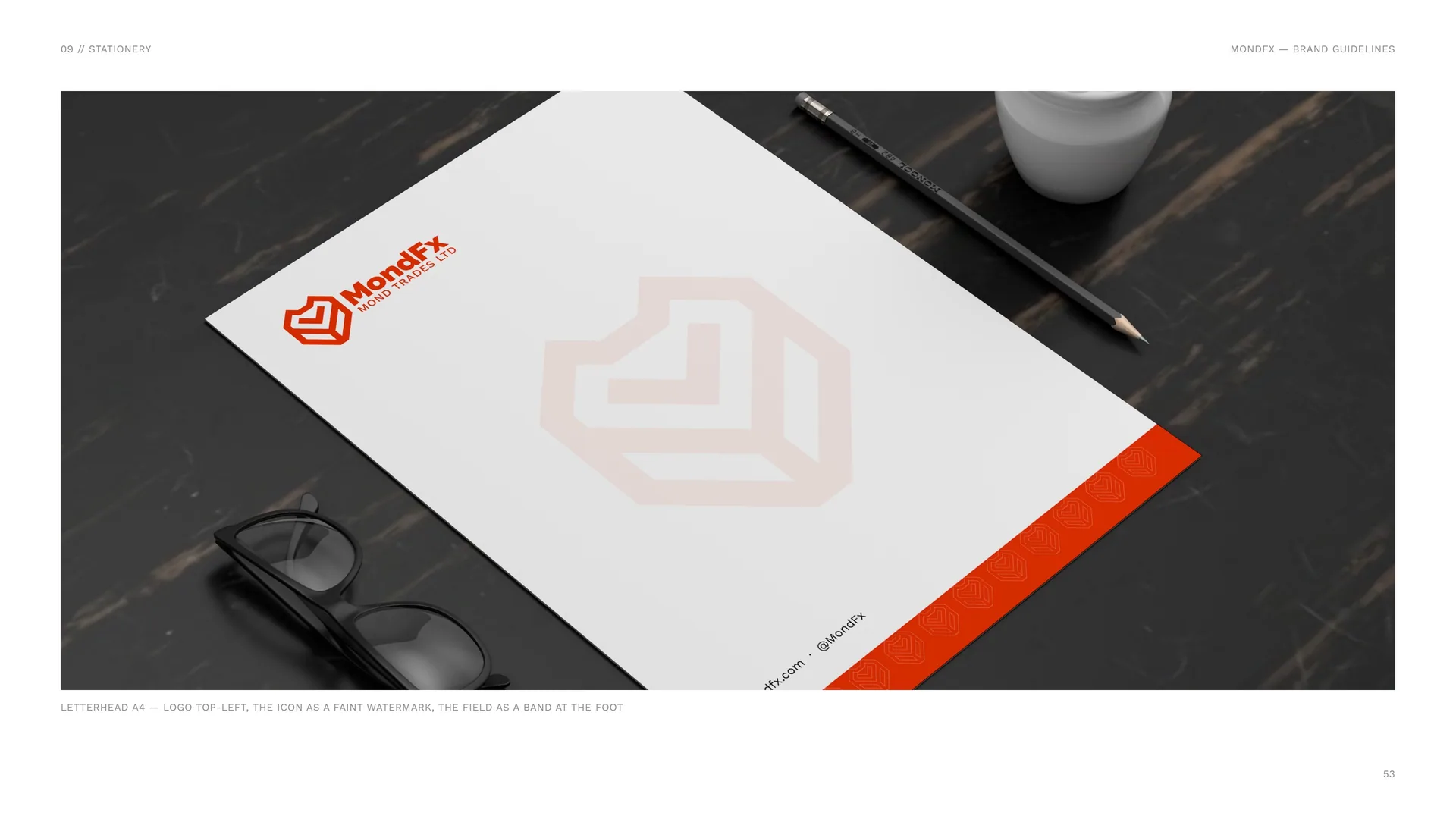
Letterhead A4 — logo top-left, the icon as a faint watermark, the field as a band at the foot.
10
Packaging
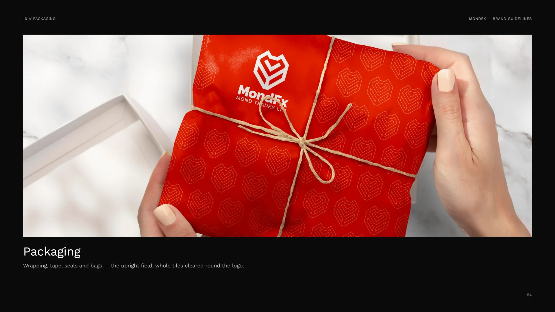
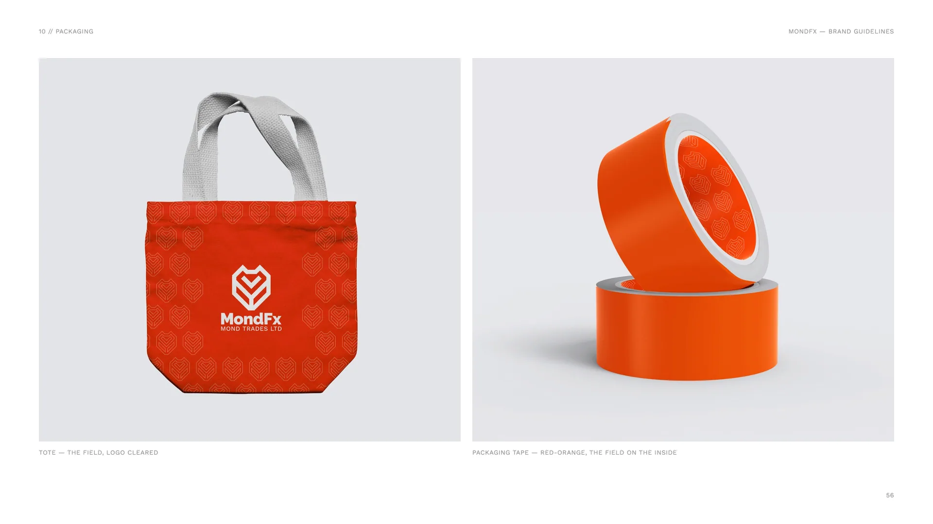
Wrapping, tape, seals and bags — the upright field, whole tiles cleared round the logo.
10.1
Packaging Kit
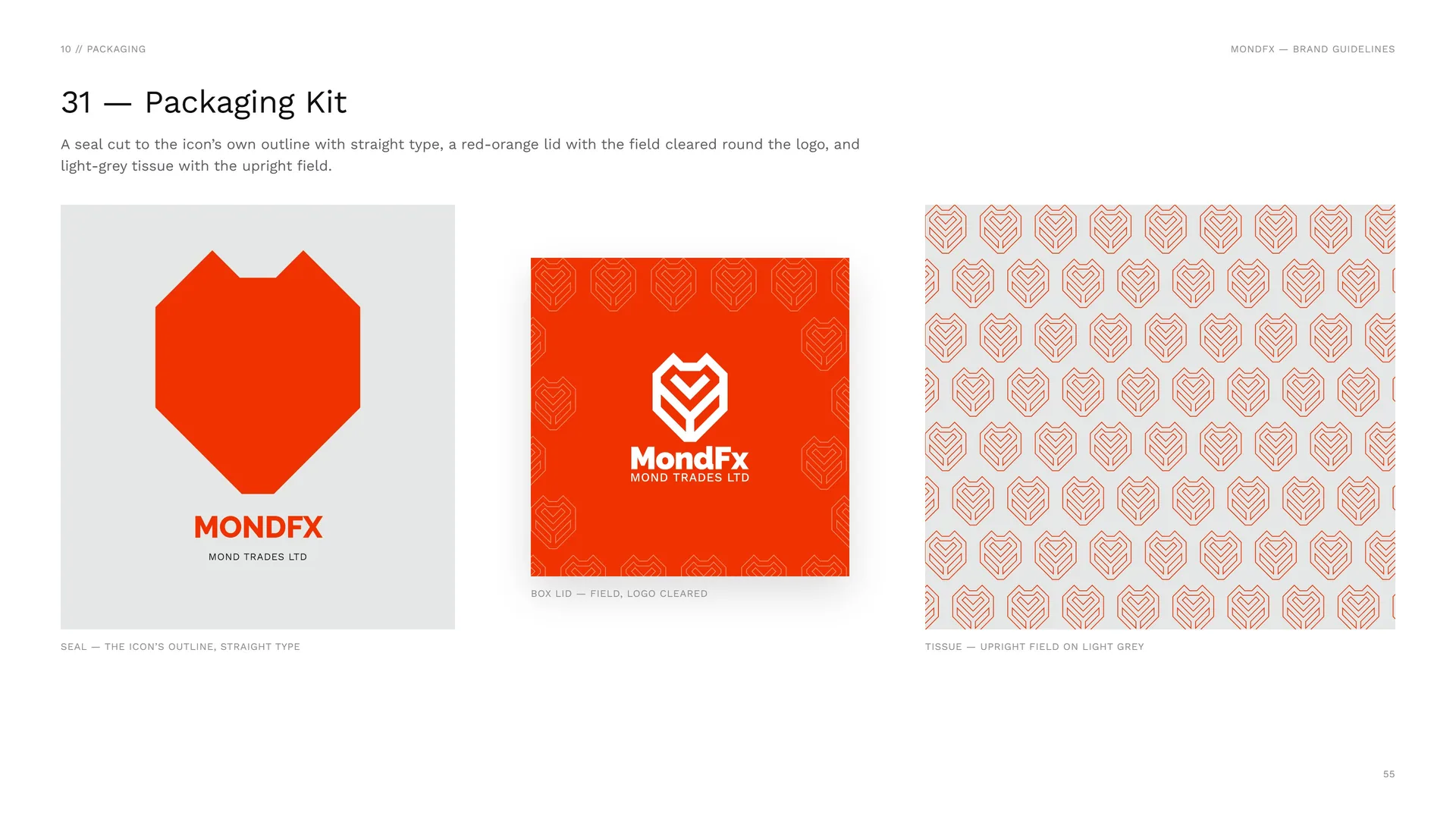
A seal cut to the icon’s own outline with straight type, a red-orange lid with the field cleared round the logo, and light-grey tissue with the upright field.
Seal — the icon’s outline, straight type.
Box lid — field, logo cleared.
Tissue — upright field on light grey.
Tote — the field, logo cleared.
Packaging tape — red-orange, the field on the inside.
11
Digital media
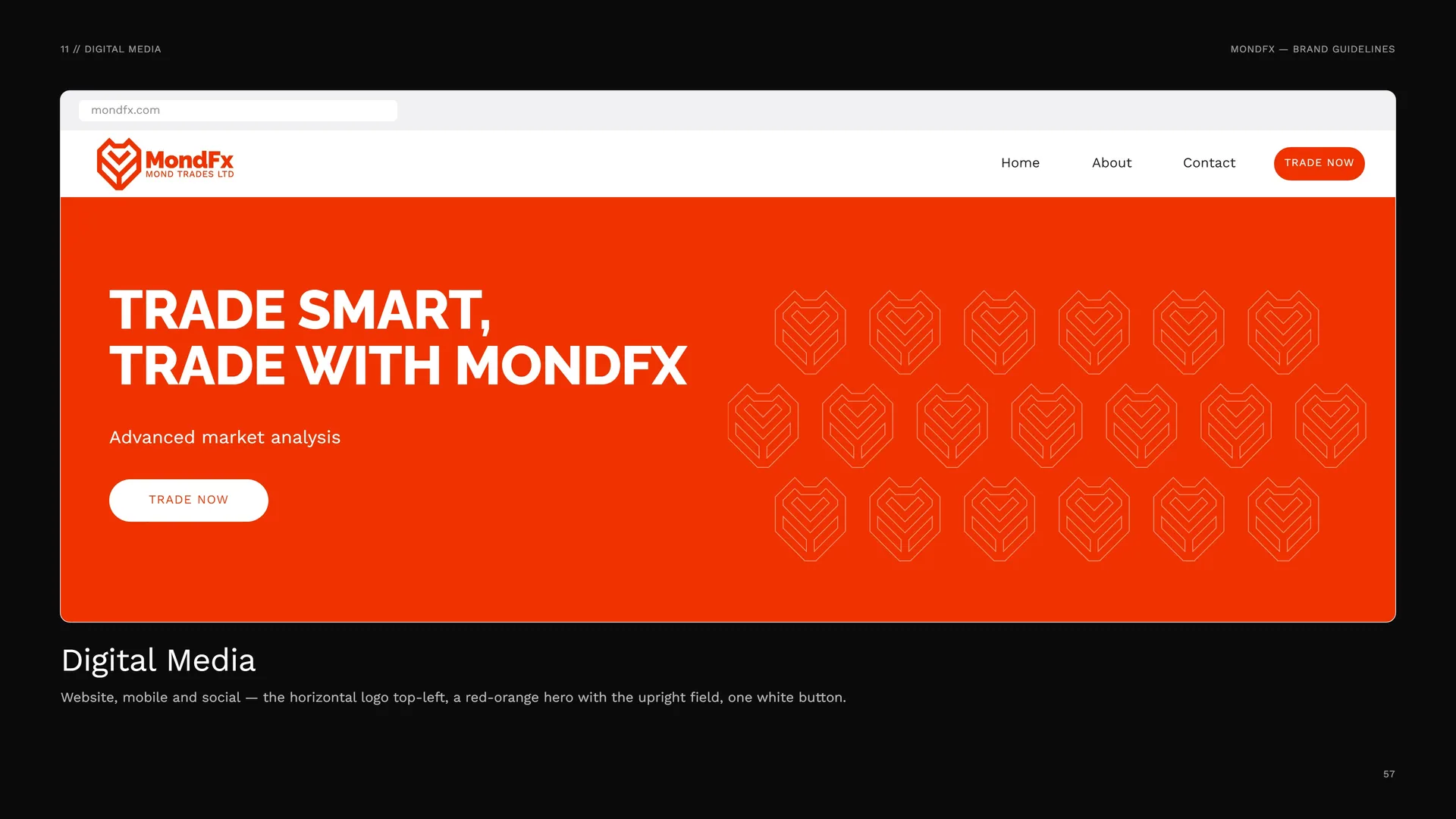
Website, mobile and social — the horizontal logo top-left, a red-orange hero with the upright field, one white button.
11.1
Website & Mobile
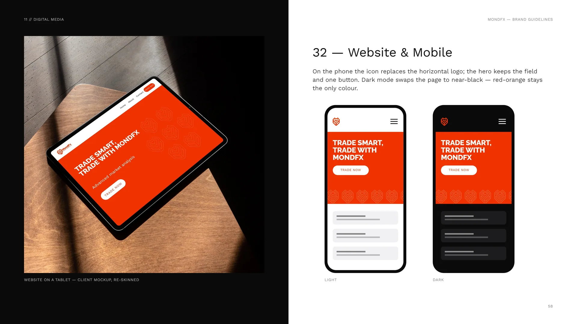
Website on a tablet — client mockup, re-skinned.
On the phone the icon replaces the horizontal logo; the hero keeps the field and one button. Dark mode swaps the page to near-black — red-orange stays the only colour.
Light · Dark.
11.2
Social Grid
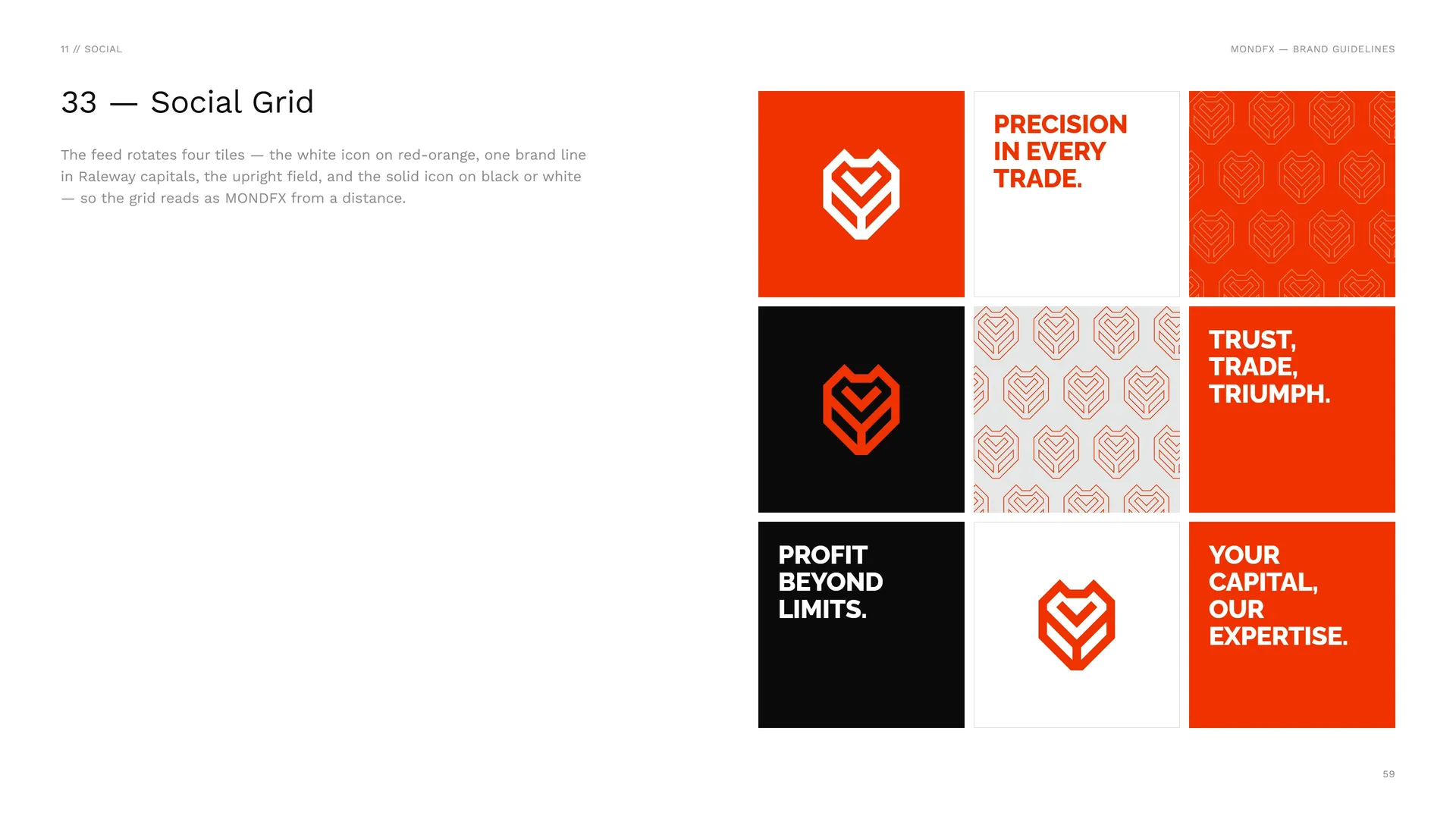
The feed rotates four tiles — the white icon on red-orange, one brand line in Raleway capitals, the upright field, and the solid icon on black or white — so the grid reads as MONDFX from a distance.
12
Merchandise
12.1
Merchandise
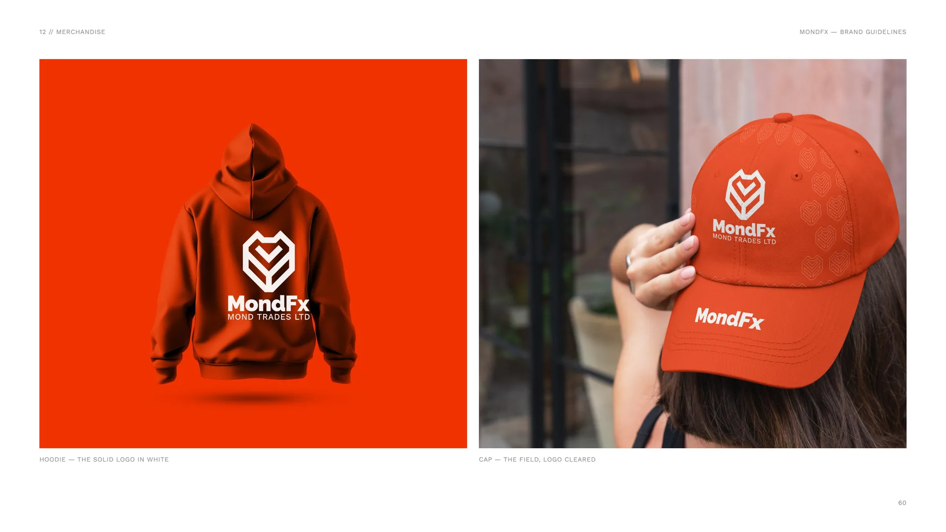
Hoodie — the solid logo in white.
Cap — the field, logo cleared.
13
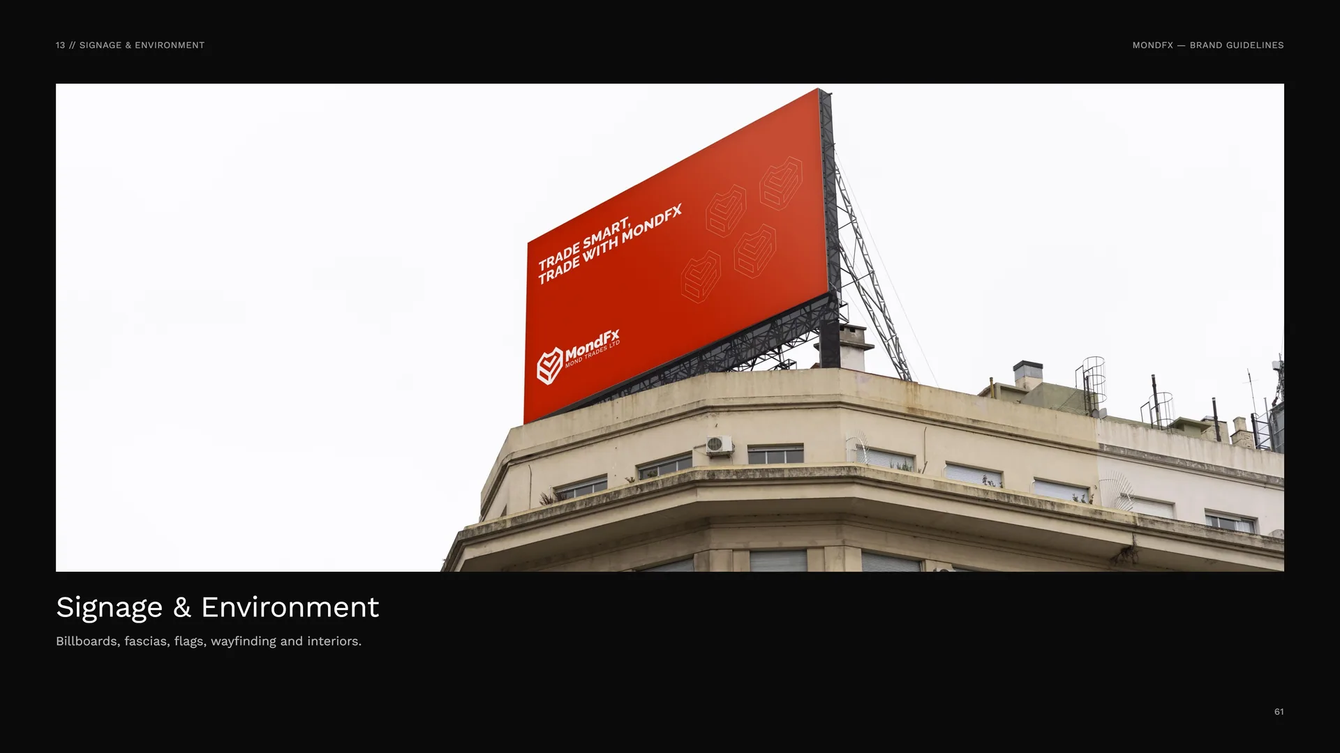
Signage & environment
Billboards, fascias, flags, wayfinding and interiors.
13.1
Fascia & Door Plate
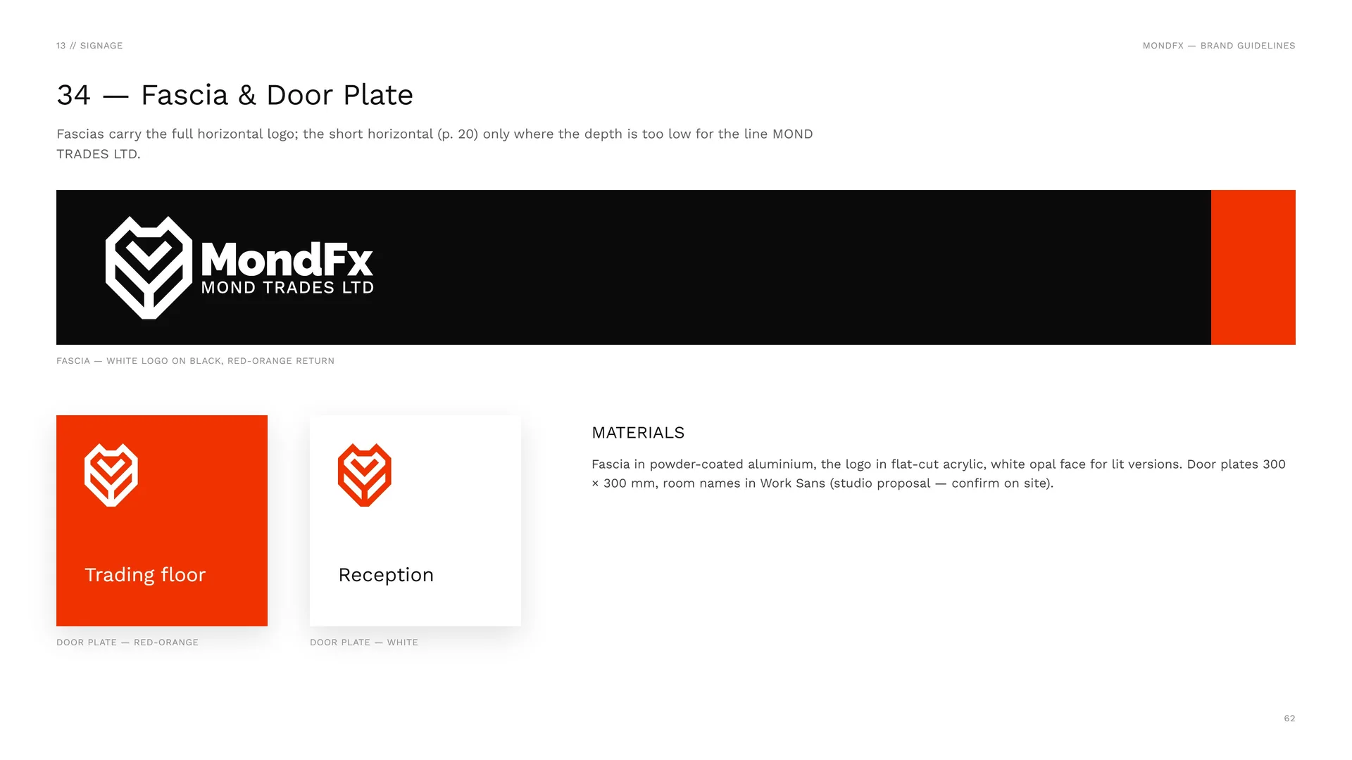
Fascias carry the full horizontal logo; the short horizontal (p. 20) only where the depth is too low for the line MOND TRADES LTD.
Fascia — white logo on black, red-orange return.
Door plate — red-orange.
Door plate — white.
Materials: Fascia in powder-coated aluminium, the logo in flat-cut acrylic, white opal face for lit versions. Door plates 300 × 300 mm, room names in Work Sans (studio proposal — confirm on site).
13.2
Wall flag and pop-up counter
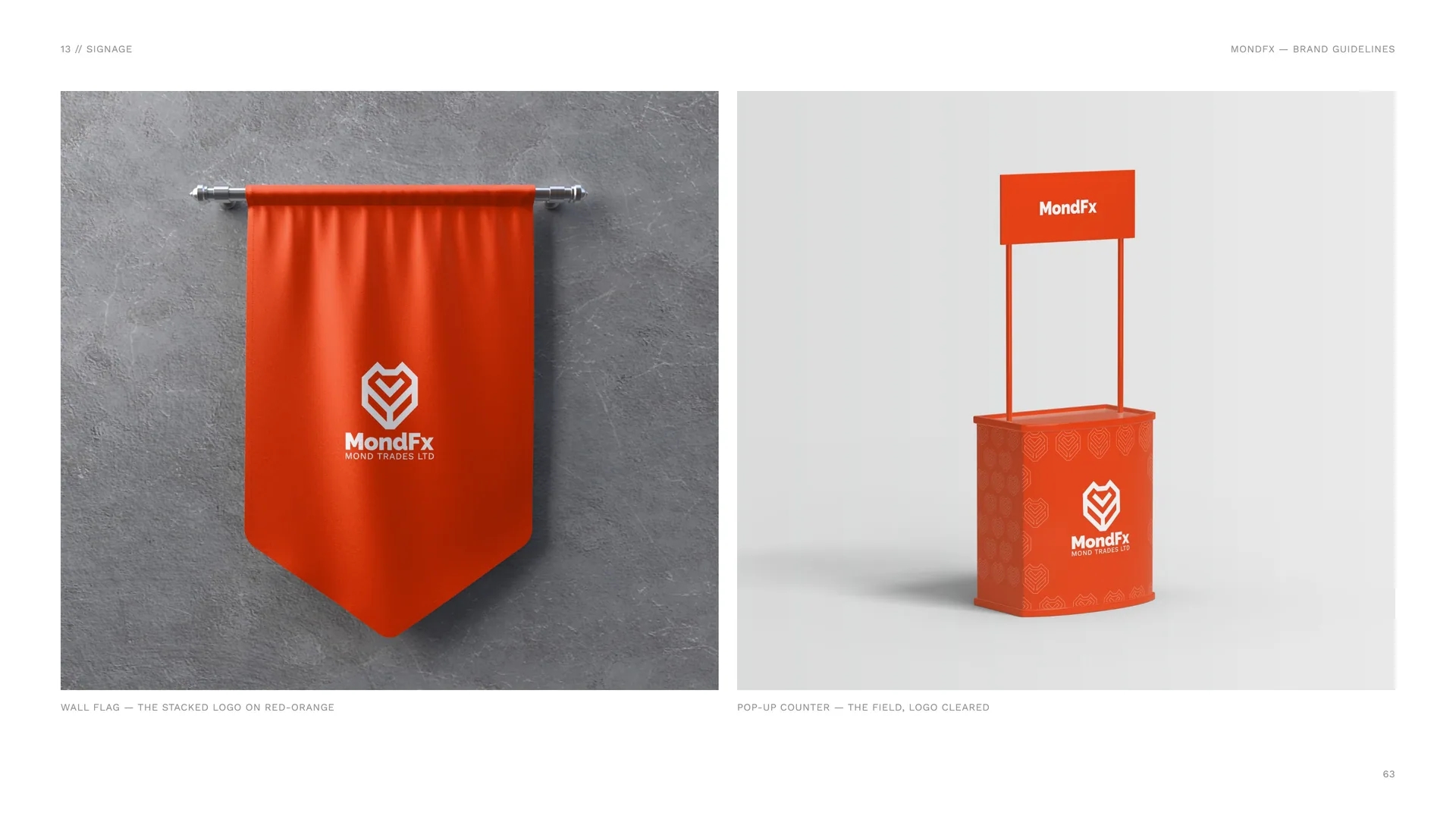
Wall flag — the stacked logo on red-orange.
Pop-up counter — the field, logo cleared.
13.3
Wayfinding
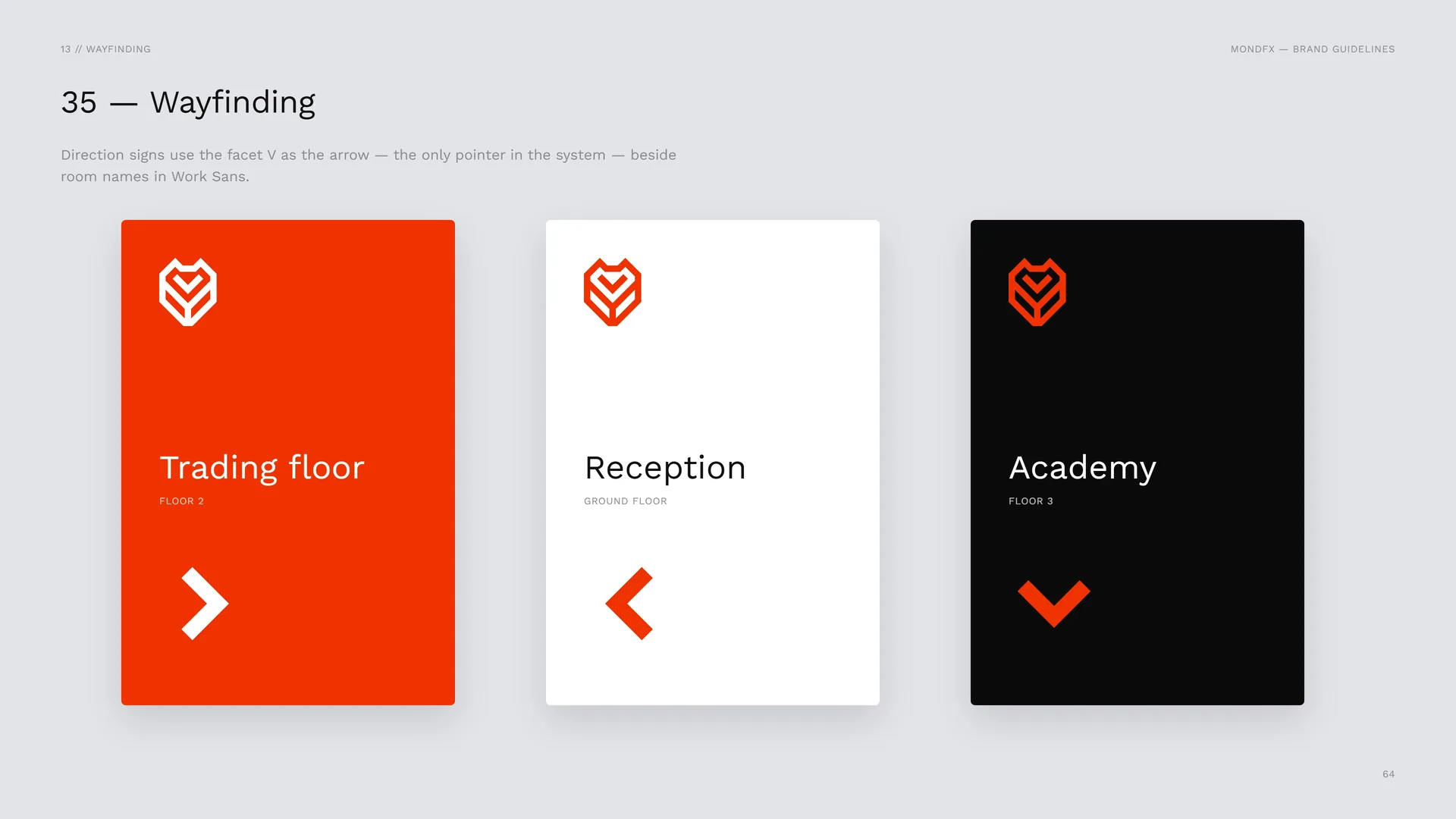
Direction signs use the facet V as the arrow — the only pointer in the system — beside room names in Work Sans.
13.4
Reception wall
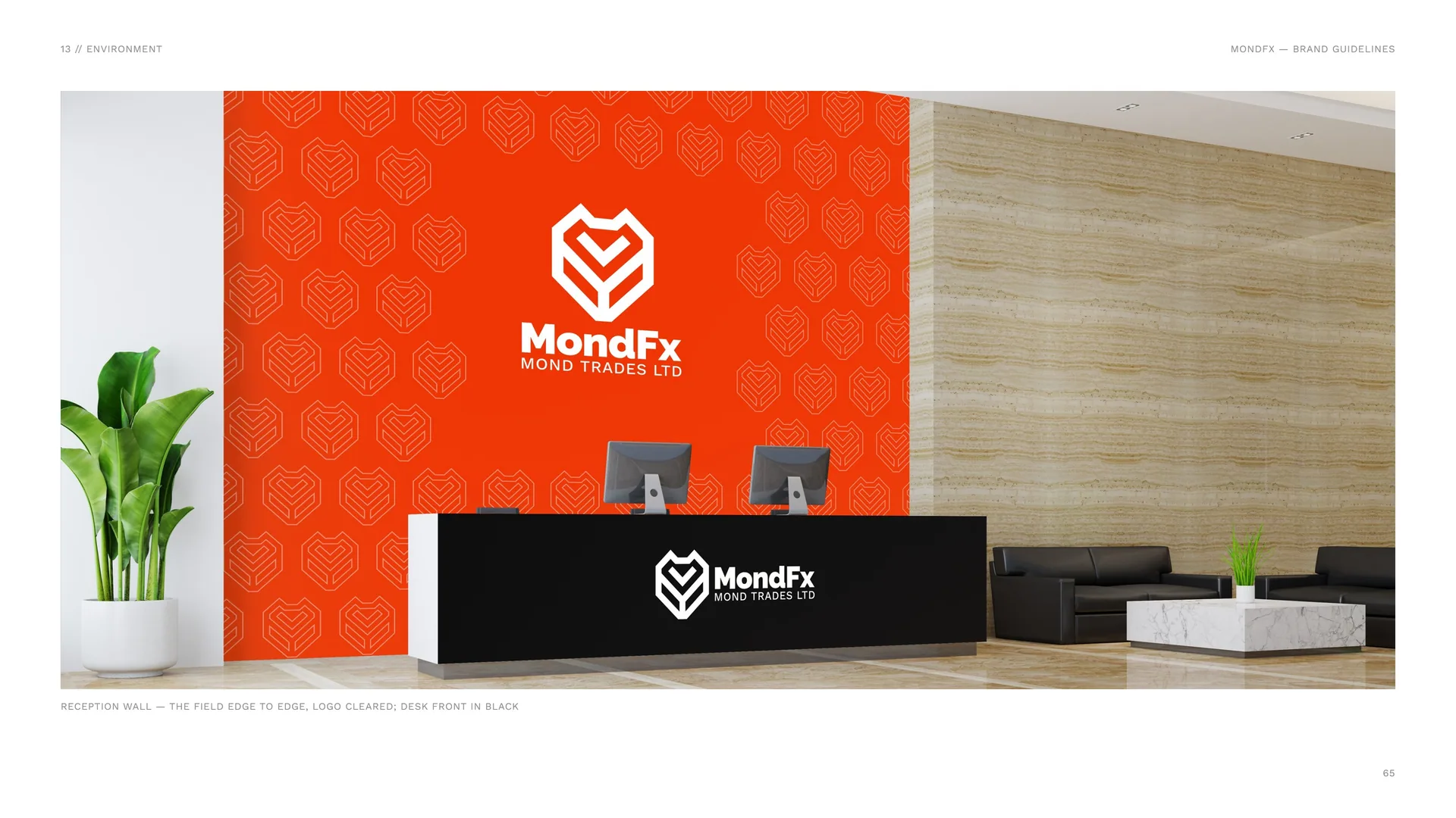
Reception wall — the field edge to edge, logo cleared; desk front in black.
14
Campaign & files
14.1
Campaign Lines
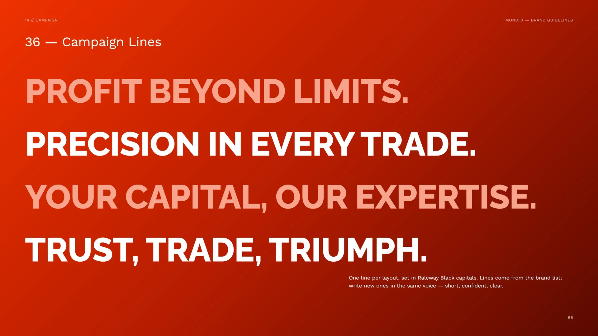
Profit beyond limits. · Precision in every trade. · Your capital, our expertise. · Trust, trade, triumph.
One line per layout, set in Raleway Black capitals. Lines come from the brand list; write new ones in the same voice — short, confident, clear.
14.2
Social
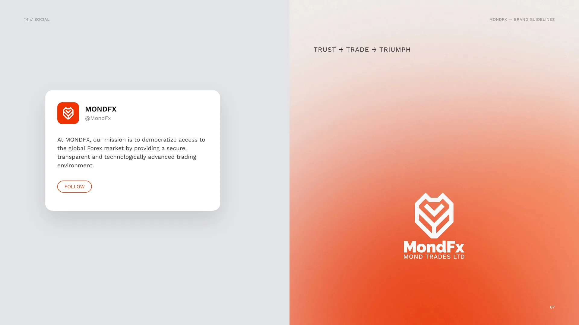
Trust → Trade → Triumph.
14.3
The Guide
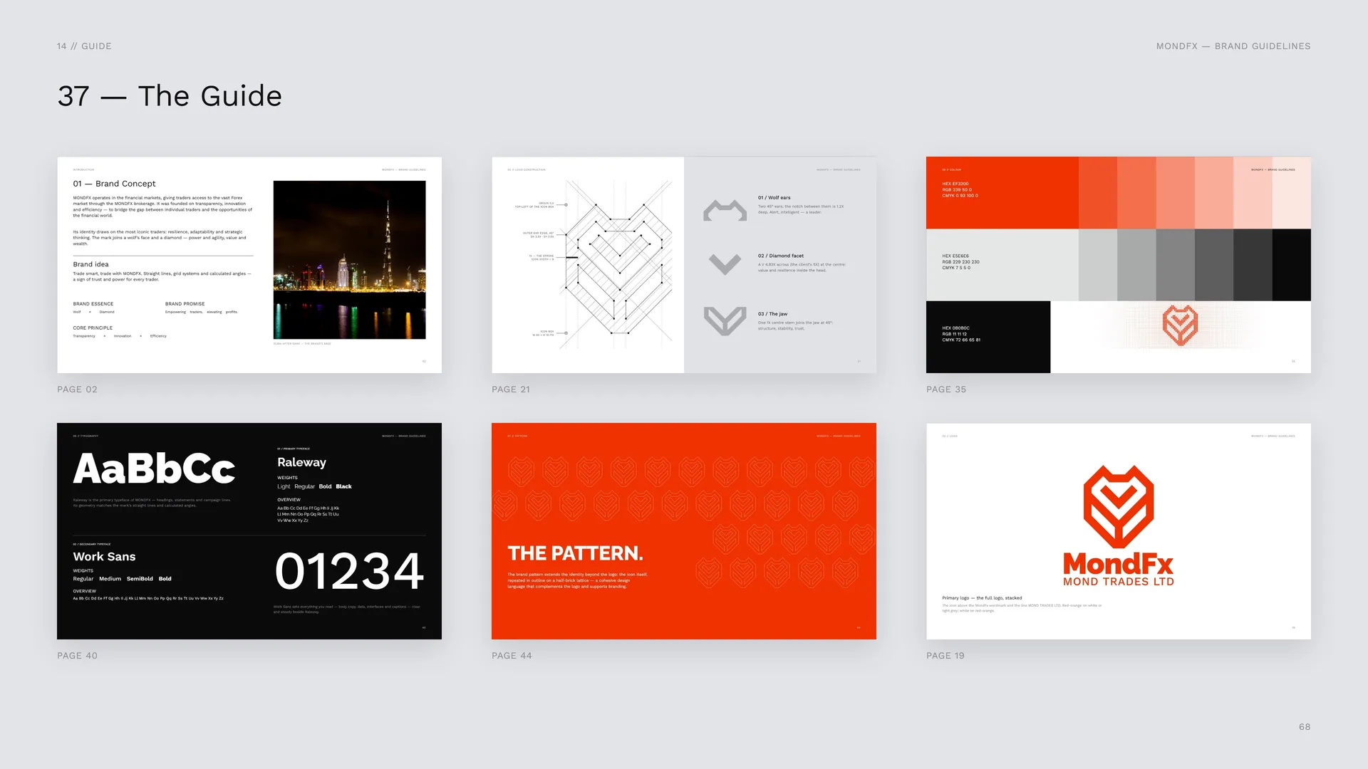
Page 02 · Page 21 · Page 35 · Page 40 · Page 44 · Page 19.
14.4
Files & Contact
Website: mondfx.com.
Social: @MondFx.
Company: Mond Trades Ltd — Forex brokerage.
Logo files: AI · EPS · PDF — Vector masters — CMYK and Pantone 2028 C.
SVG — Vector for web and apps.
PNG — Transparent, 1x · 2x · 4x.
ICO · PNG — Icon favicon 16 · 32 · 48 · 96 · 180 px.
OTF · TTF — Raleway · Work Sans (both OFL).
Name files as MONDFX_Logo_Lockup_Colour_Mode.ext — e.g. MONDFX_Logo_Stacked_RedOrange_RGB.svg.
Version 1.0 · November 2026.
Photos: Wikimedia Commons, CC0 / public domain.
14.5
Thank you
Trust, trade, triumph. // 2026