Avorix Brand Identity Guidelines
Avorix was established in London in 2025, at a time when brands required more than visual appeal — they needed clarity, meaning and strategic direction. The agency was founded on the belief that creativity and strategy must move together to build strong and lasting brands.
From the beginning it positioned itself as a future-driven creative agency: smart minimalism, geometric structure and cohesive visual systems that turn ideas into meaningful brand experiences.
- Jahr
- 2025
- Kunde
- Avorix
- Branche
- Advertising agency · London
- Leistungen
- Visuelle Identität
- Projekt
- Brand Identity Guidelines · v1.0 · 2026
00
Introduction
00.1
Brand Concept
Avorix was established in London in 2025, at a time when brands required more than visual appeal — they needed clarity, meaning and strategic direction. The agency was founded on the belief that creativity and strategy must move together to build strong and lasting brands.
From the beginning it positioned itself as a future-driven creative agency: smart minimalism, geometric structure and cohesive visual systems that turn ideas into meaningful brand experiences.
Brand idea: Strategy and creativity, moving together. The mark fuses the brand’s letters; where its lines cross is where the two converge.
Brand essence: Strategy × Creativity.
Core principle: Clarity × Meaning × Direction.
Brand promise: Partnering with you for brand growth.
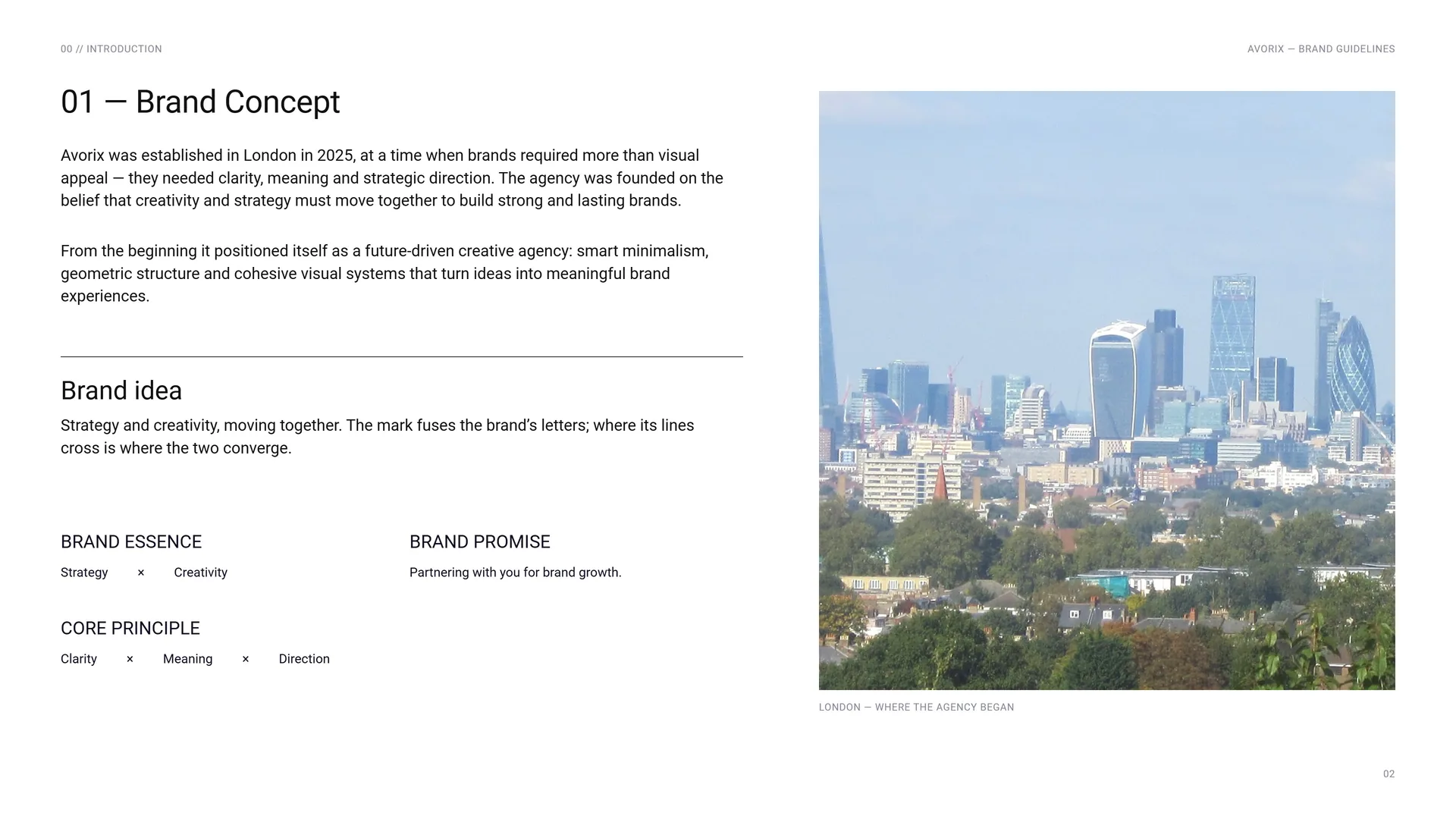
London — where the agency began.
00.2
The Brand Problem
Brands now need more than visual appeal. Without clarity, meaning and strategic direction, design stays decoration — seen, but not understood.
The challenge: Visual appeal without strategic direction · Isolated elements instead of one living system · Creativity that does not solve real problems · Messages that are seen but not understood.
Brand positioning: A future-driven creative agency: smart minimalism, geometric structure and cohesive visual systems that turn ideas into meaningful brand experiences.
The opportunity: To help brands shape their story, elevate their presence and create meaningful impact through design, creative campaigns and digital experiences.
The shift: From being seen → to being truly understood.
00.3
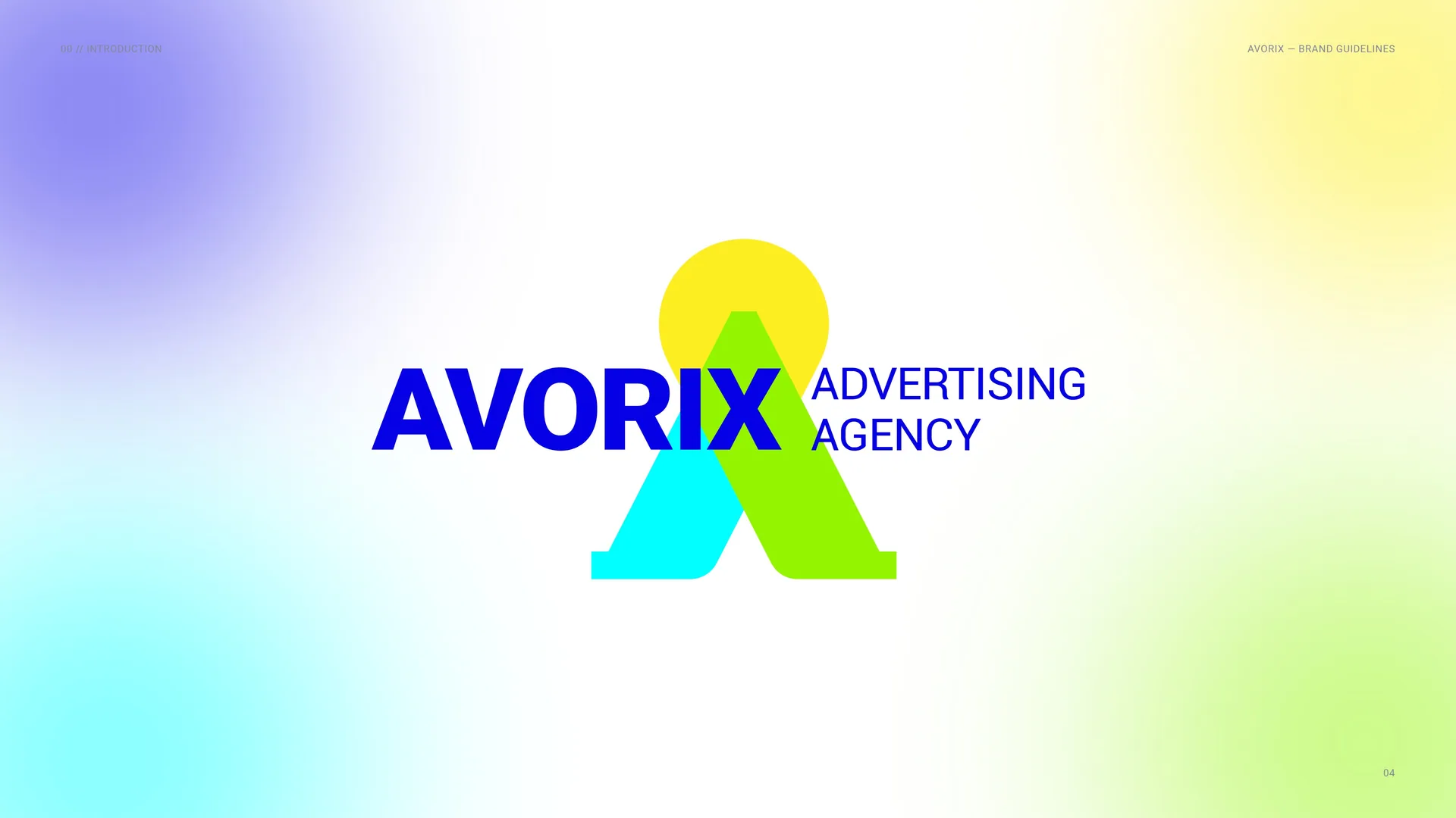
Avorix Advertising Agency
01
Brand
- 01.1Creativity and strategy, together
- 01.2Mission & Vision
- 01.3Brand Values
- 01.4Tone of Voice
- 01.5Brand line
- 01.6Services & Campaign Lines
01.1
Creativity and strategy, together
Established in London, 2025.
A future-driven creative agency.
Avorix was founded on the belief that creativity and strategy must move together. From the beginning it focused on smart minimalism, geometric structure and cohesive visual systems — turning ideas into meaningful brand experiences.
avorixcreative.co.uk
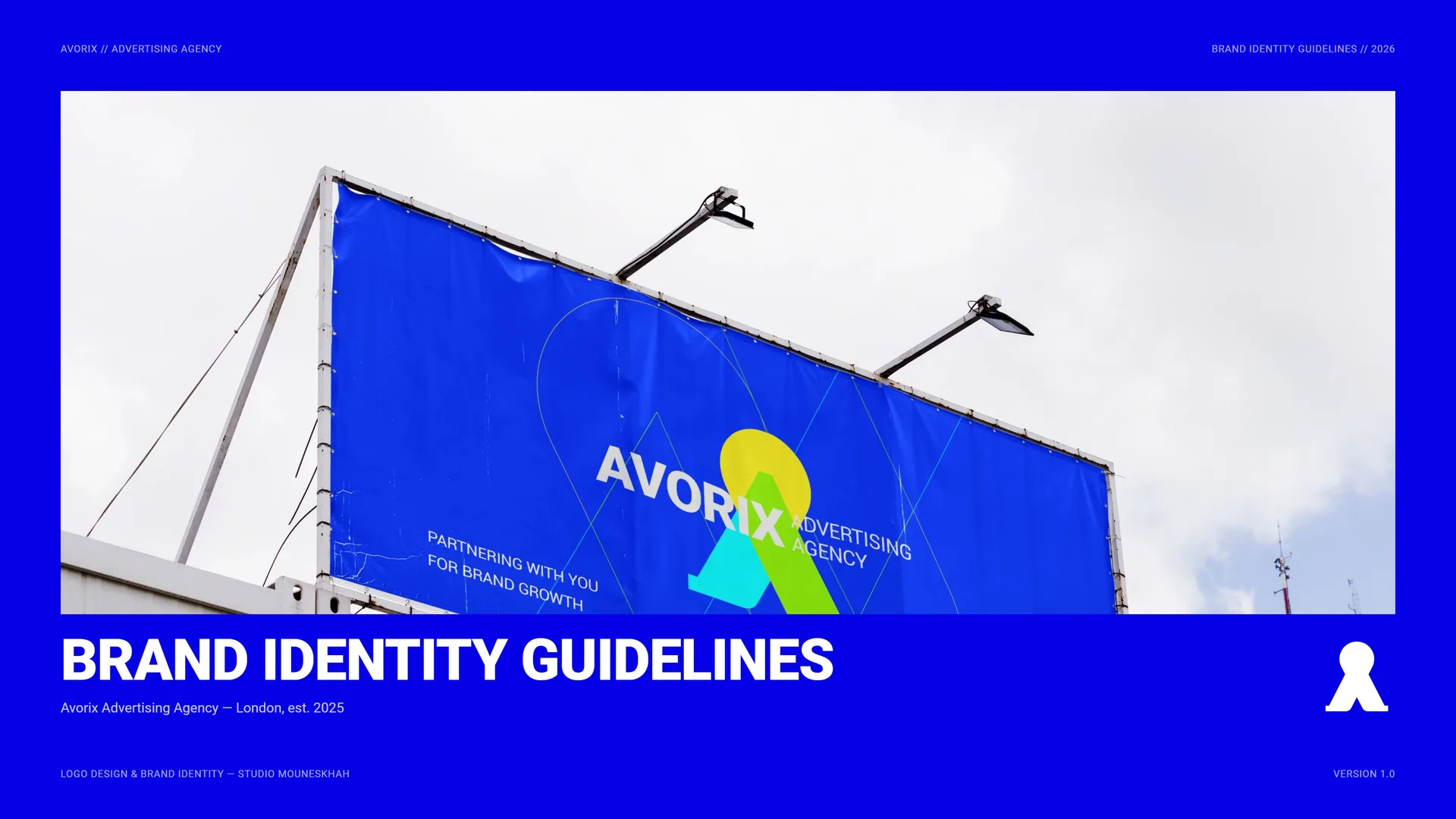
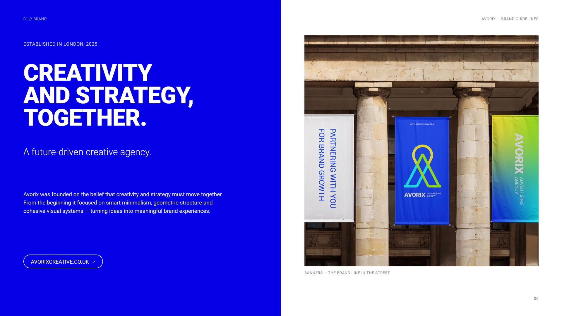
Banners — the brand line in the street.
01.2
Mission & Vision
Mission: To help brands shape their story, elevate their presence and create meaningful impact through design, creative campaigns and digital experiences.
We combine strategic thinking with purposeful creativity to build brand identities that are consistent, scalable and lasting.
Vision: To become a leading international creative agency that sets new standards in visual identity, creative campaigns and digital communication.
We aim to help brands not only be seen, but truly understood.
Seen → Understood.
01.3
Brand Values
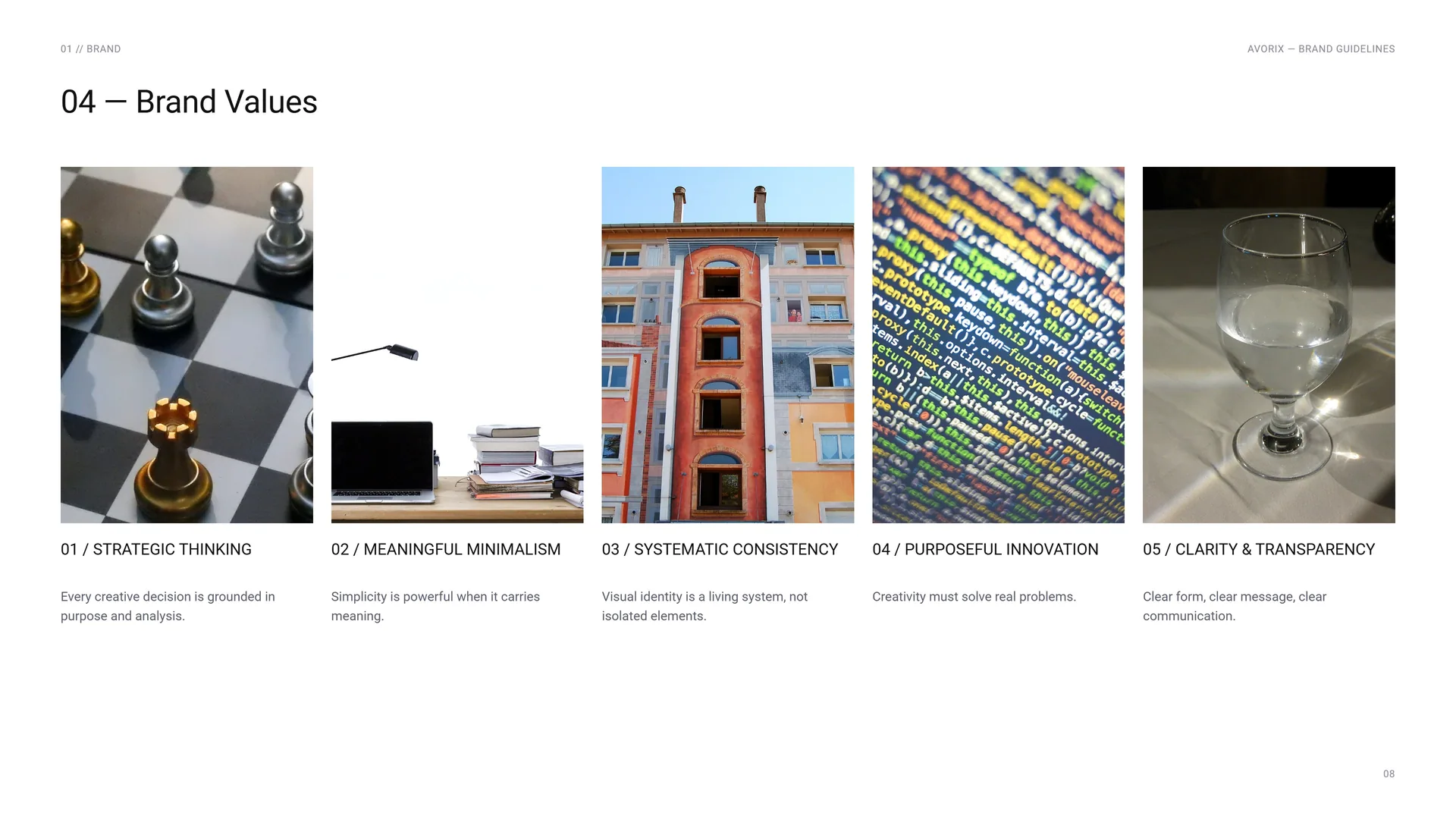
Strategic thinking: Every creative decision is grounded in purpose and analysis.
Meaningful minimalism: Simplicity is powerful when it carries meaning.
Systematic consistency: Visual identity is a living system, not isolated elements.
Purposeful innovation: Creativity must solve real problems.
Clarity & transparency: Clear form, clear message, clear communication.
01.4
Tone of Voice
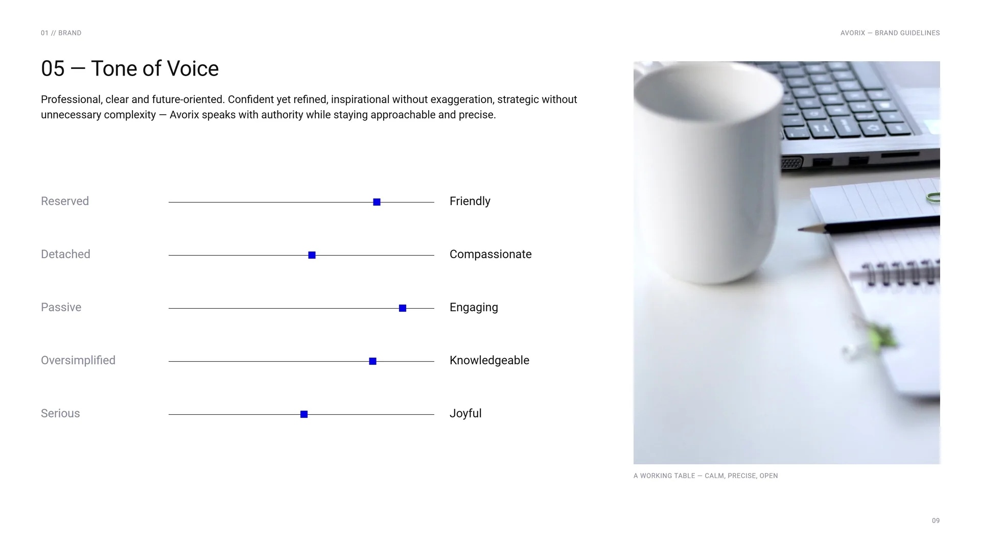
Professional, clear and future-oriented. Confident yet refined, inspirational without exaggeration, strategic without unnecessary complexity — Avorix speaks with authority while staying approachable and precise.
Reserved · Friendly.
Detached · Compassionate.
Passive · Engaging.
Oversimplified · Knowledgeable.
Serious · Joyful.
A working table — calm, precise, open.
01.5
Brand line
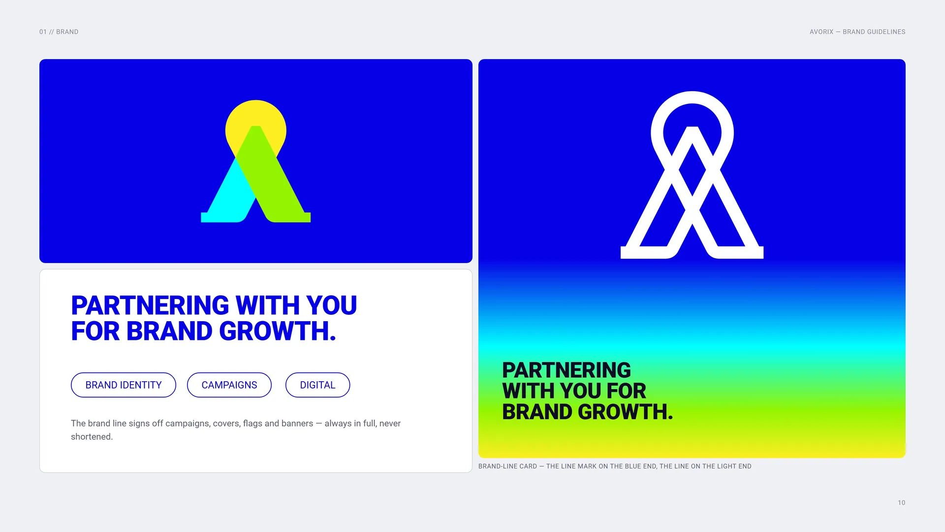
The brand line signs off campaigns, covers, flags and banners — always in full, never shortened.
Brand-line card — the line mark on the blue end, the line on the light end.
01.6
Services & Campaign Lines
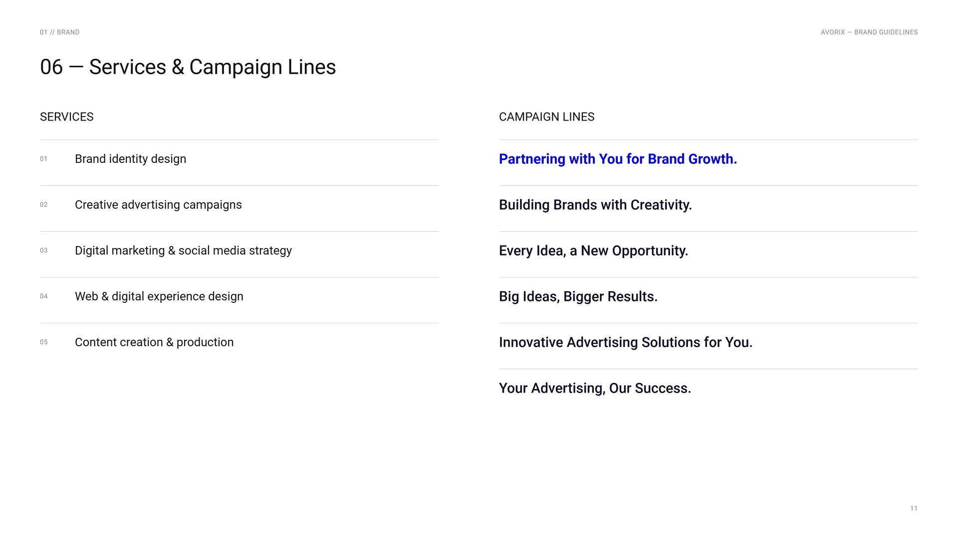
Services: Brand identity design · Creative advertising campaigns · Digital marketing & social media strategy · Web & digital experience design · Content creation & production.
Campaign lines: Partnering with You for Brand Growth. · Building Brands with Creativity. · Every Idea, a New Opportunity. · Big Ideas, Bigger Results. · Innovative Advertising Solutions for You. · Your Advertising, Our Success.
02
Concept
- 02.1Four Letters, One Mark
- 02.2Logo Meaning
- 02.3Where strategy and creativity converge
- 02.4One Circle, Two Tangents
- 02.5Solid and line
- 02.6Clarity, motion, connection
- 02.7The Mark in Motion
02.1
Four Letters, One Mark
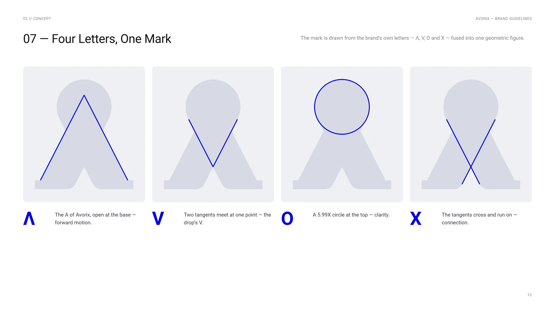
The mark is drawn from the brand’s own letters — Λ, V, O and X — fused into one geometric figure.
Λ: The A of Avorix, open at the base — forward motion.
V: Two tangents meet at one point — the drop’s V.
O: A 5.99X circle at the top — clarity.
X: The tangents cross and run on — connection.
02.2
Logo Meaning
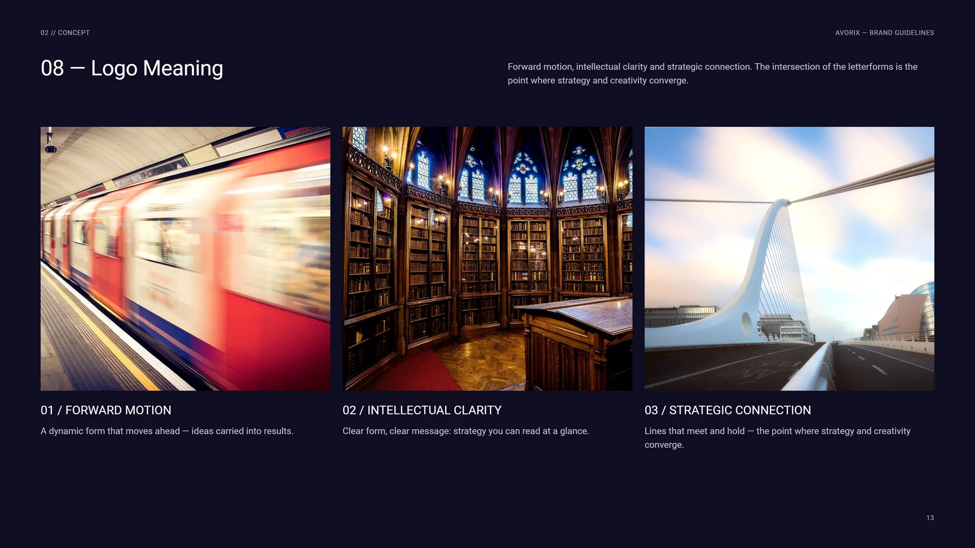
Forward motion, intellectual clarity and strategic connection. The intersection of the letterforms is the point where strategy and creativity converge.
Forward motion: A dynamic form that moves ahead — ideas carried into results.
Intellectual clarity: Clear form, clear message: strategy you can read at a glance.
Strategic connection: Lines that meet and hold — the point where strategy and creativity converge.
02.3
Where strategy and creativity converge
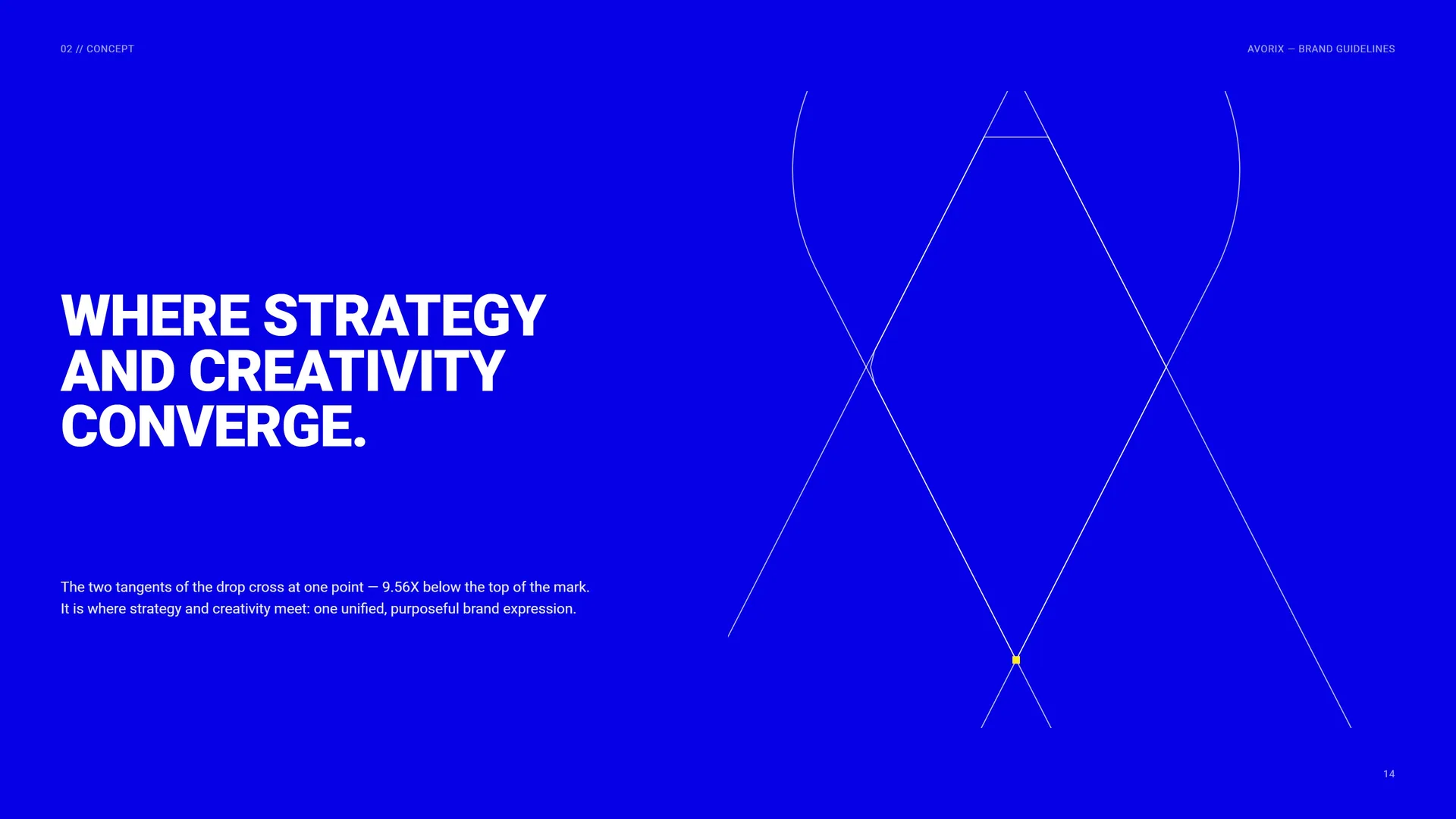
The two tangents of the drop cross at one point — 9.56X below the top of the mark. It is where strategy and creativity meet: one unified, purposeful brand expression.
02.4
One Circle, Two Tangents
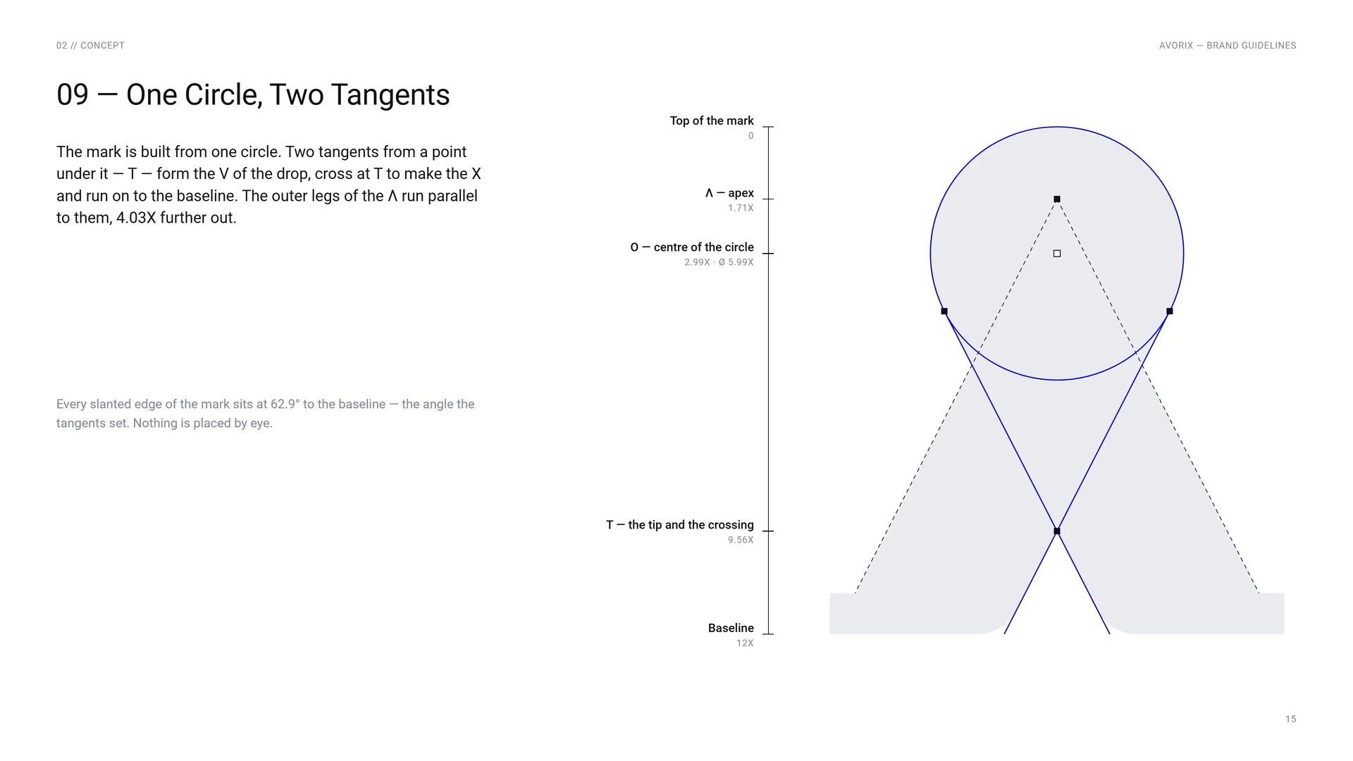
The mark is built from one circle. Two tangents from a point under it — T — form the V of the drop, cross at T to make the X and run on to the baseline. The outer legs of the Λ run parallel to them, 4.03X further out.
Top of the mark: 0.
Λ — apex: 1.71X.
O — centre of the circle: 2.99X · Ø 5.99X.
T — the tip and the crossing: 9.56X.
Baseline: 12X.
Every slanted edge of the mark sits at 62.9° to the baseline — the angle the tangents set. Nothing is placed by eye.
02.5
Solid and line
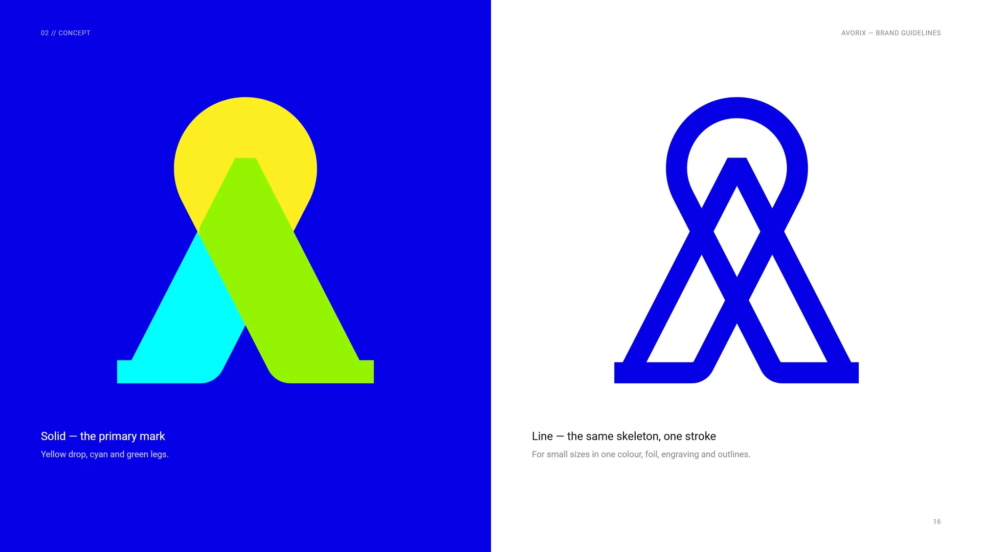
Solid — the primary mark: Yellow drop, cyan and green legs.
Line — the same skeleton, one stroke: For small sizes in one colour, foil, engraving and outlines.
02.6
Clarity, motion, connection
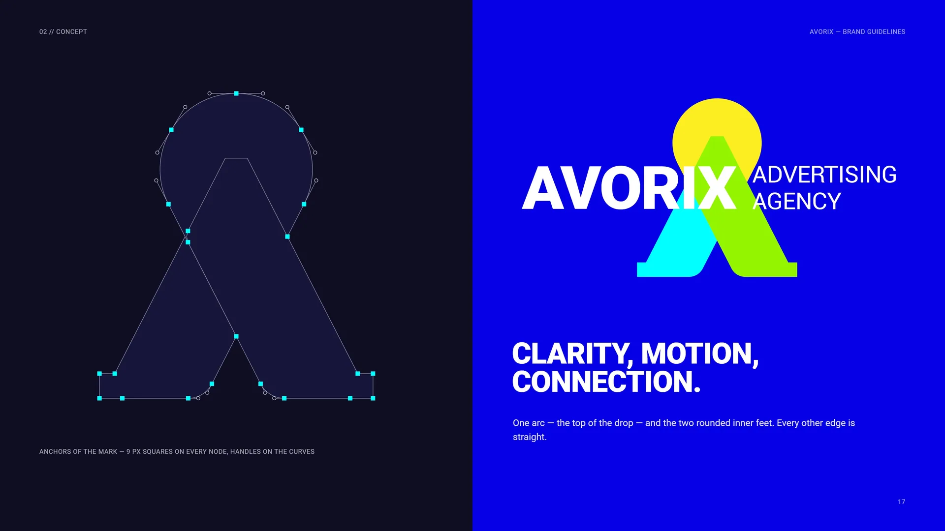
One arc — the top of the drop — and the two rounded inner feet. Every other edge is straight.
Anchors of the mark — 9 px squares on every node, handles on the curves.
02.7
The Mark in Motion
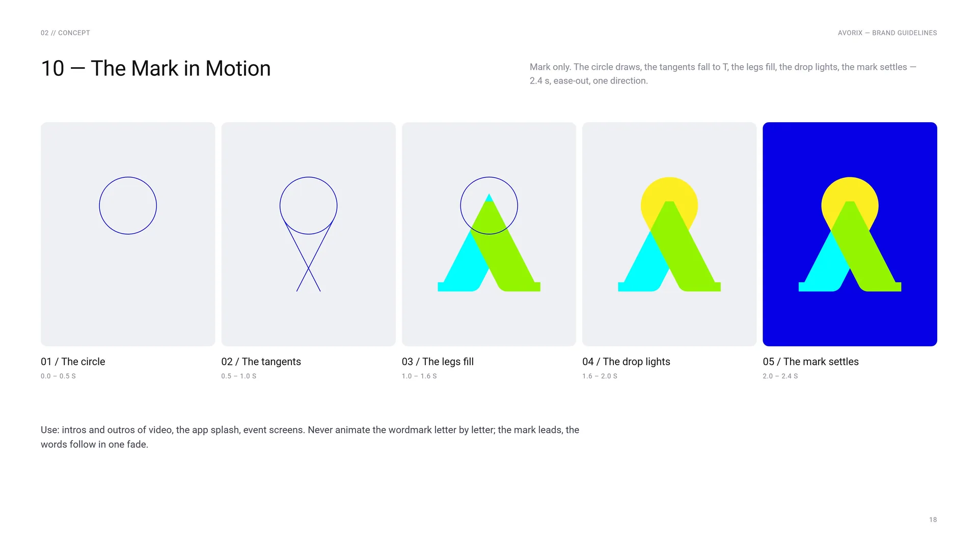
Mark only. The circle draws, the tangents fall to T, the legs fill, the drop lights, the mark settles — 2.4 s, ease-out, one direction.
The circle: 0.0 – 0.5 s.
The tangents: 0.5 – 1.0 s.
The legs fill: 1.0 – 1.6 s.
The drop lights: 1.6 – 2.0 s.
The mark settles: 2.0 – 2.4 s.
Use: intros and outros of video, the app splash, event screens. Never animate the wordmark letter by letter; the mark leads, the words follow in one fade.
03
Logo — grid & use
- 03.1Primary logo
- 03.2The O, the Λ and the X
- 03.3The 12X Grid
- 03.4Wordmark
- 03.5Partnering with You for Brand Growth
- 03.6Horizontal Proportions
- 03.7Mark with Stacked Words
- 03.8Clear Space
- 03.9Full colour, one colour, reversed
- 03.10App Icon & Favicon
- 03.11Size
- 03.12Placement
- 03.13Misuse
- 03.14On blue, white, the gradient and the pattern
- 03.15Acrylic sign and keychain
03.1
Primary logo
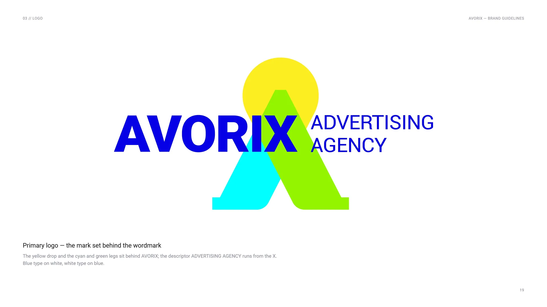
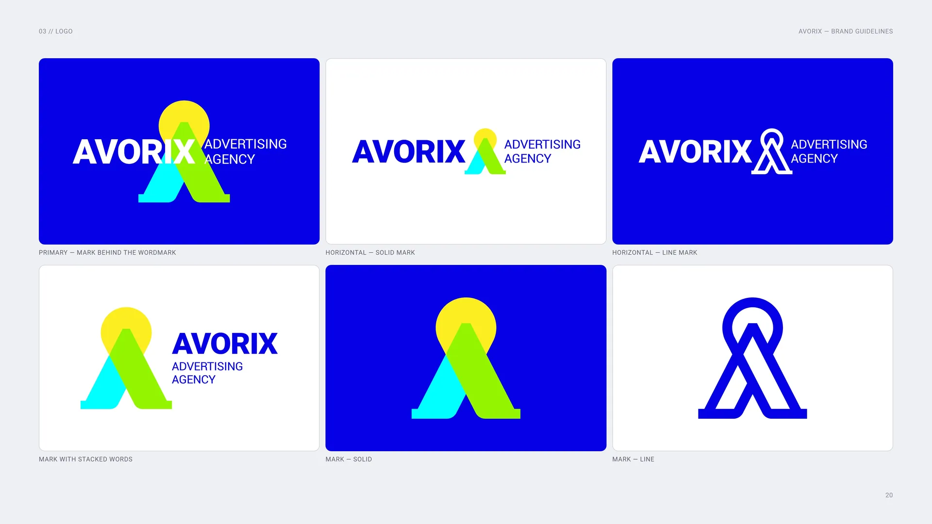
Primary logo — the mark set behind the wordmark: The yellow drop and the cyan and green legs sit behind AVORIX; the descriptor ADVERTISING AGENCY runs from the X. Blue type on white, white type on blue.
Primary — mark behind the wordmark.
Horizontal — solid mark.
Horizontal — line mark.
Mark with stacked words.
Mark — solid.
Mark — line.
03.2
The O, the Λ and the X
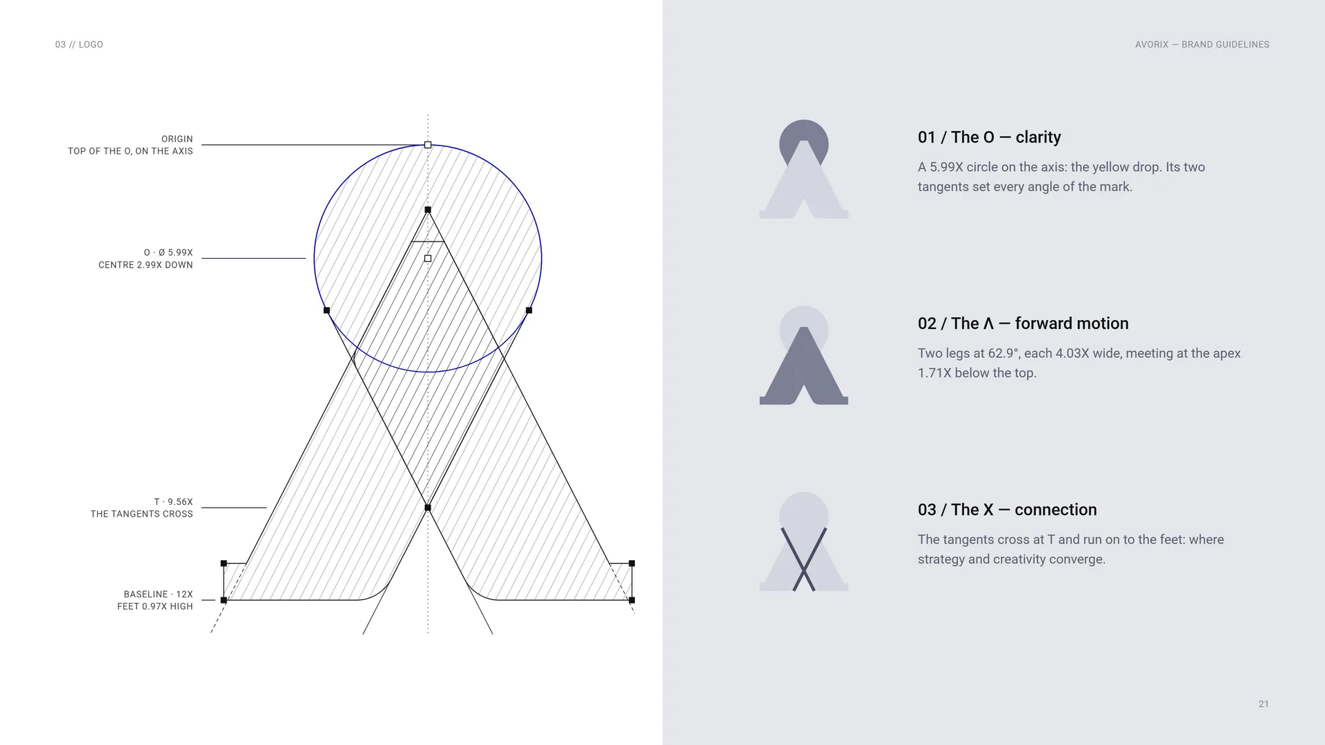
Origin: Top of the O, on the axis.
O · Ø 5.99X: Centre 2.99X down.
T · 9.56X: The tangents cross.
Baseline · 12X: Feet 0.97X high.
The O — clarity: A 5.99X circle on the axis: the yellow drop. Its two tangents set every angle of the mark.
The Λ — forward motion: Two legs at 62.9°, each 4.03X wide, meeting at the apex 1.71X below the top.
The X — connection: The tangents cross at T and run on to the feet: where strategy and creativity converge.
03.3
The 12X Grid
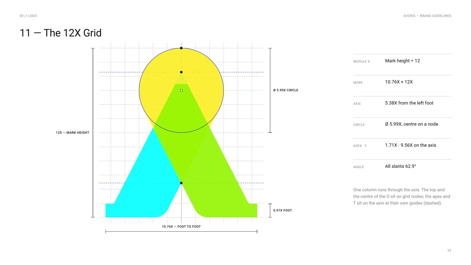
12X — mark height.
10.76X — foot to foot.
Ø 5.99X circle.
0.97X foot.
Module X: Mark height ÷ 12.
Mark: 10.76X × 12X.
Axis: 5.38X from the left foot.
Circle: Ø 5.99X, centre on a node.
Apex · T: 1.71X · 9.56X on the axis.
Angle: All slants 62.9°.
One column runs through the axis. The top and the centre of the O sit on grid nodes; the apex and T sit on the axis at their own guides (dashed).
03.4
Wordmark
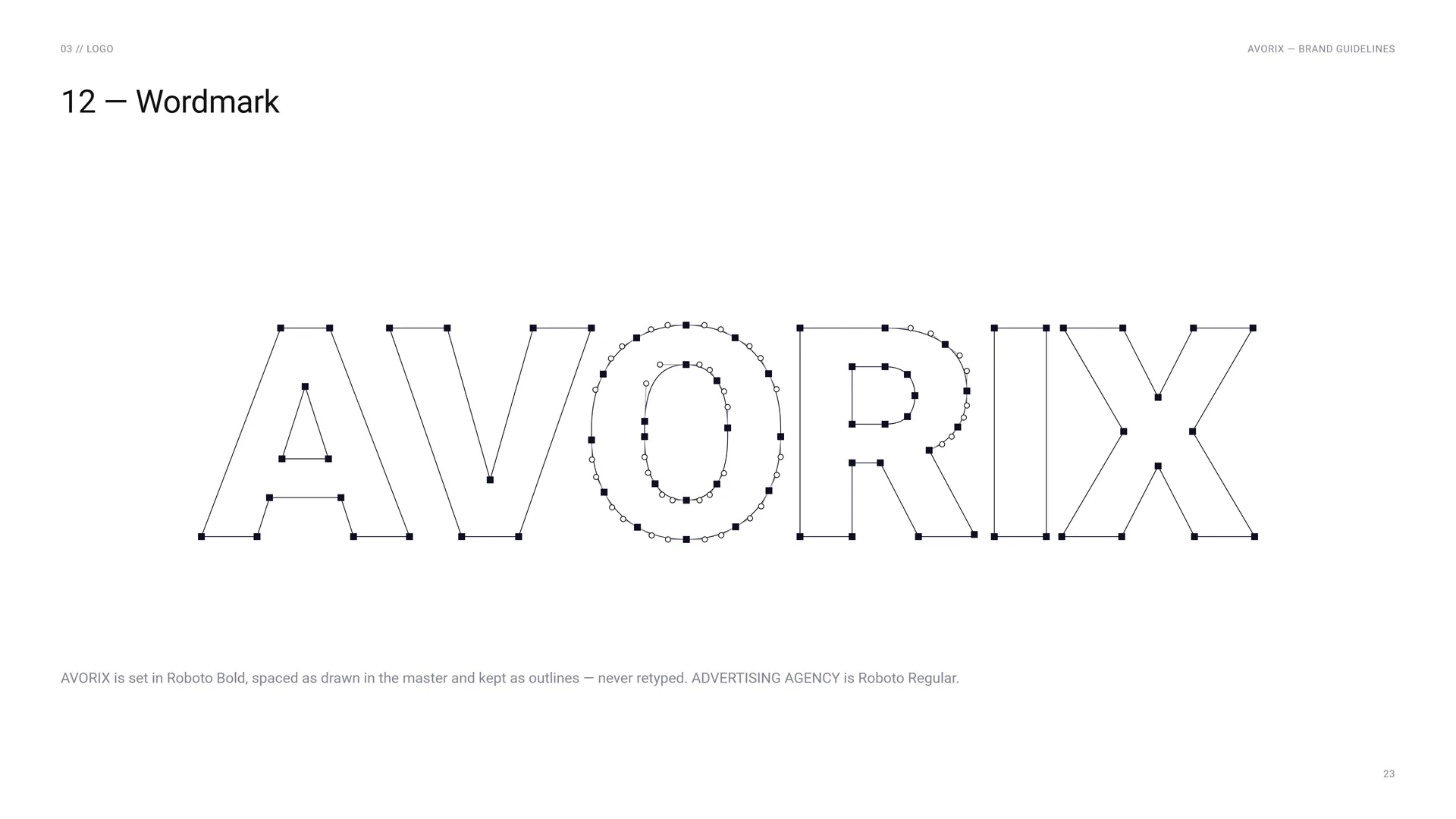
AVORIX is set in Roboto Bold, spaced as drawn in the master and kept as outlines — never retyped. ADVERTISING AGENCY is Roboto Regular.
03.5
Partnering with You for Brand Growth
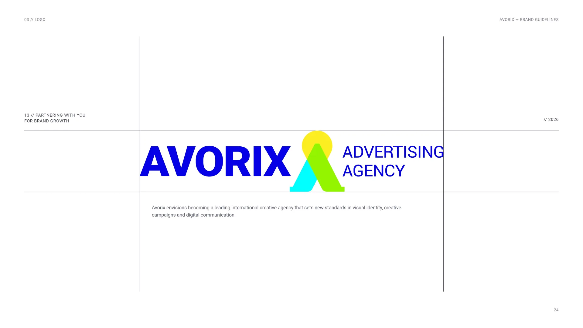
Avorix envisions becoming a leading international creative agency that sets new standards in visual identity, creative campaigns and digital communication.
03.6
Horizontal Proportions
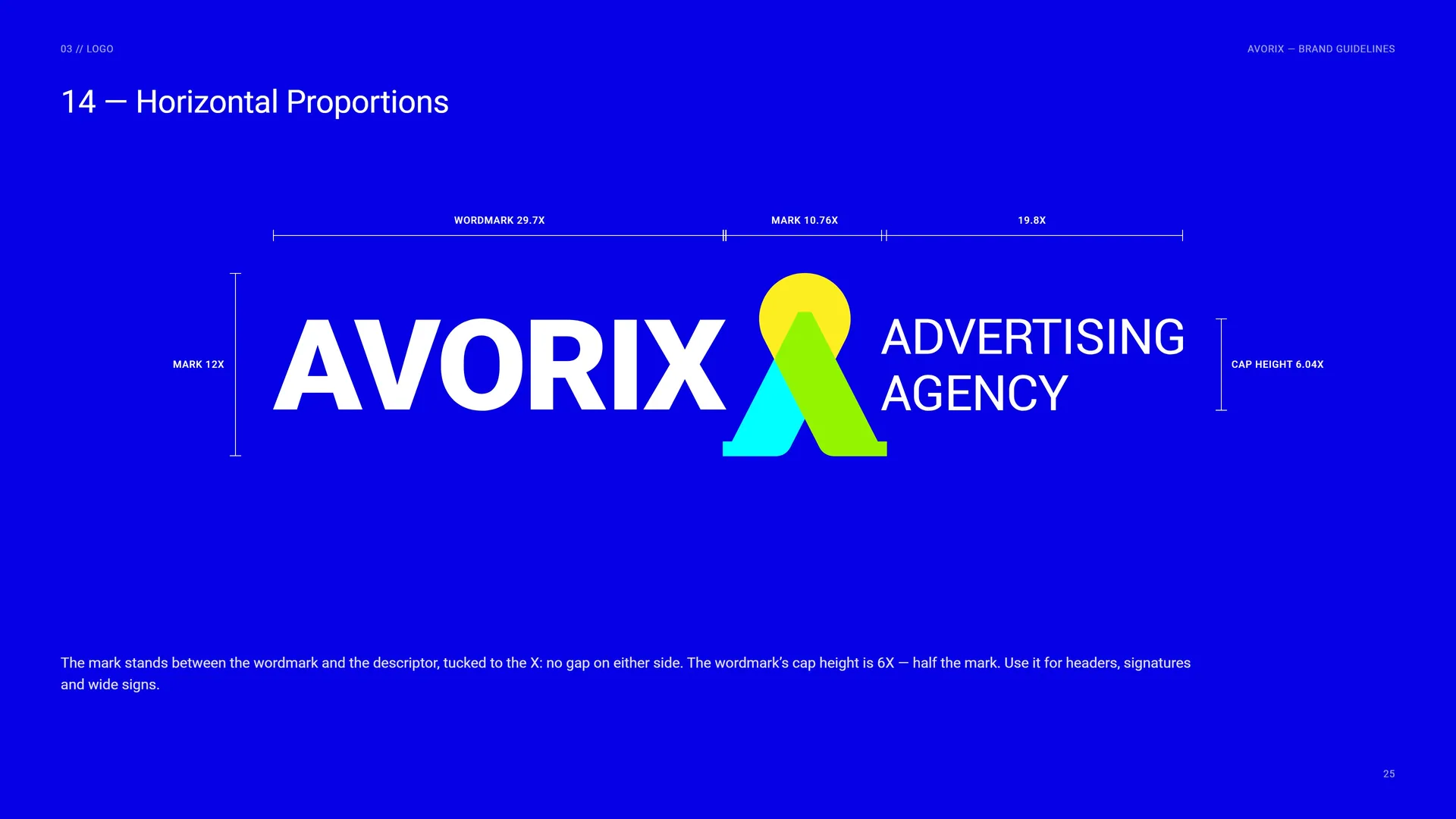
Wordmark 29.7X · Mark 10.76X · 19.8X.
Mark 12X · Cap height 6.04X.
The mark stands between the wordmark and the descriptor, tucked to the X: no gap on either side. The wordmark’s cap height is 6X — half the mark. Use it for headers, signatures and wide signs.
03.7
Mark with Stacked Words
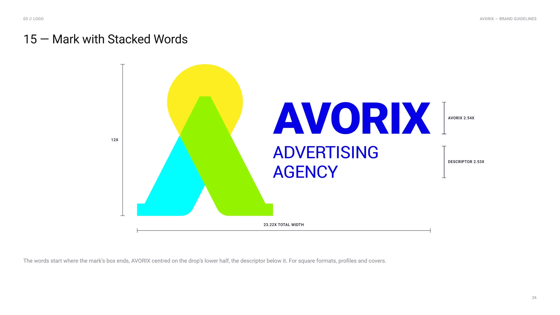
12X · AVORIX 2.54X · Descriptor 2.53X · 23.22X total width.
The words start where the mark’s box ends, AVORIX centred on the drop’s lower half, the descriptor below it. For square formats, profiles and covers.
03.8
Clear Space
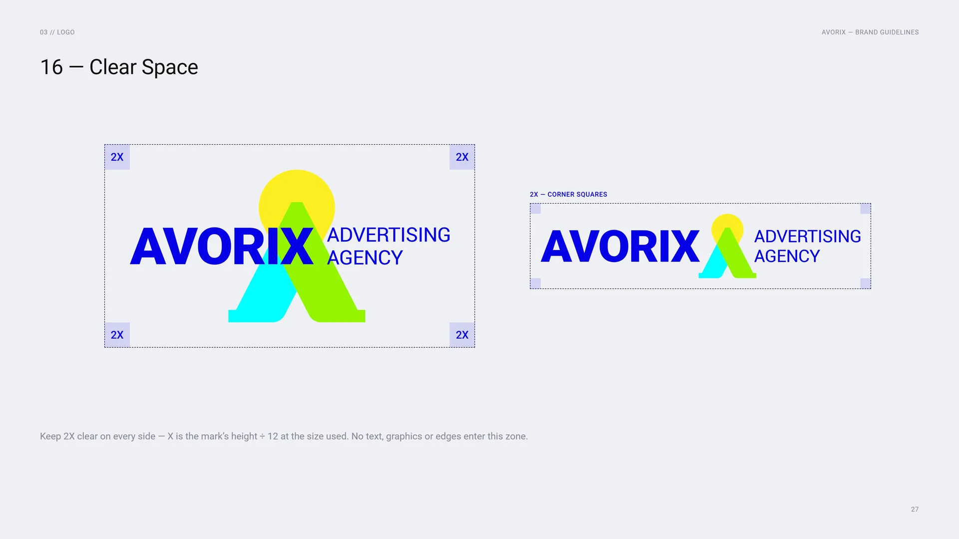
Keep 2X clear on every side — X is the mark’s height ÷ 12 at the size used. No text, graphics or edges enter this zone.
2X — corner squares.
03.9
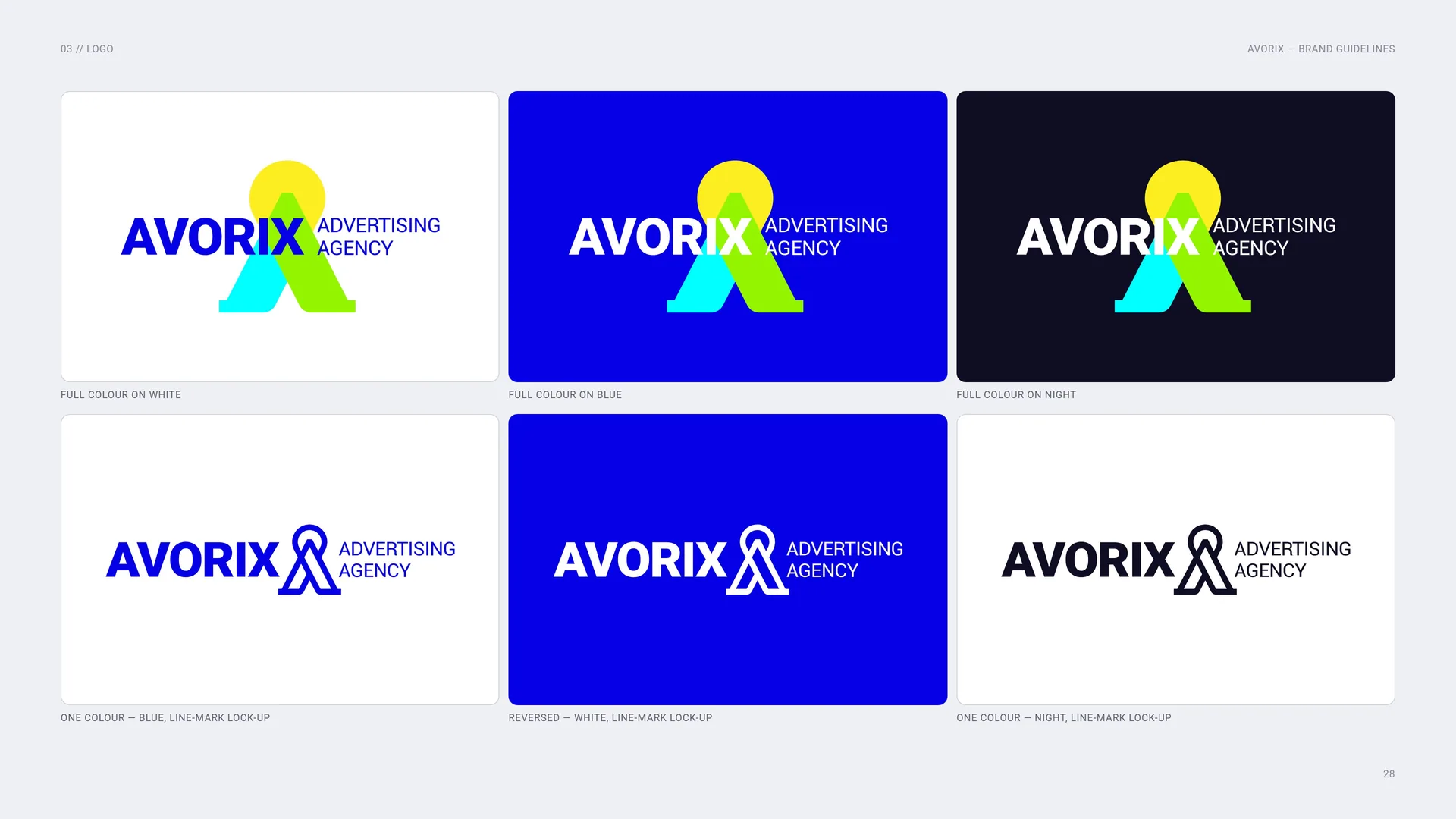
Full colour, one colour, reversed
Full colour on white.
Full colour on blue.
Full colour on night.
One colour — blue, line-mark lock-up.
Reversed — white, line-mark lock-up.
One colour — night, line-mark lock-up.
03.10
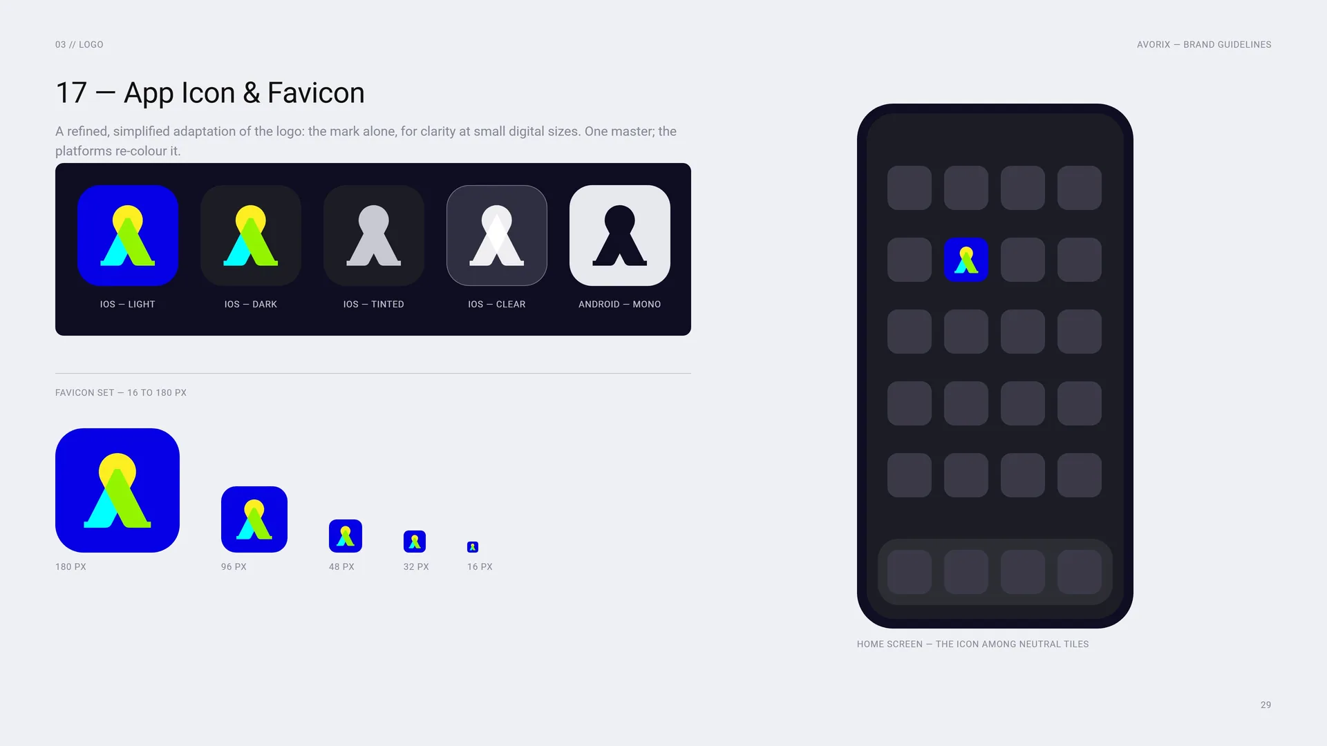
App Icon & Favicon
A refined, simplified adaptation of the logo: the mark alone, for clarity at small digital sizes. One master; the platforms re-colour it.
iOS — light · iOS — dark · iOS — tinted · iOS — clear · Android — mono.
Favicon set — 16 to 180 px: 180 px · 96 px · 48 px · 32 px · 16 px.
Home screen — the icon among neutral tiles.
03.11
Size
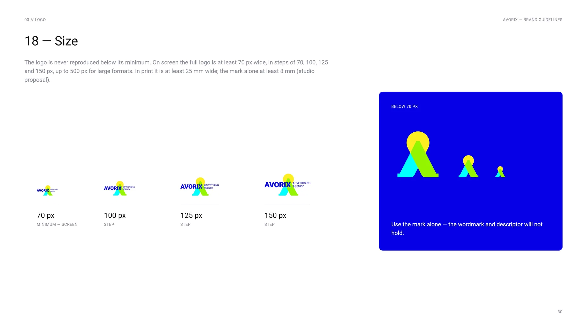
The logo is never reproduced below its minimum. On screen the full logo is at least 70 px wide, in steps of 70, 100, 125 and 150 px, up to 500 px for large formats. In print it is at least 25 mm wide; the mark alone at least 8 mm (studio proposal).
Below 70 px: Use the mark alone — the wordmark and descriptor will not hold.
70 px: Minimum — screen.
100 px: Step.
125 px: Step.
150 px: Step.
03.12
Placement
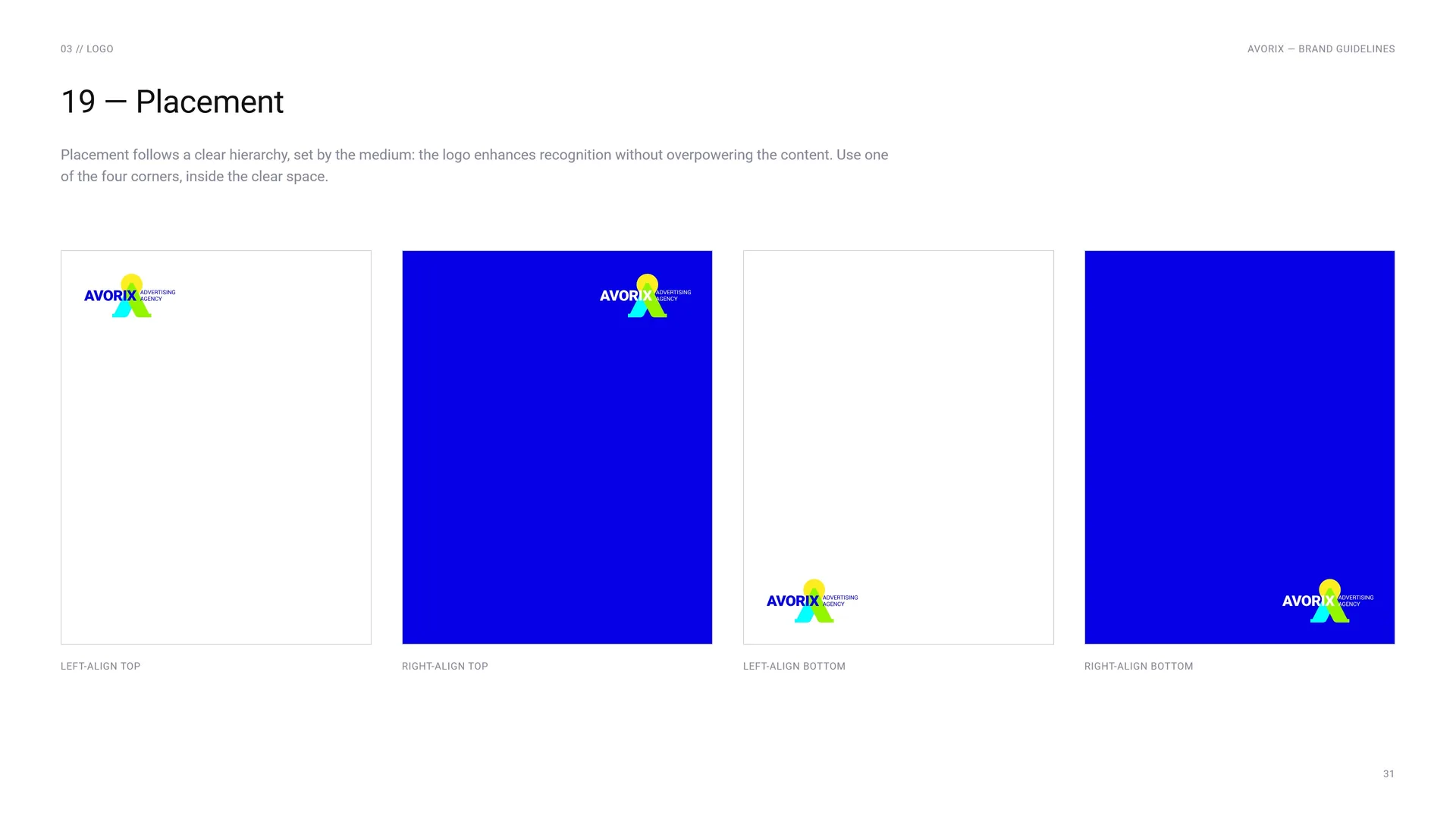
Placement follows a clear hierarchy, set by the medium: the logo enhances recognition without overpowering the content. Use one of the four corners, inside the clear space.
Left-align top · Right-align top · Left-align bottom · Right-align bottom.
03.13
Misuse
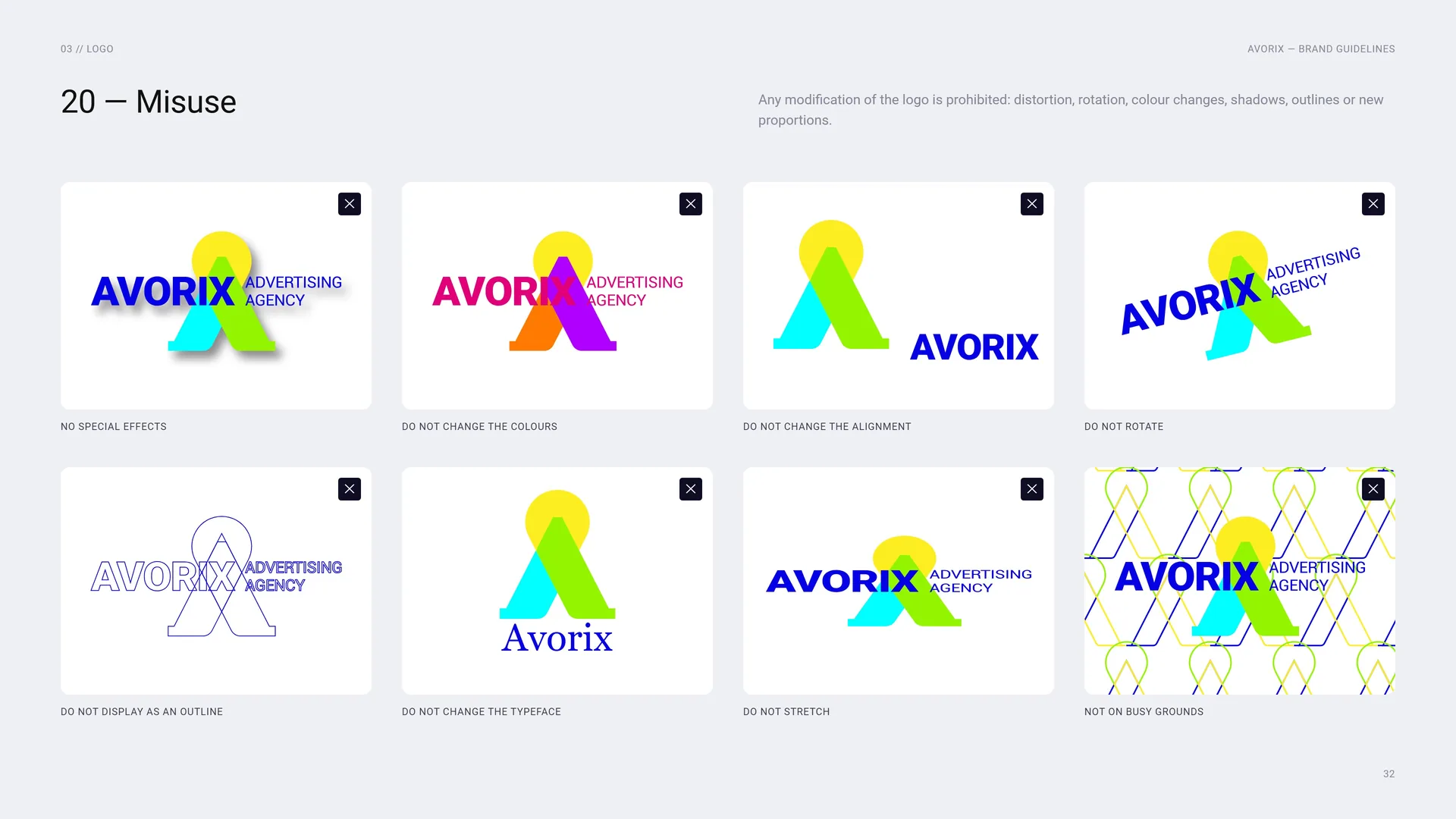
Any modification of the logo is prohibited: distortion, rotation, colour changes, shadows, outlines or new proportions.
No special effects · Do not change the colours · Do not change the alignment · Do not rotate · Do not display as an outline · Do not change the typeface · Do not stretch · Not on busy grounds.
03.14
On blue, white, the gradient and the pattern
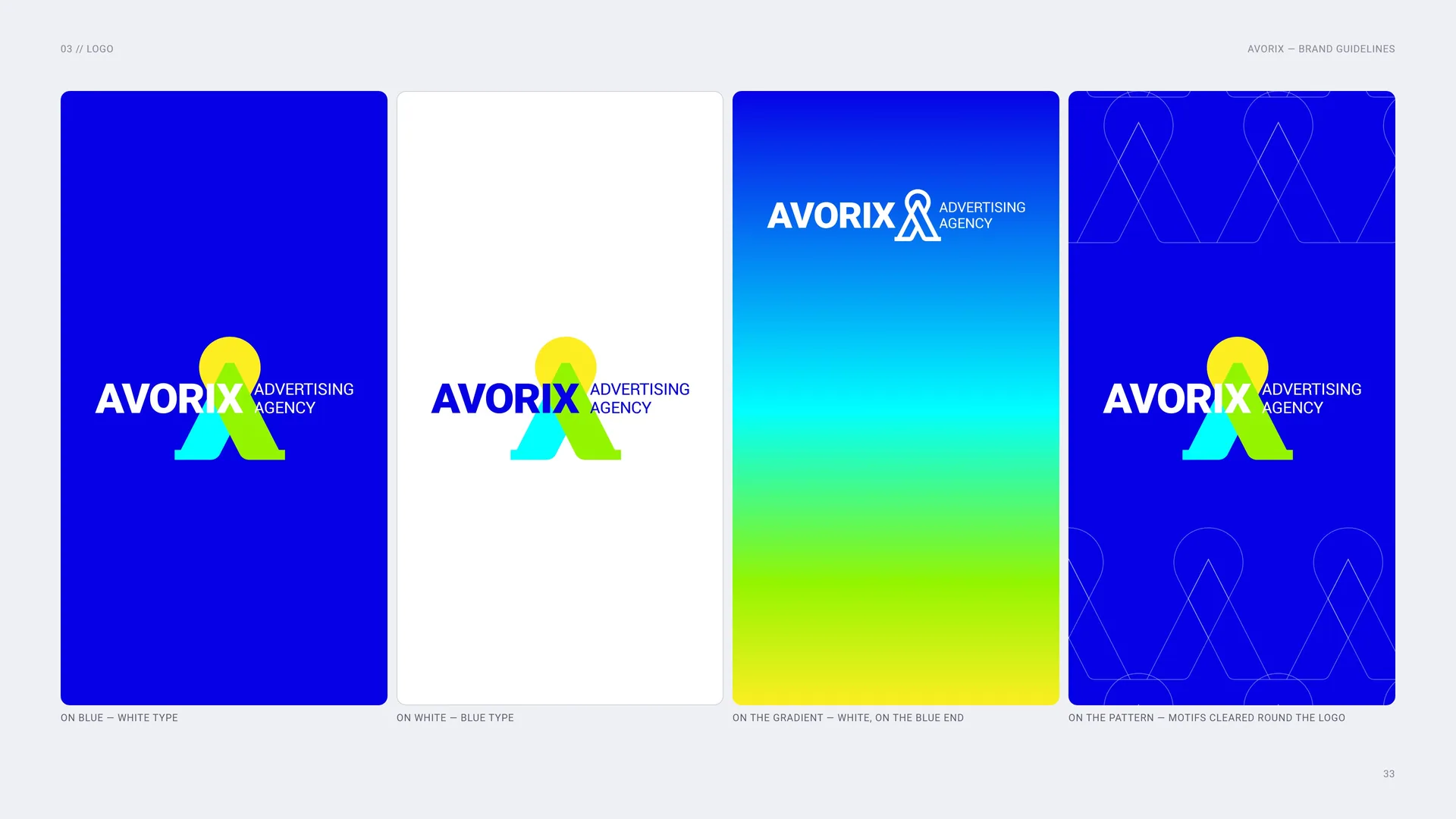
On blue — white type.
On white — blue type.
On the gradient — white, on the blue end.
On the pattern — motifs cleared round the logo.
03.15
Acrylic sign and keychain
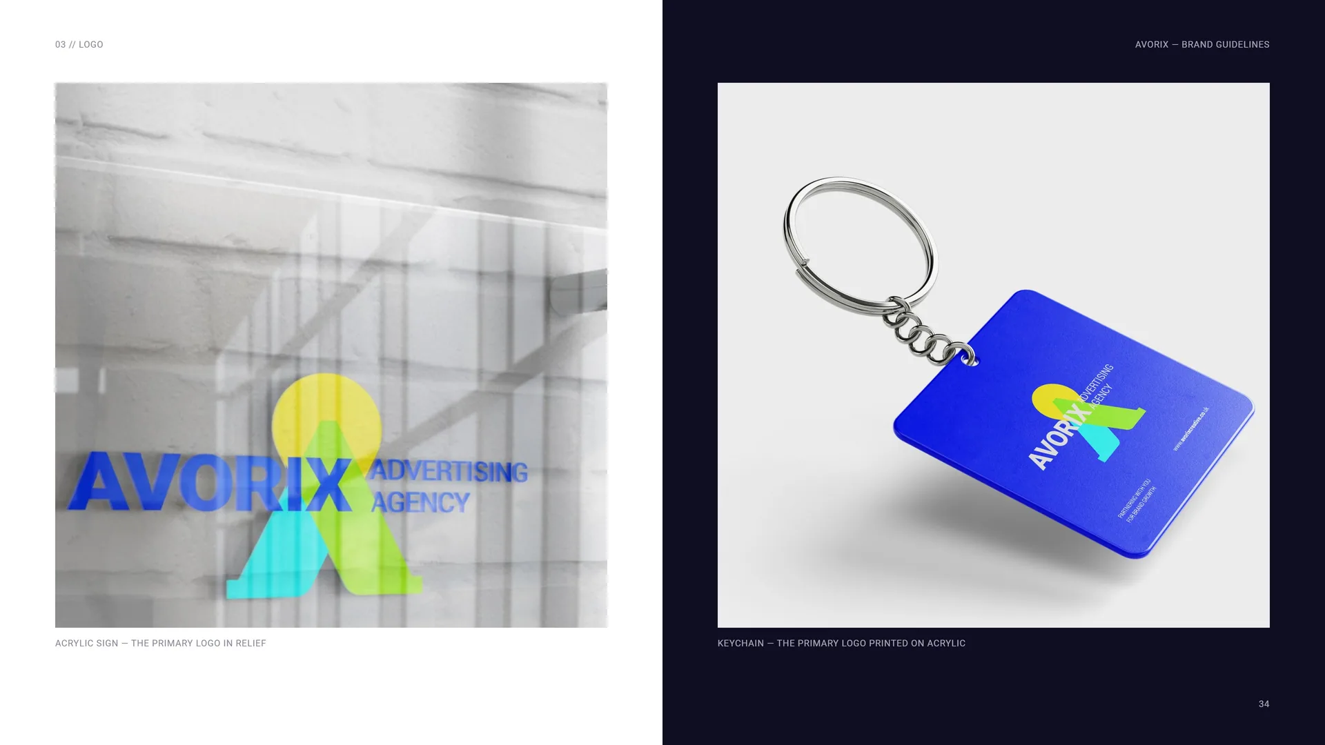
Acrylic sign — the primary logo in relief.
Keychain — the primary logo printed on acrylic.
04
Colour
04.1
Colour Values
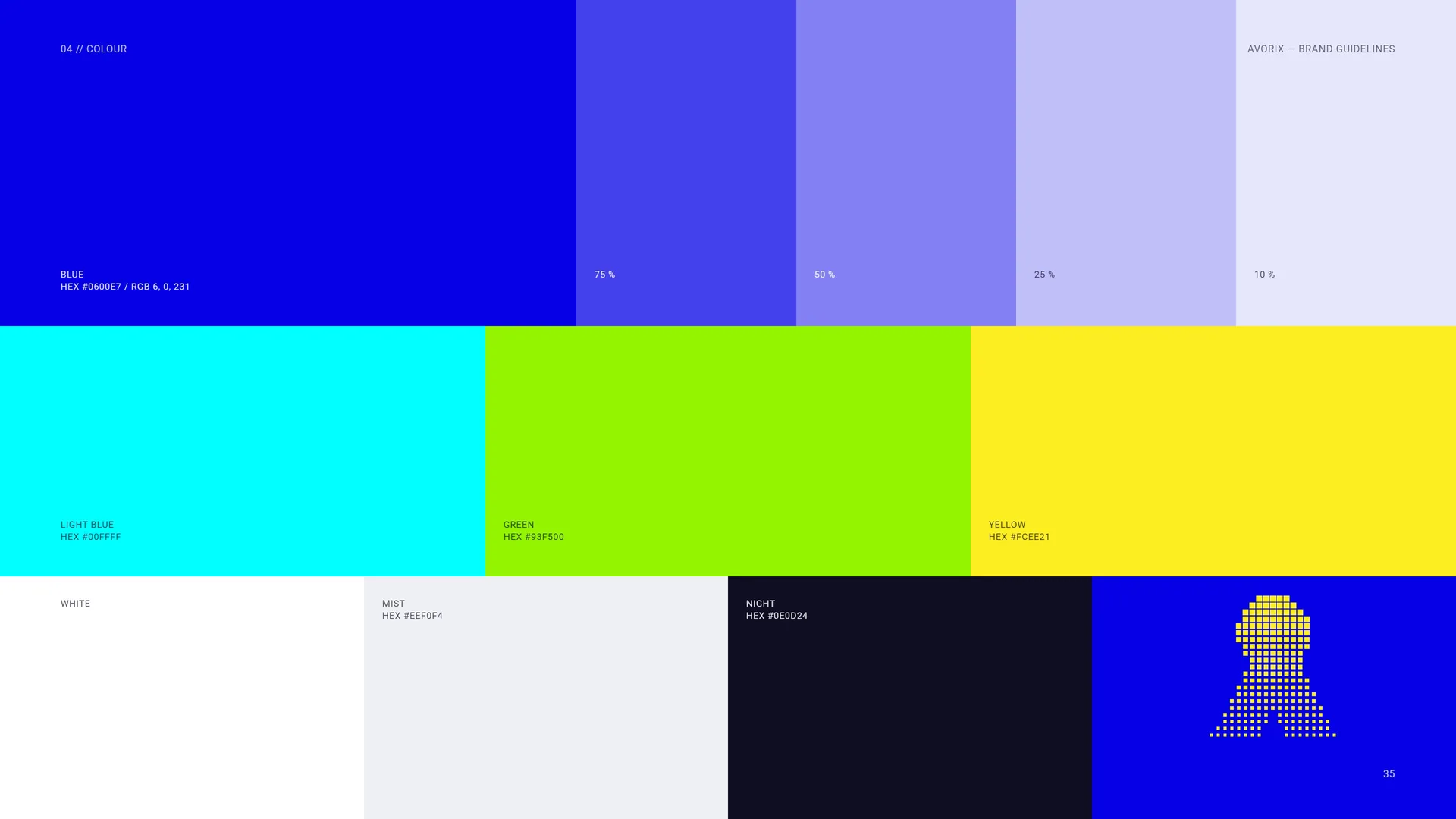
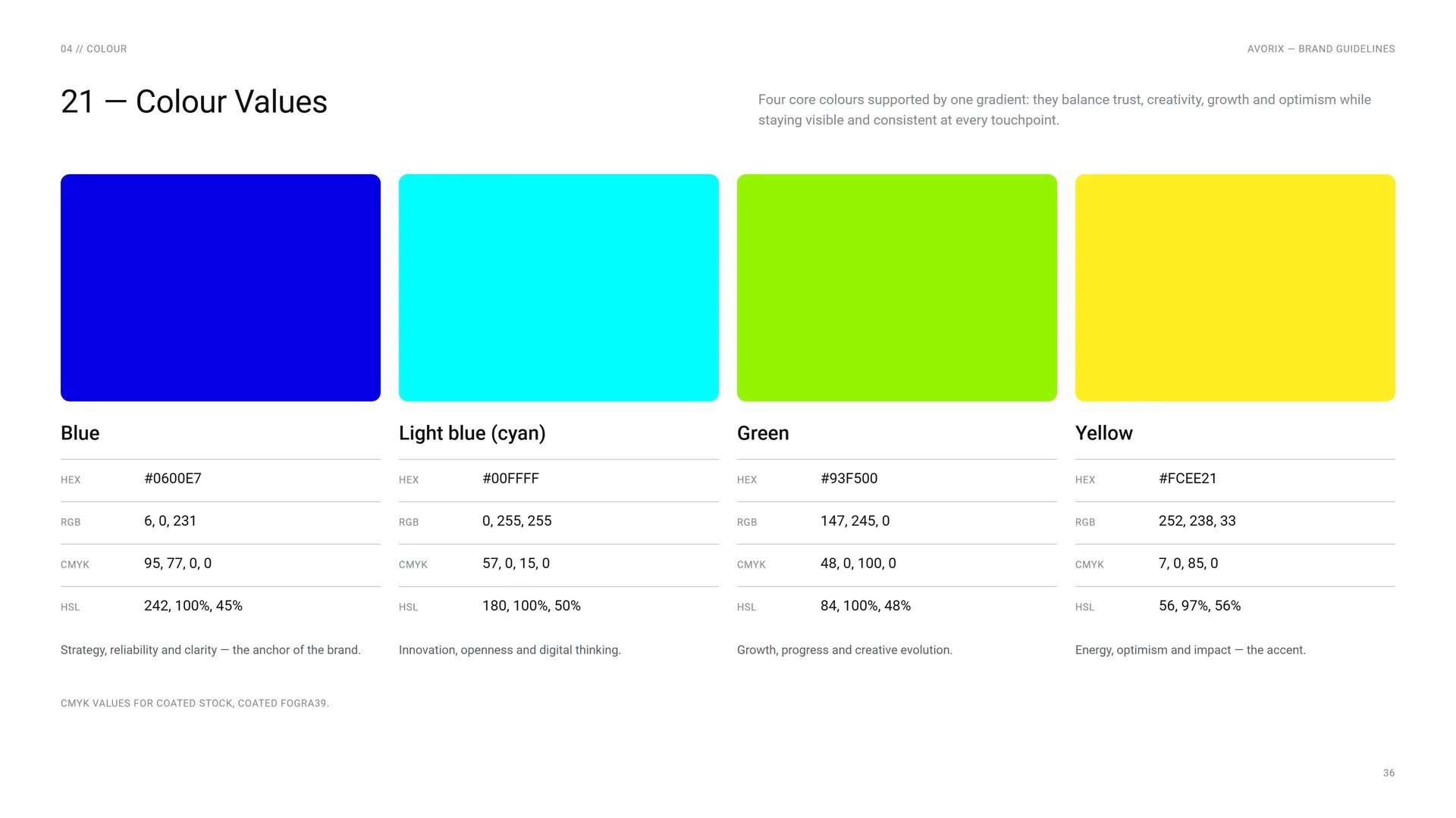
Blue: HEX #0600E7 · RGB 6, 0, 231. Tints 75 % · 50 % · 25 % · 10 %.
Light blue: HEX #00FFFF.
Green: HEX #93F500.
Yellow: HEX #FCEE21.
White.
Mist: HEX #EEF0F4.
Night: HEX #0E0D24.
Four core colours supported by one gradient: they balance trust, creativity, growth and optimism while staying visible and consistent at every touchpoint.
Blue: HEX #0600E7 · RGB 6, 0, 231 · CMYK 95, 77, 0, 0 · HSL 242, 100%, 45%. Strategy, reliability and clarity — the anchor of the brand.
Light blue (cyan): HEX #00FFFF · RGB 0, 255, 255 · CMYK 57, 0, 15, 0 · HSL 180, 100%, 50%. Innovation, openness and digital thinking.
Green: HEX #93F500 · RGB 147, 245, 0 · CMYK 48, 0, 100, 0 · HSL 84, 100%, 48%. Growth, progress and creative evolution.
Yellow: HEX #FCEE21 · RGB 252, 238, 33 · CMYK 7, 0, 85, 0 · HSL 56, 97%, 56%. Energy, optimism and impact — the accent.
CMYK values for coated stock, Coated FOGRA39.
04.2
The Gradient
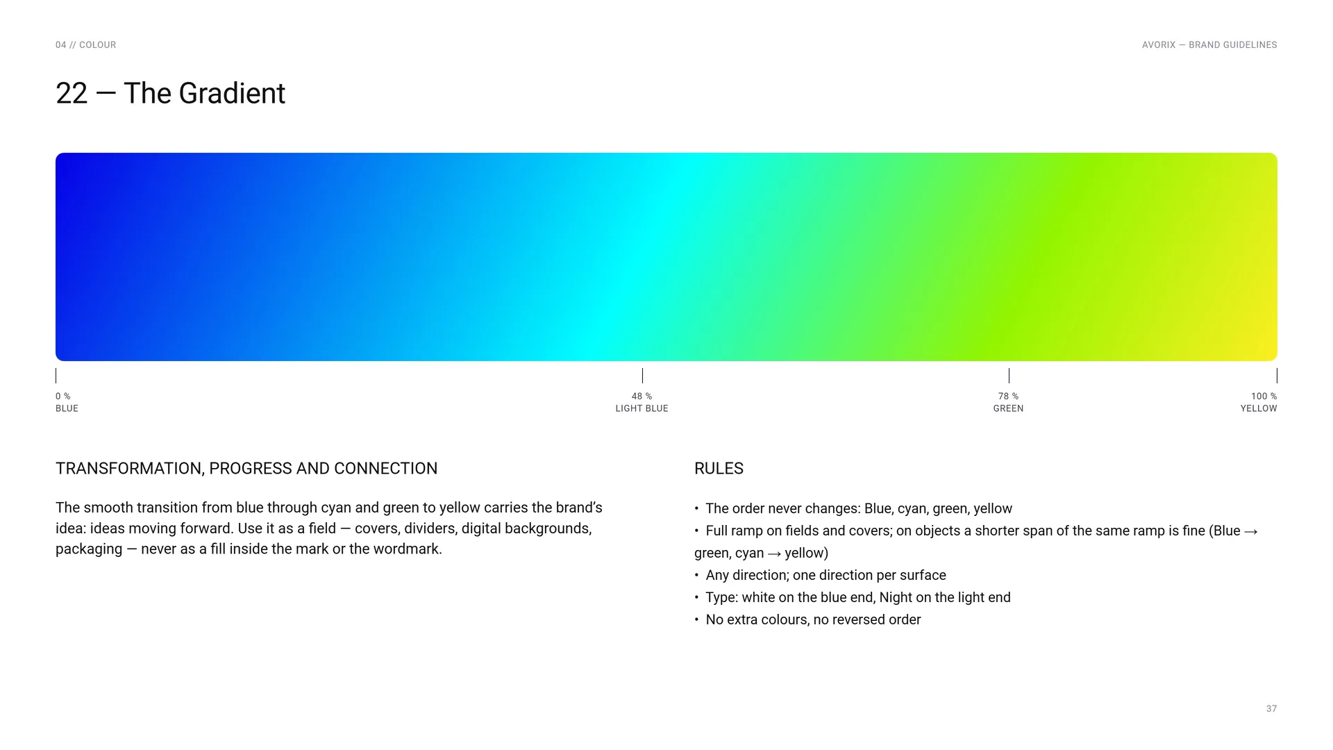
0 % Blue · 48 % Light blue · 78 % Green · 100 % Yellow.
Transformation, progress and connection: The smooth transition from blue through cyan and green to yellow carries the brand’s idea: ideas moving forward. Use it as a field — covers, dividers, digital backgrounds, packaging — never as a fill inside the mark or the wordmark.
Rules: The order never changes: Blue, cyan, green, yellow · Full ramp on fields and covers; on objects a shorter span of the same ramp is fine (Blue → green, cyan → yellow) · Any direction; one direction per surface · Type: white on the blue end, Night on the light end · No extra colours, no reversed order.
04.3
Contrast & Accessibility
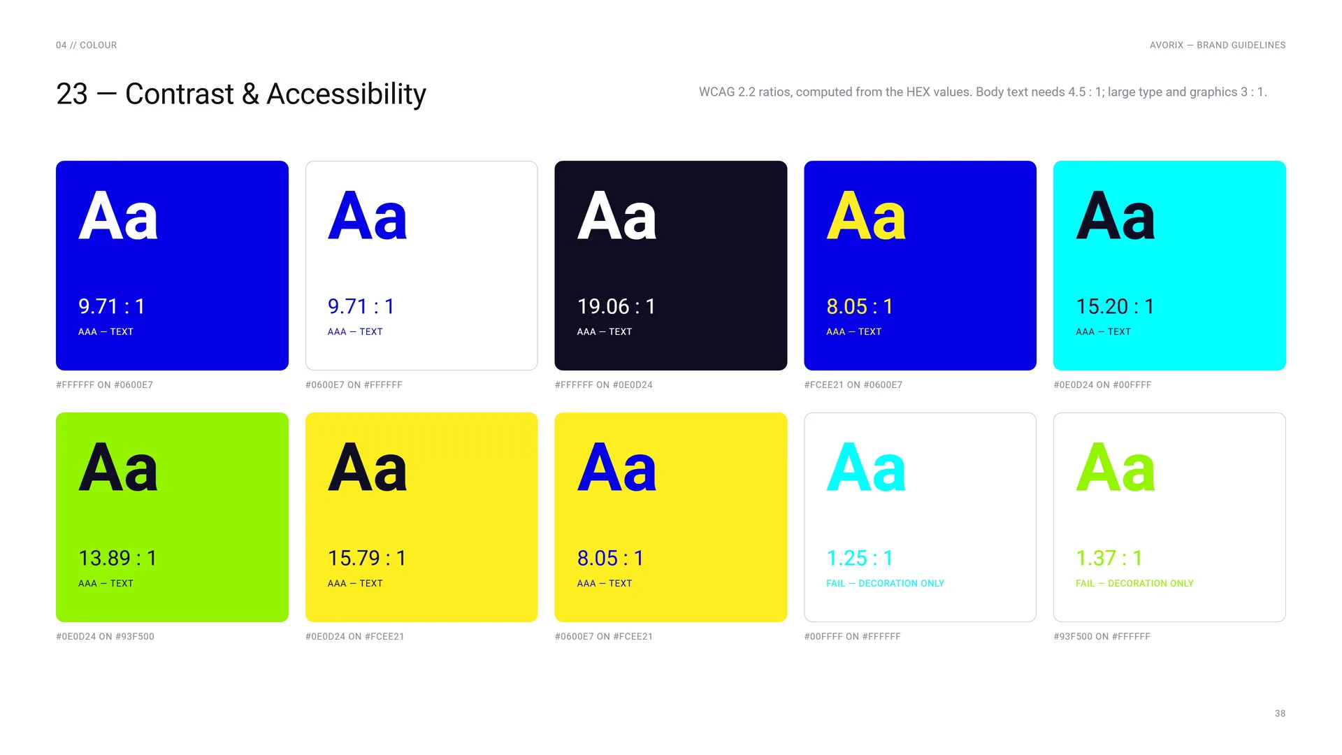
WCAG 2.2 ratios, computed from the HEX values. Body text needs 4.5 : 1; large type and graphics 3 : 1.
#FFFFFF on #0600E7: 9.71 : 1 — AAA, text.
#0600E7 on #FFFFFF: 9.71 : 1 — AAA, text.
#FFFFFF on #0E0D24: 19.06 : 1 — AAA, text.
#0E0D24 on #93F500: 13.89 : 1 — AAA, text.
#0E0D24 on #FCEE21: 15.79 : 1 — AAA, text.
#0600E7 on #FCEE21: 8.05 : 1 — AAA, text.
#FCEE21 on #0600E7: 8.05 : 1 — AAA, text.
#0E0D24 on #00FFFF: 15.20 : 1 — AAA, text.
#00FFFF on #FFFFFF: 1.25 : 1 — fail, decoration only.
#93F500 on #FFFFFF: 1.37 : 1 — fail, decoration only.
04.4
Colour Balance
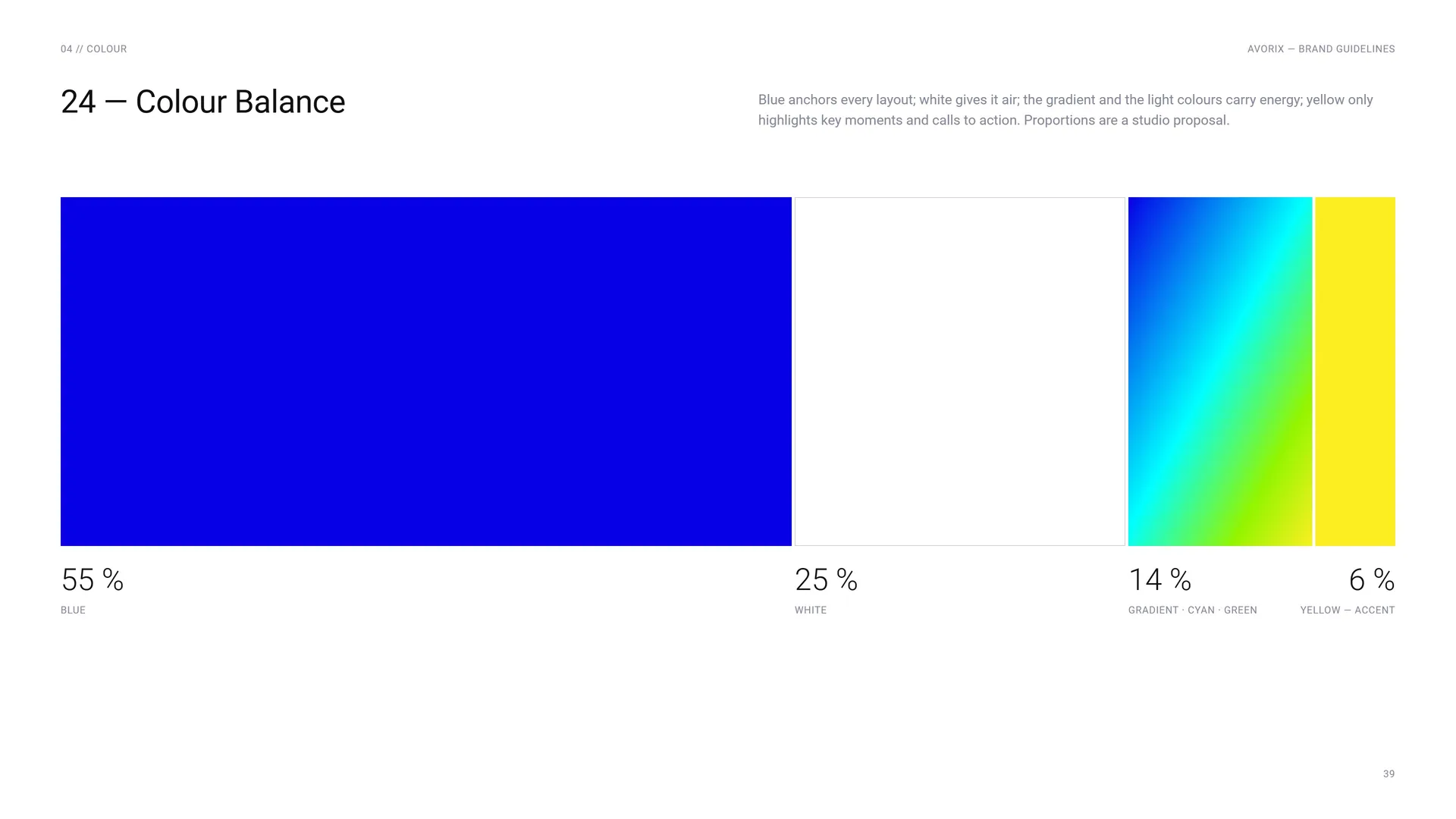
Blue anchors every layout; white gives it air; the gradient and the light colours carry energy; yellow only highlights key moments and calls to action. Proportions are a studio proposal.
55 % Blue · 25 % White · 14 % Gradient · cyan · green · 6 % Yellow — accent.
05
Typography
05.1
Primary Typeface
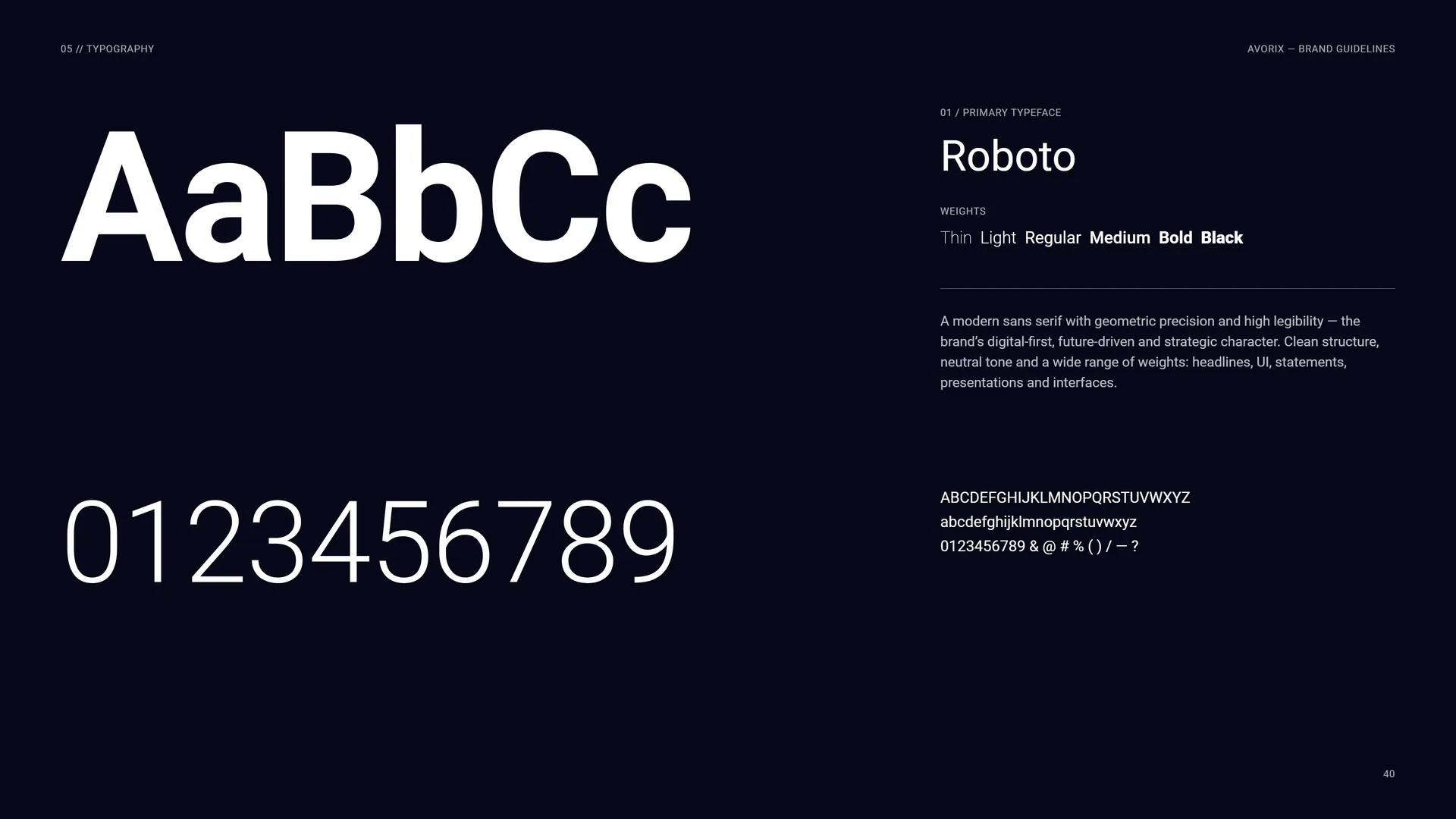
Roboto.
Weights: Thin · Light · Regular · Medium · Bold · Black.
A modern sans serif with geometric precision and high legibility — the brand’s digital-first, future-driven and strategic character. Clean structure, neutral tone and a wide range of weights: headlines, UI, statements, presentations and interfaces.
ABCDEFGHIJKLMNOPQRSTUVWXYZ abcdefghijklmnopqrstuvwxyz 0123456789 & @ # % ( ) / — ?
05.2
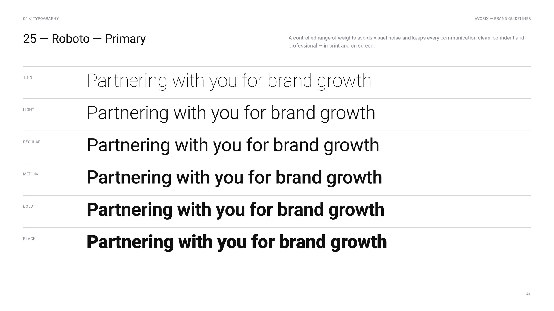
Roboto — Primary
A controlled range of weights avoids visual noise and keeps every communication clean, confident and professional — in print and on screen.
Thin: Partnering with you for brand growth.
Light: Partnering with you for brand growth.
Regular: Partnering with you for brand growth.
Medium: Partnering with you for brand growth.
Bold: Partnering with you for brand growth.
Black: Partnering with you for brand growth.
05.3
Secondary Typeface
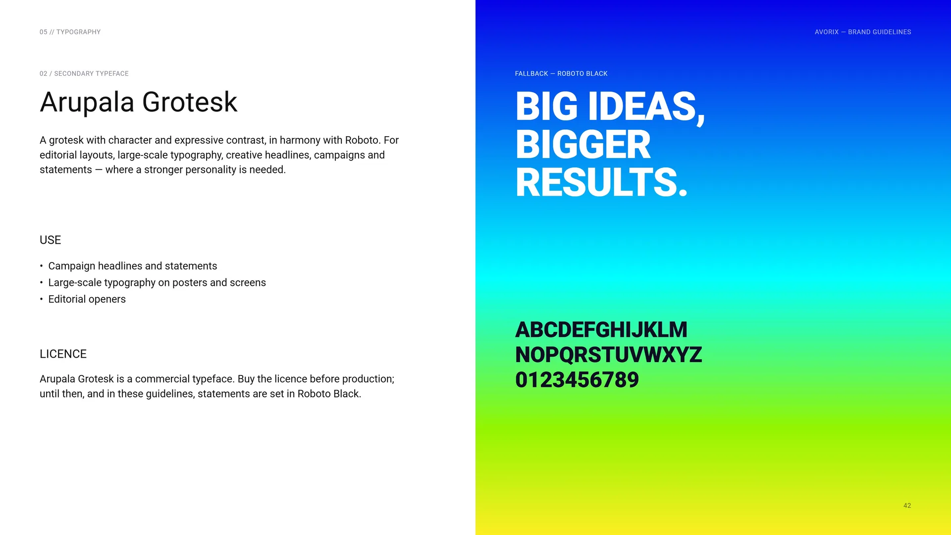
Arupala Grotesk.
A grotesk with character and expressive contrast, in harmony with Roboto. For editorial layouts, large-scale typography, creative headlines, campaigns and statements — where a stronger personality is needed.
Use: Campaign headlines and statements · Large-scale typography on posters and screens · Editorial openers.
Licence: Arupala Grotesk is a commercial typeface. Buy the licence before production; until then, and in these guidelines, statements are set in Roboto Black.
Fallback — Roboto Black: Big ideas, bigger results.
05.4
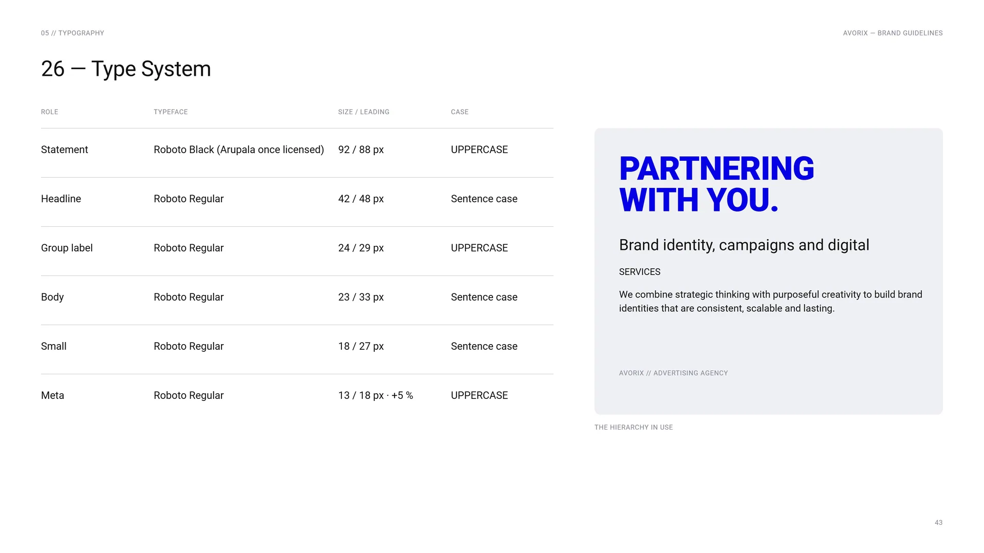
Type System
Statement: Roboto Black (Arupala once licensed) · 92 / 88 px · Uppercase.
Headline: Roboto Regular · 42 / 48 px · Sentence case.
Group label: Roboto Regular · 24 / 29 px · Uppercase.
Body: Roboto Regular · 23 / 33 px · Sentence case.
Small: Roboto Regular · 18 / 27 px · Sentence case.
Meta: Roboto Regular · 13 / 18 px · +5 % · Uppercase.
The hierarchy in use.
06
Pattern
- 06.1The Pattern
- 06.2How the Pattern Is Built
- 06.3Field and giant
- 06.4Dot texture
- 06.5Pattern Rules
- 06.6Laptop sleeve, letterhead cover, office envelope
06.1
The Pattern
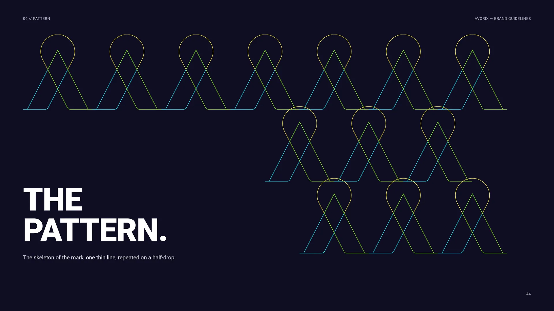
The skeleton of the mark, one thin line, repeated on a half-drop.
06.2
How the Pattern Is Built
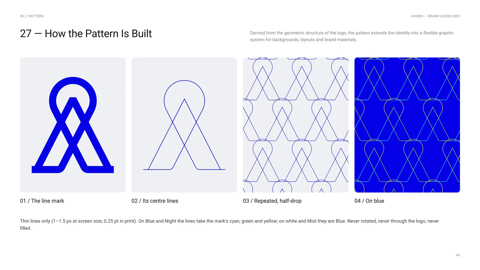
Derived from the geometric structure of the logo, the pattern extends the identity into a flexible graphic system for backgrounds, layouts and brand materials.
The line mark.
Its centre lines.
Repeated, half-drop.
On blue.
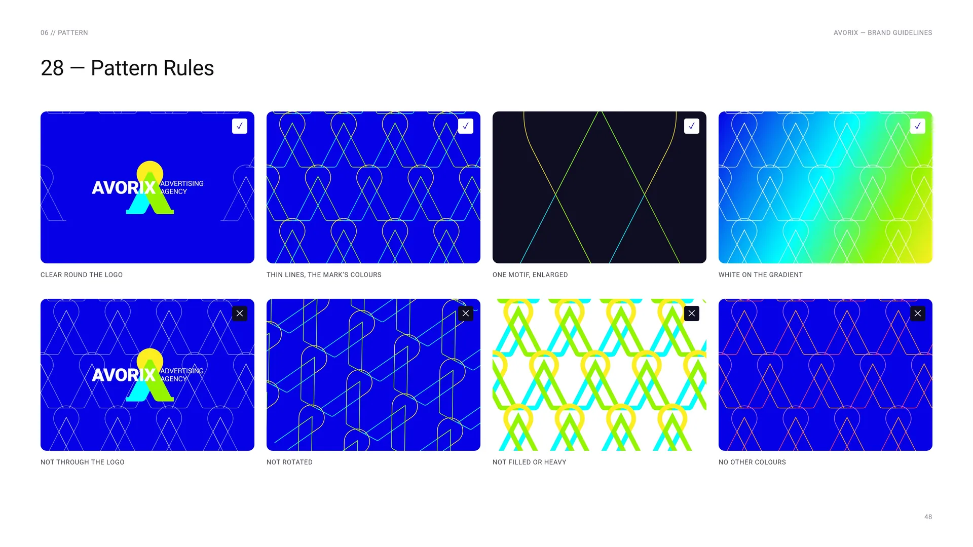
Thin lines only (1–1.5 px at screen size, 0.25 pt in print). On Blue and Night the lines take the mark’s cyan, green and yellow; on white and Mist they are Blue. Never rotated, never through the logo, never filled.
06.3
Field and giant
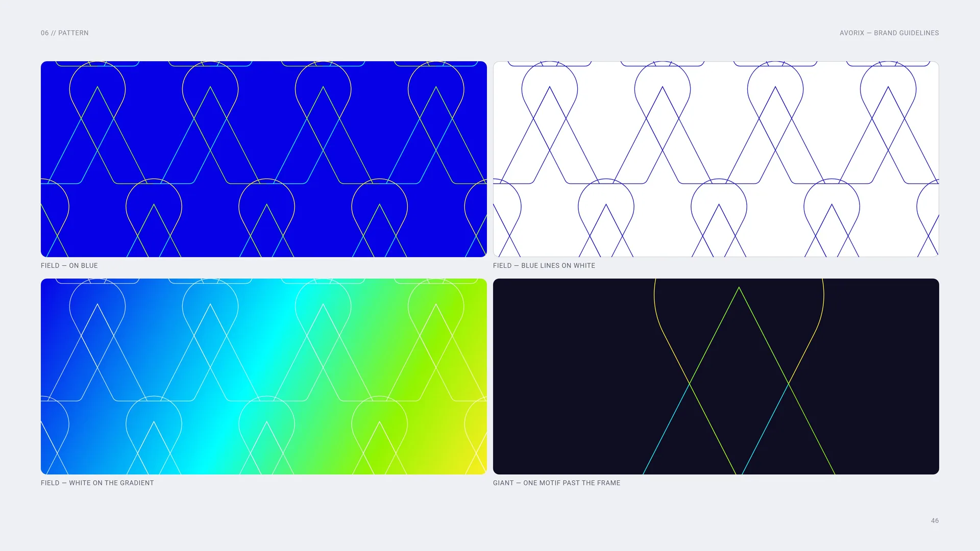
Field — on blue.
Field — blue lines on white.
Field — white on the gradient.
Giant — one motif past the frame.
06.4
Dot texture
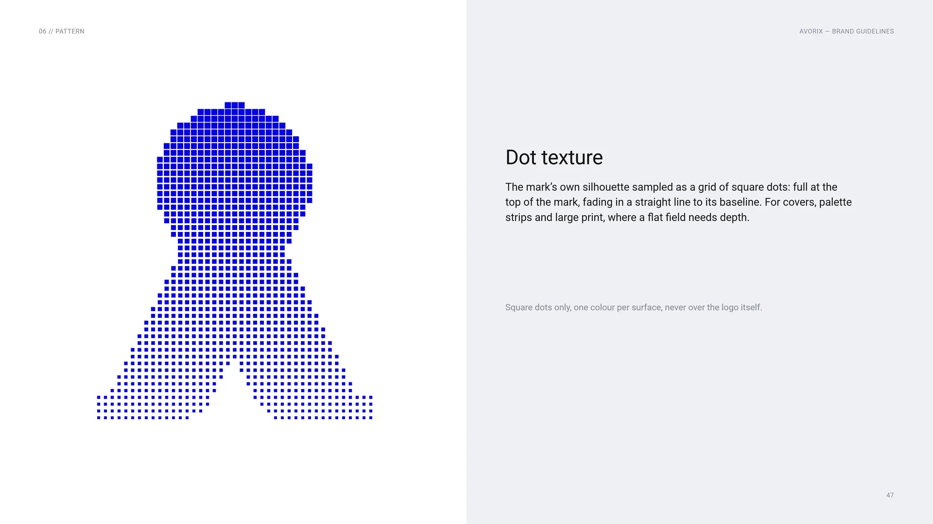
The mark’s own silhouette sampled as a grid of square dots: full at the top of the mark, fading in a straight line to its baseline. For covers, palette strips and large print, where a flat field needs depth.
Square dots only, one colour per surface, never over the logo itself.
06.5
Pattern Rules
Do: Clear round the logo · Thin lines, the mark’s colours · One motif, enlarged · White on the gradient.
Don’t: Not through the logo · Not rotated · Not filled or heavy · No other colours.
06.6
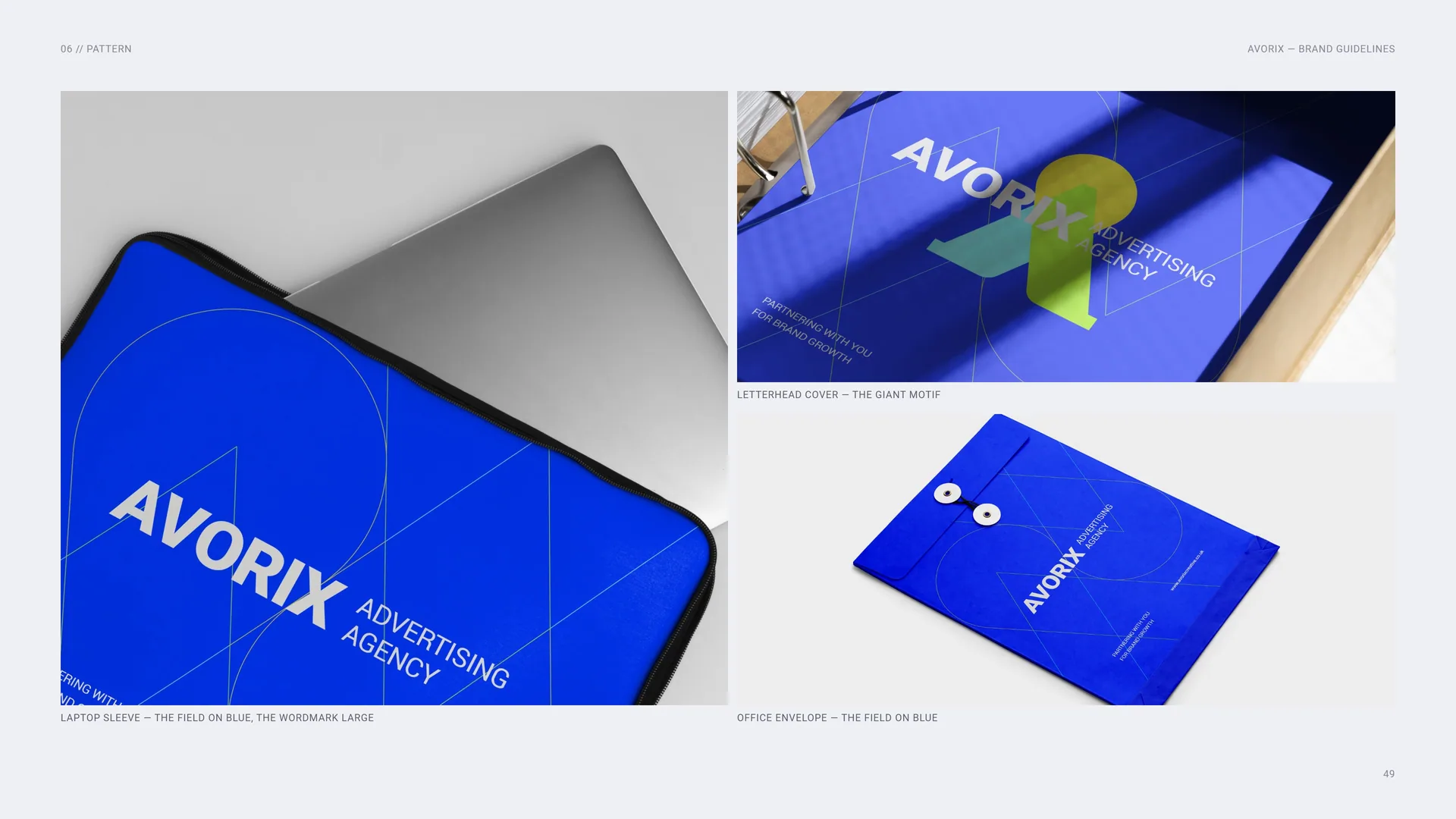
Laptop sleeve, letterhead cover, office envelope
Laptop sleeve — the field on blue, the wordmark large.
Letterhead cover — the giant motif.
Office envelope — the field on blue.
07
Imagery
07.1
Imagery
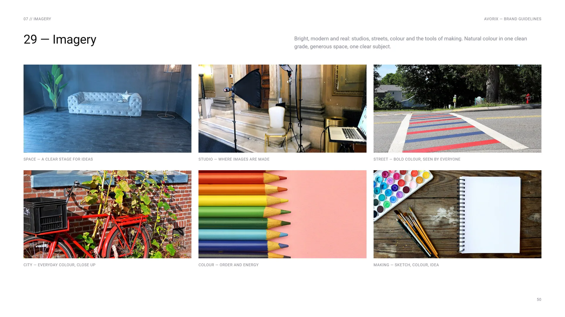
Bright, modern and real: studios, streets, colour and the tools of making. Natural colour in one clean grade, generous space, one clear subject.
Space — a clear stage for ideas.
Studio — where images are made.
Street — bold colour, seen by everyone.
City — everyday colour, close up.
Colour — order and energy.
Making — sketch, colour, idea.
08
Stationery
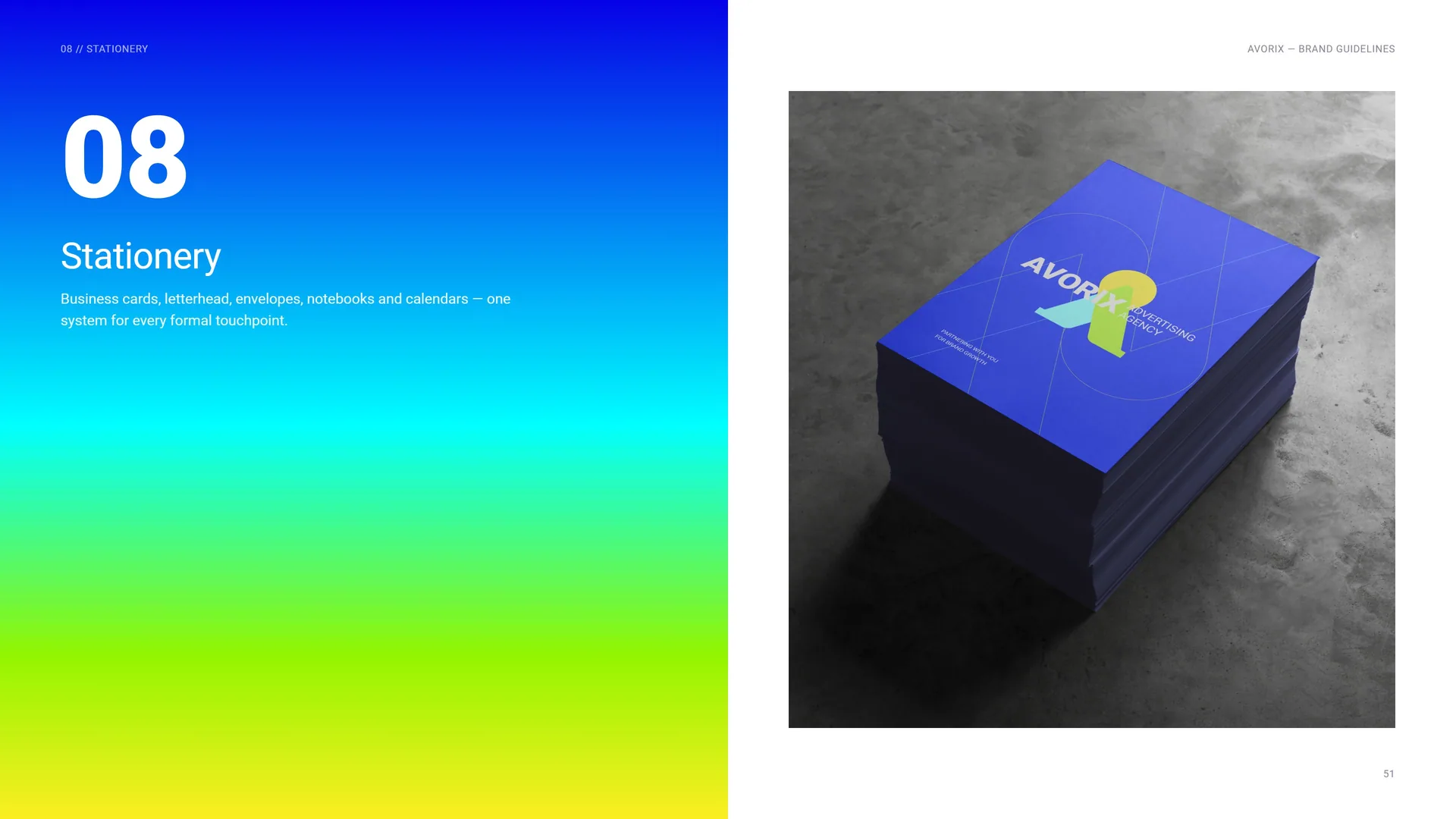
Business cards, letterhead, envelopes, notebooks and calendars — one system for every formal touchpoint.
08.1
Business Cards
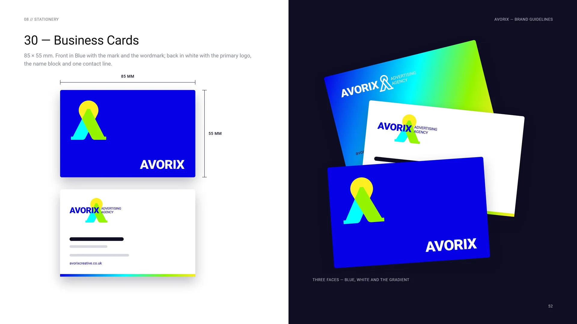
85 × 55 mm. Front in Blue with the mark and the wordmark; back in white with the primary logo, the name block and one contact line.
Three faces — blue, white and the gradient.
08.2
Letterhead & Envelope
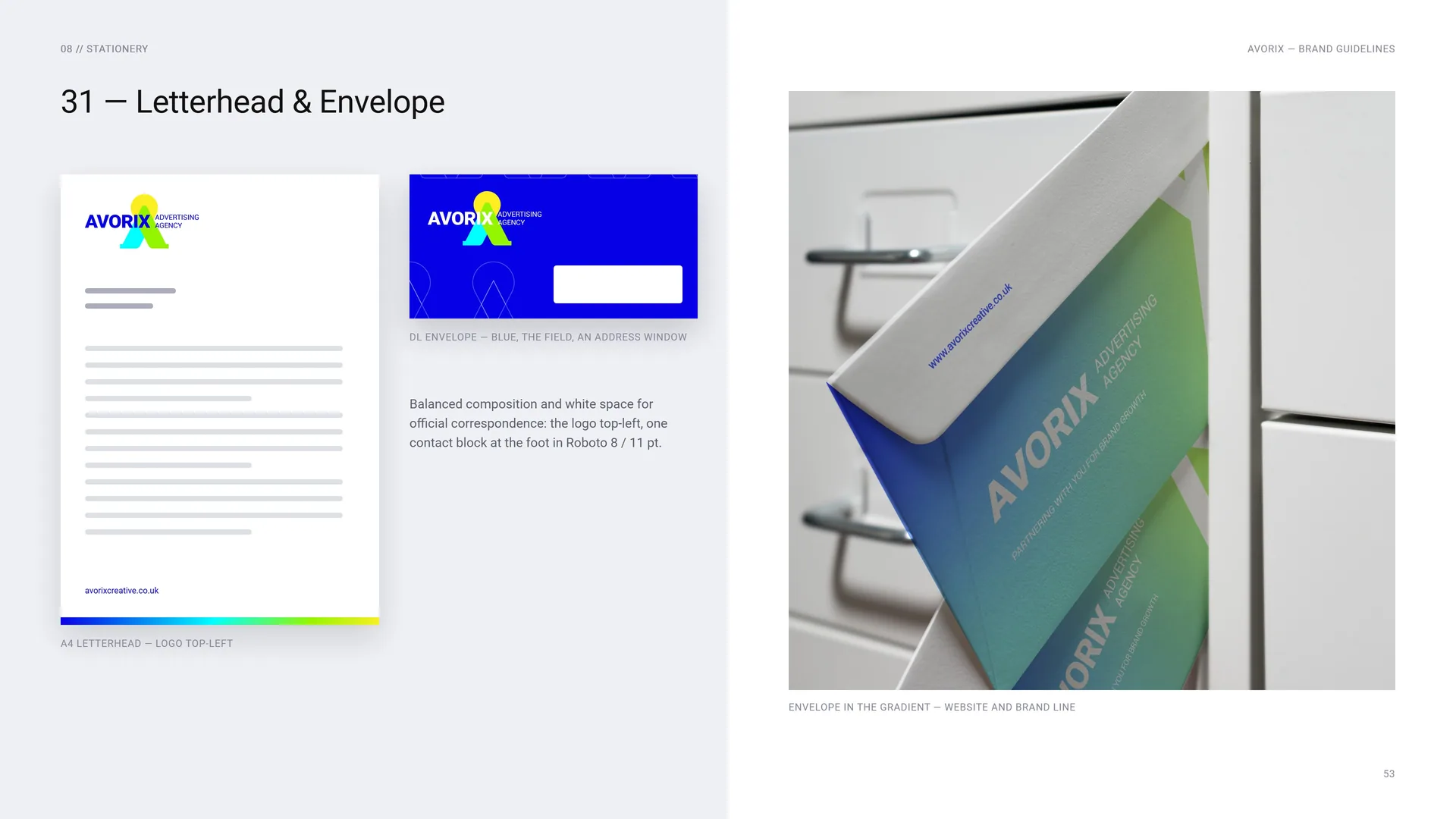
A4 letterhead — logo top-left.
DL envelope — blue, the field, an address window.
Balanced composition and white space for official correspondence: the logo top-left, one contact block at the foot in Roboto 8 / 11 pt.
Envelope in the gradient — website and brand line.
08.3
Notebooks and calendar
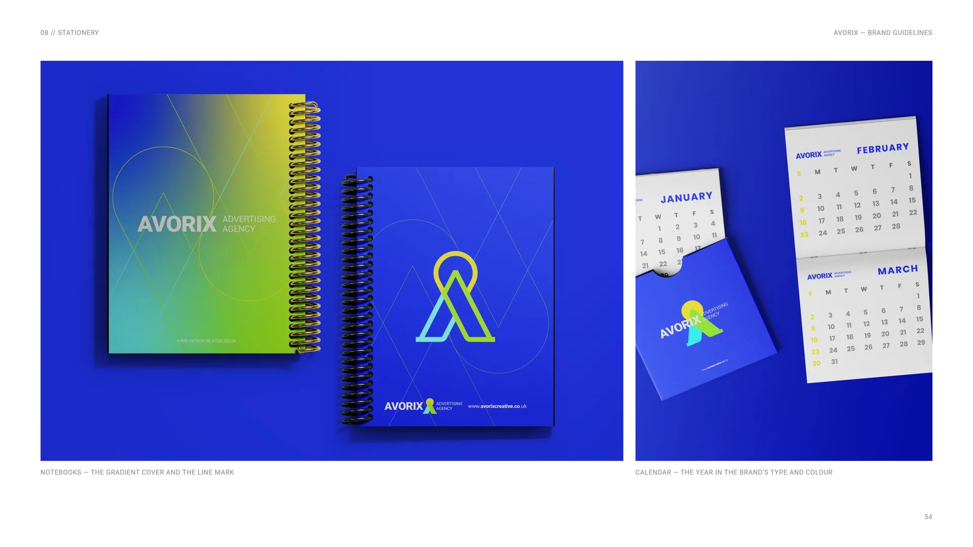
Notebooks — the gradient cover and the line mark.
Calendar — the year in the brand’s type and colour.
09
Digital media
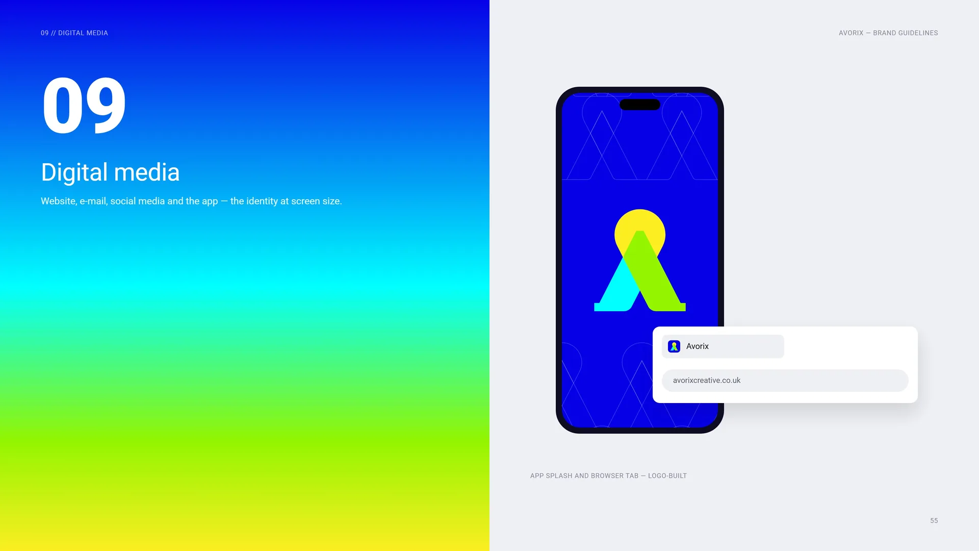
Website, e-mail, social media and the app — the identity at screen size.
App splash and browser tab — logo-built.
09.1
Website
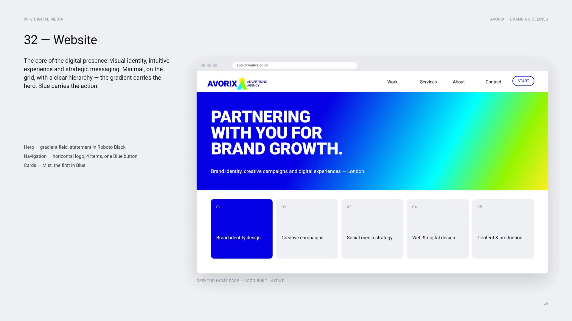
The core of the digital presence: visual identity, intuitive experience and strategic messaging. Minimal, on the grid, with a clear hierarchy — the gradient carries the hero, Blue carries the action.
Hero — gradient field, statement in Roboto Black · Navigation — horizontal logo, 4 items, one Blue button · Cards — Mist, the first in Blue.
Desktop home page — logo-built layout.
09.2
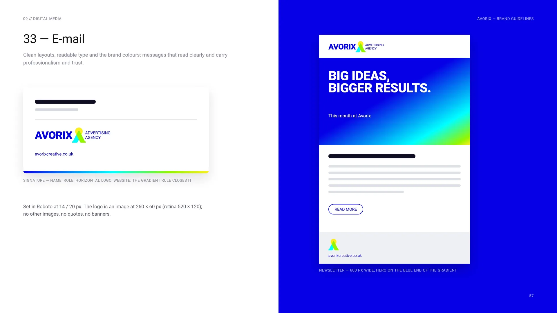
Clean layouts, readable type and the brand colours: messages that read clearly and carry professionalism and trust.
Signature — name, role, horizontal logo, website; the gradient rule closes it.
Set in Roboto at 14 / 20 px. The logo is an image at 260 × 60 px (retina 520 × 120); no other images, no quotes, no banners.
Newsletter — 600 px width, hero on the blue end of the gradient.
09.3
Social Media
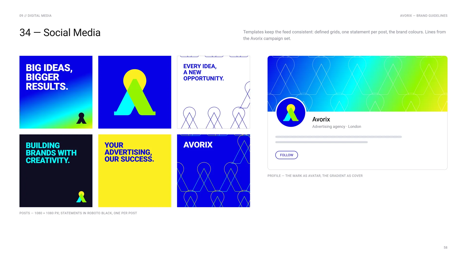
Templates keep the feed consistent: defined grids, one statement per post, the brand colours. Lines from the Avorix campaign set.
Profile — the mark as avatar, the gradient as cover.
Posts — 1080 × 1080 px; statements in Roboto Black, one per post.
10
Merchandise
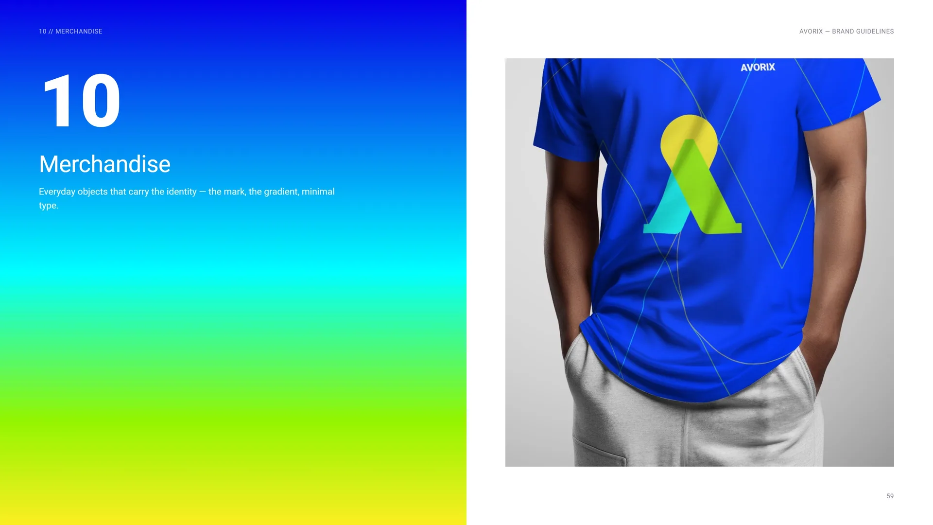
Everyday objects that carry the identity — the mark, the gradient, minimal type.
- 10.1Hoodie and cap
- 10.2Paper bag, lanyard, drinkware and pen
- 10.3Phone case and USB drives
- 10.4Packaging
10.1
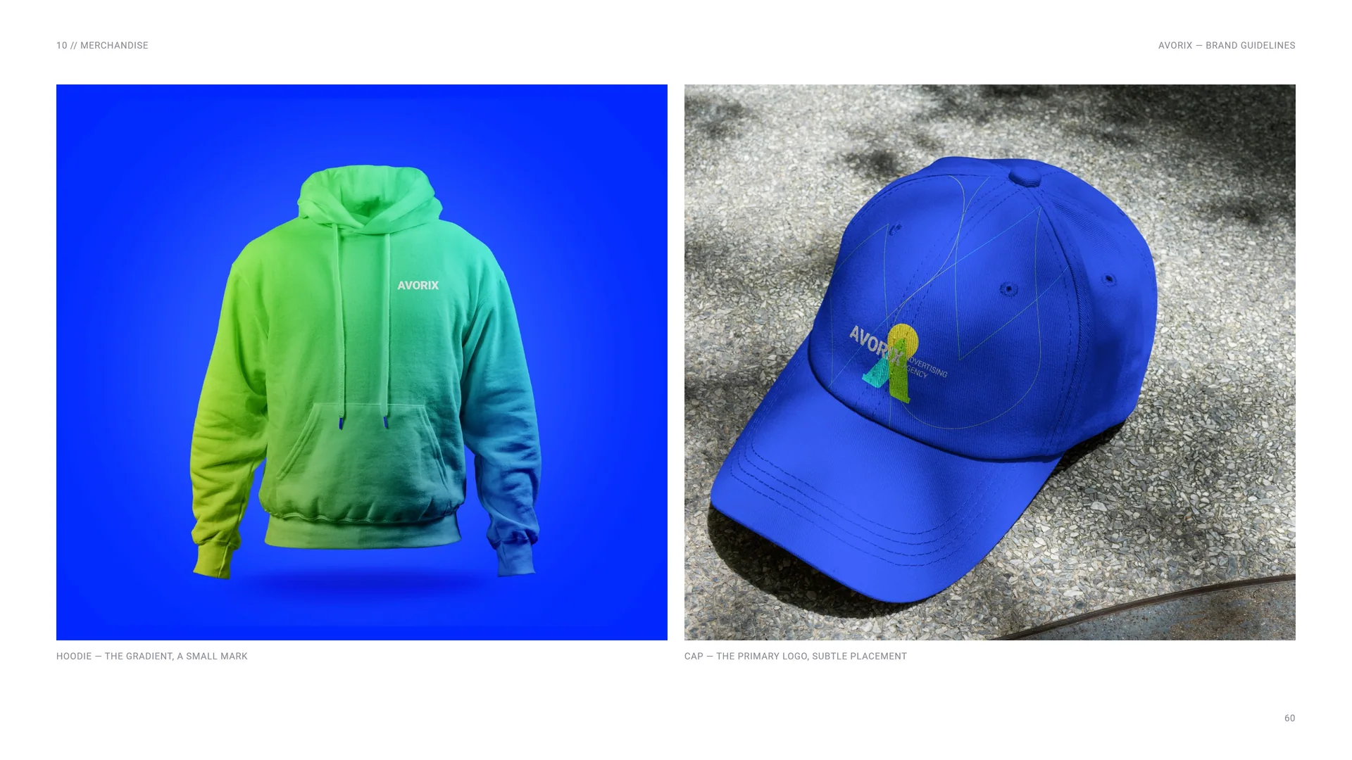
Hoodie and cap
Hoodie — the gradient, a small mark.
Cap — the primary logo, subtle placement.
10.2
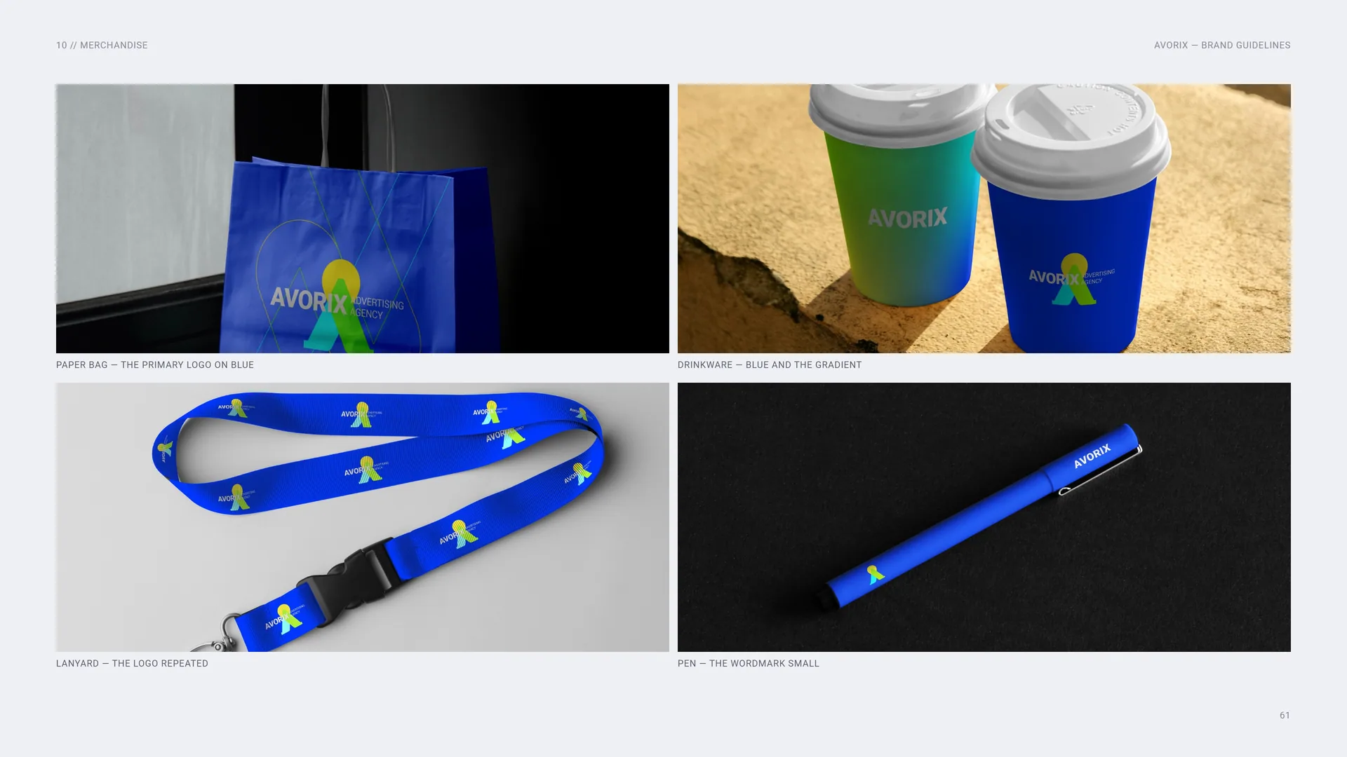
Paper bag, lanyard, drinkware and pen
Paper bag — the primary logo on blue.
Drinkware — blue and the gradient.
Lanyard — the logo repeated.
Pen — the wordmark small.
10.3
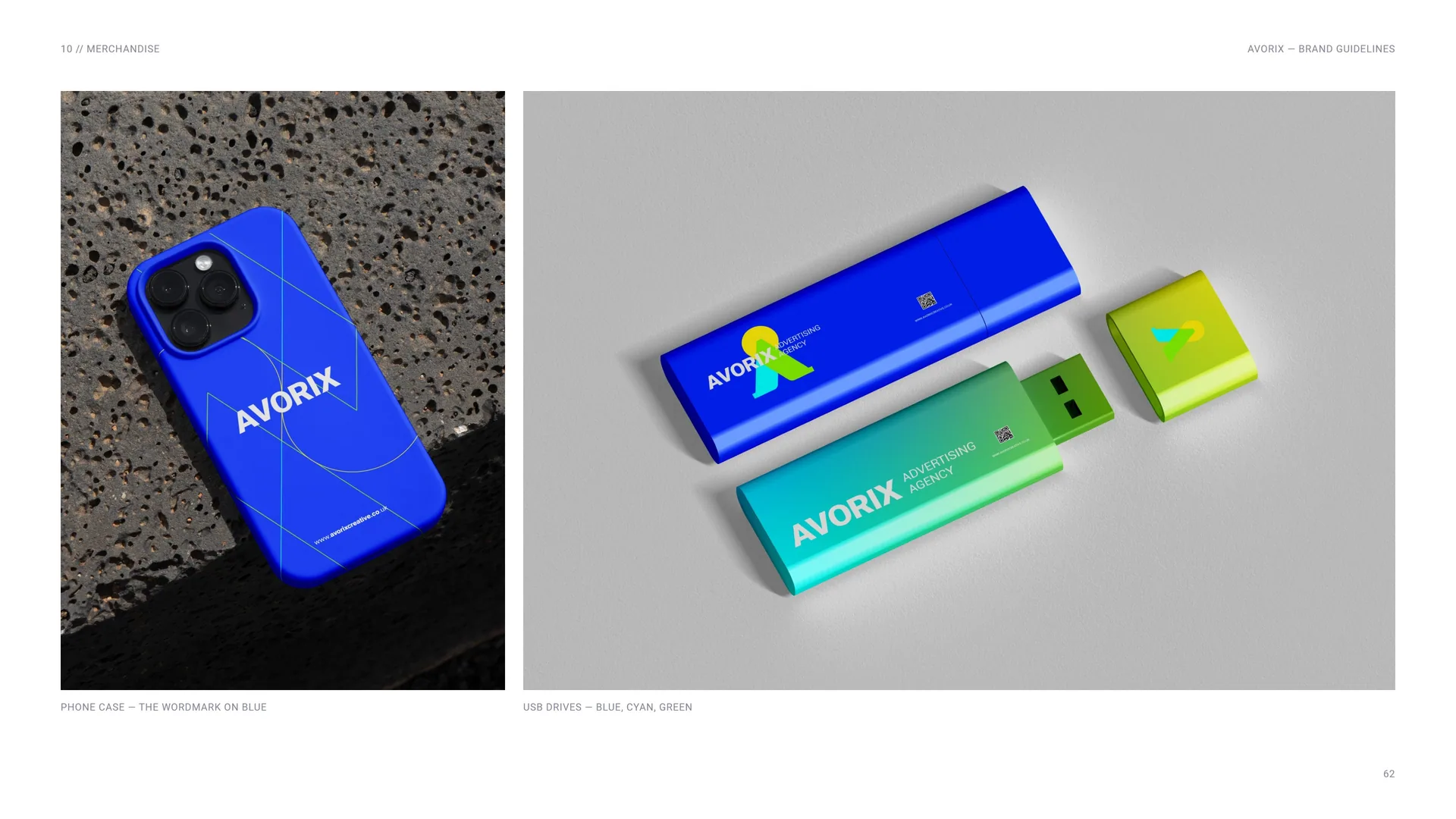
Phone case and USB drives
Phone case — the wordmark on blue.
USB drives — blue, cyan, green.
10.4
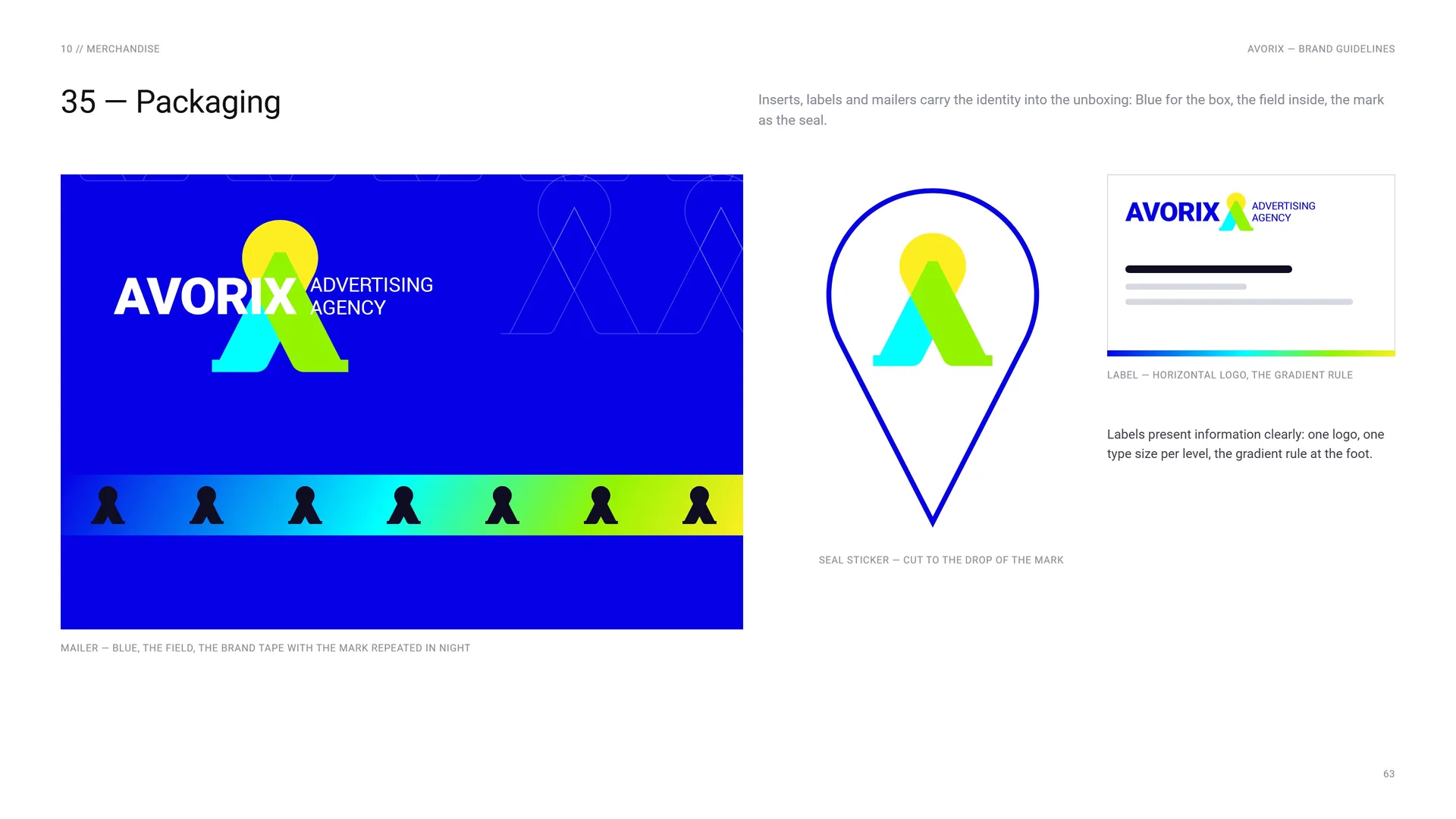
Packaging
Mailer — blue, the field, the brand tape with the mark repeated in Night.
Inserts, labels and mailers carry the identity into the unboxing: Blue for the box, the field inside, the mark as the seal.
Label — horizontal logo, the gradient rule.
Labels present information clearly: one logo, one type size per level, the gradient rule at the foot.
Seal sticker — cut to the drop of the mark.
11
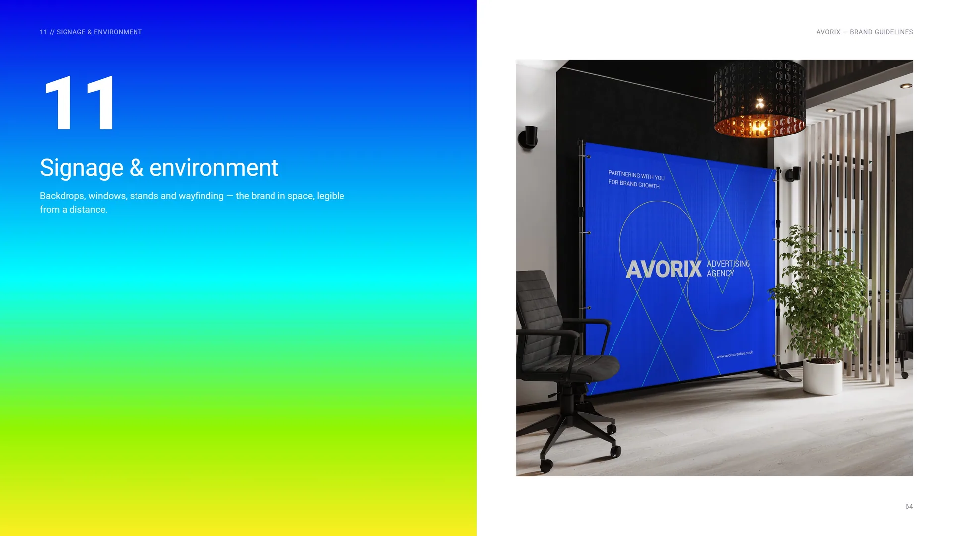
Signage & environment
Backdrops, windows, stands and wayfinding — the brand in space, legible from a distance.
11.1
Signage System
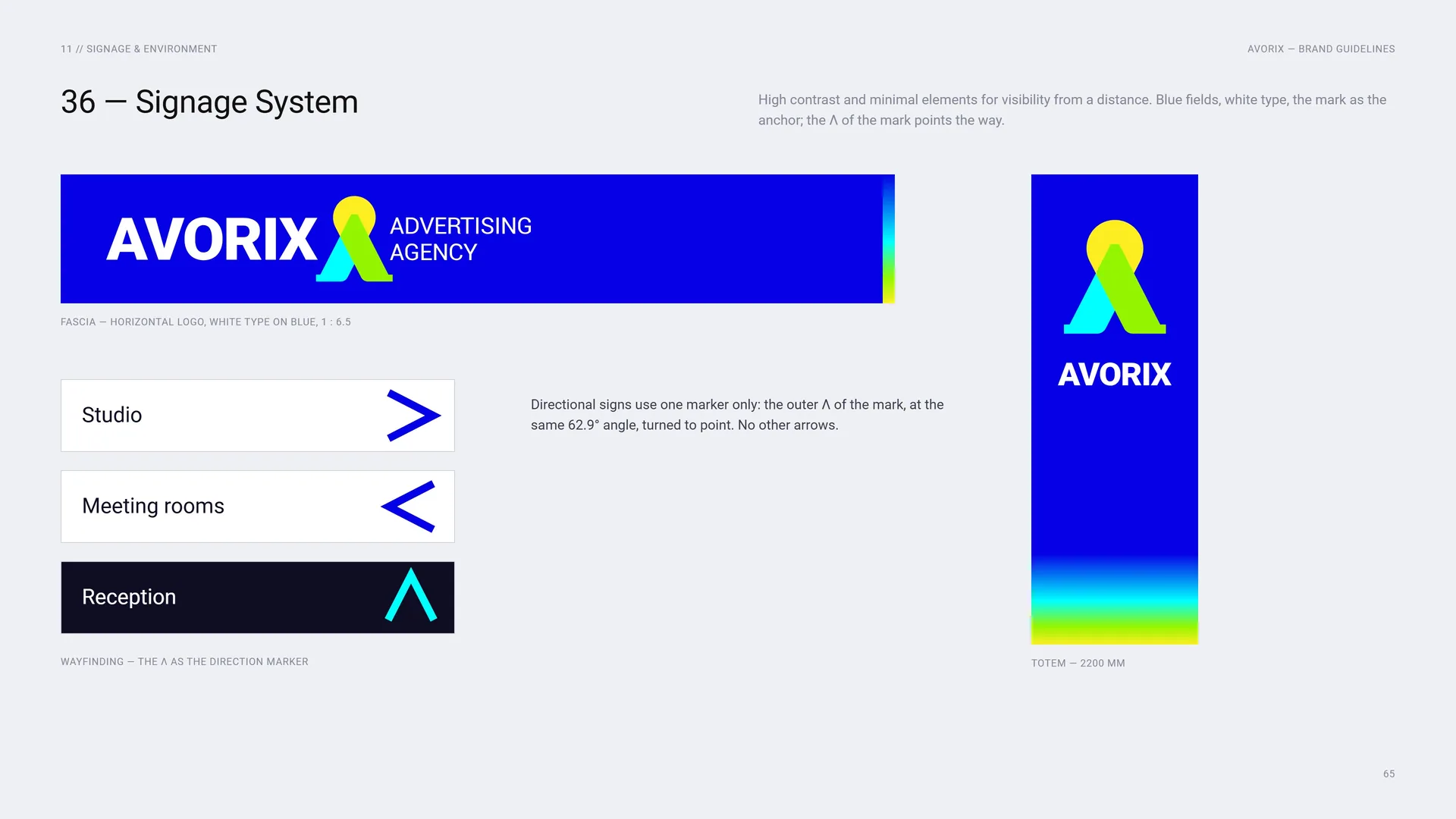
High contrast and minimal elements for visibility from a distance. Blue fields, white type, the mark as the anchor; the Λ of the mark points the way.
Fascia — horizontal logo, white type on blue, 1 : 6.5.
Wayfinding — the Λ as the direction marker.
Directional signs use one marker only: the outer Λ of the mark, at the same 62.9° angle, turned to point. No other arrows.
Totem — 2200 mm.
11.2
Window Graphics
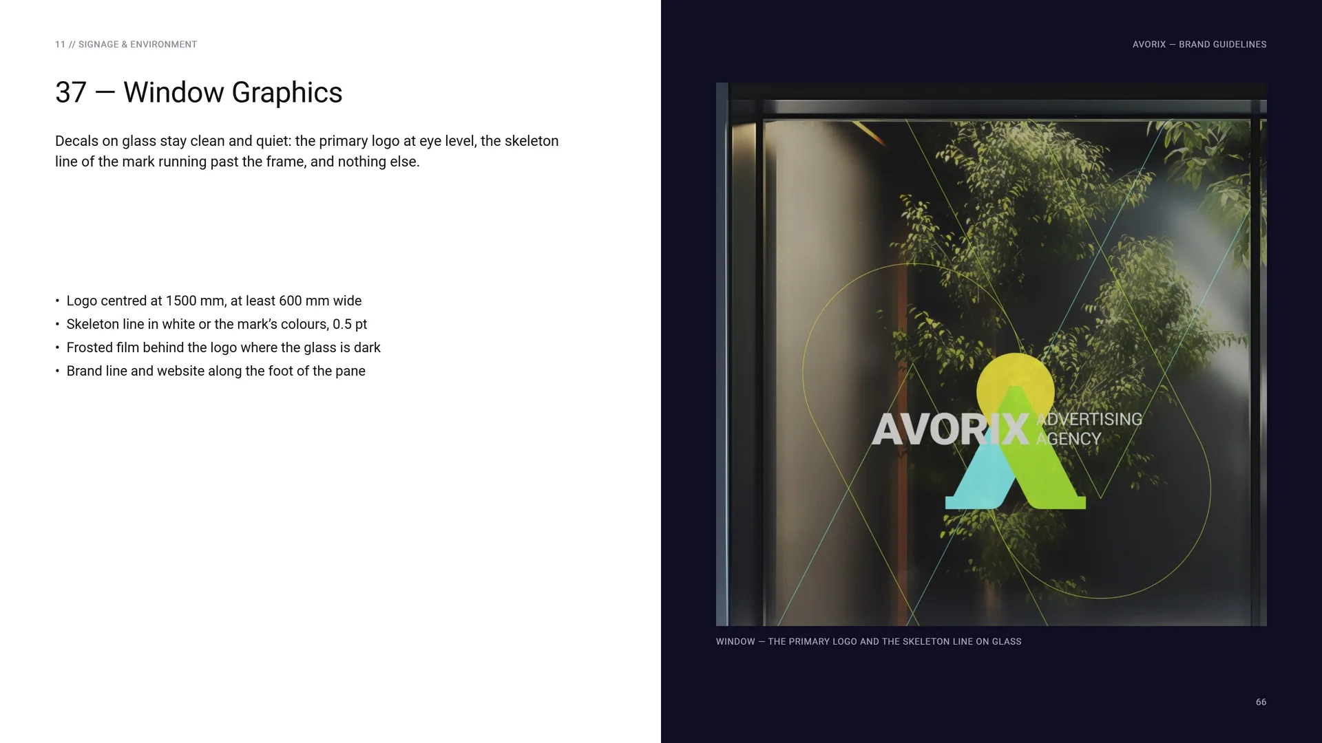
Decals on glass stay clean and quiet: the primary logo at eye level, the skeleton line of the mark running past the frame, and nothing else.
Logo centred at 1500 mm, at least 600 mm wide · Skeleton line in white or the mark’s colours, 0.5 pt · Frosted film behind the logo where the glass is dark · Brand line and website along the foot of the pane.
Window — the primary logo and the skeleton line on glass.
11.3
Exhibition Stand
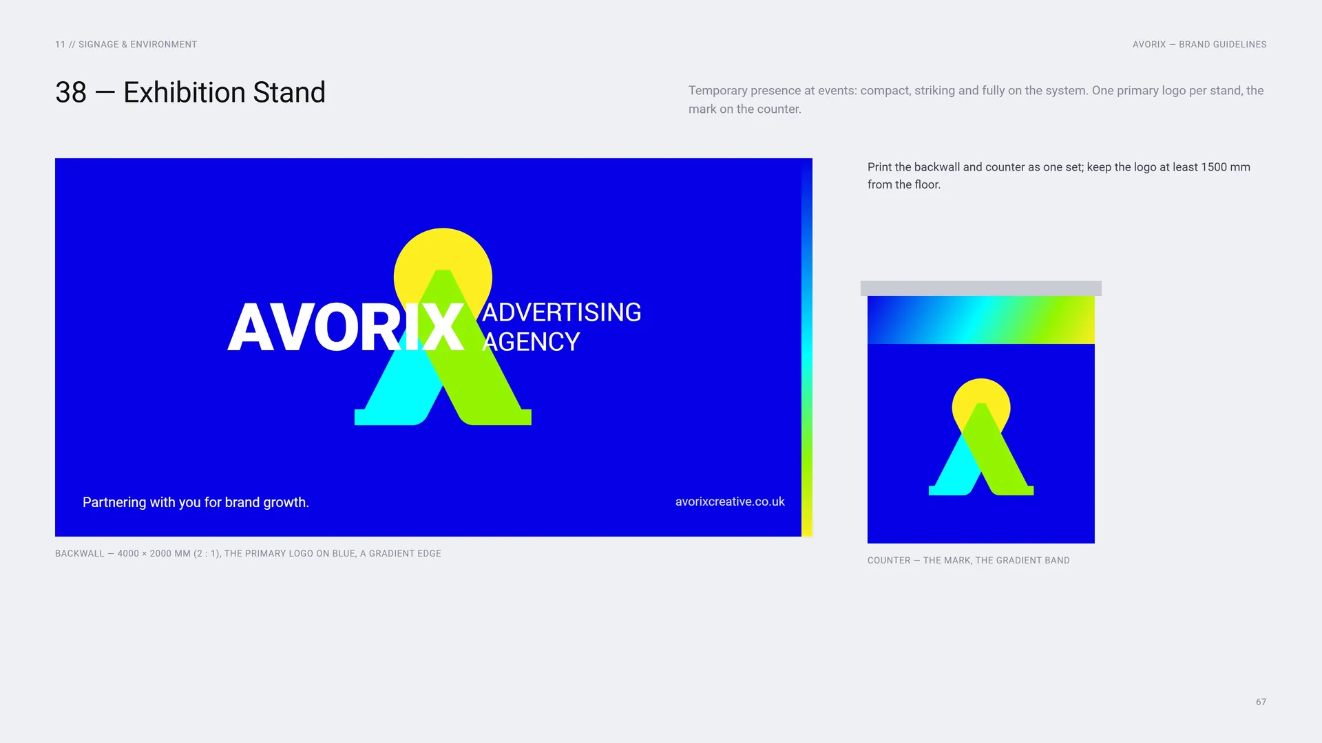
Temporary presence at events: compact, striking and fully on the system. One primary logo per stand, the mark on the counter.
Print the backwall and counter as one set; keep the logo at least 1500 mm from the floor.
Backwall — 4000 × 2000 mm (2 : 1), the primary logo on blue, a gradient edge.
Counter — the mark, the gradient band.
12
Campaign
12.1
Campaign Posters
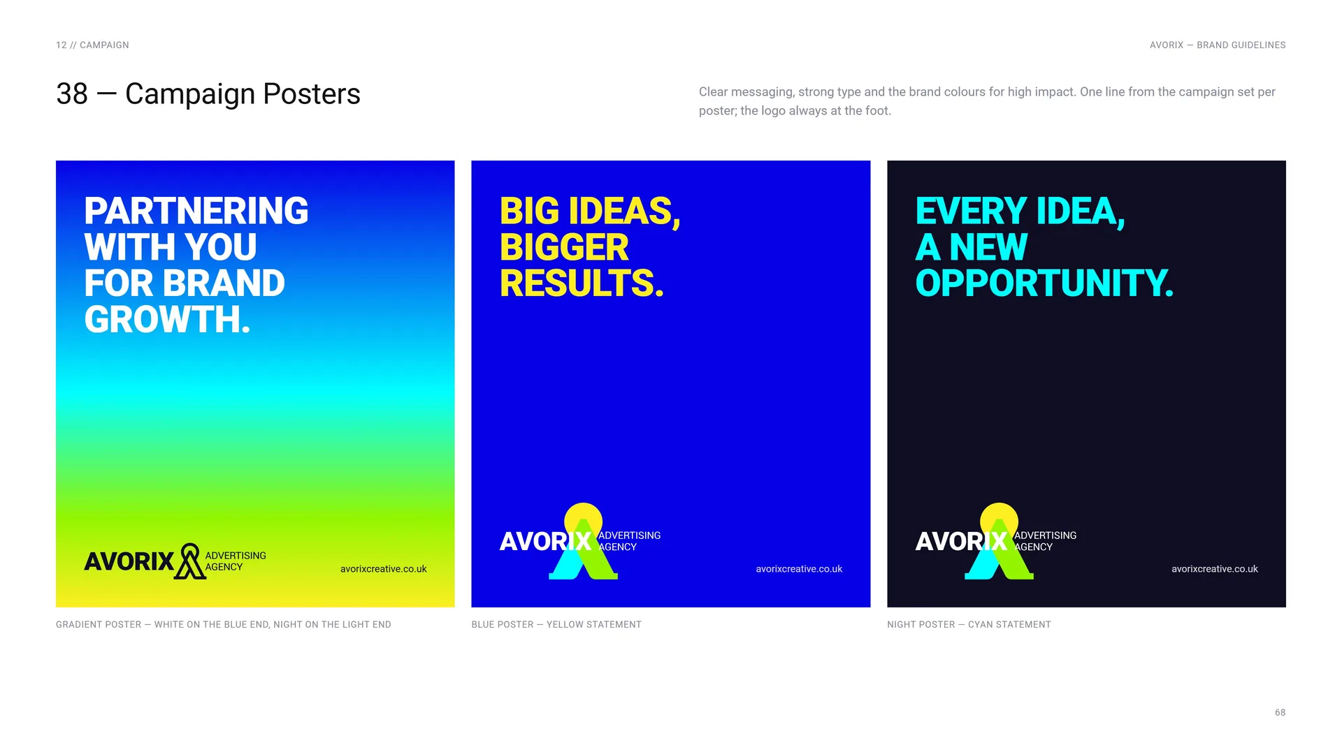
Clear messaging, strong type and the brand colours for high impact. One line from the campaign set per poster; the logo always at the foot.
Gradient poster — white on the blue end, Night on the light end.
Blue poster — yellow statement.
Night poster — cyan statement.
13
Files & contact
13.1
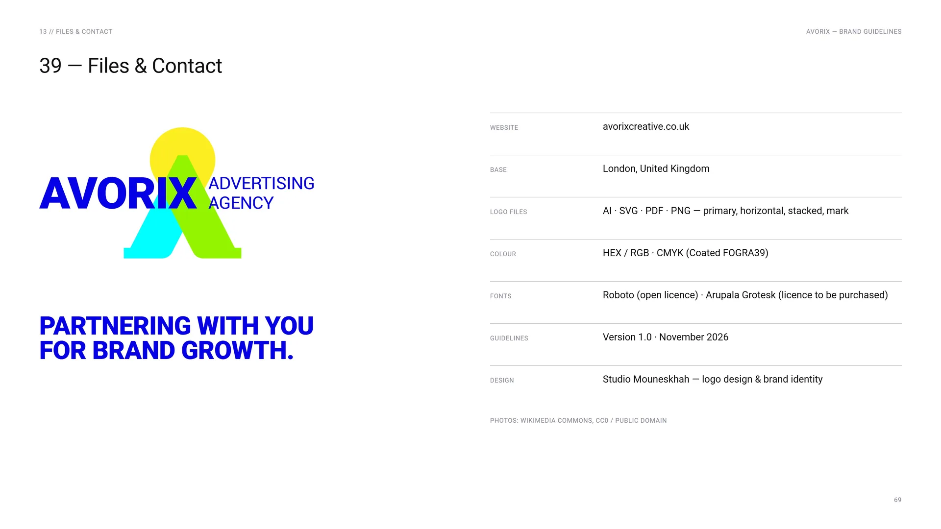
Files & Contact
Partnering with you for brand growth.
Website: avorixcreative.co.uk.
Base: London, United Kingdom.
Logo files: AI · SVG · PDF · PNG — primary, horizontal, stacked, mark.
Colour: HEX / RGB · CMYK (Coated FOGRA39).
Fonts: Roboto (open licence) · Arupala Grotesk (licence to be purchased).
Guidelines: Version 1.0 · November 2026.
Design: Studio Mouneskhah — logo design & brand identity.
Photos: Wikimedia Commons, CC0 / public domain.
13.2
Thank you
Partnering with you for brand growth.
avorixcreative.co.uk