SIRMA COMPANY
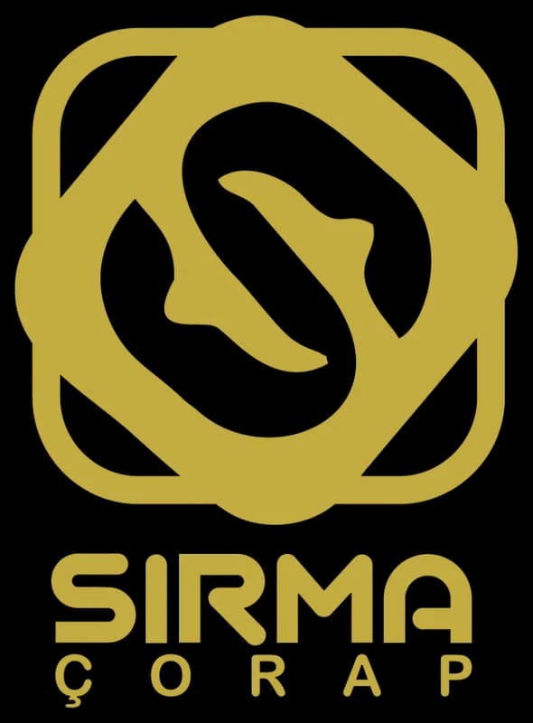
In the logo, the first letter of the brand name, (S) with negative space, portrays itself as a sock. Using the first letter of the brand name is one of the principles of logo design, which provides a unique identity and recognition of the logo. The square geometric shape in the logo conveys assurance, balance, power, and trust to the target audience, symbolizing balance and strength in the business. The chosen color for this logo is gold, representing wealth and value.
- Year
- 2016
- Client
- Sirma
- Field
- Socks
- Services
- Logo design
- Project
- SIRMA LOGO
About
SIRMA Company is engaged in the production of socks and understands the importance of logos in branding and its significant impact on sales and brand recognition. Therefore, logo design for manufacturing companies like sock producers and similar products has become an essential requirement.
Careful selection of graphic elements is crucial in achieving the best results in logo design. The SIRMA logo design is a perfect example of this.
The design
By avoiding excessive complexity and making appropriate graphic principles, the SIRMA logo has become a symbol for the company, leading to better recognition and a stronger connection with its products.