PEJVAK ORGANIZATION
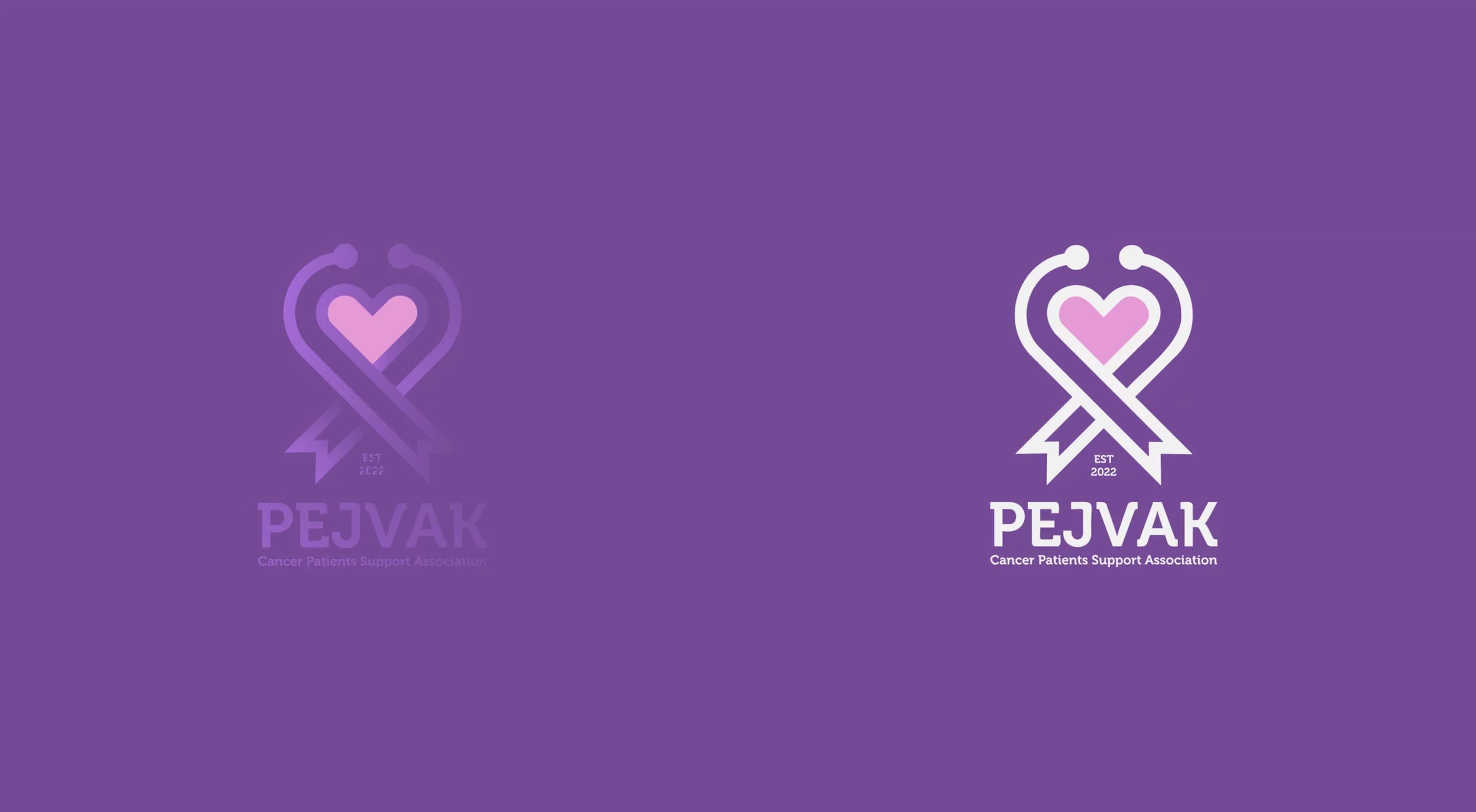
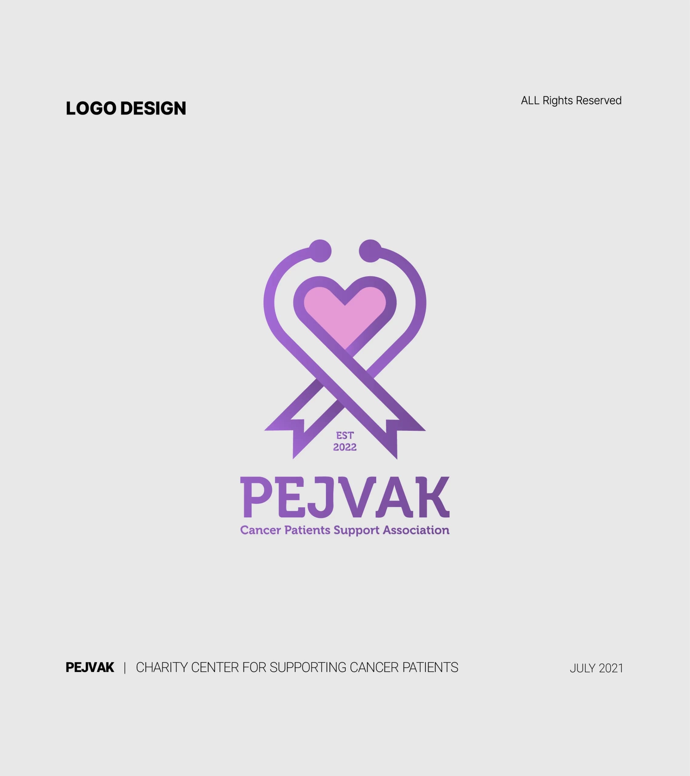
The chosen colors for the logo are pink and purple. Pink symbolizes love, friendship, and compassion, and evokes positive emotions such as trust, patience, peace, and hope. Purple creates a sense of tranquility and comfort and indicates involvement in the medical field. These colors complement each other and create a balanced and beautiful design that attracts attention to the logo.
- Year
- 2021
- Client
- Pejvak
- Field
- Cancer patients' charity
- Services
- Logo design
- Project
- PEJVAK LOGO
About
PEJVAK is a non-profit organization that supports cancer patients and aims to improve the lives of those affected by this disease.
The logo of this organization reflects its goals and mission. It features a heart symbol to represent the love, compassion, care, and supportive role of the organization, and a medical stethoscope symbol to highlight the medical and healthcare activities of the organization.
The design
Overall,PEJVAK, a non-profit organization supporting cancer patients, has a logo featuring a heart and a stethoscope, symbolizing compassion and medical care. The pink and purple colors evoke love, hope, and tranquility, reflecting the organization's mission and creating an appealing, balanced design. In designing the PEJVAK logo, appropriate use of shapes and colors resulted in a logo that suits this organization.