CARAMEL CAFE
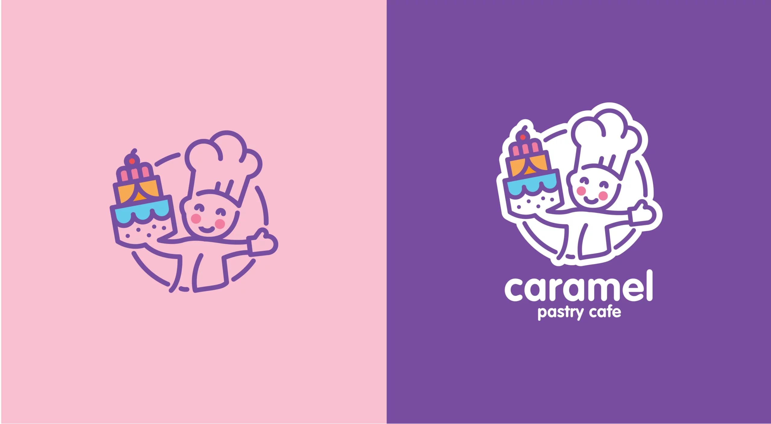
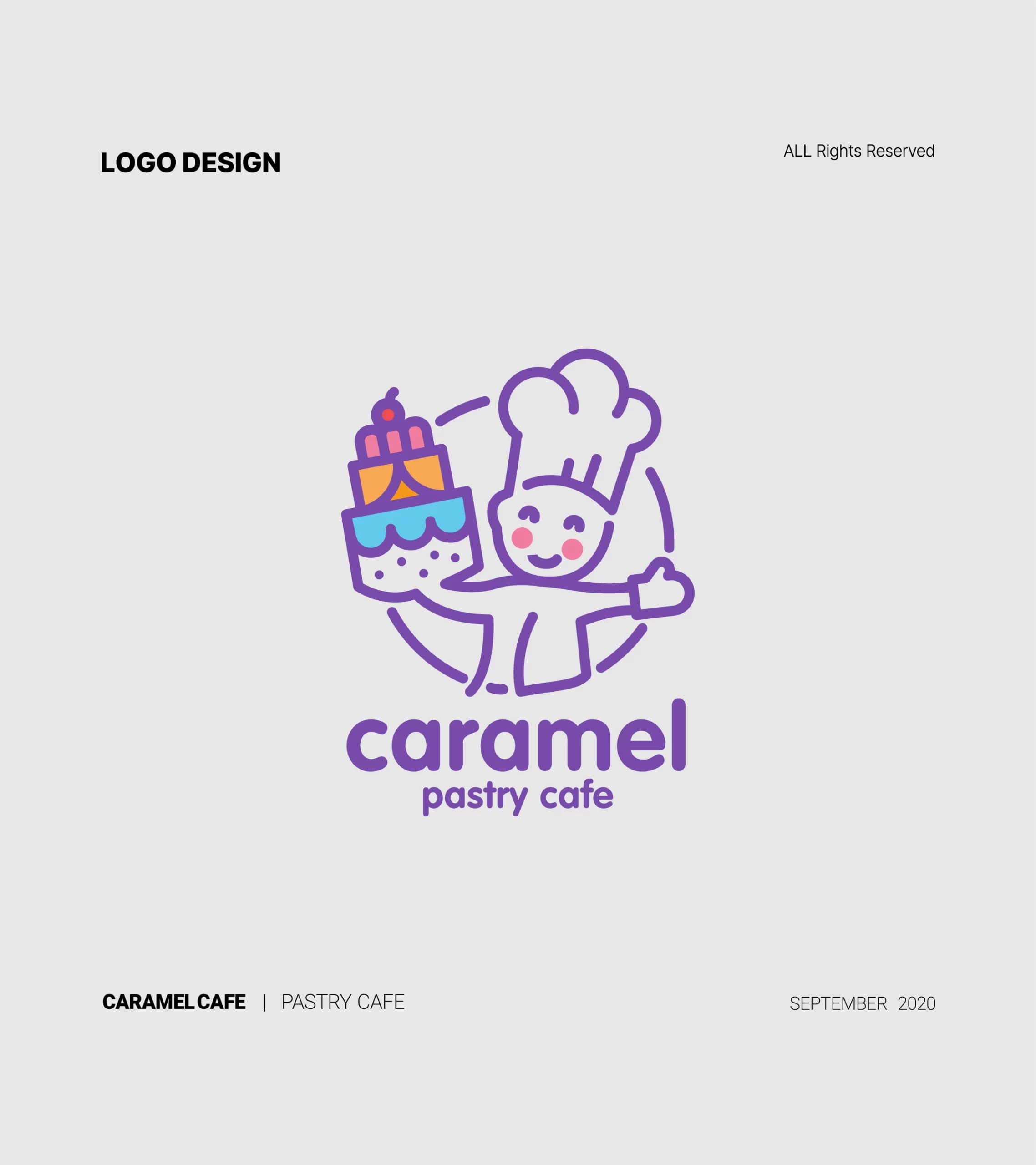
The blue, orange, pink, and purple colors signify the cakes and their freshness. Bright blue symbolizes health and tranquility, indicating the freshness and healthiness of the products. Orange stimulates appetite and symbolizes action and movement, making it an appetite stimulant for customers. Pink enhances energy and guides individuals toward a dynamic experience. Purple represents authenticity, value, and credibility, reflecting the value and credibility of this collection.
- Year
- 2020
- Client
- Caramel
- Field
- Pastry café
- Services
- Logo design
- Project
- CARAMEL LOGO
About
Caramel Cafe is a cozy cafe that specializes in baking cakes. The logo features a pastry chef with a hat and gloves, which signifies the freshness and deliciousness of its cakes. Also using curved lines to depict the delicacy and freshness of the cakes, inducing delightful moments and a pleasant experience for the target audience.
The logo uses several colors to represent various types of cakes.
The design
The combination of forms and colors in the Caramel Cafe logo assures customers will encounter not only a wide variety of products but also an enjoyable experience.