HOTEL SEHRAMA
The SEHRAMA Hotel, a five-star hotel with comfortable amenities, is nestled amidst the lush forests of Arasbaran.
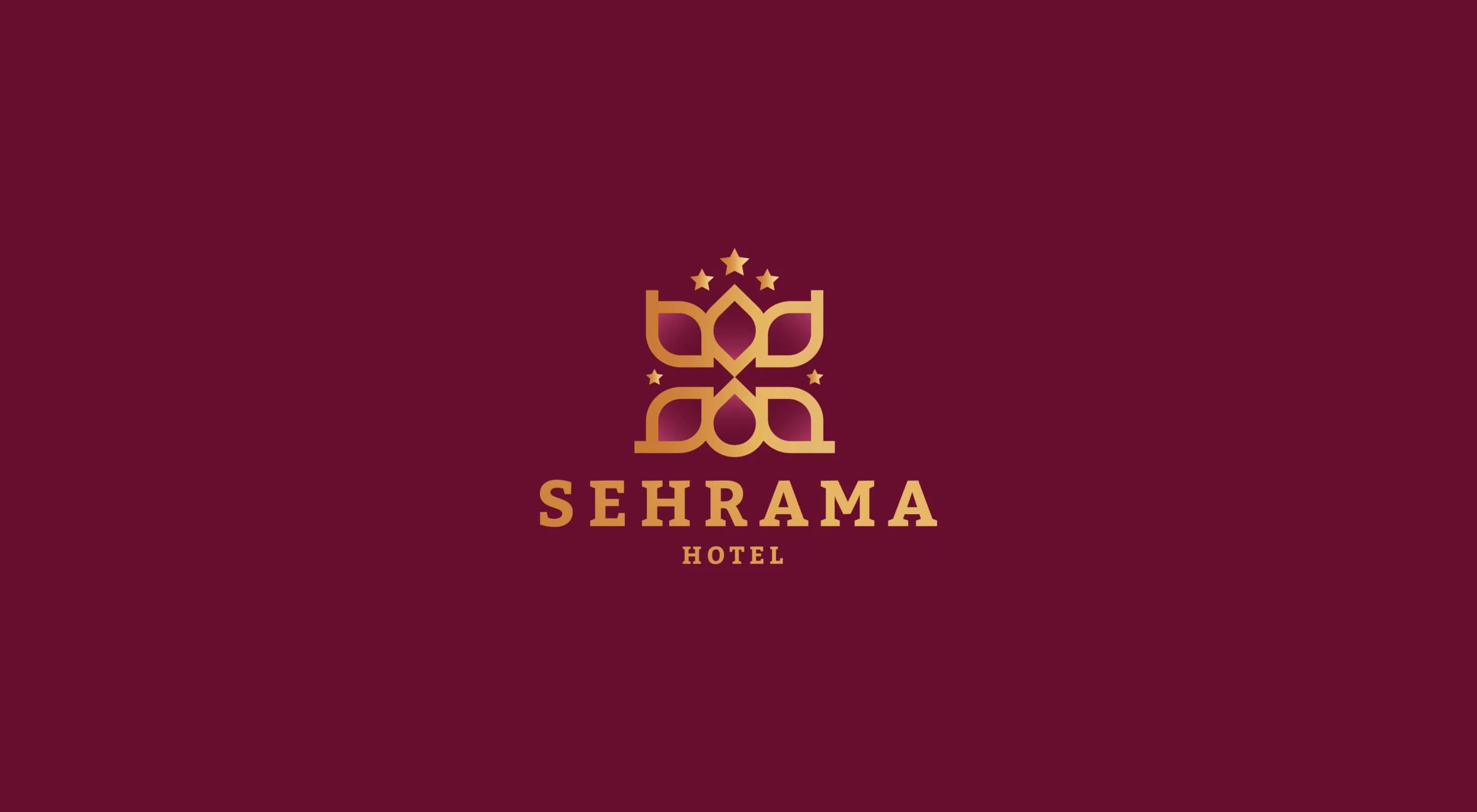
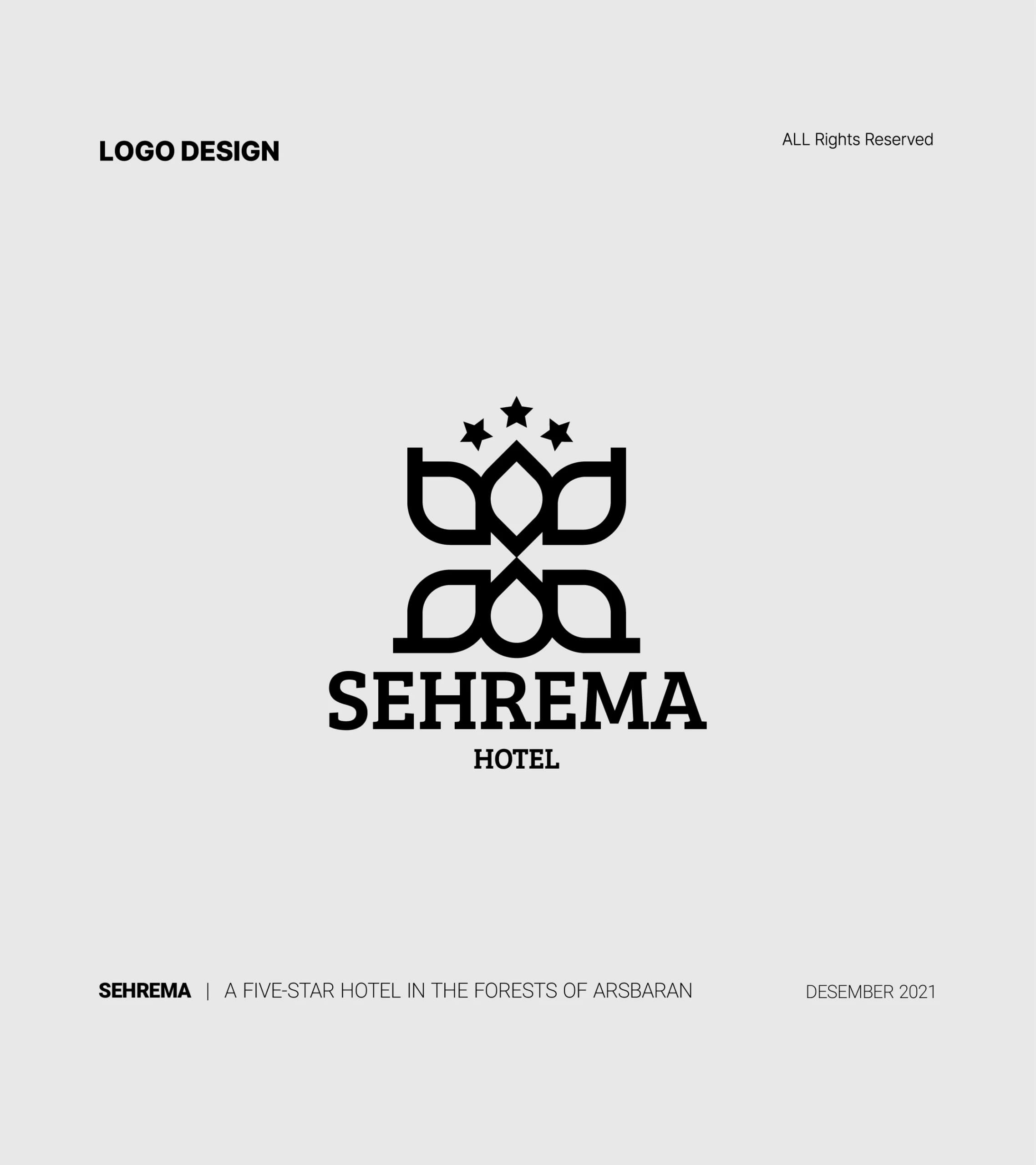
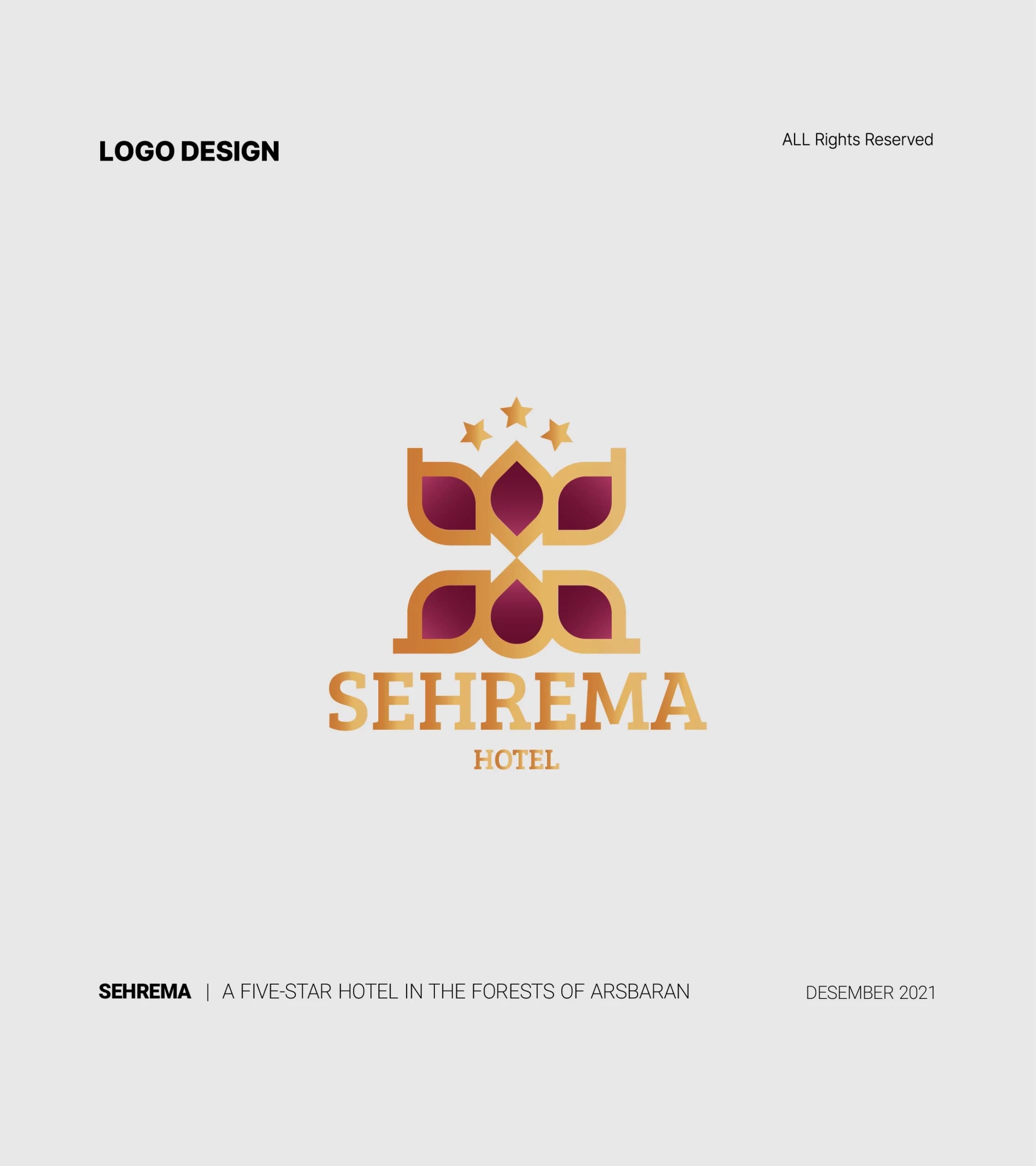
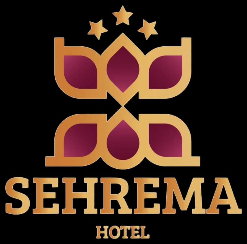
In the logo design of this hotel, the shape of a water droplet and a leaf have been used as elements of nature, evoking the flow of life and vitality.
- Year
- 2021
- Client
- Sehrama
- Field
- Hotel
- Services
- Logo design
- Project
- SEHRAMA LOGO
About
These two elements, alongside each other, were designed in the form of a crown, symbolizing beauty, affluence, and prestige. The chosen colors for the SEHRAMA logo are a gradient of gold and crimson. Gold signifies wealth, while crimson represents authenticity. Two arrows in the negative space of the logo represent the entry of guests into the hotel.
The design
The harmony between shapes and colors in the logo provides a complete identity. Due to its flexibility in dimensions and resolutions, the SEHRAMA logo can be used across various media and environments.
Overall, the logo uses graphic elements and principles, as well as negative space, ensuring not only beauty and attractiveness but also alignment with the concept and identity of the SEHRAMA Hotel.