HOMAR TRADING COMPANY
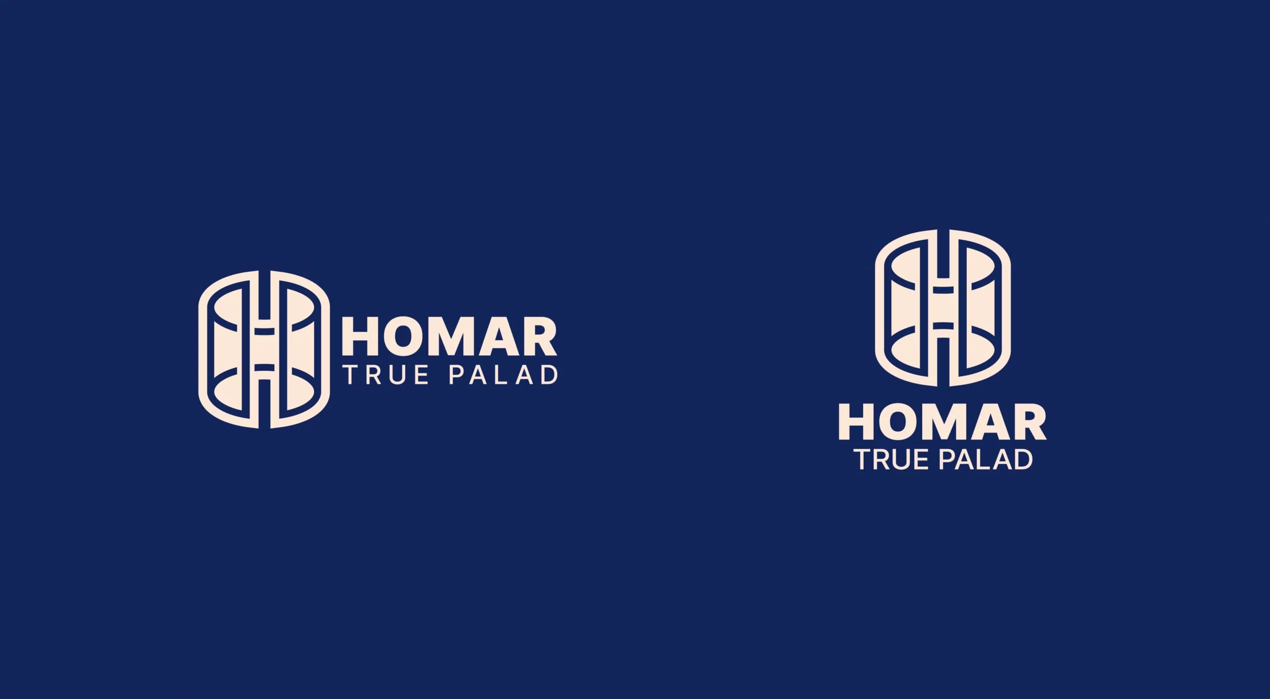
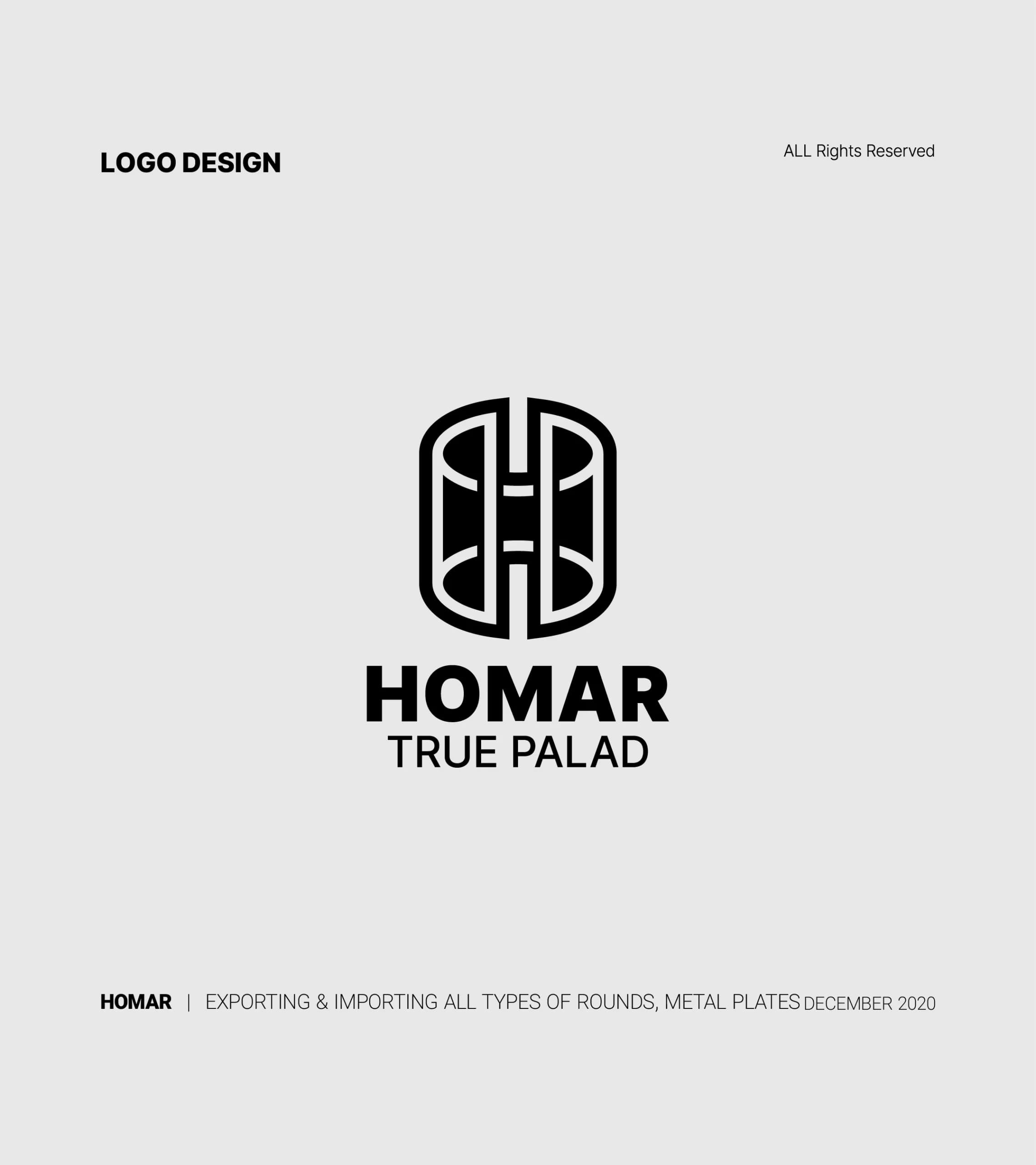
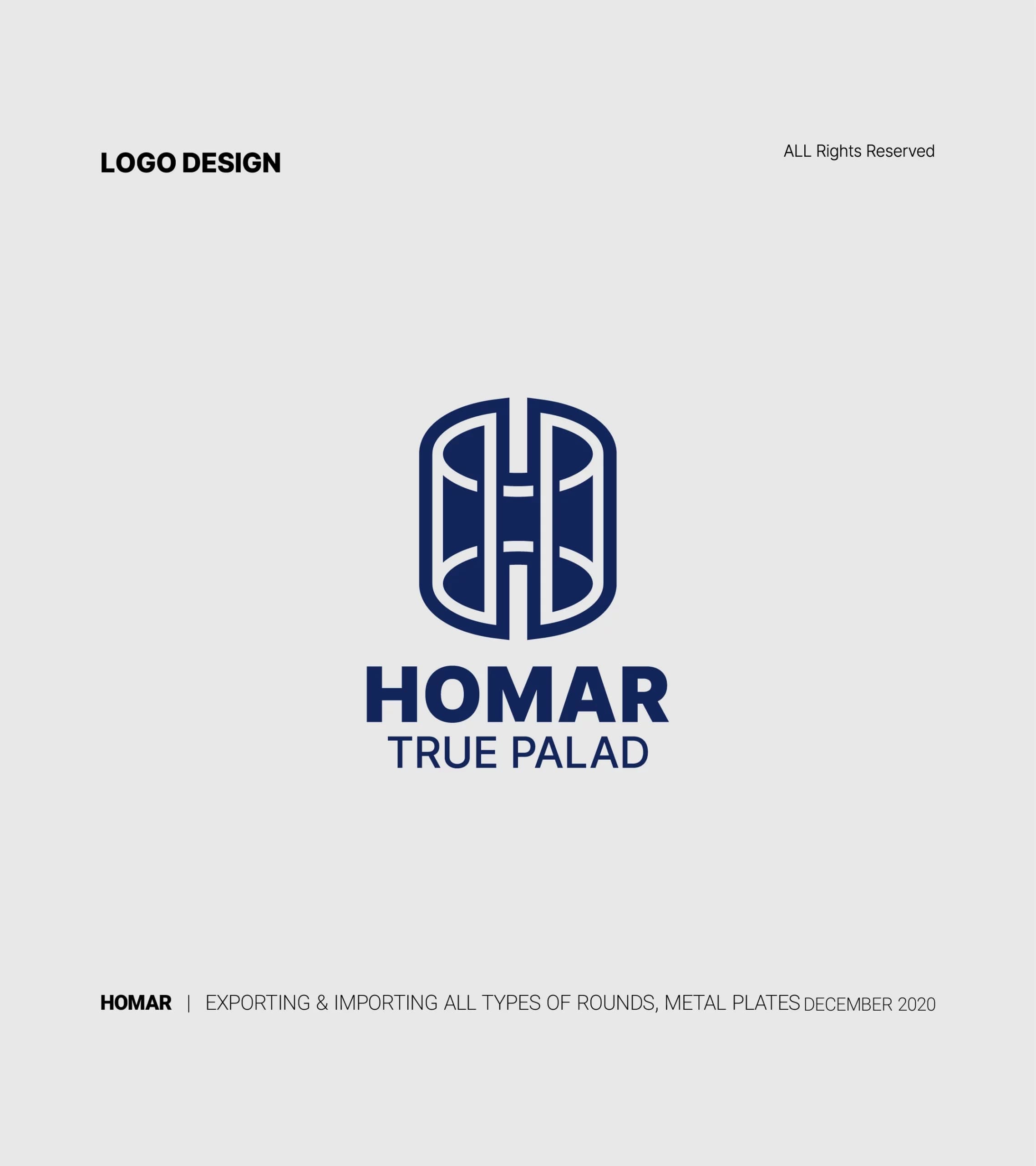
HOMAR Trading Company specializes in importing and exporting various rebar and metal sheets. The HOMAR logo, designed with a combination of letters and symbols, creates a unique graphic identity. In this logo, the letter "H," representing the first letter of the company's name, is combined with a shape resembling a metal sheet. This combination depicts the identity and primary activity of the company.
- Year
- 2020
- Client
- Homar
- Field
- Trading company
- Services
- Logo design
- Project
- HOMAR LOGO
About
The circular geometric shape also adds a professional and attractive touch to the Homer logo.
The chosen color for the logo is black. Black is a classic color in design and can serve as an ideal background to highlight other colors and graphic elements in the logo. This color adds power and formality to the logo. Furthermore, the proper use of negative space enhances the attractiveness of the logo and makes its elements distinguishable.
The design
Overall, the graphic design of the logo is carefully executed with coordination and balance of elements such as shapes and colors, fully representing the company's concept. This logo is not only a trademark but also a prominent tool for enhancing brand recognition with target markets.