ELHAM MORAD
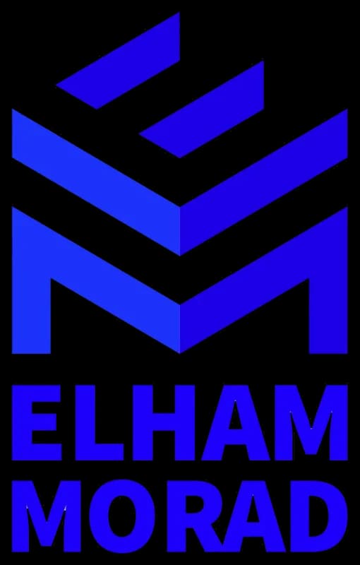
The ELHAM MORAD logo is a representation of Mrs. Elham Morad's brand, which deals with architecture and interior design.
The logo uses a monogram of the letters E and M from the first name and surname of Mrs. Elham Morad.
- Year
- 2021
- Client
- ELHAM MORAD
- Field
- Architecture & interiors
- Services
- Logo design
- Project
- ELHAM MORAD LOGO
About
The letter E represents the interior view of a building, giving the logo a three-dimensional look that demonstrates the finesse, order, and precision of the brand owner's work. Sans-serif font gives the logo a modern appearance, signifying innovation in service delivery. The ELHAM MORAD logo's elements are well-coordinated with the field of interior decoration.
The design
Blue color represents strength and endurance. Blue is a moderate and calm color with proper adaptation in the field of architecture and interior design ensures the desirability of the design.
The combination of shape, form, and color makes the ELHAM MORAD logo a reputable symbol in architecture and interior design. It creates a modern, powerful, and reliable identity for the ELHAM MORAD brand.