BARZIN International Trading Company
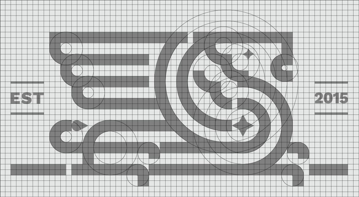
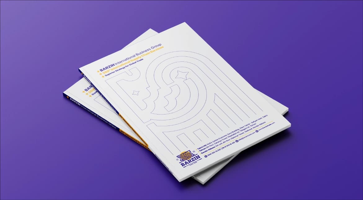
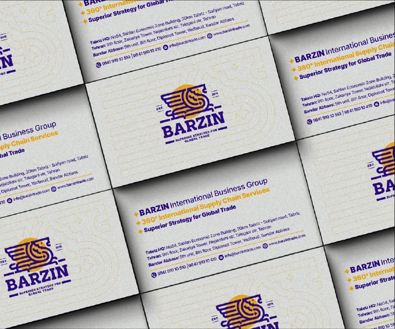
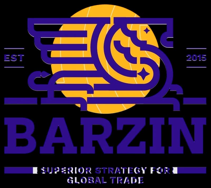
The logo redesign project for BARZIN Trading Company was an exciting and challenging task that required close attention to detail and adherence to graphic design principles. The logo's overall form and concept were retained, and the golden ratio and grid system were utilized to make proportional changes and enhance the logo's beauty while preserving its context.
- Year
- 2024
- Client
- Barzin
- Field
- International trade
- Services
- Visual identity
- Project
- BARZIN Visual Identity Design
About
The BARZIN International Trading Company has a rich history in international transportation, customs clearance, import and export, and supply chain management. It runs four branches in Iran and representative offices in several countries, including India, Turkey, Uzbekistan, the United Arab Emirates, and Egypt.
The design
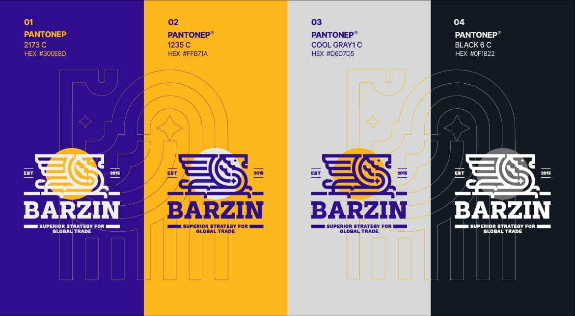
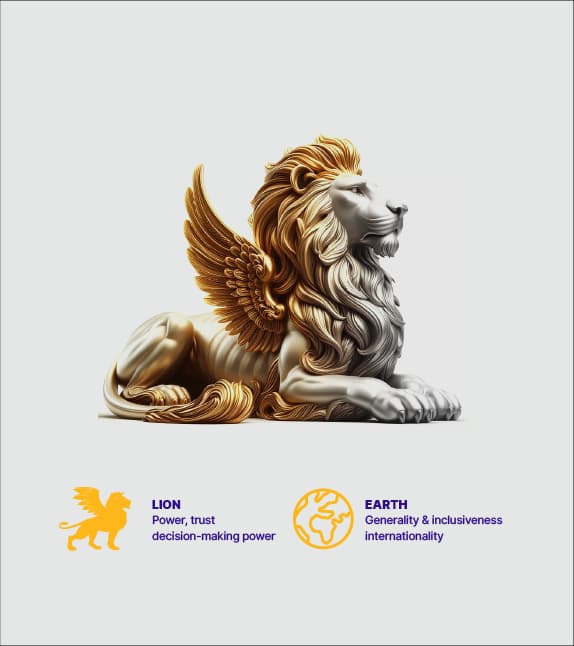
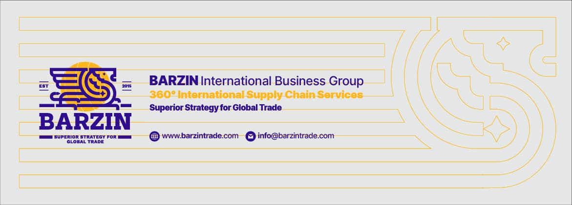
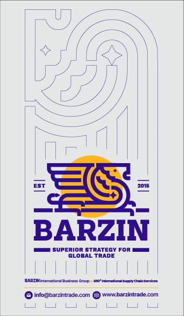
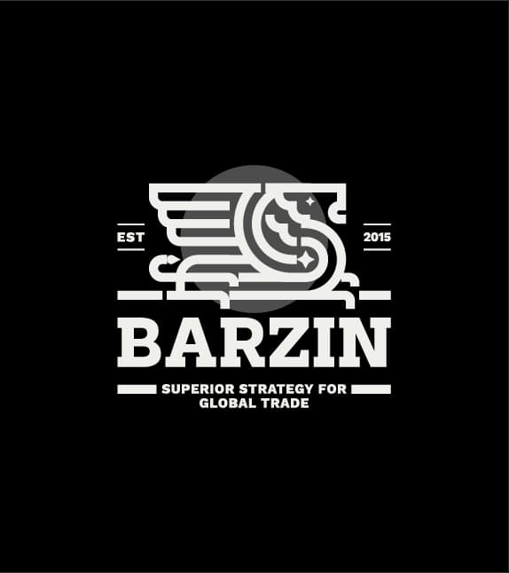
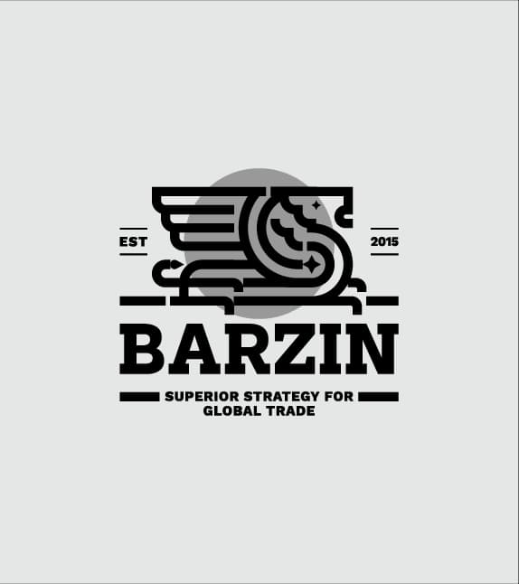
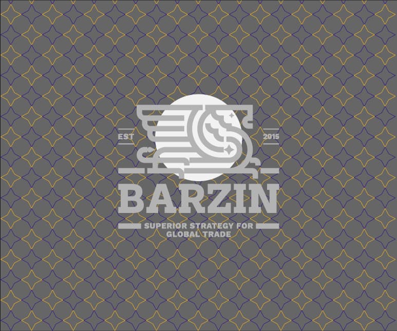
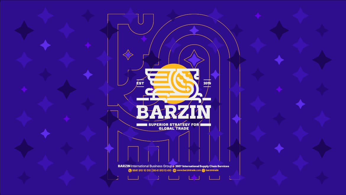
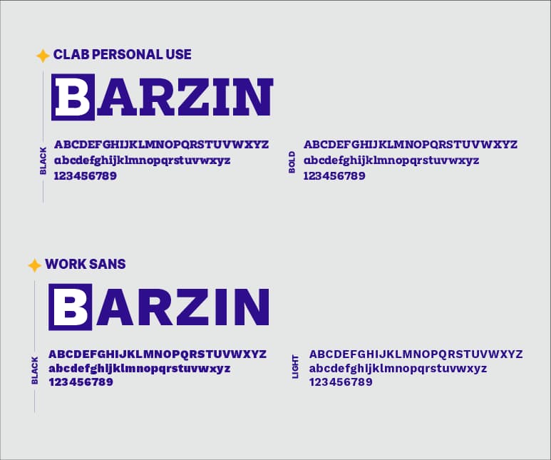
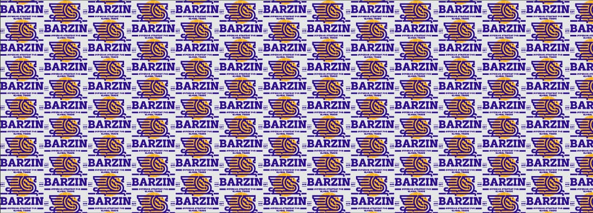
The previous logo, which featured a winged lion, a column, and a globe, was updated using the golden ratio and grid system while adhering to design principles. The winged lion's graphic shape, seated with its head raised and looking forward, conveys a sense of calmness and unique splendor, and the spread wings symbolize power and confidence to the target audience. The chosen colors followed the Pantone color principles. A serif English font was used to maintain the logo's identity and create a stronger connection between the logo and the company's values.
Overall, these changes provide BARZIN with a powerful tool for advertising and better brand recognition.