ARKADISCUS COMPANY
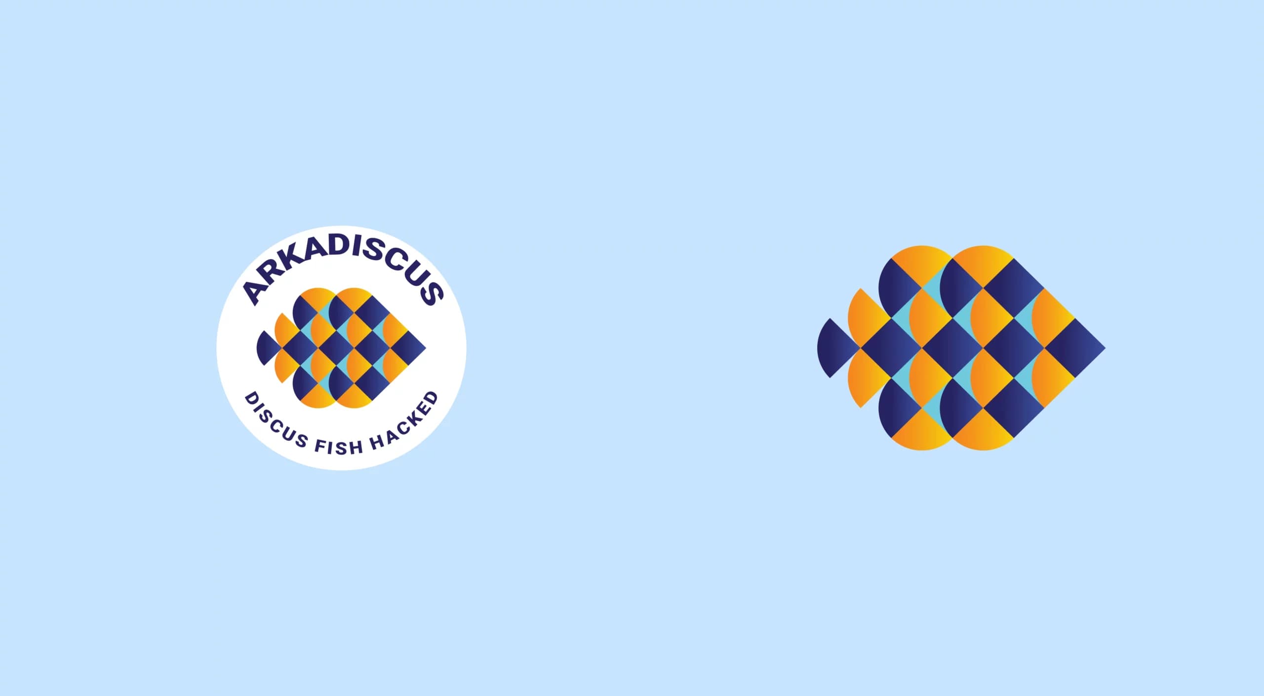
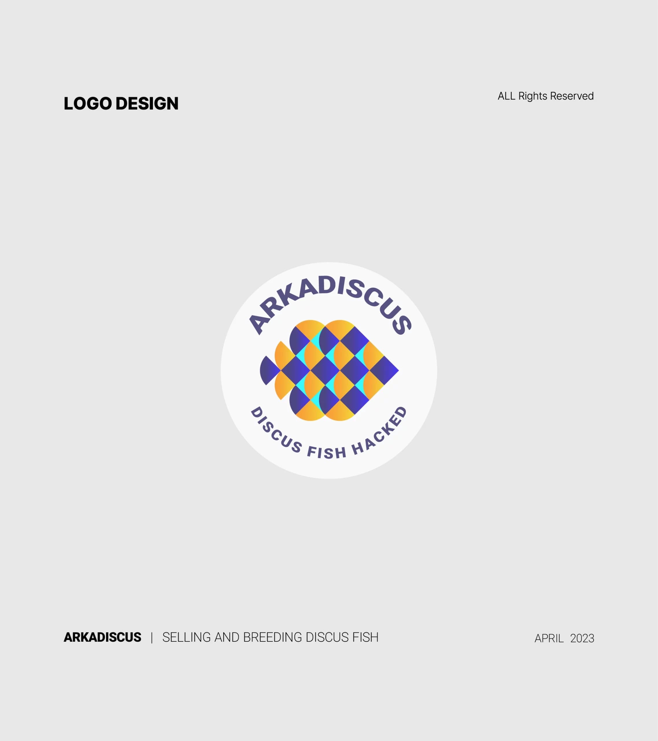
ARKADISCUS Company is involved in breeding and selling fish. Its logo visually represents its field of activity. The logo's main goal is to create a visually appealing sign and communicate the company's main activity to the target audience. The logo features a fish shape, symbolizing ARKADISCUS' involvement in fish breeding and sales.
The logo uses a gradient of color, orange and dark blue.
- Year
- 2023
- Client
- Arkadiscus
- Field
- Discus fish
- Services
- Logo design
- Project
- ARKADISCUS

About
Orange symbolizes enthusiasm, excitement, and creativity, while blue represents calmness, intelligence, responsibility, and trust. Light blue also represents health and gentleness. This color combination attracts attention and establishes a mental connection with the viewer by creating contrast and a suitable balance. The logo background is simple to focus more on the logo itself and the message conveyed. The font used is legible and consistent with the style of the logo.
The design
Overall, the shapes and designs in the ARKADISCUS logo convey the concept and identity of the business. The fish shape in the logo creates a connection between the image and the company's main activity. This visual form provides harmony between visual appeal and accurately conveying the message.