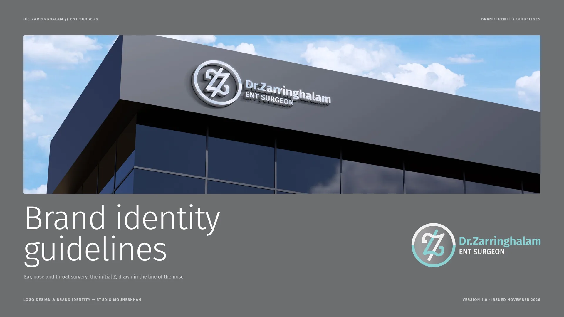
Dr. Zarringhalam Brand Identity Guidelines
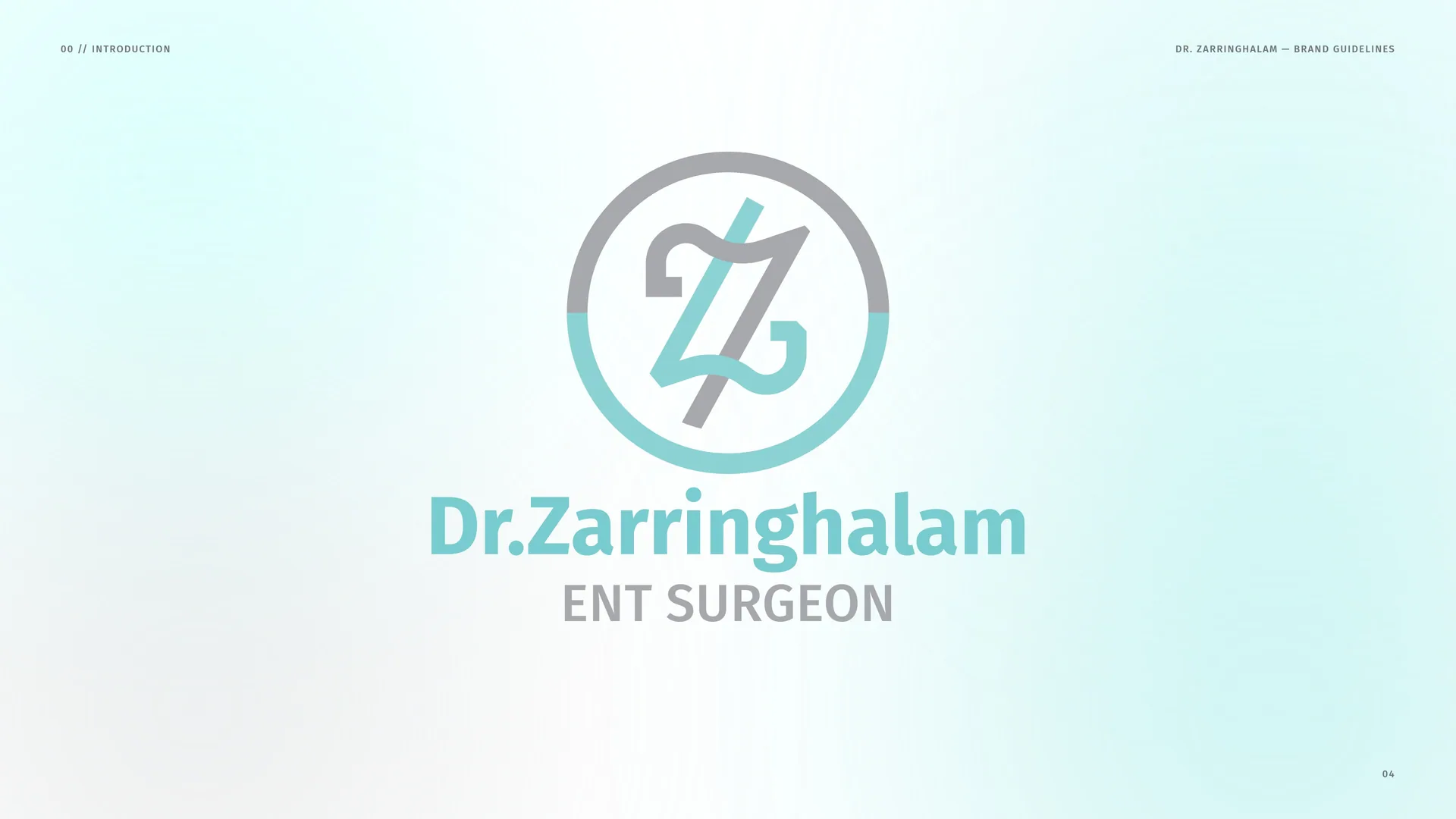
Dr. Zarringhalam is an ear, nose and throat surgeon who performs rhinoplasty, surgery of the nose. The sign is a personal monogram: the initial Z, drawn from two profiles of the nose, one turned against the other, inside a ring.
Brand idea: A surgeon’s initial, drawn in the line of the nose.
- Müşteri
- Dr. Zarringhalam
- Alan
- ENT surgeon · ear, nose and throat surgery, rhinoplasty
- Hizmetler
- Görsel kimlik
- Proje
- Brand Identity Guidelines · v1.0
00
Introduction
00.1
Brand Concept
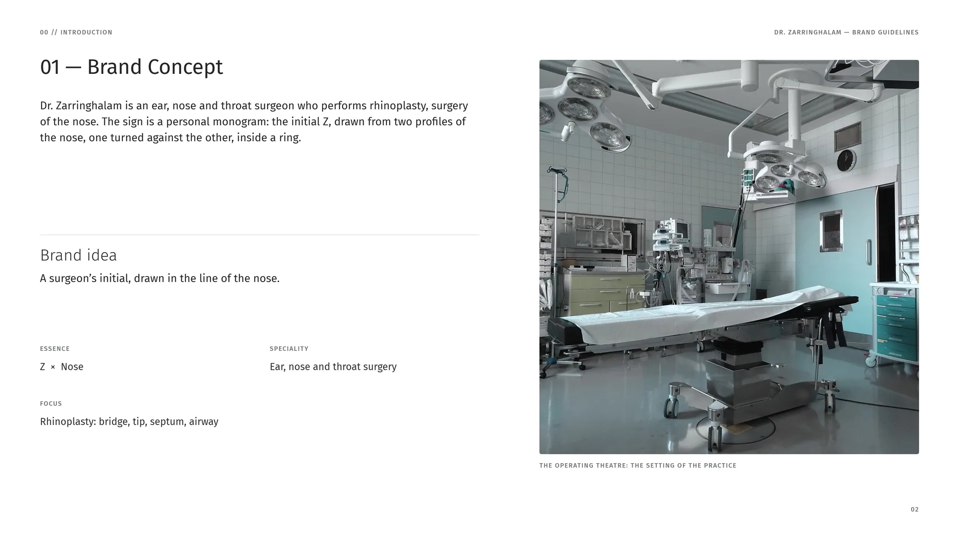
Dr. Zarringhalam is an ear, nose and throat surgeon who performs rhinoplasty, surgery of the nose. The sign is a personal monogram: the initial Z, drawn from two profiles of the nose, one turned against the other, inside a ring.
Brand idea: A surgeon’s initial, drawn in the line of the nose.
Essence: Z × Nose.
Speciality: Ear, nose and throat surgery.
Focus: Rhinoplasty: bridge, tip, septum, airway.
The operating theatre: the setting of the practice.
00.2
The Brief
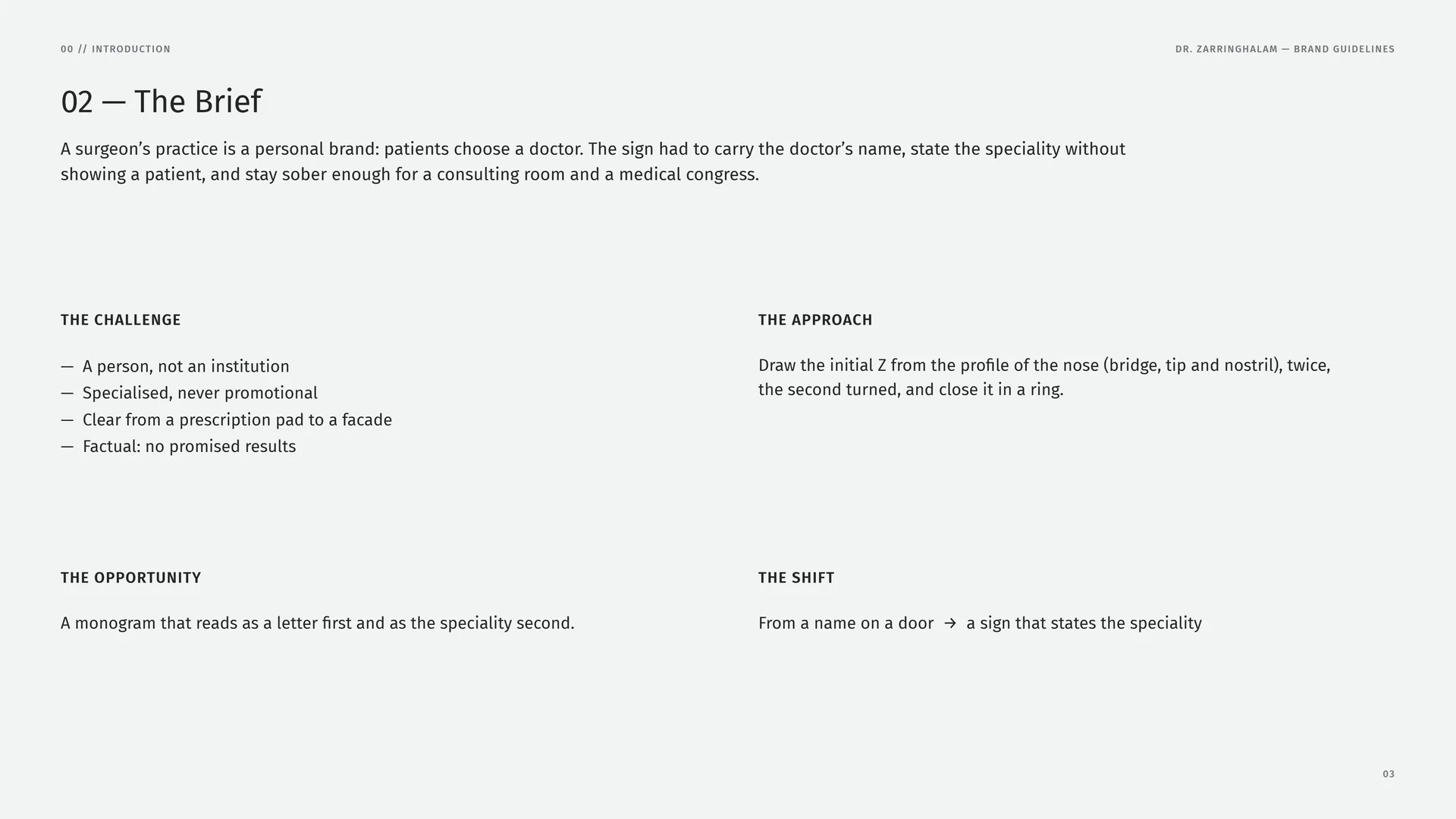
A surgeon’s practice is a personal brand: patients choose a doctor. The sign had to carry the doctor’s name, state the speciality without showing a patient, and stay sober enough for a consulting room and a medical congress.
The challenge: A person, not an institution · Specialised, never promotional · Clear from a prescription pad to a facade · Factual: no promised results.
The approach: Draw the initial Z from the profile of the nose (bridge, tip and nostril), twice, the second turned, and close it in a ring.
The opportunity: A monogram that reads as a letter first and as the speciality second.
The shift: From a name on a door → a sign that states the speciality.
00.3
Primary logo
01
Brand
- 01.1Ear, nose and throat
- 01.2Three Organs, One Practice
- 01.3Brand Values
- 01.4Tone of Voice
- 01.5Form and function
- 01.6Writing the Name
01.1
Ear, nose and throat
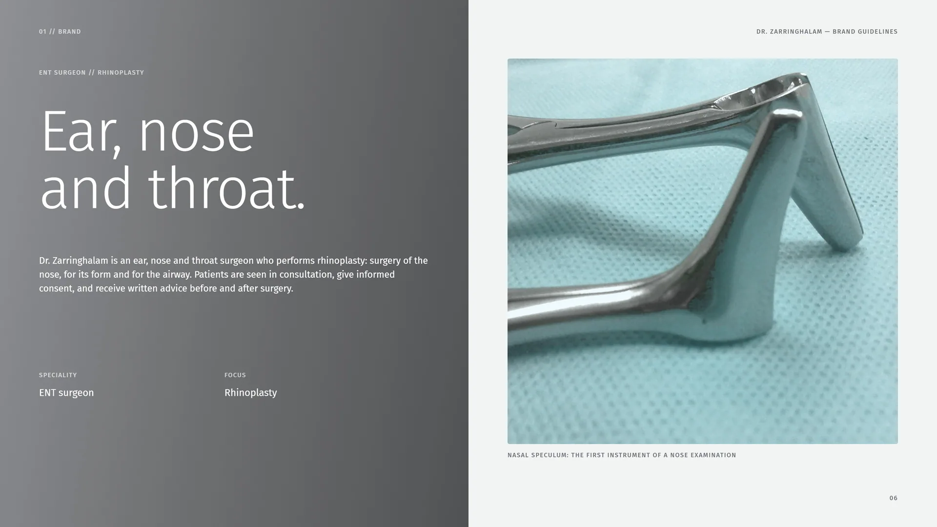
Dr. Zarringhalam is an ear, nose and throat surgeon who performs rhinoplasty: surgery of the nose, for its form and for the airway. Patients are seen in consultation, give informed consent, and receive written advice before and after surgery.
Speciality: ENT surgeon.
Focus: Rhinoplasty.
Nasal speculum: the first instrument of a nose examination.
01.2
Three Organs, One Practice
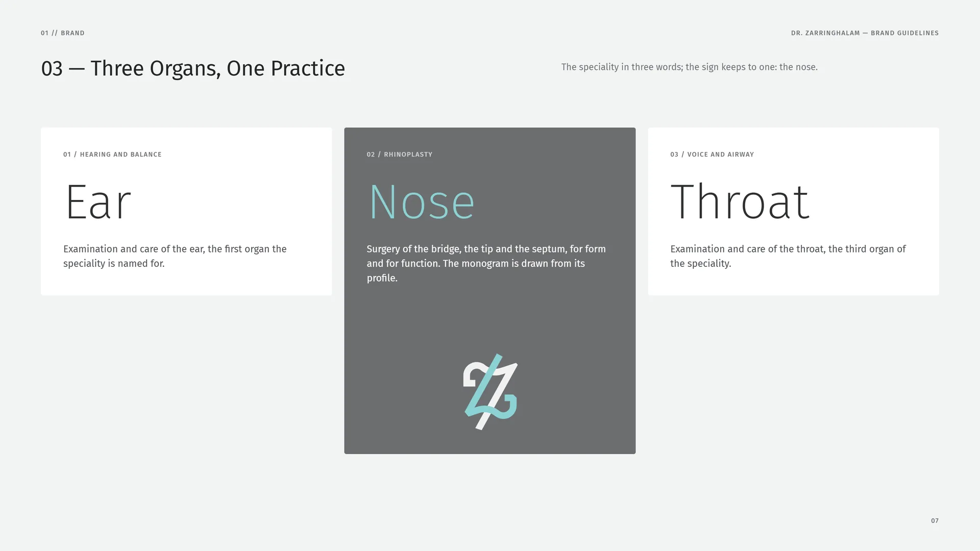
The speciality in three words; the sign keeps to one: the nose.
Ear — Hearing and balance: Examination and care of the ear, the first organ the speciality is named for.
Nose — Rhinoplasty: Surgery of the bridge, the tip and the septum, for form and for function. The monogram is drawn from its profile.
Throat — Voice and airway: Examination and care of the throat, the third organ of the speciality.
01.3
Brand Values
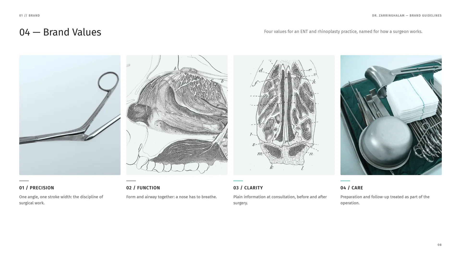
Four values for an ENT and rhinoplasty practice, named for how a surgeon works.
Precision: One angle, one stroke width: the discipline of surgical work.
Function: Form and airway together: a nose has to breathe.
Clarity: Plain information at consultation, before and after surgery.
Care: Preparation and follow-up treated as part of the operation.
01.4
Tone of Voice
The voice of a good consultation: exact, plain and honest. Name the procedure and its stages; explain what each involves; never promise a result.
Exact / Vague: Name the procedure, the stages and the recovery.
Plain / Technical: Septum, cartilage, airway: use the term, then say what it means.
Honest / Promotional: No promised outcomes, no superlatives, no before-and-after images.
Discreet / Showy: Patients are never shown or named.
Calm / Urgent: No offers or countdowns: surgery is a decision, not a sale.
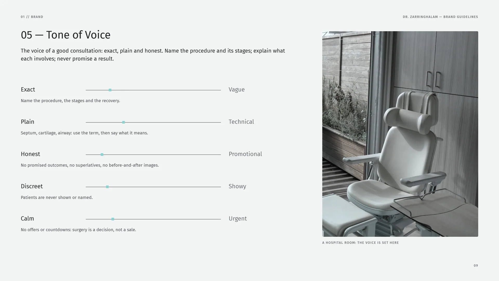
A hospital room: the voice is set here.
01.5
Form and function
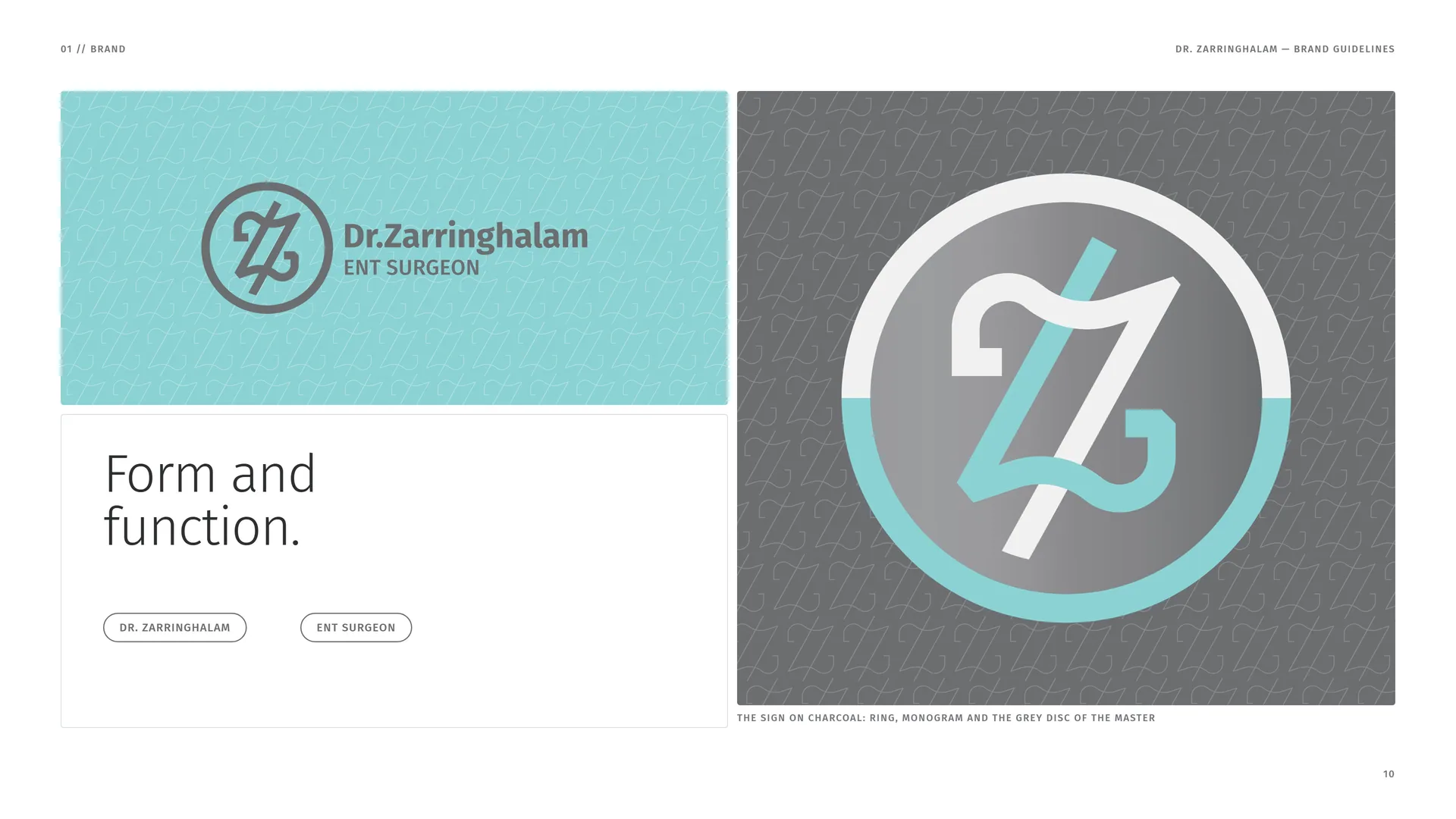
Dr. Zarringhalam · ENT surgeon.
The sign on charcoal: ring, monogram and the grey disc of the master.
01.6
Writing the Name
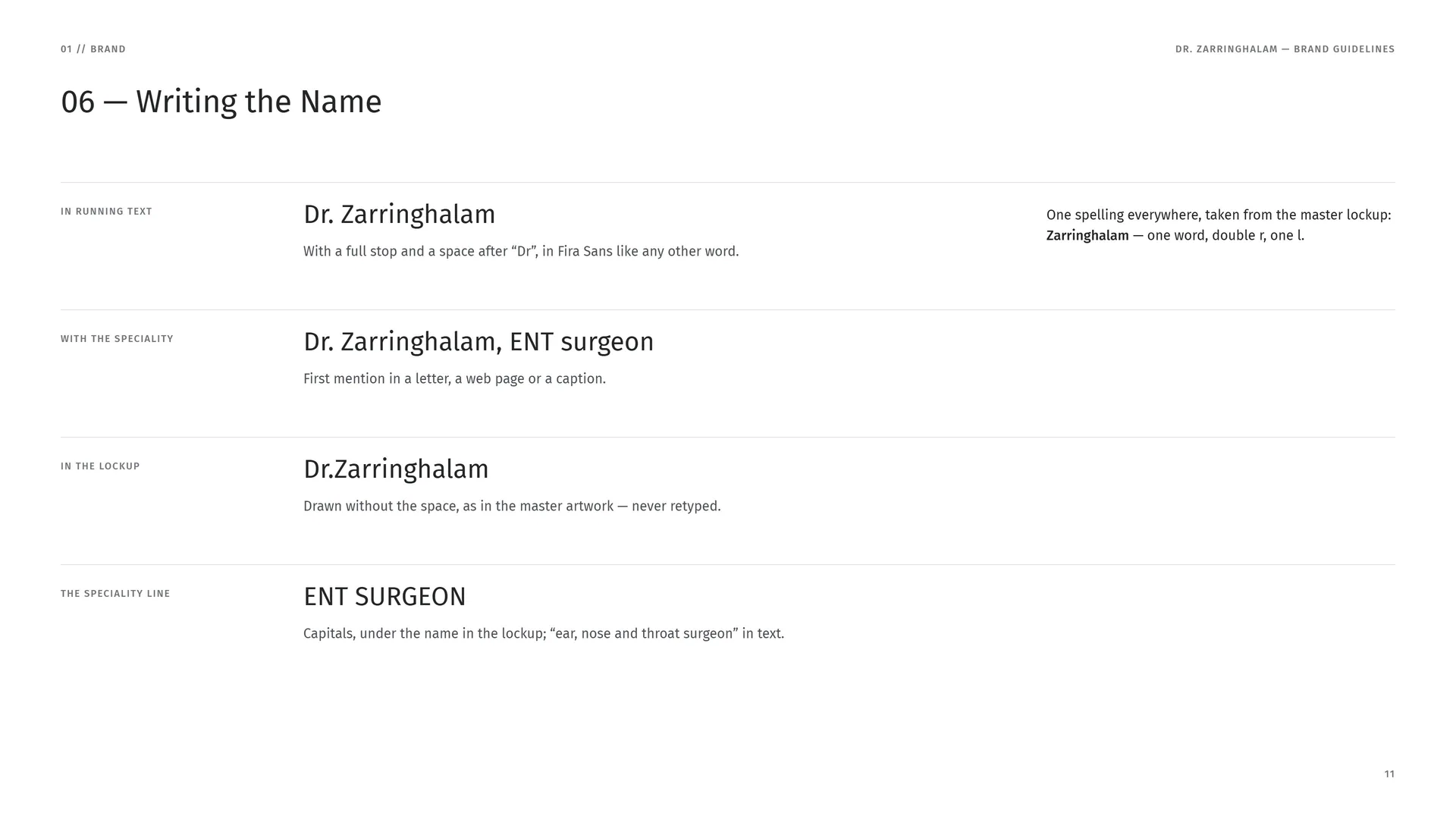
In running text: Dr. Zarringhalam. With a full stop and a space after “Dr”, in Fira Sans like any other word.
One spelling everywhere, taken from the master lockup: Zarringhalam — one word, double r, one l.
With the speciality: Dr. Zarringhalam, ENT surgeon. First mention in a letter, a web page or a caption.
In the lockup: Dr.Zarringhalam. Drawn without the space, as in the master artwork — never retyped.
The speciality line: ENT SURGEON. Capitals, under the name in the lockup; “ear, nose and throat surgeon” in text.
02
Concept
- 02.1Z + Nose = One Sign
- 02.2Logo Meaning
- 02.3Two Profiles, One Z
- 02.4Two stems, one angle
- 02.5Steel above, scrubs below
- 02.6Every line, one hand
- 02.7The Mark in Motion
02.1
Z + Nose = One Sign
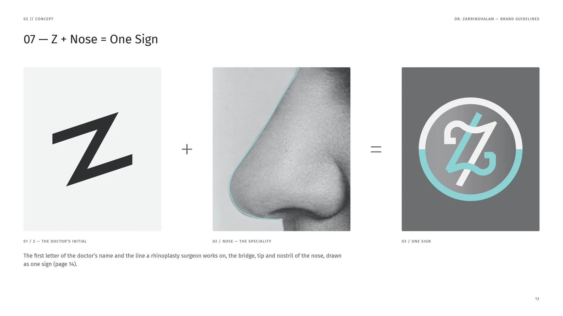
Z — the doctor’s initial.
Nose — the speciality.
One sign.
The first letter of the doctor’s name and the line a rhinoplasty surgeon works on, the bridge, tip and nostril of the nose, drawn as one sign (page 14).
02.2
Logo Meaning
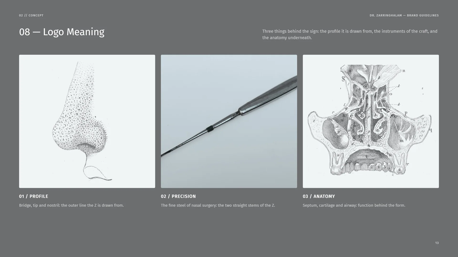
Three things behind the sign: the profile it is drawn from, the instruments of the craft, and the anatomy underneath.
Profile: Bridge, tip and nostril: the outer line the Z is drawn from.
Precision: The fine steel of nasal surgery: the two straight stems of the Z.
Anatomy: Septum, cartilage and airway: function behind the form.
02.3
Two Profiles, One Z
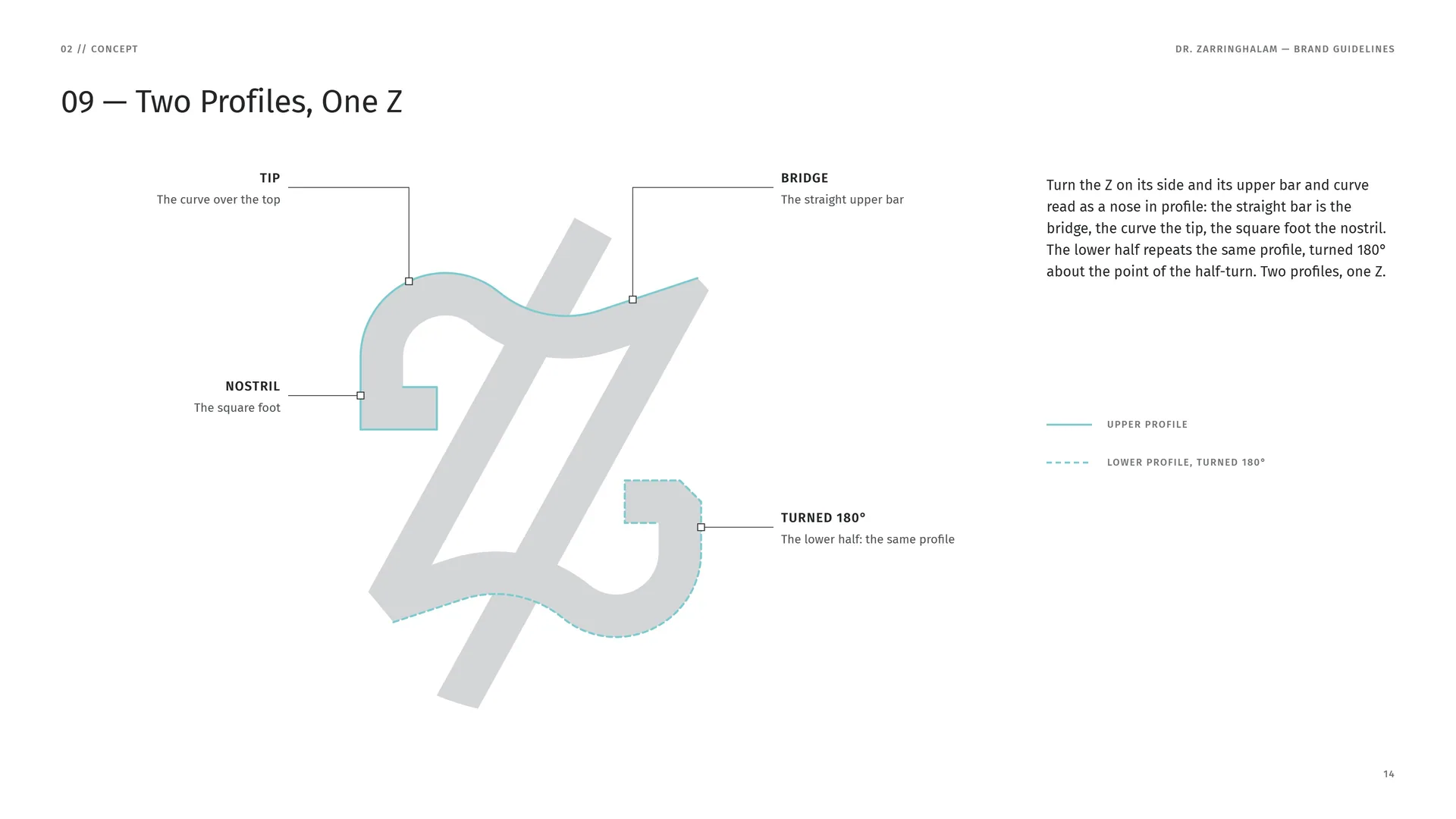
Turn the Z on its side and its upper bar and curve read as a nose in profile: the straight bar is the bridge, the curve the tip, the square foot the nostril. The lower half repeats the same profile, turned 180° about the point of the half-turn. Two profiles, one Z.
Tip: The curve over the top.
Bridge: The straight upper bar.
Nostril: The square foot.
Turned 180°: The lower half: the same profile.
Upper profile · Lower profile, turned 180°.
02.4
Two stems, one angle
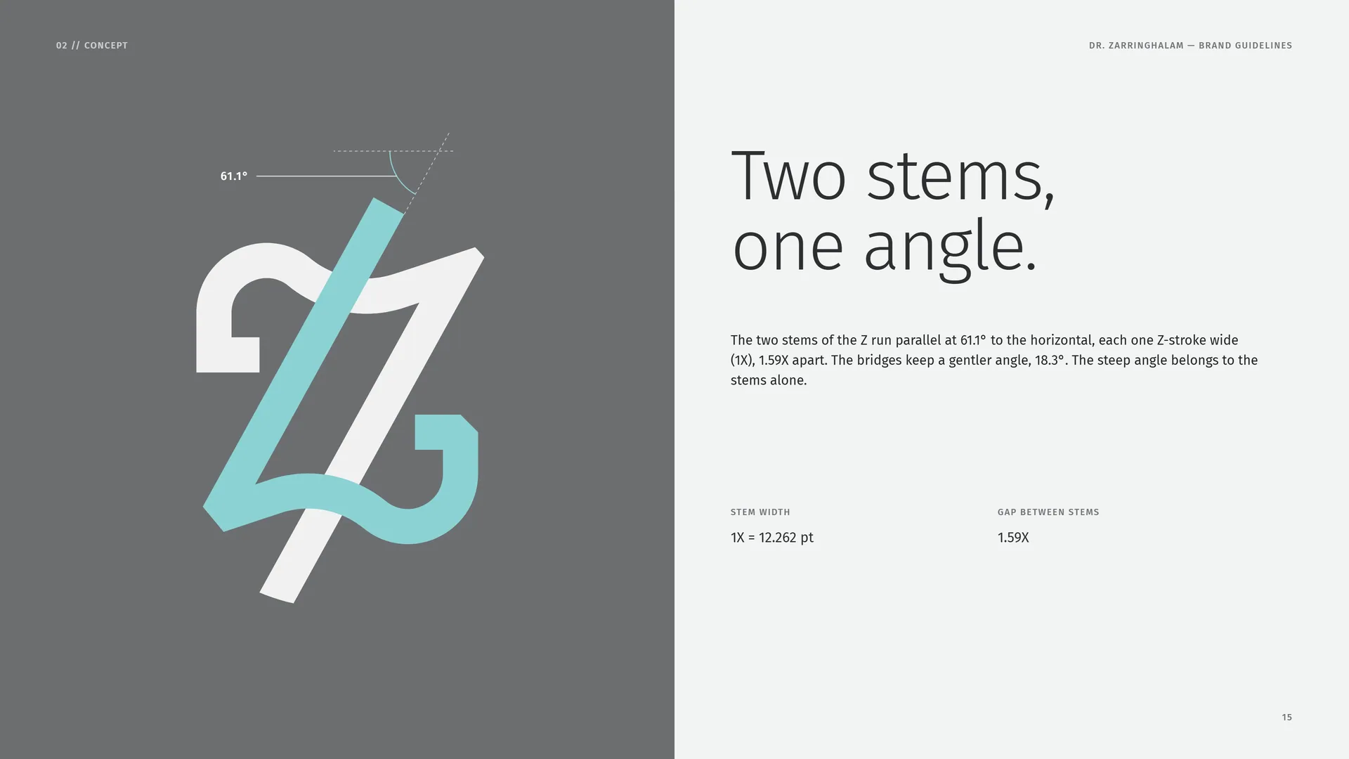
The two stems of the Z run parallel at 61.1° to the horizontal, each one Z-stroke wide (1X), 1.59X apart. The bridges keep a gentler angle, 18.3°. The steep angle belongs to the stems alone.
Stem width: 1X = 12.262 pt.
Gap between stems: 1.59X.
02.5
Steel above, scrubs below
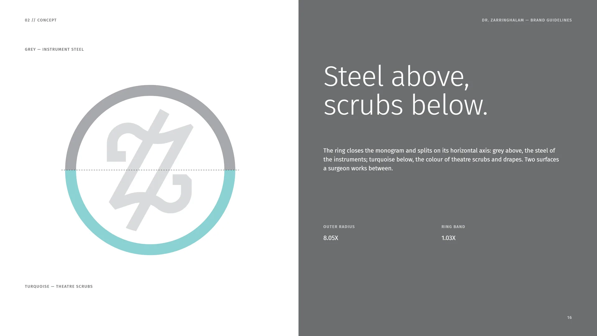
The ring closes the monogram and splits on its horizontal axis: grey above, the steel of the instruments; turquoise below, the colour of theatre scrubs and drapes. Two surfaces a surgeon works between.
Grey — instrument steel · Turquoise — theatre scrubs.
Outer radius: 8.05X.
Ring band: 1.03X.
02.6
Every line, one hand
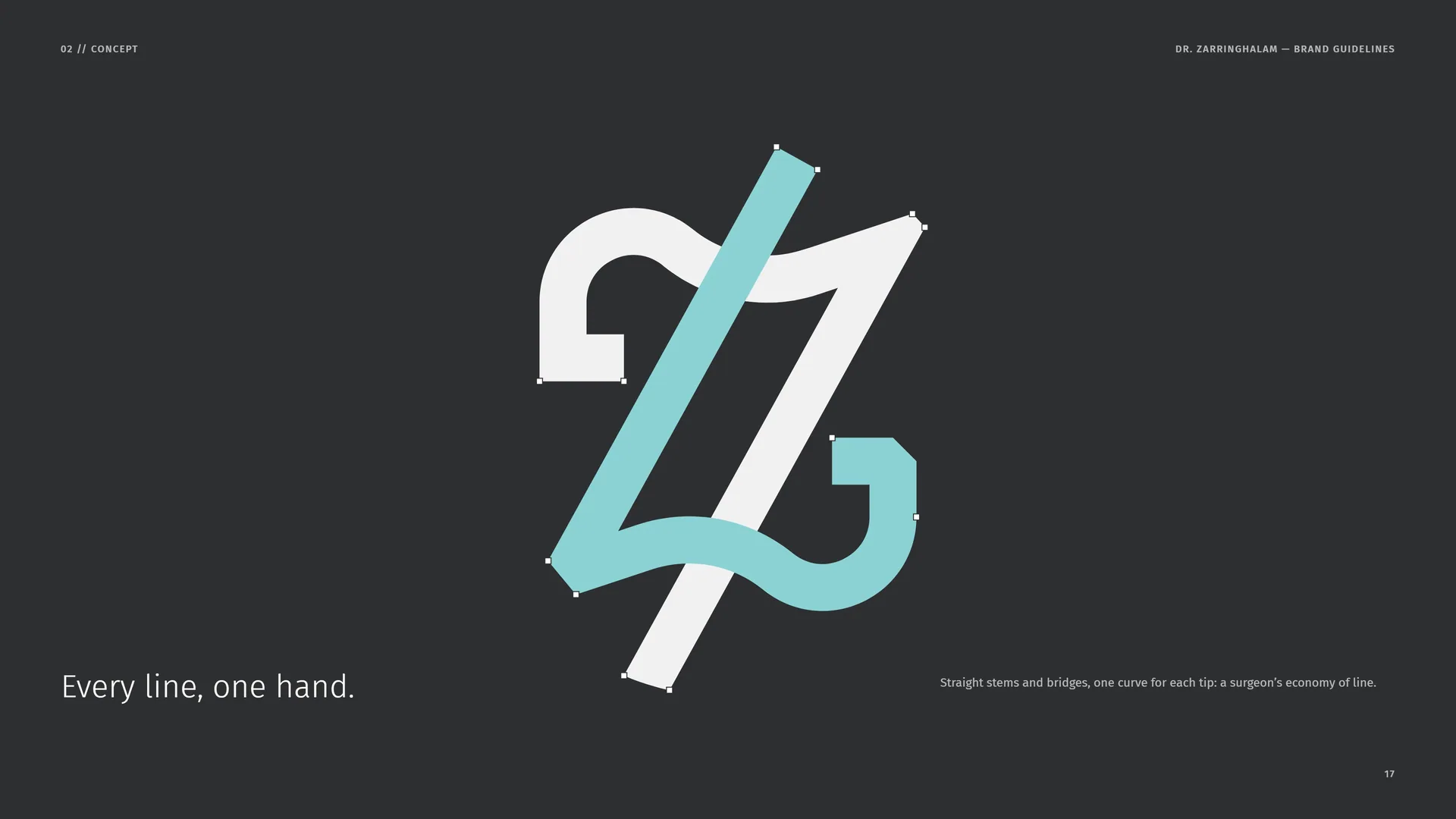
Straight stems and bridges, one curve for each tip: a surgeon’s economy of line.
02.7
The Mark in Motion
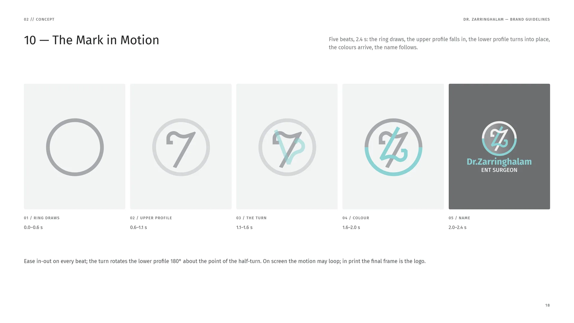
Five beats, 2.4 s: the ring draws, the upper profile falls in, the lower profile turns into place, the colours arrive, the name follows.
Ring draws: 0.0–0.6 s.
Upper profile: 0.6–1.1 s.
The turn: 1.1–1.6 s.
Colour: 1.6–2.0 s.
Name: 2.0–2.4 s.
Ease in-out on every beat; the turn rotates the lower profile 180° about the point of the half-turn. On screen the motion may loop; in print the final frame is the logo.
03
Logo & grid
- 03.1The Primary Logo
- 03.2The Logo Family
- 03.3Anatomy
- 03.4The Construction Grid
- 03.5Proportions in X
- 03.6The Upper Profile, Drawn
- 03.7Ring and Z
- 03.8The Name, Drawn
- 03.9Stacked Proportions
- 03.10Horizontal Proportions
- 03.11Clear Space
- 03.12Colour Versions
- 03.13App Icon & Favicon
- 03.14Minimum Size
- 03.15Misuse
- 03.16Logo on Grounds & Photos
03.1
The Primary Logo
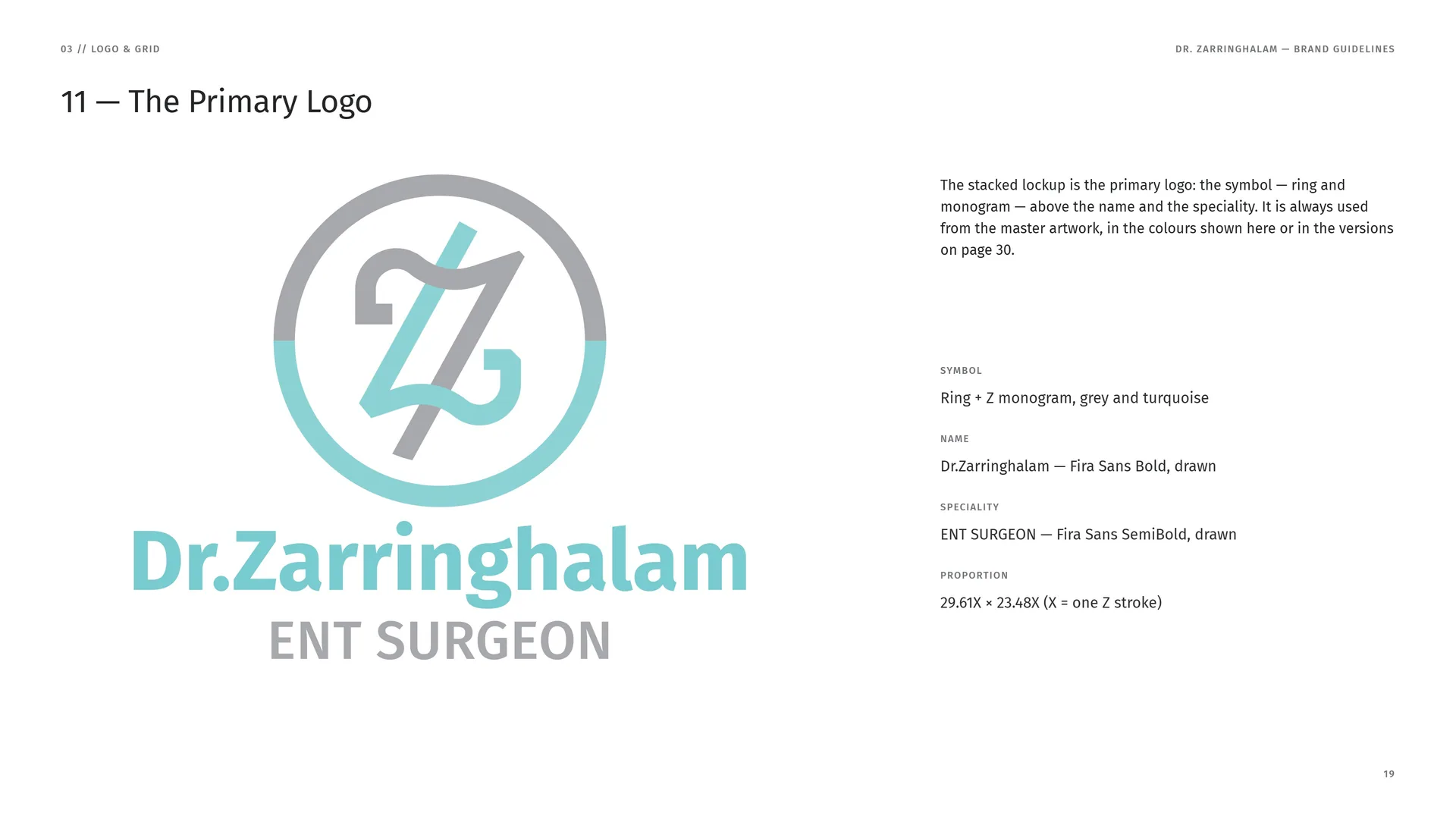
The stacked lockup is the primary logo: the symbol — ring and monogram — above the name and the speciality. It is always used from the master artwork, in the colours shown here or in the versions on page 30.
Symbol: Ring + Z monogram, grey and turquoise.
Name: Dr.Zarringhalam — Fira Sans Bold, drawn.
Speciality: ENT SURGEON — Fira Sans SemiBold, drawn.
Proportion: 29.61X × 23.48X (X = one Z stroke).
03.2
The Logo Family
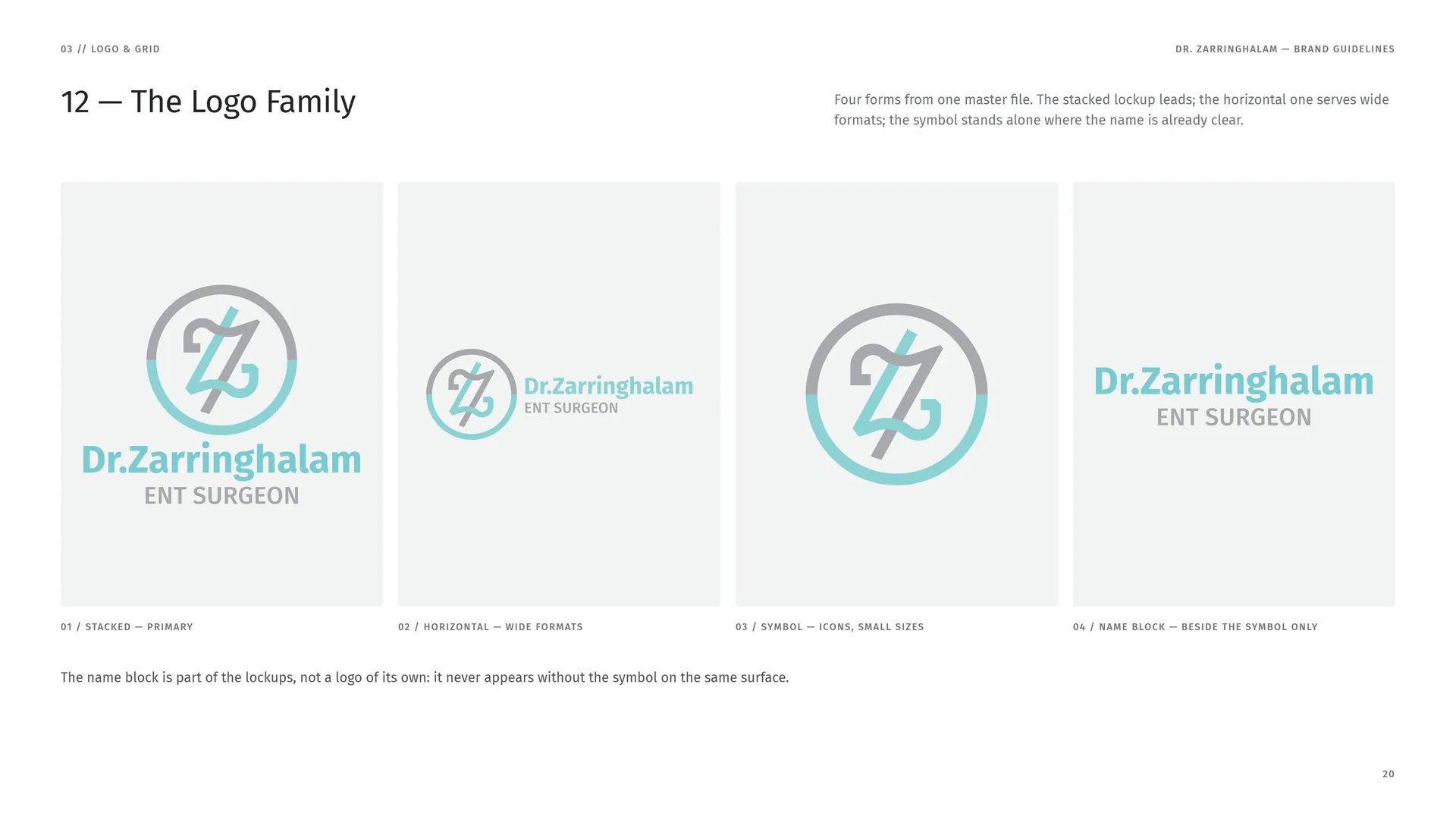
Four forms from one master file. The stacked lockup leads; the horizontal one serves wide formats; the symbol stands alone where the name is already clear.
Stacked — primary.
Horizontal — wide formats.
Symbol — icons, small sizes.
Name block — beside the symbol only.
The name block is part of the lockups, not a logo of its own: it never appears without the symbol on the same surface.
03.3
Anatomy
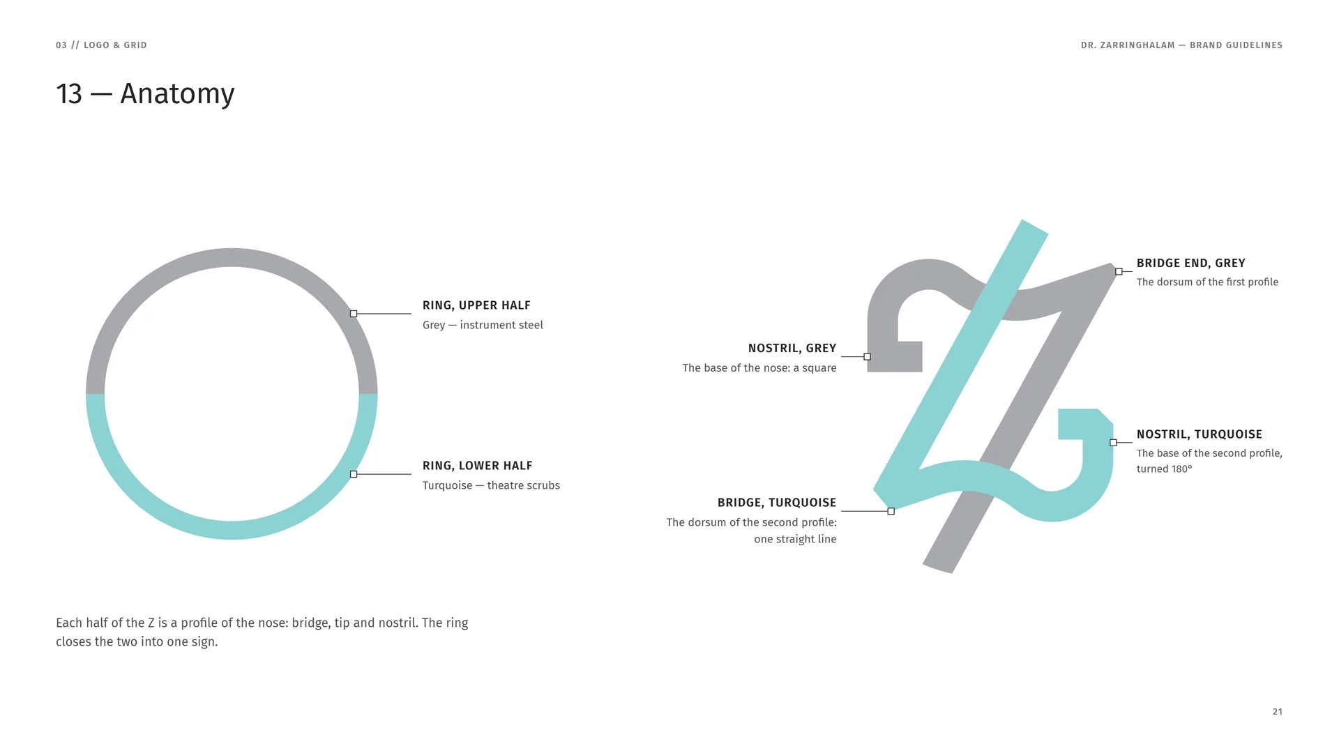
Ring, upper half: Grey — instrument steel.
Ring, lower half: Turquoise — theatre scrubs.
Bridge end, grey: The dorsum of the first profile.
Nostril, grey: The base of the nose: a square.
Nostril, turquoise: The base of the second profile, turned 180°.
Bridge, turquoise: The dorsum of the second profile: one straight line.
Each half of the Z is a profile of the nose: bridge, tip and nostril. The ring closes the two into one sign.
03.4
The Construction Grid
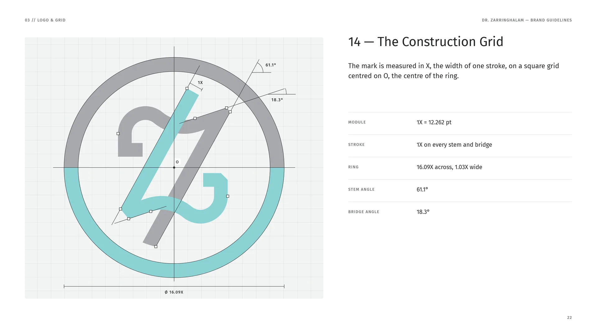
The mark is measured in X, the width of one stroke, on a square grid centred on O, the centre of the ring.
Module: 1X = 12.262 pt.
Stroke: 1X on every stem and bridge.
Ring: 16.09X across, 1.03X wide.
Stem angle: 61.1°.
Bridge angle: 18.3°.
03.5
Proportions in X
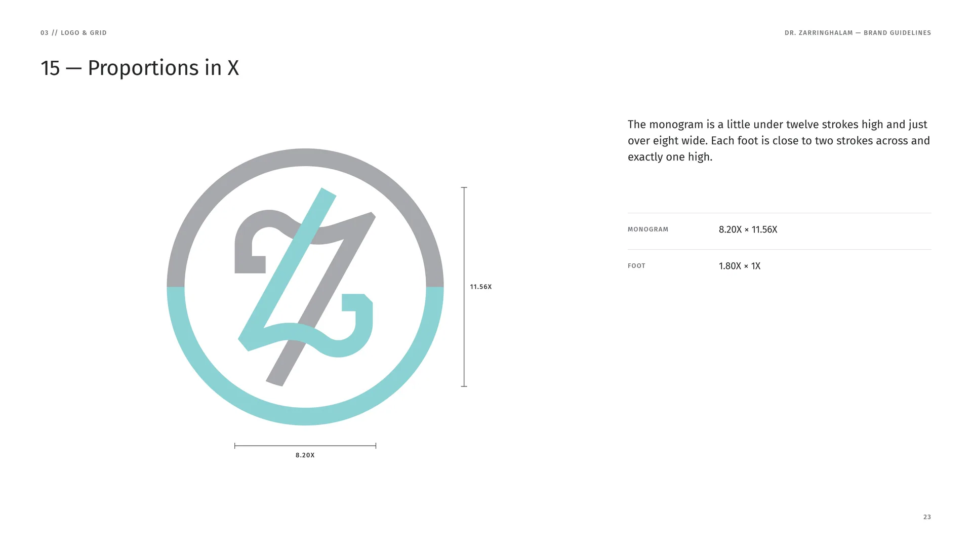
The monogram is a little under twelve strokes high and just over eight wide. Each foot is close to two strokes across and exactly one high.
Monogram: 8.20X × 11.56X.
Foot: 1.80X × 1X.
03.6
The Upper Profile, Drawn
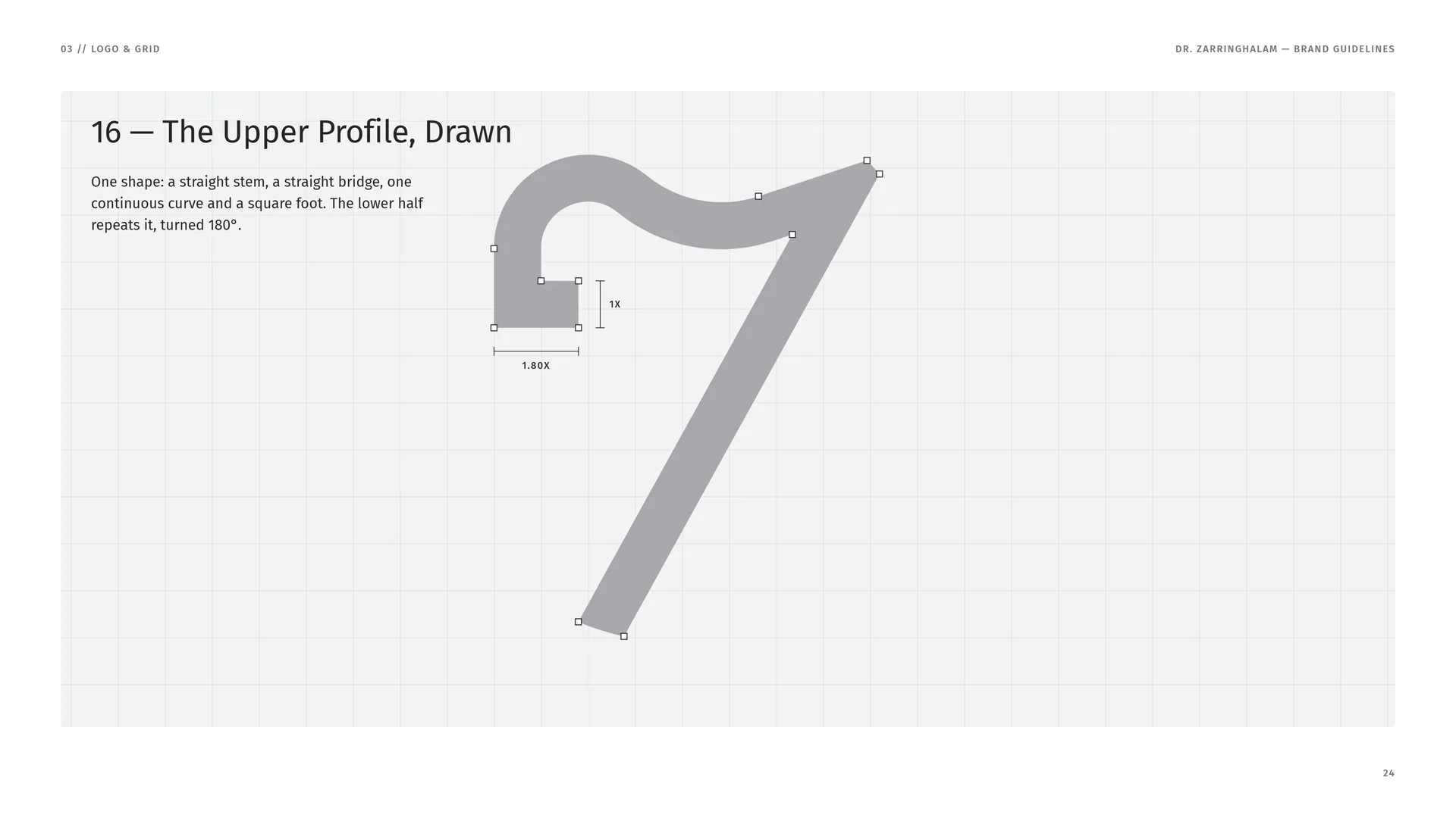
One shape: a straight stem, a straight bridge, one continuous curve and a square foot. The lower half repeats it, turned 180°.
03.7
Ring and Z
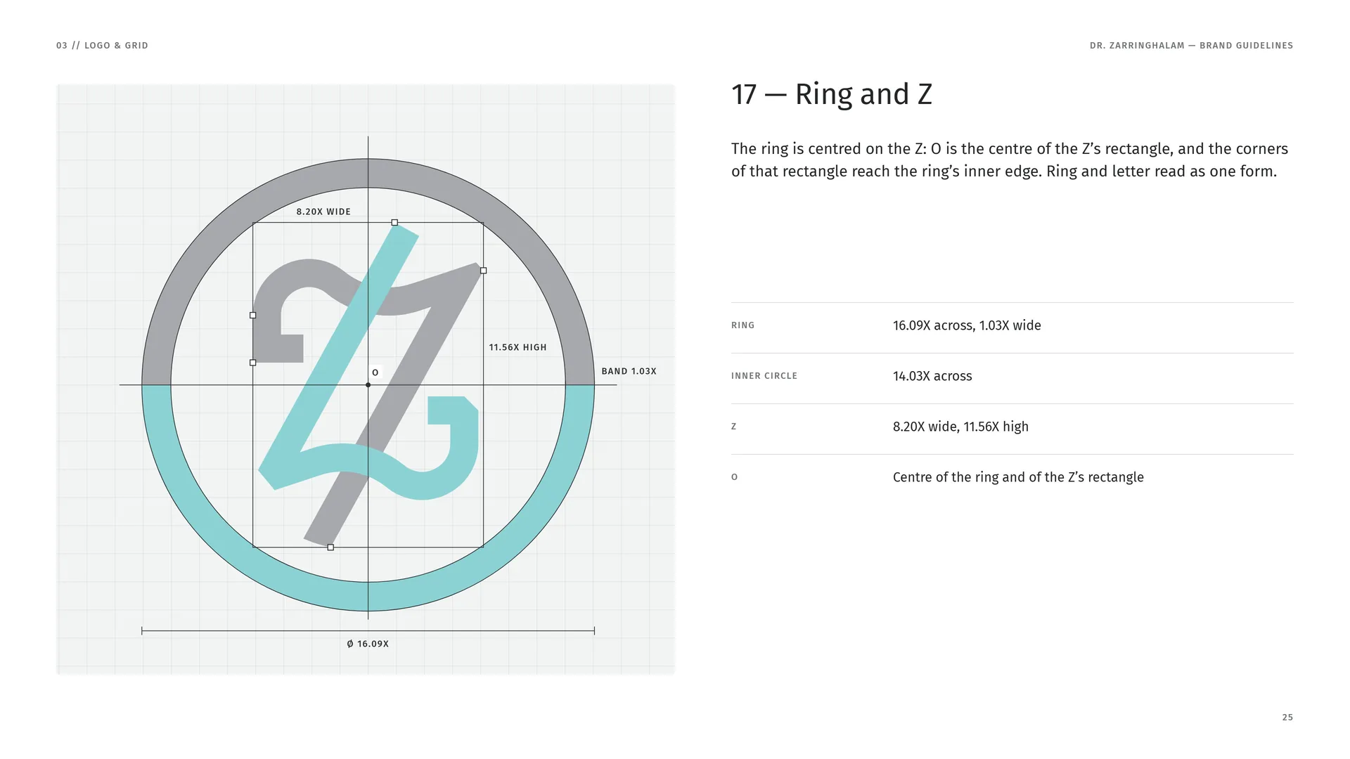
The ring is centred on the Z: O is the centre of the Z’s rectangle, and the corners of that rectangle reach the ring’s inner edge. Ring and letter read as one form.
Ring: 16.09X across, 1.03X wide.
Inner circle: 14.03X across.
Z: 8.20X wide, 11.56X high.
O: Centre of the ring and of the Z’s rectangle.
03.8
The Name, Drawn
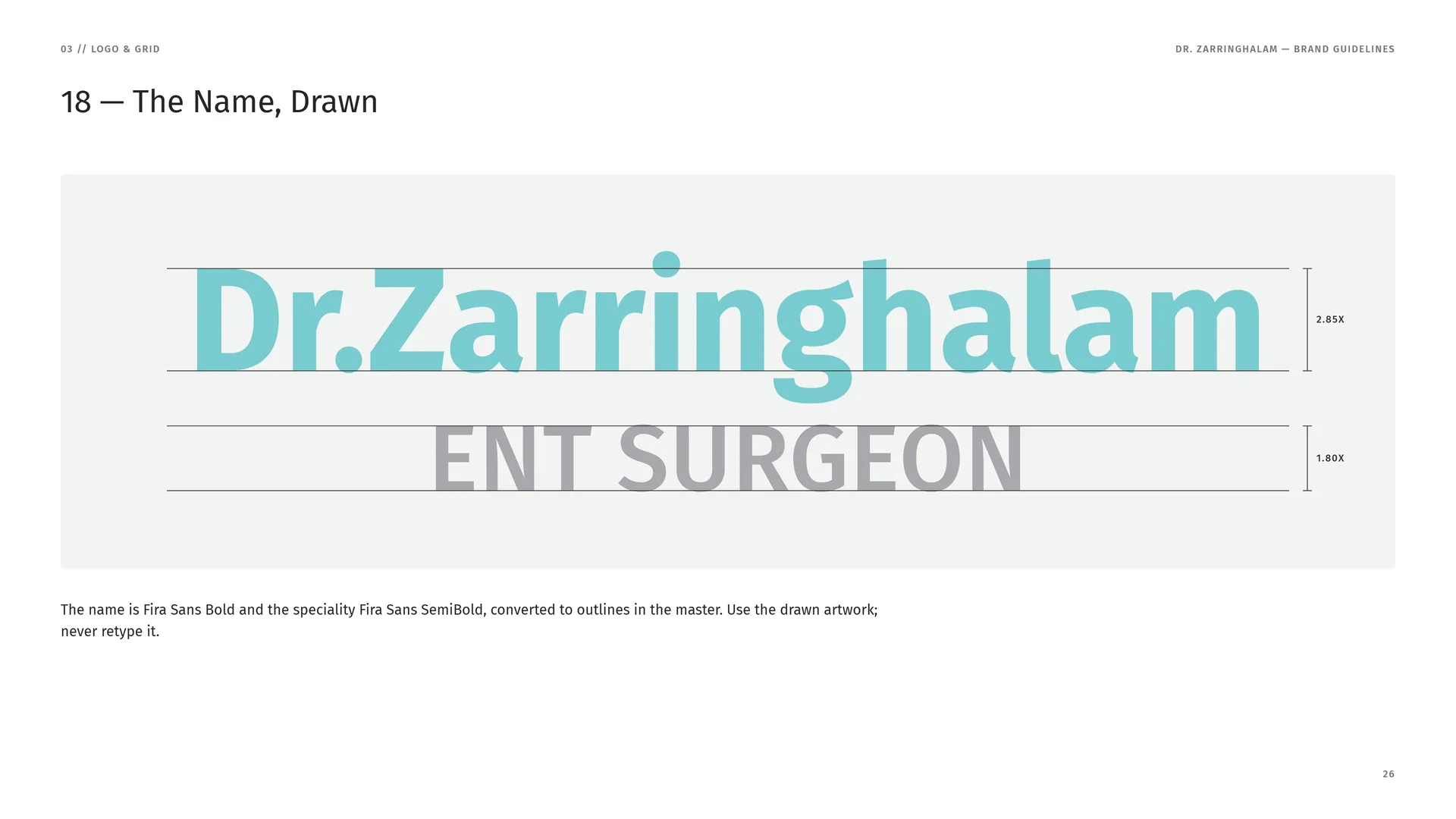
The name is Fira Sans Bold and the speciality Fira Sans SemiBold, converted to outlines in the master. Use the drawn artwork; never retype it.
03.9
Stacked Proportions
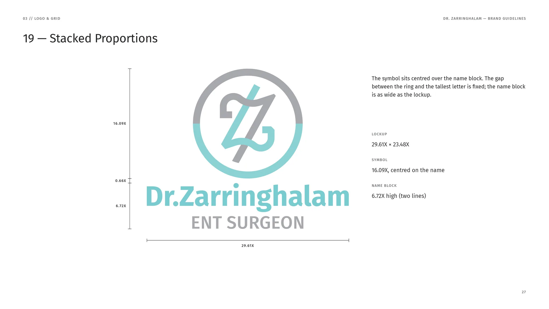
The symbol sits centred over the name block. The gap between the ring and the tallest letter is fixed; the name block is as wide as the lockup.
Lockup: 29.61X × 23.48X.
Symbol: 16.09X, centred on the name.
Name block: 6.72X high (two lines).
03.10
Horizontal Proportions
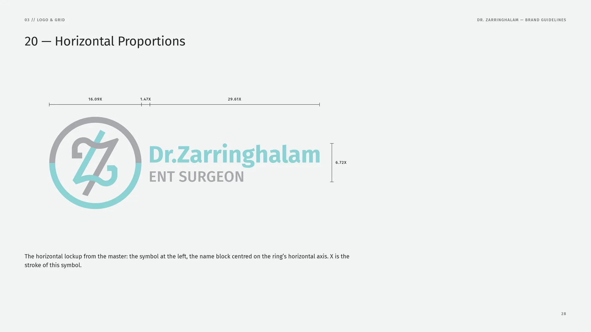
The horizontal lockup from the master: the symbol at the left, the name block centred on the ring’s horizontal axis. X is the stroke of this symbol.
03.11
Clear Space
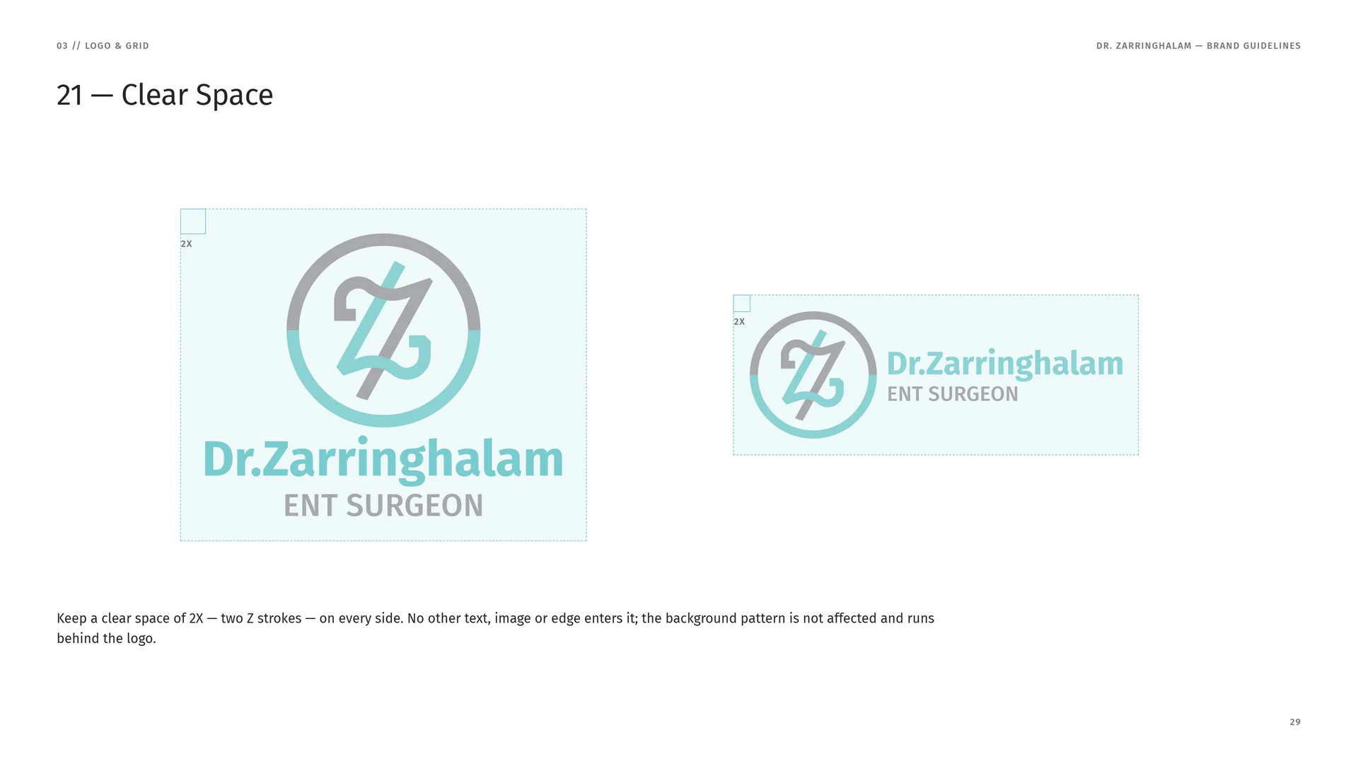
Keep a clear space of 2X — two Z strokes — on every side. No other text, image or edge enters it; the background pattern is not affected and runs behind the logo.
03.12
Colour Versions
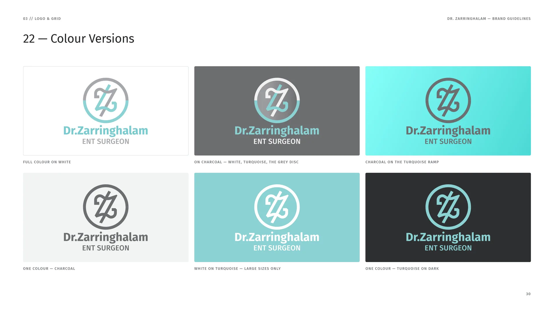
Full colour on white.
On charcoal — white, turquoise, the grey disc.
Charcoal on the turquoise ramp.
One colour — charcoal.
White on turquoise — large sizes only.
One colour — turquoise on dark.
03.13
App Icon & Favicon
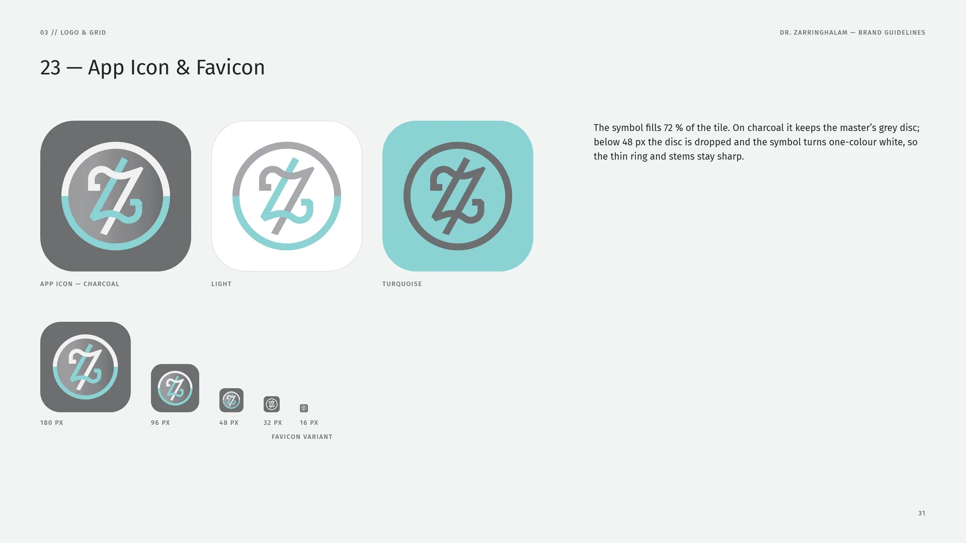
The symbol fills 72 % of the tile. On charcoal it keeps the master’s grey disc; below 48 px the disc is dropped and the symbol turns one-colour white, so the thin ring and stems stay sharp.
App icon — charcoal · Light · Turquoise.
180 px · 96 px · 48 px · 32 px · 16 px — favicon variant.
03.14
Minimum Size
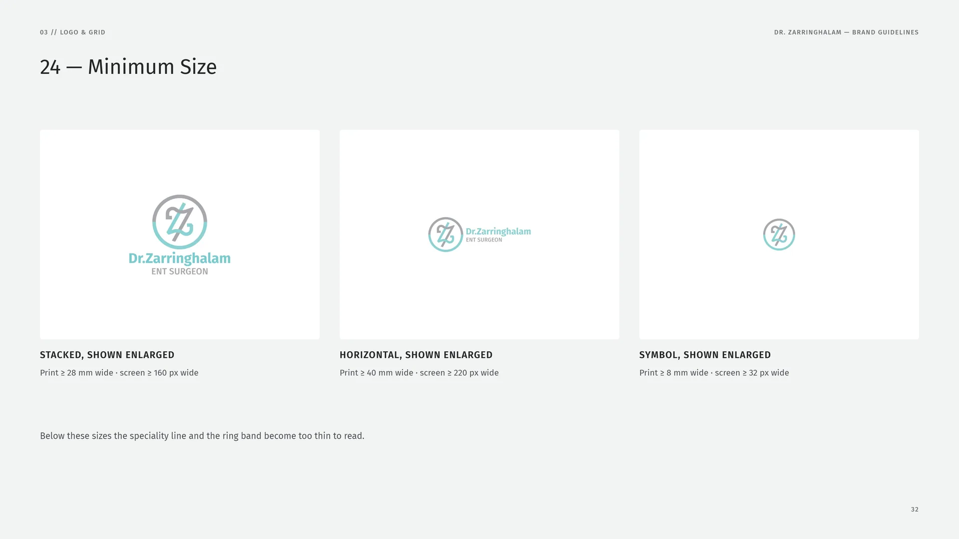
Stacked, shown enlarged: Print ≥ 28 mm wide · screen ≥ 160 px wide.
Horizontal, shown enlarged: Print ≥ 40 mm wide · screen ≥ 220 px wide.
Symbol, shown enlarged: Print ≥ 8 mm wide · screen ≥ 32 px wide.
Below these sizes the speciality line and the ring band become too thin to read.
03.15
Misuse
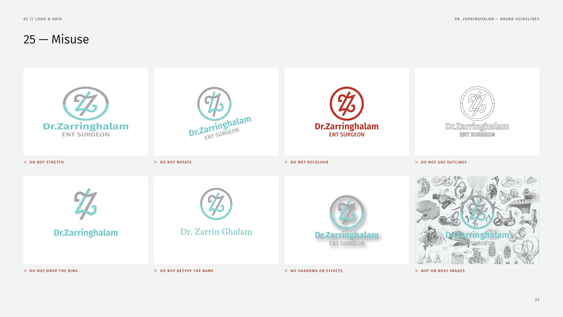
Do not stretch · Do not rotate · Do not recolour · Do not use outlines · Do not drop the ring · Do not retype the name · No shadows or effects · Not on busy images.
03.16
Logo on Grounds & Photos
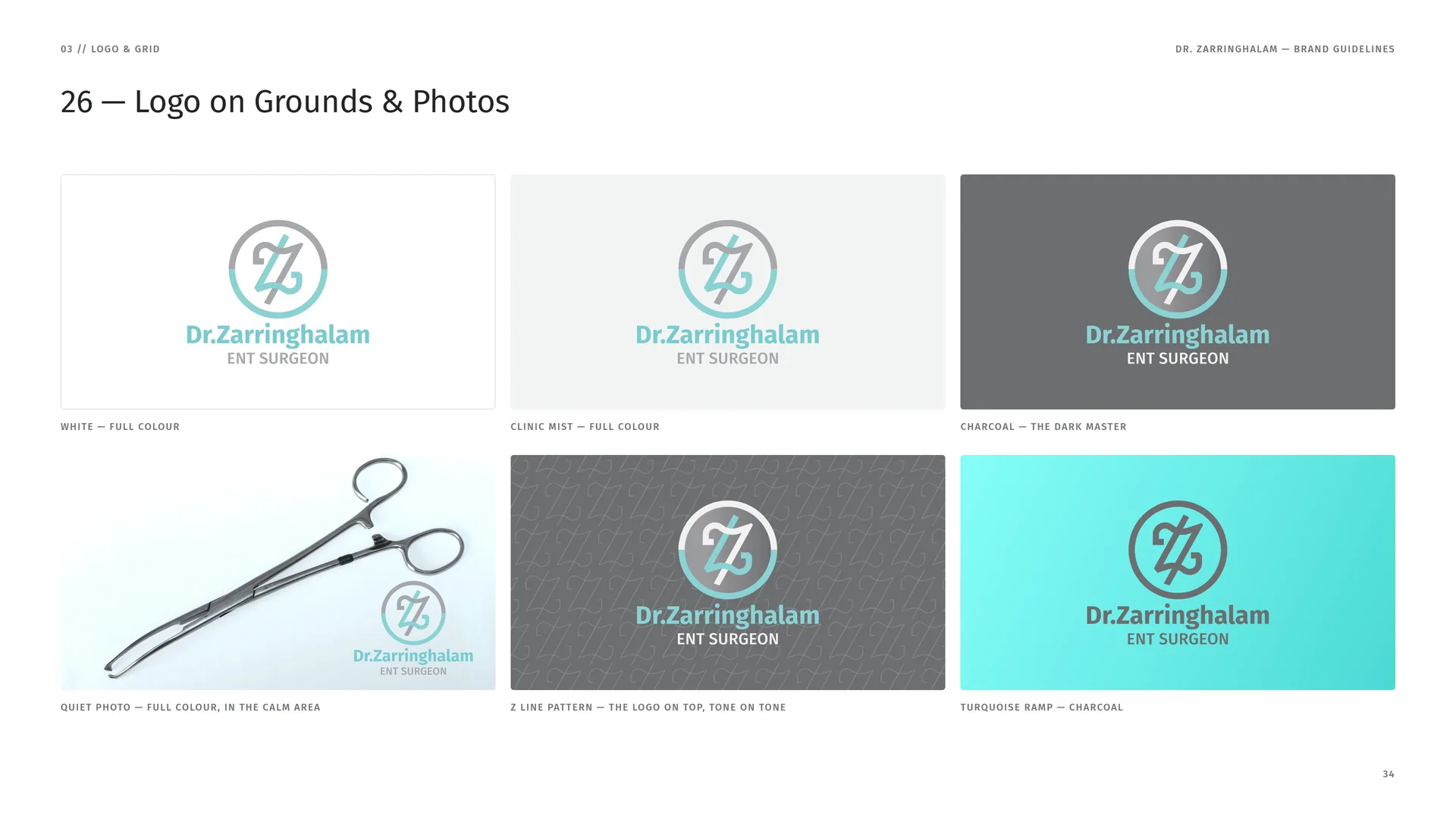
White — full colour.
Clinic Mist — full colour.
Charcoal — the dark master.
Quiet photo — full colour, in the calm area.
Z line pattern — the logo on top, tone on tone.
Turquoise ramp — charcoal.
04
Colour
- 04.1Steel grey, theatre turquoise
- 04.2Colour Values
- 04.3Steel on a drape
- 04.4Contrast & Accessibility
- 04.5Tints & Gradient
04.1
Steel grey, theatre turquoise
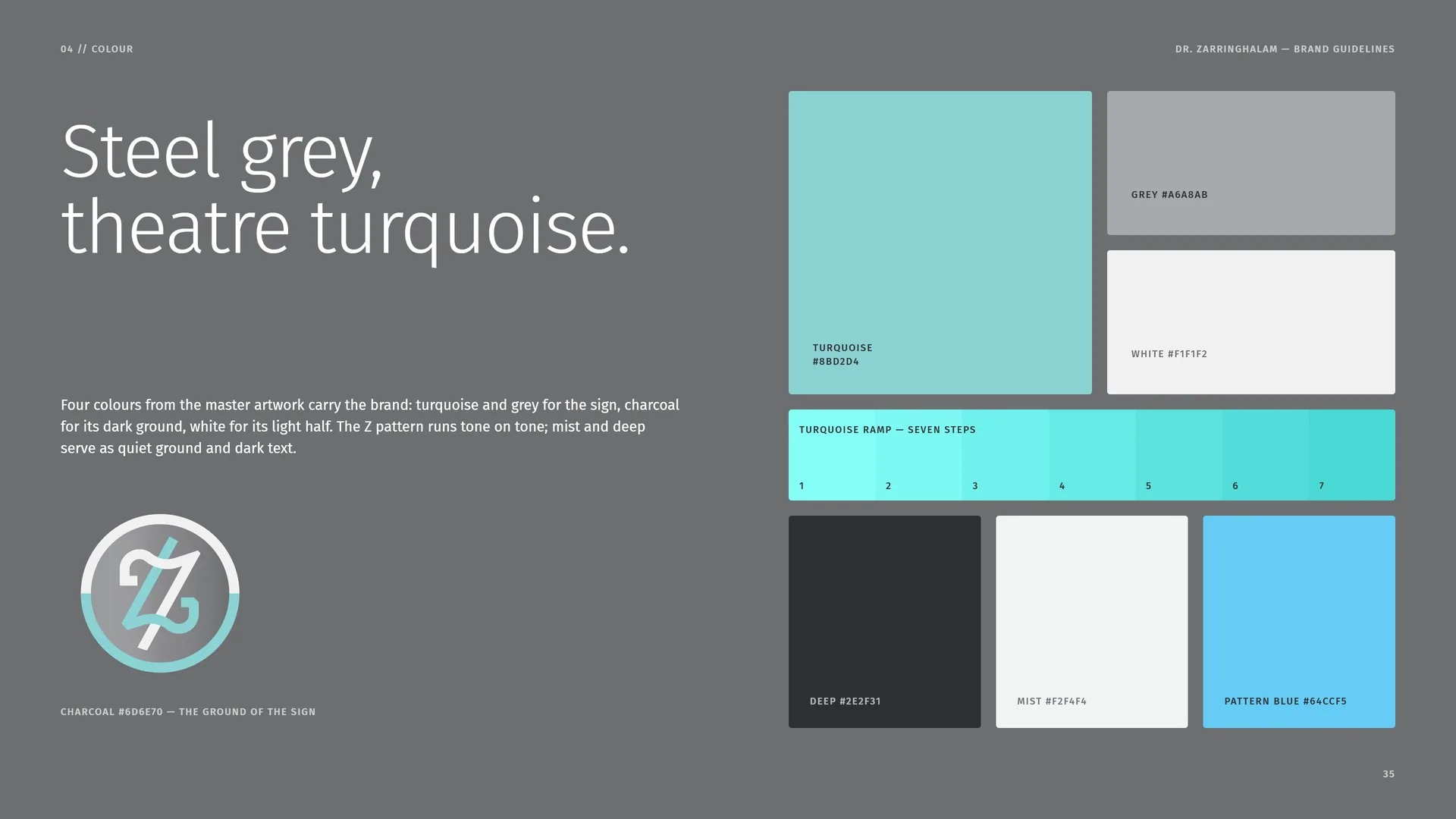
Four colours from the master artwork carry the brand: turquoise and grey for the sign, charcoal for its dark ground, white for its light half. The Z pattern runs tone on tone; mist and deep serve as quiet ground and dark text.
Charcoal #6D6E70 — the ground of the sign.
Turquoise #8BD2D4 · Grey #A6A8AB · White #F1F1F2 · Turquoise ramp — seven steps · Deep #2E2F31 · Mist #F2F4F4 · Pattern Blue #64CCF5.
04.2
Colour Values
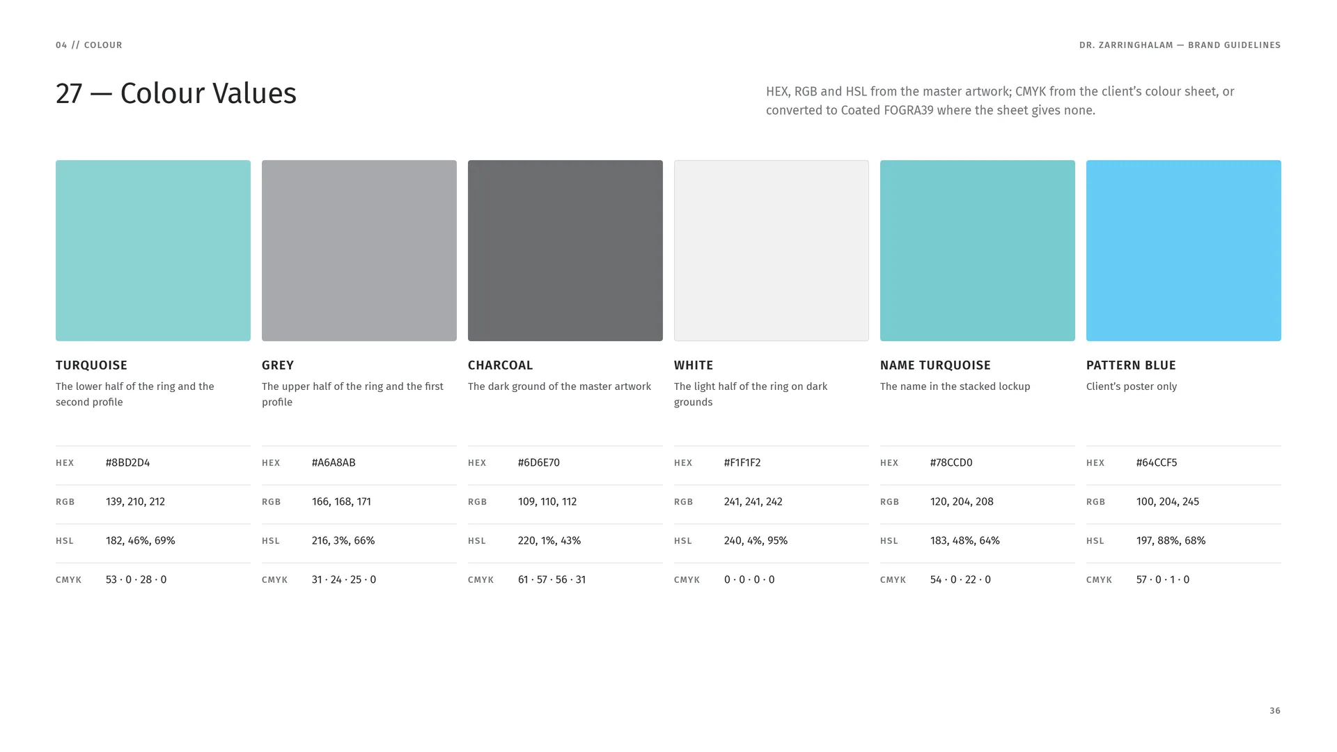
HEX, RGB and HSL from the master artwork; CMYK from the client’s colour sheet, or converted to Coated FOGRA39 where the sheet gives none.
Turquoise — The lower half of the ring and the second profile. HEX #8BD2D4 · RGB 139, 210, 212 · HSL 182, 46%, 69% · CMYK 53 · 0 · 28 · 0.
Grey — The upper half of the ring and the first profile. HEX #A6A8AB · RGB 166, 168, 171 · HSL 216, 3%, 66% · CMYK 31 · 24 · 25 · 0.
Charcoal — The dark ground of the master artwork. HEX #6D6E70 · RGB 109, 110, 112 · HSL 220, 1%, 43% · CMYK 61 · 57 · 56 · 31.
White — The light half of the ring on dark grounds. HEX #F1F1F2 · RGB 241, 241, 242 · HSL 240, 4%, 95% · CMYK 0 · 0 · 0 · 0.
Name Turquoise — The name in the stacked lockup. HEX #78CCD0 · RGB 120, 204, 208 · HSL 183, 48%, 64% · CMYK 54 · 0 · 22 · 0.
Pattern Blue — Client’s poster only. HEX #64CCF5 · RGB 100, 204, 245 · HSL 197, 88%, 68% · CMYK 57 · 0 · 1 · 0.
04.3
Steel on a drape
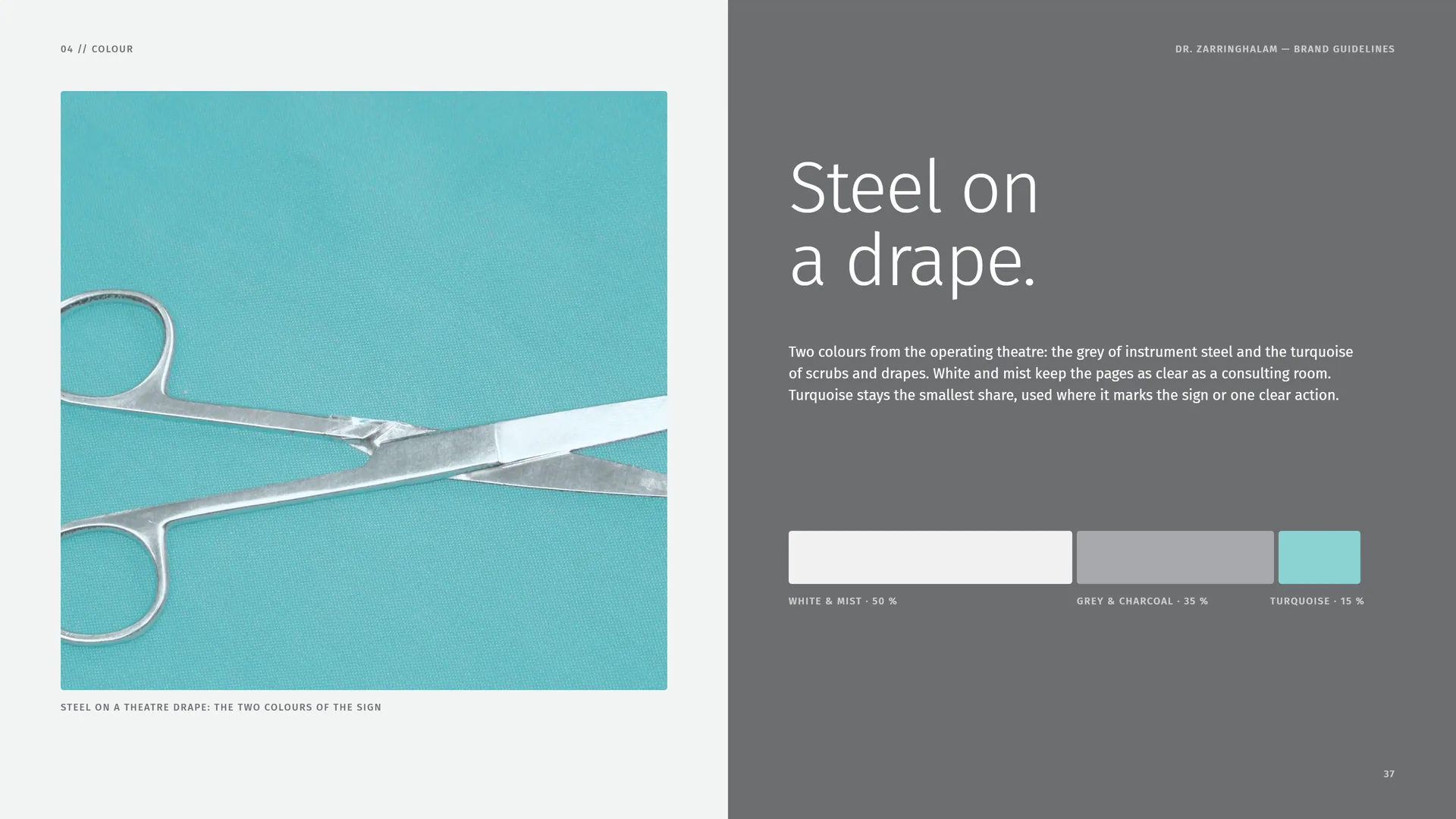
Two colours from the operating theatre: the grey of instrument steel and the turquoise of scrubs and drapes. White and mist keep the pages as clear as a consulting room. Turquoise stays the smallest share, used where it marks the sign or one clear action.
White & mist · 50 % — Grey & charcoal · 35 % — Turquoise · 15 %.
Steel on a theatre drape: the two colours of the sign.
04.4
Contrast & Accessibility
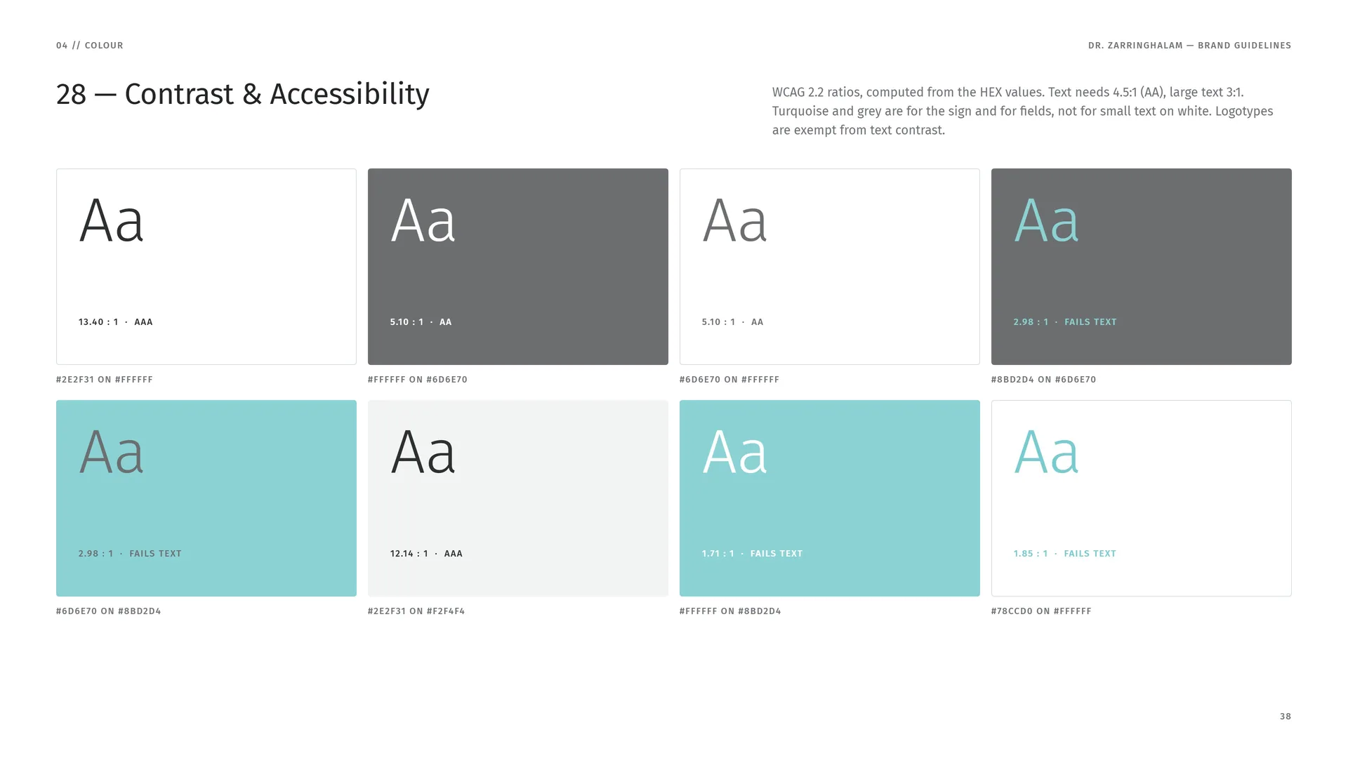
WCAG 2.2 ratios, computed from the HEX values. Text needs 4.5:1 (AA), large text 3:1. Turquoise and grey are for the sign and for fields, not for small text on white. Logotypes are exempt from text contrast.
#2E2F31 on #FFFFFF · 13.40 : 1 · AAA.
#FFFFFF on #6D6E70 · 5.10 : 1 · AA.
#6D6E70 on #FFFFFF · 5.10 : 1 · AA.
#8BD2D4 on #6D6E70 · 2.98 : 1 · Fails text.
#6D6E70 on #8BD2D4 · 2.98 : 1 · Fails text.
#2E2F31 on #F2F4F4 · 12.14 : 1 · AAA.
#FFFFFF on #8BD2D4 · 1.71 : 1 · Fails text.
#78CCD0 on #FFFFFF · 1.85 : 1 · Fails text.
04.5
Tints & Gradient
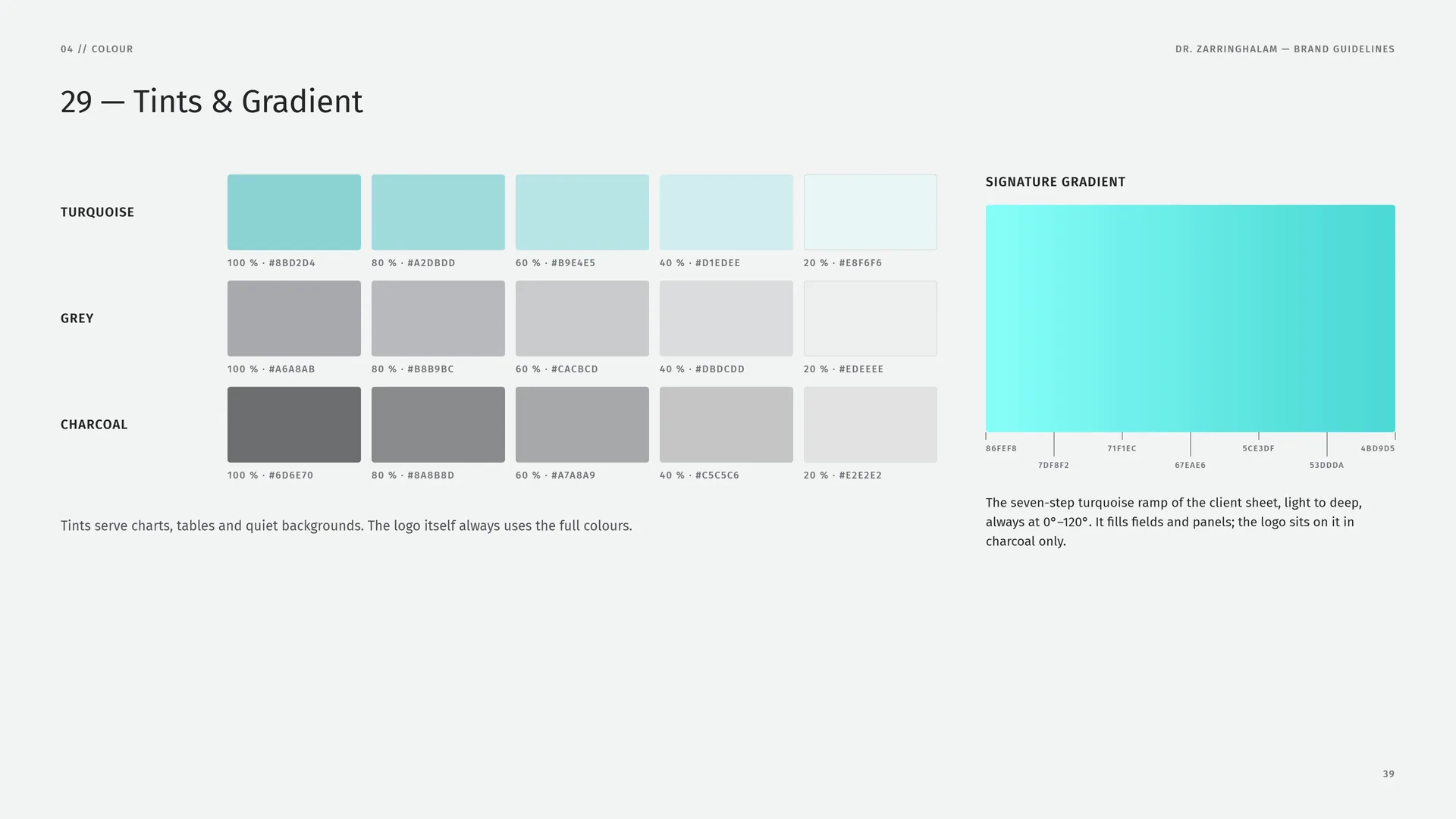
Turquoise: 100 % #8BD2D4 · 80 % #A2DBDD · 60 % #B9E4E5 · 40 % #D1EDEE · 20 % #E8F6F6.
Grey: 100 % #A6A8AB · 80 % #B8B9BC · 60 % #CACBCD · 40 % #DBDCDD · 20 % #EDEEEE.
Charcoal: 100 % #6D6E70 · 80 % #8A8B8D · 60 % #A7A8A9 · 40 % #C5C5C6 · 20 % #E2E2E2.
Tints serve charts, tables and quiet backgrounds. The logo itself always uses the full colours.
Signature gradient: #86FEF8 · #7DF8F2 · #71F1EC · #67EAE6 · #5CE3DF · #53DDDA · #4BD9D5.
The seven-step turquoise ramp of the client sheet, light to deep, always at 0°–120°. It fills fields and panels; the logo sits on it in charcoal only.
05
Typography
05.1
Fira Sans
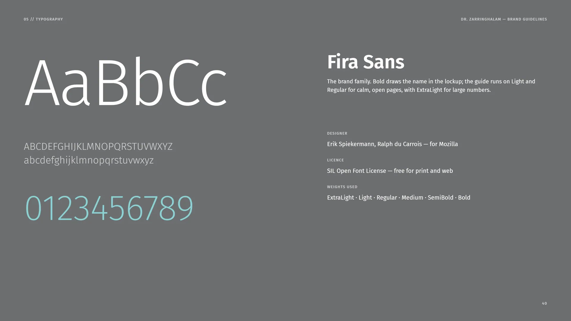
The brand family. Bold draws the name in the lockup; the guide runs on Light and Regular for calm, open pages, with ExtraLight for large numbers.
Designer: Erik Spiekermann, Ralph du Carrois — for Mozilla.
Licence: SIL Open Font License — free for print and web.
Weights used: ExtraLight · Light · Regular · Medium · SemiBold · Bold.
05.2
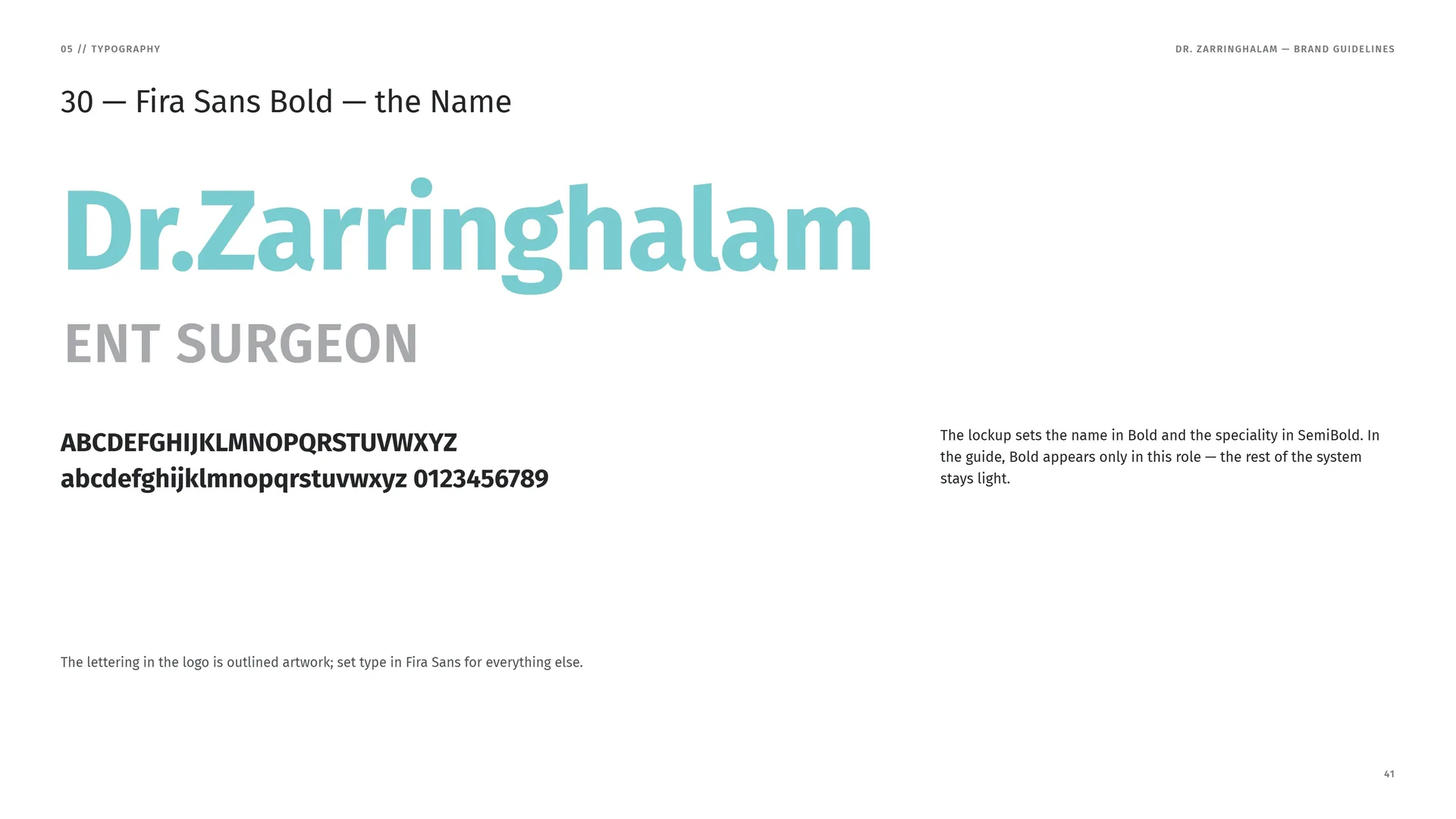
Fira Sans Bold — the Name
The lockup sets the name in Bold and the speciality in SemiBold. In the guide, Bold appears only in this role — the rest of the system stays light.
The lettering in the logo is outlined artwork; set type in Fira Sans for everything else.
05.3
Weights
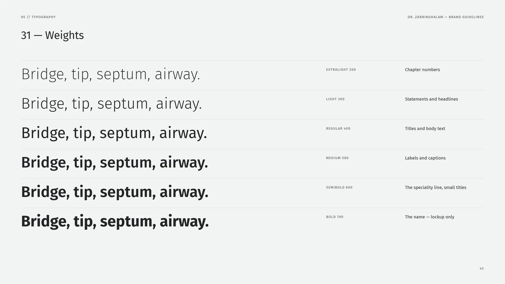
Bridge, tip, septum, airway.
ExtraLight 200: Chapter numbers.
Light 300: Statements and headlines.
Regular 400: Titles and body text.
Medium 500: Labels and captions.
SemiBold 600: The speciality line, small titles.
Bold 700: The name — lockup only.
05.4
Type System
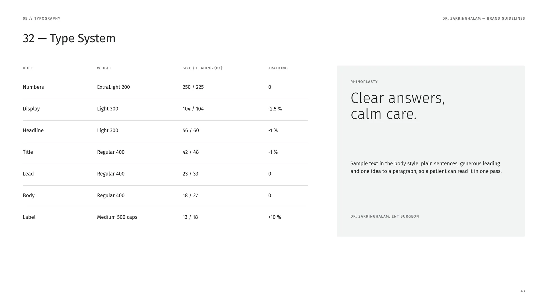
Numbers: ExtraLight 200 · 250 / 225 px · tracking 0.
Display: Light 300 · 104 / 104 px · tracking −2.5 %.
Headline: Light 300 · 56 / 60 px · tracking −1 %.
Title: Regular 400 · 42 / 48 px · tracking −1 %.
Lead: Regular 400 · 23 / 33 px · tracking 0.
Body: Regular 400 · 18 / 27 px · tracking 0.
Label: Medium 500 caps · 13 / 18 px · tracking +10 %.
Rhinoplasty: Clear answers, calm care.
Sample text in the body style: plain sentences, generous leading and one idea to a paragraph, so a patient can read it in one pass.
Dr. Zarringhalam, ENT surgeon.
06
Pattern
- 06.1The Z, as a single line
- 06.2How the Pattern Is Built
- 06.3Scale & Line
- 06.4Pattern Rules
- 06.5Pattern in Use
06.1
The Z, as a single line
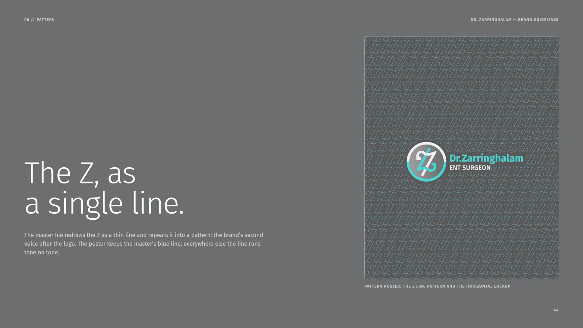
The master file redraws the Z as a thin line and repeats it into a pattern: the brand’s second voice after the logo. The poster keeps the master’s blue line; everywhere else the line runs tone on tone.
Pattern poster: the Z line pattern and the horizontal lockup.
06.2
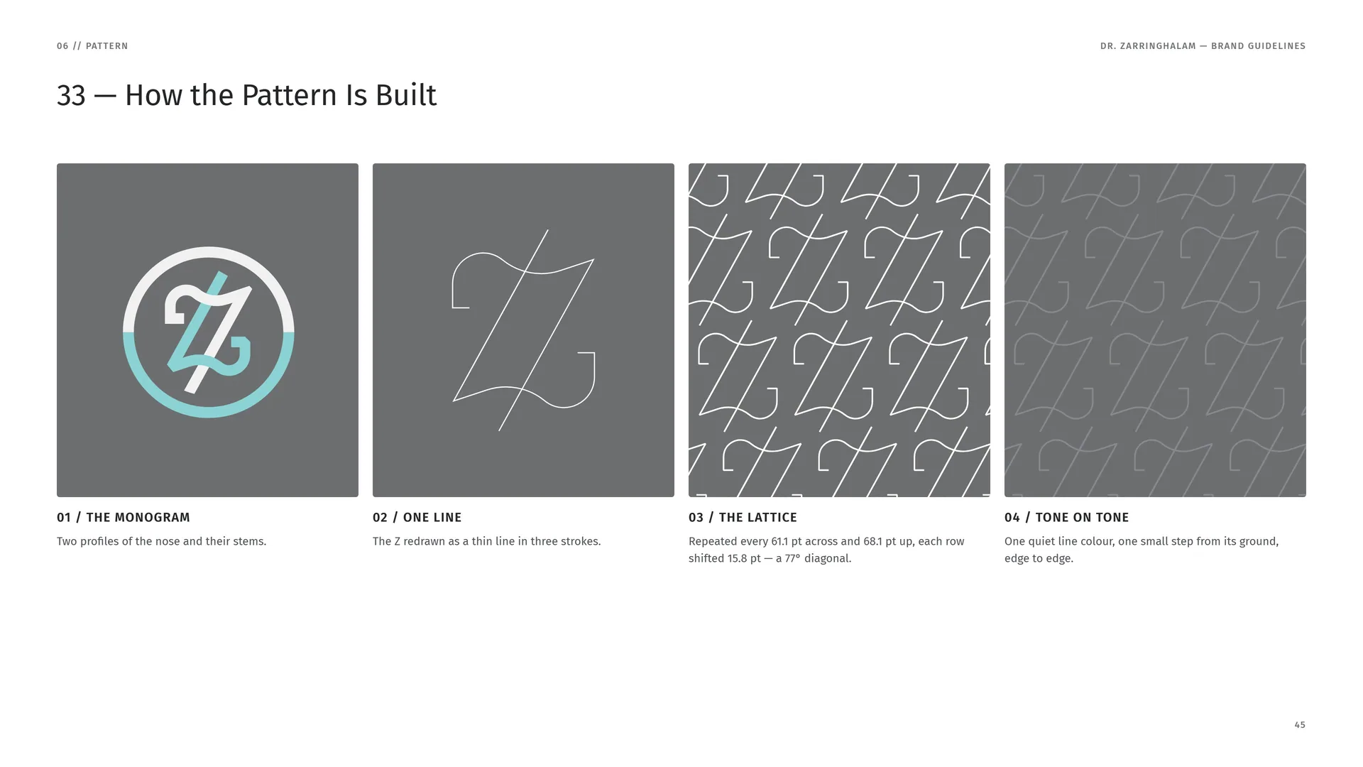
How the Pattern Is Built
The monogram: Two profiles of the nose and their stems.
One line: The Z redrawn as a thin line in three strokes.
The lattice: Repeated every 61.1 pt across and 68.1 pt up, each row shifted 15.8 pt — a 77° diagonal.
Tone on tone: One quiet line colour, one small step from its ground, edge to edge.
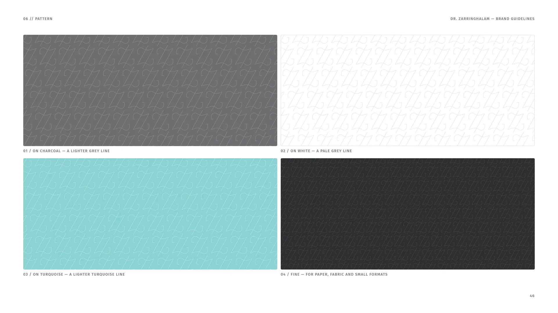
On charcoal — a lighter grey line.
On white — a pale grey line.
On turquoise — a lighter turquoise line.
Fine — for paper, fabric and small formats.
06.3
Scale & Line
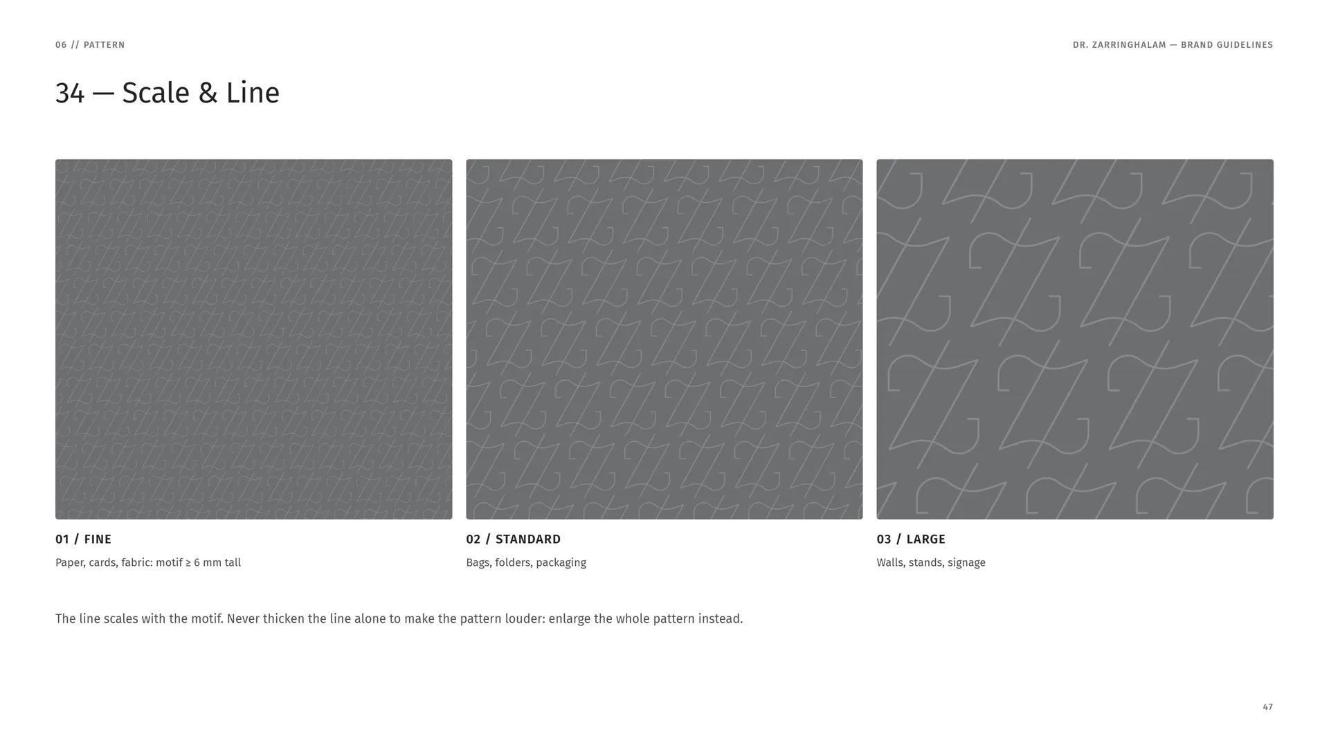
Fine: Paper, cards, fabric: motif ≥ 6 mm tall.
Standard: Bags, folders, packaging.
Large: Walls, stands, signage.
The line scales with the motif. Never thicken the line alone to make the pattern louder: enlarge the whole pattern instead.
06.4
Pattern Rules
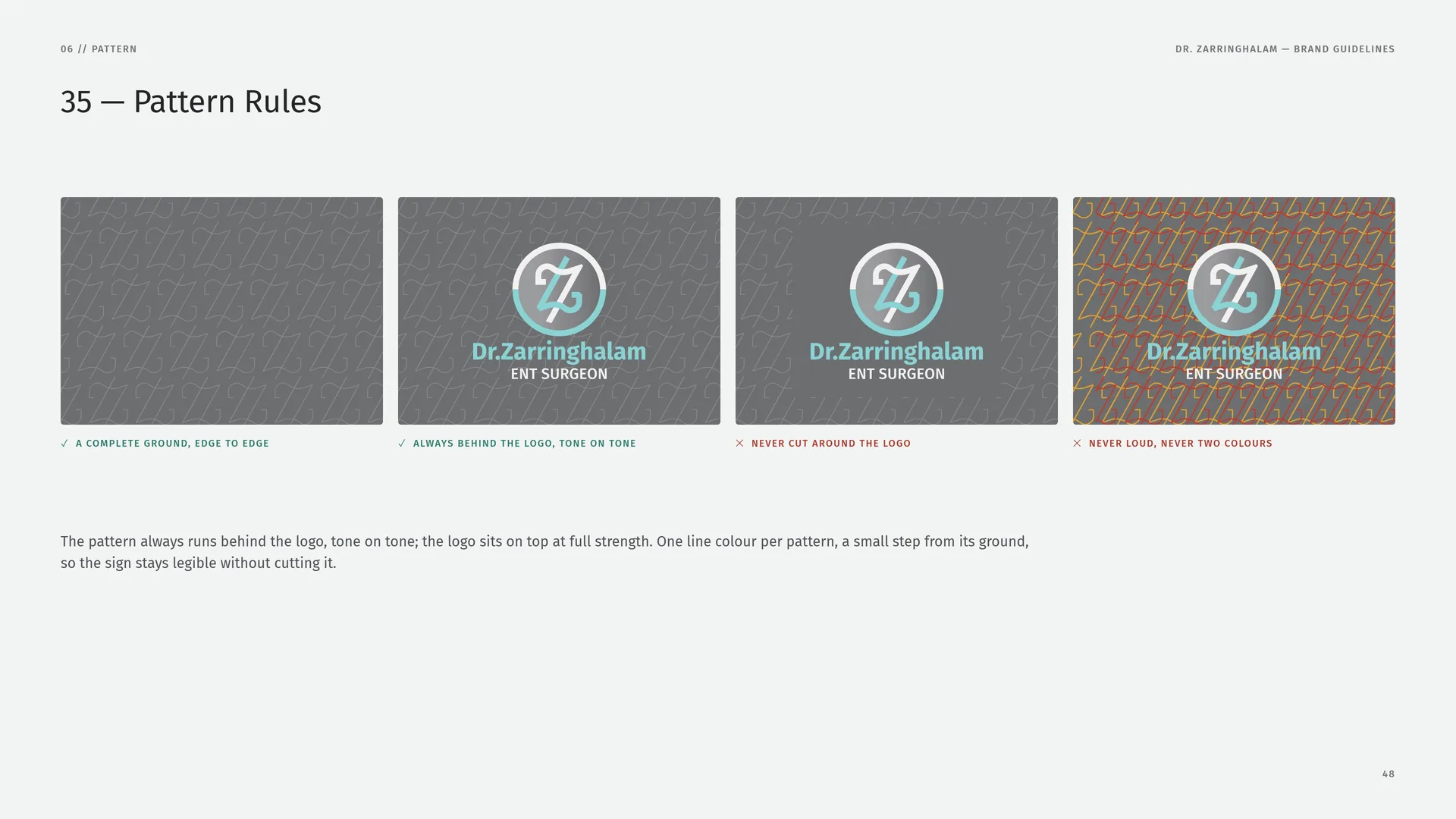
A complete ground, edge to edge · Always behind the logo, tone on tone.
Never cut around the logo · Never loud, never two colours.
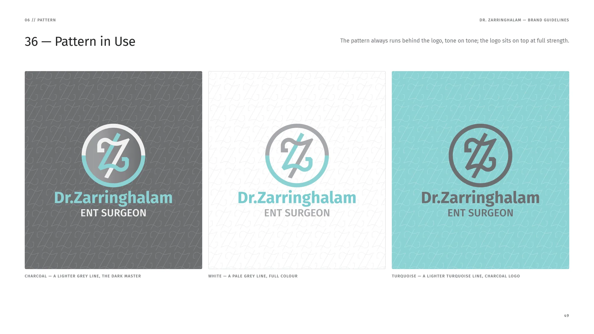
The pattern always runs behind the logo, tone on tone; the logo sits on top at full strength. One line colour per pattern, a small step from its ground, so the sign stays legible without cutting it.
06.5
Pattern in Use
The pattern always runs behind the logo, tone on tone; the logo sits on top at full strength.
Charcoal — a lighter grey line, the dark master.
White — a pale grey line, full colour.
Turquoise — a lighter turquoise line, charcoal logo.
07
Imagery
07.1
Photography
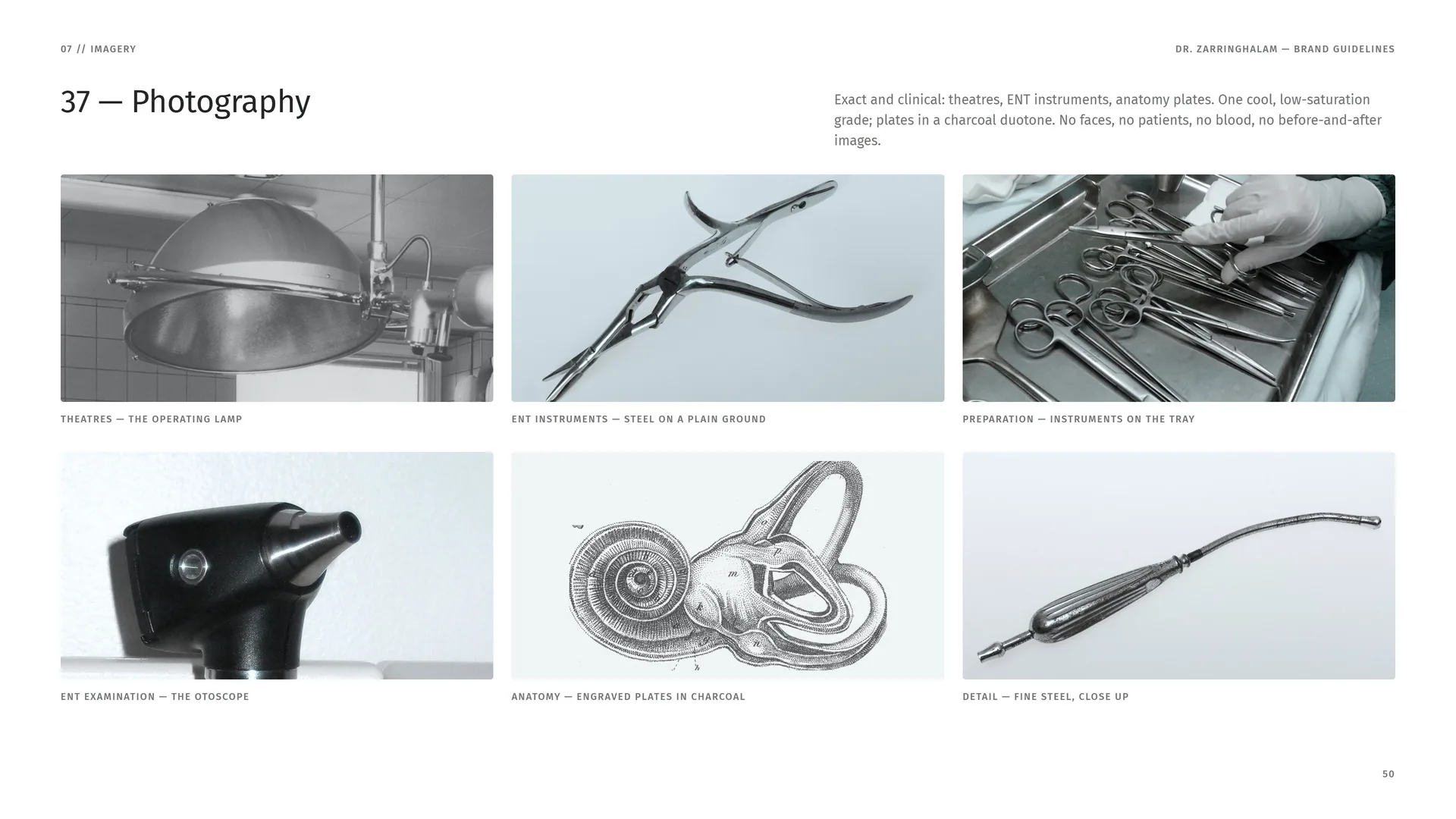
Exact and clinical: theatres, ENT instruments, anatomy plates. One cool, low-saturation grade; plates in a charcoal duotone. No faces, no patients, no blood, no before-and-after images.
Theatres — the operating lamp.
ENT instruments — steel on a plain ground.
Preparation — instruments on the tray.
ENT examination — the otoscope.
Anatomy — engraved plates in charcoal.
Detail — fine steel, close up.
08
Stationery
Cards, letterhead, folders and the paper a patient takes home.
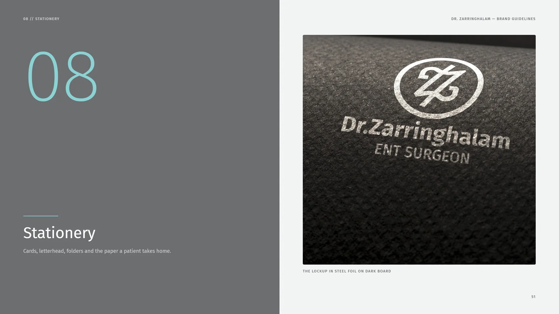
The lockup in steel foil on dark board.
08.1
Business & Appointment Card
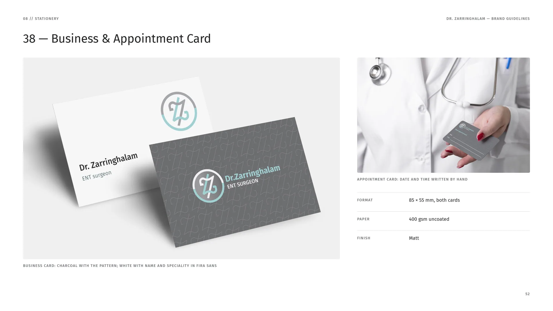
Business card: charcoal with the pattern; white with name and speciality in Fira Sans.
Appointment card: date and time written by hand.
Format: 85 × 55 mm, both cards.
Paper: 400 gsm uncoated.
Finish: Matt.
08.2
Letterhead & Envelope
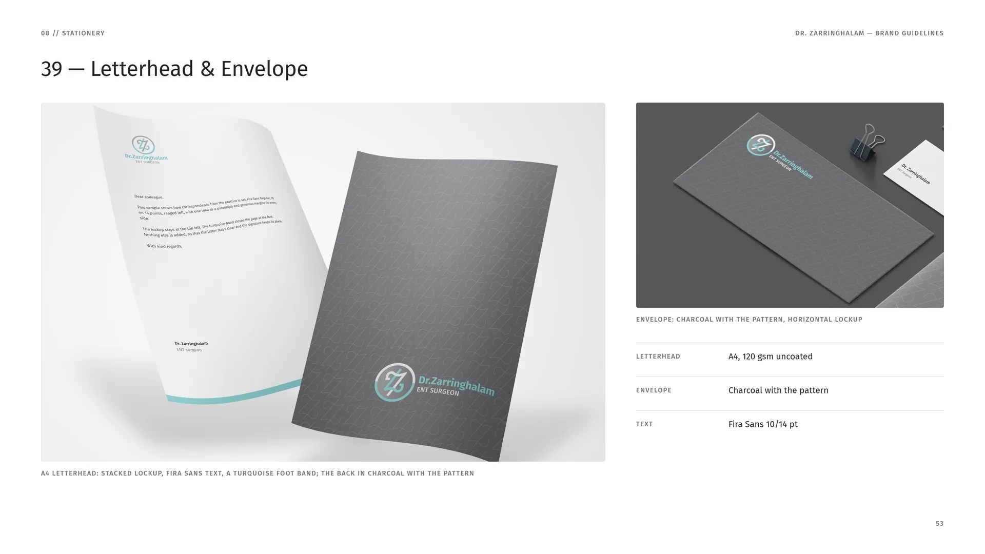
A4 letterhead: stacked lockup, Fira Sans text, a turquoise foot band; the back in charcoal with the pattern.
Envelope: charcoal with the pattern, horizontal lockup.
Letterhead: A4, 120 gsm uncoated.
Envelope: Charcoal with the pattern.
Text: Fira Sans 10/14 pt.
08.3
Folder & Notebook
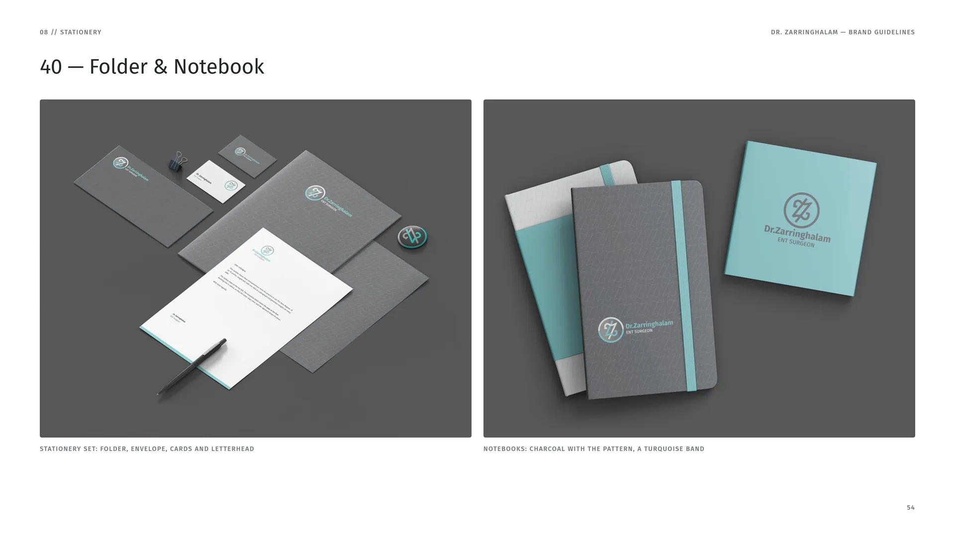
Stationery set: folder, envelope, cards and letterhead.
Notebooks: charcoal with the pattern, a turquoise band.
08.4
Patient Paper
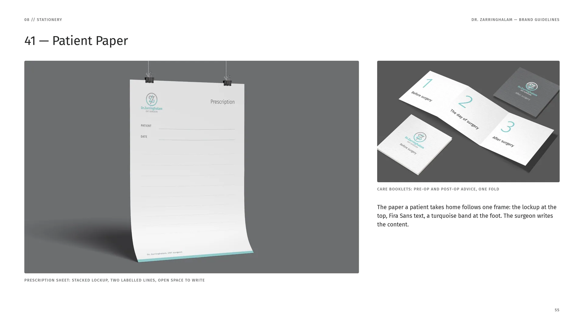
Prescription sheet: stacked lockup, two labelled lines, open space to write.
Care booklets: pre-op and post-op advice, one fold.
The paper a patient takes home follows one frame: the lockup at the top, Fira Sans text, a turquoise band at the foot. The surgeon writes the content.
09
Packaging
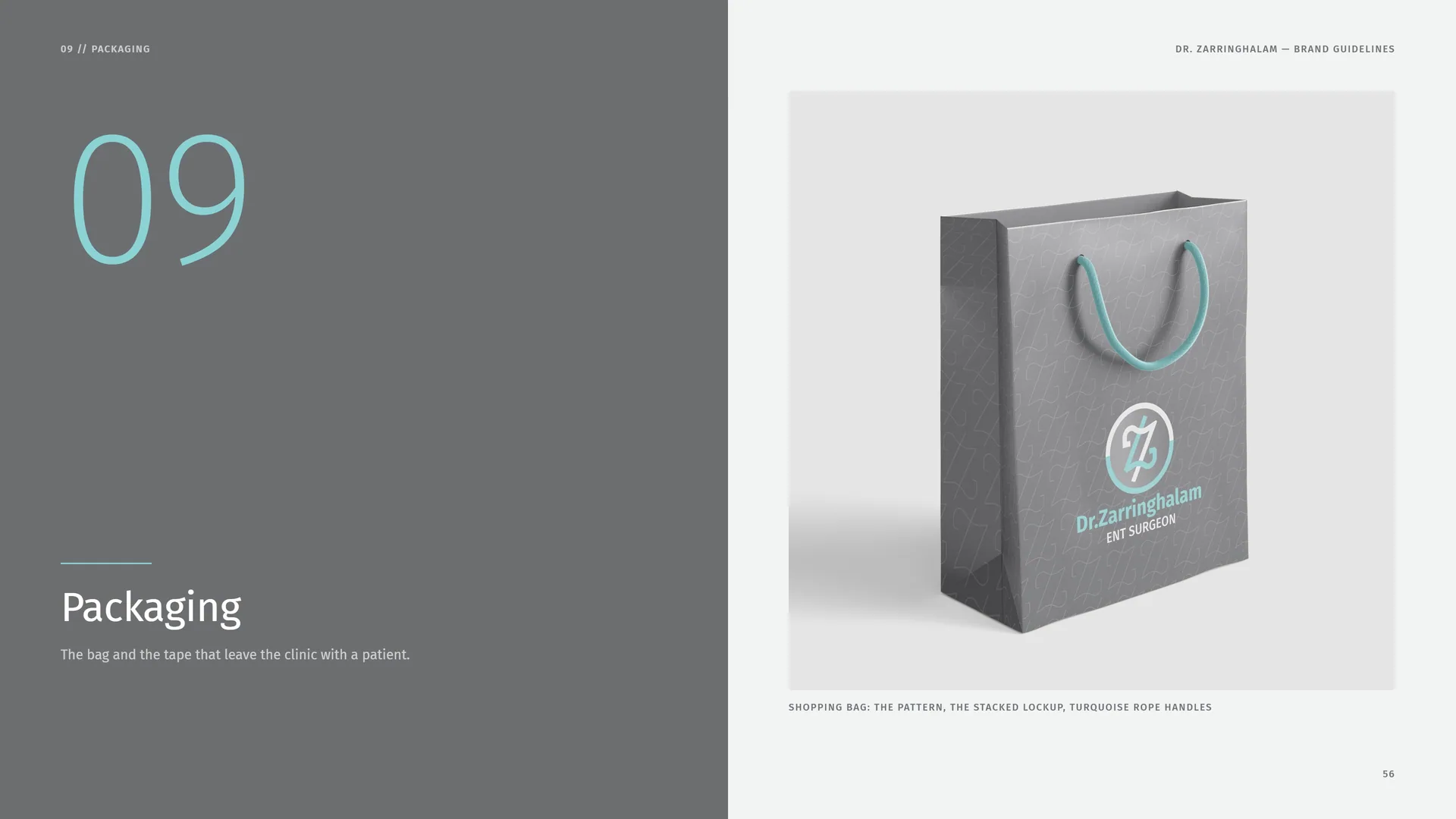
The bag and the tape that leave the clinic with a patient.
Shopping bag: the pattern, the stacked lockup, turquoise rope handles.
09.1
Tape & Cup
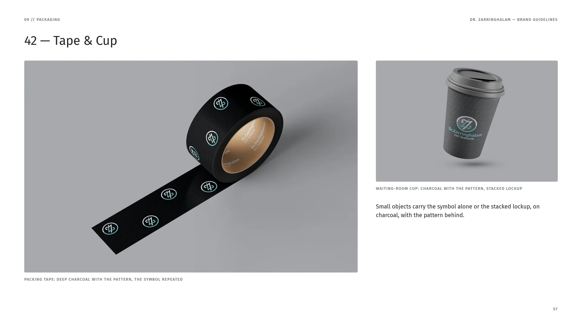
Packing tape: deep charcoal with the pattern, the symbol repeated.
Waiting-room cup: charcoal with the pattern, stacked lockup.
Small objects carry the symbol alone or the stacked lockup, on charcoal, with the pattern behind.
10
Clinic wear
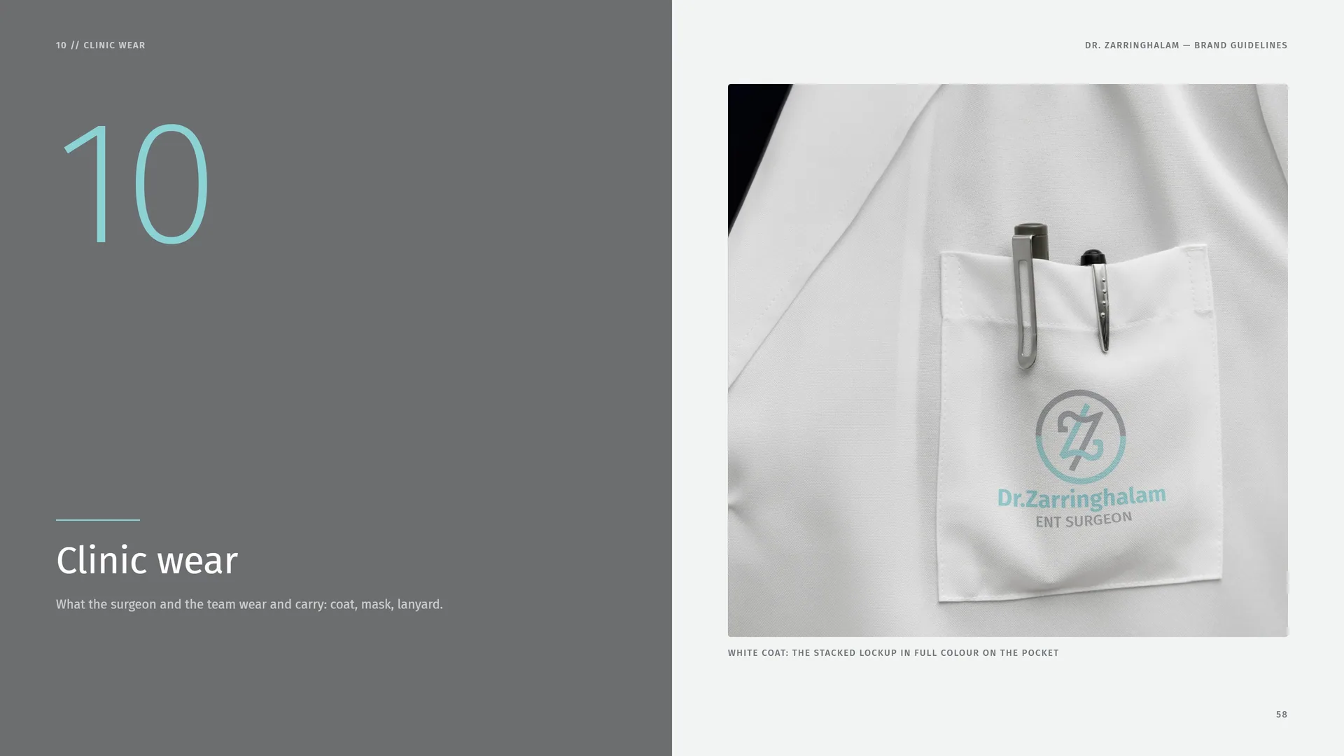
What the surgeon and the team wear and carry: coat, mask, lanyard.
White coat: the stacked lockup in full colour on the pocket.
10.1
Cushions & Lanyard
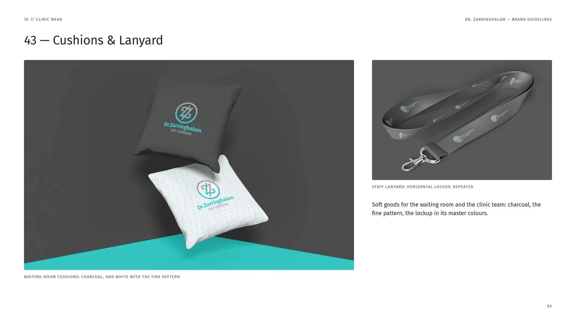
Waiting-room cushions: charcoal, and white with the fine pattern.
Staff lanyard: horizontal lockup, repeated.
Soft goods for the waiting room and the clinic team: charcoal, the fine pattern, the lockup in its master colours.
10.2
Surgical Mask & Badge
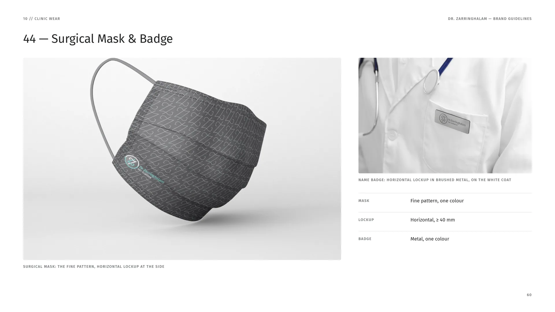
Surgical mask: the fine pattern, horizontal lockup at the side.
Name badge: horizontal lockup in brushed metal, on the white coat.
Mask: Fine pattern, one colour.
Lockup: Horizontal, ≥ 40 mm.
Badge: Metal, one colour.
11
Signage & environment
How the practice is found: window, wall, city, congress.
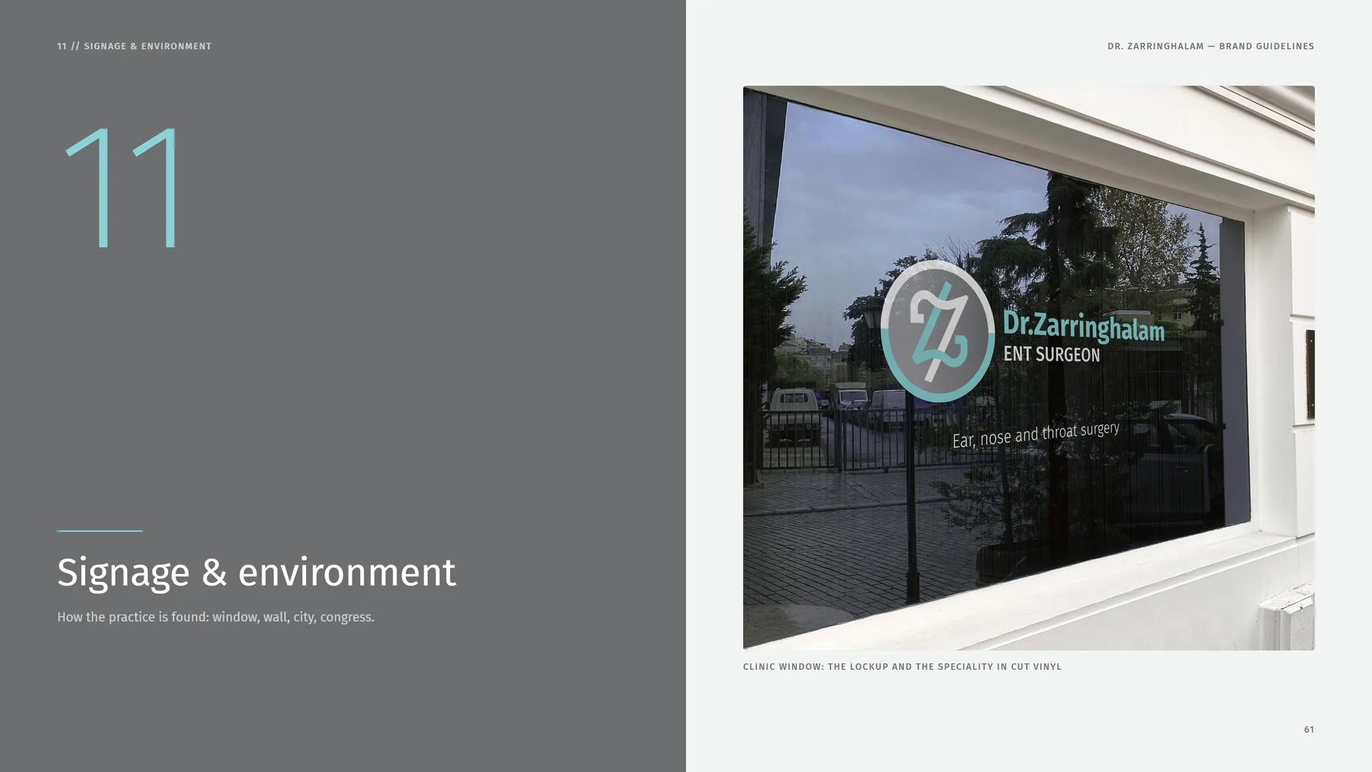
Clinic window: the lockup and the speciality in cut vinyl.
11.1
Wall & City
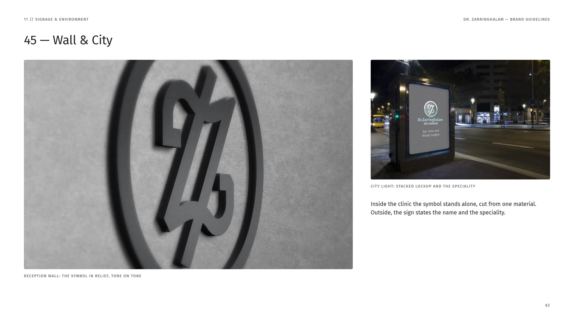
Reception wall: the symbol in relief, tone on tone.
City light: stacked lockup and the speciality.
Inside the clinic the symbol stands alone, cut from one material. Outside, the sign states the name and the speciality.
11.2
Event Stand
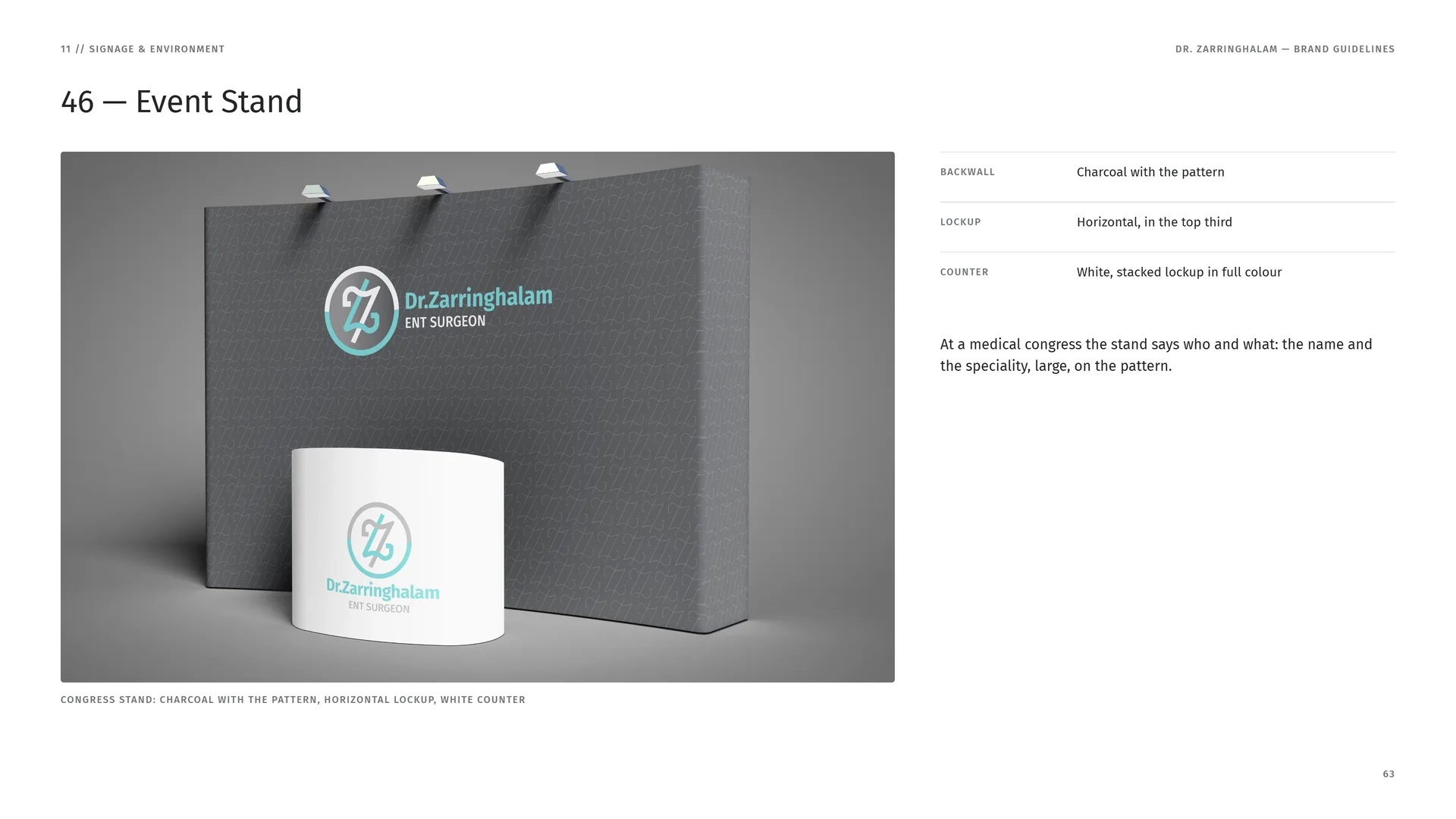
Congress stand: charcoal with the pattern, horizontal lockup, white counter.
Backwall: Charcoal with the pattern.
Lockup: Horizontal, in the top third.
Counter: White, stacked lockup in full colour.
At a medical congress the stand says who and what: the name and the speciality, large, on the pattern.
11.3
Finishes
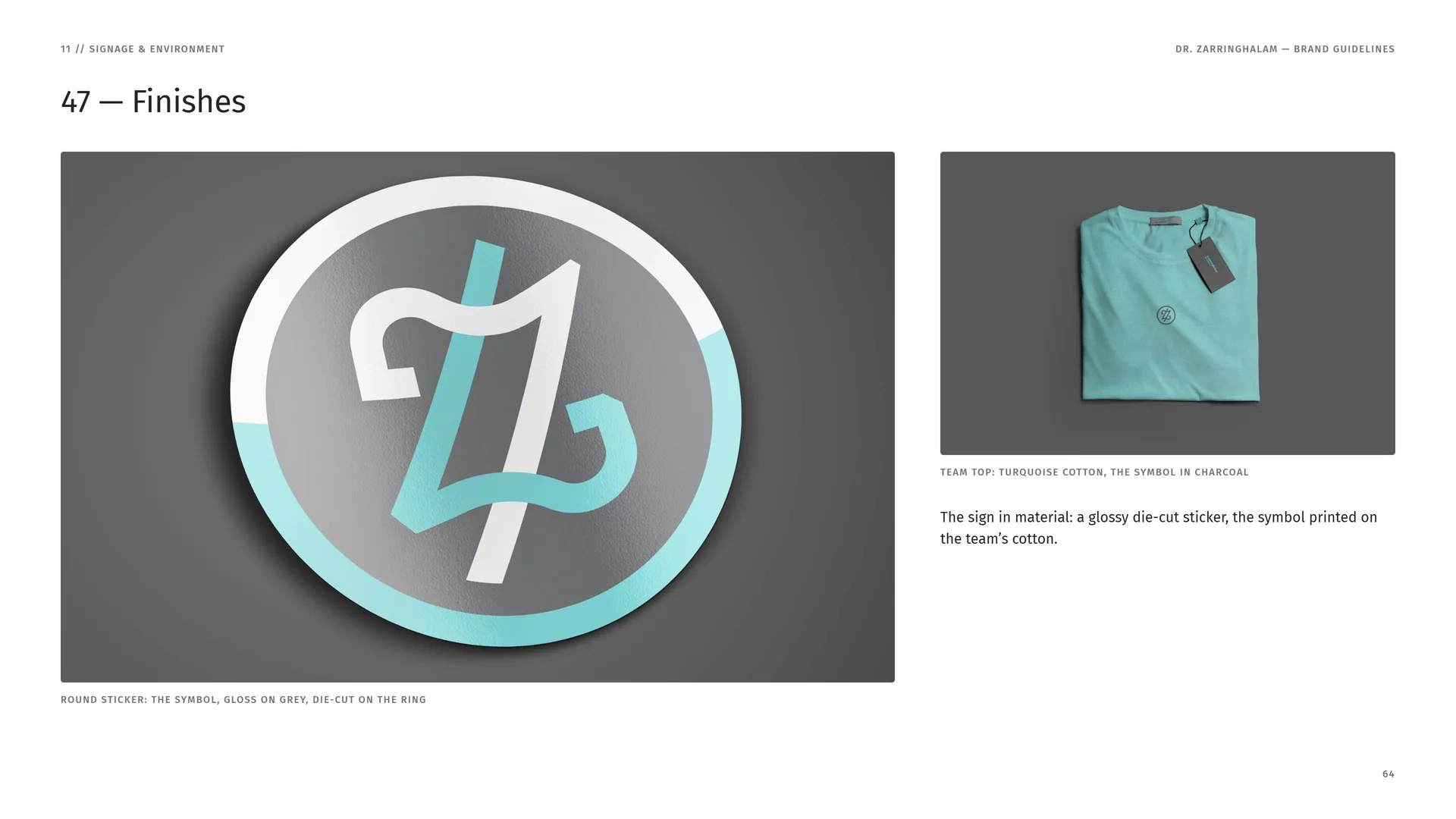
Round sticker: the symbol, gloss on grey, die-cut on the ring.
Team top: turquoise cotton, the symbol in charcoal.
The sign in material: a glossy die-cut sticker, the symbol printed on the team’s cotton.
12
Digital
The phone, the website and the posts.
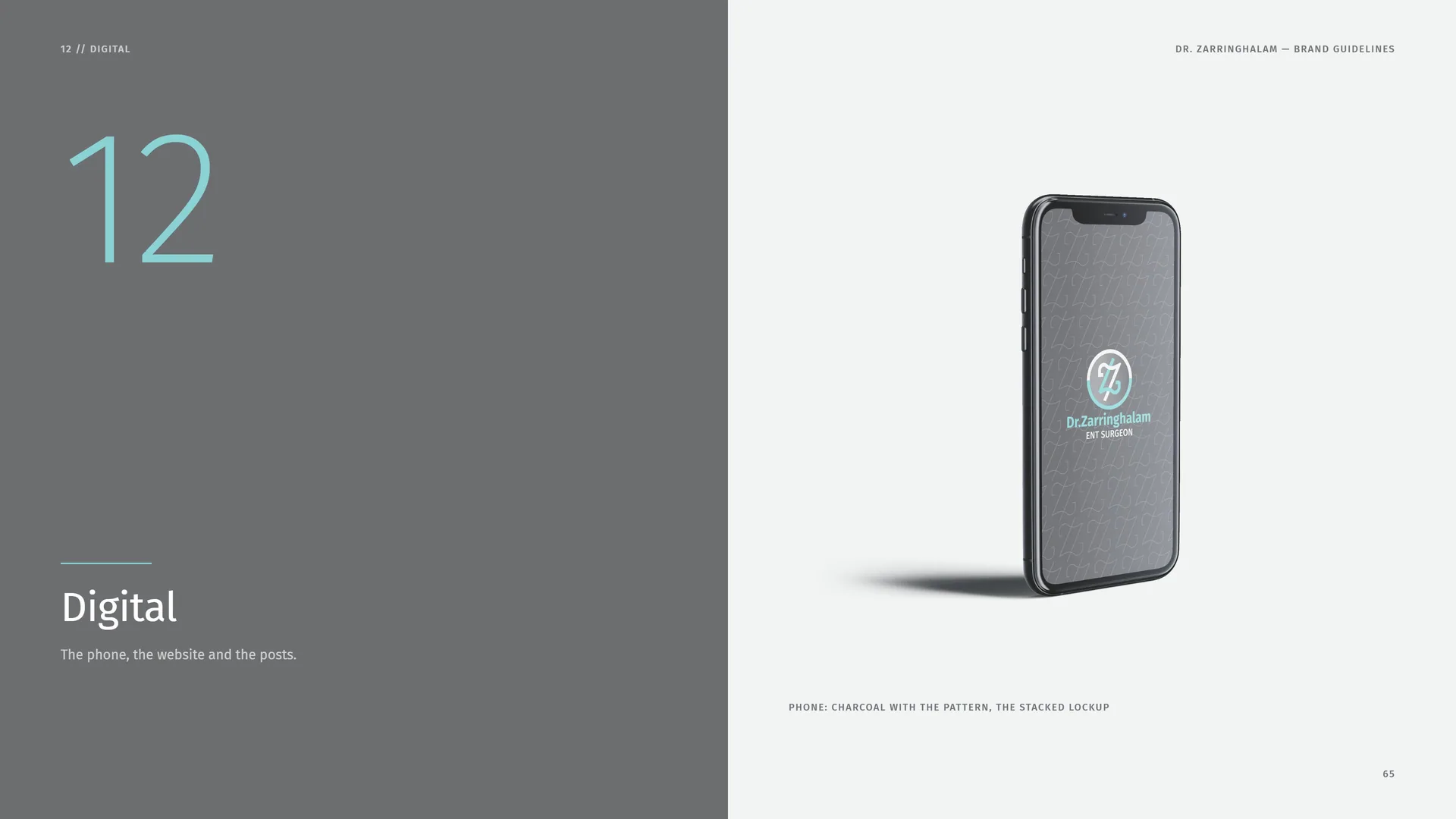
Phone: charcoal with the pattern, the stacked lockup.
12.1
Website
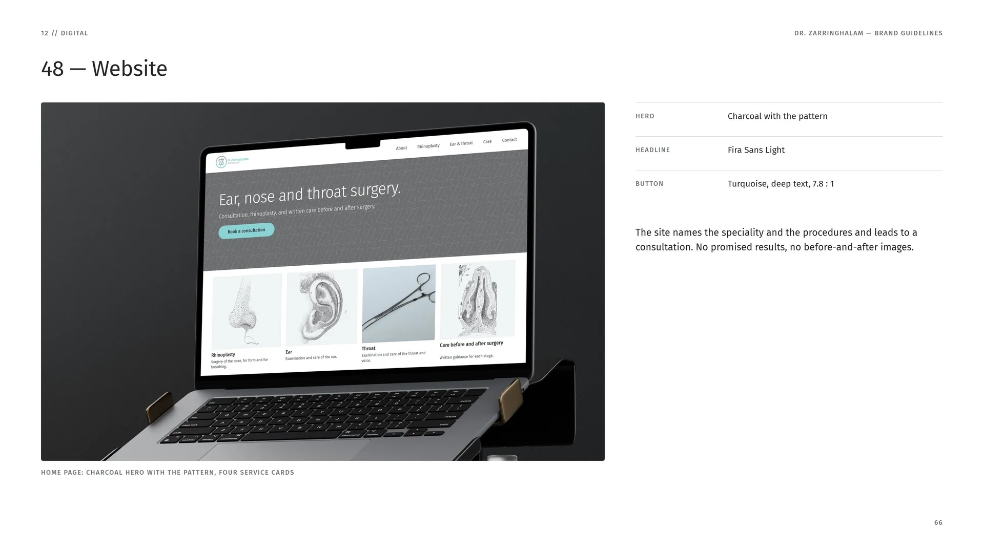
Home page: charcoal hero with the pattern, four service cards.
Hero: Charcoal with the pattern.
Headline: Fira Sans Light.
Button: Turquoise, deep text, 7.8 : 1.
The site names the speciality and the procedures and leads to a consultation. No promised results, no before-and-after images.
12.2
Social Posts
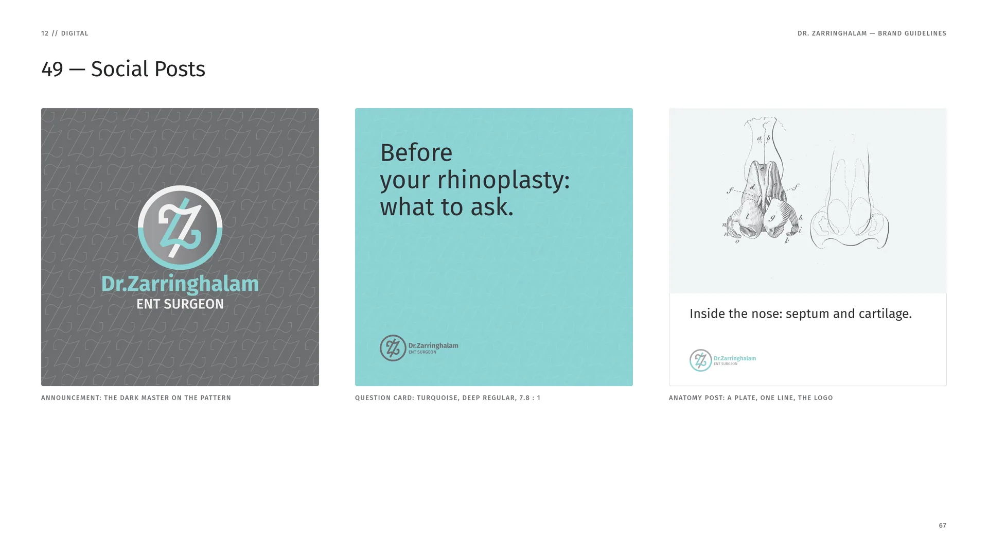
Announcement: the dark master on the pattern.
Question card: turquoise, deep Regular, 7.8 : 1.
Anatomy post: a plate, one line, the logo.
13
Closing
13.1
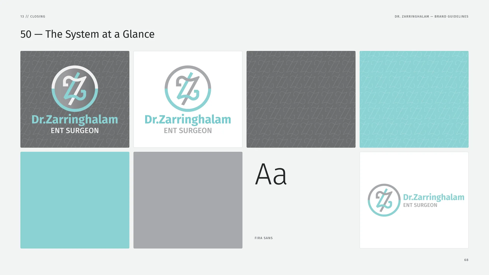
The System at a Glance
Fira Sans.
13.2
Files, on Request
Logo — stacked: AI · PDF · SVG · PNG (light and dark).
Logo — horizontal: AI · PDF · SVG · PNG.
Symbol & app icon: SVG · PNG 16–1024 px.
Colour: ASE swatches (artwork values).
Pattern: Z line pattern, AI tile.
Type: Fira Sans — free download (SIL OFL).
Photography: Wikimedia Commons, CC0 / public domain.
This presentation is delivered as slide images, a contact sheet and photo credits. The working files listed here are available from the studio on request.
Photos: Wikimedia Commons, CC0 / public domain. Logo design & brand identity: Studio Mouneskhah.
13.3
Thank you
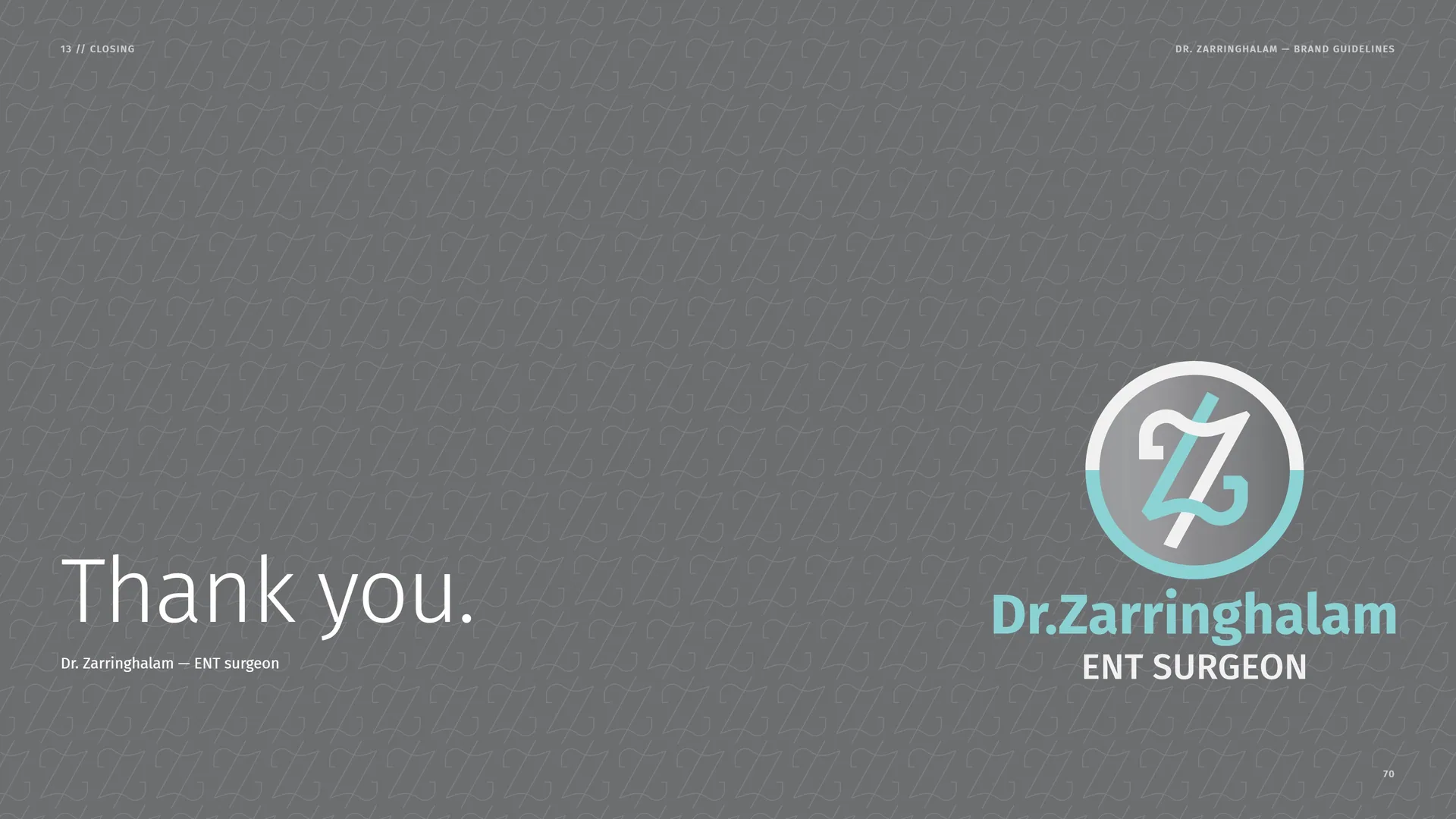
Dr. Zarringhalam — ENT surgeon.