KOSAR Brand Identity Guidelines
KOSAR offers herbal medicine and health services. Herbal medicine — also called botanical medicine or phytomedicine — uses a plant’s seeds, berries, roots, leaves, bark or flowers for medicinal purposes.
The brand joins two symbols: a flower, for beauty, delicacy, purity and health, and the letter K, the first letter of its name. Together they leave an image of beauty, kindness and health — calm, fresh and full of energy.
- Yıl
- 2023
- Müşteri
- KOSAR
- Alan
- Medical and herbal services
- Hizmetler
- Görsel kimlik, Logo tasarımı
- Proje
- Brand Identity Guidelines · 2026
00
Introduction
00.1
Primary logo
Primary logo — full colour, reversed on the Kosar signature gradient.
01
Brand
- 01.1Brand Concept
- 01.2History of the Brand
- 01.3Mission & Vision
- 01.4Brand Values
- 01.5Tone of Voice
- 01.6Taglines
- 01.7Services
- 01.8Healing through nature, wellness for life
01.1
Brand Concept
KOSAR offers herbal medicine and health services. Herbal medicine — also called botanical medicine or phytomedicine — uses a plant’s seeds, berries, roots, leaves, bark or flowers for medicinal purposes.
The brand joins two symbols: a flower, for beauty, delicacy, purity and health, and the letter K, the first letter of its name. Together they leave an image of beauty, kindness and health — calm, fresh and full of energy.
Trust in Nature, Trust in Kosar.
Brand essence: Nature · Science · Care.
Brand promise: Healing through Nature, Wellness for Life.
Field: Herbal medicine and health services.
Core idea: A flower in the shape of the letter K.
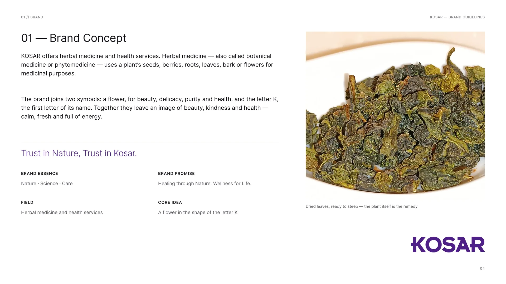
Dried leaves, ready to steep — the plant itself is the remedy.
01.2
History of the Brand
Kosar was founded to bring the benefits of herbal medicine and natural health solutions to a wider audience. Recognising the long traditions of herbal medicine across many cultures, the brand set out to provide high-quality, effective and safe botanical remedies.
It joins ancient knowledge with modern science. Over the years Kosar has built a strong reputation in herbal medicine: its products meet rigorous standards and are backed by research and quality assurance.
Business: Herbal medicine and health services.
Practice: Botanical medicine — phytomedicine.
Tagline: Trust in Nature, Trust in Kosar.
Identity: Studio Mouneskhah.
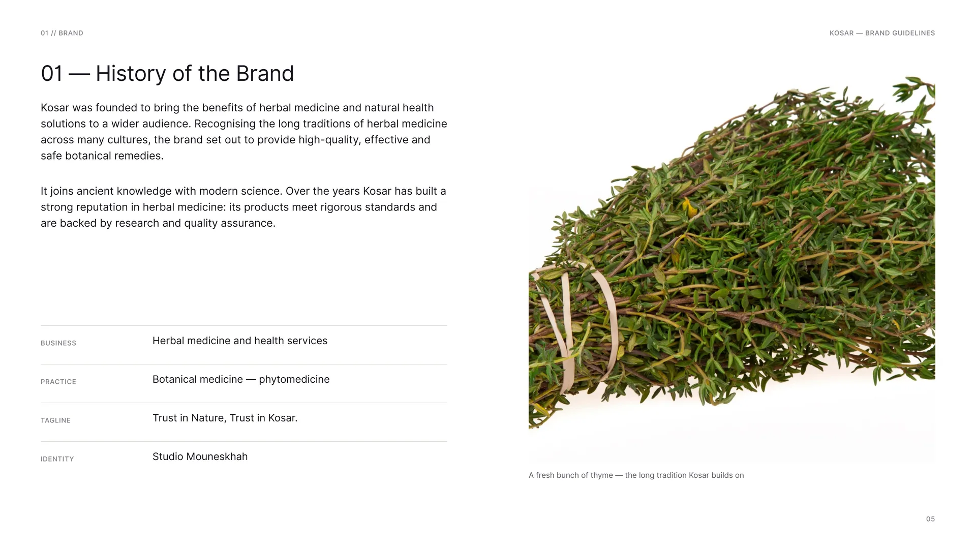
A fresh bunch of thyme — the long tradition Kosar builds on.
01.3
Mission & Vision
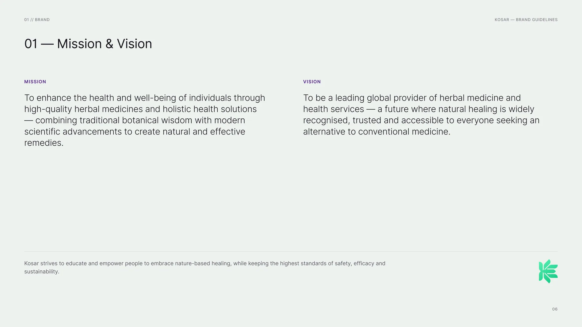
Mission: To enhance the health and well-being of individuals through high-quality herbal medicines and holistic health solutions — combining traditional botanical wisdom with modern scientific advancements to create natural and effective remedies.
Vision: To be a leading global provider of herbal medicine and health services — a future where natural healing is widely recognised, trusted and accessible to everyone seeking an alternative to conventional medicine.
Kosar strives to educate and empower people to embrace nature-based healing, while keeping the highest standards of safety, efficacy and sustainability.
01.4
Brand Values
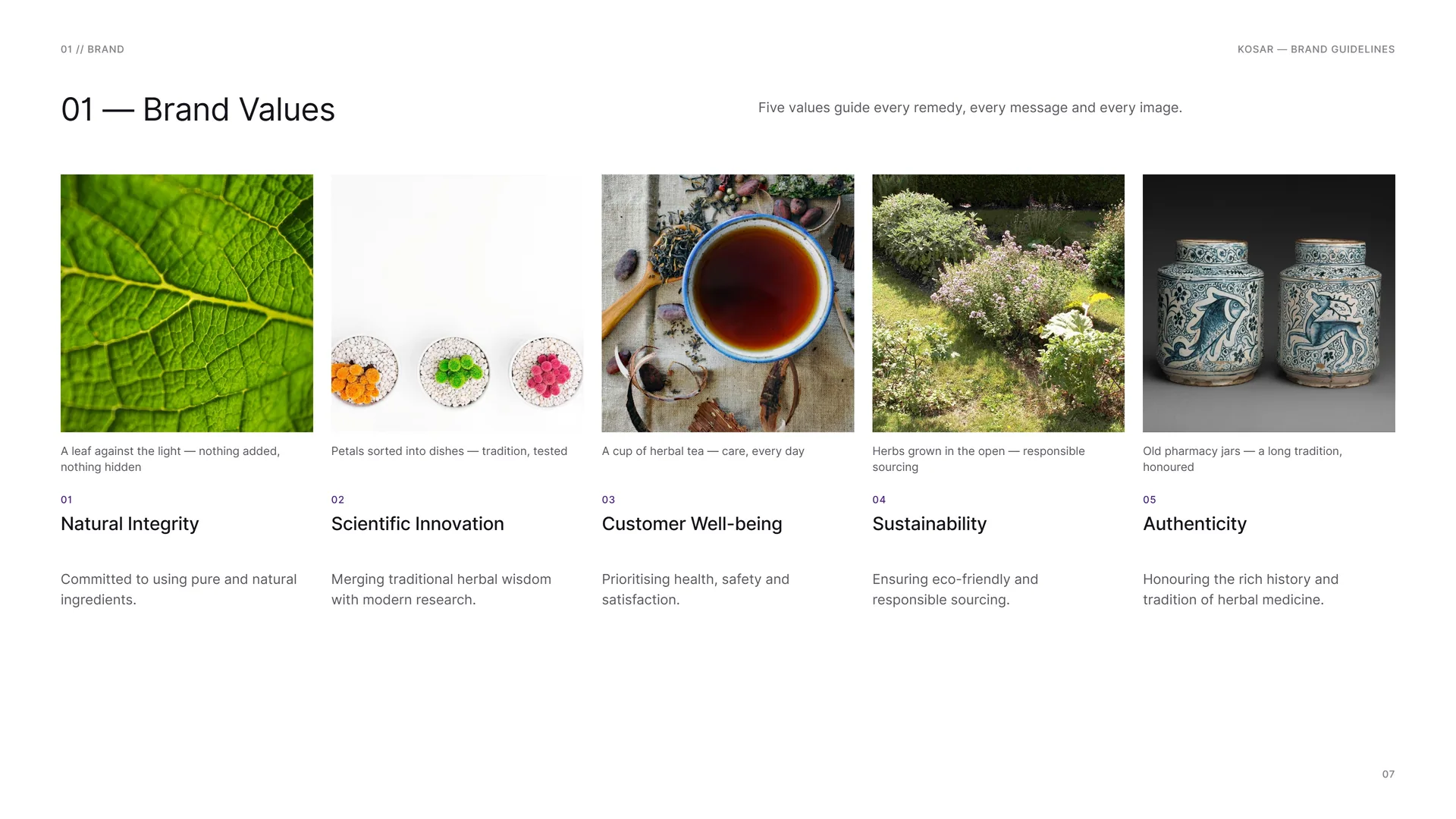
Five values guide every remedy, every message and every image.
Natural Integrity: Committed to using pure and natural ingredients.
Scientific Innovation: Merging traditional herbal wisdom with modern research.
Customer Well-being: Prioritising health, safety and satisfaction.
Sustainability: Ensuring eco-friendly and responsible sourcing.
Authenticity: Honouring the rich history and tradition of herbal medicine.
A leaf against the light — nothing added, nothing hidden.
Petals sorted into dishes — tradition, tested.
A cup of herbal tea — care, every day.
Herbs grown in the open — responsible sourcing.
Old pharmacy jars — a long tradition, honoured.
01.5
Tone of Voice
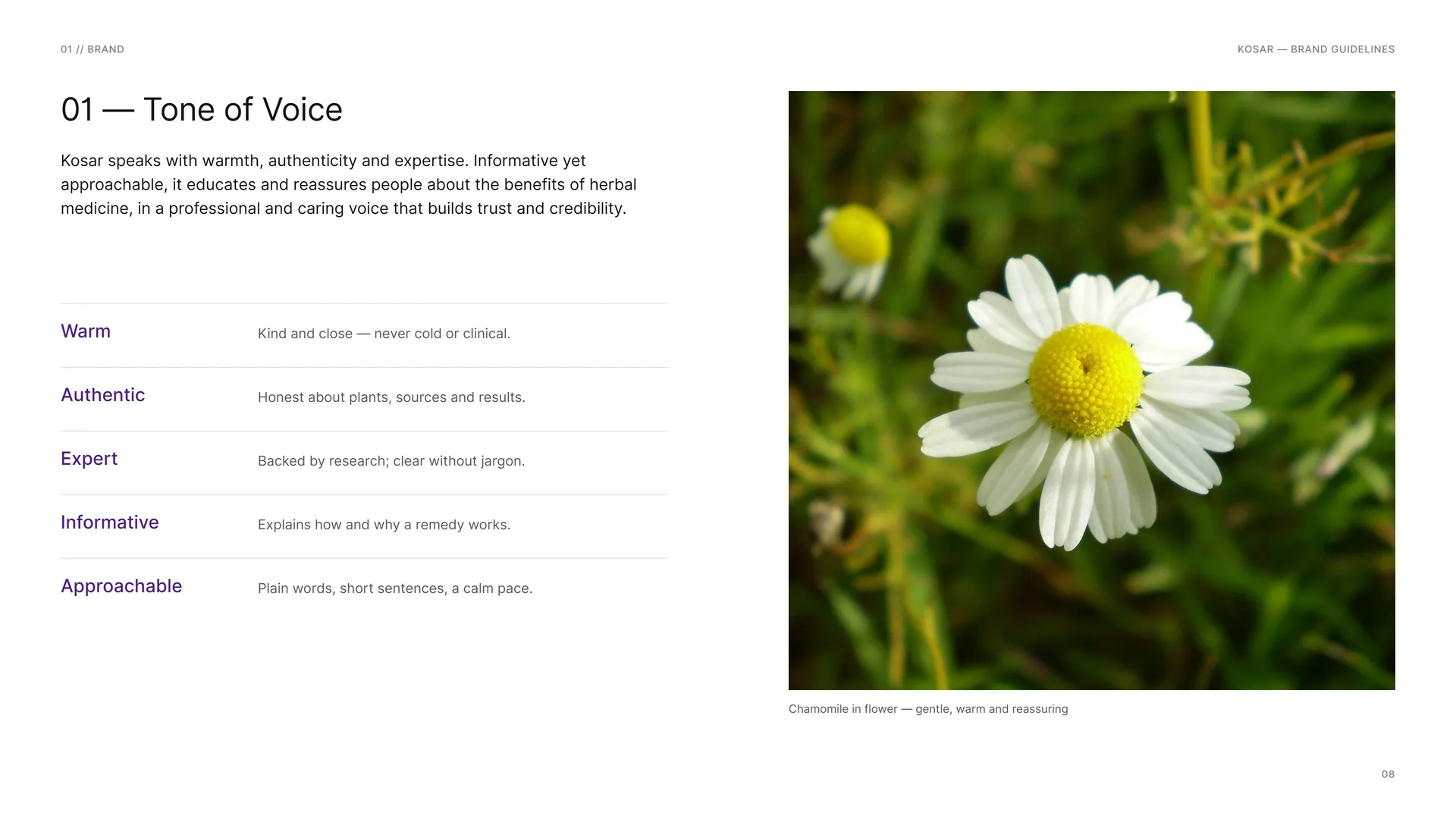
Kosar speaks with warmth, authenticity and expertise. Informative yet approachable, it educates and reassures people about the benefits of herbal medicine, in a professional and caring voice that builds trust and credibility.
Warm: Kind and close — never cold or clinical.
Authentic: Honest about plants, sources and results.
Expert: Backed by research; clear without jargon.
Informative: Explains how and why a remedy works.
Approachable: Plain words, short sentences, a calm pace.
Chamomile in flower — gentle, warm and reassuring.
01.6
Taglines
Trust in Nature, Trust in Kosar.
The primary line — on the billboard and the last frame of every film.
02: Healing through Nature, Wellness for Life.
03: Pure Herbs, True Health.
04: Bringing Nature’s Power to Your Health.
05: Ancient Wisdom, Modern Healing.
06: Kosar — Your Path to Natural Wellness.
07: Sustainability, Purity and Health in Every Drop.
08: Harnessing the Healing Power of Plants.
09: A Greener Approach to Better Health.
10: Nature’s Remedy, Science’s Assurance.
01.7
Services
Ten services, one promise: natural remedies, backed by science, delivered with care.
01 Customised Herbal Therapy · 02 Natural Skincare Solutions · 03 Herbal Detox Programmes · 04 Holistic Wellness Consultations · 05 Organic Herbal Supplements · 06 Traditional Medicine Workshops · 07 Personalised Nutrition Plans · 08 Aromatherapy & Essential Oils · 09 Stress-Relief Herbal Blends · 10 Eco-Friendly Health Products.
Herbal medicine · Natural remedies · Holistic healing · Plant-based medicine · Botanical healing · Medicinal plants.
01.8
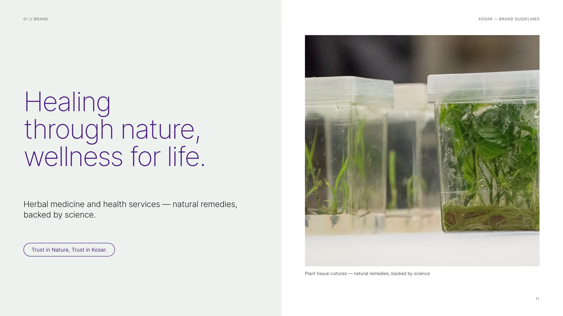
Healing through nature, wellness for life
Healing through nature, wellness for life.
Herbal medicine and health services — natural remedies, backed by science.
Trust in Nature, Trust in Kosar.
Plant tissue cultures — natural remedies, backed by science.
02
Concept
- 02.1A Flower and the Letter K
- 02.2Turn It a Quarter
- 02.3Petals in the Shape of K
- 02.4Light leaf to deep leaf
- 02.5The mark, opened up
- 02.60°, 45° and 90°
02.1
A Flower and the Letter K
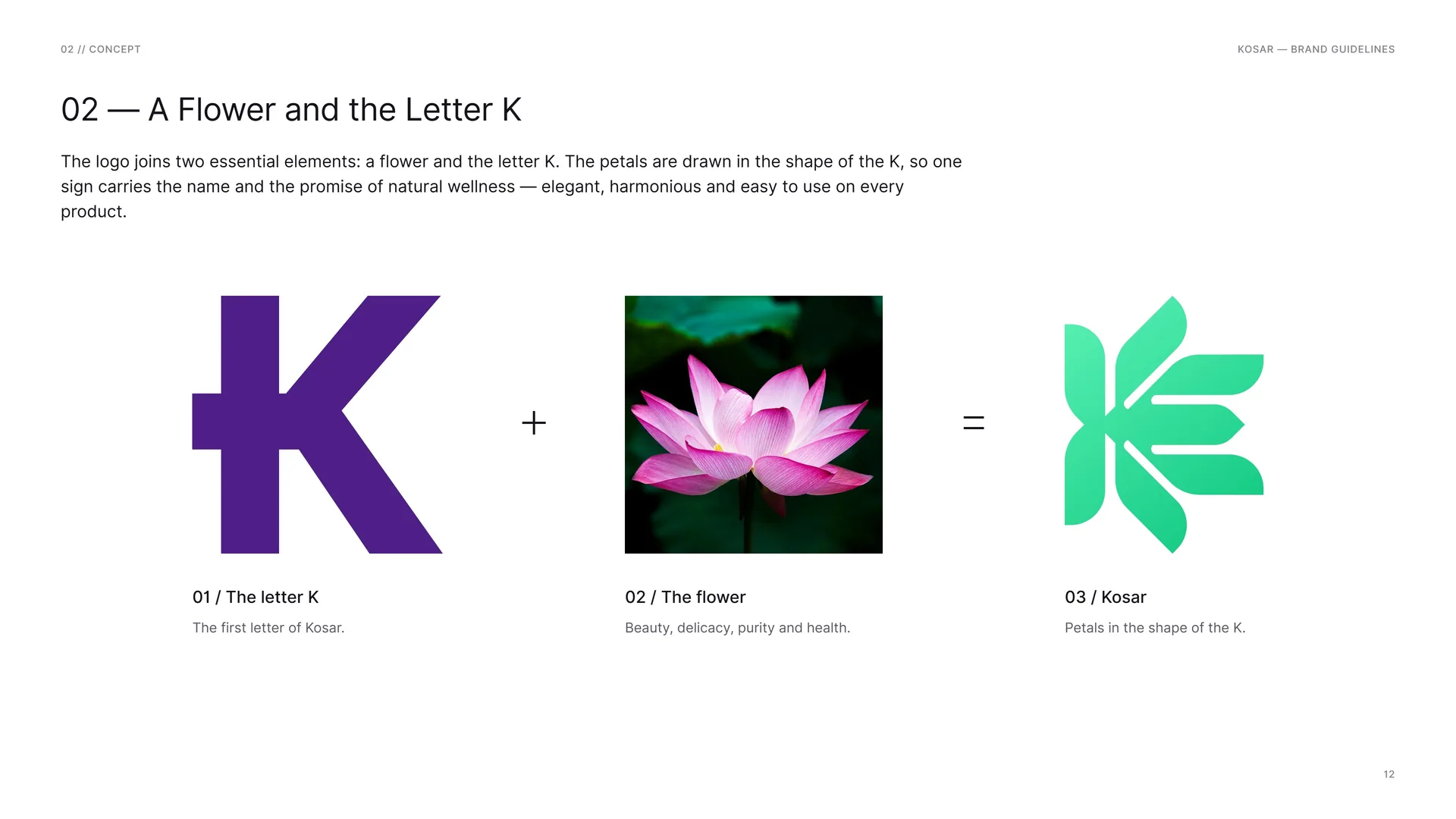
The logo joins two essential elements: a flower and the letter K. The petals are drawn in the shape of the K, so one sign carries the name and the promise of natural wellness — elegant, harmonious and easy to use on every product.
The letter K: The first letter of Kosar.
The flower: Beauty, delicacy, purity and health.
Kosar: Petals in the shape of the K.
02.2
Turn It a Quarter
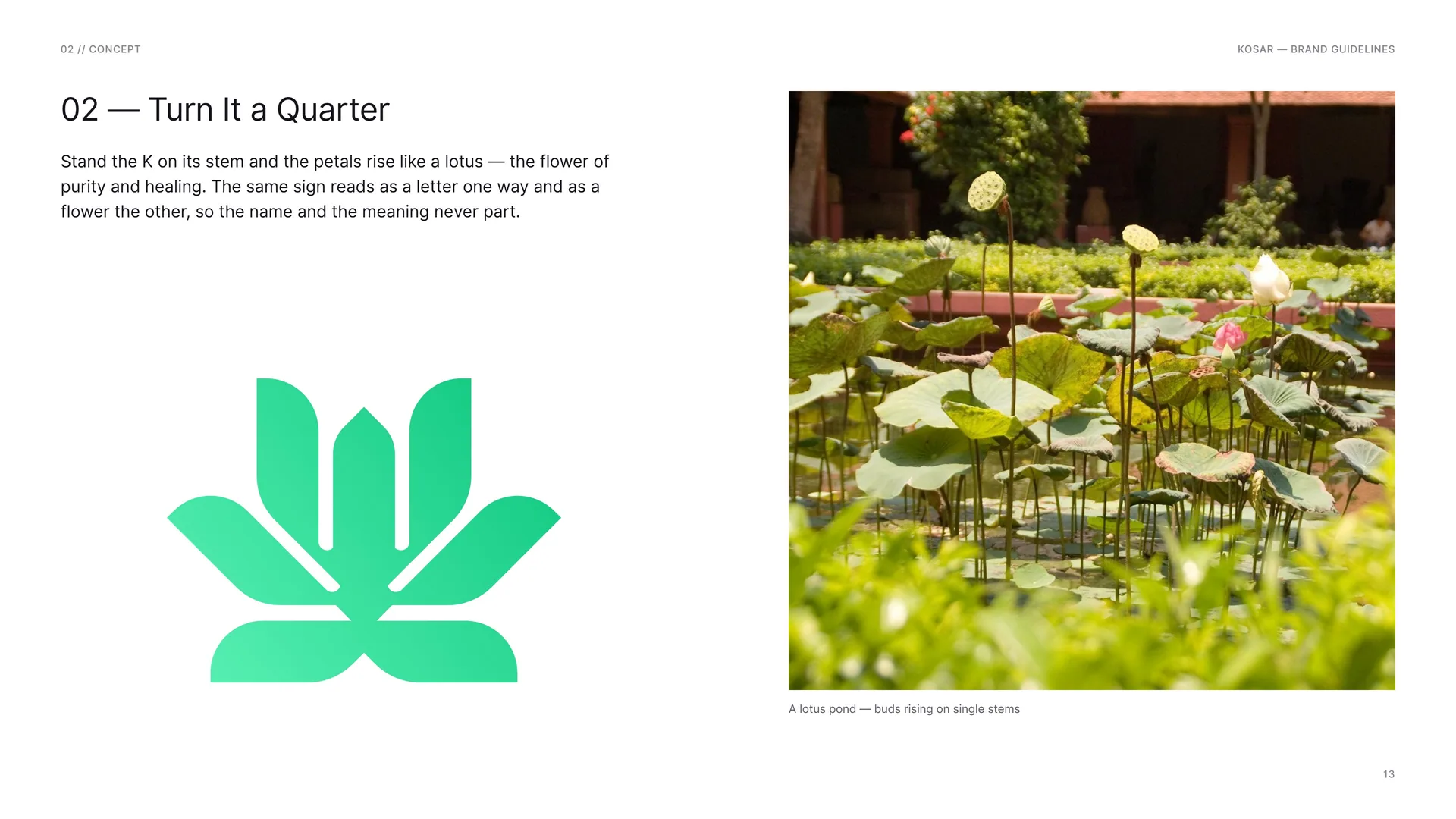
Stand the K on its stem and the petals rise like a lotus — the flower of purity and healing. The same sign reads as a letter one way and as a flower the other, so the name and the meaning never part.
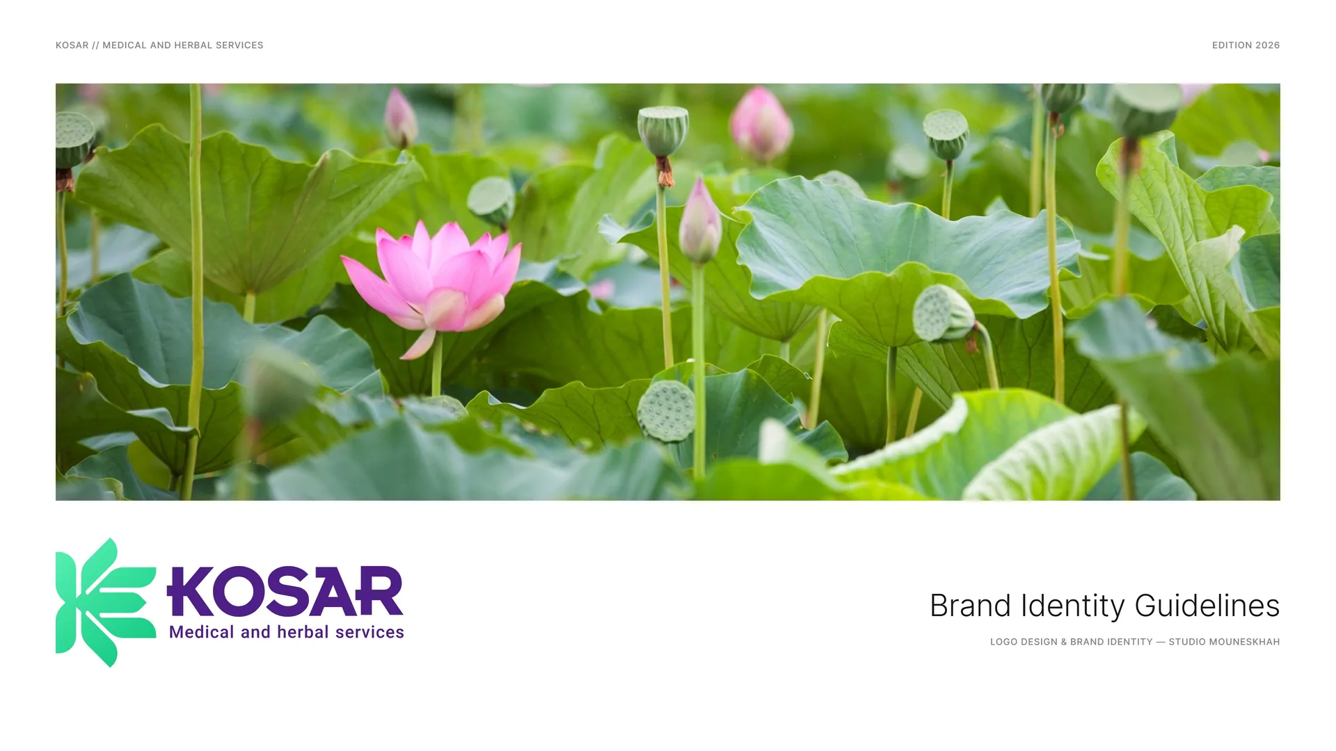
A lotus pond — buds rising on single stems.
02.3
Petals in the Shape of K
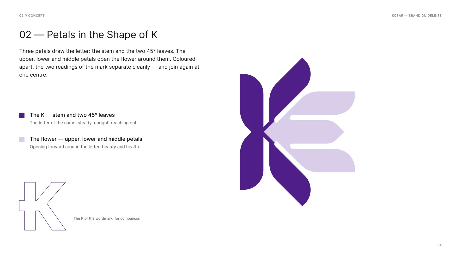
Three petals draw the letter: the stem and the two 45° leaves. The upper, lower and middle petals open the flower around them. Coloured apart, the two readings of the mark separate cleanly — and join again at one centre.
The K — stem and two 45° leaves: The letter of the name: steady, upright, reaching out.
The flower — upper, lower and middle petals: Opening forward around the letter: beauty and health.
The K of the wordmark, for comparison.
02.4
Light leaf to deep leaf
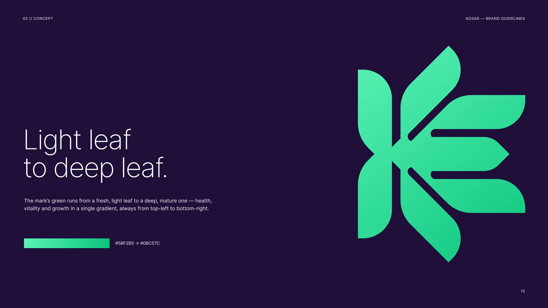
Light leaf to deep leaf.
The mark’s green runs from a fresh, light leaf to a deep, mature one — health, vitality and growth in a single gradient, always from top-left to bottom-right.
#5BF2B5 → #0BC57C.
02.5
The mark, opened up
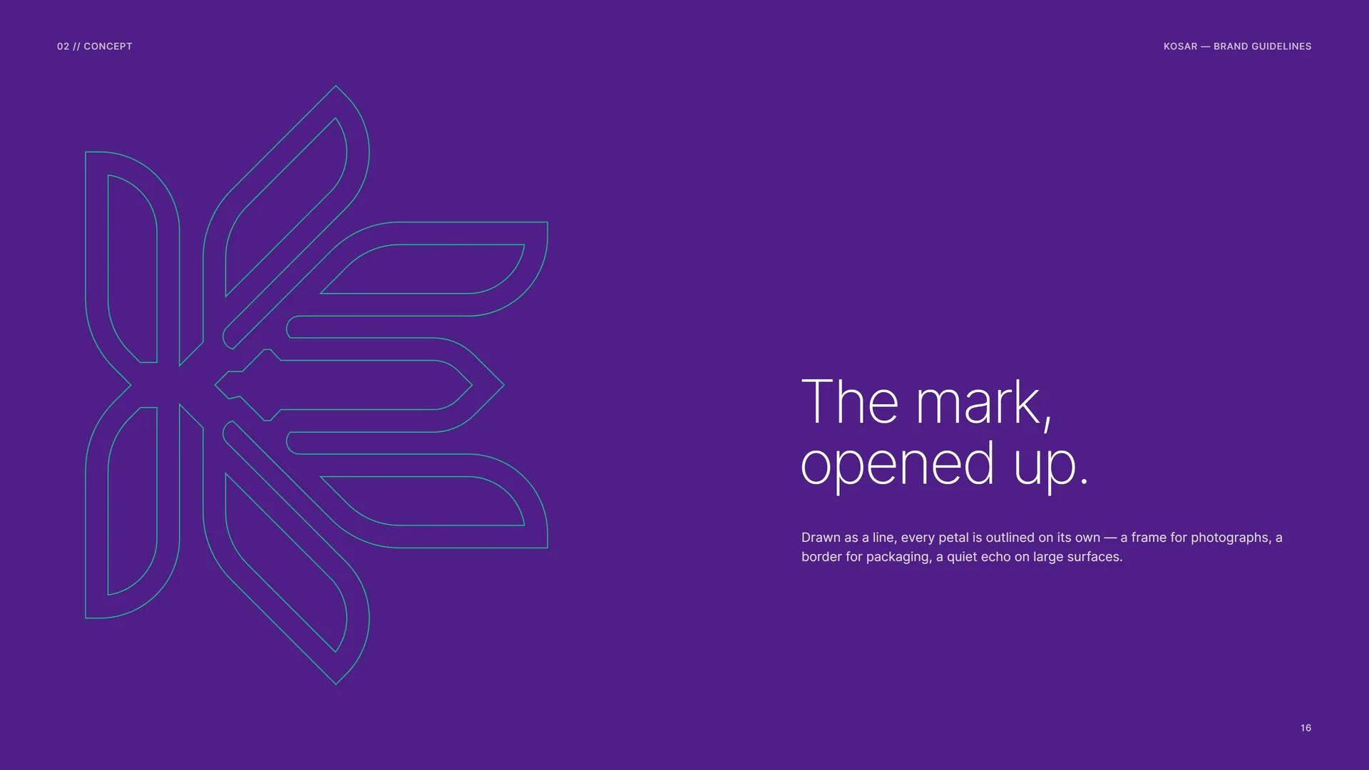
The mark, opened up.
Drawn as a line, every petal is outlined on its own — a frame for photographs, a border for packaging, a quiet echo on large surfaces.
02.6
0°, 45° and 90°
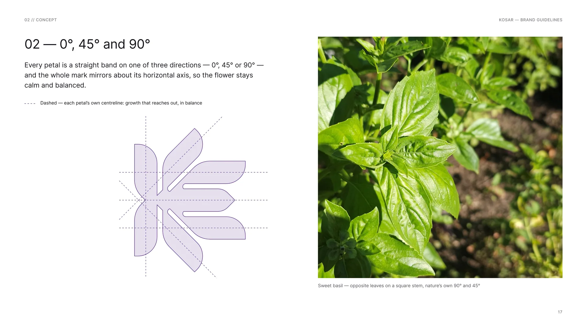
Every petal is a straight band on one of three directions — 0°, 45° or 90° — and the whole mark mirrors about its horizontal axis, so the flower stays calm and balanced.
Dashed — each petal’s own centreline: growth that reaches out, in balance.
Sweet basil — opposite leaves on a square stem, nature’s own 90° and 45°.
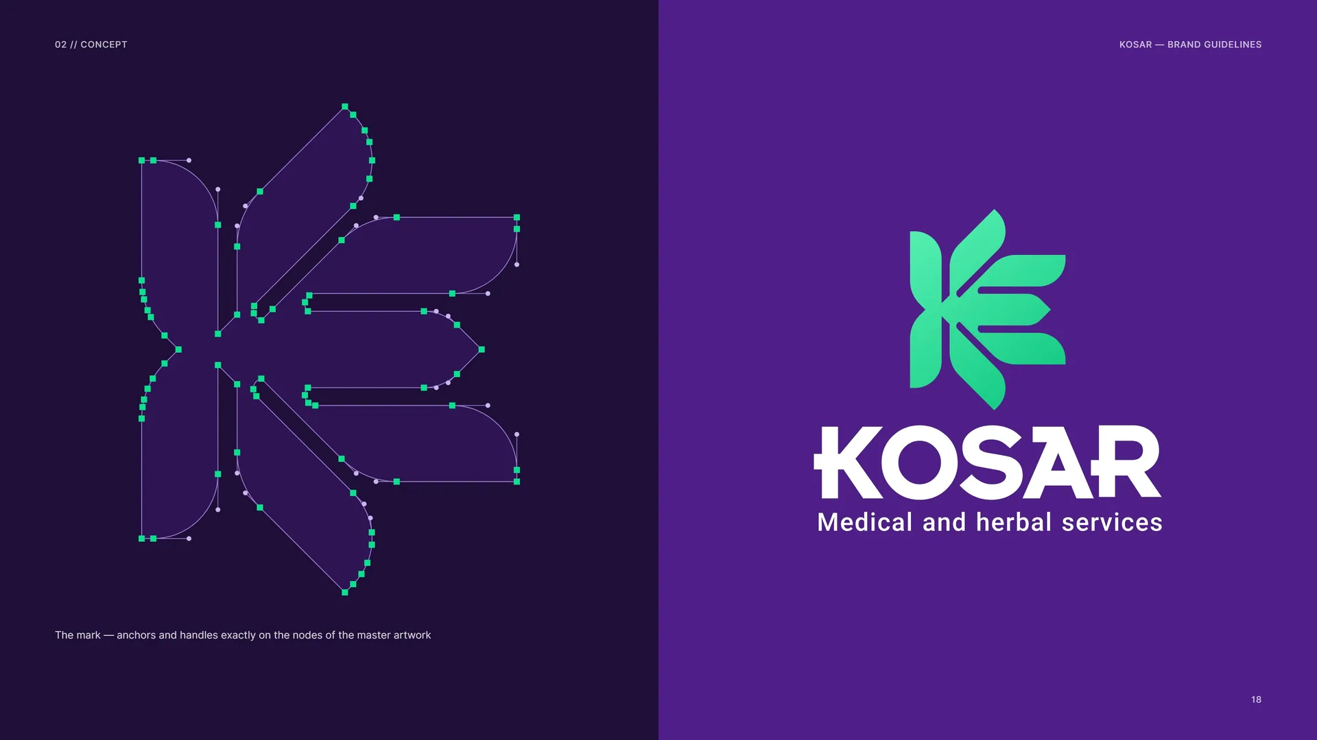
The mark — anchors and handles exactly on the nodes of the master artwork.
03
Logo & grid
- 03.1The Logo
- 03.2Anatomy
- 03.3Construction
- 03.4Bands, Gaps and Ends
- 03.5The Hexagon Frame
- 03.6Wordmark
- 03.7Horizontal Proportions
- 03.8Stacked Proportions
- 03.9Clear Space
- 03.10Logo versions
- 03.11The Logo Family
- 03.12App Icon & Favicon
- 03.13Minimum Size
- 03.14Placement
- 03.15Misuse
- 03.16Logo on Grounds
03.1
The Logo
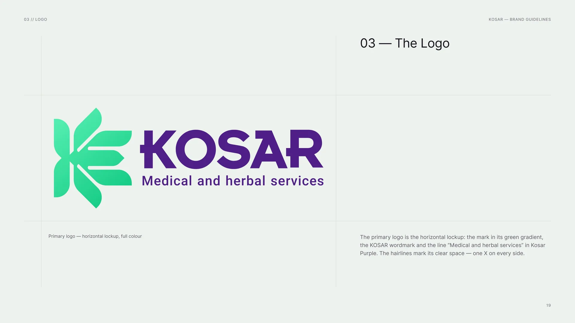
The primary logo is the horizontal lockup: the mark in its green gradient, the KOSAR wordmark and the line “Medical and herbal services” in Kosar Purple. The hairlines mark its clear space — one X on every side.
Primary logo — horizontal lockup, full colour.
03.2
Anatomy
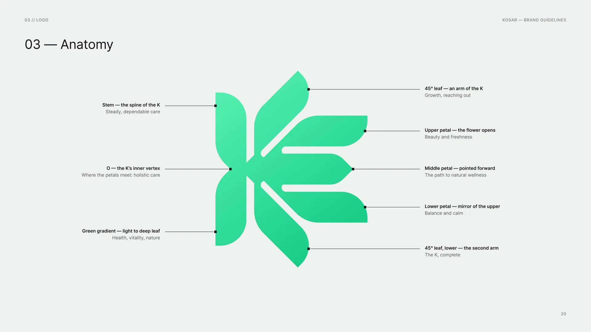
Stem — the spine of the K: Steady, dependable care.
O — the K’s inner vertex: Where the petals meet: holistic care.
Green gradient — light to deep leaf: Health, vitality, nature.
45° leaf — an arm of the K: Growth, reaching out.
Upper petal — the flower opens: Beauty and freshness.
Middle petal — pointed forward: The path to natural wellness.
Lower petal — mirror of the upper: Balance and calm.
45° leaf, lower — the second arm: The K, complete.
03.3
Construction
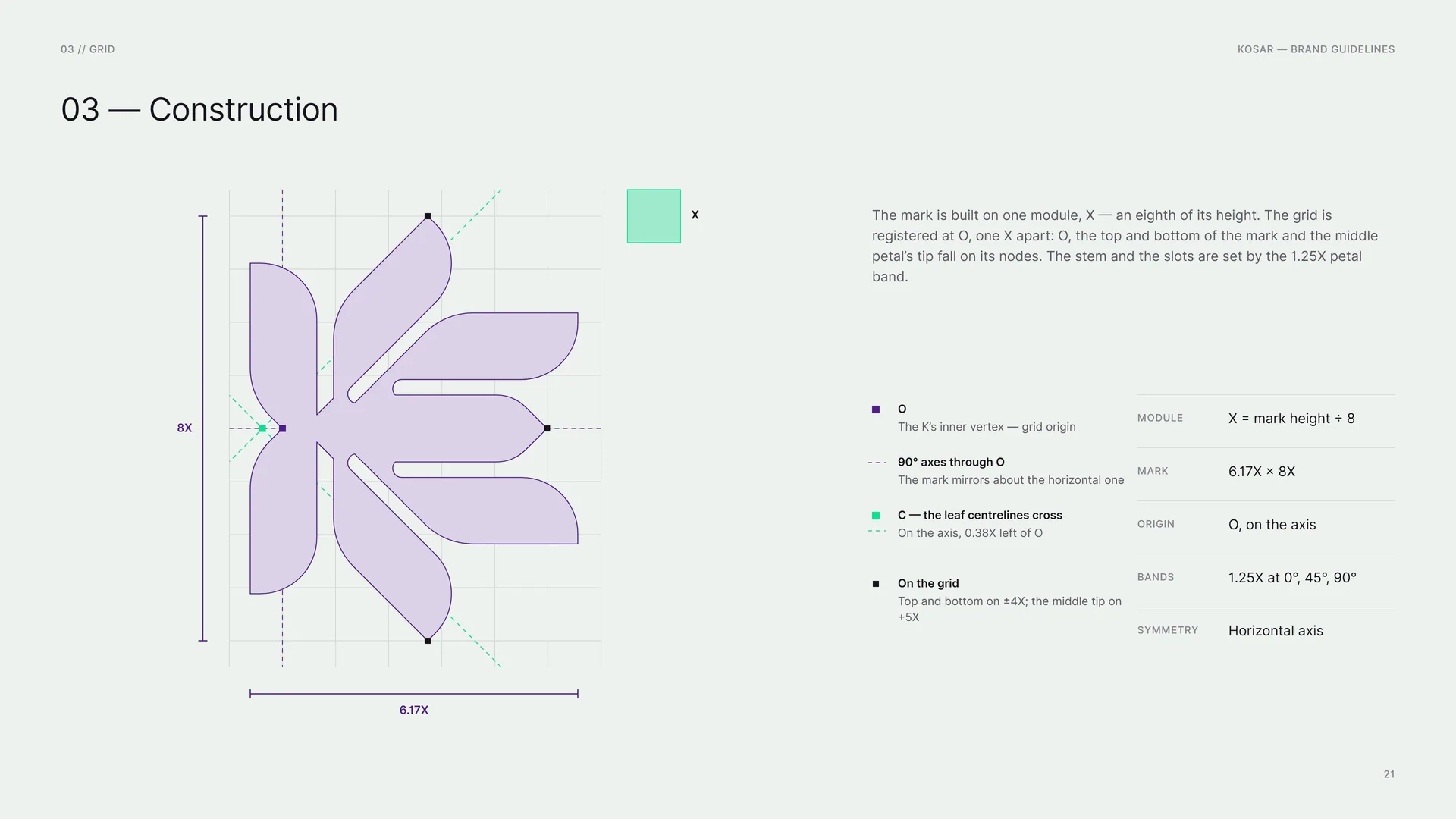
The mark is built on one module, X — an eighth of its height. The grid is registered at O, one X apart: O, the top and bottom of the mark and the middle petal’s tip fall on its nodes. The stem and the slots are set by the 1.25X petal band.
O: The K’s inner vertex — grid origin.
90° axes through O: The mark mirrors about the horizontal one.
C — the leaf centrelines cross: On the axis, 0.38X left of O.
On the grid: Top and bottom on ±4X; the middle tip on +5X.
Module: X = mark height ÷ 8.
Mark: 6.17X × 8X.
Origin: O, on the axis.
Bands: 1.25X at 0°, 45°, 90°.
Symmetry: Horizontal axis.
03.4
Bands, Gaps and Ends
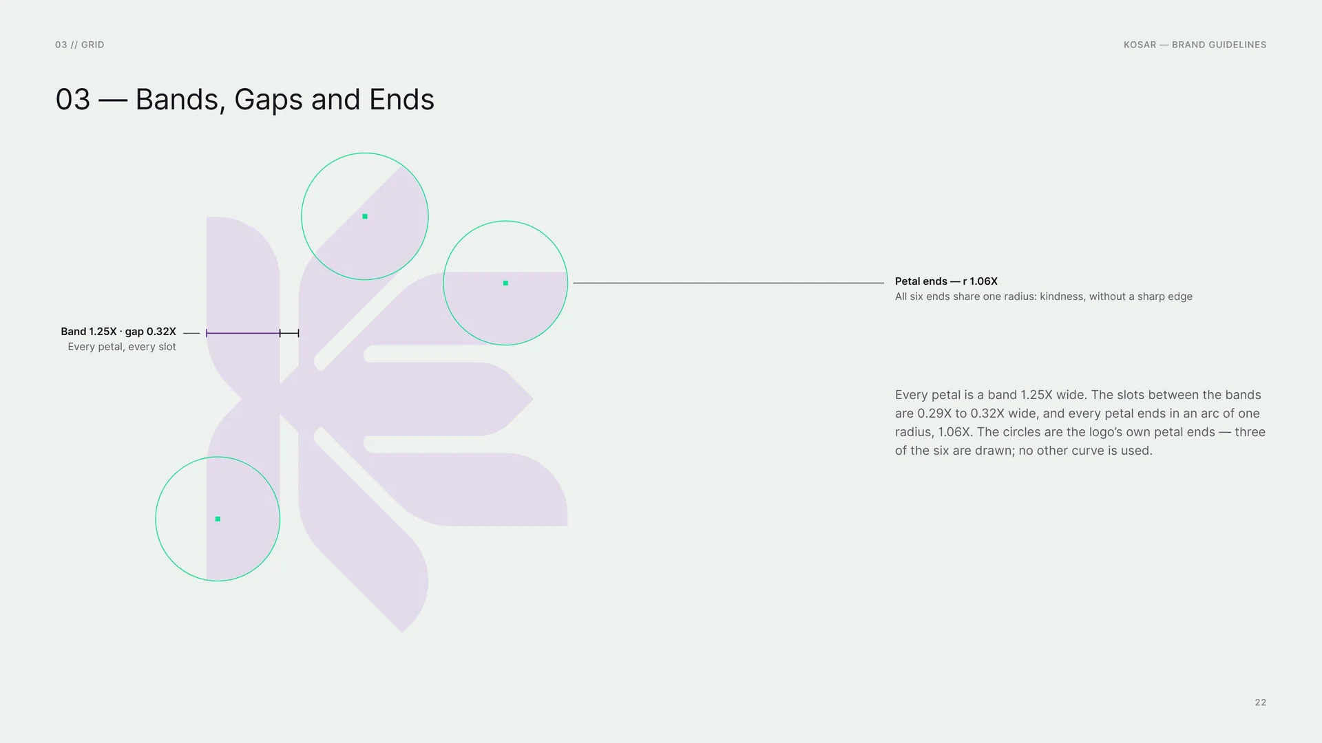
Every petal is a band 1.25X wide. The slots between the bands are 0.29X to 0.32X wide, and every petal ends in an arc of one radius, 1.06X. The circles are the logo’s own petal ends — three of the six are drawn; no other curve is used.
Band 1.25X · gap 0.32X: Every petal, every slot.
Petal ends — r 1.06X: All six ends share one radius: kindness, without a sharp edge.
03.5
The Hexagon Frame
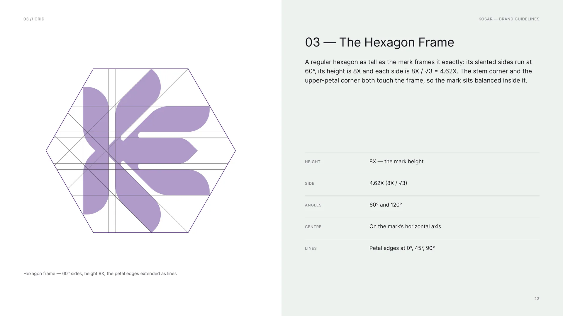
A regular hexagon as tall as the mark frames it exactly: its slanted sides run at 60°, its height is 8X and each side is 8X / √3 = 4.62X. The stem corner and the upper-petal corner both touch the frame, so the mark sits balanced inside it.
Height: 8X — the mark height.
Side: 4.62X (8X / √3).
Angles: 60° and 120°.
Centre: On the mark’s horizontal axis.
Lines: Petal edges at 0°, 45°, 90°.
Hexagon frame — 60° sides, height 8X; the petal edges extended as lines.
03.6
Wordmark
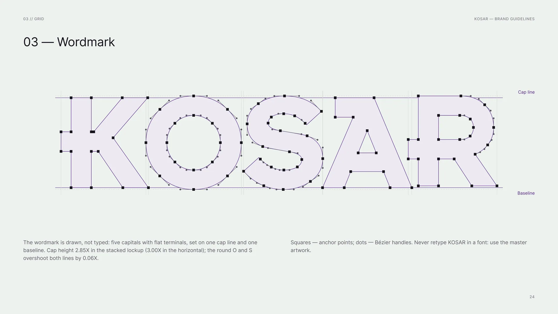
The wordmark is drawn, not typed: five capitals with flat terminals, set on one cap line and one baseline. Cap height 2.85X in the stacked lockup (3.00X in the horizontal); the round O and S overshoot both lines by 0.06X.
Squares — anchor points; dots — Bézier handles. Never retype KOSAR in a font: use the master artwork.
Cap line · Baseline.
03.7
Horizontal Proportions
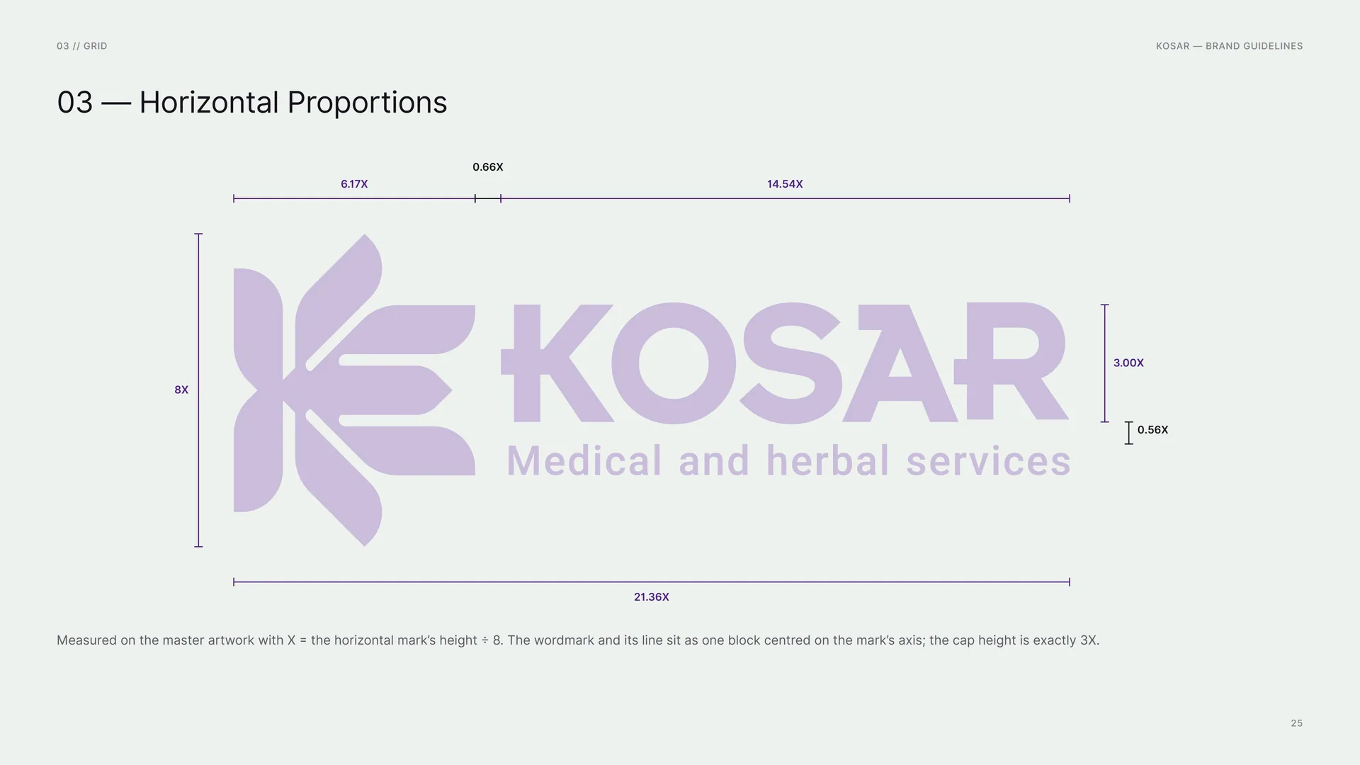
Measured on the master artwork with X = the horizontal mark’s height ÷ 8. The wordmark and its line sit as one block centred on the mark’s axis; the cap height is exactly 3X.
6.17X · 0.66X · 14.54X · 8X · 3.00X · 0.56X · 21.36X.
03.8
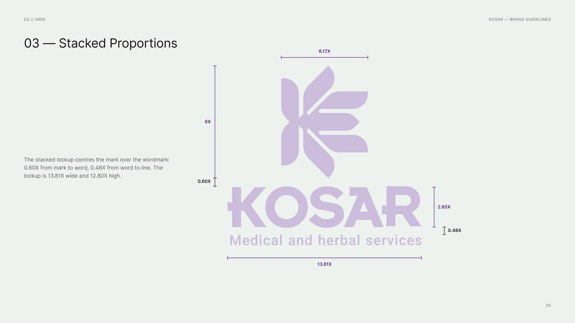
Stacked Proportions
The stacked lockup centres the mark over the wordmark: 0.60X from mark to word, 0.48X from word to line. The lockup is 13.81X wide and 12.80X high.
6.17X · 8X · 0.60X · 2.85X · 0.48X · 13.81X.
03.9
Clear Space
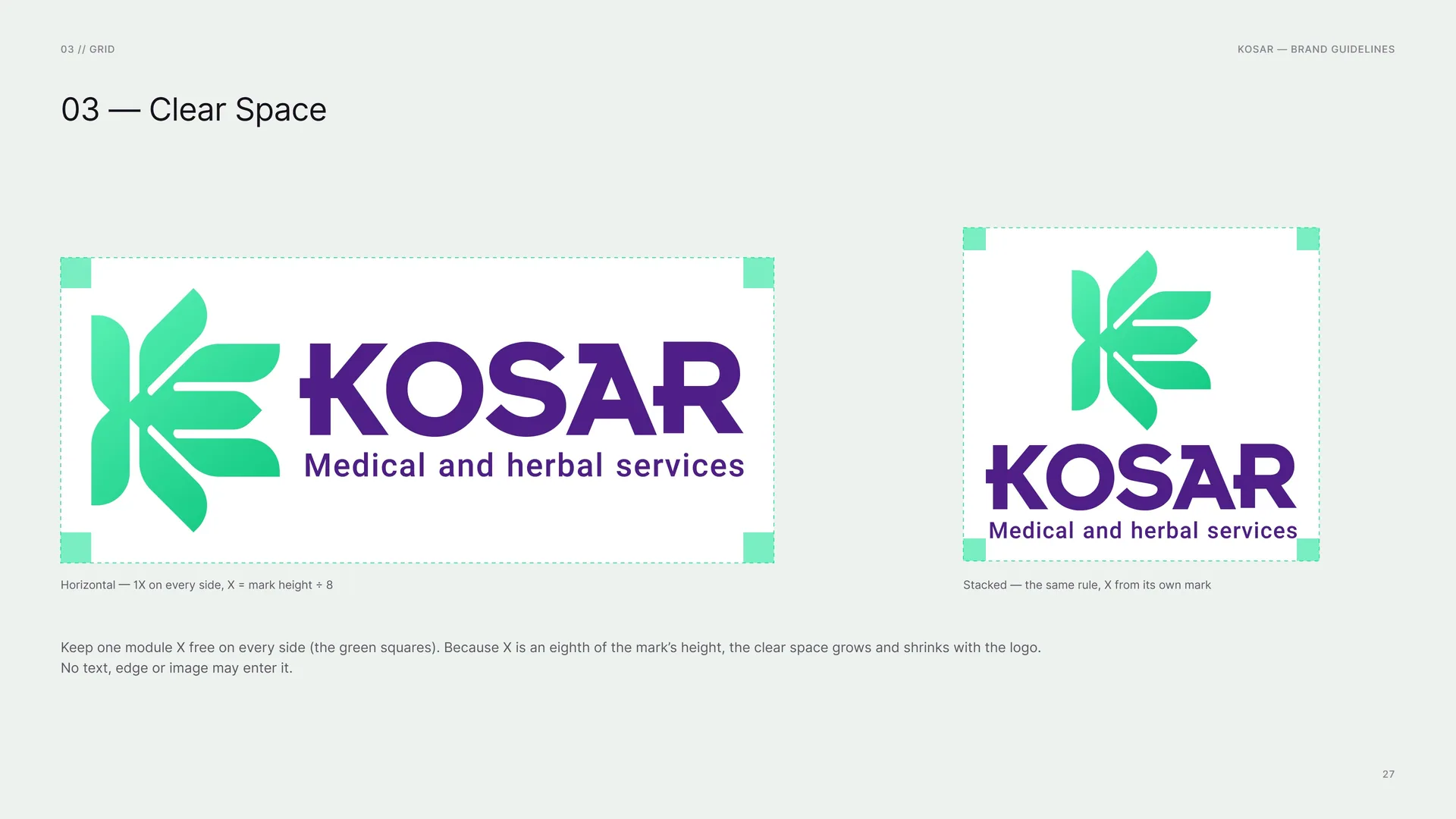
Horizontal — 1X on every side, X = mark height ÷ 8.
Stacked — the same rule, X from its own mark.
Keep one module X free on every side (the green squares). Because X is an eighth of the mark’s height, the clear space grows and shrinks with the logo. No text, edge or image may enter it.
03.10
Logo versions
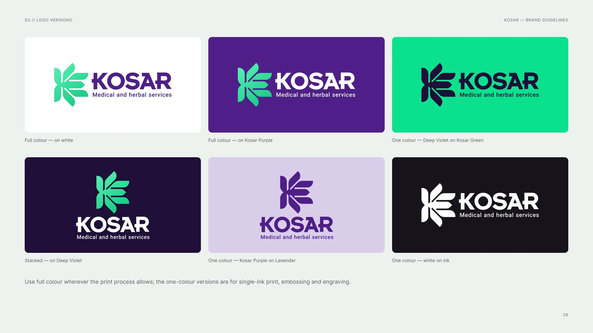
Full colour — on white.
Full colour — on Kosar Purple.
One colour — Deep Violet on Kosar Green.
Stacked — on Deep Violet.
One colour — Kosar Purple on Lavender.
One colour — white on ink.
Use full colour wherever the print process allows; the one-colour versions are for single-ink print, embossing and engraving.
03.11
The Logo Family
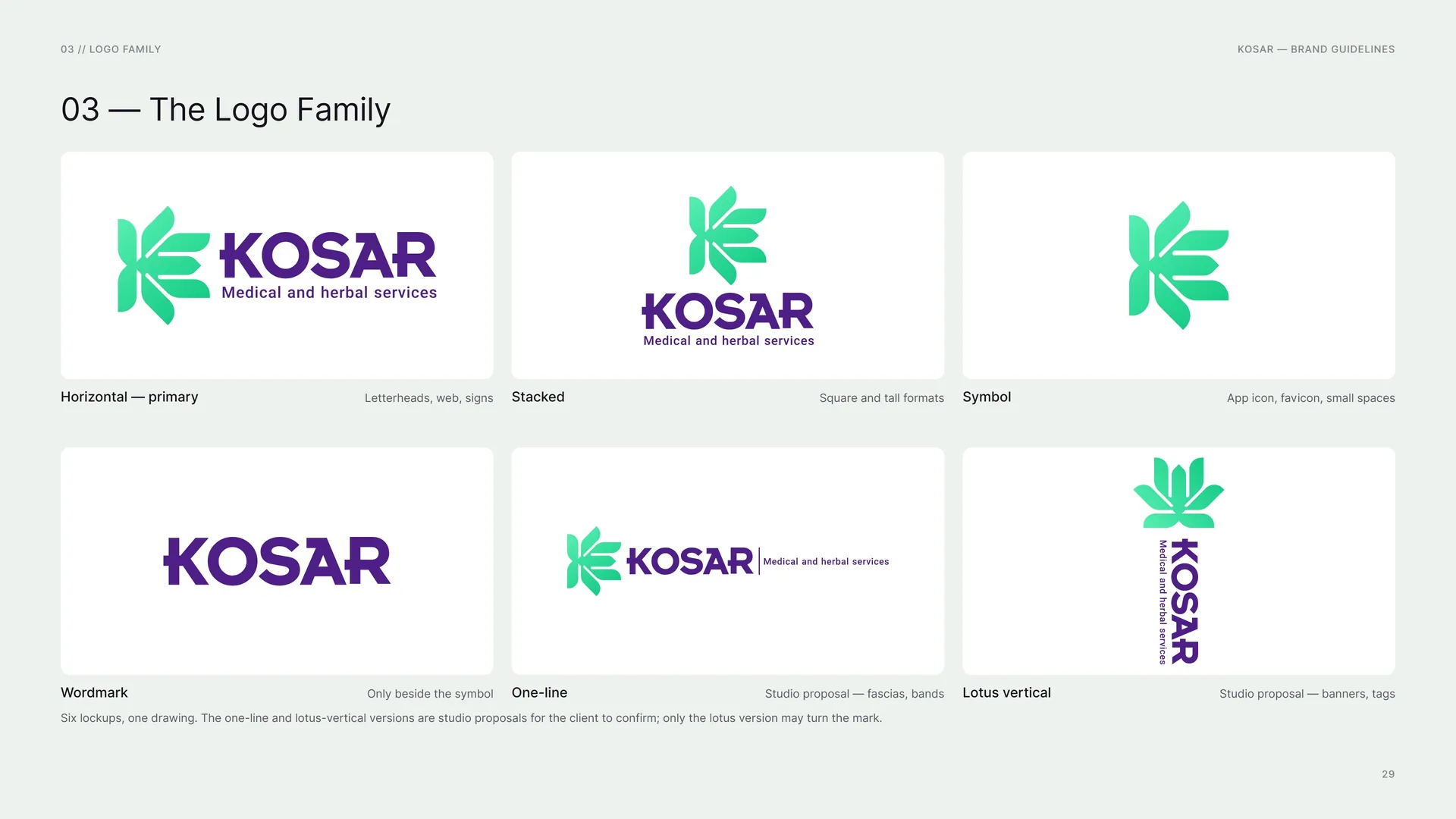
Horizontal — primary: Letterheads, web, signs.
Stacked: Square and tall formats.
Symbol: App icon, favicon, small spaces.
Wordmark: Only beside the symbol.
One-line: Studio proposal — fascias, bands.
Lotus vertical: Studio proposal — banners, tags.
Six lockups, one drawing. The one-line and lotus-vertical versions are studio proposals for the client to confirm; only the lotus version may turn the mark.
03.12
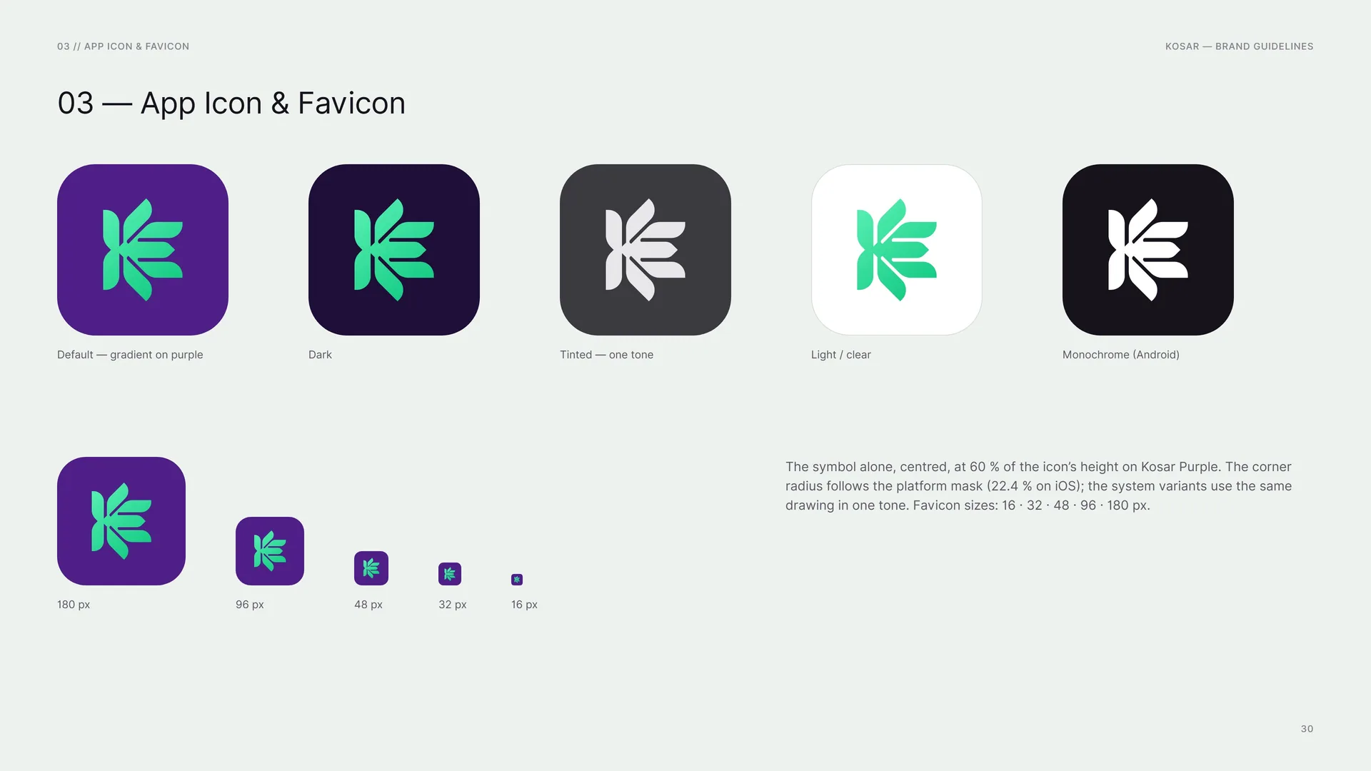
App Icon & Favicon
Default — gradient on purple.
Dark.
Tinted — one tone.
Light / clear.
Monochrome (Android).
180 px · 96 px · 48 px · 32 px · 16 px.
The symbol alone, centred, at 60 % of the icon’s height on Kosar Purple. The corner radius follows the platform mask (22.4 % on iOS); the system variants use the same drawing in one tone. Favicon sizes: 16 · 32 · 48 · 96 · 180 px.
03.13
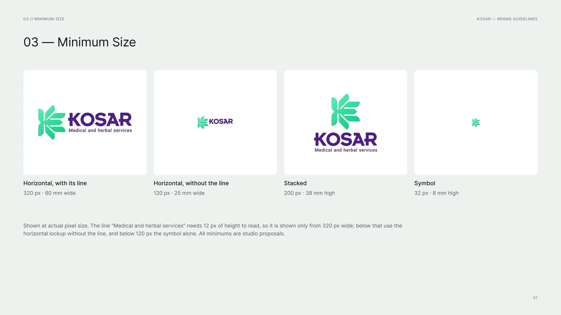
Minimum Size
Horizontal, with its line: 320 px · 60 mm wide.
Horizontal, without the line: 120 px · 25 mm wide.
Stacked: 200 px · 38 mm high.
Symbol: 32 px · 8 mm high.
Shown at actual pixel size. The line “Medical and herbal services” needs 12 px of height to read, so it is shown only from 320 px wide; below that use the horizontal lockup without the line, and below 120 px the symbol alone. All minimums are studio proposals.
03.14
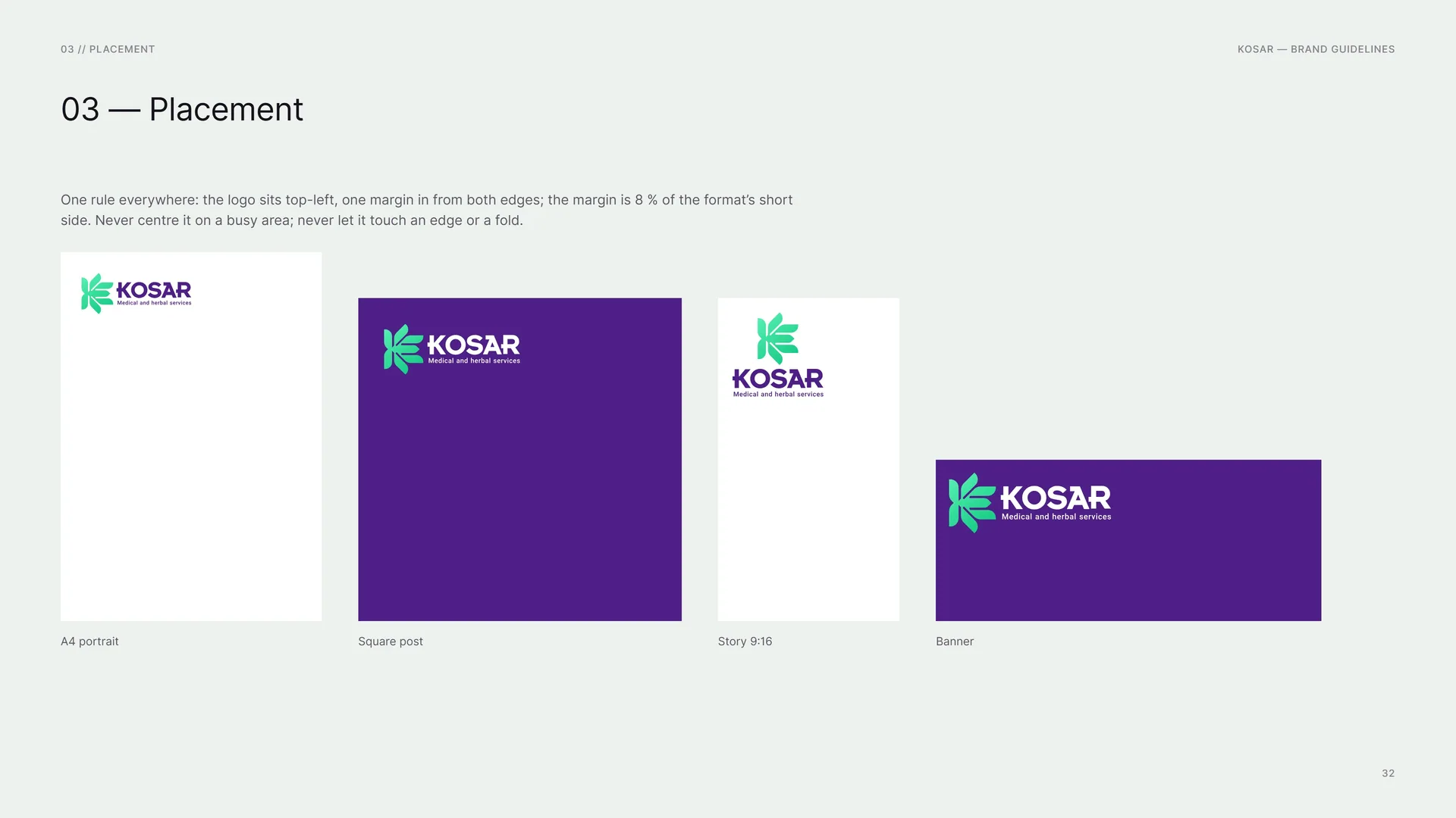
Placement
One rule everywhere: the logo sits top-left, one margin in from both edges; the margin is 8 % of the format’s short side. Never centre it on a busy area; never let it touch an edge or a fold.
A4 portrait · Square post · Story 9:16 · Banner.
03.15
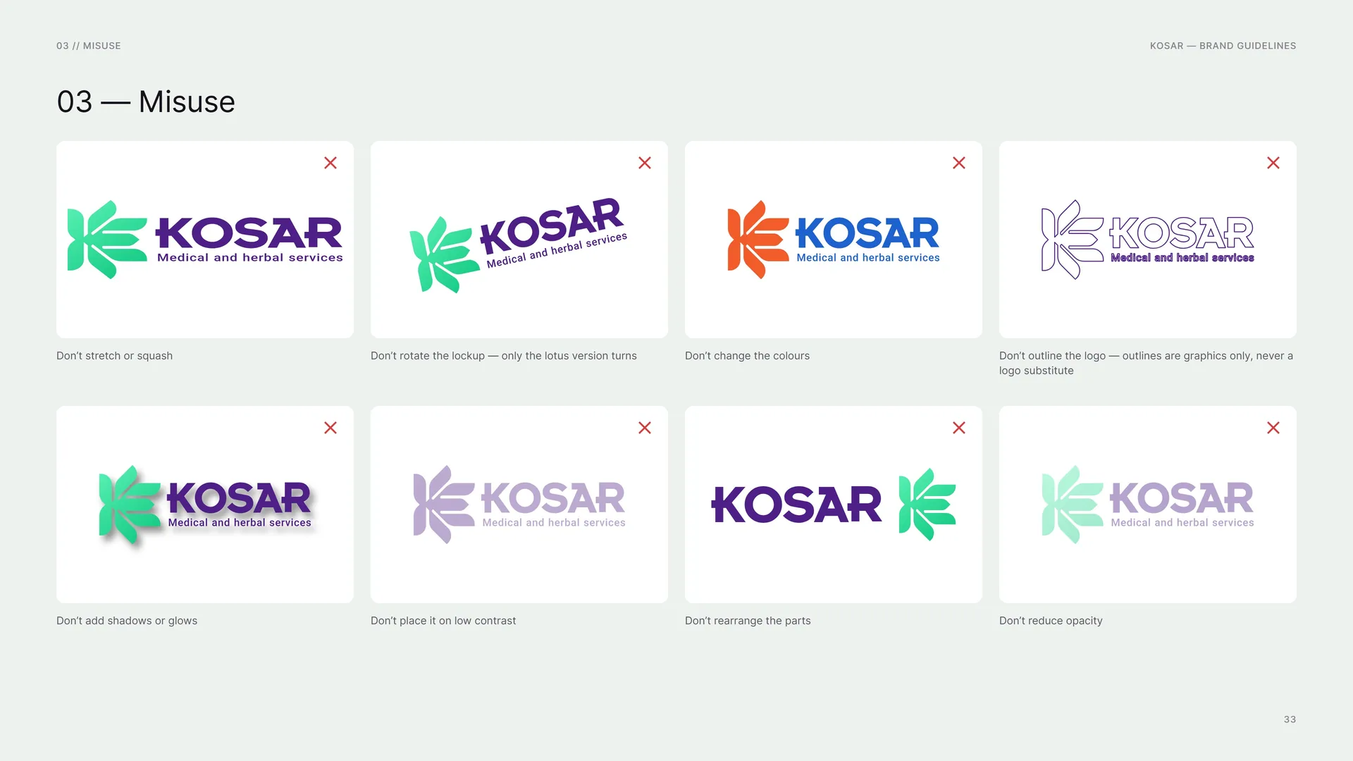
Misuse
Don’t stretch or squash.
Don’t rotate the lockup — only the lotus version turns.
Don’t change the colours.
Don’t outline the logo — outlines are graphics only, never a logo substitute.
Don’t add shadows or glows.
Don’t place it on low contrast.
Don’t rearrange the parts.
Don’t reduce opacity.
03.16
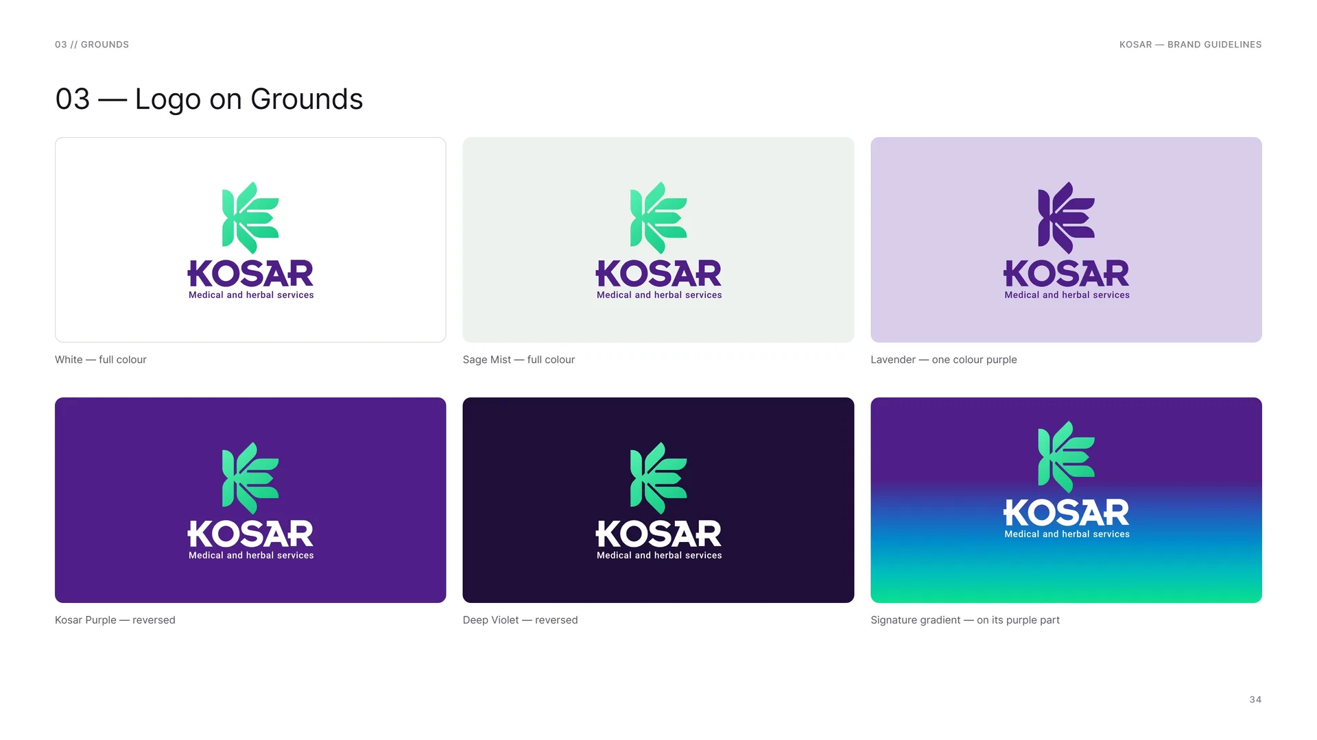
Logo on Grounds
White — full colour.
Sage Mist — full colour.
Kosar Purple — reversed.
Deep Violet — reversed.
Lavender — one colour purple.
Signature gradient — on its purple part.
04
Colour
04.1
Colour
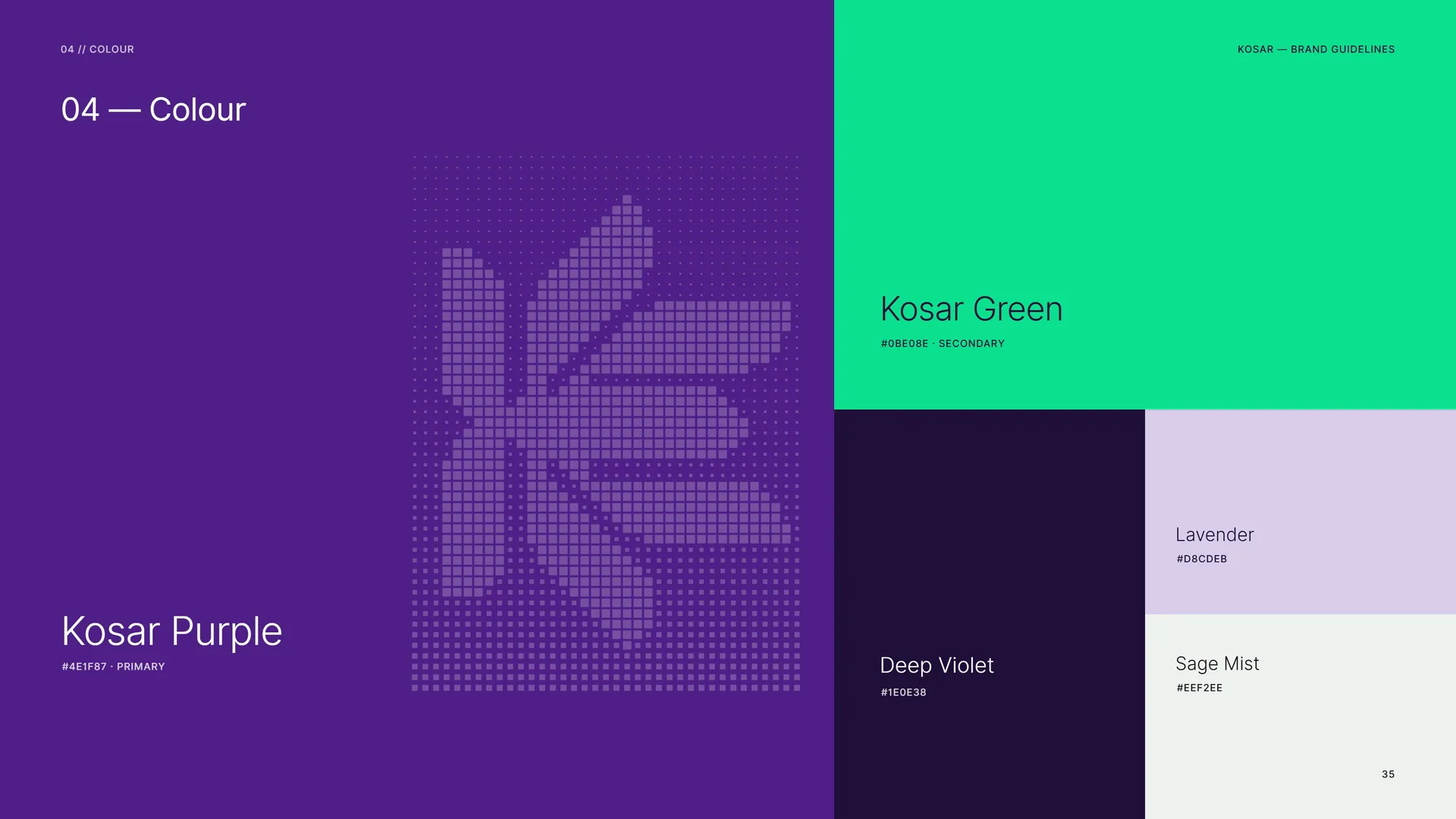
Kosar Purple: #4E1F87 · Primary.
Kosar Green: #0BE08E · Secondary.
Deep Violet: #1E0E38.
Lavender: #D8CDEB.
Sage Mist: #EEF2EE.
04.2
Colour Values
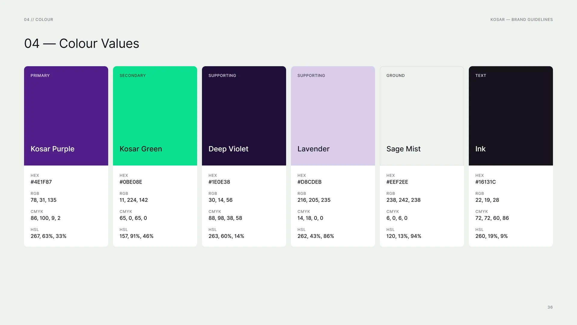
Kosar Purple (primary): HEX #4E1F87 · RGB 78, 31, 135 · CMYK 86, 100, 9, 2 · HSL 267, 63%, 33%.
Kosar Green (secondary): HEX #0BE08E · RGB 11, 224, 142 · CMYK 65, 0, 65, 0 · HSL 157, 91%, 46%.
Deep Violet (supporting): HEX #1E0E38 · RGB 30, 14, 56 · CMYK 88, 98, 38, 58 · HSL 263, 60%, 14%.
Lavender (supporting): HEX #D8CDEB · RGB 216, 205, 235 · CMYK 14, 18, 0, 0 · HSL 262, 43%, 86%.
Sage Mist (ground): HEX #EEF2EE · RGB 238, 242, 238 · CMYK 6, 0, 6, 0 · HSL 120, 13%, 94%.
Ink (text): HEX #16131C · RGB 22, 19, 28 · CMYK 72, 72, 60, 86 · HSL 260, 19%, 9%.
04.3
Tints & Shades
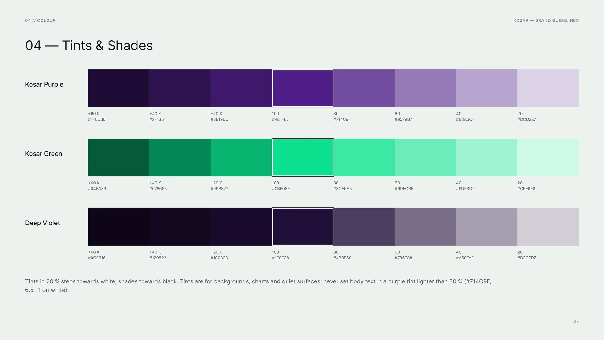
Kosar Purple: +60 K #1F0C36 · +40 K #2F1351 · +20 K #3E196C · 100 #4E1F87 · 80 #714C9F · 60 #9579B7 · 40 #B8A5CF · 20 #DCD2E7.
Kosar Green: +60 K #045A39 · +40 K #078655 · +20 K #09B372 · 100 #0BE08E · 80 #3CE6A5 · 60 #6DECBB · 40 #9DF3D2 · 20 #CEF9E8.
Deep Violet: +60 K #0C0616 · +40 K #120822 · +20 K #180B2D · 100 #1E0E38 · 80 #4B3E60 · 60 #786E88 · 40 #A59FAF · 20 #D2CFD7.
Tints in 20 % steps towards white, shades towards black. Tints are for backgrounds, charts and quiet surfaces; never set body text in a purple tint lighter than 80 % (#714C9F, 6.5 : 1 on white).
04.4
Contrast & Accessibility
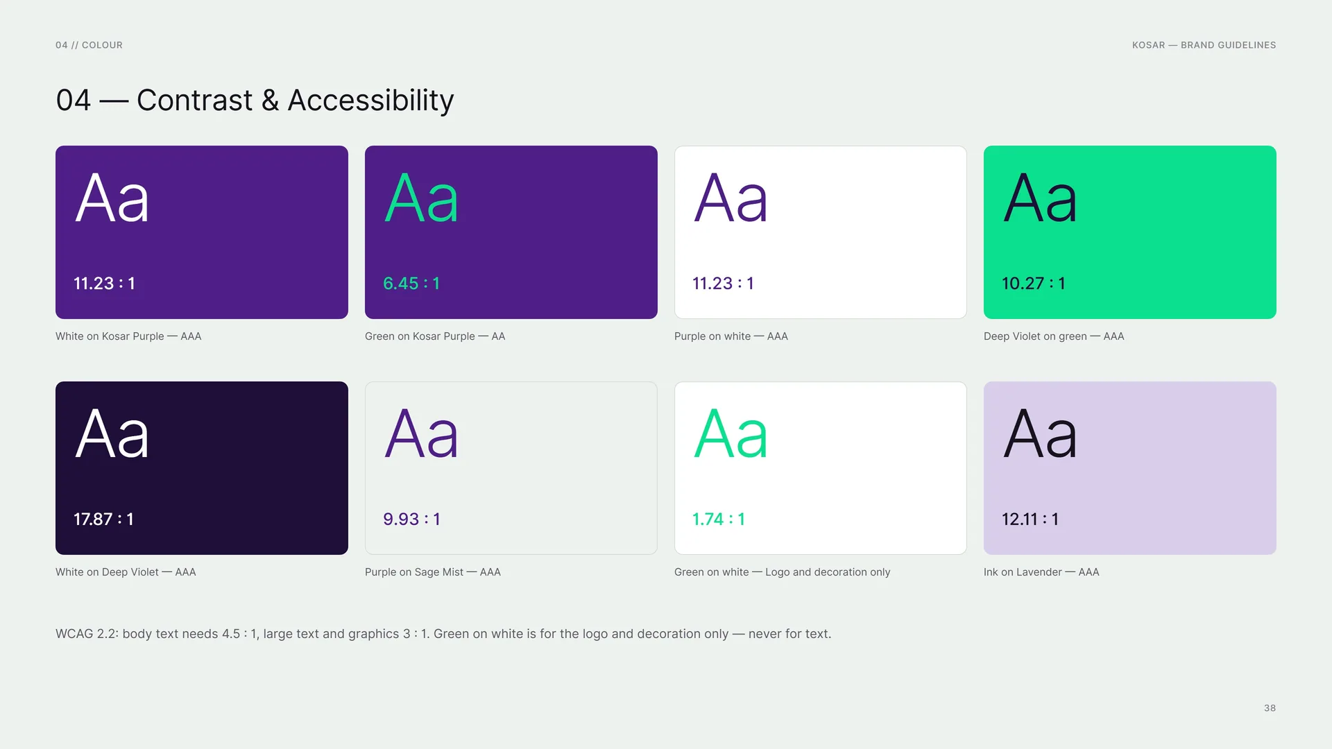
WCAG 2.2: body text needs 4.5 : 1, large text and graphics 3 : 1. Green on white is for the logo and decoration only — never for text.
White on Kosar Purple: 11.23 : 1 — AAA.
Green on Kosar Purple: 6.45 : 1 — AA.
Purple on white: 11.23 : 1 — AAA.
White on Deep Violet: 17.87 : 1 — AAA.
Purple on Sage Mist: 9.93 : 1 — AAA.
Green on white: 1.74 : 1 — Logo and decoration only.
Deep Violet on green: 10.27 : 1 — AAA.
Ink on Lavender: 12.11 : 1 — AAA.
04.5
Colour Story
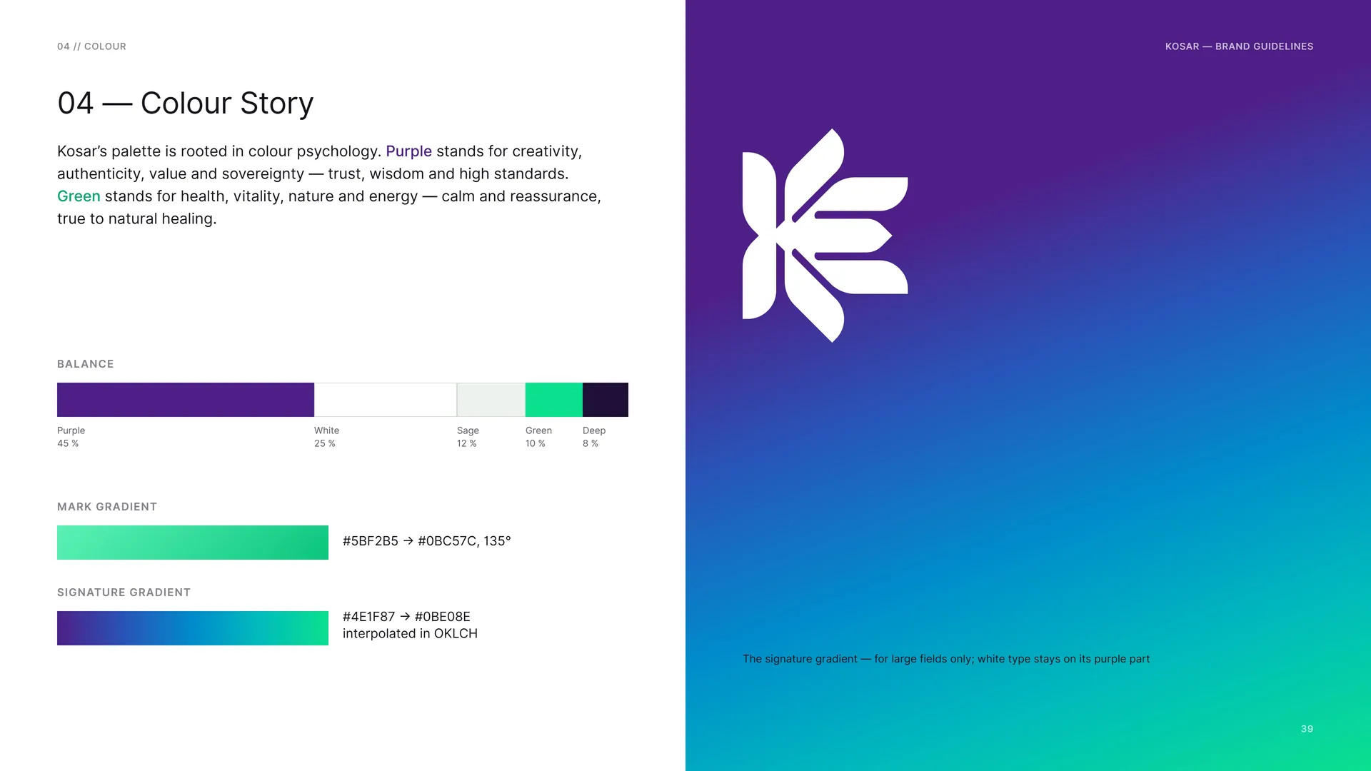
Kosar’s palette is rooted in colour psychology. Purple stands for creativity, authenticity, value and sovereignty — trust, wisdom and high standards. Green stands for health, vitality, nature and energy — calm and reassurance, true to natural healing.
Balance: Purple 45 % · White 25 % · Sage 12 % · Green 10 % · Deep 8 %.
Mark gradient: #5BF2B5 → #0BC57C, 135°.
Signature gradient: #4E1F87 → #0BE08E interpolated in OKLCH.
The signature gradient — for large fields only; white type stays on its purple part.
05
Typography
05.1
Typography
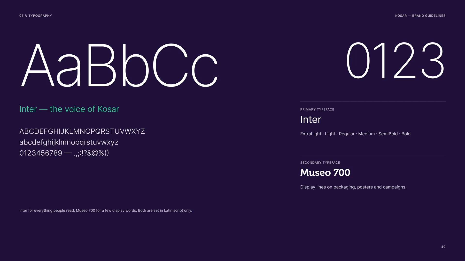
Inter — the voice of Kosar.
Inter for everything people read; Museo 700 for a few display words. Both are set in Latin script only.
Primary typeface: Inter — ExtraLight · Light · Regular · Medium · SemiBold · Bold.
Secondary typeface: Museo 700 — Display lines on packaging, posters and campaigns.
05.2
Inter
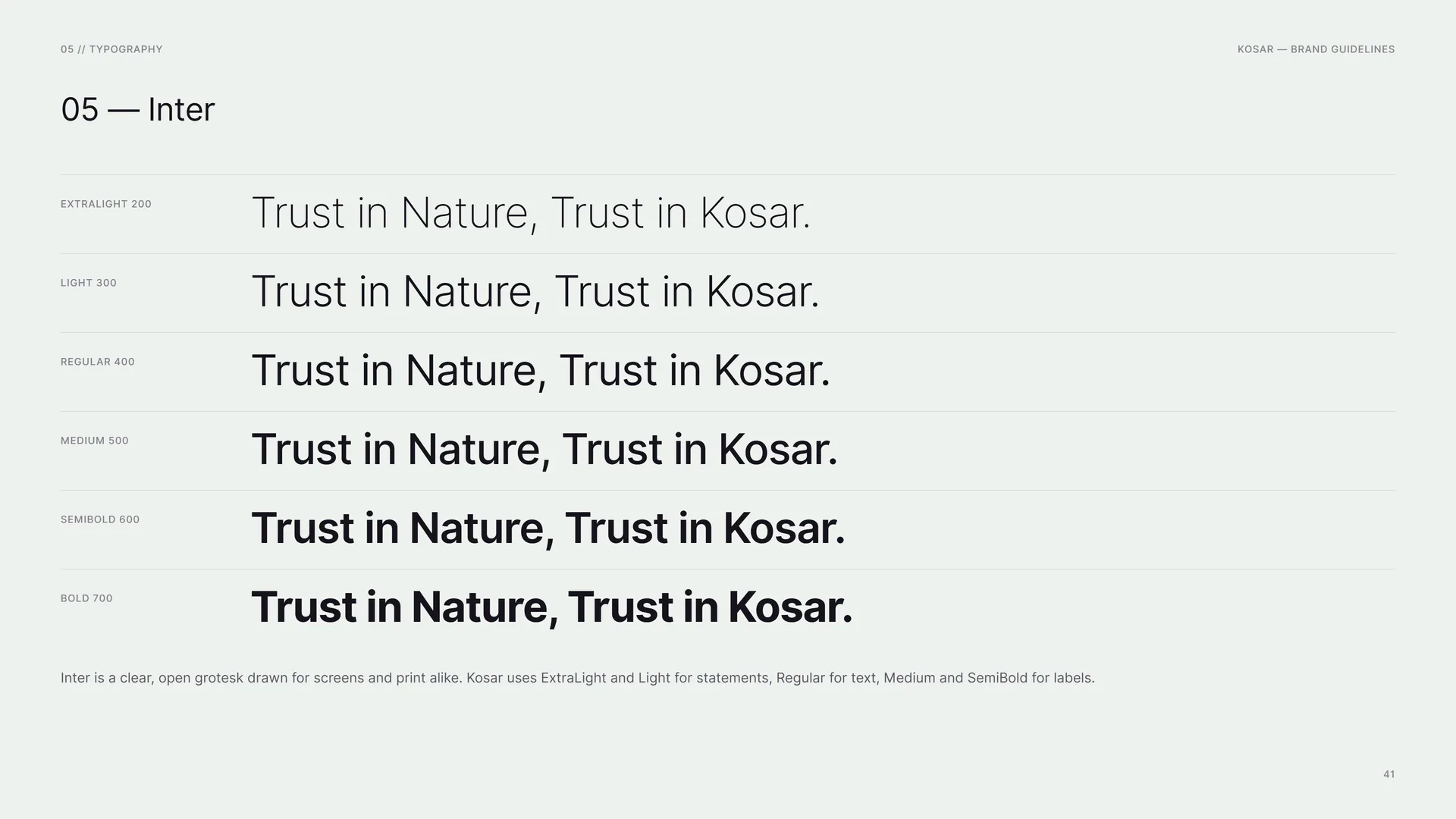
ExtraLight 200 · Light 300 · Regular 400 · Medium 500 · SemiBold 600 · Bold 700: Trust in Nature, Trust in Kosar.
Inter is a clear, open grotesk drawn for screens and print alike. Kosar uses ExtraLight and Light for statements, Regular for text, Medium and SemiBold for labels.
05.3
Museo 700
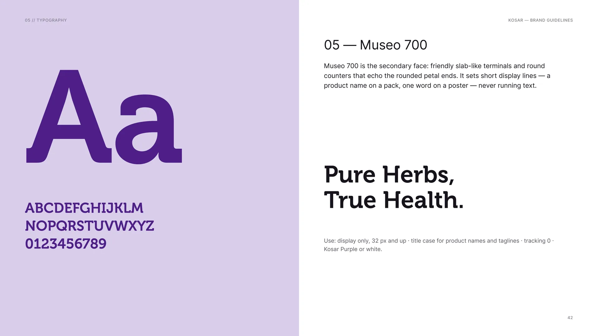
Museo 700 is the secondary face: friendly slab-like terminals and round counters that echo the rounded petal ends. It sets short display lines — a product name on a pack, one word on a poster — never running text.
Pure Herbs, True Health.
Use: display only, 32 px and up · title case for product names and taglines · tracking 0 · Kosar Purple or white.
05.4
Type System
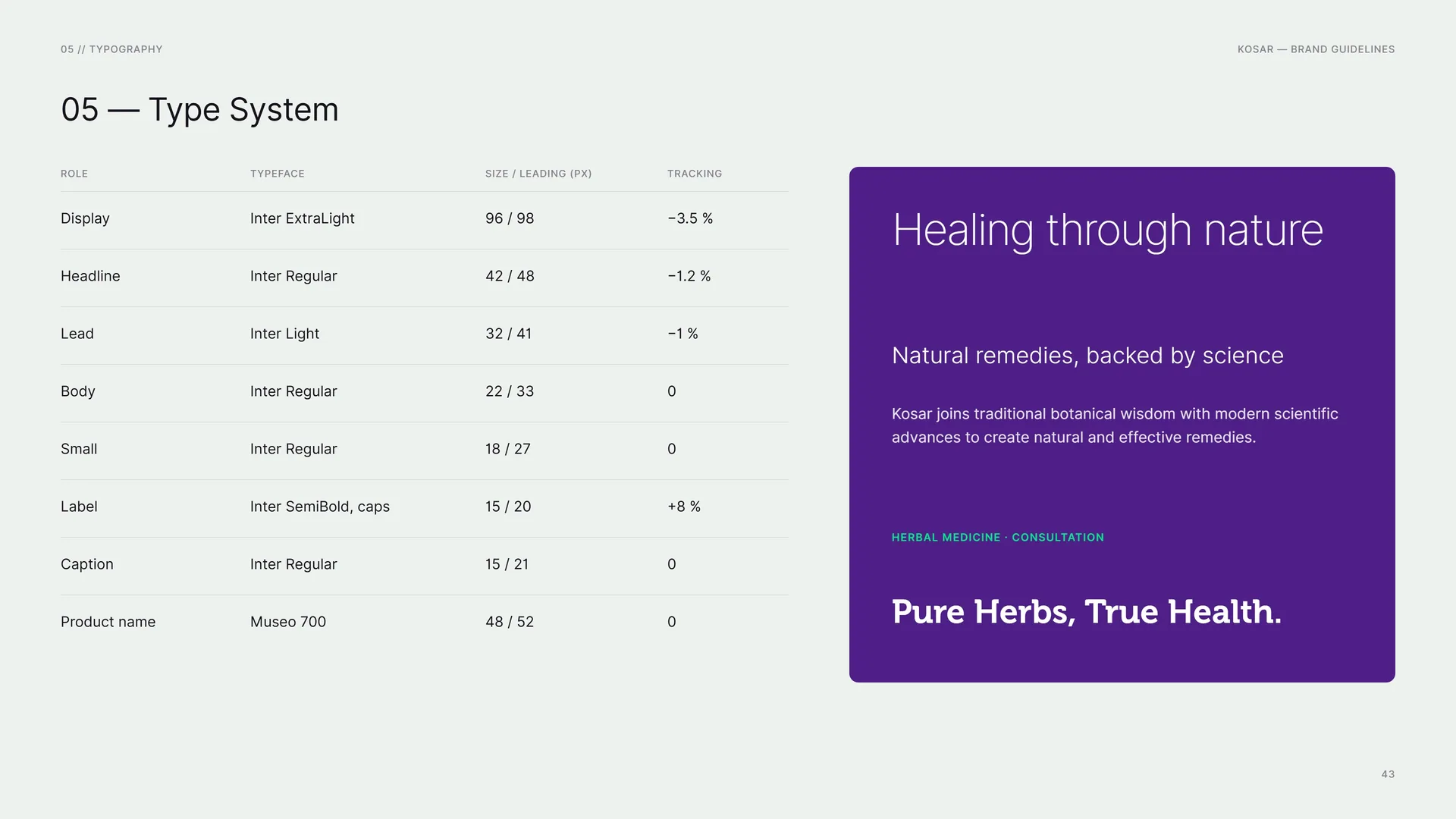
Display: Inter ExtraLight · 96 / 98 px · −3.5 %.
Headline: Inter Regular · 42 / 48 px · −1.2 %.
Lead: Inter Light · 32 / 41 px · −1 %.
Body: Inter Regular · 22 / 33 px · 0.
Small: Inter Regular · 18 / 27 px · 0.
Label: Inter SemiBold, caps · 15 / 20 px · +8 %.
Caption: Inter Regular · 15 / 21 px · 0.
Product name: Museo 700 · 48 / 52 px · 0.
Healing through nature.
Natural remedies, backed by science.
Kosar joins traditional botanical wisdom with modern scientific advances to create natural and effective remedies.
Herbal medicine · Consultation.
Pure Herbs, True Health.
06
Pattern & graphics
- 06.1The capsule field
- 06.2How the Pattern Is Built
- 06.3Petal Tiles
- 06.4Line Art & Logo Stroke
- 06.5Pattern on Grounds
- 06.6Brochure, bag, envelope and bottle
06.1
The capsule field
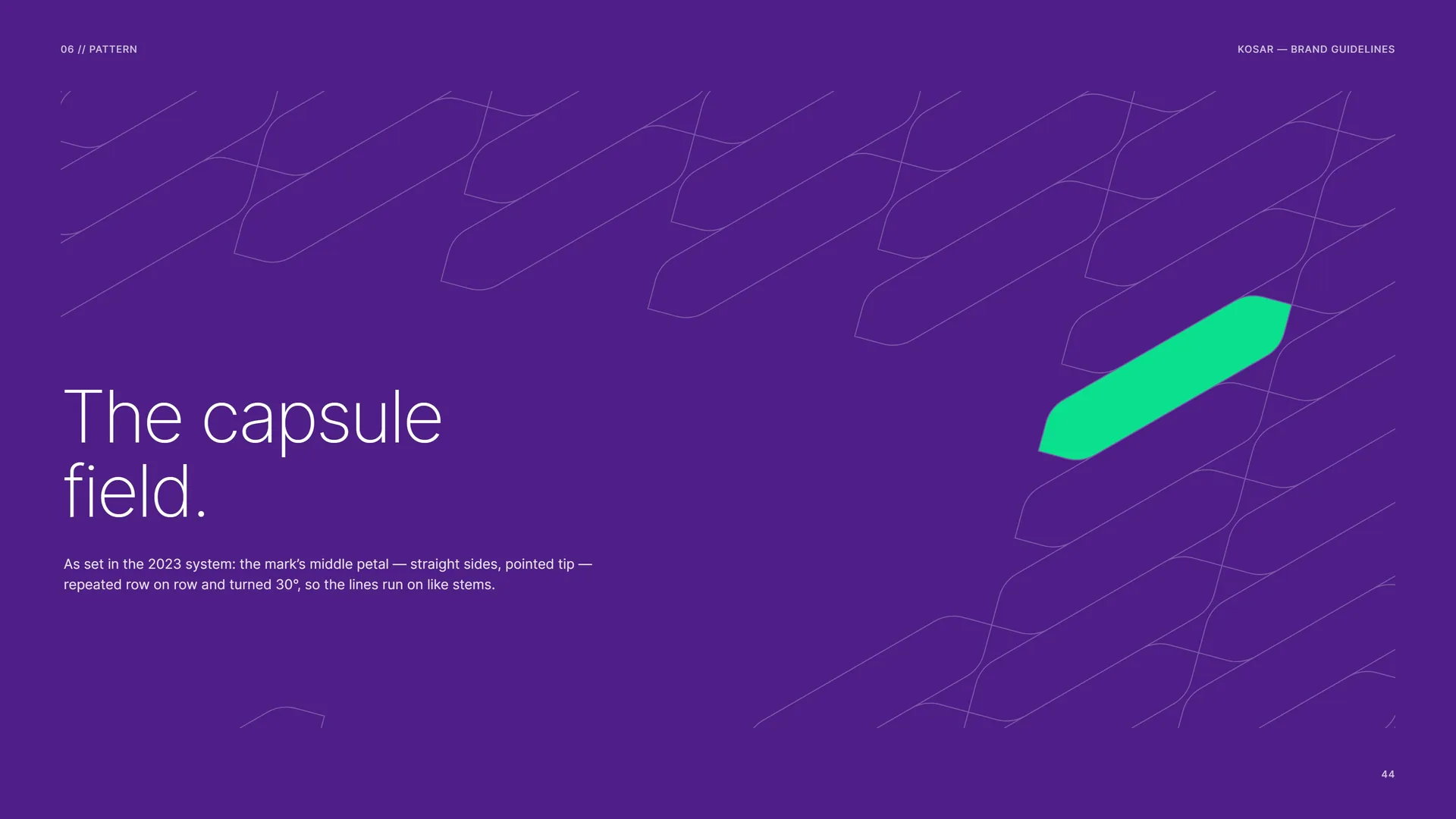
The capsule field.
As set in the 2023 system: the mark’s middle petal — straight sides, pointed tip — repeated row on row and turned 30°, so the lines run on like stems.
06.2
How the Pattern Is Built
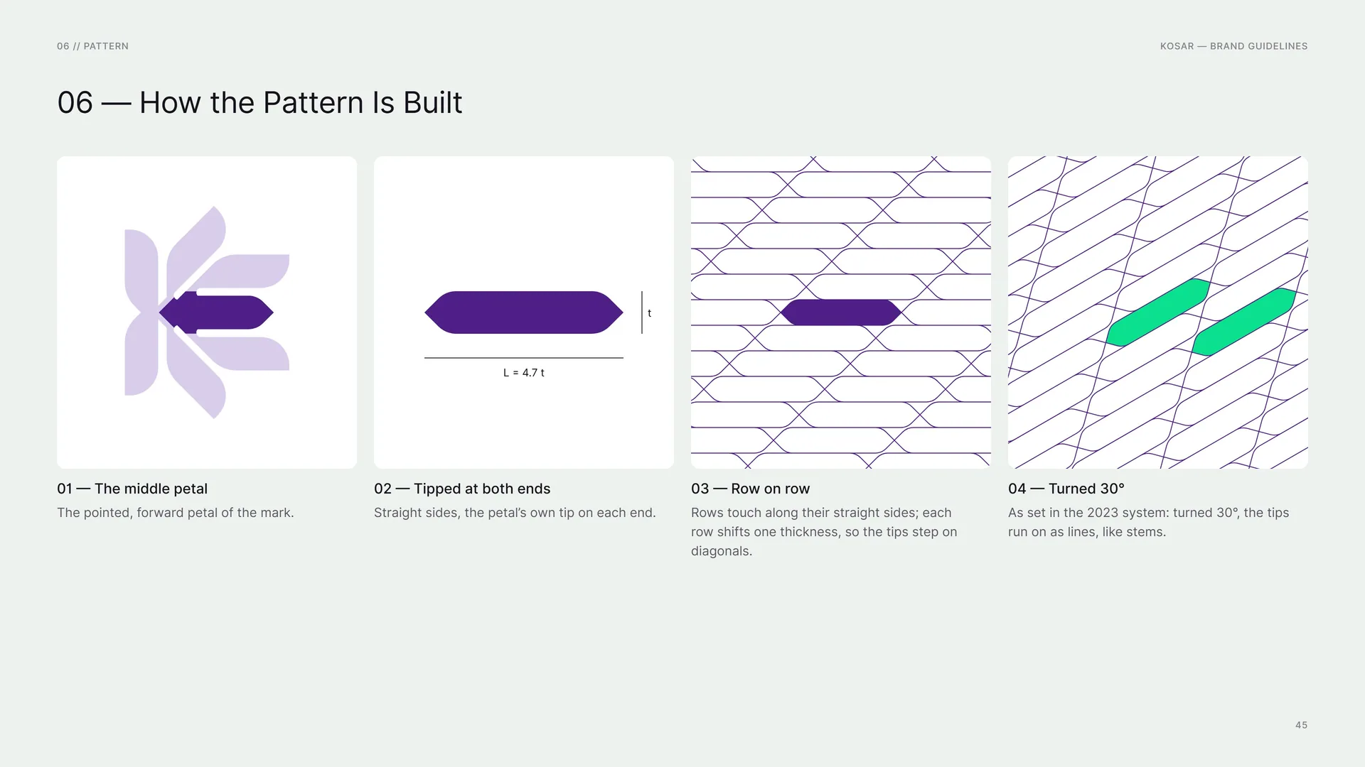
The middle petal: The pointed, forward petal of the mark.
Tipped at both ends: Straight sides, the petal’s own tip on each end.
L = 4.7 t.
Row on row: Rows touch along their straight sides; each row shifts one thickness, so the tips step on diagonals.
Turned 30°: As set in the 2023 system: turned 30°, the tips run on as lines, like stems.
06.3
Petal Tiles
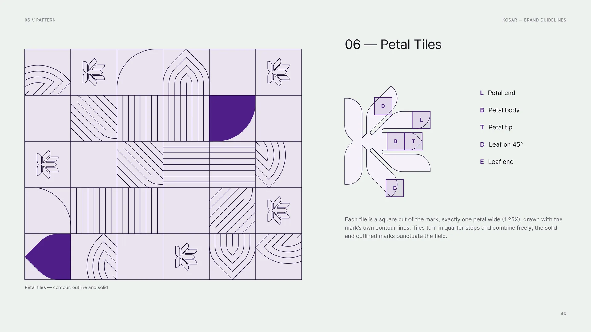
Each tile is a square cut of the mark, exactly one petal wide (1.25X), drawn with the mark’s own contour lines. Tiles turn in quarter steps and combine freely; the solid and outlined marks punctuate the field.
Petal tiles — contour, outline and solid.
L: Petal end · B: Petal body · T: Petal tip · D: Leaf on 45° · E: Leaf end.
06.4
Line Art & Logo Stroke
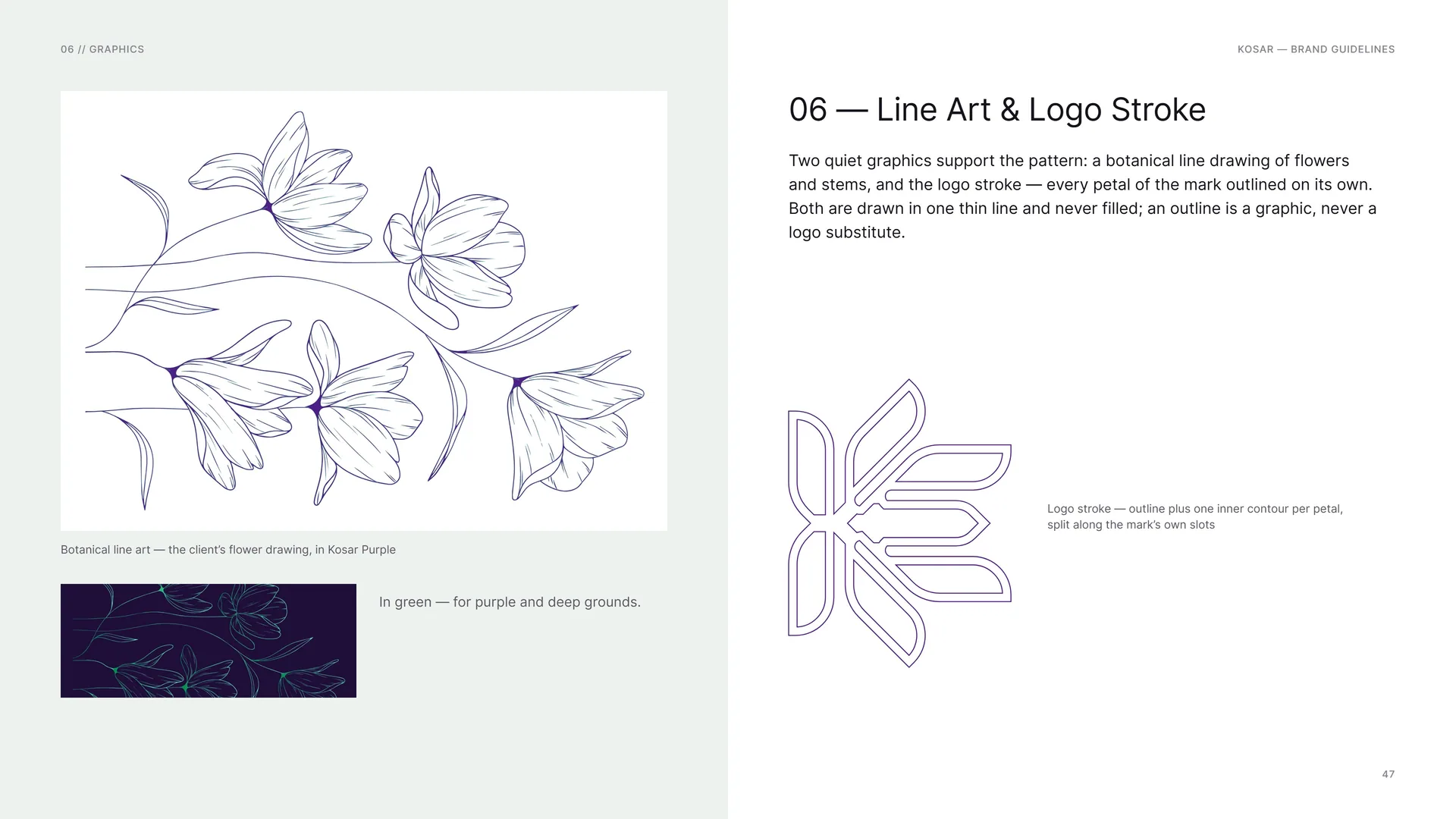
Two quiet graphics support the pattern: a botanical line drawing of flowers and stems, and the logo stroke — every petal of the mark outlined on its own. Both are drawn in one thin line and never filled; an outline is a graphic, never a logo substitute.
Botanical line art — the client’s flower drawing, in Kosar Purple.
In green — for purple and deep grounds.
Logo stroke — outline plus one inner contour per petal, split along the mark’s own slots.
06.5
Pattern on Grounds
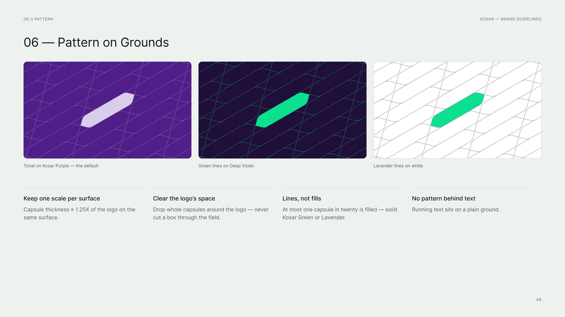
Tonal on Kosar Purple — the default.
Green lines on Deep Violet.
Lavender lines on white.
Keep one scale per surface: Capsule thickness ≥ 1.25X of the logo on the same surface.
Clear the logo’s space: Drop whole capsules around the logo — never cut a box through the field.
Lines, not fills: At most one capsule in twenty is filled — solid Kosar Green or Lavender.
No pattern behind text: Running text sits on a plain ground.
06.6
Brochure, bag, envelope and bottle
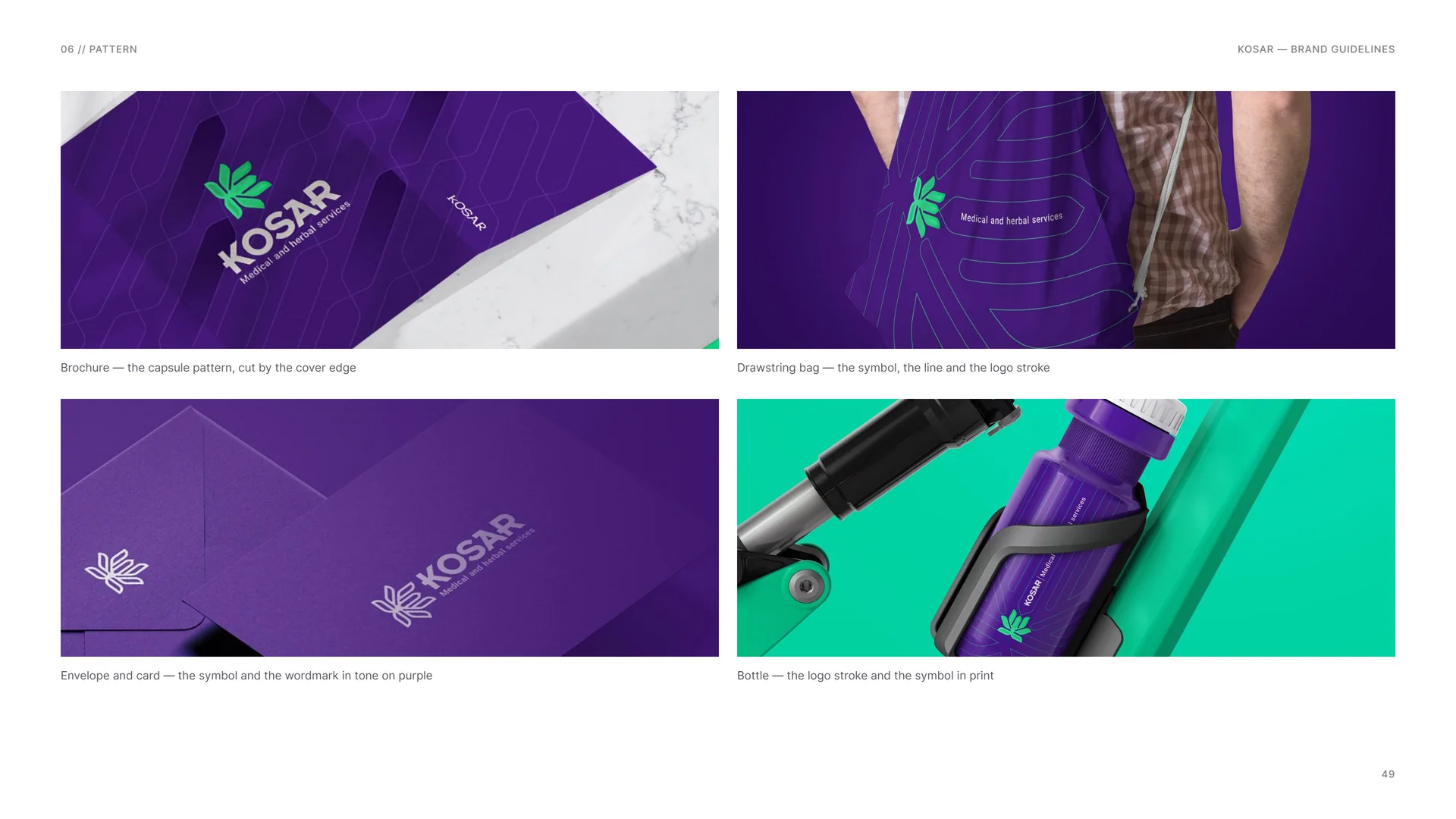
Brochure — the capsule pattern, cut by the cover edge.
Drawstring bag — the symbol, the line and the logo stroke.
Envelope and card — the symbol and the wordmark in tone on purple.
Bottle — the logo stroke and the symbol in print.
07
Imagery & motion
07.1
Imagery
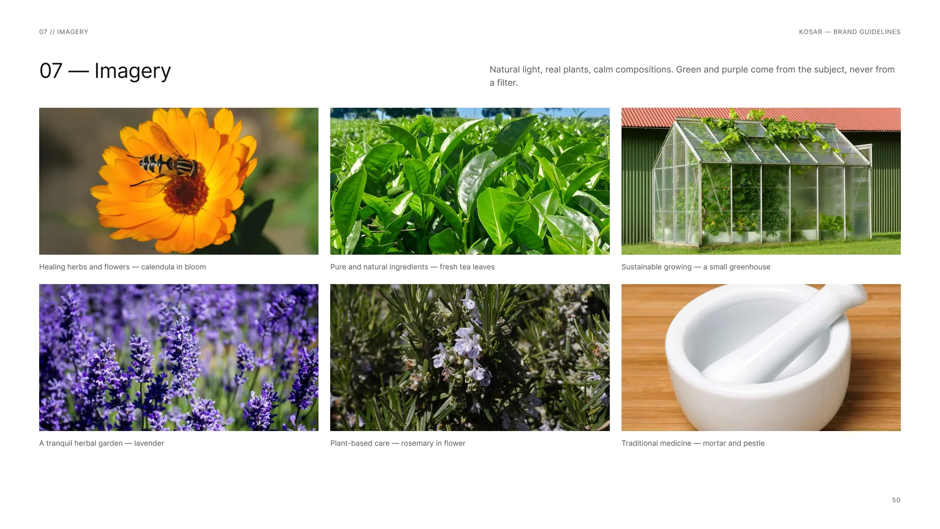
Natural light, real plants, calm compositions. Green and purple come from the subject, never from a filter.
Healing herbs and flowers — calendula in bloom.
Pure and natural ingredients — fresh tea leaves.
Sustainable growing — a small greenhouse.
A tranquil herbal garden — lavender.
Plant-based care — rosemary in flower.
Traditional medicine — mortar and pestle.
07.2
Logo in Motion
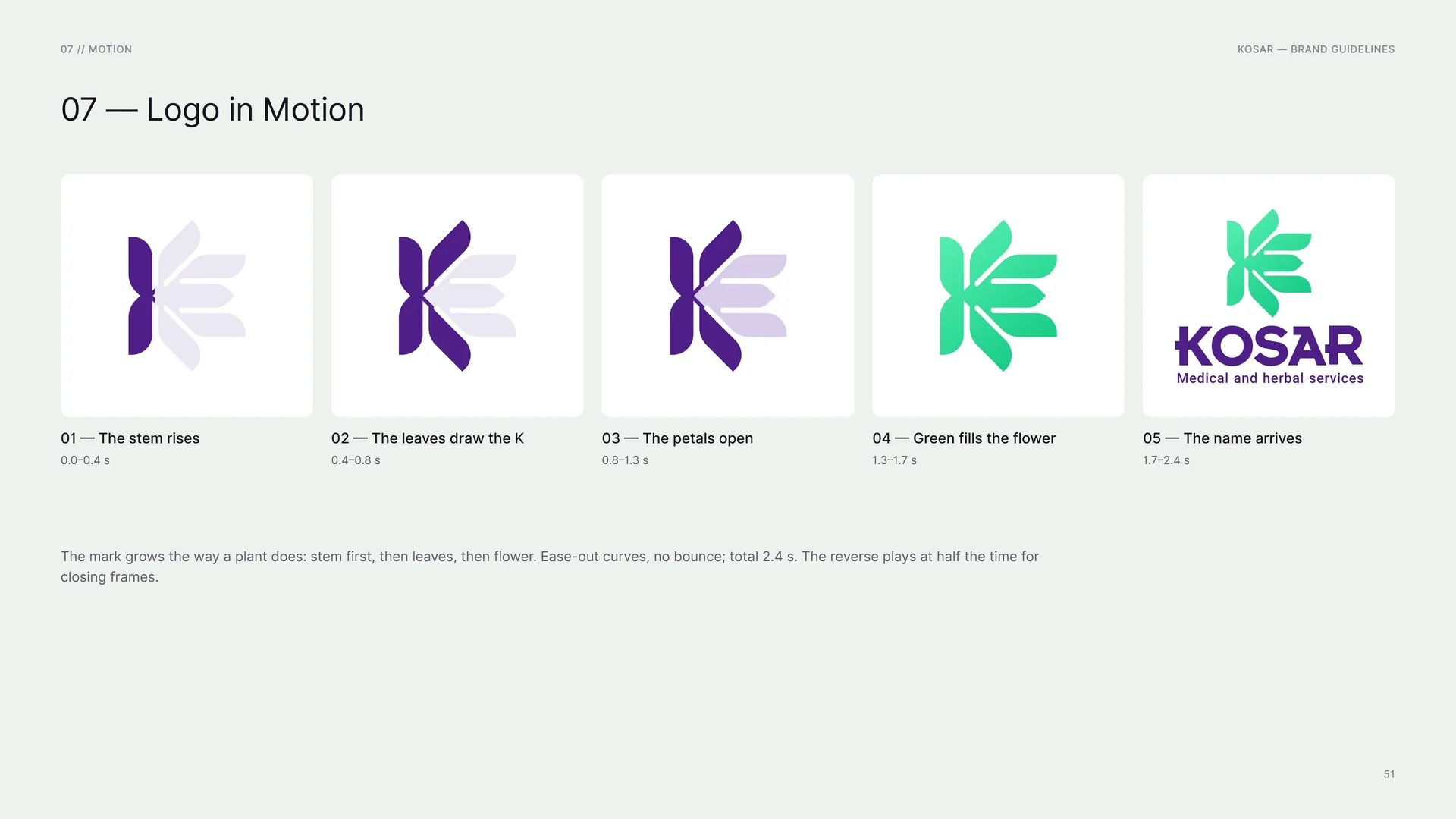
The stem rises: 0.0–0.4 s.
The leaves draw the K: 0.4–0.8 s.
The petals open: 0.8–1.3 s.
Green fills the flower: 1.3–1.7 s.
The name arrives: 1.7–2.4 s.
The mark grows the way a plant does: stem first, then leaves, then flower. Ease-out curves, no bounce; total 2.4 s. The reverse plays at half the time for closing frames.
08
Stationery
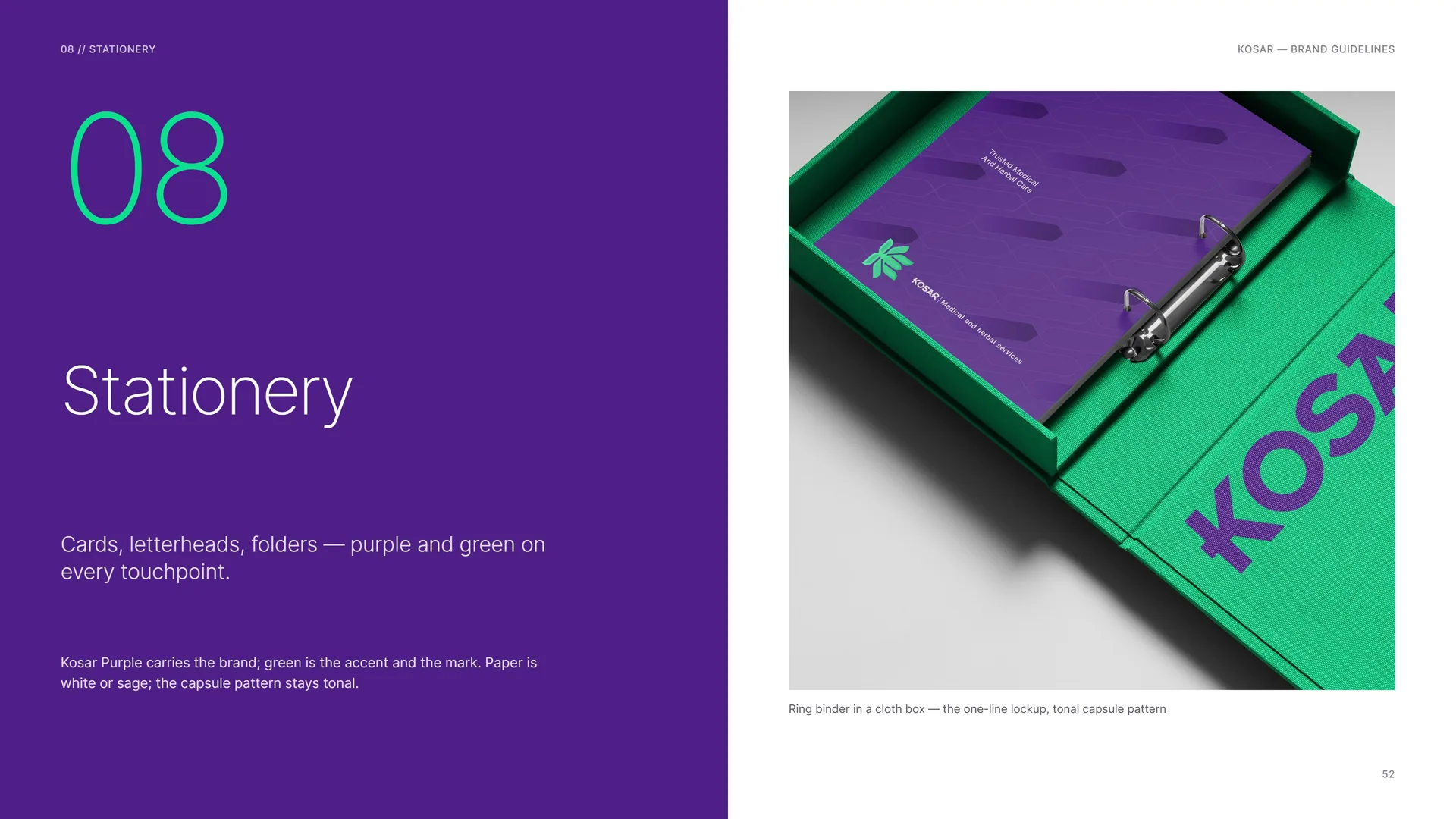
Cards, letterheads, folders — purple and green on every touchpoint.
Kosar Purple carries the brand; green is the accent and the mark. Paper is white or sage; the capsule pattern stays tonal.
Ring binder in a cloth box — the one-line lockup, tonal capsule pattern.
08.1
Business Cards
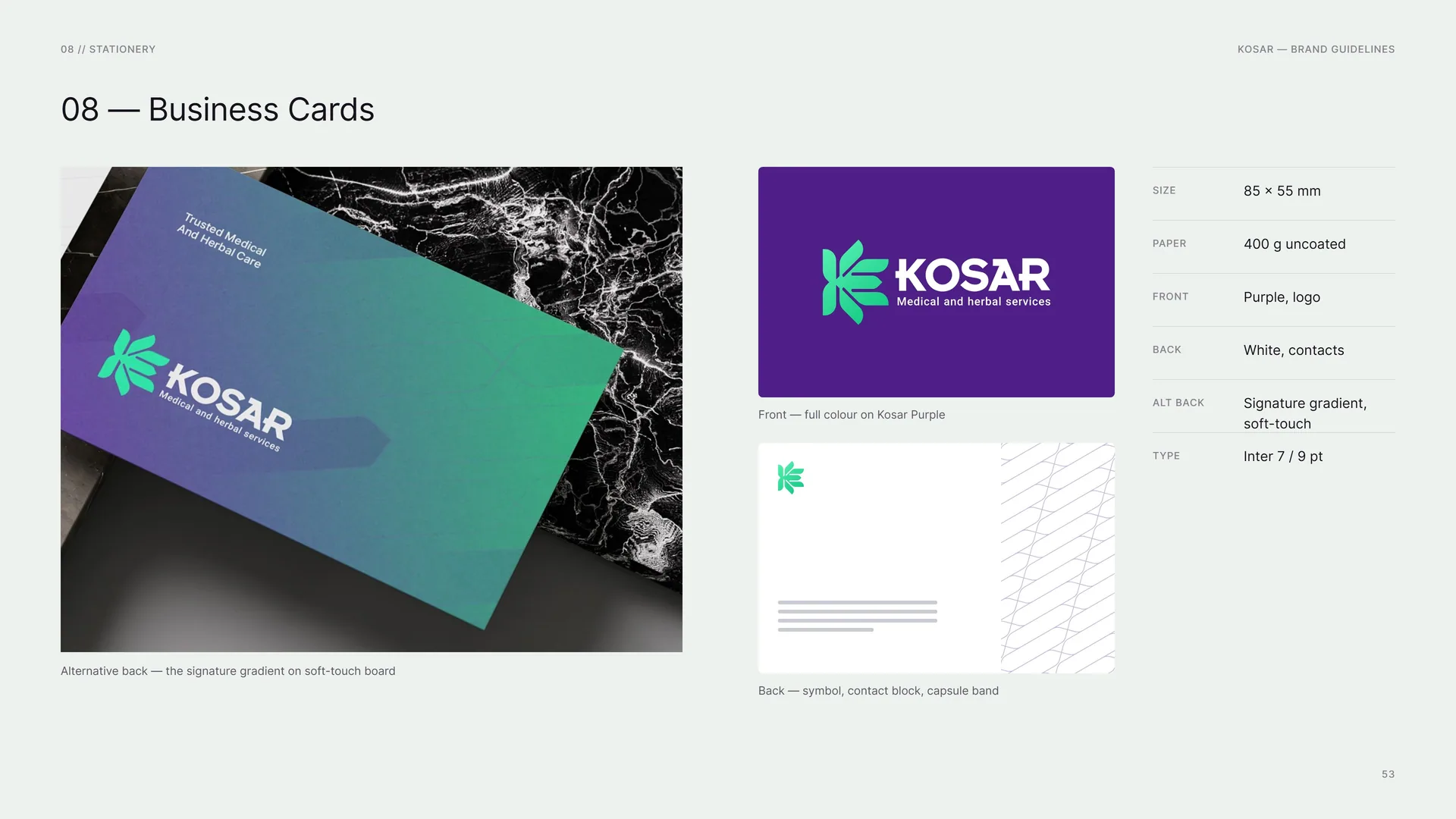
Alternative back — the signature gradient on soft-touch board.
Front — full colour on Kosar Purple.
Back — symbol, contact block, capsule band.
Size: 85 × 55 mm.
Paper: 400 g uncoated.
Front: Purple, logo.
Back: White, contacts.
Alt back: Signature gradient, soft-touch.
Type: Inter 7 / 9 pt.
08.2
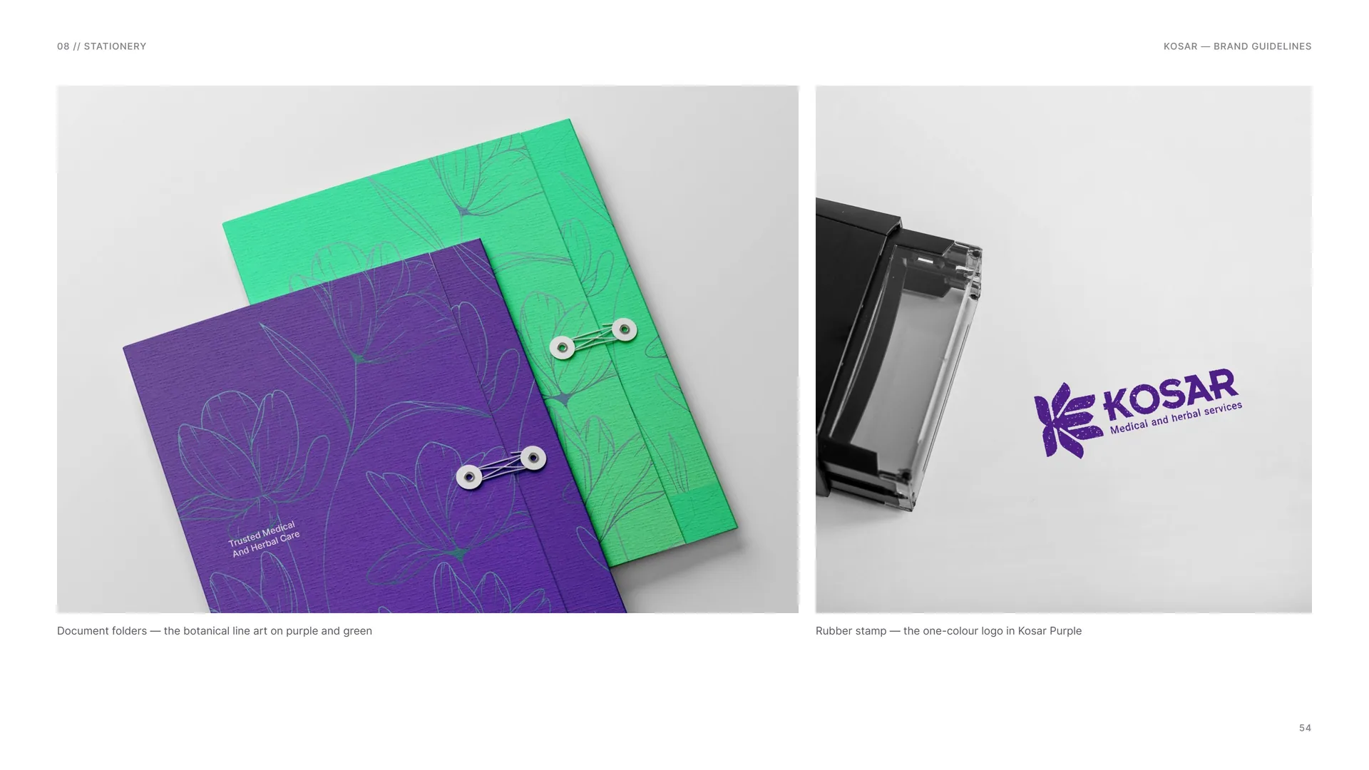
Document folders and rubber stamp
Document folders — the botanical line art on purple and green.
Rubber stamp — the one-colour logo in Kosar Purple.
08.3
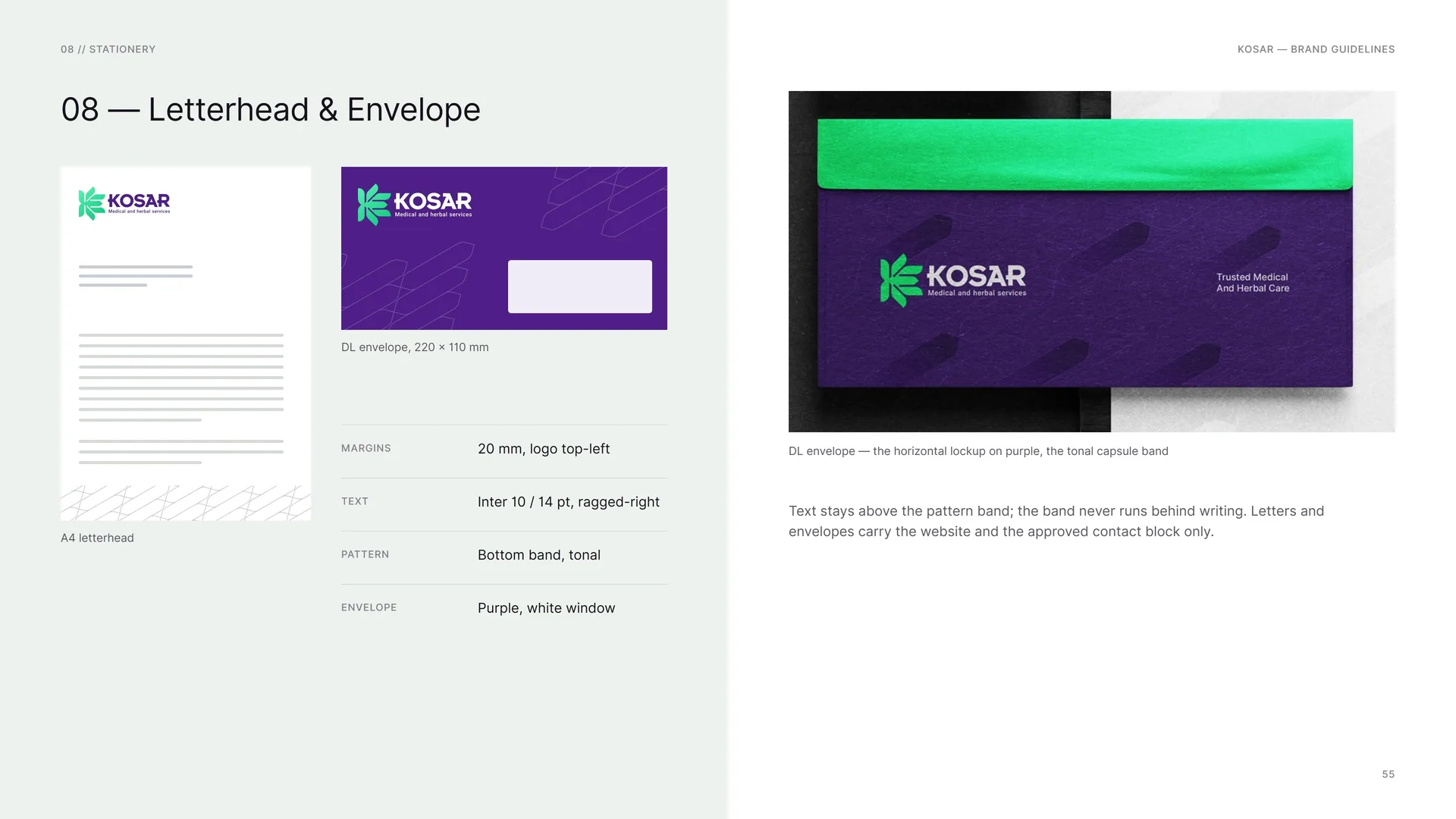
Letterhead & Envelope
A4 letterhead.
DL envelope, 220 × 110 mm.
Margins: 20 mm, logo top-left.
Text: Inter 10 / 14 pt, ragged-right.
Pattern: Bottom band, tonal.
Envelope: Purple, white window.
DL envelope — the horizontal lockup on purple, the tonal capsule band.
Text stays above the pattern band; the band never runs behind writing. Letters and envelopes carry the website and the approved contact block only.
09
Packaging
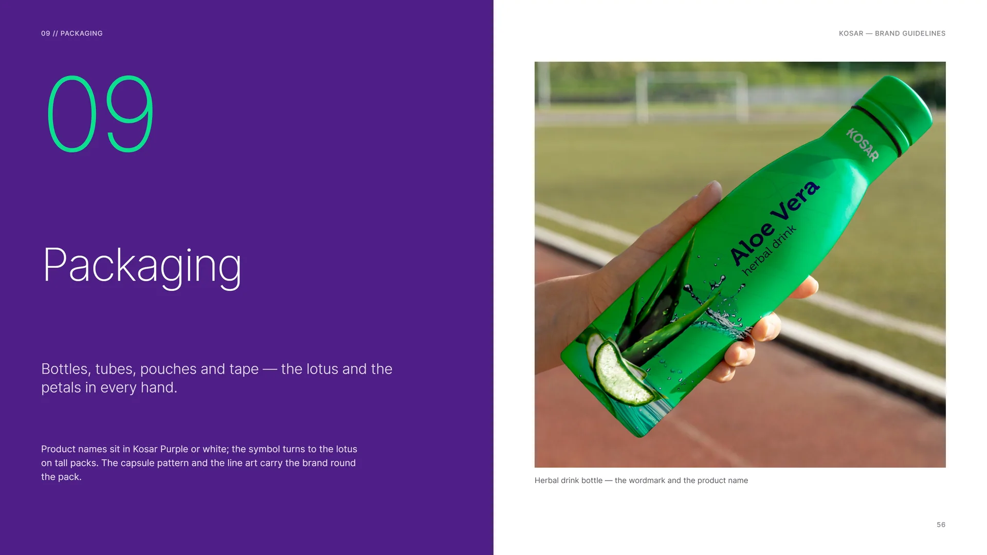
Bottles, tubes, pouches and tape — the lotus and the petals in every hand.
Product names sit in Kosar Purple or white; the symbol turns to the lotus on tall packs. The capsule pattern and the line art carry the brand round the pack.
Herbal drink bottle — the wordmark and the product name.
09.1
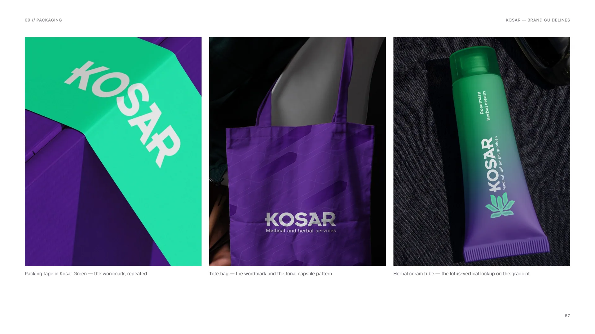
Packing tape, tote bag and cream tube
Packing tape in Kosar Green — the wordmark, repeated.
Tote bag — the wordmark and the tonal capsule pattern.
Herbal cream tube — the lotus-vertical lockup on the gradient.
09.2
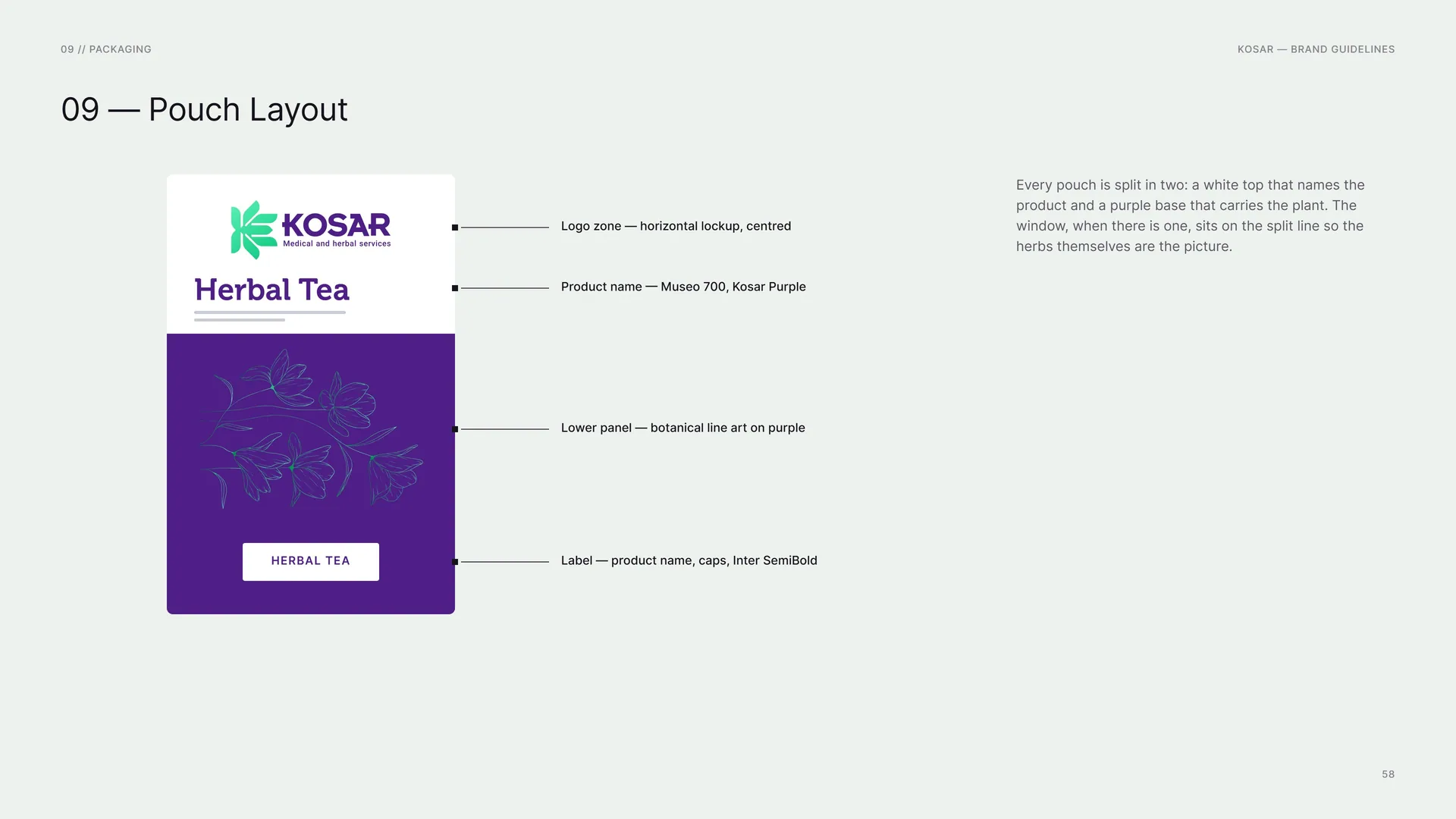
Pouch Layout
Herbal tea.
Logo zone — horizontal lockup, centred.
Product name — Museo 700, Kosar Purple.
Lower panel — botanical line art on purple.
Label — product name, caps, Inter SemiBold.
Every pouch is split in two: a white top that names the product and a purple base that carries the plant. The window, when there is one, sits on the split line so the herbs themselves are the picture.
10
Digital
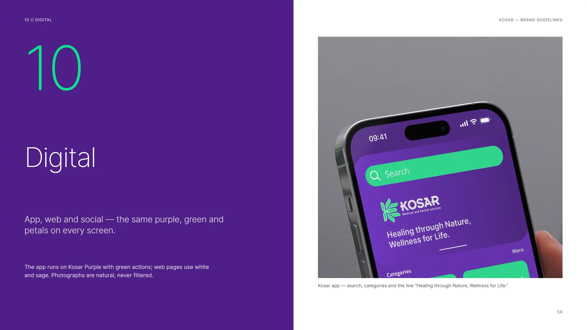
App, web and social — the same purple, green and petals on every screen.
The app runs on Kosar Purple with green actions; web pages use white and sage. Photographs are natural, never filtered.
Kosar app — search, categories and the line “Healing through Nature, Wellness for Life.”
10.1
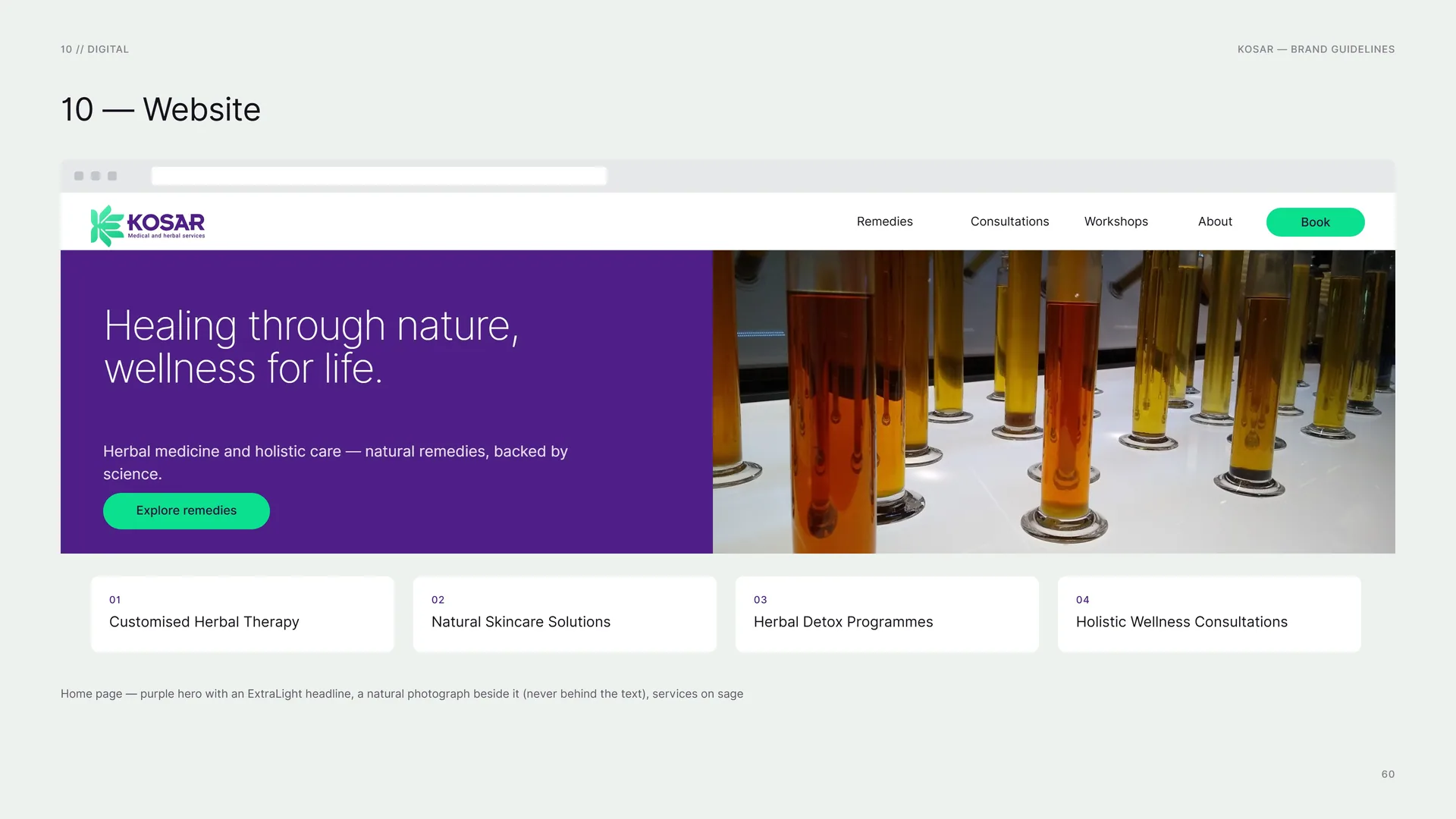
Website
Home page — purple hero with an ExtraLight headline, a natural photograph beside it (never behind the text), services on sage.
10.2
Social Media
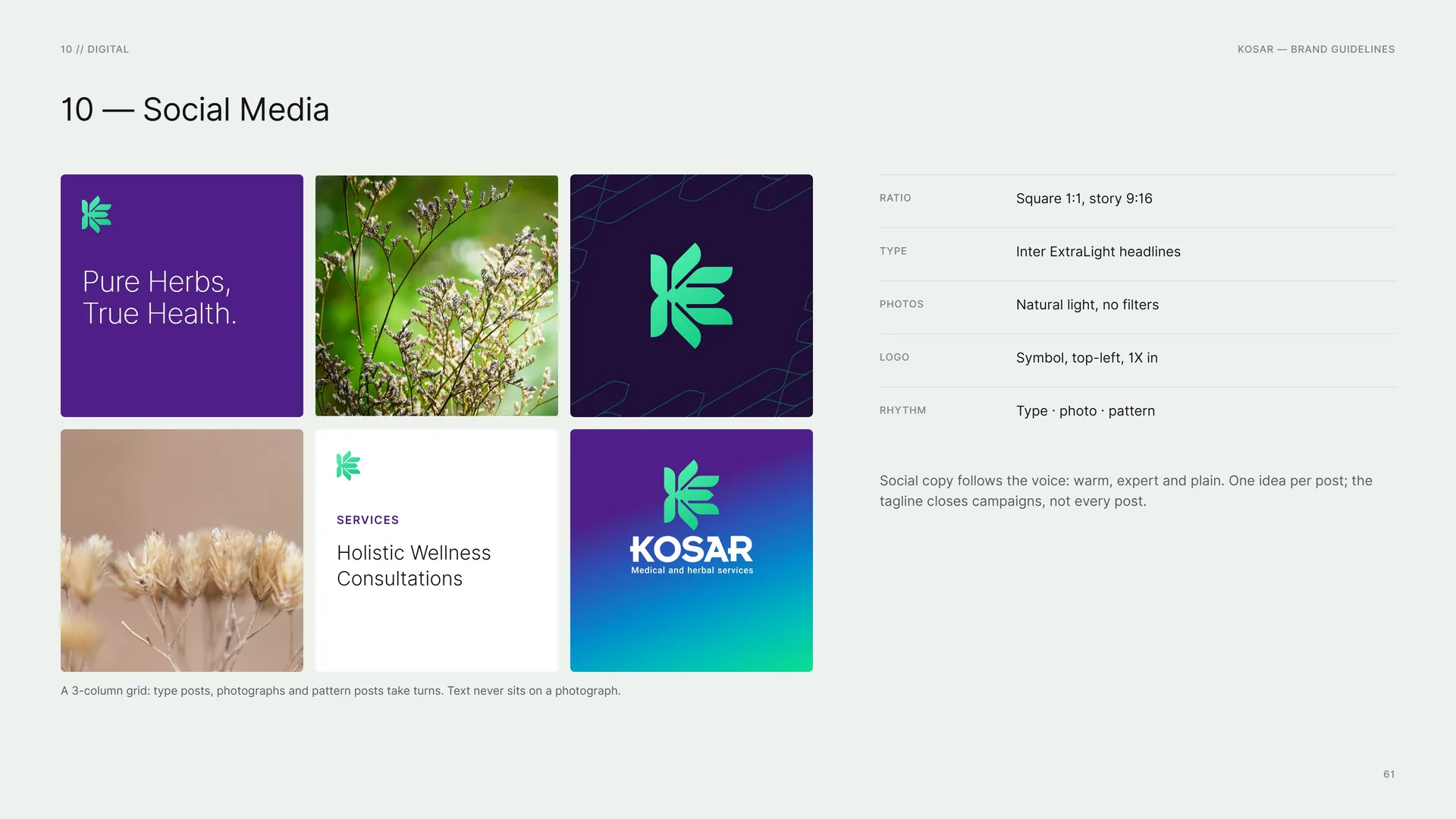
A 3-column grid: type posts, photographs and pattern posts take turns. Text never sits on a photograph.
Ratio: Square 1:1, story 9:16.
Type: Inter ExtraLight headlines.
Photos: Natural light, no filters.
Logo: Symbol, top-left, 1X in.
Rhythm: Type · photo · pattern.
Social copy follows the voice: warm, expert and plain. One idea per post; the tagline closes campaigns, not every post.
10.3
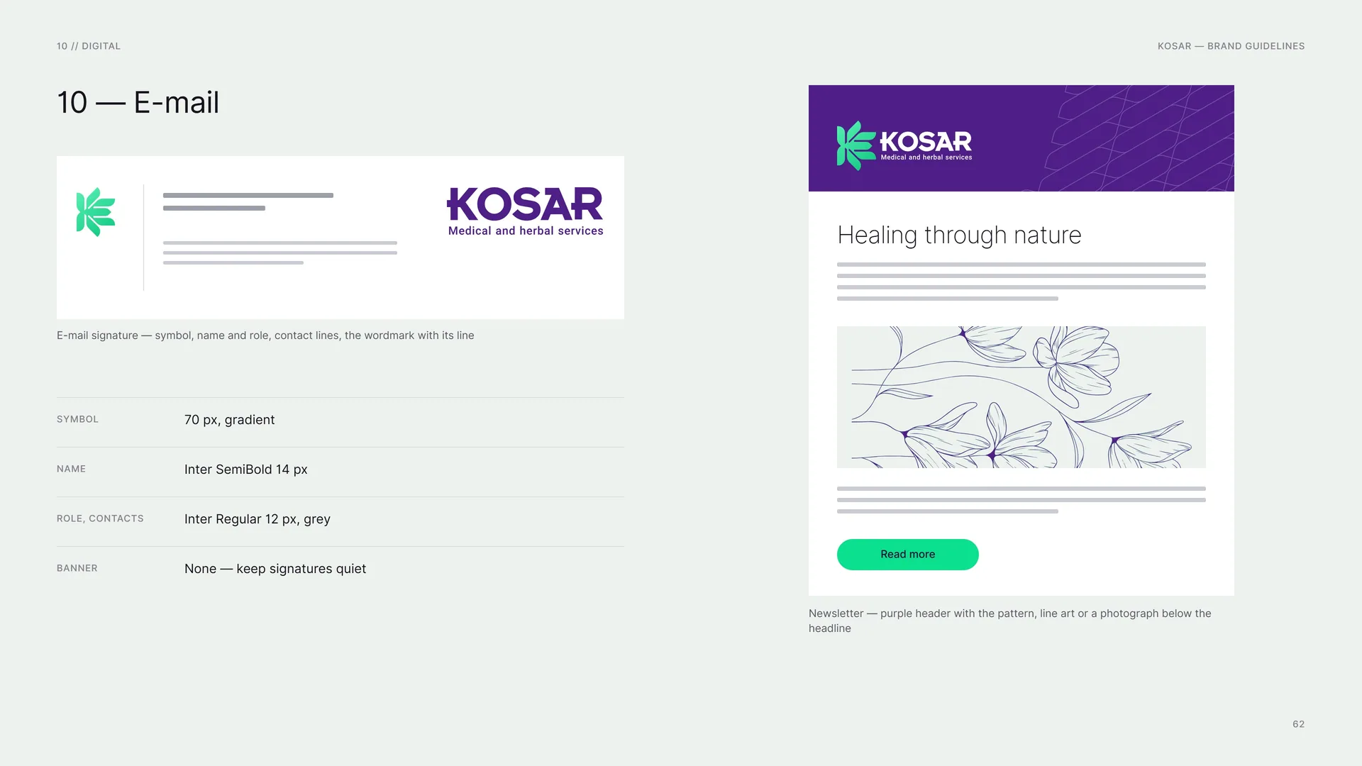
E-mail signature — symbol, name and role, contact lines, the wordmark with its line.
Symbol: 70 px, gradient.
Name: Inter SemiBold 14 px.
Role, contacts: Inter Regular 12 px, grey.
Banner: None — keep signatures quiet.
Newsletter — purple header with the pattern, line art or a photograph below the headline.
11
Merchandise
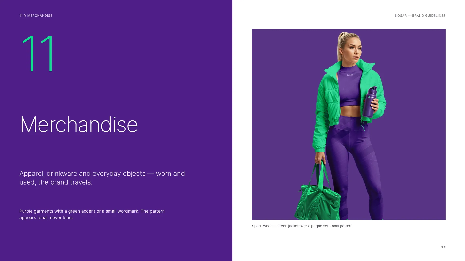
Apparel, drinkware and everyday objects — worn and used, the brand travels.
Purple garments with a green accent or a small wordmark. The pattern appears tonal, never loud.
Sportswear — green jacket over a purple set, tonal pattern.
11.1
Hoodie, polo and T-shirt
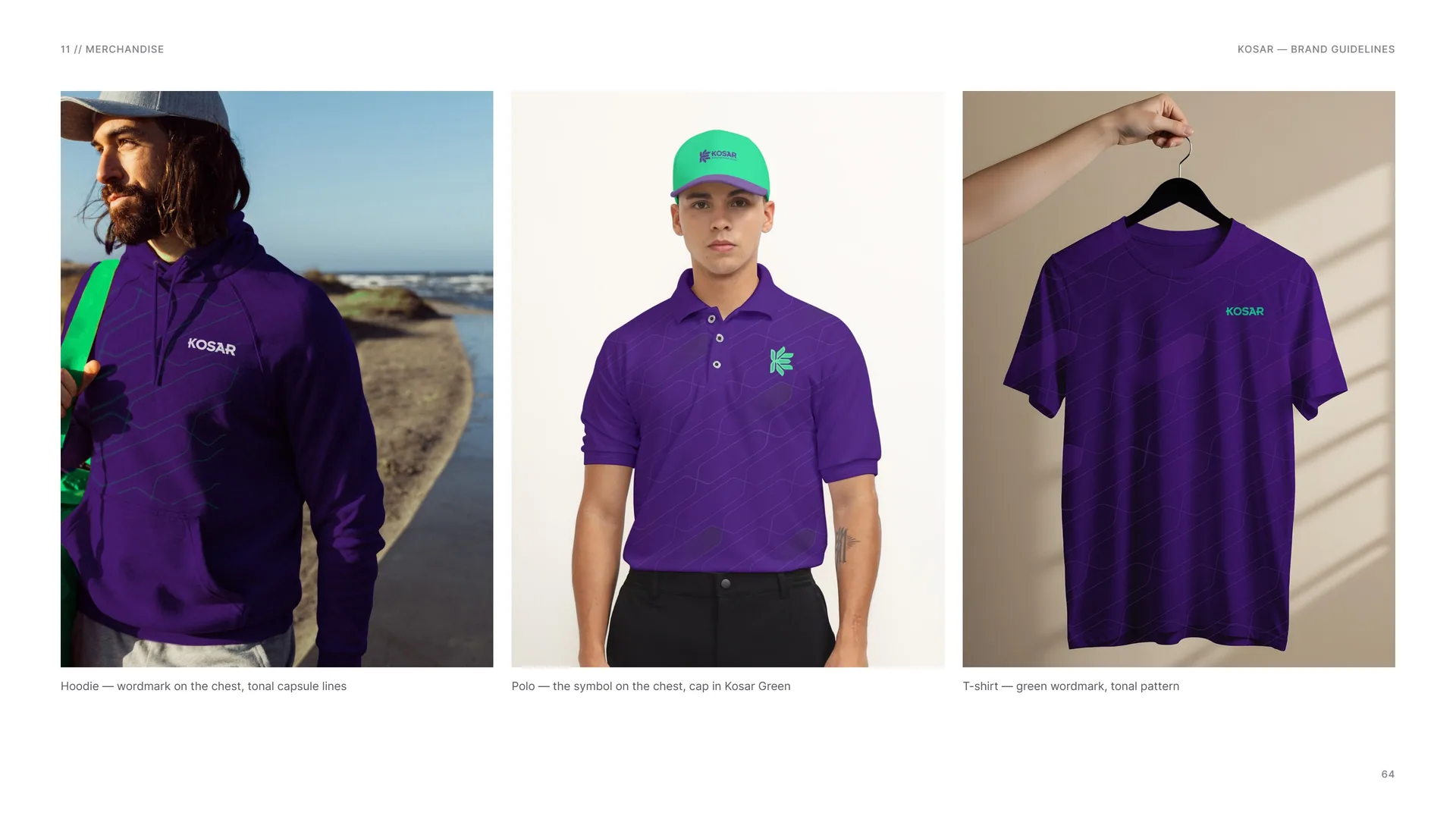
Hoodie — wordmark on the chest, tonal capsule lines.
Polo — the symbol on the chest, cap in Kosar Green.
T-shirt — green wordmark, tonal pattern.
11.2
Merchandise Spec
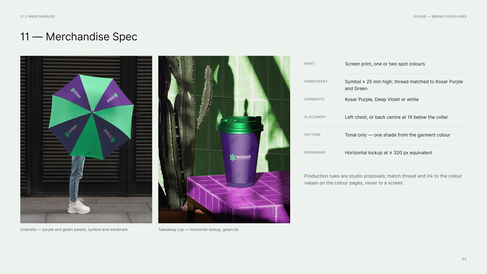
Umbrella — purple and green panels, symbol and wordmark.
Takeaway cup — horizontal lockup, green lid.
Print: Screen print, one or two spot colours.
Embroidery: Symbol ≥ 25 mm high; thread matched to Kosar Purple and Green.
Garments: Kosar Purple, Deep Violet or white.
Placement: Left chest, or back centre at 1X below the collar.
Pattern: Tonal only — one shade from the garment colour.
Drinkware: Horizontal lockup at ≥ 320 px equivalent.
Production rules are studio proposals; match thread and ink to the colour values on the colour pages, never to a screen.
12
Signage & environment
Façades, banners and boards — clear at a distance, calm up close.
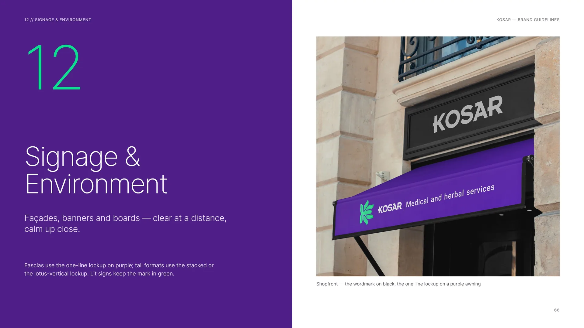
Fascias use the one-line lockup on purple; tall formats use the stacked or the lotus-vertical lockup. Lit signs keep the mark in green.
Shopfront — the wordmark on black, the one-line lockup on a purple awning.
12.1
Billboard and banner stand
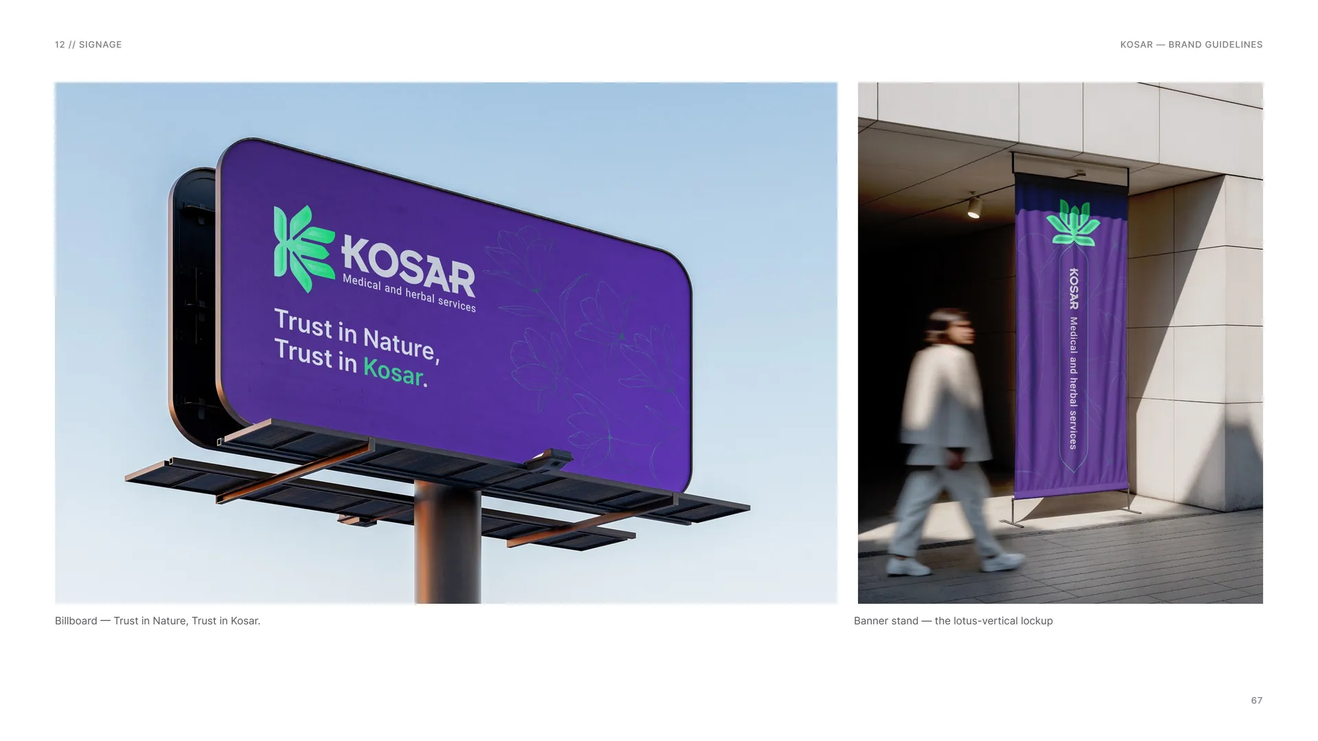
Billboard — Trust in Nature, Trust in Kosar.
Banner stand — the lotus-vertical lockup.
12.2
Signage System
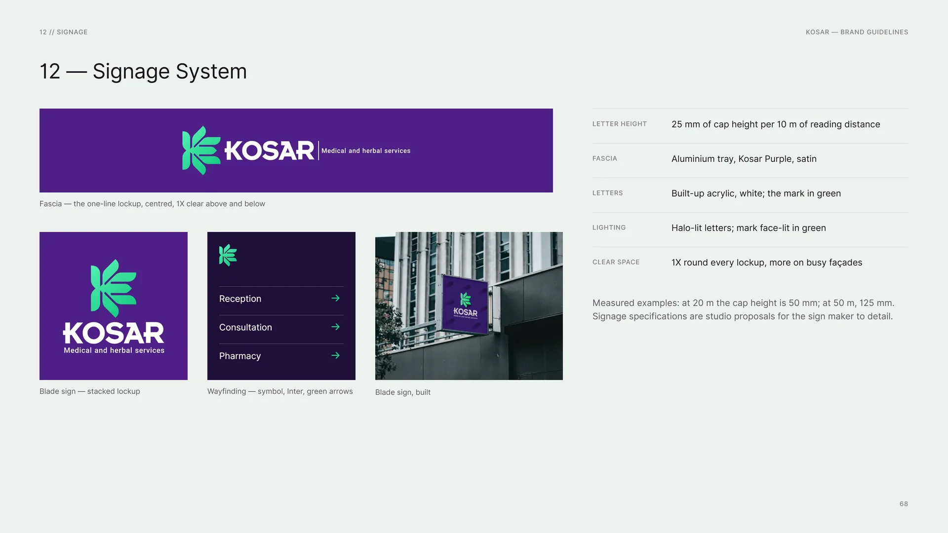
Fascia — the one-line lockup, centred, 1X clear above and below.
Blade sign — stacked lockup.
Wayfinding — symbol, Inter, green arrows.
Blade sign, built.
Letter height: 25 mm of cap height per 10 m of reading distance.
Fascia: Aluminium tray, Kosar Purple, satin.
Letters: Built-up acrylic, white; the mark in green.
Lighting: Halo-lit letters; mark face-lit in green.
Clear space: 1X round every lockup, more on busy façades.
Measured examples: at 20 m the cap height is 50 mm; at 50 m, 125 mm. Signage specifications are studio proposals for the sign maker to detail.
13
Files
13.1
Files
Logo: Horizontal, stacked, symbol and wordmark. Full colour, one colour and white — AI, PDF, SVG, PNG.
Colour: Swatches in RGB, CMYK and HEX — ASE.
Type: Inter (open source), Museo 700.
Graphics: Capsule pattern, petal tiles, logo stroke, botanical line art — AI, SVG.
Templates: Business card, letterhead, envelope, pouch, social posts.
Logo design & brand identity — Studio Mouneskhah.
Photos: Wikimedia Commons, CC0 / public domain.
13.2
Thank you
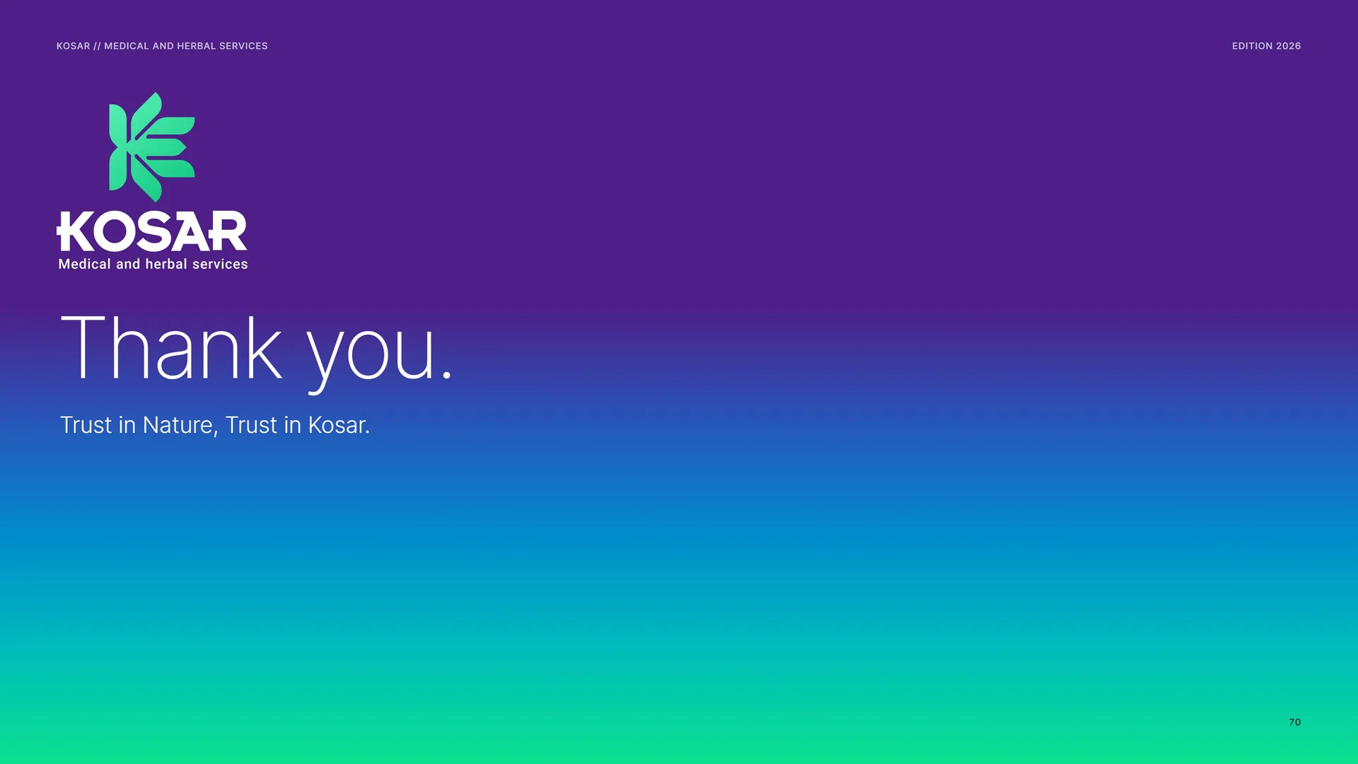
Thank you.
Trust in Nature, Trust in Kosar.