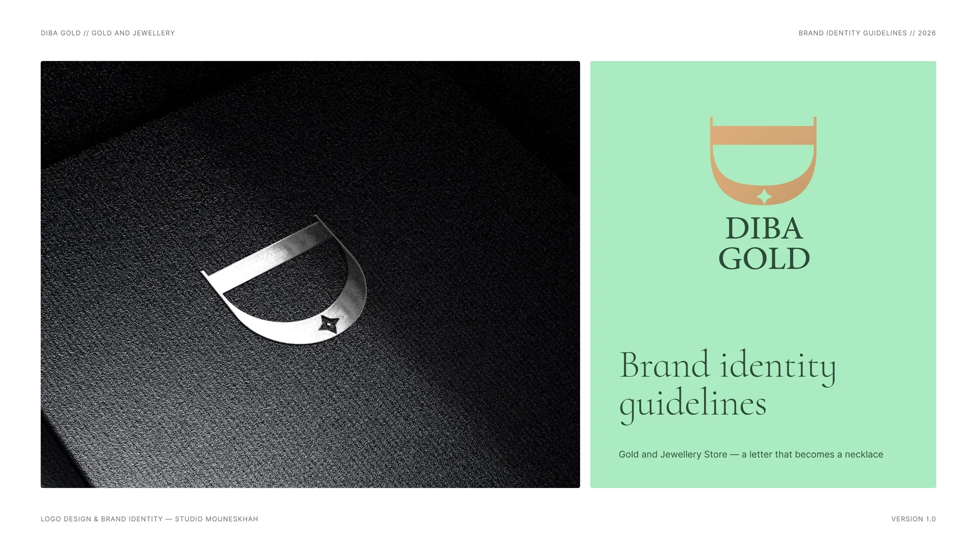
DIBA GOLD Brand Identity Guidelines
DIBA GOLD is a gold and jewellery store. Its identity is built from one letter: the D of Diba, laid on its back so that its bowl hangs like a necklace — with a four-point star set exactly where the pendant falls.
The name already speaks of craft: Diba is a fine, richly woven silk — a word for something precious, soft and made with care. The identity keeps that feeling: light, refined and quietly luxurious.
- Müşteri
- DIBA GOLD
- Alan
- Gold and jewellery store
- Hizmetler
- Görsel kimlik
- Proje
- Brand Identity Guidelines · v1.0 · 2026
00
Introduction
00.1
Brand Concept
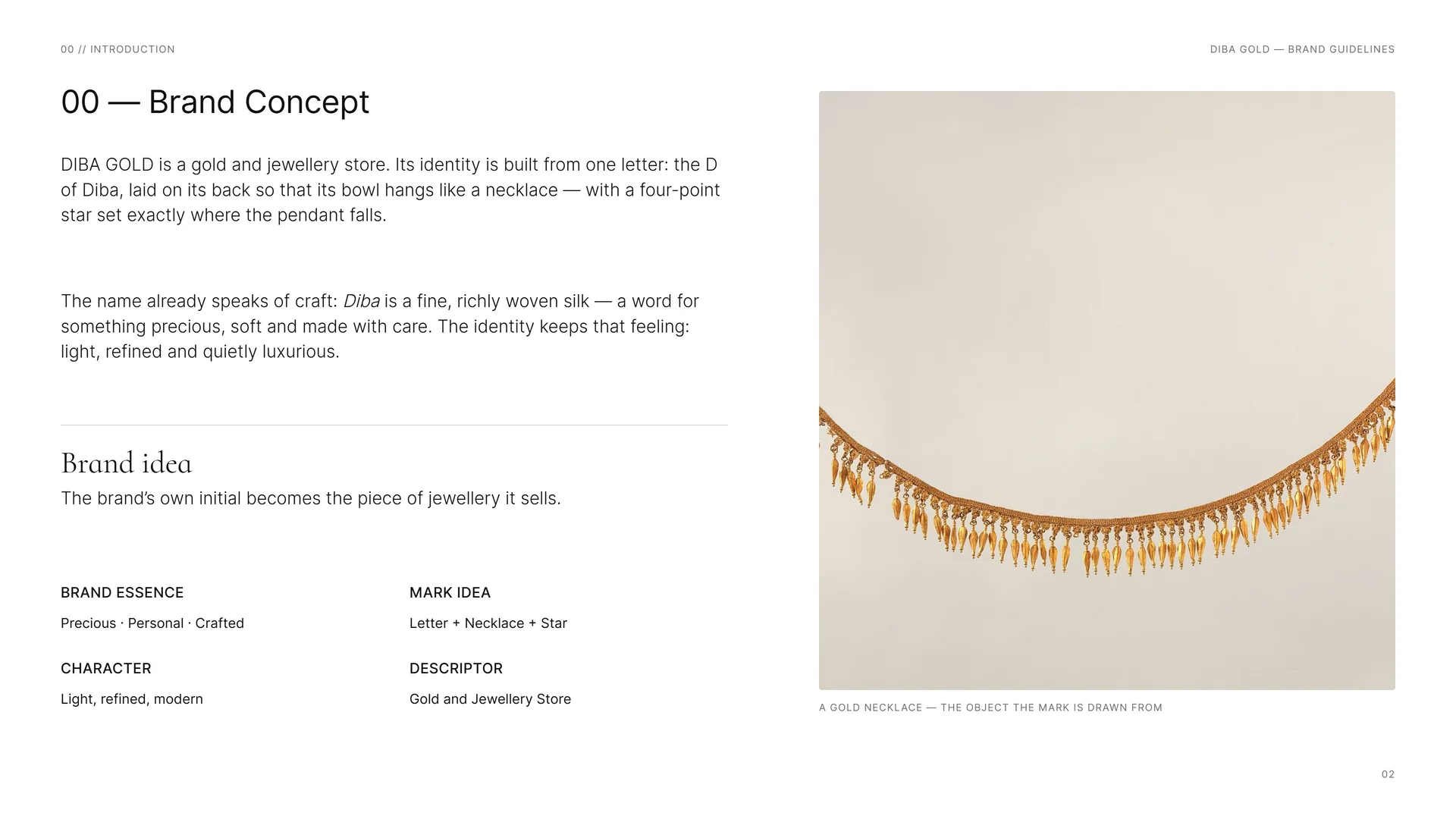
DIBA GOLD is a gold and jewellery store. Its identity is built from one letter: the D of Diba, laid on its back so that its bowl hangs like a necklace — with a four-point star set exactly where the pendant falls.
The name already speaks of craft: Diba is a fine, richly woven silk — a word for something precious, soft and made with care. The identity keeps that feeling: light, refined and quietly luxurious.
Brand idea: The brand’s own initial becomes the piece of jewellery it sells.
Brand essence: Precious · Personal · Crafted.
Character: Light, refined, modern.
Mark idea: Letter + Necklace + Star.
Descriptor: Gold and Jewellery Store.
A gold necklace — the object the mark is drawn from.
00.2
Starting Point
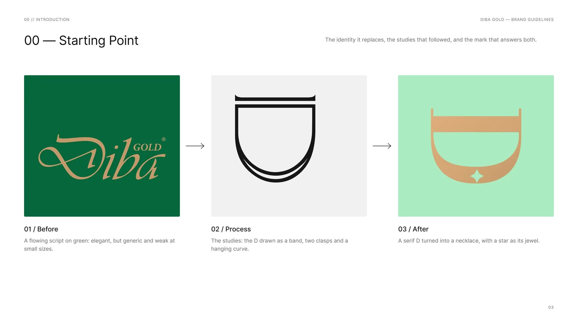
The identity it replaces, the studies that followed, and the mark that answers both.
Before: A flowing script on green: elegant, but generic and weak at small sizes.
Process: The studies: the D drawn as a band, two clasps and a hanging curve.
After: A serif D turned into a necklace, with a star as its jewel.
00.3
Primary logo
01
Brand
- 01.1The Name
- 01.2Brand Idea
- 01.3Brand Essence
- 01.4Tone of Voice
- 01.5Brand lines
- 01.6What the Store Offers
01.1
The Name
Diba — woven silk.
Diba is a fine, richly woven silk: something precious, soft and made with care. A gold and jewellery store could hardly ask for a better word. The identity keeps the silk in its colours and its light, and the gold in its mark.
Gold and jewellery store.
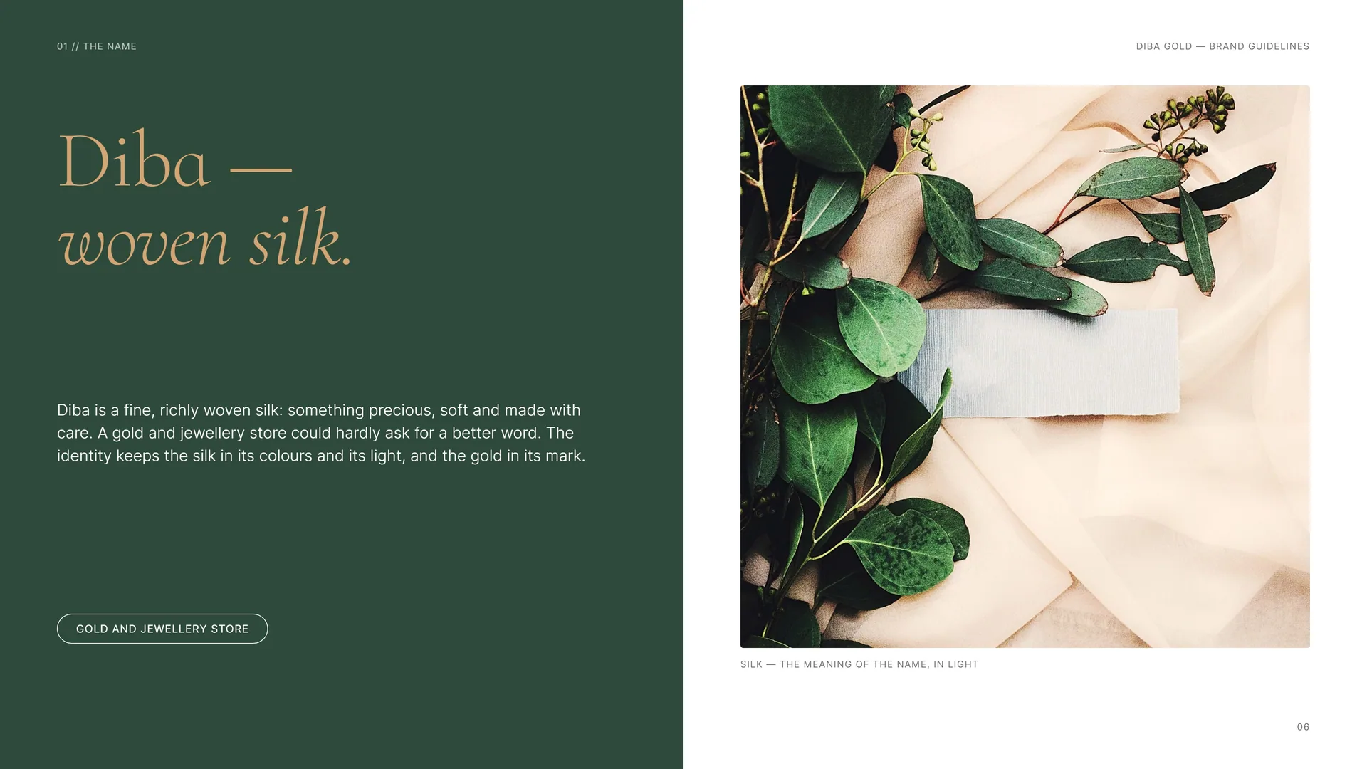
Silk — the meaning of the name, in light.
01.2
Brand Idea
One letter, worn.
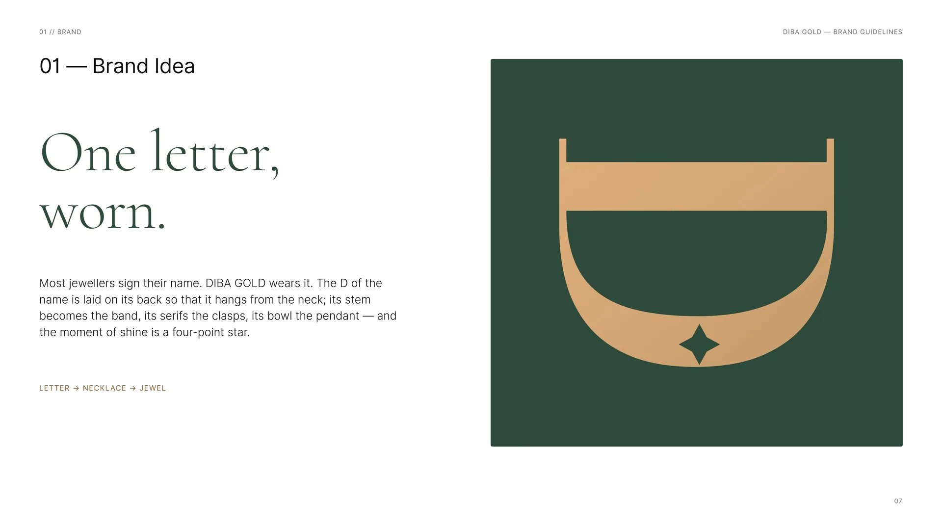
Most jewellers sign their name. DIBA GOLD wears it. The D of the name is laid on its back so that it hangs from the neck; its stem becomes the band, its serifs the clasps, its bowl the pendant — and the moment of shine is a four-point star.
Letter → Necklace → Jewel.
01.3
Brand Essence
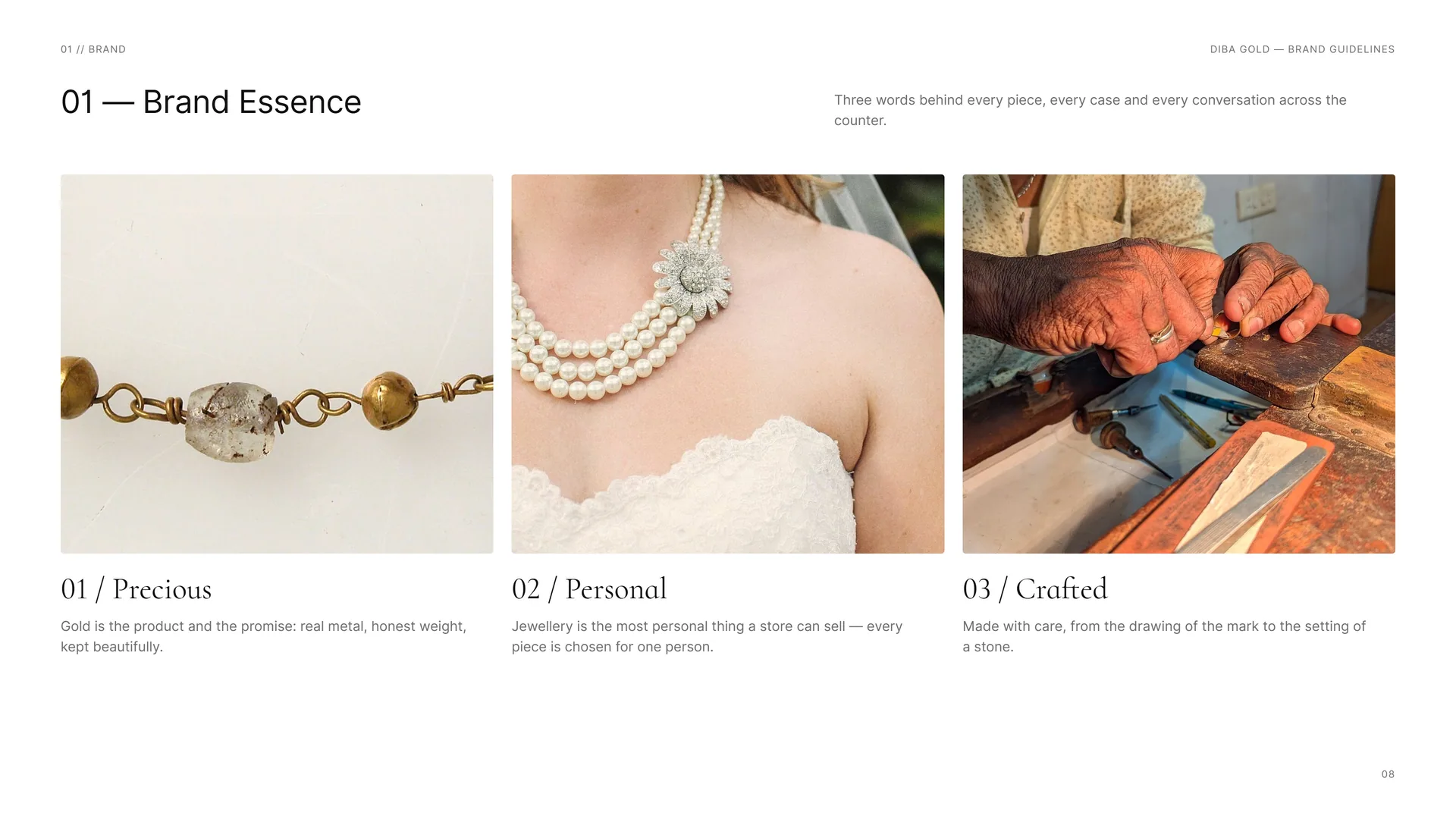
Three words behind every piece, every case and every conversation across the counter.
Precious: Gold is the product and the promise: real metal, honest weight, kept beautifully.
Personal: Jewellery is the most personal thing a store can sell — every piece is chosen for one person.
Crafted: Made with care, from the drawing of the mark to the setting of a stone.
01.4
Tone of Voice
Light, refined and modern — never loud. DIBA GOLD speaks the way a good jeweller serves: calmly, precisely, with time for the customer.
Refined: Few words, chosen well. No exclamation marks, no superlatives.
Warm: Personal and attentive — jewellery marks moments in people’s lives.
Precise: Carat, weight and finish stated plainly; trust is built on facts.
Modern: Fresh mint and light space where gold retail is usually dark and heavy.
Quiet: The piece is the hero; the brand frames it and steps back.
Showy · Distant · Vague · Old-fashioned · Loud.
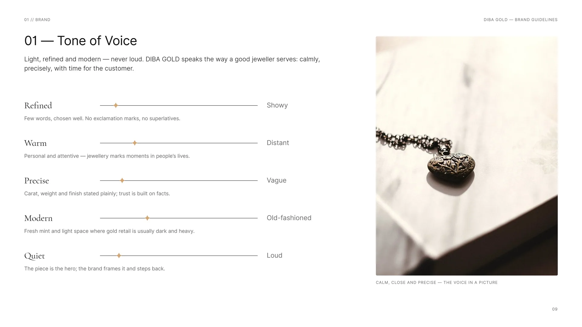
Calm, close and precise — the voice in a picture.
01.5
Brand lines
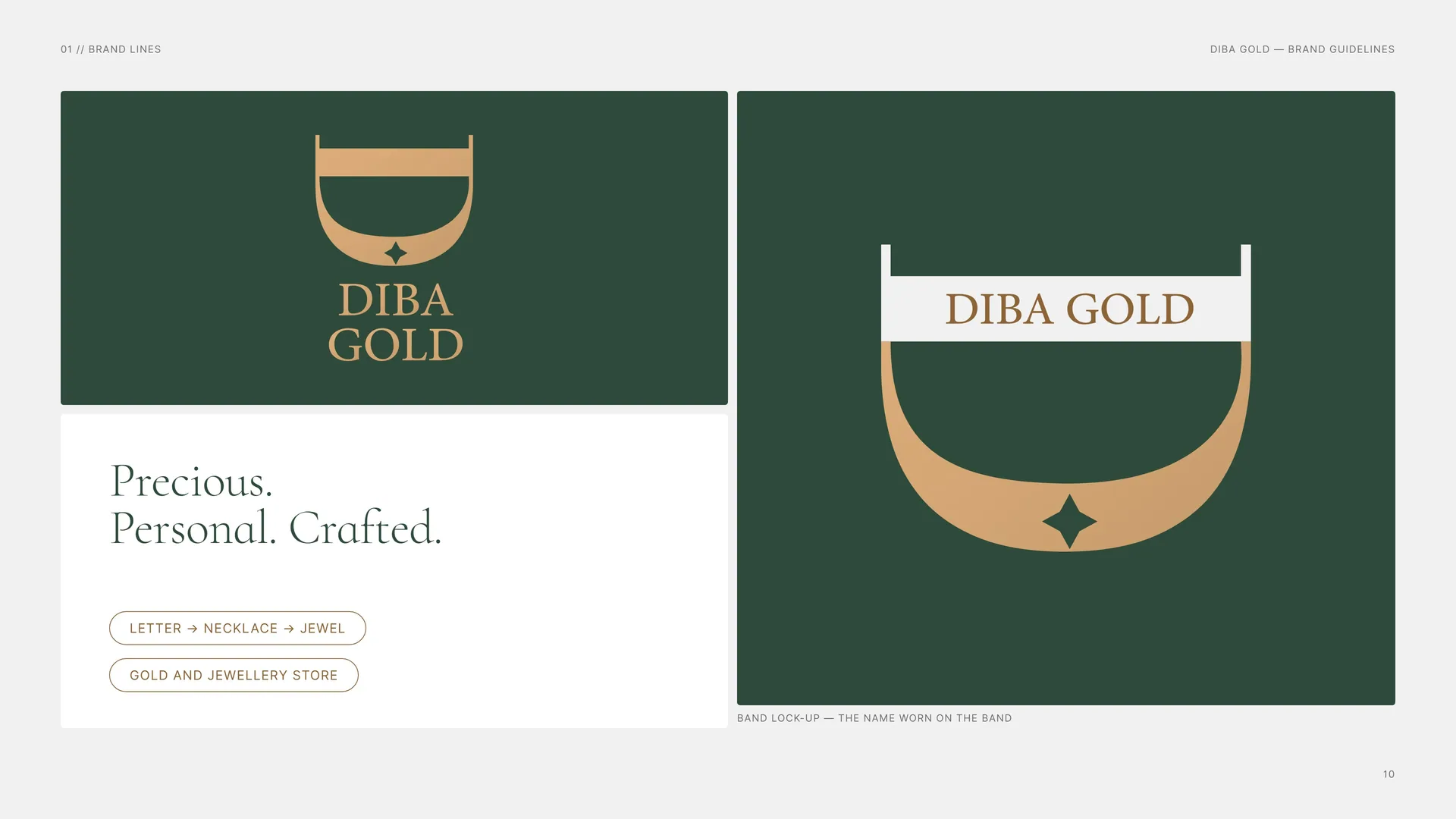
Precious. Personal. Crafted.
Letter → Necklace → Jewel.
Gold and Jewellery Store.
Band lock-up — the name worn on the band.
01.6
What the Store Offers
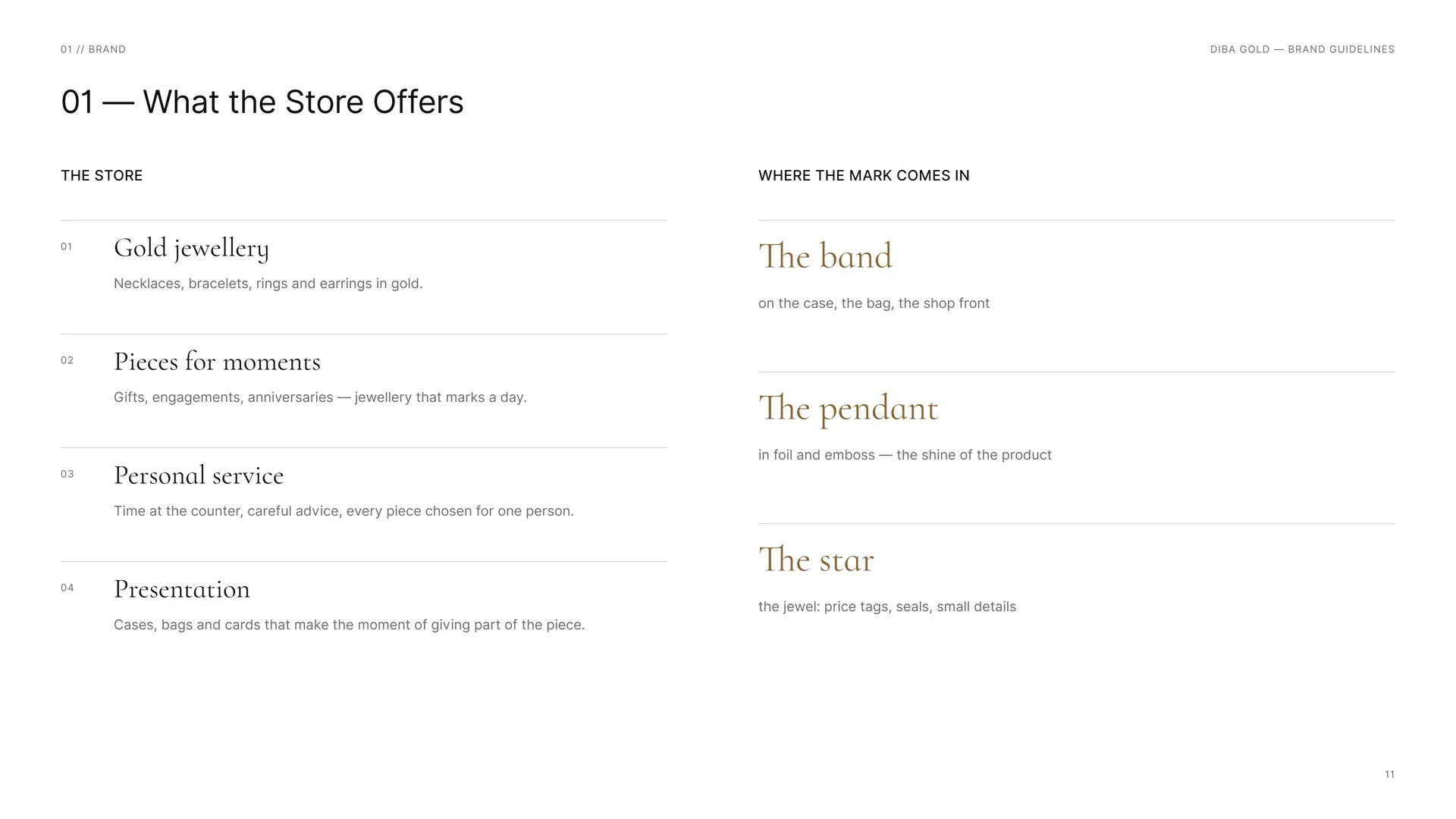
The store.
Gold jewellery: Necklaces, bracelets, rings and earrings in gold.
Pieces for moments: Gifts, engagements, anniversaries — jewellery that marks a day.
Personal service: Time at the counter, careful advice, every piece chosen for one person.
Presentation: Cases, bags and cards that make the moment of giving part of the piece.
Where the mark comes in.
The band: on the case, the bag, the shop front.
The pendant: in foil and emboss — the shine of the product.
The star: the jewel: price tags, seals, small details.
02
Concept
- 02.1Letter + Necklace + Star
- 02.2A D, Turned
- 02.3Explorations
- 02.4Logo Meaning
- 02.5From letter to jewel
- 02.6Few points, long curves
- 02.7The Mark in Motion
02.1
Letter + Necklace + Star
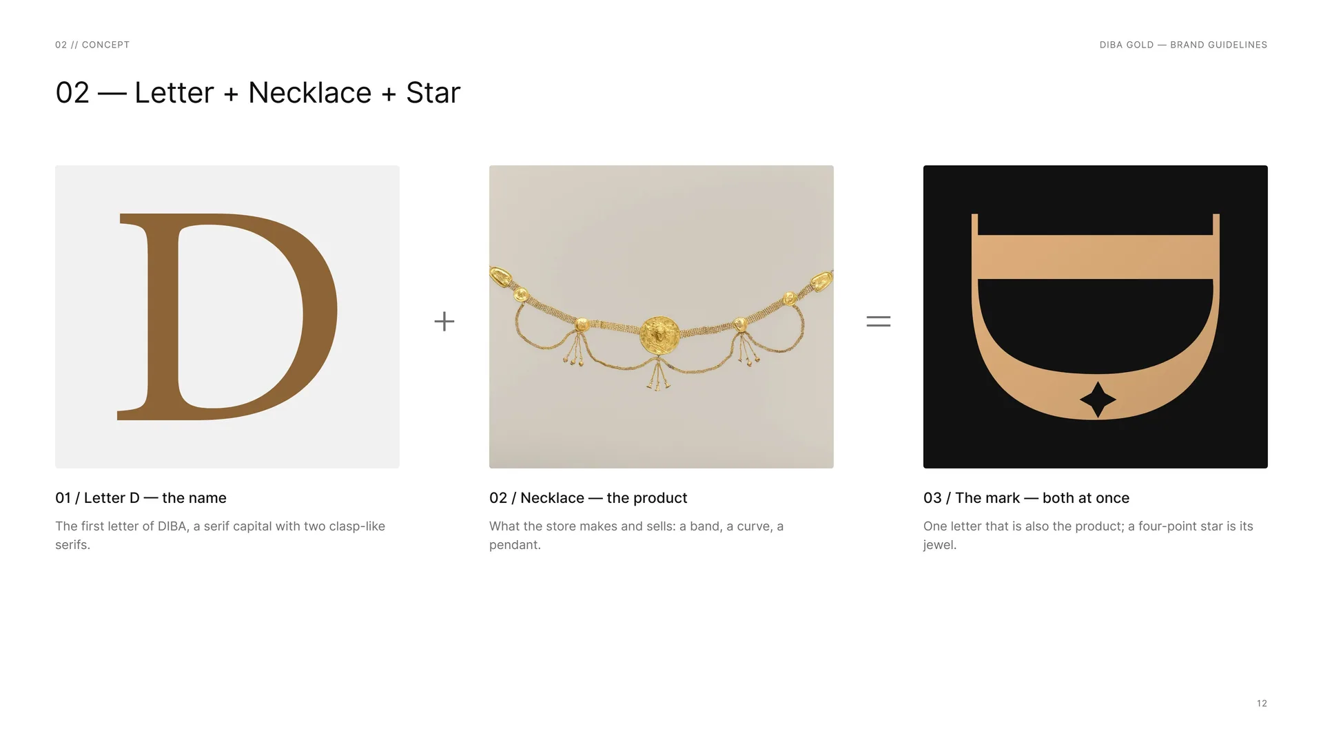
Letter D — the name: The first letter of DIBA, a serif capital with two clasp-like serifs.
Necklace — the product: What the store makes and sells: a band, a curve, a pendant.
The mark — both at once: One letter that is also the product; a four-point star is its jewel.
02.2
A D, Turned
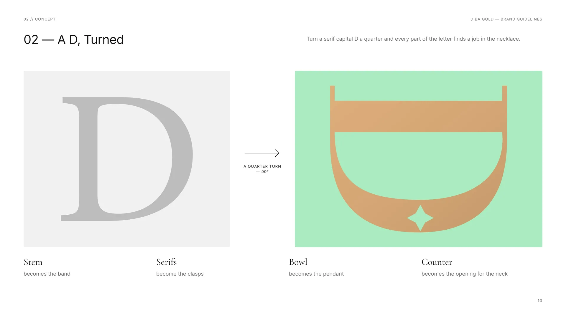
Turn a serif capital D a quarter and every part of the letter finds a job in the necklace.
Stem: becomes the band.
Serifs: become the clasps.
Bowl: becomes the pendant.
Counter: becomes the opening for the neck.
A quarter turn — 90°.
02.3
Explorations
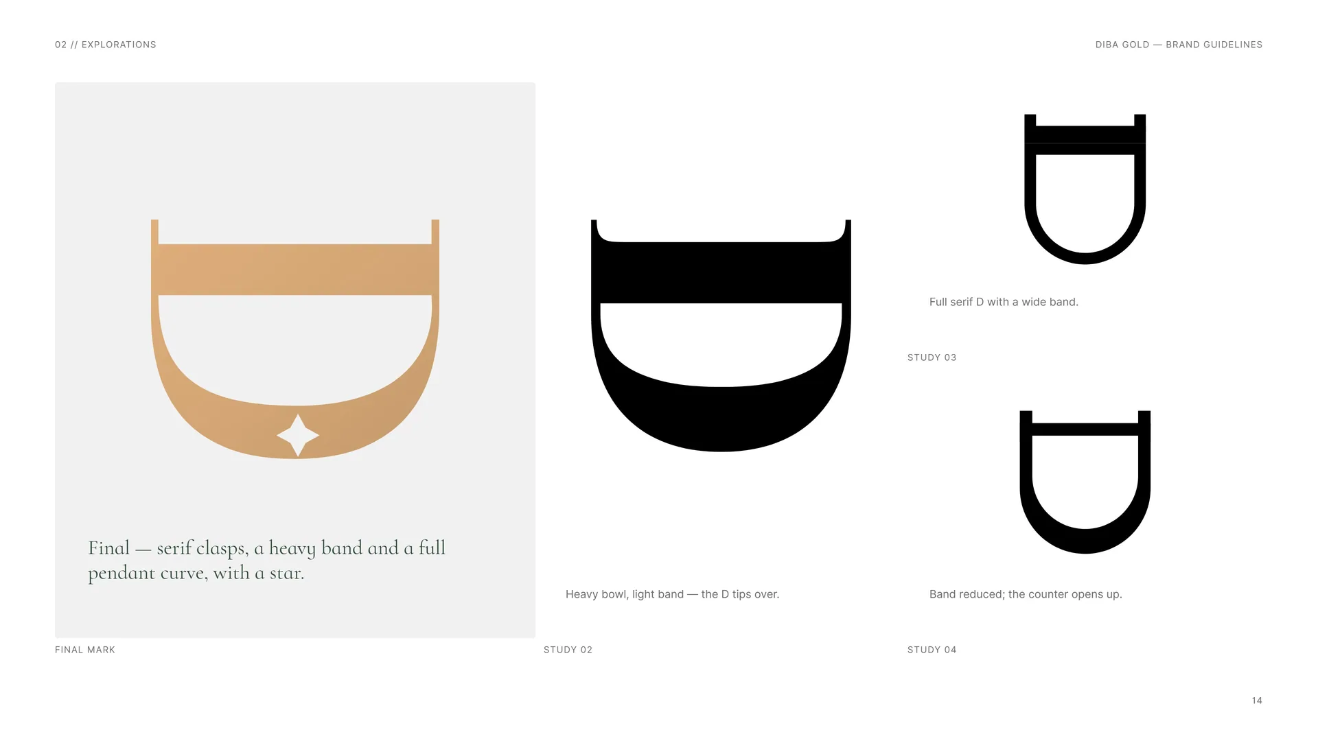
Final mark: Final — serif clasps, a heavy band and a full pendant curve, with a star.
Study 02: Heavy bowl, light band — the D tips over.
Study 03: Full serif D with a wide band.
Study 04: Band reduced; the counter opens up.
02.4
Logo Meaning
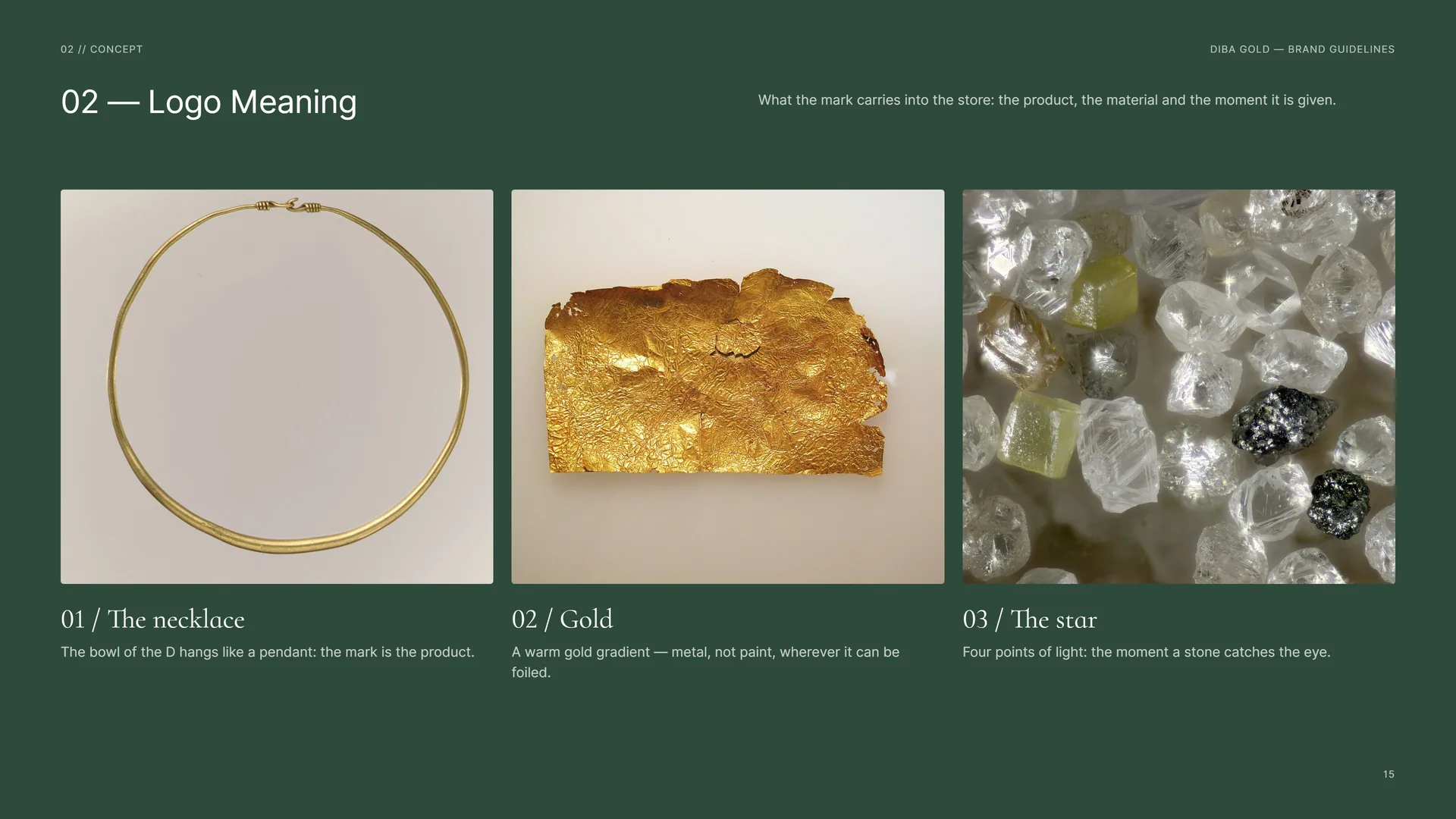
What the mark carries into the store: the product, the material and the moment it is given.
The necklace: The bowl of the D hangs like a pendant: the mark is the product.
Gold: A warm gold gradient — metal, not paint, wherever it can be foiled.
The star: Four points of light: the moment a stone catches the eye.
02.5
From letter to jewel
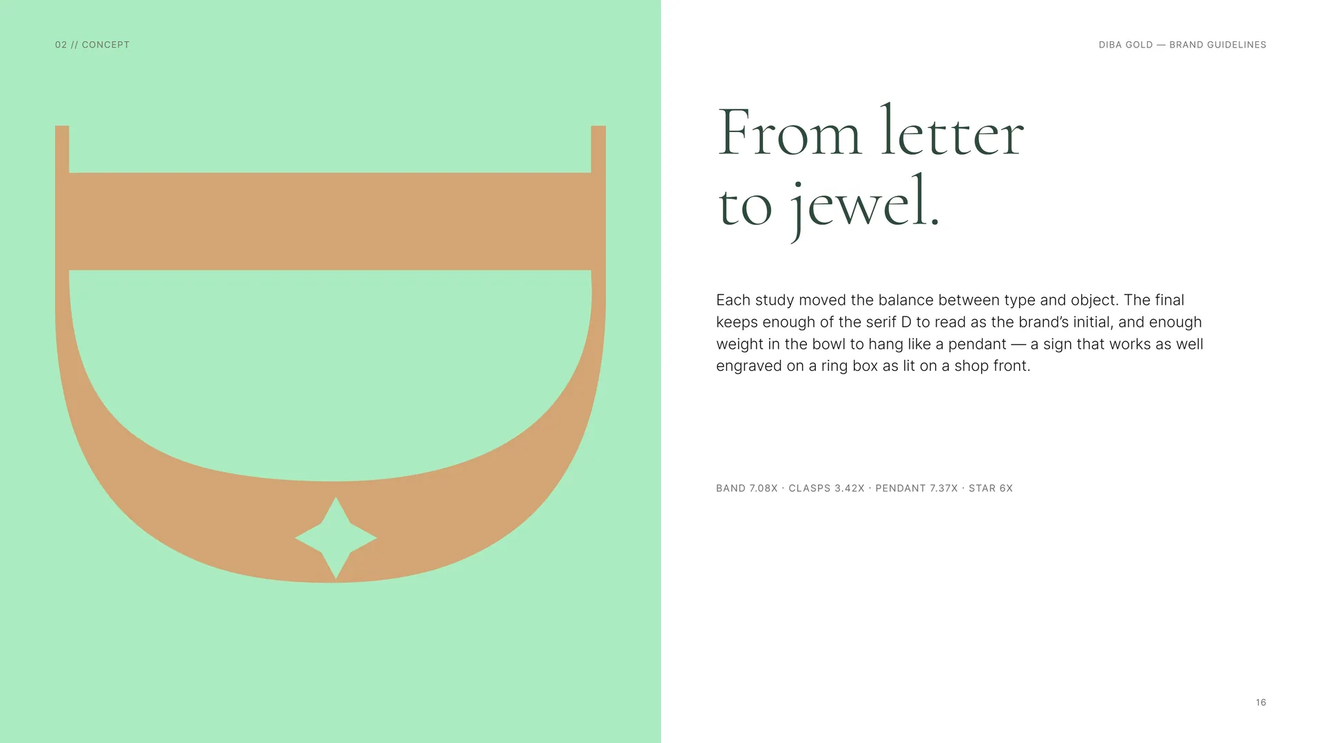
From letter to jewel.
Each study moved the balance between type and object. The final keeps enough of the serif D to read as the brand’s initial, and enough weight in the bowl to hang like a pendant — a sign that works as well engraved on a ring box as lit on a shop front.
Band 7.08X · Clasps 3.42X · Pendant 7.37X · Star 6X.
02.6
Few points, long curves
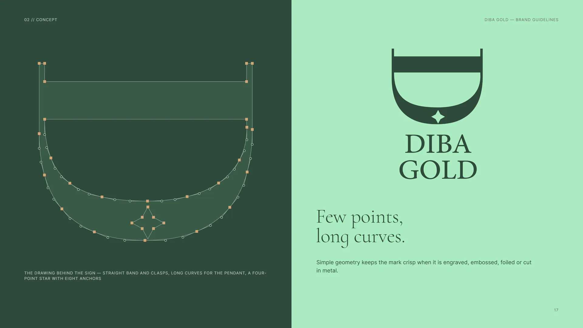
Few points, long curves.
Simple geometry keeps the mark crisp when it is engraved, embossed, foiled or cut in metal.
The drawing behind the sign — straight band and clasps, long curves for the pendant, a four-point star with eight anchors.
02.7
The Mark in Motion
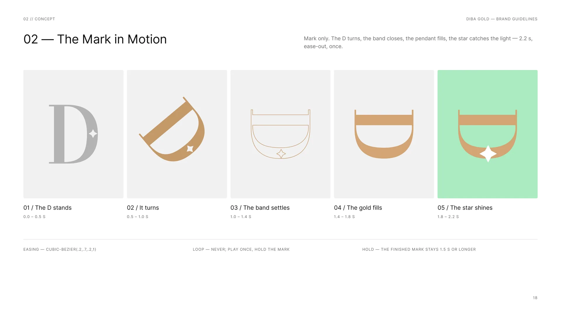
Mark only. The D turns, the band closes, the pendant fills, the star catches the light — 2.2 s, ease-out, once.
The D stands: 0.0 – 0.5 s.
It turns: 0.5 – 1.0 s.
The band settles: 1.0 – 1.4 s.
The gold fills: 1.4 – 1.8 s.
The star shines: 1.8 – 2.2 s.
Easing — cubic-bezier(.2,.7,.2,1).
Loop — never; play once, hold the mark.
Hold — the finished mark stays 1.5 s or longer.
03
Logo
- 03.1The Logo
- 03.2Anatomy
- 03.3Construction
- 03.4The 1X Grid
- 03.5The Jewel
- 03.6Wordmark
- 03.7Horizontal Proportions
- 03.8Stacked Proportions
- 03.9Clear Space
- 03.10Versions
- 03.11The Logo Family
- 03.12App Icon & Favicon
- 03.13Minimum Size
- 03.14Placement
- 03.15Misuse
- 03.16Logo on materials
03.1
The Logo
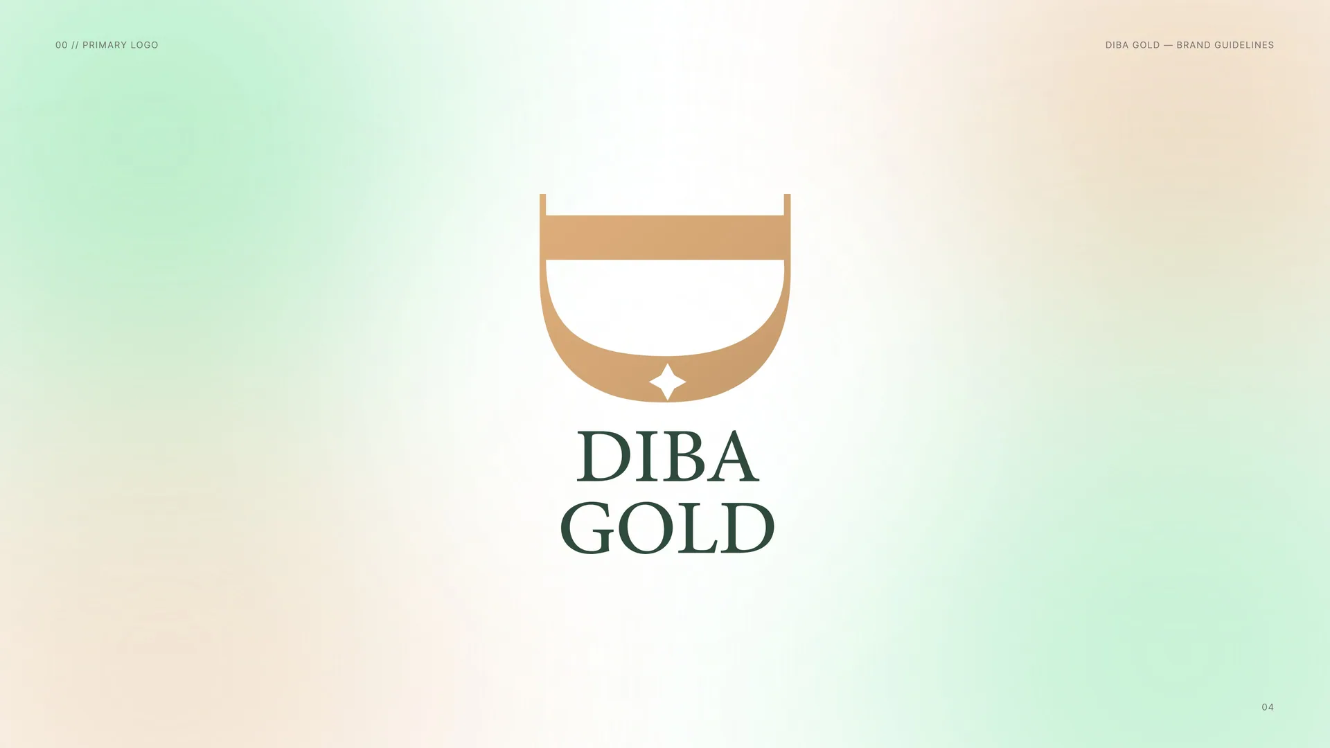
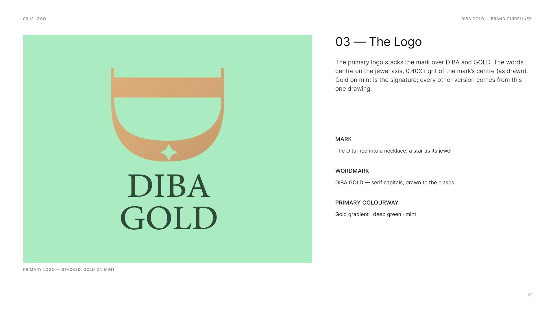
The primary logo stacks the mark over DIBA and GOLD. The words centre on the jewel axis, 0.40X right of the mark’s centre (as drawn). Gold on mint is the signature; every other version comes from this one drawing.
Mark: The D turned into a necklace, a star as its jewel.
Wordmark: DIBA GOLD — serif capitals, drawn to the clasps.
Primary colourway: Gold gradient · deep green · mint.
Primary logo — stacked, gold on mint.
03.2
Anatomy
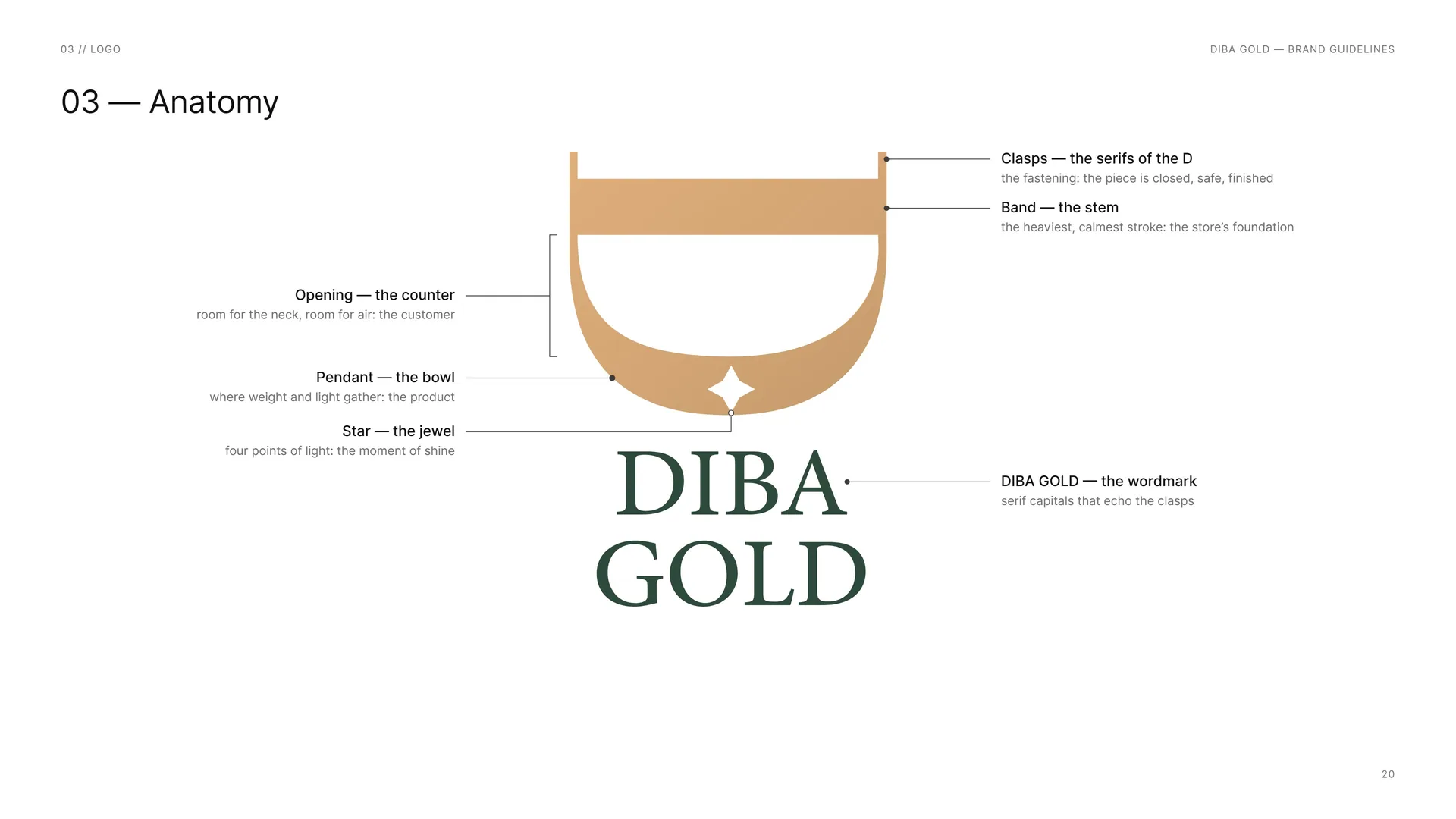
Opening — the counter: room for the neck, room for air: the customer.
Pendant — the bowl: where weight and light gather: the product.
Star — the jewel: four points of light: the moment of shine.
Clasps — the serifs of the D: the fastening: the piece is closed, safe, finished.
Band — the stem: the heaviest, calmest stroke: the store’s foundation.
DIBA GOLD — the wordmark: serif capitals that echo the clasps.
03.3
Construction
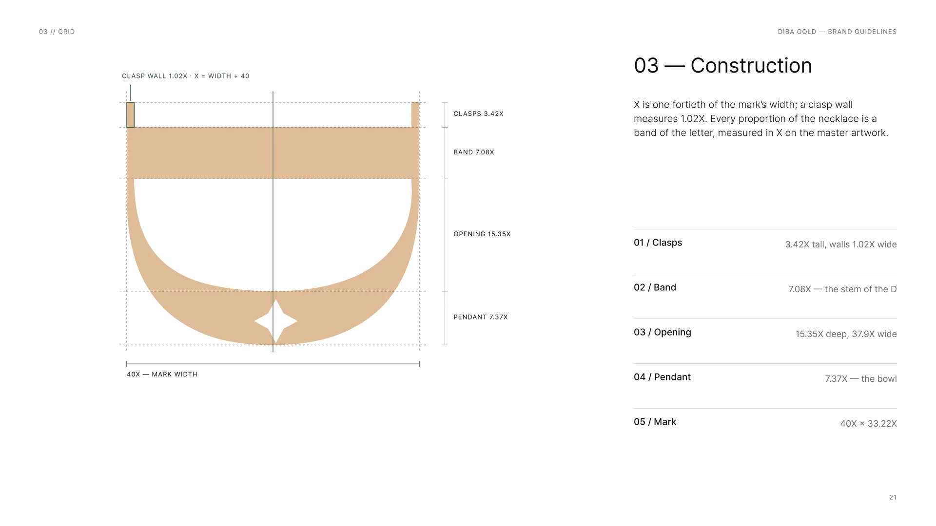
X is one fortieth of the mark’s width; a clasp wall measures 1.02X. Every proportion of the necklace is a band of the letter, measured in X on the master artwork.
Clasps: 3.42X tall, walls 1.02X wide.
Band: 7.08X — the stem of the D.
Opening: 15.35X deep, 37.9X wide.
Pendant: 7.37X — the bowl.
Mark: 40X × 33.22X.
Clasp wall 1.02X · X = width ÷ 40.
03.4
The 1X Grid
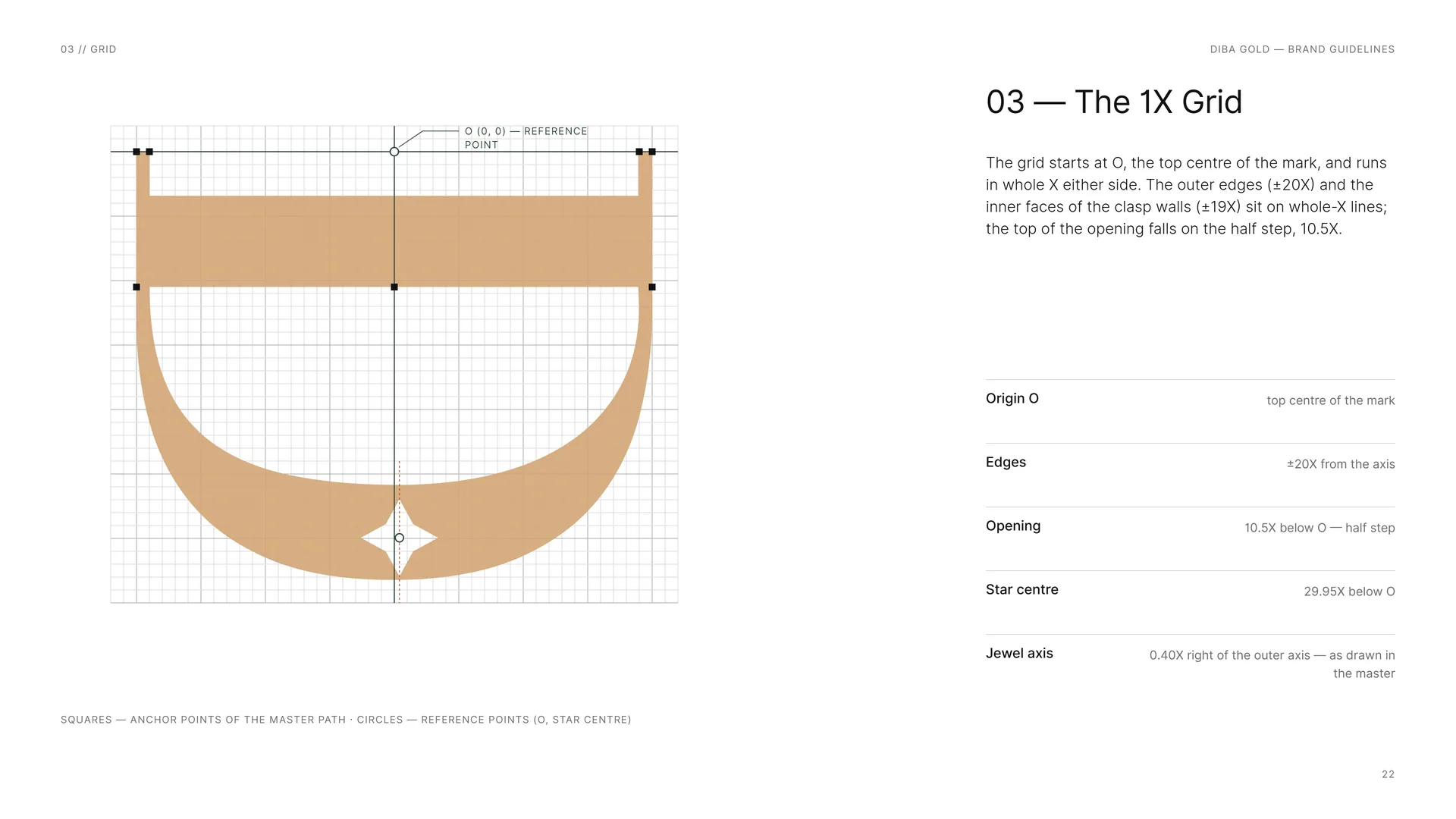
The grid starts at O, the top centre of the mark, and runs in whole X either side. The outer edges (±20X) and the inner faces of the clasp walls (±19X) sit on whole-X lines; the top of the opening falls on the half step, 10.5X.
Origin O: top centre of the mark.
Edges: ±20X from the axis.
Opening: 10.5X below O — half step.
Star centre: 29.95X below O.
Jewel axis: 0.40X right of the outer axis — as drawn in the master.
Squares — anchor points of the master path · circles — reference points (O, star centre).
03.5
The Jewel
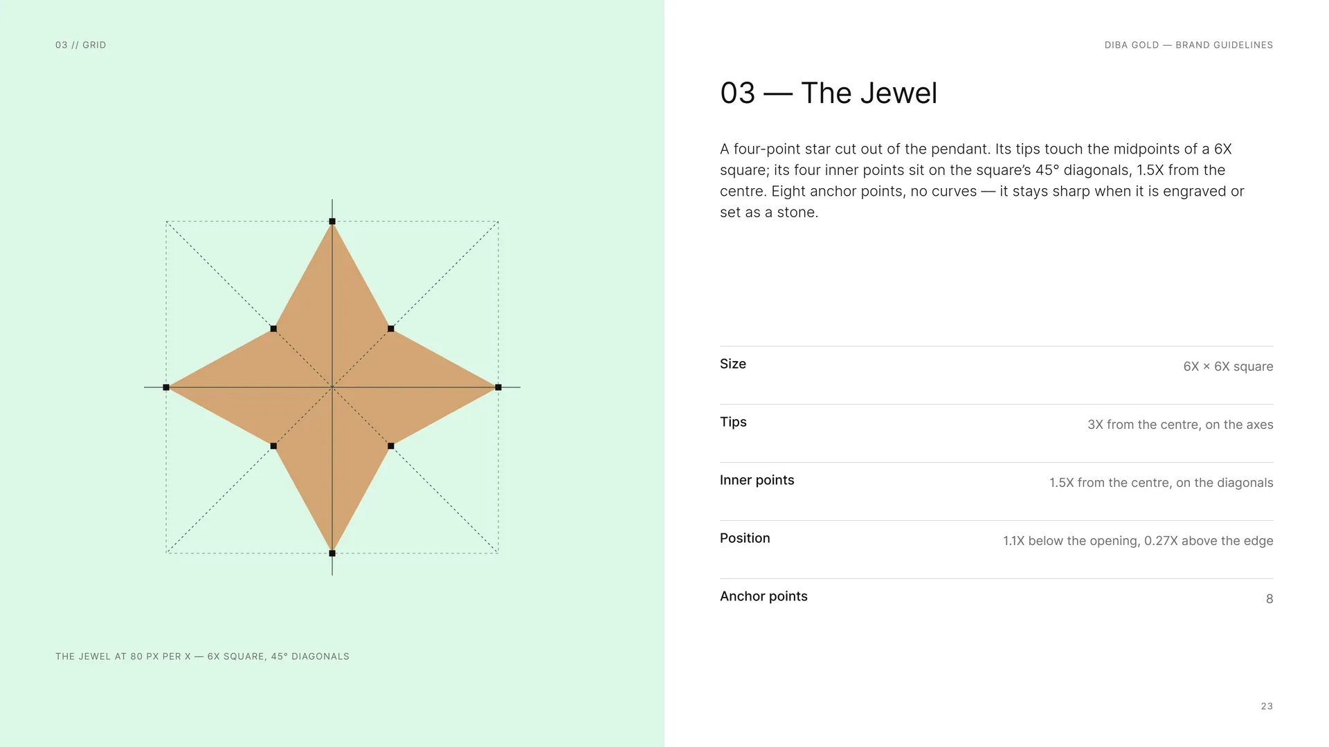
A four-point star cut out of the pendant. Its tips touch the midpoints of a 6X square; its four inner points sit on the square’s 45° diagonals, 1.5X from the centre. Eight anchor points, no curves — it stays sharp when it is engraved or set as a stone.
Size: 6X × 6X square.
Tips: 3X from the centre, on the axes.
Inner points: 1.5X from the centre, on the diagonals.
Position: 1.1X below the opening, 0.27X above the edge.
Anchor points: 8.
The jewel at 80 px per X — 6X square, 45° diagonals.
03.6
Wordmark
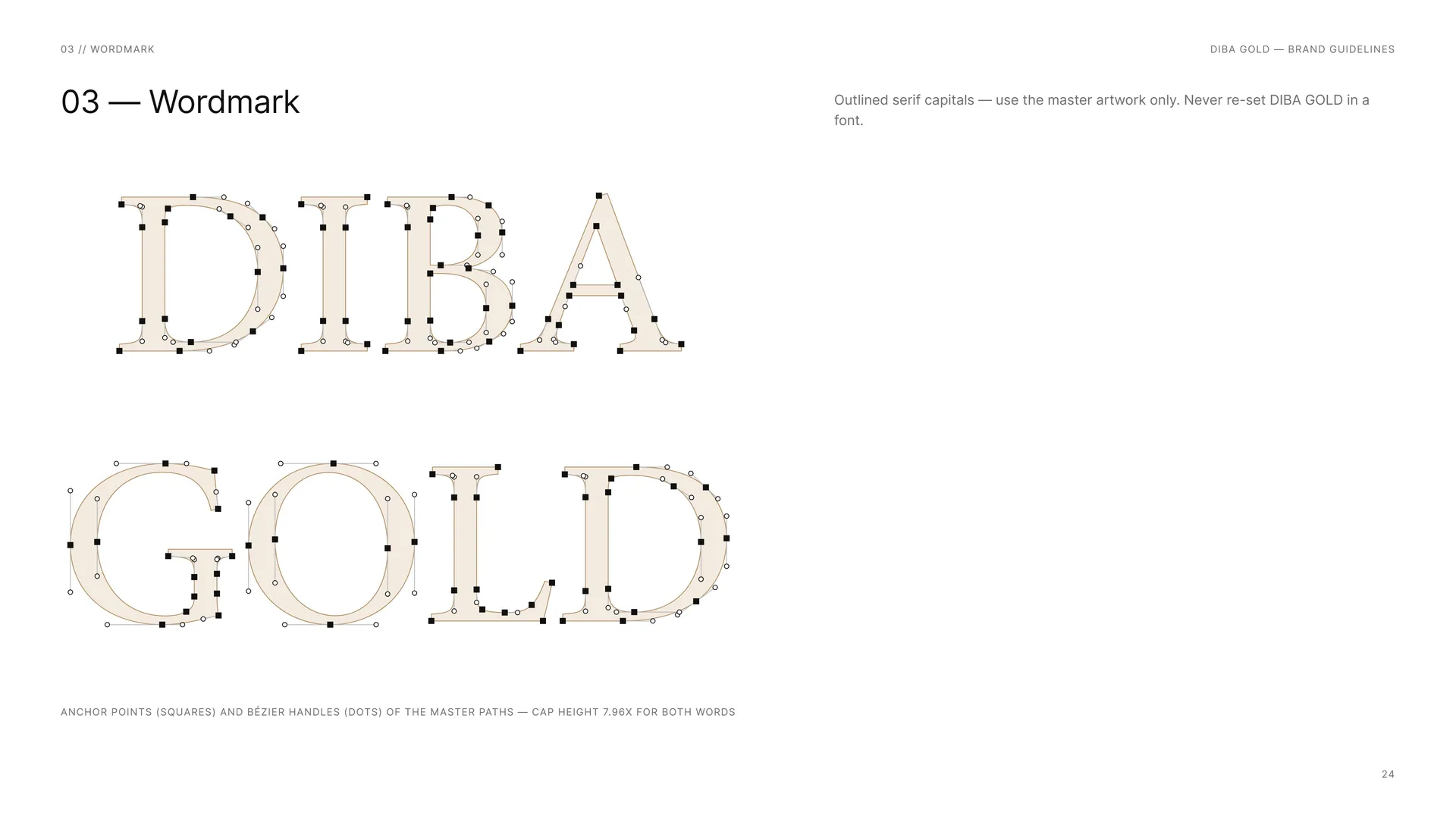
Outlined serif capitals — use the master artwork only. Never re-set DIBA GOLD in a font.
Anchor points (squares) and Bézier handles (dots) of the master paths — cap height 7.96X for both words.
03.7
Horizontal Proportions
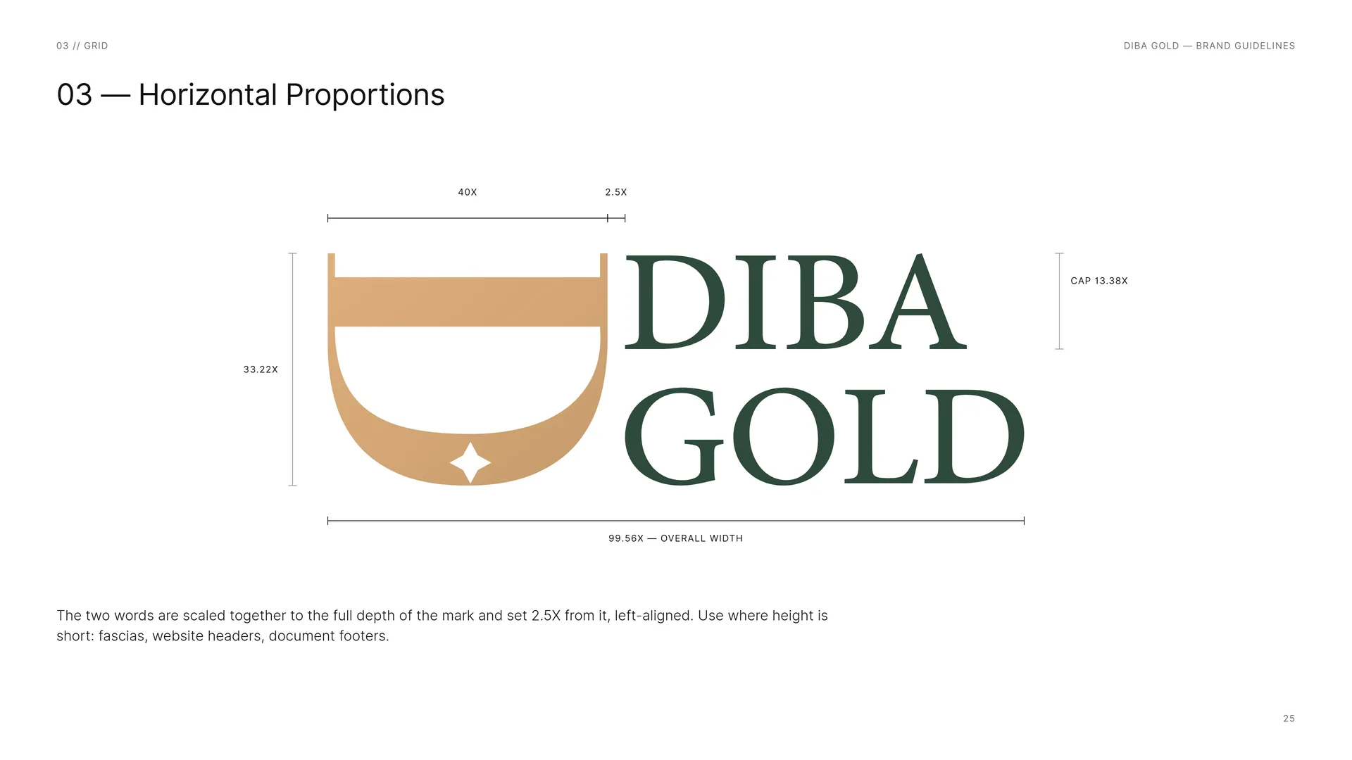
The two words are scaled together to the full depth of the mark and set 2.5X from it, left-aligned. Use where height is short: fascias, website headers, document footers.
40X · 2.5X · 33.22X · Cap 13.38X · 99.56X — overall width.
03.8
Stacked Proportions
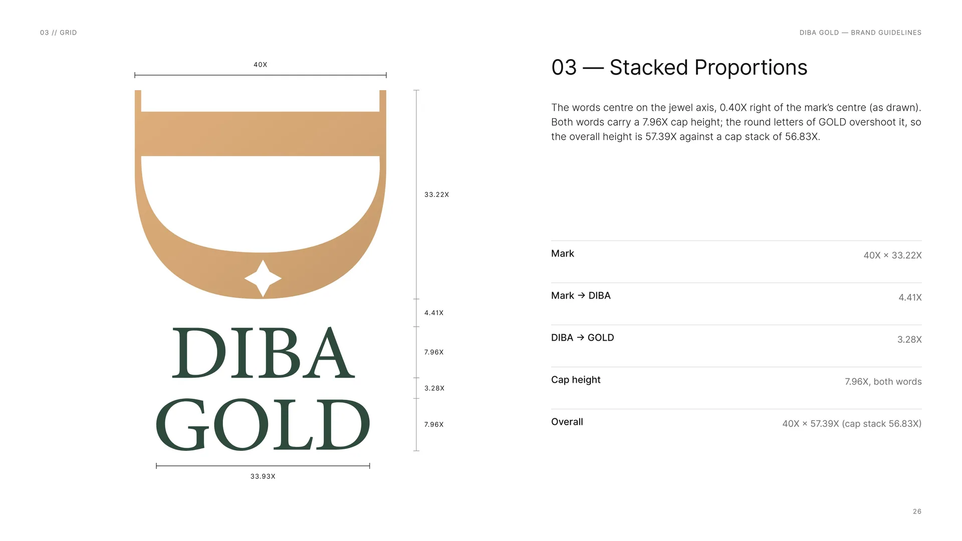
The words centre on the jewel axis, 0.40X right of the mark’s centre (as drawn). Both words carry a 7.96X cap height; the round letters of GOLD overshoot it, so the overall height is 57.39X against a cap stack of 56.83X.
Mark: 40X × 33.22X.
Mark → DIBA: 4.41X.
DIBA → GOLD: 3.28X.
Cap height: 7.96X, both words.
Overall: 40X × 57.39X (cap stack 56.83X).
03.9
Clear Space
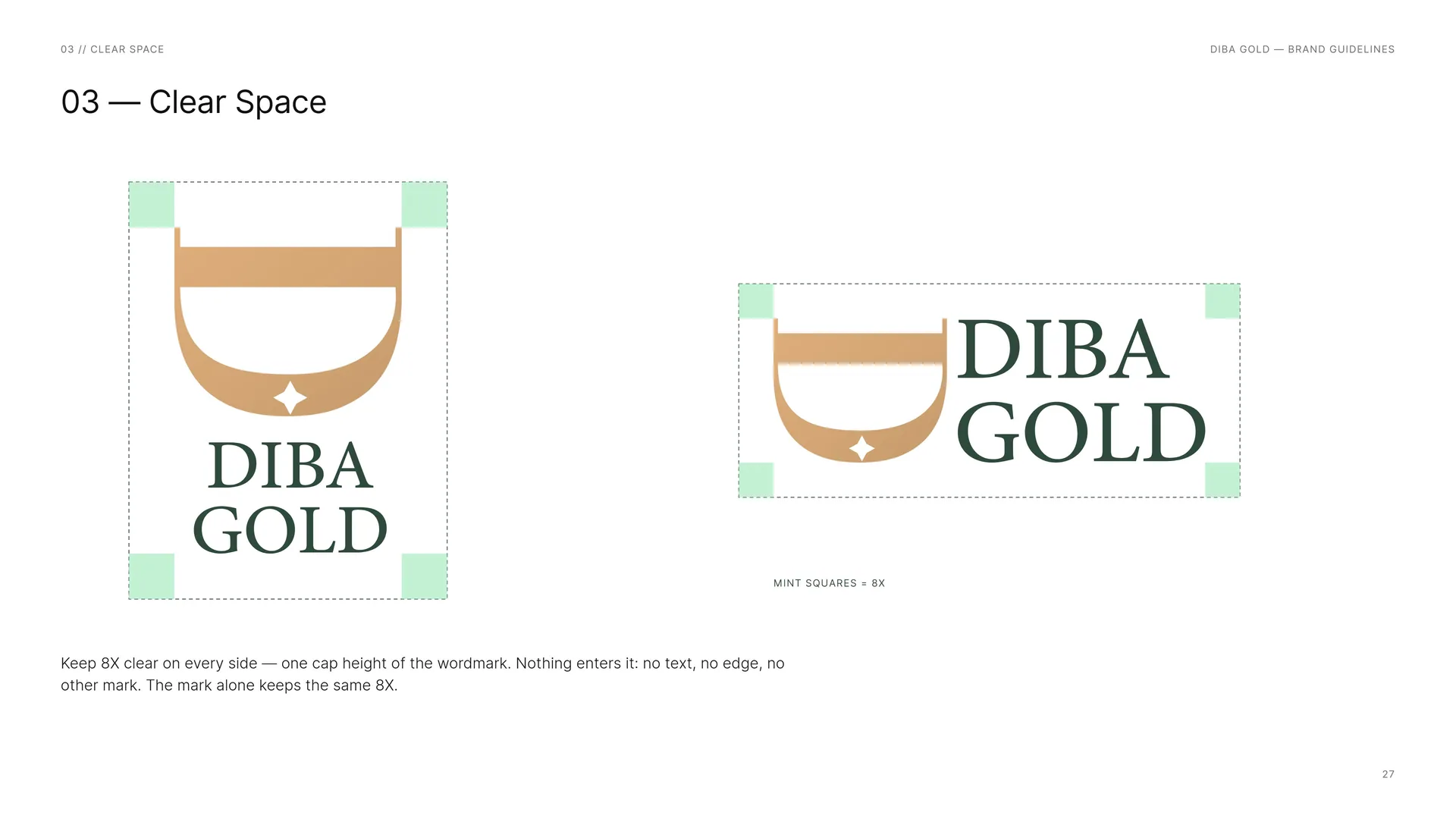
Mint squares = 8X.
Keep 8X clear on every side — one cap height of the wordmark. Nothing enters it: no text, no edge, no other mark. The mark alone keeps the same 8X.
03.10
Versions
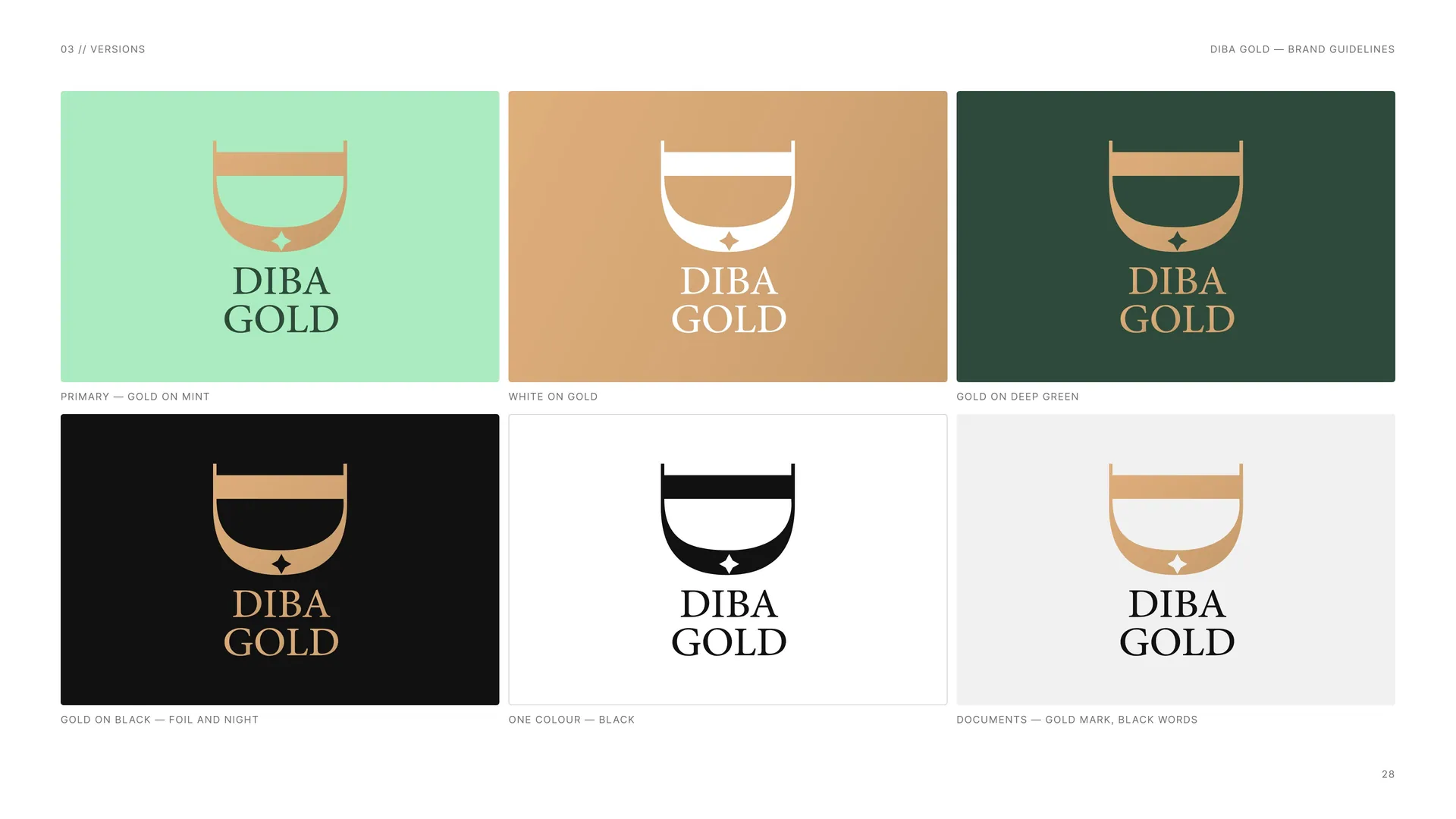
Primary — gold on mint.
White on gold.
Gold on deep green.
Gold on black — foil and night.
One colour — black.
Documents — gold mark, black words.
03.11
The Logo Family
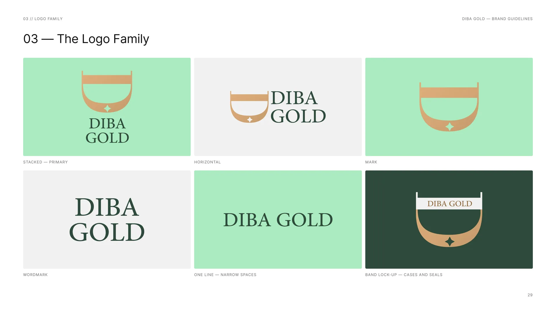
Stacked — primary.
Horizontal.
Mark.
Wordmark.
One line — narrow spaces.
Band lock-up — cases and seals.
03.12
App Icon & Favicon
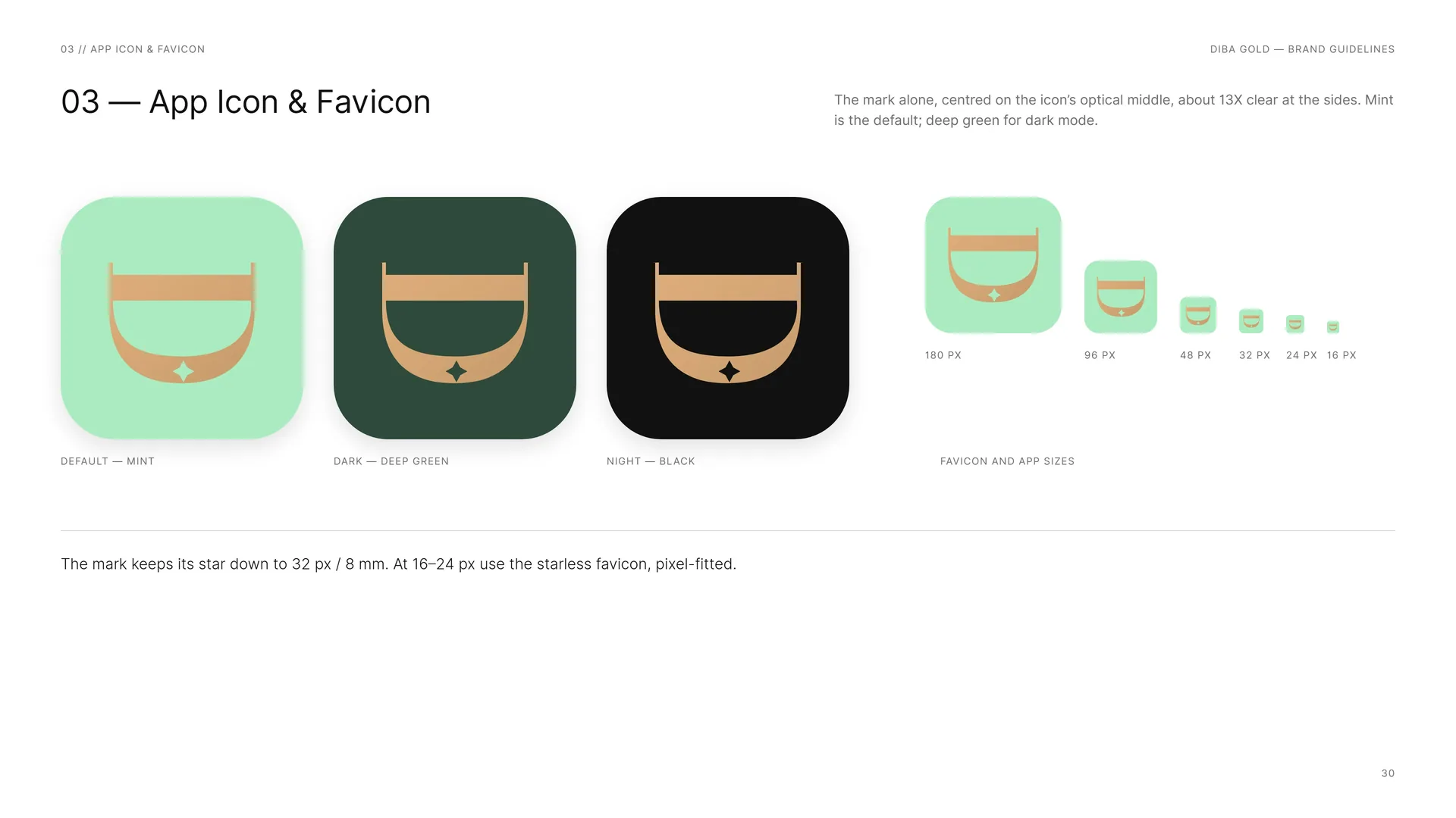
The mark alone, centred on the icon’s optical middle, about 13X clear at the sides. Mint is the default; deep green for dark mode.
Default — mint.
Dark — deep green.
Night — black.
Favicon and app sizes: 180 px · 96 px · 48 px · 32 px · 24 px · 16 px.
The mark keeps its star down to 32 px / 8 mm. At 16–24 px use the starless favicon, pixel-fitted.
03.13
Minimum Size
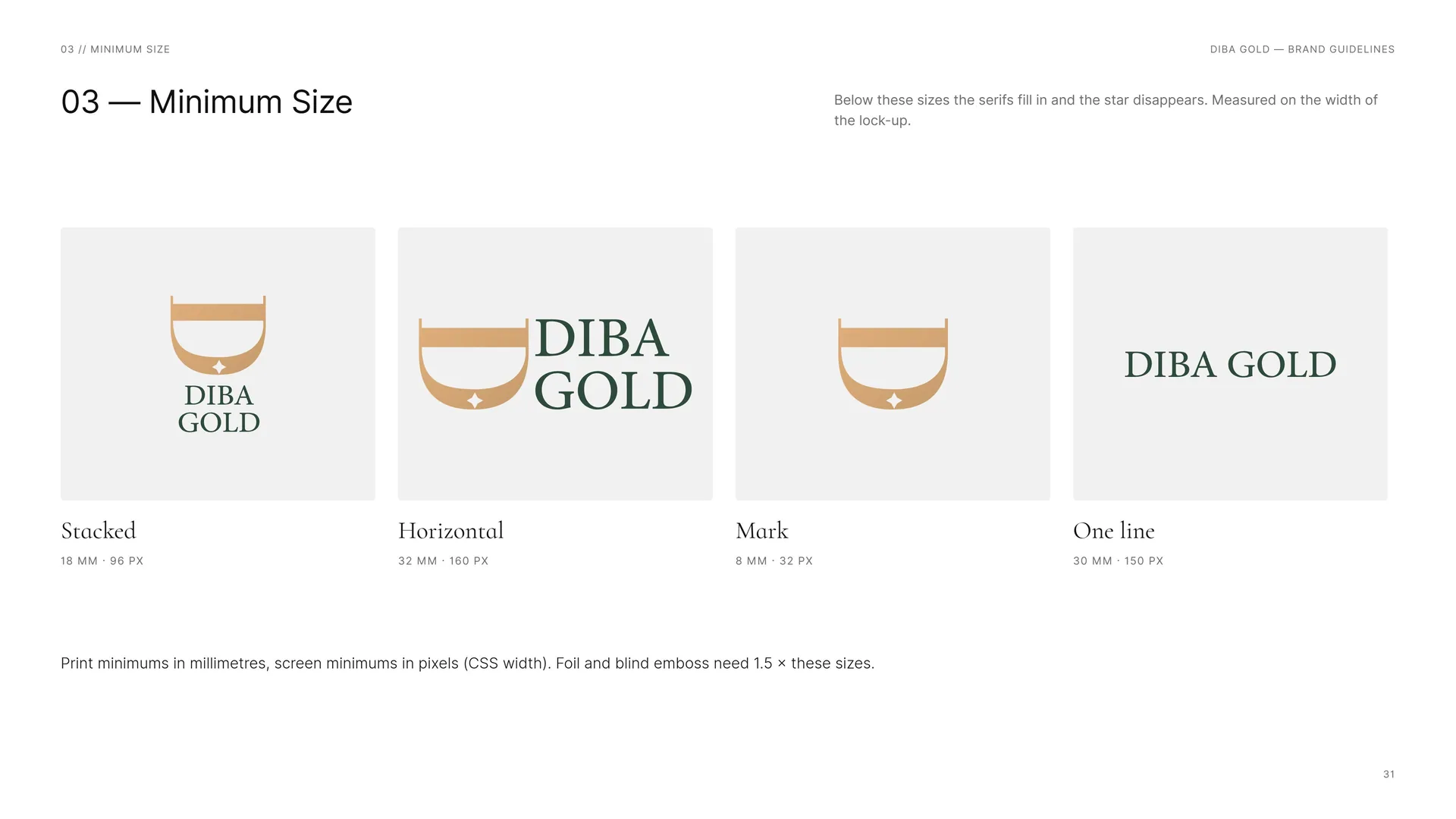
Below these sizes the serifs fill in and the star disappears. Measured on the width of the lock-up.
Stacked: 18 mm · 96 px.
Horizontal: 32 mm · 160 px.
Mark: 8 mm · 32 px.
One line: 30 mm · 150 px.
Print minimums in millimetres, screen minimums in pixels (CSS width). Foil and blind emboss need 1.5 × these sizes.
03.14
Placement
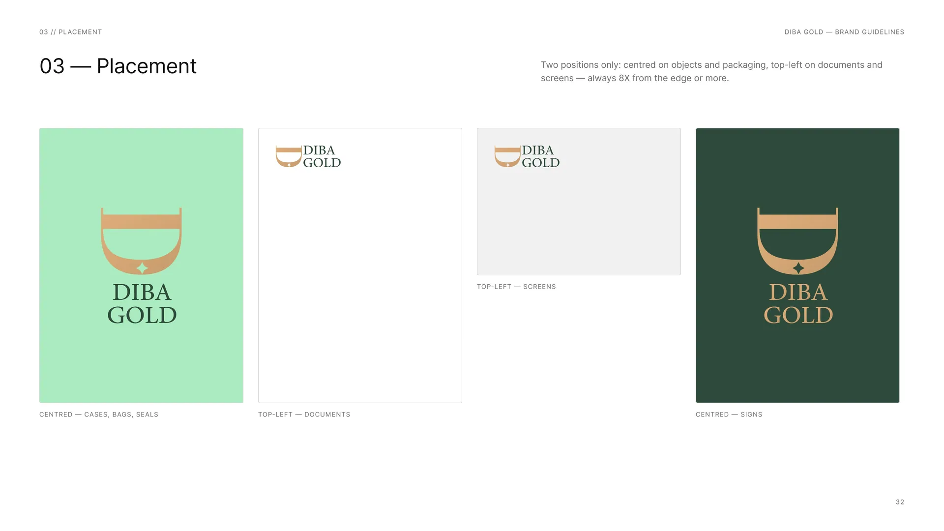
Two positions only: centred on objects and packaging, top-left on documents and screens — always 8X from the edge or more.
Centred — cases, bags, seals.
Top-left — documents.
Top-left — screens.
Centred — signs.
03.15
Misuse
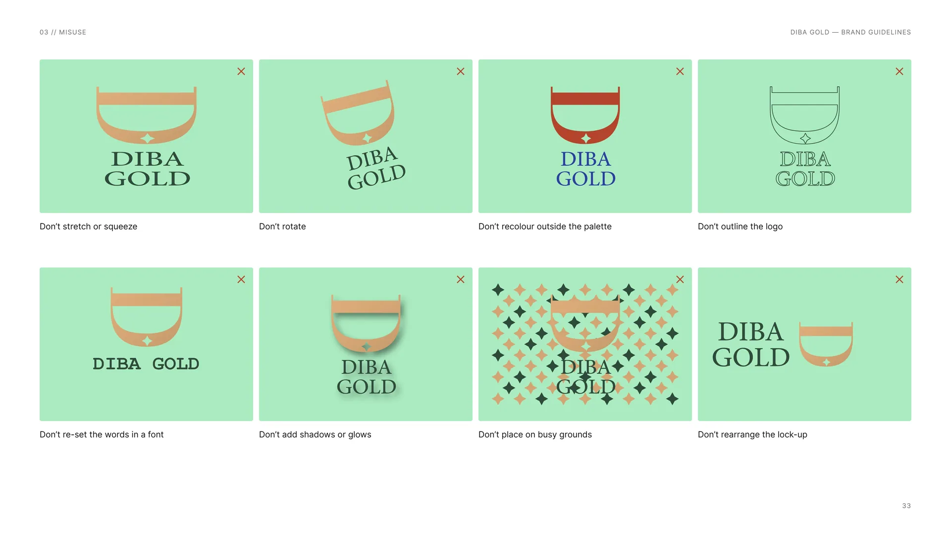
Don’t stretch or squeeze.
Don’t rotate.
Don’t recolour outside the palette.
Don’t outline the logo.
Don’t re-set the words in a font.
Don’t add shadows or glows.
Don’t place on busy grounds.
Don’t rearrange the lock-up.
03.16
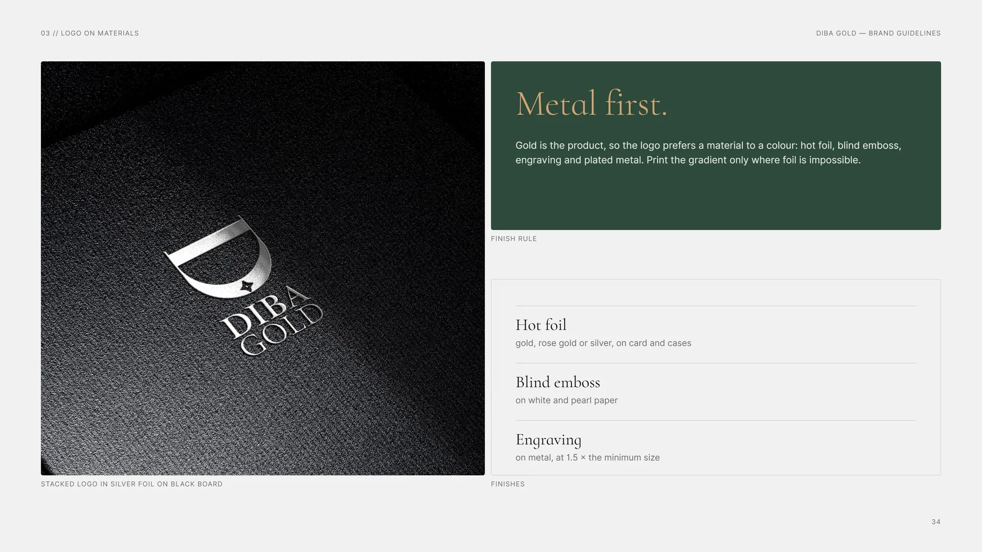
Logo on materials
Stacked logo in silver foil on black board.
Metal first.
Gold is the product, so the logo prefers a material to a colour: hot foil, blind emboss, engraving and plated metal. Print the gradient only where foil is impossible.
Finish rule.
Hot foil: gold, rose gold or silver, on card and cases.
Blind emboss: on white and pearl paper.
Engraving: on metal, at 1.5 × the minimum size.
04
Colour
04.1
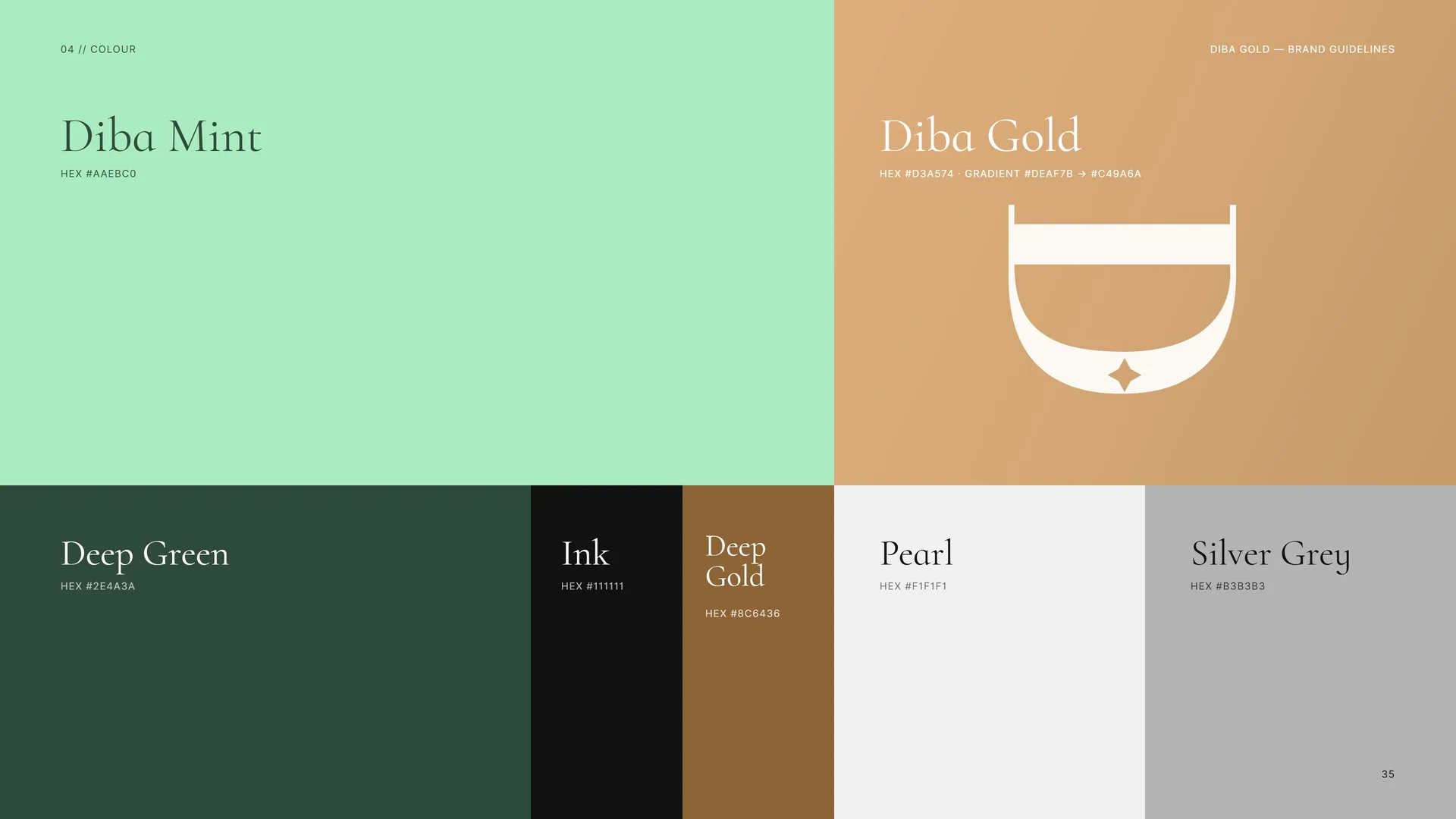
Colour
Diba Mint: HEX #AAEBC0.
Diba Gold: HEX #D3A574 · gradient #DEAF7B → #C49A6A.
Deep Green: HEX #2E4A3A.
Ink: HEX #111111.
Deep Gold: HEX #8C6436.
Pearl: HEX #F1F1F1.
Silver Grey: HEX #B3B3B3.
04.2
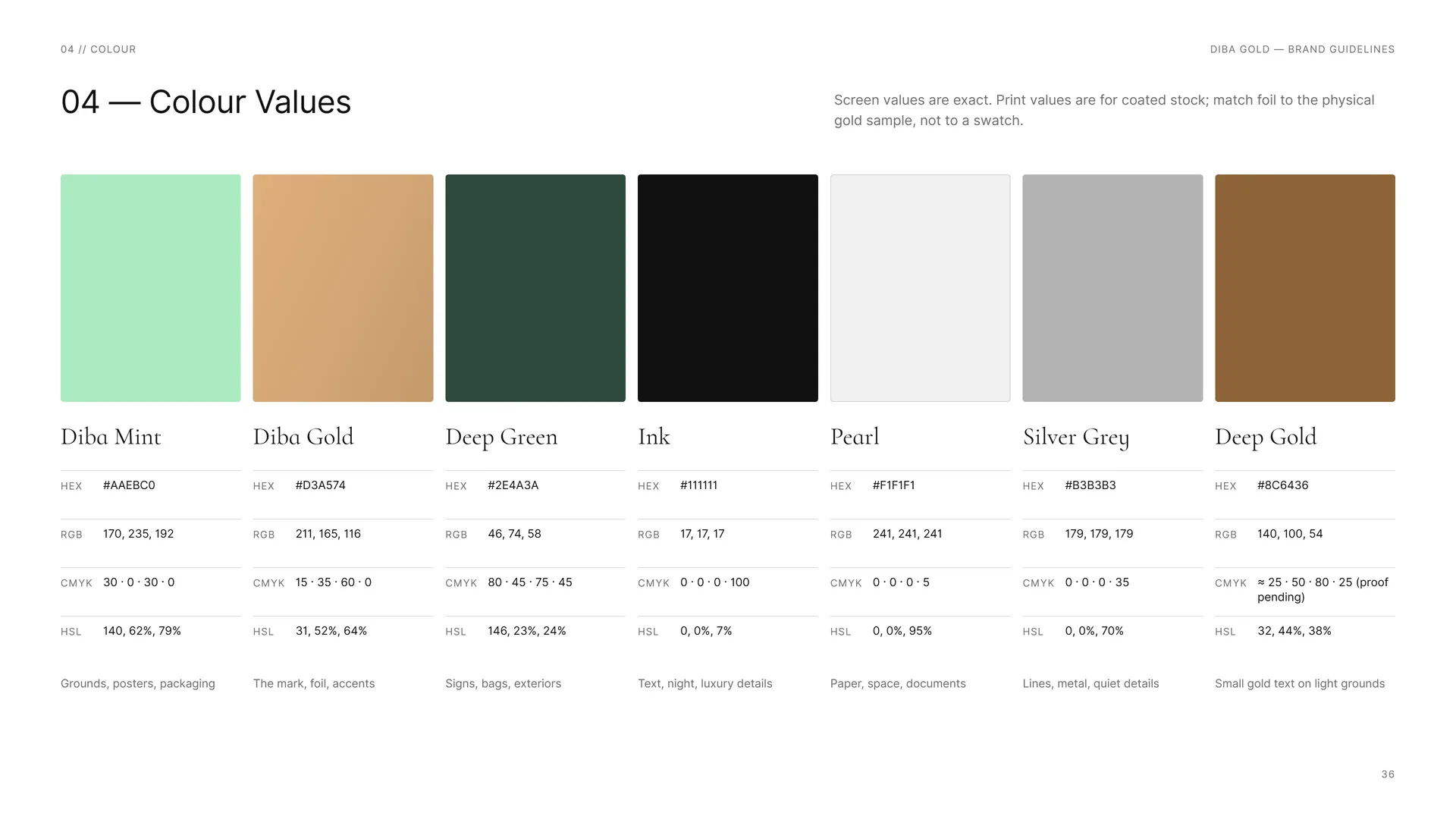
Colour Values
Screen values are exact. Print values are for coated stock; match foil to the physical gold sample, not to a swatch.
Diba Mint: HEX #AAEBC0 · RGB 170, 235, 192 · CMYK 30 · 0 · 30 · 0 · HSL 140, 62%, 79% — grounds, posters, packaging.
Diba Gold: HEX #D3A574 · RGB 211, 165, 116 · CMYK 15 · 35 · 60 · 0 · HSL 31, 52%, 64% — the mark, foil, accents.
Deep Green: HEX #2E4A3A · RGB 46, 74, 58 · CMYK 80 · 45 · 75 · 45 · HSL 146, 23%, 24% — signs, bags, exteriors.
Ink: HEX #111111 · RGB 17, 17, 17 · CMYK 0 · 0 · 0 · 100 · HSL 0, 0%, 7% — text, night, luxury details.
Pearl: HEX #F1F1F1 · RGB 241, 241, 241 · CMYK 0 · 0 · 0 · 5 · HSL 0, 0%, 95% — paper, space, documents.
Silver Grey: HEX #B3B3B3 · RGB 179, 179, 179 · CMYK 0 · 0 · 0 · 35 · HSL 0, 0%, 70% — lines, metal, quiet details.
Deep Gold: HEX #8C6436 · RGB 140, 100, 54 · CMYK ≈ 25 · 50 · 80 · 25 (proof pending) · HSL 32, 44%, 38% — small gold text on light grounds.
04.3
Mint is the surprise
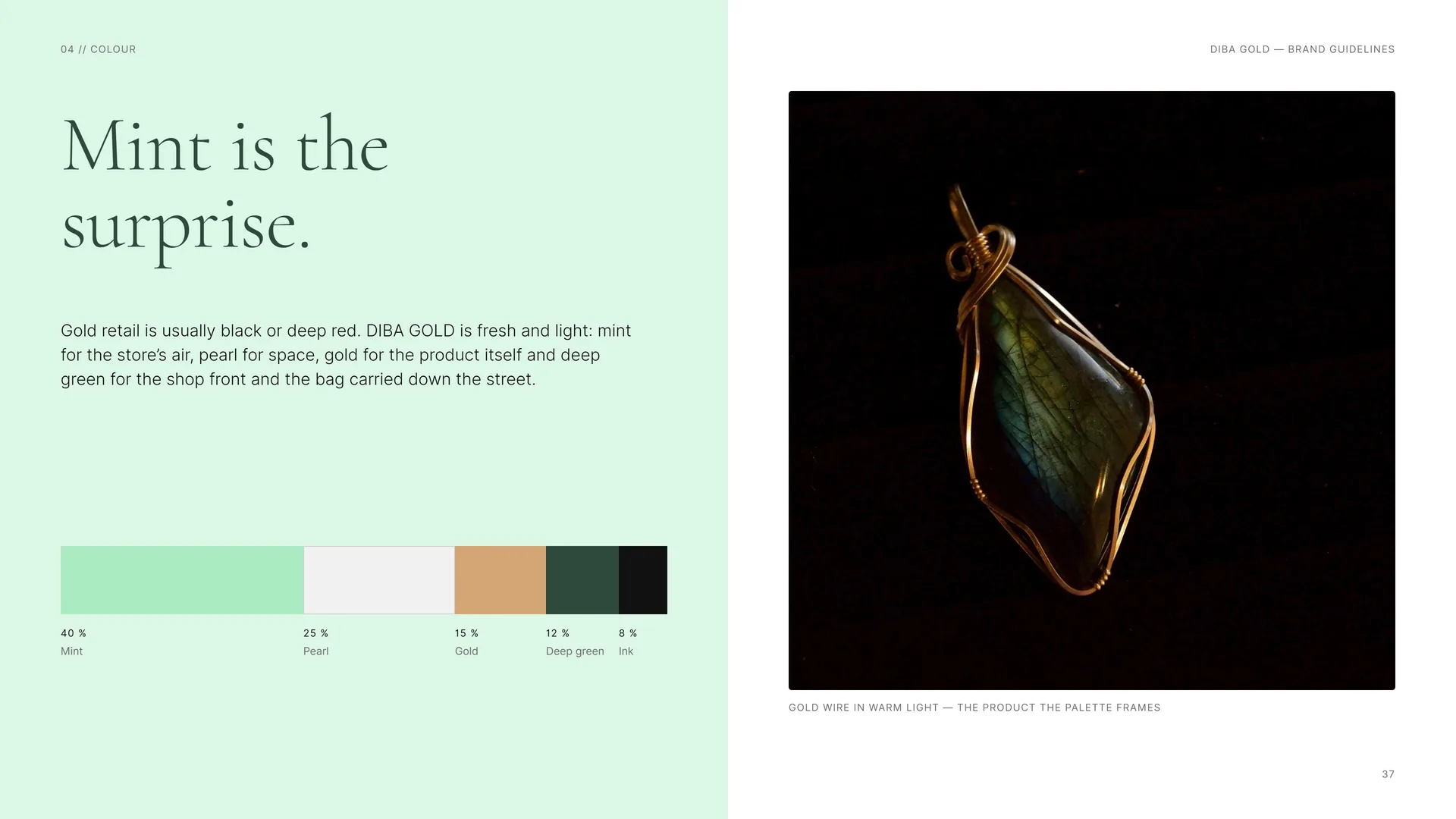
Mint is the surprise.
Gold retail is usually black or deep red. DIBA GOLD is fresh and light: mint for the store’s air, pearl for space, gold for the product itself and deep green for the shop front and the bag carried down the street.
Proportions: 40 % Mint · 25 % Pearl · 15 % Gold · 12 % Deep green · 8 % Ink.
Gold wire in warm light — the product the palette frames.
04.4
Contrast & Accessibility
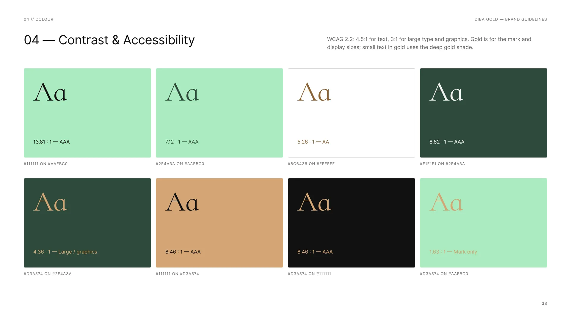
WCAG 2.2: 4.5:1 for text, 3:1 for large type and graphics. Gold is for the mark and display sizes; small text in gold uses the deep gold shade.
#111111 on #AAEBC0: 13.81 : 1 — AAA.
#2E4A3A on #AAEBC0: 7.12 : 1 — AAA.
#8C6436 on #FFFFFF: 5.26 : 1 — AA.
#F1F1F1 on #2E4A3A: 8.62 : 1 — AAA.
#D3A574 on #2E4A3A: 4.36 : 1 — Large / graphics.
#111111 on #D3A574: 8.46 : 1 — AAA.
#D3A574 on #111111: 8.46 : 1 — AAA.
#D3A574 on #AAEBC0: 1.63 : 1 — Mark only.
04.5
Tints & Gradient
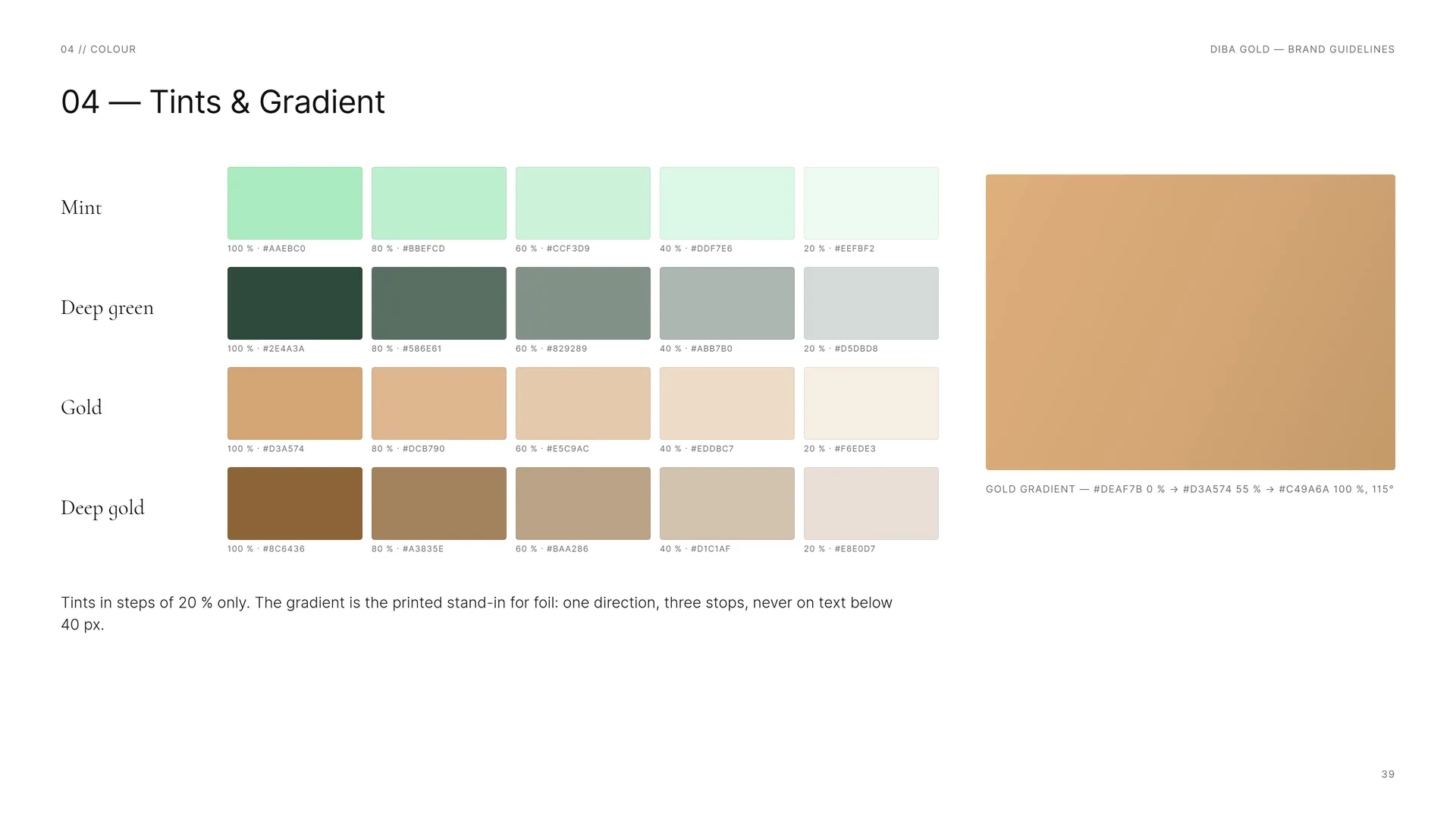
Mint: 100 % · #AAEBC0 — 80 % · #BBEFCD — 60 % · #CCF3D9 — 40 % · #DDF7E6 — 20 % · #EEFBF2.
Deep green: 100 % · #2E4A3A — 80 % · #586E61 — 60 % · #829289 — 40 % · #ABB7B0 — 20 % · #D5DBD8.
Gold: 100 % · #D3A574 — 80 % · #DCB790 — 60 % · #E5C9AC — 40 % · #EDDBC7 — 20 % · #F6EDE3.
Deep gold: 100 % · #8C6436 — 80 % · #A3835E — 60 % · #BAA286 — 40 % · #D1C1AF — 20 % · #E8E0D7.
Tints in steps of 20 % only. The gradient is the printed stand-in for foil: one direction, three stops, never on text below 40 px.
Gold gradient — #DEAF7B 0 % → #D3A574 55 % → #C49A6A 100 %, 115°.
05
Typography
05.1
Typography
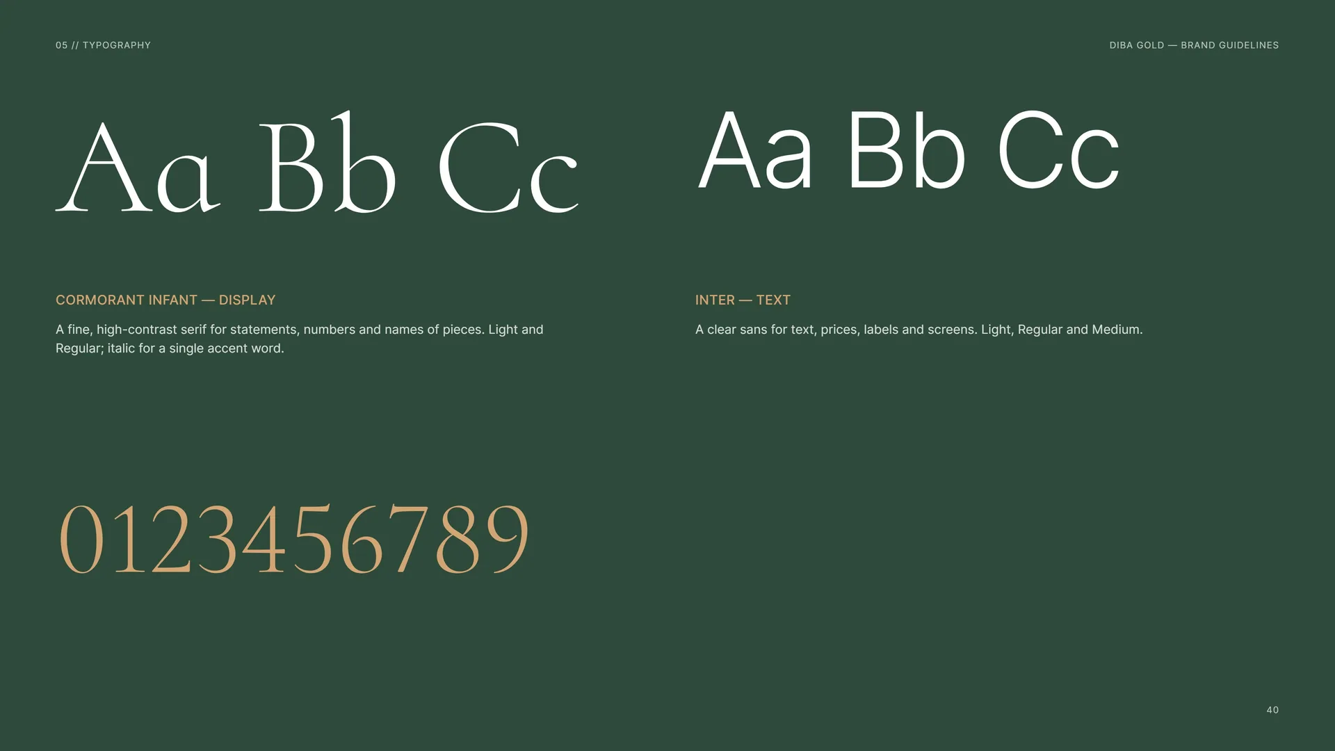
Cormorant Infant — Display: A fine, high-contrast serif for statements, numbers and names of pieces. Light and Regular; italic for a single accent word.
Inter — Text: A clear sans for text, prices, labels and screens. Light, Regular and Medium.
05.2
Cormorant Infant
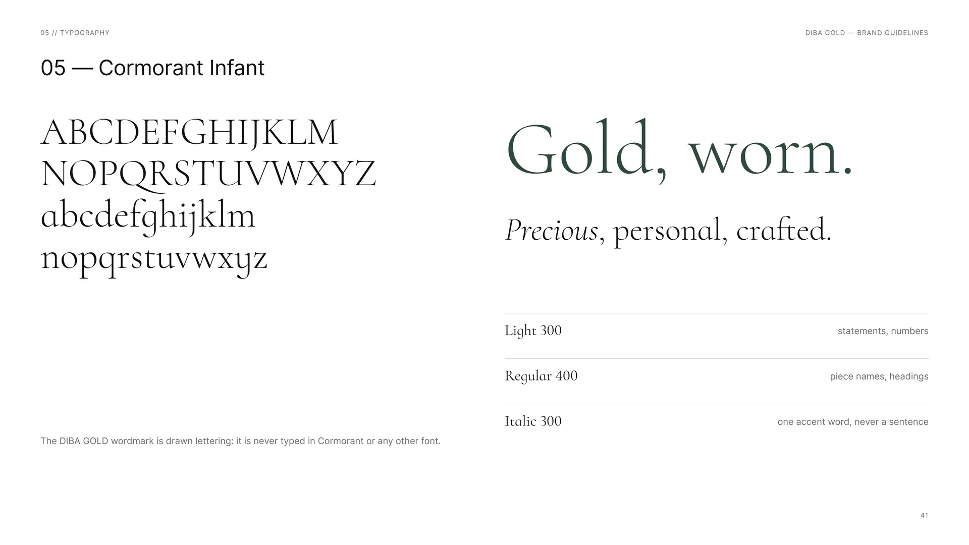
Gold, worn.
Precious, personal, crafted.
The DIBA GOLD wordmark is drawn lettering: it is never typed in Cormorant or any other font.
Light 300: statements, numbers.
Regular 400: piece names, headings.
Italic 300: one accent word, never a sentence.
05.3
Inter
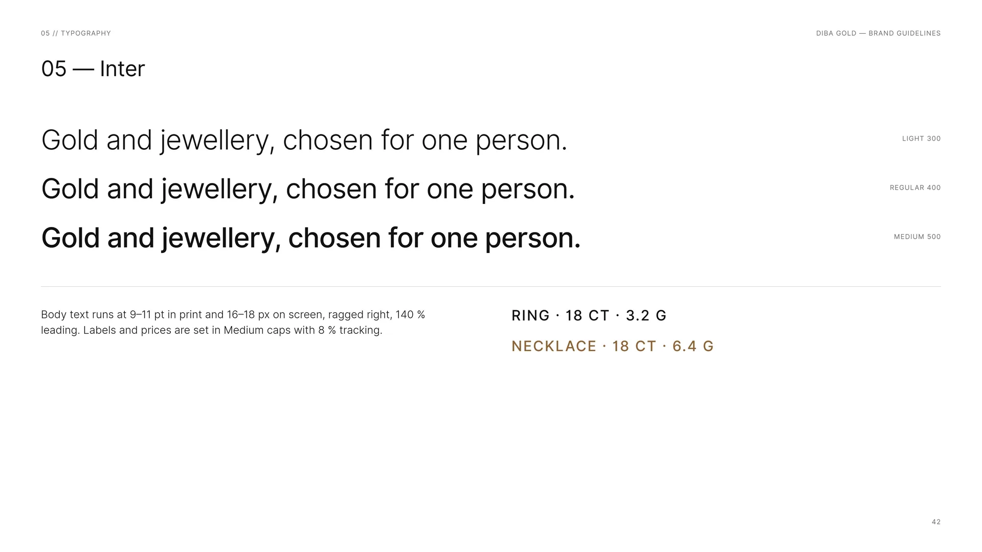
Gold and jewellery, chosen for one person.
Body text runs at 9–11 pt in print and 16–18 px on screen, ragged right, 140 % leading. Labels and prices are set in Medium caps with 8 % tracking.
Light 300 · Regular 400 · Medium 500.
Ring · 18 CT · 3.2 G.
Necklace · 18 CT · 6.4 G.
05.4
Type System
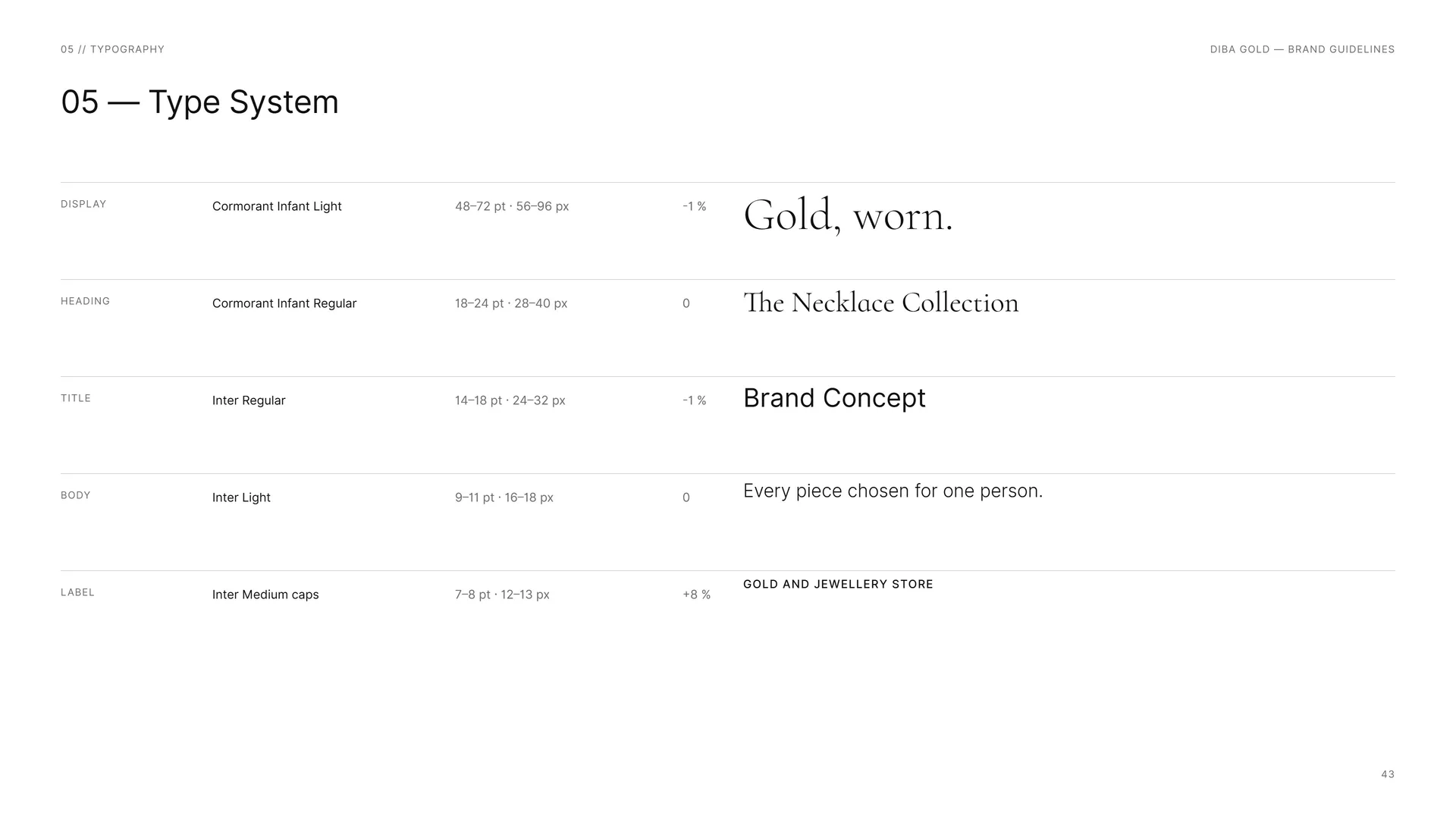
Display: Cormorant Infant Light · 48–72 pt · 56–96 px · −1 %.
Heading: Cormorant Infant Regular · 18–24 pt · 28–40 px · 0.
Title: Inter Regular · 14–18 pt · 24–32 px · −1 %.
Body: Inter Light · 9–11 pt · 16–18 px · 0.
Label: Inter Medium caps · 7–8 pt · 12–13 px · +8 %.
06
Pattern
- 06.1The rosette
- 06.2How the Rosette Is Built
- 06.3Pattern family
- 06.4The jewel, scattered
- 06.5Pattern Rules
- 06.6Pattern in use
06.1
The rosette
The rosette.
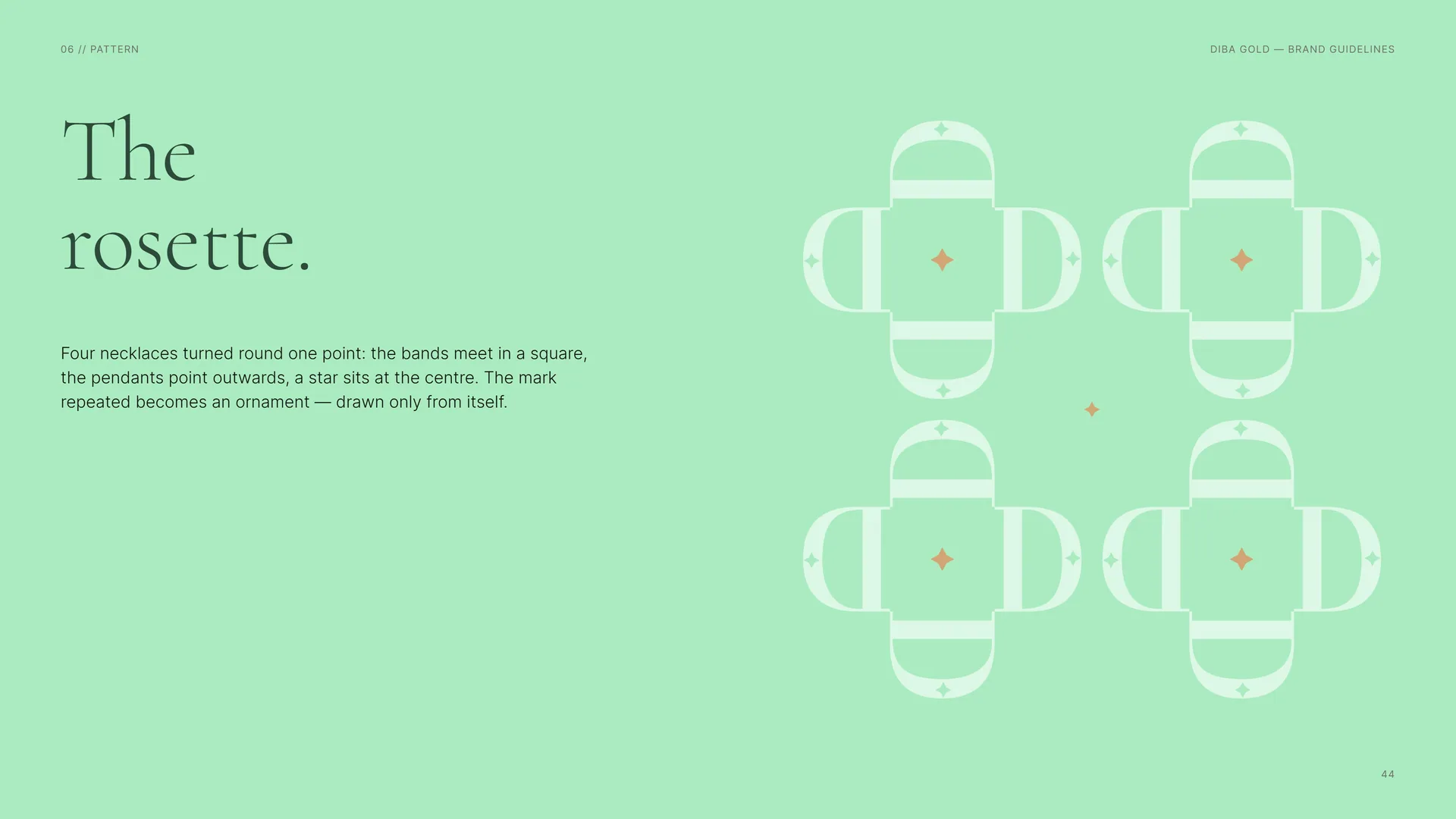
Four necklaces turned round one point: the bands meet in a square, the pendants point outwards, a star sits at the centre. The mark repeated becomes an ornament — drawn only from itself.
06.2
How the Rosette Is Built
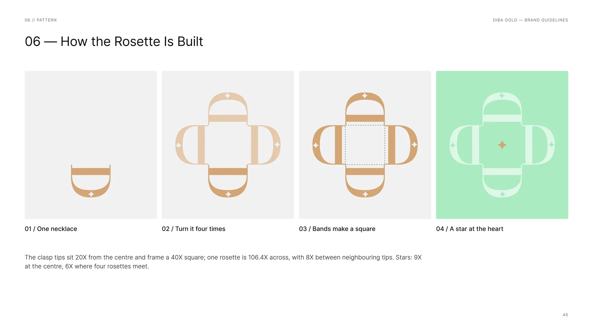
One necklace.
Turn it four times.
Bands make a square.
A star at the heart.
The clasp tips sit 20X from the centre and frame a 40X square; one rosette is 106.4X across, with 8X between neighbouring tips. Stars: 9X at the centre, 6X where four rosettes meet.
06.3
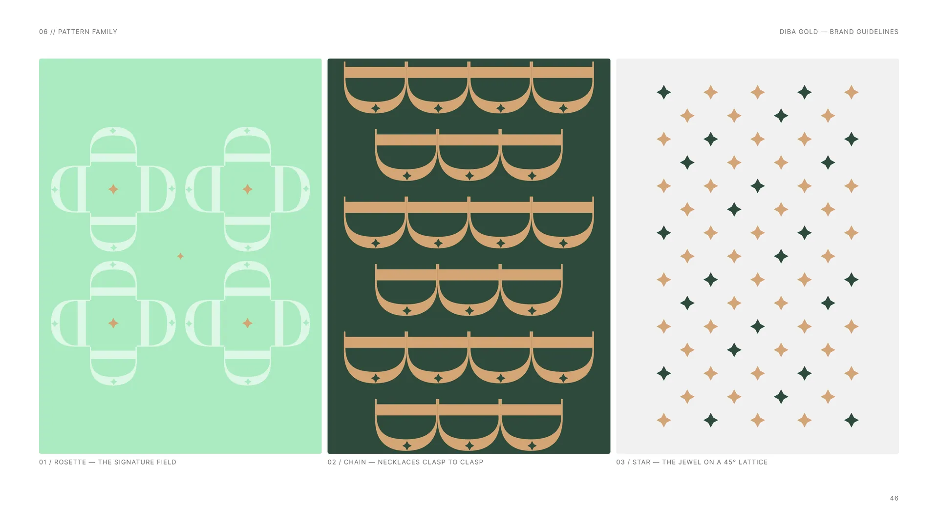
Pattern family
Rosette — the signature field.
Chain — necklaces clasp to clasp.
Star — the jewel on a 45° lattice.
06.4
The jewel, scattered
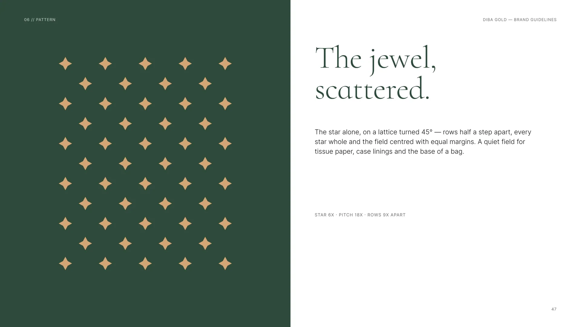
The jewel, scattered.
The star alone, on a lattice turned 45° — rows half a step apart, every star whole and the field centred with equal margins. A quiet field for tissue paper, case linings and the base of a bag.
Star 6X · pitch 18X · rows 9X apart.
06.5
Pattern Rules
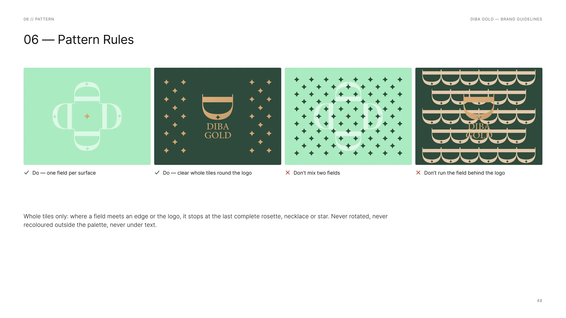
Do — one field per surface.
Do — clear whole tiles round the logo.
Don’t mix two fields.
Don’t run the field behind the logo.
Whole tiles only: where a field meets an edge or the logo, it stops at the last complete rosette, necklace or star. Never rotated, never recoloured outside the palette, never under text.
06.6
Pattern in use
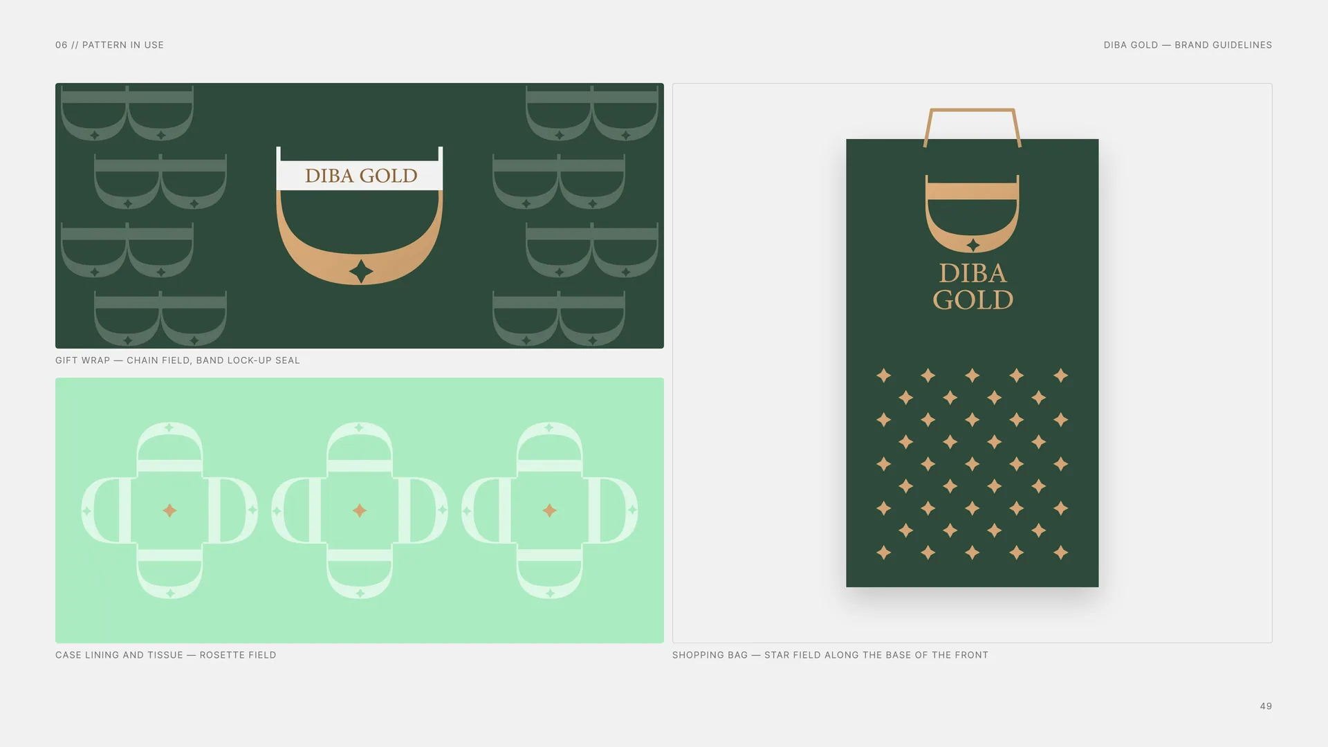
Gift wrap — chain field, band lock-up seal.
Case lining and tissue — rosette field.
Shopping bag — star field along the base of the front.
07
Imagery
07.1
Photography
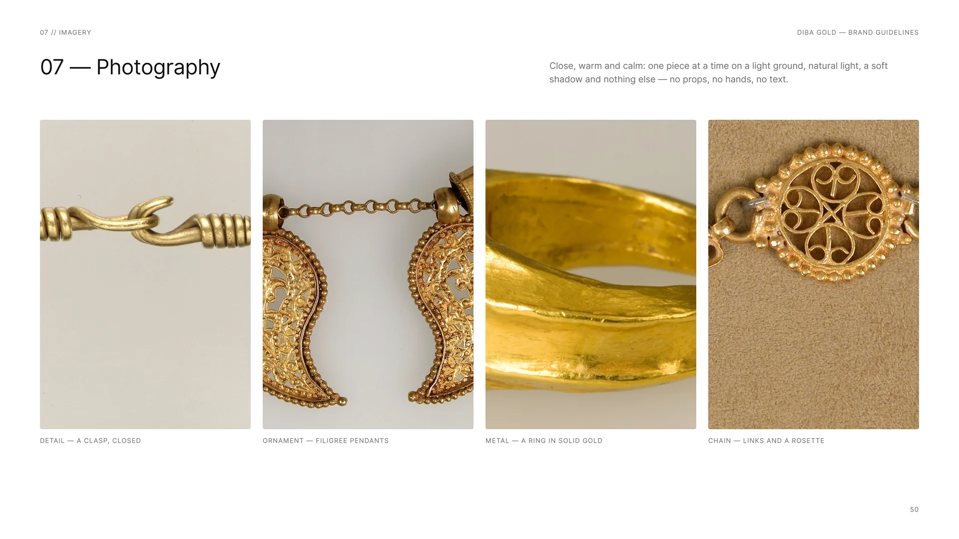
Close, warm and calm: one piece at a time on a light ground, natural light, a soft shadow and nothing else — no props, no hands, no text.
Detail — a clasp, closed.
Ornament — filigree pendants.
Metal — a ring in solid gold.
Chain — links and a rosette.
08
Stationery
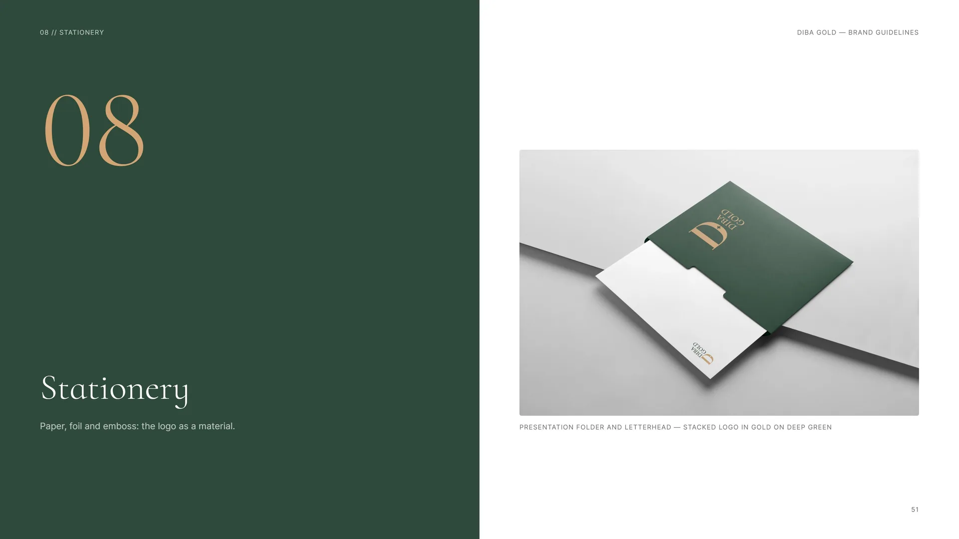
Paper, foil and emboss: the logo as a material.
Presentation folder and letterhead — stacked logo in gold on deep green.
08.1
Business Cards
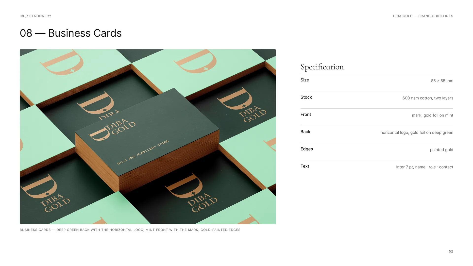
Business cards — deep green back with the horizontal logo, mint front with the mark, gold-painted edges.
Size: 85 × 55 mm.
Stock: 600 gsm cotton, two layers.
Front: mark, gold foil on mint.
Back: horizontal logo, gold foil on deep green.
Edges: painted gold.
Text: Inter 7 pt, name · role · contact.
08.2
Letterhead & Envelope
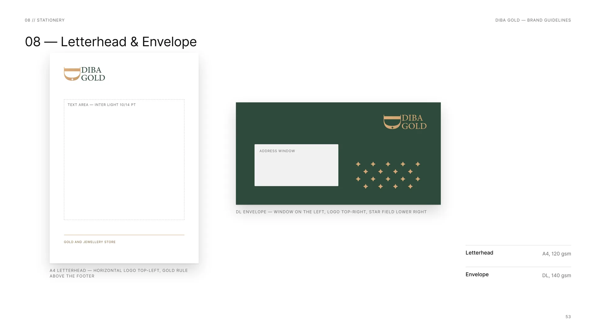
Text area — Inter Light 10/14 pt.
Address window.
A4 letterhead — horizontal logo top-left, gold rule above the footer.
DL envelope — window on the left, logo top-right, star field lower right.
Letterhead: A4, 120 gsm.
Envelope: DL, 140 gsm.
08.3
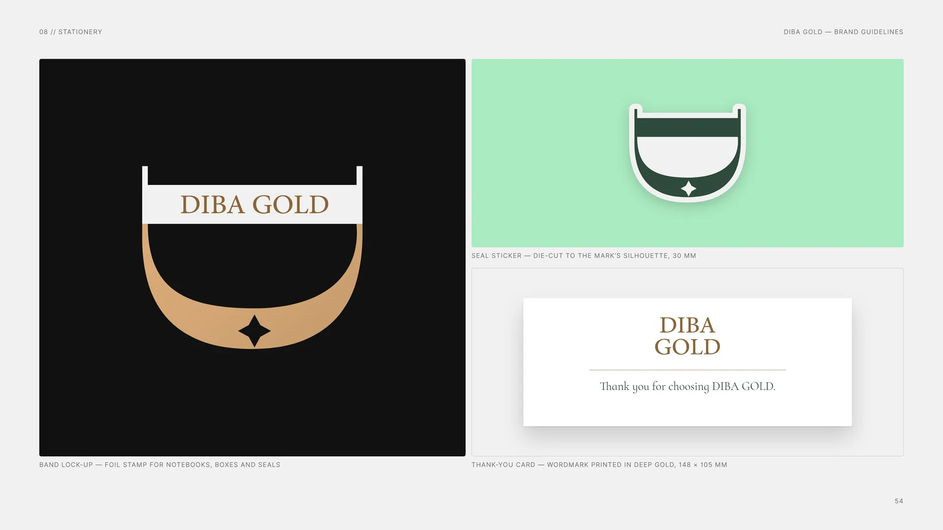
Foil stamp, seal and thank-you card
Band lock-up — foil stamp for notebooks, boxes and seals.
Seal sticker — die-cut to the mark’s silhouette, 30 mm.
Thank-you card — wordmark printed in deep gold, 148 × 105 mm.
Thank you for choosing DIBA GOLD.
09
Packaging
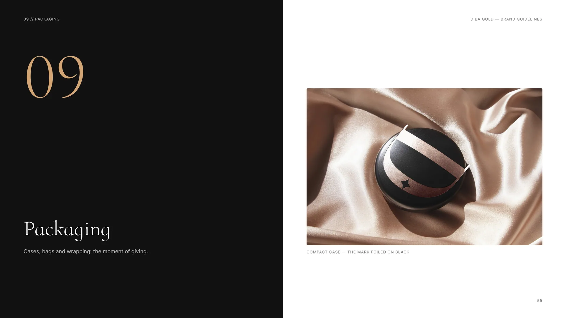
Cases, bags and wrapping: the moment of giving.
Compact case — the mark foiled on black.
09.1
Gift Box
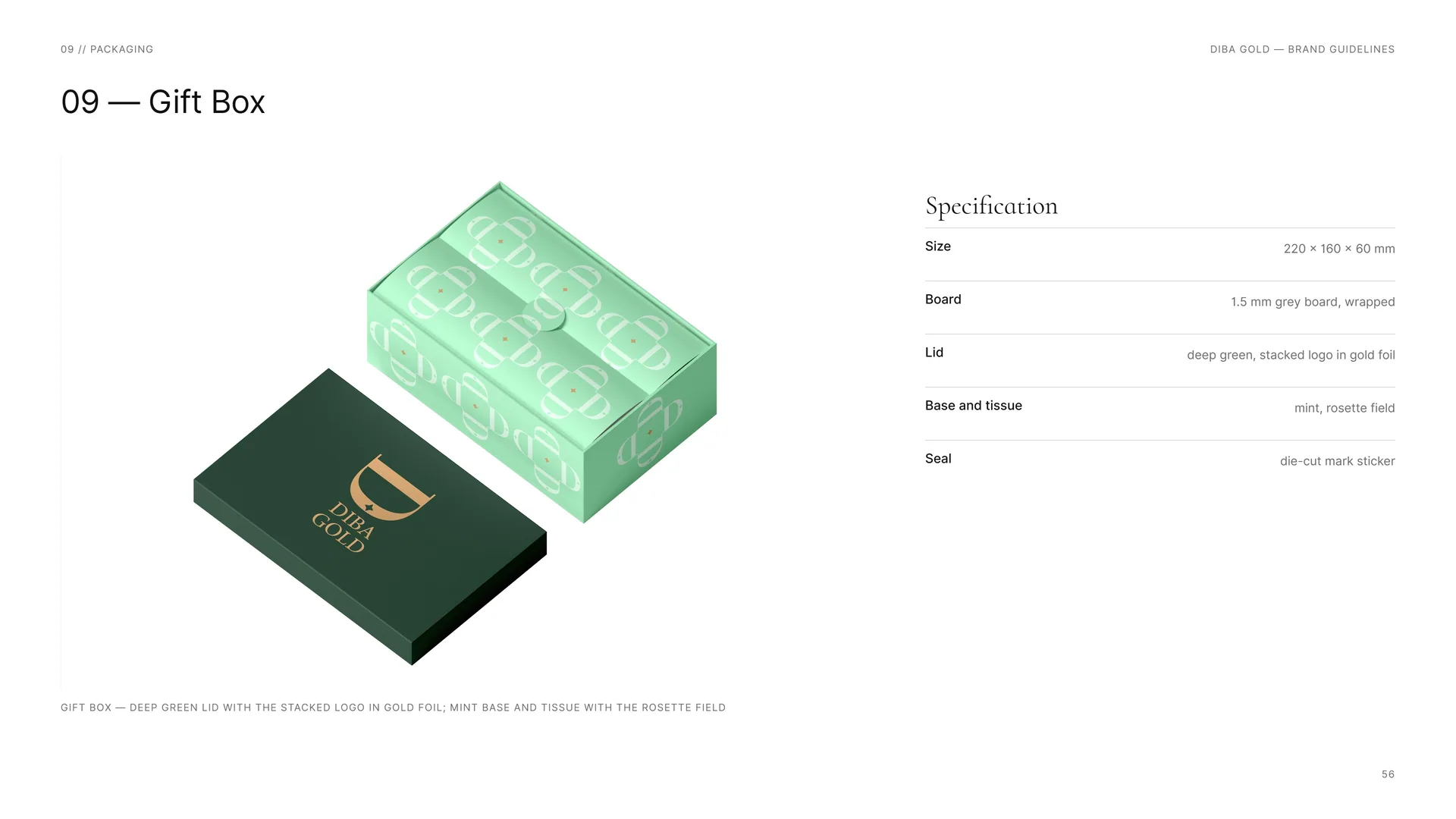
Gift box — deep green lid with the stacked logo in gold foil; mint base and tissue with the rosette field.
Size: 220 × 160 × 60 mm.
Board: 1.5 mm grey board, wrapped.
Lid: deep green, stacked logo in gold foil.
Base and tissue: mint, rosette field.
Seal: die-cut mark sticker.
09.2
Shopping Bag
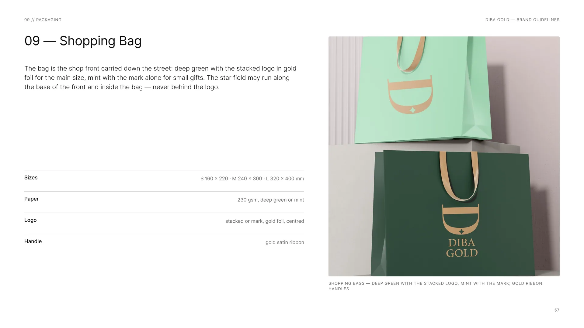
The bag is the shop front carried down the street: deep green with the stacked logo in gold foil for the main size, mint with the mark alone for small gifts. The star field may run along the base of the front and inside the bag — never behind the logo.
Sizes: S 160 × 220 · M 240 × 300 · L 320 × 400 mm.
Paper: 230 gsm, deep green or mint.
Logo: stacked or mark, gold foil, centred.
Handle: gold satin ribbon.
Shopping bags — deep green with the stacked logo, mint with the mark; gold ribbon handles.
09.3
Gift wrap, seal, ribbon and tissue
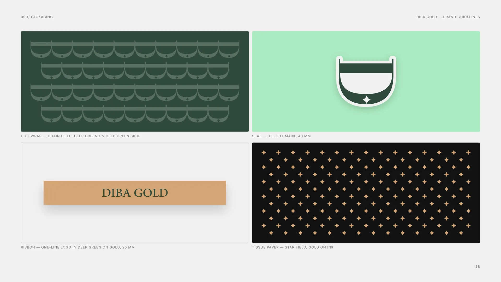
Gift wrap — chain field, deep green on deep green 80 %.
Seal — die-cut mark, 40 mm.
Ribbon — one-line logo in deep green on gold, 25 mm.
Tissue paper — star field, gold on ink.
09.4
Certificate & Care Card
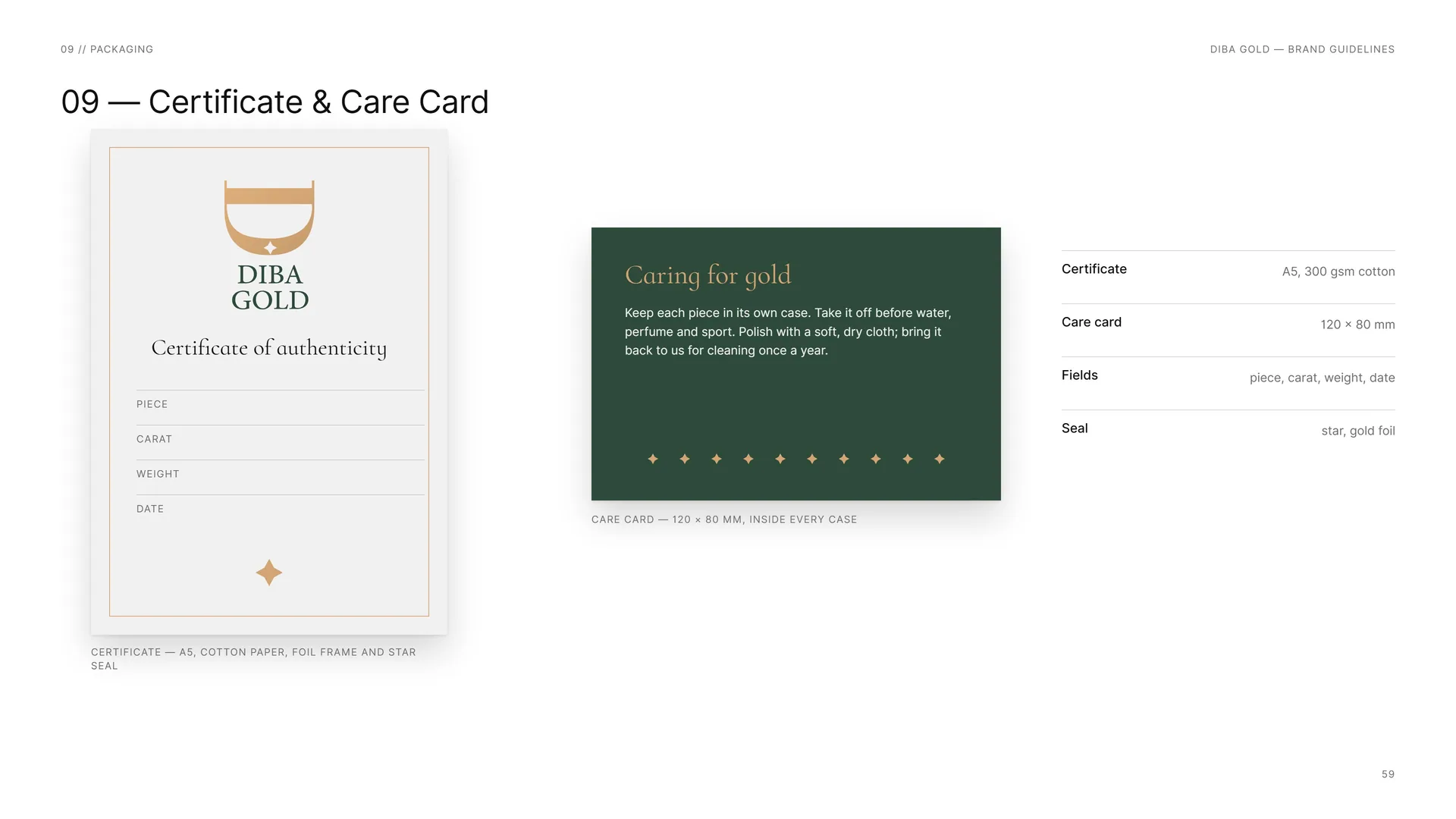
Caring for gold: Keep each piece in its own case. Take it off before water, perfume and sport. Polish with a soft, dry cloth; bring it back to us for cleaning once a year.
Care card — 120 × 80 mm, inside every case.
Certificate — A5, cotton paper, foil frame and star seal.
Certificate: A5, 300 gsm cotton.
Care card: 120 × 80 mm.
Fields: piece, carat, weight, date.
Seal: star, gold foil.
10
Digital
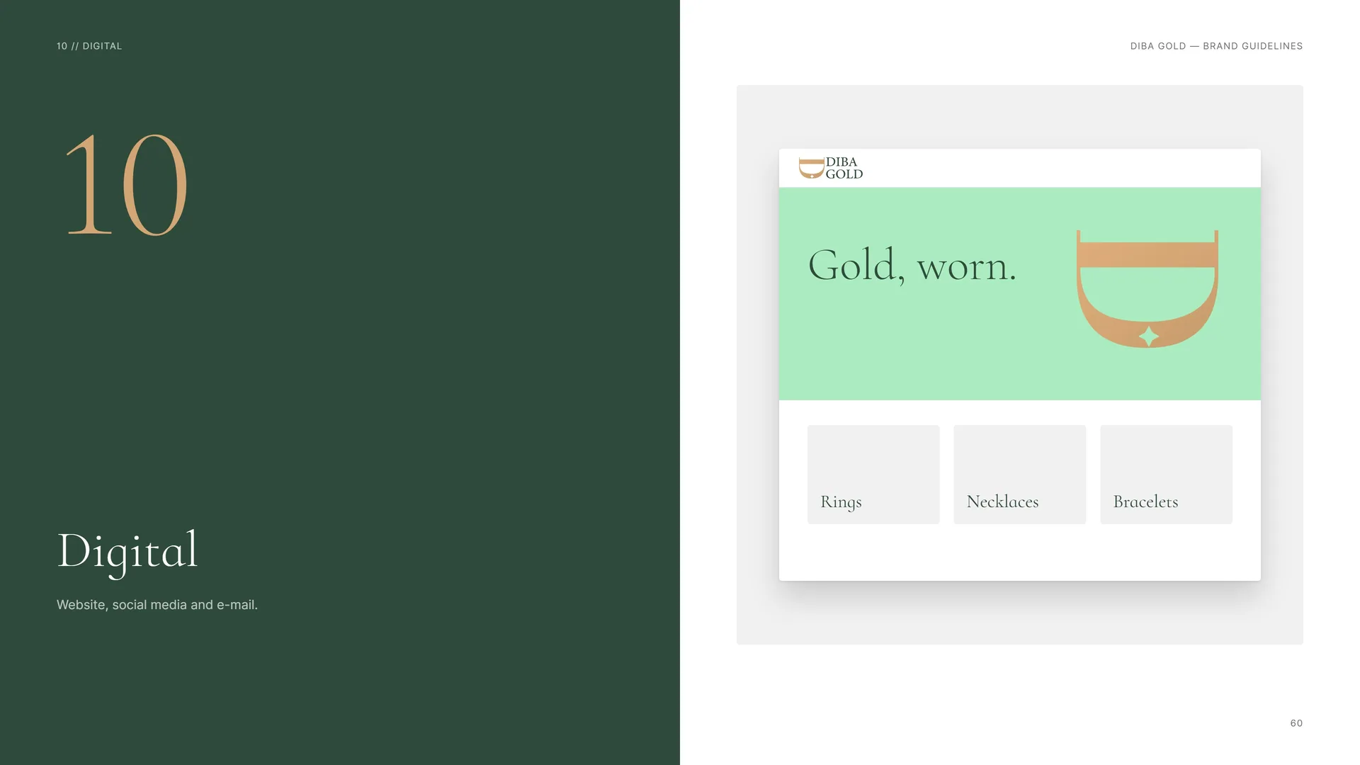
Website, social media and e-mail.
10.1
Social Media
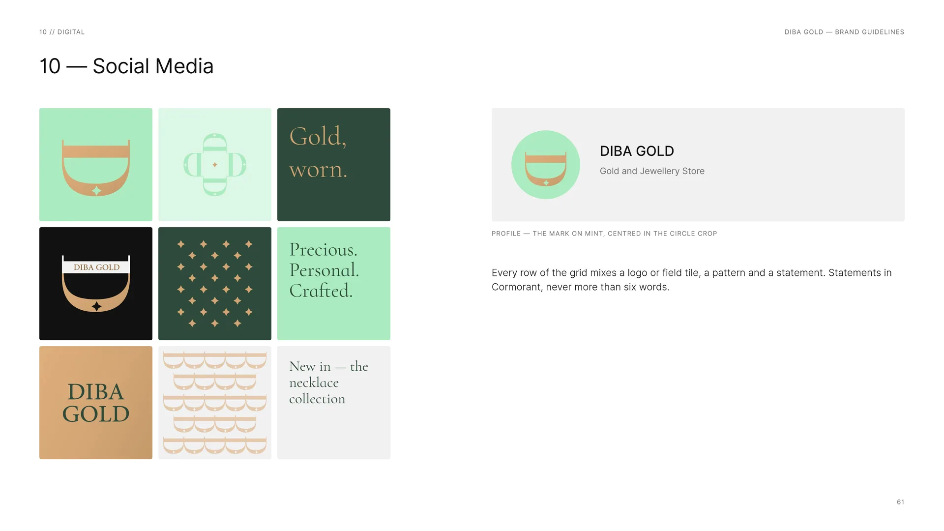
Every row of the grid mixes a logo or field tile, a pattern and a statement. Statements in Cormorant, never more than six words.
Profile — the mark on mint, centred in the circle crop.
10.2
E-mail & Tokens
Name: Inter Medium 14 px.
Role: Inter Light 13 px.
Phone · e-mail: Inter Light 13 px, deep gold.
Descriptor: Gold and Jewellery Store.
E-mail signature — horizontal logo 40 px high as a hosted image, every other line live text.
Tokens: --color-mint #AAEBC0 · --color-gold #D3A574 · --color-deep-gold #8C6436 · --color-green #2E4A3A · --color-ink #111111 · --color-pearl #F1F1F1 · --font-display Cormorant Infant · --font-text Inter · --radius 4px · --space-unit 8px.
11
Retail & display
Counters, trays and cards: the store at arm’s length.
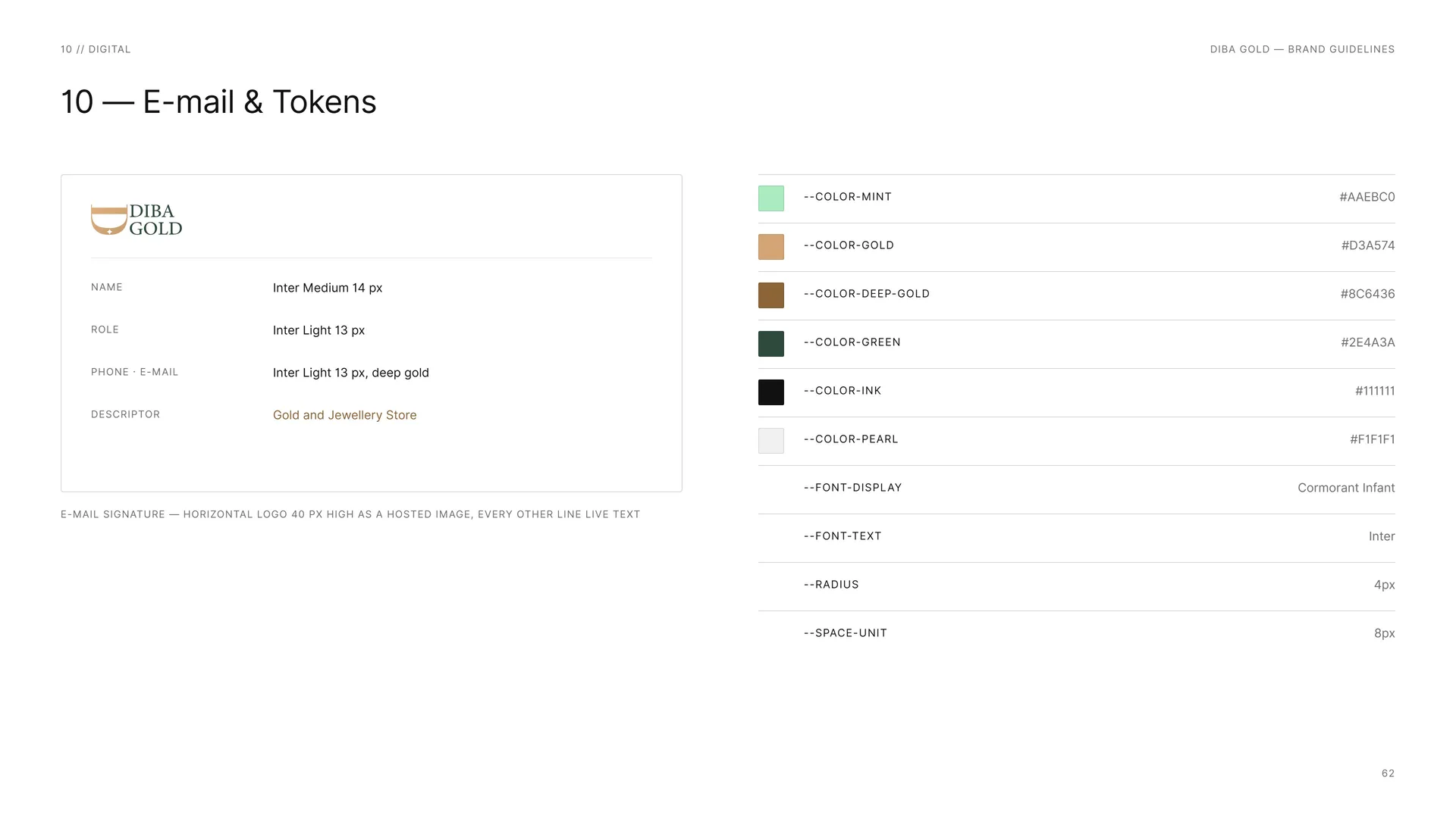
Reception wall — horizontal logo in polished rose-gold letters.
11.1
Counter & Tray
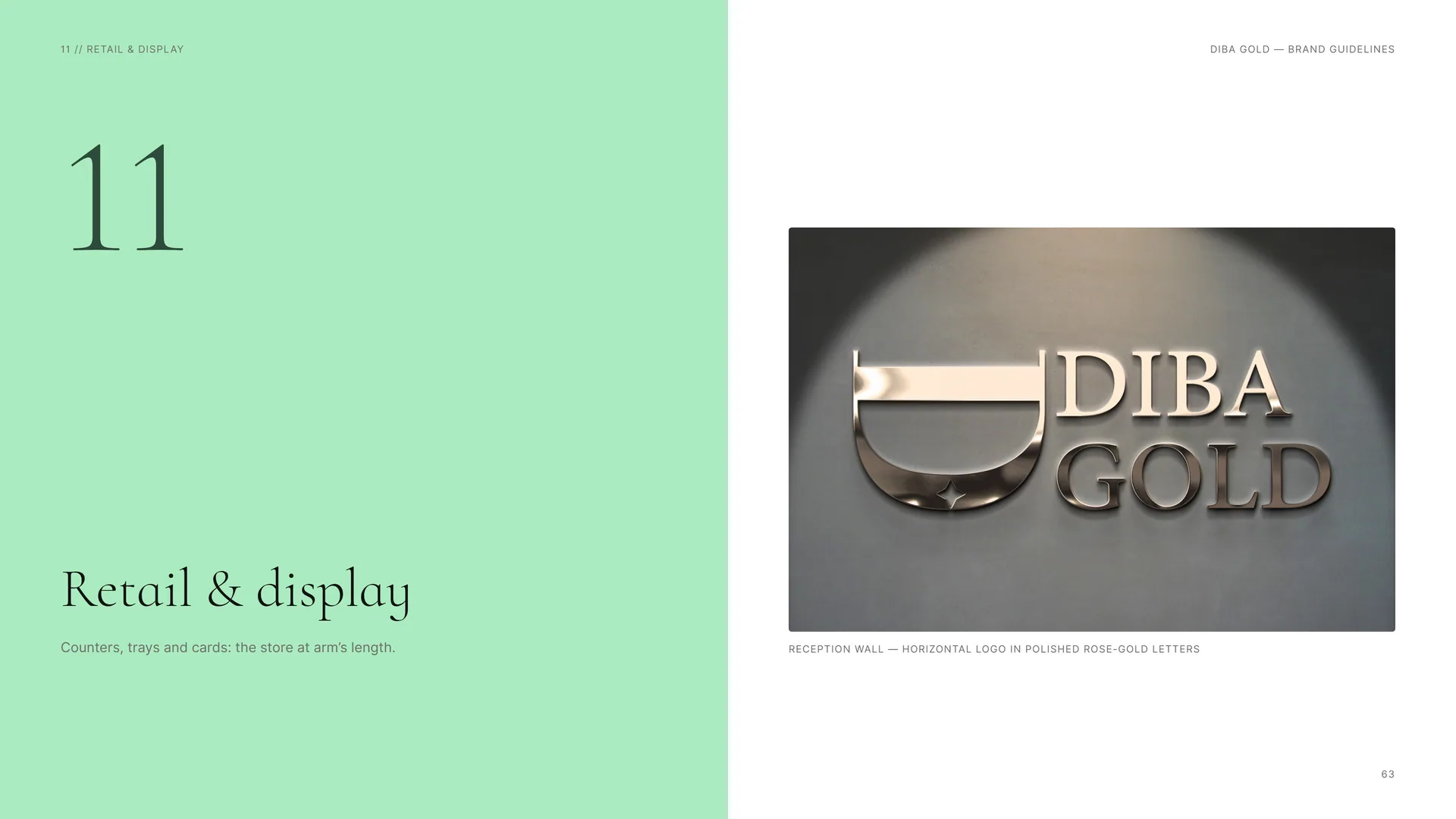
Every surface the customer touches carries the mark once and the piece once. Prices and carats in Inter Medium caps; nothing else competes with the jewellery.
Display tray — mint velvet in a deep-green frame, one-line logo in gold.
Counter card — mark + piece details.
Price tag — gold card, ink mark and text.
12
Signage & environment
The shop front, the window and the plaque.
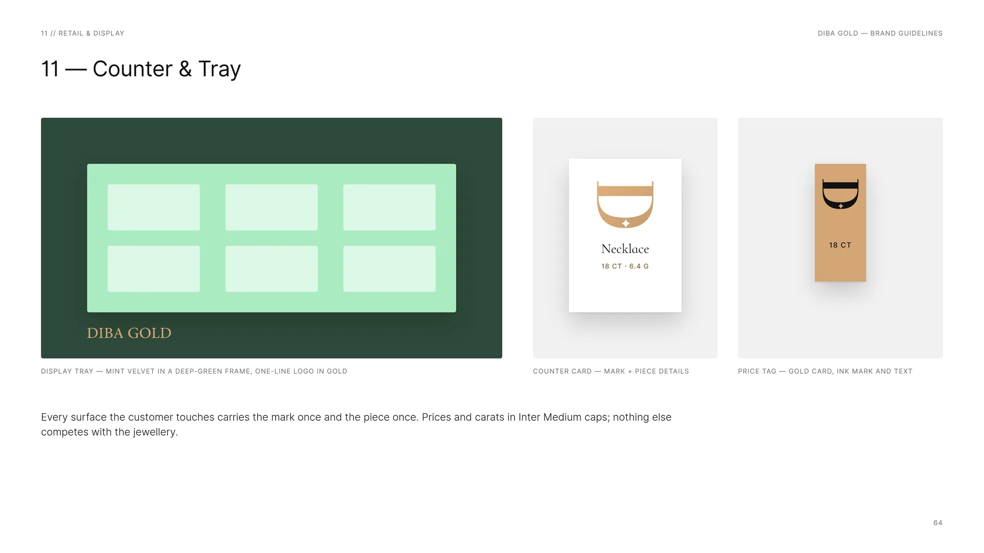
Fascia and projecting sign — horizontal logo and mark in gold on deep green.
12.1
Signage
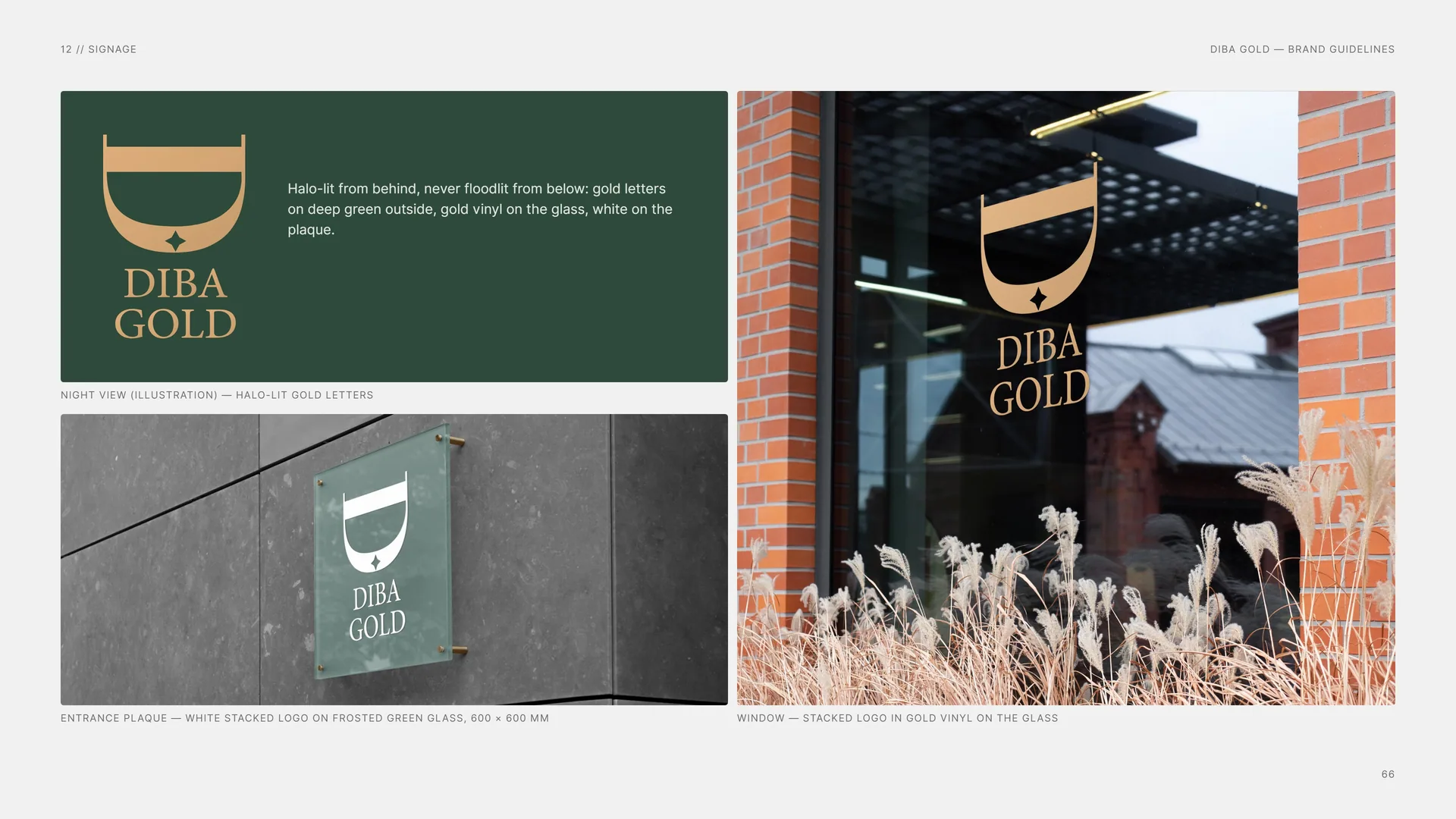
Halo-lit from behind, never floodlit from below: gold letters on deep green outside, gold vinyl on the glass, white on the plaque.
Night view (illustration) — halo-lit gold letters.
Entrance plaque — white stacked logo on frosted green glass, 600 × 600 mm.
Window — stacked logo in gold vinyl on the glass.
12.2
Signage System
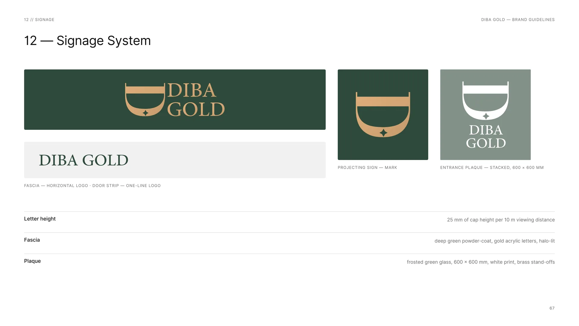
Fascia — horizontal logo · door strip — one-line logo.
Projecting sign — mark.
Entrance plaque — stacked, 600 × 600 mm.
Letter height: 25 mm of cap height per 10 m viewing distance.
Fascia: deep green powder-coat, gold acrylic letters, halo-lit.
Plaque: frosted green glass, 600 × 600 mm, white print, brass stand-offs.
13
The system
13.1
The System at a Glance
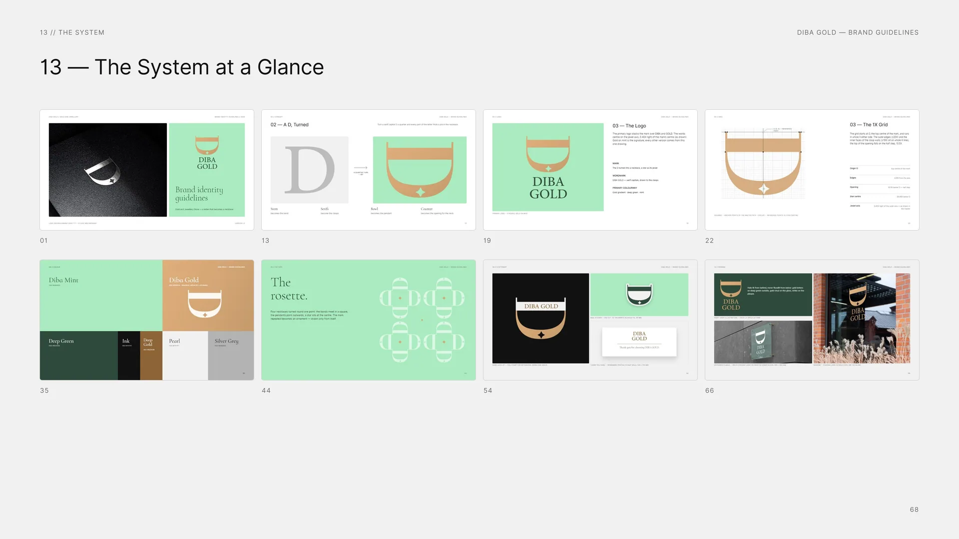
01 · 13 · 19 · 22 · 35 · 44 · 54 · 66.
14
Files
14.1
Files
Logo — master: AI · PDF · SVG — stacked, horizontal, mark, wordmark, one line, band lock-up.
Logo — screen: PNG · SVG — every colourway, transparent.
Colour: ASE · PDF — screen and coated print values.
Pattern: AI · SVG — rosette, chain and star fields.
Fonts: Cormorant Infant · Inter — open licences (OFL).
Guidelines: PDF — this document.
Photos: Wikimedia Commons, CC0 / public domain.
Gold and jewellery store.
14.2
Thank you
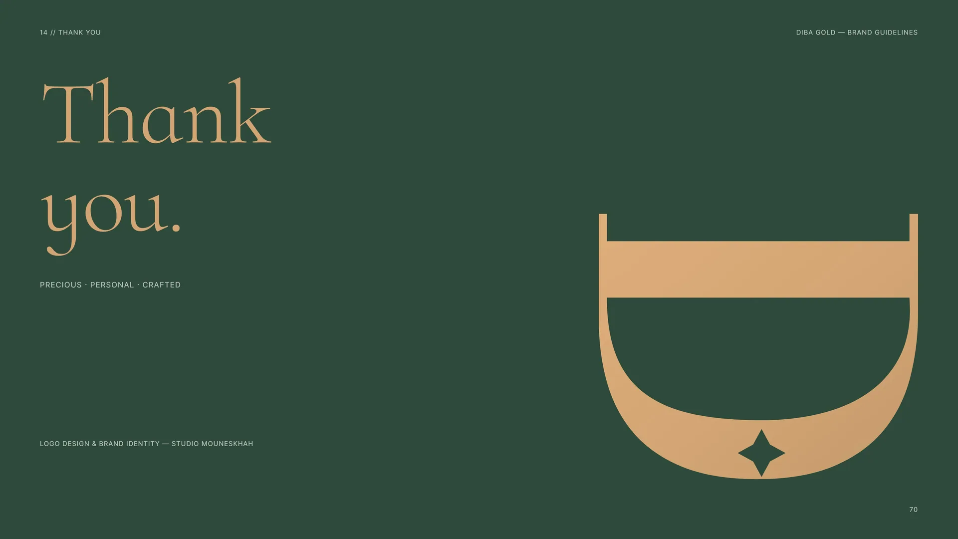
Thank you.
Precious · Personal · Crafted.
Logo design & brand identity — Studio Mouneskhah.