AKOPET Brand Identity Guidelines
AKOPET is a pet services brand: veterinary care, pet food supply, grooming, training and online pet adoption — one comprehensive resource for owners of dogs, cats, ornamental fish and birds.
It is not just a service centre but a caring, compassionate space for pets. Its identity joins the body and scales of a fish with the snout of a dog or a cat — the breadth of AKOPET’s care in one sign.
- Yıl
- 2022
- Müşteri
- AKOPET
- Alan
- Pet services brand
- Hizmetler
- Görsel kimlik
- Proje
- Brand Identity Guidelines · v1.0 · 2026
00
Introduction
00.1
Brand Concept
AKOPET is a pet services brand: veterinary care, pet food supply, grooming, training and online pet adoption — one comprehensive resource for owners of dogs, cats, ornamental fish and birds.
It is not just a service centre but a caring, compassionate space for pets. Its identity joins the body and scales of a fish with the snout of a dog or a cat — the breadth of AKOPET’s care in one sign.
Brand idea: Love, care, repeat. Every pet cherished as a member of the family — the same warmth, every visit, every day.
Brand essence: Fish × Snout.
Brand promise: Every pet cherished, cared for, loved.
Core values: Compassion × Innovation × Quality.
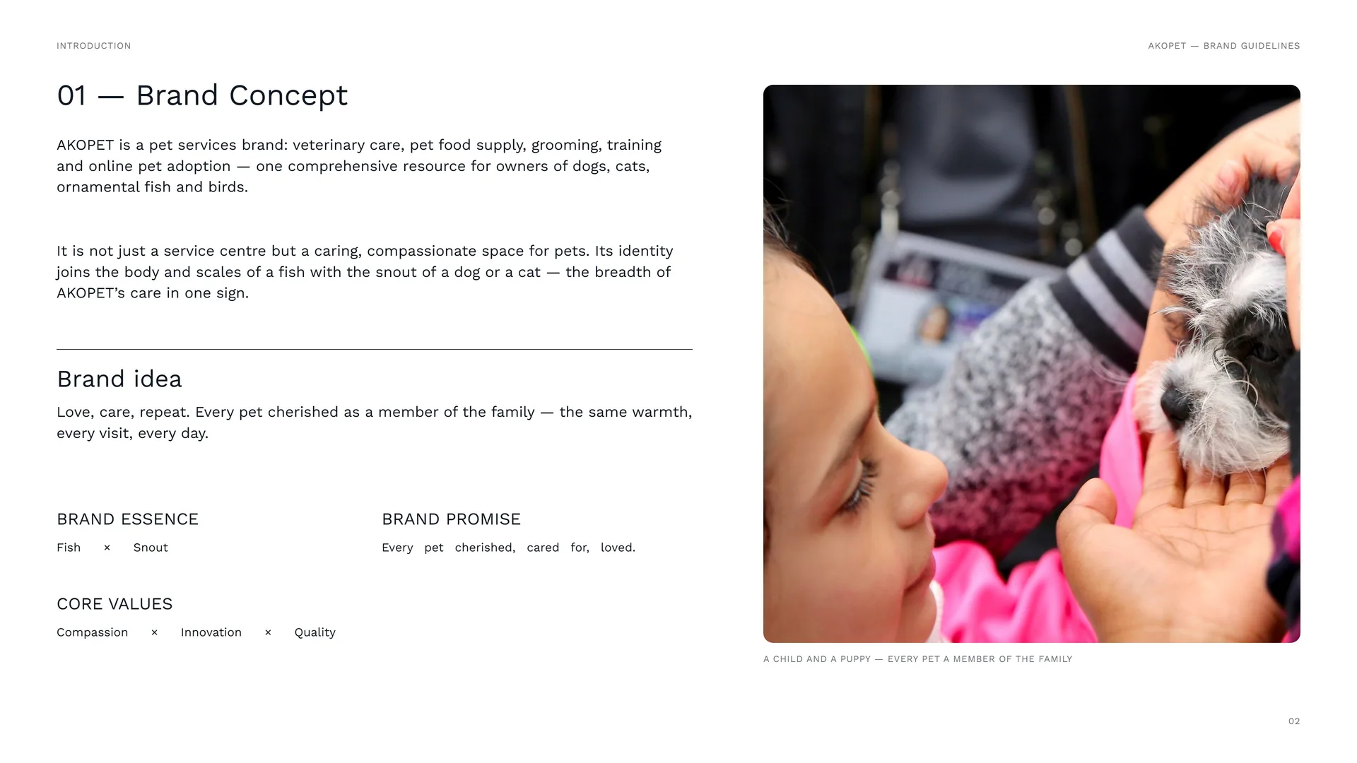
A child and a puppy — every pet a member of the family.
00.2
The Brand Problem
Pet owners have had to piece care together — a vet in one place, food in another, grooming, training and adoption somewhere else. The deep bond between people and their animals deserved one place where pets are cared for and celebrated as family.
The challenge: Care split across many providers · The stress of navigating them all · Different needs for dogs, cats, fish and birds · Pets treated as customers, not family.
Brand positioning: A comprehensive, compassionate pet-care brand: everything under one roof, for every kind of pet.
The opportunity: To make pet ownership enriching and worry-free — through diverse services and a strong community presence.
The shift: From many providers → one caring home for every pet.
00.3
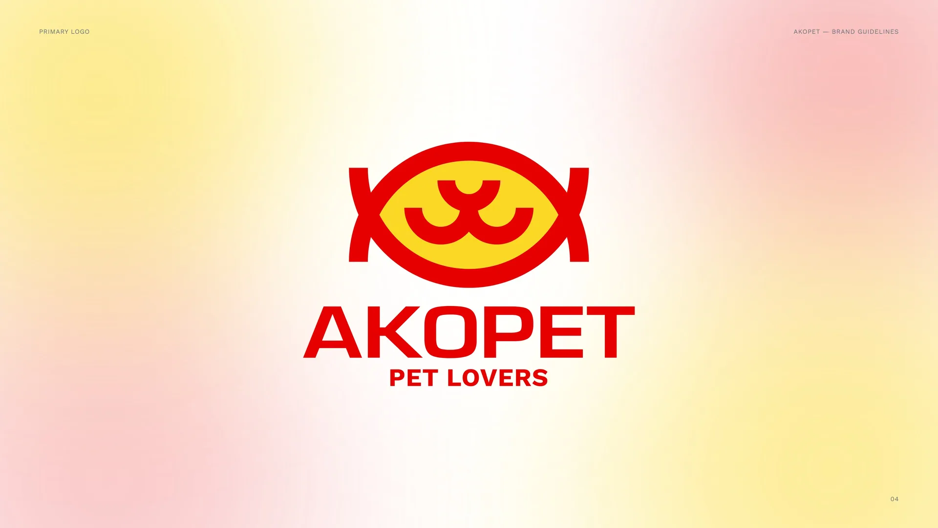
Primary logo
01
Brand
- 01.1History of the brand
- 01.2Mission & Vision
- 01.3Brand Values
- 01.4Tone of Voice
- 01.5Brand lines
- 01.6Services & the Pets We Serve
01.1
History of the brand
Founded to redefine the way people care for their pets.
Love, care, repeat.
AKOPET began with veterinary care and grooming and grew into premium pet food, professional training and an online adoption platform — a trusted community hub for dogs, cats, ornamental fish and birds. More than a provider: a movement for the happiness of pets and their owners.
akopet.co
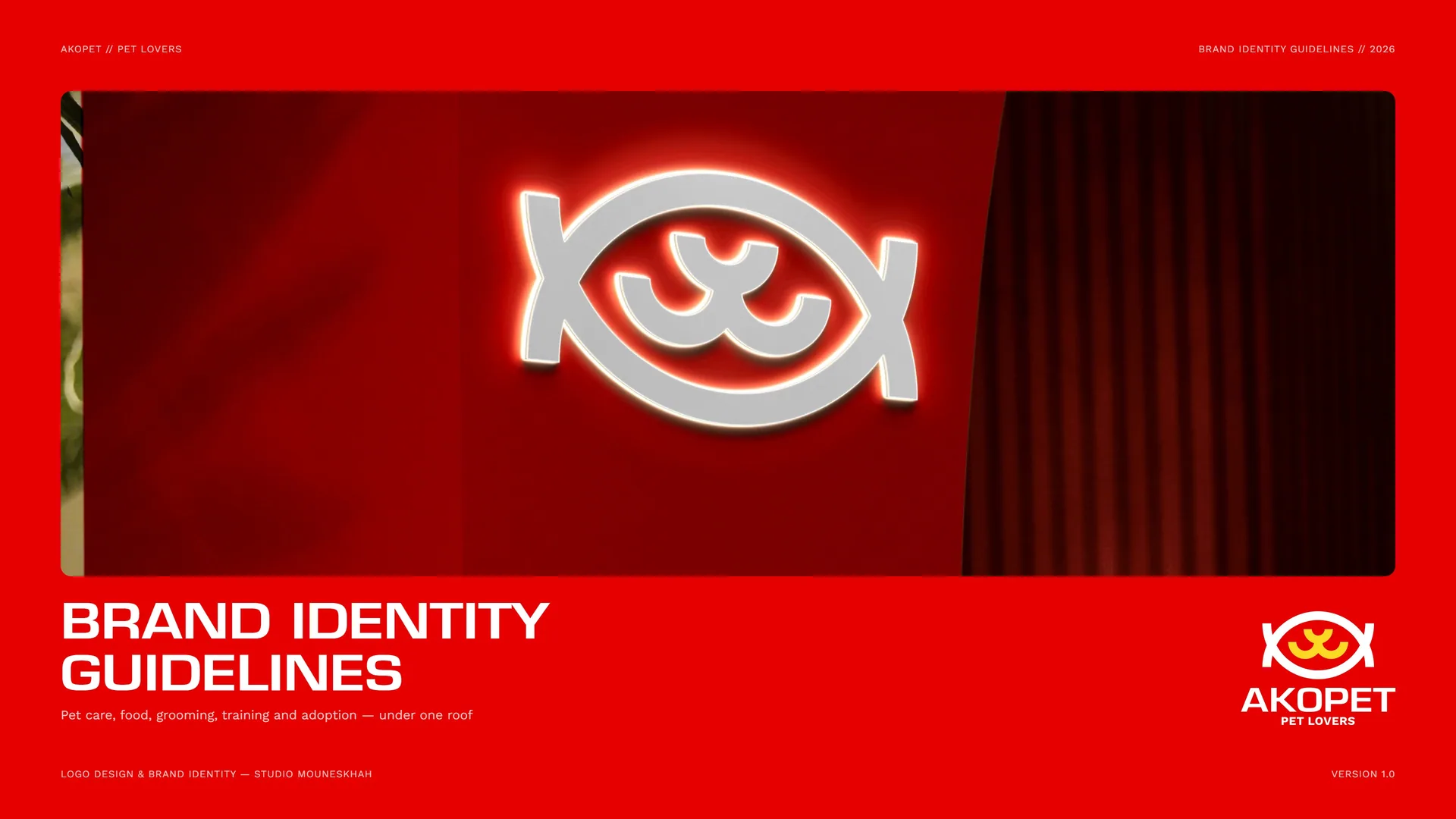
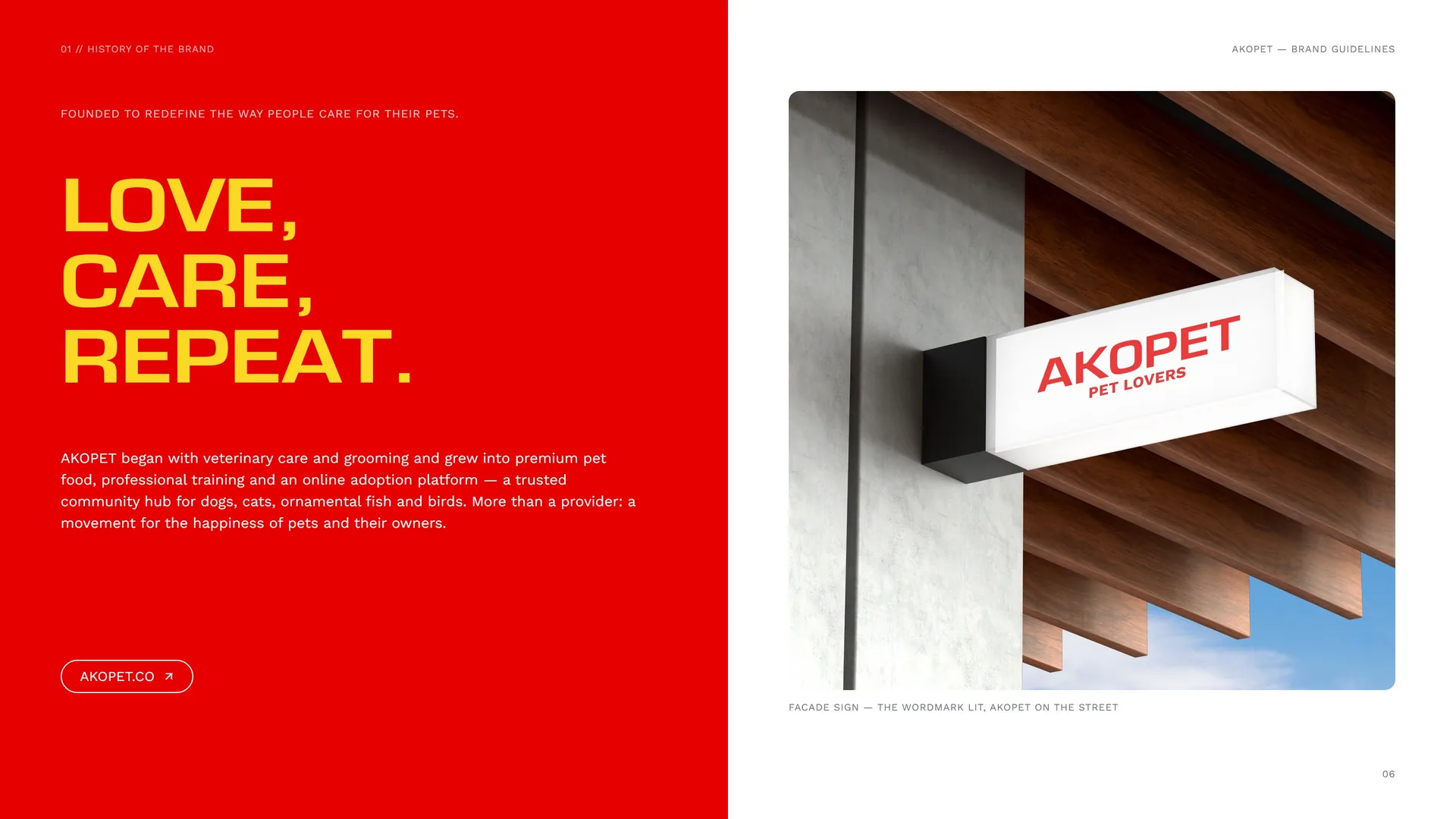
Facade sign — the wordmark lit, AKOPET on the street.
01.2
Mission & Vision
Mission: To enhance the lives of pets and their owners with a comprehensive range of high-quality, compassionate and innovative services — a loving environment where pets are cared for as family members.
Their health, happiness and well-being come first. Through diverse services and a strong community presence, we make pet ownership enriching and worry-free.
Vision: A world where every pet is cherished, cared for and loved — and AKOPET the most trusted, best-loved pet care brand, setting new standards in quality and innovation.
We aim to empower owners with the knowledge, tools and resources for happy, healthy pets, while staying committed to sustainability, community building and the needs of every species we serve.
01.3
Brand Values
The principles behind every service, every product and every conversation with a pet owner.
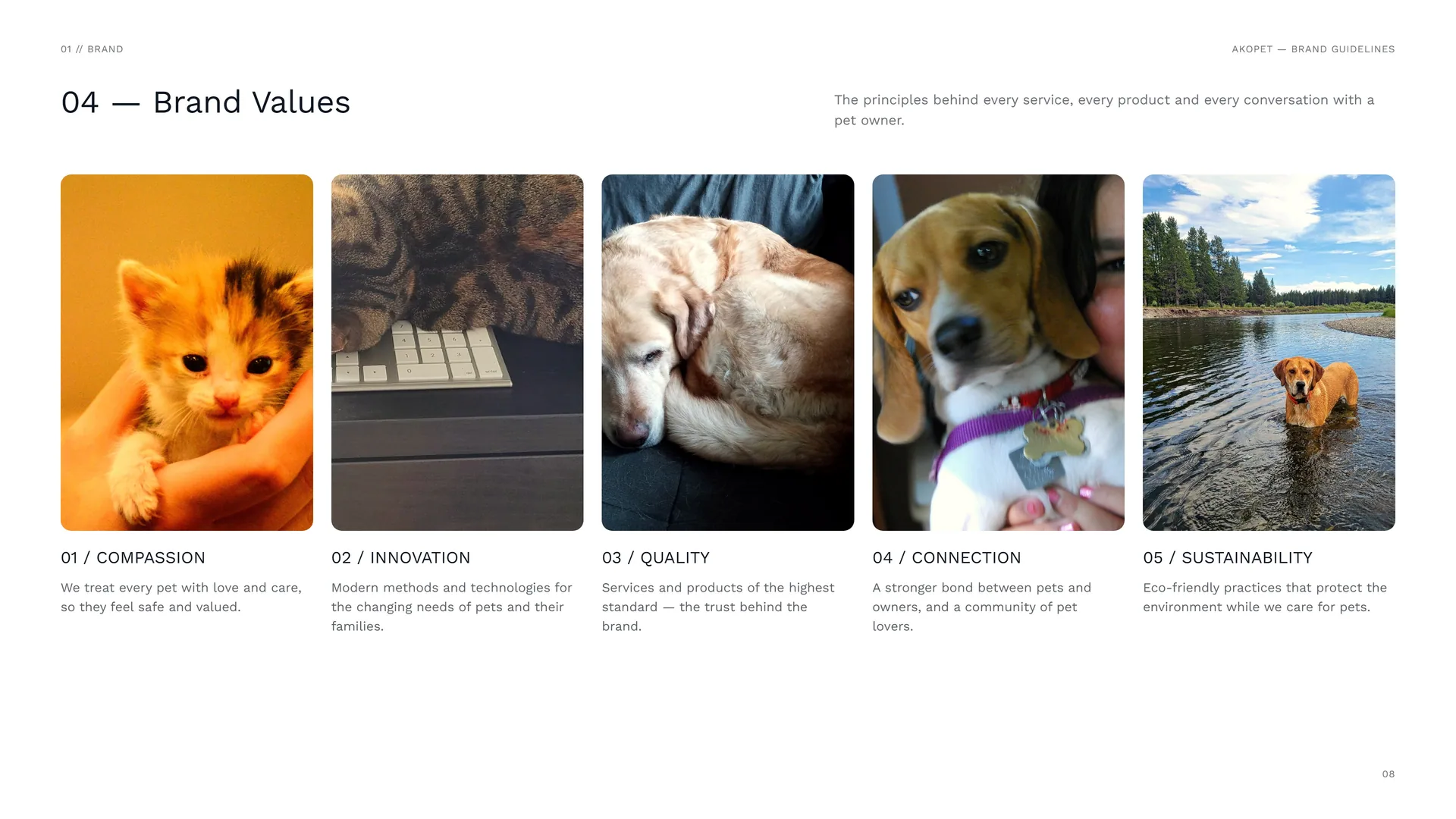
Compassion: We treat every pet with love and care, so they feel safe and valued.
Innovation: Modern methods and technologies for the changing needs of pets and their families.
Quality: Services and products of the highest standard — the trust behind the brand.
Connection: A stronger bond between pets and owners, and a community of pet lovers.
Sustainability: Eco-friendly practices that protect the environment while we care for pets.
01.4
Tone of Voice
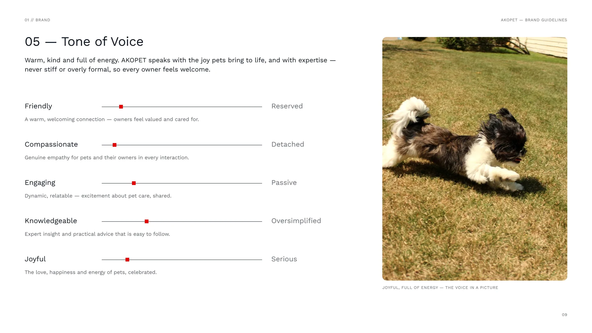
Warm, kind and full of energy. AKOPET speaks with the joy pets bring to life, and with expertise — never stiff or overly formal, so every owner feels welcome.
Friendly: A warm, welcoming connection — owners feel valued and cared for.
Compassionate: Genuine empathy for pets and their owners in every interaction.
Engaging: Dynamic, relatable — excitement about pet care, shared.
Knowledgeable: Expert insight and practical advice that is easy to follow.
Joyful: The love, happiness and energy of pets, celebrated.
Reserved · Detached · Passive · Oversimplified · Serious.
Joyful, full of energy — the voice in a picture.
01.5
Brand lines
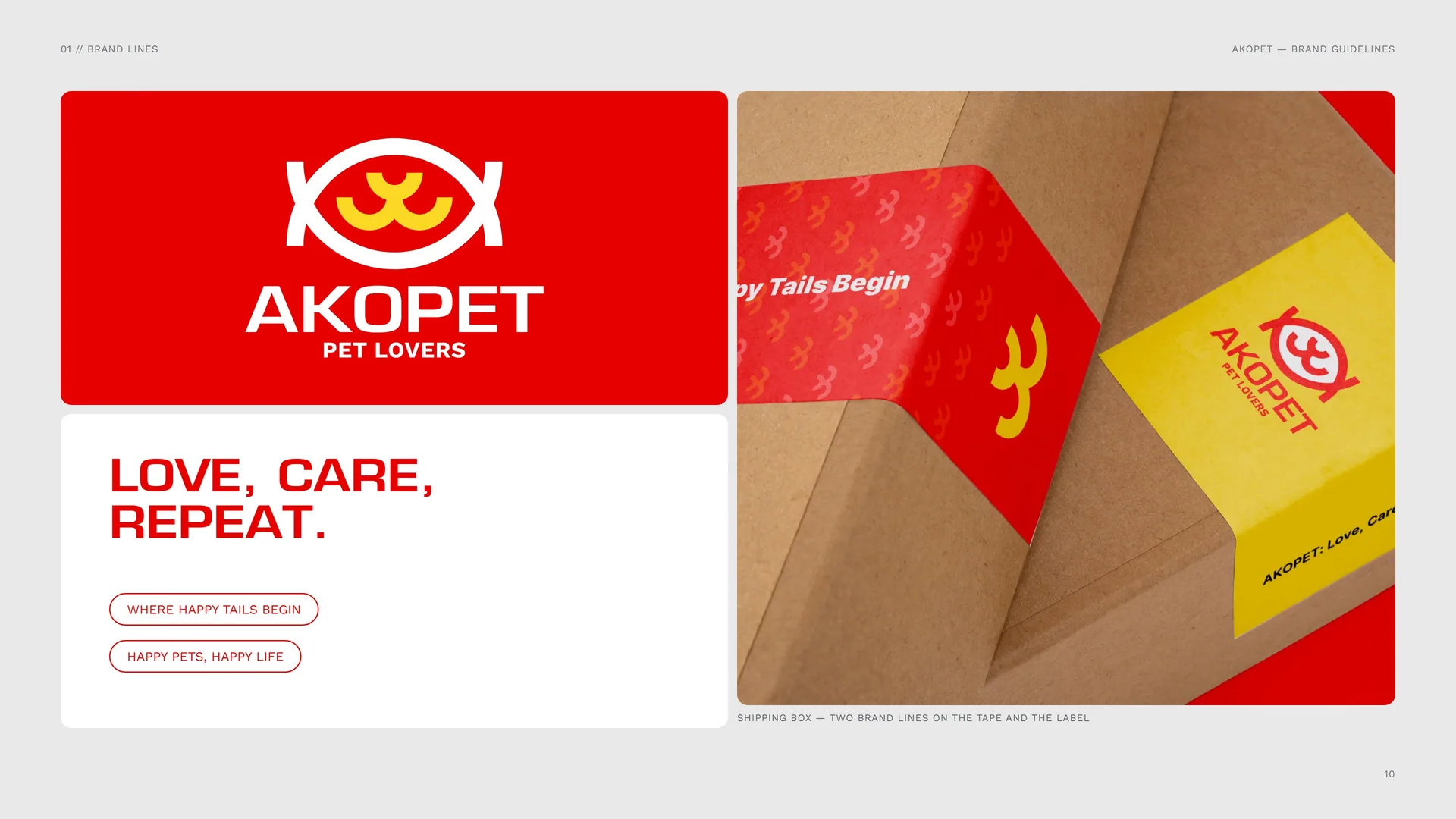
Love, care, repeat.
Where happy tails begin · Happy pets, happy life.
Shipping box — two brand lines on the tape and the label.
01.6
Services & the Pets We Serve
Services.
Veterinary care: Health checks, treatment and prevention.
Pet food supply: Premium, nutritious and balanced meals.
Pet grooming: Hygiene, comfort and care for every coat.
Training: Professional training for a happy home.
Online pet adoption: A platform that finds pets a family.
The pets we serve — and where they live in the mark.
Dogs — in the mark: the snout.
Cats — in the mark: the snout.
Ornamental fish — in the mark: the body and its scales.
Birds — in the mark: the colours — energy and joy.
02
Concept
- 02.1Fish + Snout = One Mark
- 02.2Logo Meaning
- 02.3Two rings, one fish
- 02.4One lobe, two cheeks
- 02.5The ring, repeated
- 02.6Where happy tails begin
- 02.7The Mark in Motion
02.1
Fish + Snout = One Mark
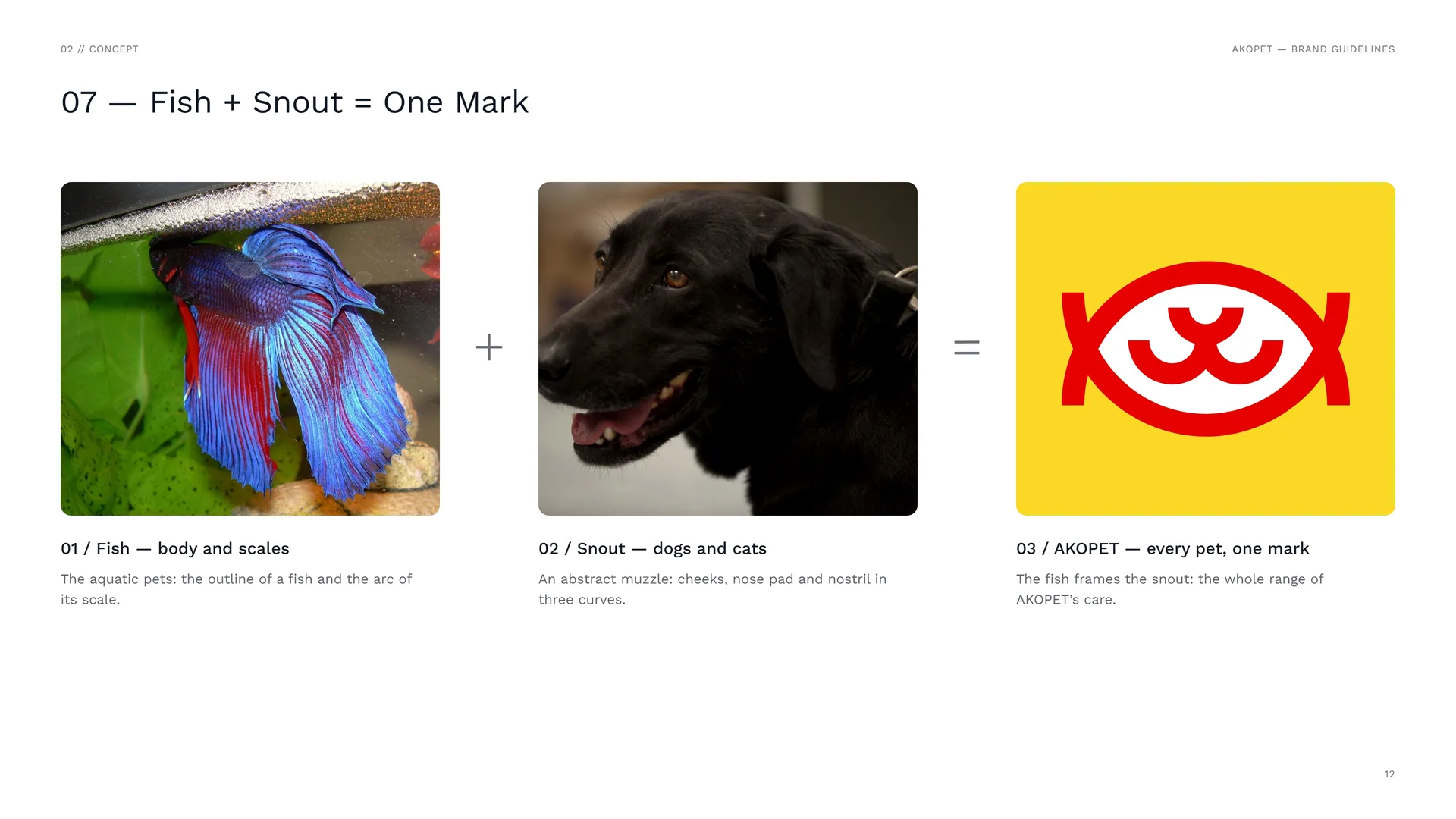
Fish — body and scales: The aquatic pets: the outline of a fish and the arc of its scale.
Snout — dogs and cats: An abstract muzzle: cheeks, nose pad and nostril in three curves.
AKOPET — every pet, one mark: The fish frames the snout: the whole range of AKOPET’s care.
02.2
Logo Meaning
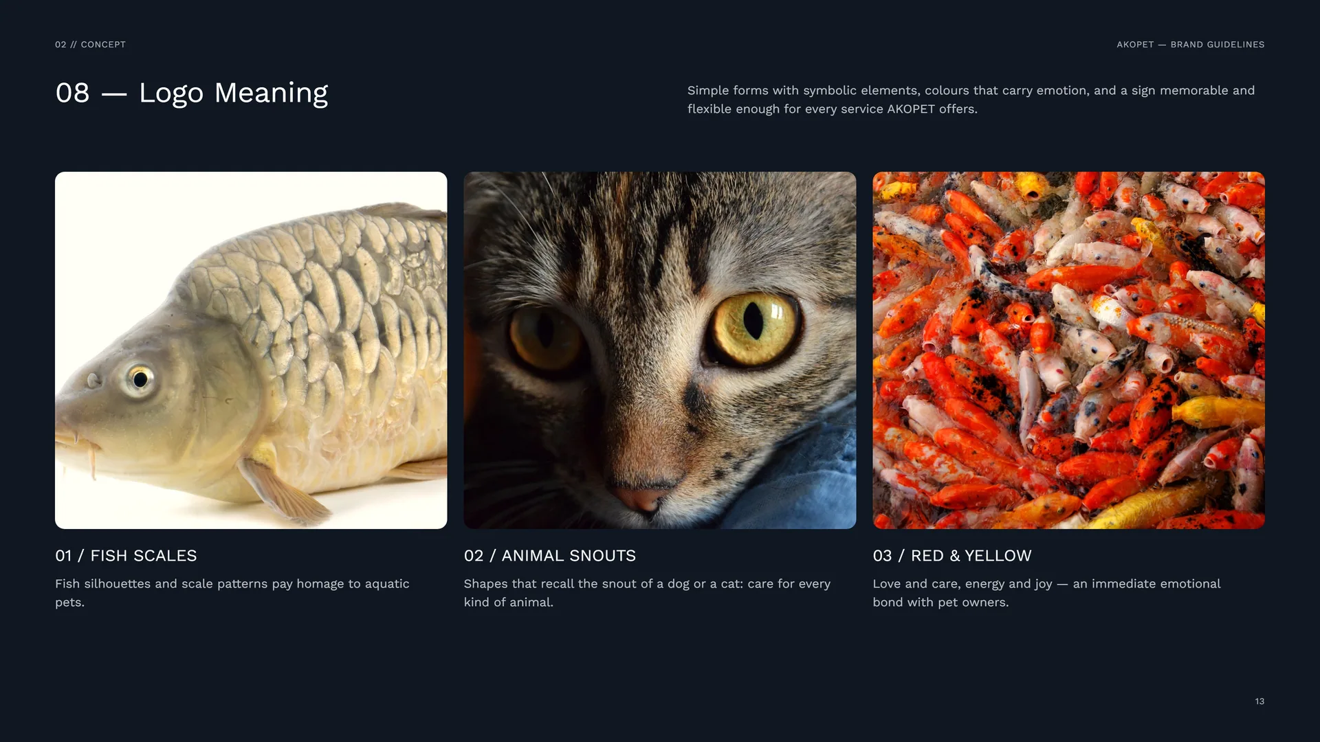
Simple forms with symbolic elements, colours that carry emotion, and a sign memorable and flexible enough for every service AKOPET offers.
Fish scales: Fish silhouettes and scale patterns pay homage to aquatic pets.
Animal snouts: Shapes that recall the snout of a dog or a cat: care for every kind of animal.
Red & yellow: Love and care, energy and joy — an immediate emotional bond with pet owners.
02.3
Two rings, one fish
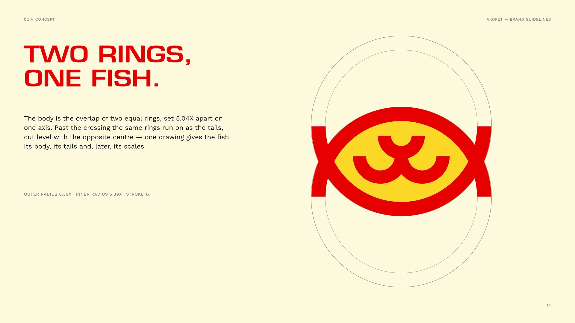
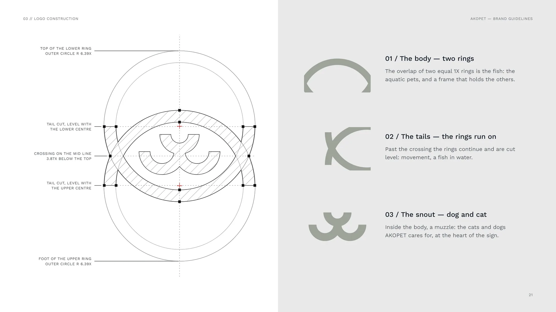
The body is the overlap of two equal rings, set 5.04X apart on one axis. Past the crossing the same rings run on as the tails, cut level with the opposite centre — one drawing gives the fish its body, its tails and, later, its scales.
Outer radius 6.39X · inner radius 5.39X · stroke 1X.
02.4
One lobe, two cheeks
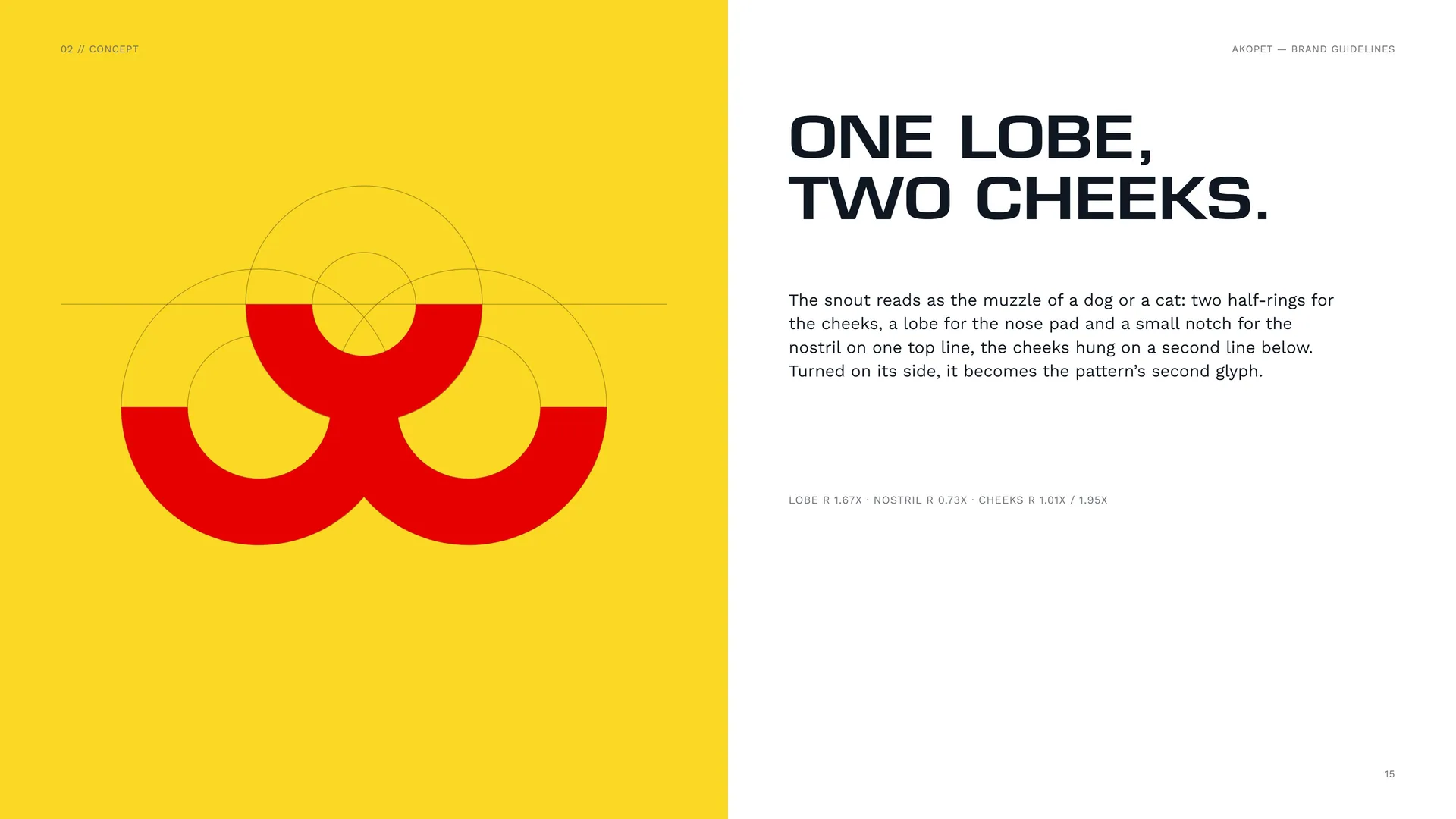
The snout reads as the muzzle of a dog or a cat: two half-rings for the cheeks, a lobe for the nose pad and a small notch for the nostril on one top line, the cheeks hung on a second line below. Turned on its side, it becomes the pattern’s second glyph.
Lobe R 1.67X · nostril R 0.73X · cheeks R 1.01X / 1.95X.
02.5
The ring, repeated
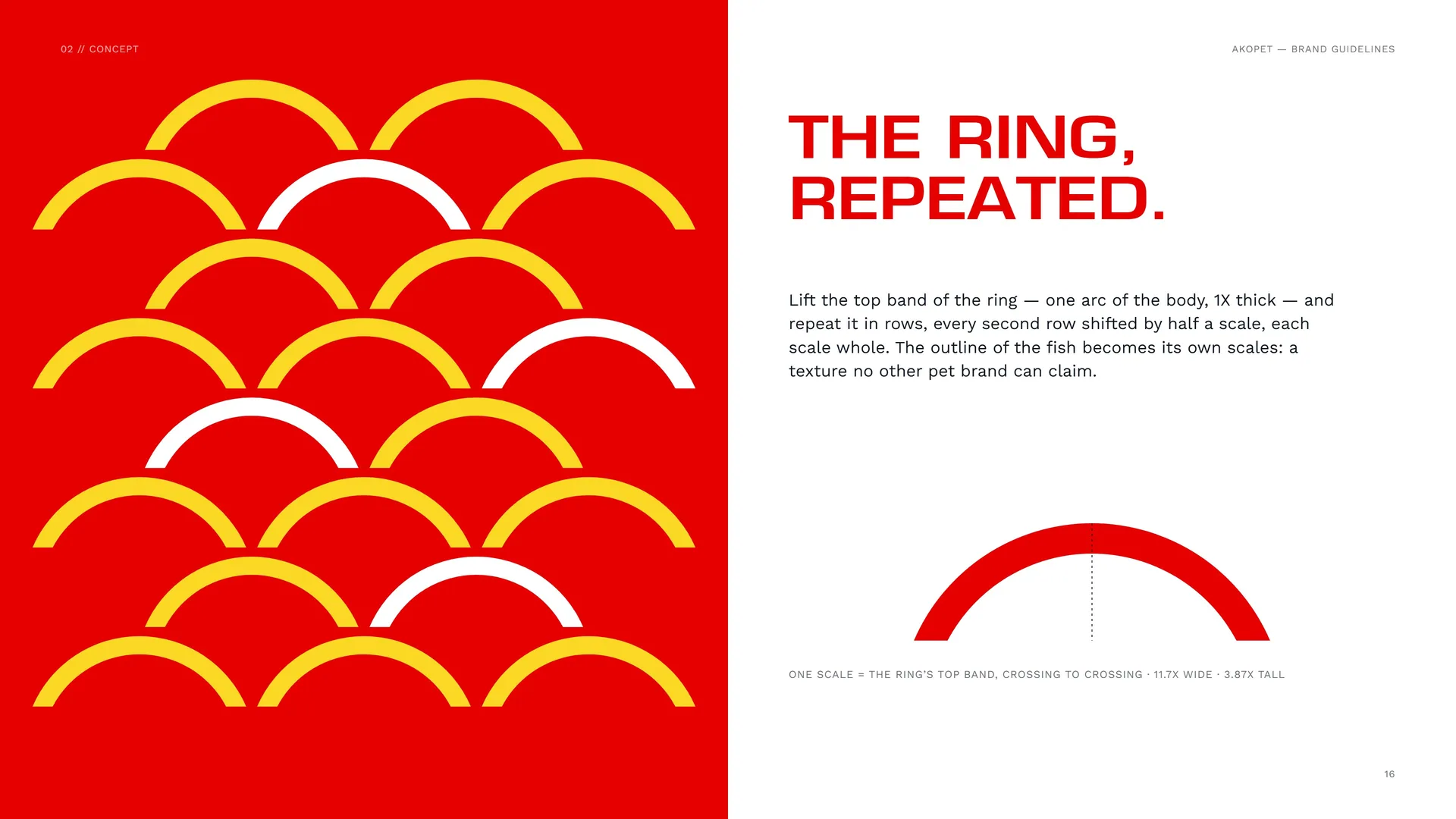
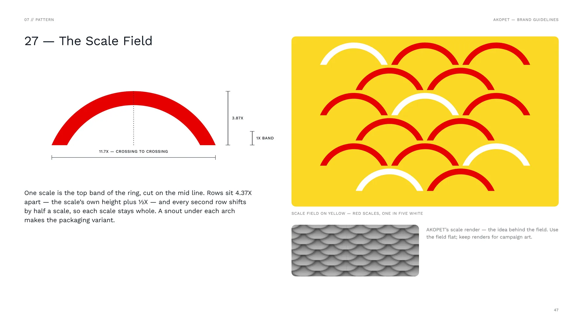
Lift the top band of the ring — one arc of the body, 1X thick — and repeat it in rows, every second row shifted by half a scale, each scale whole. The outline of the fish becomes its own scales: a texture no other pet brand can claim.
One scale = the ring’s top band, crossing to crossing · 11.7X wide · 3.87X tall.
02.6
Where happy tails begin
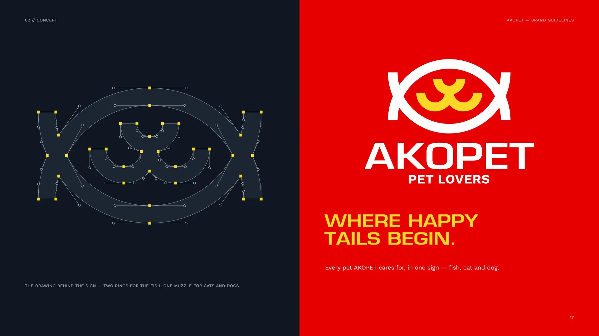
The drawing behind the sign — two rings for the fish, one muzzle for cats and dogs.
Every pet AKOPET cares for, in one sign — fish, cat and dog.
02.7
The Mark in Motion
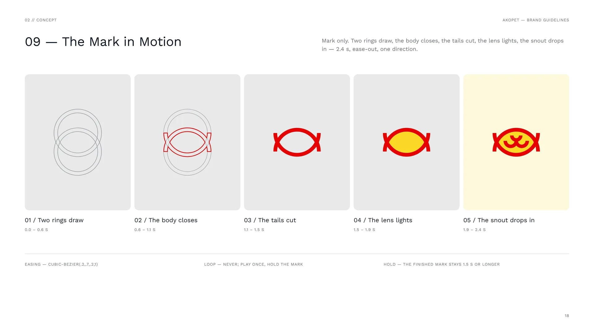
Mark only. Two rings draw, the body closes, the tails cut, the lens lights, the snout drops in — 2.4 s, ease-out, one direction.
Two rings draw: 0.0 – 0.6 s.
The body closes: 0.6 – 1.1 s.
The tails cut: 1.1 – 1.5 s.
The lens lights: 1.5 – 1.9 s.
The snout drops in: 1.9 – 2.4 s.
Easing — cubic-bezier(.2,.7,.2,1).
Loop — never; play once, hold the mark.
Hold — the finished mark stays 1.5 s or longer.
03
Logo & grid
- 03.1Primary logo — the full logo, stacked
- 03.2Logo variations
- 03.3Logo construction
- 03.4The 1X Grid
- 03.5The Snout
- 03.6Wordmark
- 03.7Love, care, repeat
- 03.8Stacked Proportions
- 03.9Clear Space
03.1
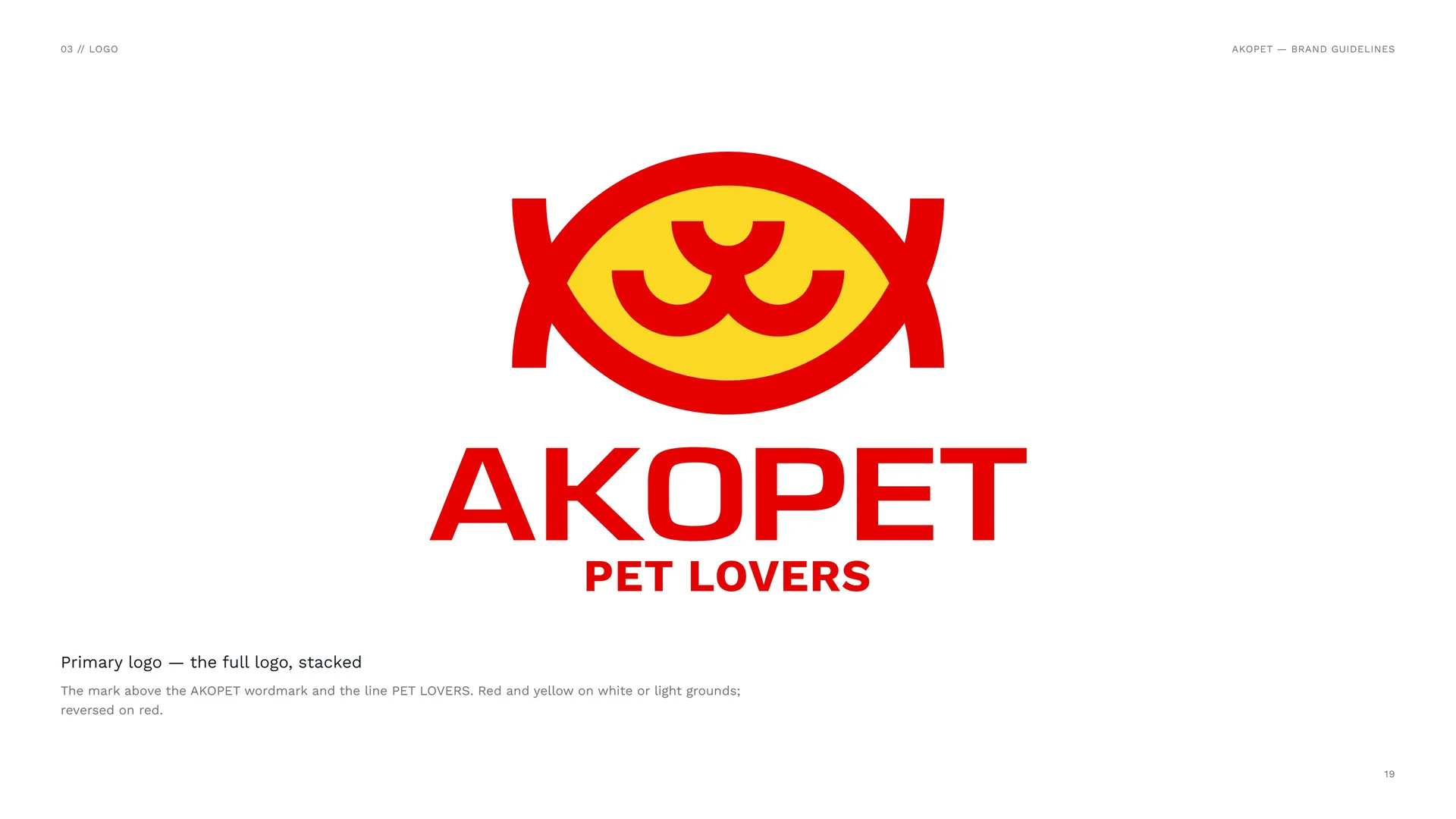
Primary logo — the full logo, stacked
The mark above the AKOPET wordmark and the line PET LOVERS. Red and yellow on white or light grounds; reversed on red.
03.2
Logo variations
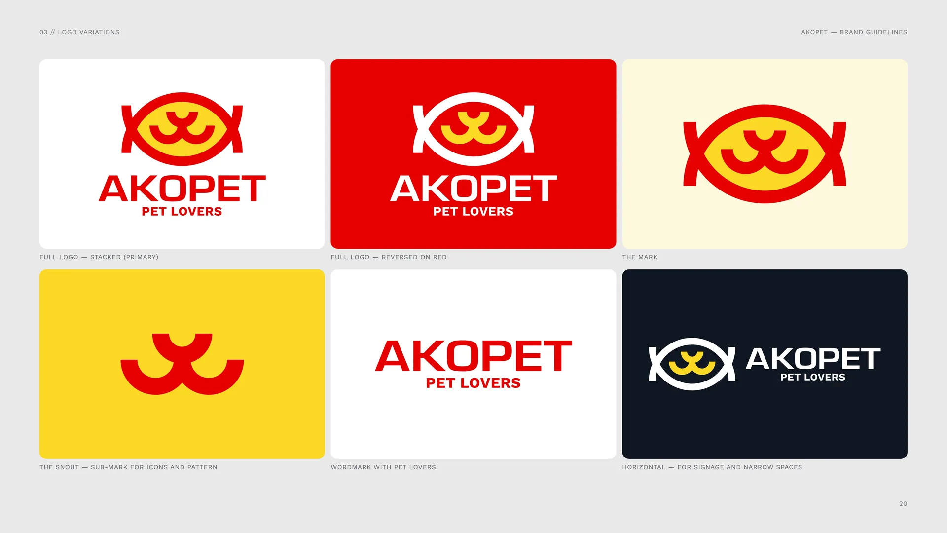
Full logo — stacked (primary).
Full logo — reversed on red.
The mark.
The snout — sub-mark for icons and pattern.
Wordmark with PET LOVERS.
Horizontal — for signage and narrow spaces.
03.3
Logo construction
The body — two rings: The overlap of two equal 1X rings is the fish: the aquatic pets, and a frame that holds the others.
The tails — the rings run on: Past the crossing the rings continue and are cut level: movement, a fish in water.
The snout — dog and cat: Inside the body, a muzzle: the cats and dogs AKOPET cares for, at the heart of the sign.
03.4
The 1X Grid
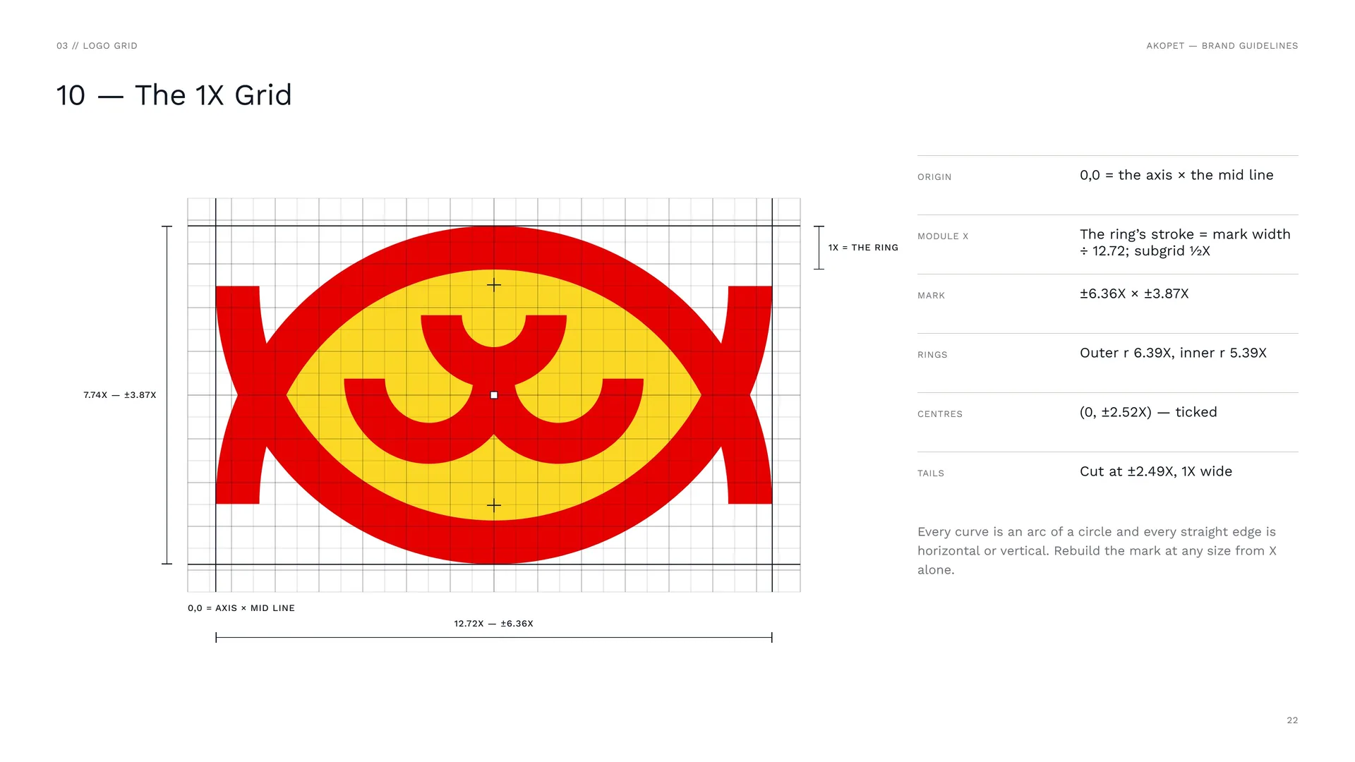
Origin: 0,0 = the axis × the mid line.
Module X: The ring’s stroke = mark width ÷ 12.72; subgrid ½X.
Mark: ±6.36X × ±3.87X.
Rings: Outer r 6.39X, inner r 5.39X.
Centres: (0, ±2.52X) — ticked.
Tails: Cut at ±2.49X, 1X wide.
Every curve is an arc of a circle and every straight edge is horizontal or vertical. Rebuild the mark at any size from X alone.
03.5
The Snout
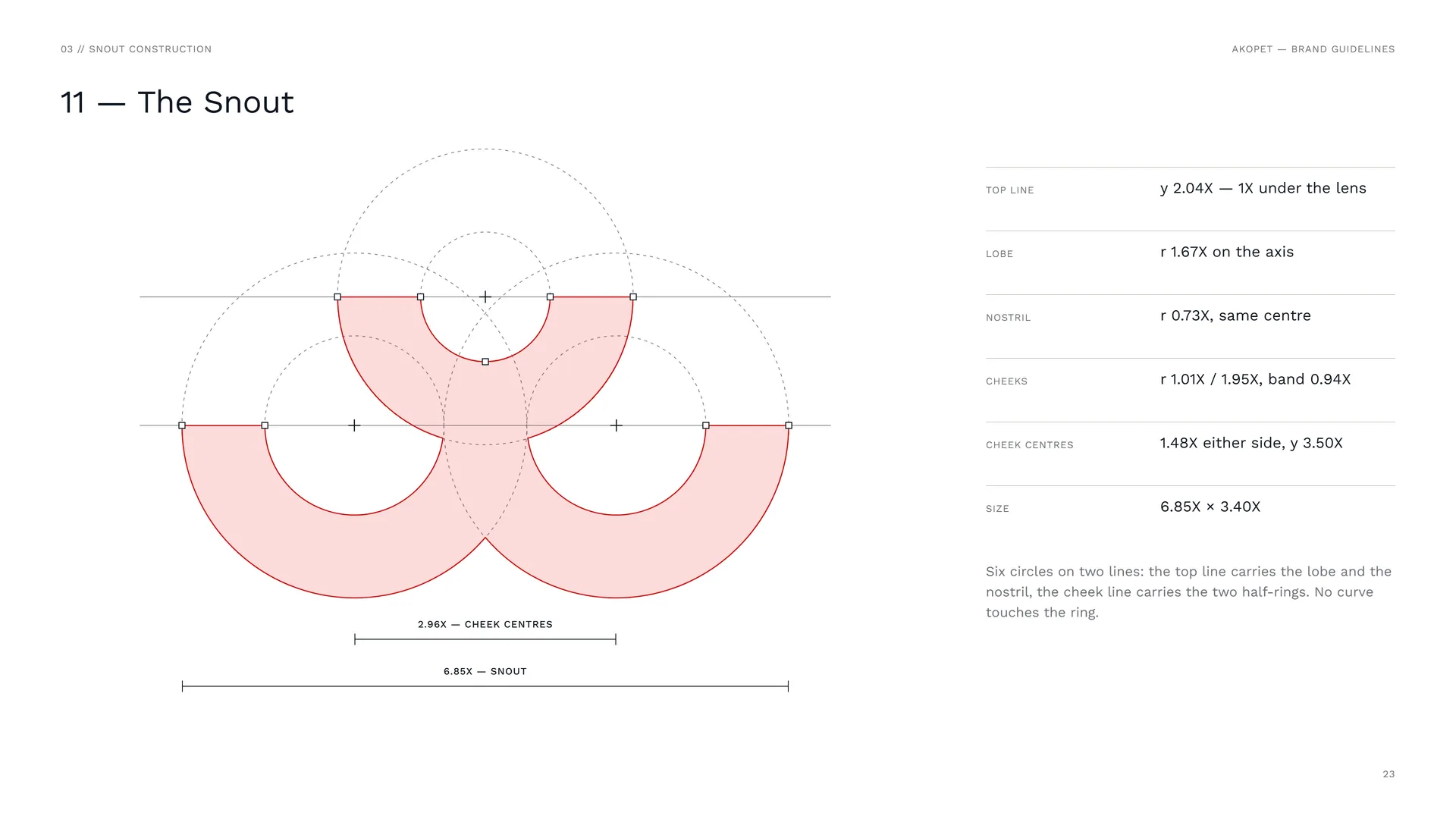
Top line: y 2.04X — 1X under the lens.
Lobe: r 1.67X on the axis.
Nostril: r 0.73X, same centre.
Cheeks: r 1.01X / 1.95X, band 0.94X.
Cheek centres: 1.48X either side, y 3.50X.
Size: 6.85X × 3.40X.
Six circles on two lines: the top line carries the lobe and the nostril, the cheek line carries the two half-rings. No curve touches the ring.
03.6
Wordmark
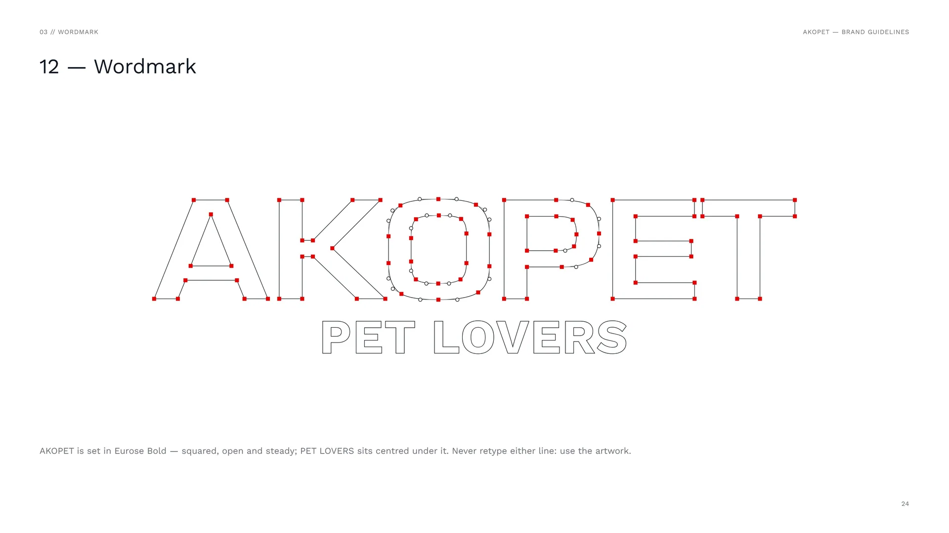
AKOPET is set in Eurose Bold — squared, open and steady; PET LOVERS sits centred under it. Never retype either line: use the artwork.
03.7
Love, care, repeat
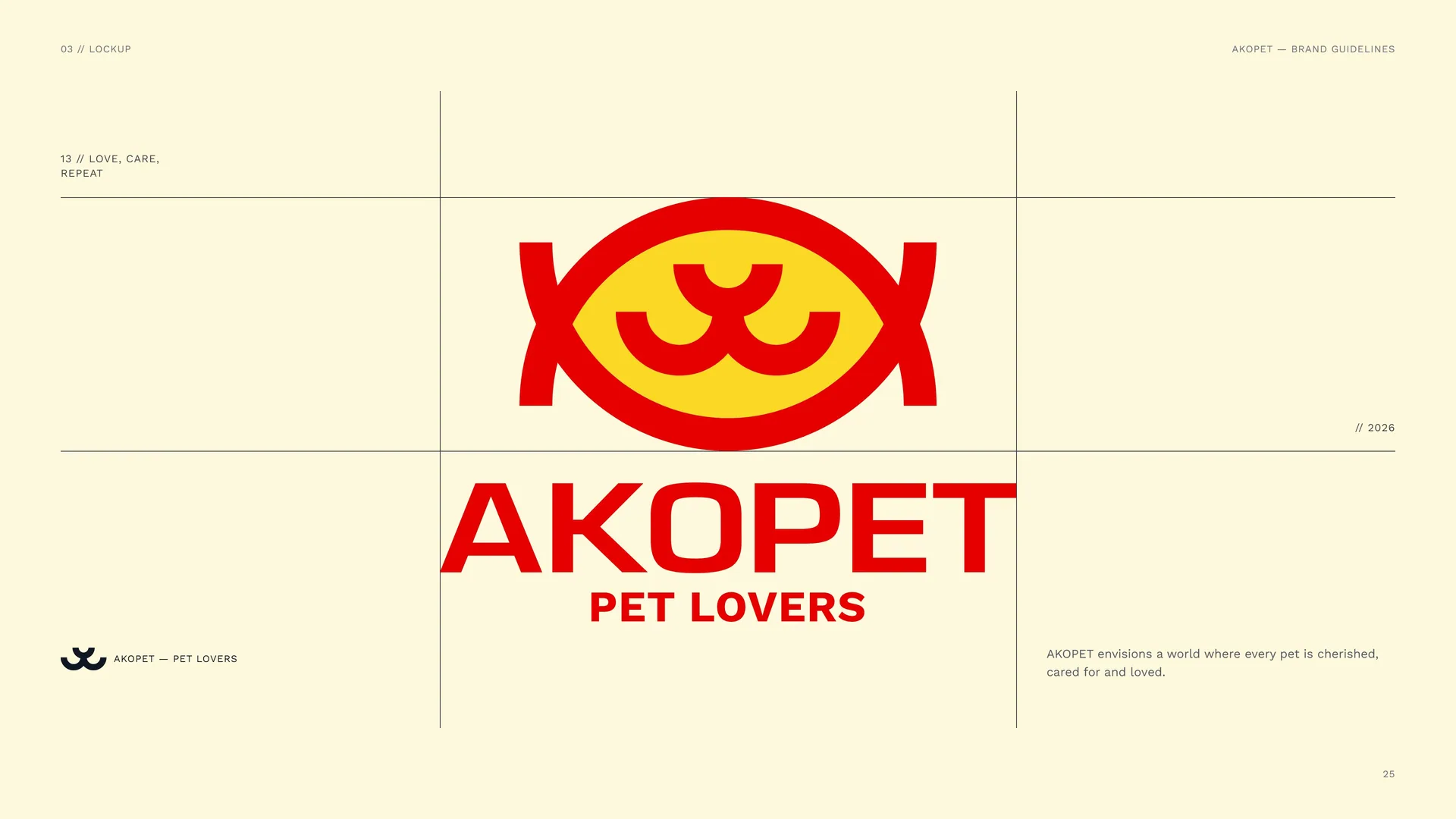
AKOPET envisions a world where every pet is cherished, cared for and loved.
03.8
Stacked Proportions
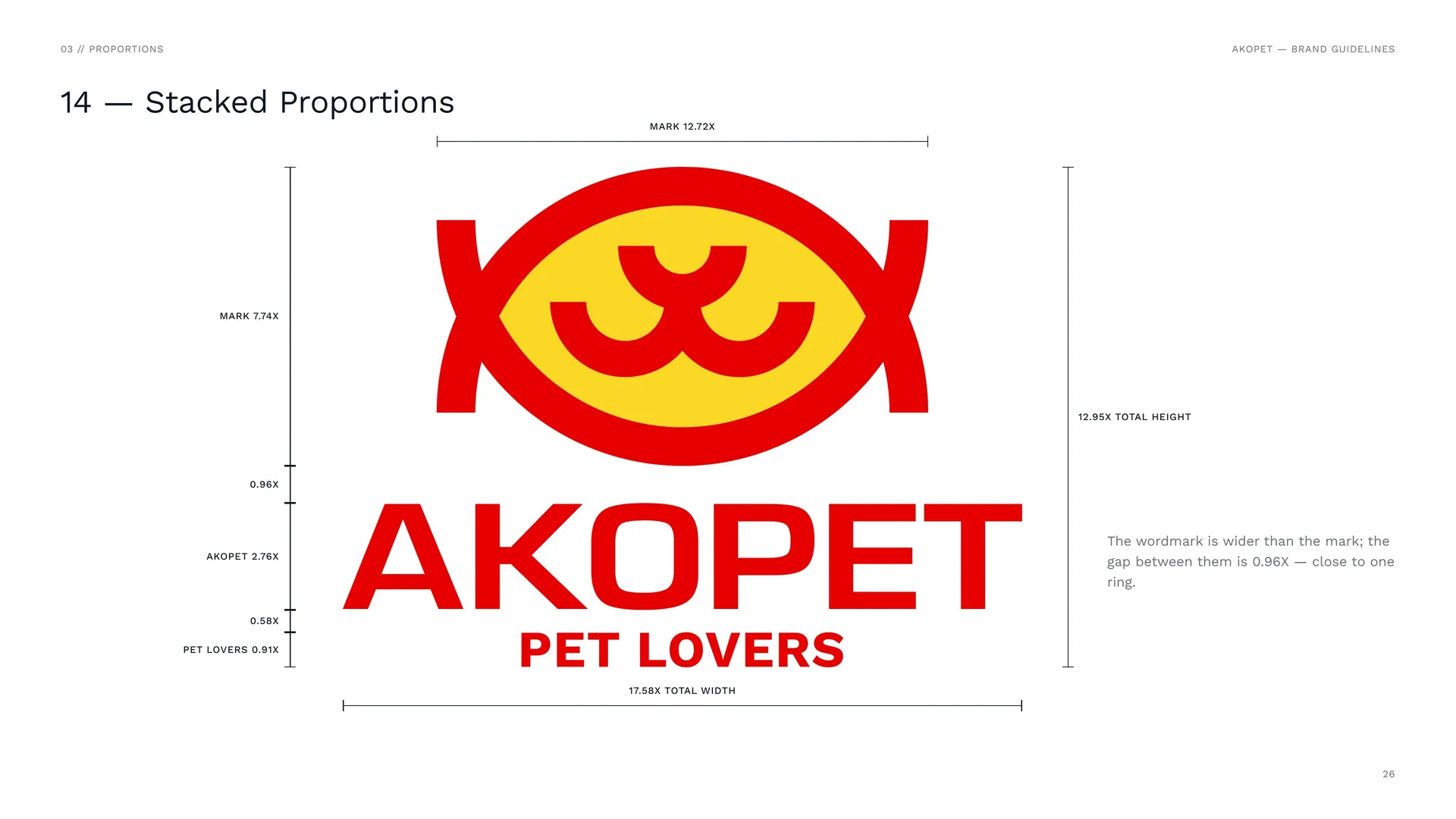
The wordmark is wider than the mark; the gap between them is 0.96X — close to one ring.
17.58X total width · 12.95X total height.
03.9
Clear Space
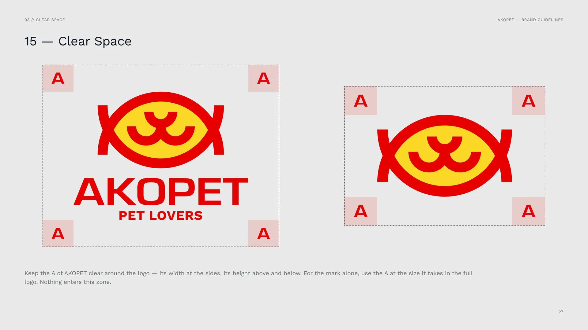
Keep the A of AKOPET clear around the logo — its width at the sides, its height above and below. For the mark alone, use the A at the size it takes in the full logo. Nothing enters this zone.
04
Logo in use
- 04.1Versions
- 04.2App Icon & Favicon
- 04.3Size
- 04.4Placement
- 04.5Misuse
- 04.6Logo on backgrounds
- 04.7Logo in material
04.1
Versions
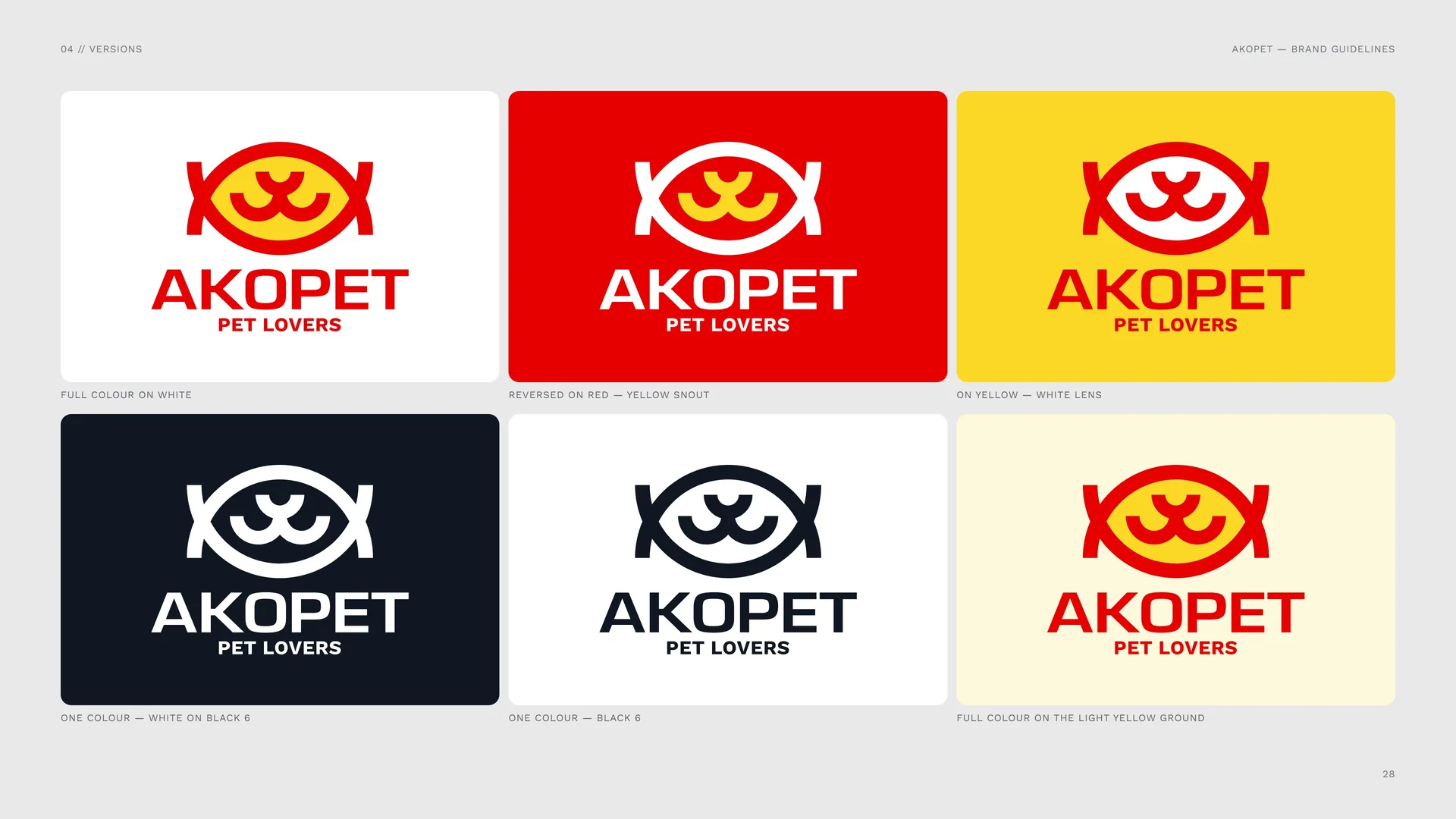
Full colour on white.
Reversed on red — yellow snout.
On yellow — white lens.
One colour — white on Black 6.
One colour — Black 6.
Full colour on the light yellow ground.
04.2
App Icon & Favicon
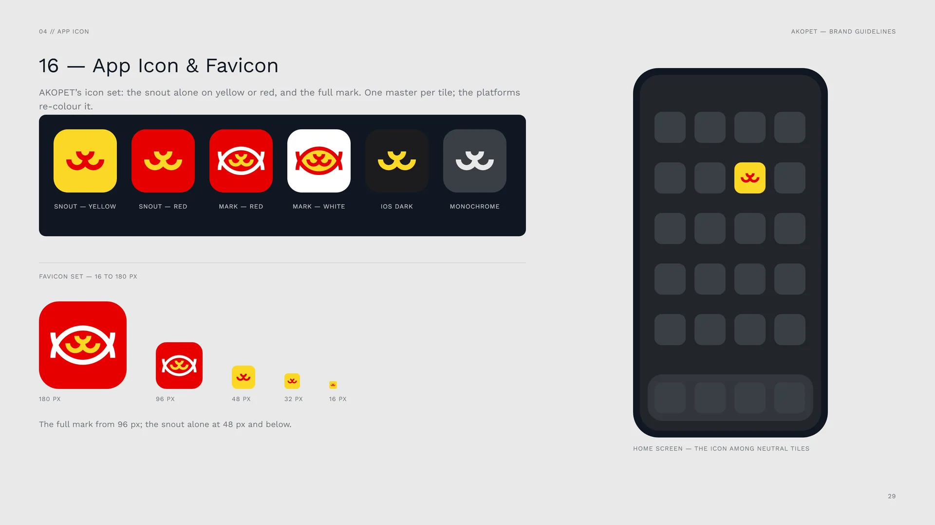
AKOPET’s icon set: the snout alone on yellow or red, and the full mark. One master per tile; the platforms re-colour it.
Snout — yellow · Snout — red · Mark — red · Mark — white · iOS dark · Monochrome.
Favicon set — 16 to 180 px: 180 px · 96 px · 48 px · 32 px · 16 px.
The full mark from 96 px; the snout alone at 48 px and below.
Home screen — the icon among neutral tiles.
04.3
Size
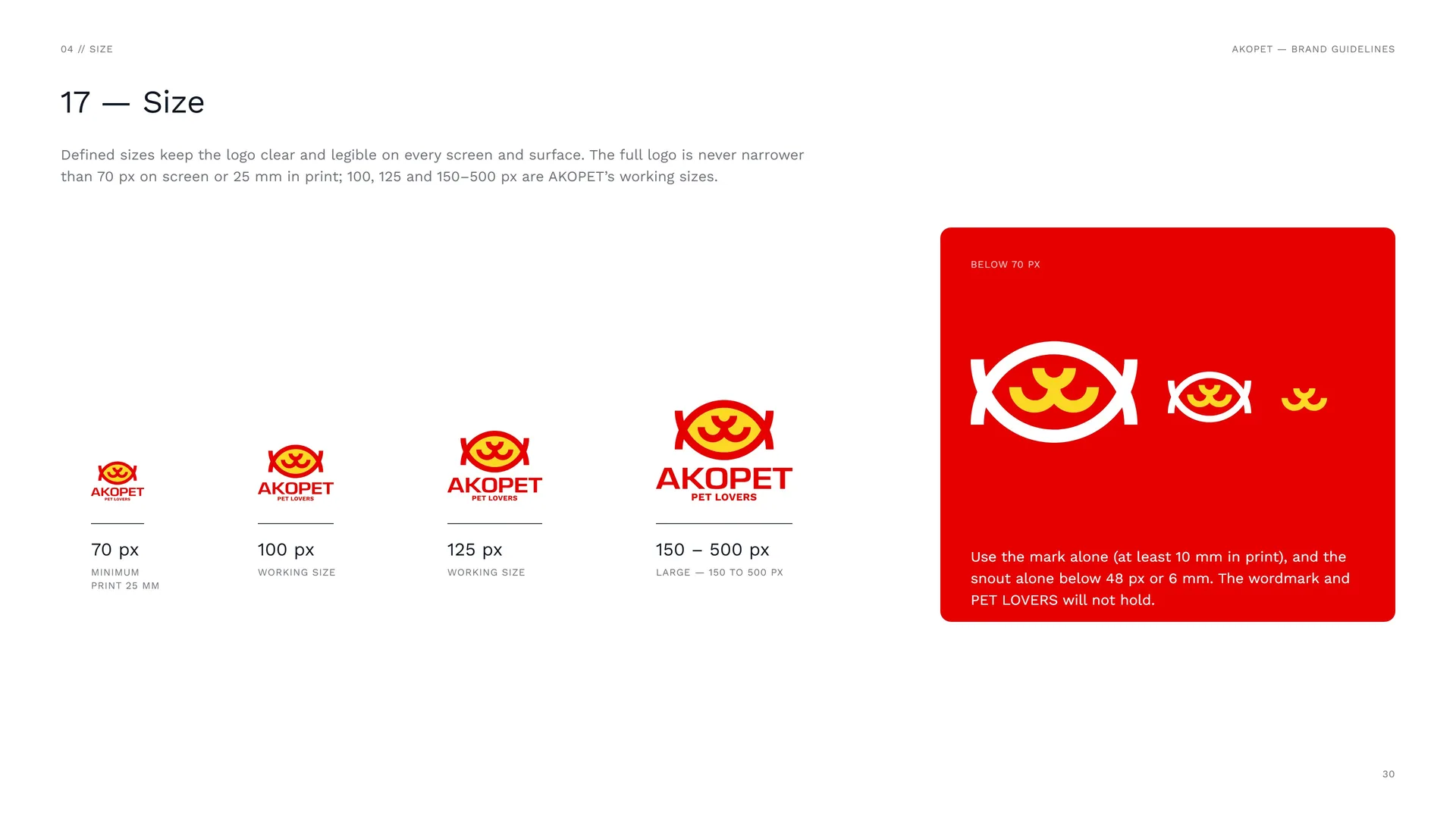
Defined sizes keep the logo clear and legible on every screen and surface. The full logo is never narrower than 70 px on screen or 25 mm in print; 100, 125 and 150–500 px are AKOPET’s working sizes.
70 px — minimum print 25 mm.
100 px — working size.
125 px — working size.
150 – 500 px — large — 150 to 500 px.
Below 70 px: Use the mark alone (at least 10 mm in print), and the snout alone below 48 px or 6 mm. The wordmark and PET LOVERS will not hold.
04.4
Placement
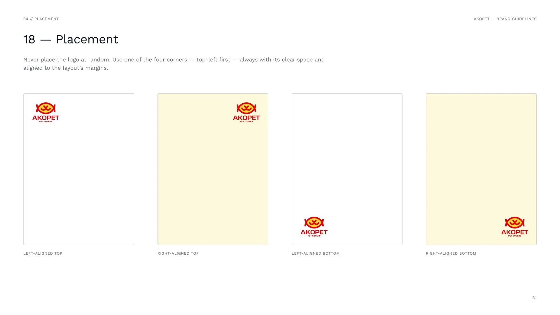
Never place the logo at random. Use one of the four corners — top-left first — always with its clear space and aligned to the layout’s margins.
Left-aligned top · Right-aligned top · Left-aligned bottom · Right-aligned bottom.
04.5
Misuse
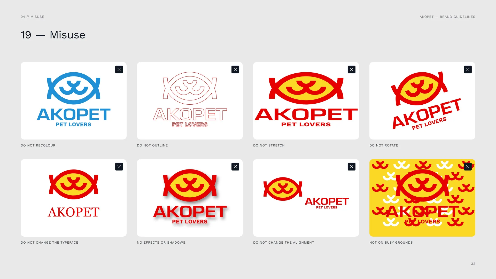
Do not recolour · Do not outline · Do not stretch · Do not rotate · Do not change the typeface · No effects or shadows · Do not change the alignment · Not on busy grounds.
04.6
Logo on backgrounds
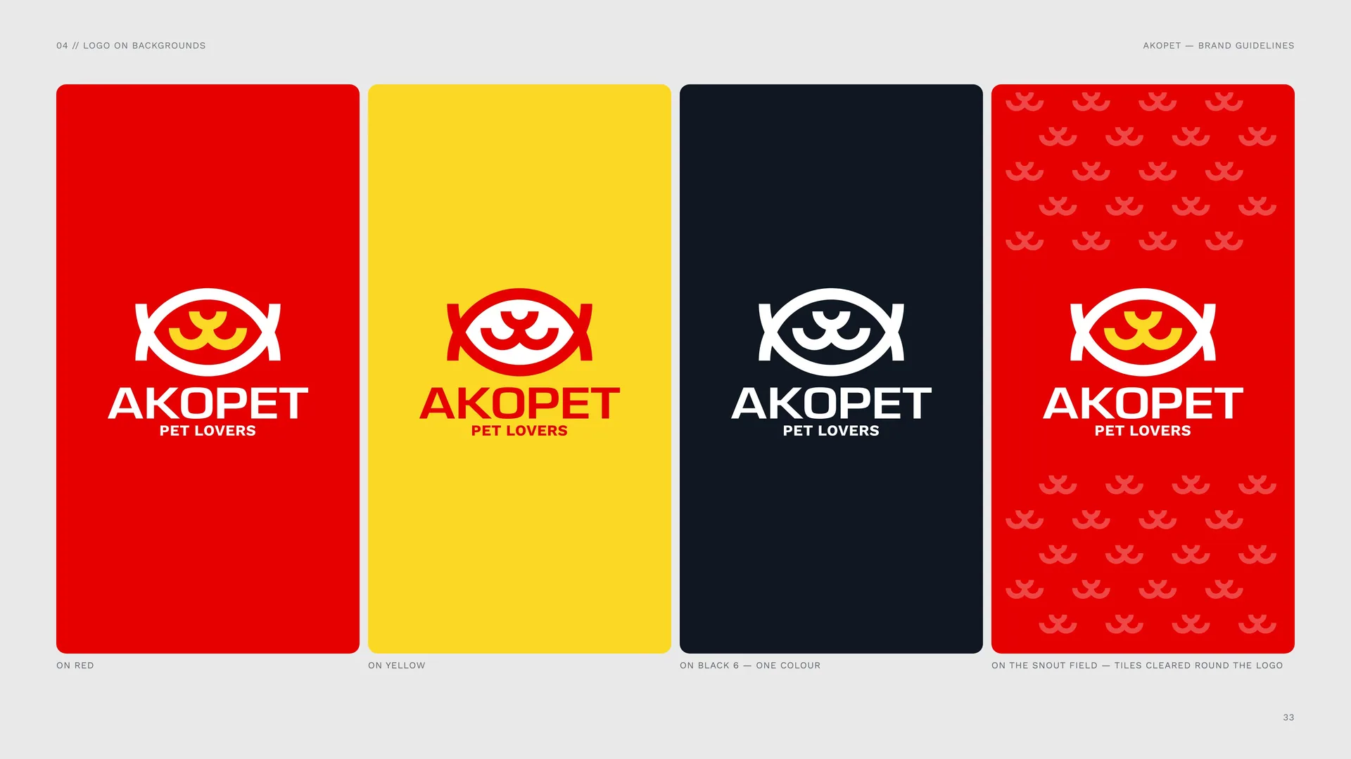
On red · On yellow · On Black 6 — one colour.
On the snout field — tiles cleared round the logo.
04.7
Logo in material
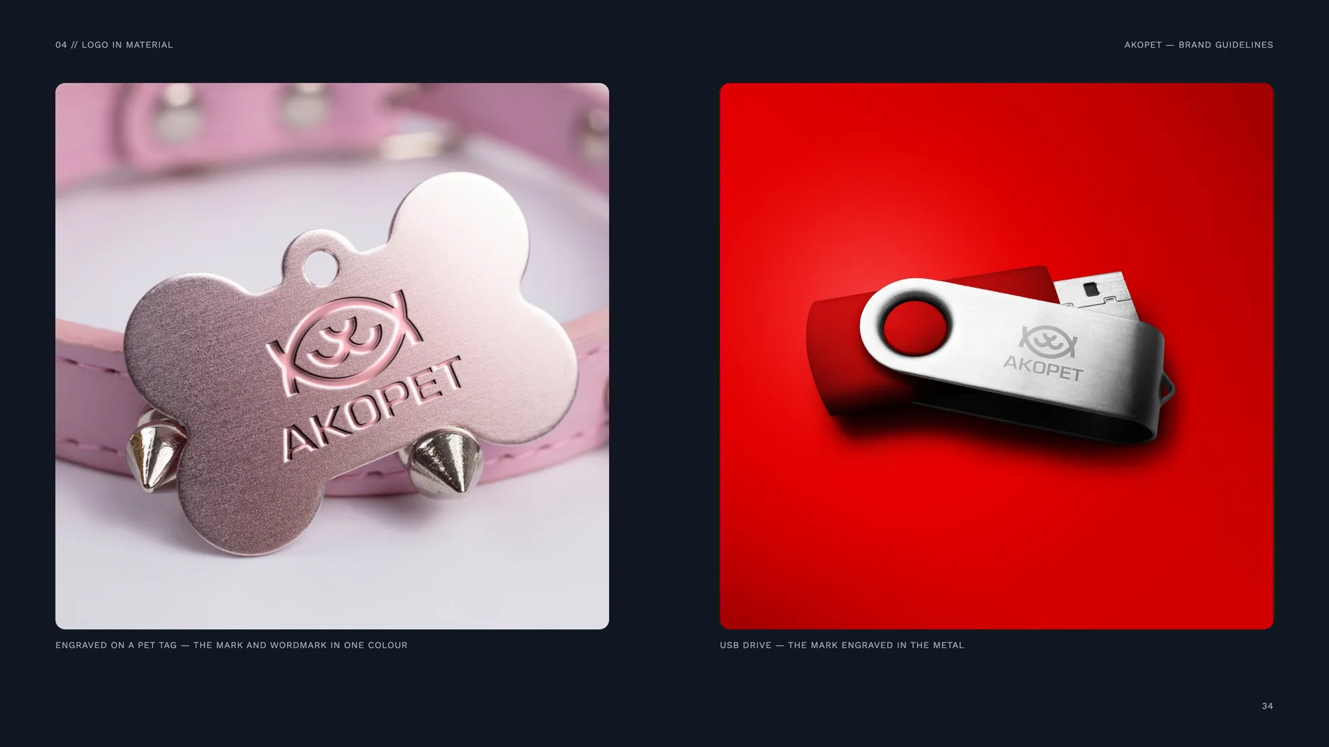
Engraved on a pet tag — the mark and wordmark in one colour.
USB drive — the mark engraved in the metal.
05
Colour
05.1
Colour
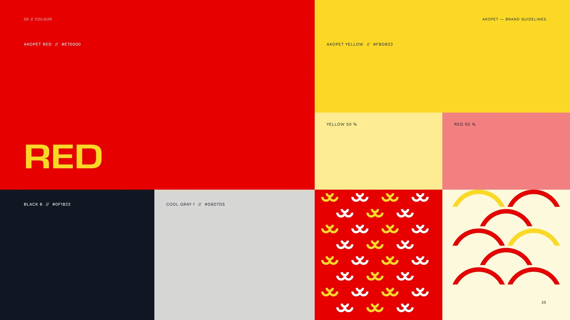
Akopet Red · #E70000.
Akopet Yellow · #FBD823.
Yellow 50 % · Red 50 %.
Black 6 · #0F1822.
Cool Gray 1 · #D6D7D5.
05.2
Colour Values
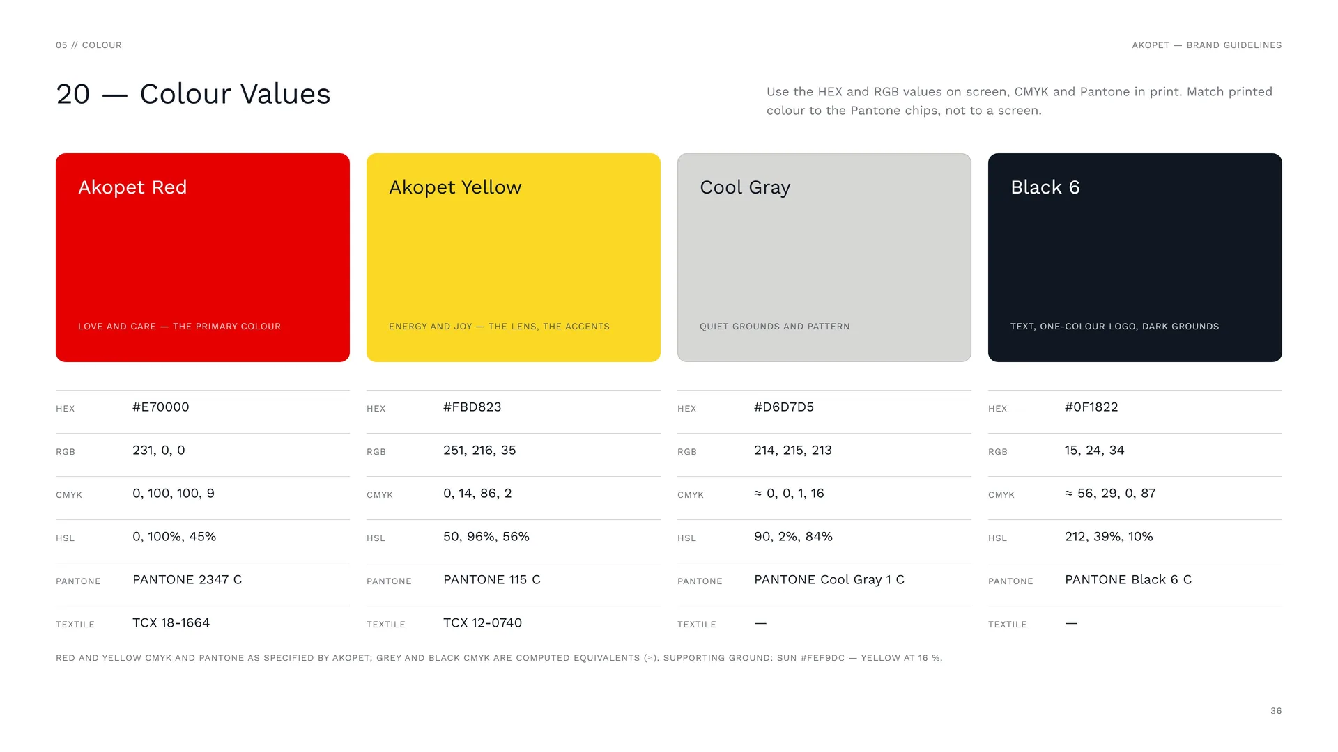
Use the HEX and RGB values on screen, CMYK and Pantone in print. Match printed colour to the Pantone chips, not to a screen.
Akopet Red: Love and care — the primary colour. HEX #E70000 · RGB 231, 0, 0 · CMYK 0, 100, 100, 9 · HSL 0, 100%, 45% · PANTONE 2347 C · TEXTILE TCX 18-1664.
Akopet Yellow: Energy and joy — the lens, the accents. HEX #FBD823 · RGB 251, 216, 35 · CMYK 0, 14, 86, 2 · HSL 50, 96%, 56% · PANTONE 115 C · TEXTILE TCX 12-0740.
Cool Gray: Quiet grounds and pattern. HEX #D6D7D5 · RGB 214, 215, 213 · CMYK ≈ 0, 0, 1, 16 · HSL 90, 2%, 84% · PANTONE Cool Gray 1 C.
Black 6: Text, one-colour logo, dark grounds. HEX #0F1822 · RGB 15, 24, 34 · CMYK ≈ 56, 29, 0, 87 · HSL 212, 39%, 10% · PANTONE Black 6 C.
Red and yellow CMYK and Pantone as specified by AKOPET; grey and black CMYK are computed equivalents (≈). Supporting ground: Sun #FEF9DC — yellow at 16 %.
05.3
Colour story
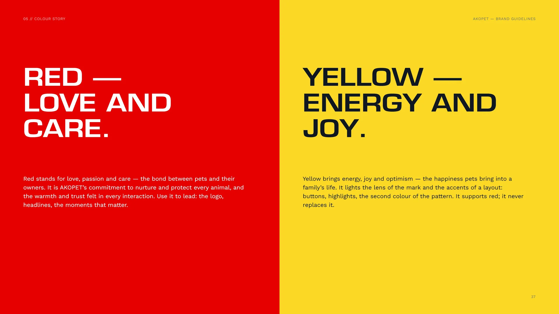
Red — love and care. Red stands for love, passion and care — the bond between pets and their owners. It is AKOPET’s commitment to nurture and protect every animal, and the warmth and trust felt in every interaction. Use it to lead: the logo, headlines, the moments that matter.
Yellow — energy and joy. Yellow brings energy, joy and optimism — the happiness pets bring into a family’s life. It lights the lens of the mark and the accents of a layout: buttons, highlights, the second colour of the pattern. It supports red; it never replaces it.
05.4
Contrast — WCAG 2.2
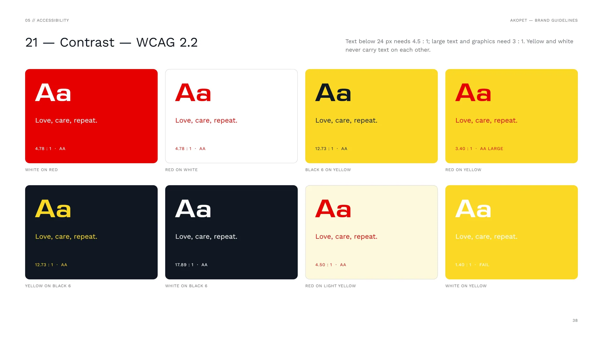
Text below 24 px needs 4.5 : 1; large text and graphics need 3 : 1. Yellow and white never carry text on each other.
White on red: 4.78 : 1 · AA.
Red on white: 4.78 : 1 · AA.
Black 6 on yellow: 12.73 : 1 · AA.
Red on yellow: 3.40 : 1 · AA large.
Yellow on Black 6: 12.73 : 1 · AA.
White on Black 6: 17.89 : 1 · AA.
Red on light yellow: 4.50 : 1 · AA.
White on yellow: 1.40 : 1 · Fail.
05.5
Tints & Gradient
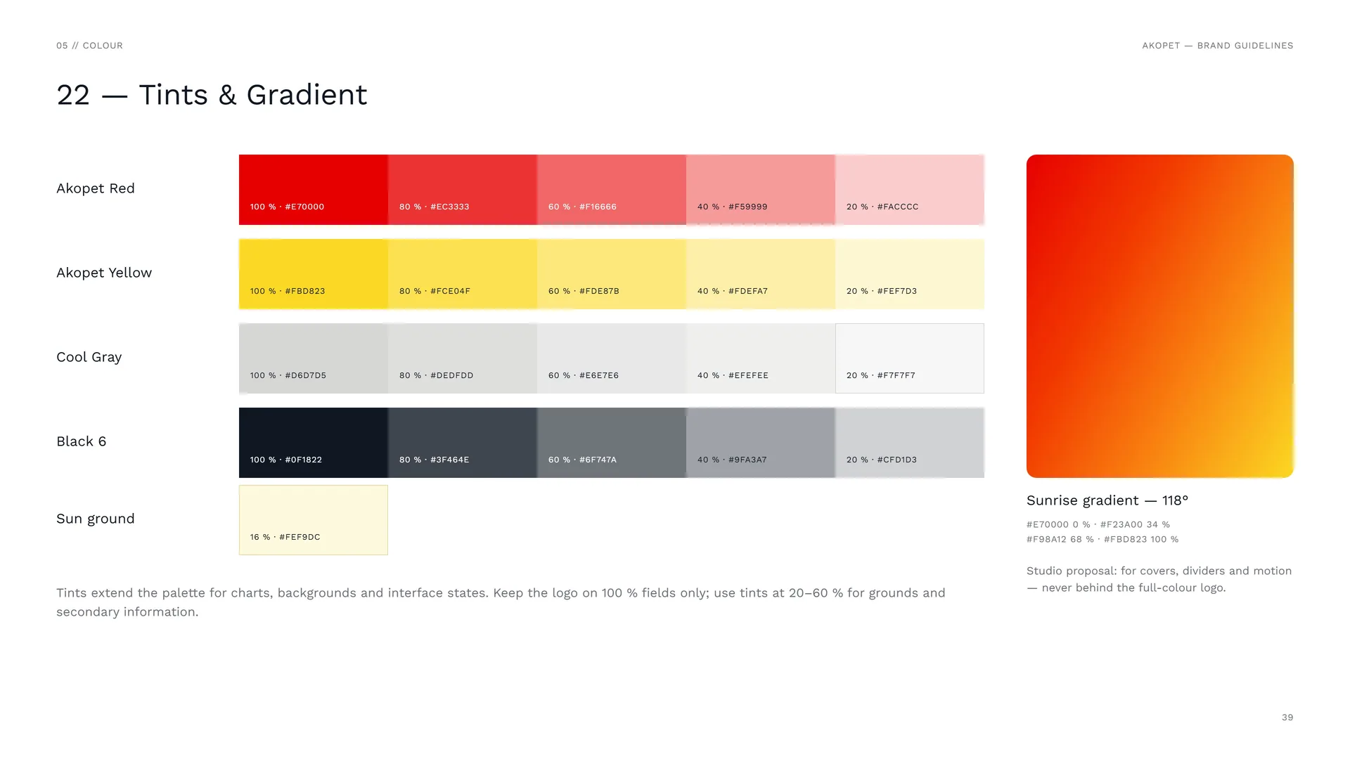
Akopet Red: 100 % #E70000 · 80 % #EC3333 · 60 % #F16666 · 40 % #F59999 · 20 % #FACCCC.
Akopet Yellow: 100 % #FBD823 · 80 % #FCE04F · 60 % #FDE87B · 40 % #FDEFA7 · 20 % #FEF7D3.
Cool Gray: 100 % #D6D7D5 · 80 % #DEDFDD · 60 % #E6E7E6 · 40 % #EFEFEE · 20 % #F7F7F7.
Black 6: 100 % #0F1822 · 80 % #3F464E · 60 % #6F747A · 40 % #9FA3A7 · 20 % #CFD1D3.
Sun ground: 16 % #FEF9DC.
Tints extend the palette for charts, backgrounds and interface states. Keep the logo on 100 % fields only; use tints at 20–60 % for grounds and secondary information.
Sunrise gradient — 118°: #E70000 0 % · #F23A00 34 % · #F98A12 68 % · #FBD823 100 %.
Studio proposal: for covers, dividers and motion — never behind the full-colour logo.
06
Typography
06.1
Typography
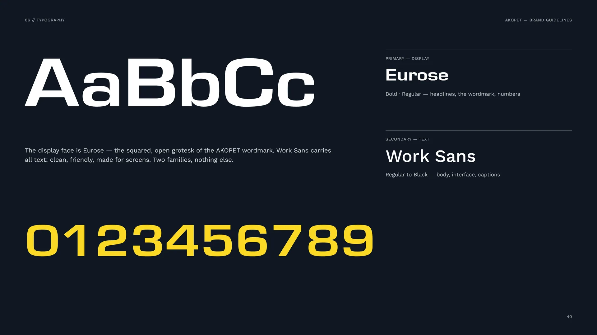
The display face is Eurose — the squared, open grotesk of the AKOPET wordmark. Work Sans carries all text: clean, friendly, made for screens. Two families, nothing else.
Primary — display: Eurose. Bold · Regular — headlines, the wordmark, numbers.
Secondary — text: Work Sans. Regular to Black — body, interface, captions.
06.2
Eurose — Display
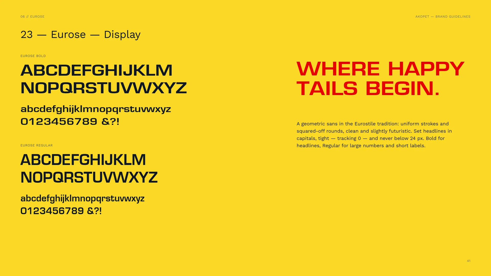
A geometric sans in the Eurostile tradition: uniform strokes and squared-off rounds, clean and slightly futuristic. Set headlines in capitals, tight — tracking 0 — and never below 24 px. Bold for headlines, Regular for large numbers and short labels.
06.3
Work Sans — Text
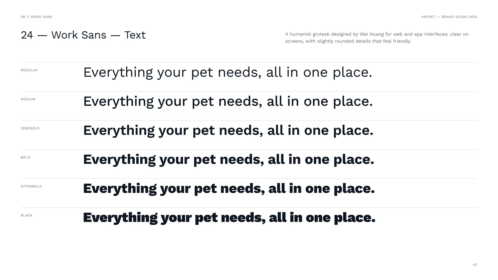
A humanist grotesk designed by Wei Huang for web and app interfaces: clear on screens, with slightly rounded details that feel friendly.
Regular · Medium · SemiBold · Bold · ExtraBold · Black.
06.4
Type System
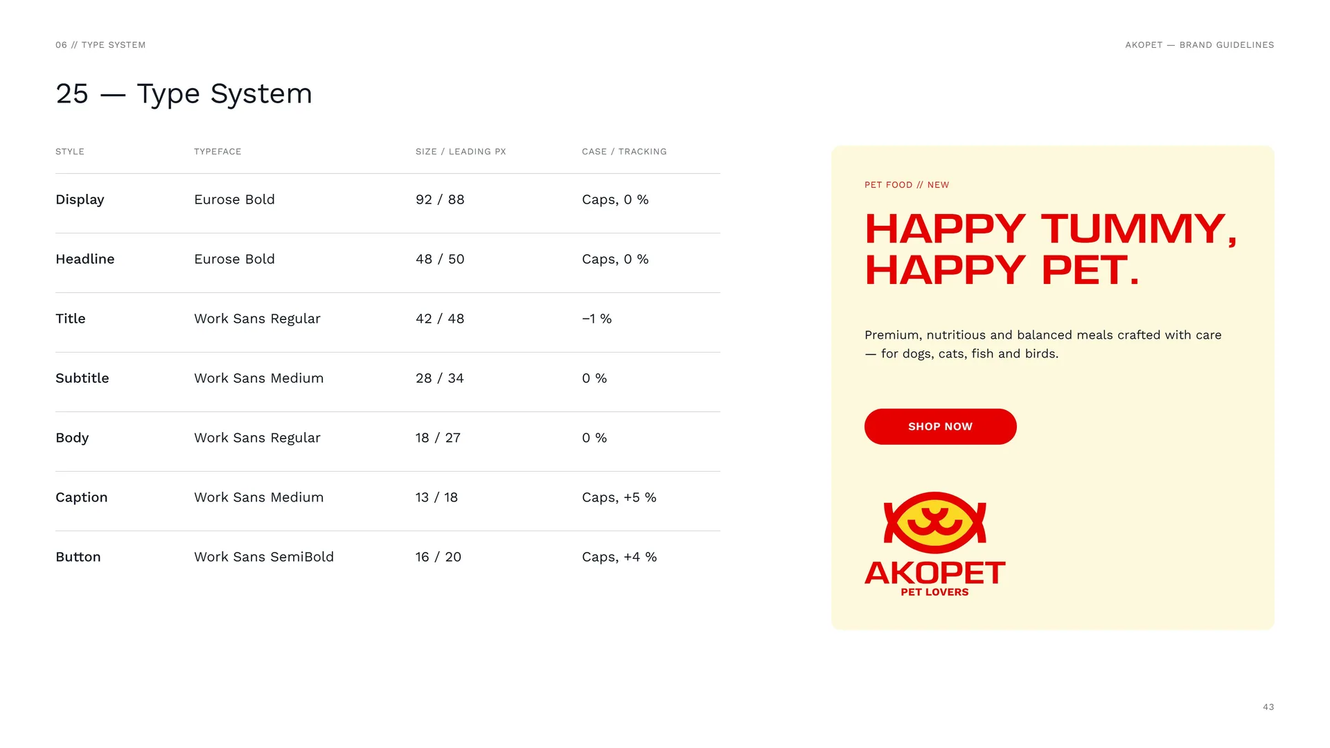
Display: Eurose Bold · 92 / 88 px · caps, 0 %.
Headline: Eurose Bold · 48 / 50 px · caps, 0 %.
Title: Work Sans Regular · 42 / 48 px · −1 %.
Subtitle: Work Sans Medium · 28 / 34 px · 0 %.
Body: Work Sans Regular · 18 / 27 px · 0 %.
Caption: Work Sans Medium · 13 / 18 px · caps, +5 %.
Button: Work Sans SemiBold · 16 / 20 px · caps, +4 %.
07
Pattern
- 07.1The snout field
- 07.2How the Pattern Is Built
- 07.3Pattern family
- 07.4The Scale Field
- 07.5Pattern Rules
- 07.6Pattern in use
07.1
The snout field
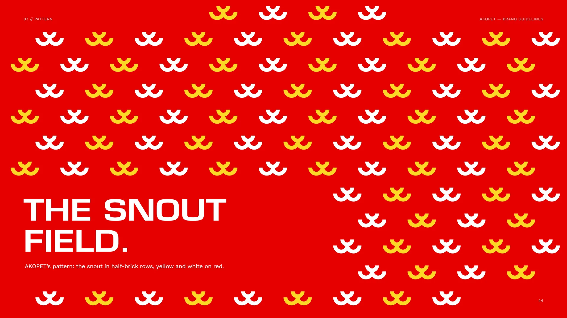
AKOPET’s pattern: the snout in half-brick rows, yellow and white on red.
07.2
How the Pattern Is Built
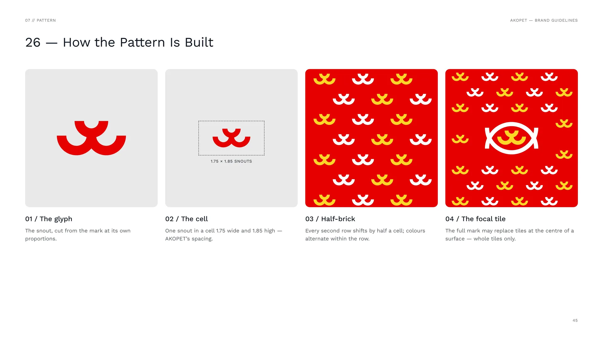
The glyph: The snout, cut from the mark at its own proportions.
The cell: One snout in a cell 1.75 wide and 1.85 high — AKOPET’s spacing.
Half-brick: Every second row shifts by half a cell; colours alternate within the row.
The focal tile: The full mark may replace tiles at the centre of a surface — whole tiles only.
07.3
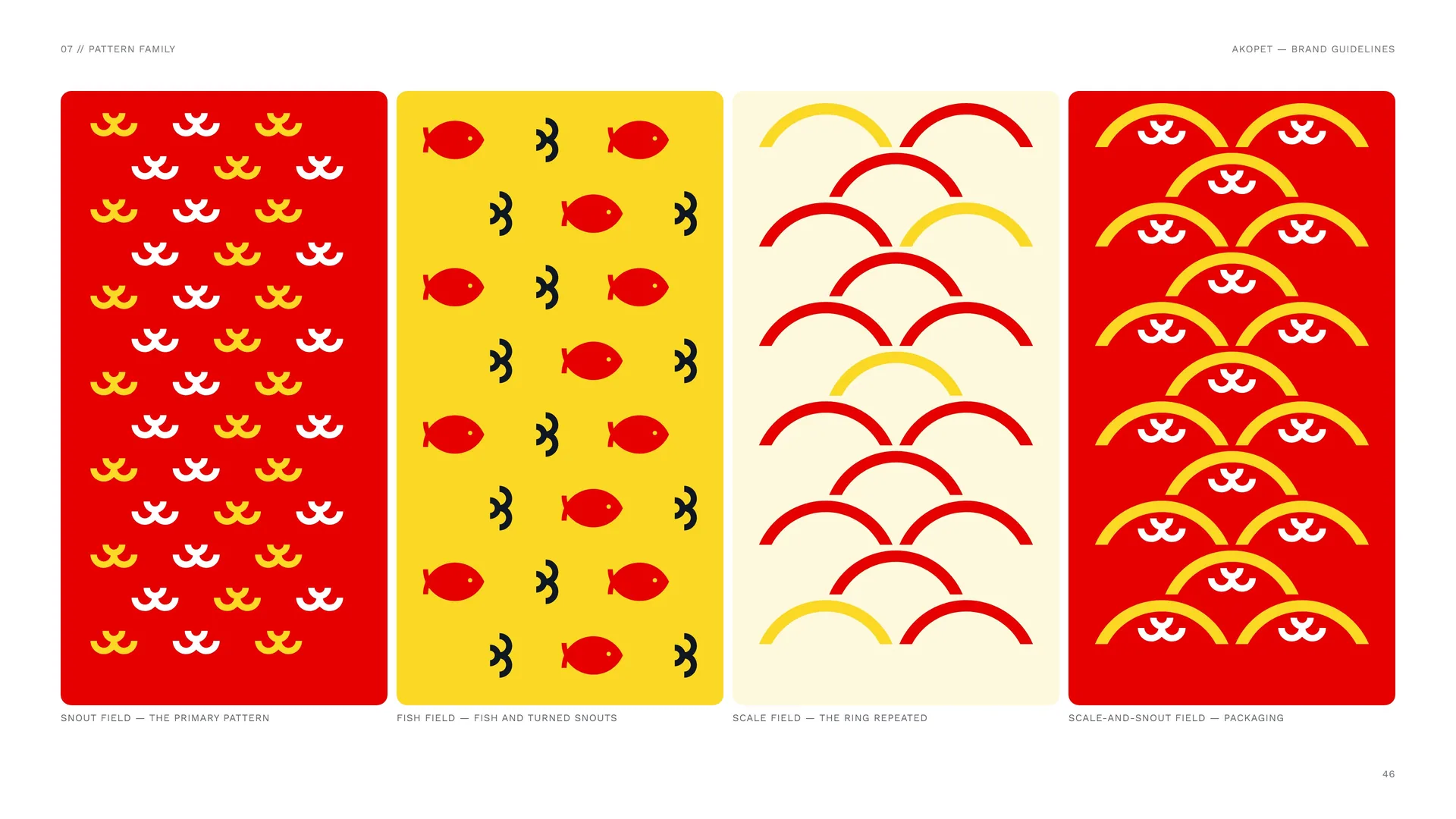
Pattern family
Snout field — the primary pattern.
Fish field — fish and turned snouts.
Scale field — the ring repeated.
Scale-and-snout field — packaging.
07.4
The Scale Field
One scale is the top band of the ring, cut on the mid line. Rows sit 4.37X apart — the scale’s own height plus ½X — and every second row shifts by half a scale, so each scale stays whole. A snout under each arch makes the packaging variant.
Scale field on yellow — red scales, one in five white.
AKOPET’s scale render — the idea behind the field. Use the field flat; keep renders for campaign art.
07.5
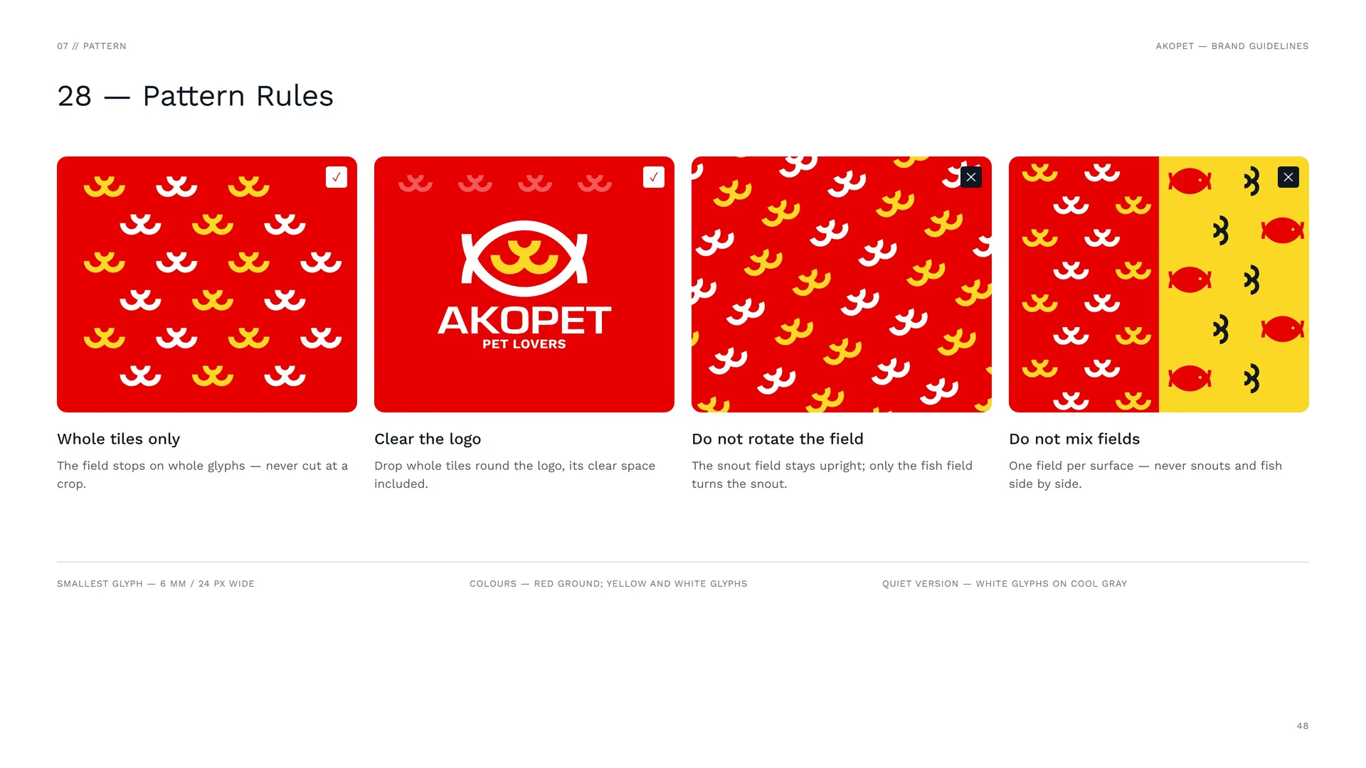
Pattern Rules
Whole tiles only: The field stops on whole glyphs — never cut at a crop.
Clear the logo: Drop whole tiles round the logo, its clear space included.
Do not rotate the field: The snout field stays upright; only the fish field turns the snout.
Do not mix fields: One field per surface — never snouts and fish side by side.
Smallest glyph — 6 mm / 24 px wide.
Colours — red ground; yellow and white glyphs.
Quiet version — white glyphs on Cool Gray.
07.6
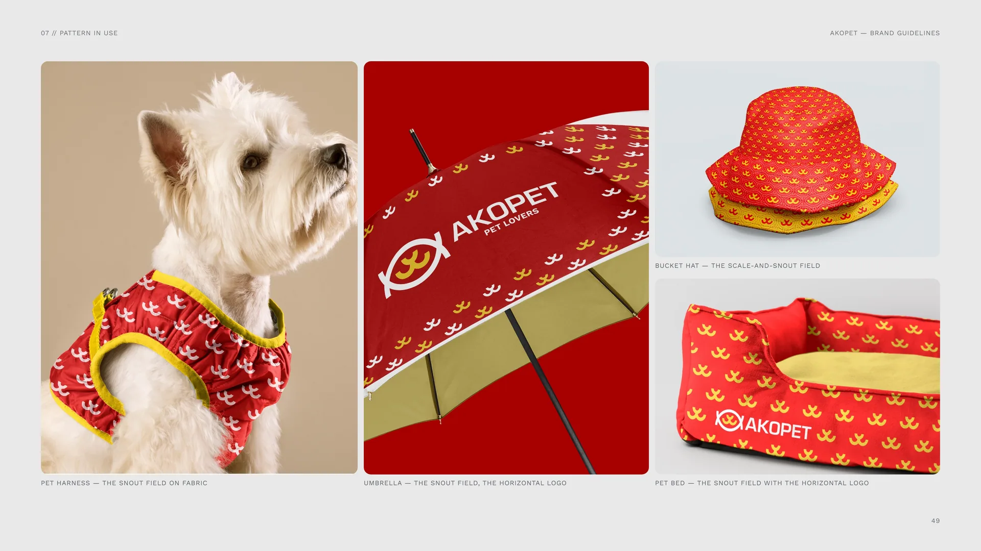
Pattern in use
Pet harness — the snout field on fabric.
Umbrella — the snout field, the horizontal logo.
Bucket hat — the scale-and-snout field.
Pet bed — the snout field with the horizontal logo.
08
Imagery
08.1
Photography
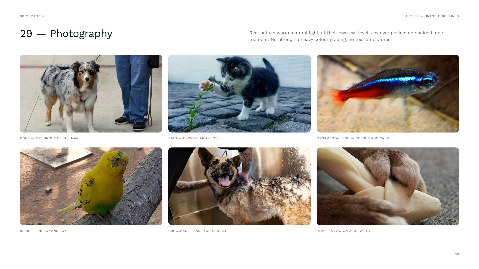
Real pets in warm, natural light, at their own eye level. Joy over posing; one animal, one moment. No filters, no heavy colour grading, no text on pictures.
Dogs — the snout of the mark.
Cats — curious and close.
Ornamental fish — colour and calm.
Birds — energy and joy.
Grooming — care you can see.
Play — a paw on a chew toy.
09
Stationery
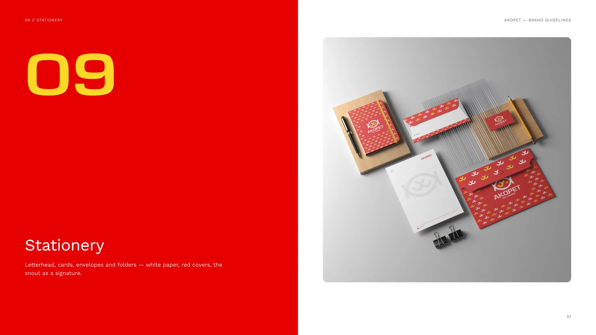
Letterhead, cards, envelopes and folders — white paper, red covers, the snout as a signature.
09.1
Letterhead
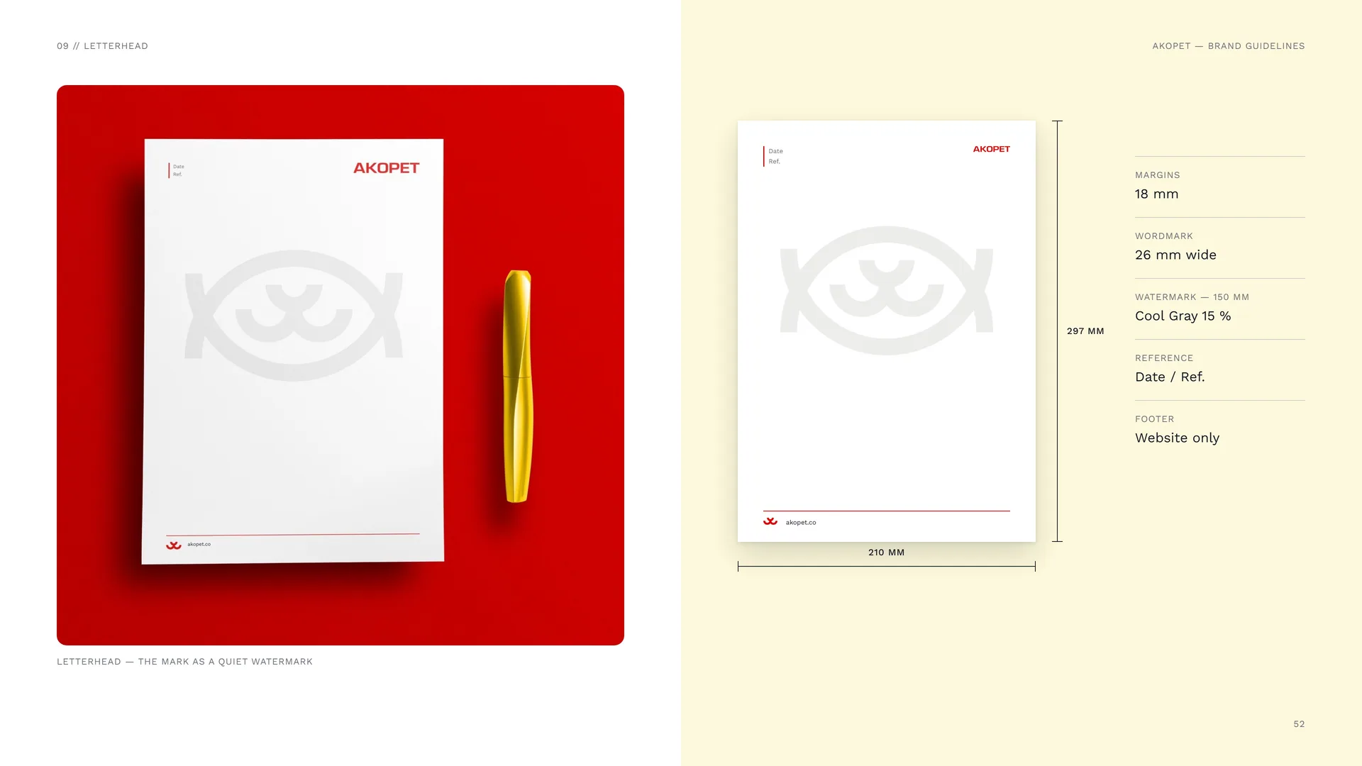
Letterhead — the mark as a quiet watermark.
Margins: 18 mm.
Wordmark: 26 mm wide.
Watermark — 150 mm: Cool Gray 15 %.
Reference: Date / Ref.
Footer: Website only.
09.2
Business cards & gift card
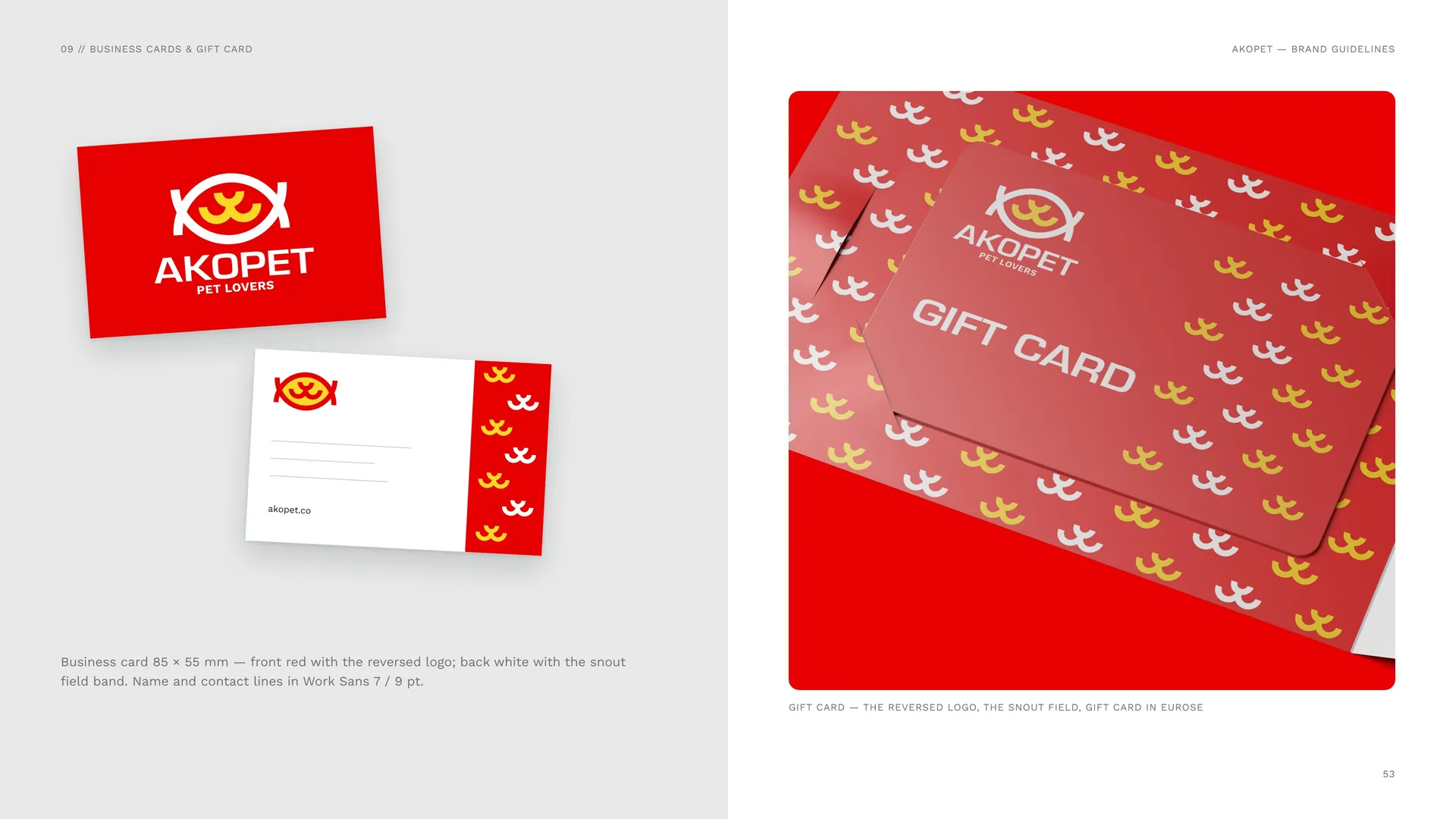
Business card 85 × 55 mm — front red with the reversed logo; back white with the snout field band. Name and contact lines in Work Sans 7 / 9 pt.
Gift card — the reversed logo, the snout field, gift card in Eurose.
09.3
Envelope & Folder
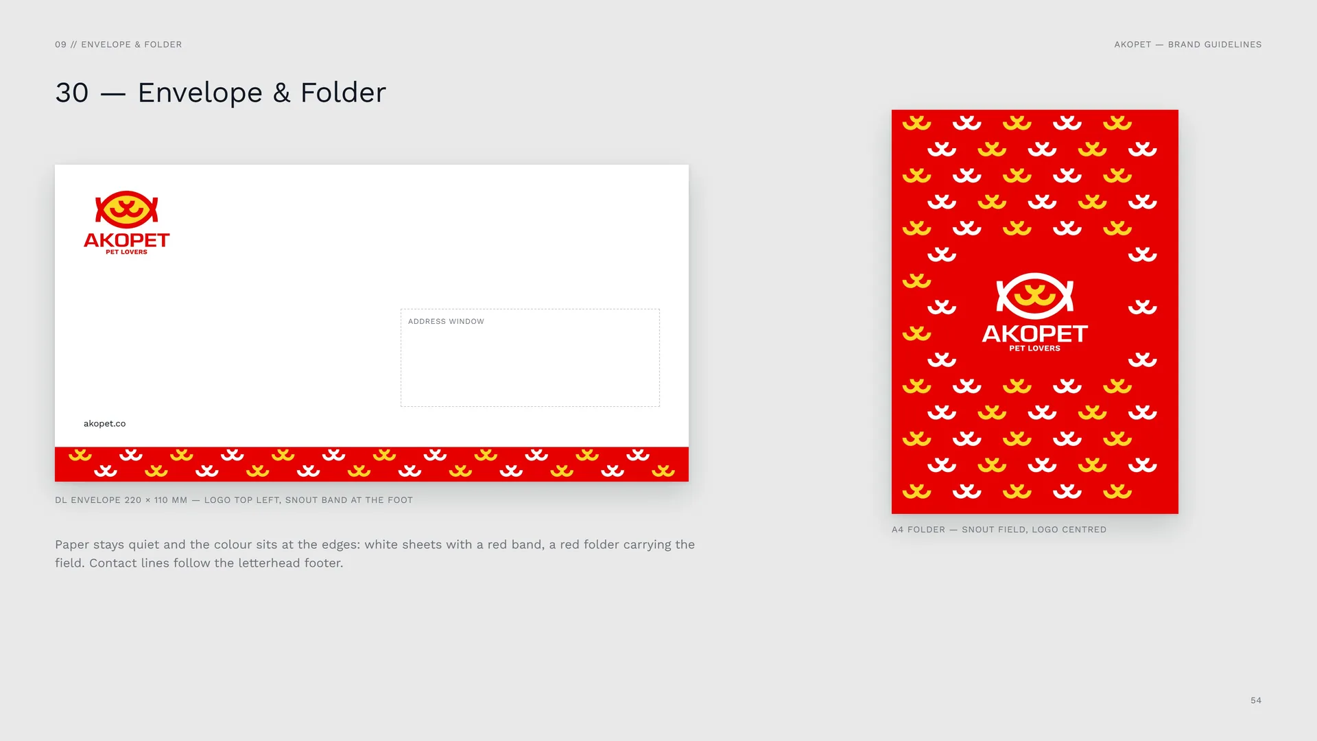
DL envelope 220 × 110 mm — logo top left, snout band at the foot.
Paper stays quiet and the colour sits at the edges: white sheets with a red band, a red folder carrying the field. Contact lines follow the letterhead footer.
A4 folder — snout field, logo centred.
10
Packaging
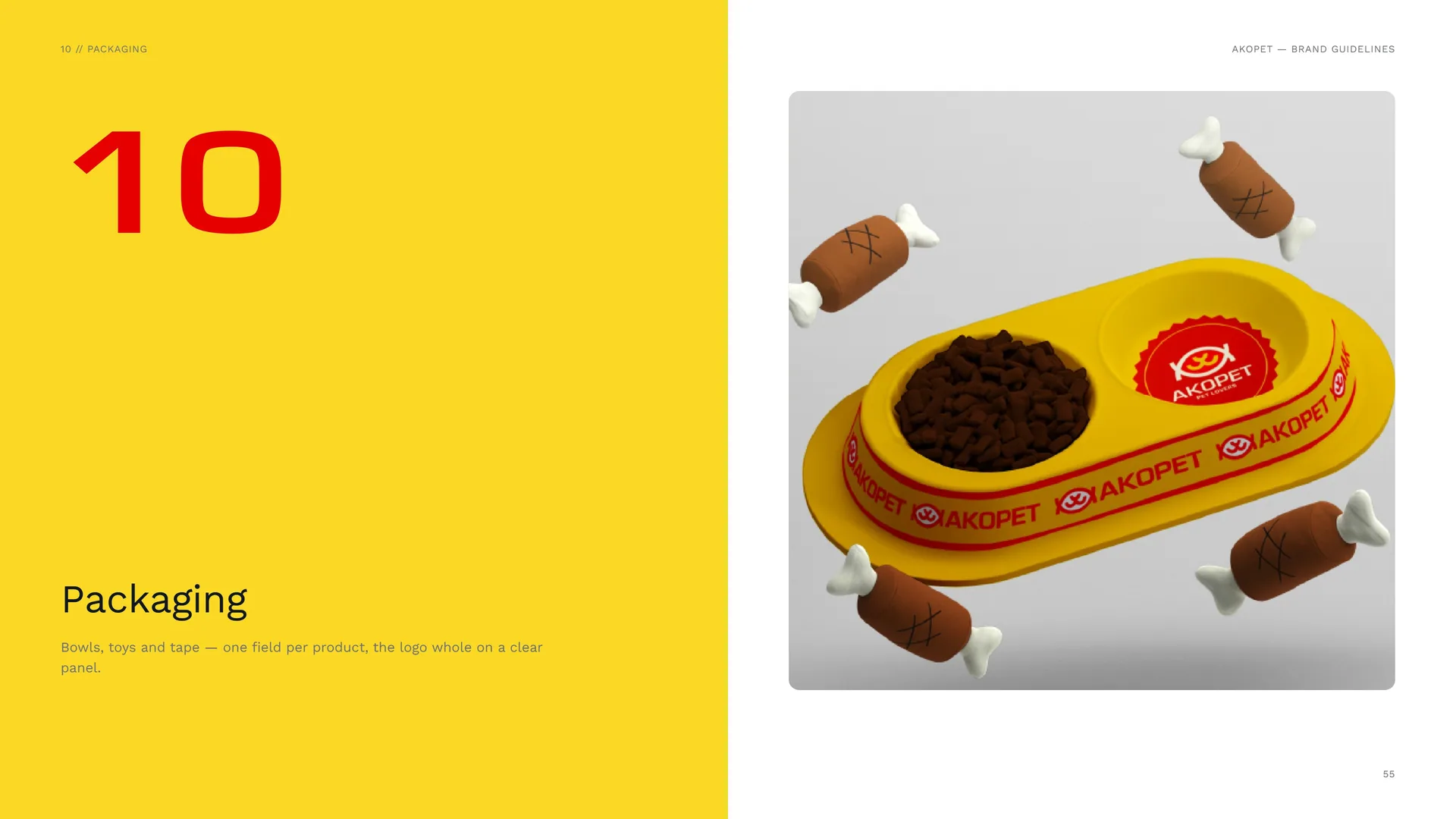
Bowls, toys and tape — one field per product, the logo whole on a clear panel.
10.1
One field per product
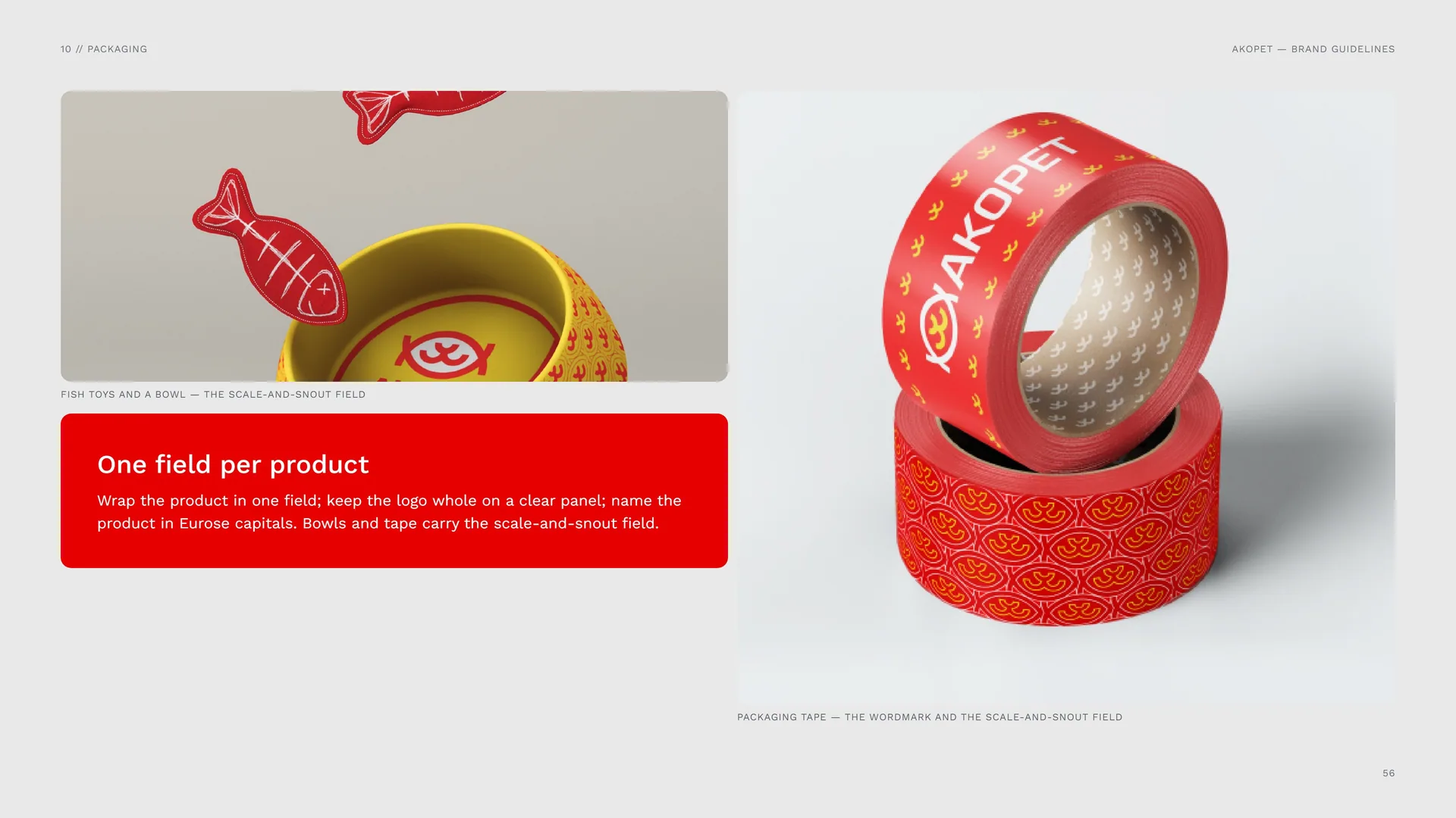
Fish toys and a bowl — the scale-and-snout field.
Wrap the product in one field; keep the logo whole on a clear panel; name the product in Eurose capitals. Bowls and tape carry the scale-and-snout field.
Packaging tape — the wordmark and the scale-and-snout field.
10.2
Pet Food Bag
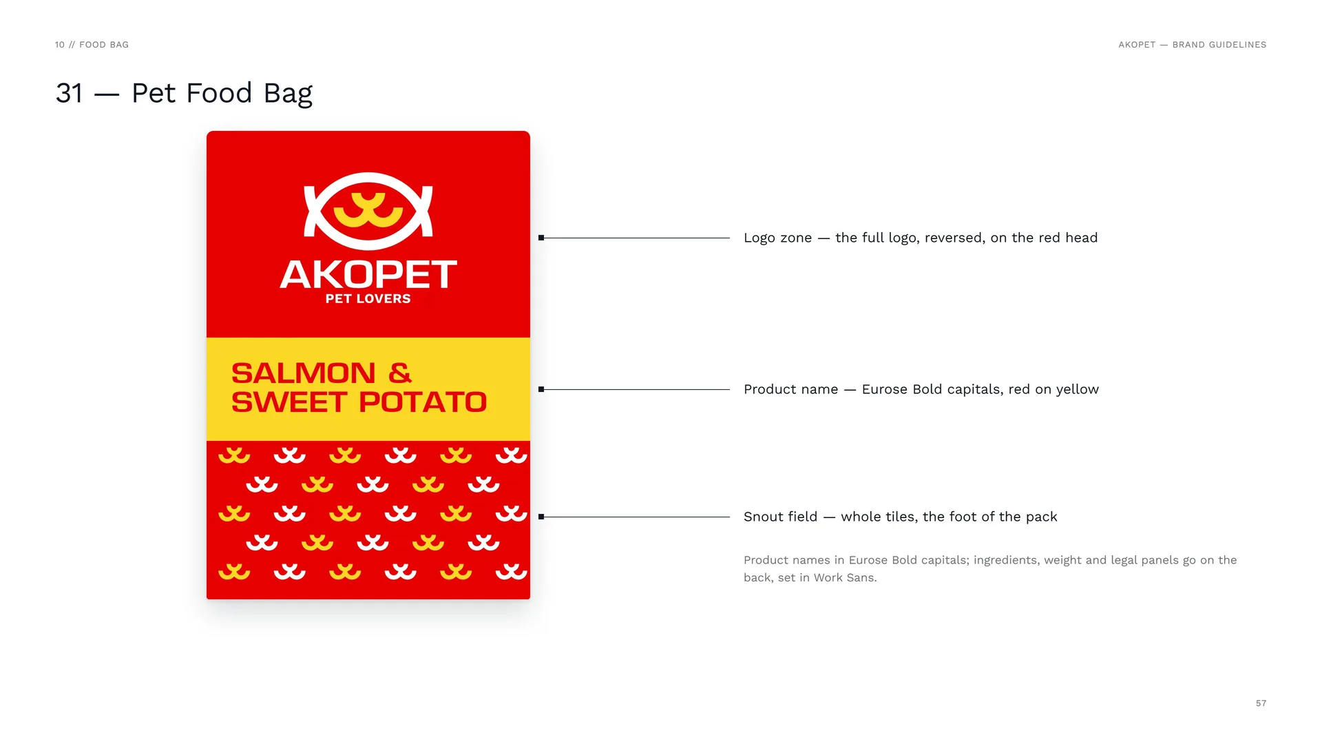
Logo zone — the full logo, reversed, on the red head.
Product name — Eurose Bold capitals, red on yellow.
Snout field — whole tiles, the foot of the pack.
Product names in Eurose Bold capitals; ingredients, weight and legal panels go on the back, set in Work Sans.
11
Digital media
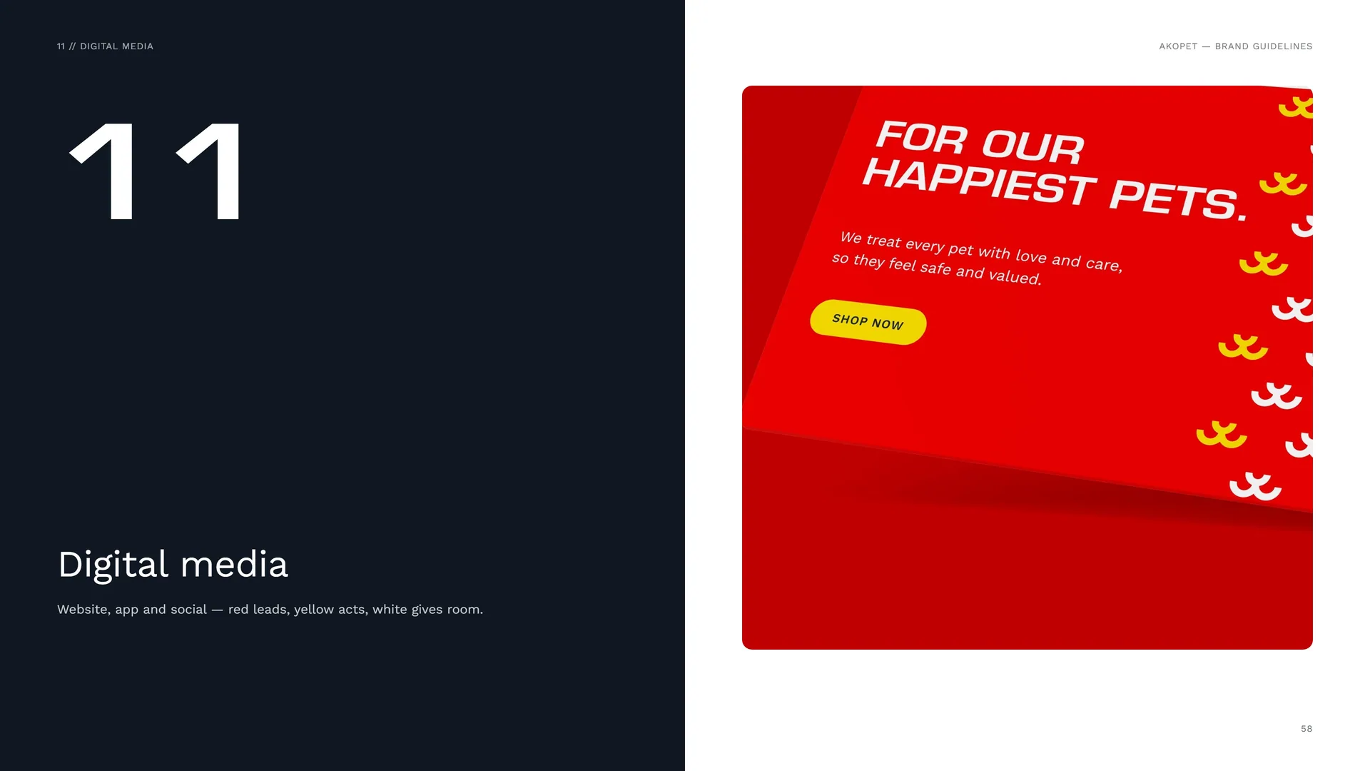
Website, app and social — red leads, yellow acts, white gives room.
11.1
Website & App
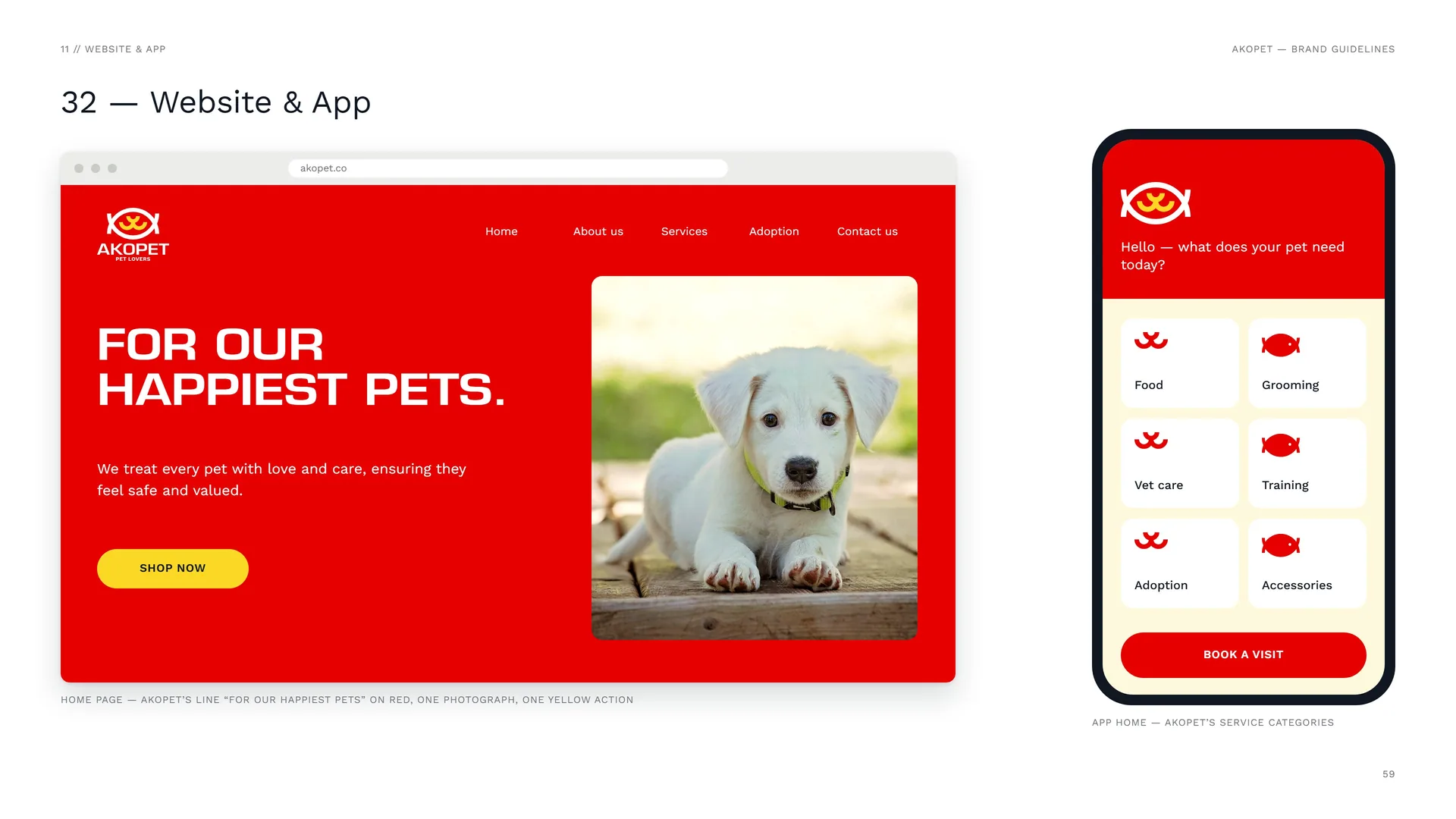
Home page — AKOPET’s line “For our happiest pets” on red, one photograph, one yellow action.
App home — AKOPET’s service categories.
11.2
Social media
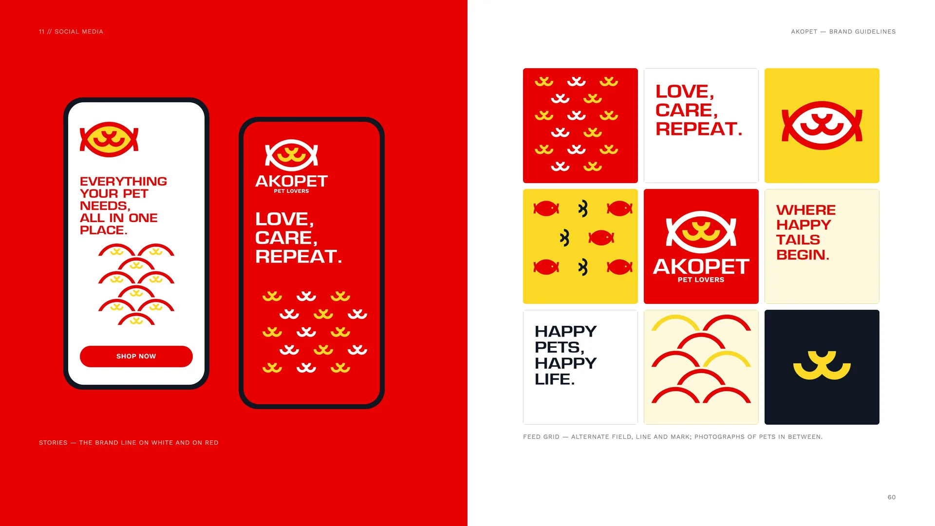
Stories — the brand line on white and on red.
Feed grid — alternate field, line and mark; photographs of pets in between.
11.3
Design Tokens & E-mail
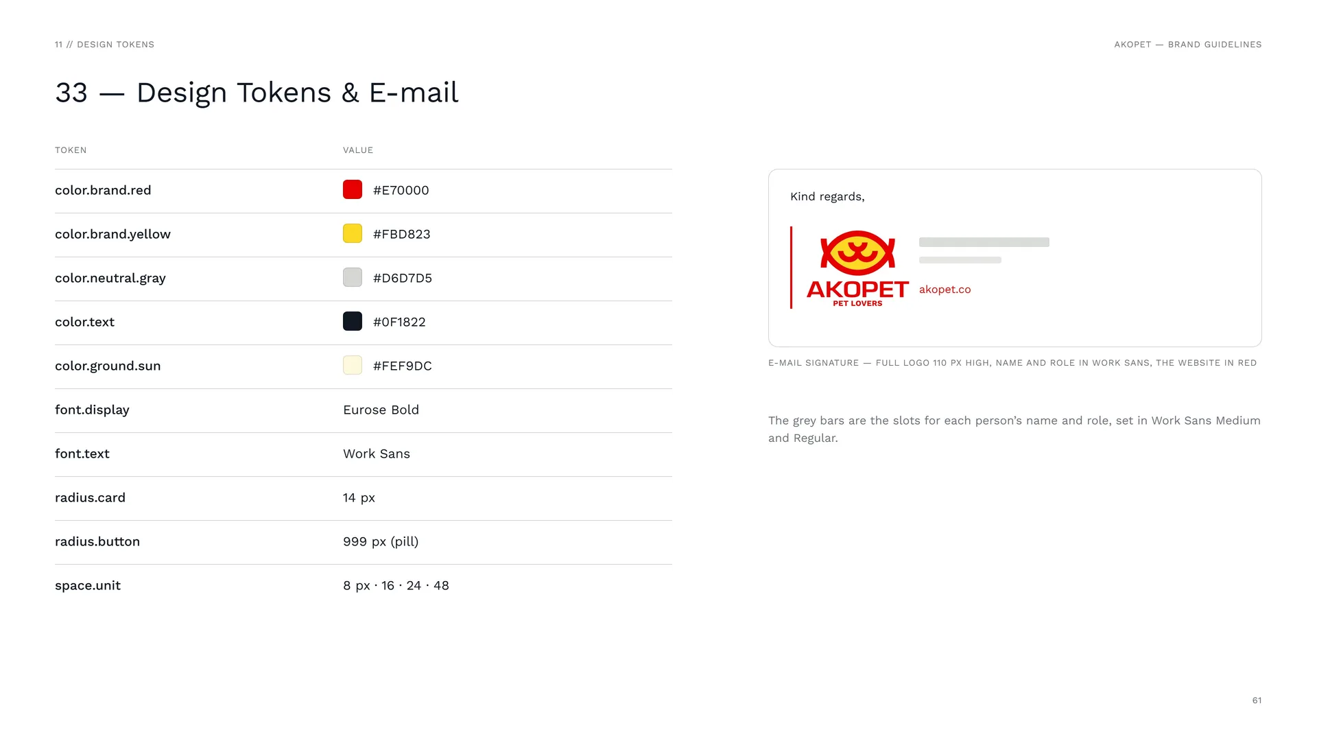
color.brand.red: #E70000.
color.brand.yellow: #FBD823.
color.neutral.gray: #D6D7D5.
color.text: #0F1822.
color.ground.sun: #FEF9DC.
font.display: Eurose Bold.
font.text: Work Sans.
radius.card: 14 px.
radius.button: 999 px (pill).
space.unit: 8 px · 16 · 24 · 48.
E-mail signature — full logo 110 px high, name and role in Work Sans, the website in red.
The grey bars are the slots for each person’s name and role, set in Work Sans Medium and Regular.
12
Merchandise & campaign
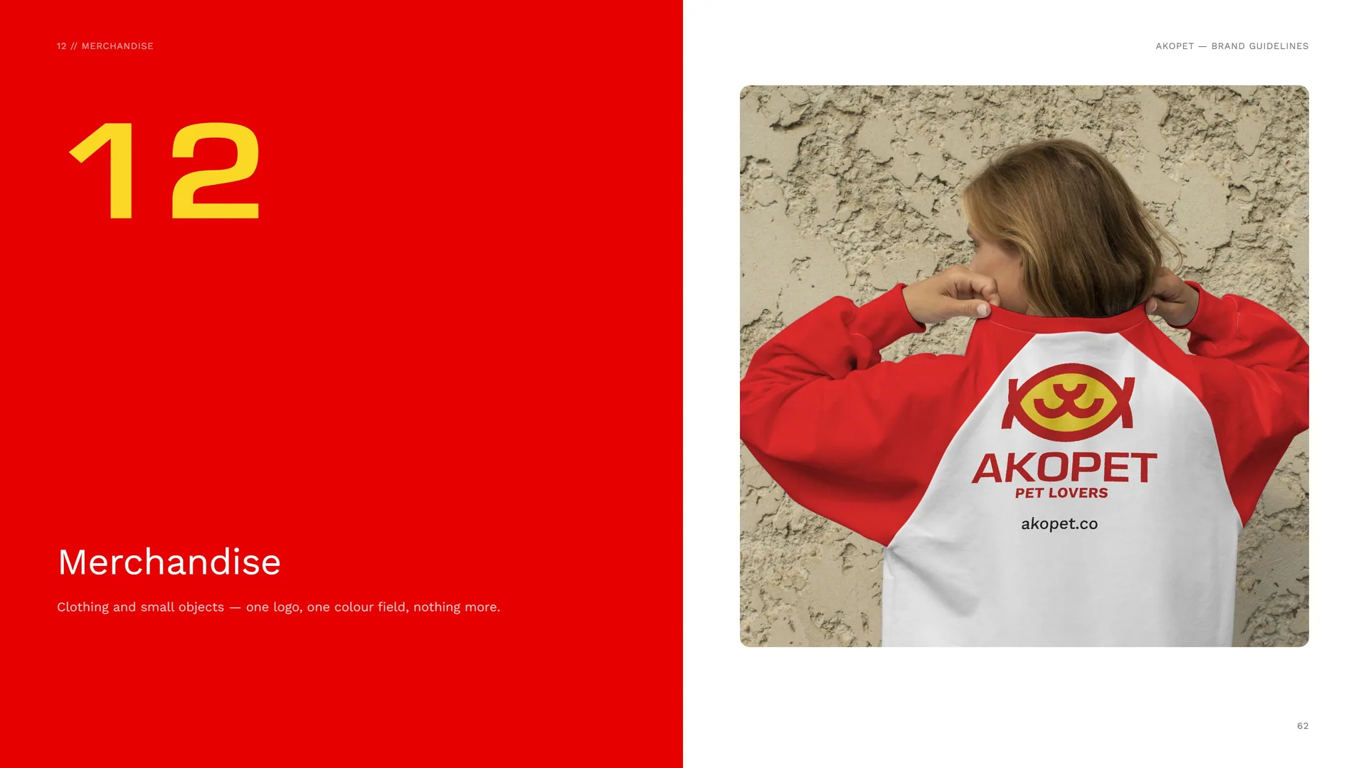
Clothing and small objects — one logo, one colour field, nothing more.
12.1
Merchandise
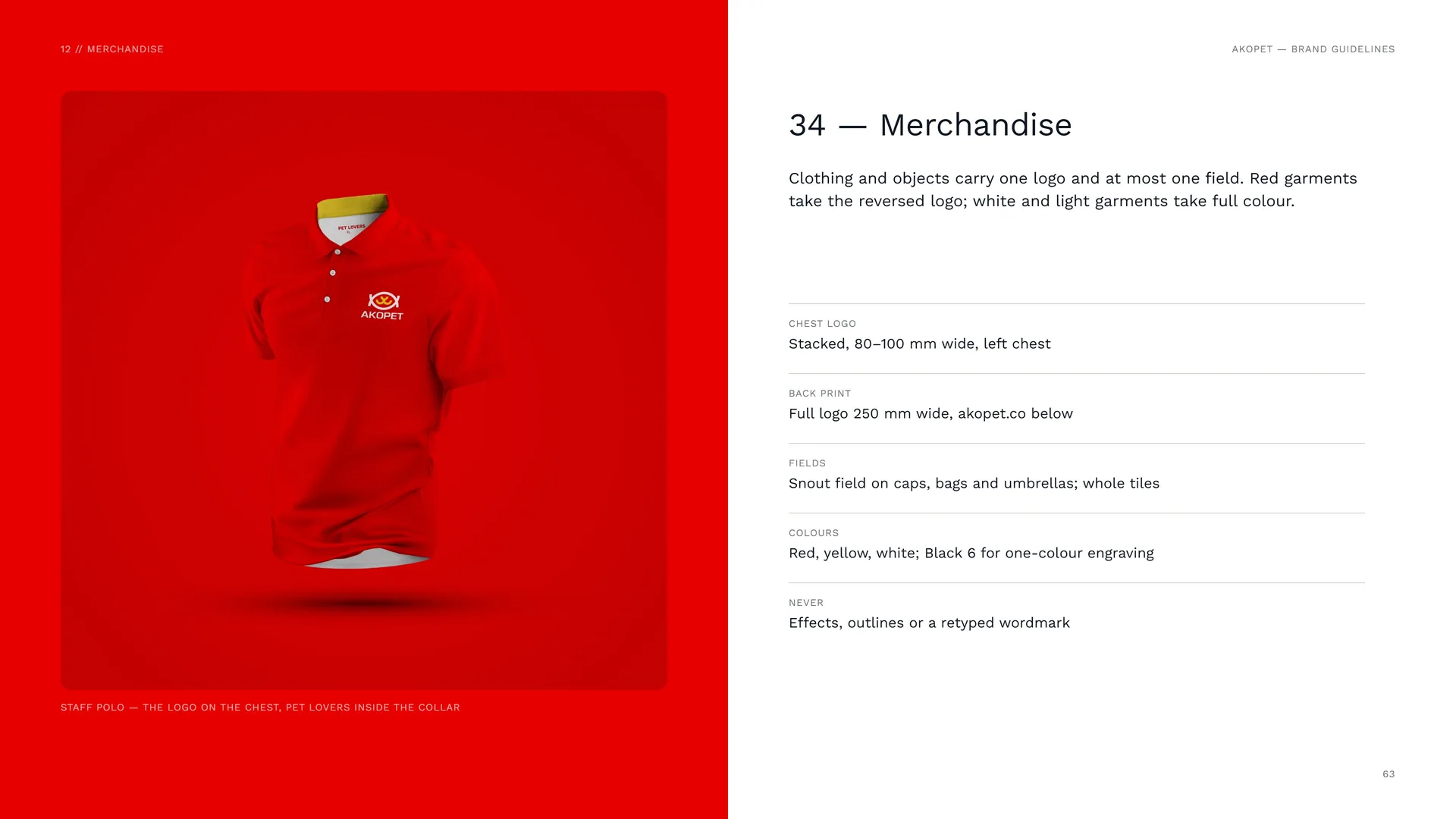
Staff polo — the logo on the chest, PET LOVERS inside the collar.
Clothing and objects carry one logo and at most one field. Red garments take the reversed logo; white and light garments take full colour.
Chest logo: Stacked, 80–100 mm wide, left chest.
Back print: Full logo 250 mm wide, akopet.co below.
Fields: Snout field on caps, bags and umbrellas; whole tiles.
Colours: Red, yellow, white; Black 6 for one-colour engraving.
Never: Effects, outlines or a retyped wordmark.
12.2
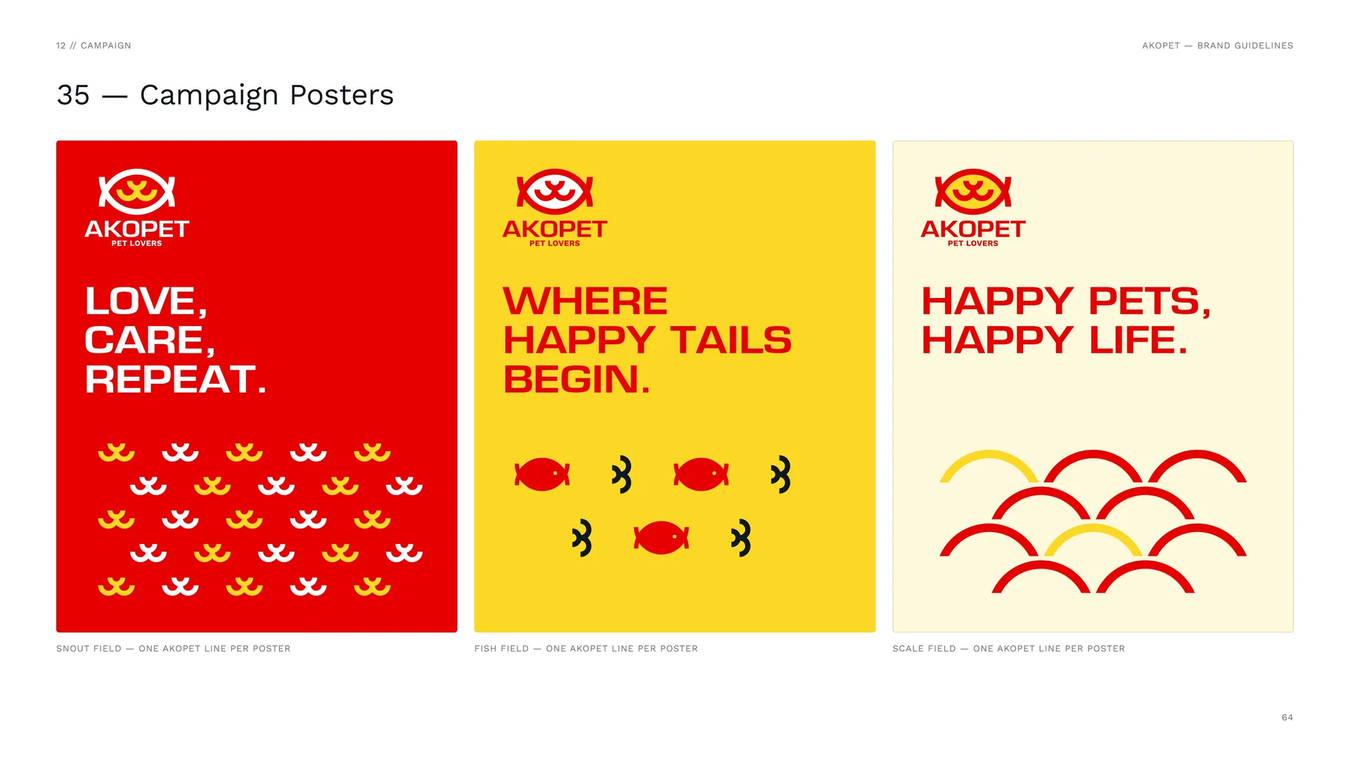
Campaign Posters
Snout field — one AKOPET line per poster.
Fish field — one AKOPET line per poster.
Scale field — one AKOPET line per poster.
13
Signage & environment
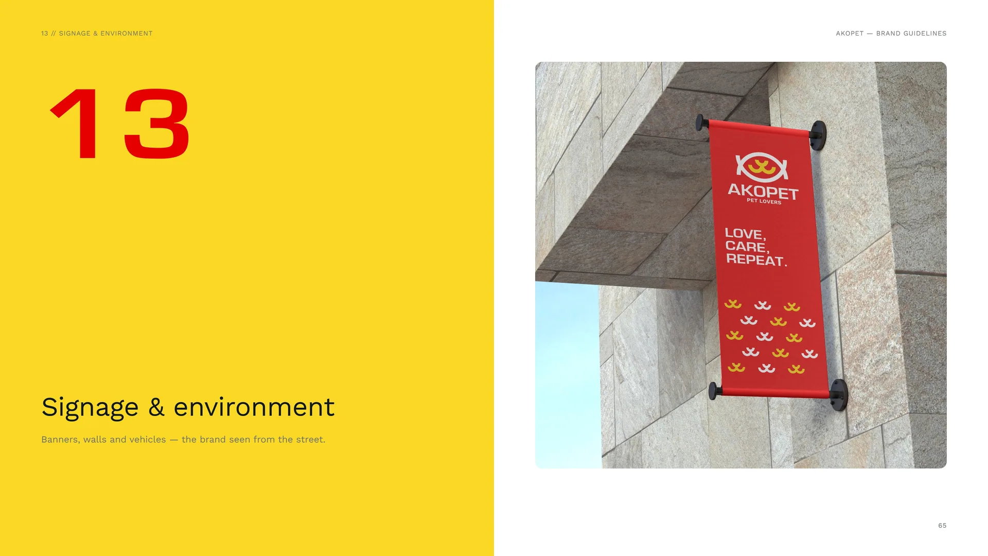
Banners, walls and vehicles — the brand seen from the street.
13.1
Vehicle
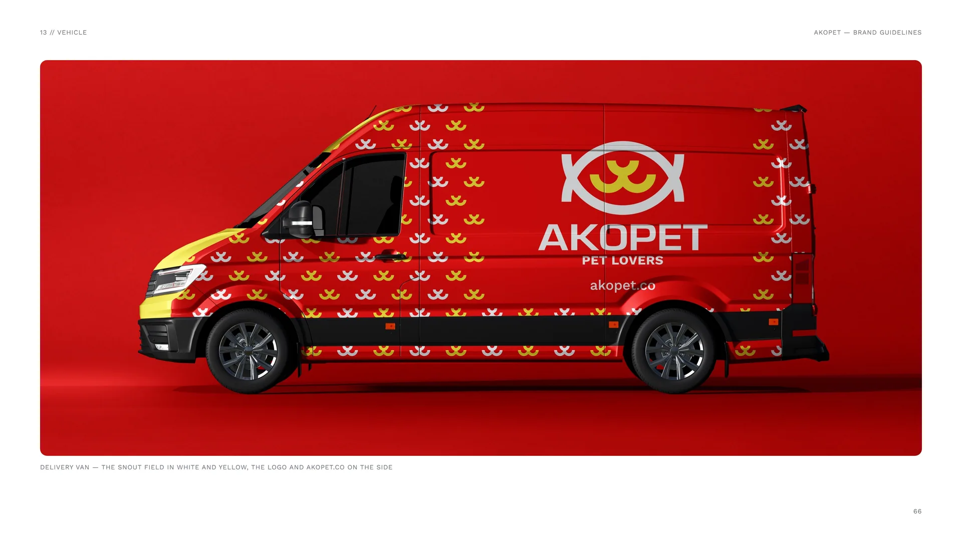
Delivery van — the snout field in white and yellow, the logo and akopet.co on the side.
13.2
Street
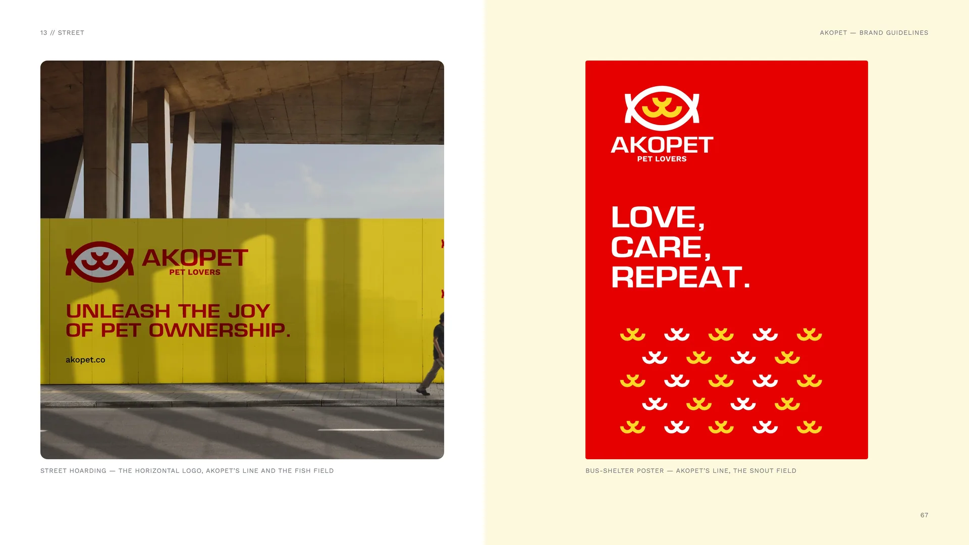
Street hoarding — the horizontal logo, AKOPET’s line and the fish field.
Bus-shelter poster — AKOPET’s line, the snout field.
13.3
Signage System
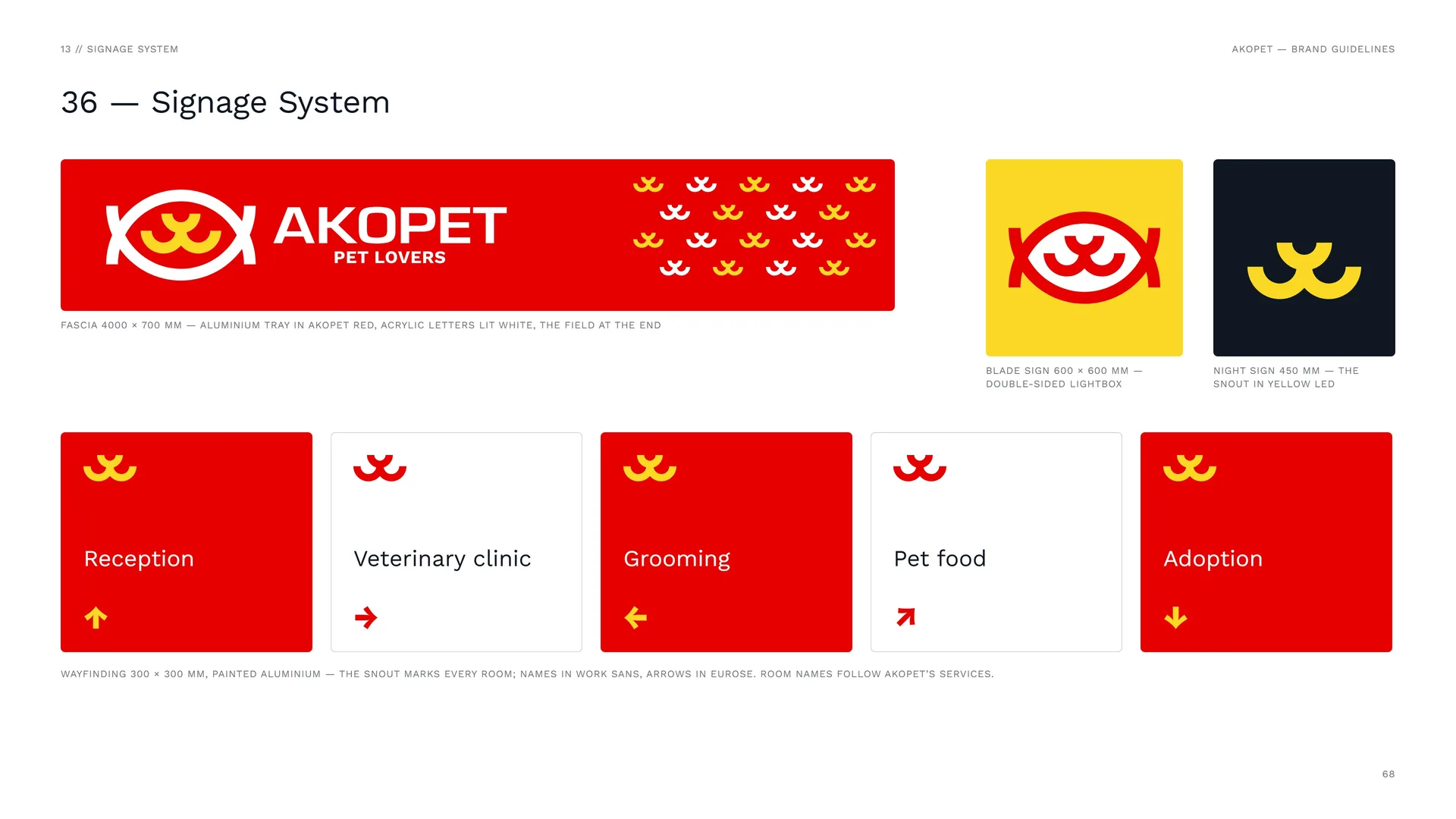
Fascia 4000 × 700 mm — aluminium tray in AKOPET red, acrylic letters lit white, the field at the end.
Blade sign 600 × 600 mm — double-sided lightbox.
Night sign 450 mm — the snout in yellow LED.
Wayfinding 300 × 300 mm, painted aluminium — the snout marks every room; names in Work Sans, arrows in Eurose. Room names follow AKOPET’s services.
14
Files & contact
14.1
Files & Contact
Website: akopet.co.
Logo files: AI · EPS · SVG · PDF · PNG — full colour, reversed, one colour.
Colour: Print CMYK + Pantone; screen RGB / HEX.
Typefaces: Eurose (display) · Work Sans (text).
Photography: Photos: Wikimedia Commons, CC0 / public domain.
Identity: Logo design & brand identity — Studio Mouneskhah.
Version 1.0 · November 2026.
14.2
Thank you
AKOPET // Love, care, repeat.
2026