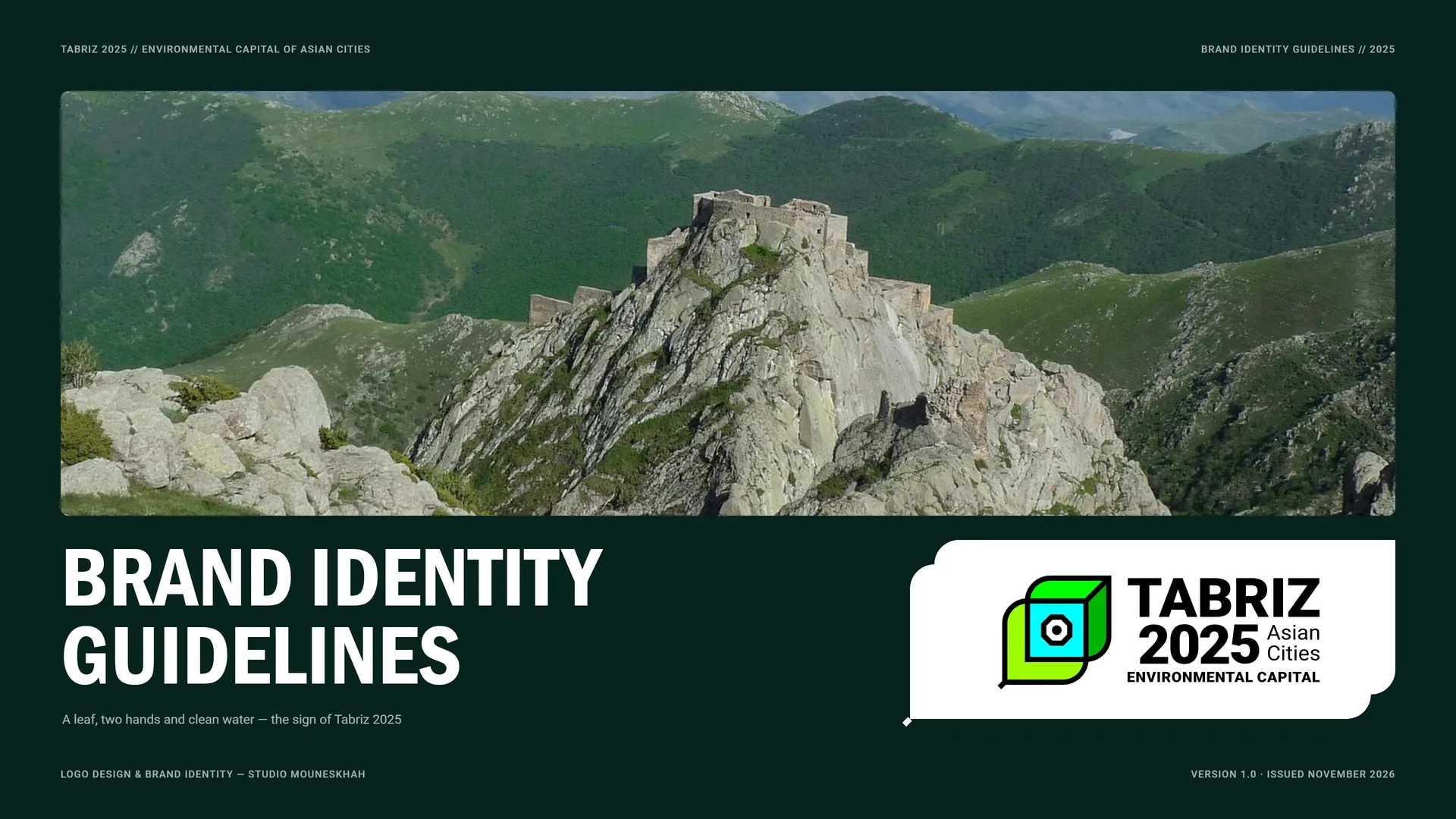
TABRIZ 2025 Brand Identity Guidelines
TABRIZ 2025 is the sign of Tabriz as the Environmental Capital of Asian Cities. It joins the historic identity of the city with today’s ideas of environment: a leaf, two hands, clean water and the octagon of El Gölü, drawn in one line.
- Клиент
- TABRIZ 2025
- Сфера
- Environmental Capital of Asian Cities · Tabriz, East Azerbaijan
- Услуги
- Фирменный стиль
- Проект
- Brand Identity Guidelines · v1.0 · 2025
00
Introduction
00.1
Brand Concept
TABRIZ 2025 is the sign of Tabriz as the Environmental Capital of Asian Cities. It joins the historic identity of the city with today’s ideas of environment: a leaf, two hands, clean water and the octagon of El Gölü, drawn in one line.
Brand idea: A city that keeps its past in its architecture, its present in its nature and its future in sustainable growth.
Essence: Leaf × Water.
Message: Protect what keeps a city alive.
Five ideas: Life · Care · Clean water & air · Heritage · Harmony.
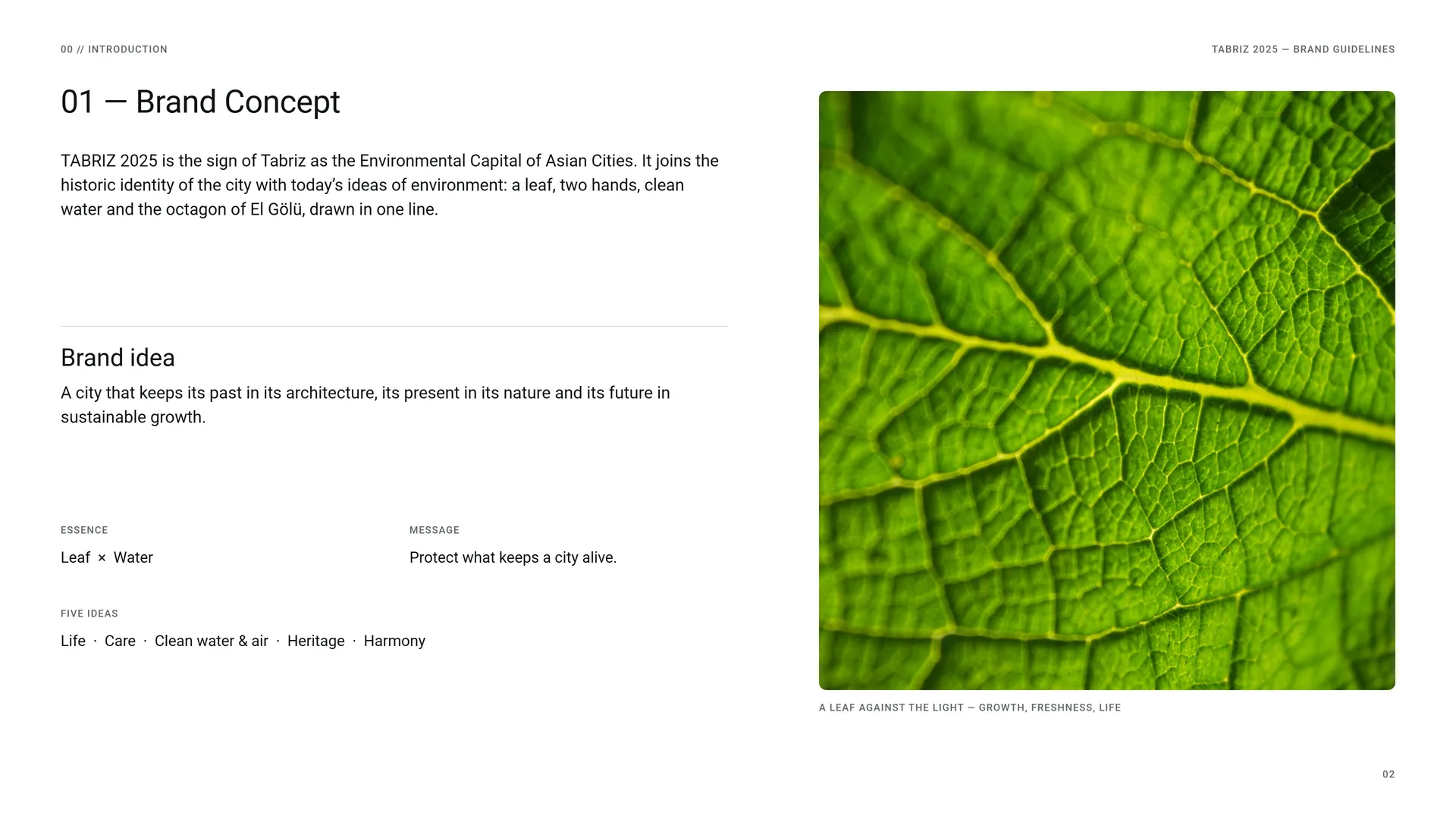
A leaf against the light — growth, freshness, life.
00.2
The Brief
The League of Asian Mayors named Tabriz the capital of environment, culture and tourism for 2025. The title needed one sign that speaks to residents, visitors and partner cities at once — modern enough to travel, rooted enough to belong to Tabriz.
The challenge: A city title, not a product · One sign for many languages and places · Heritage and environment in one form · From a pin badge to a city street.
The approach: Reduce the city’s landmarks to their simplest forms and set them inside a leaf — a symbol of life that every culture reads.
The opportunity: A sign simple enough for a pin and strong enough for a city.
The shift: From a city of monuments → a city that cares for its water, air and trees.
00.3
Primary Logo
01
Brand
- 01.1The City
- 01.2Past, Present, Future
- 01.3Five Ideas in One Sign
- 01.4Tone of Voice
- 01.5Brand Lines
- 01.6Writing the Name
01.1
The City
Tabriz // East Azerbaijan.
A city with a green future.
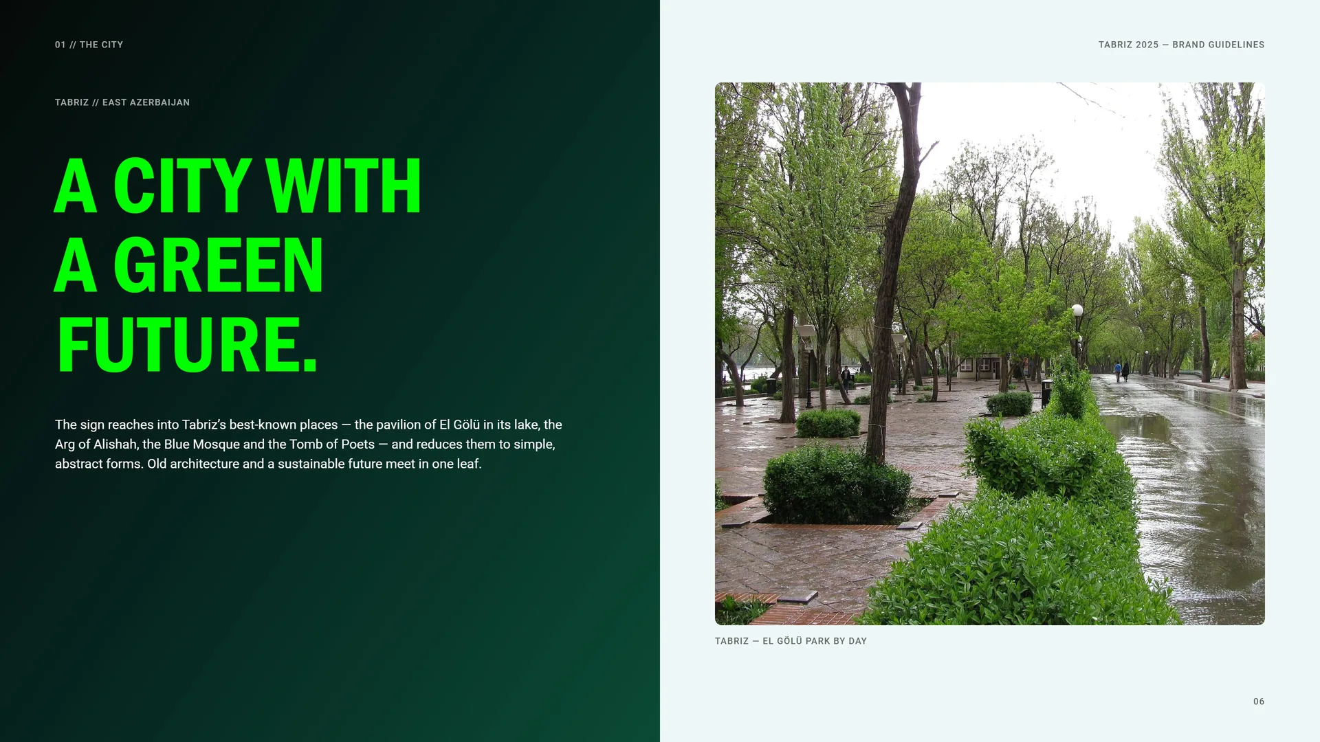
The sign reaches into Tabriz’s best-known places — the pavilion of El Gölü in its lake, the Arg of Alishah, the Blue Mosque and the Tomb of Poets — and reduces them to simple, abstract forms. Old architecture and a sustainable future meet in one leaf.
Tabriz — El Gölü Park by day.
01.2
Past, Present, Future
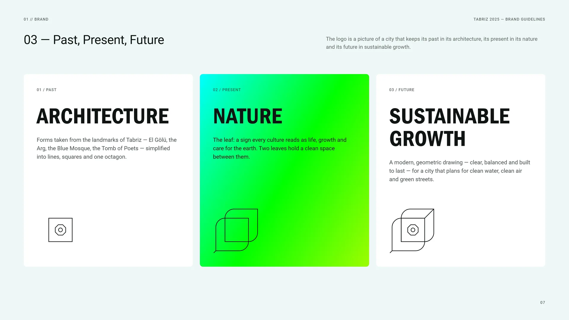
The logo is a picture of a city that keeps its past in its architecture, its present in its nature and its future in sustainable growth.
Past — Architecture: Forms taken from the landmarks of Tabriz — El Gölü, the Arg, the Blue Mosque, the Tomb of Poets — simplified into lines, squares and one octagon.
Present — Nature: The leaf: a sign every culture reads as life, growth and care for the earth. Two leaves hold a clean space between them.
Future — Sustainable growth: A modern, geometric drawing — clear, balanced and built to last — for a city that plans for clean water, clean air and green streets.
01.3
Five Ideas in One Sign
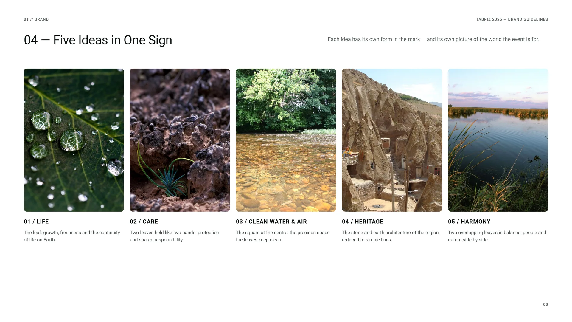
Each idea has its own form in the mark — and its own picture of the world the event is for.
Life: The leaf: growth, freshness and the continuity of life on Earth.
Care: Two leaves held like two hands: protection and shared responsibility.
Clean water & air: The square at the centre: the precious space the leaves keep clean.
Heritage: The stone and earth architecture of the region, reduced to simple lines.
Harmony: Two overlapping leaves in balance: people and nature side by side.
01.4
Tone of Voice
Simple, meaningful and easy to recognise — the qualities the sign was drawn for. The words follow it: clear facts, a committed and balanced message, local roots in a language the whole world reads.
Simple: Short sentences, one idea at a time.
Committed: Clear about what the city does for its water, air and trees.
Balanced: Hopeful and factual, never a warning shout.
Rooted: Name the places of Tabriz; speak for this city.
Open: Written for residents, visitors and partner cities alike.
Not: Complex · Neutral · Alarmist · Generic · Closed.
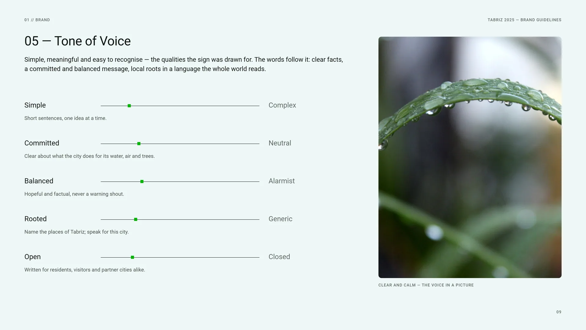
Clear and calm — the voice in a picture.
01.5
Brand Lines
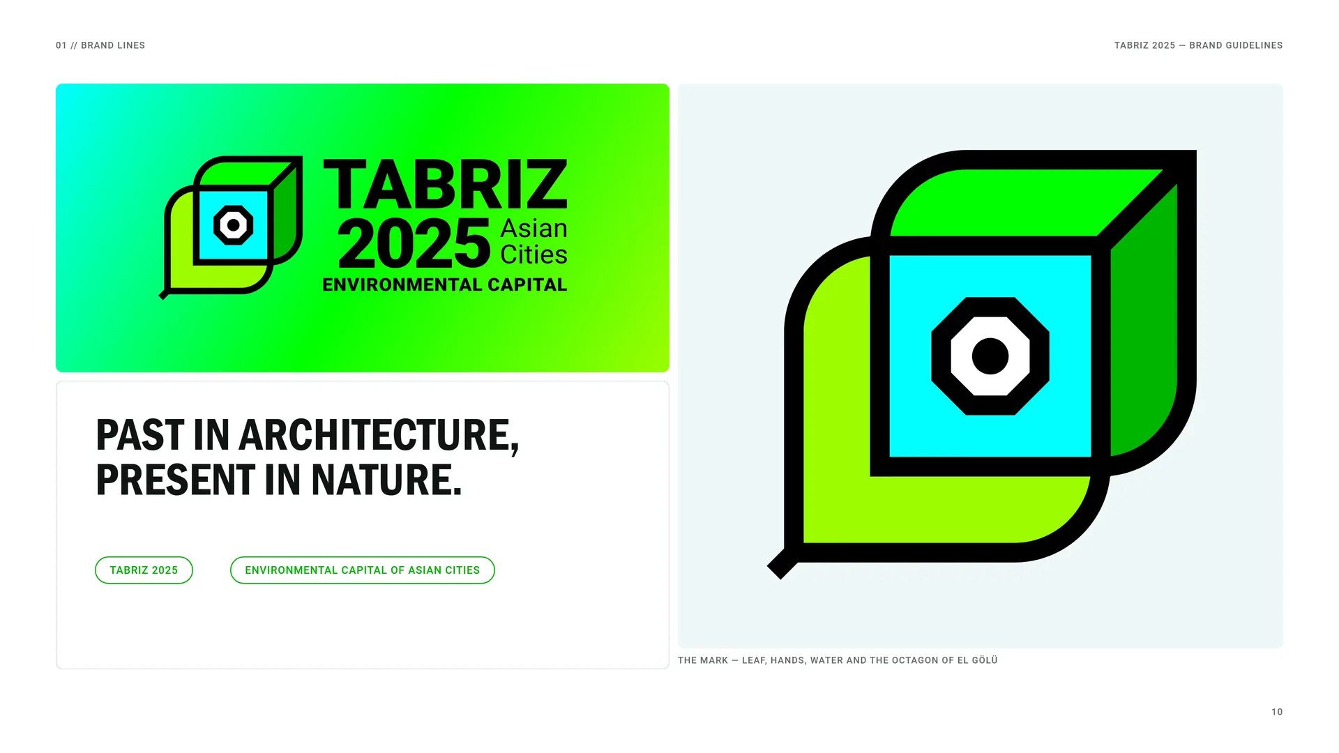
Past in architecture, present in nature.
TABRIZ 2025 · Environmental Capital of Asian Cities.
The mark — leaf, hands, water and the octagon of El Gölü.
01.6
Writing the Name
Full name: TABRIZ 2025 — Environmental Capital of Asian Cities. Titles, the first mention in a text, partner documents.
Short name: Tabriz 2025. Every mention after the first; social media; signs with little room.
Title line: Environmental Capital of Asian Cities. Under the name, in sentence case: never “Environment Capital”, never shortened.
The year: 2025, always in figures. Never “Tabriz ’25” or the year in words.
The logo is always the drawn lockup from the master file. In running text the name is set in Roboto like any other words — never in the logo’s own arrangement.
02
Concept
- 02.1Leaf + Hands + Water = One Mark
- 02.2Logo Meaning
- 02.3Two Leaves, Two Hands
- 02.4Clean Water at the Heart
- 02.5The Octagon of El Gölü
- 02.6Line Art, Leaf and Arch
- 02.7The Mark in Motion
02.1
Leaf + Hands + Water = One Mark
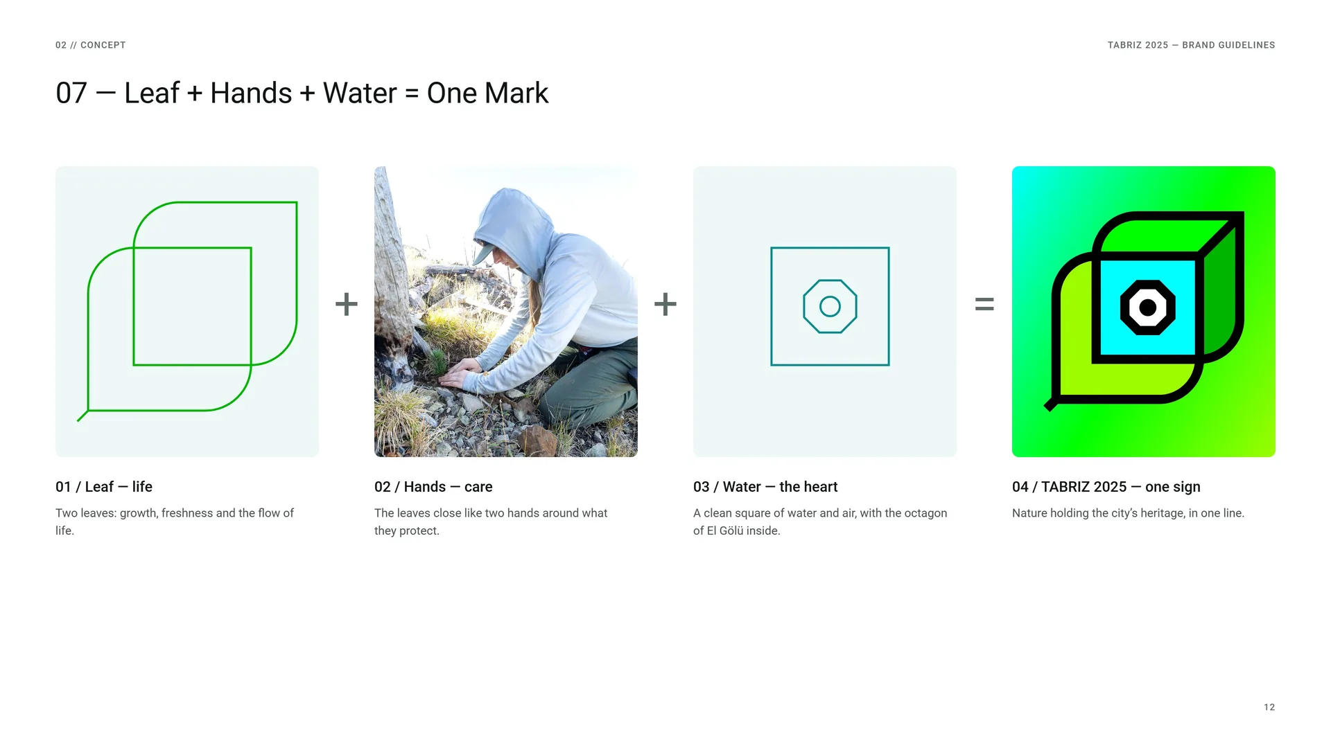
Leaf — life: Two leaves: growth, freshness and the flow of life.
Hands — care: The leaves close like two hands around what they protect.
Water — the heart: A clean square of water and air, with the octagon of El Gölü inside.
TABRIZ 2025 — one sign: Nature holding the city’s heritage, in one line.
02.2
Logo Meaning
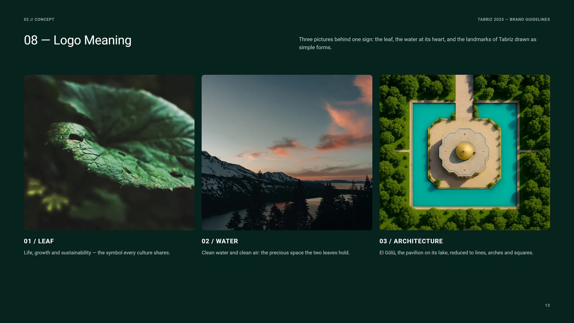
Three pictures behind one sign: the leaf, the water at its heart, and the landmarks of Tabriz drawn as simple forms.
Leaf: Life, growth and sustainability — the symbol every culture shares.
Water: Clean water and clean air: the precious space the two leaves hold.
Architecture: El Gölü, the pavilion on its lake, reduced to lines, arches and squares.
02.3
Two Leaves, Two Hands
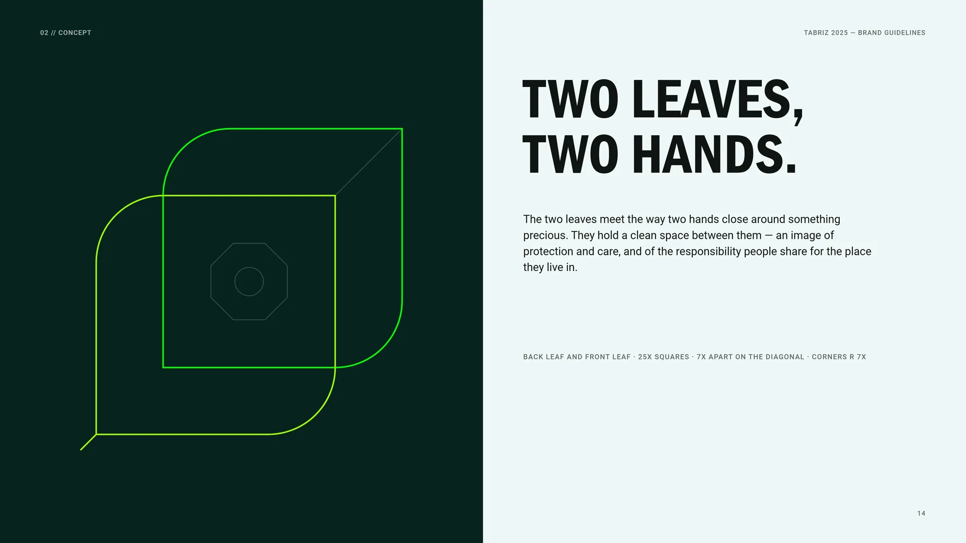
The two leaves meet the way two hands close around something precious. They hold a clean space between them — an image of protection and care, and of the responsibility people share for the place they live in.
Back leaf and front leaf · 25X squares · 7X apart on the diagonal · corners r 7X.
02.4
Clean Water at the Heart
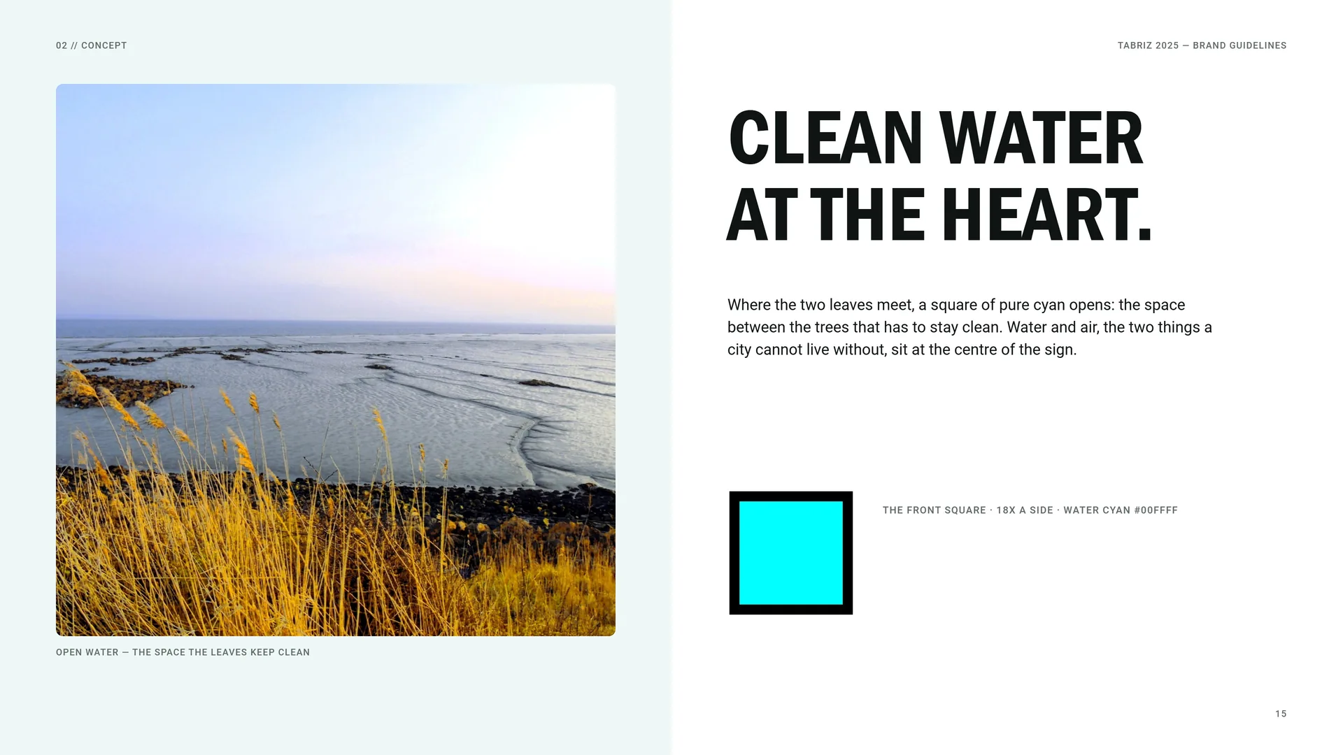
Open water — the space the leaves keep clean.
Where the two leaves meet, a square of pure cyan opens: the space between the trees that has to stay clean. Water and air, the two things a city cannot live without, sit at the centre of the sign.
The front square · 18X a side · water cyan #00FFFF.
02.5
The Octagon of El Gölü
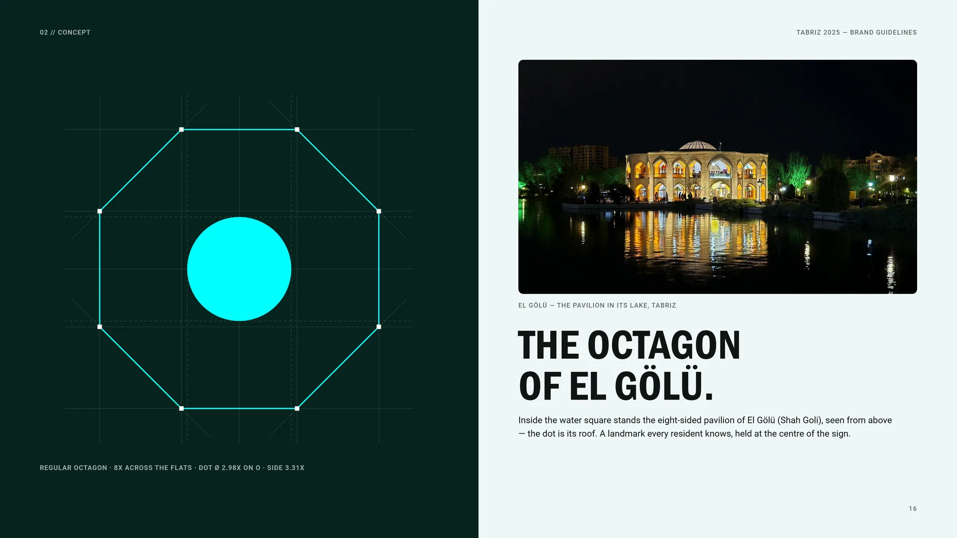
Regular octagon · 8X across the flats · dot Ø 2.98X on O · side 3.31X.
El Gölü — the pavilion in its lake, Tabriz.
Inside the water square stands the eight-sided pavilion of El Gölü (Shah Goli), seen from above — the dot is its roof. A landmark every resident knows, held at the centre of the sign.
02.6
Line Art, Leaf and Arch
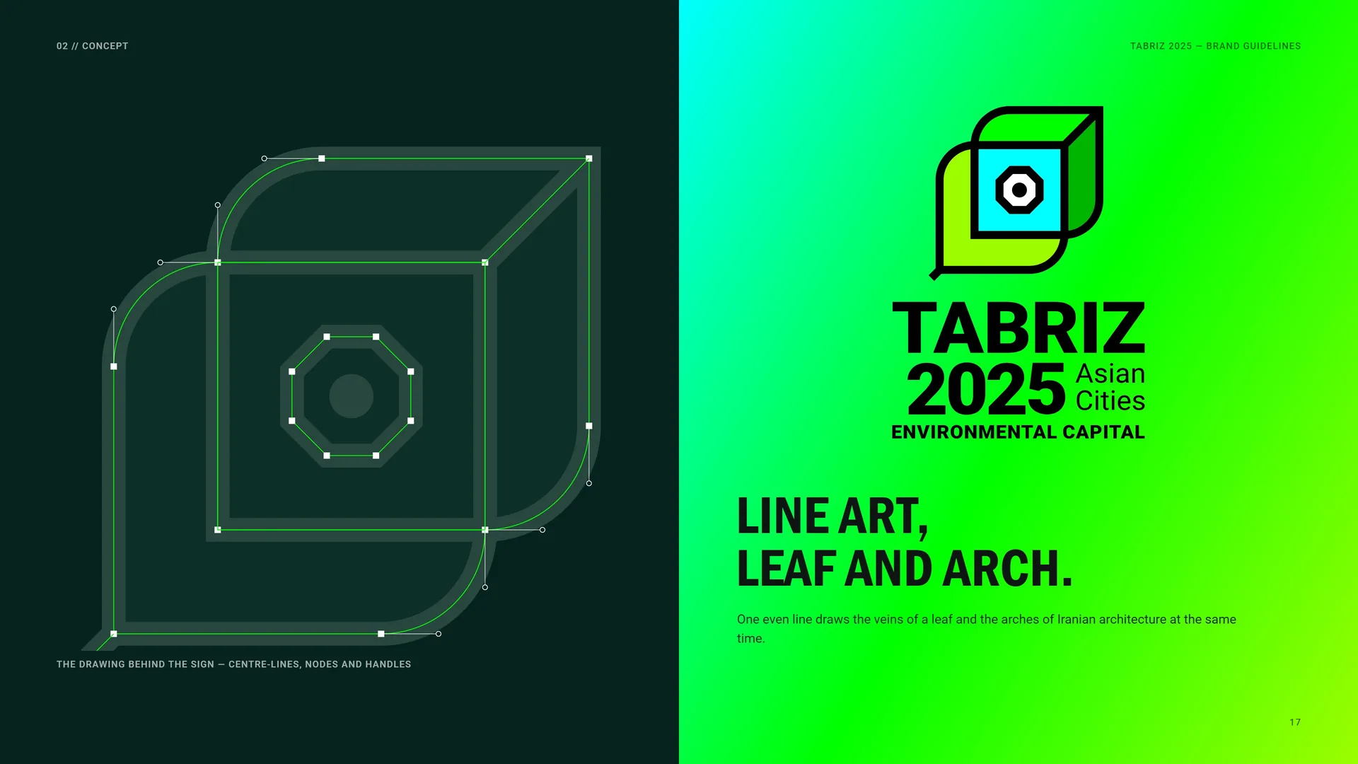
The drawing behind the sign — centre-lines, nodes and handles.
One even line draws the veins of a leaf and the arches of Iranian architecture at the same time.
02.7
The Mark in Motion
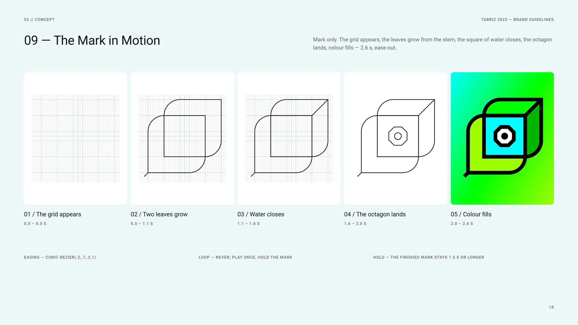
Mark only. The grid appears, the leaves grow from the stem, the square of water closes, the octagon lands, colour fills — 2.6 s, ease-out.
The grid appears: 0.0 – 0.5 s.
Two leaves grow: 0.5 – 1.1 s.
Water closes: 1.1 – 1.6 s.
The octagon lands: 1.6 – 2.0 s.
Colour fills: 2.0 – 2.6 s.
Easing — cubic-bezier(.2,.7,.2,1).
Loop — never; play once, hold the mark.
Hold — the finished mark stays 1.5 s or longer.
03
Logo & grid
- 03.1The Primary Logo
- 03.2The Logo Family
- 03.3Anatomy
- 03.4The Grid
- 03.5Proportions in X
- 03.6One Radius, One Angle
- 03.7Octagon and Dot
- 03.8The Word Block
- 03.9Stacked Proportions
- 03.10Horizontal Proportions
- 03.11Clear Space
- 03.12Colour Versions
- 03.13App Icon & Favicon
- 03.14Minimum Size
- 03.15Misuse
- 03.16Logo on Grounds & Photos
03.1
The Primary Logo
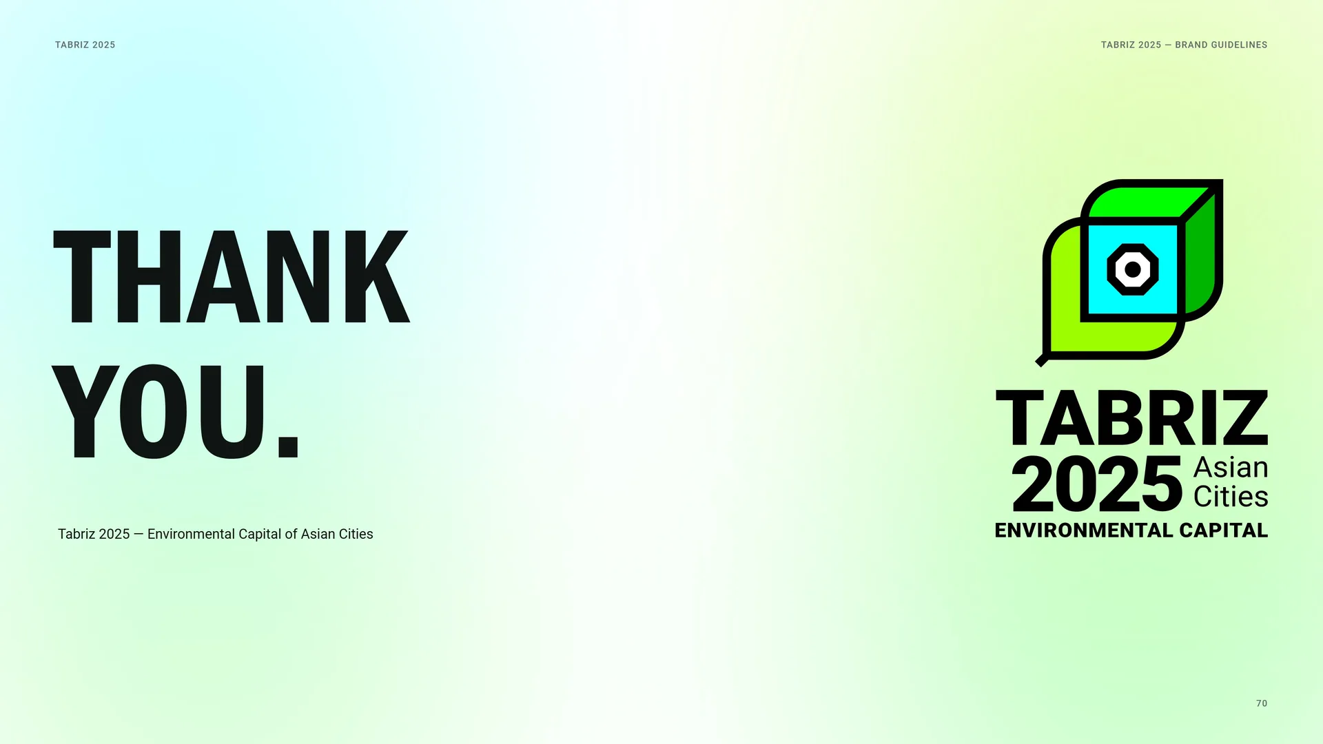
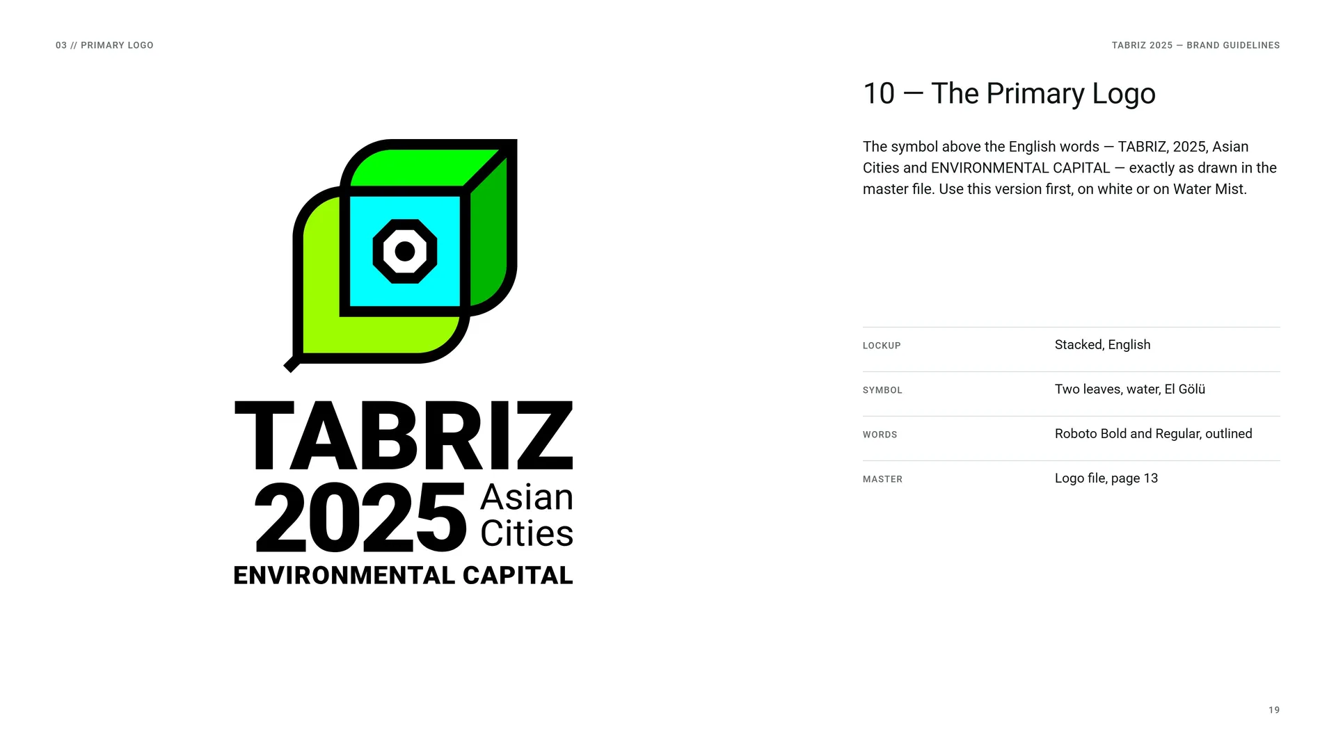
The symbol above the English words — TABRIZ, 2025, Asian Cities and ENVIRONMENTAL CAPITAL — exactly as drawn in the master file. Use this version first, on white or on Water Mist.
Lockup: Stacked, English.
Symbol: Two leaves, water, El Gölü.
Words: Roboto Bold and Regular, outlined.
Master: Logo file, page 13.
03.2
The Logo Family
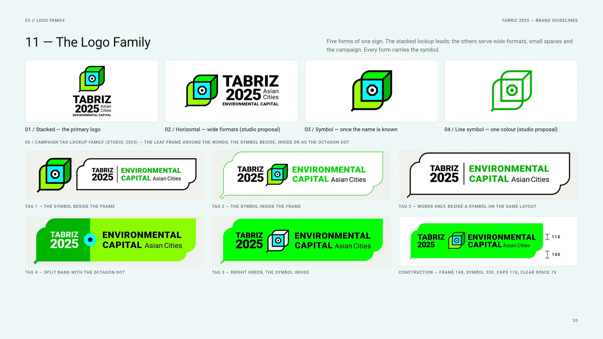
Five forms of one sign. The stacked lockup leads; the others serve wide formats, small spaces and the campaign. Every form carries the symbol.
Stacked — the primary logo.
Horizontal — wide formats (studio proposal).
Symbol — once the name is known.
Line symbol — one colour (studio proposal).
Campaign tag-lockup family (studio, 2025) — the leaf frame around the words; the symbol beside, inside or as the octagon dot.
Tag 1 — the symbol beside the frame.
Tag 2 — the symbol inside the frame.
Tag 3 — words only, beside a symbol on the same layout.
Tag 4 — split band with the octagon dot.
Tag 5 — bright green, the symbol inside.
Construction — frame 14X, symbol 35X, caps 11X, clear space 7X.
03.3
Anatomy
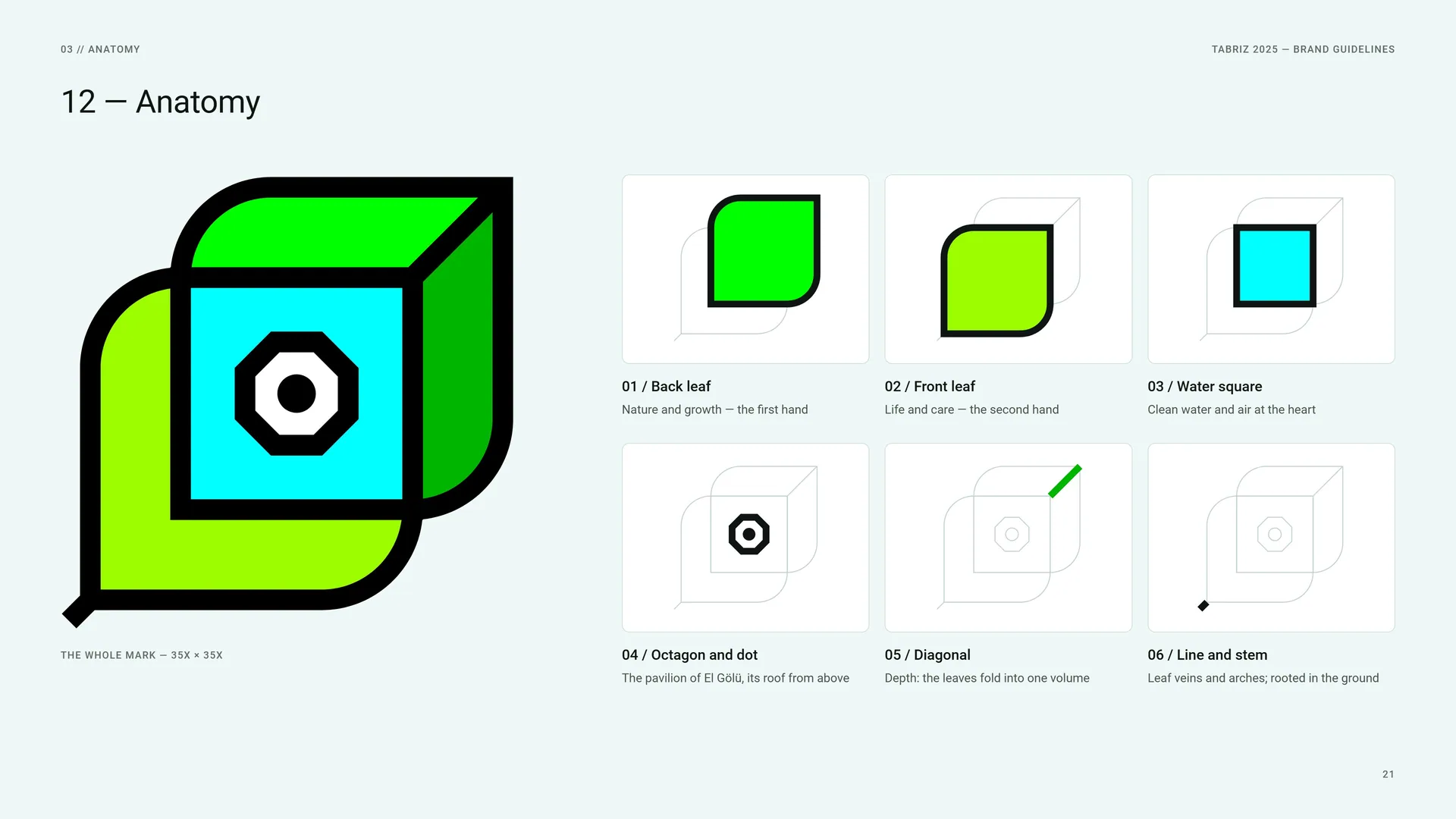
The whole mark — 35X × 35X.
Back leaf: Nature and growth — the first hand.
Front leaf: Life and care — the second hand.
Water square: Clean water and air at the heart.
Octagon and dot: The pavilion of El Gölü, its roof from above.
Diagonal: Depth: the leaves fold into one volume.
Line and stem: Leaf veins and arches; rooted in the ground.
03.4
The Grid
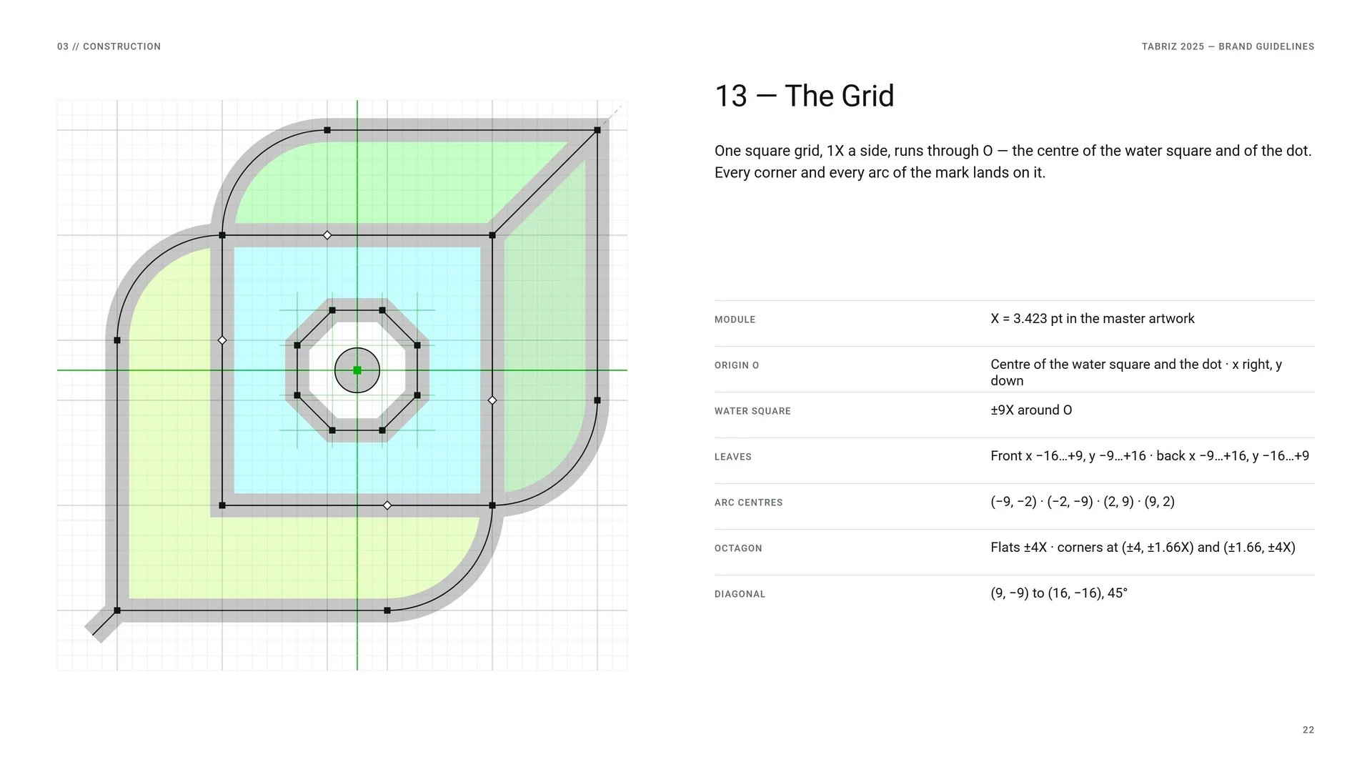
One square grid, 1X a side, runs through O — the centre of the water square and of the dot. Every corner and every arc of the mark lands on it.
Module: X = 3.423 pt in the master artwork.
Origin O: Centre of the water square and the dot · x right, y down.
Water square: ±9X around O.
Leaves: Front x −16…+9, y −9…+16 · back x −9…+16, y −16…+9.
Arc centres: (−9, −2) · (−2, −9) · (2, 9) · (9, 2).
Octagon: Flats ±4X · corners at (±4, ±1.66X) and (±1.66, ±4X).
Diagonal: (9, −9) to (16, −16), 45°.
03.5
Proportions in X
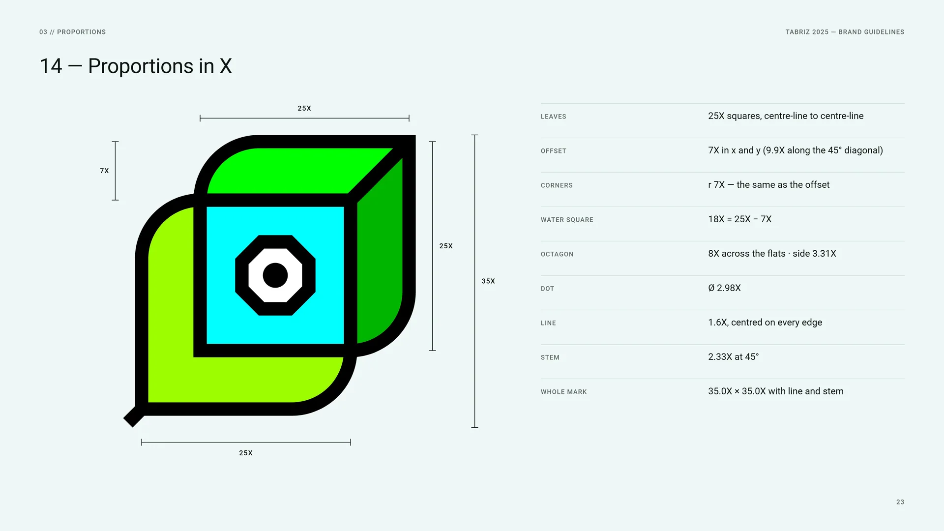
Leaves: 25X squares, centre-line to centre-line.
Offset: 7X in x and y (9.9X along the 45° diagonal).
Corners: r 7X — the same as the offset.
Water square: 18X = 25X − 7X.
Octagon: 8X across the flats · side 3.31X.
Dot: Ø 2.98X.
Line: 1.6X, centred on every edge.
Stem: 2.33X at 45°.
Whole mark: 35.0X × 35.0X with line and stem.
03.6
One Radius, One Angle
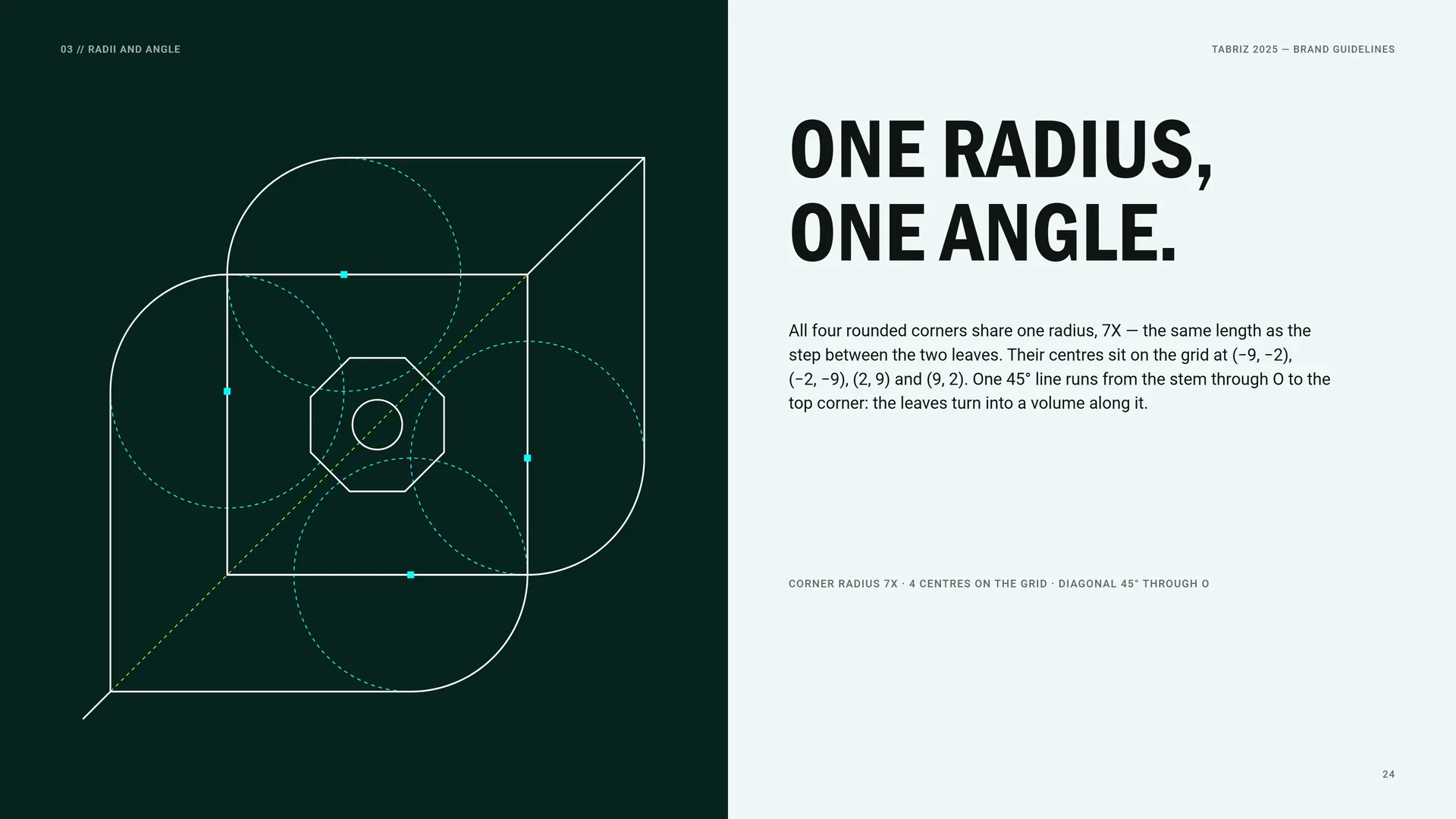
All four rounded corners share one radius, 7X — the same length as the step between the two leaves. Their centres sit on the grid at (−9, −2), (−2, −9), (2, 9) and (9, 2). One 45° line runs from the stem through O to the top corner: the leaves turn into a volume along it.
Corner radius 7X · 4 centres on the grid · diagonal 45° through O.
03.7
Octagon and Dot
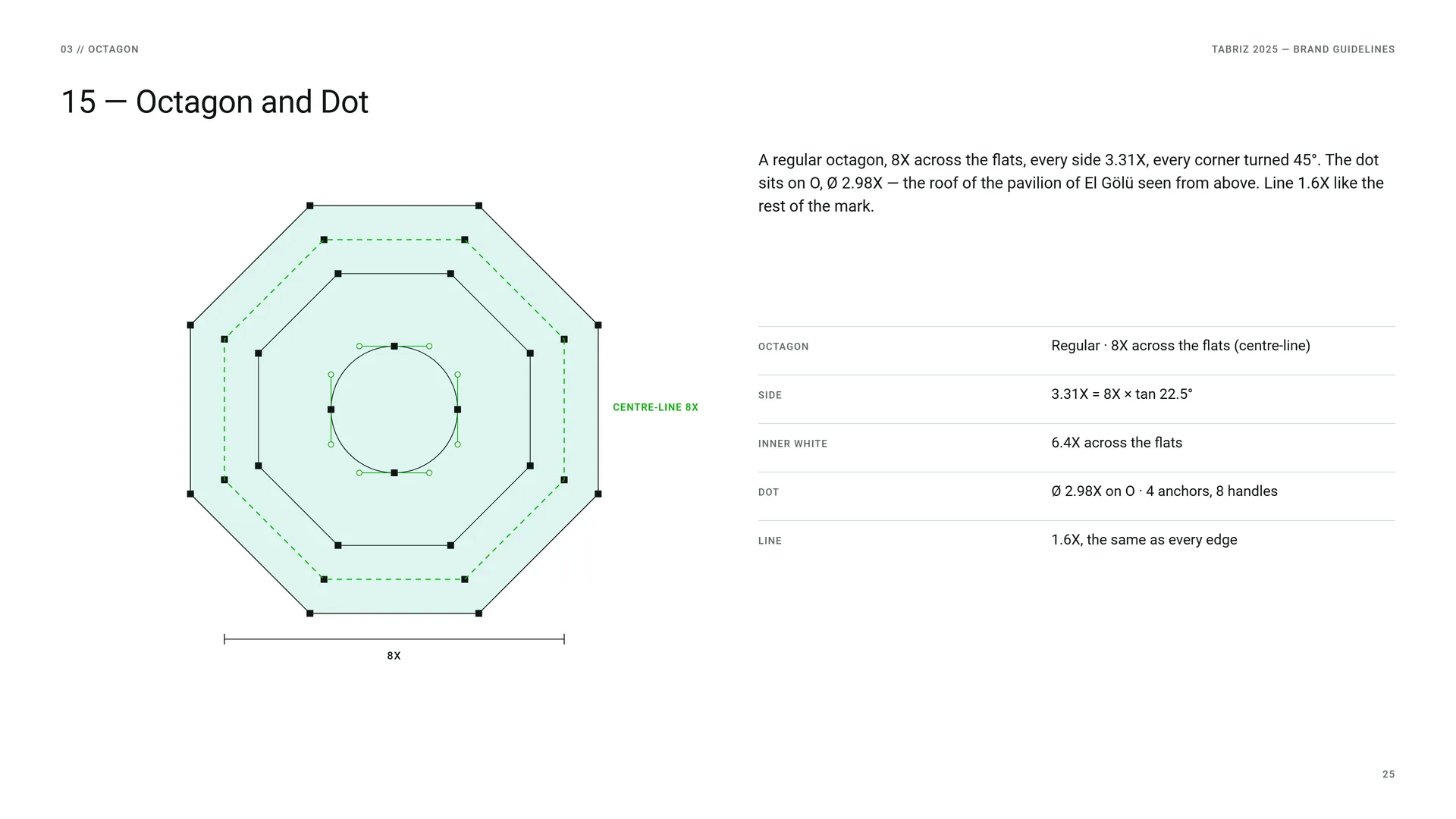
A regular octagon, 8X across the flats, every side 3.31X, every corner turned 45°. The dot sits on O, Ø 2.98X — the roof of the pavilion of El Gölü seen from above. Line 1.6X like the rest of the mark.
Octagon: Regular · 8X across the flats (centre-line).
Side: 3.31X = 8X × tan 22.5°.
Inner white: 6.4X across the flats.
Dot: Ø 2.98X on O · 4 anchors, 8 handles.
Line: 1.6X, the same as every edge.
03.8
The Word Block
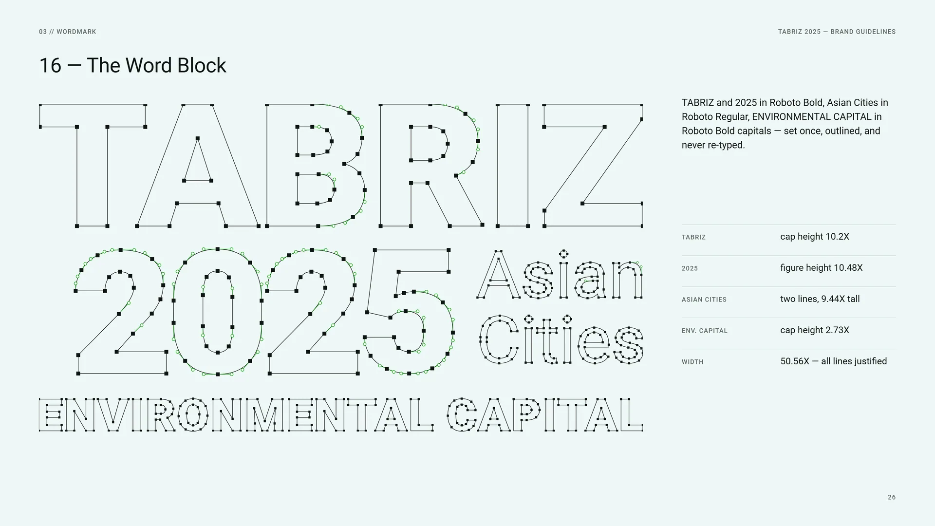
TABRIZ and 2025 in Roboto Bold, Asian Cities in Roboto Regular, ENVIRONMENTAL CAPITAL in Roboto Bold capitals — set once, outlined, and never re-typed.
TABRIZ: cap height 10.2X.
2025: figure height 10.48X.
Asian Cities: two lines, 9.44X tall.
Env. Capital: cap height 2.73X.
Width: 50.56X — all lines justified.
03.9
Stacked Proportions
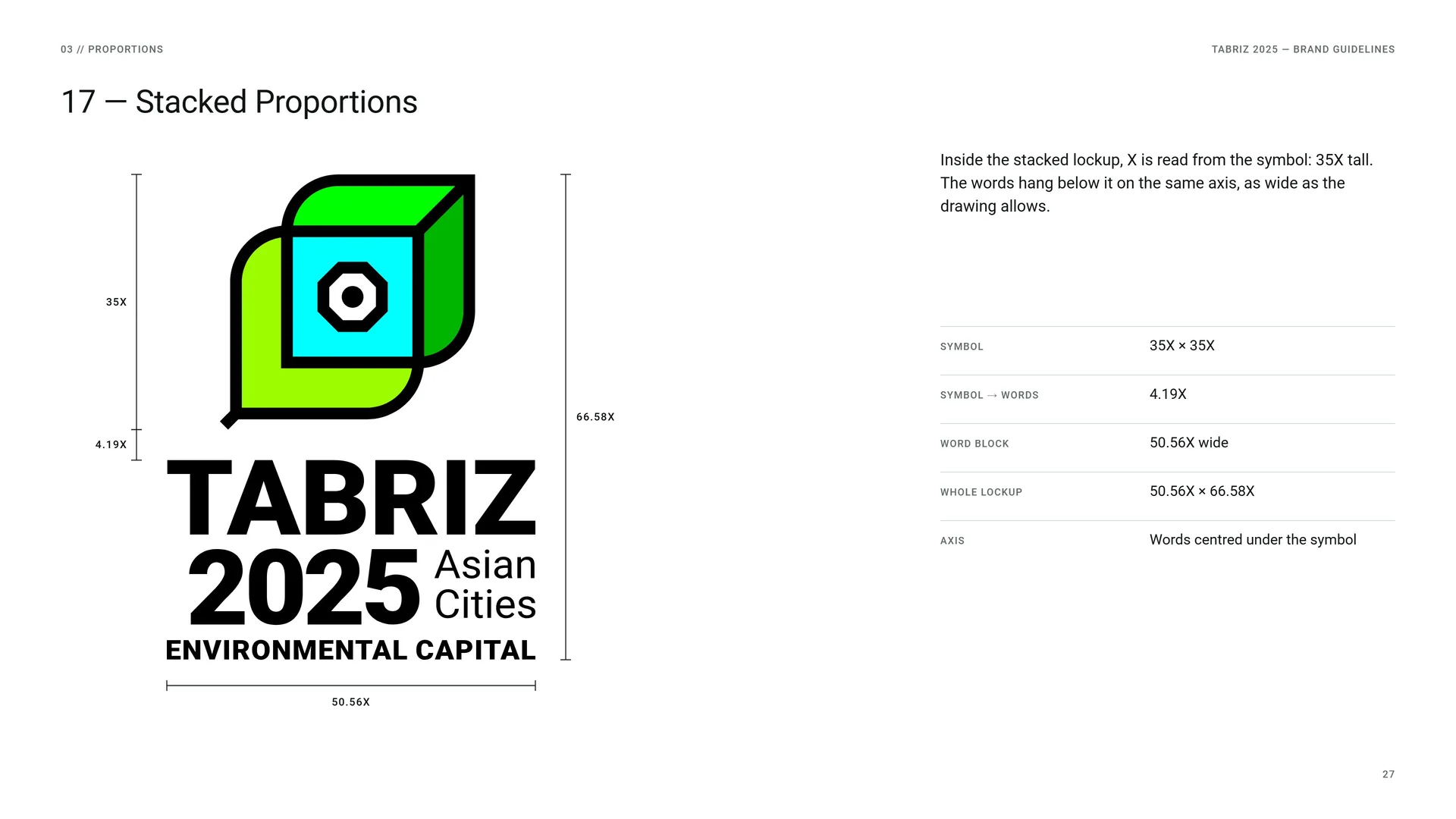
Inside the stacked lockup, X is read from the symbol: 35X tall. The words hang below it on the same axis, as wide as the drawing allows.
Symbol: 35X × 35X.
Symbol → words: 4.19X.
Word block: 50.56X wide.
Whole lockup: 50.56X × 66.58X.
Axis: Words centred under the symbol.
03.10
Horizontal Proportions
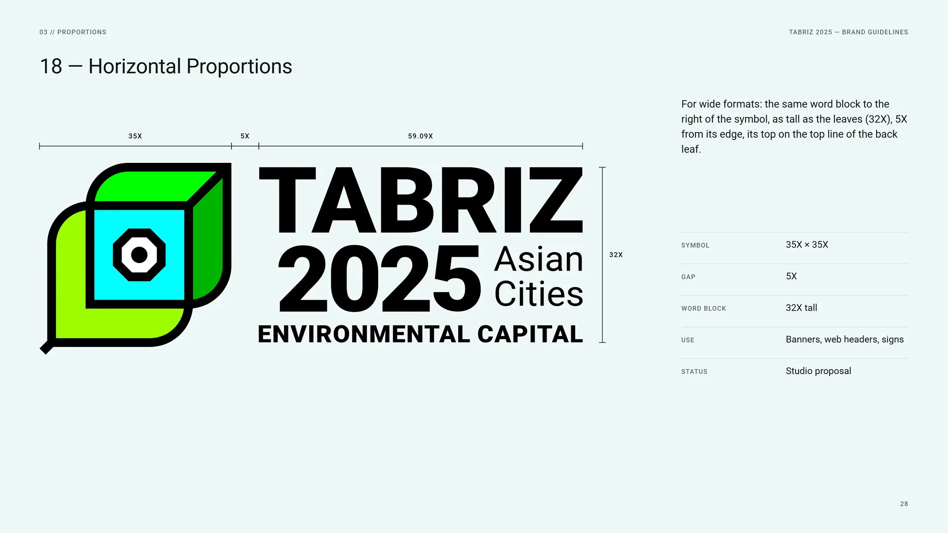
For wide formats: the same word block to the right of the symbol, as tall as the leaves (32X), 5X from its edge, its top on the top line of the back leaf.
Symbol: 35X × 35X.
Gap: 5X.
Word block: 32X tall.
Use: Banners, web headers, signs.
Status: Studio proposal.
03.11
Clear Space
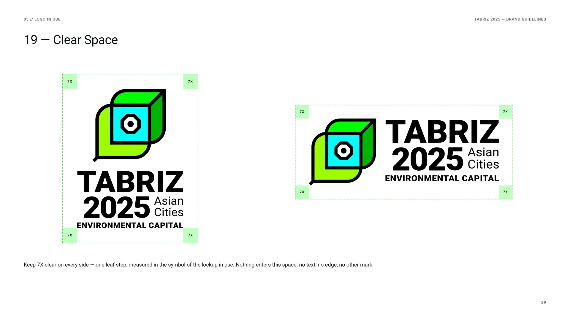
Keep 7X clear on every side — one leaf step, measured in the symbol of the lockup in use. Nothing enters this space: no text, no edge, no other mark.
03.12
Colour Versions
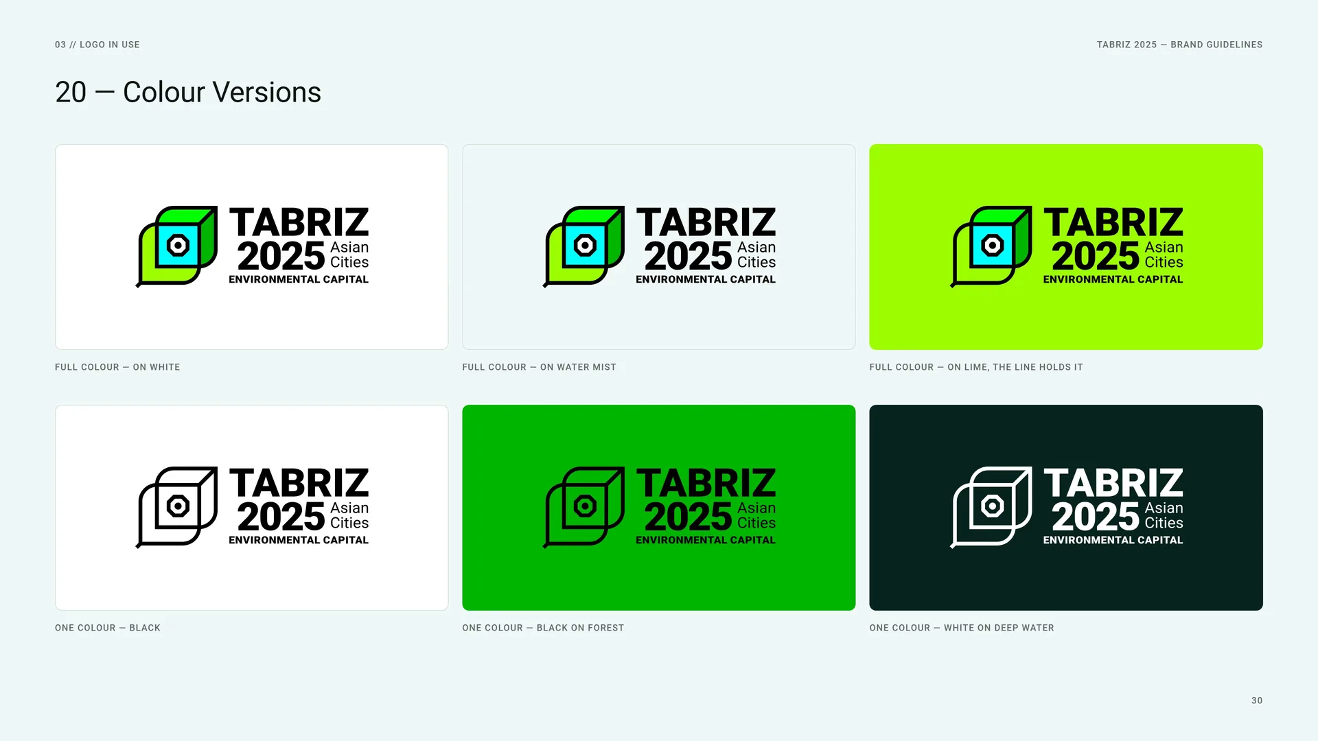
Full colour — on white.
Full colour — on Water Mist.
Full colour — on lime, the line holds it.
One colour — black.
One colour — black on Forest.
One colour — white on Deep Water.
03.13
App Icon & Favicon
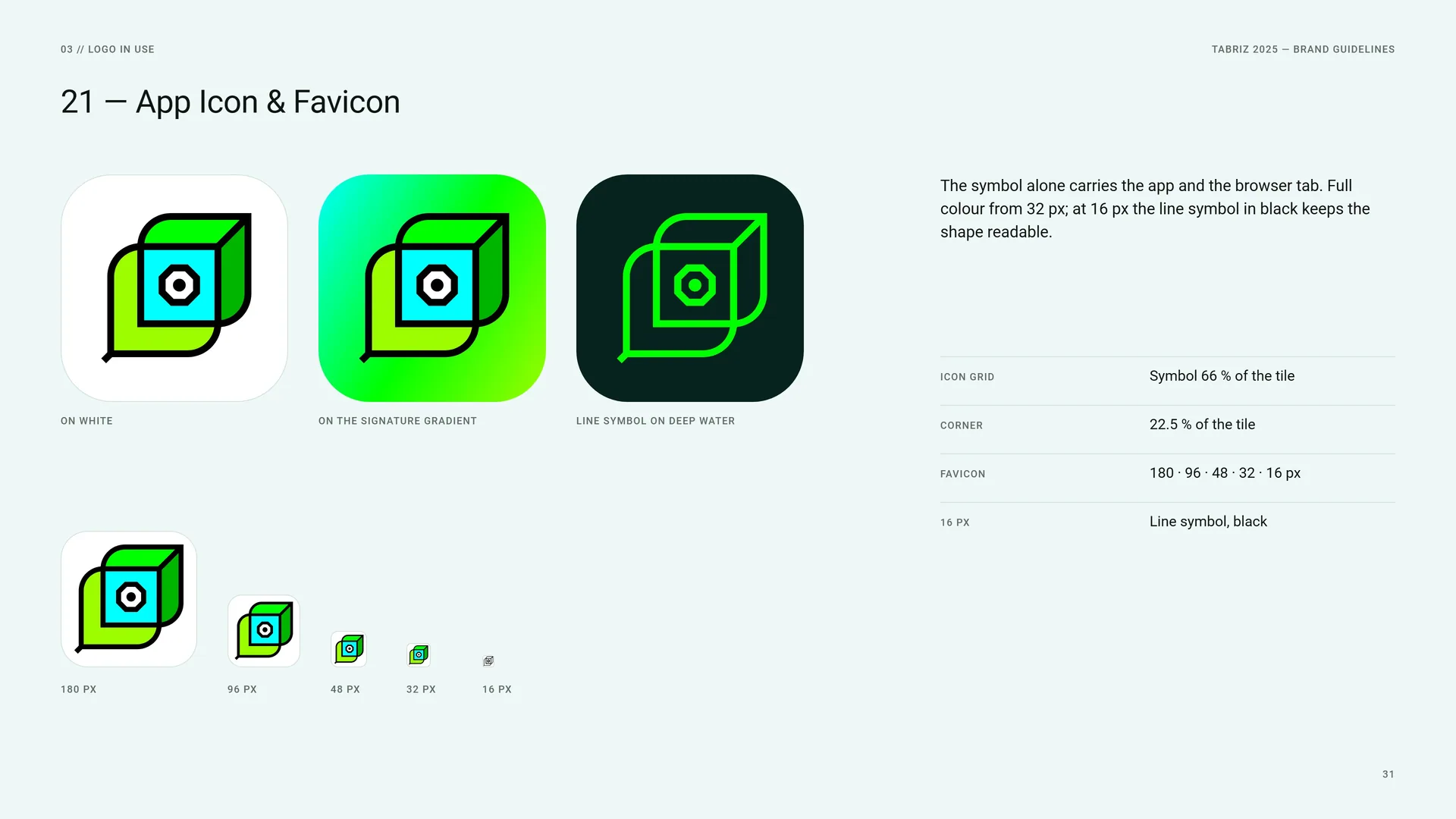
The symbol alone carries the app and the browser tab. Full colour from 32 px; at 16 px the line symbol in black keeps the shape readable.
On white.
On the signature gradient.
Line symbol on Deep Water.
Icon grid: Symbol 66 % of the tile.
Corner: 22.5 % of the tile.
Favicon: 180 · 96 · 48 · 32 · 16 px.
16 px: Line symbol, black.
03.14
Minimum Size
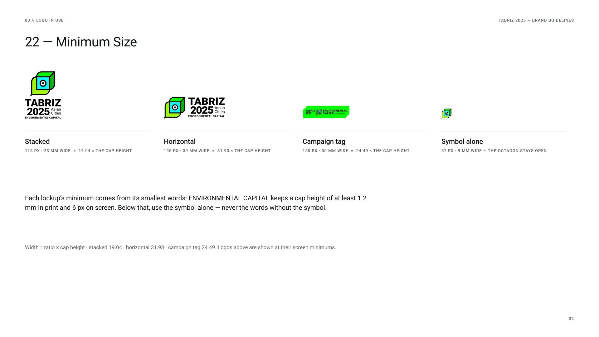
Stacked: 115 px · 23 mm wide = 19.04 × the cap height.
Horizontal: 195 px · 39 mm wide = 31.93 × the cap height.
Campaign tag: 150 px · 30 mm wide = 24.49 × the cap height.
Symbol alone: 32 px · 9 mm wide — the octagon stays open.
Each lockup’s minimum comes from its smallest words: ENVIRONMENTAL CAPITAL keeps a cap height of at least 1.2 mm in print and 6 px on screen. Below that, use the symbol alone — never the words without the symbol.
Width = ratio × cap height · stacked 19.04 · horizontal 31.93 · campaign tag 24.49. Logos above are shown at their screen minimums.
03.15
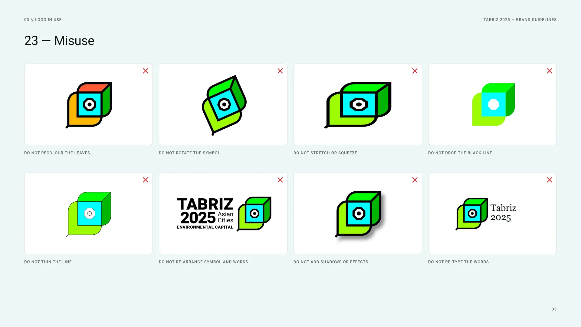
Misuse
Do not recolour the leaves · Do not rotate the symbol · Do not stretch or squeeze · Do not drop the black line · Do not thin the line · Do not re-arrange symbol and words · Do not add shadows or effects · Do not re-type the words.
03.16
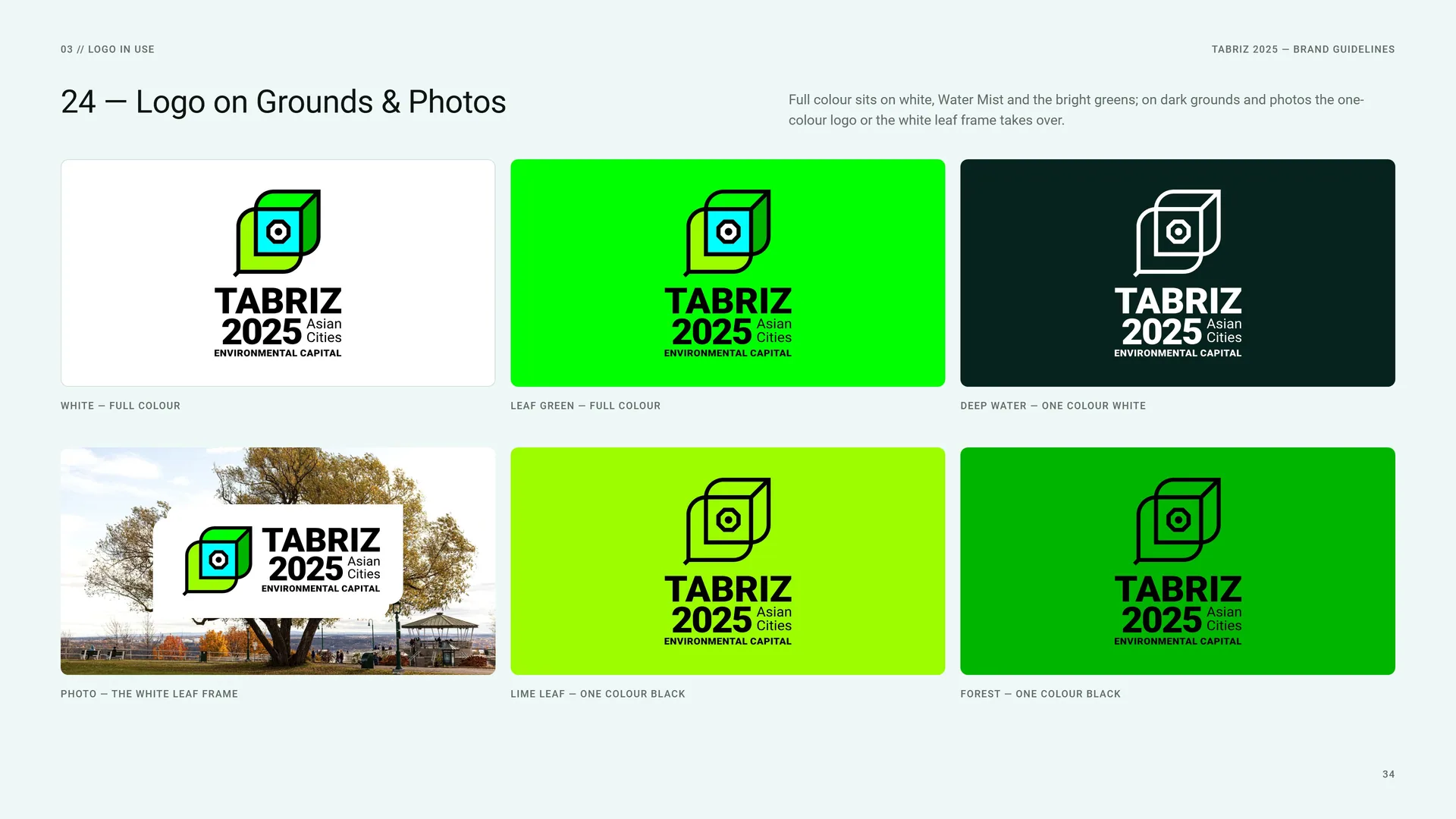
Logo on Grounds & Photos
Full colour sits on white, Water Mist and the bright greens; on dark grounds and photos the one-colour logo or the white leaf frame takes over.
White — full colour.
Leaf Green — full colour.
Deep Water — one colour white.
Photo — the white leaf frame.
Lime Leaf — one colour black.
Forest — one colour black.
04
Colour
- 04.1Water & Leaf
- 04.2Colour Values
- 04.3Colour from Nature
- 04.4Contrast & Accessibility
- 04.5Tints & Signature Gradient
04.1
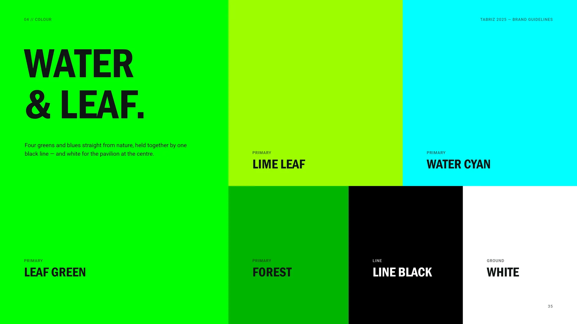
Water & Leaf
Four greens and blues straight from nature, held together by one black line — and white for the pavilion at the centre.
Primary: Lime Leaf · Water Cyan · Leaf Green · Forest.
Line: Line Black.
Ground: White.
04.2
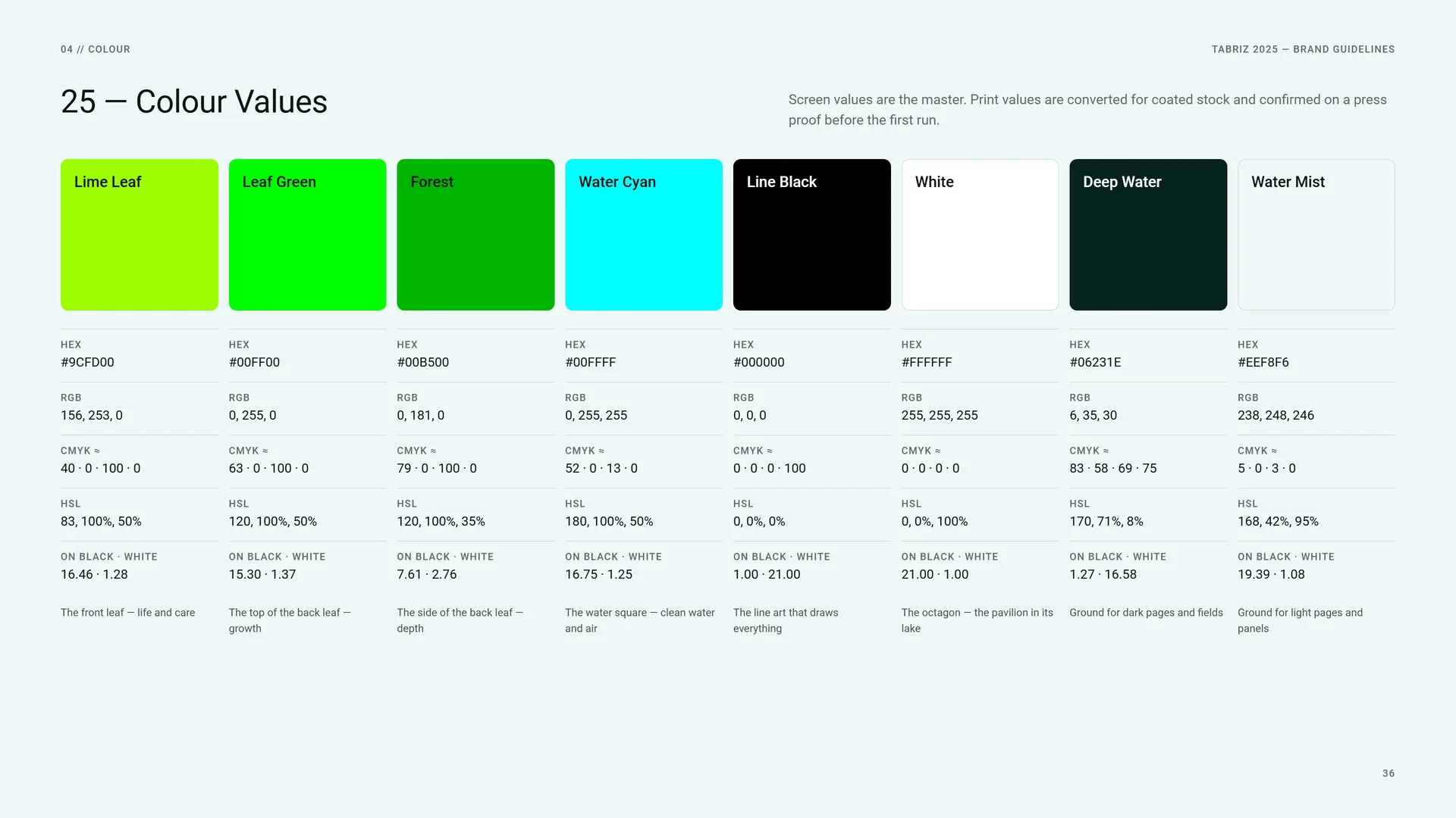
Colour Values
Screen values are the master. Print values are converted for coated stock and confirmed on a press proof before the first run.
Lime Leaf: HEX #9CFD00 · RGB 156, 253, 0 · CMYK ≈ 40 · 0 · 100 · 0 · HSL 83, 100%, 50% · on black · white 16.46 · 1.28. The front leaf — life and care.
Leaf Green: HEX #00FF00 · RGB 0, 255, 0 · CMYK ≈ 63 · 0 · 100 · 0 · HSL 120, 100%, 50% · on black · white 15.30 · 1.37. The top of the back leaf — growth.
Forest: HEX #00B500 · RGB 0, 181, 0 · CMYK ≈ 79 · 0 · 100 · 0 · HSL 120, 100%, 35% · on black · white 7.61 · 2.76. The side of the back leaf — depth.
Water Cyan: HEX #00FFFF · RGB 0, 255, 255 · CMYK ≈ 52 · 0 · 13 · 0 · HSL 180, 100%, 50% · on black · white 16.75 · 1.25. The water square — clean water and air.
Line Black: HEX #000000 · RGB 0, 0, 0 · CMYK ≈ 0 · 0 · 0 · 100 · HSL 0, 0%, 0% · on black · white 1.00 · 21.00. The line art that draws everything.
White: HEX #FFFFFF · RGB 255, 255, 255 · CMYK ≈ 0 · 0 · 0 · 0 · HSL 0, 0%, 100% · on black · white 21.00 · 1.00. The octagon — the pavilion in its lake.
Deep Water: HEX #06231E · RGB 6, 35, 30 · CMYK ≈ 83 · 58 · 69 · 75 · HSL 170, 71%, 8% · on black · white 1.27 · 16.58. Ground for dark pages and fields.
Water Mist: HEX #EEF8F6 · RGB 238, 248, 246 · CMYK ≈ 5 · 0 · 3 · 0 · HSL 168, 42%, 95% · on black · white 19.39 · 1.08. Ground for light pages and panels.
04.3
Colour from Nature
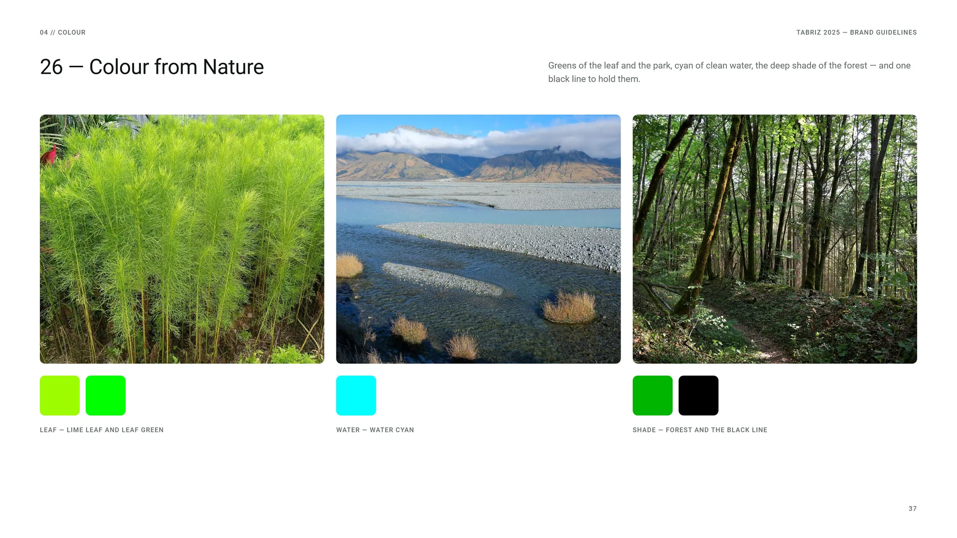
Greens of the leaf and the park, cyan of clean water, the deep shade of the forest — and one black line to hold them.
Leaf — Lime Leaf and Leaf Green.
Water — Water Cyan.
Shade — Forest and the black line.
04.4
Contrast & Accessibility
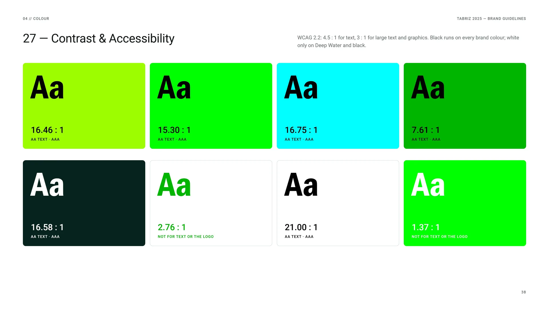
WCAG 2.2: 4.5 : 1 for text, 3 : 1 for large text and graphics. Black runs on every brand colour; white only on Deep Water and black.
16.46 : 1 — AA text · AAA.
15.30 : 1 — AA text · AAA.
16.75 : 1 — AA text · AAA.
7.61 : 1 — AA text · AAA.
16.58 : 1 — AA text · AAA.
2.76 : 1 — not for text or the logo.
21.00 : 1 — AA text · AAA.
1.37 : 1 — not for text or the logo.
04.5
Tints & Signature Gradient
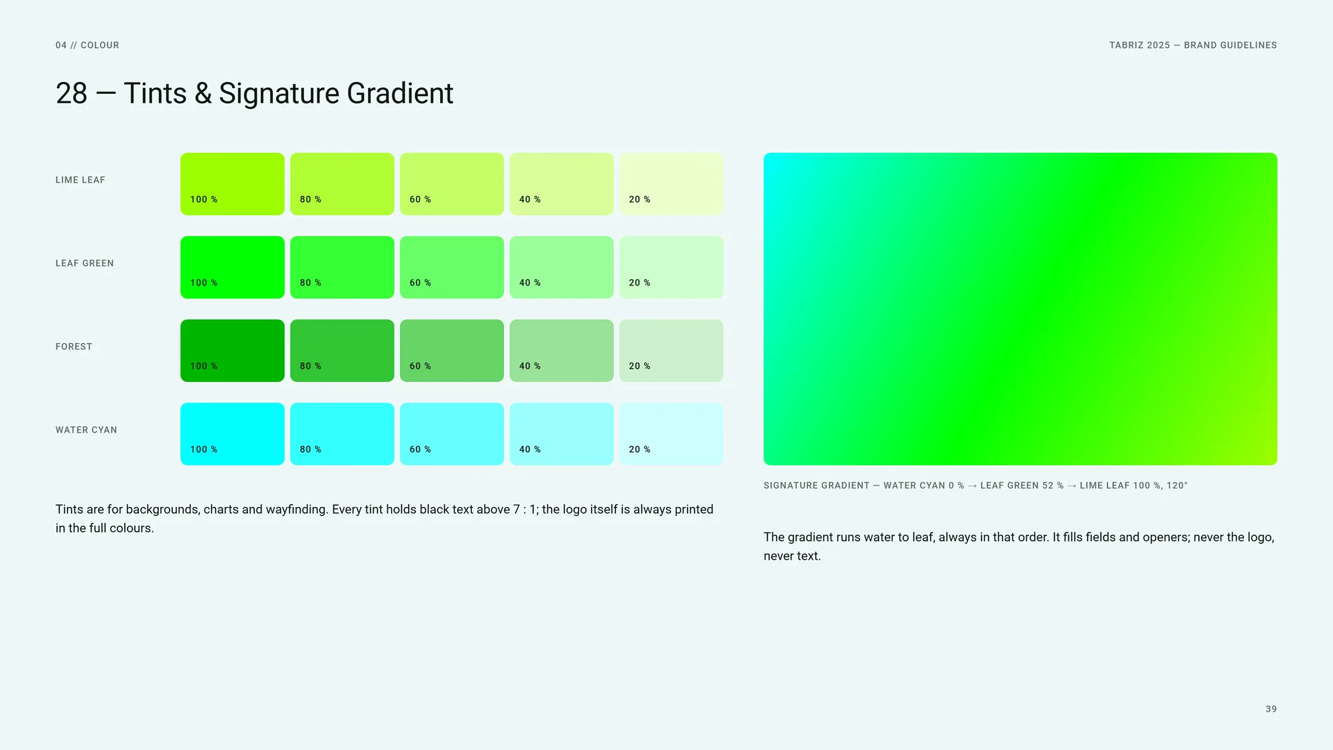
Lime Leaf · Leaf Green · Forest · Water Cyan: 100 % · 80 % · 60 % · 40 % · 20 %.
Tints are for backgrounds, charts and wayfinding. Every tint holds black text above 7 : 1; the logo itself is always printed in the full colours.
Signature gradient — Water Cyan 0 % → Leaf Green 52 % → Lime Leaf 100 %, 120°.
The gradient runs water to leaf, always in that order. It fills fields and openers; never the logo, never text.
05
Typography
05.1
Typography
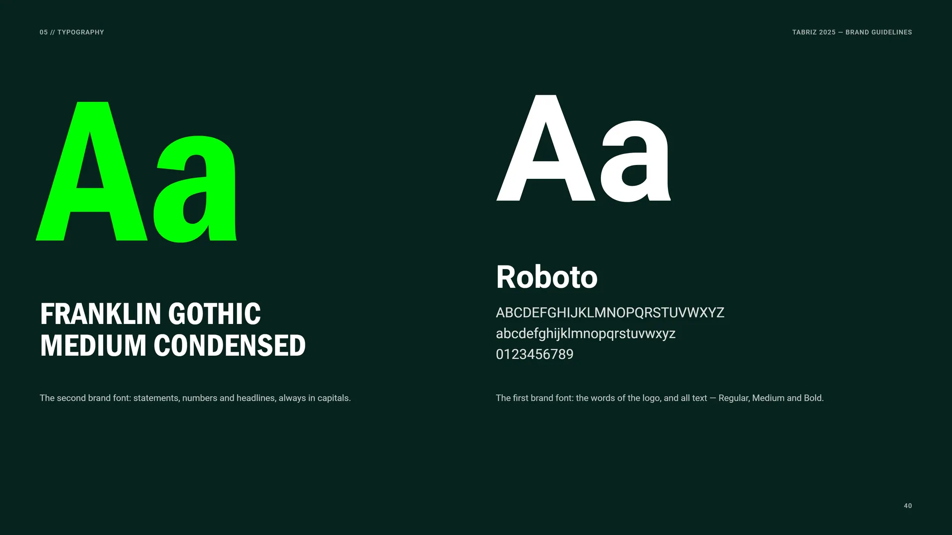
Franklin Gothic Medium Condensed: The second brand font: statements, numbers and headlines, always in capitals.
Roboto: The first brand font: the words of the logo, and all text — Regular, Medium and Bold.
ABCDEFGHIJKLMNOPQRSTUVWXYZ abcdefghijklmnopqrstuvwxyz 0123456789
05.2
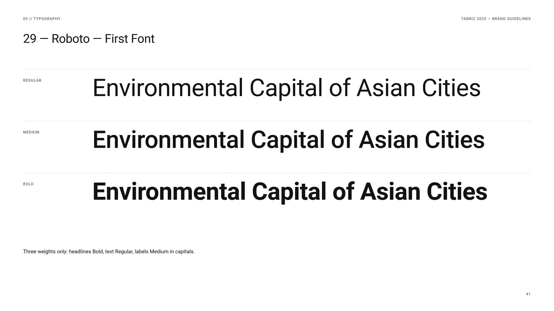
Roboto — First Font
Regular: Environmental Capital of Asian Cities.
Medium: Environmental Capital of Asian Cities.
Bold: Environmental Capital of Asian Cities.
Three weights only: headlines Bold, text Regular, labels Medium in capitals.
05.3
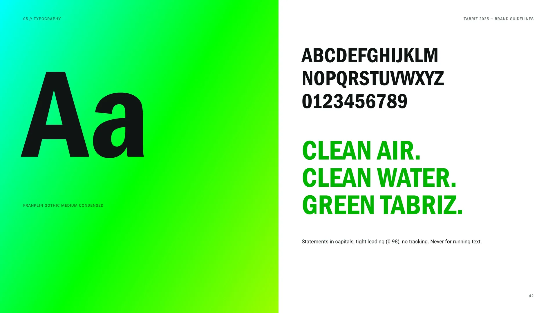
Franklin Gothic Medium Condensed
ABCDEFGHIJKLM NOPQRSTUVWXYZ 0123456789
Clean air. Clean water. Green Tabriz.
Statements in capitals, tight leading (0.98), no tracking. Never for running text.
05.4
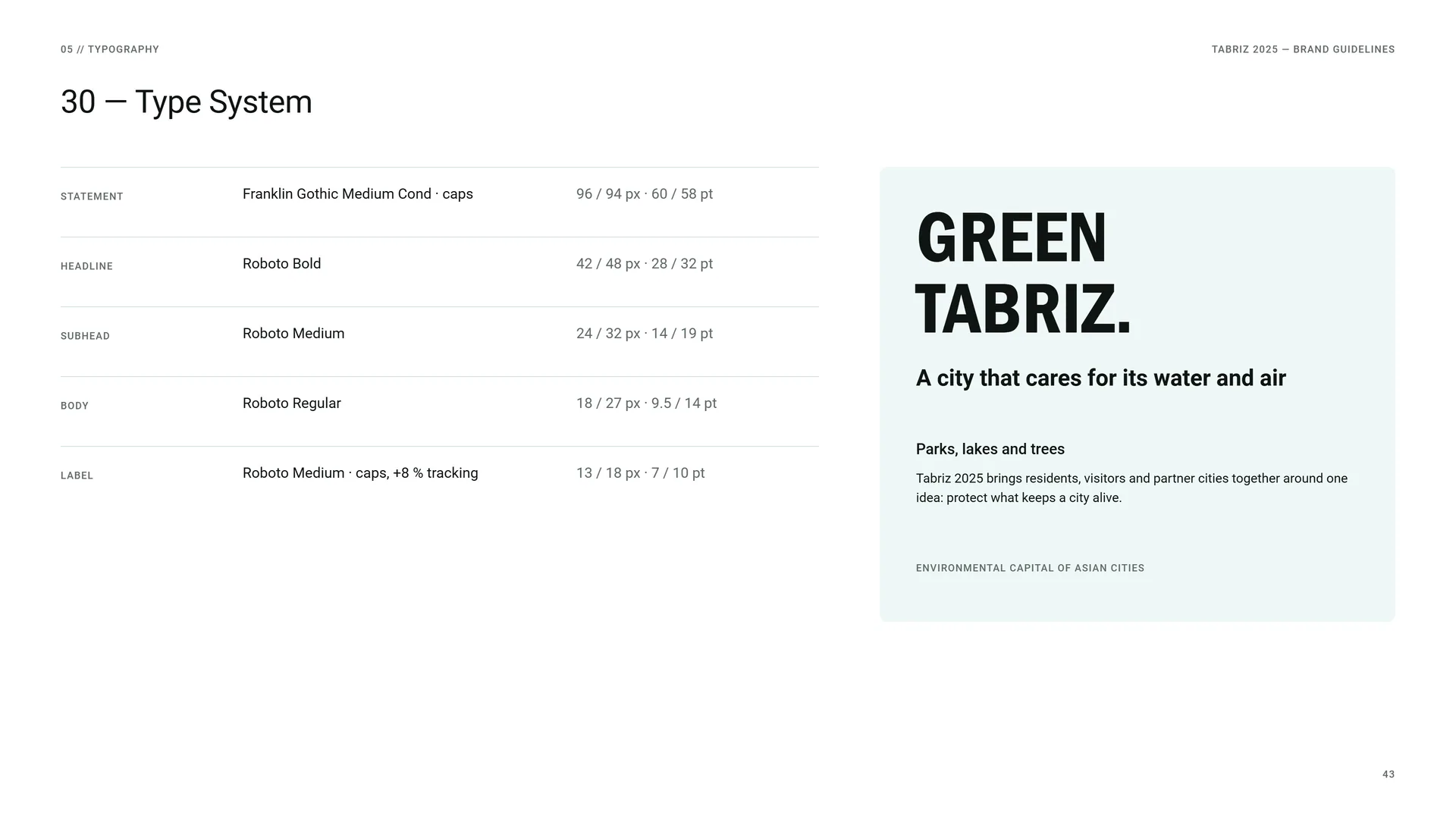
Type System
Statement: Franklin Gothic Medium Cond · caps · 96 / 94 px · 60 / 58 pt.
Headline: Roboto Bold · 42 / 48 px · 28 / 32 pt.
Subhead: Roboto Medium · 24 / 32 px · 14 / 19 pt.
Body: Roboto Regular · 18 / 27 px · 9.5 / 14 pt.
Label: Roboto Medium · caps, +8 % tracking · 13 / 18 px · 7 / 10 pt.
06
Pattern
- 06.1The Rosette
- 06.2How the Rosette Is Built
- 06.3Pattern Family
- 06.4The Leaf Frame
- 06.5Pattern Rules
- 06.6Campaign Tag Field
06.1
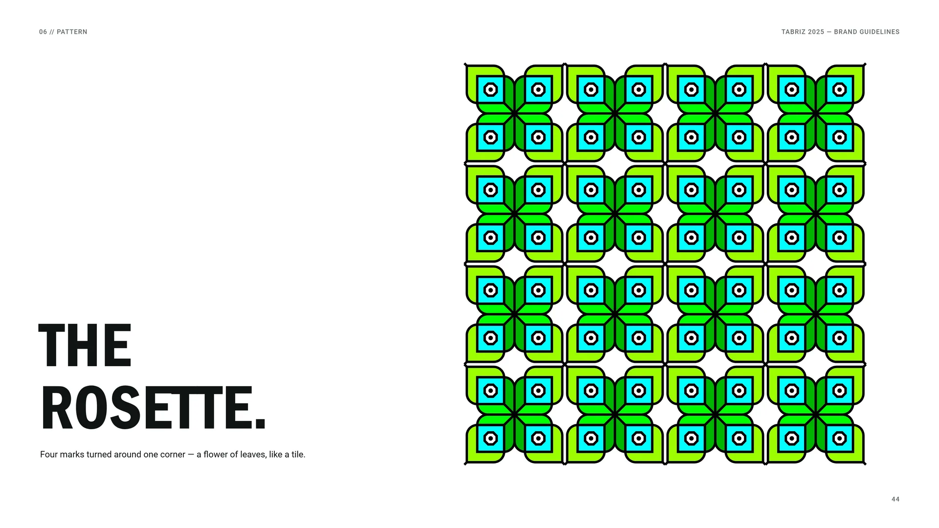
The Rosette
Four marks turned around one corner — a flower of leaves, like a tile.
06.2
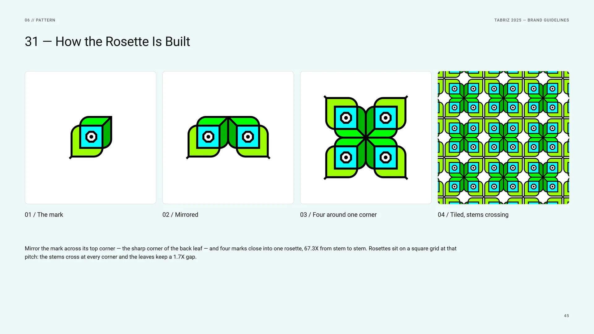
How the Rosette Is Built
The mark.
Mirrored.
Four around one corner.
Tiled, stems crossing.
Mirror the mark across its top corner — the sharp corner of the back leaf — and four marks close into one rosette, 67.3X from stem to stem. Rosettes sit on a square grid at that pitch: the stems cross at every corner and the leaves keep a 1.7X gap.
06.3
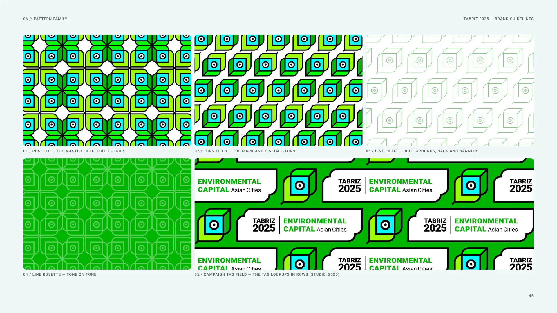
Pattern Family
Rosette — the master field, full colour.
Turn field — the mark and its half-turn.
Line field — light grounds, bags and banners.
Line rosette — tone on tone.
Campaign tag field — the tag lockups in rows (studio, 2025).
06.4
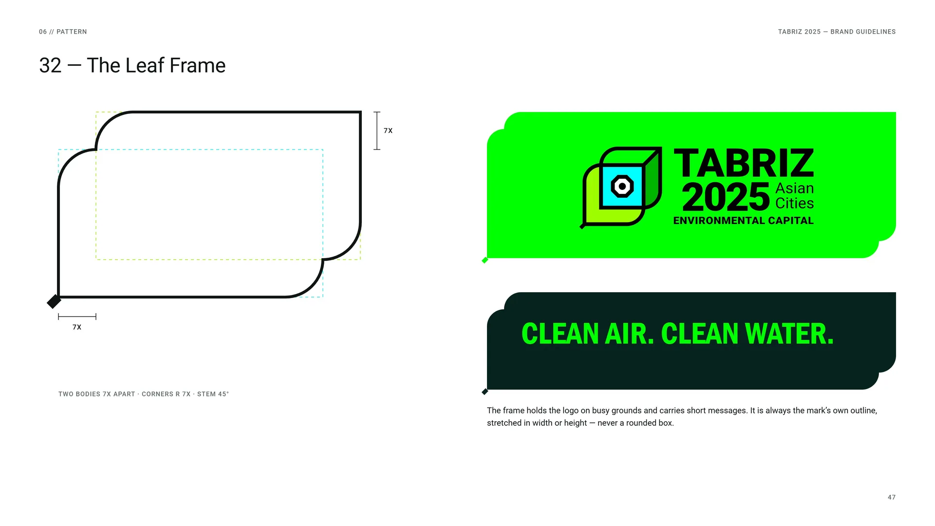
The Leaf Frame
Two bodies 7X apart · corners r 7X · stem 45°.
Clean air. Clean water.
The frame holds the logo on busy grounds and carries short messages. It is always the mark’s own outline, stretched in width or height — never a rounded box.
06.5
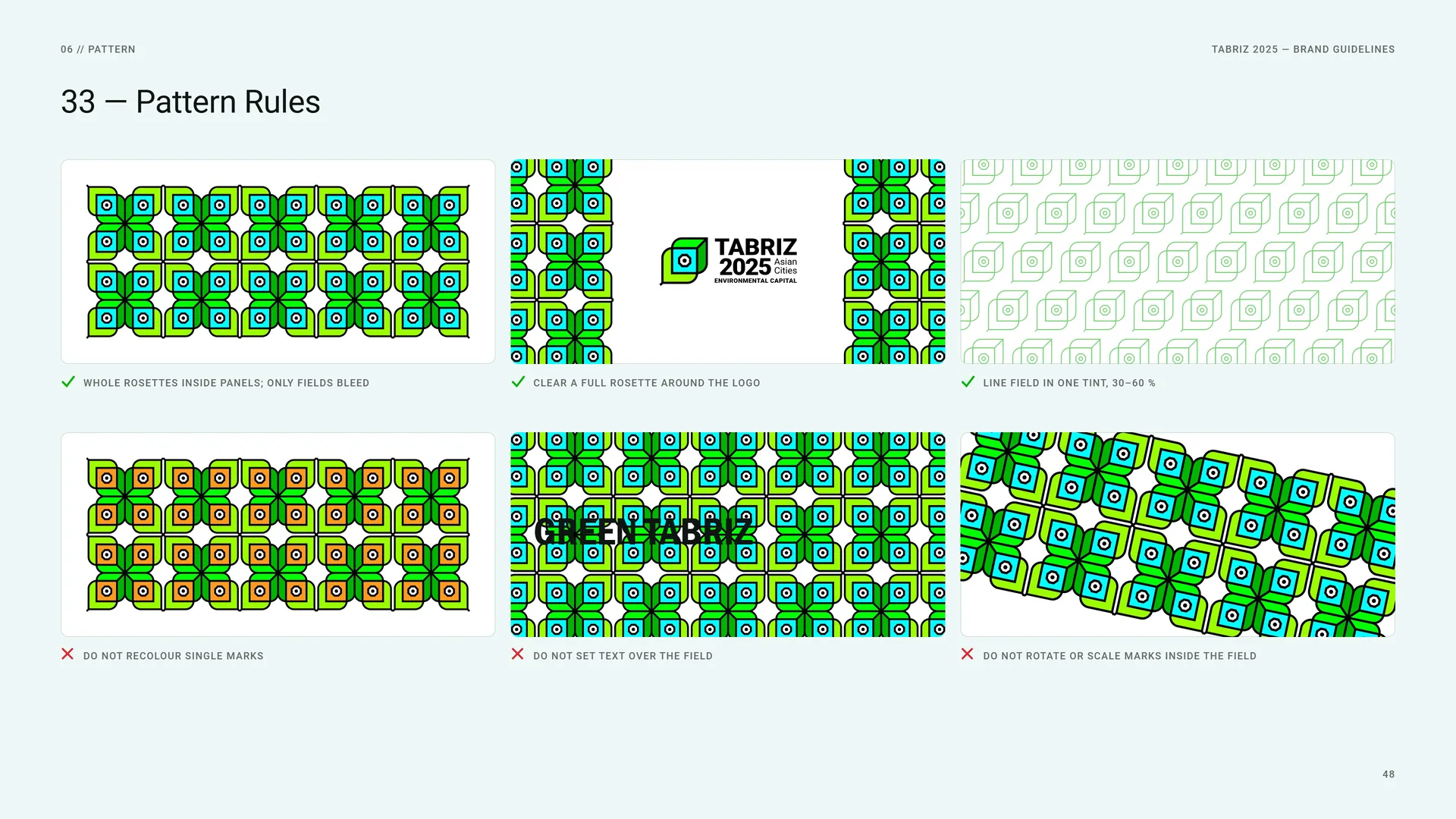
Pattern Rules
Whole rosettes inside panels; only fields bleed.
Clear a full rosette around the logo.
Line field in one tint, 30–60 %.
Do not recolour single marks.
Do not set text over the field.
Do not rotate or scale marks inside the field.
06.6
Campaign Tag Field
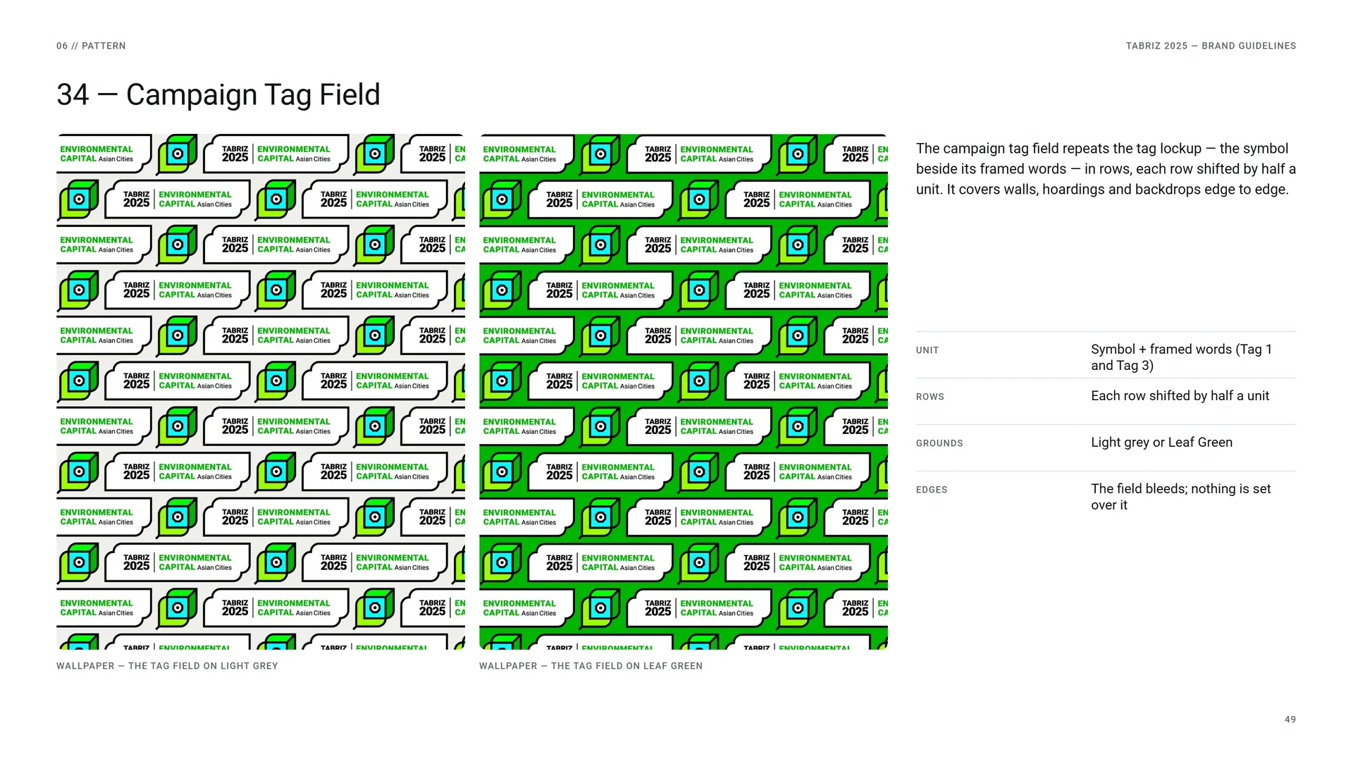
The campaign tag field repeats the tag lockup — the symbol beside its framed words — in rows, each row shifted by half a unit. It covers walls, hoardings and backdrops edge to edge.
Wallpaper — the tag field on light grey.
Wallpaper — the tag field on Leaf Green.
Unit: Symbol + framed words (Tag 1 and Tag 3).
Rows: Each row shifted by half a unit.
Grounds: Light grey or Leaf Green.
Edges: The field bleeds; nothing is set over it.
07
Imagery
07.1
Photography
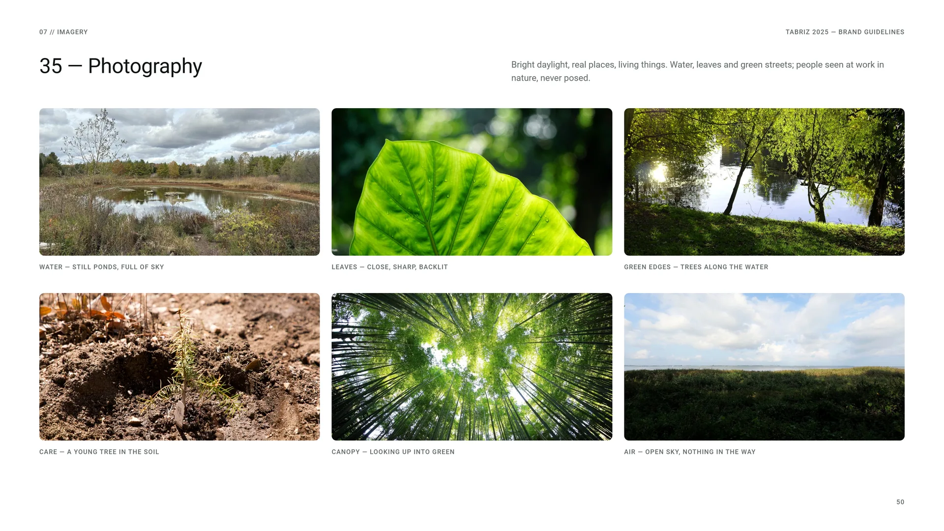
Bright daylight, real places, living things. Water, leaves and green streets; people seen at work in nature, never posed.
Water — still ponds, full of sky.
Leaves — close, sharp, backlit.
Green edges — trees along the water.
Care — a young tree in the soil.
Canopy — looking up into green.
Air — open sky, nothing in the way.
08
Stationery
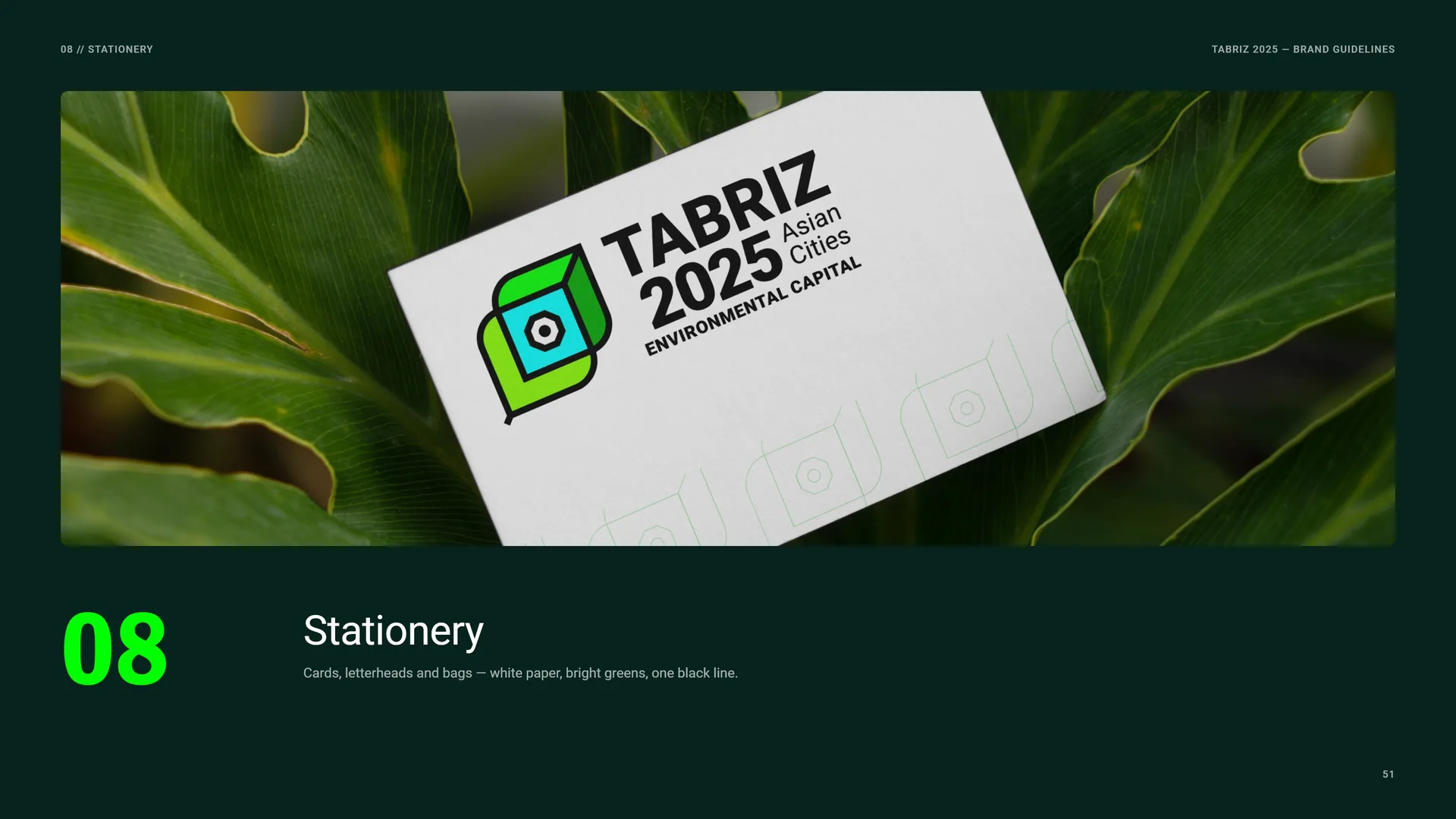
Cards, letterheads and bags — white paper, bright greens, one black line.
08.1
Business Cards
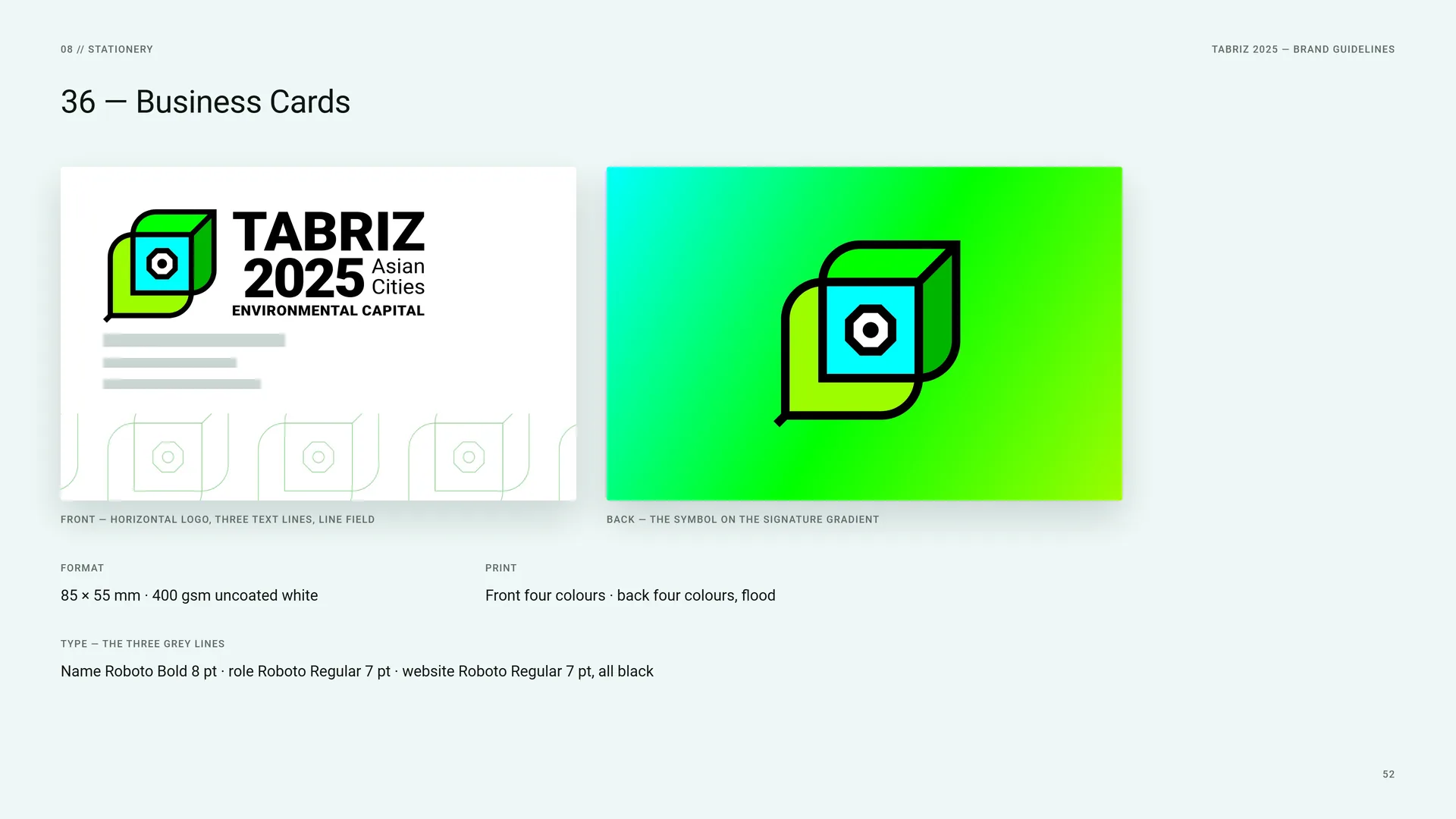
Front — horizontal logo, three text lines, line field.
Back — the symbol on the signature gradient.
Format: 85 × 55 mm · 400 gsm uncoated white.
Print: Front four colours · back four colours, flood.
Type — the three grey lines: Name Roboto Bold 8 pt · role Roboto Regular 7 pt · website Roboto Regular 7 pt, all black.
08.2
Bags
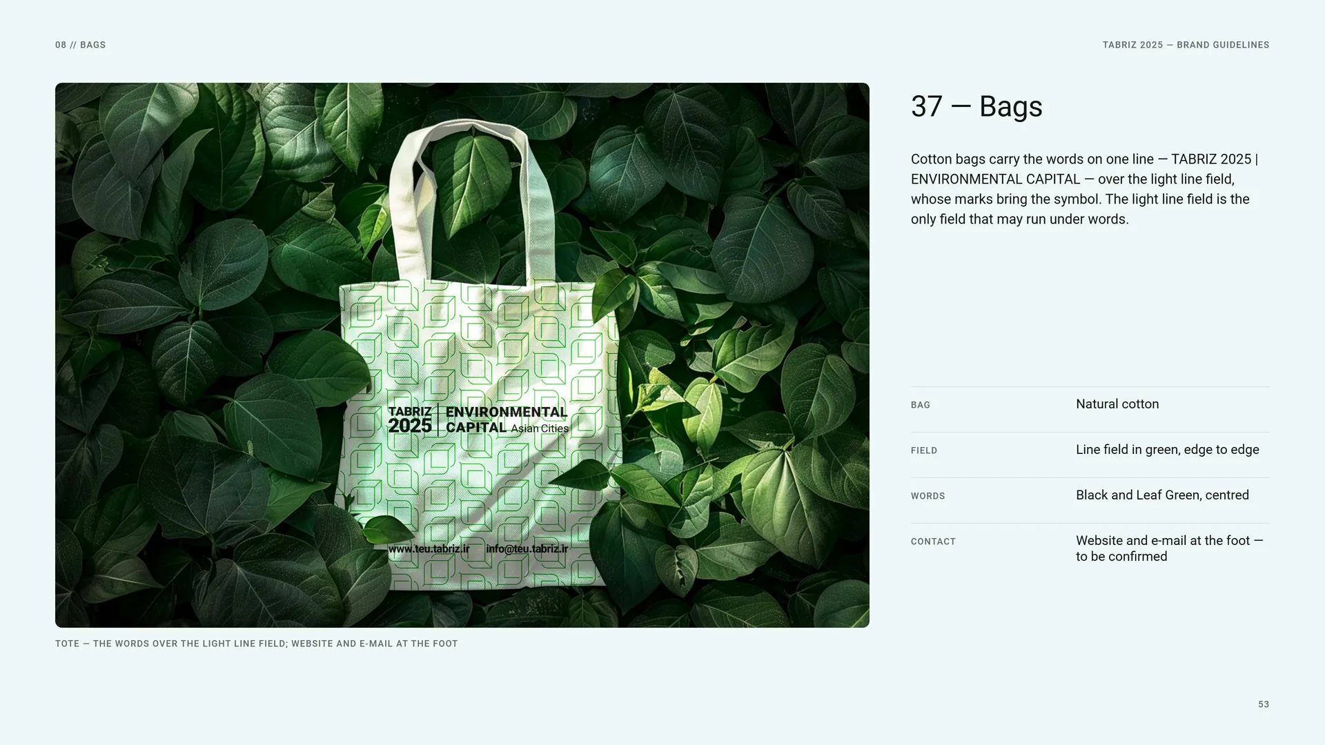
Tote — the words over the light line field; website and e-mail at the foot.
Cotton bags carry the words on one line — TABRIZ 2025 | ENVIRONMENTAL CAPITAL — over the light line field, whose marks bring the symbol. The light line field is the only field that may run under words.
Bag: Natural cotton.
Field: Line field in green, edge to edge.
Words: Black and Leaf Green, centred.
Contact: Website and e-mail at the foot — to be confirmed.
08.3
Letterhead & Envelope
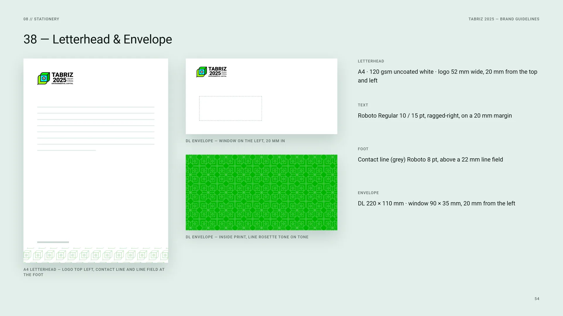
A4 letterhead — logo top left, contact line and line field at the foot.
DL envelope — window on the left, 20 mm in.
DL envelope — inside print, line rosette tone on tone.
Letterhead: A4 · 120 gsm uncoated white · logo 52 mm wide, 20 mm from the top and left.
Text: Roboto Regular 10 / 15 pt, ragged-right, on a 20 mm margin.
Foot: Contact line (grey) Roboto 8 pt, above a 22 mm line field.
Envelope: DL 220 × 110 mm · window 90 × 35 mm, 20 mm from the left.
09
Signage & environment
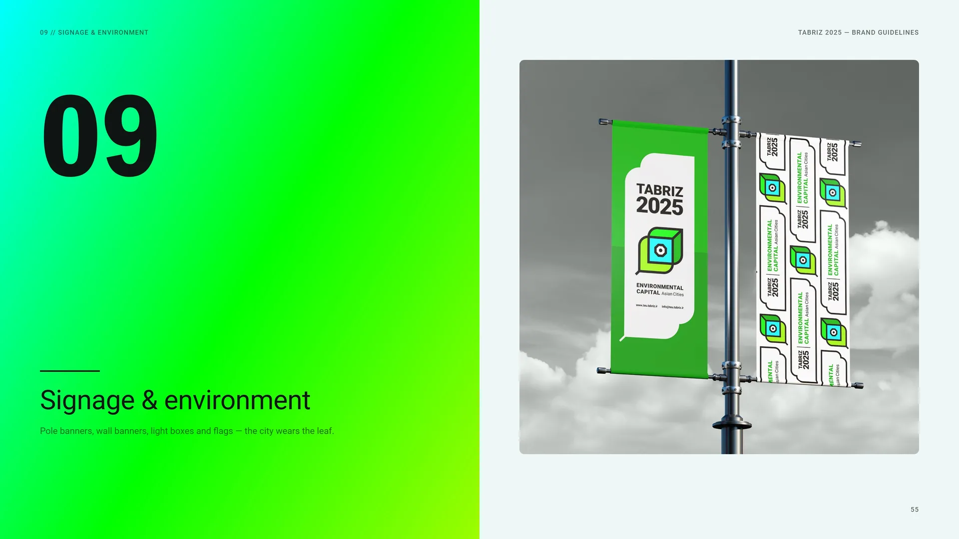
Pole banners, wall banners, light boxes and flags — the city wears the leaf.
09.1
Street & Wall Banners
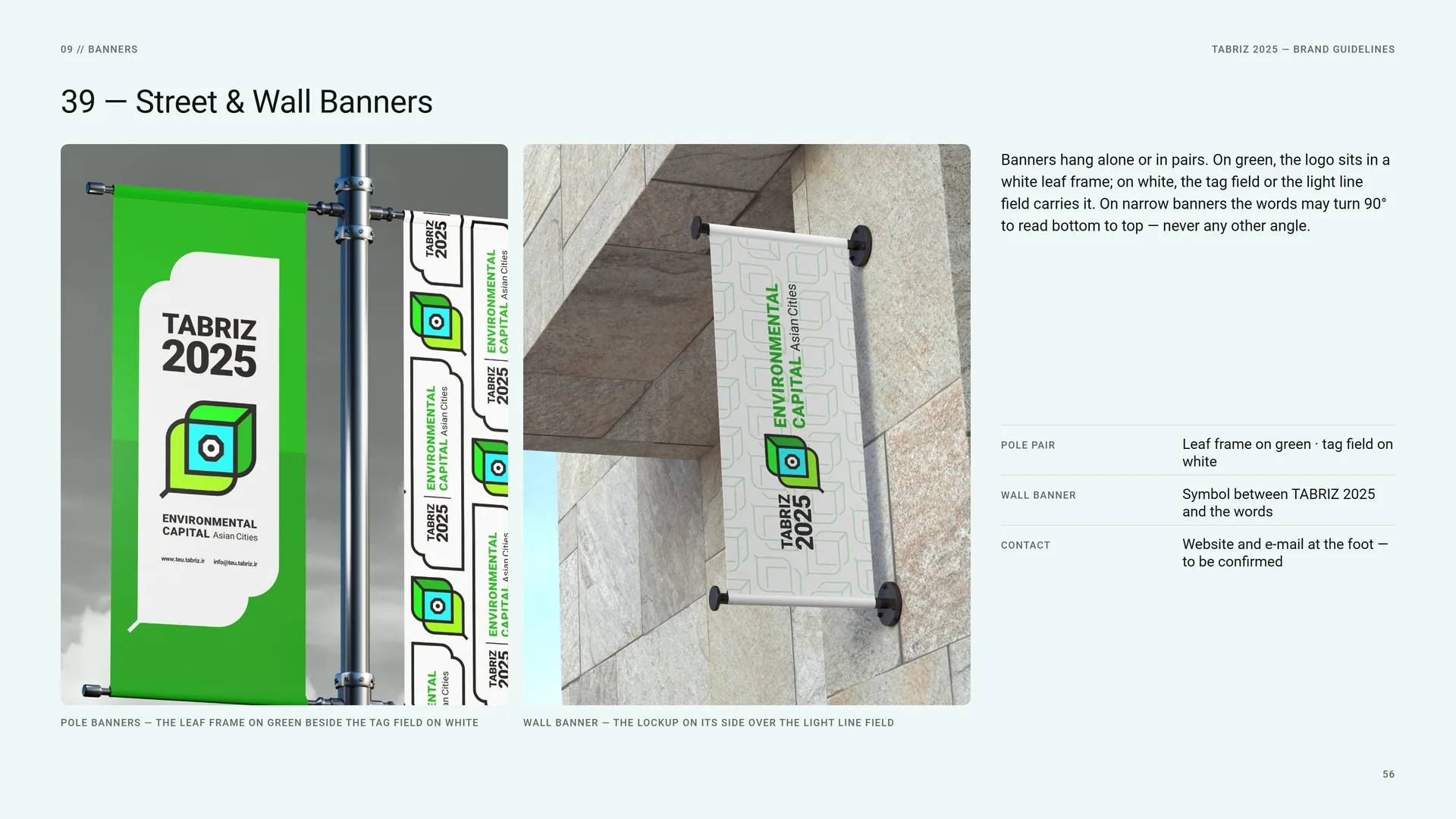
Banners hang alone or in pairs. On green, the logo sits in a white leaf frame; on white, the tag field or the light line field carries it. On narrow banners the words may turn 90° to read bottom to top — never any other angle.
Pole banners — the leaf frame on green beside the tag field on white.
Wall banner — the lockup on its side over the light line field.
Pole pair: Leaf frame on green · tag field on white.
Wall banner: Symbol between TABRIZ 2025 and the words.
Contact: Website and e-mail at the foot — to be confirmed.
09.2
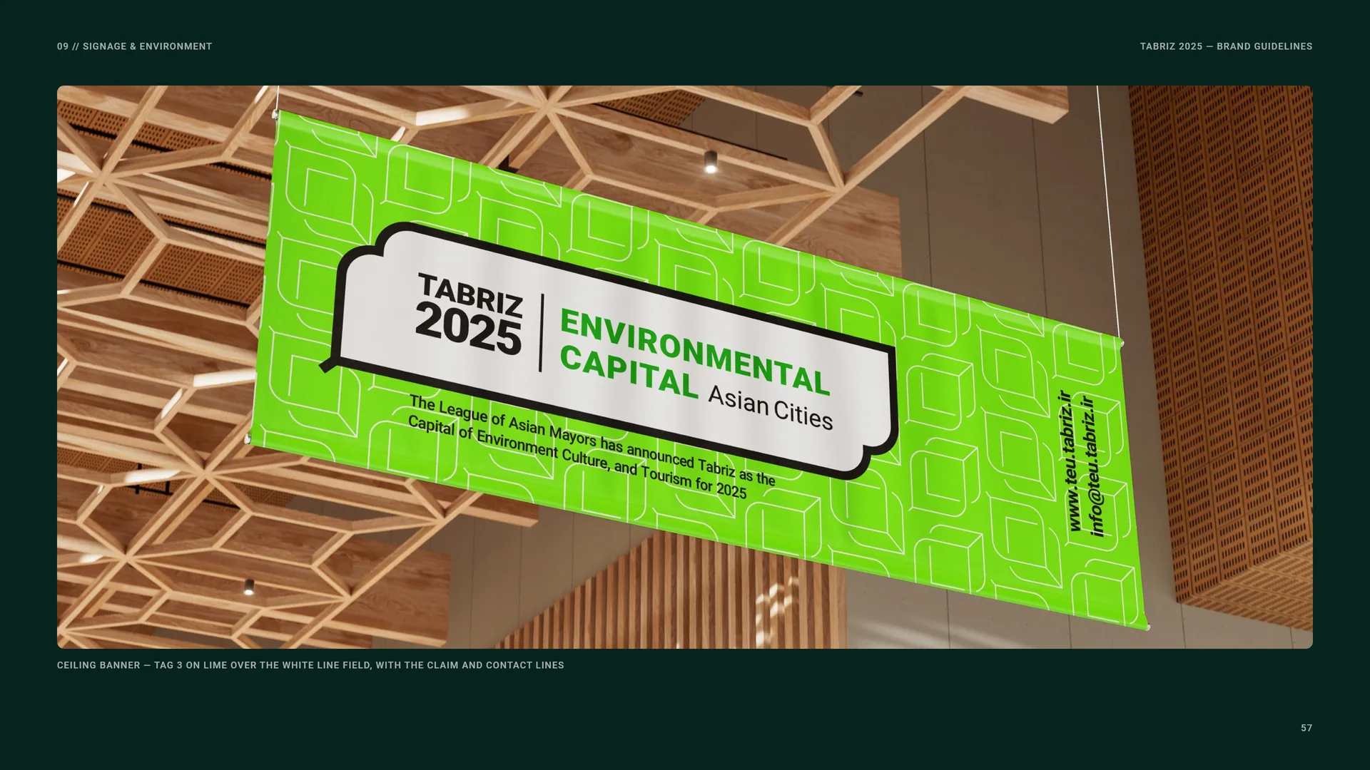
Ceiling banner
Ceiling banner — Tag 3 on lime over the white line field, with the claim and contact lines.
09.3
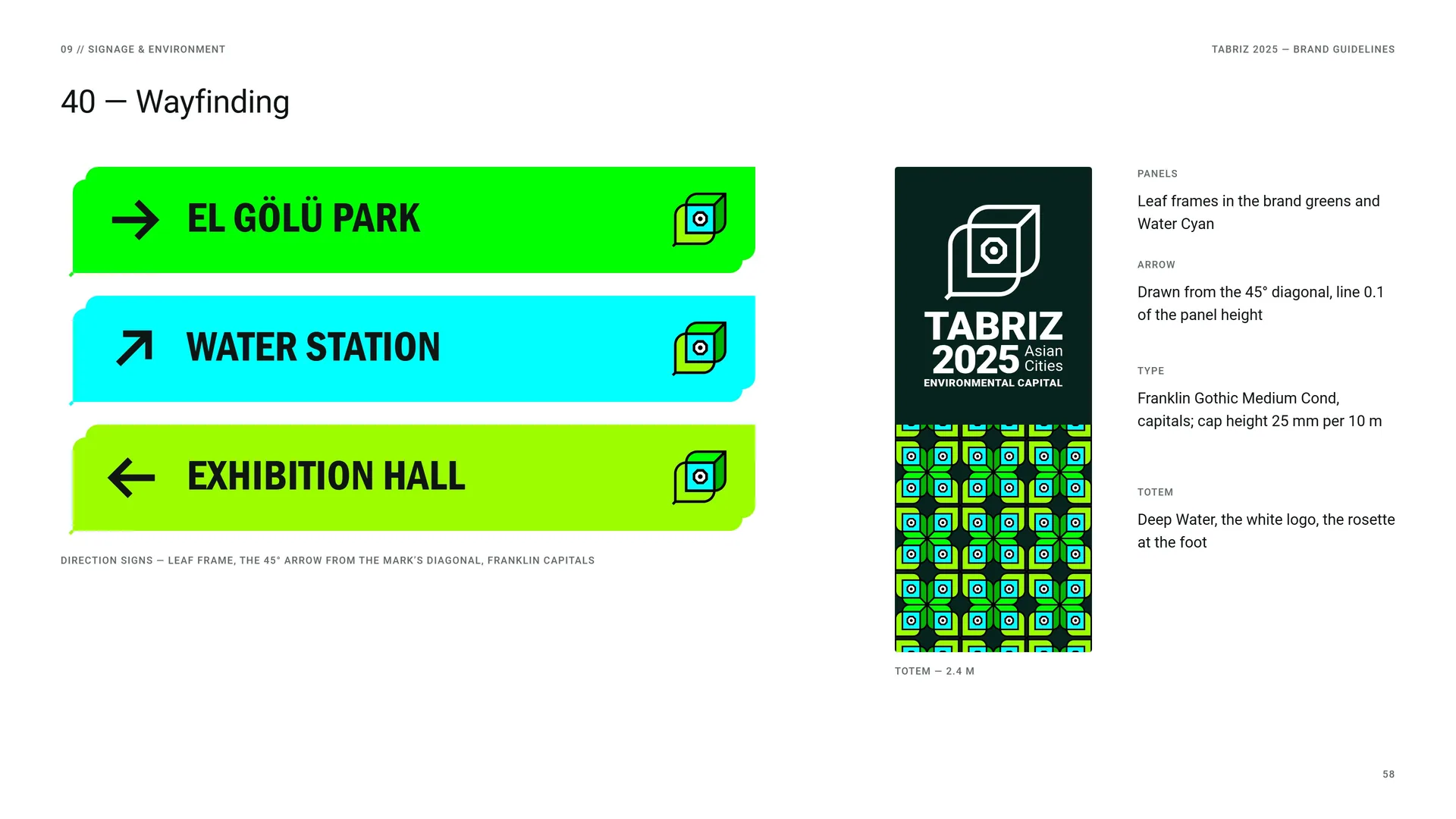
Wayfinding
Direction signs — leaf frame, the 45° arrow from the mark’s diagonal, Franklin capitals.
Totem — 2.4 m.
Panels: Leaf frames in the brand greens and Water Cyan.
Arrow: Drawn from the 45° diagonal, line 0.1 of the panel height.
Type: Franklin Gothic Medium Cond, capitals; cap height 25 mm per 10 m.
Totem: Deep Water, the white logo, the rosette at the foot.
09.4
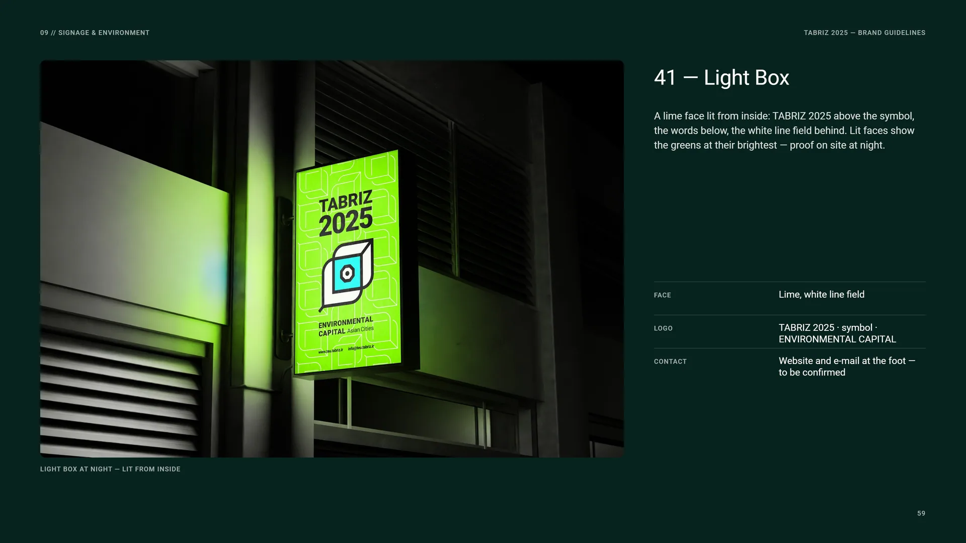
Light Box
A lime face lit from inside: TABRIZ 2025 above the symbol, the words below, the white line field behind. Lit faces show the greens at their brightest — proof on site at night.
Light box at night — lit from inside.
Face: Lime, white line field.
Logo: TABRIZ 2025 · symbol · ENVIRONMENTAL CAPITAL.
Contact: Website and e-mail at the foot — to be confirmed.
09.5
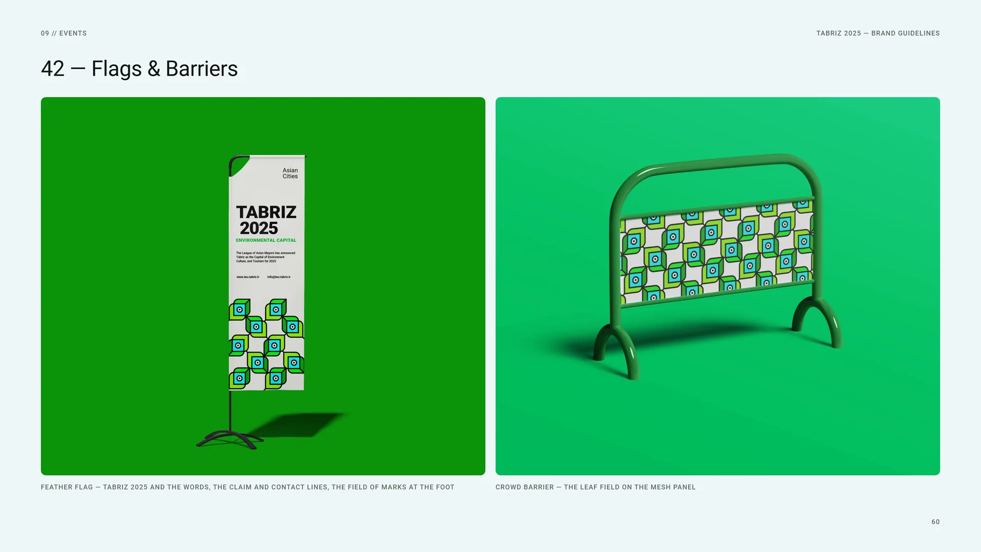
Flags & Barriers
Feather flag — TABRIZ 2025 and the words, the claim and contact lines, the field of marks at the foot.
Crowd barrier — the leaf field on the mesh panel.
10
Digital media
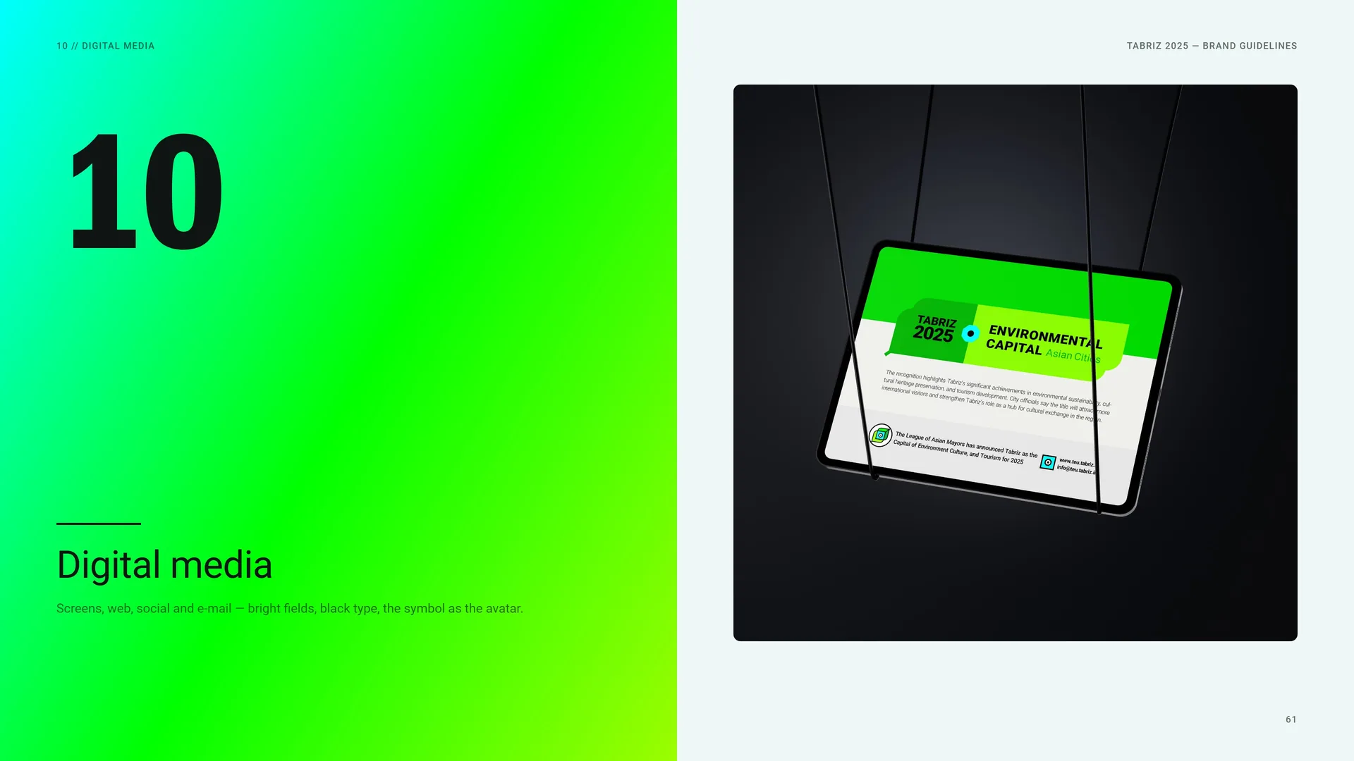
Screens, web, social and e-mail — bright fields, black type, the symbol as the avatar.
10.1
Website
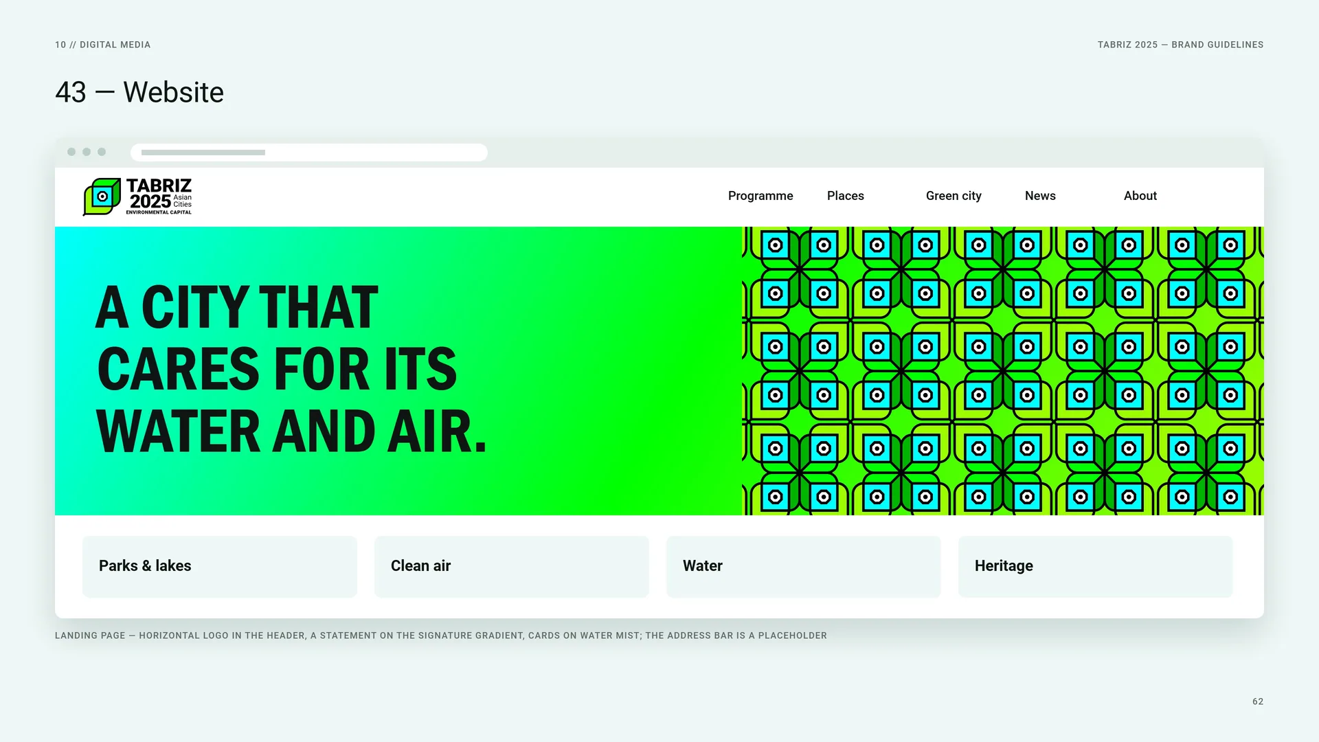
Landing page — horizontal logo in the header, a statement on the signature gradient, cards on Water Mist; the address bar is a placeholder.
10.2
Social Media
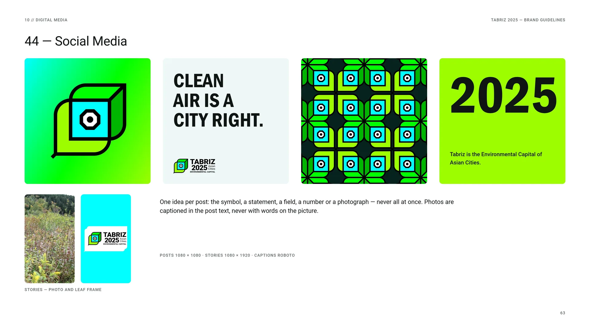
One idea per post: the symbol, a statement, a field, a number or a photograph — never all at once. Photos are captioned in the post text, never with words on the picture.
Posts 1080 × 1080 · stories 1080 × 1920 · captions Roboto.
Stories — photo and leaf frame.
10.3
E-mail & Profile
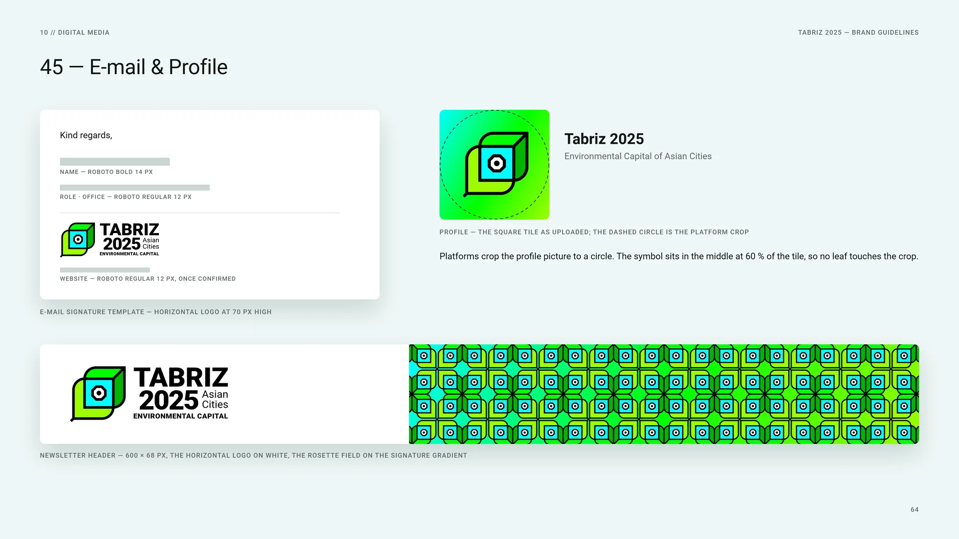
E-mail signature template — horizontal logo at 70 px high.
Name — Roboto Bold 14 px. Role · office — Roboto Regular 12 px. Website — Roboto Regular 12 px, once confirmed.
Profile — the square tile as uploaded; the dashed circle is the platform crop.
Platforms crop the profile picture to a circle. The symbol sits in the middle at 60 % of the tile, so no leaf touches the crop.
Newsletter header — 600 × 68 px, the horizontal logo on white, the rosette field on the signature gradient.
11
Campaign
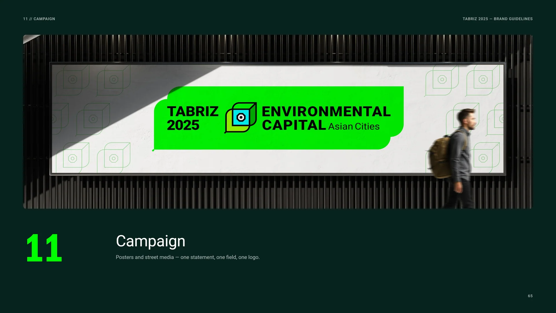
Posters and street media — one statement, one field, one logo.
11.1
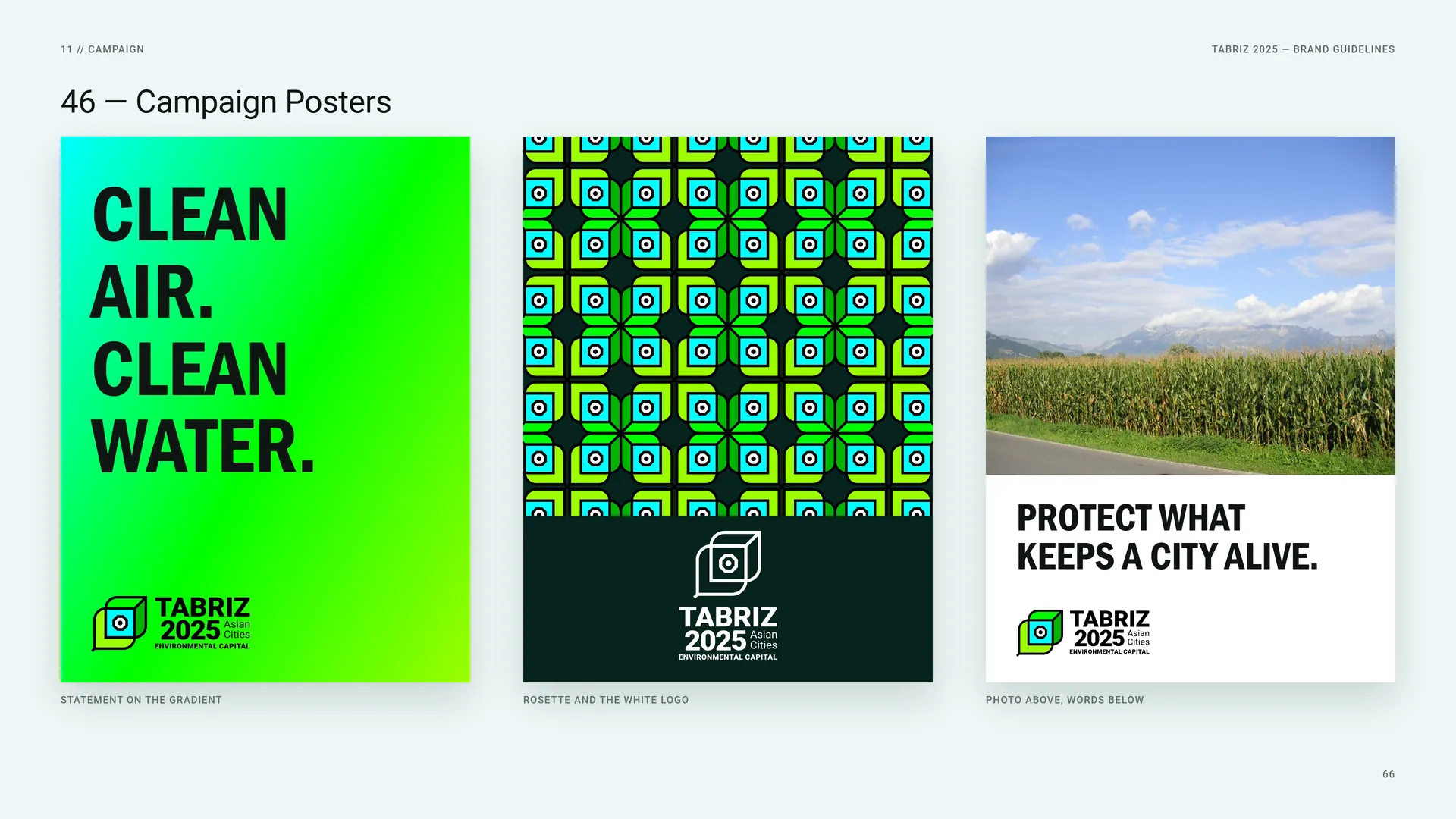
Campaign Posters
Statement on the gradient.
Rosette and the white logo.
Photo above, words below.
11.2
Vertical Banners
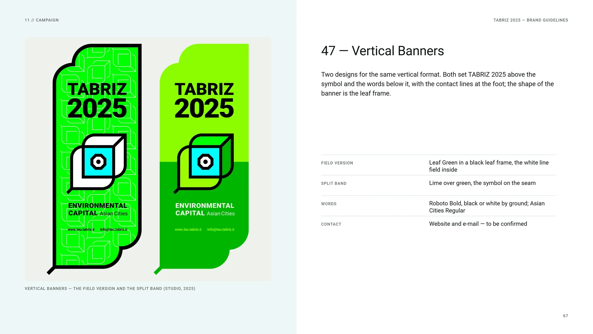
Two designs for the same vertical format. Both set TABRIZ 2025 above the symbol and the words below it, with the contact lines at the foot; the shape of the banner is the leaf frame.
Vertical banners — the field version and the split band (studio, 2025).
Field version: Leaf Green in a black leaf frame, the white line field inside.
Split band: Lime over green, the symbol on the seam.
Words: Roboto Bold, black or white by ground; Asian Cities Regular.
Contact: Website and e-mail — to be confirmed.
11.3
The System at a Glance
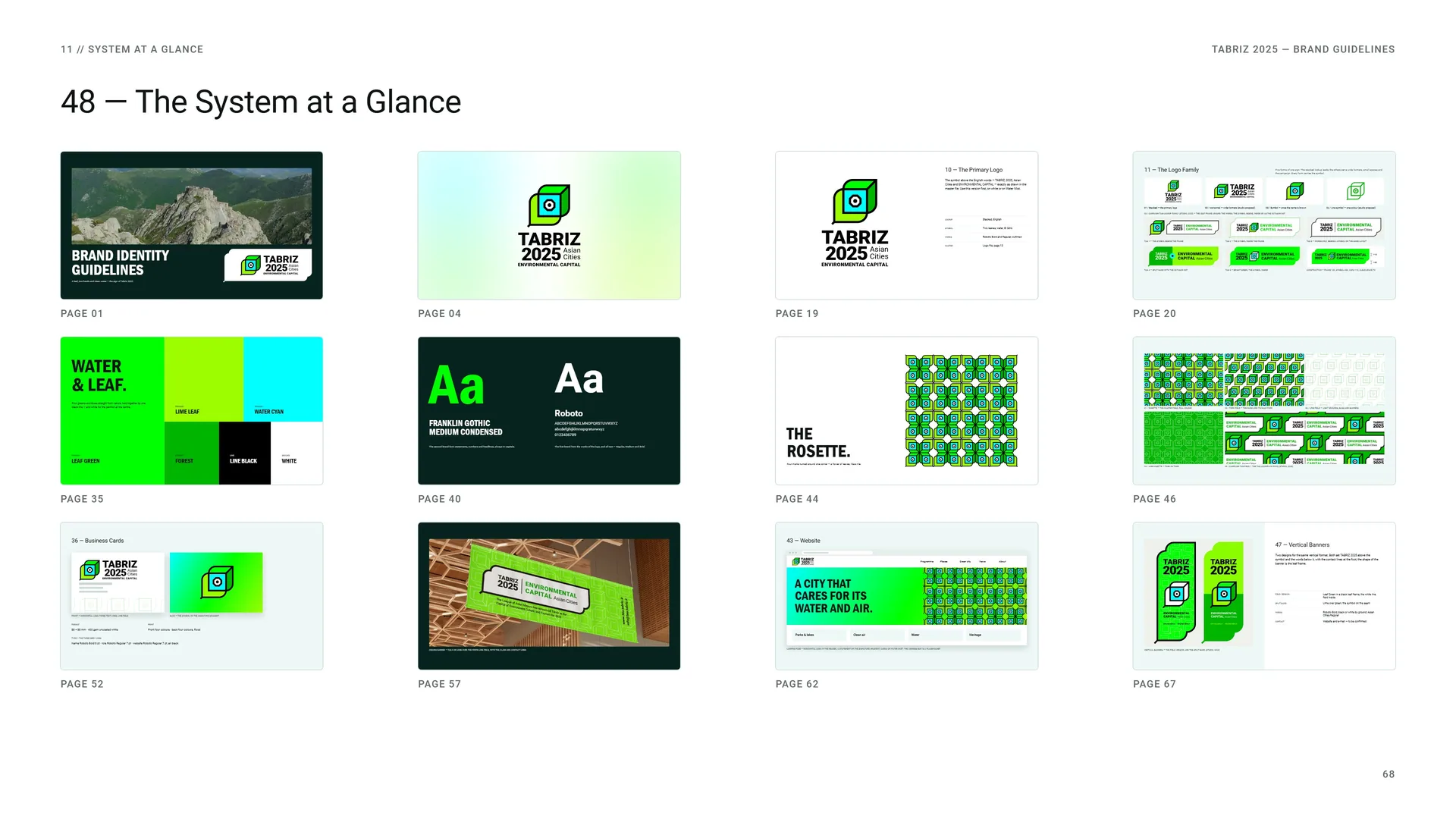
Page 01 · Page 04 · Page 19 · Page 20 · Page 35 · Page 40 · Page 44 · Page 46 · Page 52 · Page 57 · Page 62 · Page 67.
12
Files
12.1
Files
Logo: Stacked, horizontal and campaign tag lockups, symbol, line symbol — SVG, PDF, PNG.
Colour: Full colour on white · one colour black · one colour white.
Fonts: Roboto Regular, Medium and Bold · Franklin Gothic Medium Condensed.
Patterns: Rosette, turn field, line field, leaf frame — vector files.
Photography: Wikimedia Commons, CC0 / public domain — credits listed with these guidelines.
Website: To be confirmed by the client.
Photos: Wikimedia Commons, CC0 / public domain.
12.2
Thank You
Tabriz 2025 — Environmental Capital of Asian Cities.