Majaley Salamati Brand Identity Guidelines
Majaley Salamati is an online health information resource for patients and their families and friends. It was founded to bridge evidence-based knowledge with everyday wellbeing.
From its earliest issues the brand fused three constants — care (heart), growth (flower) and learning (book). Over time these symbols moved from editorial motifs to the core of the visual identity.
- السنة
- 2025
- العميل
- Majaley Salamati
- المجال
- Online health information resource for patients and their families and friends
- الخدمات
- الهوية البصرية
- المشروع
- Brand Identity Guidelines · 2026
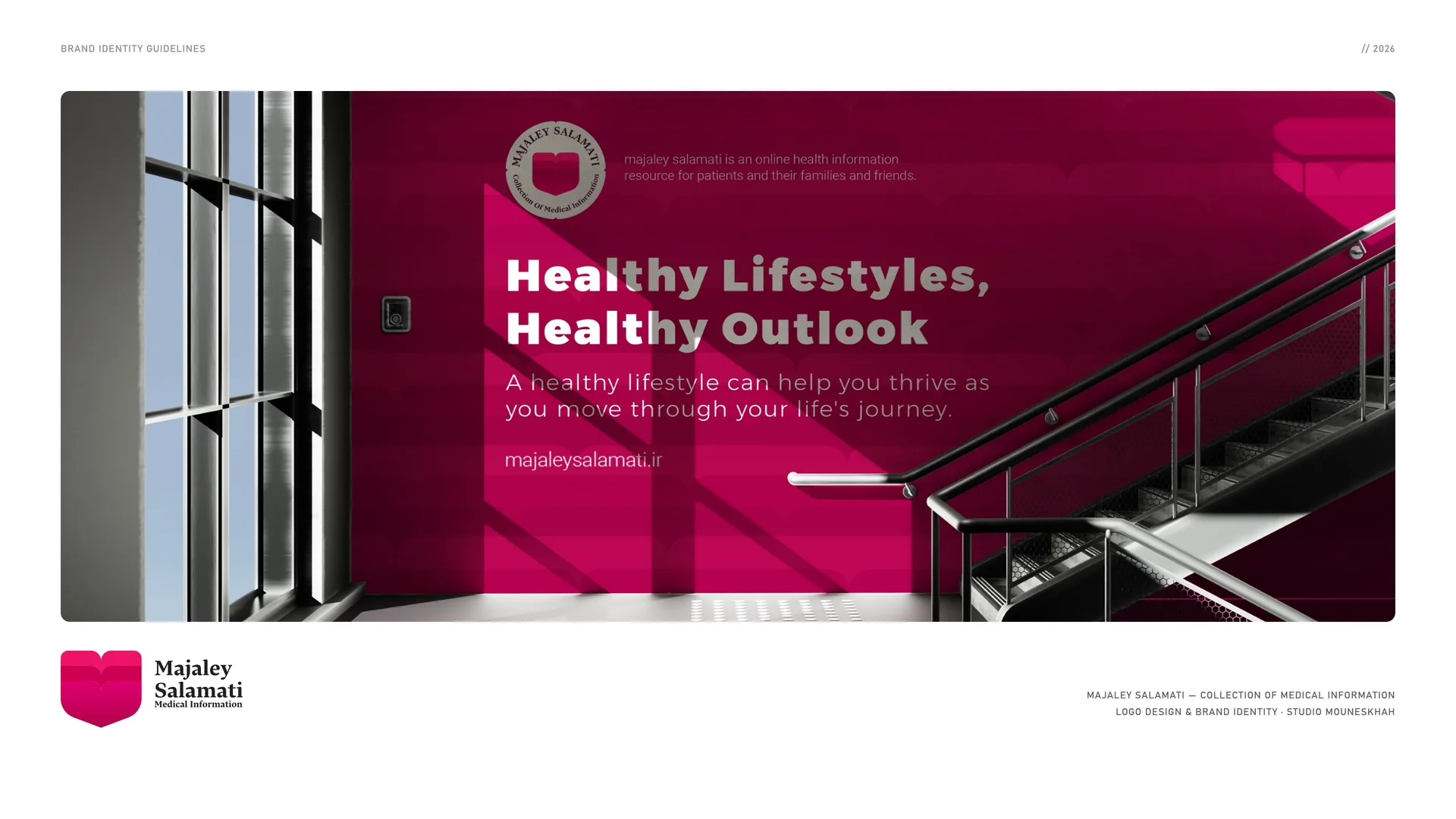
00
Introduction
00.1
Brand Concept
Majaley Salamati is an online health information resource for patients and their families and friends. It was founded to bridge evidence-based knowledge with everyday wellbeing.
From its earliest issues the brand fused three constants — care (heart), growth (flower) and learning (book). Over time these symbols moved from editorial motifs to the core of the visual identity.
Brand idea: Translate trusted health knowledge into clear, motivating guidance that helps people care for body and mind.
Brand essence: Care · Growth · Learning.
Brand promise: Clear, credible guidance for body and mind.
Core principle: Health × Growth × Knowledge.
00.2
The Brand Problem
Health information is everywhere, but much of it is sensational, fear-based or written in jargon — and it often speaks to the body while forgetting the mind.
The challenge: Sensational, fear-based headlines · Jargon that leaves readers outside · Advice without practical takeaways · The body without the mind · Sources that cannot be checked.
Brand positioning: An online health information resource for patients and their families and friends — evidence first, human always.
The opportunity: To become the most trusted, design-driven health media brand — where science meets daily life.
The shift: From Health Noise → Clear, Caring Guidance.
00.3
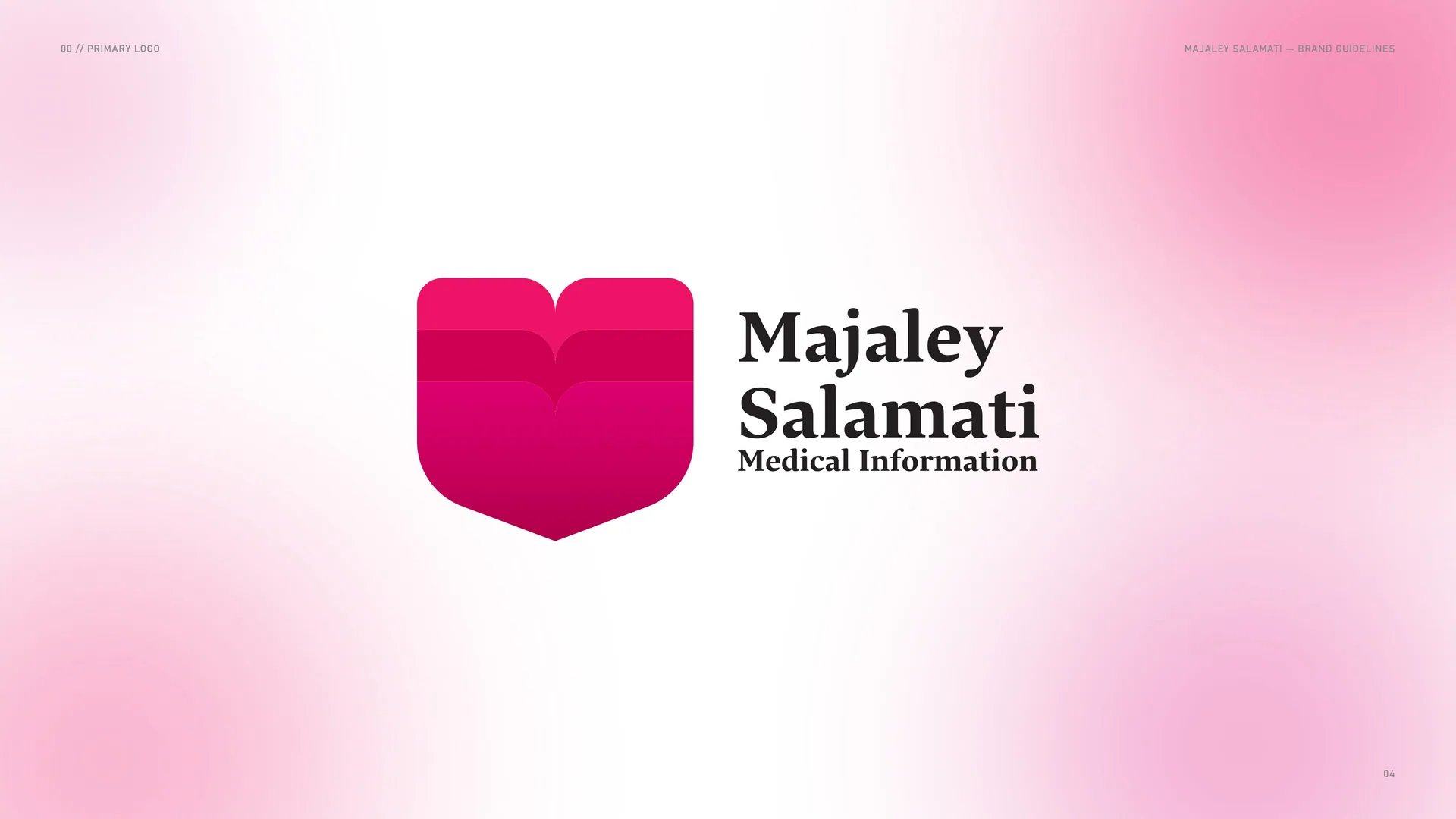
Primary logo
01
Brand
- 01.1History of the brand
- 01.2Mission & Vision
- 01.3Brand values
- 01.4Tone of voice
- 01.5The voice in practice
- 01.6Health is wealth. Reap the benefits.
01.1
History of the brand
Health Magazine — Majaley Salamati — was founded to bridge evidence-based knowledge with everyday wellbeing. Its three constants, care, growth and learning, evolved from editorial motifs into the core of the identity, unified by a rhythm that reflects an active, modern lifestyle and a commitment to credible, accessible health education.
Type: Online health information resource.
Audience: Patients, their families and friends.
Constants: Care · Growth · Learning.
Identity: Studio Mouneskhah.
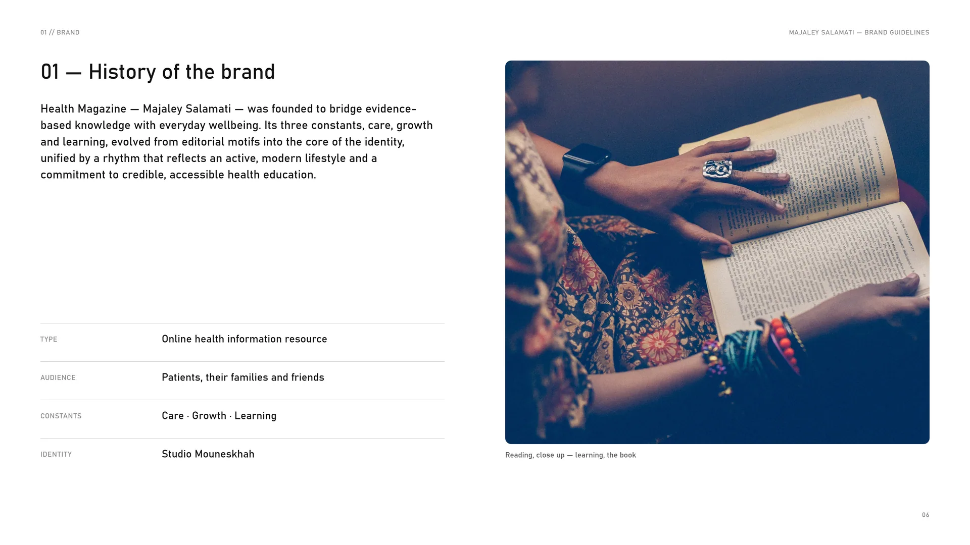
Reading, close up — learning, the book.
01.2
Mission & Vision
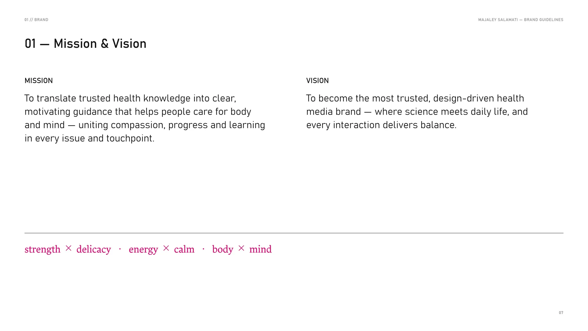
Mission: To translate trusted health knowledge into clear, motivating guidance that helps people care for body and mind — uniting compassion, progress and learning in every issue and touchpoint.
Vision: To become the most trusted, design-driven health media brand — where science meets daily life, and every interaction delivers balance.
Strength × delicacy · energy × calm · body × mind.
01.3
Brand values
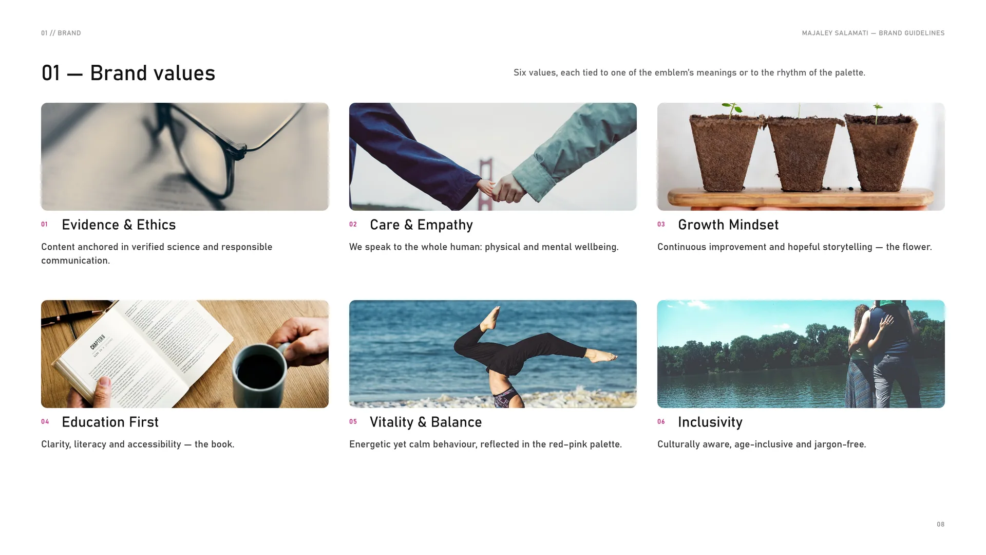
Six values, each tied to one of the emblem’s meanings or to the rhythm of the palette.
Evidence & ethics: Content anchored in verified science and responsible communication.
Care & empathy: We speak to the whole human: physical and mental wellbeing.
Growth mindset: Continuous improvement and hopeful storytelling — the flower.
Education first: Clarity, literacy and accessibility — the book.
Vitality & balance: Energetic yet calm behaviour, reflected in the red–pink palette.
Inclusivity: Culturally aware, age-inclusive and jargon-free.
01.4
Tone of voice
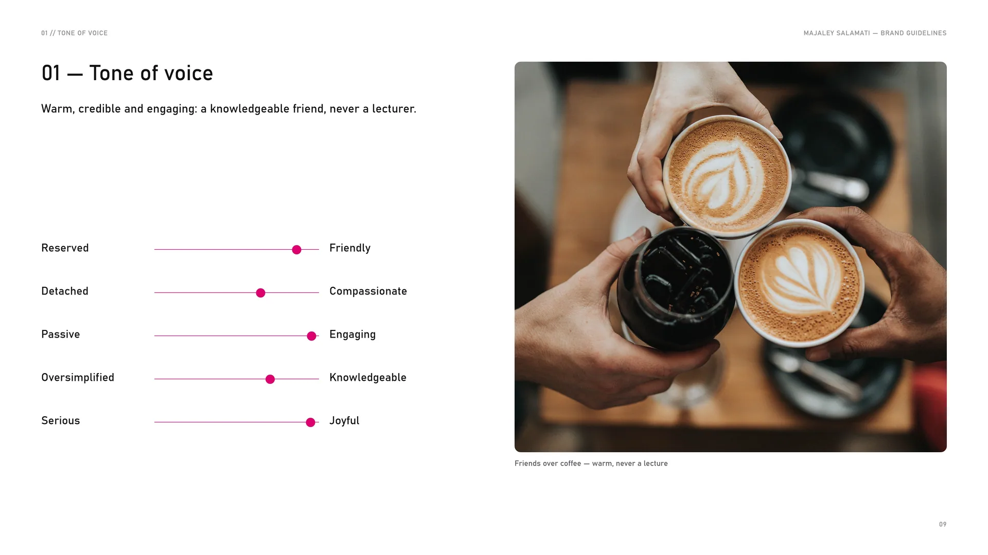
Warm, credible and engaging: a knowledgeable friend, never a lecturer.
Reserved — Friendly.
Detached — Compassionate.
Passive — Engaging.
Oversimplified — Knowledgeable.
Serious — Joyful.
Friends over coffee — warm, never a lecture.
01.5
The voice in practice
Headlines carry energy; body text calms. Each trait below is a rule an editor can check.
Clear & credible: Plain language, sources cited when needed; no sensationalism.
Warm & motivational: Encouraging, never fear-based.
Balanced & human: Equal attention to body and mind; practical takeaways.
Optimistic & actionable: Frame change as achievable steps; offer checklists and infographics.
Modern & rhythmic: Short, well-paced sentences; headlines energetic, body text calming.
01.6
Health is wealth. Reap the benefits.
Health · Growth · Knowledge.
Magazine on linen — the campaign line on the cover.
02
Concept
- 02.1Heart + flower + book = one emblem
- 02.2The pages, opened
- 02.3The heart notch
- 02.4The seal
- 02.5Built, not drawn freehand
- 02.6Mind over matter. Health gets better.
02.1
Heart + flower + book = one emblem
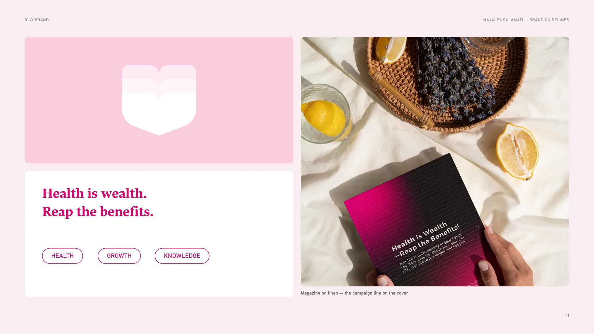
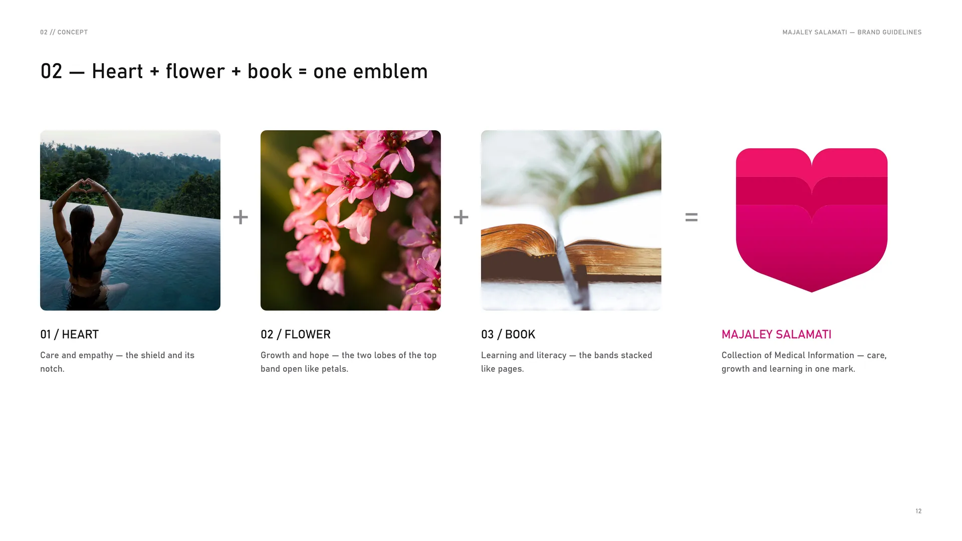
The heart: Care and empathy — the shield and its notch.
The flower: Growth and hope — the two lobes of the top band open like petals.
The book: Learning and literacy — the bands stacked like pages.
Majaley Salamati: Collection of Medical Information — care, growth and learning in one mark.
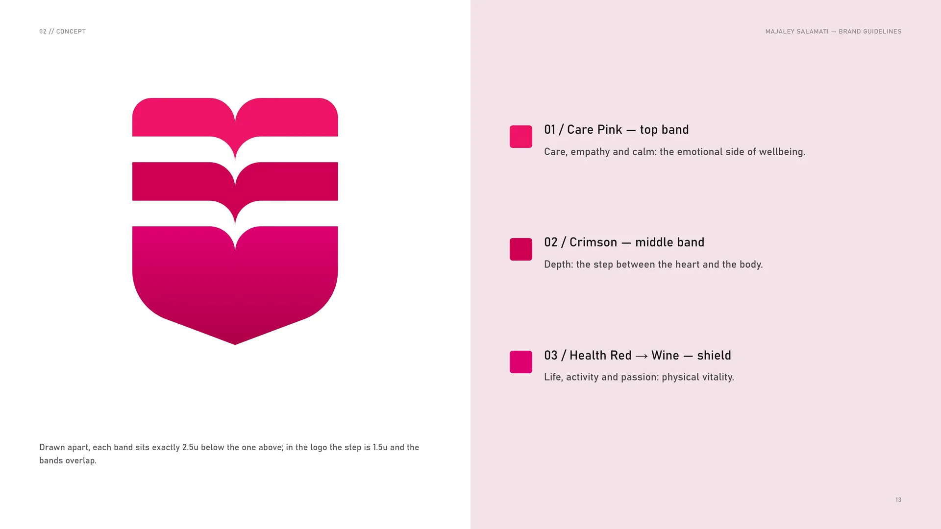
Drawn apart, each band sits exactly 2.5u below the one above; in the logo the step is 1.5u and the bands overlap.
Care Pink — top band: Care, empathy and calm: the emotional side of wellbeing.
Crimson — middle band: Depth: the step between the heart and the body.
Health Red → Wine — shield: Life, activity and passion: physical vitality.
02.2
The pages, opened
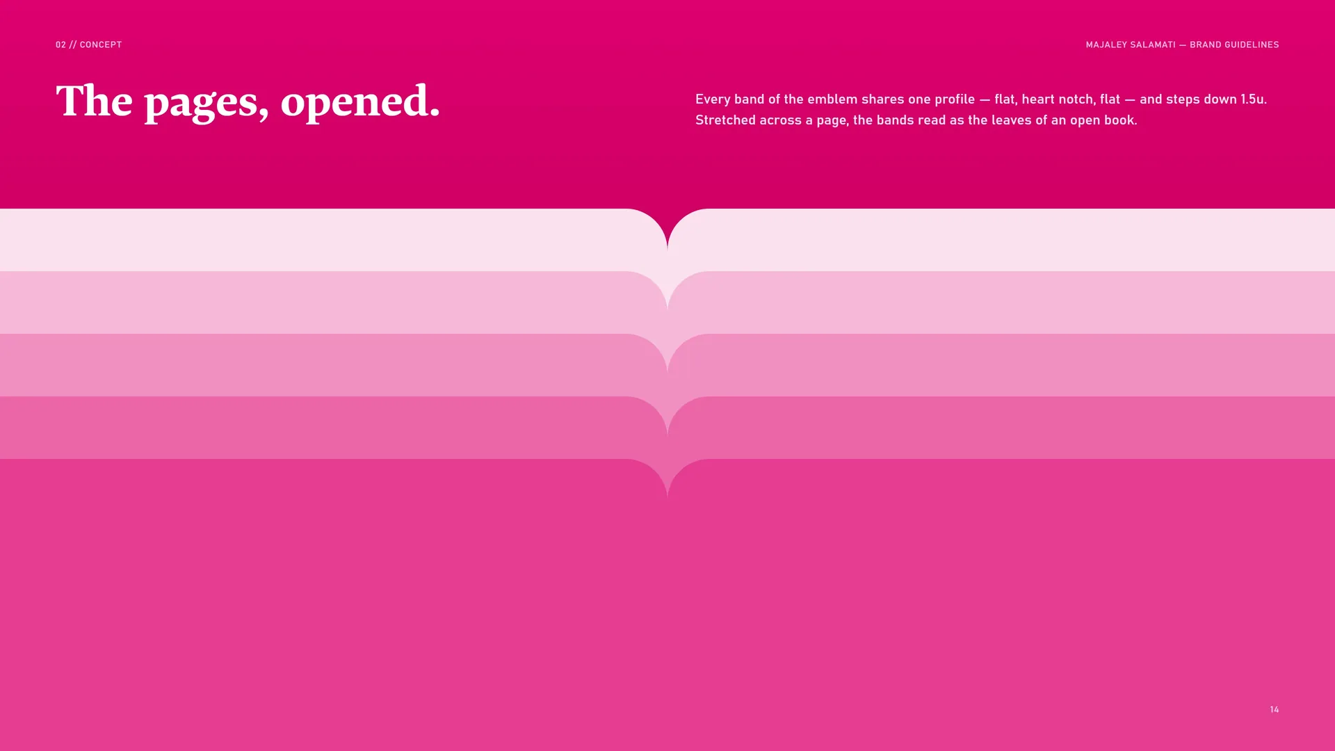
Every band of the emblem shares one profile — flat, heart notch, flat — and steps down 1.5u. Stretched across a page, the bands read as the leaves of an open book.
02.3
The heart notch
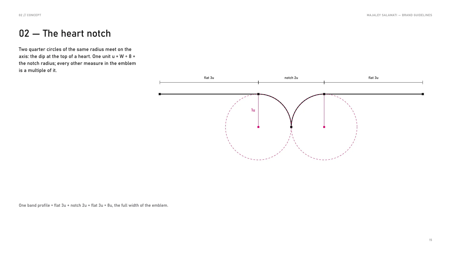
Two quarter circles of the same radius meet on the axis: the dip at the top of a heart. One unit u = W ÷ 8 = the notch radius; every other measure in the emblem is a multiple of it.
One band profile = flat 3u + notch 2u + flat 3u = 8u, the full width of the emblem.
02.4
The seal
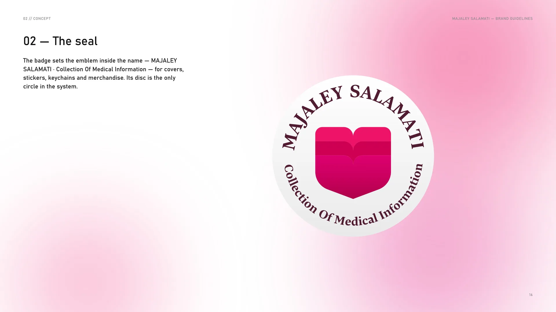
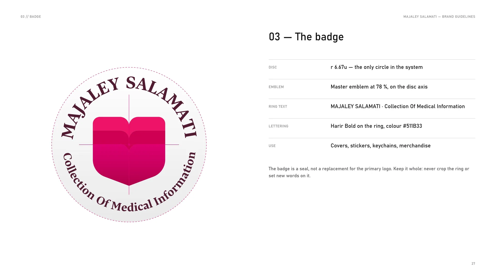
The badge sets the emblem inside the name — MAJALEY SALAMATI · Collection Of Medical Information — for covers, stickers, keychains and merchandise. Its disc is the only circle in the system.
02.5
Built, not drawn freehand
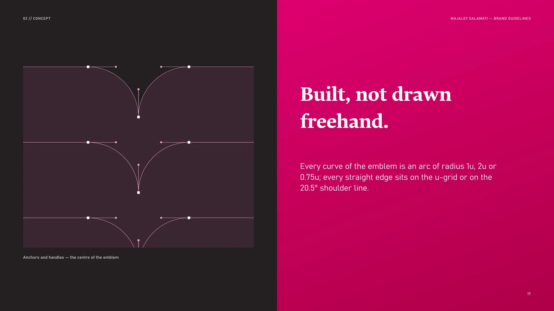
Every curve of the emblem is an arc of radius 1u, 2u or 0.75u; every straight edge sits on the u-grid or on the 20.5° shoulder line.
Anchors and handles — the centre of the emblem.
02.6
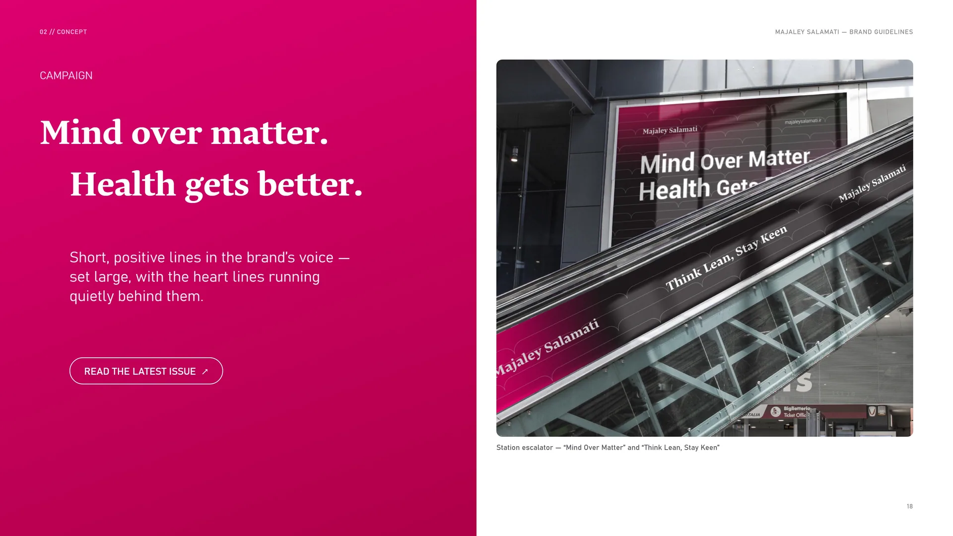
Mind over matter. Health gets better.
Campaign.
Short, positive lines in the brand’s voice — set large, with the heart lines running quietly behind them.
Station escalator — “Mind Over Matter” and “Think Lean, Stay Keen”.
03
Logo & grid
- 03.1Primary logo
- 03.2Anatomy
- 03.3Construction
- 03.4The u-grid
- 03.5Wordmark
- 03.6Horizontal lock-up (master)
- 03.7Stacked lock-up
- 03.8Clear space
- 03.9The badge
03.1
Primary logo
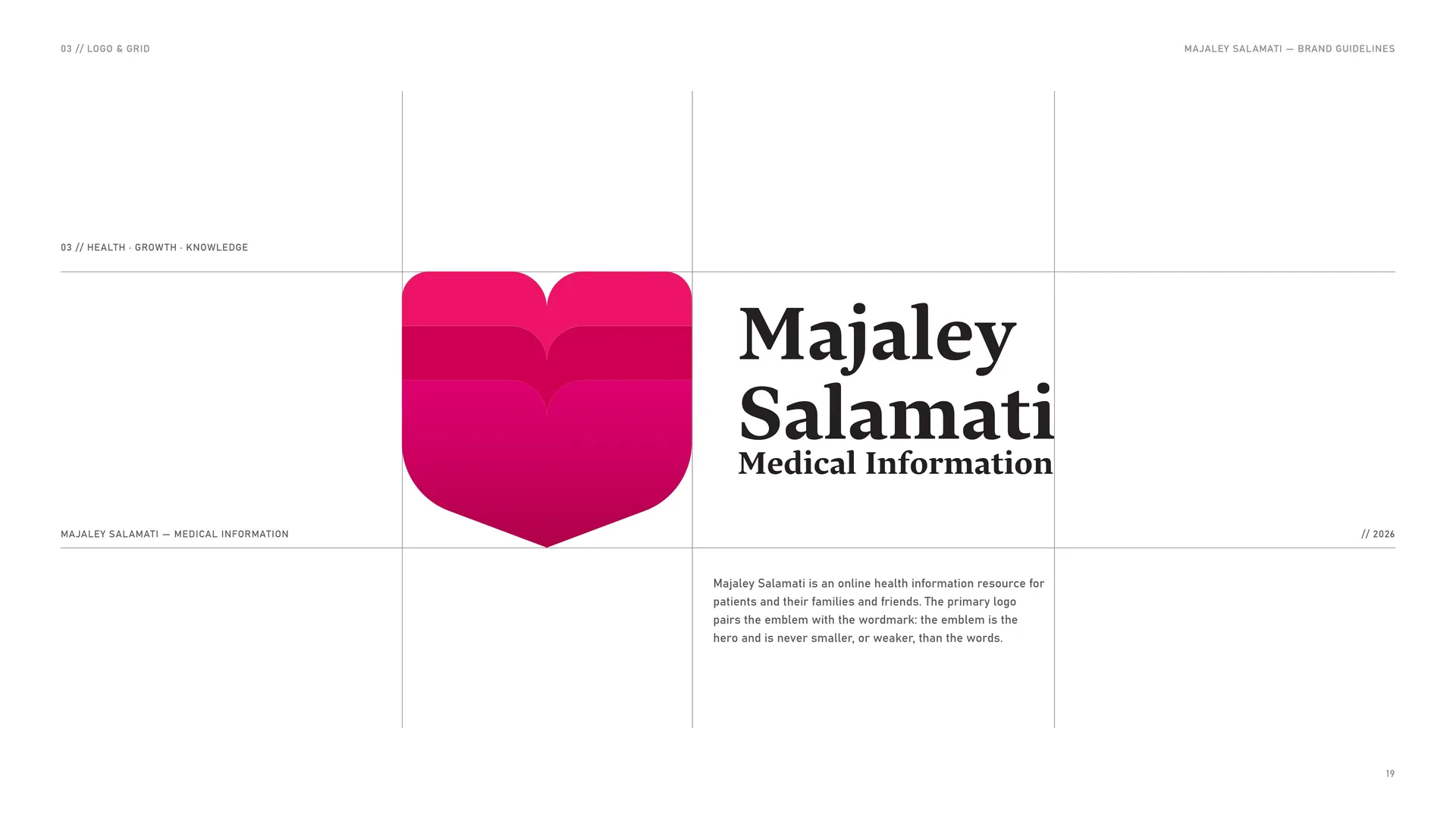
Majaley Salamati is an online health information resource for patients and their families and friends. The primary logo pairs the emblem with the wordmark: the emblem is the hero and is never smaller, or weaker, than the words.
03.2
Anatomy
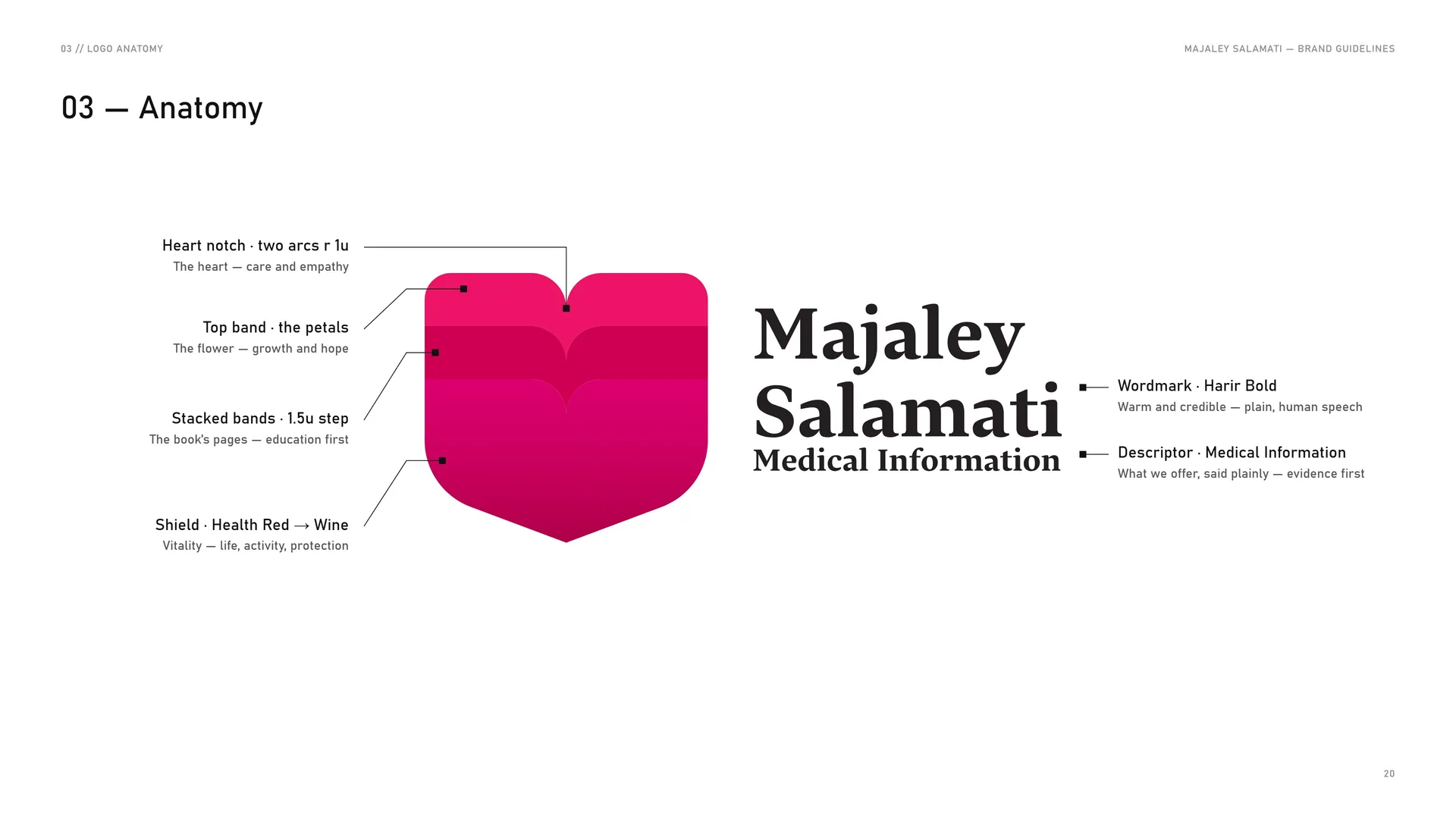
Heart notch · two arcs r 1u: The heart — care and empathy.
Top band · the petals: The flower — growth and hope.
Stacked bands · 1.5u step: The book’s pages — education first.
Shield · Health Red → Wine: Vitality — life, activity, protection.
Wordmark · Harir Bold: Warm and credible — plain, human speech.
Descriptor · Medical Information: What we offer, said plainly — evidence first.
03.3
Construction
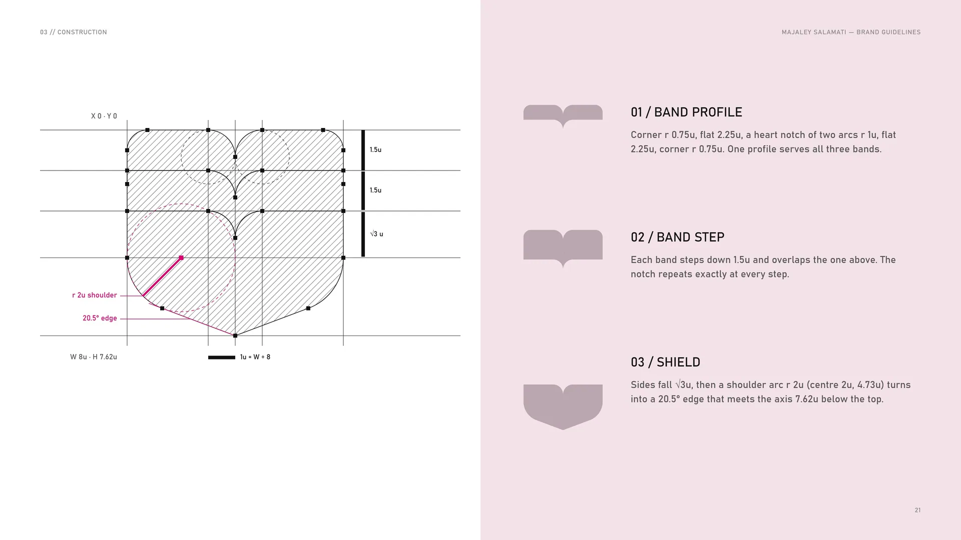
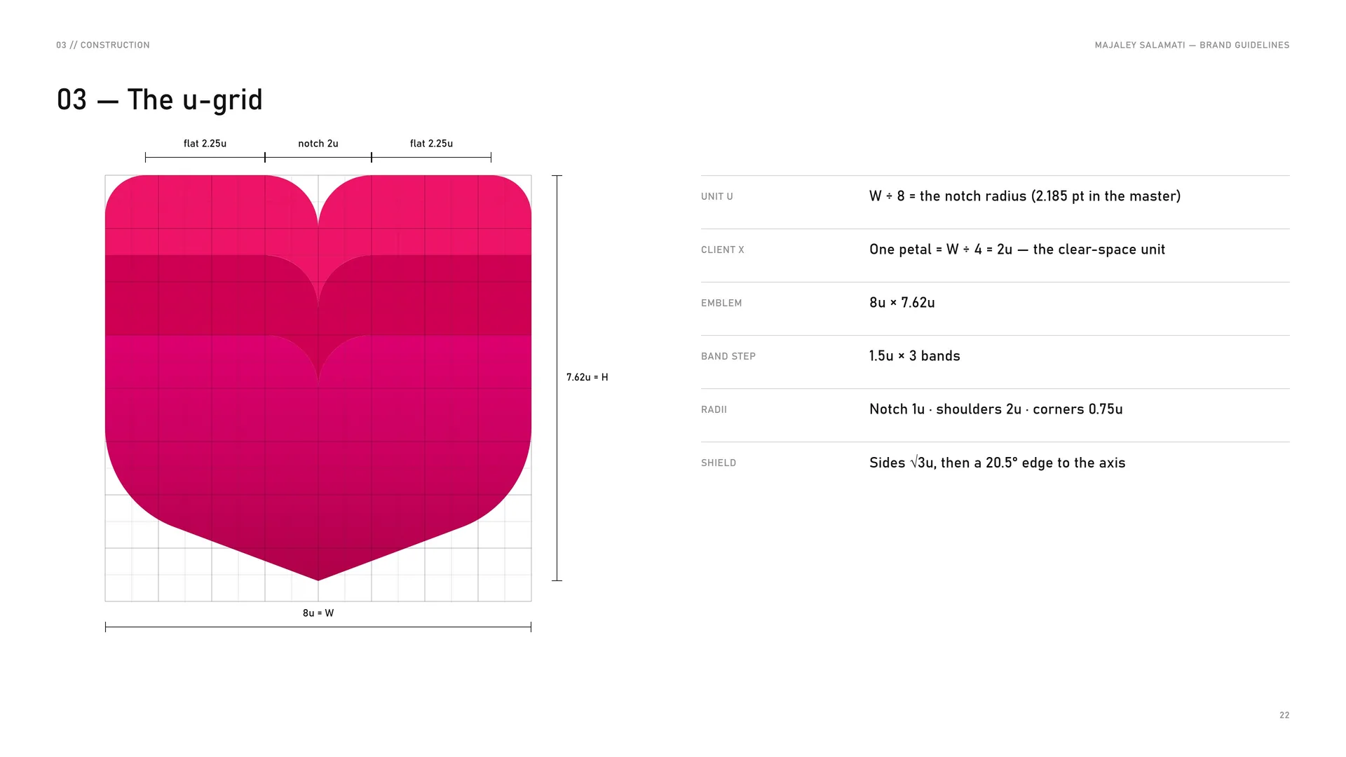
Band profile: Corner r 0.75u, flat 2.25u, a heart notch of two arcs r 1u, flat 2.25u, corner r 0.75u. One profile serves all three bands.
Band step: Each band steps down 1.5u and overlaps the one above. The notch repeats exactly at every step.
Shield: Sides fall √3u, then a shoulder arc r 2u (centre 2u, 4.73u) turns into a 20.5° edge that meets the axis 7.62u below the top.
1u = W ÷ 8.
03.4
The u-grid
Unit u: W ÷ 8 = the notch radius (2.185 pt in the master).
Client X: One petal = W ÷ 4 = 2u — the clear-space unit.
Emblem: 8u × 7.62u.
Band step: 1.5u × 3 bands.
Radii: Notch 1u · shoulders 2u · corners 0.75u.
Shield: Sides √3u, then a 20.5° edge to the axis.
03.5
Wordmark
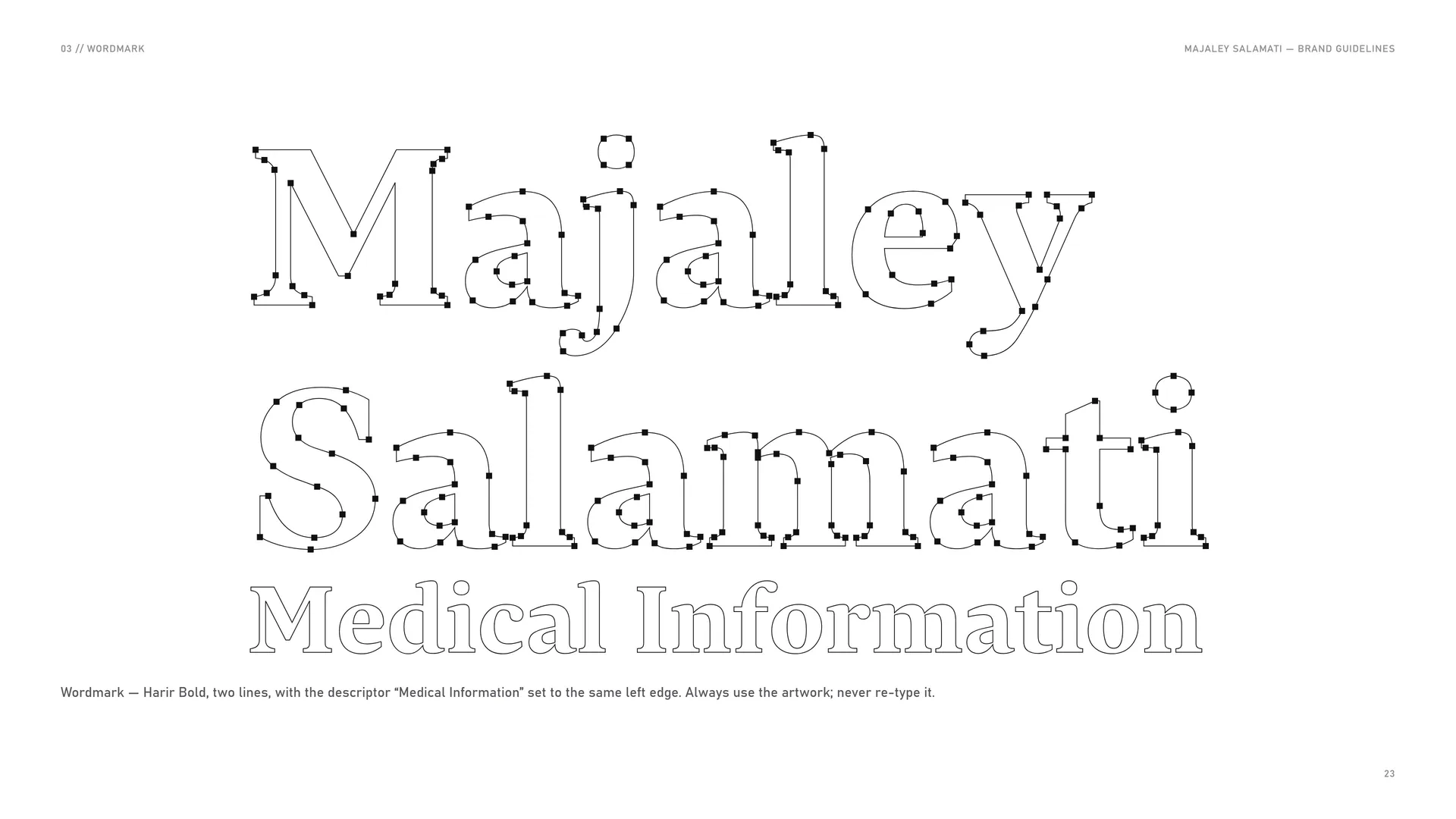
Wordmark — Harir Bold, two lines, with the descriptor “Medical Information” set to the same left edge. Always use the artwork; never re-type it.
03.6
Horizontal lock-up (master)
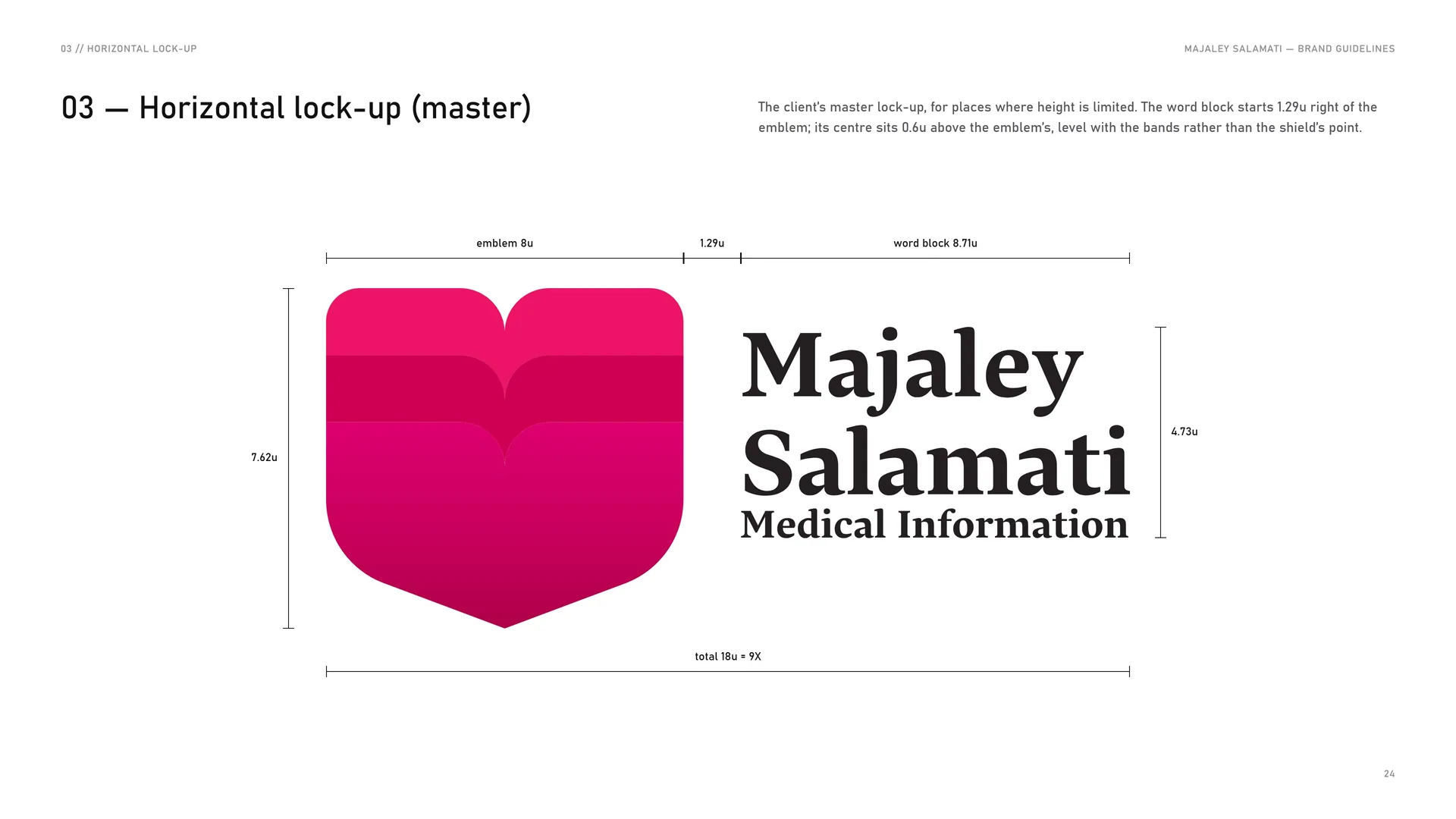
The client’s master lock-up, for places where height is limited. The word block starts 1.29u right of the emblem; its centre sits 0.6u above the emblem’s, level with the bands rather than the shield’s point.
Total 18u = 9X.
03.7
Stacked lock-up
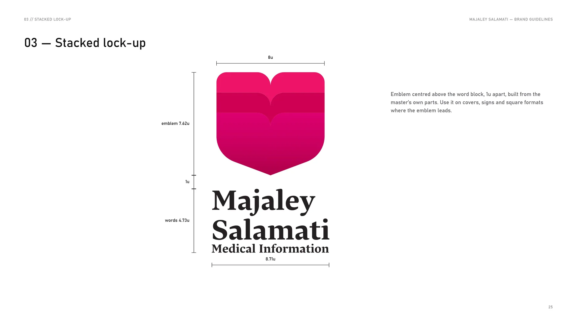
Emblem centred above the word block, 1u apart, built from the master’s own parts. Use it on covers, signs and square formats where the emblem leads.
03.8
Clear space
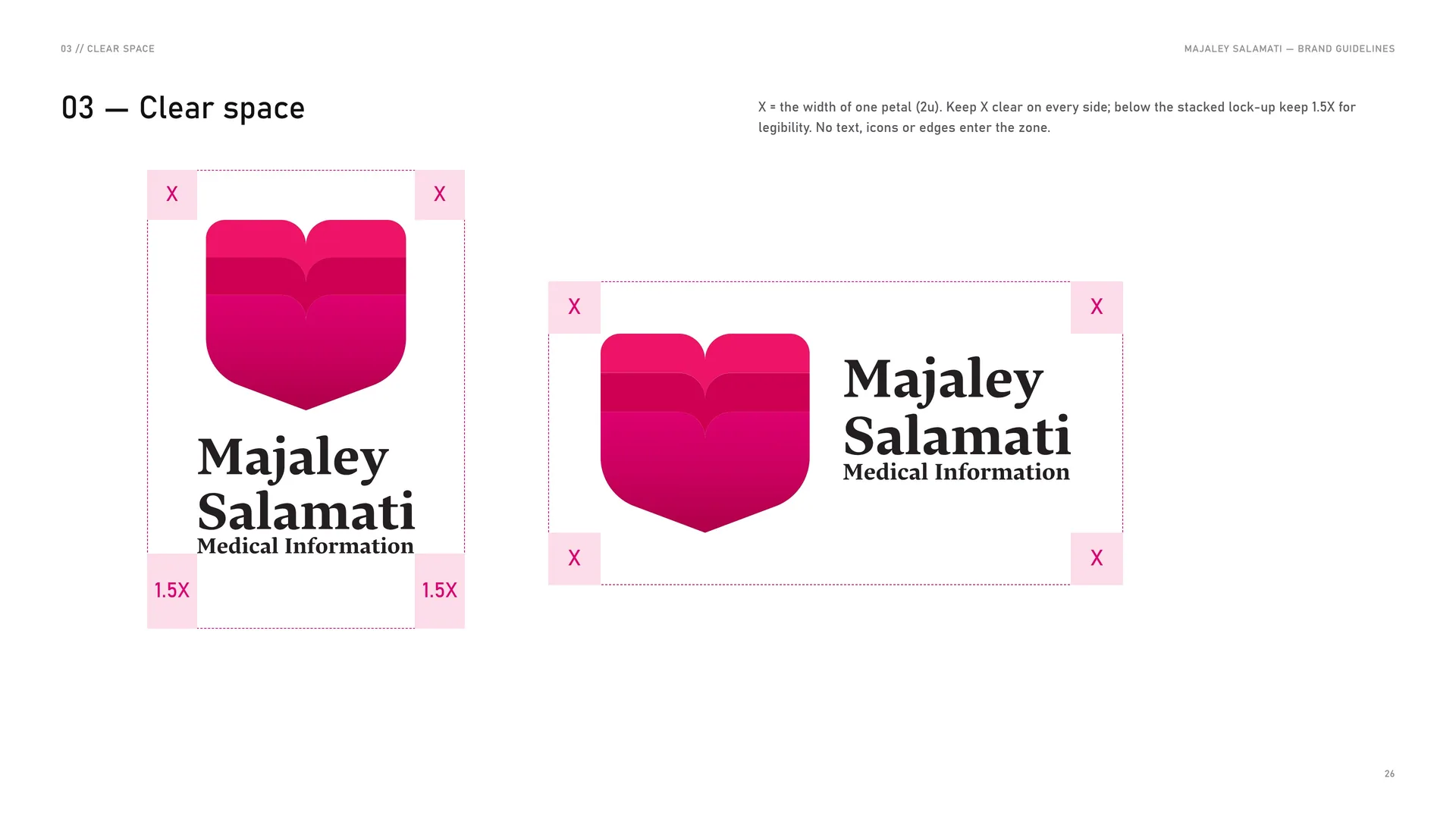
X = the width of one petal (2u). Keep X clear on every side; below the stacked lock-up keep 1.5X for legibility. No text, icons or edges enter the zone.
03.9
The badge
Disc: r 6.67u — the only circle in the system.
Emblem: Master emblem at 78 %, on the disc axis.
Ring text: MAJALEY SALAMATI · Collection Of Medical Information.
Lettering: Harir Bold on the ring, colour #511B33.
Use: Covers, stickers, keychains, merchandise.
The badge is a seal, not a replacement for the primary logo. Keep it whole: never crop the ring or set new words on it.
04
Logo in use
- 04.1Versions
- 04.2The logo family
- 04.3App icon & favicon
- 04.4Size
- 04.5Placement
- 04.6Misuse
- 04.7Logo on backgrounds
04.1
Versions
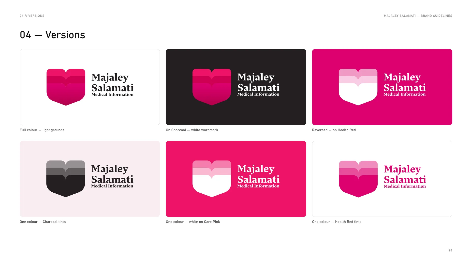
Full colour — light grounds.
On Charcoal — white wordmark.
Reversed — on Health Red.
One colour — Charcoal tints.
One colour — white on Care Pink.
One colour — Health Red tints.
04.2
The logo family
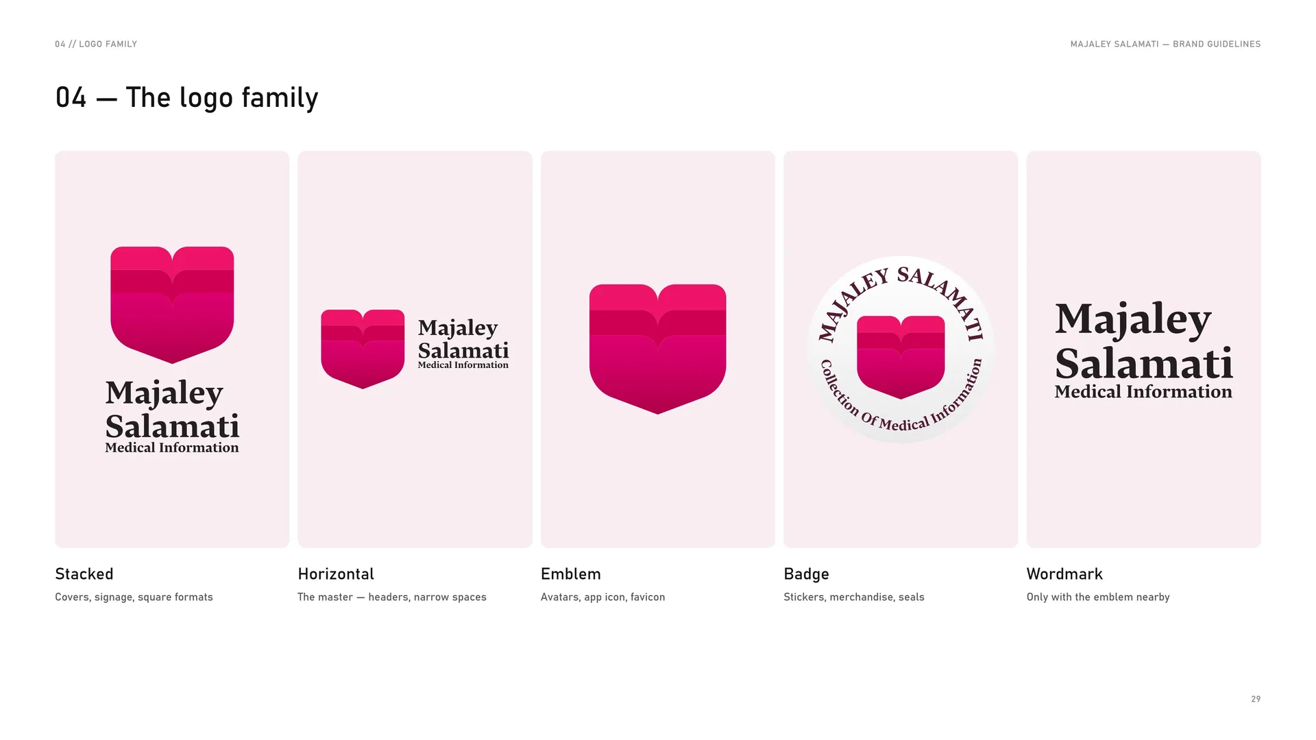
Stacked: Covers, signage, square formats.
Horizontal: The master — headers, narrow spaces.
Emblem: Avatars, app icon, favicon.
Badge: Stickers, merchandise, seals.
Wordmark: Only with the emblem nearby.
04.3
App icon & favicon
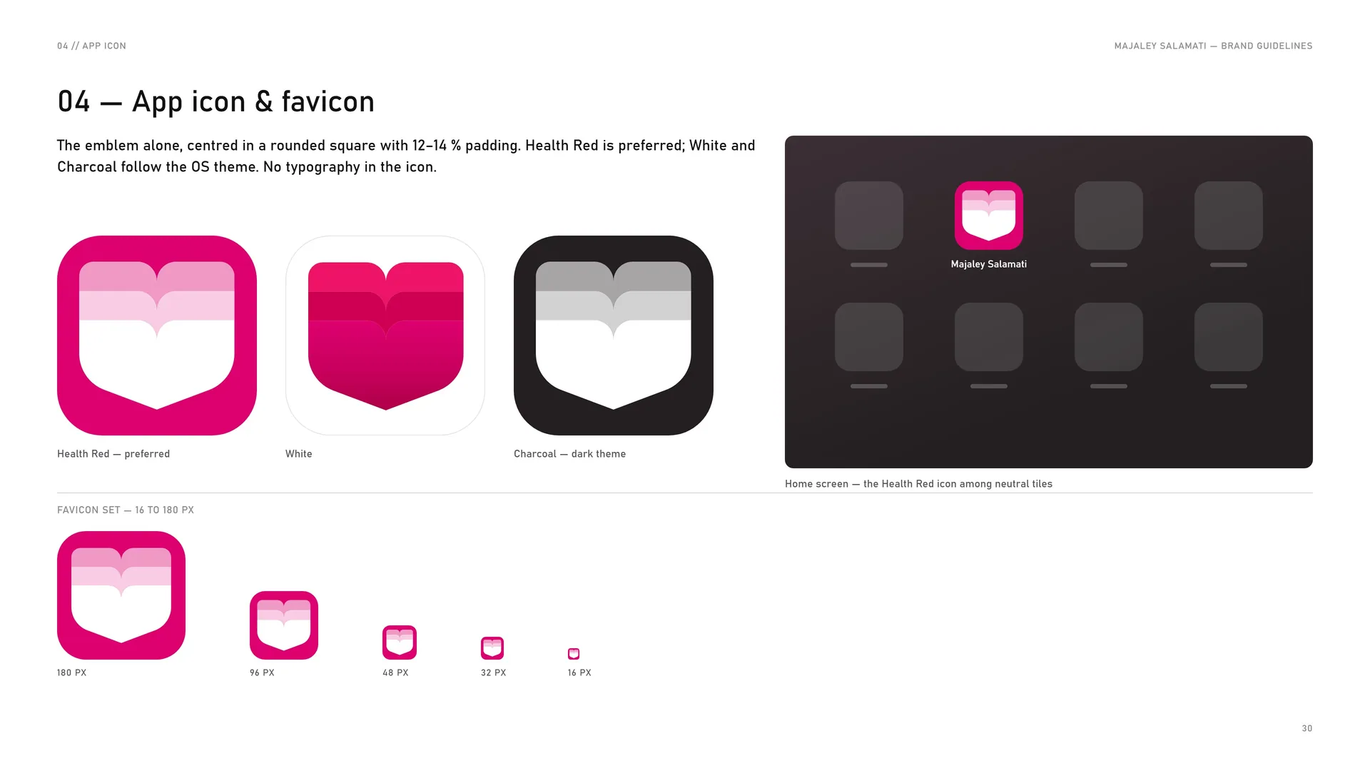
The emblem alone, centred in a rounded square with 12–14 % padding. Health Red is preferred; White and Charcoal follow the OS theme. No typography in the icon.
Health Red — preferred.
White.
Charcoal — dark theme.
Favicon set — 16 to 180 px: 180 px · 96 px · 48 px · 32 px · 16 px.
Home screen — the Health Red icon among neutral tiles.
04.4
Size
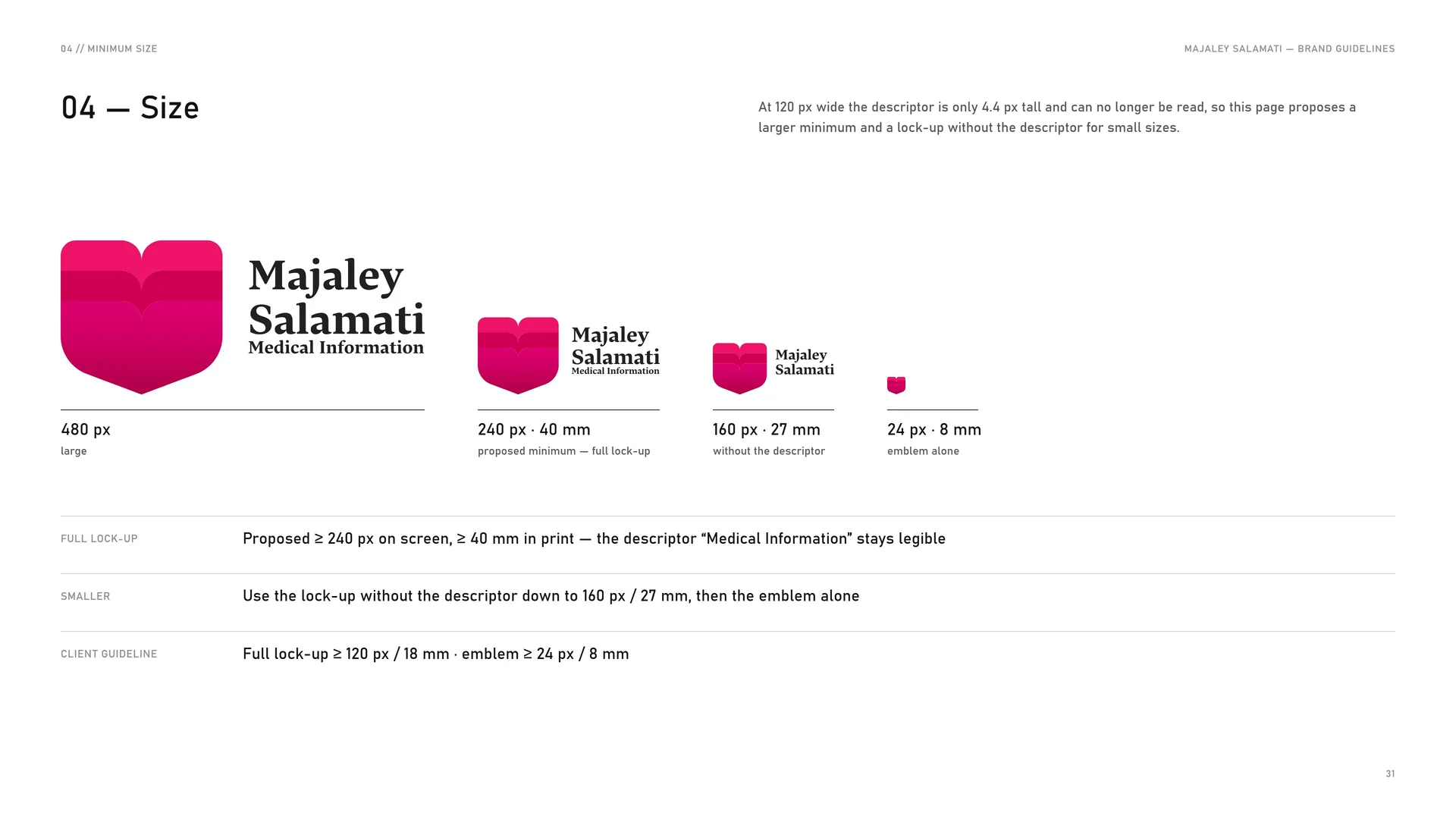
At 120 px wide the descriptor is only 4.4 px tall and can no longer be read, so this page proposes a larger minimum and a lock-up without the descriptor for small sizes.
480 px — large.
240 px · 40 mm — proposed minimum — full lock-up.
160 px · 27 mm — without the descriptor.
24 px · 8 mm — emblem alone.
Full lock-up: Proposed ≥ 240 px on screen, ≥ 40 mm in print — the descriptor “Medical Information” stays legible.
Smaller: Use the lock-up without the descriptor down to 160 px / 27 mm, then the emblem alone.
Client guideline: Full lock-up ≥ 120 px / 18 mm · emblem ≥ 24 px / 8 mm.
04.5
Placement
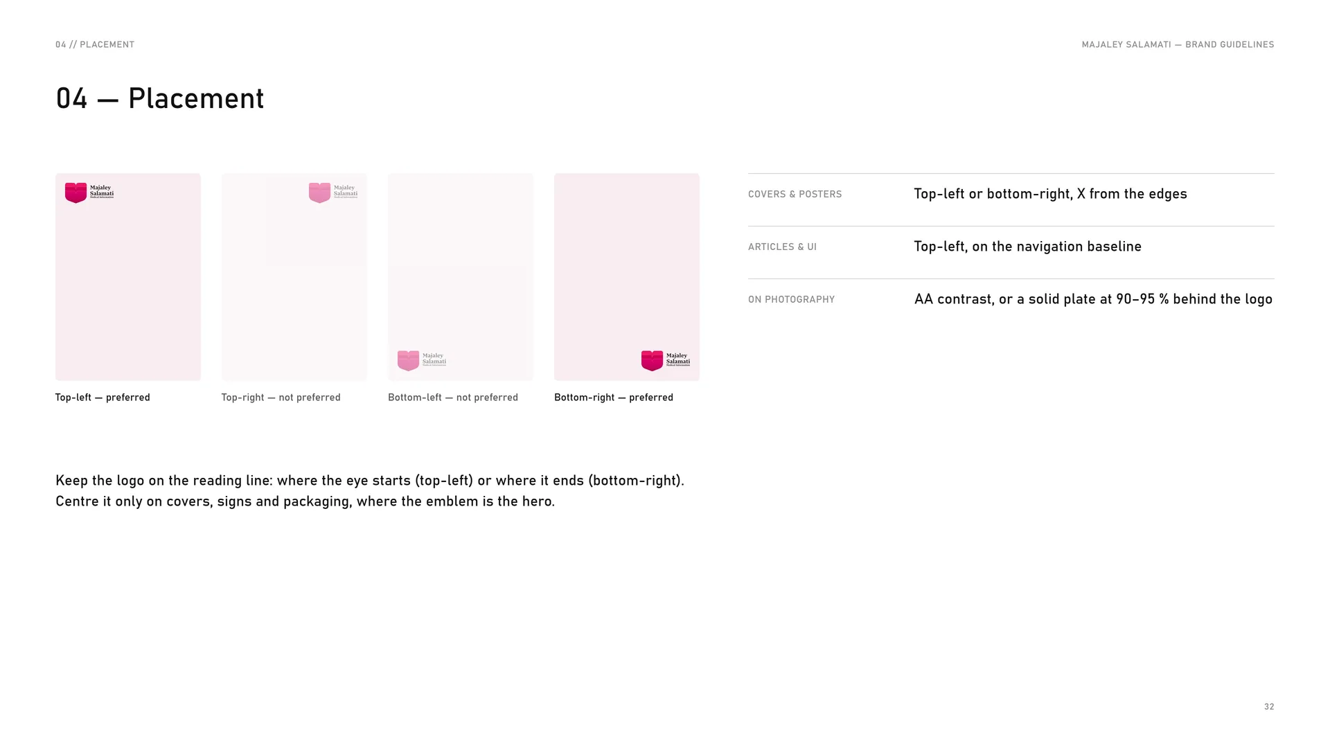
Covers & posters: Top-left or bottom-right, X from the edges.
Articles & UI: Top-left, on the navigation baseline.
On photography: AA contrast, or a solid plate at 90–95 % behind the logo.
Top-left — preferred.
Top-right — not preferred.
Bottom-left — not preferred.
Bottom-right — preferred.
Keep the logo on the reading line: where the eye starts (top-left) or where it ends (bottom-right). Centre it only on covers, signs and packaging, where the emblem is the hero.
04.6
Misuse
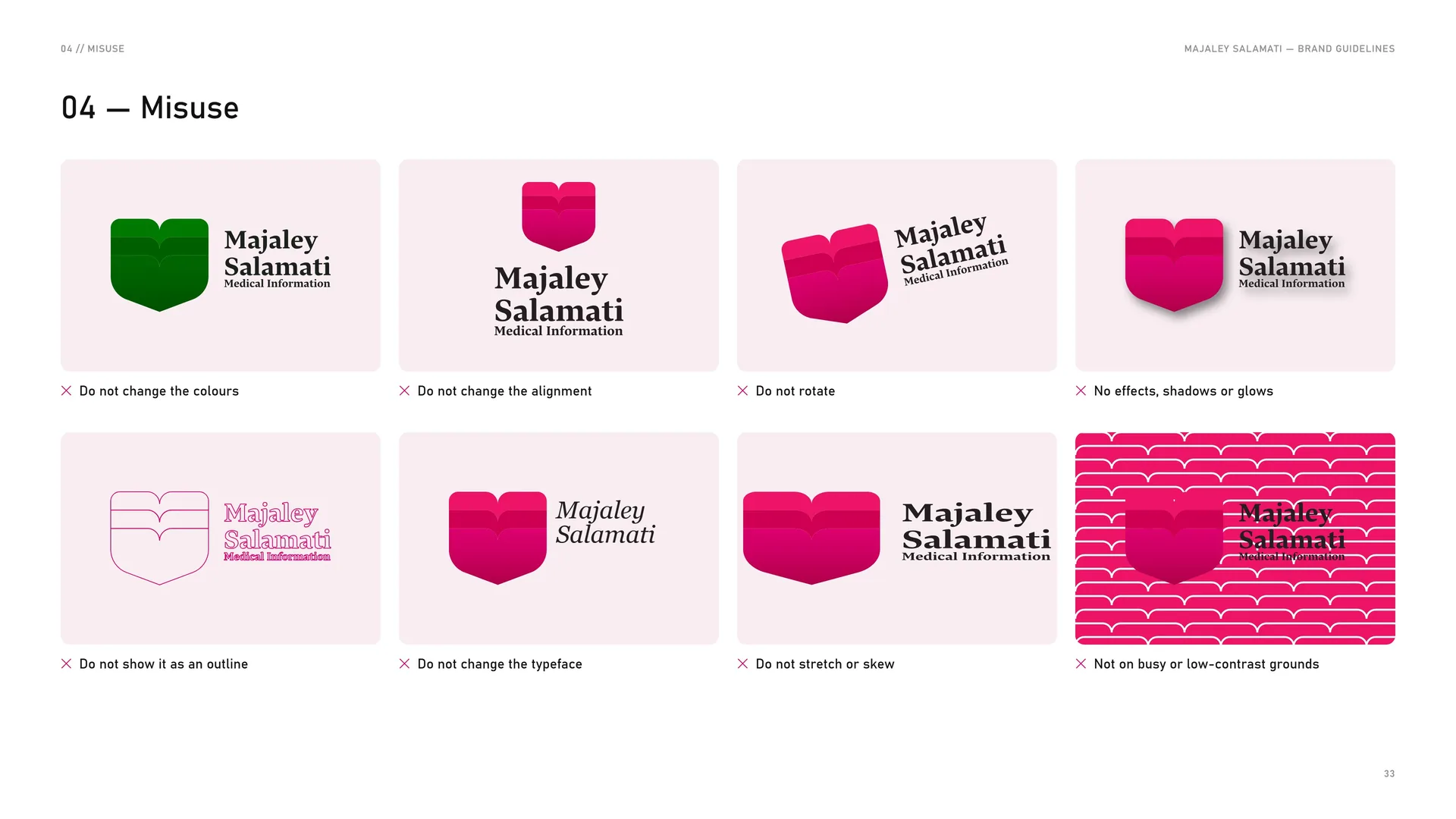
✕ Do not change the colours.
✕ Do not change the alignment.
✕ Do not rotate.
✕ No effects, shadows or glows.
✕ Do not show it as an outline.
✕ Do not change the typeface.
✕ Do not stretch or skew.
✕ Not on busy or low-contrast grounds.
04.7
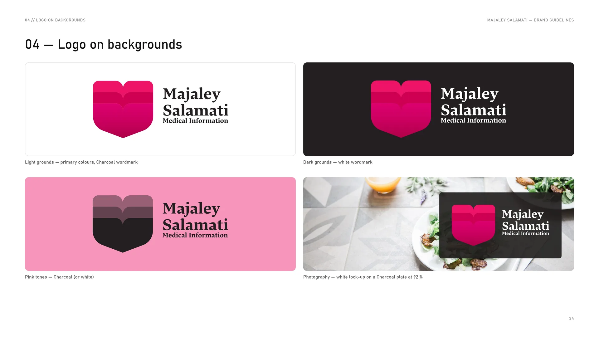
Logo on backgrounds
Light grounds — primary colours, Charcoal wordmark.
Dark grounds — white wordmark.
Pink tones — Charcoal (or white).
Photography — white lock-up on a Charcoal plate at 92 %.
05
Colour
05.1
Colour
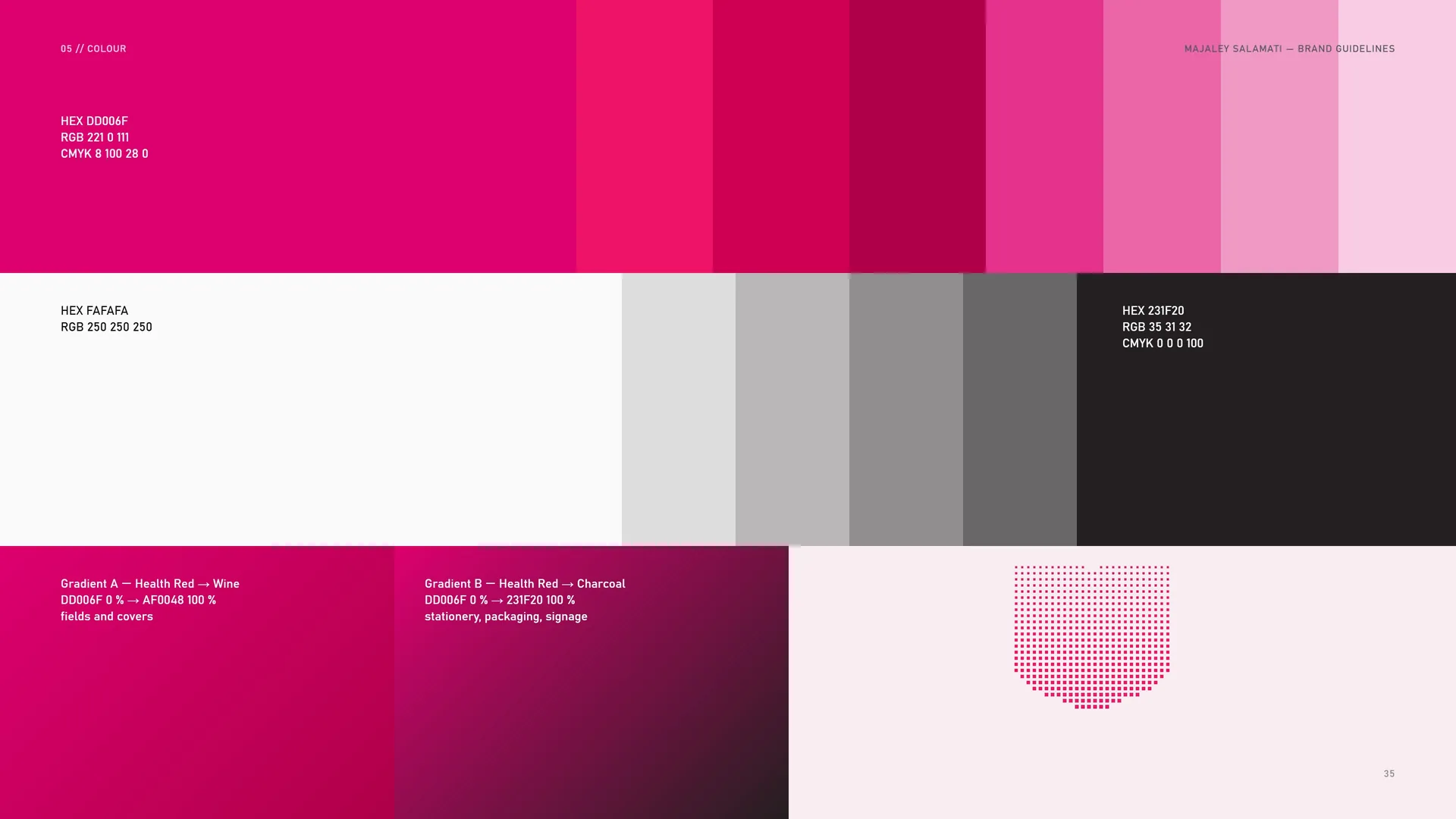
HEX DD006F · RGB 221 0 111 · CMYK 8 100 28 0.
HEX FAFAFA · RGB 250 250 250.
HEX 231F20 · RGB 35 31 32 · CMYK 0 0 0 100.
Gradient A — Health Red → Wine: DD006F 0 % → AF0048 100 % — fields and covers.
Gradient B — Health Red → Charcoal: DD006F 0 % → 231F20 100 % — stationery, packaging, signage.
05.2
Colour values
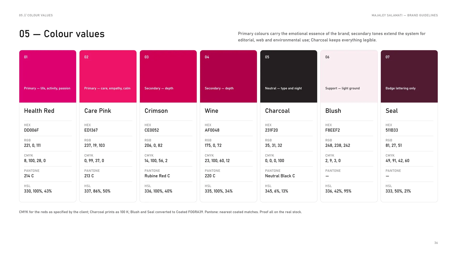
Primary colours carry the emotional essence of the brand; secondary tones extend the system for editorial, web and environmental use; Charcoal keeps everything legible.
Primary — life, activity, passion. Health Red: HEX #DD006F · RGB 221, 0, 111 · CMYK 8, 100, 28, 0 · PANTONE 214 C · HSL 330, 100%, 43%.
Primary — care, empathy, calm. Care Pink: HEX #ED1367 · RGB 237, 19, 103 · CMYK 0, 99, 37, 0 · PANTONE 213 C · HSL 337, 86%, 50%.
Secondary — depth. Crimson: HEX #CE0052 · RGB 206, 0, 82 · CMYK 14, 100, 56, 2 · PANTONE Rubine Red C · HSL 336, 100%, 40%.
Secondary — depth. Wine: HEX #AF0048 · RGB 175, 0, 72 · CMYK 23, 100, 60, 12 · PANTONE 220 C · HSL 335, 100%, 34%.
Neutral — type and night. Charcoal: HEX #231F20 · RGB 35, 31, 32 · CMYK 0, 0, 0, 100 · PANTONE Neutral Black C · HSL 345, 6%, 13%.
Support — light ground. Blush: HEX #F8EEF2 · RGB 248, 238, 242 · CMYK 2, 9, 3, 0 · HSL 336, 42%, 95%.
Badge lettering only. Seal: HEX #511B33 · RGB 81, 27, 51 · CMYK 49, 91, 42, 60 · HSL 333, 50%, 21%.
CMYK for the reds as specified by the client; Charcoal prints as 100 K; Blush and Seal converted to Coated FOGRA39. Pantone: nearest coated matches. Proof all on the real stock.
05.3
Tints
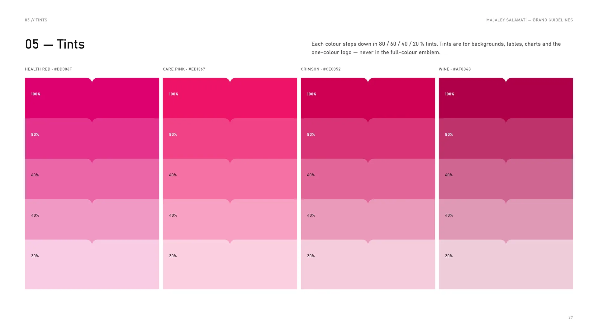
Each colour steps down in 80 / 60 / 40 / 20 % tints. Tints are for backgrounds, tables, charts and the one-colour logo — never in the full-colour emblem.
Health Red · #DD006F: 100% · 80% · 60% · 40% · 20%.
Care Pink · #ED1367: 100% · 80% · 60% · 40% · 20%.
Crimson · #CE0052: 100% · 80% · 60% · 40% · 20%.
Wine · #AF0048: 100% · 80% · 60% · 40% · 20%.
05.4
Balanced vitality
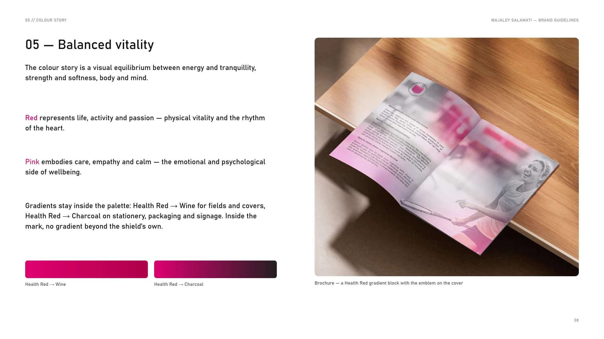
The colour story is a visual equilibrium between energy and tranquillity, strength and softness, body and mind.
Red represents life, activity and passion — physical vitality and the rhythm of the heart.
Pink embodies care, empathy and calm — the emotional and psychological side of wellbeing.
Gradients stay inside the palette: Health Red → Wine for fields and covers, Health Red → Charcoal on stationery, packaging and signage. Inside the mark, no gradient beyond the shield’s own.
Health Red → Wine.
Health Red → Charcoal.
Brochure — a Health Red gradient block with the emblem on the cover.
05.5
Contrast & accessibility
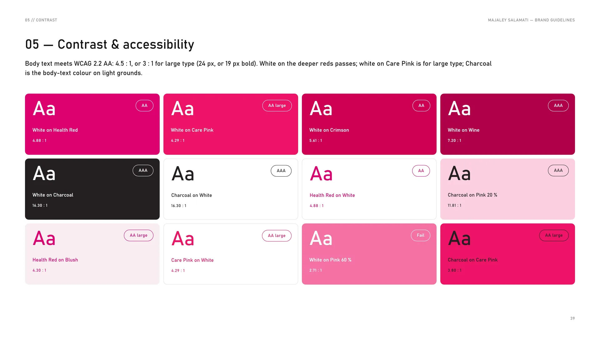
Body text meets WCAG 2.2 AA: 4.5 : 1, or 3 : 1 for large type (24 px, or 19 px bold). White on the deeper reds passes; white on Care Pink is for large type; Charcoal is the body-text colour on light grounds.
White on Health Red — 4.88 : 1 · AA.
White on Care Pink — 4.29 : 1 · AA large.
White on Crimson — 5.61 : 1 · AA.
White on Wine — 7.20 : 1 · AAA.
White on Charcoal — 16.30 : 1 · AAA.
Charcoal on White — 16.30 : 1 · AAA.
Health Red on White — 4.88 : 1 · AA.
Charcoal on Pink 20 % — 11.81 : 1 · AAA.
Health Red on Blush — 4.30 : 1 · AA large.
Care Pink on White — 4.29 : 1 · AA large.
White on Pink 60 % — 2.71 : 1 · Fail.
Charcoal on Care Pink — 3.80 : 1 · AA large.
06
Typography
06.1
Typography
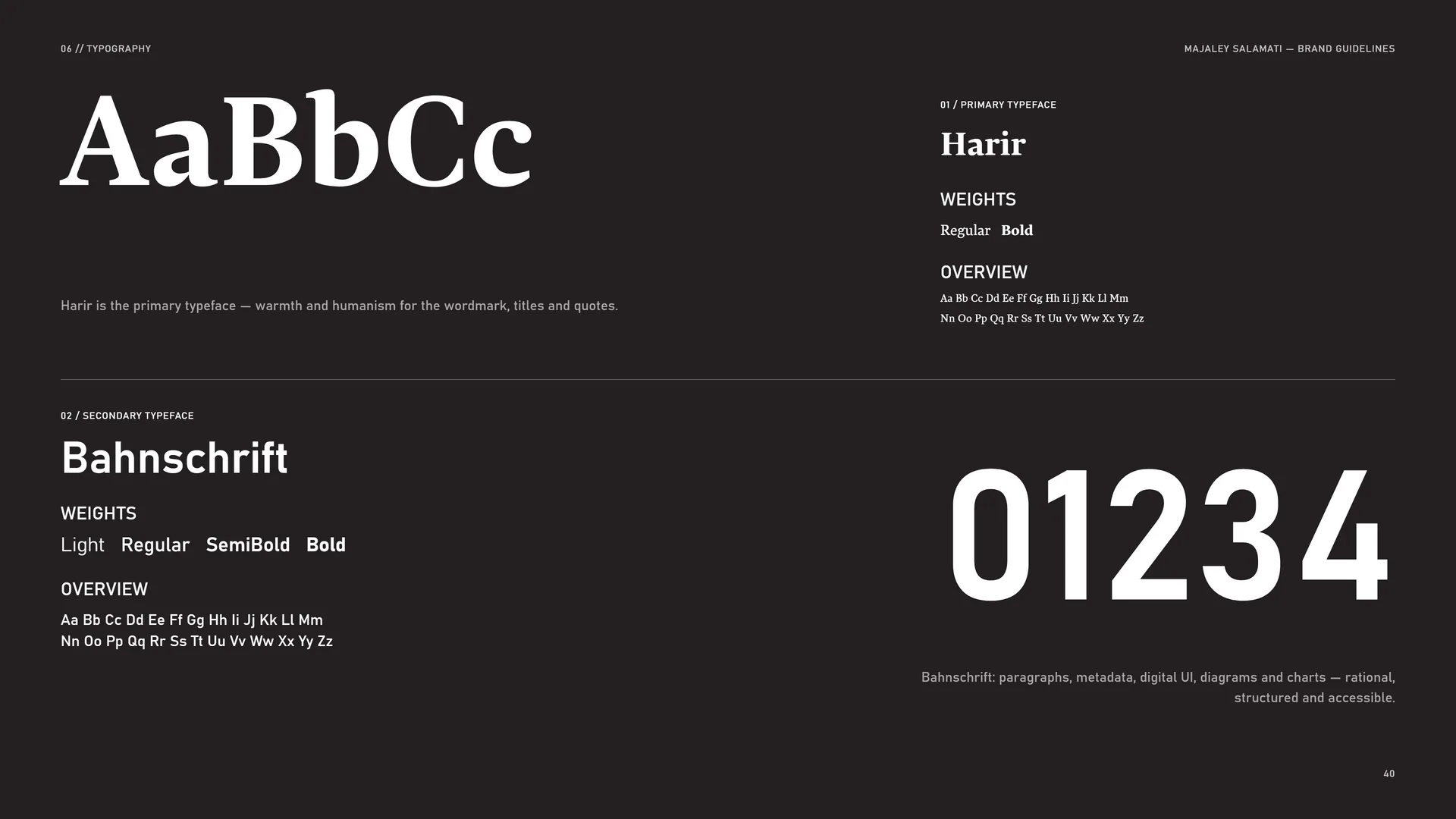
Harir is the primary typeface — warmth and humanism for the wordmark, titles and quotes.
Primary typeface: Harir. Weights: Regular · Bold.
Overview: Aa Bb Cc Dd Ee Ff Gg Hh Ii Jj Kk Ll Mm Nn Oo Pp Qq Rr Ss Tt Uu Vv Ww Xx Yy Zz.
Secondary typeface: Bahnschrift. Weights: Light · Regular · SemiBold · Bold.
Overview: Aa Bb Cc Dd Ee Ff Gg Hh Ii Jj Kk Ll Mm Nn Oo Pp Qq Rr Ss Tt Uu Vv Ww Xx Yy Zz.
Bahnschrift: paragraphs, metadata, digital UI, diagrams and charts — rational, structured and accessible.
06.2
Harir
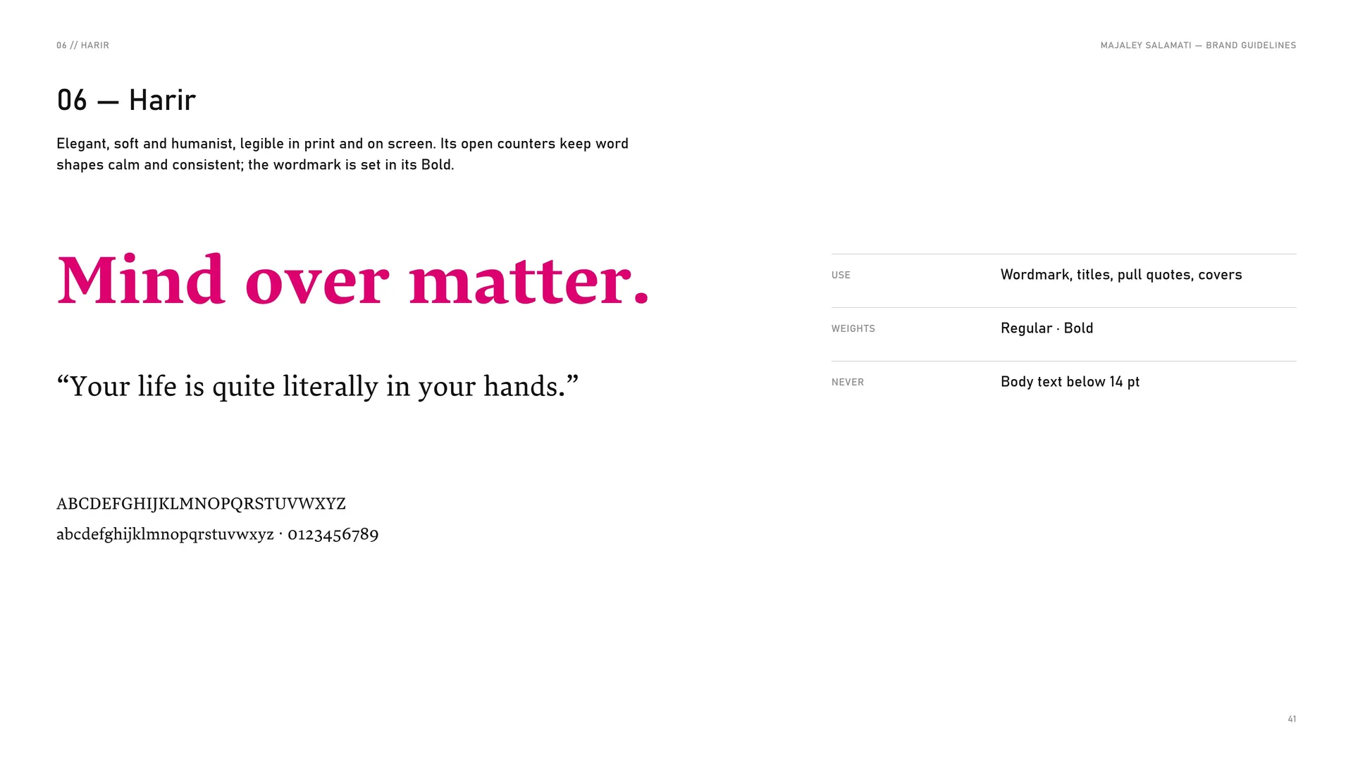
Elegant, soft and humanist, legible in print and on screen. Its open counters keep word shapes calm and consistent; the wordmark is set in its Bold.
Mind over matter.
“Your life is quite literally in your hands.”
ABCDEFGHIJKLMNOPQRSTUVWXYZ abcdefghijklmnopqrstuvwxyz · 0123456789.
Use: Wordmark, titles, pull quotes, covers.
Weights: Regular · Bold.
Never: Body text below 14 pt.
06.3
Bahnschrift
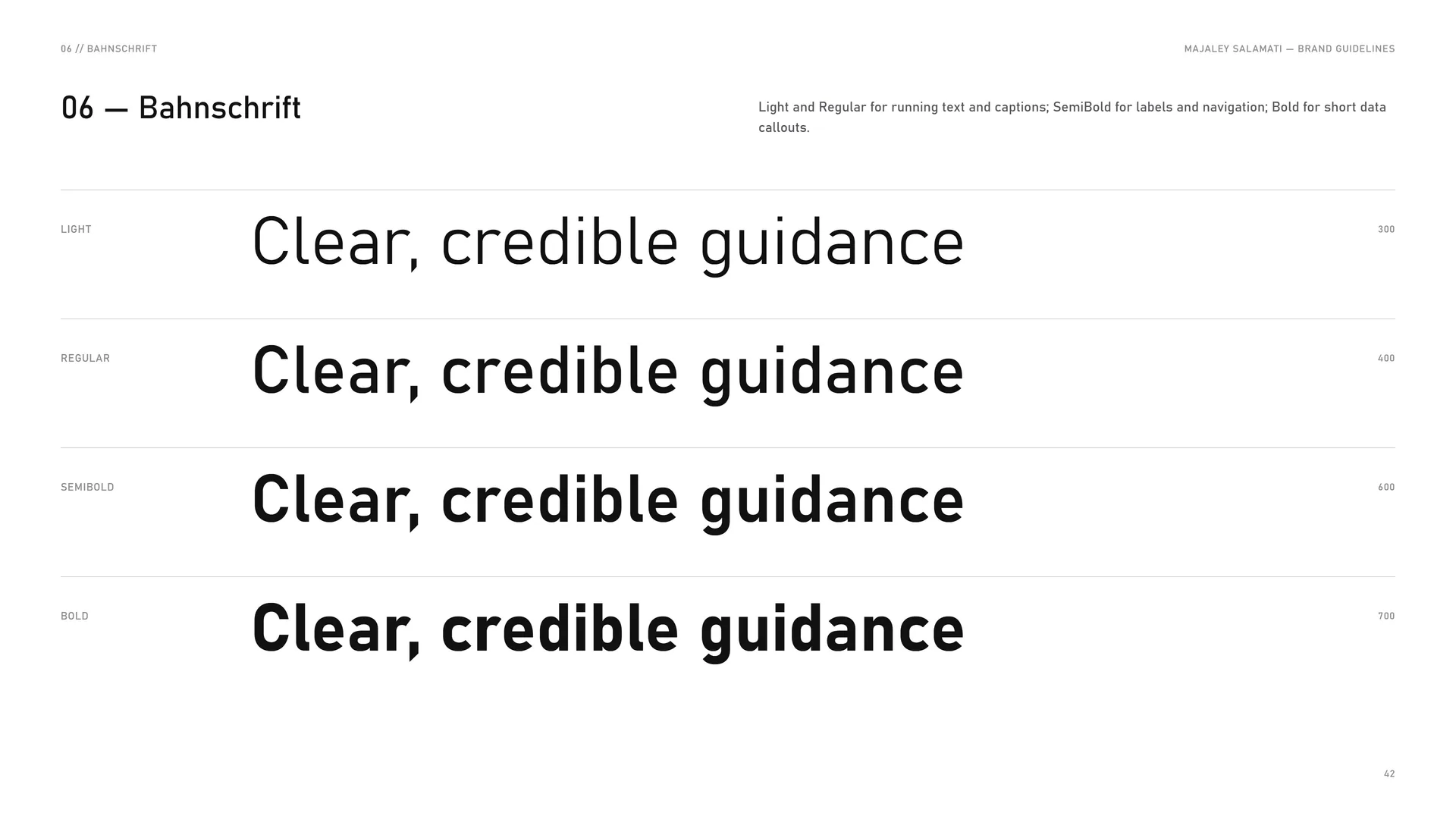
Light and Regular for running text and captions; SemiBold for labels and navigation; Bold for short data callouts.
Light 300: Clear, credible guidance.
Regular 400: Clear, credible guidance.
SemiBold 600: Clear, credible guidance.
Bold 700: Clear, credible guidance.
06.4
Type system
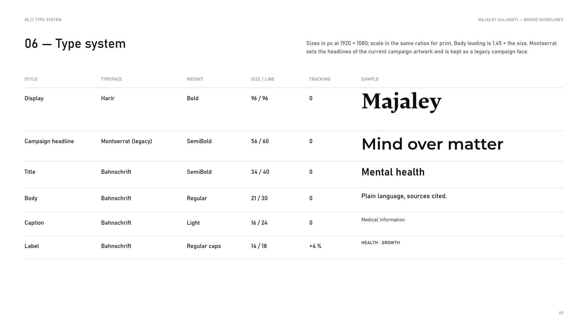
Sizes in px at 1920 × 1080; scale in the same ratios for print. Body leading is 1.45 × the size. Montserrat sets the headlines of the current campaign artwork and is kept as a legacy campaign face.
Display: Harir · Bold · 96 / 96 · tracking 0.
Campaign headline: Montserrat (legacy) · SemiBold · 56 / 60 · tracking 0.
Title: Bahnschrift · SemiBold · 34 / 40 · tracking 0.
Body: Bahnschrift · Regular · 21 / 30 · tracking 0.
Caption: Bahnschrift · Light · 16 / 24 · tracking 0.
Label: Bahnschrift · Regular caps · 14 / 18 · tracking +4 %.
07
Pattern
- 07.1The heart line
- 07.2How the pattern is built
- 07.3Pattern family
- 07.4Line and colour
- 07.5Pattern rules
- 07.6Pattern in use
07.1
The heart line
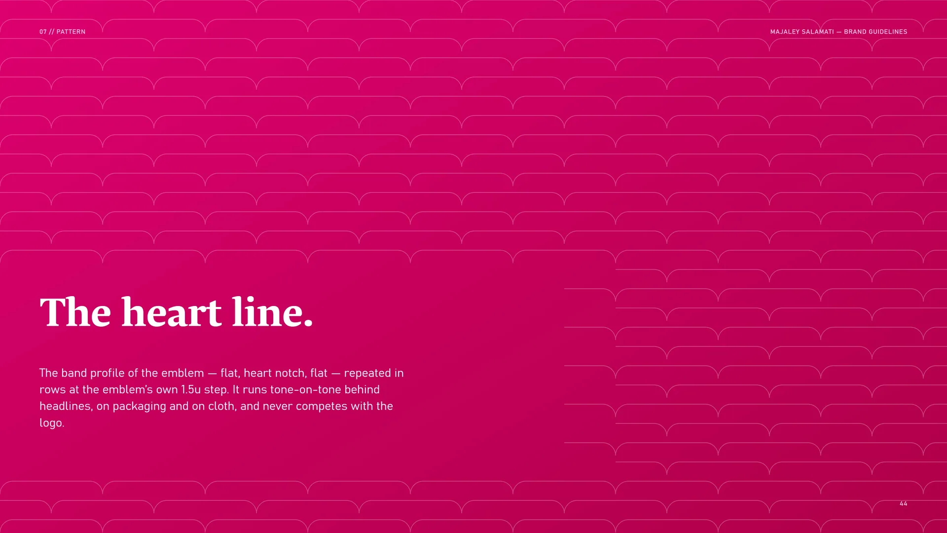
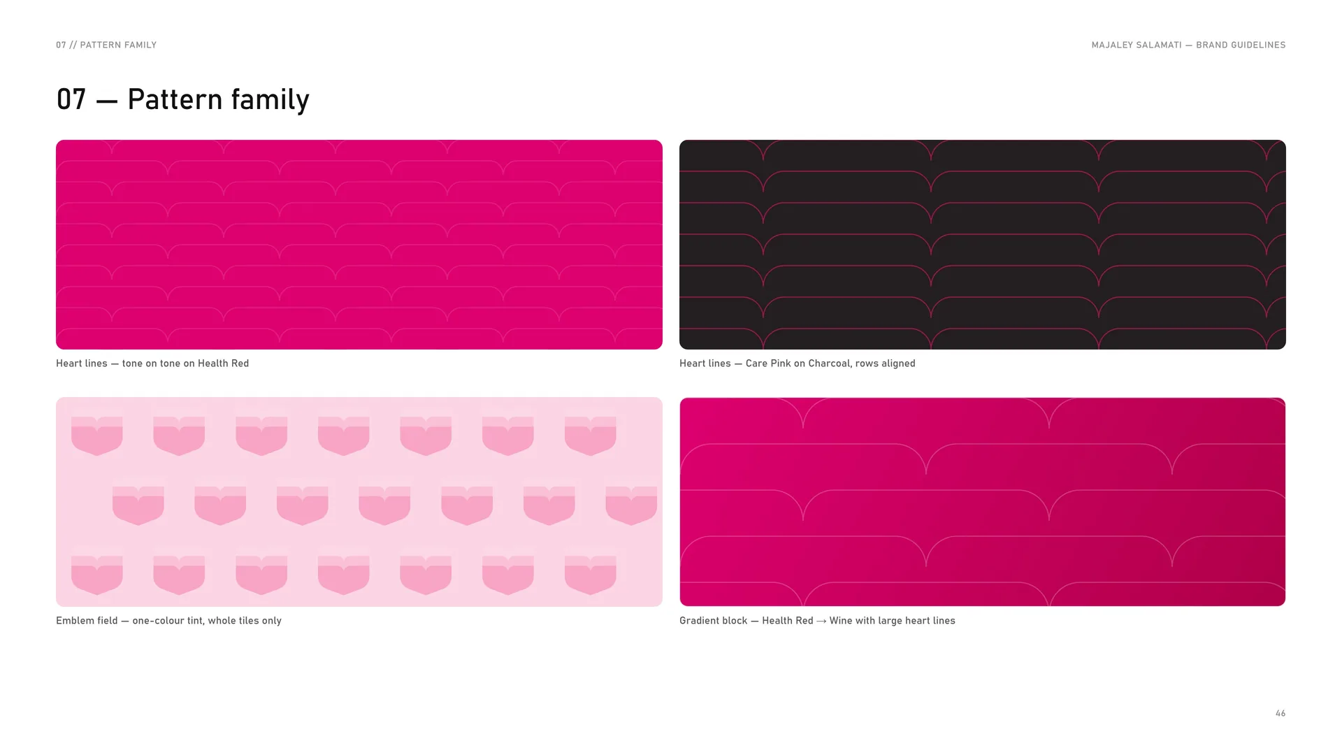
The band profile of the emblem — flat, heart notch, flat — repeated in rows at the emblem’s own 1.5u step. It runs tone-on-tone behind headlines, on packaging and on cloth, and never competes with the logo.
07.2
How the pattern is built
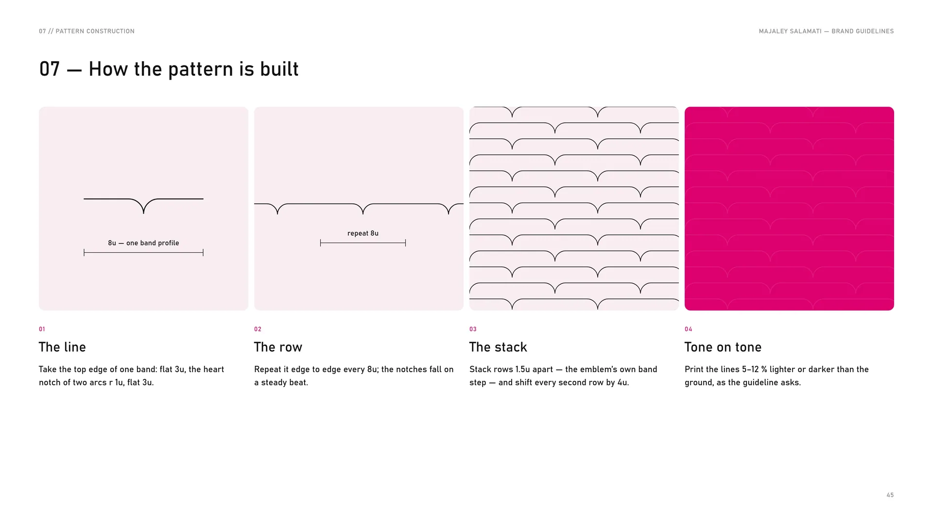
The line: Take the top edge of one band: flat 3u, the heart notch of two arcs r 1u, flat 3u.
The row: Repeat it edge to edge every 8u; the notches fall on a steady beat.
The stack: Stack rows 1.5u apart — the emblem’s own band step — and shift every second row by 4u.
Tone on tone: Print the lines 5–12 % lighter or darker than the ground, as the guideline asks.
07.3
Pattern family
Heart lines — tone on tone on Health Red.
Emblem field — one-colour tint, whole tiles only.
Heart lines — Care Pink on Charcoal, rows aligned.
Gradient block — Health Red → Wine with large heart lines.
07.4
Line and colour
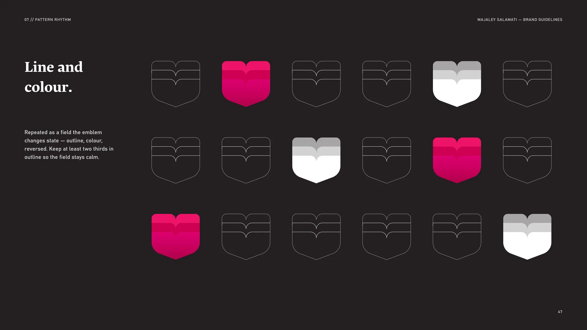
Repeated as a field the emblem changes state — outline, colour, reversed. Keep at least two thirds in outline so the field stays calm.
07.5
Pattern rules
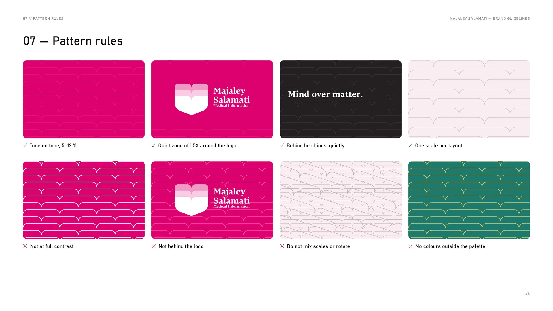
✓ Tone on tone, 5–12 %.
✓ Quiet zone of 1.5X around the logo.
✓ Behind headlines, quietly.
✓ One scale per layout.
✕ Not at full contrast.
✕ Not behind the logo.
✕ Do not mix scales or rotate.
✕ No colours outside the palette.
07.6
Pattern in use
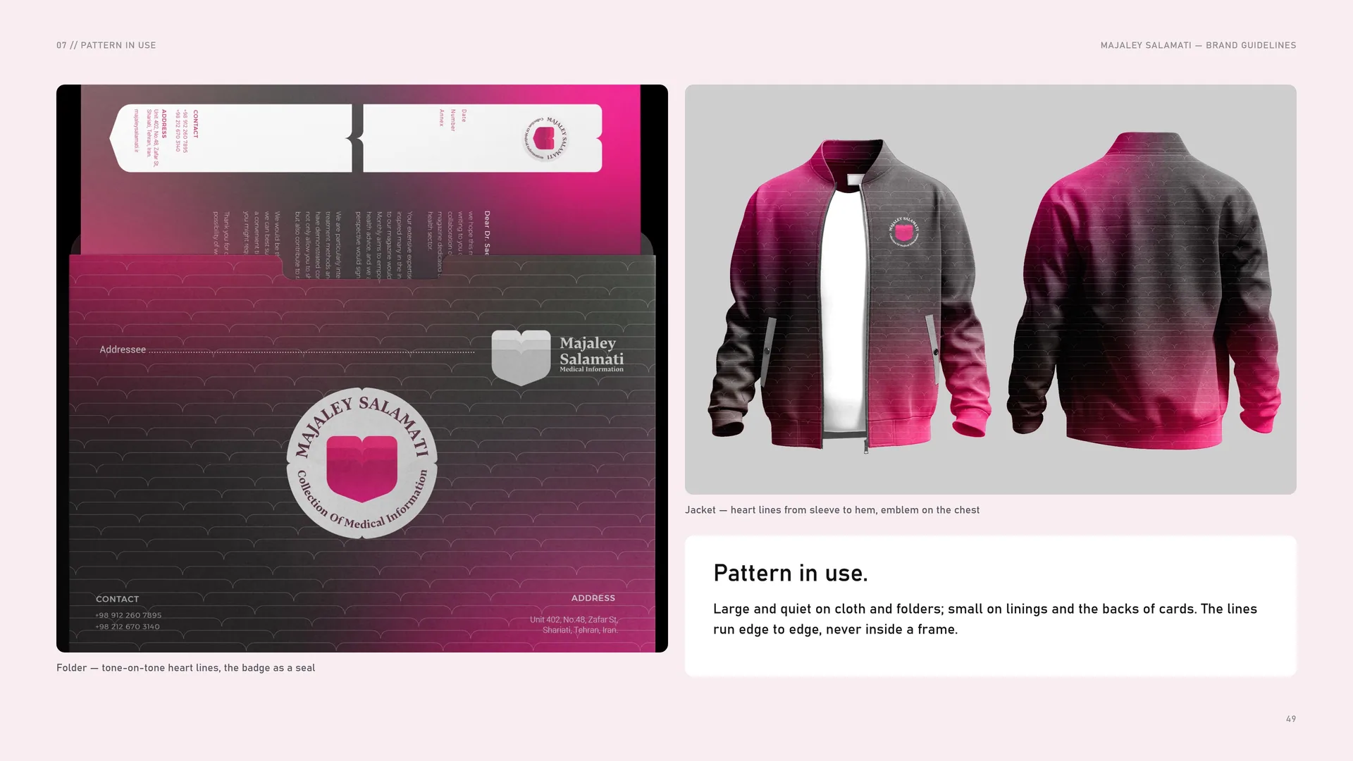
Large and quiet on cloth and folders; small on linings and the backs of cards. The lines run edge to edge, never inside a frame.
Folder — tone-on-tone heart lines, the badge as a seal.
Jacket — heart lines from sleeve to hem, emblem on the chest.
08
Imagery
08.1
Imagery
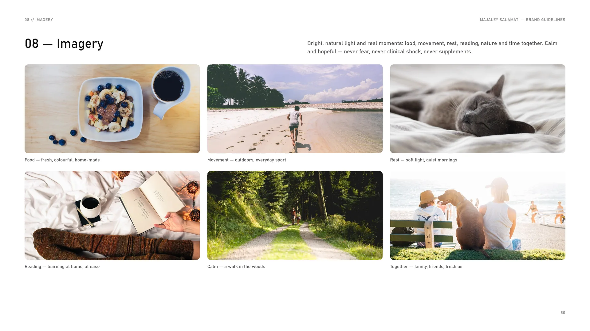
Bright, natural light and real moments: food, movement, rest, reading, nature and time together. Calm and hopeful — never fear, never clinical shock, never supplements.
Food — fresh, colourful, home-made.
Movement — outdoors, everyday sport.
Rest — soft light, quiet mornings.
Reading — learning at home, at ease.
Calm — a walk in the woods.
Together — family, friends, fresh air.
09
Stationery
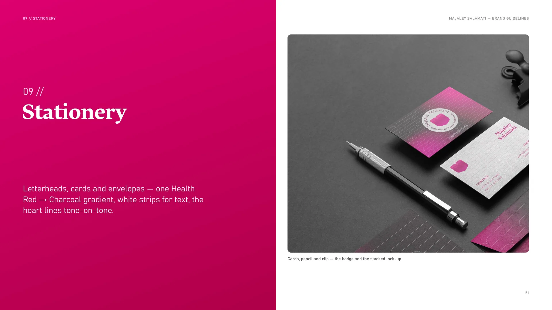
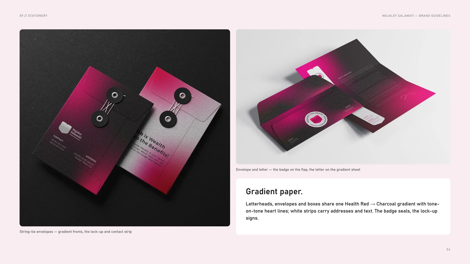
Letterheads, cards and envelopes — one Health Red → Charcoal gradient, white strips for text, the heart lines tone-on-tone.
Cards, pencil and clip — the badge and the stacked lock-up.
09.1
Letterhead
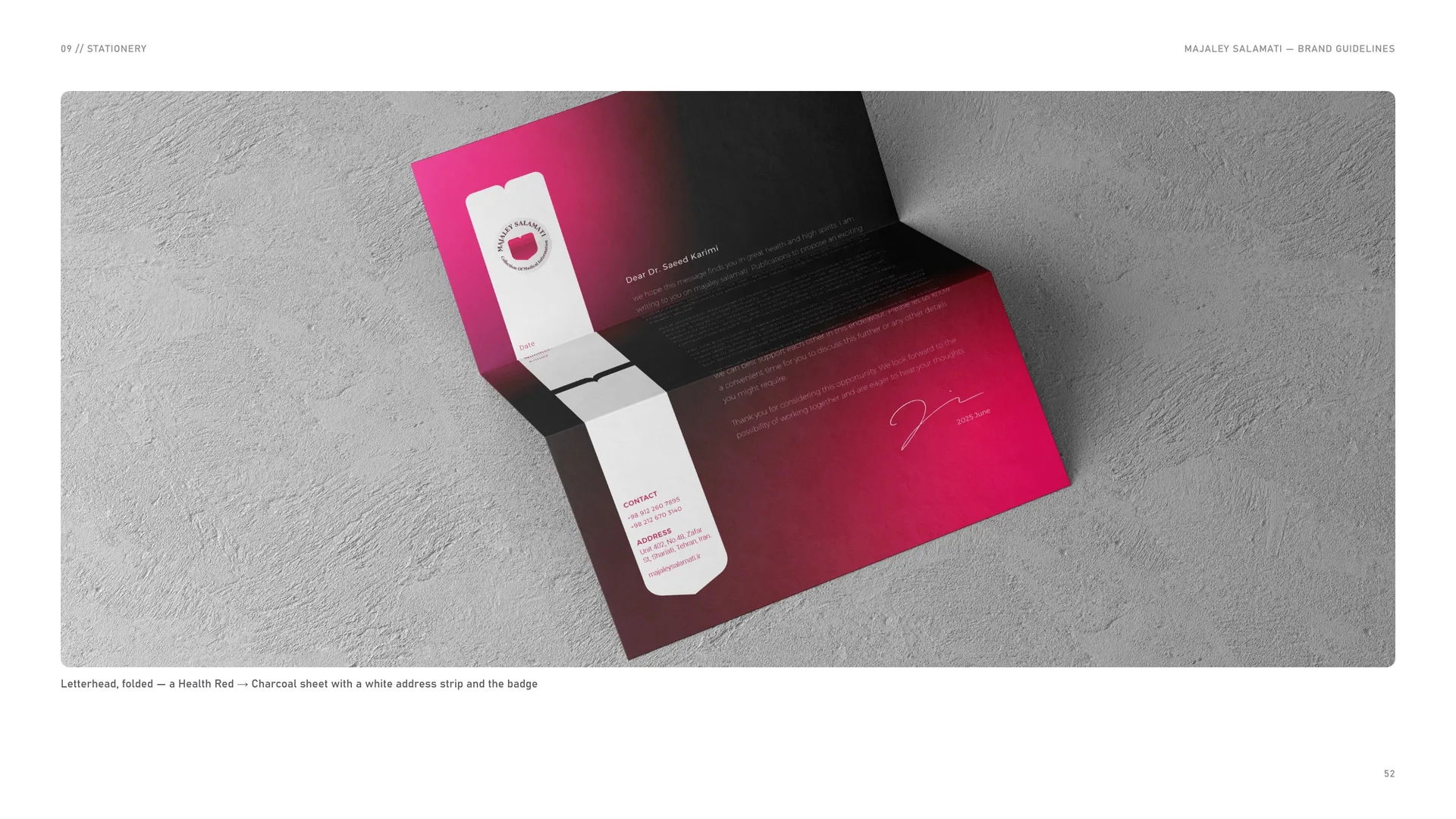
Letterhead, folded — a Health Red → Charcoal sheet with a white address strip and the badge.
09.2
Business cards
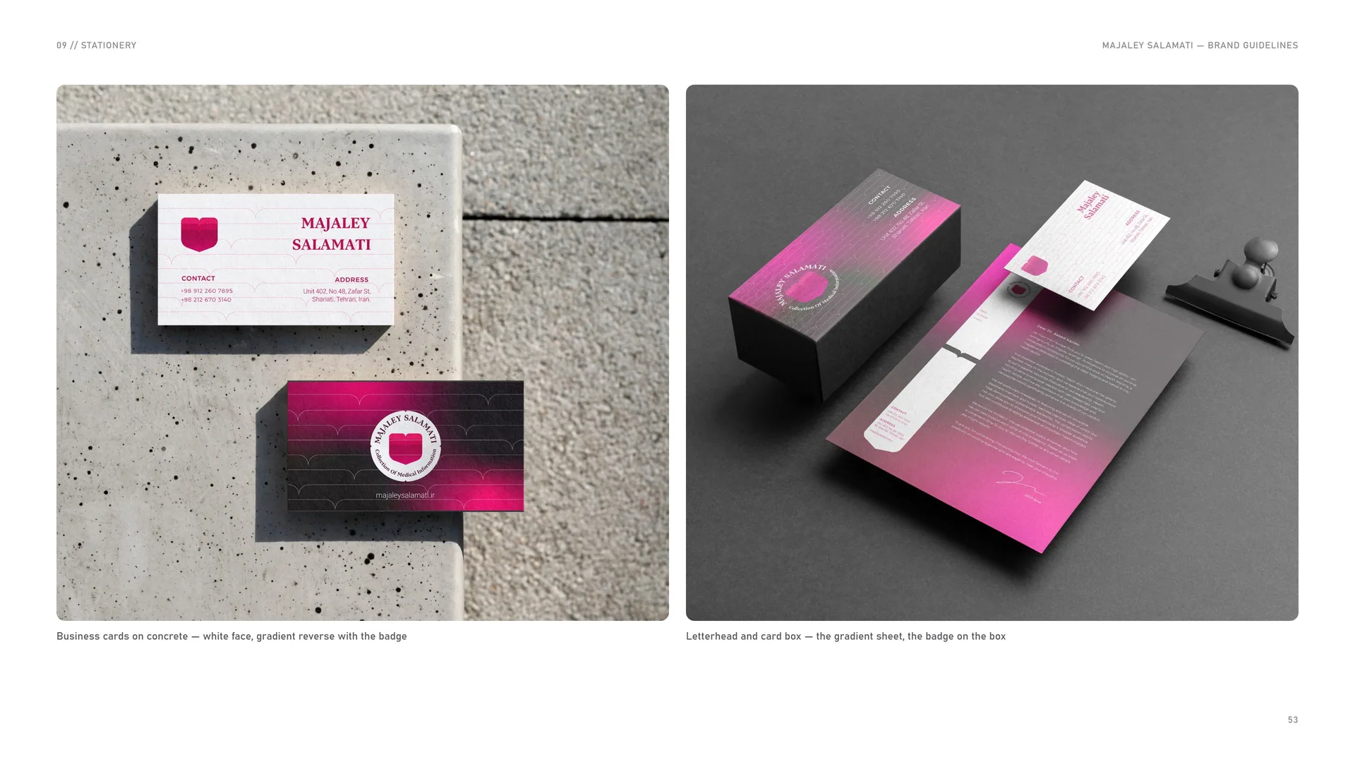
Business cards on concrete — white face, gradient reverse with the badge.
Letterhead and card box — the gradient sheet, the badge on the box.
09.3
Gradient paper
Letterheads, envelopes and boxes share one Health Red → Charcoal gradient with tone-on-tone heart lines; white strips carry addresses and text. The badge seals, the lock-up signs.
String-tie envelopes — gradient fronts, the lock-up and contact strip.
Envelope and letter — the badge on the flap, the letter on the gradient sheet.
10
Packaging
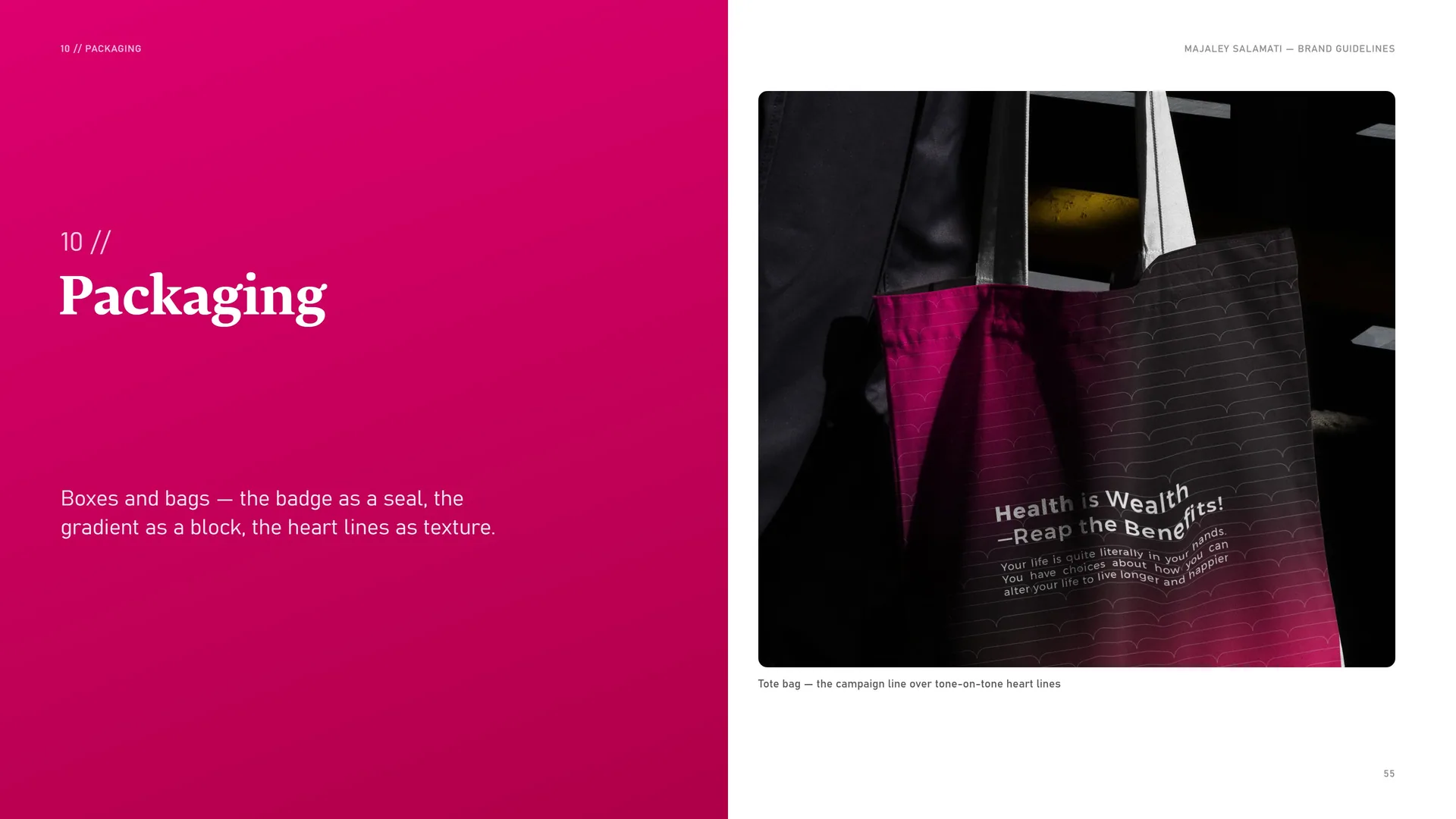
Boxes and bags — the badge as a seal, the gradient as a block, the heart lines as texture.
Tote bag — the campaign line over tone-on-tone heart lines.
10.1
Sleeves & boxes
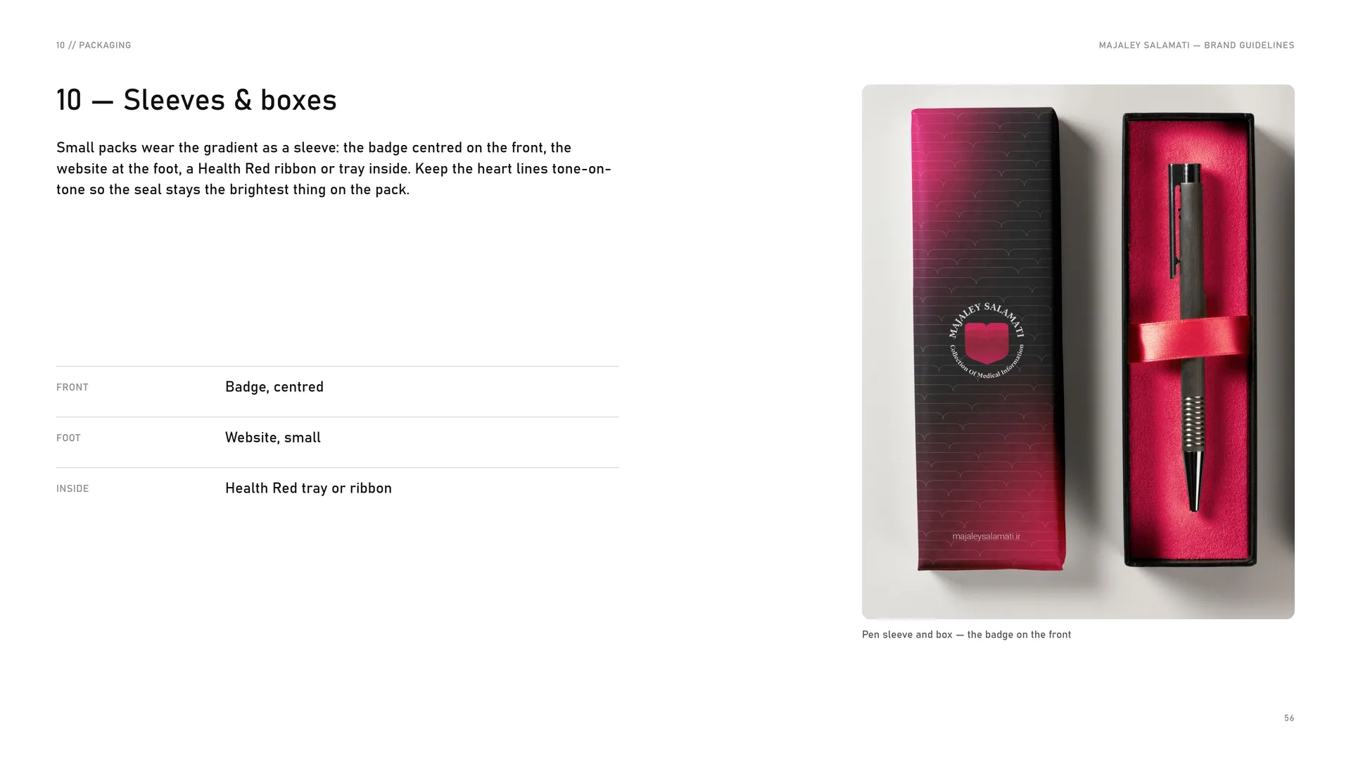
Small packs wear the gradient as a sleeve: the badge centred on the front, the website at the foot, a Health Red ribbon or tray inside. Keep the heart lines tone-on-tone so the seal stays the brightest thing on the pack.
Front: Badge, centred.
Foot: Website, small.
Inside: Health Red tray or ribbon.
Pen sleeve and box — the badge on the front.
11
Digital media
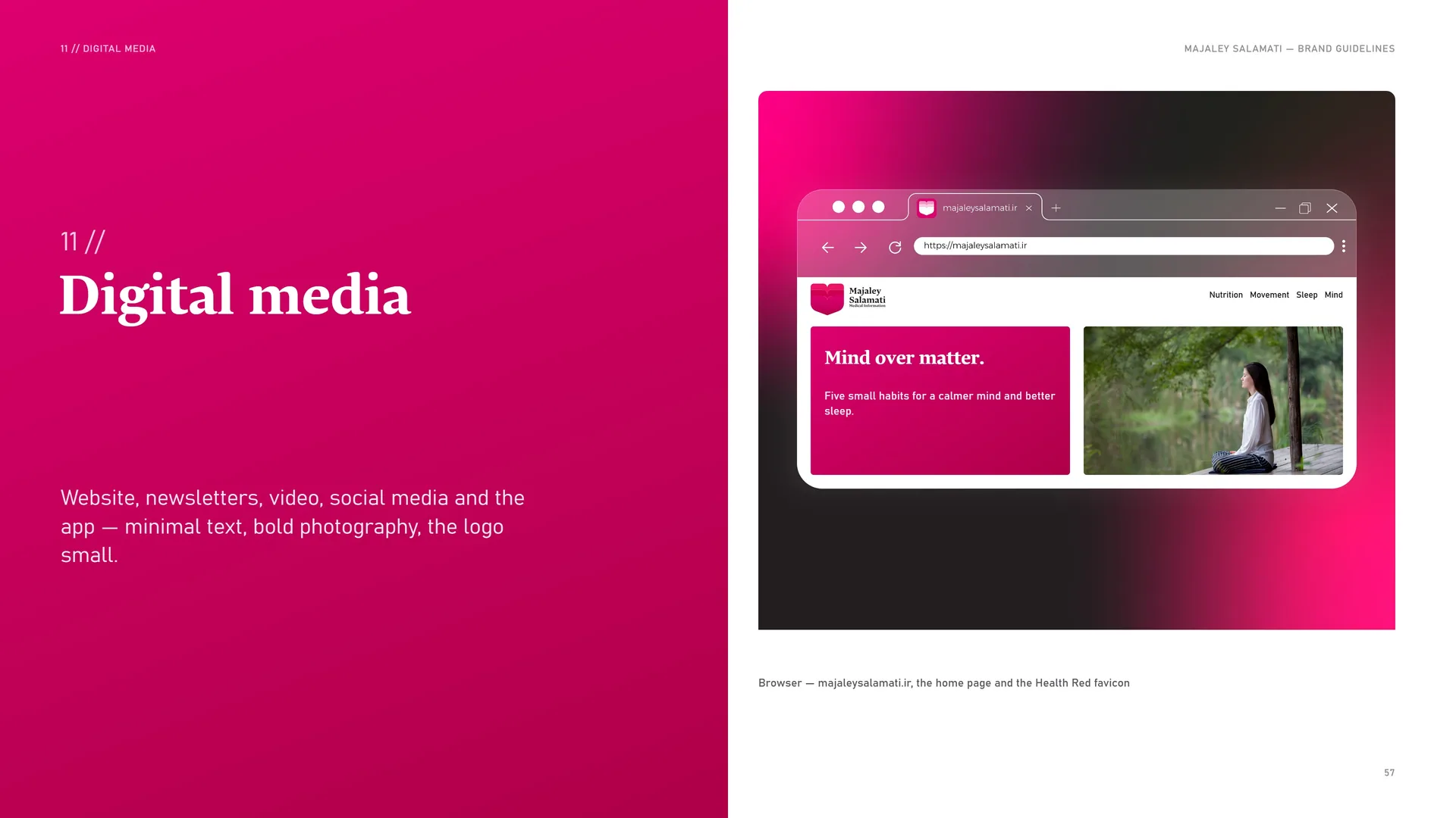
Website, newsletters, video, social media and the app — minimal text, bold photography, the logo small.
Browser — majaleysalamati.ir, the home page and the Health Red favicon.
- 11.1Website
- 11.2Video channel, app screens and lock screen
- 11.3Social posts
- 11.4E-mail and display stand
11.1
Website
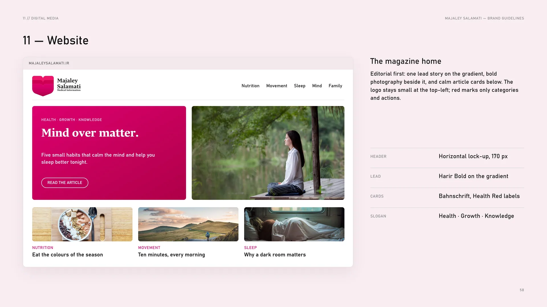
The magazine home: Editorial first: one lead story on the gradient, bold photography beside it, and calm article cards below. The logo stays small at the top-left; red marks only categories and actions.
Header: Horizontal lock-up, 170 px.
Lead: Harir Bold on the gradient.
Cards: Bahnschrift, Health Red labels.
Slogan: Health · Growth · Knowledge.
11.2
Video channel, app screens and lock screen
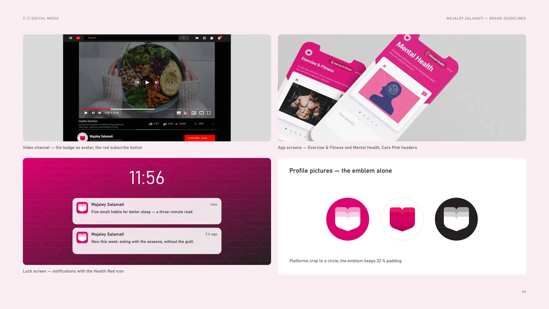
Video channel — the badge as avatar, the red subscribe button.
App screens — Exercise & Fitness and Mental Health, Care Pink headers.
Profile pictures — the emblem alone.
Lock screen — notifications with the Health Red icon.
Platforms crop to a circle; the emblem keeps 22 % padding.
11.3
Social posts
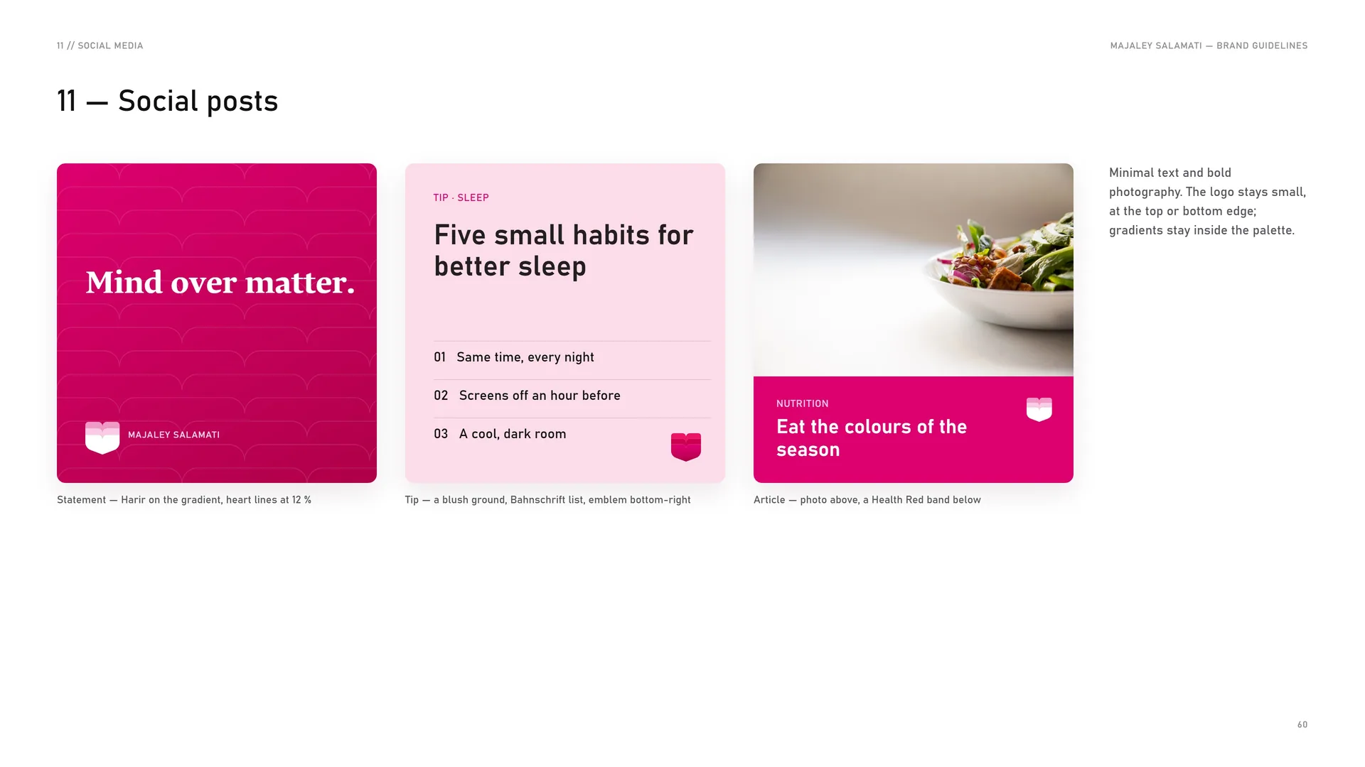
Minimal text and bold photography. The logo stays small, at the top or bottom edge; gradients stay inside the palette.
Statement — Harir on the gradient, heart lines at 12 %.
Tip — a blush ground, Bahnschrift list, emblem bottom-right.
Article — photo above, a Health Red band below.
11.4
E-mail and display stand
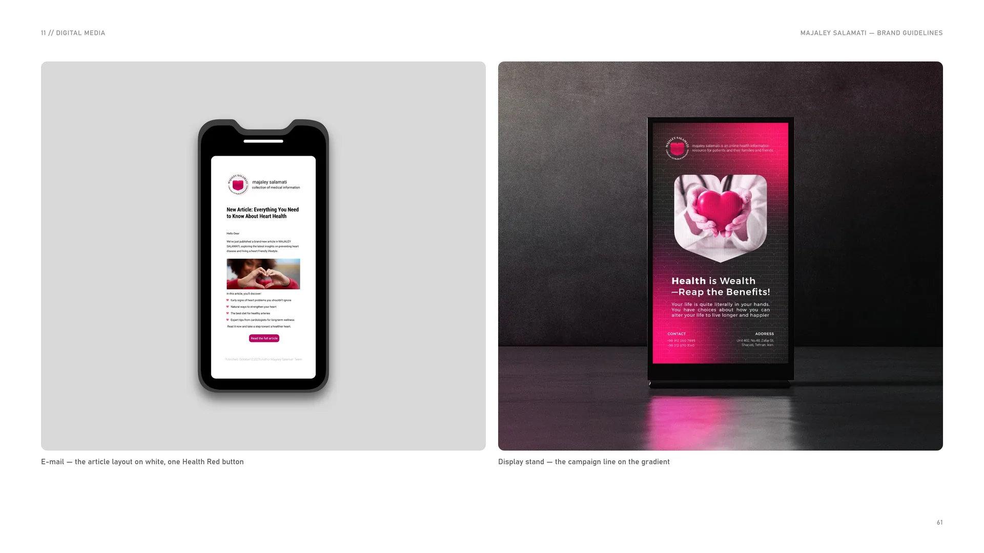
E-mail — the article layout on white, one Health Red button.
Display stand — the campaign line on the gradient.
12
Merchandise
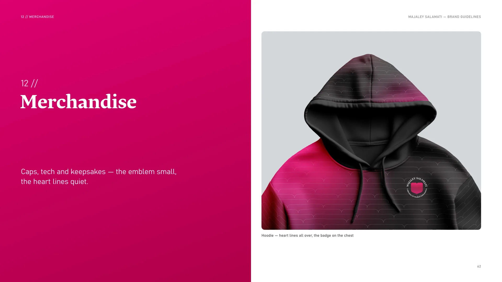
Caps, tech and keepsakes — the emblem small, the heart lines quiet.
Hoodie — heart lines all over, the badge on the chest.
12.1
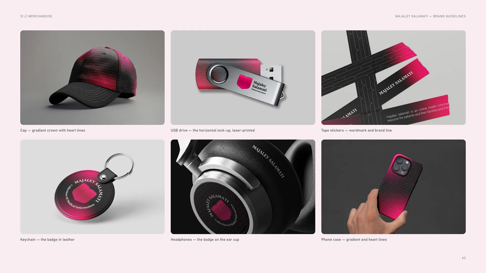
Cap, USB drive, stickers, keychain, headphones and phone case
Cap — gradient crown with heart lines.
USB drive — the horizontal lock-up, laser-printed.
Tape stickers — wordmark and brand line.
Keychain — the badge in leather.
Headphones — the badge on the ear cup.
Phone case — gradient and heart lines.
12.2
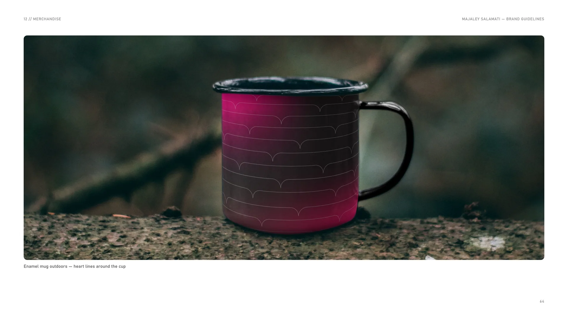
Enamel mug
Enamel mug outdoors — heart lines around the cup.
13
Signage & environment
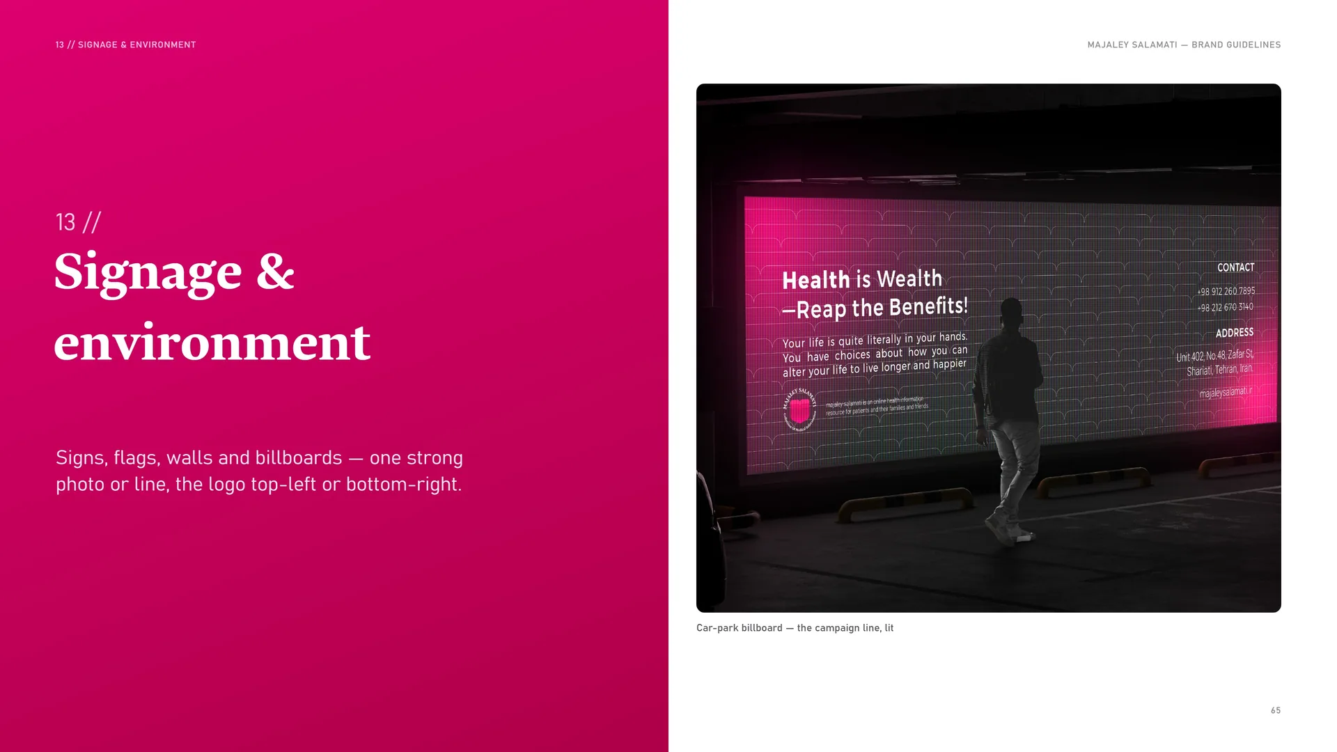
Signs, flags, walls and billboards — one strong photo or line, the logo top-left or bottom-right.
Car-park billboard — the campaign line, lit.
13.1
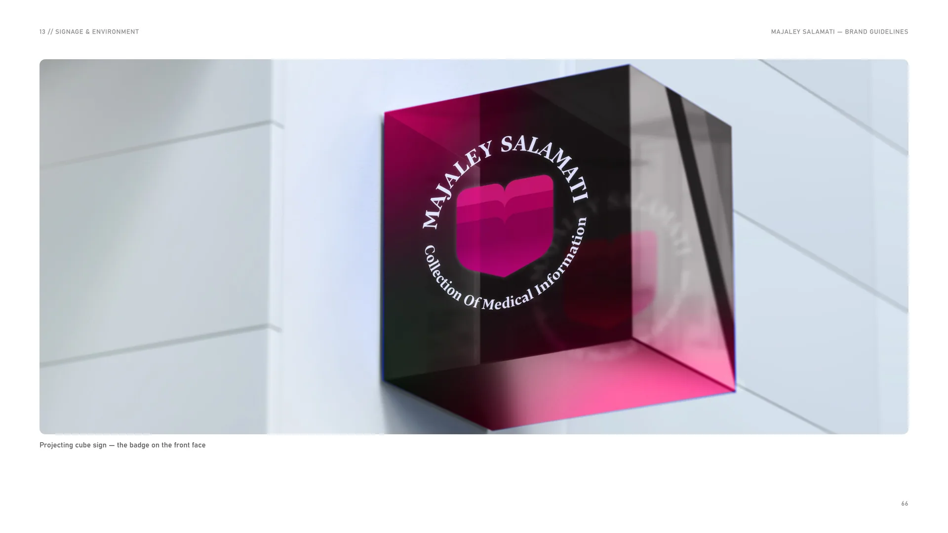
Projecting cube sign
Projecting cube sign — the badge on the front face.
13.2
Flags & banners
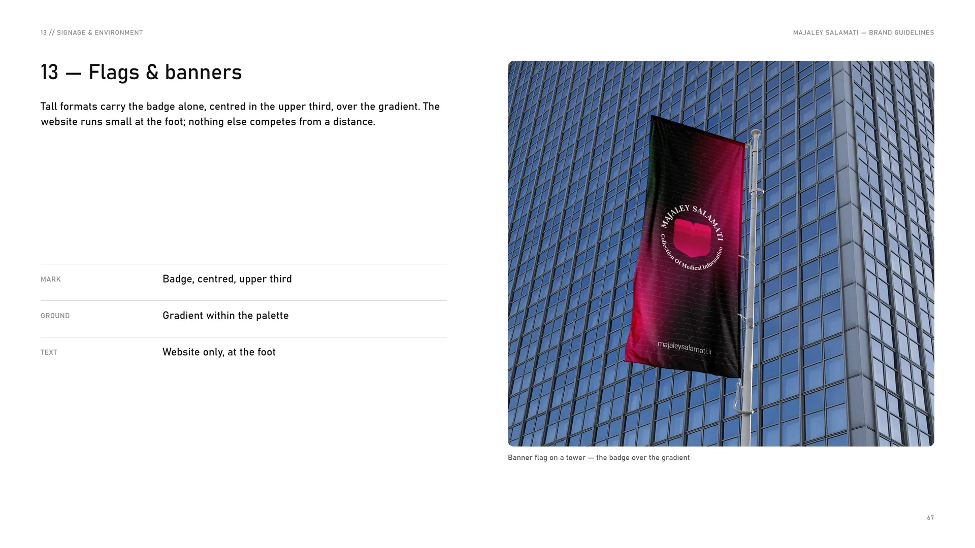
Tall formats carry the badge alone, centred in the upper third, over the gradient. The website runs small at the foot; nothing else competes from a distance.
Mark: Badge, centred, upper third.
Ground: Gradient within the palette.
Text: Website only, at the foot.
Banner flag on a tower — the badge over the gradient.
13.3
Walls
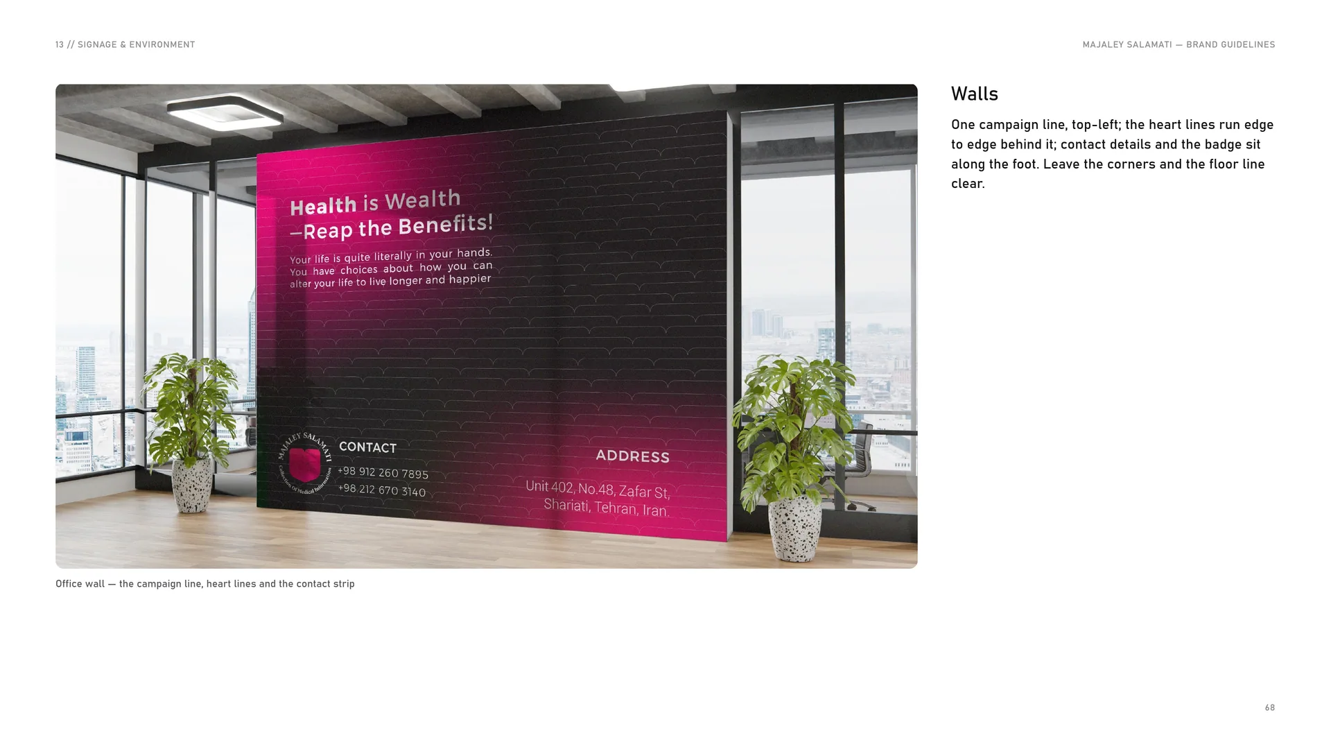
One campaign line, top-left; the heart lines run edge to edge behind it; contact details and the badge sit along the foot. Leave the corners and the floor line clear.
Office wall — the campaign line, heart lines and the contact strip.
14
Files & contact
14.1
Files & contact
Website: majaleysalamati.ir.
About: An online health information resource for patients and their families and friends.
Slogan: Health · Growth · Knowledge.
Logo files — AI · EPS · PDF: Vector masters — CMYK.
SVG: Vector for web and apps.
PNG: Transparent, 1x · 2x · 4x.
ICO · PNG: Emblem favicon 16 · 32 · 48 · 96 · 180 px.
Fonts: Harir (Regular, Bold) — licensed with the identity.
Bahnschrift is a Microsoft system font that ships with Windows; it is not redistributed with these files. Name files as MAJALEY-SALAMATI_Logo_Lockup_Colour_Mode.ext.
Photos: Wikimedia Commons, CC0 / public domain — titles and photographers listed in credits.txt.
Version 1.0 · November 2026.
14.2
Thank you
Health · Growth · Knowledge.