Health Publication Logo Design
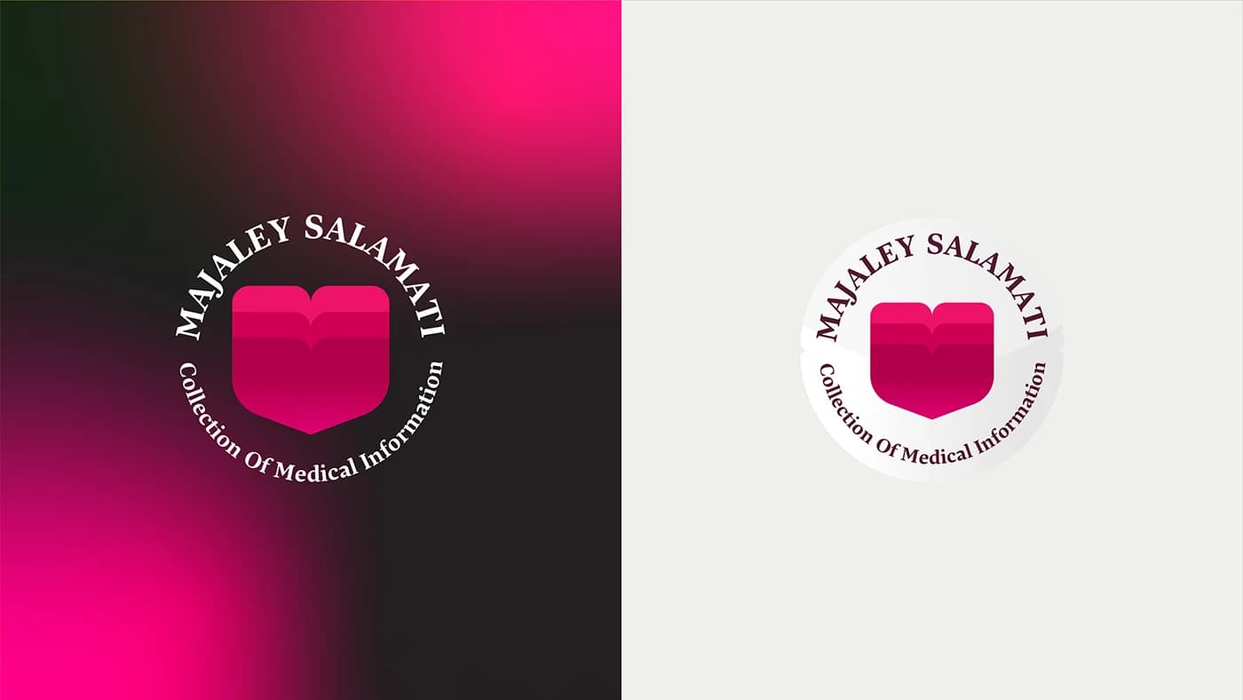
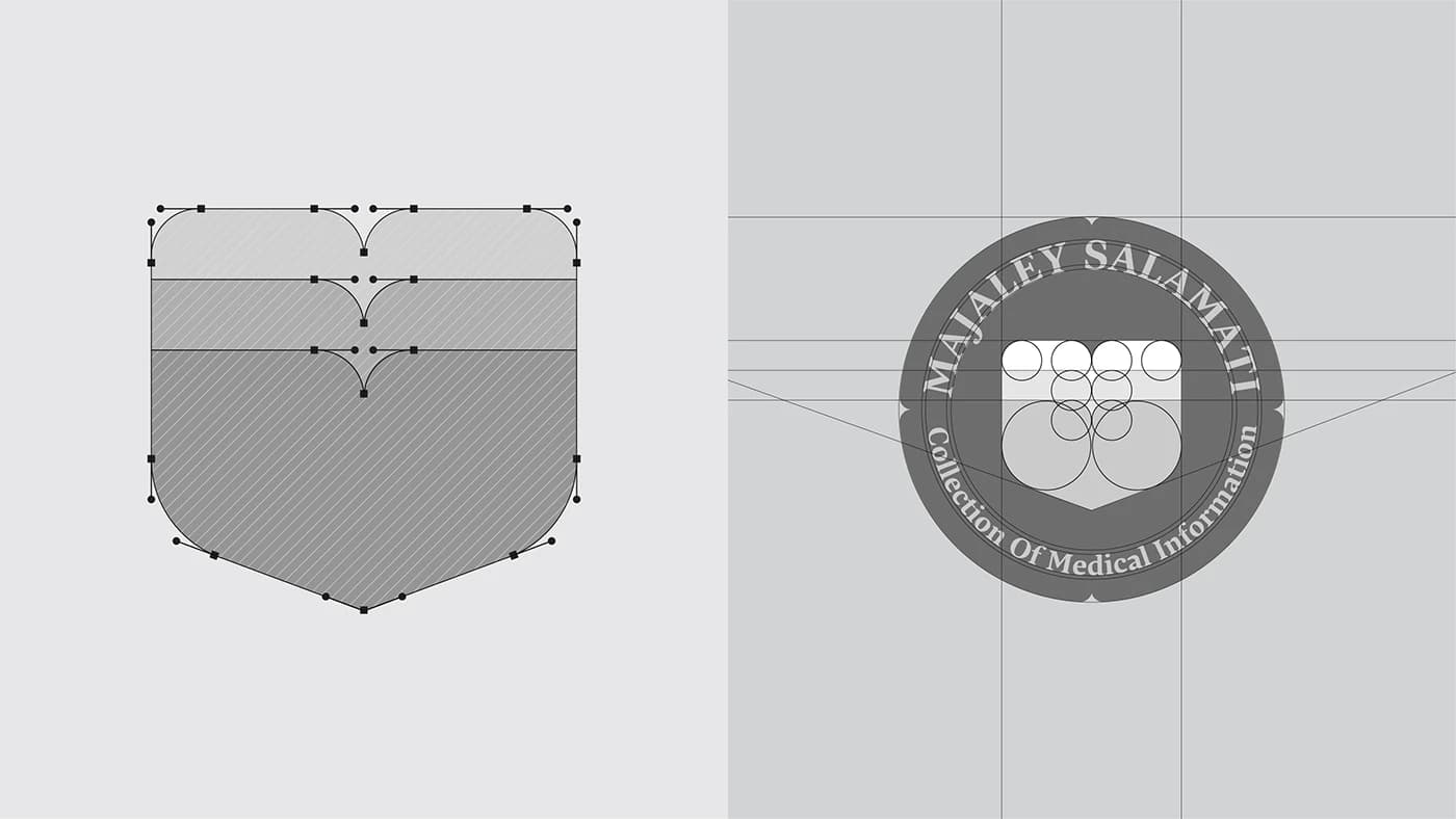
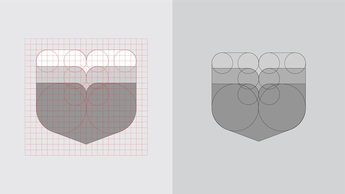
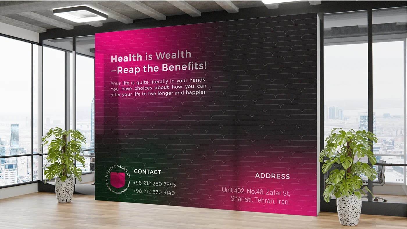
This project showcases the mathematical construction and structural logic behind the emblem for a premium healthcare media platform.
- Year
- 2025
- Client
- Health Publication
- Field
- Health magazine
- Services
- Logo design
- Project
- Health Publication Logo Design
About
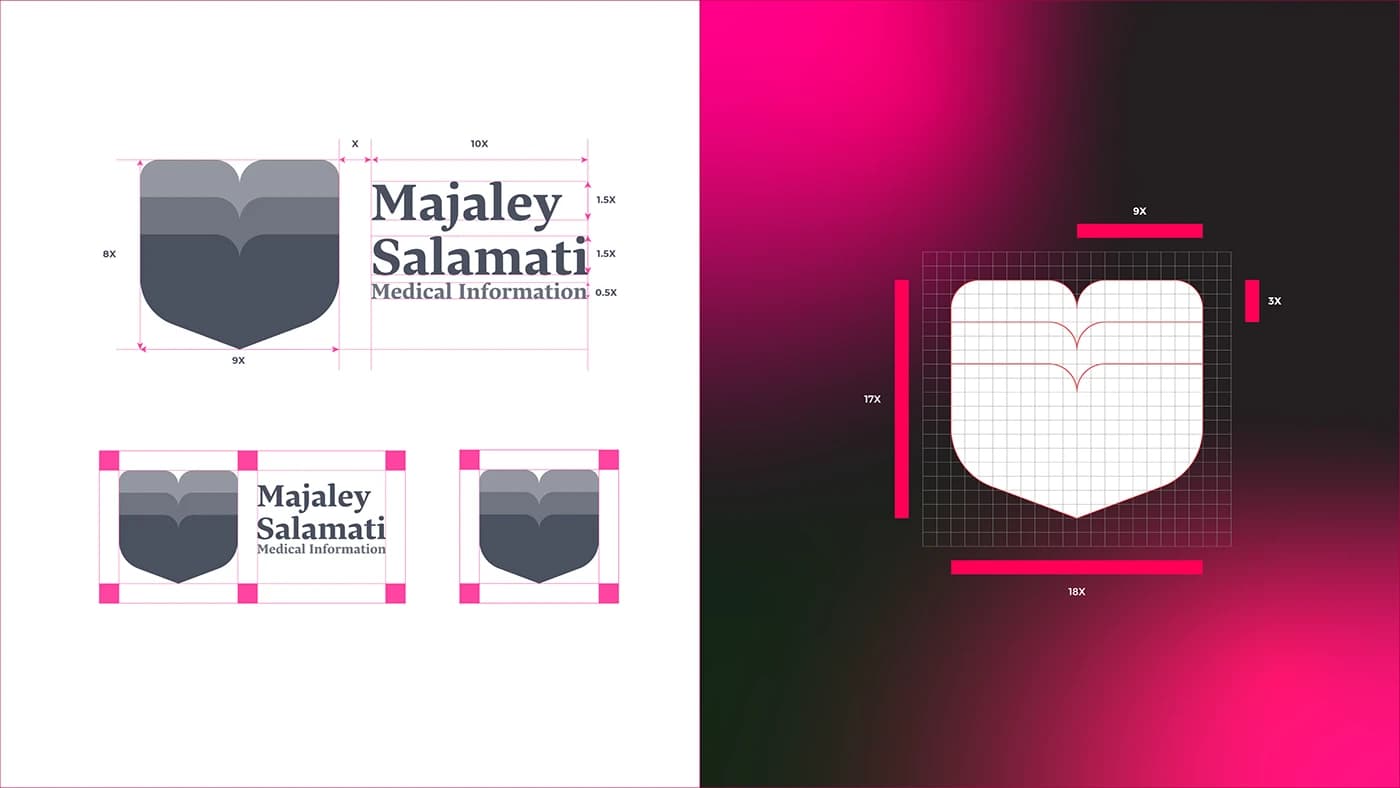
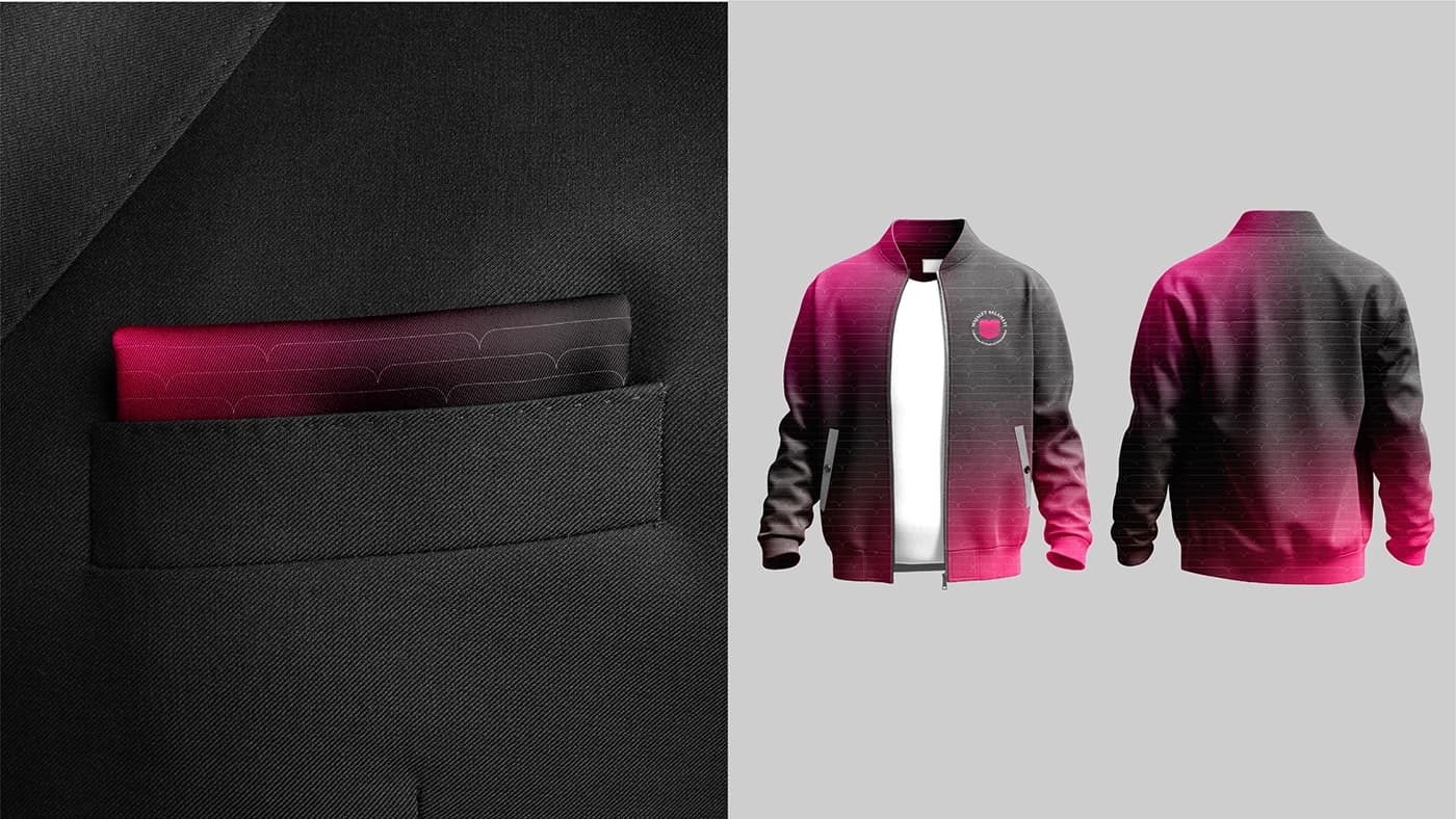
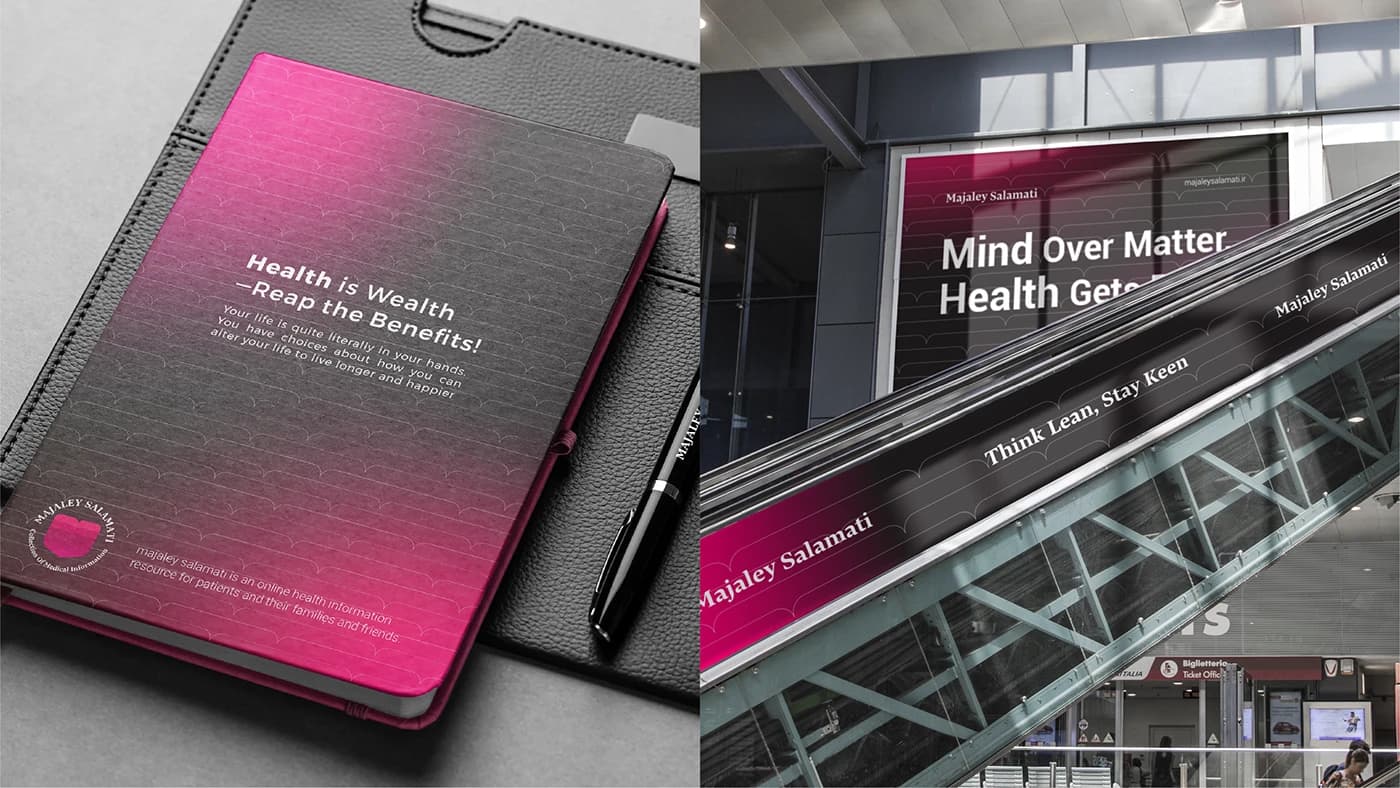
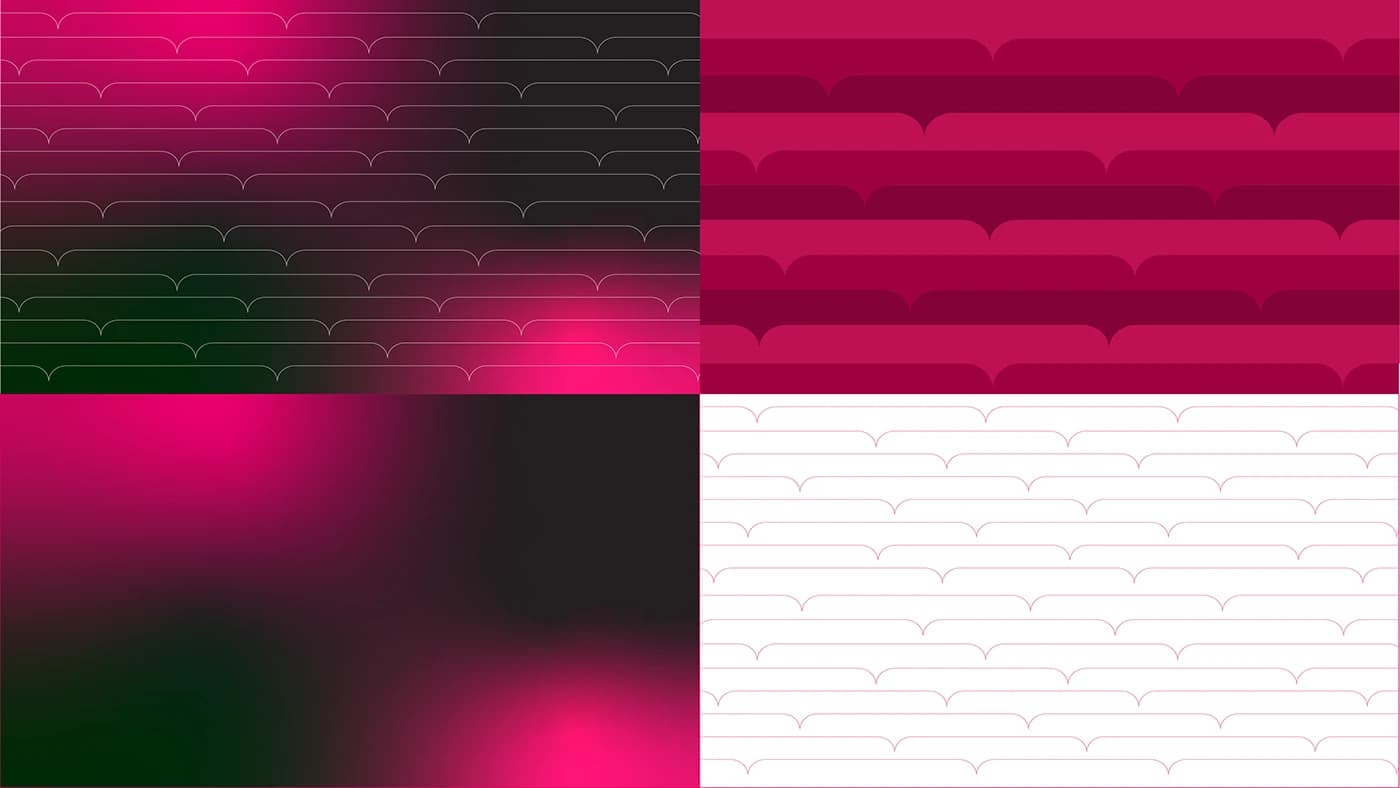
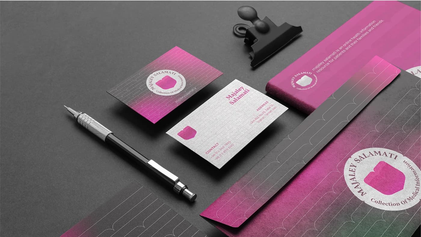
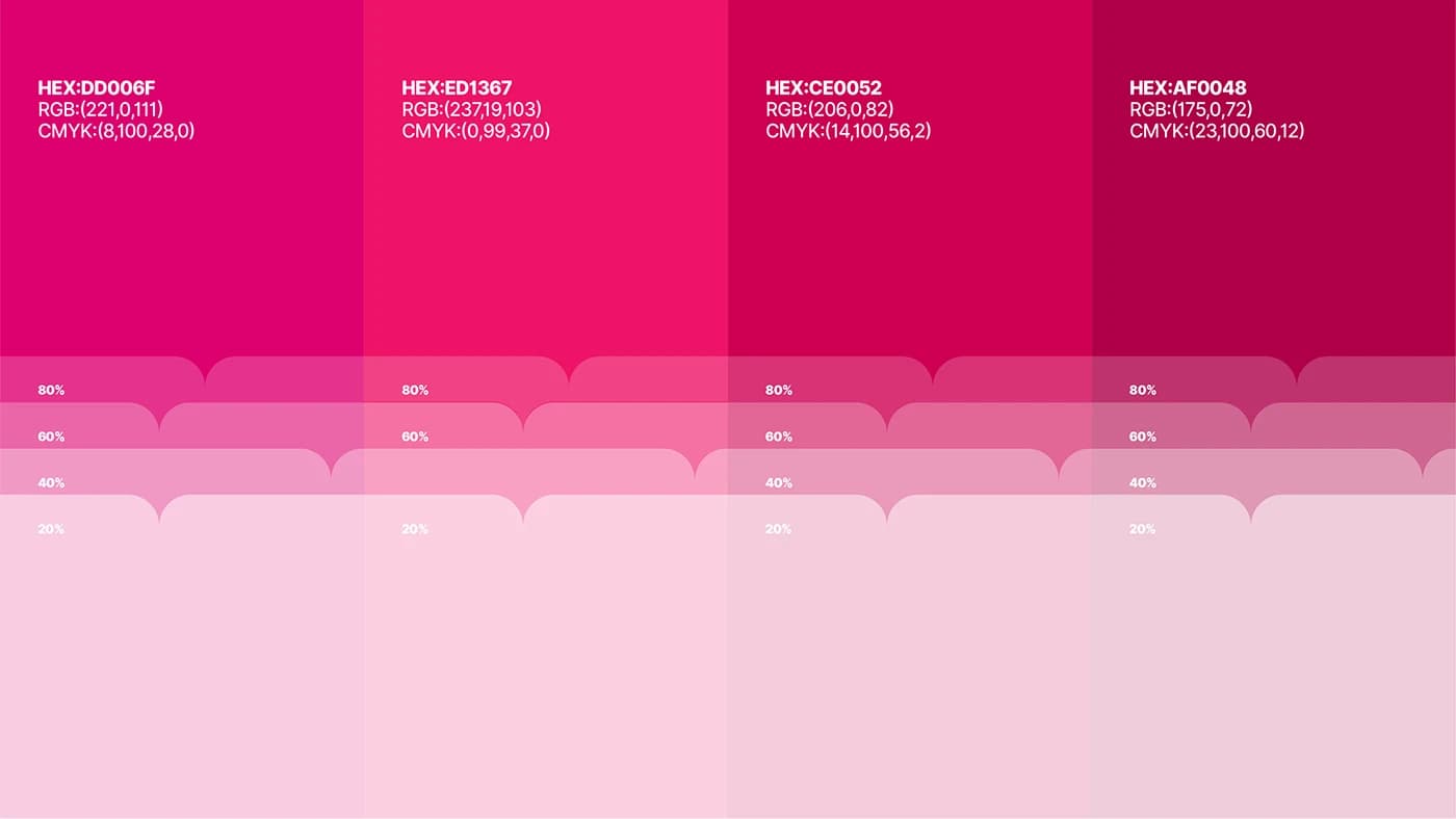
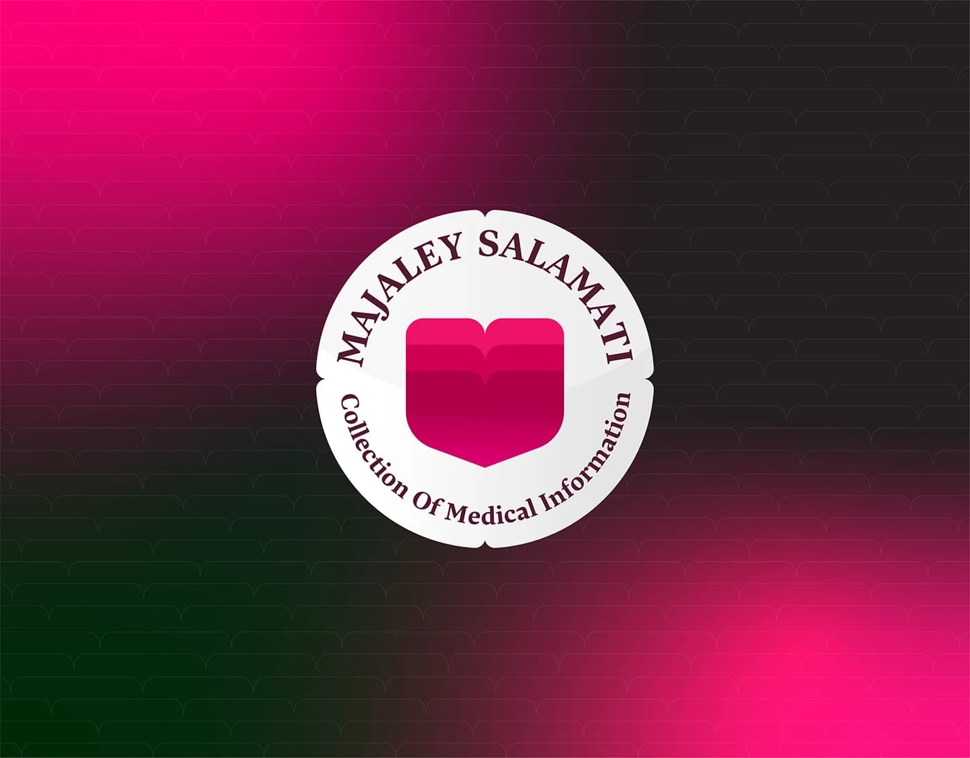
Engineered at the exact intersection of vitality and precision, the logomark is built upon strict geometric grids and proportional balance. By merging organic and clinical archetypes through semiotic mapping and Gestalt principles, this minimalist mark communicates high-level care via a sophisticated red-to-pink color story. This case study breaks down the complete anatomy of the logo, demonstrating: Mathematical Construction: Precision engineering using strict grid systems and proportional logic.
The design
Semiotic Integration: Balancing organic fluidity with clinical stability. Color Strategy: A targeted red-to-pink spectrum designed for premium positioning. Scalability: A modular emblem optimized for both complex editorial layouts and digital icons.